Beginning HTML5 & CSS3 For Dummies® (2013)
Part V
Enhancing Your Pages’ Look and Feel
17
Web Typography
In This Chapter
![]() Changing font sizes
Changing font sizes
![]() Emboldening with bold
Emboldening with bold
![]() Emphasizing with italic
Emphasizing with italic
![]() Changing capitalization
Changing capitalization
![]() Using web fonts
Using web fonts
![]() Working with online font libraries
Working with online font libraries
Typography is defined as the art and technique of arranging type in order to make language visible. Even more than just making language visible, however, typography has been shown to have a dramatic impact on whether people believe and assign value to what an author is saying. Despite the growing amount of video, images, and audio on the Internet, most websites are still primarily focused on conveying information through text. How the text looks has a major impact on how a website looks and how easy it is for people to read.
When you get the hang of working with text, the options for making your website more readable and more expressive are endless!
Finding Out about Fonts
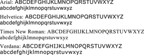
A font is a set of characters that share a similar design. Examples of fonts include Times New Roman, Helvetica, Arial, and the dreaded Comic Sans. Cascading Style Sheets (CSS) gives you many different techniques for working with fonts. These techniques range from selecting a font, to making text bold or italic, to changing the color and size of text, and much more.
As you saw with border, margin, and padding, you can define individual font properties for different HTML5 elements with
![]() Individual CSS properties, such as font-family, line-height, and font-size
Individual CSS properties, such as font-family, line-height, and font-size
![]() A group of font properties in the catchall shorthand font property
A group of font properties in the catchall shorthand font property
Keep this in mind as you journey into the sometimes mind-boggling array of font properties. We show you the long way of doing things first, but the shorthand properties are often more commonly used.
Font family
To define the font face by using the CSS font-family property:
1. Identify the selector for the style declaration.
For example, making p the selector defines a font family for all <p> tags.
2. Add the property name font-family.
 Browsers can access a limited number of font families by default. Different browsers on different operating systems can access different sets of font families. To deal with this situation, CSS allows you to specify multiple font families in case a browser doesn't support the font family you prefer. You can list multiple font family names, separated by commas. For example, it's common to see font-family declarations that look like this:
font-family: Arial, Helvetica, sans-serif;
This declaration lists, in order, the designer’s preference for which font family should be used. The browser uses the first name in the list available on the computer on which it’s running.
If a limited number of available font families sounds like a real bummer to you, hang on! With CSS3, this limitation has been lifted, as you see later in this chapter.
3. Define a value for the property (the name of the font family).
 Use single or double quotation marks around any font family names that include spaces.
To format all first-level headings to use the Verdana font, use a style rule like this:
h1 {font-family: Verdana, Helvetica, sans-serif;}
In the preceding declaration, two more font families appear in case someone’s browser doesn’t support the Verdana font family.
 We recommend including these font families in your style declarations:
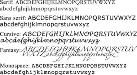
![]() Common: At least one of these common font families:
Common: At least one of these common font families:
![]() Generic: At least one of these generic font families:
Generic: At least one of these generic font families:
Different elements may be formatted using different font families. These rules define a different font family for hyperlinks (see Figure 17-1):
body {color: #808000; font-family: Arial, sans-serif; font-size: 85%;}
hr {text-align: center;}
a {font-family: Courier, "Courier New", monospace;}
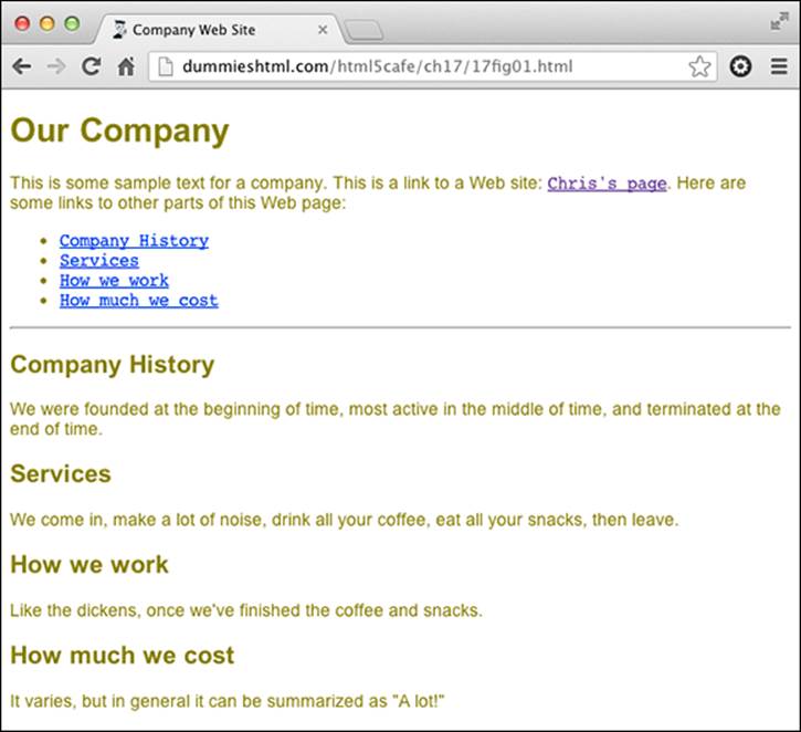
Figure 17-1: The font family for hyperlinks differs from the font family for the rest of the text.
Sizing text fonts with CSS
In addition to the font size names (xx-small, x-small, small, medium, large, x-large, or xx-large), you can also assign font sizes by using the following CSS units of measure: px (pixels), pt (points), % (percent), or em (the m-height for the font in use, whatever it may be). Pixels are a fixed-size unit that depends on the resolution of the user's monitor and doesn't scale. Designers are fond of using px for font sizes, because they allow a level of precision in translating from design files to Web pages. However, the use of px for specifying font sizes can have a negative impact on accessibility by the visually impaired, and on the scalability for smaller devices.
Points are a unit that is more commonly used for print than screen measurements. They have the same downside as pixels in that they are a fixed unit.
The em is the most widely used unit in sizing fonts in CSS nowadays, and this approach is considered a best practice for sizing fonts using style sheets. Choosing em units for font sizes makes it quick and easy for you to size type relative to your underlying font. For more information on using these units, which take the form font-size: 2em; (to double font size) or font-size: 0.8em; (to reduce a font to 80 percent of the base), see Chapter 11.
The percent unit operates very much like the em unit. The current font-size is equal to 100 percent. If you want to make the font size half as large you can set the font-size to 50 percent, if you want to make it 25 percent larger you can set it to 125 percent, and so on.
Sizing
The following properties allow you to control the dimensions of your text.
Font size
The style declaration to specify the size of text is
selector {font-size: value;}
The value of the declaration can be
![]() One of the standard font-property measurement values (listed in Chapter 11)
One of the standard font-property measurement values (listed in Chapter 11)
![]() One of these user-defined keywords:
One of these user-defined keywords:
xx-small, x-small, small, medium, large, x-large, or xx-large
The actual size of each font size keyword is determined by the browser, not by the style rule.
The following rules define
![]() A base font size of 85 percent for all text.
A base font size of 85 percent for all text.
![]() A size in ems for all first-level headings.
A size in ems for all first-level headings.
body {color: #808000; font-family: Arial, sans-serif; font-size: 85%;}
h1 {font-family: "Trebuchet MS", Verdana, Geneva, Arial, Helvetica,
sans-serif; font-size: 2em; line-height: 2.5em; color: teal;}
The result appears in Figure 17-2.
Line height
The line height of a paragraph is the amount of space between each line within the paragraph.
Line height is like line spacing in a word processor.
To alter the amount of space between lines of a paragraph, use the line-height property:
selector {line-height: value;}
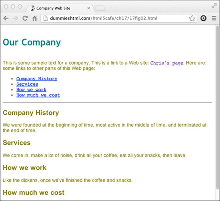
Figure 17-2: The body text is set to 85 percent, and first-level headings are set to 2em.
The value of the line-height property can be either
![]() One of the standard font property measurement values (listed above and in Chapter 11)
One of the standard font property measurement values (listed above and in Chapter 11)
![]() A number that multiplies the element's font size, such as 1.5
A number that multiplies the element's font size, such as 1.5
We assign a quotation class to the first paragraph throughout this chapter so you can see the changes. This allows us to apply these styles to the first paragraph by using
<p class="quotation">
in the HTML document.
The following rules style the first paragraph in italics, indent that paragraph, and increase the line height to increase readability (see Figure 17-3):
body {color: #808000; font-family: Arial, sans-serif; font-size: 85%;}
h1 {font-family: "trebuchet ms", verdana, geneva, arial, helvetica, sans-serif;
font-size: 2em; line-height: 2.5em; color: teal;}
.quotation {font-style: italic; text-indent: 2em; line-height: 150%;}
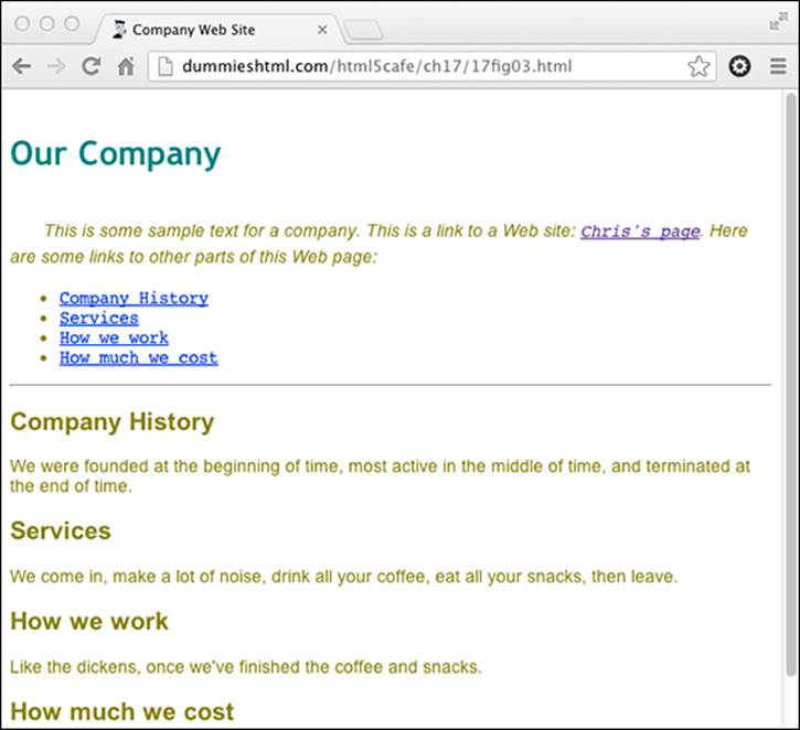
Figure 17-3: Any element that belongs to the quotation class gets the same formatting.
Character spacing
You can increase or reduce the amount of spacing between letters or words by using these properties:
![]() word-spacing: The style declaration for word-spacing is
word-spacing: The style declaration for word-spacing is
selector {word-spacing: value;}
Designers call the space between words tracking.
![]() letter-spacing: The style declaration for letter-spacing is
letter-spacing: The style declaration for letter-spacing is
selector {letter-spacing: value;}
Designers call the space between letters kerning.
The value of either spacing property must be a length defined by a standard font property measurement value (listed in Chapter 11).
The following rule increases the letter spacing (kerning) of the first paragraph (see Figure 17-4):
.quotation {font-style: italic; text-indent: 10pt; line-height: 150%; letter-spacing: 0.2em;}
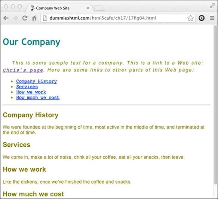
Figure 17-4: Kerning can be larger or smaller than the font’s normal spacing.
Trying Out Text Treatments
CSS allows you to decorate your text by using boldface, italics, underline, overline, or strikethrough. CSS3 includes text effects such as inset text, drop shadows, and much more, which we talk about in Chapter 18.
Embolden with bold
Boldface font is one of the more common text embellishments a designer can use. To apply boldface in HTML, use the <b> tag or the <strong> tag. However, CSS provides you with more control over the font weight of the bolded text.
Syntax for applying bold
This style declaration uses the font-weight property:
selector {font-weight: value;}
The value of the font-weight property may be one of the following:
![]() bold: Renders the text in an average bold weight
bold: Renders the text in an average bold weight
![]() bolder: Relative value that renders a font weight bolder than the current weight (possibly assigned by a parent element)
bolder: Relative value that renders a font weight bolder than the current weight (possibly assigned by a parent element)
![]() lighter: Relative value that renders a font weight lighter than the current weight (possibly assigned by a parent element)
lighter: Relative value that renders a font weight lighter than the current weight (possibly assigned by a parent element)
![]() normal: Removes any bold formatting
normal: Removes any bold formatting
![]() One of these integer values: 100 (lightest); 200, 300, 400 (normal); 500, 600, 700 (standard bold); 800, 900 (darkest)
One of these integer values: 100 (lightest); 200, 300, 400 (normal); 500, 600, 700 (standard bold); 800, 900 (darkest)
Markup for applying bold
The following example bolds hyperlinks (see Figure 17-5), turns the underline off, and changes the color to green once a link is visited. We did this to Chris’s page and the Company History items to show you what it looks like.
body {color: black; font-family: Arial, sans-serif; font-size: 85%;}
a {font-weight: bold;}
a:link {color: olive; text-decoration: underline;}
a:visited {color: green; text-decoration: none;}
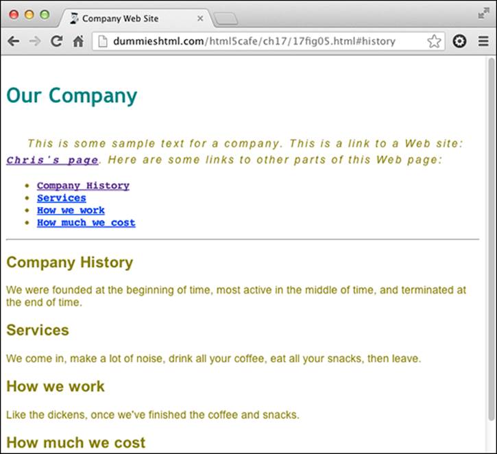
Figure 17-5: All hyperlinks are bolded.
Emphasizing with italic
Italics are commonly used to set off quotations or to emphasize text. To apply italics in HTML5, use the <i> or <em> tags. However, CSS provides you with more control over the font style of text through the font-style property.
Syntax for applying italic
This style declaration uses the font-style property:
selector {font-style: value;}
The value of the font-style property may be one of the following:
![]() italic: Renders the text in italics (a special font that usually slopes to the right)
italic: Renders the text in italics (a special font that usually slopes to the right)
![]() oblique: Renders the text as oblique (a different slanted version of a normal font; seldom if ever used for font definitions)
oblique: Renders the text as oblique (a different slanted version of a normal font; seldom if ever used for font definitions)
![]() normal: Removes any italic or oblique formatting
normal: Removes any italic or oblique formatting
Markup for applying italic
The following example assigns an italic font style to the first-level heading:
body {color: #808000; font-family: Verdana, sans-serif; font-size: 85%;}
h1 {color: teal; font-family: "MS Trebuchet", Arial, Helvetica, sans-serif;
text-transform: uppercase; font-style: italic; font-weight: 800;
font-size: 2em; line-height: 30pt; text-align: center;}
Changing capitalization
You use the text-transform property to set capitalization in your document.
Syntax for changing capitalization
This style declaration uses the text-transform property:
selector {text-transform: value;}
The value of the text-transform property may be one of the following:
![]() capitalize: Capitalizes the first character in every word
capitalize: Capitalizes the first character in every word
![]() uppercase: Renders all letters of the text of the specified element in uppercase
uppercase: Renders all letters of the text of the specified element in uppercase
![]() lowercase: Renders all letters of the text of the specified element in lowercase
lowercase: Renders all letters of the text of the specified element in lowercase
![]() none: Keeps the value of the inherited element
none: Keeps the value of the inherited element
Markup for changing capitalization
The following example renders the first-level heading in uppercase (shown in Figure 17-6):
body {color: black; font-family: Arial, sans-serif; font-size: 85%;}
a {font-weight: bold;}
a:link {color: olive; text-decoration: underline;}
a:visited {color: green; text-decoration: none;}
h1 {font-family: "Trebuchet MS", verdana, geneva, arial, helvetica, sans-serif; font-size: 2em; line-height: 2.5em; color: teal; text-transform: uppercase; text-align: center}
Figure 17-6: The first-level heading is rendered in all uppercase.
Getting fancy with the text-decoration property
The text-decoration property is a shorthand property for three new CSS3 text-decoration properties:
![]() text-decoration-color
text-decoration-color
![]() text-decoration-line
text-decoration-line
![]() text-decoration-style
text-decoration-style
Most often, however, the text-decoration property is simply used to add or remove underlines, overlines, or line-through to text.
Syntax for text decoration
This style declaration uses the text-decoration property:
selector {text-decoration: value;}
The value of the text-decoration property may be one of the following:
![]() underline: Underlines text
underline: Underlines text
![]() overline: Renders the text with a line over it
overline: Renders the text with a line over it
![]() line-through: Renders the text with a line through it
line-through: Renders the text with a line through it
![]() none: Removes any text decoration
none: Removes any text decoration
There is one more possible value for the text-decoration: blink. Blinking text was probably the first form of animation on the web, and it was horribly over-used in the early days of web browsers. As a result, it got a very bad reputation and fell very much out of favor. In fact, blinking text became so unpopular that at least one HTML editor would reportedly delete your document if it detected blinking text!
The blink value of text-decoration isn't supported by every browser, and we hesitate to even mention it here. But, you may be the person who invents an ingenious use for blinking text and brings it back from the brink. Best of luck with that!
 Keep in mind also that blinking and scrolling text can present issues for people with seizure disorders, vestibular disease, and other similar health concerns and should be avoided for those reasons too.
Markup for text decoration
The following example changes the link when the mouse hovers over it. In this case, it turns off any underlining for a link:
body {color: #808000; font-family: Verdana, sans-serif; font-size: 85%;}
a:link {color: olive; text-decoration: underline;}
a:visited {color: olive; text-decoration: underline;}
a:hover {color: olive; text-decoration: none;}
Checking Out the Catchall Font Property
You can summarize many font properties in one style declaration by using the shorthand font property. When it's used, only one style rule is needed to define a combination of font properties:
selector {font: style variant weight size/line-height font-family;}
The value of the font property is a list of any values that correspond to the various font properties:
![]() The following values must be defined in the following order although they aren’t all required:
The following values must be defined in the following order although they aren’t all required:
• font-size (required)
• line-height (optional)
If line height is specified, it must be separated from the font-size value by a forward slash.
• font-family (required)
The font-family value list must be the last value in the font declaration.
Use commas to separate multiple font family names. For example, you can use the following style declaration to create a specific style for paragraph text that specifies font-size, line-height, and font-family in that (required) order:
p {font: 1.5em bold 150% Arial, Helvetica, sans-serif;}
![]() The following values are optional and may occur in any order within the declaration as long as they come before font-size and font-family. Individual values are separated by spaces:
The following values are optional and may occur in any order within the declaration as long as they come before font-size and font-family. Individual values are separated by spaces:
• font-style
• font-variant
• font-weight
For example, you can use the following style declaration to create a specific style for a first-level heading that uses all of the required and optional values of the font shorthand property:
h1 {font: italic small-caps bold 2em/150% Arial, Helvetica, sans-serif;}
Experimenting with Web Fonts
CSS2 introduced the ability to download fonts to a user's web browser using the @font-face rule. However, @font-face got off to a rocky start, and was actually removed from the specification in CSS 2.1. It wasn't until CSS3 that it was added back in.
Today, @font-face is supported by almost every browser available and gives Web designers far more choices when choosing fonts than they ever had before.
Font file formats
Fonts come in various file formats. Font file formats are similar to image file formats in that different formats have different strengths and weaknesses. Also, different browsers feature support for different file formats.
Deciding which file format to use is often a matter of seeing what format the font you want to use comes in. The following are the most frequently used font file formats:
![]() TrueType has been around since the 1980s and is the standard format for the Microsoft system fonts.
TrueType has been around since the 1980s and is the standard format for the Microsoft system fonts.
![]() OpenType is based on TrueType and was developed by Microsoft and Adobe together. OpenType fonts support some advanced typographical features that aren’t supported by TrueType. For Web Fonts, however, you’re probably better off using TrueType fonts because of a bug in the way OpenType fonts are displayed in Windows.
OpenType is based on TrueType and was developed by Microsoft and Adobe together. OpenType fonts support some advanced typographical features that aren’t supported by TrueType. For Web Fonts, however, you’re probably better off using TrueType fonts because of a bug in the way OpenType fonts are displayed in Windows.
![]() Embedded OpenType (EOT) is an Internet Explorer-only font file format. EOT fonts are the only way to use web fonts on older versions of Internet Explorer (before 9).
Embedded OpenType (EOT) is an Internet Explorer-only font file format. EOT fonts are the only way to use web fonts on older versions of Internet Explorer (before 9).
![]() Web Open Font Format (WOFF) isn’t really a new font format, but a way to package TrueType and OpenType fonts for ease of use on the web.
Web Open Font Format (WOFF) isn’t really a new font format, but a way to package TrueType and OpenType fonts for ease of use on the web.
Finding fonts
With web fonts, you can apply almost any font you can find to your web pages. However, having the ability doesn’t mean that it’s a good idea or that it’s legal.
Many fonts are owned by companies that charge designers licensing fees to use their fonts. These companies, called type foundries, are concerned that the @font-face rule allows people to distribute their fonts without paying fees. To make sure that you're not using a font that you don't have the right to distribute, you should do one of the following:
![]() Purchase the fonts from a foundry site, such as www.fonts.com, and make sure that you read the licensing agreement.
Purchase the fonts from a foundry site, such as www.fonts.com, and make sure that you read the licensing agreement.
![]() Pay for a service that allows you to select fonts from a database of commercial fonts to use on your site. An example of such a site is www.typekit.com.
Pay for a service that allows you to select fonts from a database of commercial fonts to use on your site. An example of such a site is www.typekit.com.
![]() Use open source fonts. These are fonts that are made available with much less restrictive license agreements by their owners. The fonts in Google’s Font Directory, which we look at in the next section, may be used for free on any website. Pretty awesome, huh?
Use open source fonts. These are fonts that are made available with much less restrictive license agreements by their owners. The fonts in Google’s Font Directory, which we look at in the next section, may be used for free on any website. Pretty awesome, huh?
Linking fonts
After you've found a font that you want to use, the next step is to link to it. This is where the @font-face rule comes in. The @font-face rule has the following structure:
@font-face {
font-family: value;
src: value;
font-variant: value;
font-weight: value;
font-style: value;
}
Notice that font-face doesn't look like the other parts of CSS that you've seen so far. It starts with a @ symbol, for one. @font-face is what's called an at-rule. An at-rule's function is to give instructions to the CSS parser. In the case of @font-face, it gives instructions about what a particular font-family is and where it may be found.
The value of the font-family property is the name of the font. This must be a different value from any other font names used by your website, obviously. Other than that requirement, it can be pretty much anything you want. Generally, however, the font-family is the name that the creator of the font has given the font.
The value of the src property is the location of the font file. It can be a URL or a reference to the font on the user's computer. You can specify multiple values for the src property, and the user's browser will try them in order and select one that it can use.
In the following example, the font named Baskerville will be used if the user has it on his computer. If that font isn’t found, the font named Buenard-Regular.ttf will be used.
@font-face {
font-family: MyBaskerville;
src: local("Baskerville"),
url("Buenard-Regular.ttf");
}
If you use a URL for the value of the src property, it may be an absolute or relative URL. If you use a relative URL, make sure that you upload the file to the same web server as your HTML and CSS documents.
Using Google Fonts
The Google Font Library is a repository of hundreds of freely available, and high-quality, fonts that anyone can use in any way at all — including on websites or in print.
The Google Fonts website, shown in Figure 17-7, lets you sort through the different available fonts, search for fonts, and preview what the fonts look like with sample text.
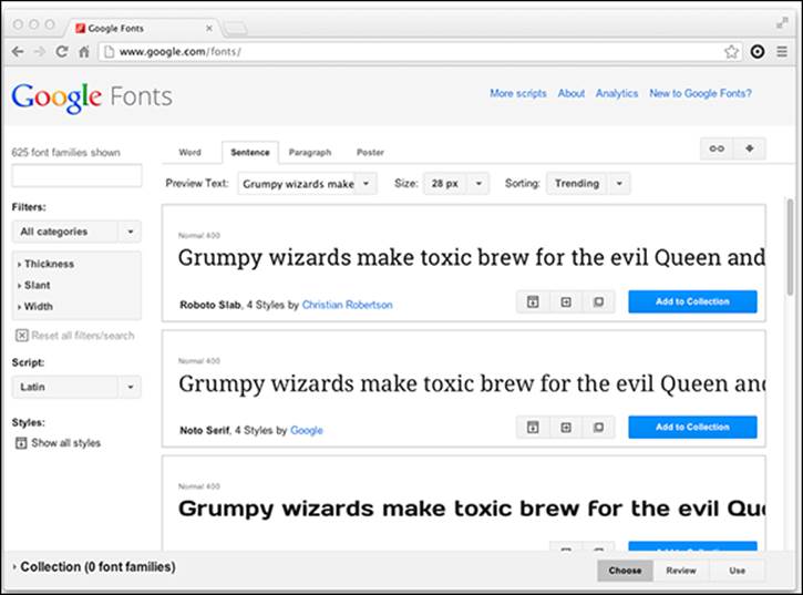
Figure 17-7: The grumpy wizards at Google have given the web a major gift.
To use a Google Font on your website, you can just follow these steps:
1. Locate the font you want to use.
For this demonstration, we look at the sans-serif font family called Roboto. Figure 17-8 shows the preview of Roboto on Google Fonts.
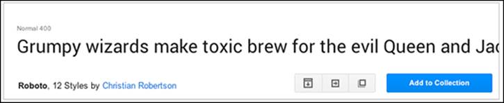
Figure 17-8: The Roboto font family, from Google Fonts.
2. Click the Quick-use button in the lower right of the font preview box.
The Quick-use button is that one that looks like a box with an arrow pointing to the right.
3. Choose the styles that you’ll use.
A style is a variation on a font, such as a bolder version, or an italic version. Figure 17-9 shows the font style selection area on the Quick Use page.
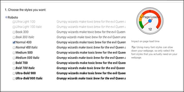
Figure 17-9: Select your styles.
4. Choose the character sets that you want.
A character set is a collection of characters for a specific language or type of language. The default character set is usually Latin, which contains the characters that are used in the Western European languages, including English, French, Spanish, German, Italian, Portuguese, Icelandic, Dutch, Danish, Swedish, and Norwegian. Figure 17-10 shows the character set selection area.
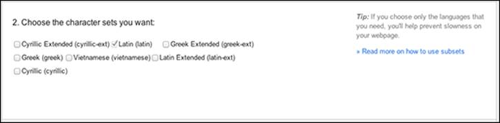
Figure 17-10: Select your character set.
Each additional font style or character set that you select will increase the page load time, because each character set must be downloaded from Google before it can appear on your web page. So, if you expect to use only one character set, choose only that one. You can always come back and modify your selections later if you need to.
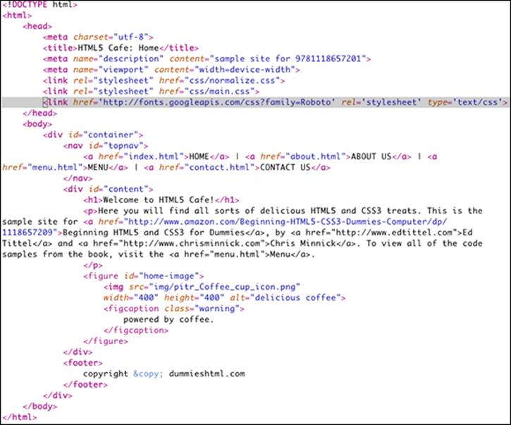
5. Copy the standard <link> element from the Quick Use page and paste it into the <head> section of each HTML document that will make use of this font family.
Figure 17-11 shows the code section from the Quick Use page on Google Fonts. Listing 17-1 shows the link element pasted into the head of the HTML5 Cafe home page.
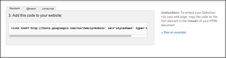
Figure 17-11: The generated font family link code from Google Fonts.
When you include this link code in your HTML document, you're actually including a style sheet from Google that contains the @font-face rule for the particular fonts you selected.
Listing 17-1: The Link Code Placed in the <head> Element
6. Use the new font family by adding the name of it to CSS font rules.
For example, to change the <h1> elements in HTML5 Cafe to the Roboto font family, type this CSS rule into the main.css file:
h1 {font-family: 'Roboto', sans-serif;}
Note that we use the generic font-family sans serif as a backup font in the previous CSS rule. This is to make sure that some sans-serif font will be used instead of Roboto if the browser happens to not support web fonts.
When you preview the HTML5 Cafe home page in a browser with the new font rule and the new linked font-family, it should resemble Figure 17-12.
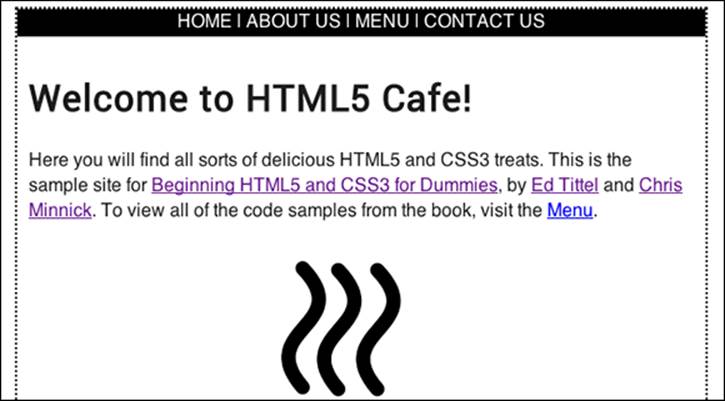
Figure 17-12: The HTML5 Cafe home page with the <h1> text in Roboto.
The difference between Roboto and the default sans-serif font that the site was using may be pretty subtle. For something dramatic and crazy, we’ve changed the header to a handwriting-style font family called Rock Salt in Figure 17-13.
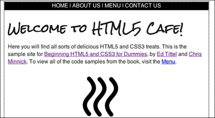
Figure 17-13: The HTML5 Cafe home page with the <h1> text in Rock Salt.