Beginning HTML5 & CSS3 For Dummies® (2013)
Part V
Enhancing Your Pages’ Look and Feel
18
CSS Text and Shadow Effects
In This Chapter
 Creating shadows
Creating inset text
Creating 3D text
Creating a letterpress effect
Adding drop shadows
Rotating text
CSS3 contains many new properties that web developers and designers can use to style, alter, transform, customize, tweak, and enhance text. The result of all these new properties is that the need to use images to achieve desired text effects is greatly reduced.
You get the following benefits out of being able to use styled text rather than images:
 Text takes up less storage space and therefore it downloads faster than images.
Text can be read by screen readers and other types of alternative browsers for people with disabilities. Images cannot.
Search engines can read and index text, which makes it easier for people to find your content. Text inside of images cannot be indexed.
CSS3 and the latest crop of web browsers are turning the web into a designer’s paradise. If you know how to use the latest font-related CSS properties, the effects that you can achieve are impressive!
Most of the best CSS text effects rely on tricks of light and shadow. When you understand shadows, you can use them to create stunning effects not just with text but with any object on your web pages.
Creating Shadows
Shadows are a great tool for adding an illusion of depth to a web page. CSS3 has two properties for creating shadows:
text-shadow: Adds a shadow to each letter in a text block
box-shadow: Adds a shadow to any box element
By applying shadows in different ways, you can create effects such as drop shadows, letterpress text, and 3D text. We get to those later in this chapter, but first we show you the basics.
text-shadow
The simplest form of the text-shadow property looks like this:
h1 {text-shadow: 0.1em 0.1em #aaaaaa}
The syntax of this simple form of the text-shadow is:
text-shadow: offset-x offset-y color;
The offset-x and offset-y values tell how far horizontally (x-axis) and vertically (y-axis) to move the shadow relative to the text. You can specify the offset by using any of the standard measurement units in CSS. The color sets the color of the shadow and can be specified using any of the standard methods for naming colors in CSS.
The preceding example applies a gray (#aaaaaa) shadow 0.1em to the right and 0.1em down from the normal first level heading text. The result when applied to the HTML5 Cafe home page is shown in Figure 18-1.
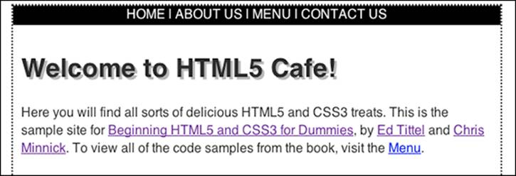
Figure 18-1: A simple text shadow on the h1 element.
The text-shadow property has another, optional, parameter: the blur-radius. The blur-radius makes the shadow fuzzy and lighter. The larger the blur-radius value, the larger and lighter the blur will be. Like the offset, the blur-radius is a standard CSS length value.
To set the blur-radius, add a space and a length after the color.
text-shadow: 0.1em 0.1em #aaaaaa .2em;
When applied to the <h1> element, the result is shown in Figure 18-2.
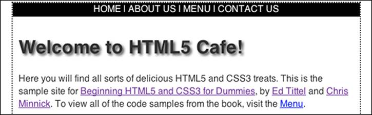
Figure 18-2: A text shadow with a blur radius of 0.2em.
box-shadow
The box-shadow property creates one or more shadows for an element. Like the text-shadow property, the simplest use of a box-shadow requires only three values: offset-x, offset-y, and color.
.author img {
margin-right: 10px;
float: left;
box-shadow: 4px 4px #777777;}
Figure 18-3 shows a box-shadow applied to Ed's picture on the About Us page of the HTML5 Cafe site.
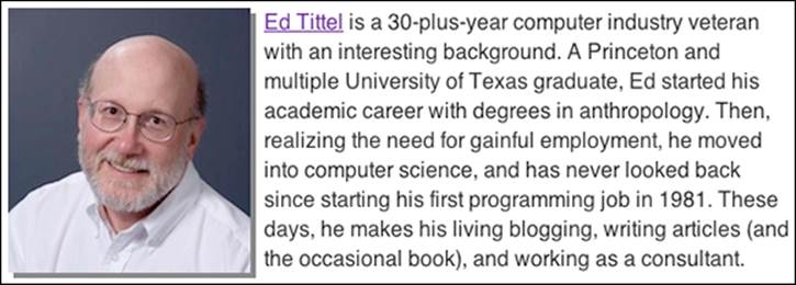
Figure 18-3: A simple shadow on Ed’s picture.
To add a blur effect to the shadow, you can put the blur-radius after the offset-y:
.author img {
margin-right: 10px;
float: left;
box-shadow: 4px 4px 6px #777777;}
The result is a more realistic and subtle shadow, as shown in Figure 18-4.
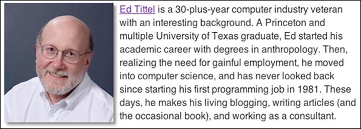
Figure 18-4: A shadow with a blur-radius applied.
Creating Inset Text
Inset text is text that appears to recede into the background. The key to inset text is to use a text shadow that’s lighter than the text background color. This causes the text to look like it’s inset and a shadow is being cast inside the letters. The more contrast between the shadow and the text and background, the more pronounced the effect will be.
For this example, we use the following HTML:
<h1 class="insetText">Welcome to HTML5 Café!</h1>
To create inset text, we recommend creating a class selector in your external style sheet. For example:
.insetText {text-shadow: 0px 1px 0px #ffffff;}
When applied to text, this rule creates a white shadow that is 1px lower than the text it’s applied to. For the white shadow to be visible, the background must not be white. So, we set it to blue by creating and applying an additional class. Here’s the new class:
.bgBlue{background-color:#999999;padding:4px;}
Now, take a look at the HTML with this class added. Notice that you can add multiple classes to the same element by separating them with spaces.
<h2 class="insetText bgGray">Welcome to HTML5 Café!</h2>
You can see the result in Figure 18-5.
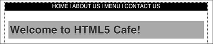
Figure 18-5: The light shadow and darker background makes the text appear inset.
Creating 3D Text
Three-dimensional text is the opposite of inset text. In 3D text, the text appears to protrude from the page or even float above the page!
The key to 3D text is to use multiple text shadows together. We also introduce another new feature of CSS3 to help with this trick: opacity. Here’s an example:
text-shadow: 0px 3px 0px #b2a98f,
0px 7px 5px rgba(0,0,0,0.15),
0px 12px 1px rgba(0,0,0,0.1),
0px 17px 17px rgba(0,0,0,1);
We know this may look cryptic right now, but when you understand what we've done, it's actually pretty simple. Before we get to that, take a look at Figure 18-6, which shows the result of applying opacity to the HTML5 Cafe <h1> element.
Figure 18-6: A 3D effect applied to the <h1> on HTML5 Cafe.
Now, take a closer look at what’s going on here.
First of all, this declaration has four shadows. Each shadow is separated by a comma, and the semicolon that ends the whole text-shadow declaration comes at the end. Each shadow has four properties. From the earlier "text-shadows" section, you know that these are offset-x, offset-y,blur-radius, and color.
But, look closely at the color property for each of the shadows. Here's something you haven't seen before: RGBA. The "A" in RGBA stands for alpha. When it comes to how transparency works in image editing software, alpha compositing is the process of combining an image with its background to give the illusion of transparency. In RGBA color, the A is a fourth value that ranges from 0 to 1. A value of 0 is completely transparent (just background, that is), and a value of 1 is completely opaque (just the image or the text shadow).
So, in the HTML5 Cafe header example, you’re adjusting the transparency of blurred shadows that are offset different amounts from the text to give the appearance of hovering text. Pretty cool, huh?
 Shadows and text effects can get pretty complicated, as you're starting to see. However, when you have the basic understanding of how they work, you don't need to always figure them out and write them by hand. Websites such as the 3D CSS Text Generator atwww.3dcsstext.com can handle most of the hard work of creating the CSS markup for you.
Creating a Letterpress Effect
You can use transparency along with a new property called background-clip to do a much more realistic inset, or letterpress, effect than the simple one we created earlier in this chapter.
Here’s the CSS:
h1 {
background-color: #666666;
-webkit-background-clip: text;
-moz-background-clip: text;
background-clip: text;
color: transparent;
text-shadow: 0px 3px 3px rgba(255,255,255,0.5);}
Notice that your old friends, the browser prefixes (also known as vendor prefixes), are back. The background-clip property isn't fully standardized just yet, so browsers have implemented their own versions of it.
 As of this writing, background-clip: text is experimental. We include this technique here to demonstrate the amazing things that you can do with CSS, but make sure to test thoroughly on multiple browsers before you use this technique on a live website.
The background-clip property specifies whether the background extends under the border of the object. In this case, we're using a value of text. The most common use of this property is to add a background image to text, which can be used to create some really cool effects.
However, what you’re doing here is adding a background on the inside of transparent text that has a shadow. So, what you get is just the shadow showing on the inside of text. The effect ends up looking like the image in Figure 18-7.
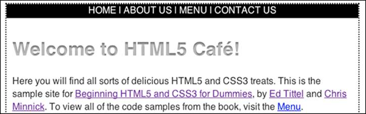
Figure 18-7: Using background-clip and transparency to create a realistic letterpress effect.
To better understand how this works, try removing the background-clip property to see just the shadow, as shown in Figure 18-8. (Remember that the so-called color of the text is set to transparent.)
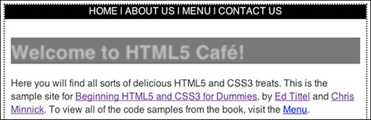
Figure 18-8: Transparent text with a shadow without background-clip:text.
Without the background-clip property in place, it becomes apparent that its purpose is to just remove (or clip) everything outside of the borders of each letter.
Drop Shadows
Text isn’t the only type of markup that you can apply shadows to. You can also create effects with box shadows. One very popular effect is called a drop shadow. Drop shadows give objects on a flat screen (or paper for that matter) more depth.
Figure 18-9 shows a picture with a drop shadow applied by using the box-shadow property.
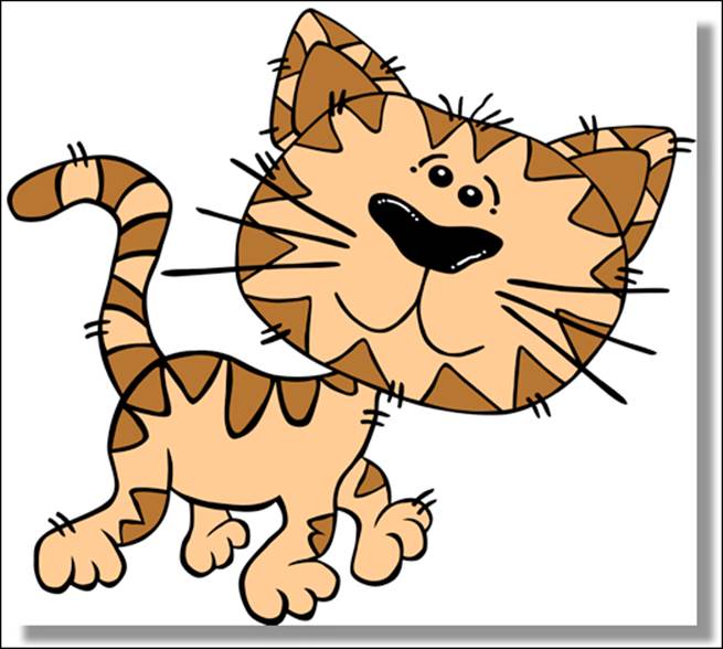
Figure 18-9: A picture with a drop shadow applied using box-shadow.
This technique is simple, fast, and works in most browsers today. However, it has one big drawback: The drop shadow has to be a box.
In this example, it looks like a picture of the cat is hovering. But what if you want something a bit more sophisticated? What if you want the shadow to follow the shape of the cat?
Just a couple years ago, we would have said that you couldn’t do it. You would need to add the shadow in an image editing program.
Happily, things change. Today, you can use the new CSS3 filter property to add a real drop shadow to a non-rectangular image — and the shadow even works in some percentage of your users’ browsers.
Here’s what the CSS looks like:
.shadowfilter {
-webkit-filter: drop-shadow(9px 9px 9px rgba(0,0,0,0.5));
}
And here’s how you can apply it to an image:
<img src="images/Gerald_G_Cartoon_Cat_Walking500px.fw.png" alt="cat" class="shadowfilter">
The result (at least when viewed in a WebKit browser (such as Google Chrome or Apple Safari) is shown in Figure 18-10. Get ready to impress even your hardest-to-impress web developer friends with this one.
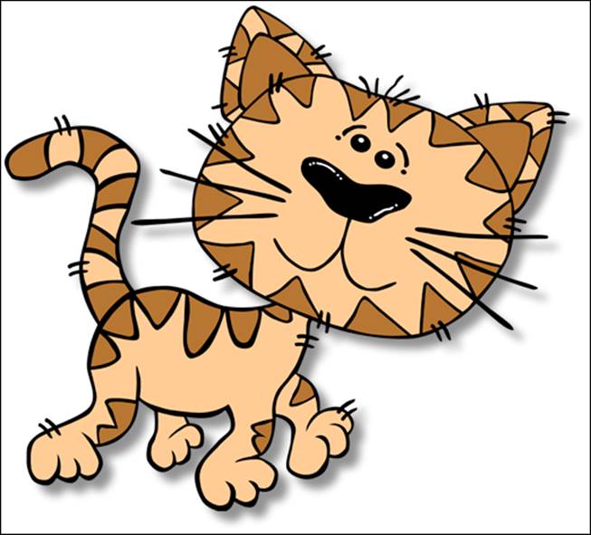
Figure 18-10: A drop shadow applied using the CSS drop-shadow filter.
Explaining how CSS filter effects work is beyond the scope of this book, but if you want to know more, check out the great tutorial at this site:
www.html5rocks.com/en/tutorials/filters/understanding-css
Text Rotation
You can use the CSS3 transform property to rotate objects and text to create interesting effects.
For something to be rotated, it must be a block-level element or have its display property set to block.
Here’s the syntax for rotating an element with CSS transform:
selector {transform: rotate(value);}
The value inside the parentheses after rotate must be a positive or negative number of degrees that the element should be rotated. For example:
transform: rotate(-45deg);
Prefixes are currently necessary for transform to work in most browsers. So make sure to test any experimental CSS properties in multiple browsers — there’s a chance that they may not work as you expect because of changes in the browser or the (still evolving) specification.
To apply rotation to the figure caption under the image on the HTML5 Cafe, use this style rule:
.warning {-webkit-transform: rotate(90deg);
-moz-transform: rotate(90deg);
transform: rotate(90deg);}
Because elements are rotated around their center point, it's often necessary to adjust their position to place them exactly where you want them to appear. For the following figure, we added relative positioning to the rotated warning class:
.warning {-webkit-transform: rotate(90deg);
-moz-transform: rotate(90deg);
transform: rotate(90deg);
position: relative;
top: -30px;
right: -215px;}
The result is shown in Figure 18-11.
Figure 18-11: Rotated text.