HTML5 Games: Creating Fun with HTML5, CSS3, and WebGL (2012)
part 1
Getting Started with HTML5 Games
Chapter 3
Going Mobile
in this chapter
• Designing for mobile devices
• Supporting different screen resolutions
• Creating the main menu
• Making web applications for Apple iDevices
This chapter discusses some of the advantages and challenges you face when taking your web application to the mobile platform. It briefly covers how user interaction on mobile devices differs from the desktop before explaining the concept of the viewport and how to make the game scale correctly on small screens.
Next, the chapter moves on to CSS media queries and shows how you can use them to create views of your game that adapt and look good on both low- and high-resolution devices, regardless of their orientation. In this chapter, you also learn how to make your applications and games feel like native applications by toggling the iOS web application mode and disabling some default browser behavior.
Finally, you learn a few tricks that can help you debug your iOS and Android web applications.
Developing Mobile Web Applications
In March 2011, Apple announced that total iPhone sales had reached 100 million units. Combine this with the more than 50 million iPod touch and iPad devices sold to date, and you have more than 150 million handheld devices running Apple’s iOS software, which enables these devices to run advanced web applications. The iPhone’s main competitor, the Google-backed Android system, has taken big bites out of the mobile market as well, with more than a million Android-based devices being sold each week. That’s a huge number of devices. Neglecting to create your applications and games with these in mind would be a mistake.
Games have been particularly successful on platforms like iOS and Android. If you look through lists of the most downloaded iPhone and Android applications, you’re bound to find several games, some at the top spots. Since the days of Snake on Nokia phones, playing games on your mobile phone has become more and more common. With the recent generations of high-resolution, touch-enabled smartphones and tablets, the gaming experience has improved immensely.
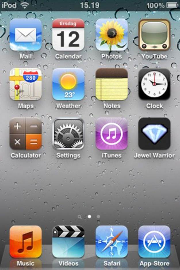
Not all games are a natural fit for the small screen, however. Complex strategy games and fast-paced first-person shooters, for example, rely on big displays and ample control options. Similar games certainly exist on mobile platforms, but the games that really succeed appear to be the ones that take good advantage of the small and touch-enabled screen as well as cater to the more casual pick-up-and-play mentality of mobile users. If the user just needs to kill a few minutes on the bus, they don’t want to sit through a long introduction that takes up a lot of time. Match-three games like Jewel Warrior fit this profile nicely. The gameplay is sufficiently simple that most people can pick it up and play with little or no instruction and games can be as short or long as needed. The game controls are also simple enough that the lack of keyboard and mouse is not a problem. The jewel-swapping mechanics of the game fit the small touch screens nicely because the user can select and swap jewels by simply tapping them on the screen.
Write once, read many
One of the biggest advantages to developing mobile applications and games with HTML, CSS, and JavaScript is the fact that, if you build it properly, your application can run on many different platforms and devices with little or no modification at all. In light of the challenges that native application developers face, this is a huge win for web applications. For example, in order to port a native iPhone game to Android, you need knowledge of the Objective-C language used on iOS devices and the Java used on Android, as well as their respective Software Development Kits (SDK). By using open web technologies, the tools and code stay the same no matter what platform or device you’re developing for. This saves time in both the development phase and later when you’re doing post-release maintenance.
Another nice thing about web applications is that they get around the restrictive rules of distribution channels like Apple’s App Store. Getting your app accepted for the App Store means subjecting it to a closed and somewhat obscure approval process. Web applications don’t suffer from that. You can host and distribute your application anywhere you want.
The challenges of mobile platforms
Developing your application or game with web technology isn’t all upside, however. It presents challenges as well. Not being tied down to a single distribution channel can also be a drawback. Getting new apps from the App Store or from the Android Market is easy and many users never venture any further than the built-in app delivery system they’re familiar with. This means that making your potential users aware of your application can be a problem. Fortunately, more and more alternative channels are emerging, making it easier to get your apps out there. In Chapter 14, I take a closer look at how you can distribute your web apps and games.
Handling User Input on Mobile Devices
Developing for smart phones and tablets creates technical challenges as well. One of the most apparent challenges is how the interaction between user and application changes. On a desktop computer or laptop, users have been accustomed to having both keyboard and mouse available. Smart phones and tablets primarily use the touch-enabled screen, which is very intuitive but also quite limited.
Some devices, like the iPhone and many Android devices, have a few additional methods of interacting with the user and their environment. Cameras and microphones have been on cell phones for a long time, but the smartphones of today also come equipped with hardware sensors such as accelerometers and gyroscopes. These are all very interesting tools that developers can use to create innovative game experiences. Motion-based input has been quite successful already. Several hit mobile games rely on nothing but tilting the device the right way at the right time, with goals as diverse as steering a vehicle (Shrek Kart), jumping on clouds (Doodle Jump), and guiding a ball through a maze (Labyrinth). Unfortunately, these extra features are not available for web developers yet. Until HTML and JavaScript can utilize these hardware features, you can use tools like PhoneGap to make a bridge between the native world and the web. I discuss these options in Chapter 14.
Keyboard input
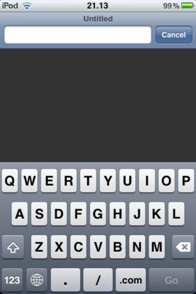
When developing for mobile versus desktop, the biggest loss in terms of user input is probably the keyboard. Many types of games simply don’t work as well without the detailed controls that come with the keyboard. Some mobile games opt for virtual buttons displayed on the screen and, in some cases, that will do just fine. In other cases, the lack of real buttons can make it hard to control the game. This is especially true for fast-paced games where the player often relies on the physical feeling of buttons to quickly switch between functions. Many devices offer tactile feedback in the form of vibrations, but without looking directly at the buttons, it is still hard to pick out the right ones to touch.
Both Android devices and iDevices have a virtual keyboard that slides up when needed. Because the keyboard is only triggered on elements that allow text input, it is difficult to use it for much more than its intended purpose. Besides, on most regular sized smartphones and iPod touch devices, it takes up a significant portion of the screen (see Figure 3-1).
Figure 3-1: The virtual keyboard on the iPod touch and iPhone
Mouse versus touch
Mobile devices also lack a mouse, of course, but at least the function of the touch screen is somewhat analogous to the computer mouse. Tapping the screen works the same as clicking the mouse, so for many purposes, you can use the touch screen in place of the mouse and vice versa. You can even do double taps to simulate a double-click on the mouse. That’s about as far the similarities go, however.
Computers rarely have more than one mouse, but most people have ten fingers. It would be a shame not to take advantage, so the latest touch enabled devices expose so-called multi-touch events. This opens up a completely new world of possibilities. You probably already know the ubiquitous pinch-to-zoom found in mobile browsers and map applications, but multi-touch features have also been successfully used to implement multi-player games on the same screen.
Touch screens have limitations as well. For example, the concept of hovering the mouse pointer over an element has no analogue in the world of touch. The screen can’t tell where your finger is until you actually touch it, and when you do, it’s no longer hovering. Computer mice usually have at least two buttons and most people are used to the right mouse button as a shortcut to context menus or other alternative actions. On touch screens, it’s difficult to differentiate between types of touches. We only have one type of finger. The workaround most often used is to differentiate between short and long taps, with a long press bringing up the context menu or whatever other action you would assign to the right mouse button.
With all these elaborate control mechanisms missing, you might think that the diversity in the mobile game market would suffer. However, constraints often fuel creativity. Sure, the App Store and Android Market do have problems with repetitive copycat applications and games, but many of these games use gameplay and game mechanics that are unique. Games like Fruit Ninja and Cut the Rope have shown that simple, well-timed swipes on the screen can provide perfect casual game experiences. Game types that never made sense before are now blockbusters.
Adapting to Small Screen Resolutions
Perhaps the most apparent difference when switching to handheld devices is the small form factor compared to full-size computers. Smaller screens usually have lower resolutions and often different aspect ratios. If you want your game to work well on most devices, you need to make sure it can handle a wide variety of display sizes. Table 3-1 shows a selection of smartphones and their resolutions.
Table 3-1 Smartphone resolutions and aspect ratios
|
Device |
Resolution (Portrait) |
Aspect Ratio |
|
Sony Ericsson X10 Mini HTC Wildfire HTC Tattoo |
240x320 |
3:4 |
|
Motorola DROID X Sony Ericsson X10 |
480x854 |
~9:16 |
|
iPod touch (third generation) iPhone 3GS HTC Legend |
320x480 |
2:3 |
|
Nexus One HTC Desire HTC Evo 4G |
480x800 |
9:15 |
|
iPhone 4 iPod touch (fourth generation) |
640x960 |
2:3 |
Table 3-1 shows that not only do the resolutions range from small 240x320 pixel displays to those with four times as many pixels, but the resulting aspect ratios also vary a great deal. Small form factor phones like the HTC Wildfire have a low-resolution display that is almost square, whereas, for example, the HTC Desire sports a high-resolution display with a height that is almost twice the width.
The number of display resolutions gets even higher when you include tablets. Some tablets have resolutions that are close to high-end smartphones, but others have higher definition displays that almost rival those found on laptops and desktop computers. Table 3-2 shows a small selection of display resolutions on various tablets.
Table 3-2 Tablet resolutions and aspect ratios
|
Device |
Resolution (Portrait) |
Aspect Ratio |
|
iPad iPad 2 |
768x1024 |
3:4 |
|
ARCHOS 70 ViewSonic ViewPad 7 |
480x800 |
9:15 |
|
Samsung Galaxy Tab ViewSonic gTablet |
600x1024 |
~7:12 |
|
Motorola Xoom |
800x1200 |
10:16 |
With all of these different possible display sizes and resolutions, the challenge of making the layout and graphics of the game scale appropriately for as many devices as possible is anything but trivial.
Creating scalable layouts
You can solve many of the problems caused by multiple display resolutions by using an elastic layout based on relative units instead of absolute values. CSS supports several different units that you can use when setting positions, dimensions, margins, and so on, and they each have their strengths and weaknesses. Some of these units are absolute and fixed-size. For example, setting the width and height properties using px values makes that element use the same amount of pixels no matter where you place it and how much space is available.
Other units are relative to other values. These units include the em and percent (%) units. Percentage values are relatively easy to understand; setting the width property to 25% makes the element use 25% of the width made available to it by its parent element. If you make the parent element bigger, the child element automatically adjusts itself so that it still uses 25% of the space. That makes percentage values much more suitable for multi-device development than fixed-size pixel values.
The em unit is another powerful tool for creating scalable layouts. It has its roots in traditional typography, where one em was equal to the width of a capital M in the typeface and size being used. Because the actual size of one em varies when you change the typeface or the point size, the unit is a relative unit. The em unit has transferred over to the digital world and web typography, albeit with the slight modification that one em is now equal to the height of the font. This way, the computer can safely use kerning to adjust the space between letters to improve readability. It also allows the em unit to be used in other alphabets that have no letter M.
The em unit is also used to define a few special characters. The width of the em dash (—) is equal to one em, as is the width of its cousin, the em space. HTML gives you both of these special characters through the entities — and .
Use units like em and percentages to make the layout of the application more suitable for varying display sizes. The main font-size that all the content inherits is defined on the #game element in main.css. Choosing a base font-size can be tricky, but you can usually find a size that divides the page in a nice grid. Jewel Warrior uses an 8x8 board in the game and the game width is set to 320 pixels. If the game takes up all of the width, a font-size value of 40 pixels would mean that each cell on the board is a 1x1 em block. Listing 3.1 shows the changed #game element CSS inmain.css.
Listing 3.1 Setting the Base Font Size
#game {
...
font-size : 40px;
width : 8em;
height : 12em;
...
}
The width and height of the #game element are also defined using em units. These absolute dimensions are used only when running the game in desktop browsers. In the next section, I show you how to make the game fit any available space on mobile devices.
Now that the #game element sets the base size, you can use em units to scale the rest of the content. In Listing 3.2, you can see the changes to the logo styles.
Listing 3.2 Using Relative Units in the Logo Styles
.logo {
font-size : 1.5em;
line-height : 0.9em;
text-shadow : 0.03em 0.03em 0.03em rgb(255,255,0),
-0.03em -0.03em 0.03em rgb(255,255,0),
0.10em 0.15em 0.15em rgb(0,0,0);
...
Note that, because the .logo class has its own font-size value, the rest of the values that are specified in ems are now relative to that font-size value. Listing 3.3 shows the changes to the splash screen styles.
Listing 3.3 Using Relative Units in the Splash Screen Styles
#splash-screen {
...
padding-top : 2.5em;
}
#splash-screen .continue-text {
cursor : pointer;
font-size : 0.75em;
}
The content on the splash screen is now all based on the single font-size value specified in the game element CSS rule. Change that value and everything else changes as well.
Controlling the viewport
To really understand how mobile devices display web content, you need to understand what the viewport is and how it relates to the page. You can think of the viewport as the area on which the browser renders the page. You might that think that this is simply the area of the browser window. In some cases, that is correct. The dimensions of the viewport and the dimensions of the “hole” through which the page is viewed are not the same thing, however. In desktop browsers, the width of the viewport is generally equal to the width of the browser window, but on mobile devices, this is not necessarily true. For example, the mobile Safari browser on third-generation iPhones has a default viewport width of 980 pixels even if the actual display is only 320 pixels wide. The viewport can be controlled with a meta tag.
<meta name=”viewport” content=”...”>
The content attribute takes a number of optional parameters that describe the viewport. Table 3-3 lists all the valid parameters for the viewport meta tag.
Table 3-3 Viewport meta tag parameters
|
Directive |
Description |
|
width |
A numeric value in pixels that specifies the width of the viewport that the device should use to display the page. The special value device-width sets the width to that of the device display. |
|
height |
A numeric value in pixels that specifies the height of the viewport that the device should use to display the page. The special value device-height sets the height to that of the device display. |
|
user-scalable |
Possible values for this parameter are yes and no. If set to no, the native pinch-zoom feature is disabled. The default is yes. |
|
initial-scale |
Determines the level of scaling applied to the page when it loads initially. |
|
maximum-scale |
A numeric value that determines the maximum level of scaling that the user can apply. This parameter has no effect if user-scalable is set to no. |
|
minimum-scale |
A numeric value that determines the minimum level of scaling that the user can apply. This parameter has no effect if user-scalable is set to no. |
The default values for most of these directives depend on the device and the browser. Usually, you want to use the special device-width and device-height values instead of constant values. That way, the device can automatically scale the content to fill the screen. The viewport meta tag goes in the head section of the HTML page. Listing 3.4 shows the meta tag added to index.html.
Listing 3.4 Setting the Viewport
<head>
...
<meta name=”viewport” content=”width=device-width”>
...
</head>
Disabling user scaling
Having the native user zoom feature enabled in a game is, in most cases, a bad idea. If you leave it enabled, you risk accidental zooming by the user, which could break the game experience. Set the user-scalable parameter to no. The browser should display the content without further scaling, so the initial-scale value should be set to 1.0. However, because width is set to device-width, the browser automatically infers a value of 1.0 for initial-scale, so you don’t even need to set the scaling explicitly. This works the other way around as well; an initial-scale value of 1.0 automatically infers that width is equal to device-width, unless you explicitly set another value for the width parameter. The maximum-scale and minimum-scale parameters are irrelevant because the user zoom is disabled. Listing 3.5 shows the modified viewport meta tag.
Listing 3.5 Disabling User Scaling
<head>
...
<meta name=”viewport”
content=”width=device-width, user-scalable=no”>
...
</head>
If you load the game now on, for example, an iPad, the game area doesn’t fill the entire screen but you’ll notice that, no matter how much the user pinches the screen, they can’t accidentally zoom and mess up the rendering of the game.
Creating Different Views
When the user clicks on the splash screen, they are taken to the main menu. To ensure that the menu looks all right on both small and large screens, in this section, I show you how to load different style sheets depending on the screen size, as well as how to differentiate between portrait and landscape modes. First, however, you have to build the menu.
Creating the main menu
The menu is a simple, unordered list of buttons. Each button has a name attribute that indicates which screen should be loaded when the button is clicked. The menu also features a smaller version of the game logo, positioned above the menu items. Listing 3.6 shows the markup for the main menu added to index.html.
Listing 3.6 Adding the Menu HTML
<div id=”game”>
...
<div class=”screen” id=”main-menu”>
<h2 class=”logo”>Jewel <br/>Warrior</h2>
<ul class=”menu”>
<li><button name=”game-screen”>Play</button>
<li><button name=”hiscore”>Highscore</button>
<li><button name=”about”>About</button>
<li><button name=”exit-screen”>Exit</button>
</ul>
</div>
</div>
Now add some CSS rules to the main.css style sheet. Listing 3.7 shows all the menu-related rules.
Listing 3.7 Adding Menu CSS Rules
/* Main menu styles */
#main-menu {
padding-top : 1em;
}
ul.menu {
text-align : center;
padding : 0;
margin : 0;
list-style : none;
}
ul.menu li {
margin : 0.8em 0;
}
ul.menu li button {
font-family : Slackey, sans-serif;
font-size : 0.6em;
color : rgb(100,120,0);
width : 10em;
height : 1.5em;
background : rgb(10,20,0);
border : 0.1em solid rgb(255,255,0);
border-radius : 0.5em;
-webkit-box-shadow : 0.2em 0.2em 0.3em rgb(0,0,0);
-moz-box-shadow : 0.2em 0.2em 0.3em rgb(0,0,0);
box-shadow : 0.2em 0.2em 0.3em rgb(0,0,0);
}
ul.menu li button:hover {
background : rgb(30,40,0);
}
ul.menu li button:active {
color : rgb(255,255,0);
background : rgb(30,40,0);
}
Note the extra box-shadow declarations in the button style. Far from all CSS3 features are fully supported across all browsers, and many are only available via vendor-specific prefixes like -webkit for WebKit browsers and -moz for Firefox.
Remember that values specified in em units are relative to the font-size of the element. Because the button elements have a font-size value of their own, this means that all the other CSS values of the button elements are now relative to this font-size. Furthermore, this font-size is itself specified in em units, so the actual, calculated font-size value for the buttons is equal to the inherited font-size value multiplied by its own font-size value.
Adding screen modules
Most of the game screens contain some form of activity or user interaction. I use discrete modules to encapsulate this functionality. The first screen module you need is the splash screen module. Instead of placing the screen modules directly on the top-level jewel namespace, you can keep them together by adding another level to the namespace. Modify the jewel declaration in loader.js as follows:
var jewel = {
screens : {}
};
The splash screen module should listen for click events and, when the user clicks or taps anywhere on the screen, switch to the main menu screen. Screen modules are built the same way as the rest of the game modules. For now, you need to expose one method that sets up any initial behavior. Listing 3.8 shows the splash screen module. Put the code in a new file called screen.splash.js in the scripts folder.
Listing 3.8 The Splash Screen Module
jewel.screens[“splash-screen”] = (function() {
var game = jewel.game,
dom = jewel.dom,
firstRun = true;
function setup() {
dom.bind(“#splash-screen”, “click”, function() {
game.showScreen(“main-menu”);
});
}
function run() {
if (firstRun) {
setup();
firstRun = false;
}
}
return {
run : run
};
})();
The first time it is called, the public run() method calls the setup() function. This function sets up an event handler on the screen element that switches screens when the user clicks or taps the screen. As you can see in Listing 3.8, the setup() function uses a new helper function from the dommodule. The dom.bind() function takes a selector string, finds the element, and attaches the handler function to the specified event. Listing 3.9 shows the bind() function added to the dom module in dom.js.
Listing 3.9 Adding the Event Binding Helper Function
jewel.dom = (function() {
...
function bind(element, event, handler) {
if (typeof element == “string”) {
element = $(element)[0];
}
element.addEventListener(event, handler, false)
}
return {
...
bind : bind
};
})();
Before attaching the event listener, the dom.bind() function tests the type of the element argument. If a string is passed, it is used as a Sizzle selector string; otherwise, it is assumed that element is an actual DOM element.
Now you just need to make sure the run() function is called whenever the screen is displayed. Modify the showScreen() function in game.js as shown in Listing 3.10.
Listing 3.10 Calling the Run Method
jewel.game = (function() {
...
function showScreen(screenId) {
...
// run the screen module
jewel.screens[screenId].run();
// display the screen html
dom.addClass(screen, “active”);
}
...
})();
When the splash screen is displayed for the first time, a click event handler is attached to the screen so that a click or tap takes the user to the main menu. Of course, you haven’t created a main menu module yet. The function of the main menu module is mainly to take care of what happens when the user clicks or taps on a menu item. Listing 3.11 shows the module. Put the code in a file called screen.main-menu.js in the scripts folder.
Listing 3.11 The Main Menu Module
jewel.screens[“main-menu”] = (function() {
var dom = jewel.dom,
game = jewel.game,
firstRun = true;
function setup() {
dom.bind(“#main-menu ul.menu”, “click”, function(e) {
if (e.target.nodeName.toLowerCase() === “button”) {
var action = e.target.getAttribute(“name”);
game.showScreen(action);
}
});
}
function run() {
if (firstRun) {
setup();
firstRun = false;
}
}
return {
run : run
};
})();
The first time the main menu is displayed, the event handling is set up so that clicking on the menu items takes the user to the appropriate screens. I have used event delegation rather than attaching event handlers to every single menu button. A single click event handler is added to the menuul element. When the event fires, the handler function examines the target element and determines if the click event came from a button element. If it did, the event handler switches the game to the correct screen using the name attribute on the button element. Not only does event delegation usually save you some repetitive typing, but it also comes with a cool bonus: The parent event handler automatically covers any items that are added dynamically with JavaScript.
The main menu currently uses the click event to handle the menu interaction. On touch-enabled devices, you can also use touch events that are sometimes better suited for those devices. However, because a tap on the screen is also translated into a click event, an old-fashioned click event handler often does the trick. In Chapter 8, I dive further into event handling, user input, and touch-based interaction.
Finally, add the new files to the loader in loader.js:
Modernizr.load([
{
load : [
...
“scripts/screen.splash.js”,
“scripts/screen.main-menu.js”
],
complete : ...
}
]);
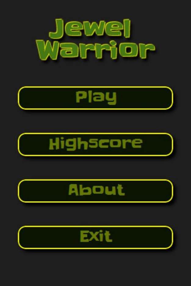
You can now click on the splash screen to go to the main menu. The event handlers on the menu are in place, but the menu items lead nowhere until more screens are added further along in the process. Figure 3-2 shows the menu.
Figure 3-2: The main menu
Using CSS media queries
No matter how hard you try, sometimes you just can’t make a single set of CSS rules behave properly across all devices and resolutions. Sometimes, the best solution is to make separate style sheets for different display sizes and load the appropriate ones when needed. CSS3 media queries provide a great solution for this problem. Media queries extend the media type functionality of CSS2 with additional conditions. Whereas CSS2 let you use different style sheets depending on the media type (print, screen, handheld, and so on), media queries set conditions based on features of the media. Data such as resolution, display dimensions, and orientation can now be used to select the appropriate styles. This snippet shows an example of a style sheet with a media query:
<link rel=”stylesheet”
media=”print and resolution > 150dpi”
href=”print150.css”>
This query applies the print150.css style sheet to the content only when it is printed on a device with a resolution higher than 150 dots per inch (dpi).
You can also use media queries in the actual CSS:
@media screen and (min-width : 480px) {
body {
font-size : 150%;
}
}
This example scales the font-size to 150%, but only when the content is displayed on a screen and only if the width of the display is at least 480 pixels. By using queries such as these, you can easily target different resolutions and screen sizes to ensure that the layout of the game behaves nicely when viewed on different devices. Table 3-4 shows a list of all the media features defined in CSS3.
Table 3-4 Media features
|
Feature |
Values |
Description |
|
width |
Non-negative length, for example, 980px |
Describes the width of the viewport. |
|
height |
Non-negative length, for example, 800px |
Describes the height of the viewport. |
|
device-width |
Non-negative length, for example, 320px |
Describes the width of the output device. |
|
device-height |
Non-negative length, for example 480px |
Describes the height of the output device. |
|
orientation |
landscape or portrait |
Describes the orientation of the output device. If height is greater than width, the value of the orientation feature is portrait; otherwise, it is landscape. |
|
aspect-ratio |
Positive ratio, for example, 3/4 |
The ratio of the width value to the height value. |
|
device-aspect-ratio |
Positive ratio, for example, 3/4 |
The ratio of the device-width value to the device-height value. |
|
color |
Non-negative value, for example, 8 |
Describes the number of bits per color component (red, green, blue) used in the output device. |
|
color-index |
Non-negative value, for example, 64 |
Describes the number of entries in the color index of the output device. If the display is not indexed, the value is 0. |
|
monochrome |
Non-negative value, for example, 2 |
Describes the number of bits per pixel used in a monochrome output device. The value is 0 for non-monochrome displays. |
|
resolution |
Positive resolution, for example, 300dpi |
|
|
scan |
progressive or interlace |
Only applies to the tv media type. |
|
grid |
0 or 1 |
Indicates a grid-based output device, such as a computer terminal. |
All media features except orientation, scan, and grid can also be used with min- and max- prefixes.
Detecting device orientation
Most smartphones and tablets can be used in both portrait and landscape modes with the device automatically rotating and adjusting the image. This introduces an interesting challenge for application developers because they need to make sure the application or game can handle this change. The three basic choices are
• Do nothing. Let the device rotate the display and hope for the best.
• Don’t rotate the display, making it usable in only one orientation.
• Adjust the application to look good in both orientations.
For most web sites, it’s usually fine to let the device figure out how display the site properly. As long as you set the viewport, things usually work out fine. Games, on the other hand, often use the screen space in a very controlled manner. Leaving it to the device to rearrange things can break the experience and usability. Some applications choose to fix the display in one orientation. This is an easy fix if the layout of the application or game can’t easily adapt to both orientations. However, it’s not the most practical solution for web applications because you can’t disable the native display reorientation. This means you have to rotate the whole page back using, for example, CSS transforms. That leaves only the third option, making sure the game can handle both orientations.
Applying special CSS for different orientations is relatively easy with the help of media queries. The orientation media feature makes it a breeze to apply rules specifically to, for example, devices in landscape mode:
@media screen and (orientation: portrait) {
#sidebar {
display : none;
}
}
@media screen and (orientation: landscape) {
#sidebar {
display : block;
}
}
This example only shows the #sidebar element when the page is displayed in landscape mode.
Adding a mobile style sheet
Now take a look at how to use media queries to add a special style sheet for mobile devices. The query should match the largest possible device that could be handled by the mobile style sheet. The iPad has a resolution of 768x1024, so this will be the upper boundary for the media query. Because the device width changes depending on the orientation, you need two queries to detect both portrait and landscape mode. You can combine multiple queries to the same style sheet by separating them with commas. Listing 3.12 shows the link element that loads the mobile style sheet.
Listing 3.12 Loading the Mobile Style Sheet
<head>
...
<link rel=”stylesheet”
href=”styles/mobile.css”
media=”screen and (max-device-width: 768px)
and (orientation: portrait),
screen and (max-device-width: 1024px)
and (orientation: landscape)”/>
...
</head>
The media query specifies that the mobile.css style sheet should only be applied to screen devices that are at most 768 pixels wide when in portrait mode and 1,024 pixels wide in landscape mode.
The first thing to do in the mobile.css style sheet is to make the game fill the entire display. In main.css, you gave the game element a fixed size of 320x480 pixels. That works fine for placing the game on a web page and displaying it on a computer monitor. A game like Jewel Warrior doesn’t need the vast screen space available on laptops or desktop computers. On mobile devices, you should grab as much space as possible. Listing 3.13 shows the first rule added to mobile.css.
Listing 3.13 Filling the Entire Screen
#game {
width : 100%;
height : 100%;
}
This small change is enough to make the current application look fine on medium devices like the iPhone or high-resolution Android smartphones. Remember that you can scale everything by simply changing the font-size value on the game element. You can use that with a media query to, for example, scale up the content on large-screen devices like the iPad. Listing 3.14 shows the targeted CSS rules in mobile.css.
Listing 3.14 Scaling Content for Large Displays
/* use a smaller base size for small screens */
@media (max-device-width: 480px) {
#game {
font-size : 32px;
}
}
/* use a bigger base size for ipad and tablets */
@media (min-device-width: 768px) {
#game {
font-size : 64px;
}
}
The ul.menu rule scales the entire menu structure a bit so it fits regardless of the different aspect ratio. Note also the two queries used to target the iPad, one for each of the orientations.
The landscape mode is a more problematic issue. Cramming the tall menu into the limited vertical space in landscape mode leads to very small buttons. A better solution is to have them automatically adjust themselves in a 2x2 grid if the space permits. The styles in Listing 3.15 apply to devices of various sizes in landscape mode.
Listing 3.15 Adding Landscape Styles
/* smartphones landscape */
@media (orientation: landscape) {
#splash-screen,
#main-menu {
font-size : 1.0em;
padding-top : 0.75em;
}
ul.menu li {
display : inline-block;
margin : 0;
}
ul.menu li button {
margin : 0.5em;
font-size : 0.5em;
}
}
/* small screens landscape */
@media (orientation: landscape) and (max-device-width : 480px) {
ul.menu li button {
font-size : 0.4em;
}
}
/* tablets landscape */
@media (orientation: landscape) and (min-device-width : 768px) {
#splash-screen,
#main-menu {
padding-top : 1.5em;
}
}
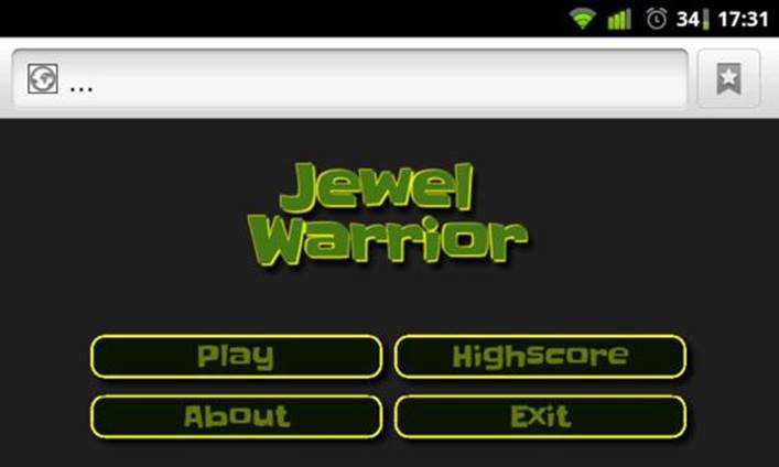
Setting display to inline-block on the menu items positions them side by side, wrapping only if there’s not enough space. Figure 3-3 shows the menu in landscape mode as rendered on an HTC Desire.
Figure 3-3: The main menu in landscape mode
All applications have different layouts and no silver bullet makes everything look good on all devices. In the end, it comes down to experimenting — trying to find solutions that look good on as many devices as possible without too many special cases in the CSS.
Developing for iOS and Android Devices
Apple sits heavily on the handheld device market: That’s no secret. Android devices are gaining market share, but the ubiquity of iPod, iPhone, and iPad devices that all run the same tightly controlled software makes them good targets for mobile web developers. Apple’s mobile Safari and iOS system provides a few extra goodies for web application developers. You can use some of these features to better control how the application appears and have it blend in with the native applications on the device.
Placing web applications on the home screen
When you run a web application in mobile Safari, the available screen space is reduced due to the surrounding Safari UI (icons, address bar, and so on). This is not a huge problem for devices like the iPad where plenty of screen real estate is generally available. However, for small-screen devices like the iPod touch or the iPhone, it quickly becomes a problem. For example, the iPod touch 3G has a resolution of 320x480 pixels, but because the status bar and the Safari UI elements take up a good chunk of that space, you can only use an area of 320x360 for your application.
In Safari, the user can choose to place a link to an application or web site on the home screen by tapping the bookmark icon. This adds an icon to the home screen that acts like a shortcut to the web address. However, the application still runs inside Safari and behaves exactly like a regular web site, so it really is just a bookmark. Fortunately, there’s an easy fix to get you a long way towards the feel of a native application. By adding a special meta tag to index.html as shown in Listing 3.16, you can indicate that the page is a web application and should not be treated as a simple link.
Listing 3.16 Enabling Web Application Mode
<head>
...
<meta name=”apple-mobile-web-app-capable” content=”yes” />
...
</head>
With apple-mobile-web-app-capable set to yes, iOS knows that when this page is bookmarked and subsequently launched from the home screen, it must do so in full-screen mode without the usual Safari user interface. Of course, this feature is not worth much if the user doesn’t know about it. In the next section, I show how you can display a message to the users who have the option available.
In older versions of the iOS system, the bookmark icon used a plus (+) symbol, but as of iOS 4.2, the icon has changed to a curved arrow.
One important motivation for getting the game placed on the home screen is that it keeps it fresh in the memory of the user. If the game only exists via Safari and, at best, a bookmark, the users will probably forget about it the next time they need to kill a bit of time. If you put it on the home screen, users see a constant reminder that the game is there, waiting to be played.
Detecting standalone apps
Safari provides an easy way to determine if the page is being viewed as a web application or as a regular web page. Using JavaScript, you can examine the window.navigator object for a property named standalone. If this property exists and is true, the page has been launched from the home screen in web application mode. Listing 3.17 shows a basic example of how to detect whether the application is running as a standalone application or in a browser.
Listing 3.17 Testing for the Standalone Property
if (window.navigator.standalone) {
alert(“You are running the standalone app!”);
} else if (window.navigator.standalone == false) {
alert(“You are using app in mobile Safari!”);
} else {
alert(“You are using the app in another browser!”);
}
The test has three cases: one for standalone iOS web applications, one for web pages running in the mobile Safari browser, and finally a catchall for everything else. Note that the detection code explicitly tests the standalone property for the boolean false value. This is to distinguish between the value being false and the property not existing. Only iOS devices support the standalone property; for other browsers, this property is undefined and these browsers therefore match only the third case.
Extending Modernizr
After you know how detect the standalone web application mode, you can use that to modify the application accordingly. There is no built-in way to do the detection in CSS, but it would be nice to have if you wanted to add special CSS rules for standalone applications. Modernizr adds CSS classes to the html element to indicate which features are supported. For example, if the html element has the class websockets, the browser supports WebSockets. If the html element has the class no-websockets, they are not supported. This pattern is simple and provides an easy way to add CSS rules based on available features. Extending Modernizr to enable testing for the web application capability is easy as well. Listing 3.18 shows the additions to the loader.js script.
Listing 3.18 Extending Modernizr
Modernizr.addTest(“standalone”, function() {
return (window.navigator.standalone != false);
});
Modernizr.load([
...
]);
The new test determines whether the standalone mode is enabled. Because the question doesn’t make sense on non-iOS devices, we treat a non-existent standalone property as if it’s running in standalone mode. Besides, what we are really interested in is being able to tell when the user has the option of installing the application but hasn’t used that option yet.
Making a special splash screen
Now modify the loader to load a different splash screen if standalone mode is not active. This is easily done using the conditional loading features in Modernizr. Listing 3.19 shows the modified load order in loader.js.
Listing 3.19 Loading the Right Splash Screen
// loading stage 1
Modernizr.load([
{
load : [
“scripts/sizzle.js”,
“scripts/dom.js”,
“scripts/game.js”
]
},{
test : Modernizr.standalone,
yep : “scripts/screen.splash.js”,
nope : “scripts/screen.install.js”,
complete : function() {
if (Modernizr.standalone) {
jewel.game.showScreen(“splash-screen”);
} else {
jewel.game.showScreen(“install-screen”);
}
}
}
]);
// loading stage 2
if (Modernizr.standalone) {
Modernizr.load([
{
load : [“scripts/screen.main-menu.js”]
}
]);
}
Notice that the loading has also been divided into two stages now. The second stage is only activated if the game is running in standalone mode, ensuring that you don’t waste bandwidth loading unneeded resources.
Just because you split the loading in two doesn’t mean that Modernizr can’t take advantage of its parallel loading techniques. All the necessary files are still loaded efficiently, and only the execution of the scripts is affected.
This install screen module in screen.splash-install.js is just an empty module with no real functionality. Its function is merely to display a non-interactive message. Listing 3.20 shows this module.
Listing 3.20 The Install Screen Module
jewel.screens[“install-screen”] = (function() {
return {
run : function() {}
};
})();
The markup for the install screen is similar to the splash screen, so to create the install screen, make a copy of the splash screen element and change the id attribute to install-screen. The message displayed on this screen should ask the user to install the game to the home screen via the bookmark button. Listing 3.21 shows the new screen element added to index.html.
Listing 3.21 Adding the Install Screen Markup
<div id=”game”>
...
<div class=”screen” id=”install-screen”>
<h1 class=”logo”>Jewel <br/>Warrior</h1>
<span>
Click the <img src=”images/install-icon.png”
alt=”Install icon”>
button to install the game to your home screen.
</span>
</div>
</div>
The CSS for the install screen is also very similar to that of the splash screen. The only difference is that the install screen has less padding at the top. You can find the install-icon.png image file in the images folder in the code archive for this chapter. Remember that the mobile Safari browser takes a lot of the available space. Listing 3.22 shows the styles for the install screen added to main.css.
Listing 3.22 Styling the Install Screen
/* Install screen for iOS devices */
#install-screen {
padding-top : 0.5em;
text-align : center;
}
#install-screen span {
font-size : 0.75em;
display : inline-block;
padding : 0 0.5em;
}
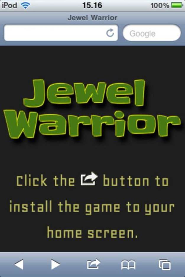
When the game loads in the mobile Safari browser, the user now sees the install notification rather than the normal splash screen. Figure 3-4 shows this screen.
Figure 3-4: The mobile Safari install screen
Adding an application icon
By default, iOS uses a tiny screenshot of the application when it generates an icon. Naturally, that won’t always produce good results. With a special link element, you can specify an icon file to use instead of the screenshot.
<link rel=”apple-touch-icon” href=”icon.png”/>
The icon is processed by iOS in a way that adds a few extra effects. By using apple-touch-icon-precomposed instead of apple-touch-icon, you can tell iOS to leave the icon alone and use it as-is:
<link rel=”apple-touch-icon-precomposed”
href=”images/ios-icon.png”/>
Because iDevices have different resolutions, iOS also supports application icons of varying sizes. Older generations of iPod touch and iPhone devices have a relatively low resolution and use 57x57 icons on the home screen. The iPhone 4 display has twice the resolution of its predecessors and can therefore take advantage of more detailed 114x114 icons. Both the first and second-generation iPad tablets use a resolution somewhere in between — they need 72x72 icons. If you create icons in these different sizes, you can point to them in the HTML by adding a sizes parameter to the link element and adding extra link elements for each resolution you want to support. Listing 3.23 shows the extra elements added to the head element in index.html.
Listing 3.23 Using Icons for Multiple Resolutions
<head>
...
<link rel=”apple-touch-icon-precomposed”
href=”images/ios-icon.png”/>
<link rel=”apple-touch-icon-precomposed” sizes=”72x72”
href=”images/ios-icon-ipad.png”/>
<link rel=”apple-touch-icon-precomposed” sizes=”114x114”
href=”images/ios-icon-iphone4.png”/>
...
</head>
The device automatically picks the icon with the most appropriate size. If the exact size needed for its resolution isn’t available, it picks either the smallest icon that is larger than the ideal size or the largest icon with a smaller size. If it doesn’t find a suitable icon, it falls back to using the default icon with unspecified size. Figure 3-5 shows the game icon on an iPod home screen.
Figure 3-5: The Jewel Warrior icon on the home screen
You can also use one set of icons for the entire web site by leaving out the link elements and instead placing the icon images in the root directory of the web site. The iOS system then searches the root for a suitable icon using a list of predefined filenames in the format apple-touch-icon[-<w>x<h>][-precomposed].png. Precomposed icons are chosen over regular icons and icons with the specific size needed for that resolution are chosen over the default icon. A device that uses 57x57 icons looks for the following list of filenames:
• apple-touch-icon-57x57-precomposed.png
• apple-touch-icon-57x57.png
• apple-touch-icon-precomposed.png
• apple-touch-icon.png
If you want provide all three icon sizes and use precomposed icons, you would have to put the following files in the root directory of the web site:
• apple-touch-icon-114x114-precomposed.png
• apple-touch-icon-72x72-precomposed.png
• apple-touch-icon-precomposed.png
In this case, the file with no size specified in the filename should be a 57x57 icon so it serves as both the correct icon for older iPhones as well as the default fallback icon for any future devices with different resolutions.
In many situations, it is better to explicitly point to the icons using link elements. Placing the application icons in the root means that every application running on that domain uses the same icons. This can cause problems if you ever want to serve other applications or games from that web site.
Adding a startup image
When the user launches the game in standalone mode and later exits the game, iOS saves a screenshot of the current state of the game. The next time the application is launched, this image is then displayed until the page is loaded. It’s not always appropriate to just show the last state of the game. The game won’t pick up exactly where it left off so the old image would just appear as a brief flash. Fortunately, it’s easy to specify your own image. A simple fix to get rid of the flash from the past is to just use an image with a solid color instead. A good choice would be the same color that is used as the background in the game.
All of the iOS devices need an image that takes up the full screen minus the top 20 pixels that are reserved for the native status bar. That means 320x460 for the iPhone and iPod touch and 768x1004 for the iPad. On the iPad, you can add an extra startup image for landscape mode. This image must have the dimensions 748x1024, which means that the content needs to be rotated 90 degrees. I have created three startup images that just display the dimensions of the images so you can see when each one is loaded. You can find these images in the images folder in the code archive for this chapter. Listing 3.24 shows the extra link tags added to the head element in index.html.
Listing 3.24 Specifying a Startup Image
<head>
...
<link rel=”apple-touch-startup-image”
href=”images/ios-startup-748x1024.png”
media=”screen and (min-device-width: 768px)
and (orientation:landscape)” />
<link rel=”apple-touch-startup-image”
href=”images/ios-startup-768x1004.png”
media=”screen and (min-device-width: 768px)
and (orientation:portrait)” />
<link rel=”apple-touch-startup-image”
href=”images/ios-startup-320x460.png”
media=”screen and (max-device-width:320px)”/>
</head>
If you add multiple link elements, the last element simply overrides all the others unless you specify a media query to target the specific devices. In Listing 3.24, the two first link elements target only the iPad while the third element targets the smaller screen of the iPhone and iPod touch.
Styling the status bar
All mobile iDevices use a standard 20 pixels status bar at the top of the screen. Even when the web application is running in full screen mode, this status bar is still visible. This means that the actual available screen space on, for example, an iPad is 768x1004 in portrait mode, as opposed to the full 768x1024. Unfortunately, you can’t hide the status bar completely, but iOS does give you a bit of control over its appearance. By adding a special meta tag to the page, you can choose between a few different styles. Listing 3.25 shows the meta tag needed to toggle a solid black background on the status bar in index.html.
Listing 3.25 Making the Status Bar Black
<head>
...
<meta name=”apple-mobile-web-app-status-bar-style”
content=”black” />
...
</head>
The value of the content attribute must be one of default, black, and black-translucent.
Getting the browser out of the way
A web browser imposes a lot of extraneous behavior on your application. While some of it might be welcome, other functionality only detracts from the experience. Ideally, a game running as a web application and the same game in native form should have no apparent differences. In the next sections, I show you a few things you can do to disable some of the native browser behavior.
Disabling overscroll
When you scroll a web page in the Android browser or mobile Safari, you’ll notice that you can scroll past the end of the page. When you let go, the page springs back to the end position. Preferably, the game should not scroll at all because there is never any content outside the visible area on the screen. You can disable this overscroll feature by simply disabling touch scrolling altogether. Do this by listening for the touchmove event on the document element and calling the event.preventDefault() method. No setup function currently takes care of initial things like this, so add one to the game module. Listing 3.26 shows the new function.
Listing 3.26 Adding a Setup Function to the Game Module
jewel.game = (function() {
...
function setup() {
// disable native touchmove behavior to
// prevent overscroll
dom.bind(document, “touchmove”, function(event) {
event.preventDefault();
});
}
...
return {
...
setup : setup
}
);
The setup() function should be invoked once before the first screen is shown. Add the call in the loader script right before the splash or install screen is toggled. Listing 3.27 shows the correct placement in loader.js.
Listing 3.27 Calling the Setup Function from the Loader
// loading stage 1
Modernizr.load([
...
complete : function() {
jewel.game.setup();
if (Modernizr.standalone) {
jewel.game.showScreen(“splash-screen”);
...
} else {
jewel.game.showScreen(“install-screen”);
}
}
}
]);
If you load up the game in a mobile browser, you will see that you cannot scroll outside the game area anymore.
Hiding the address bar
The Android browser doesn’t have a feature like the apple-mobile-web-app-capable meta tag that mobile Safari provides. You can’t make Android load the page as an application; the best you can do is put a shortcut on the home screen that opens in the standard browser application. However, the Android browser gives you more space to work with than Safari and the only space that is reserved is the top status bar. When a page loads in the Android browser, it is usually displayed in such a way that the URL address bar is still visible. With a bit of JavaScript, shown in Listing 3.28, you can make the address bar disappear — or at least move it out of the way.
The issue also exists on iPod touch and iPhones, but it doesn’t matter as much on those devices because we simply ask the user to install the game to the home screen. Because we have disabled touch scrolling, hiding the address bar can also cause problems on iOS because there is no other way for the user to leave the page. If the user instead launches the game from the home screen icon, the address bar problem disappears.
The trick to hiding the address bar is to force the browser to scroll to the top of the page. If there’s enough content, it automatically pushes the address bar out of view. Because the height is set to 100%, the game only takes up as much as space as it can, so scrolling to the top has no effect. You can make sure the page is long enough by increasing the height of the html element to, say, 200%. Listing 3.28 shows the Android-targeted changes to the setup() function in game.js.
Listing 3.28 Hiding the Address Bar
jewel.game = (function() {
...
function setup() {
...
// hide the address bar on Android devices
if (/Android/.test(navigator.userAgent)) {
$(“html”)[0].style.height = “200%”;
setTimeout(function() {
window.scrollTo(0, 1);
}, 0);
}
}
...
);
Disabling default browser behavior
Mobile Safari and the Android browser have a few behaviors that, although they make sense and generally improve the user experience on regular web pages, are best left disabled for games.
When you keep your finger pressed down for a second or two on, for example, an image or a link, a small callout appears, giving you the option to follow the link, save the image, and so on. This feature has no place in a game. The user should be able to tap and press anything without interference from the native browser behavior. The following CSS property disables the callout.
-webkit-touch-callout: none;
Likewise, the ability to select text and images can be disabled with the following CSS property:
-webkit-user-select : none;
The Android browser highlights clickable elements when you tap them. Again, this is something that makes more sense in the context of links on web pages. Remove the highlighting by setting its color to transparent:
-webkit-tap-highlight-color: rgba(0,0,0,0);
Under some circumstances, such as orientation changes, the browser sometimes automatically adjusts the size of the text to account for the change in available size. It’s best to keep as much control over the appearance as possible, so disable the automatic adjustment with the following rule:
-webkit-text-size-adjust: none;
These four properties must apply to all content in the game and thus should go on one of the top-most elements. Listing 3.29 shows the extra CSS rules added to the body element in main.css.
Listing 3.29 Modifying Mobile Browser Behavior
body {
...
-webkit-touch-callout: none;
-webkit-tap-highlight-color: rgba(0,0,0,0);
-webkit-text-size-adjust: none;
-webkit-user-select : none;
}
Debugging Mobile Web Applications
Debugging web applications on mobile devices can be a bit of a pain. If you are used to nice tools like Firebug or the WebKit developer tools, you will find that debugging web applications on mobile devices is a completely different experience. You cannot inspect the HTML, you have no console to test JavaScript in, and you often find yourself resorting to alert() debugging when things don’t work out as expected. Although the mobile browsers are not as feature-rich as their desktop counterparts, they do have options that come in handy for debugging JavaScript.
Enabling the Safari debugger
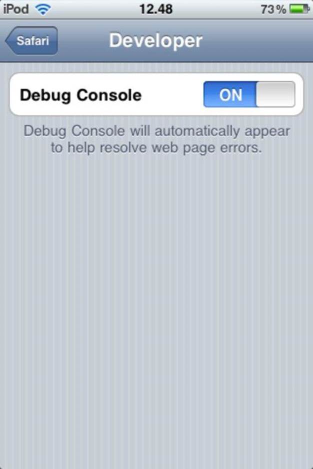
Apple’s mobile Safari browser has a debug console that is disabled by default. To turn it on, go to the iOS settings and find the Safari pane. Scroll down to the bottom and select the Developer menu item (Figure 3-6). On the developer screen, you can turn the Debug Console on and off (Figure 3-7).
Figure 3-6: The mobile Safari settings
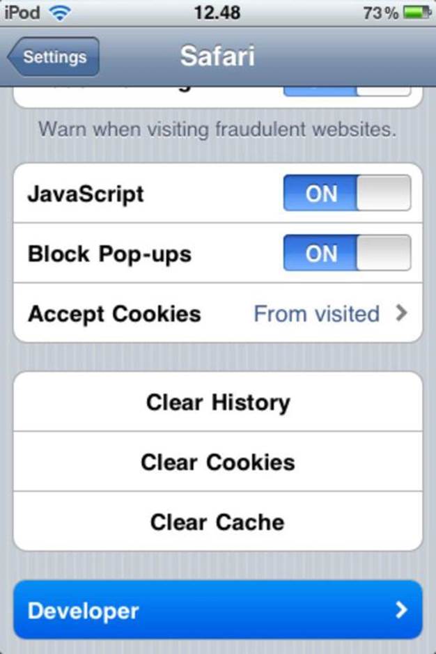
Figure 3-7: The mobile Safari developer settings
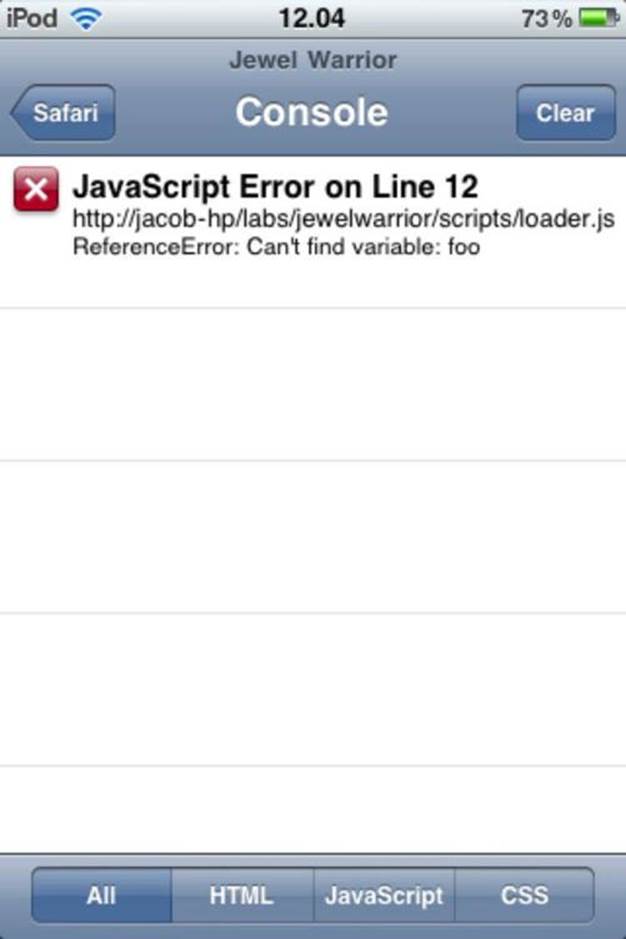
When the console is enabled, you see an error bar just below the URL bar in Safari. The error bar reports the number of errors on the page. If any HTML, CSS, or JavaScript errors occur, you can click the error bar to get detailed information. See Figure 3-8 for an example of the error details.
You can also write your own debug messages by a console API similar to that found in most desktop browsers.
console.log(“Hello World”) // prints a message in the log
You can also use the related console.error(), console.warn(), and console.info() functions.
Safari may not offer any extensive inspection features like you know from desktop browsers, but the ones it has are definitely better than nothing. There is one slightly annoying catch, though. Debug Console only works when running in the full Safari browser. When the application is launched in standalone mode from the home screen, enabling Debug Console has no effect.
Figure 3-8: Detailed error information in mobile Safari
Accessing the Android log
The Android browser has no built-in console. Instead, errors and console messages are sent to the Android logging system. If you are familiar with the Android Debug Bridge (ADB), you can view the log messages with the ADB command.
adb logcat
Several log viewing applications are available from the Android Market. One example is aLogcat, which is free and lets you filter the log output by entering keywords. The log receives messages from many different sources, so filtering the output makes it easier to find the relevant messages. Messages from the browser can be picked out by filtering for the keyword browser.
Unlike some of their desktop counterparts, the JavaScript console functions in Android and iOS take only one argument. You can supply more than one argument to, for example, console.log(), but only the first is used in the log message.
Summary
In this chapter, you learned how to use a combination of scalable layouts, the viewport meta tag, and CSS media queries to make your game behave nicely on multiple devices with varying resolutions. You also saw how media queries can be used to tackle the issue of landscape versus portrait orientations.
I showed you how to use the iOS standalone mode for web applications to put a game icon on the home screen that launches the game in full-screen mode. You used conditional loading to load an install screen instead of the regular splash screen. By introducing a few more settings, you learned how to control the appearance of the iOS status bar and how to add a splash image.
In the final part of the chapter, you learned how to get rid of some unwanted browser behavior, such as over-scrolling, the address bar, and the long-press callout on images and links.