Mastering Responsive Web Design with HTML5 and CSS3 (2015)
Chapter 4. CSS Grids, CSS Frameworks, UI Kits, and Flexbox for RWD
Responsive Web Design (RWD) has introduced a new layer of work for everyone building responsive websites and apps. When we have to test our work on different devices and in different dimensions, wherever the content breaks, we need to add a breakpoint and test again.
This can happen many, many times. So, building a website or app will take a bit longer than it used to.
To make things a little more interesting, as web designers and developers, we need to be mindful of how the content is laid out at different dimensions and how a grid can help us structure the content to different layouts.
Now that we have mentioned grids, have you ever asked yourself, "what do we use a grid for anyway?"
To borrow a few terms from the design industry and answer that question, we use a grid to allow the content to have rhythm, proportion, and balance. The objective is that those who use our websites/apps will have a more pleasant experience with our content, since it will be easier to scan (rhythm), easier to read (proportion) and organized (balance).
In order to speed up the design and build processes while keeping all the content properly formatted in different dimensions, many authors and companies have created CSS frameworks and CSS grids that contain not only a grid but also many other features and styles than can be leveraged by using a simple class name.
As time goes by and browsers start supporting more and more CSS3 properties, such as Flexbox, it'll become easier to work with layouts. This will render the grids inside CSS frameworks almost unnecessary.
Let's see what CSS grids, CSS frameworks, UI kits, and Flexbox are all about and how they can help us with RWD.
In this chapter, we're going to cover the following topics:
· What is a grid?
· CSS grids
· The pros and cons of CSS grids for RWD
· CSS frameworks
· UI kits
· The pros and cons of CSS frameworks for RWD
· Creating a custom CSS grid
· Building a sample page with the custom CSS grid
· Using Flexbox
· Building a sample page with Flexbox
What is a grid?
A grid is a set of visual guidelines (vertical, horizontal, or both, hence the term grid) that help define where elements can be placed. Once the elements have been placed, we end up with a layout.
The benefit of using a grid is that the elements placed on it will have a harmonious flow along the pages, enhancing the user experience in terms of legibility, layout consistency, and good proportions between the elements.
CSS grids
A CSS grid is basically a compound of vertical guidelines that form columns. The properties of these columns are defined in a CSS file. This file contains a list of classes with specific widths that match the amount of columns that a specific grid is built for.
We've seen this before in Chapter 3, Mobile-first or Desktop-first? when we used the 980 Grid System (980GS) to retrofit an old, fixed-width site. Here's the SCSS file again:
*, *:before, *:after {
box-sizing: border-box;
}
//Container
.container-12 {
width: 980px;
padding: 0 10px;
margin: auto;
}
//Grid >> Global
.grid {
&-1, &-2, &-3, &-4, &-5, &-6, &-7, &-8, &-9, &-10, &-11, &-12 {
float: left;
margin: 0 10px;
}
}
//Grid >> 12 Columns
.container-12 {
.grid-1 { width: 60px; }
.grid-2 { width: 140px; }
.grid-3 { width: 220px; }
.grid-4 { width: 300px; }
.grid-5 { width: 380px; }
.grid-6 { width: 460px; }
.grid-7 { width: 540px; }
.grid-8 { width: 620px; }
.grid-9 { width: 700px; }
.grid-10 { width: 780px; }
.grid-11 { width: 860px; }
.grid-12 { width: 940px; }
}
//Clear Floated Elements - http://davidwalsh.name/css-clear-fix
.clear, .row {
&:before,
&:after { content: ''; display: table; }
&:after { clear: both; }
}
//Use rows to nest containers
.row { margin-bottom: 10px;
&:last-of-type { margin-bottom: 0; }
}
//Legacy IE
.clear { zoom: 1; }
Tip
Remember that we turned 960GS into 980GS because the content would look too close to the edge of the main container with only 10px gutters on the left and right of that main container. So, we added 10px more to each side and made the main container 980px wide.
Because we are mastering RWD with HTML5 and CSS3, let's look at that same 980GS with percentages to make it fluid.
The RWD magic formula is (target ÷ context) x 100 = result %.
Our context in this case is 980px, as shown here:
//Container
.container-12 {
width: 100%;
max-width: 980px;
padding: 0 1.02%;
margin: auto;
}
//Grid >> Global
.grid {
&-1, &-2, &-3, &-4, &-5, &-6, &-7, &-8, &-9, &-10, &-11, &-12 {
float: left;
margin: 0 1.02%;
}
}
//Grid >> 12 Columns
.container-12 {
.grid-1 { width: 6.12%; }
.grid-2 { width: 14.29%; }
.grid-3 { width: 22.45%; }
.grid-4 { width: 30.61%; }
.grid-5 { width: 38.78%; }
.grid-6 { width: 46.94%; }
.grid-7 { width: 55.10%; }
.grid-8 { width: 63.27%; }
.grid-9 { width: 71.43%; }
.grid-10 { width: 79.59%; }
.grid-11 { width: 87.76%; }
.grid-12 { width: 95.92%; }
}
//Clear Floated Elements - http://davidwalsh.name/css-clear-fix
.clear, .row {
&:before,
&:after { content: ''; display: table; }
&:after { clear: both; }
}
//Use rows to nest containers
.row { margin-bottom: 10px;
&:last-of-type { margin-bottom: 0; }
}
//Legacy IE
.clear { zoom: 1; }
In web design, grids are usually made with 12 or 16 columns. 960GS is pretty much one of the most famous ones, albeit it's always been a fixed-width grid. But other authors have ported it to make it fluid, such as the Fluid 960 Grid System, but not responsive. The 960GS also has the option of 24 columns, but it's not as popular as the 12 column version.
There are other grids for web design that do not have a defined frame width or number of columns, instead these grids can have an infinite amount of columns, such as the Frameless Grid, which is based on Adaptive Web Design (AWD). This means that the width of the main container snaps to a specific breakpoint calculated by the number of columns that fit in it.
The pros and cons of CSS grids for RWD
The idea behind listing pros and cons of CSS grids for RWD is that we should be able to make the most informed decision when we plan to use a certain type of grid. It helps clarify the clients' expectations and ours, because using a certain grid will impact the timeline, design, layout, and many UX factors.
The advantages are as follows:
· Laying out elements is a lot easier because the columns serve as guidelines for placement.
· If using a prebuilt CSS grid, there's no need to do any of the math to deal with the column and gutter widths. It's already taken care of by the author of the grid.
· We can build faster, since all we need to do is add specific classes to our containers in our HTML and—for the most part—the layout will happen instantly.
· Understanding grids in web design is relatively simple, so enhancing/editing someone else's markup and code in an already built project is less painful than if they hadn't used a CSS grid at all.
· If the grid is responsive or adaptive, we don't have to worry too much about the breakpoints.
· If we are using a third-party CSS grid, any cross-browser issues have already been addressed.
The disadvantages are as follows:
· Some CSS grids have a steeper learning curve than others.
· With many CSS grids, we are locked into using the name conventions the author created.
· We may have to change/adapt the way we write our HTML.
· There are so many CSS grids to choose from that it can be overwhelming for some.
· If our content breaks at certain points the grid doesn't support, we have to spend time amending the original grid to fit each individual situation.
CSS frameworks
A CSS framework is a group of prebuilt features that basically help speed up frontend development for the Web. A lot of the small but important details have already been taken care of by the authors of these CSS frameworks, so those who decide to use them can focus on their tasks at hand while leaving a lot of the decisions to the CSS frameworks themselves.
Many developers and designers believe (I do too) that the true value of any CSS framework is their CSS grids, and sometimes we go to great lengths to extract the CSS grid and customize it to fit our needs.
In this book, we're going to focus on the CSS grids to master RWD rather than stripping one out from a CSS framework or UI kit (if it happens to offer one). We'll get to this shortly.
The following list describes some of the features and characteristics of CSS frameworks:
· CSS frameworks are focused solely on web-based development, not native mobile apps.
· CSS frameworks always offer a CSS grid.
· Many of them also offer user interface components as well (just like a UI kit), for example, sliders, paginations, navigation bars, typography, buttons, and so on in the form of HTML and CSS.
· Both CSS frameworks and web-oriented UI kits can be called frontend frameworks.
UI kits
Similar to CSS frameworks, there is another type of frontend framework called UI kits. However, UI kits can be a breed of their own.
Truth be told, sometimes differentiating between a CSS framework and a UI kit is difficult. But don't delve too much into which one is which, the important thing is to understand why we're using them in the first place and how they can help us build better and faster responsive sites and apps.
The following list describes some of the features and characteristics of UI kits:
· There are basically two types of UI kits: those that are built with web technologies (HTML and CSS) and can be used to prototype web-based applications, and those that are made of (usually) Photoshop (PSD) files to help mock up and design native mobile apps.
· Very few web-oriented UI kits offer a grid of some sort.
· UI kits are focused on providing user interface components such as sliders, paginations, navigation bars, dialog boxes, overlays/modals, buttons, typography, tooltips, lists, accordions, tab systems, carousels/slideshows, forms, and so on.
· In a web-oriented UI kit, the architecture is very modular. This means that each component can be incorporated into any CSS framework.
The pros and cons of CSS frameworks for RWD
With RWD as our main driver for any decisions we make in terms of layout versus screen real estate, let's take a look at what the good and not so good things are about CSS frameworks:
The advantages are as follows:
· They are very useful to rapidly build responsive prototypes rather than showing static wireframes.
· Cross-browser issues are already taken care of.
· They force you, in a good way, to create grid-based layouts.
· They offer a solid starting point to build on top of.
· The modularity allows you to handpick the components you want. For example, you can just use the CSS grid module or you can use the forms module.
· Changing the styling to fit your design(s) is relatively easy.
· If you aren't too good at CSS, you can still use a CSS framework to implement your own designs.
The disadvantages are as follows:
· They can bloat your project(s) with CSS that you will never use.
· They have a large footprint if you decide to use the entire CSS framework.
· You might need to change your habits and the way you write your HTML and CSS to fit the CSS framework you're using.
· They can be opinionated, so if you don't like the way things are named you have very little choice for customization.
· Customizing a CSS framework is doable, but it can be very time consuming and dangerous. Change a name to something else and there's almost no way to know what the impact is going to be on other parts of the framework.
· If the default styling is not changed to fit your brand/designs, your site or app will not be unique and will look like everyone else's, losing credibility in front of users.
· If you need to build something simple, using a CSS framework is overkill.
· Every website/app or project is different, so you may end up spending a lot of time changing and overriding properties for every single project.
· They try to solve every frontend problem.
Now that we've seen the pros and cons of CSS grids, CSS frameworks and UI kits it's time to make a decision and answer this question: which methodology is best for RWD?
The answer isn't the most encouraging, I admit it, but it's the truth: it depends.
If we're freelancing and doing everything ourselves, or working in a very small group, it may not be necessary to use any frameworks at all. We can custom build something based on the same principles major frameworks have been built on. Obviously, we would want to automate any repetitive processes so we use our time efficiently.
But if we're working in a large team, a melting pot of web professional with in-house and off-shore resources, maybe using a framework can be helpful. This is because everyone will need to adhere to the framework's structures so that all things are consistent.
Creating a custom CSS grid
Since we're mastering RWD, we have the luxury of creating our own CSS grid. However, we need to work smart, not hard. So what we're going to do is leverage the Variable Grid System app and combine its result with our own approach, making a mobile-first, fluid, custom build, and solid CSS grid from which we can create robust responsive designs.
Let's lay out our CSS grid requirements:
· It should have 12 columns.
· It should be 1200px wide to account for 1280px screens.
· It should be fluid, with relative units (percentages) for the columns and gutters.
· It should use the mobile-first approach.
· It should use the SCSS syntax.
· It should be reusable for other projects.
· It should be simple to use and understand.
· It should be easily scalable.
Here's what our 1200 pixel wide and 12-column width 20px grid looks like:
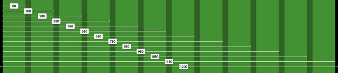
The left and right padding in black are 10px each. We'll convert those 10px into percentages at the end of this process.
Doing the math
We're going to use the RWD magic formula: (target ÷ context) x 100 = result %.
Our context is going to be 1200px. So let's convert one column: 80 ÷ 1200 x 100 = 6.67%.
For two columns, we have to account for the gutter that is 20px. In other words, we can't say that two columns are exactly 160px. That's not entirely correct.
Two columns are: 80px + 20px + 80px = 180px.
Let's now convert two columns: 180 ÷ 1200 x 100 = 15%.
For three columns, we now have to account for two gutters: 80px + 20px + 80px + 20px + 80px = 280px.
Let's now convert three columns: 280 ÷ 1200 x 100 = 23.33%.
Can you see the pattern now? Every time we add a column, all that we need to do is add 100 to the value. This value accounts for the gutters too!
Check the screenshot of the grid we saw moments ago, you can see the values of the columns increment by 100.
So, all the equations are as follows:
1 column: 80 ÷ 1200 x 100 = 6.67%
2 columns: 180 ÷ 1200 x 100 = 15%
3 columns: 280 ÷ 1200 x 100 = 23.33%
4 columns: 380 ÷ 1200 x 100 = 31.67%
5 columns: 480 ÷ 1200 x 100 = 40%
6 columns: 580 ÷ 1200 x 100 = 48.33%
7 columns: 680 ÷ 1200 x 100 = 56.67%
8 columns: 780 ÷ 1200 x 100 = 65%
9 columns: 880 ÷ 1200 x 100 = 73.33%
10 columns: 980 ÷ 1200 x 100 = 81.67%
11 columns: 1080 ÷ 1200 x 100 = 90%
12 columns: 1180 ÷ 1200 x 100 = 98.33%
Let's create the SCSS for the 12-column grid:
//Grid 12 Columns
.grid {
&-1 { width:6.67%; }
&-2 { width:15%; }
&-3 { width:23.33%; }
&-4 { width:31.67%; }
&-5 { width:40%; }
&-6 { width:48.33%; }
&-7 { width:56.67%; }
&-8 { width:65%; }
&-9 { width:73.33%; }
&-10 { width:81.67%; }
&-11 { width:90%; }
&-12 { width:98.33%; }
}
Tip
Using hyphens (-) to separate words allows for easier selection of the terms when editing the code.
Adding the UTF-8 character set directive and a Credits section
Don't forget to include the UTF-8 encoding directive at the top of the file to let browsers know the character set we're using. Let's spruce up our code by adding a Credits section at the top. The code is as follows:
@charset "UTF-8";
/*
Custom Fluid & Responsive Grid System
Structure: Mobile-first (min-width)
Syntax: SCSS
Grid: Float-based
Created by: Your Name
Date: MM/DD/YY
*/
//Grid 12 Columns
.grid {
&-1 { width:6.67%; }
&-2 { width:15%; }
&-3 { width:23.33%; }
&-4 { width:31.67%; }
&-5 { width:40%; }
&-6 { width:48.33%; }
&-7 { width:56.67%; }
&-8 { width:65%; }
&-9 { width:73.33%; }
&-10 { width:81.67%; }
&-11 { width:90%; }
&-12 { width:98.33%; }
}
Tip
Notice the Credits are commented with CSS style comments: /* */. These types of comments, depending on the way we compile our SCSS files, don't get stripped out. This way, the Credits are always visible so that others know who authored the file. This may or may not work for teams. Also, the impact on file size of having the Credits display is imperceptible, if any.
Including the box-sizing property and the mobile-first mixin
Including the box-sizing property allows the browser's box model to account for the padding inside the containers; this means the padding gets subtracted rather than added, thus maintaining the defined width(s).
Since the structure of our custom CSS grid is going to be mobile-first, we need to include the mixin that will handle this aspect:
@charset "UTF-8";
/*
Custom Fluid & Responsive Grid System
Structure: Mobile-first (min-width)
Syntax: SCSS
Grid: Float-based
Created by: Your Name
Date: MM/DD/YY
*/
*, *:before, *:after {
box-sizing: border-box;
}
//Moble-first Media Queries Mixin
@mixin forLargeScreens($width) {
@media (min-width: $width/16+em) { @content }
}
//Grid 12 Columns
.grid {
&-1 { width:6.67%; }
&-2 { width:15%; }
&-3 { width:23.33%; }
&-4 { width:31.67%; }
&-5 { width:40%; }
&-6 { width:48.33%; }
&-7 { width:56.67%; }
&-8 { width:65%; }
&-9 { width:73.33%; }
&-10 { width:81.67%; }
&-11 { width:90%; }
&-12 { width:98.33%; }
}
The main container and converting 10px to percentage value
Since we're using the mobile-first approach, our main container is going to be 100% wide by default; but we're also going to give it a maximum width of 1200px since the requirement is to create a grid of that size.
We're also going to convert 10px into a percentage value, so using the RWD magic formula: 10 ÷ 1200 x 100 = 0.83%.
However, as we've seen before, 10px, or in this case 0.83%, is not enough padding and makes the content appear too close to the edge of the main container. So we're going to increase the padding to 20px: 20 ÷ 1200 x 100 = 1.67%.
We're also going to horizontally center the main container with margin: auto;.
Tip
There's no need to declare zero values to the top and bottom margins to center horizontally. In other words, margin: 0 auto; isn't necessary. Just declaring margin: auto; is enough.
Let's include these values now:
@charset "UTF-8";
/*
Custom Fluid & Responsive Grid System
Structure: Mobile-first (min-width)
Syntax: SCSS
Grid: Float-based
Created by: Your Name
Date: MM/DD/YY
*/
*, *:before, *:after {
box-sizing: border-box;
}
//Moble-first Media Queries Mixin
@mixin forLargeScreens($width) {
@media (min-width: $width/16+em) { @content }
}
//Main Container
.container-12 {
width: 100%;
//Change this value to ANYTHING you want, no need to edit anything else.
max-width: 1200px;
padding: 0 1.67%;
margin: auto;
}
//Grid 12 Columns
.grid {
&-1 { width:6.67%; }
&-2 { width:15%; }
&-3 { width:23.33%; }
&-4 { width:31.67%; }
&-5 { width:40%; }
&-6 { width:48.33%; }
&-7 { width:56.67%; }
&-8 { width:65%; }
&-9 { width:73.33%; }
&-10 { width:81.67%; }
&-11 { width:90%; }
&-12 { width:98.33%; }
}
Tip
In the padding property, it's the same if we type 0.83% or .83%. We can omit the zero. It's always a good practice to keep our code as streamlined as possible. This is the same principle as when we use hexadecimal shorthand values: #3336699 is the same as #369.
Making it mobile-first
On small screens, all the columns are going to be 100% wide. Since we're working with a single column layout, we don't use gutters; this means we don't have to declare margins, at least yet.
At 640px, the grid will kick in and assign corresponding percentages to each column, so we're going to include the columns in a 40em (640px) media query and float them to the left. At this point, we need gutters. Thus, we declare the margin with .83% to the left and right padding.
Tip
I chose 40em (640px) arbitrarily and only as a starting point. Remember to create content-based breakpoints rather than device-based ones.
The code is as follows:
@charset "UTF-8";
/*
Custom Fluid & Responsive Grid System
Structure: Mobile-first (min-width)
Syntax: SCSS
Grid: Float-based
Created by: Your Name
Date: MM/DD/YY
*/
*, *:before, *:after {
box-sizing: border-box;
}
//Moble-first Media Queries Mixin
@mixin forLargeScreens($width) {
@media (min-width: $width/16+em) { @content }
}
//Main Container
.container-12 {
width: 100%;
//Change this value to ANYTHING you want, no need to edit anything else.
max-width: 1200px;
padding: 0 1.67%;
margin: auto;
}
//Grid
.grid {
//Global Properties - Mobile-first
&-1, &-2, &-3, &-4, &-5, &-6, &-7, &-8, &-9, &-10, &-11, &-12 {
width: 100%;
}
@include forLargeScreens(640) { //Totally arbitrary width, it's only a starting point.
//Global Properties - Large screens
&-1, &-2, &-3, &-4, &-5, &-6, &-7, &-8, &-9, &-10, &-11, &-12 {
float: left;
margin: 0 .83%;
}
//Grid 12 Columns
.grid {
&-1 { width:6.67%; }
&-2 { width:15%; }
&-3 { width:23.33%; }
&-4 { width:31.67%; }
&-5 { width:40%; }
&-6 { width:48.33%; }
&-7 { width:56.67%; }
&-8 { width:65%; }
&-9 { width:73.33%; }
&-10 { width:81.67%; }
&-11 { width:90%; }
&-12 { width:98.33%; }
}
}
Adding the row and float clearing rules
If we use rows in our HTML structure or add the class .clear to a tag, we can declare all the float clearing values in a single nested rule with the :before and :after pseudo-elements.
Tip
It's the same thing to use single or double colons when declaring pseudo-elements. The double colon is a CSS3 syntax and the single colon is a CSS2.1 syntax. The idea was to be able to differentiate them at a glance so a developer could tell which CSS version they were written on. However, IE8 and below do not support the double-colon syntax.
The float clearing technique is an adaptation of David Walsh's CSS snippet (http://davidwalsh.name/css-clear-fix).
We're also adding a rule for the rows with a bottom margin of 10px to separate them from each other, while removing that margin from the last row to avoid creating unwanted extra spacing at the bottom. Finally, we add the clearing rule for legacy IEs.
Let's include these rules now:
@charset "UTF-8";
/*
Custom Fluid & Responsive Grid System
Structure: Mobile-first (min-width)
Syntax: SCSS
Grid: Float-based
Created by: Your Name
Date: MM/DD/YY
*/
*, *:before, *:after {
box-sizing: border-box;
}
//Moble-first Media Queries Mixin
@mixin forLargeScreens($width) {
@media (min-width: $width/16+em) { @content }
}
//Main Container
.container-12 {
width: 100%;
//Change this value to ANYTHING you want, no need to edit anything else.
max-width: 1200px;
padding: 0 1.67%;
margin: auto;
}
//Grid
.grid {
//Global Properties - Mobile-first
&-1, &-2, &-3, &-4, &-5, &-6, &-7, &-8, &-9, &-10, &-11, &-12 {
width: 100%;
}
@include forLargeScreens(640) { //Totally arbitrary width, it's only a starting point.
//Global Properties - Large screens
&-1, &-2, &-3, &-4, &-5, &-6, &-7, &-8, &-9, &-10, &-11, &-12 {
float: left;
margin: 0 .83%;
}
//Grid 12 Columns
.grid {
&-1 { width:6.67%; }
&-2 { width:15%; }
&-3 { width:23.33%; }
&-4 { width:31.67%; }
&-5 { width:40%; }
&-6 { width:48.33%; }
&-7 { width:56.67%; }
&-8 { width:65%; }
&-9 { width:73.33%; }
&-10 { width:81.67%; }
&-11 { width:90%; }
&-12 { width:98.33%; }
}
}
//Clear Floated Elements - http://davidwalsh.name/css-clear-fix
.clear, .row {
&:before,
&:after { content: ''; display: table; }
&:after { clear: both; }
}
//Use rows to nest containers
.row { margin-bottom: 10px;
&:last-of-type { margin-bottom: 0; }
}
//Legacy IE
.clear { zoom: 1; }
Let's recap our CSS grid requirements:
· 12 columns: Starting from .grid-1 to .grid-12.
· 1200px wide to account for 1280px screens: The .container-12 container has max-width: 1200px;
· Fluid and relative units (percentages) for the columns and gutters: The percentages go from 6.67% to 98.33%.
· Mobile-first: We added the mobile-first mixin (using min-width) and nested the grid inside of it.
· The SCSS syntax: The whole file is Sass-based.
· Reusable: As long as we're using 12 columns and we're using the mobile-first approach, we can use this CSS grid multiple times.
· Simple to use and understand: The class names are very straightforward. The .grid-6 grid is used for an element that spans 6 columns, .grid-7 is used for an element that spans 7 columns, and so on.
· Easily scalable: If we want to use 980px instead of 1200px, all we need to do is change the value in the .container-12 max-width property. Since all the elements are using relative units (percentages), everything will adapt proportionally to the new width—toany width for that matter. Pretty sweet if you ask me.
Building a sample page with the custom CSS grid
Here's the HTML we're going to use in this example:
<!DOCTYPE html>
<html>
<head>
<meta charset="utf-8">
<meta http-equiv="X-UA-Compatible" content="IE=edge">
<meta name="viewport" content="width=device-width, initial-scale=1">
<title>Mastering RWD with HTML5 & CSS3</title>
<link rel="stylesheet" href="css/site-styles.css">
<!--[if lt IE 9]>
<script src="//html5shiv.googlecode.com/svn/trunk/html5.js">
</script>
<![endif]-->
</head>
<body>
<h1>Basic Layout Using a Custom CSS Grid</h1>
<main class="container-12 clear" role="main">
<header class="grid-12" role="banner">Header (.grid-12)</header>
<nav class="grid-4" role="navigation">Nav (.grid-4)</nav>
<section class="grid-8">
<div class="row">
<div class="grid-6 black">.grid-6</div>
<div class="grid-6 black">.grid-6</div>
</div>
<div class="row">
<div class="grid-4 black">.grid-4</div>
<div class="grid-4 black">.grid-4</div>
<div class="grid-4 black">.grid-4</div>
</div>
<div class="row">
<div class="grid-3 black">.grid-3</div>
<div class="grid-3 black">.grid-3</div>
<div class="grid-3 black">.grid-3</div>
<div class="grid-3 black">.grid-3</div>
</div>
<div class="row">
<div class="grid-2 black">.grid-2</div>
<div class="grid-7 black">.grid-7</div>
<div class="grid-3 black">.grid-3</div>
</div>
<p>Content (.grid-8)</p>
</section>
<footer class="grid-12" role="contentinfo">Footer (.grid-12)</footer>
</main>
</body>
Nested containers
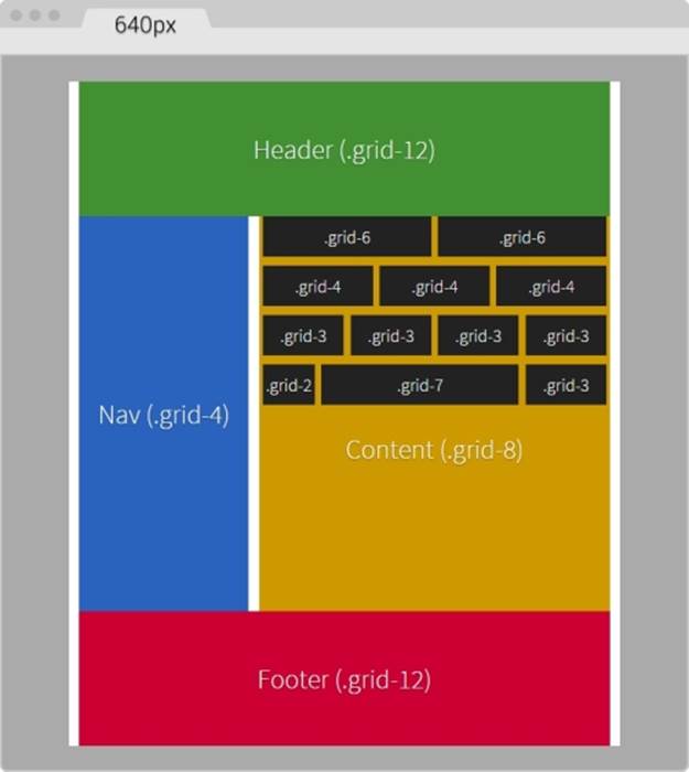
Notice that there are several nested containers inside their own row (black background). The idea here is to highlight the nested content sections that add up to 12 columns.
Nesting columns are a major advantage of any grid system. In this book, we are harnessing this power so we don't limit the design in any way.
Tip
We're using the HTML5 Shiv polyfill to add HTML5 support to IE8 and below.
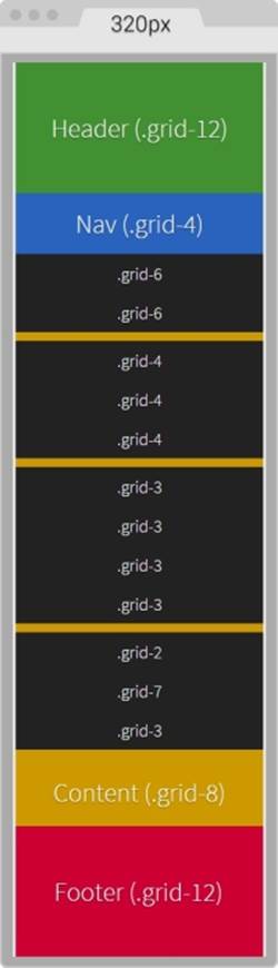
On small screens (320px wide), this is what the container looks like:
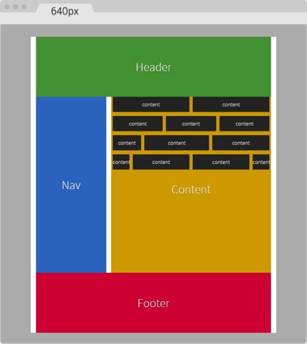
On large screens starting at 40em (640px) wide, this is what the layout looks like:
You can see the demo I created on CodePen at http://codepen.io/ricardozea/pen/d6ab6e0293be9b6bac2e16ad37942ed5.
Stop using CSS grids, use Flexbox!
I bet you didn't see this one coming, ha!
Indeed, Flexbox is one amazing CSS property that opens the layout possibilities to new horizons. Here are a few things about Flexbox:
· Its browser support is perfect in modern browsers.
· IE8 and IE9 don't support it. But no worries, addressing these two browsers is very simple using the conditional classes technique mentioned in Chapter 3, Mobile-first or Desktop-first?
· IE10 only supports the 2012 syntax, but Autoprefixer (within Prepros) takes care of this old vendor prefixing automatically for us.
· We need to be careful when using Flexbox because the old display: box; syntax causes the browser to do a multi-pass in the layout, deteriorating the performance.
· In contrast, the new/current syntax display: flex; has no impact on performance whatsoever. Browser performance issues have now been addressed since the old syntax, so we should be in good shape.
Tip
Paul Irish and Ojan Vafai explain this very well in the post Flexbox layout isn't slow, which can be found at http://updates.html5rocks.com/2013/10/Flexbox-layout-isn-t-slow.
Let's get down to it, shall we?
Building a sample page with Flexbox
In the following example, we are going to build the same layout we built using the custom CSS grid but using the Flexbox property. This will help us better understand the power of Flexbox and eventually detach us from using CSS grids altogether, while keeping a more semantic structure in our HTML.
Tip
A great article by Chris Coyer, A Complete Guide to Flexbox, can be found at https://css-tricks.com/snippets/css/a-guide-to-flexbox/.
A few things to note about the sample page:
· We're including the conditional classes in the <html> element to support legacy browsers and save one request to the server from using a JavaScript file dependency.
· Since we're not using a CSS grid, the nested containers are just going to have to the term Content, display in them.
· We're going to use the HTML5 Shiv polyfill to have IE8 support for all the necessary HTML5 tags.
· Since IE10 has some math calculation issues with Flexbox, we need to target it with an .ie10 class added to the <html> element. We're going to accomplish this by using a simple script created by Louis Lazaris inside an IE-excluding Conditional Comment so that IE8/9 doesn't run the script. All the information about this script can be found in the article at http://www.impressivewebs.com/ie10-css-hacks/.
Tip
The script we're using to target IE10 is not using User Agent sniffing. UA sniffing isn't considered a good practice. The script is using a Conditional Compilation statement. More information about the @cc_on statement can be found in the Microsoft Developer Network (MSDN): https://msdn.microsoft.com/en-us/library/8ka90k2e(v=vs.94).aspx.
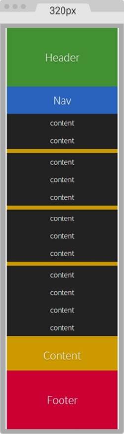
This is what the Flexbox layout looks like on small screens (320px wide):
This is what it looks like on large screens. This screen is 768px wide but the content is 40em (640px):
The HTML
Here's the markup we're going to use in the sample page:
<!DOCTYPE html>
<!--[if IE 8]> <html class="no-js ie8" lang="en"> <![endif]-->
<!--[if IE 9]> <html class="no-js ie9" lang="en"> <![endif]-->
<!--[if gt IE 9]><!--><html class="no-js" lang="en"><!--<![endif]-->
<head>
<meta charset="utf-8">
<meta name="viewport" content="width=device-width, initial-scale=1">
<meta http-equiv="X-UA-Compatible" content="IE=edge">
<title>Basic Layout Using Flexbox</title>
<!--[if lt IE 9]>
<script src="http://html5shiv.googlecode.com/svn/trunk/html5.js">
</script>
<![endif]-->
<!--[if !IE]><!-->
<script>
if (/*@cc_on!@*/false && document.documentMode === 10) {
document.documentElement.className+=' ie10';
}
</script>
<!--<![endif]-->
</head>
<body>
<h1>Basic Layout Using Flexbox</h1>
<main class="main-container" role="main">
<header role="banner">Header</header>
<!-- Flexible elements need to be wrapped in a container -->
<div class="flex-container">
<nav role="navigation">Nav</nav>
<section>
<div class="flex-container row-1">
<div class="level-1">content</div>
<div class="level-1">content</div>
</div>
<div class="flex-container row-2">
<div class="level-1">content</div>
<div class="level-1">content</div>
<div class="level-1">content</div>
</div>
<div class="flex-container row-3">
<div class="level-1">content</div>
<div class="level-1">content</div>
<div class="level-1">content</div>
<div class="level-1">content</div>
</div>
<div class="flex-container row-4">
<div class="level-1 content-a">content</div>
<div class="level-1 content-b">">content</div>
<div class="level-1 content-c">content</div>
</div>
<p>Content</p>
</section>
</div>
<footer role="contentinfo">Footer</footer>
</main>
</body>
</html>
The SCSS
The SCSS code has a few sections similar to the code used in the CSS grid. However, there are important differences.
Let's take it apart.
We're going to start by creating the Credits section, the box-sizing: border-box; parameter to account for the padding inside the containers rather than outside, the mobile-first mixin, and the main container properties:
/*
Custom Fluid & Responsive Grid System
Structure: Mobile-first (min-width)
Syntax: SCSS
Grid: Flexbox-based
Created by: Your Name
Date: MM/DD/YY
*/
*, *:before, *:after {
box-sizing: border-box;
}
//Moble-first Media Queries Mixin
@mixin forLargeScreens($media) {
@media (min-width: $media/16+em) { @content }
}
//Main container
.main-container {
width: 100%;
//Change this value to ANYTHING you want, no need to edit anything else
max-width: 1200px;
//Any value you want
padding: 0 1.67%;
margin: auto;
}
Adding the Flexbox container
Now, let's add the properties for the Flexbox container that acts somewhat similar to the .row in the CSS grid. The code is as follows:
/*
Custom Fluid & Responsive Grid System
Structure: Mobile-first (min-width)
Syntax: SCSS
Grid: Flexbox-based
Created by: Your Name
Date: MM/DD/YY
*/
*, *:before, *:after {
box-sizing: border-box;
}
//Moble-first Media Queries Mixin
@mixin forLargeScreens($media) {
@media (min-width: $media/16+em) { @content }
}
//Main container
.main-container {
width: 100%;
//Change this value to ANYTHING you want, no need to edit anything else
max-width: 1200px;
//Any value you want
padding: 0 1.67%;
margin: auto;
}
//Flexbox container
.flex-container {
margin-bottom: 10px;
//Remove the margin from the last flexbox container
&:last-of-type {
margin-bottom: 0;
}
@include forLargeScreens(640) {
display: flex;
}
}
As you can see, we're adding margin-bottom: 10px; to separate the content rows. However, we're removing that margin on the last Flexbox container so that it doesn't generate unwanted extra padding at the end.
Then we're including the mobile-first mixin that targets a screen width of 640px (40em). This means that we're only going to use Flexbox for large screens, but for small screens, we are not going to use it.
Tip
There's no need to use Flexbox if all the columns have equal width. In our example columns are 100% wide in small screens.
DIVs inside the Flexbox container
Now, let's add the .83% left and right margins to the columns on large screens. On small screens, the columns have no margins. Remember that 10px = 0.83%.
We are going to use the attribute selector with the star/asterisk so we can target all the DIVs that contain at least one value with the term level- in their class name. We're also going to remove the left margin on the first container and the right margin on the last container, so our DIVs are flushed to the edges of their parent containers. The code is as follows:
/*
Custom Fluid & Responsive Grid System
Structure: Mobile-first (min-width)
Syntax: SCSS
Grid: Flexbox-based
Created by: Your Name
Date: MM/DD/YY
*/
*, *:before, *:after {
box-sizing: border-box;
}
//Moble-first Media Queries Mixin
@mixin forLargeScreens($media) {
@media (min-width: $media/16+em) { @content }
}
//Main container
.main-container {
width: 100%;
//Change this value to ANYTHING you want, no need to edit anything else
max-width: 1200px;
//Any value you want
padding: 0 1.67%;
margin: auto;
}
//Flexbox container
.flex-container {
margin-bottom: 10px;
//Remove the margin from the last flexbox container
&:last-of-type {
margin-bottom: 0;
}
@include forLargeScreens(640) {
display: flex;
}
}
//DIVs inside the flex container
[class*="level-"] {
width: 100%;
@include forLargeScreens(640) {
margin: 0 .83%;
}
&:first-of-type { margin-left: 0; }
&:last-of-type { margin-right: 0; }
}
The Header, Footer, Nav, and Section Containers
Now, the Header and Footer sections are 100% wide on both small and large screens, so they don't need any specific rules. This example, however, adds a few properties to both the Header and Footer sections but only for styling reasons, not really for layout. Nonetheless, the Nav and Section containers do have particular widths depending on the available screen width.
On small screens, the Nav and Section containers are 100% wide, while on large screens they stay side by side; The Nav container is 33% wide with a right margin to create the gutter of 1.67% (which equals 20px). The Section container is 65.33% wide on large screens. Here's the formula: 33% + 1.67% + 65.33 = 100%.
Let's go ahead and define those properties for the Nav and Section containers:
/*
Custom Fluid & Responsive Grid System
Structure: Mobile-first (min-width)
Syntax: SCSS
Grid: Flexbox-based
Created by: Your Name
Date: MM/DD/YY
*/
*, *:before, *:after {
box-sizing: border-box;
}
//Moble-first Media Queries Mixin
@mixin forLargeScreens($media) {
@media (min-width: $media/16+em) { @content }
}
//Main container
.main-container {
width: 100%;
//Change this value to ANYTHING you want, no need to edit anything else
max-width: 1200px;
//Any value you want
padding: 0 1.67%;
margin: auto;
}
//Flexbox container
.flex-container {
margin-bottom: 10px;
//Remove the margin from the last flexbox container
&:last-of-type {
margin-bottom: 0;
}
@include forLargeScreens(640) {
display: flex;
}
}
//DIVs inside the flex container
[class*="level-"] {
width: 100%;
@include forLargeScreens(640) {
margin: 0 .83%;
}
&:first-of-type { margin-left: 0; }
&:last-of-type { margin-right: 0; }
}
//Nav
nav {
width: 100%;
@include forLargeScreens(640) {
width: 33%;
margin-right: 1.67%;
}
}
//Content area
section {
width: 100%;
@include forLargeScreens(640) {
width: 65.33%;
}
}
Nested containers
Finally, for this example, we're going to define widths for different content sections with a black background so you can have a clear idea about how to nest containers.
What we're basically doing is assigning specific but different widths to both .content-a and .content-c, which are the first and third content areas of that row. There's no need to assign a width to the second content area, unless we wanted to. Flexbox will make that second container fully occupy all the remaining space between the first and third content areas.
Tip
IE10 has issues calculating the nested containers values, so we need to create specific widths to those containers. We are going to include the widths for IE10 in the same rule we're going to create for IE8 and IE9.
The reason I'm using arbitrary values such as 30% and 42% is to show you that we can play with these values all we want and Flexbox will always try to maintain these proportions as long as there's space available.
Let's add those properties now for the different nested containers:
/*
Custom Fluid & Responsive Grid System
Structure: Mobile-first (min-width)
Syntax: SCSS
Grid: Flexbox-based
Created by: Your Name
Date: MM/DD/YY
*/
*, *:before, *:after {
box-sizing: border-box;
}
//Moble-first Media Queries Mixin
@mixin forLargeScreens($media) {
@media (min-width: $media/16+em) { @content }
}
.main-container {
//Change this value to ANYTHING you want, no need to edit anything else.
width: 100%;
max-width: 1200px;
//Any value you want
padding: 0 1.67%;
margin: auto;
}
//Flexbox container
.flex-container {
margin-bottom: 10px;
//Remove the margin from the last flexbox container
&:last-of-type {
margin-bottom: 0;
}
@include forLargeScreens(640) {
display: flex;
}
}
//DIVs inside the flex container
[class*="level-"] {
width: 100%;
@include forLargeScreens(640) {
margin: 0 .83%;
}
&:first-of-type { margin-left: 0; }
&:last-of-type { margin-right: 0; }
}
//Nav
nav {
width: 100%;
@include forLargeScreens(640) {
width: 33%;
margin-right: 1.67%;
}
}
//Content area
section {
width: 100%;
@include forLargeScreens(640) {
width: 65.33%;
}
}
//Different width containers
.content- {
@include forLargeScreens(640) {
&a { width: 30%; }
&c { width: 42%; }
}
}
Supporting old IEs
Using Flexbox doesn't come with its caveats regarding IE8, IE9 and IE10 as well.
As with legacy browsers, it's a matter of tweaking values and testing to get the best results. And remember that websites do not have to look exactly the same in every browser.
Let's clarify a few things. The classes .ie8 and .ie9 come from the Conditional Classes in the <html> element. The class .ie10 comes from the script inside an IE-excluding Conditional Comment. Therefore, IE8 and IE9 are unable to run this script. But no need to fret, the solutions are simple, you'll see. Let's check them out.
One rule to rule them all
The first thing we do is create a rule for all three: IE8, IE9 and IE10. In this rule, we're going to declare the widths of the nested containers in percentages. Truth be told, we could declare these widths in pixels as well, but we're going to use percentages for consistency reasons with all other responsive examples.
Here's the one rule that… well, rules them all:
/*
Custom Fluid & Responsive Grid System
Structure: Mobile-first (min-width)
Syntax: SCSS
Grid: Flexbox-based
Created by: Your Name
Date: MM/DD/YY
*/
*, *:before, *:after {
box-sizing: border-box;
}
//Moble-first Media Queries Mixin
@mixin forLargeScreens($media) {
@media (min-width: $media/16+em) { @content }
}
.main-container {
//Change this value to ANYTHING you want, no need to edit anything else.
width: 100%;
max-width: 1200px;
//Any value you want
padding: 0 1.67%;
margin: auto;
}
//Flexbox container
.flex-container {
margin-bottom: 10px;
//Remove the margin from the last flexbox container
&:last-of-type {
margin-bottom: 0;
}
@include forLargeScreens(640) {
display: flex;
}
}
//DIVs inside the flex container
[class*="level-"] {
width: 100%;
@include forLargeScreens(640) {
margin: 0 .83%;
}
&:first-of-type { margin-left: 0; }
&:last-of-type { margin-right: 0; }
}
//Nav
nav {
width: 100%;
@include forLargeScreens(640) {
width: 33%;
margin-right: 1.67%;
}
}
//Content area
section {
width: 100%;
@include forLargeScreens(640) {
width: 65.33%;
}
}
//Different width containers
.content- {
@include forLargeScreens(640) {
&a { width: 30%; }
&c { width: 42%; }
}
}
//All IEs
.ie8, .ie9, .ie10 {
//Exact values (desired width − 0.83% = result %) are commented, but they need tweaked to have one value for all IEs
section {
.row-1 .level-1 { width: 49.17%; }
//Exact value is 32.17%
.row-2 .level-1 { width: 32.20%; }
//Exact value is 24.17%
.row-3 .level-1 { width: 23.75%; }
.row-4 {
.content-a { width: 19.17%; }
.content-b { width: 49.17%; }
//Exact value is 29.17%
.content-c { width: 28.3%; }
}
}
}
Rules for both IE8 and IE9
We will now declare the rule that will handle the values for IE8 and IE9. We declare overflow: hidden; to clear the floats in their parent container, the .flex-container DIVs. We then float left to the Nav and Content sections and give them a height; this height is merely for styling purposes.
We give the Nav section a width and a margin right of 1% to keep things simple. We assign a width to the Content section as well. Then, we use the Footer to clear the floating Nav and Content sections with both the clear: both; and zoom: 1; parameters for good measure.
Here's the SCSS for IE8/9:
/*
Custom Fluid & Responsive Grid System
Structure: Mobile-first (min-width)
Syntax: SCSS
Grid: Flexbox-based
Created by: Your Name
Date: MM/DD/YY
*/
*, *:before, *:after {
box-sizing: border-box;
}
//Moble-first Media Queries Mixin
@mixin forLargeScreens($media) {
@media (min-width: $media/16+em) { @content }
}
.main-container {
//Change this value to ANYTHING you want, no need to edit anything else.
width: 100%;
max-width: 1200px;
//Any value you want
padding: 0 1.67%;
margin: auto;
}
//Flexbox container
.flex-container {
margin-bottom: 10px;
//Remove the margin from the last flexbox container
&:last-of-type {
margin-bottom: 0;
}
@include forLargeScreens(640) {
display: flex;
}
}
//DIVs inside the flex container
[class*="level-"] {
width: 100%;
@include forLargeScreens(640) {
margin: 0 .83%;
}
&:first-of-type { margin-left: 0; }
&:last-of-type { margin-right: 0; }
}
//Nav
nav {
width: 100%;
@include forLargeScreens(640) {
width: 33%;
margin-right: 1.67%;
}
}
//Content area
section {
width: 100%;
@include forLargeScreens(640) {
width: 65.33%;
}
}
//Different width containers
.content- {
@include forLargeScreens(640) {
&a { width: 30%; }
&c { width: 42%; }
}
}
//All IEs
.ie8, .ie9, .ie10 {
//Exact values (desired width − 0.83% = result %) are commented, but they need tweaked to have one value for all IEs
section {
.row-1 .level-1 { width: 49.17%; }
//Exact value is 32.17%
.row-2 .level-1 { width: 32.20%; }
//Exact value is 24.17%
.row-3 .level-1 { width: 23.75%; }
.row-4 {
.content-a { width: 19.17%; }
.content-b { width: 49.17%; }
//Exact value is 29.17%
.content-c { width: 28.3%; }
}
}
}
//IE8/9
.ie8, .ie9 {
.flex-container { overflow: hidden; }
nav, section { float: left; min-height: 440px; }
nav { width: 29%; margin-right: 1%; }
section { width: 70%; }
footer { clear: both; zoom: 1; }
}
Specific rules for IE8 and IE9
Finally, we seal the deal for legacy browsers with a couple of rules: one for IE8 and another one for IE9 using the attribute selector for all the nested containers.
For IE8, we give the nested containers display: inline-block; rather than float: left; to make the groups of nested containers centered in their corresponding rows. If we don't do this, there are going to be weird gaps on the right side of all the rows. We're also going to declare a left and right margin of .2%. After testing, any larger value makes the nested containers wrap.
For IE9, we're going to float the nested containers to the left.
Let's check these two rules out:
/*
Custom Fluid & Responsive Grid System
Structure: Mobile-first (min-width)
Syntax: SCSS
Grid: Flexbox-based
Created by: Your Name
Date: MM/DD/YY
*/
*, *:before, *:after {
box-sizing: border-box;
}
//Moble-first Media Queries Mixin
@mixin forLargeScreens($media) {
@media (min-width: $media/16+em) { @content }
}
.main-container {
//Change this value to ANYTHING you want, no need to edit anything else.
width: 100%;
max-width: 1200px;
//Any value you want
padding: 0 1.67%;
margin: auto;
}
//Flexbox container
.flex-container {
margin-bottom: 10px;
//Remove the margin from the last flexbox container
&:last-of-type {
margin-bottom: 0;
}
@include forLargeScreens(640) {
display: flex;
}
}
//DIVs inside the flex container
[class*="level-"] {
width: 100%;
@include forLargeScreens(640) {
margin: 0 .83%;
}
&:first-of-type { margin-left: 0; }
&:last-of-type { margin-right: 0; }
}
//Nav
nav {
width: 100%;
@include forLargeScreens(640) {
width: 33%;
margin-right: 1.67%;
}
}
//Content area
section {
width: 100%;
@include forLargeScreens(640) {
width: 65.33%;
}
}
//Different width containers
.content- {
@include forLargeScreens(640) {
&a { width: 30%; }
&c { width: 42%; }
}
}
//All IEs
.ie8, .ie9, .ie10 {
//Exact values (desired width − 0.83% = result %) are commented, but they need tweaked to have one value for all IEs
section {
.row-1 .level-1 { width: 49.17%; }
//Exact value is 32.17%
.row-2 .level-1 { width: 32.20%; }
//Exact value is 24.17%
.row-3 .level-1 { width: 23.75%; }
.row-4 {
.content-a { width: 19.17%; }
.content-b { width: 49.17%; }
//Exact value is 29.17%
.content-c { width: 28.3%; }
}
}
}
//IE8/9
.ie8, .ie9 {
.flex-container { overflow: hidden; }
nav, section { float: left; min-height: 440px; }
nav { width: 29%; margin-right: 1%; }
section { width: 70%; }
footer { clear: both; zoom: 1; }
}
//IE8
.ie8 {
[class*="level-"] {
display: inline-block;
margin: 0 .2%;
}
}
//IE9
.ie9 {
[class*="level-"] { float: left; }
}
Summary
A lot to digest in this chapter, eh?
However, we now know what a grid is and what it's used for, something many of us have never really questioned before. We also understand more about CSS grids, CSS frameworks, and UI kits; use them as you please, as long as you are clear about how they help us be more efficient when building sound responsive sites and apps.
Creating our custom CSS with the traditional floats technique was a matter of identifying the pattern where the addition of a new column was a matter of increasing the value by 100. Now, we can create a 12-column grid at any width we want.
With the help of Flexbox, we now understand where the future of responsive and fluid layouts is. With such great browser support, there's no question Flexbox is a major contender for the traditional CSS grids. Using Conditional Classes is a good option to support our complex layouts in legacy browsers. In addition, for IE10 we need to use the Conditional Compilation script that only IE10 is capable of seeing. Therefore, we can target IE10 with an .ie10 specific selector.
In the next chapter, we're going to dive into the world of usability and UX when we talk about building responsive interfaces for our large fingers on small screens. Time to put those big fingers to the test!