Mastering Responsive Web Design with HTML5 and CSS3 (2015)
Chapter 5. Designing Small UIs Driven by Large Finger
The intense popularity of touchscreen devices is nothing new to us—the web/mobile designers and developers. So we're not going to talk about market shares, statistics, or analytics numbers. Instead, we're going to talk about the things we need to consider to build a usable interface, such as target sizes, navigation patterns, navigation icons, best practices and mobile device ergonomics.
In this chapter, we're going to cover the following topics:
· The ideal target sizes on small UIs.
· The posture patterns and the touch zones.
· The basic guidelines to consider for RWD.
· The navigation patterns for RWD.
The ideal target sizes on small UIs
All vendors have different sets of rules and guidelines regarding the ideal size of targets on small screen devices. Some of them refer to these sizes in pixels, others in points, and others in units such as inches, millimeters, or centimeters.
Regardless of the units these vendors use, they all agree on one basic concept: make your target size big enough to avoid accidental taps. This goes in hand with Fitts's law, which states that the smaller the target, the longer the user will take to reach it.
Obviously, as web designers, we have to be mindful of what large means in the context of our designs, so we need to balance the target size recommendations with good design principles. Our aim is that the messages should reach the users and they should be able to comfortably use our interfaces.
One thing to keep in mind is that the guidelines for target sizes for RWD are mostly based on mobile apps design patterns. Let's get right to it.
The average width of an adult's index finger is about 16 mm to 20 mm. This is close to 45px to 57px.
According to Apple's iOS Human Interface Guidelines, the recommended minimum target size is 44pt x 44pt.
Tip
The reason some user interface guidelines use points and millimeters as their measuring units is to provide a consistent scale that is device independent. That's because 1px in one device may not necessarily mean exactly 1px in another device. Nonetheless, some vendors do provide guidelines on pixels, but mostly so we can get an idea of how an element's proportions relate to one another.
In the past, Apple did recommend their target sizes in pixels, 44px x 44px, but when retina displays were introduced, 1 pixel from the iPhone 3 turned into 4 pixels on the iPhone 4. There wasn't a 1:1 ratio anymore.
This means that 44pt x 44pt in non-retina devices is actually 44px x 44px, but on retina devices it is 88px x 88px. These pixel values change again every time Apple releases a new device with an even higher density screen.
Having a good understanding of the screen density of Apple's devices, or any device for that matter, is a must in the RWD world. This way, we can always account for these technicalities when creating our designs so we don't hinder the user experience and the usability of our websites and apps.
On the other hand, Microsoft's Windows 8 Touch Guidance documentation recommends an ideal target size of 7 mm x 7 mm (40px x 40px). If accuracy is crucial, because of serious consequences such as close or delete, the Windows 8 Touch Guidance guidelines recommend target sizes of 9 mm x 9 mm (50px x 50px). Also, when screen real estate is scarce and things need to fit, the minimum recommended target size is 5 mm x 5 mm (30px x 30px).
These dimensions are for non high-density screens.
The Windows 8 Touch Guidance guidelines go as far as recommending a minimum padding between elements: 2 mm (10px), regardless of the target size (and this is good).
The Android Developers guidelines recommend a minimum target size of 48dp, which is about 9 mm. The minimum and maximum recommended target sizes are 7 mm and 10 mm, respectively.
The Android Developers guidelines also recommend a minimum spacing between elements of 8dp.
Tip
Here, dp means density-independent pixels. This means that 1dp is the same as 1px in normal density screens. Just like Apple with the use of points (pt), they are trying to define a unit that is global and screen density independent.
There is also the Ubuntu documentation recommending that interface elements shouldn't be smaller than 1 cm (about 55px).
As we can see, the recommended minimum and maximum target sizes vary from vendor to vendor. However, they are not that far apart.
We can safely conclude from all the target sizes mentioned, that the proper dimensions are (in low density screens):
· The recommended target size is 48dp × 48dp = 48px × 48px.
· The minimum target size is 5 mm x 5 mm = 30px × 30px.
· The maximum target size is 10 mm x 10 mm = 55px × 55px.
· The padding between any element is 2 mm = 10px.
The posture patterns and the touch zones
No matter how usable the sizes of our touch targets are, if they are not placed in the right location, all our efforts are pretty much worthless.
We can't talk about small UIs and large fingers without mentioning the extensive work of Luke Wroblewski in his article Responsive Navigation: Optimizing for Touch Across Devices (http://www.lukew.com/ff/entry.asp?1649).
The posture patterns
In his article, Luke talks about the patterns of posture most users have when holding their smartphones, tablets, and touch-enabled laptops:
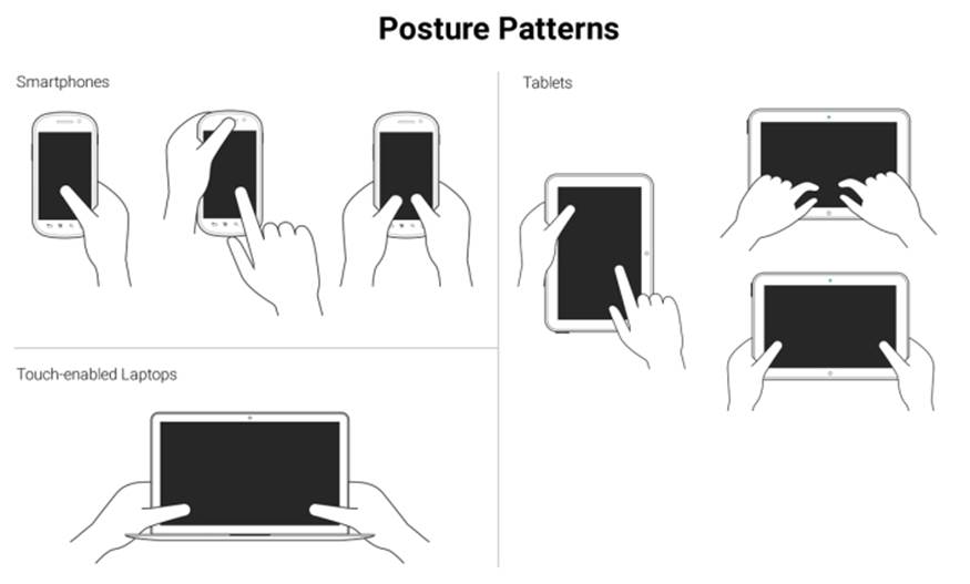
These patterns allow us to define the best way to lay out our content in order to be easily usable and accessible.
Understanding the posture patterns of our users will allow us to understand when our targets can be the right size or even a bit smaller if there isn't enough screen real estate, or a bit larger if precision is needed, since it's different when someone uses their thumbs as opposed to their index fingers.
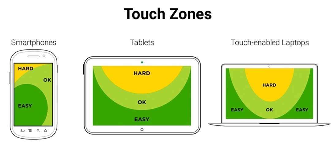
The touch zones
Luke also talks about touch zones, which are basically the areas of a device that are either easy or hard to reach, depending on the posture.
In all major styles of devices, smartphones, tablets and touch-enabled laptops, the ideal touch zones are in dark green, the ok touch zones are in lighter green, and the hard-to-reach zones are in yellow:
In RWD, it's a bit hard to drastically change the layout of a single page, let alone many pages (at least yet) like a standalone app, without an exorbitant amount of work. Also, there is a very high probability of negatively impacting the user experience and maintaining the content hierarchy.
RWD is strongly coupled with content strategy, so the content hierarchy needs to be preserved regardless of the device our site/app is being viewed on. We need to make sure the elements themselves are big enough for someone with large fingers to use properly. These elements are, to name a few, links, buttons, form fields, navigation items, controls of any sort like paginations, open/collapse controls in accordions, tab systems, and so on.
Now, there is one website/app element that is quite versatile in RWD: the menu button.
In order to trigger the navigation, there is a very particular element that the UX communities have very strong opinions about: The hamburger icon (≡). For now, we're going to call it something more generic: the nav icon. I'm calling it the nav icon because it doesn't necessarily have to be a hamburger icon/graphic, it can be another type of icon or a word.
The location, behavior, and design of the navigation icon and the navigation items themselves have as many variations as there are designers. What works for others may not necessarily work for us, and vice versa. So, testing becomes the go-to methodology to decide what our users feel comfortable with.
Nonetheless, there are a few UX guidelines for the nav icon that are worth mentioning and that we're going to see next.
The nav icon – basic guidelines to consider for RWD
The nav icon can be represented in many ways. RWD takes patterns from mobile apps since small screens apps and websites have many similar metaphors.
Let's take a look at the common navigation icon patterns:
· The hamburger icon.
· The word Menu.
· The hamburger icon plus the word Menu.
The hamburger icon
This is by far the most popular icon used to represent the navigation button: ≡.
The hamburger icon was created by Norm Cox in 1981. Norm's intention with this icon was to "…mimic the look of the resulting displayed menu list." (http://gizmodo.com/who-designed-the-iconic-hamburger-icon-1555438787).
In other words, the hamburger icon's real name is the list icon.
Now, if we think about it, the hamburger icon is semantically correct because it represents exactly what is displayed when it's triggered: a list of items. However, some UX studies have revealed that the hamburger icon isn't as effective as we may think, and yet we see it all over the place in both responsive sites and mobile apps.
Although the hamburger icon has several cons, it's a matter of time before practically everyone is able to recognize this icon as a representation of navigation.
The bottom line is that there's nothing wrong with using the hamburger icon as long as we follow the target size recommendations and make the links inside the navigation bar easy to tap on small screens.
The advantages are as follows:
· It's easily recognized by certain demographics, especially young ones.
· It takes up very little space in a design.
· It's not language dependent.
· It's easy to make using the Unicode character 2261 (≡), which has a global support of 96 percent.
The disadvantages are as follows:
· It's not easily recognized by some demographics, especially older ones.
· Although very popular, a lot of people have a hard time understanding that the hamburger icon represents a menu.
· It promotes low discoverability since a site's navigation will usually be hidden.
If you plan to use the hamburger icon, don't bother using images of any kind or any CSS techniques with borders or box shadows. Keep it simple. All you need to do is use the Unicode character 2261 (≡).
In the following examples, we are going to use a well-known technique to hide content (with a few variations to fit our demos): the Kellum Method. This method is not in any way a hack or anything similar; we are not trying to deceive our users or the search engines with this approach. We're actually being quite mindful of the improved accessibility the navigation icons gain by leaving the text in the markup so that users with assistive technologies can still access the menus. Consider the following example.
The HTML is as follows:
<button class="hamburger-icon"><span>Menu</span></button>SCSS
//Hamburger Icon
.hamburger-icon {
//Basic styling, modify if you want
font-size: 40px;
color: #666;
background: #efefef;
padding: 0 10px;
border-radius: 3px;
cursor: pointer;
//Hamburger Icon
&:before {
content: '≡';
}
//Hide the term Menu from displaying without sacrificing accessibility
span {
display: inline-block;
width: 0;
height: 0;
text-indent: -100%;
overflow: hidden;
white-space: nowrap;
}
}
The result is this one:

Tip
The word Menu should always be included in the markup for accessibility reasons. When users with assistive technology (AT) will focus on the hamburger icon, the screen reader will read the word Menu. Also, enclosing the word Menu in <span> tags allows us to hide the word from being displayed in the browser without hurting the accessibility of the link.
The word Menu
Some informal tests on the web have yielded that using the word Menu is the most trusted solution to the drawbacks of the hamburger icon.
However, it's important to note that the studies and tests done by many authors where they compare the hamburger icon versus the word Menu can be misleading, since they are testing different visual languages: an icon versus a word.
For these tests to be fully reliable, they would have to test icon versus icon, and word versus word. For example, testing the hamburger icon against an arrow pointing down or the word Menu against the word Nav.
Let's look at the pros and cons of the word Menu.
The advantages are as follows:
· It's self-explanatory.
· Virtually anyone from any demographic can understand what it means.
· It can be used in any language.
· It takes up very little space in the design.
The disadvantage is as follows:
· It may clash with an iconography system since it's a word.
Consider the following example.
Here's the HTML:
<button class="word-menu">Menu</button>
And here's the CSS:
//Word "Menu"
.word-menu {
//Basic styling, modify if you want
display: inline-block;
padding: 16px 8px;
color: #666;
font: 12px Arial, "Helvetica Neue", Helvetica, sans-serif;
background: #efefef;
border-radius: 3px;
cursor: pointer;
}
And this is the result:

Tip
In this example, I used the class name .word-menu to explicitly represent my intent for this book, but this is not the proper way to name your elements for production. Use more meaningful and universal naming conventions, for example, something like .menu-trigger could be an alternative. Using a generic class name will allow us to use any design for the navigation icon without altering the markup.
The hamburger icon plus the word Menu
One alternative to the hamburger icon versus the word Menu discussion is to use both at the same time. Some argue that we may get the best of both worlds by doing this.
The advantages are:
· It's self-explanatory.
· Virtually anyone from any demographic can understand what it means.
· It can be used in any language.
· It can still take up very little space in the design.
· It is easy to make using the Unicode character 2261 (≡), which has a global support of 96 percent.
The disadvantage is:
· Depending on the design, the word Menu could be too small.
Let's look at two styles that we can use to represent this pattern.
Consider the following example.
The HTML is as follows:
<button class="hamburger-icon-plus-menu style-1">Menu</button>
The SCSS is as follows:
//Hamburger Icon Plus Word "Menu" – Style 1
.hamburger-icon-plus-menu {
//Basic styling, modify if you want
display: inline-block;
font-family: Arial, "Helvetica Neue", Helvetica, sans-serif;
background: #efefef;
color: #666;
border-radius: 3px;
cursor: pointer;
}
.style-1 {
padding: 16px 8px;
font-size: 16px;
//Hamburger Icon
&:before {
content: '≡ ';
}
}
The result is as follows:

Tip
Notice the space after the '≡ ', that's what separates the icon from the word "Menu" without having to use margins of any kind.
Consider the following example.
The HTML is:
<button class="hamburger-icon-plus-menu style-2">Menu</button>
The SCSS is:
//Hamburger Icon plus Word "Menu" – Style 2
.hamburger-icon-plus-menu {
//Basic styling, modify if you want
display: inline-block;
font-family: Arial, "Helvetica Neue", Helvetica, sans-serif;
background: #efefef;
color: #666;
border-radius: 3px;cursor: pointer;
}
.style-2 {
padding: 4px 12px 6px;
font-size: 10px;
line-height: .8;
text-align: center;
//Hamburger Icon
&:before {
display: block;
content: '≡';
font-size: 40px;
}
}
And here's the result:

You can see a demo I created in CodePen at http://codepen.io/ricardozea/pen/f4ddc6443bc060004b58a7301aae83db.
The navigation patterns for RWD
One of the most mystifying features of RWD is the navigation. It can be as simple or as complex as we want it to be.
In this section, I'm going to show you how to build three commonly used navigation patterns:
· Toggle navigation: This is based on Brad Frost's Toggle Menu demo (http://codepen.io/bradfrost/pen/sHvaz/).
· Off-Canvas or Off-Screen navigation: This is based on Austin Wulf's SitePoint Pure CSS Off-Screen Navigation Menu demo (http://codepen.io/SitePoint/pen/uIemr/).
· Flexbox-based navigation: This is our custom solution.
Before we look at the details of each, let's clarify a few features about the mentioned patterns:
Design
On small screens, all navigation patterns use the hamburger icon as a trigger except the Flexbox-based navigation. On large screens, the navigation bar on all examples is a horizontal group of links with centered links.
To improve usability in both the Toggle and the Off-Canvas navigations, the hamburger icon gets the class .active added/removed to offer a visual cue showing that the item has been tapped. This is done with a bit of jQuery.
Including jQuery is part of these demos, so it's necessary to call it for them to work.
Scope
The markup shown is only for the menu itself, elements and directives such as the <html> tag and HTML5 Doctype have been purposely left out.
The examples work in all major browsers that have support for relatively advanced CSS3 properties. They don't use the FastClick script to remove the 300 ms delay that mobile devices have by default.
Vendor prefixes have been left out; after all, we should be using Autoprefixer to handle this for us.
Third-party demos
Since there's no need to reinvent the wheel, the following examples are based on other authors' demos, such as the ones by Brad Frost and Austin Wulf.
However, all original demos have been forked and extensively scaled, enhanced, cleaned up, optimized, restyled, and ported to Sass in order to fit the scope and style of this book. In other words, the markup and code you'll see has been heavily customized exclusively for you.
Let's begin.
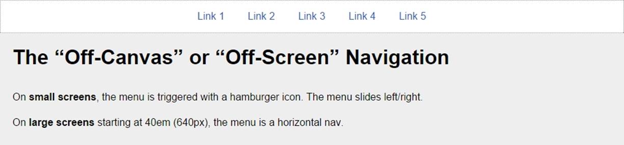
The Off-Canvas or Off-Screen navigation
This is by far the most commonly used pattern for navigation both in RWD and mobile apps. It uses the hamburger icon as the trigger for the menu when tapped/clicked. When this happens, the main container slides to the right to reveal the menu on the left and slides back again to the left to hide it.
This example does not depend on JavaScript to work. However, it uses a few unsemantic elements to make it work: the <input> and <label> elements. In defense of this method, it uses the :checked pseudo-class, which has perfect support across the board.
Here's our HTML:
<!DOCTYPE html>
<html>
<head>
<meta charset="UTF-8">
<meta name="viewport" content="width=device-width, initial-scale=1">
<script src="https://ajax.googleapis.com/ajax/libs/jquery/2.1.3/jquery.min.js"></script>
</head>
<body>
<!-- Checkbox whose checked/unchecked states trigger the navigation -->
<input type="checkbox" id="nav-trigger" class="nav-trigger">
<!-- Hamburger icon -->
<label for="nav-trigger" class="label-trigger"><span>Menu</span></label>
<!-- Navigation -->
<nav role="navigation">
<ul class="menu">
<li><a href="#">Link 1</a></li>
<li><a href="#">Link 2</a></li>
<li><a href="#">Link 3</a></li>
<li><a href="#">Link 4</a></li>
<li><a href="#">Link 5</a></li>
</ul>
</nav>
<!-- Main container -->
<main class="main-container" role="main">
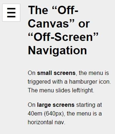
<h1>The "Off-Canvas" or "Off-Screen" Navigation</h1>
<p>On <strong>small screens</strong>, the menu is triggered with a hamburger icon. The menu slides left/right.</p>
<p>On <strong>large screens</strong> starting at 40em (640px), the menu is a horizontal nav.</p>
</main>
</body>
</html>
And here's our SCSS:
*, *:before, *:after { box-sizing: border-box; }
//Globals
html, body {
height: 100%;
width: 100%;
margin: 0;
}
//Mobile-first Media Query Mixin
@mixin forLargeScreens($media) {
@media (min-width: $media/16+em) { @content; }
}
//Mixin for animating the hamburger icon
@mixin animation-nav-icon ( $direction: left, $duration: .2s) {
transition: $direction $duration;
}
//Menu itself
.menu {
width: 100%;
height: 100%;
margin: 0;
padding: 0;
position: fixed;
top: 0;
right: 0;
bottom: 0;
left: 0;
z-index: 0;
list-style: none;
@include forLargeScreens(640) {
max-width: 980px;
min-height: 50%;
margin: 10px auto 0;
position: relative;
text-align: center;
border: #999 1px dotted;
}
//List items
li {
width: 100%;
border-bottom: 1px dotted #999;
@include forLargeScreens(640) {
display: inline;
border: none;
}
//Links themselves
a {
display: block;
padding: 1em;
color: #2963BD;
text-decoration: none;
@include forLargeScreens(640) {
display: inline-block;
}
}
}
}
//Main Container
.main-container {
max-width: 980px;
min-height: 100%;
margin: auto;
padding: 20px 0 20px 80px;
position: relative;
top: 0;
bottom: 100%;
left: 0;
z-index: 1;
background: #eee;
@include forLargeScreens(640) {
padding: 20px;
}
}
//Navigation Trigger - Hide the checkbox
.nav-trigger {
position: absolute;
clip: rect(0, 0, 0, 0);
}
//Label that triggers the checkbox
.label-trigger {
position: fixed;
left: 10px;
top: 10px;
z-index: 2;
height: 50px;
width: 50px;
cursor: pointer;
background: #fff;
border-radius: 2px;
border: 1px solid #ccc;
//Hamburger icon
&:before {
display: block;
padding-top: 25px;
text-align: center;
content: '≡';
font-size: 3em;
line-height: 0;
}
//Active hamburger icon
&.active {
background: #333;
color: #fff;
}
//Hide the term 'Menu' from displaying without sacrificing accessibility
span {
display: inline-block;
text-indent: -100%;
overflow: hidden;
white-space: nowrap;
}
}
//Animate the menu
.nav-trigger {
& + label {
@include animation-nav-icon;
//Hide the checkbox and label in large screens
@include forLargeScreens(640) {
display: none;
}
}
//Animate the label when checkbox is checked
&:checked + label {
left: 215px;
}
//Animate the main container when checkbox is checked
&:checked ~ .main-container {
left: 200px;
box-shadow: 0 0 5px 1px rgba(black, .15);
}
}
//Animate the main container
.main-container {
@include animation-nav-icon;
}
//Avoid horizontal scrollbars due to repositioning of elements
body, html { overflow-x: hidden; }
//Styling stuff not needed for demo
html, body { font-family: Arial, "Helvetica Neue", Helvetica, sans-serif; }
h1, p { margin: 0 auto 1em; }
p { line-height: 1.5; }
Here's the jQuery script:
$(function() {
//Set up the click behavior
$(".label-trigger").click(function() {
//Toggle the class .active on the hamburger icon
$(this).toggleClass("active");
});
});
Let's take a look at the screenshots.
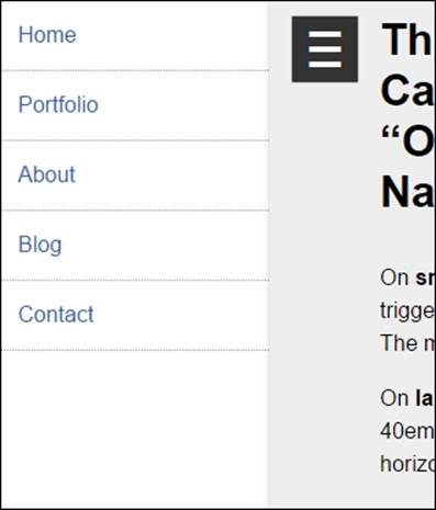
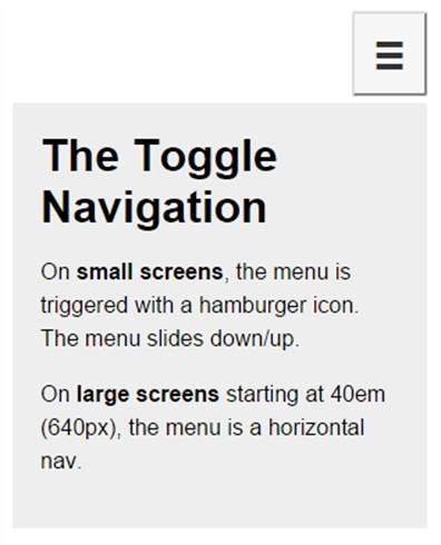
Here is what it looks like on small screens in the collapsed state:
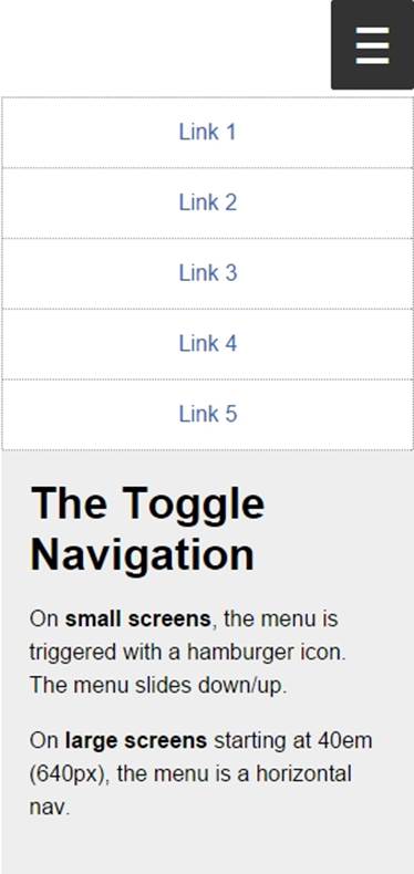
Here is what it looks like in the expanded state:
This is what it looks like on large screens:
You can see a demo I created in CodePen at http://codepen.io/ricardozea/pen/fd504cbcf362069320d15a4ea8a88b27.
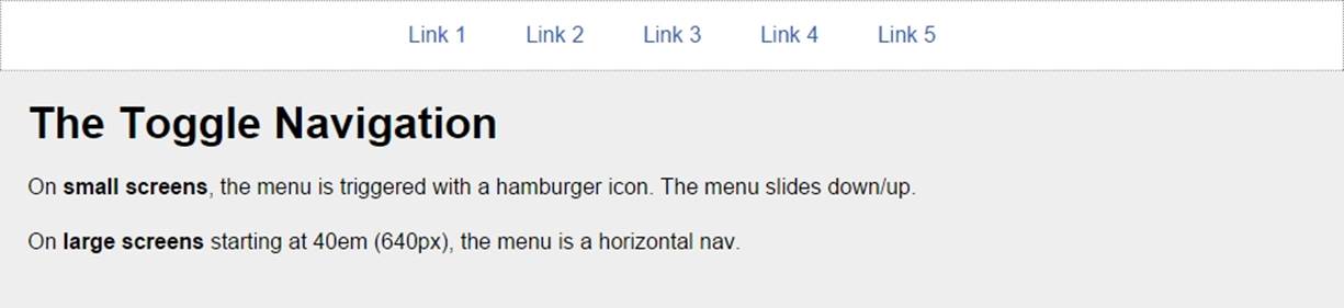
The Toggle navigation
In the Toggle pattern, when the hamburger icon is tapped or clicked, the navigation bar slides down and the links are stacked. The navigation bar collapses when the hamburger icon is tapped again.
The HTML is as follows:
<!DOCTYPE html>
<html>
<head>
<meta charset="UTF-8">
<meta name="viewport" content="width=device-width, initial-scale=1">
<script src="https://ajax.googleapis.com/ajax/libs/jquery/2.1.3/jquery.min.js"></script>
</head>
<body>
<!-- Hamburger icon -->
<button class="menu-link"><span>Menu</span></button>
<!-- Navigation -->
<nav id="menu" class="menu" role="navigation">
<ul>
<li><a href="#">Link 1</a></li>
<li><a href="#">Link 2</a></li>
<li><a href="#">Link 3</a></li>
<li><a href="#">Link 4</a></li>
<li><a href="#">Link 5</a></li>
</ul>
</nav>
<!-- Main container -->
<main class="main-container" role="main">
<h1>The Toggle Navigation</h1>
<p>On <strong>small screens</strong>, the menu is triggered with a hamburger icon. The menu slides down/up.</p>
<p>On <strong>large screens</strong> starting at 40em (640px), the menu is a horizontal nav.</p>
</main>
</body>
</html>
The SCSS is as follows:
*, *:before, *:after { box-sizing: border-box; }
//Mobile-first Media Query Mixin
@mixin forLargeScreens($media) {
@media (min-width: $media/16+em) { @content; }
}
//General Styling
.main-container, .menu {
width: 98%;
max-width: 980px;
margin: auto;
padding: 20px;
background: #eee;
}
//Link that triggers the menu
.menu-link {
//Change to float: left; if you want the hamburger menu on the left side
float: right;
margin: 0 1% 5px 0;
padding: 1.5em 1em 1em;
background: #f6f6f6;
line-height: 0;
text-decoration: none;
color: #333;
border-radius: 2px;
cursor: pointer;
//Hamburger icon
&:before {
display: block;
padding: 10px 0;
content: '≡';
font-size: 3em;
line-height: 0;
}
//Active hamburger icon
&.active {
background: #333;
color: #fff;
}
//Hide the term 'Menu' from displaying without sacrificing accessibility
span {
display: inline-block;
text-indent: -100%;
overflow: hidden;
white-space: nowrap;
}
//On large screens hide the menu trigger
@include forLargeScreens(640) {
display: none;
}
}
//If JavaScript is available, hide the menu.
.js .menu {
overflow: hidden;
max-height: 0;
@include forLargeScreens(640) {
max-height: inherit;
}
}
//Menu itself
.menu {
padding: 0;
clear: both;
transition: all .3s ease-out;
//Define height of the menu
&.active {
max-height: 17em;
}
//Normalize the unordered list and add a bit of styling
ul {
margin: 0;
padding: 0;
list-style-type: none;
border: 1px #999 dotted;
border-bottom: none;
text-align: center;
//In large screens remove the border
@include forLargeScreens(640) {
background: #fff;
}
}
//List items
li {
//Links themselves
a {
display: block;
padding: 1em;
border-bottom: 1px #999 dotted;
text-decoration: none;
color: #2963BD;
background: #fff;
@include forLargeScreens(640) {
border: 0;
background: none;
}
}
//On large screens make links horizontal
@include forLargeScreens(640) {
display: inline-block;
margin: 0 .20em;
}
}
}
//Styling stuff not needed for demo
body { font-family: Arial, "Helvetica Neue", Helvetica, sans-serif; }
p { line-height: 1.5; }
h1 { margin: 0; }
The jQuery is as follows:
$(function() {
//Add class .js to the body if JS is enabled
$("body").addClass("js");
//Set up the click behavior
$(".menu-link").click(function() {
//Toggle the class .active on the hamburger icon
$(this).toggleClass("active");
//Toggle the class .active on the menu to make it slide down/up
$(".menu").toggleClass("active");
});
});
Let's take a look at the screenshots.
Here is what it looks like on small screens in the collapsed state:
And here is the expanded state:
Here is what it looks like on large screens:
You can see a demo I created in CodePen at http://codepen.io/ricardozea/pen/e91a5e6ea456d41f4128d9bd405ccaa0.
You can also visit http://responsive-nav.com/ for a nice Toggle navigation functionality.
The Flexbox-based navigation
This custom solution using Flexbox is incredibly versatile and it doesn't necessarily require the use of media queries. The other two menu solutions (Toggle navigation and Off-Canvas navigation) do require media queries.
With this solution, the menu items adapt to the available space, making the target zones as large as possible, automatically enhancing the usability of the menu. Another major plus of this Flexbox-based solution is that it's not JavaScript dependent.
This is the HTML:
<!DOCTYPE html>
<html>
<head>
<meta charset="UTF-8">
<meta name="viewport" content="width=device-width, initial-scale=1">
</head>
<body>
<nav role="navigation">
<ul class="menu">
<li><a href="#">Link 1</a></li>
<li><a href="#">Link 2</a></li>
<li><a href="#">Link 3</a></li>
<li><a href="#">Link 4</a></li>
<li><a href="#">Link 5</a></li>
</ul>
</nav>
<!-- Main container -->
<main class="main-container" role="main">
<h1>The Flexbox-based Navigation</h1>
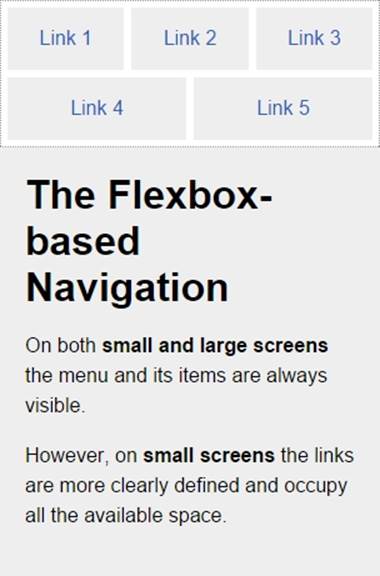
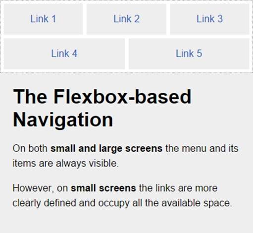
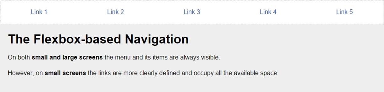
<p>On both <strong>small and large screens</strong> the menu and its items are always visible.</p>
<p>However, on <strong>small screens</strong> the links are more clearly defined and occupy all the available space.</p>
</main>
</body>
</html>
And now the SCSS:
*, *:before, *:after { box-sizing: border-box; }
//Mobile-first Media Query Mixin
@mixin forLargeScreens($media) {
@media (min-width: $media/16+em) { @content; }
}
//Menu itself
.menu {
display: flex;
flex-wrap: wrap;
justify-content: space-around;
max-width: 980px;
margin: auto;
padding: 2px;
list-style: none;
border: #999 1px dotted;
//List items
li {
//Expand to use any available space
flex-grow: 1;
margin: 3px;
text-align: center;
flex-basis: 100%;
@include forLargeScreens(320) {
flex-basis: 30%;
}
@include forLargeScreens(426) {
flex-basis: 0;
}
//Links themselves
a {
display: block;
padding: 1em;
color: #2963bd;
text-decoration: none;
background: #eee;
@include forLargeScreens(426) {
background: none;
}
}
}
}
//Main Container
.main-container {
max-width: 980px;
margin: auto;
padding: 20px;
background: #eee;
}
//Styling stuff not needed for demo
body { margin: 8px; font-family: Arial, "Helvetica Neue", Helvetica, sans-serif; }
p { line-height: 1.5; }
h1 { margin: 0; }
Let's take a look at the screenshots.
Here is what it looks like on small screens (320px):
Here is what it looks like on small screens (426px):
Here is what it looks like on a large screens (980px):
You can see a demo I created in CodePen at http://codepen.io/ricardozea/pen/022b38c6c395368ec4befbf43737e398.
Summary
We are now halfway through mastering RWD with HTML5 and CSS3. What a milestone! A huge thanks for coming this far!
RWD is clearly more than media queries, Sass mixins, and CSS grids. It's also about understanding the different sizes of our target zones, the location of our controls (links, buttons, form fields, and so on), and the touch zones in different devices.
There will always be different approaches to creating a menu button, just make sure the functionalities never break on any screen size. Once we defined the style of our menu button, we defined which navigation pattern would work best for our content and our users.
There isn't really one single, best solution for menu button or navigation pattern; it all depends on each project's specific conditions. What I do recommend is that whatever you build, make sure you always maintain a high level of browser support, scalability, and performance, so that the users can have a great experience and the client/company can meet its goals.
Now that we are talking about performance, in the next chapter we're going to talk about the "ugly child" of RWD: images.
Let's dance!