HTML5: The Missing Manual Matthew MacDonald (2013)
Part 1. Modern Markup
Chapter 2. Structuring Pages with Semantic Elements
Over the two decades that the Web’s been around, websites have changed dramatically. But the greatest surprise isn’t how much the Web has changed, but how well ancient HTML elements have held up. In fact, web developers use the same set of elements to build today’s modern sites that they used to build their predecessors 10 years ago.
One element in particular—the humble <div> (or division)—is the cornerstone of nearly every modern web page. Using <div> elements, you can carve an HTML document into headers, side panels, navigation bars, and more. Add a healthy pinch of CSS formatting, and you can turn these sections into bordered boxes or shaded columns, and place each one exactly where it belongs.
This <div>-and-style technique is straightforward, powerful, and flexible, but it’s not transparent. When you look at someone else’s markup, you have to put some effort into figuring out what each <div> represents and how the whole page fits together. To make sense of it all, you need to jump back and forth among the markup, the style sheet, and the displayed page in the browser. And you’ll face this confusion every time you crack open anyone else’s halfway-sophisticated page, even though you’re probably using the same design techniques in your own websites.
This situation got people thinking. What if there was a way to replace <div> with something better? Something that worked like <div>, but conveyed a bit more meaning. Something that might help separate the sidebars from the headers and the ad bars from the menus. HTML5 fulfills this dream with a set of new elements for structuring pages.
TIP
If your CSS skills are so rusty that you need a tetanus shot before you can crack open a style sheet, then you’re not quite ready for this chapter. Fortunately, Appendix A, has a condensed introduction that covers the fundamentals.
Introducing the Semantic Elements
To improve the structure of your web pages, you need HTML5’s semantic elements. These elements give extra meaning to the content they enclose. For example, the new <time> element flags a valid date or time in your web page. Here’s an example of the <time> element at its very simplest:
Registration begins on <time>2014-11-25</time>.
And this is what someone sees when viewing the page:
Registration begins on 2014-11-25.
The important thing to understand is that the <time> element doesn’t have any built-in formatting. In fact, the web page reader has no way of knowing that there’s an extra element wrapping the date. You can add your own formatting to the <time> element using a style sheet, but by default, the text inside a <time> element is indistinguishable from ordinary text.
The <time> element is designed to wrap a single piece of information. However, most of HTML5’s semantic elements are designed to identify larger sections of content. For example, the <nav> element identifies a set of navigation links. The <footer> element wraps the footer that sits at the bottom of a page. And so on, for a dozen (or so) new elements.
NOTE
Although semantic elements are the least showy of HTML5’s new features, they’re one of the largest. In fact, the majority of the new elements in HTML5 are semantic elements.
All the semantic elements share a distinguishing feature: They don’t really do anything. By contrast, the <video> element, for example, embeds a fully capable video player in your page (Automatic Playback). So why bother using all these new elements that don’t change the way your web page looks?
There are several good reasons:
§ Easier editing and maintenance. It can be difficult to interpret the markup in a traditional HTML page. To understand the overall layout and the significance of various sections, you’ll often need to scour a web page’s style sheet. But by using HTML5’s semantic elements, you provide extra structural information in the markup. That makes your life easier when you need to edit the page months later, and it’s even more important if someone else needs to revise your work.
§ Accessibility. One of the key themes of modern web design is making accessible pages—that is, pages that people can navigate using screen readers and other assistive tools. Accessibility tools that understand HTML5 can provide a far better browsing experience for disabled visitors. (For just one example, imagine how a screen reader can home in on the <nav> sections to quickly find the navigation links for a website.)
TIP
To learn more about the best practices for web accessibility, you can visit the WAI (Web Accessibility Initiative) website at www.w3.org/WAI. Or, to get a quick look at what life is like behind a screen reader (and to learn why properly arranged headings are so important), check out the YouTube video at http://tinyurl.com/6bu4pe.
§ Search-engine optimization. Search engines like Google use powerful search bots—automated programs that crawl the Web and fetch every page they can—to scan your content and index it in their search databases. The better Google understands your site, the better the chance that it can match a web searcher’s query to your content, and the better the chance that your website will turn up in someone’s search results. Search bots already check for some of HTML5’s semantic elements to glean more information about the pages they’re indexing.
§ Future features. New browsers and web editing tools are sure to take advantage of semantic elements. For example, a browser could provide an outline that lets visitors jump to the appropriate section in a page. (In fact, Chrome already has a plug-in that does exactly that—see The HTML5 Outlining System.) Similarly, web design tools can include features that let you build or edit navigation menus by managing the content you’ve placed in the <nav> section.
The bottom line is this: If you can apply the semantic elements correctly, you can create cleaner, clearer pages that are ready for the next wave of browsers and web tools. But if your brain is still tied up with the old-fashioned practices of traditional HTML, the future may pass you by.
Retrofitting a Traditional HTML Page
The easiest way to introduce yourself to the new semantic elements—and to learn how to use them to structure a page—is to take a classic HTML document and inject it with some HTML5 goodness. Figure 2-1 shows the first example you’ll tackle. It’s a simple, standalone web page that holds an article, although other types of content (like a blog posting, a product description, or a short story) would work equally well.
TIP
You can view or download the example in Figure 2-1 from the try-out site at http://prosetech.com/html5, along with all the examples for this chapter. Start with ApocalypsePage_Original.html if you’d like to try to remodel the HTML yourself, or ApocalypsePage_Revised.html if you want to jump straight to the HTML5-improved final product.
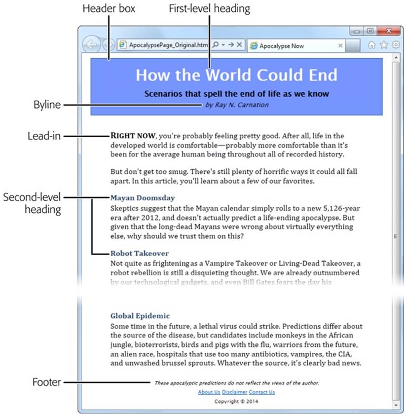
Figure 2-1. This ordinary HTML page has a basic, document-like structure. A linked style sheet provides all the formatting.
Page Structure the Old Way
There are a number of ways to format a page like the one shown in Figure 2-1. Happily, this example uses HTML best practices, which means the markup doesn’t have a lick of formatting logic. There are no bold or italic elements, no inline styles, and certainly nothing as hideous as the obsolete <font> element. Instead, it’s a neatly formatted document that’s bound to an external style sheet.
Here’s a shortened version of the markup, which highlights where the document plugs into its style sheet:
<div class="Header">
<h1>How the World Could End</h1>
<p class="Teaser">Scenarios that spell the end of life as we kno
w it</p>
<p class="Byline">by Ray N. Carnation</p>
</div>
<div class="Content">
<p><span class="LeadIn">Right now
</span>, you're probably ...</p>
<p>...</p>
<h2>Mayan Doomsday</h2>
<p>Skeptics suggest ...</p>
...
</div>
<div class="Footer">
<p class="Disclaimer">These apocalyptic predictions ...</p>
<p>
<a href="AboutUs.html">About Us</a>
...
</p>
<p>Copyright © 2014</p>
</div>
UP TO SPEED: WHAT ARE THESE DOTS (…)?
This book can’t show you the full markup for every example—at least not without expanding itself to 12,000 pages and wiping out an entire old-growth forest. But it can show you basic structure of a page and all its important elements. To do that, many of the examples in this book use an ellipsis (a series of three dots) to show where some content has been left out.
For example, consider the markup shown above on this page. It includes the full body of the page shown in Figure 2-2, but it leaves out the full text of most paragraphs, most of the article after the “Mayan Doomsday” heading, and the full list of links in the footer. But, as you know, you can pore over every detail by examining the sample files for this chapter on the try-out site (http://prosetech.com/html5).
In a well-written, traditional HTML page (like this one), most of the work is farmed out to the style sheet using the <div> and <span> containers. The <span> lets you format snippets of text inside another element. The <div> allows you to format entire sections of content, and it establishes the overall structure of the page (Figure 2-2).
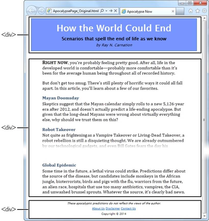
Figure 2-2. The <div> elements carve this page into three logical sections: the header at the top, the content that follows, and the footer at the bottom.
Here, the style sheet formatting tasks are simple. The entire page is given a maximum width (800 pixels) to prevent really long text lines on widescreen monitors. The header is put in a bordered blue box. The content is padded on either side, and the footer is centered at the bottom of the page.
Thanks to the <div>, formatting is easy. For example, the ApocalypsePage_Original.css style sheet uses the following rules to format the header box and the content inside:
/* Format the <div> that represents the header (as a blue, bordered box). */
.Header {
background-color: #7695FE;
border: thin #336699 solid;
padding: 10px;
margin: 10px;
text-align: center;
}
/* Format any <h1> headings in the header <div> (that's the article title). */
.Header h1 {
margin: 0px;
color: white;
font-size: xx-large;
}
/* Format the subtitle in the header <div>. */
.Header .Teaser {
margin: 0px;
font-weight: bold;
}
/* Format the byline in the header <div>. */
.Header .Byline {
font-style: italic;
font-size: small;
margin: 0px;
}
You’ll notice that this example makes good use of contextual selectors (Multiple Selectors). For example, it uses the selector .Header h1 to format all <h1> elements in the header box.
TIP
This example is also described in the CSS review in Appendix A. If you’d like to take a detailed walk through the style sheet rules that format each section, flip to A Style Sheet Tour.
Page Structure with HTML5
The <div> element is still a staple of web design. It’s a straightforward, all-purpose container that you can use to apply formatting anywhere you want in a web page. The limitation of the <div> is that it doesn’t provide any information about the page. When you (or a browser, or a design tool, or a screen reader, or a search bot) come across a <div>, you know that you’ve found a separate section of the page, but you don’t know the purpose of that section.
To improve this situation in HTML5, you can replace some of your <div> elements with more descriptive semantic elements. The semantic elements behave exactly like <div> elements: They group a block of markup, they don’t do anything on their own, and they give you a styling hook that lets you apply formatting. However, they also give your page a little more semantic smarts.
Here’s a quick revision of the article shown in Figure 2-1. It removes two <div> elements and adds two semantic elements from HTML5: <header> and <footer>.
<header class="Header">
<h1>How the World Could End</h1>
<p class="Teaser">Scenarios that spell the end of life as we know it</p>
<p class="Byline">by Ray N. Carnation</p>
</header>
<div class="Content">
<p><span class="LeadIn">Right now</span>, you're probably ...</p>
<p>...</p>
<h2>Mayan Doomsday</h2>
<p>Skeptics suggest ...</p>
...
</div>
<footer class="Footer">
<p class="Disclaimer">These apocalyptic predictions ...</p>
<p>
<a href="AboutUs.html">About Us</a>
...
</p>
<p>Copyright © 2014</p>
</footer>
In this example, the <header> and <footer> elements take the place of the <div> elements that were there before. Web developers who are revising a large website might start by wrapping the existing <div> elements in the appropriate HTML5 semantic elements.
You’ll also notice that the <header> and <footer> elements in this example still use the same class names. This way, you don’t need to change the original style sheet. Thanks to the class names, the style sheet rules that used to format the <div> elements now format the <header> and<footer> elements.
However, you might feel that the class names seem a bit redundant. If so, you can leave them out, like this:
<header>
<h1>How the World Could End</h1>
<p class="Teaser">Scenarios that spell the end of life as we know it</p>
<p class="Byline">by Ray N. Carnation</p>
</header>
To make this work, you need to alter your style sheet rules so they apply themselves by element name. This works for the header and footer, because the current page has just a single <header> element and a single <footer> element.
Here’s the revised style sheet that applies its formatting to the <header> element:
/* Format the <header> (as a blue, bordered box.) */
header {
...
}
/* Format any <h1> headings in the <header> (that's the article title). */
header h1 {
...
}
/* Format the subtitle in the <header>. */
header .Teaser {
...
}
/* Format the byline in the <header>. */
header .Byline {
...
}
Both approaches are equally valid. As with many design decisions in HTML5, there are plenty of discussions but no hard rules.
You’ll notice that the <div> section for the content remains. This is perfectly acceptable, as HTML5 web pages often contain a mix of semantic elements and the more generic <div> containers. Because there’s no HTML5 “content” element, an ordinary <div> still makes sense.
NOTE
Left to its own devices, this web page won’t display correctly on versions of Internet Explorer before IE 9. To fix this issue, you need the simple workaround discussed on Browser Compatibility for the Semantic Elements. But first, check out a few more semantic elements that can enhance your pages.
Finally, there’s one more element worth adding to this example. HTML5 includes an <article> element that represents a complete, self-contained piece of content, like a blog posting or a news story. The <article> element includes the whole shebang, including the title, author byline, and main content. Once you add the <article> element to the page, you get this structure:
<article>
<header>
<h1>How the World Could End</h1>
...
</header>
<div class="Content">
<p><span class="LeadIn">Right now</span>, you're probably ...</p>
<p>...</p>
<h2>Mayan Doomsday</h2>
<p>Skeptics suggest ...</p>
...
</div>
</article>
<footer>
<p class="Disclaimer">These apocalyptic predictions ...</p>
...
</footer>
Figure 2-3 shows the final structure.
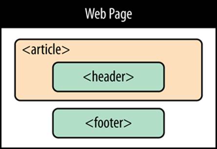
Figure 2-3. After the redesign, the page uses three of HTML5’s semantic elements. If the old structure said, “Here is a page with three sections,” then the new structure says, “Here is an article with a header, on a page with a footer.”
Although the web page still looks the same in the browser, there’s a fair bit of extra information lurking behind the scenes. For example, a search bot that stops by your site can quickly find your page’s content (that’s your article) and the title of that content (that’s the header). It won’t pay as much attention to the footer.
NOTE
Sometimes articles are split over several web pages. The current consensus of webheads is that each part of the article should be wrapped in its own <article> element, even though it’s not complete and self-contained. This messy compromise is just one of many that occur when semantics meet the practical, presentational considerations of the Web.
Adding a Figure with <figure>
Plenty of pages have images. But the concept of a figure is a bit different. The HTML5 specification suggests that you think of them much like figures in a book—in other words, a picture that’s separate from the text, yet referred to in the text.
Generally, you let figures float, which means you put them in the nearest convenient spot alongside your text, rather than lock them in place next to a specific word or element. Often, figures have captions that float with them.
The following example shows some HTML markup that adds a figure to the apocalyptic article. It also includes the paragraph that immediately precedes the figure and the one that follows it, so you can see exactly where the figure is placed in the markup.
<p><span class="LeadIn">Right now</span>, you're probably ...</p>
<div class="FloatFigure">
<img src="human_skull.jpg" alt="Human skull">
<p>Will you be the last person standing if one of these apocalyptic
scenarios plays out?</p>
</div>
<p>But don't get too smug ...</p>
This markup assumes that you’ve created a style sheet rule that positions the figure (and sets margins, controls the formatting of the caption text, and optionally draws a border around it). Here’s an example:
/* Format the floating figure box. */
.FloatFigure {
float: left;
margin-left: 0px;
margin-top: 0px;
margin-right: 20px;
margin-bottom: 0px;
}
/* Format the figure caption text. */
.FloatFigure p {
max-width: 200px;
font-size: small;
font-style: italic;
margin-bottom: 5px;
}
Figure 2-4 shows this example at work.
If you’ve created this sort of figure before, you’ll be interested to know that HTML5 provides new semantic elements that are tailor-made for this pattern. Instead of using a boring <div> to hold the figure box, you use a <figure> element. And if you have any caption text, you put that in a<figcaption> element inside the <figure>:
<figure class="FloatFigure">
<img src="human_skull.jpg" alt="Human skull">
<figcaption>Will you be the last person standing if one of these
apocalyptic scenarios plays out?</figcaption>
</figure>
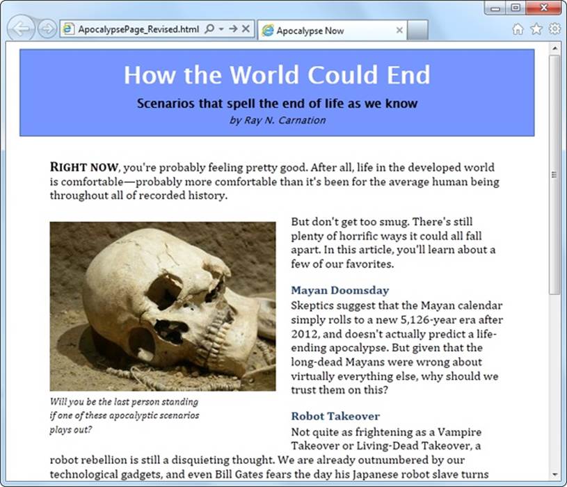
Figure 2-4. Now a figure graces the article. In the markup, it’s defined just after the first paragraph, so it floats to the left of the following text. Notice that the width of the caption is limited, to create a nice, packed paragraph.
Of course it’s still up to you to use a style sheet to position and format your figure box. In this example, you need to change the style rule selector that targets the caption text. Right now it uses .FloatFigure p, but the revised example requires .FloatFigure figcaption.
TIP
In this example, the <figure> element still gets its formatting based on its class name (FloatFigure), not its element type. That’s because you’re likely to format figures in more than one way. For example, you might have figures that float on the left, figures that float on the right, ones that need different margin or caption settings, and so on. To preserve this sort of flexibility, it makes sense to format your figures with classes.
In the browser, the figure still looks the same. The difference is that the purpose of your figure markup is now perfectly clear. (Incidentally, <figcaption> isn’t limited to holding text—you can use any HTML elements that make sense. Other possibilities include links and tiny icons.)
Finally, it’s worth noting that in some cases the figure caption may include a complete description of the image, rendering the alt text redundant. In this situation, you can remove the alt attribute from the <img> element:
<figure class="FloatFigure">
<img src="human_skull.jpg">
<figcaption>A human skull lies on the sand</figcaption>
</figure>
Just make sure you don’t set the alternate text with an empty string, because that means your image is purely presentational and screen readers should avoid it altogether.
Adding a Sidebar with <aside>
The new <aside> element represents content that is tangentially related to the text that surrounds it. For example, you can use an <aside> in the same way you use a sidebar in print—to introduce a related topic or to expand on a point that’s raised in the main document. (See, for instance, the box at the bottom of Adding a Sidebar with <aside>.) The <aside> element also makes sense if you need somewhere to stash a block of ads, some related content links, or even a pull-quote like the one shown in Figure 2-5.
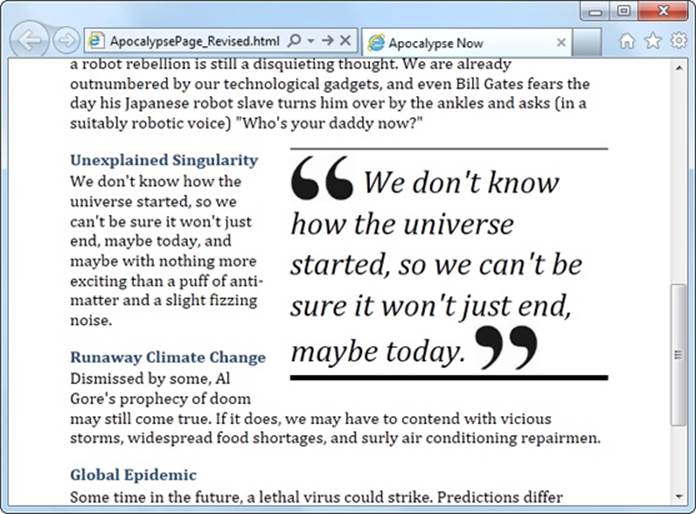
Figure 2-5. A pull-quote is a technique borrowed from print. It attracts the reader’s attention and highlights important content.
You can easily create this effect with the well-worn <div> element, but the <aside> element gives you a more meaningful way to mark up the same content:
<p>... (in a suitably robotic voice) "Who's your daddy now?"</p>
<aside class="PullQuote">
<img src="quotes_start.png" alt="Quote">
We don't know how the universe started, so we can't be sure it won't
just end, maybe today.
<img src="quotes_end.png" alt="End quote">
</aside>
<h2>Unexplained Singularity</h2>
This time, the style sheet rule floats the pull-quote to the right. Here are the styling details, just in case you’re curious:
.PullQuote {
float: right;
max-width: 300px;
border-top: thin black solid;
border-bottom: thick black solid;
font-size: 30px;
line-height: 130%;
font-style: italic;
padding-top: 5px;
padding-bottom: 5px;
margin-left: 15px;
margin-bottom: 10px;
}
.PullQuote img {
vertical-align: bottom;
}
UP TO SPEED: HOW THE SEMANTIC ELEMENTS WERE CHOSEN
Before inventing HTML5, its creators took a long look at the current crop of web pages. And they didn’t just browse through their favorite sites; instead, they reviewed the Google-crunched statistics for over a billion web pages. (You can see the results of this remarkable survey at http://tinyurl.com/state-of-the-web.)
The Google survey analyzed the markup and compiled a list of the class names web authors were using in their pages. Their idea was that the class name might betray the purpose of the element and give a valuable clue about the way people were structuring pages. For example, if everyone has a <div> element that uses a class named header, then it’s logical to assume everyone is putting headers at the tops of their web pages.
The first thing that Google found is that the vast majority of pages didn’t use class names (or style sheets at all). Next, they compiled a short list of the most commonly used class names. Some of the most popular names were footer, header, title, menu, nav—which correspond well to HTML5’s new semantic elements <footer>, <header>, and <nav>. A few others suggest possible semantic elements that haven’t been created yet, like search and copyright.
In other words, the Web is awash with the same basic designs—for example, pages with headers, footers, sidebars, and navigation menus. But everyone has a slightly different way of doing more or less the same thing. From this realization, it’s just a small leap to decide that the HTML language could be expanded with a few new elements that capture the semantics of what everyone is already doing. And this is exactly the insight that inspired HTML5’s semantic elements.
Browser Compatibility for the Semantic Elements
So far, this exercise has been a lot of fun. But the best-structured page is useless if it won’t work on older browsers.
Fortunately, HTML5’s semantic elements are broadly supported on all modern browsers. It’s almost impossible to find a version of Chrome, Firefox, Safari, or Opera that doesn’t recognize them. The chief stumbling block is any version of Internet Explorer before IE 9, including the still-kicking IE 8.
Fortunately, this is one missing feature that’s easy to patch up. After all, the semantic elements don’t actually do anything. To support them, a browser simply needs to treat them like an ordinary <div> element. And to make that happen, all you need to do is fiddle with their styles, as described in the following sections. Do that, and you’ll be rewarded with super-reliable semantic elements that work with any browser that’s been released in the last 10 years.
NOTE
If you’re already using Modernizr (Feature Detection with Modernizr), your pages are automatically immunized against semantic element issues, and you can safely skip the following discussion. But if you aren’t using Modernizr, or if you’re curious about how this fix works, read on.
Styling the Semantic Elements
When a browser meets an element it doesn’t recognize, it treats it as an inline element. Most of HTML5’s semantic elements (including all the ones you’ve seen in this chapter, except <time>) are block elements, which means the browser is supposed to render them on a separate line, with a little bit of space between them and the preceding and following elements.
Web browsers that don’t recognize the HTML5 elements won’t know to display some of them as block elements, so they’re likely to end up in a clumped-together mess. To fix this problem, you simply need to add a new rule to your style sheet. Here’s a super-rule that applies block display formatting to the nine HTML5 elements that need it in one step:
article, aside, figure, figcaption, footer, header, main, nav, section,
summary {
display: block;
}
This style sheet rule won’t have any effect for browsers that already recognize HTML5, because the display property is already set to block. And it won’t affect any style rules you already use to format these elements. They will still apply in addition to this rule.
Using the HTML5 Shiv
That technique described in the previous section is enough to solve compatibility issues in most browsers, but “most” doesn’t include Internet Explorer 8 and older. Old versions of IE introduce a second challenge: They refuse to apply style sheet formatting to elements they don’t recognize. Fortunately, there is a workaround: You can trick IE into recognizing a foreign element by registering it with a JavaScript command. For example, here’s a script block that gives IE the ability to recognize and style the <header> element:
<script>
document.createElement('header')
</script>
Rather than write this sort of code yourself, you can find a ready-made script that does it for you. You simply need to add a reference to it in the <head> section of your page, like this:
<head>
<title>...</title>
<script src="http://html5shim.googlecode.com/svn/trunk/html5.js">
</script>
...
<head>
This code grabs the script from the html5shim.googlecode.com web server and runs it before the browser starts processing the rest of the page. This script uses the JavaScript described above to create all the new HTML5 elements and goes one step further, by dynamically applying the styles described on Browser Compatibility for the Semantic Elements, to make sure the new elements display as proper block elements. The only remaining task is for you to use the elements and add your own style sheet rules to format them.
Incidentally, the html5.js script code is conditional—it runs only if it detects that you’re running an old version of Internet Explorer. But if you want to avoid the overhead of requesting the JavaScript file at all, you can make the script reference conditional, like so:
<!--[if lt IE 9]>
<script src="http://html5shim.googlecode.com/svn/trunk/html5.js"></script>
<![endif]-->
That way, other browsers (and IE 9 or later) will ignore this instruction, saving your page a few milliseconds of time.
TIP
The previous example uses the HTML5 shiv straight from Google’s code-hosting site. However, you can download your own copy from http://tinyurl.com/the-shiv and place it alongside your web pages. Just modify the script reference to point to the location where you upload the script file.
Finally, it’s worth pointing out that if you test a web page on your own computer (rather than uploading it to a web server), Internet Explorer automatically places the page in restricted mode. That means you’ll see the infamous IE security bar at the top of the page, warning you that Internet Explorer has disabled all your scripts, including the HTML5 shiv. To run it, you need to explicitly click the security bar and choose to allow active content.
This problem disappears once you upload the page to a website, but it can be a hassle when testing your work. The solution is to add the “mark of the Web” comment to the beginning of your web page, as described on Adding a Style Sheet.
Modernizr: An All-in-One Fix
There’s one excellent alternate solution to the semantic styling problem: Use Modernizr (Feature Detection with Modernizr). It has the HTML5 shiv built in, which means there’s no need for you to fiddle with style rules or to include a reference to the html5.js script. So if you’re already using Modernizr to test for feature support, consider the problem solved.
Designing a Site with the Semantic Elements
Adding the semantic elements to a simple, document-like page is easy. Adding them to a complete website isn’t any harder, but it does raise a whole lot more questions. And because HTML5 is essentially virgin territory, there are a small number of settled conventions (but a large number of legitimate disagreements). That means when you have a choice between two markup approaches, and the HTML5 standard says they’re both perfectly acceptable, it’s up to you to decide which one makes the most sense for your content.
Figure 2-6 shows the more ambitious example that you’ll consider next.
Deeper into Headers
There are two similar, but subtly different, ways to use the <header> element. First, you can use it to title some content. Second, you can use it to title your web page. Sometimes, these two tasks overlap (as with the single article example shown in Figure 2-1). But other times, you’ll have a web page with both a page header and one or more pieces of headered content. Figure 2-6 is this sort of example.
What makes this situation a bit trickier is that the conventions for using the <header> element change based on its role. If you’re dealing with content, you probably won’t use a header unless you need it. And you need it only if you’re creating a “fat” header. That is, one that includes the title and some other content—for example, a summary, the publication date, an author byline, an image, or subtopic links. Here’s an example:
<header>
<h1>How the World Could End</h1>
<p class="Tagline">Scenarios that spell the end of life as we know it</p>
<p class="Byline">by Ray N. Carnation</p>
</header>
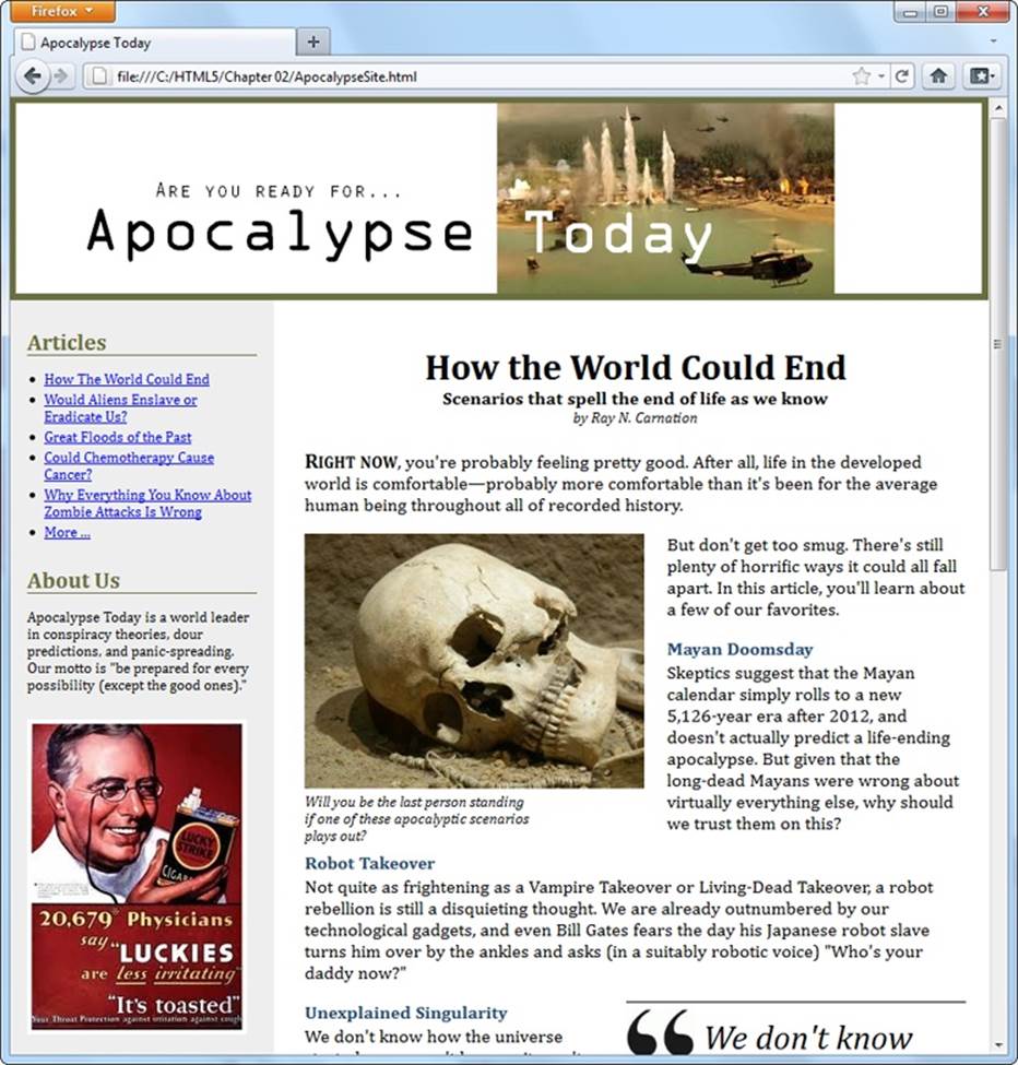
Figure 2-6. Here, the single-page article you considered previously has been placed in a complete content-based website. A site header caps the page; the content is underneath; and a sidebar on the left provides navigation controls, “About Us” information, and an image ad.
However, when people create a header for a website, they almost always wrap it in a <header> element, even if there’s nothing there but a title in a big CSS-formatted box. After all, it’s a major design point of your website, and who knows when you might need to crack it open and add something new?
Here’s the takeaway: Pages can have more than one <header> element (and they often will), even though these headers play different roles on the page.
The apocalyptic site (Figure 2-6) uses the <header> element for the website header and another <header> element for the article title. The <header> that caps the website holds a banner image, which combines graphical text and a picture:
<header class="SiteHeader">
<img src="site_logo.png" alt="Apocalypse Today">
<h1 style="display:none">Apocalypse Today</h1>
</header>
UP TO SPEED: TURNING A WEB PAGE INTO A WEBSITE
Figure 2-6 shows a single page from a fictional website.
In a real website, you’d have the same layout (and the same side panel) on dozens of different pages or more. The only thing that would change as the visitor clicks around the page is the main page content—in this case, the article.
HTML5 doesn’t have any special magic for turning web pages into websites. Instead, you need to use the same tricks and technologies that web developers rely on in traditional HTML:
§ Server-side frameworks. The idea is simple: When a browser requests a page, the web server assembles the pieces, including the common elements (like a navigation bar) and the content. This approach is by far the most common, and it’s the only way to go on big, professional websites. Countless different technologies implement this approach in different ways, from web programming platforms like ASP.NET and PHP to content management systems like Drupal and WordPress.
§ Page templates. Some high-powered web page editors (like Adobe Dreamweaver and Microsoft Visual Studio) include a page template feature. You begin by creating a template that defines the structure of your web pages and includes the repeating content you want to appear on every page (like the header and the sidebar). Then you use that template to create all your site pages. Here’s the neat part: When you update the template, your web page editor automatically updates all the pages that use it.
Of course, you’re free to use either technique, so this book focuses on the final result: the pasted-together markup that forms a complete page and is shown in the web browser.
Right away, you’ll notice that this header adds a detail that you don’t see on the page: an <h1> heading that duplicates the content that’s in the picture. However, an inline style setting hides this heading.
This example raises a clear question: What’s the point of adding a heading that you can’t see? There are actually several reasons. First, all <header> elements require some level of heading inside, just to satisfy the rules of HTML5. Second, this design makes the page more accessible for people who are navigating it with screen readers, because they’ll often jump from one heading to the next without listening to the content in between. And third, it establishes a heading structure that you can use in the rest of the page. That’s a fancy way of saying that if you start with an <h1>for your website header, you may decide to use <h2> elements to title the other sections of the page (like “Articles” and “About Us” in the sidebar). For more about this design decision, see the box on The Heading Structure of a Site.
NOTE
Of course, you could simplify your life by creating an ordinary text header. (And if you want fancy fonts, the CSS3 web font feature, described on Web Fonts, can help you out.) But for the many web pages that put the title in a picture, the hidden heading trick is the next best solution.
FREQUENTLY ASKED QUESTION: THE HEADING STRUCTURE OF A SITE
Is it acceptable to have more than one level-1 heading on a page? Is it a good idea?
According to the official rules of HTML, you can have as many level-1 headings as you want. However, website creators often strive to have just a single level-1 heading per page, because it makes for a more accessible site—because people using screen readers might miss a level-1 heading as they skip from one level-2 heading to the next. There’s also a school of webmaster thought that says every page should have exactly one level-1 heading, which is unique across the entire website and clearly tells search engines what content awaits.
The example in Figure 2-6 uses this style. The “Apocalypse Today” heading that tops the site is the only <h1> on the page. The other sections on the page, like “Articles” and “About Us” in the sidebar, use level-2 headings. The article title also uses a level-2 heading. (With a little bit of extra planning, you could vary the text of the level-1 heading to match the current article—after all, this heading isn’t actually visible, and it could help the page match more focused queries in a search engine like Google.)
But there are other, equally valid approaches. For example, you could use level-1 headings to title each major section of your page, including the sidebar, the article, and so on.
Or, you could give the website a level-1 site heading and put level-2 headings in the sidebar (as in the current example) but make the article title into a second level-1 heading. This works fine in HTML5, because of its new outlining system. As you’ll learn on The HTML5 Outlining System, some elements, including <article>, are treated as separate sections, with their own distinct outlines. So it makes perfect sense for these sections to start the heading hierarchy over again with a brand new <h1>. (However, HTML5 says it’s fine to start with a different heading level, too.)
In short, there’s no clear answer about how to structure your website. It seems likely that the “multiple <h1>” approach will become increasingly popular as HTML5 conquers the Web. But for now, many web developers are sticking with the “single <h1>” approach to keep screen readers happy.
Navigation Links with <nav>
The most interesting new feature in the apocalyptic website is the sidebar on the left, which provides the website’s navigation, some extra information, and an image ad. (Typically, you’d throw in a block of JavaScript that fetches a randomly chosen ad using a service like Google AdSense. But this example just hard-codes a picture to stand in for that.)
In a traditional HTML website, you’d wrap the whole sidebar in a <div>. In HTML5, you almost always rely on two more specific elements: <aside> and <nav>.
The <aside> element is a bit like the <header> element in that it has a subtle, slightly stretchable meaning. You can use it to mark up a piece of related content, as you did with the pull-quote on Adding a Sidebar with <aside>. Or, you can also use it to designate an entirely separate section of the page—one that’s offset from the main flow.
The <nav> element wraps a block of links. These links may point to topics on the current page, or to other pages on the website. Most pages will have multiple <nav> sections in them. But not all links need a <nav> section—instead, it’s generally reserved for the largest and most important navigational sections on a page. For example, if you have a list of articles (as in Figure 2-6), you definitely need a <nav> section. But if you have just a couple of links at the bottom of the page with licensing and contact information, a full-blown <nav> isn’t necessary.
With these two elements in mind, it’s a good time to try a practice exercise. First, review the sidebar in Figure 2-6. Next, sketch out on a piece of paper how you would mark up the structure of this content. Then, read on to find out the best possible solution.
In fact, there are at least two reasonably good ways to structure this sidebar, as shown in Figure 2-7.
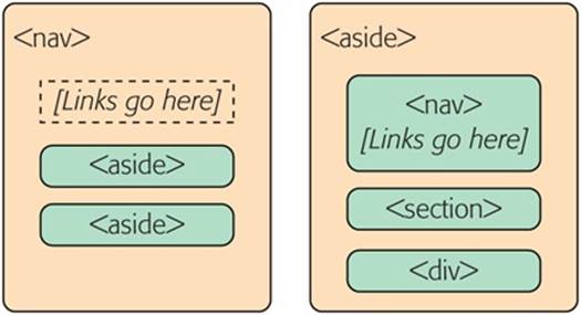
Figure 2-7. Left: You can think of the entire side panel as a navigation bar, with some other content wedged in. In this case, the whole panel can be a <nav>, and the other content sections require an <aside> (because they aren’t related to the sidebar’s main content, the links). Right: Alternatively, consider the entire side panel to be a separate web page section that serves several purposes. In this case, the sidebar becomes an <aside> while the navigational content inside is wrapped in a <nav>.
The apocalyptic site uses the second approach (Figure 2-7, right). That’s because the sidebar seems to serve several purposes, with none clearly being dominant. But if you have a lengthy and complex navigational section (like a collapsible menu) followed by a short bit of content, the first approach just might make more sense.
Here’s the markup that shapes the sidebar, dividing it into three sections:
<aside class="NavSidebar">
<nav>
<h2>Articles</h2>
<ul>
<li><a href="...">How The World Could End</a></li>
<li><a href="...">Would Aliens Enslave or Eradicate Us?</a></li>
...
</ul>
</nav>
<section>
<h2>About Us</h2>
<p>Apocalypse Today is a world leader in conspiracy theories ..."
</p>
</section>
<div>
<img src="ad.jpg" alt="Luckies cigarette ad: it's toasted">
</div>
</aside>
Here are the key points:
§ The title sections (“Articles” and “About Us”) are level-2 headings. That way, they are clearly subordinate to the level-1 website heading, which makes the page more accessible to screen readers.
§ The links are marked up in an unordered list using the <ul> and <li> elements. Website designers agree that a list is the best, most accessible way to deal with a series of links. However, you may need to use style sheet rules to remove the indent (as done here) and the bullets (not done in this example).
§ The “About Us” section is wrapped in a <section> element. That’s because there’s no other semantic element that suits this content. A <section> is slightly more specific than a <div>—it’s suitable for any block of content that starts with a heading. If there were a more specific element to use (for example, a hypothetical <about> element), that would be preferable to a basic <section>, but there isn’t.
§ The image ad is wrapped in a <div>. The <section> element is appropriate only for content that starts with a title, and the image section doesn’t have a heading. (Although if it did—say, “A Word from Our Sponsors”—a <section> element would be the better choice.) Technically, it’s not necessary to put any other element around the image, but the <div> makes it easier to separate this section, style it, and throw in some JavaScript code that manipulates it, if necessary.
There are also some details that this sidebar doesn’t have but many others do. For example, complex sidebars may start with a <header> and end with a <footer>. They may also include multiple <nav> sections—for example, one for a list of archived content, one with a list of late-breaking news, one with a blogroll or list of related sites, and so on. For an example, check out the sidebar of a typical blog, which is packed full of sections, many of which are navigational.
The style sheet rules you use to format the <aside> sidebar are the same as the ones you’d use to format a traditional <div> sidebar. They place the sidebar in the correct spot, using absolute positioning, and set some formatting details, like padding and background color:
aside.NavSidebar
{
position: absolute;
top: 179px;
left: 0px;
padding: 5px 15px 0px 15px;
width: 203px;
min-height: 1500px;
background-color:#eee;
font-size: small;
}
This rule is followed by contextual style sheet rules that format the <h2>, <ul>, <li>, and <img> elements in the sidebar. (As always, you can get the sample code from http://prosetech.com/html5, and peruse the complete style sheet.)
Now that you understand how the sidebar is put together, you’ll understand how it fits into the layout of the entire page, as shown in Figure 2-8.
NOTE
As you’ve learned, the <nav> is often found on its own, or in an <aside>. There’s one more common place for it to crop up: in the <header> element that tops a web page.
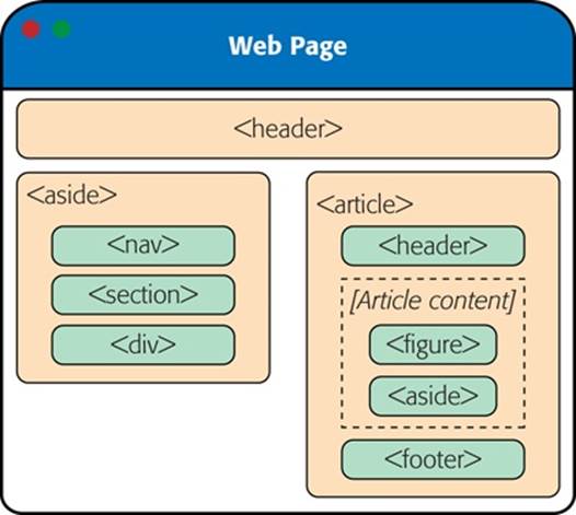
Figure 2-8. Here are all the semantic elements that you’ll find in the apocalyptic web page shown in Figure 2-6.
Deeper into Sections
As you’ve already learned, the <section> is the semantic element of last resort. If you have a titled block of content, and the other semantic elements aren’t appropriate, then the <section> element is generally a better choice than <div>.
So what goes in a typical section? Depending on your perspective, the <section> element is either a flexible tool that fits many needs, or a loose and baggy monster with no clear identity. That’s because sections play a variety of different web page roles. They can mark up any of the following:
§ Small blocks of content that are displayed alongside the main page, like the “About Us” paragraph in the apocalyptic website.
§ Self-contained content that can’t really be described as an article, like a customer billing record or a product listing.
§ Groups of content—for example, a collection of articles on a news site.
§ A portion of a longer document. For example, in the apocalyptic article, you could mark up each separate end-of-the-world scenario as a distinct section. Sometimes you’ll use sections in this way to ensure a correct outline for your document, as explained in the next section.
The last two items in the list are the most surprising. Many web developers find it’s a bit of a stretch to use the same element to deal with a small fragment of an article and an entire group of articles. Some think that HTML5 should have at least two different elements to deal with these different scenarios. But the creators of HTML5 decided to keep things simple (by limiting the number of new elements) while making the new elements as flexible and practical as possible.
There’s one last consideration. The <section> element also has an effect on a web page’s outline, which is the concept you’ll explore on The HTML5 Outlining System.
GEM IN THE ROUGH: COLLAPSIBLE BOXES WITH <DETAILS> AND <SUMMARY>
You’ve no doubt seen collapsible boxes on the Web—sections of content that you can show or hide by clicking a heading. Collapsible boxes are one of the easiest feats to pull off with basic JavaScript. You simply need to react when the heading is clicked, and then change a style setting to hide your box:
var box = document.
getElementById("myBox");
box.style.display = "none";
And then back again to make it reappear:
var box = document.
getElementById("myBox");
box.style.display = "block";
Interestingly, HTML5 adds two semantic elements that aim to make this behavior automatic. The idea is that you wrap your collapsible section in a <details> element and wrap the heading inside in a <summary> element. The final result is something like this:
<details>
<summary>Section #1</summary>
<p>If you can see this content, the
section is expanded</p>
</details>
Browsers that support these elements (currently, that’s just Chrome), will show just the heading, possibly with some sort of visual adornment (like a tiny triangle icon next to the heading). Then, if the user clicks the heading, the full content expands into view. Browsers that don’t support the <details> and <summary> elements will show the full content right from the start, without giving the user any way to collapse it.
The <details> and <summary> elements are controversial. Many web developers feel that they aren’t really semantic, because they’re more about visual style than logical structure.
For now, it’s best to avoid the <details> and <summary> elements because they have such poor browser support. Although you could write a workaround that uses JavaScript on browsers that don’t support them, writing this workaround is more effort than just using a few lines of JavaScript to perform the collapsing on your own, on any browser.
Deeper into Footers
HTML5 and fat headers were meant for each other. Not only can you stuff in subtitles and bylines, but you can also add images, navigational sections (with the <nav> element), and virtually anything else that belongs at the top of your page.
Oddly, HTML5 isn’t as accommodating when it comes to footers. The footer is supposed to be limited to a few basic details about the website’s copyright, authorship, legal restrictions, and links. Footers aren’t supposed to hold long lists of links, important pieces of content, or extraneous details like ads, social media buttons, and website widgets.
This raises a question: What should you do if your website design calls for a fat footer? After all, fat footers are wildly popular in website design right now (see Figure 2-9 for an example). They incorporate a number of fancy techniques, sometimes including the following:
§ Fixed positioning, so the footer is always attached to the bottom of the browser window, no matter where the visitor scrolls (as with the example in Figure 2-9).
§ A close button, so the visitor can close the footer and reclaim the space after reading the content (as with the example in Figure 2-9). To make this work, you use a simple piece of JavaScript that hides the element that wraps the footer (like the code shown in the box on Collapsible Boxes with <details> and <summary>).
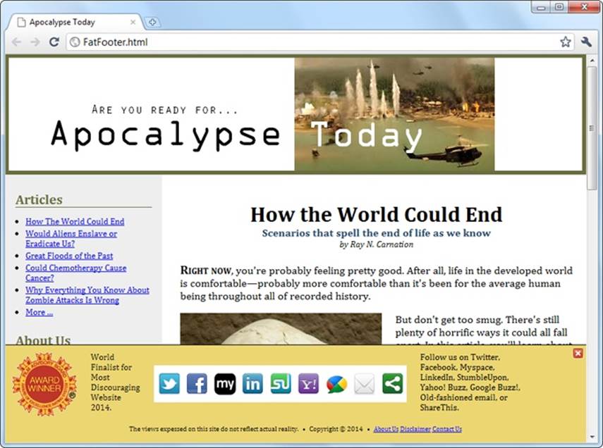
Figure 2-9. This absurdly fat footer is stuffed with garish extras, like an award picture and social media buttons. It uses fixed positioning to lock itself to the bottom of the browser window, like a toolbar. Fortunately, this footer has one redeeming quality: the close button in the top-right corner that lets anyone banish it from view.
§ A partially transparent background, so you can see the page content through the footer. This setup works well if the footer is advertising breaking news or an important disclaimer, and it’s usually used in conjunction with a close button.
§ Animation, so the footer springs or slides into view. (For an example, see the related-article box that pops up when you reach the bottom of an article at www.nytimes.com.)
If your site includes this sort of footer, you have a choice. The simple approach is to disregard the rules. This approach is not as terrible as it sounds, because other website developers are sure to commit the same mistake, and over time the official rules may be loosened, allowing fancier footers. But if you want to be on the right side of the standard right now, you need to adjust your markup. Fortunately, it’s not too difficult.
The trick is to split the standard footer details from the extras. In the browser, these can appear to be a single footer, but in the markup, they won’t all belong to the <footer> element. For example, here’s the structure of the fat footer in Figure 2-9:
<div id="FatFooter">
<!-- Fat footer content goes here. -->
<img onclick="CloseBox()" src="close_icon.png" class="CloseButton">
...
<footer>
<!-- Standard footer content goes here. -->
<p>The views expressed on this site do not ... </p>
</footer>
</div>
The outer <div> has no semantic meaning. Instead, it’s a convenient package that bundles the extra “fat” content with the bare-bones footer details. It also lets you apply the style sheet formatting rule that locks the fat footer into place:
#FatFooter {
position: fixed;
bottom: 0px;
height: 145px;
width: 100%;
background: #ECD672;
border-top: thin solid black;
font-size: small;
}
NOTE
In this example, the style sheet rule applies its formatting by ID name (using the #FatFooter selector) rather than by class name (for example, using a .FatFooter selector). That’s because the fat footer already needs a unique ID, so the JavaScript code can find it and hide it when someone clicks the close button. It makes more sense to use this unique ID in the style sheet than to add a class name for the same purpose.
You could also choose to put the footer in an <aside> element, to clearly indicate that the footer content is a separate section, and tangentially related to the rest of the content on the page. Here’s what that structure looks like:
<div id="FatFooter">
<aside>
<!-- Fat footer content goes here. -->
<img onclick="CloseBox()" src="close_icon.png" class="CloseButton">
...
</aside>
<footer>
<!-- Standard footer content goes here. -->
<p>The views expressed on this site do not ... </p>
</footer>
</div>
The important detail here is that the <footer> is not placed inside the <aside> element. That’s because the <footer> doesn’t apply to the <aside> but to the entire website. Similarly, if you have a <footer> that applies to some piece of content, your <footer> needs to be placed inside the element that wraps that content.
NOTE
The rules and guidelines for the proper use of HTML5’s semantic elements are still evolving. Questions about the proper way to mark up large, complex sites stir ferocious debate in the HTML community. The best advice is this: If something doesn’t seem true to your content, don’t do it. Or you can discuss it online, where you can get feedback from dozens of super-smart HTML gurus. (One particularly good site is http://html5doctor.com, where you can see these ongoing debates unfolding in the comments section of most articles.)
Identifying the Main Content with <main>
HTML5 includes a sometimes-overlooked <main> element that identifies a web page’s primary content. In the apocalypse site, for example, the main content is the entire article, not including the website header, sidebar, or footer. You should strongly consider using it on your own pages.
A properly applied <main> element wraps the <article> element precisely. Here’s how it looks in the apocalypse page:
<!DOCTYPE html>
<html lang="en">
<head>
...
</head>
<body>
<header>
...
</header>
<aside>
...
</aside>
<main>
<article>
...
</article>
</main>
<footer>
...
</footer>
</body>
</html>
You can’t put the <main> element inside the <article> element (or in any other semantic element). That’s because the <main> element is meant to hold the page’s full main content. It’s not meant to indicate a portion of important content inside your document. For the same reason, unlike the other semantic elements, the <main> element can be used only once in a page.
At first glance, the <main> element doesn’t seem terribly useful. However, it can be important for screen readers, because it lets them skip over extraneous material—like website headers, navigation menus, ads, sidebars, and so on—to get to the real content. And although the <main>element clings to the <article> element in this example, that’s not necessarily the case in a more complex page. For example, if you created a page that lists multiple article summaries, each one wrapped in an <article> element, the <main> element would wrap the complete list of<article> elements, like this:
<main>
<article>
...
</article>
<article>
...
</article>
<article>
...
</article>
...
</main>
Here, the distinction is clear—each <article> represents a self-contained piece of content, but the main content of the page is the full set of articles.
It’s appropriate to use the <main> element on any type of page, even if that page doesn’t include an article. For example, if you build a game or an app, the main content is the bunch of markup that creates that game or app. You can use the <main> element to wrap the whole shebang, not including outside details like headers and footers.
NOTE
The <main> element is a relative newcomer. It was introduced in the slightly tweaked version of the HTML5 standard called HTML 5.1 (page xv).
The HTML5 Outlining System
HTML5 defines a set of rules that dictate how you can create a document outline for any web page. A web page’s outline could come in handy in a lot of ways. For example, a browser could let you jump from one part of an outline to another. A design tool could let you rearrange sections by dragging and dropping them in an outline view. A search engine could use the outline to build a better page preview, and screen readers could benefit the most of all, by using outlines to guide users with vision difficulties through a deeply nested hierarchy of sections and subsections.
However, none of these scenarios is real yet, because—except for the small set of developer tools you’ll consider in the next section—almost no one uses HTML5 outlines today.
NOTE
It’s hard to get excited about a feature that doesn’t affect the way the page is presented in a browser and isn’t used by other tools. However, it’s still a good idea to review the outline of your web pages (or at least the outline of a typical page from your website) to make sure that its structure makes sense and that you aren’t breaking any HTML5 rules.
How to View an Outline
To understand outlines, you can simply take a look at the outlines your own pages produce. Right now, no browser implements the rules of HTML5 outlines (or gives you a way to peek at one). However, there are several tools that fill the gap:
§ Online HTML outliner. Visit http://gsnedders.html5.org/outliner and tell the outliner which page you want to outline. As with the HTML5 validator you used in Chapter 1 (HTML5 Validation), you can submit the page you want to outline in any of three ways: by uploading a file from your computer, by supplying a URL, or by pasting the markup into a text box.
§ Chrome extension. You can use the h5o plug-in to analyze the outlines of pages when you view them in Chrome. Install it at http://code.google.com/p/h5o and then surf to an HTML5 page somewhere on the Web (sadly, h5o doesn’t work with files that are stored on your computer). An outline icon appears in the address bar, which reveals the structure of the page when clicked (Figure 2-10). The h5o page also provides a bookmarklet (a piece of JavaScript code that you can add to your web browser’s bookmark list) which lets you display page outlines in Firefox and Internet Explorer, albeit with a few quirks.
§ Opera extension. There’s an Opera version of the h5o Chrome extension. Get it at http://tinyurl.com/3k3ecdy.
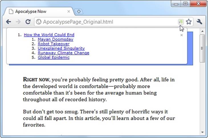
Figure 2-10. When you visit an HTML5 page with the Chrome h5o extension installed, an outline icon appears in the address bar. Click the icon to pop open a window with the full page outline.
Basic Outlines
To visualize the outline of your web page, imagine it stripped of all content except for the text in a numbered heading element (<h1>, <h2>, <h3>, and so on). Then, indent those headings based on their place in your markup, so more deeply nested headings are indented more in the outline.
For example, consider the apocalypse article in its initial, pre-HTML5 state:
<body>
<div class="Header">
<h1>How the World Could End</h1>
...
</div>
...
<h2>Mayan Doomsday</h2>
...
<h2>Robot Takeover</h2>
...
<h2>Unexplained Singularity</h2>
...
<h2>Runaway Climate Change</h2>
...
<h2>Global Epidemic</h2>
...
<div class="Footer">
...
</div>
</body>
This simple structure leads to an outline like this:
1. How the World Could End
a. Mayan Doomsday
b. Robot Takeover
c. Unexplained Singularity
d. Runaway Climate Change
e. Global Epidemic
Two levels of headings (<h1> and <h2>) create a two-level outline. This scheme is similar to the outline features in many word processing programs—for example, you can see much the same thing in Microsoft Word’s Navigation pane.
On the other hand, markup like this:
<h1>Level-1 Heading</h1>
<h2>Level-2 Heading</h2>
<h2>Level-2 Heading</h2>
<h3>Level-3 Heading</h3>
<h2>Level-2 Heading</h2>
Gets an outline like this:
1. Level-1 Heading
a. Level-2 Heading
b. Level-2 Heading
i. Level-3 Heading
c. Level-2 Heading
Again, there are no surprises.
Finally, the outline algorithm is smart enough to ignore skipped levels. For example, if you write this slightly wobbly markup, which skips from <h1> directly to <h3>:
<h1>Level-1 Heading</h1>
<h2>Level-2 Heading</h2>
<h1>Level-1 Heading</h1>
<h3>Level-3 Heading</h3>
<h2>Level-2 Heading</h2>
You get this outline:
1. Level-1 Heading
a. Level-2 Heading
2. Level-1 Heading
a. Level-3 Heading
b. Level-2 Heading
Now the level-3 heading has level-2 status in the outline, based on its position in the document. This might seem like one of those automatic error corrections browsers love to make, but it actually serves a practical purpose. In some situations, a web page may be assembled out of separate pieces—for example, it might contain a copy of an article that’s published elsewhere. In this case, the heading levels of the embedded content might not line up perfectly with the rest of the web page. But because the outlining algorithm smooths these differences out, it’s unlikely to be a problem.
Sectioning Elements
Sectioning elements are the ones that create a new, nested outline inside your page: <article>, <aside>, <nav>, and <section>. To understand how sectioning elements work, imagine a page that contains two <article> elements. Because <article> is a sectioning element, this page has (at least) three outlines—the outline of the overall page and one nested outline for each article.
To get a better grasp of this situation, consider the structure of the apocalypse article, after it’s been revised with HTML5:
<body>
<article>
<header>
<h1>How the World Could End</h1>
...
</header>
<div class="Content">
...
<h2>Mayan Doomsday</h2>
...
<h2>Robot Takeover</h2>
...
<h2>Unexplained Singularity</h2>
...
<h2>Runaway Climate Change</h2>
...
<h2>Global Epidemic</h2>
...
</div>
</article>
<footer>
...
</footer>
</body>
Plug this into an outline viewer like http://gsnedders.html5.org/outliner, and you’ll see this:
1. Untitled Section
a. How the World Could End
i. Mayan Doomsday
ii. Robot Takeover
iii. Unexplained Singularity
iv. Runaway Climate Change
v. Global Epidemic
Here, the outline starts with an untitled section, which is the root <body> element. The <article> element starts a new, nested outline, which contains a single <h1> and several <h2> elements.
Sometimes, the “Untitled Section” note indicates a mistake. Although it’s considered acceptable for <aside> and <nav> elements to exist without titles, the same leniency isn’t usually given to <article> or <section> elements. In the previous example, the untitled section is the main section for the page, which belongs to the <body> element. Because the page contains a single article, there’s no reason for the page to have a separate heading, and you can ignore this quirk.
Now consider what happens with a more complex example, like the apocalypse site with the navigation sidebar (Deeper into Headers). Put that through an outliner, and you’ll get this outline:
1. Apocalypse Today
a. Untitled Section
i. Articles
ii. About Us
b. How the World Could End
i. Mayan Doomsday
ii. Robot Takeover
iii. Untitled Section
iv. Unexplained Singularity
v. Runaway Climate Change
vi. Global Epidemic
Here, there are two sectioning elements, and two nested outlines: one for the sidebar and one for the article. There are also two untitled sections, both of which are legitimate. The first is the <aside> element for the sidebar, and the second is the <aside> element that represents the pull-quote in the article.
NOTE
In addition to sectioning elements, some elements are called section roots. These elements aren’t just branches of an existing outline; they start a new outline of their own that doesn’t appear in the main outline of the containing page. The <body> element that contains your web page content is a sectioning root, which makes sense. But HTML5 also considers the following elements to be sectioning roots: <blockquote>, <td>, <fieldset>, <figure>, and <details>.
Solving an Outline Problem
So far, you’ve looked at the examples in this chapter and seen the outlines they generated. And so far, the outlines have made perfect sense. But sometimes, a problem can occur. For example, imagine you create a document with this structure:
<body>
<article>
<h1>Natural Wonders to Visit Before You Die</h1>
...
<h2>In North America</h2>
...
<h3>The Grand Canyon</h3>
...
<h3>Yellowstone National Park</h3>
...
<h2>In the Rest of the World</h2>
...
<aside>...</aside>
...
<h3>Galapagos Islands</h3>
...
<h3>The Swiss Alps</h3>
...
</article>
</body>
GEM IN THE ROUGH: HOW SECTIONING ELEMENTS HELP COMPLEX PAGES
Sectioning is a great help with syndication and aggregation—two examples of the fine art of taking content from one web page and injecting it into another.
For example, imagine you have a web page that includes excerpts from several articles, all of which are drawn from other sites. Now imagine that this page has a deeply nested structure of headings, and somewhere inside—let’s say under an <h4> heading—there’s an article with content pulled from another web page.
In traditional HTML, you’d like the first heading in this content to use the <h5> element, because it’s nested under an <h4>. But this article was originally developed to be placed somewhere else, on a different page, with less nesting, so it probably starts with an <h2> or an <h1>. The page would still work, but its hierarchy would be scrambled, and the page could be more difficult for screen readers, search engines, and other software to process.
In HTML5, this page isn’t a problem. As long as you wrap the nested article in an <article> element, the extracted content becomes part of its own nested outline. That outline can start with any heading—it doesn’t matter. What matters is its position in the containing document. So if the <article> element falls after an <h4>, then the first level of heading in that article behaves like a logical <h5>, the second level acts like a logical <h6>, and so on.
The conclusion is this: HTML5 has a logical outline system that makes it easier to combine documents. In this outline system, the position of your headings becomes more important, and the exact level of each heading becomes less significant—making it harder to shoot yourself in the foot.
You probably expect an outline like this:
1. Untitled Section for the <body>
a. Natural Wonders to Visit Before You Die
i. In North America
i. The Grand Canyon
ii. Yellowstone National Park
ii. In the Rest of the World
iii. Untitled Section for the <aside>
i. Galapagos Islands
ii. The Swiss Alps
But the outline you actually get is this:
1. Untitled Section for the <body>
a. Natural Wonders to Visit Before You Die
i. In North America
i. The Grand Canyon
ii. Yellowstone National Park
ii. In the Rest of the World
iii. Untitled Section for the <aside>
iv. Galapagos Islands
v. The Swiss Alps
Somehow, the addition of the <aside> after the <h2> throws off the following <h3> elements, making them have the same logical level as the <h2>. This clearly isn’t what you want.
To solve this problem, you first need to understand that the HTML5 outline system automatically creates a new section every time it finds a numbered heading element (like <h1>, <h2>, <h3>, and so on), unless that element is already at the top of a section.
In this example, the outline system doesn’t do anything to the initial <h1> element, because it’s at the top of the <article> section. But the outline algorithm does create new sections for the <h2> and <h3> elements that follow. It’s as though you wrote this markup:
<body>
<article>
<h1>Natural Wonders to Visit Before You Die</h1>
...
<section>
<h2>In North America</h2>
...
<section>
<h3>The Grand Canyon</h3>
...
</section>
<section>
<h3>Yellowstone National Park</h3>
...
</section>
</section>
<section>
<h2>In the Rest of the World</h2>
...
</section>
<aside>...</aside>
...
<section>
<h3>Galapagos Islands</h3>
...
</section>
<section>
<h3>The Swiss Alps</h3>
...
</section>
</article>
</body>
Most of the time, these automatically created sections aren’t a problem. In fact, they’re usually an asset, because they make sure incorrectly numbered headings are still placed in the right outline level. The cost for this convenience is an occasional glitch, like the one shown here.
As you can see in this listing, everything goes right at first. The top <h1> is left alone (because it’s in an <article> already), there’s a subsection created for the first <h2>, then a subsection for each <h3> inside, and so on. The problem starts when the outline algorithm runs into the<aside> element. It sees this as a cue to close the current section, which means that when the sections are created for the following <h3> elements, they’re at the same logical level as the <h2> elements before.
To correct this problem, you need to take control of the sections and subsections by defining some yourself. In this example, the goal is to prevent the second <h2> section from being closed too early, which you can do by defining it explicitly in the markup:
<body>
<article>
<h1>Natural Wonders to Visit Before You Die</h1>
...
<h2>In North America</h2>
...
<h3>The Grand Canyon</h3>
...
<h3>Yellowstone National Park</h3>
...
<section>
<h2>In the Rest of the World</h2>
...
<aside>...</aside>
...
<h3>Galapagos Islands</h3>
...
<h3>The Swiss Alps</h3>
...
</section>
</article>
</body>
Now, the outline algorithm doesn’t need to create an automatic section for the second <h2>, and so there’s no risk of it closing the section when it stumbles across the <aside>. Although you could define the section for every heading in this document, there’s no need to clutter your markup, as this single change fixes the problem.
NOTE
Another solution is to replace the <aside> with a <div>. The <div> is not a sectioning element, so it won’t cause a section to close unexpectedly.
Using the <aside> element doesn’t always cause this problem. The earlier article examples used the <aside> element for a pull-quote but worked fine, because the <aside> fell between two <h2> elements. But if you carelessly plunk a sectioning element between two different heading levels, you should check your outline to make sure it still makes sense.
TIP
If the whole outline concept seems overwhelmingly theoretical, don’t worry. Truthfully, it’s a subtle concept that many web developers will ignore (at least for now). The best approach is to think of the HTML5 outlining system as a quality assurance tool that can help you out. If you review your pages in an outline generator (like one of the tools listed on The HTML5 Outlining System), you can catch mistakes that may indicate other problems and make sure that you’re using the semantic elements correctly
All materials on the site are licensed Creative Commons Attribution-Sharealike 3.0 Unported CC BY-SA 3.0 & GNU Free Documentation License (GFDL)
If you are the copyright holder of any material contained on our site and intend to remove it, please contact our site administrator for approval.
© 2016-2026 All site design rights belong to S.Y.A.