HTML5 & CSS3 FOR THE REAL WORLD (2015)
Chapter 10 Flexbox and Media Queries
At this point, we’ve added a number of CSS3 enhancements to The HTML5 Herald. Along the way, we’ve filled in some knowledge gaps by presenting aspects of CSS3 that were outside the scope of our sample site. So it’s fitting that we should introduce two other CSS3 features that have received much attention among designers targeting audiences on various devices and screen sizes: flexbox and media queries.
In Chapter 1, we talked about the growth rate of mobile devices and the importance of considering the needs of mobile users. With flexbox, we can create layouts that easily resize to accommodate different screen widths. For example, we can provide a wide screen with a three-column layout, and provide a narrower screen with a single-column layout, all without touching the HTML. With CSS3 media queries, we can take that concept a step further, not only creating layouts that resize to accommodate different screen sizes, but even providing different CSS rules based on the user’s screen size and resolution.
Flexbox
Flexbox, as described in CSS Flexible Box Layout Module Level 1, provides for an efficient way to layout, align, and distribute space among elements within your document, even when the viewport and the size of your elements is unknown and/or dynamic. Flexbox is a flexible, float-free CSS layout method that accommodates different screen sizes and display devices. Flexbox allows the browser to alter the width or height of elements to best fill the available space on any display device: with elements expanding to fill all available free space, or shrinking to prevent overflow.
With flexbox, we can modify the appearance of the document to the user―changing the appearance of the source order―without JavaScript and without actually manipulating the DOM. Flexbox allows us to fully separate the structure of the code from how it’s displayed; with CSS only we can reorder or even invert how elements are displayed, all without touching the HTML.
CSS layout has always been viewed as difficult. Flexbox makes it simple. With flexbox we can lay out elements vertically or horizontally, taking up all the space provided or the least amount of space necessary, creating elements of equal height or width with just a few lines of CSS. We can add any number of items onto one line or several lines, and even change the order of appearance of the content without touching the underlying markup.
Flex Container and Flex Item
The general idea of flexbox is that you define a containing block as the container of flexible items―either an inline or a block-level flex container―and then you nest flexible children into that parent container. You define whether those children are laid out vertically, horizontally, on one line, or several, in the source order or reversed, or in some other order, and what direction in which those children are laid out. The flex container can expand items to fill space or shrink items to prevent overflow:
<ul class="container">
<li class="flexItem">...</li>
<li class="flexItem">...</li>
<li class="flexItem">...</li>
</ul>
[14]The flex container is the parent element in which flex items are contained. The children of the flex container are flex items: when an element is turned into a flex container via the display property, each child of that flex container becomes a flex item. The flex container’s margins collapse with the margins of its contents.
The properties applied to the parent or container include display, flex-direction, flex-wrap, and flex-flow (which is shorthand for flex-direction and flex-wrap). There are also alignment properties applied to the container, including justify-content, align-items, and align-content. The children, or flex items, have properties that enable the ordering and laying out of the children within the parent, including order, align-self, flex-grow, flex-shrink, flex-basis, and flex (which is shorthand for flex-grow, flex-shrink, and flex-basis).
Container Properties
The container can be displayed as a block or inline, but avoid using either of those as values for the container’s display property. To make an element a flex container, we do use the well-known display property, but we define the block and inline presentation by using display: flex anddisplay: inline-flex respectively, as shown in Figure 10.1. If neither value is set, the element is not a flex container and the children will not be flex items:
.container {
display: flex || inline-flex;
}
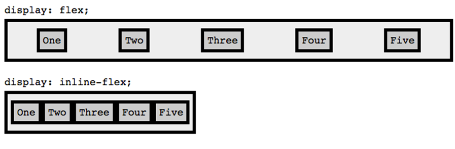
Figure 10.1. The display property set to flex and inline-flex
The flex-direction property defines the axis along which the flex items follow each other. A flex container has the default flex-direction of row, meaning that the flex items follow each other horizontally across the main axis or column. The alternative is to use a flex-direction of column, in which case the flex items flow vertically. These two directions can be reversed with row-reverse and column-reverse respectively, as shown in Figure 10.2:
.container {
display: flex;
flex-direction: row || column || row-reverse || column-reverse;
}
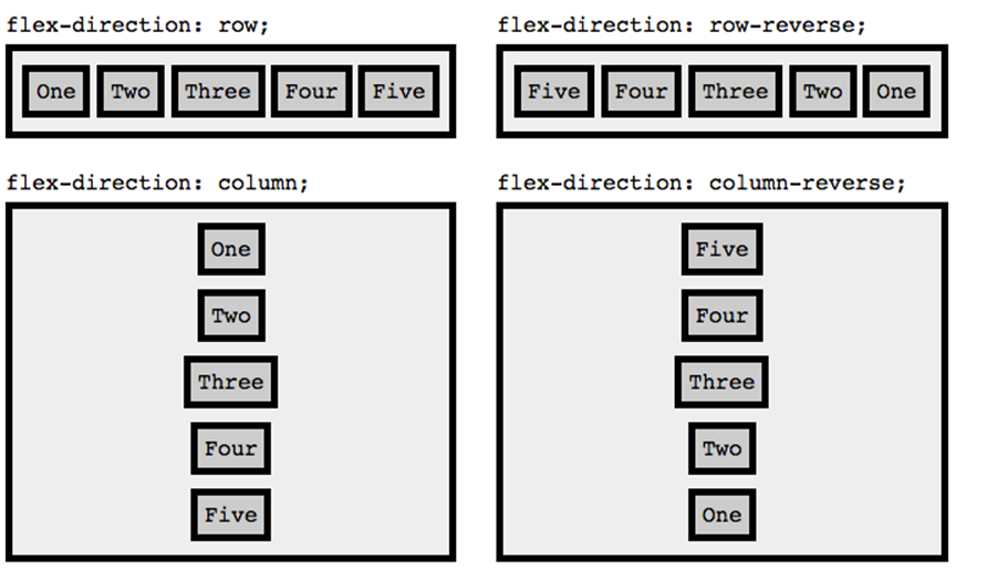
Figure 10.2. The flex-direction property defines the flex items’ axis
The flex-wrap property controls whether the flex container is single-line, multi-line, or multi-lined with each new line coming visually before the previous line with the values of nowrap, wrap, and wrap-reverse respectively. nowrap is the default. You can see the effects of the different flex-wrap property values in Figure 10.3:
.container {
display: flex;
flex-direction: row;
flex-wrap: nowrap || wrap || wrap-reverse;
}
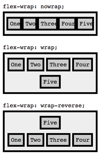
Figure 10.3. The flex-wrap property defines whether flex items can spread across multiple lines
We’re provided a shorthand of flex-flow for the flex-direction and flex-wrap properties:
.container {
display: flex;
flex-flow: row nowrap;
}
The justify-content property defines how flex items are laid out on the current line, as shown in Figure 10.4. The default is flex-start, which groups items to the left of the line (or the top, if flex-direction is set to column). flex-end groups the items to the right of the line (or bottom, ifflex-direction is set to column), while center groups the items in the center of the line. space-between will push the first item to the left or top, and the last item to the right or bottom, with equal space in between all the items. The space-around value divides the white space equally between all the items, including around the first and last items:
.container {
display: flex;
flex-flow: row nowrap;
justify-content: flex-start || flex-end || center || space- between || space-around;
}
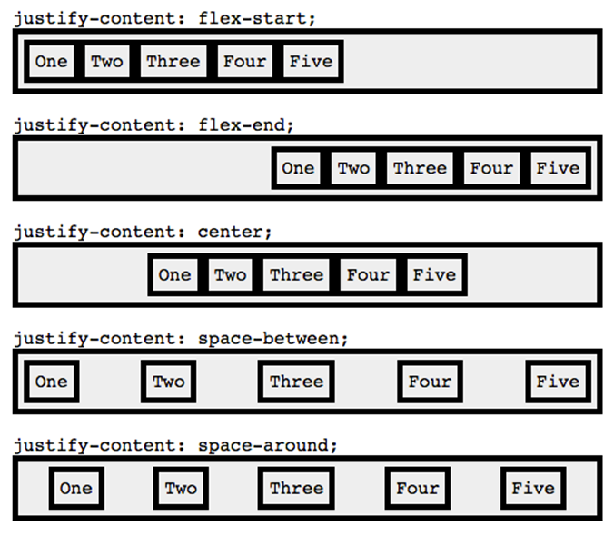
Figure 10.4. Examples of the justify-content property
Note: Mind Your Margins
Make sure the flex items, or children of the container, don’t have margin set to auto. If they do, it will appear as if the justify-content were set to space-around.
While justify-content allows us to align items along the direction axis (left to right for row and top to bottom for column), the align-items property defines how flex items are laid out along the opposite axis, as shown in Figure 10.5. When flex-direction is set to row, flex-start will place the flex items flush to the top of the container, flex-end to the bottom, center will center the items vertically, while the default, stretch, will stretch the items so that they’re all equal height—taking up 100% of the height when there’s a single row. The last value, baseline, usually appearsto be the same as flex-start, though it isn’t really the case: items are aligned along their baselines:
.container {
display: flex;
flex-flow: row nowrap;
justify-content: space-between;
align-items: flex-start || flex-end || center || stretch || baseline;
}
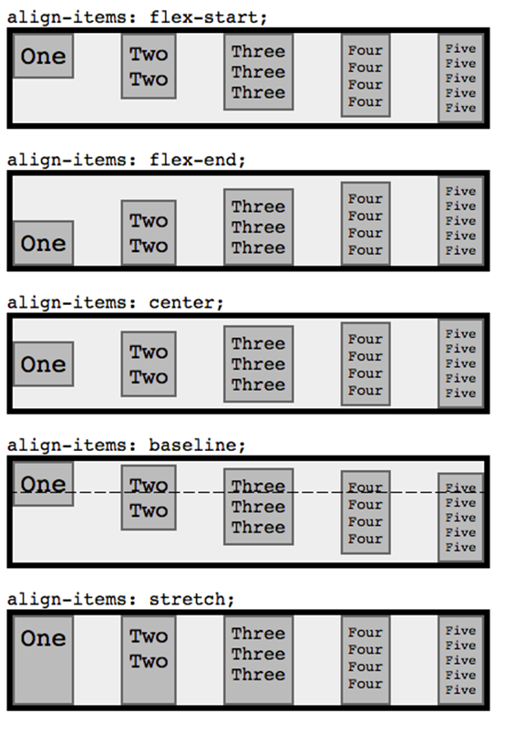
Figure 10.5. The different values of the align-items property
The flexbox layout specification also allows styling of the flex items. You can override the align-items property for individual flex items by setting the align-self property on that single flex item individually, with the value of auto, flex-start, flex-end, center, baseline, or stretch, as shown in Figure 10.6:
.container {
display: flex;
flex-direction: row;
justify-content: space-around;
align-items: stretch;
}
.flexItem:first-of-type {
align-self: auto || flex-start || flex-end || center || baseline || stretch;
}
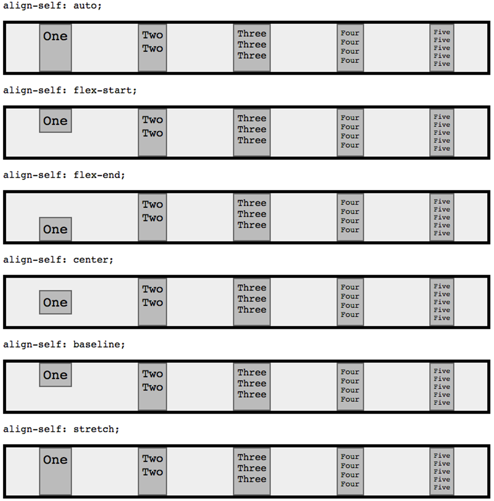
Figure 10.6. Different values of the flex item’s align-self property
For example, to center all the flex items while stretching the first element to 100% of the height, as shown in Figure 10.7, you would use the following markup:
.container {
display: flex;
flex-direction: row;
justify-content: space-between;
align-items: center;
}
.flexItem:first-of-type {
align-self: stretch;
}
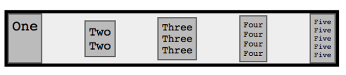
Figure 10.7. Overwriting an item’s alignment with the align-self property
Flexbox makes it very easy to display content in a different order than the source order. The order property assigns elements to ordinal groups and determines in which order the elements appear. So what does that mean? You can assign integers to the flex items’ order property, and the browser will display the items in ascending order instead of the markup’s source order.
Let’s say that you want the last item to come first, the first item to go last, and all the other flex items to follow the markup’s source order as shown in Figure 10.8. You would write this:
.flexItem:first-of-type {
order: 1;
}
.flexItem:last-of-type {
order: -1;
}
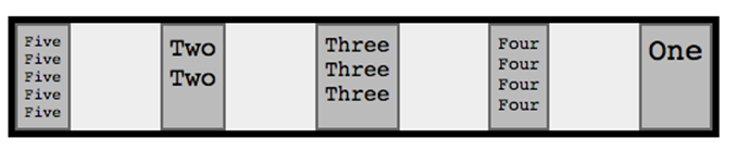
Figure 10.8. Employing the order property to change the order of appearance
Because the default value of order is 0, the flex item with a value less than 0 will be placed first, and the flex items with values greater than 0 will go last. If different flex items have different order values, the browser will display them in order starting with the lowest value, unless the order is reversed with a container with a flex-direction reversing value.
The order values of the multiple flex items don’t need to be unique. If two or more flex items have the same order value—as flex items two, three, and four do in our case (they all have the default value of 0)—the browser will display the items with the same order value in the order in which they appear in the source markup.
Note: order Only Affects Visual Rendering
In using the order property, the display order is independent of the source code order for visual rendering only. Assistive technology and tabbed navigation are not impacted by the use of order, and maintain the source order.
The flex property is shorthand for flex-grow, flex-shrink, and flex-basis, in that order.
flex-grow defines how the flex item should grow if there is room. It’s a unitless value for each item that defines the proportion or ratio that the particular element should occupy within the flex container.
Some examples of flex-grow are shown in Figure 10.9. If all items have flex-grow set to 1, every child will be set to an equal size inside the container. If you were to give one of the children a value of 2, that child would take up twice as much space as the others:
.container {
display: flex;
}
.flexItem:first-of-type {
flex-grow: 2;
}
.flexItem:last-of-type {
flex-grow: 3;
}
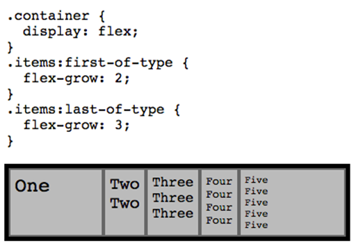
Figure 10.9. Example of the flex-grow property
In our scenario, if we have an item with flex-grow set to 2 and one set to 3, after room is made for all the items, the first item will take up 40% of the available area and the latter will take up 60% for a ratio of 2:3 of the available area (which may differ from 40% and 60% of the width of the parent).
When you use flex-grow, all the space is taken up, making the use of justify-content moot.
We can use flex-basis to define the default width of each item. Without it, our example is ugly. By default, flex items use the least amount of space necessary to fit their content. In our example, the flex items have been sized differently, as they are as narrow as their content with padding. We can use the flex-basis with a length unit value to define the default size of a flex item. The remaining space is distributed, with proportions able to be controlled by flex-grow. You can also set flex-basis: content, which automatically sizes flex items based on the item's content.
But what if there isn’t enough room for all the flex items given the flex-basis and the size of the container? That’s where flex-shrink comes in: it defines the ability for a flex item to shrink if necessary:
.container {
display: flex;
}
.flexItem {
flex-basis: 200px;
}
.flexItem:first-of-type {
flex-shrink: 3;
}
.flexItem:last-of-type {
flex-shrink: 2;
}
All flex items in this example will be 200px wide. If the container is more than 1000px (5x200px), any item with a flex-grow property will grow wider; however, if the container is less than 1000px and there isn’t enough room for all the flex items, the flex items with the largest flex-shrinkvalue will shrink first.
It’s best to avoid setting flex-shrink, flex-grow, or flex-basis as individual properties. Rather, you should set all three at once with the flex shorthand property. Setting flex: none is the same as setting flex: 0 0 auto. The default value, if none of these properties is specified, is flex: 0 1 auto;.
Note: A Few Notes
Some properties make no sense on a flex container and are therefore ignored. The column properties, vertical-align, float, and clear have no effect on a flex item. On the other hand, box-model properties such as margin, min-height, and min-width do impact flex items.
Absolutely positioned children of a flex container are positioned so that their static position is determined in reference to the main start content-box corner of their flex container.
Flexbox’s alignment property of center does true centering: the flex item stays centered even if it overflows the flex container. You can’t currently scroll the overflowed content, but we trust this will be resolved soon:
.container {
display: flex;
flex-direction: row;
justify-content: space-around;
align-items: center;
height: 100px;
}
Applying Flexbox to The HTML5 Herald
#authors {
display: flex;
}
#authors section:nth-of-type(2) {
order: 2;
}
By setting display: flex on the parent, the three author sections become flex items. We reorder the items with the order property, as shown in Figure 10.10.
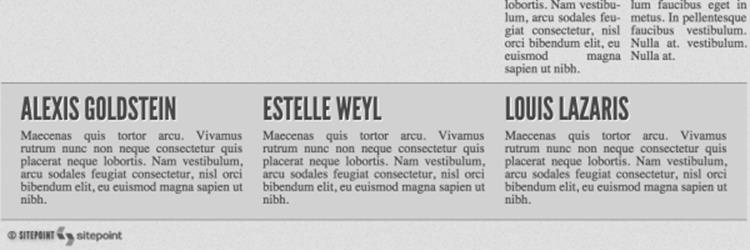
Figure 10.10. Flexbox in action on The HTML5 Herald
By default, the three author sections will be displayed side by side. But when the page is narrow—say, on a mobile device with a a screen less than 500px wide—we want each author description to take up 100% of the width. We can use media queries to change the layout for narrow browsers.
Media Queries
Media queries are at the heart of a recent design trend called responsive web design. With responsive web design all page elements, including images and widgets, are designed and coded to resize and realign seamlessly and elegantly, depending on the capabilities and dimensions of the user’s browser.
What are media queries?
Before CSS3, a developer could specify a media type for a stylesheet using the media attribute. You might have come across a link element that looked like this:
<link rel="stylesheet" href="print.css" media="print">
Notice that the media type is specified as print. Acceptable values in addition to print include screen, handheld, projection, all, and a number of others you’ll see less often, if ever. The media attribute allows you to specify which stylesheet to load based on the type of device the site is being viewed on. This has become a fairly common method for serving a print stylesheet.
With CSS3’s media queries you can, according to the W3C spec, “extend the functionality of media types by allowing more precise labeling of style sheets.” This is done using a combination of media types and expressions that check for the presence of particular media features. So media queries let you change the presentation (the CSS) of your content for a wide variety of devices without changing the content itself (the HTML).
Syntax
Let’s implement a basic media query expression:
<link rel="stylesheet" href="style.css" media="screen and (color)">
This tells the browser that the stylesheet in question should be used for all screen devices that are in color. Simple—and it should cover nearly everyone in your audience. You can do the same using @import:
@import url(styles.css) screen and (color);
Additionally, you can implement media queries using the @media at-rule, which we touched on earlier in Chapter 9 when discussing @font-face. @media is probably the most well-known usage for media queries, and is the method you’ll likely use most often:
@media handheld and (max-width: 380px) {
/* styles go here */
}
In this example, this expression will apply to all handheld devices that have a maximum display width of 380 pixels. Any styles within that block will apply only to the devices that match the expression. Note that this is likely to not be what you want: smartphones are just small-sized computers. Android and iOS happen to match screen and actually ignore handheld.
Here are a few more examples of media queries using @media, so that you can see how flexible and varied the expressions can be. This style will apply only to screen-based devices that have a minimum device width (or screen width) of 320px and a maximum device width of 480px:
@media only screen and (min-device-width: 320px) and (max-device-width: 480px) {
/* styles go here */
}
Here’s a slightly more complex example:
@media only screen and (-webkit-min-device-pixel-ratio: 1.5), only screen and (min-device-pixel-ratio: 1.5) {
/* styles go here */
}
In this example, we use the only keyword, along with the and keyword in addition to a comma—which behaves like an or keyword. This code will specifically target the iPhone 4’s higher resolution display, which could come in handy if you want that device to display a different set of images. Prefixing media queries with only causes CSS3 non-compliant browsers to ignore the rule.
The Flexibility of Media Queries
Using the aforementioned syntax, media queries allow you to change the layout of your site or application based on a wide array of circumstances. For example, if your site uses a two-column layout, you can specify that the sidebar column drop to the bottom and/or become horizontally oriented, or you can remove it completely on smaller resolutions. On small devices such as smartphones, you can serve a completely different stylesheet that eliminates everything except the bare necessities.
Additionally, you can change the size of images and other elements that aren’t normally fluid to conform to the user’s device or screen resolution. This flexibility allows you to customize the user experience for virtually any type of device while keeping the most important information and your site’s branding accessible to all users.
In The HTML5 Herald, we want to change the layout for narrow screens. Our newspaper is 758px wide. On devices under 500px wide, the scrolling required to view the page gives a bad user experience. With media queries, we can narrow the entire layout of the page, providing a better user experience for those using narrow browsers:
@media screen and (max-width: 500px) {
body {
width: 100%;
min-width: 320px;
}
body main > div:nth-of-type(n),
aside,
aside article {
width: 100%;
padding: 0 1em;
box-sizing: border-box;
}
body > header h1 {
font-size: 7vw;
}
}
The above CSS targets browsers that are 500px wide or narrower, making the width of the document 100% but not less than 320px wide, and making the aside, advertisements, and different sections as wide as the device. In addition, we make the main heading font size responsive at 7vw, or 7% of the viewport width. This way the heading is never too small, and never wider than the newspaper itself.
Returning to the layout of the site’s author listing, to make the author listing appear at 100% width instead of appearing in three columns, we can also use media queries; we change the flex-direction when the browser or viewport width is 500px wide or smaller:
@media screen and (max-width: 500px) {
...
#authors {
flex-direction: column;
}
}
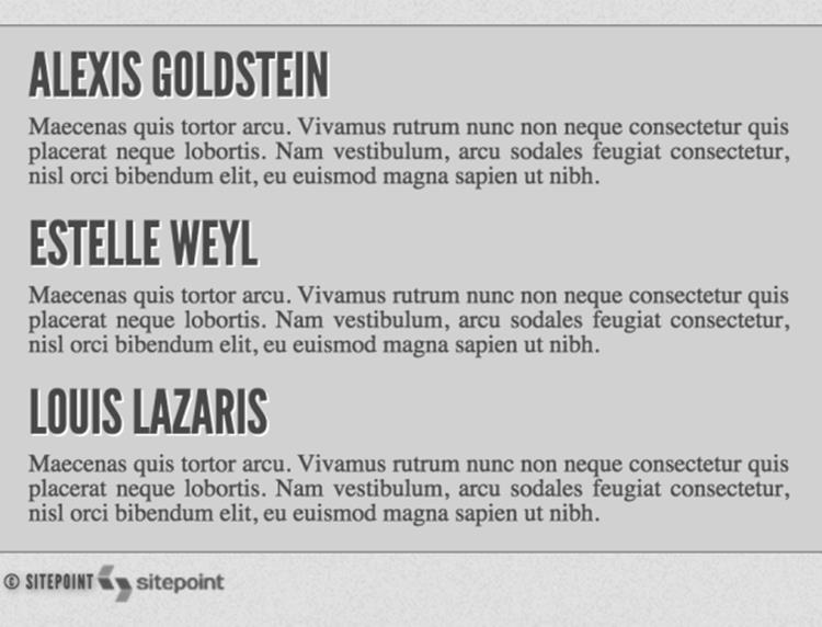
Figure 10.11. Using media queries on The HTML5 Herald to list our authors
Now in narrow browsers, we’ve changed the flex-direction from the default of row to column, so that the authors appear top to bottom instead of side by side, as shown in Figure 10.11.
Browser Support
Support for media queries is very good:
· IE9+
· Firefox 3.5+
· Safari 3.2+
· Chrome 8+
· Opera 10.6+
· iOS 3.2+
· Opera Mini 5+
· Opera Mobile 10+
· Android 2.1+
The only area of concern is previous versions of Internet Explorer. There are two options for dealing with this: you can supply these versions of IE with a “default” stylesheet that’s served without using media queries, providing a layout suitable for the majority of screen sizes, or you can use a JavaScript-based polyfill. One such ready-made solution can be found at http://code.google.com/p/css3-mediaqueries-js/.
So by taking advantage of CSS3 media queries, you can easily create a powerful way to target nearly every device and platform conceivable.
Further Reading
In a book such as this, it’s impossible to describe every aspect of media queries. That could be another book in itself—and an important one at that. But if you’d like to look into media queries a little further, be sure to check out the following articles:
· “Responsive Web Design” on A List Apart
· “How to Use CSS3 Media Queries to Create a Mobile Version of Your Site” on Smashing Magazine
Living in Style
We’ve now covered all the new features in CSS that went into making The HTML5 Herald—and quite a few that didn’t. While we haven’t covered everything CSS3 has to offer, we’ve mastered several techniques that you can use today, and a few that should be usable in the very near future. Remember to check the specifications—as these features are all subject to change—and keep up to date with the state of browser support. Things are moving quickly for a change, which is both a great boon and an additional responsibility for web developers.
Up next, we’ll switch gears to cover some of the new JavaScript APIs. As we’ve mentioned, these aren’t strictly speaking part of HTML5 or CSS3, but they’re often bundled together when people speak of these new technologies. Plus, they’re a lot of fun, so why not get our feet wet?
[14] In the markup above, we wouldn't need to add the flexItem class as we could use .container li instead, or even .container > * for less specificity: we added an unnecessary class for ease of explanation.