HTML5 & CSS3 FOR THE REAL WORLD (2015)
Chapter 4 HTML5 Forms
We’ve coded most of the page, and you now know almost all of what there is to know about new HTML5 elements and their semantics. But before we start work on the look of the site—which we do in Chapter 7—we’ll take a quick detour away from The HTML5 Herald’s front page to look at the sign-up page. This will illustrate what HTML5 has to offer in terms of web forms.
HTML5 web forms have introduced new form elements, input types, attributes, native validation, and other form features. Many of these features we’ve been using in our interfaces for years: form validation, combo boxes, placeholder text, and the like. The difference is that before we had to resort to JavaScript to create these behaviors; now they’re available directly in the browser. All you need to do is include attributes in your markup to make them available.
HTML5 not only makes marking up forms easier on the developer, it’s also better for the user. With client-side validation being handled natively by the browser, there will be greater consistency across different sites, and many pages will load faster without all that redundant JavaScript.
Let’s dive in!
Dependable Tools in Our Toolbox
Forms are often the last thing developers include in their pages—many developers find forms just plain boring. The good news is HTML5 injects a little bit more joy into coding forms. By the end of this chapter, we hope you’ll look forward to employing form elements as appropriate in your markup.
Let’s start off our sign-up form with plain old-fashioned HTML:
<form id="register" method="post">
<header>
<h1>Sign Me Up!</h1>
<p>I would like to receive your fine publication.</p>
</header>
<ul>
<li>
<label for="register-name">My name is:</label>
<input type="text" id="register-name" name="name">
</li>
<li>
<label for="address">My email address is:</label>
<input type="text" id="address" name="address">
</li>
<li>
<label for="url">My website is located at:</label>
<input type="text" id="url" name="url">
</li>
<li>
<label for="password">I would like my password to be:</label>
<p>(at least 6 characters, no spaces)</p>
<input type="password" id="password" name="password">
</li>
<li>
<label for="rating">On a scale of 1 to 10, my knowledge of HTML5 is:</label>
<input type="text" name="rating" id="rating">
</li>
<li>
<label for="startdate">Please start my subscription on: </label>
<input type="text" id="startdate" name="startdate">
</li>
<li>
<label for="quantity">I would like to receive <input type="text" name="quantity" id="quantity"> copies of <cite> The HTML5 Herald</cite>.</label>
</li>
<li>
<label for="upsell">Also sign me up for <cite>The CSS3 Chronicle</cite></label>
<input type="checkbox" id="upsell" name="upsell" value="CSS Chronicle">
</li>
<li>
<input type="submit" id="register-submit" value="Send Post Haste">
</li>
</ul>
</form>
This sample registration form uses form elements that have been available since the earliest versions of HTML. This form provides clues to users about what type of data is expected in each field via the label and p elements, so even your users on Netscape 4.7 and IE5 (kidding!) can understand the form. It works, but it can certainly be improved upon.
In this chapter we’re going to enhance this form to include HTML5 form features. HTML5 provides new input types specific to email addresses, URLs, numbers, dates, and more. In addition to these, HTML5 introduces attributes that can be used with both new and existing input types. These allow you to provide placeholder text, mark fields as required, and declare what type of data is acceptable—all without JavaScript.
We’ll cover all the newly added input types later in the chapter. Before we do that, let’s look at the new form attributes HTML5 provides.
HTML5 Form Attributes
For years, developers have written (or copied and pasted) snippets of JavaScript to validate the information users entered into form fields: what elements are required, what type of data is accepted, and so on. HTML5 provides us with several attributes that allow us to dictate what is an acceptable value and inform the user of errors, all without the use of any JavaScript.
Browsers that support these HTML5 attributes will compare data entered by the user against the attribute values, such as regular expression patterns provided by the developer (you). They check to see if all required fields are indeed filled out, enable multiple values if allowed, and so on. Even better, including these attributes won’t harm older browsers; they simply ignore the attributes they’re unable to understand. In fact, you can use these attributes and their values to power your scripting fallbacks instead of hardcoding validation patterns into your JavaScript code or adding superfluous classes to your markup. We’ll look at how this is done later; for now, let’s go through some of the new attributes.
The required Attribute
The Boolean required attribute tells the browser to only submit the form if the field in question is filled out. Obviously, this means that the field can’t be left empty, but it also means that, depending on other attributes or the field’s type, only certain types of values will be accepted. Later in the chapter, we’ll be covering different ways of letting browsers know what kind of data is expected in a form.
If a required field is empty the form will fail to submit. Opera, Firefox, Internet Explorer 10+, and Chrome provide the user with error messages; for example, “Please fill out this field” or “You have to specify a value” if left empty.
Note: Time to Focus
Time for a quick refresher: a form element is focused either when users click on the field with their mouse, tap into the field with their finger on a touch device, tab to it with their keyboard, or click or touches the label associated with that form element. For input elements, typing with the keyboard will enter data into that element.
In JavaScript focus event terminology, the focus event will fire on a form element when it receives focus, and the blur event will fire when it loses focus.
In CSS, the :focus pseudo-class can be used to style elements that currently have focus.
The required attribute is valid on any input type except button, submit, image, range, color, and hidden, all of which generally have a default value so the attribute would be redundant. As with other Boolean attributes we’ve seen so far, the syntax is either simply required, orrequired="required" if you’re using XHTML syntax.
Let’s add the required attribute to our sign-up form. We’ll make the name, email address, password, and subscription start date fields required:
<ul>
<li>
<label for="register-name">My name is:</label>
<input type="text" id="register-name" name="name" required aria- required="true">
</li>
<li>
<label for="email">My email address is:</label>
<input type="text" id="email" name="email" required aria- required="true">
</li>
<li>
<label for="url">My website is located at:</label>
<input type="text" id="url" name="url">
</li>
<li>
<label for="password">I would like my password to be:</label>
<p>(at least 6 characters, no spaces)</p>
<input type="password" id="password" name="password" required aria-required="true">
</li>
<li>
<label for="rating">On a scale of 1 to 10, my knowledge of HTML5 is:</label>
<input type="text" name="rating" type="range">
</li>
<li>
<label for="startdate">Please start my subscription on: </label>
<input type="text" id="startdate" name="startdate" required aria -required="true">
</li>
<li>
<label for="quantity">I would like to receive <input type="text" name="quantity" id="quantity"> copies of <cite> The HTML5 Herald</cite></label>
</li>
<li>
<label for="upsell">Also sign me up for <cite>The CSS3 Chronicle</cite></label>
<input type="checkbox" id="upsell" name="upsell" value="CSS Chronicle">
</li>
<li>
<input type="submit" id="register-submit" value="Send Post Haste">
</li>
</ul>
Note: Improving Accessibility
You can include the WAI-ARIA attribute aria-required="true" for improved accessibility; however, as most browsers and screen readers now natively support the required attribute, this will soon by unnecessary. See Appendix B for a brief introduction to WAI-ARIA.
Figure 4.1, Figure 4.2, and Figure 4.3 show the behavior of the required attribute when you attempt to submit the form.
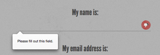
Figure 4.1. The required field validation message in Firefox
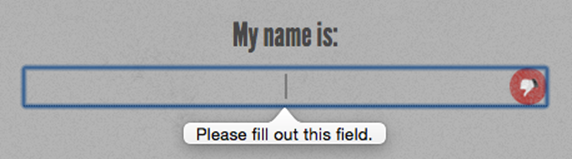
Figure 4.2. How it looks in Opera …
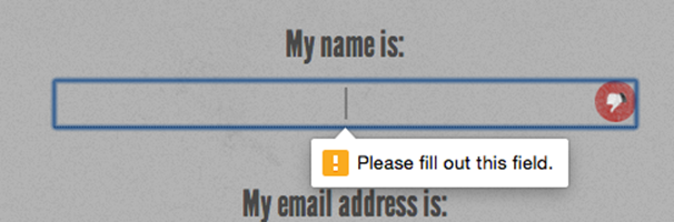
Figure 4.3. … and in Google Chrome
Styling Required Form Fields
You can style required form elements with the :required pseudo-class, and optional form elements with the :optional pseudo-class (or use the negation pseudo-class :not(:required)). You can also style valid and invalid fields with the :valid and :invalid pseudo-classes respectively. With these pseudo-classes and a little CSS magic, you provide visual cues to sighted users indicating which fields are required, and give feedback for successful data entry:
input {
background-position: 0% 50%;
background-repeat: no-repeat;
padding-left: 15px;
}
input:required {
background-image: url('../images/required.png');
}
input:focus:invalid {
background-image: url('../images/invalid.png');
}
input:focus:valid {
background-image: url('../images/valid.png');
}
We’re adding a background image (an asterisk) to required form fields. We can’t include generated content on an input as they’re replaced or empty elements, so we use a background image instead. We’ve also added separate background images to valid and invalid fields. The change is only apparent when the form element has focus, to keep the form from looking too cluttered.
Warning: Firefox Applies Styles to Invalid Elements
Note that Firefox applies its own styles to invalid elements (a red shadow), as shown in Figure 4.1 earlier. You may want to remove the native drop shadow with the following CSS:
:invalid { box-shadow: none; }
Tip: Targeted Styles for Older Browsers
Older browsers such as IE8 and IE9 don’t support the :required pseudo-class, but you can still provide targeted styles using the attribute selector:
input:required,
input[required] {
background-image: url('../images/required.png');
}
You can also use this attribute as a hook for form validation in browsers without support for HTML5 form validation. Your JavaScript code can check for the presence of the required attribute on value-less inputs, and not submit the form if any are found.
The placeholder Attribute
The placeholder attribute allows a short hint to be displayed inside the form element—space permitting—telling the user what type of data should be entered in that field. The placeholder text disappears when the field gains focus and the user enters at least one character, and reappears when the value is null. Developers have provided similar functionality with JavaScript for years―adding a temporary value, then clearing the value on focus―but in HTML5 the placeholder attribute allows it to happen natively with no JavaScript required, and stays present until a value is entered.
For The HTML5 Herald’s sign-up form, we’ll put a placeholder on the website URL and start date fields:
<li>
<label for="url">My website is located at:</label>
<input type="text" id="url" name="url" placeholder="e.g. http://example.com">
</li>
…
<li>
<label for="startdate">Please start my subscription on:</label>
<input type="text" id="startdate" name="startdate" required aria-required="true" >
</li>
In Internet Explorer, because the placeholder attribute only received support in IE10, and because the placeholder text disappears once the user enters data, you shouldn’t rely on it as the only way to inform users of requirements. If your hint exceeds the size of the field, describe the requirements in the input’s title attribute, in the label or in text next to the input element. Some developers suggest adding “e.g.” as part of the placeholder text to make it evident that it’s placeholder text and not actually prefilled data.
All browsers starting with Safari 4, Chrome 10, Opera 11.1, Firefox 4, Android 2.3, and Internet Explorer 10 support the placeholder attribute, though the original implementation of placeholder removed the placeholder text on focus rather than on data entry.
Polyfilling Support with JavaScript
Like everything else in this chapter, it won’t hurt to include the placeholder attribute even when dealing with older browsers that lack support.
As with the required attribute, you can make use of the placeholder attribute and its value to make older versions of Internet Explorer behave as if they supported it—all by using a little JavaScript polyfill magic.
Here’s how you’d go about it: first, use JavaScript to determine which browsers are without support. Then, in those browsers, use a function that creates a faux placeholder. The function needs to determine which form fields contain the placeholder attribute, then temporarily grab that attribute’s content and replace empty value attributes with that text.
Then you need to set up two event handlers: one to clear the field’s value on focus, and another to replace the placeholder value on blur if the form control’s value is still an empty string. If you do use this trick, make sure that the value of your placeholder attribute isn’t one that users might actually enter, or alternatively use the "e.g." precursor to indicate that the placeholder is an example and not a valid value. Additionally, remember to clear the faux placeholder when the form is submitted. Otherwise, you’ll have lots of “(XXX) XXX-XXXX” submissions!
Let’s look at a sample JavaScript snippet to progressively enhance our form elements using the placeholder attribute.
Here’s our placeholder polyfill:
<script>
// check if supported
if(!Modernizr.input.placeholder) {
// get all the form controls with the placeholder attribute
var fcToCheck = document.querySelectorAll("*[placeholder]"),
frmsToCheck = document.querySelectorAll('form'),
i, count;
// loop through form controls with placeholder attribute,
// copy placeholder value into value, clearing on focus and
// resetting, if empty, on blur
for(var i = 0, count = fcToCheck.length; i < count; i++) {
if(fcToCheck[i].value == "") {
fcToCheck[i].value = fcToCheck[i].getAttribute("placeholder");
fcToCheck[i].classList.add('placeholder');
fcToCheck[i].addEventListener('focus', function() {
if (this.value==this.getAttribute("placeholder")) {
this.value = '';
this.classList.remove('placeholder');
}
});
fcToCheck[i].addEventListener('blur', function() {
if (this.value == '') {
this.value = this.getAttribute("placeholder");
this.classList.add('placeholder');
}
});
}
}
for(i = 0, count = frmsToCheck.length; i < count; i++) {
frmsToCheck[i].addEventListener('submit', function(e) {
var i, count, plcHld;
// first do all the checking for required
// element and form validation.
// Only remove placeholders before final submission
plcHld = this.querySelectorAll('[placeholder]');
for(i = 0, count = plcHld.length; i < count; i++){
//if the placeholder still equals the value
if(plcHld[i].value == plcHld[i].getAttribute( 'placeholder')){
// don't submit if required
if(plcHld[i].hasAttribute('required')) {
// create error messaging
plcHld[i].classList.add('error');
e.preventDefault();
} else {
// if not required, clear value before submitting.
plcHld[i].value = '';
}
} else {
// remove legacy error messaging
plcHld[i].classList.remove('error');
}
}
});
}
</script>
The first point to note about this script is that we’re using the Modernizr JavaScript library to detect support for the placeholder attribute. There’s more information about Modernizr in Appendix A, but for now it’s enough to understand that it provides you with a whole raft of true or falseproperties for the presence of given HTML5 and CSS3 features in the browser. In this case, the property we’re using is fairly self-explanatory. Modernizr.input.placeholder will be true if the browser supports placeholder, and false if it doesn’t.
If we’ve determined that placeholder support is absent, we grab all the elements on the page with a placeholder attribute. For each of them, we check that the value isn’t empty, then replace that value with the value of the placeholder attribute. In the process, we add the placeholder class to the element, so you can lighten the color of the font in your CSS or otherwise make it look more like a native placeholder. When the user focuses on the input with the faux placeholder, the script clears the value and removes the class. When the user removes focus, the script checks to see if there is a value. If not, we add the placeholder text and class back in.
Before submitting the form, we need to check if any form controls have a value that matches their placeholder attribute. In this scenario, we could have also checked to see whether any required input still has the placeholder class when the form is submitted. If a form control is required, we add error messaging and prevent the form from submitting. If the form control isn’t required, we clear the placeholder values that are still in place before submitting, only clearing those if no required elements have prevented form submission.
Before adding a reset button to your form, determine whether your users will ever want to throw away all of their work. If the answer is yes and you include a reset button, note that if the user clicks on the reset button, our faux placeholders will disappear but the placeholder class will remain, as we are using the value in our polyfill.
This is a great example of an HTML5 polyfill: we use JavaScript to provide support only for those browsers without native support, and we do it by leveraging the HTML5 elements and attributes already in place, rather than resorting to additional classes or hard-coded values in our JavaScript.
While the placeholder attribute may not be the most important one to polyfill, it’s a good example of how we can simplify form validation scripts while polyfilling support for all the new attributes, all while maintaining separation between the content and presentation layers.
The pattern Attribute
The pattern attribute enables you to provide a regular expression that the user’s input must match in order to be considered valid. For any input where the user can enter free-form text, you can limit what syntax is acceptable with the pattern attribute.
The regular expression language used in patterns is the same Perl-based regular expression syntax as JavaScript, except that the pattern attribute must match the entire value, not just a subset. When including a pattern, you should always indicate to users what is the expected (and required) pattern.
The global title attribute has special significance when used in conjunction with the pattern attribute. Since browsers currently show the value of the title attribute on hover such as a tooltip, include pattern instructions that are more detailed than placeholder text, and which form a coherent statement. That title attribute will also be displayed with the browser’s default error message in browsers that support native form validation with error messaging, which we’ll cover later in this chapter.
Note: Regular Expressions
Regular expressions are a feature of most programming languages that allow developers to specify patterns of characters and check to see if a given string matches the pattern. Regular expressions are famously indecipherable to the uninitiated. For instance, one possible regular expression to check if a string is formatted as a hexidecimal color value is this: #[A-Fa-f0-9]{6}.
A full tutorial on the syntax of regular expressions is beyond the scope of this book, but there are plenty of great resources, tutorials, and cheat sheets available online if you’d like to learn. Alternatively, you can search the Web or ask around on forums for a pattern that will serve your purpose.
For a basic example, let’s add a pattern attribute to the password field in our form. We want to enforce the requirement that the password be at least six characters long with no spaces:
<li>
<label for="password">I would like my password to be:</label>
<p>(at least 6 characters, no spaces)</p>
<input type="password" id="password" name="password" required
title="(at least 6 characters, no spaces)" pattern="\S{6,}">
</li>
\S refers to “any nonwhitespace character,” and {6,} means “at least six times.” If you wanted to stipulate the maximum amount of characters, the syntax for between six and ten characters, for example, would be \S{6,10}.
As with the required attribute, the pattern attribute will prevent the form from being submitted if there is no match for the pattern, and will provide an error message.
If your pattern is not a valid regular expression, it will be ignored for the purposes of validation.
The pattern attribute has been supported to some extent in all browsers since Firefox 4, Safari 5, Chrome 10, Opera 11, IE10, and Android 2.3. By “some extent,” we mean that while all browsers now support the pattern attribute, some—notably Safari and Android through 4.4—allow invalid data to be sent on form submission.
Additionally, similar to the placeholder and required attributes, you can use the value of this attribute to provide the basis for your JavaScript validation code for nonsupporting browsers.
The disabled Attribute
The Boolean disabled attribute has been around longer than HTML5 but has been expanded on, to a degree. It can be used with any form control except the new output element, and, unlike previous versions of HTML, HTML5 allows you to set the disabled attribute on a fieldset and have it apply to all the form elements contained in that fieldset.
Generally, form elements with the disabled attribute have the content grayed out by default in the browser. Browsers will prohibit the user from focusing on a form control that has the disabled attribute set. This attribute is often used to disable the submit button until all fields are correctly filled out.
You can employ the :disabled pseudo-class in your CSS to style disabled form controls, and use either :enabled or :not(:disabled) pseudo-classes to target form controls that aren’t disabled.
Form controls with the disabled attribute aren’t submitted along with the form so their values will be inaccessible to your form processing code on the server side. If you want a form value that users are unable to edit but can still see and submit, use the readonly attribute.
The readonly Attribute
The readonly attribute is similar to the disabled attribute: it makes it impossible for the user to edit the form field. Unlike disabled, however, the field can receive focus and its value is submitted with the form.
In a comments form, we may want to include the URL of the current page or the title of the article that is being commented on, letting the user know that we’re collecting this data without allowing them to change it:
<label for="about">Article Title</label>
<input type="text" name="about" id="about" readonly value="http://www.thehtml5herald.com/register.html">
The multiple Attribute
The multiple attribute, if present, indicates that multiple values can be entered in a form control. While it was available in previous versions of HTML, it only applied to the select element. In HTML5, it can be added to file, email, and range input types as well. If present, the user can select more than one file, include several comma-separated email addresses, or have a range with two sliders.
While multiple file input is supported in all browsers since mobile Safari 7 and IE10, the multiple attribute on range input is yet to be supported anywhere at the time of writing.
Note: Spaces or commas?
You may notice that the iOS touch keyboard for email inputs includes a space. Of course, spaces aren’t permitted in email addresses, but browsers allow you to separate multiple emails with spaces along with the required comma. Originally the spaces were disallowed in some browsers, but adding spaces after the comma separator has been included in the specification.
The form Attribute
Not to be confused with the form element, the form attribute in HTML5 allows you to associate form elements with forms in which they’re not nested. It means that you can now associate a fieldset or form control with any other form in the document. This solves the age-old issue of forms not being nestable. While you’re still unable to nest forms, you can associate “nested” form controls with a form that’s not an ancestor.
The form attribute takes as its value the ID of the form element with which the fieldset or control should be associated.
If the attribute is omitted, the control will only be submitted with the form in which it’s nested. If you include the form attribute and remove it, make sure to use el.removeAttribute('form') and not el.setAttribute('form', ''). If the form attribute is included but the value is either empty or points to an invalid form ID, the form control will be disassociated from all forms on the page and will not be submitted with any form, including any ancestral form in which it may be nested.
This attribute is supported in all browsers, starting with Android 4 and IE 11.
The autocomplete Attribute
The autocomplete attribute specifies whether the form, or a form control, should have autocomplete functionality. For most form fields, this will be a drop-down that appears when the user begins typing. For password fields, it’s the ability to save the password in the browser. Support for this attribute has been present in browsers for years, though it was never in the specification until HTML5.
If the autocomplete attribute is omitted from the form control or the form, the default value is on. You may have noticed this the last time you filled out a form. In order to disable autocomplete on a form control (or form), use autocomplete="off". This is a good idea for sensitive information, such as a credit card number, or data that will never need to be reused, such as a CAPTCHA.
Autocompletion is also controlled by the browser, ignoring developer-set preferences. While the default value is on, the browser must have it enabled for it to work at all; however, setting the autocomplete attribute to off overrides the browser's on preference for the relevant form control.
The datalist Element and the list Attribute
Datalists are currently supported in all browsers except Safari, starting with IE10 and Android 4.4.3. In the default form, they fulfill a common requirement: a text field with a set of predefined autocomplete options. Unlike the select element, users can enter whatever value they like, but they’ll be presented with a set of suggested options.
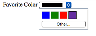
Figure 4.4. The datalist element in action in Firefox
For some input types, like text and date input types, a drop-down list of options is presented as users type into the field, as shown in Figure 4.4. For the range input type, the browser will display little tick marks along the slider rule indicating where suggested options are found. For the colorinput type, users are presented with swatches of color suggestions, with the option to switch to the device's default color picker if they prefer to pick a different color.
The datalist element, much like select, is a list of options, with each one placed in an option element. You then associate the datalist with an input using the list attribute on the input. The list attribute takes as its value the id attribute of the datalist you want to associate with the input. One datalist can be associated with several input fields.
Here’s what this would look like in practice:
<label for="favcolor">Favorite Color</label>
<input type="color" list="colors" id="favcolor" name="favcolor">
<datalist id="colors">
<option value="#0000FF" label="blue">
<option value="#008000" label="green">
<option value="#ff0000" label="red">
<option value="#663399" label="RebeccaPurple">
</datalist>
[8]Here, the user will be presented with a selection of four color swatches, with the choice to see the full color picker if they prefer a different color.
The autofocus Attribute
The Boolean autofocus attribute specifies that a form control should be focused as soon as the page loads. Only one form element can have autofocus in a given page. For a better user experience and for accessibility reasons, it is best not to use this attribute.
The input elements support many more attributes, with some being type-specific. The attributes include alt, src, height, and width for the image input type, and step, min, and max for numeric input types, including dates and range. dirname helps tell the server the form control’s directionality. formaction, formenctype, formmethod, formnovalidate, and formtarget provide methods to override the form’s attributes. inputmode helps indicate to the browser what keypad to show when the device is capable of displaying dynamic keypads. minlength and maxlength dictate the length of allowable input. checked, name, size, type, and value should already be familiar to you, though :checked and :default pseudo-classes may be new. We’ll cover some of these with their relevant input types next.
Input Types
You’re probably already familiar with the input element’s type attribute. This is the attribute that determines what kind of form input will be presented to the user. If it is omitted—or in the case of new input types and older browsers, not understood—it still works; the input will default totype="text". This is the key that makes HTML5 forms usable today even if you’re still supporting older browsers. If you use a new input type, such as email or search, older browsers will simply present users with a standard text field.
Our sign-up form currently uses four of the ten input types you’re familiar with: checkbox, text, password, and submit. Here’s the full list of types that were available before HTML5:
· button
· checkbox
· file
· hidden
· image
· password
· radio
· reset
· submit
· text
The HTML5 specification gave us nine more input types that provide for more data-specific UI elements and native data validation:
· search
· url
· tel
· date
· time
· number
· range
· color
HTML5.1 and the WHATWG HTML Living Standard includes four additional date input types, three of which are well supported in modern browsers:
· datetime-local
· month
· week
· datetime (not supported in any browser)
Let’s look at each of these new types in detail, and see how we can put them to use.
Search
The search input type (type="search") provides a search field—a one-line text input control for entering one or more search terms. The spec states:
The difference between the text state and the search state is primarily stylistic: on platforms where search fields are distinguished from regular text fields, the search state might result in an appearance consistent with the platform’s search fields rather than appearing like a regular text field.
Many browsers style search inputs in a manner consistent with the browser or the operating system’s search boxes. Currently, Chrome, Safari, Opera, and IE have added the ability to clear the input with the click of a mouse by providing an × icon once text is entered into the field, as shown in Figure 4.5. The date/time input types are also clearable in Chrome and Opera, and IE11 includes an × icon to clear most input types now, including inputs of type text.
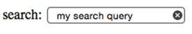
Figure 4.5. The search input type is styled to resemble the operating system’s search fields
On Apple devices, the search field has rounded corners by default in Chrome, Safari, and Opera, matching the devices’ search field appearance. On touch pads with dynamic keyboards, the “go” button appears as a search icon or the word “search,” depending on the device. If you include the non-standard results attribute, Chrome and Opera will display a magnifying/looking glass icon within the form field.
While you can still use type="text" for search fields, the new search type is a visual cue as to where the user needs to go to search the site, and provides an interface to which the user is accustomed. The HTML5 Herald has no search field, but here’s an example of how you’d use it:
<form id="search" method="get">
<label for="s">Search</label>
<input type="search" id="s" name="s">
<input type="submit" value="Search">
</form>
Since search, like all the new input types, appears as a regular text box in nonsupporting browsers, there’s no reason not to use it when appropriate.
Email Addresses
The email type (type="email") is, not surprisingly, used for specifying one or more email addresses. It supports the Boolean multiple attribute, allowing for multiple comma-separated (with optional space) email addresses.
Let’s change our form to use type="email" for the registrant’s email address:
<label for="email">My email address is</label>
<input type="email" id="email" name="email">
If you change the input type from text to email, as we’ve done here, you’ll notice no visible change in the user interface; the input still looks like a plain text field. However, there are differences behind the scenes.
The change becomes apparent if you’re using a touchpad device. When you focus on the email field, most touchpad devices—such as the iPad or Android phone running Chromium—will all display a keyboard optimized for email entry, including the @ symbol, period, and space buttons, but no comma, as shown in Figure 4.6.
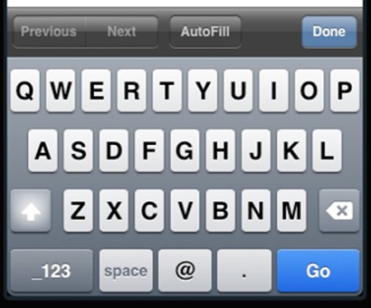
Figure 4.6. The email input type provides a custom keyboard on iOS devices
Firefox, Chrome, Opera, and Internet Explorer 10 also provide error messaging for invalid email inputs: if you try to submit a form with content unrecognizable as one or more email addresses, the browser will tell you what’s wrong. The default error messages are shown in Figure 4.7.
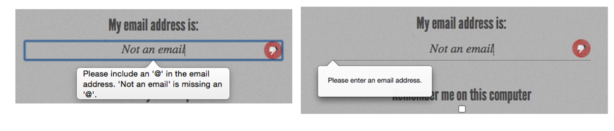
Figure 4.7. Error messages for incorrectly formatted email addresses on Opera (left) and Firefox (right)
Note: Custom Validation Messages
Dislike the default error messages the browsers provide? Set your own with .setCustomValidity(errorMsg). setCustomValidity takes as its only parameter the error message you want to provide. If you set a custom validation message, once that value becomes valid you must set the validation message to an empty string (a falsy value) to enable form submission:
function setErrorMessages(formControl) {
var validityState_object = formControl.validity;
if (validityState_object.valueMissing) {
formControl.setCustomValidity('Please set an age (required)');
} else if (validityState_object.rangeUnderflow) {
formControl.setCustomValidity('You\'re too young');
} else if (validityState_object.rangeOverflow) {
formControl.setCustomValidity('You\'re too old');
} else if (validityState_object.stepMismatch) {
formControl.setCustomValidity('Counting half birthdays?');
} else {
//if valid, must set falsy value or will always error
formControl.setCustomValidity('');
}
}
Unfortunately, while you can change the content of the message, you’re stuck with its appearance, at least for now.
URLs
The url input (type="url") is used for specifying a web address. Much like email, it will appear as a normal text field. On many touch screens, the onscreen keyboard displayed will be optimized for web address entry, with a forward slash (/) and a “.com” shortcut key.
Let’s update our registration form to use the url input type:
<label for="url">My website is located at:</label>
<input type="url" id="url" name="url">
Validation of URLs
All modern browsers starting with Internet Explorer 10 support the url input type, reporting the input as invalid if the value doesn’t begin with a protocol. Only the general protocol format of a URL is validated, so, for example, q://example.xyz will be considered valid, even though q://isn’t a real protocol and .xyz isn’t a real top-level domain. If you want the value entered to conform to a more specific format, provide information in your label (or in a placeholder) to let your users know, and use the pattern attribute to ensure that it’s correct, as previously described.
Telephone Numbers
For telephone numbers, use the tel input type (type="tel"). Unlike the url and email types, the tel type doesn’t enforce a particular syntax or pattern. Letters and numbers—indeed, any characters other than new lines or carriage returns—are valid. There’s a good reason for this: all over the world, countries have valid phone numbers of various lengths and punctuation, so it would be impossible to specify a single format as standard. For example, in the USA, +1(415)555-1212 is just as well understood as 415.555.1212, but companies may also use letters in their phone number, such as (800)CALL-NOW.
You can encourage a particular format by including a placeholder with the correct syntax, or a comment after the input with an example. Additionally, you can stipulate a format by using the pattern attribute. Include a title with the pattern attribute to provide for a tooltip and to improve the UX of the native validation error message. You can also use the setCustomValidity method to provide more informative client-side validation.
In using the tel input type, dynamic touch pads will usually display the telephone keyboard, including the asterisk and pound key. You can use tel for more than just phone numbers. For example, it is likely to be the best keypad for social security number form entry.
Numbers
The number type (type="number") provides an input for entering a number. Usually, this is a spinner box, where you can either enter a number, or click on the up/down arrows in a native browser spinner UI to select a number.
Let’s change our quantity field to use the number input type:
<label for="quantity">I would like to receive <input type="number" min="1" name="quantity" id="quantity"> copies of <cite>The HTML5 Herald</cite></label>
Figure 4.8 shows what this looks like in Opera.

Figure 4.8. The number input seen in Opera
On many touchscreen devices, focusing on a number input type will bring up a number touch pad (rather than a full keyboard).
The number input has min, max, and step attributes to specify the minimum, maximum, and incremental values allowed. If the step is omitted it defaults to 1. If you would like to allow float values, you must specify a float step, such as 0.1 or the keyword any to allow for any value. Note that some browsers will minimize the width of the number form field for restricted numbers. For example, min="0" max="10" step="1" doesn't need to be as wide as step="any", where the user could enter the full value of Pi.
Warning: Use number with Caution
There will be times when you may think you want to use number, when in reality another input type is more appropriate. For example, it might seem to make sense that a street address should be a number. But think about it: would you want to click the spinner box all the way up to 34154? More importantly, many street numbers have non-numeric portions: think 24½ or 36B, neither of which work with the number input type.
Additionally, account numbers may be a mixture of letters and numbers, or have dashes. If you know the pattern of your number, use the pattern attribute. Just remember not to use number if the range is extensive or the number could contain non-numeric characters and the field is required. If the field is optional, you might want to use number anyway, or tel in order to prompt the number or telephone keyboard as the default on touchscreen devices.
Ranges
The range input type (type="range") displays a slider control. As with the number type, it allows the min, max, and step attributes. The difference between number and range, according to the spec, is that the exact value of the number is unimportant with range. It’s ideal for inputs where you want an imprecise number; for example, a customer satisfaction survey asking clients to rate aspects of the service they received.
Let’s change our registration form to use the range input type. We'll create a field asking users to rate their knowledge of HTML5 on a scale of 1 to 10:
<label for="rating">On a scale of 1 to 10, my knowledge of HTML5 is:</label>
<input name="rating" type="range" min="1" max="10" step="1">
Figure 4.9 shows what this input type looks like in Safari. In this case the step attribute is not required, as it defaults to 1. A negative value for step will break the range by making the thumb immovable in Firefox.

Figure 4.9. The range input type in Safari
The default value of a range is the midpoint of the slider—in other words, halfway between the minimum and the maximum. Including the list attribute with an associated datalist enables creating little notches along the slider path showing the location of the suggested values.
The spec allows for a reversed slider (with values from right to left) if the maximum specified is less than the minimum; however, no browsers currently support this. Additionally, the spec allows for two thumbs with the inclusion of the multiple attribute. No browsers support this either.
range is supported in all browsers, starting with Firefox 23, Android 4.2, and Internet Explorer 10. list support on the range input type is currently only found in Chrome 20+, Opera, and Internet Explorer 10+.
Colors
The color input type (type="color") provides the user with a color picker—or at least it does in some browsers, including BlackBerry 10, Firefox 29+, Safari 8+ for desktop, Chrome, Opera, and Android 4.4. WebKit for iOS 8 and Internet Explorer 11 are yet to support the color input type. The color picker returns a lower-case hexadecimal RGB color value, such as #ff3300, with the default value being #000000 (black).
If you want to use a color input, provide placeholder text indicating that a hexadecimal RGB color format is required, and use the pattern attribute to restrict the entry to only valid hexadecimal color values.
We don’t use color in our form, but if we did, it would look a little like this:
<label for="clr">Color: </label>
<input id="clr" name="clr" type="color" placeholder="#ffffff" pattern="#(?:[0-9A-Fa-f]{6})">
The resulting color picker is shown in Figure 4.10. Clicking the Other… button brings up a full color wheel, allowing the user to select any hexadecimal color value. If you’re after other colors, use the list attribute with an associated datalist to define each color you want to suggest as individual options. This is currently supported in Blink browsers only.
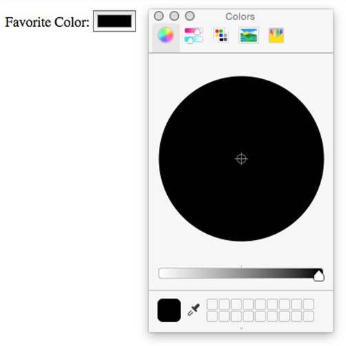
Figure 4.10. Chrome’s color picker control for the color input type
Dates and Times
There are new date and time input types, some of which are included in the HTML5 specification, as well as a few others that are still listed in the HTML Living Standard and the HTML5.1 draft that may be at risk. The date and time input types made it into the HTML5 W3C Recommendation, while datetime, datetime-local, month, and week are at risk of being dropped. All date and time inputs accept data formatted according to the ISO 8601 standard.
Here are the available date and time input types:
· date: comprises the date (year, month, and day), but no time; for example, 2004-06-24.
· time: signifies a time of day using the military format (24-hour clock); for example, 22:00 instead of 10.00 p.m.
· month: only includes the year and month; for example, 2012-12.
· week: covers the year and week number (from 1 to 52); for example, 2011-W01 or 2012-W52.
· datetime: includes both the date and time, separated by a “T”, and followed by either a “Z” to represent UTC (Coordinated Universal Time) or by a time zone specified with a + or - character; for example, “2011-03-17T10:45-5:00” represents 10:45 a.m. on the 17th of March, 2011 in the UTC minus five hours time zone (Eastern Standard Time). This value has been removed from the spec and then added back in. It is currently without support.
· datetime-local: is identical to datetime, except that it omits the time zone; the main difference is that datetime-local is supported in browsers that support date and time, while datetime is not.
The most commonly used of these types is date. The specifications call for the browser to display date controls. At the time of writing, WebKit for iOS, Chrome 20+, and Opera provide calendar controls for most of these values. Internet Explorer 11, Safari for desktop, and Firefox 37 still do not.
Let’s change our subscription start date field to use the date input type:
<label for="startdate">Please start my subscription on:</label>
<input type="date" min="1904-03-17" max="1904-05-17" id="startdate" name="startdate" required aria-required="true" placeholder="1904-03-17">
Now, we’ll have a calendar control when we view our form in Opera, Chrome, or iOS WebKit, as shown in Figure 4.11. Unfortunately, it’s unable to be styled with CSS at present.
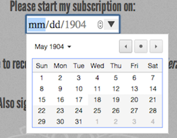
Figure 4.11. A calendar control
For the month and week types, browsers display a similar UI as the date input type, but only allow the user to select full months or weeks. In those cases, individual days are unable to be selected; instead, clicking on a day selects the whole month or week. While datetime-local is supported in these browsers, datetime is not. datetime has been deprecated. month, week, and datetime-local are at risk as well, but have yet to fall to the same fate. Chrome lost support for datetime in version 26, Opera in version 15, and Safari in iOS7. Instead of using datetime since support should be deprecated, use date and time as two separate input types.
We recommend including a minimum and maximum when using the date input type. As with number and range, this is done with the min and max attributes.
The placeholder attribute that we added to our start date field earlier is made redundant in browsers supporting the datepicker interface, but it makes sense to leave it in place to guide users of IE, Safari, and Firefox until they implement the date and time controls. Until all browsers support the UI of the new input types, placeholders are a good way to hint to your users what kind of data is expected in those fields. Remember, they’ll just look like regular text fields in nonsupporting browsers.
Tip: Dynamic Dates
In our example, we hardcoded the min and max values into our HTML. If you wanted the minimum to be the day after the current date—which makes sense for a newspaper subscription start date—this would require updating the HTML every day. The best way to handle it is to dynamically generate the minimum and maximum allowed dates on the server side. A little PHP can go a long way:
<?php
function daysFromNow($days){
$added = ($days * 24 * 3600) + time();
return date("Y-m-d", $added);
}
?>
In our markup where we had static dates, we now dynamically create them with the above function:
<li>
<label for="startdate">Please start my subscription on: </label>
<input type="date" min="<?php echo(daysFromNow(1)); ?>" max="<?php echo(daysFromNow(91)); ?>" id="startdate" name="startdate" required aria-required="true" placeholder="<?php echo(daysFromNow(1)); ?>">
</li>
This way, the user is limited to entering dates that make sense in the context of the form.
You can also include the step attribute with these input types. For example, step="7" on date will limit the user to selecting only one day per week: the particular weekday depends on the min if one is present, or is the current day of the week if none is present. On time input, the stepattribute must be expressed in seconds, so adding step="900" on the time input type will cause the input to step in increments of 15 minutes.
Additional New Form Controls in HTML5
We’ve covered the new values for the input element’s type attribute, along with some attributes that are valid on most form elements. But HTML5 web forms still have more to offer us! There are five new form elements in the HTML5 forms specification: datalist, output, keygen, progress, and meter. We covered datalist above. We introduced you to progress and meter in the last chapter as they are often useful outside of forms. So let’s recap and take a look at the other two elements.
The progress and meter Elements
Two of the most well-known HTML5 elements are the progress and meter elements.
The meter element provides for a gauge, displaying a general value within a range. You provide minimum (min) and maximum (max) values, and the required value that falls between those minimum and maximum values. While many think it’s a form control with attributes similar to some numeric input types, it has no name attribute and won’t be submitted on form submission.
The meter will default the minimum value to 0, or the meter’s value, whichever is lower. The maximum value defaults to 1 or the meter’s value, whichever is higher. Use meter when there is a minimum value, a maximum value, and optimal values, and the value can go up and down like a test grade, gas tank level, or blood pressure. With these three attributes, browsers that support meter including Android 4.4+ (but not iOS7 or IE11) will show a green gauge.
meter enables us to show when a value is in the right range with the low, high, and optimum values. If the value is between min and low, the meter is yellow. If the value is between the low and high value the meter is green. If the value is between high and max, it will be red. Currently theoptimum value has no noticeable effect.
The meter element should not be used to indicate progress; instead, use a progress bar to indicate the percentage of how complete a task is.
Progress attributes include max and value, with progress always being between 0 and 100% complete. The browser calculates what percentage the value is of the maximum and adjusts the length of the progress bar accordingly. It displays a partially filled gray to blue progress bar where it is fully gray at 0% and fully blue at 100%.
If no value is included, the progress bar is indeterminate. Chrome, Opera, Safari, and Firefox display indeterminate progress as animated bars, with IE styling it as animated dots.
Unlike meter, progress heads only in the direction of 100% of the max value. The presentation defaults to inline-block so you can set width and height on progress elements. Height will not change the actual height of the stylized bar (unlike meter) but will add space below it.
The output Element
The purpose of the output element is to accept and display the result of a calculation. The output element should be used when the user can see the value, but not directly manipulate it, and when the value can be derived from other values entered in the form. An example use might be the total cost calculated after shipping and taxes in a shopping cart.
The output element’s value is contained between the opening and closing tags. Generally, it will make sense to use JavaScript in the browser to update this value. The output element has a for attribute, which is used to reference the IDs of form fields whose values went into the calculation of the output element’s value.
The output element’s name and value are submitted along with the form.
The keygen Element
The keygen element is a control for generating a public-private key pair and for submitting the public key from that key pair. Opera, Chrome, Safari, Android, and Firefox all support this element, rendering it as a drop-down menu with options for the length of the generated keys; all provide different options, though. There is still no support in iOS7 and IE11.
The keygen element introduces two new attributes: the challenge attribute specifies a string that is submitted along with the public key, and the keytype attribute specifies the type of key generated. At the time of writing, the only supported keytype value is rsa, a common algorithm used in public-key cryptography.
The contenteditable Attribute
While it is always best to use the most appropriate form element for its intended purpose, sometimes the existing form elements fall short of our needs; for example, no form control makes for a good inline WYSIWYG text editor.
There is a roundabout solution for that, though. Any element in an HTML5 document can be made editable with the contenteditable attribute. The contenteditable attribute, written simply as contenteditable or contenteditable="true", makes the element on which it is included editable. You will usually find this attribute on divs, but you can even make a style element that's set to "display:block" editable, and change CSS on the fly. While any element that is not natively a form control will not by default be sent to the server with the rest of the form data on form submission, you can use JavaScript to send user edited content to the server asynchronously or on form submission.
If you’ve ever seen an editable profile where the element to click doesn’t look like a form control at all, there is a chance that you were actually editing a contenteditable element. Any edits made on contenteditable components actually update the DOM.
Simply adding contenteditable to an element makes that element editable in all browsers. In addition, its descendents will also be editable unless contenteditable="false" is explicitly applied to them. While this does update the DOM client side, you do have to add JavaScript to explicitly save it.
Changes to Existing Form Controls
There have been a few other changes to form controls in HTML5.
The form Element
Throughout this chapter, we’ve been talking about attributes that apply to various form field elements; however, there are also some new attributes specific to the form element itself.
First, as we’ve seen, HTML5 provides a number of ways to natively validate form fields; certain input types such as email and url, for example, as well as the required and pattern attributes. You may, however, want to use these input types and attributes for styling or semantic reasons without preventing the form being submitted. The new Boolean novalidate attribute allows a form to be submitted without native validation of its fields.
Next, forms no longer need to have the action attribute defined. You no longer need to explicitly state the URL to use it for form submission. If omitted, the form will behave as though the action were set to the current page. You can write or override the URL defined in the form’s actionattribute with the formaction attribute of the button input types that activate form submission.
Lastly, the autocomplete attribute we introduced earlier can also be added directly to the form element; in this case, it will apply to all fields in that form unless those fields override it with their own autocomplete attribute.
The optgroup Element
In HTML5, you can have an optgroup as a child of another optgroup, which is useful for multilevel select menus.
The textarea Element
In HTML 4, we were required to specify a textarea element’s size by specifying values for the rows and cols attributes. In HTML5, these attributes are no longer required; you should use CSS to define a textarea’s width and height.
New in HTML5 is the wrap attribute. This attribute applies to the textarea element, and can have the values soft (the default) or hard. With soft, the text is submitted without line breaks other than those actually entered by the user, whereas hard will submit any line breaks introduced by the browser due to the size of the field. If you set the wrap to hard, you need to specify a cols attribute.
In Conclusion
Unfortunately, we weren’t able to cover everything—that should be a book in itself. This was, however, a fairly in-depth introduction. As support for HTML5 input elements and attributes grows, sites will require less and less JavaScript for client-side validation and user interface enhancements, while browsers handle most of the heavy lifting. Legacy user agents are likely to stick around for the foreseeable future, but there is no reason to avoid moving forward and using HTML5 web forms, with appropriate polyfills and fallbacks filling the gaps where required.
In the next chapter, we’ll continue fleshing out The HTML5 Herald by adding what many consider to be HTML5’s killer feature: native video and audio.
[8] The named color "rebeccapurple" #663399, is a tribute to Eric Meyer's daughter, who passed away in 2014. It is a mark of support from all the web community to Eric Meyer.