HTML5 & CSS3 FOR THE REAL WORLD (2015)
Chapter 7 CSS3 Gradients and Multiple Backgrounds
In Chapter 6, we learned a few ways to add decorative styling features—such as shadows and rounded corners—to our pages without the use of additional markup or images. The next most common feature frequently added to websites that used to require images is gradients. CSS3 provides us with the ability to include multiple background images on any element including multiple radial and linear gradients that we can make the browser create for us. With CSS3, there’s no need to create the multitudes of JPEGs of years past, or add nonsemantic hooks to our markup.
Browser support for gradients and multiple backgrounds has fully evolved, with IE9 supporting multiple background images and IE10 supporting gradients.
We’ll start by looking at CSS3 gradients. But first, what are gradients about? Gradients are smooth transitions between two or more specified colors. In creating gradients, you can specify multiple in-between color values called color stops. Each color stop is made up of a color and a position; the browser fades the colors from each stop to the next to create a smooth gradient. Gradients can be utilized anywhere a CSS image can be used. This means that in your CSS, a gradient can be theoretically employed anywhere a url() value can be used, such as background-image,border-image, and even list-style-type.
By using CSS gradients to replace images, you save your users from having to download extra images. Furthermore, CSS gradients are fully responsive, and so you avoid pixelation when you zoom in, unlike with images.
Linear and radial gradients are both well-supported types of gradients. Let’s go over them in turn.
Linear Gradients
Linear gradients are those where colors transition across a straight line: from top to bottom, left to right, or along any arbitrary axis. If you’ve spent any time with image-editing tools such as Photoshop and Fireworks, you should be familiar with linear gradients—but as a refresher, Figure 7.1shows some examples.
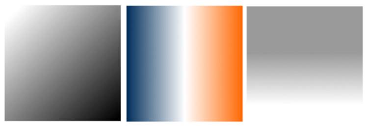
Figure 7.1. Linear gradient examples
Similar to image-editing programs, to create a linear gradient you specify a direction, the starting color, the end color, and any color stops you want to add along the gradient line. The browser takes care of the rest, filling the entire element by painting lines of color perpendicular to the gradient line. It produces a smooth fade from one color to the next, progressing in the direction you specify.
When it comes to browsers and linear gradients, it becomes a little messy. WebKit first introduced gradients several years ago using a particular and—many argued—convoluted syntax. After that, Mozilla implemented gradients using a simpler and more straightforward syntax. Then, in January of 2011, the W3C included a proposed syntax in CSS3. The final W3C syntax, which is slightly different from the previous prefixed implementation, is supported by all major browsers starting with IE10. It is supported without prefixes, though you may want to use the intermediate syntax with the -webkit- prefix to target some mobile WebKit browsers that are still in play, such as Android 4 to 4.3, Blackberry 10, and UC Browser for Android 9.
That still leaves us with the question of how to handle gradients in IE9 and earlier. Fortunately, IE9 supports scalable vector graphics (SVG) backgrounds—and it’s fairly simple to create gradients in SVG. (We’ll be covering SVG in more detail in Chapter 12.) In addition, IE8 supports a proprietary filter that enables the creation of basic linear gradients.
Confused? Don’t be. While gradients are important to understand, memorizing all the browser syntaxes is unnecessary. We’ll cover the final syntax, as well as the soon-to-be-forgotten old-style syntax, but first we’ll let you in on a little secret: there are tools that will create all the required styles for you, so there’s no need to remember all the specifics of each syntax. Let’s get started.
There’s one linear gradient in The HTML5 Herald, in the second advertisement block shown in Figure 7.2 (which happens to be advertising this very book!). You’ll note that the gradient starts off dark at the top, lightens, then darkens again as if to create a road under the cyclist, before lightening again.

Figure 7.2. A linear gradient in The HTML5 Herald
To create a cross-browser gradient for our ad, we’ll start with the standard syntax. Then we’ll cover how to tweak it slightly to target older WebKit browsers.
The W3C Syntax
Here’s the basic syntax for linear gradients:
background-image: linear-gradient( … );
Inside those parentheses, you specify the direction of the gradient and then provide some color stops. For the direction, you can provide either the angle along which the gradient should proceed, or the side or corner to which it should end—in which case it will proceed towards the opposite side or corner.
For angles, you use values in degrees (deg). 0deg points upward, 90deg points toward the right, and so on in a clockwise rotation. For a side or corner, use to top, to bottom, to left, to right, to top left, to bottom left, to top right, or to bottom right direction key phrases.
After specifying the direction, provide your color stops; these are made up of a color and a percentage or length specifying how far along the gradient that stop is located.
That’s a lot to take in, so let’s look at some gradient examples. For the sake of illustration, we’ll use a gradient with just two color stops: #FFF (white) to #000 (black).
To have the gradient go from top to bottom of an element, as shown in Figure 7.3, you could specify any of the following:
background-image: linear-gradient(180deg, #FFF 0%, #000 100%);
background-image: linear-gradient(to bottom, #FFF 0%, #000 100%);
background-image: linear-gradient(#FFF 0%, #000 100%);
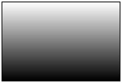
Figure 7.3. A white-to-black gradient from the top center to the bottom center of an element
The last declaration works because to bottom is the default in the absence of a specified direction.
Because the first color stop is assumed to be at 0%, and the last color stop is assumed to be at 100%, you could also omit the percentages from that example and achieve the same result:
background-image: linear-gradient(#FFF, #000);
While all of these examples are functionality-equivalent, we recommend that you select a preferred way of declaring your gradients for consistency and markup legibility.
Now let’s put our gradient on an angle and place an additional color stop. Let’s say we want to go from black to white, and then back to black again:
background-image: linear-gradient(60deg, #000, #FFF 75%, #000);
We’ve placed the color stop 75% along the way, so the white band is closer to the gradient’s end point than its starting point, as shown in Figure 7.4.
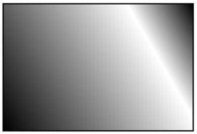
Figure 7.4. A gradient with three color stops
You can place your first color stop somewhere other than 0%, and your last color stop at a place other than 100%. All the space between 0% and the first stop will be the same color as the first stop, and all the space between the last stop and 100% will be the color of the last stop. Here’s an example:
background-image: linear-gradient(60deg, #000 50%, #FFF 75%, #000 90%);
The resulting gradient is shown in Figure 7.5.
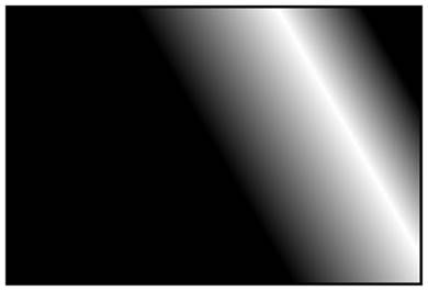
Figure 7.5. A gradient confined to a narrow band by offsetting the start and end color stops
There’s no need to actually specify positions for any of the color stops. If you omit them, the stops will be evenly distributed. Here’s an example:
background-image:
linear-gradient(45deg,
#FF0000 0%,
#FF6633 20%,
#FFFF00 40%,
#00FF00 60%,
#0000FF 80%,
#AA00AA 100%);
background-image:
linear-gradient(45deg,
#FF0000,
#FF6633,
#FFFF00,
#00FF00,
#0000FF,
#AA00AA);
Each of the previous declarations makes for a fairly unattractive angled rainbow. Note that we’ve added line breaks and indenting for ease of legibility—they are not essential.
Colors transition smoothly from one color stop to the next; however, if two color stops are placed at the same position along the gradient, the colors won’t fade, but will stop and start on a hard line. This is a way to create a striped background effect, such as the one shown in Figure 7.6.
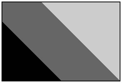
Figure 7.6. Careful placement of color stops can create striped backgrounds
Here are the styles used to construct that example:
background-image:
linear-gradient(45deg,
#000000 30%,
#666666 30%,
#666666 60%,
#CCCCCC 60%,
#CCCCCC 90%
);
At some point in the reasonably near future, you can expect this hopefully final, non-prefixed version of the syntax to be the only one you’ll need to write—but we’re not quite there yet.
The Prefixed Syntax
If you intend targeting gradients to older mobile WebKit browsers, you need to include a prefixed gradient declaration with slightly different syntax.
In the prefixed rendition of linear gradients, the angles were different: 0deg pointed to the right, and angles went counterclockwise instead of clockwise, so 90deg was up, and so on. In addition, the key phrases were different: we declared where the gradient was coming from instead of where it was going to. For a side or corner, in the prefixed syntax use top, bottom, left, right, top left, bottom left, top right, or bottom right.
In this intermediate syntax, the corner gradients didn’t necessarily go from corner to corner like the new syntax: instead, they went at a 45 degrees angle through the center of the element on which it was applied.
These three declarations are the same as our three default declarations listed, but with the -webkit- prefix.
background-image: -webkit-linear-gradient(270deg, #FFF 0%, #000 100%);
background-image: -webkit-linear-gradient(top, #FFF 0%, #000 100%);
background-image: -webkit-linear-gradient(#FFF 0%, #000 100%);
This -webkit- prefixed syntax works for Safari 5.1-6, iOS 5-6.1, Chrome 10-25, Android 4.0-4.3, and Blackberry 10. Microsoft, other than for its developer preview, never released a browser with prefixed linear gradients.
The Old WebKit Syntax
Older versions of Webkit for Safari 4 and 5, Android 2.3 to 3, iOS 3.2 to 4.3, Blackberry 7, and Chrome through version 9 supported the original syntax. If you still need to support these browsers, you have to understand the syntax. But think twice before including it as the performance and memory consumption of this old syntax on old devices that require it may not make the gradient worth the effort.
Let’s look at this original syntax, using our first white-to-black gradient example again:
background-image:
-webkit-gradient(linear, 0% 0%, 0% 100%, from(#FFFFFF), to(#000000));
Rather than use a specific linear-gradient property, there’s a general-purpose -webkit-gradient property where you specify the type of gradient (linear in this case) as the first parameter. The linear gradient then needs both a start and end point to determine the direction of the gradient. The start and end points can be specified using percentages, numeric values, or the keywords top, bottom, left, right, or center.
The next step was to declare color stops of the gradients. You can include the originating color with the from keyword and the end color with the to keyword. Then you can include any number of intermediate colors using the color-stop function to create a color stop. The first parameter of the color-stop() function is the position of the stop expressed as a percentage, and the second parameter is the color at that location.
Here’s an example:
background-image:
-webkit-gradient(linear, left top, right bottom,
from(red),
to(purple),
color-stop(20%, orange),
color-stop(40%, yellow),
color-stop(60%, green),
color-stop(80%, blue));
With that, we’ve recreated our angled rainbow, reminiscent of GeoCities circa 1996.
This syntax is more complicated than what was finally adopted by the W3C. Fortunately, tools exist to generate all the required code for a given gradient automatically. We’ll be looking at some of them at the end of this section, but first we’ll see how to use both syntaxes to create a cross-browser gradient for The HTML5 Herald. The good news is that since the three WebKit syntaxes use different property values, you can use them side by side without conflict. The old syntax is still supported in newer browsers, so the browser will just use whichever one was declared last. We’ve included it here mainly for legacy purposes, as you might come across this still-supported old syntax in legacy code.
Putting It All Together
Now that you have a fairly good understanding of how to declare linear gradients, let’s declare ours.
If your designer included a gradient in the design, it’s likely to have been created in Photoshop or another image-editing program. You can use this to your advantage; if you have the original files, it’s fairly easy to replicate exactly what your designer intended.
If we open Photoshop and inspect the gradient we want to use for the ad (shown in Figure 7.7), we see that our gradient is linear, with five color stops that change the opacity of a single color (black).
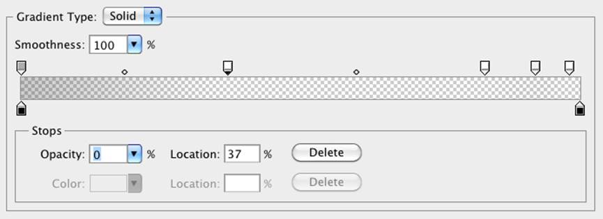
Figure 7.7. An example linear gradient in Photoshop
You’ll note via the Photoshop screengrab that the first color stop’s location is at 37% with an opacity of 0%. We can use this tool to grab the data for our CSS declaration, beginning with the -webkit- prefixed version for older browsers, and followed by the W3C non-prefixed syntax:
.ad-ad3 {
…
background-image:
-webkit-linear-gradient(
270deg,
rgba(0,0,0,0.4) 0,
rgba(0,0,0,0) 37%,
rgba(0,0,0,0) 83%,
rgba(0,0,0,0.06) 92%,
rgba(0,0,0,0) 98%
);
background-image:
linear-gradient(
180deg,
rgba(0,0,0,0.4) 0,
rgba(0,0,0,0) 37%,
rgba(0,0,0,0) 83%,
rgba(0,0,0,0.06) 92%,
rgba(0,0,0,0) 98%
);
}
We want the gradient to run from the very top of the ad to the bottom, so we set the angle to 180deg, which is toward bottom, or 180 degrees clockwise from the top of 0 degrees. The prefixed syntax has a different angle with 270deg: as in the older version 0 degrees is to the right instead of to the top, and angle measurements are counterclockwise unlike the final syntax that is clockwise.
We’ve then added all the color stops from the Photoshop gradient. Note that we’ve omitted the end point of the gradient, because the last color stop is at 98%—everything after that stop will be the same color as the stop in question (in this case, black at 0% opacity, or fully transparent).
Linear Gradients with SVG
We still have a few more browsers to add our linear gradient to. For IE9, which lacks support for gradients, we can declare SVG files as background images. By creating a gradient in an SVG file and declaring that SVG as the background image of an element, we can recreate the same effect we achieved with CSS3 gradients.
Note: SVG
SVG stands for Scalable Vector Graphics. It’s an XML-based language for defining vector graphics using a set of elements—like what you use in HTML to define the structure of a document. We’ll be covering SVG in much more depth in Chapter 12, but for now we’ll just skim over the basics, since all we’re creating is a simple gradient.
An SVG file sounds scary, but for creating gradients it’s quite straightforward. Here’s our gradient in SVG form:
<?xml version="1.0" standalone="no"?>
<!DOCTYPE svg PUBLIC "-//W3C//DTD SVG 1.0//EN"
"http://www.w3.org/TR/2001/REC-SVG-20050904/DTD/svg10.dtd">
<svg xmlns="http://www.w3.org/2000/svg"
xmlns:xlink="http://www.w3.org/1999/xlink" version="1.1">
<title>Module Gradient</title>
<defs>
<linearGradient id="grad" x1="0" y1="0" x2="0" y2="100%">
<stop offset="0" stop-opacity="0.3" color-stop="#000000" />
<stop offset="0.37" stop-opacity="0" stop-color="#000000" />
<stop offset="0.83" stop-opacity="0" stop-color="#000000" />
<stop offset="0.92" stop-opacity="0.06" stop-color="#000000" />
<stop offset="0.98" stop-opacity="0" stop-color="#000000" />
</linearGradient>
</defs>
<rect x="0" y="0" width="100%" height="100%" style="fill:url(#grad)" />
</svg>
Looking at the SVG file, you should notice that it’s quite similar to the syntax for linear gradients in CSS3. We declare the gradient type and the orientation in the linearGradient element, then add color stops. Like in the oldest WebKit syntax, the orientation is set with start and end coordinates, from x1, y1 to x2, y2. The color stops are fairly self-explanatory, having an offset between 0 and 1 determining their position and a stop-color for their color. After declaring the gradient, we then have to create a rectangle (the rect element) and fill it with our gradient using thestyle attribute.
So, we’ve created a nifty little gradient, but how do we use it on our site? Save the SVG file with the .svg extension. Then in your CSS declare the SVG as your background image with the same syntax, as if it were a JPEG, GIF, or PNG:
.ad-ad3 {
…
background-image: url("../images/gradient.svg);
…
}
The SVG background should be declared before the CSS3 gradients, so browsers that understand both will use the latter. Browsers that support gradients are even smart enough not to download the SVG if it’s overwritten by another background-image property later on in your CSS.
The major difference between our CSS linear gradients and the SVG version is that the SVG background image won’t default to 100% of the height and width of the container the way CSS gradients do. To make the SVG fill the container, declare the height and width of your SVG rectangle as 100%.
Linear Gradients with IE Filters
For Internet Explorer prior to version 9, we can use the proprietary IE filter syntax to create simple gradients. The IE gradient filter doesn’t support color stops, gradient angle, or, as we’ll see later, radial gradients. All you have is the ability to specify whether the gradient is horizontal or vertical, as well as the “to” and “from” colors. It’s fairly basic, but if you need a gradient on these older browsers, it can provide the solution.
The filter syntax for IE is:
filter:progid:DXImageTransform.Microsoft.gradient(GradientType=0, startColorstr='#COLOR', endColorstr='#COLOR); /* IE6 & IE7 */
-ms-filter:"progid:DXImageTransform.Microsoft.gradient(GradientType= 0,startColorstr='#COLOR', endColorstr='#COLOR')"; /* IE8 */
The GradientType parameter should be set to 1 for a horizontal gradient, or 0 for a vertical gradient.
Since the gradient we’re using for our ad block requires color stops, we’ll skip using the IE filters. The ad still looks fine without the gradient, so it’s all good.
As we’ve mentioned before, IE’s filters can have a significant impact on performance, so use them sparingly if at all. Calculating the display of filter effects takes processing time, with some effects being slower than others. We recommend against using Microsoft filters: sites do not need to look the same in all browsers.
Tools of the Trade
Now that you understand how to create linear gradients and have mastered the intricacies of their convoluted syntax, there’s no need to worry if you forget the specifics of the syntax you just learned. There are some very cool tools to help you create linear gradients without having to recreate your code for the old and new syntaxes.
John Allsop’s CSS3 Sandbox is a tool that enables you to create gradients with color stops, with separate tabs for radial and linear gradients. The tool only creates gradients with hexadecimal color notation, but it does provide you with copy-and-paste code, so you can copy it and then switch the hexadecimal color values to RGBA or HSLA if you prefer.
Damian Galarza’s Gradient Generator provides for both color stops and RGB. It even lets you set colors with an HSL color picker, but converts it to RGB in the code. It does not provide for alpha transparency, but since the code generated is in RGB, it’s easy to update. This gradient generator is more powerful than John Allsop's one, but may be a bit overwhelming for a newbie.
Radial Gradients
Radial gradients are circular or elliptical gradients. Rather than proceeding along a straight axis, colors blend out from a starting point in all directions. To create a radial gradient you define the center of the gradient, its size and shape, and the color stops, like we do for linear gradients. The color stops start at the center and progress outwards. Similar to linear gradients, radial gradients are supported in all browsers (beginning with IE10). As with linear gradients, they can be created in SVG so support can be provided to IE9. Radial gradients are entirely unsupported in IE8 and earlier—not even with filters.
The W3C Syntax
Let’s start with a basic circular gradient to illustrate the standard syntax:
background-image: radial-gradient(circle farthest-corner at center, #FFF, #000);
This will result in the gradient shown in Figure 7.8. We’ve declared the shape of the gradient as a circle: the default radial gradient is an ellipse whose height and width has the same aspect ratio as the container on which it is set, unless the size is declared in length units with differing proportions. We’ve declared the size as farthest-corner, which means that the end of the gradient is at the corner furthest from the center of the gradient. We set the center of the gradient to be at the center of the containing block, which is the default. We then defined two color stops of white and black. Color stops are declared the same way as linear gradients.
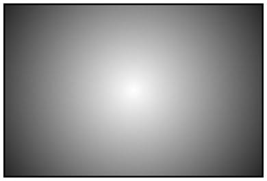
Figure 7.8. A centered radial gradient
Let’s now play with the position:
background-image: radial-gradient(circle farthest-corner at 30px 30px, #FFF, #000);
This will place the center of the gradient 30 pixels from the top and 30 pixels from the left of the element, as you can see in Figure 7.9. As with background-position, you can use values, percentages, or keywords to set the gradient’s position.
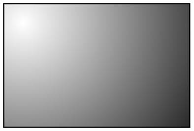
Figure 7.9. A radial gradient positioned off-center
Now let’s look at the shape and size parameter. The shape can take one of two values, circle or ellipse, with the latter being the default.
For the size parameter, you can use one of the following values (and you can see example results in Figure 7.10):
closest-side
The gradient’s shape meets the side of the box closest to its center (for circles), or meets both the vertical and horizontal sides closest to the center (for ellipses). It creates the smallest gradient of the four key terms.
closest-corner
The gradient’s shape is sized so that it meets exactly the closest corner of the box from its center.
farthest-side
Similar to closest-side, except that the shape is sized to meet the side of the box farthest from its center—or the farthest vertical and horizontal sides in the case of ellipses.
farthest-corner
The gradient’s shape is sized so that it meets exactly the farthest corner of the box from its center. Creates the largest gradient of the four key terms.
lengths
For the size we could have used a length unit instead of one of the four key terms mentioned, with percentage values being supported for elliptical declarations, but not for circles. If you declare lengths, the circle gradient only supports one value; for ellipses, the length unit requires both the horizontal and vertical radii be declared, with the width coming before the height.
The length or key term determines where the 100% color stop will be located. Any points beyond that color stop will be the same color as that color stop.
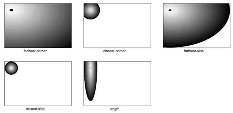
Figure 7.10. Radial gradient sizing
The color stop syntax is the same as for linear gradients: a color value followed by an optional stop position. Let’s look at one last example:
background-image: radial-gradient(circle farthest-side at 30px 30px, #FFF, #000 30%, #FFF);
This will create a gradient like the one in Figure 7.11.
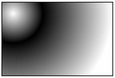
Figure 7.11. A radial gradient with a modified size and shape, and an extra color stop
The Prefixed WebKit Syntax
To create the example in Figure 7.11 using the prefixed WebKit syntax currently in iOS up to 5.1, Android up to 4.3, and BlackBerry 10, we need to prefix the value and reorder the value components:
background-image: -webkit-radial-gradient(30px 30px, circle farthest-side, #FFF, #000 30%, #FFF);
We prefix the property value with -webkit-. The location is declared first, without the at key term. Otherwise, the prefixed version is similar to the unprefixed syntax.
Making Our Own Radial Gradient
Let’s take all that we’ve learned and implement a radial gradient for The HTML5 Herald. You may not have noticed, but the form submit button has a radial gradient in the background. The center of the radial gradient is outside the button area, towards the left and a little below the bottom, as Figure 7.12 shows.

Figure 7.12. A radial gradient on a button in The HTML5 Herald’s sign-up form
We’ll want to declare at least three background images: an SVG file for IE9, the older WebKit syntax for mobile Webkit, and the unprefixed version for modern browsers:
input[type=submit] {
…
background-color: #333;
/* SVG for IE9 */
background-image: url(../images/button-gradient.svg);
/* prefixed for Android 4 to 4.3, Blackberry and UC Browser
background-image: -webkit-radial-gradient(30% 120%, circle,
rgba(144,144,144,1) 0%,
rgba(72,72,72,1) 50%);
background-image: radial-gradient(circle at 30% 120%,
rgba(144,144,144,1) 0%,
rgba(72,72,72,1) 50%);
}
The center of the circle is 30% from the left, and 120% from the top, so it’s actually below the bottom edge of the container. We’ve included two color stops for the color #484848—or rgba(72,72,72)—and #909090—or rgba(144,144,144).
And here’s the SVG file used as a fallback:
<?xml version="1.0" standalone="no"?>
<!DOCTYPE svg PUBLIC "-//W3C//DTD SVG 1.0//EN" "http://www.w3.org/TR/2001/REC-SVG-20050904/DTD/svg10.dtd">
<svg xmlns="http://www.w3.org/2000/svg" xmlns:xlink=" http://www.w3.org/1999/xlink" version="1.1">
<title>Button Gradient</title>
<defs>
<radialGradient id="grad" cx="30%" cy="120%" fx="30%" fy="120%" r="50%" gradientUnits="userSpaceOnUse">
<stop offset="0" stop-color="#909090" />
<stop offset="1" stop-color="#484848" />
</radialGradient>
</defs>
<rect x="0" y="0" width="100%" height="100%" style="fill:url(#grad)" />
</svg>
The syntax is fairly explanatory, but we’ll cover SVG in Chapter 12 anyway. Keep in mind that you can also leverage background-position and background-size for your design.
Repeating Gradients
Sometimes you’ll find yourself wanting to create a gradient pattern that repeats over the background of an element. While recurring linear gradients can be created by repeating the background image (with background-repeat), there’s no equivalent way to easily create repeating radial gradients. Fortunately, CSS3 comes to the rescue with both a repeating-linear-gradient and a repeating-radial-gradient syntax. The vendor-prefixed repeating-linear-gradient syntax is supported in Firefox 3.6+, Safari 5.0.3+, Chrome 10+, and Opera 11.10+, and unprefixed since IE10, Firefox 16, Safari 6.1, iOS 7.1, Opera 12.1, Chrome 26 (though it can be quirky) and even Opera Mobile 12.1.
In terms of color stops and angles, gradients with repeating-linear-gradient and repeating-radial-gradient have the same syntax as the non-repeating versions.
Here are examples of what can be created with just a few lines of CSS:
.repeat_linear_1 {
background-image:
repeating-linear-gradient(to right,
rgba(0,0,0,0.5) 10%,
rgba(0,0,0,0.1) 30%);
}
.repeat_radial_2 {
background-image:
repeating-radial-gradient(circle at top left,
rgba(0,0,0,0.9),
rgba(0,0,0,0.1) 10%,
rgba(0,0,0,0.5) 20%);
}
.multiple_gradients_3 {
background-image:
repeating-linear-gradient(to right,
rgba(0,0,0,0.5) 10%,
rgba(0,0,0,0.1) 30%),
repeating-radial-gradient(circle at top left,
rgba(0,0,0,0.9),
rgba(0,0,0,0.1) 10%,
rgba(0,0,0,0.5) 20%);
}
The resulting gradients are shown in Figure 7.13.
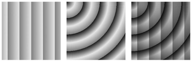
Figure 7.13. A few examples of repeating gradients
The important difference to remember is that the color-stop placement values matter in repeating gradients. In regular gradients, the last color stop location is simply the end point of the color transition. In repeating gradients, the first color stop is the beginning of the gradient, and the last color stop location is the end of the gradient: it starts repeating with the first color stop at that location. In our example our two color stops are at10% and 30%. This means the gradient will repeat five times, as each is 20% of the width of the containing object (30% - 10% = 20%). In our radial example, the first color stop has no location, so it defaults to 0%.
Multiple Background Images
You probably noticed that our advertisement with the linear gradient is incomplete: we’re missing the bicycle. Prior to CSS3, adding the bicycle would have required placing an additional element in the markup to contain the new background image. In CSS3, there’s no need to include an element for every background image; it provides us with the ability to add more than one background image to any element, even to pseudo-elements.
To understand multiple background images, you need to understand the syntax and values of the various background properties. The syntax for the values of all the background properties, including background-image and the shorthand background property, are the same whether you have one background image or many. To make a declaration for multiple background images, simply separate the values for each individual image with a comma. For example:
background-image:
url(firstImage.jpg),
url(secondImage.gif),
url(thirdImage.png);
This works just as well if you’re using the shorthand background property:
background:
url(firstImage.jpg) no-repeat 0 0,
url(secondImage.gif) no-repeat 100% 0,
url(thirdImage.png) no-repeat 50% 0;
The background images are layered one on top of the other with the first declaration on top, as if it had a higher z-index. The final image is drawn under all the images preceding it in the declaration, as if it had a low z-index. Basically, think of the images as being stacked in reverse order with the last one being drawn first, and each previous image being drawn on top of it.
IE8 doesn’t support multiple background images. If you’re still supporting IE8, declare a single background image before the multiple background image declaration.
If you want to declare a background color—which you should, especially if it’s light-colored text on a dark-colored background image—declare it last. It’s often simpler and more readable to declare it separately using the background-color property.
As a reminder, the shorthand background property is short for eight longhand background properties. If you use the shorthand, any longhand background property value that’s omitted from the declaration will default to the longhand property’s default (or initial) value. The default values for the various background properties are listed:
· background-color: transparent;
· background-image: none;
· background-position: 0 0;
· background-size: auto;
· background-repeat: repeat;
· background-clip: border-box;
· background-origin: padding-box;
· background-attachment: scroll;
The heading on our sign-up form has two background images. While we could attach a single extra-wide image in this case, spanning across the entire form, there’s no need! With multiple background images, CSS3 allows us to attach two separate small images, or a single image sprite twice with different background positions. This saves on bandwidth, of course, but it’s also beneficial if the heading needed to stretch; a single image would be unable to accommodate differently sized elements. This time, we’ll use the background shorthand:
background:
url("../images/bg-formtitle-left.png") left 13px no-repeat,
url("../images/bg-formtitle-right.png") right 13px no-repeat;
Note: Using the Shorthand
In browsers that support all the available background properties and the shorthand, the following two statements are equivalent:
div {
background: url("tile.png") no-repeat scroll center bottom / cover rgba(0, 0, 0, 0.2);
}
div {
background-color: rgba(0,0,0,0.2);
background-position: 50% 100%;
background-size: cover;
background-repeat: no-repeat;
background-clip: border-box;
background-origin: padding-box;
background-attachment: scroll;
background-image: url(form.png);
}
If you declare the shorthand, remember that all omitted properties reset themselves to each longhand property’s default value. When using both shorthand with a property override, remember to declare the shorthand before the longhand property.
Note: Multiple Background Images in IE8
If you still need to support IE8, which does not support multiple background images, you can leverage generated content to access three hooks to use for single background images: adding a single background image to the element, the :before content and the :after content as shown:
div {
position: relative;
background: url(secondImage.gif) no-repeat 100% 0;
}
div:before, div:after {
position: absolute;
top: 0; left: 0; right: 0; bottom: 0;
content: '';
}
div:after { background: url(firstImage.jpg) no-repeat 0 0;}
div:before { background: url(thirdImage.png) no-repeat 50% 0;}
Remember to use single-colon notation as IE8 doesn’t understand double-colon notation.
Background Size
The background-size property allows you to specify the size you want your background images to have. Include background-size within the shorthand background declaration by adding it after the background’s position, separated with a slash (/). This syntax is confusing to many. As a result, many developers use the background-size property as a separate declaration instead. Support for background-size is fairly universal, starting with IE9, and unprefixed starting with Firefox 4 and Android 3.
The background-size value takes a length, a percentage, or one of the key terms cover, contain, or auto, with auto being the default.
If you include a single length or percentage value, that will define the width of the image, with the height set to maintain the image’s aspect ratio. If you prefer to base the size on the height of the image, use two values with the first (or width) being auto and the second being the height preference, as the first value is the width and the second, the height. If you have multiple background images, separate the sizes for each image with a comma.
Both these lines have the same meaning:
background-size: 100px auto, auto auto;
background-size: 100px, auto;
As with all background properties, use commas to separate values for each image declared. If you only include one size, all the background images will be of that size. If we wanted our bicycle to be really big, we could declare:
background-size: 100px auto, cover;
By default, a background image is the actual size of the image. Sometimes the image is just a bit smaller or larger than its container. You can define the size of your background image in pixels (as shown) or percentages, or you can use the contain or cover keyterms.
The contain value scales the image while preserving its aspect ratio, which may leave uncovered space. The cover value scales the image so that it completely covers the element, also maintaining the image’s aspect ratio. This can result in clipping the image if the background image has a different aspect ratio than the element.
Note: Background Image Performance
In terms of performance, it’s best to use auto with the background-size property if you can, especially when animating. All other values require the image to be decoded twice, with cover requiring the most time and CPU.
Tip: Working with HiDPI Devices
The background-size property comes in handy for devices that have different pixel densities, such as HiDPI devices like the many mobile devices and Apple laptops that have a pixel density four times higher than the average inexpensive laptop or monitor. To prevent pages designed for older devices from looking tiny, the browsers on these HiDPI devices behave as though they had a regular display. The iPhone 5, for example, has a screen resolution of 640×960 but behaves as if it has a 320×480 display. On this device, every pixel in your CSS corresponds to four screen pixels. Images are scaled up to compensate, but this means they can sometimes look a little rough compared to the smoothness of the text displayed.
To deal with this, you can provide higher-resolution images to HiDPI devices. For example, if we were providing a high-resolution image of a bicycle for the iPad, it would measure 74×90px instead of 37×45px. However, we don’t actually want it to be twice as big! We only want it to take up 37×45px worth of space. We can use background-size to ensure that our high-resolution image still takes up the right amount of space:
background-size: 37px 45px, cover;
In this scenario, you can use media queries to define which device receives what based on the viewport size and pixel density, with min-resolution replacing the min-device-pixel-ratio:
<link rel="stylesheet" media="screen and (max-device-width: 520px) and (min-resolution: 2dppx)" />
In the Background
That’s all for CSS3 backgrounds and gradients. In the next chapter, we’ll be looking at transforms, animations, and transitions. These allow you to add dynamic effects and movement to your pages without relying on bandwidth- and processor-heavy JavaScript.
All materials on the site are licensed Creative Commons Attribution-Sharealike 3.0 Unported CC BY-SA 3.0 & GNU Free Documentation License (GFDL)
If you are the copyright holder of any material contained on our site and intend to remove it, please contact our site administrator for approval.
© 2016-2026 All site design rights belong to S.Y.A.