HTML5 & CSS3 FOR THE REAL WORLD (2015)
Chapter 8 CSS3 Transforms and Transitions
Our page is fairly static. Actually, it’s completely static. In Chapter 4 we learned a little about how to alter a form’s appearance based on its state with the :invalid and :valid pseudo-classes. But what about really moving things around? What about changing the appearance of elements, such as rotating or skewing them?
For years, the only way to display text on an angle was to use an image of text created in an image-editing program and the only way to animate was to change positioning with JavaScript. This is far from ideal. Enter CSS3: without a line of JavaScript or a single JPEG, you can tilt, scale, move, and even flip your elements with ease.
Let’s see how it’s done.
Transforms
The CSS3 transform property lets you lets you translate, rotate, scale, and/or skew any element on the page. While some of these effects were possible using previously existing CSS features (such as translating with relative and absolute positioning), CSS3 gives you unprecedented control over many more aspects of the element’s appearance.
We can manipulate an element’s appearance using transform functions. The value of the transform property is one or more transform functions (separated by spaces) that will be applied in the order they’re provided. In this book, we’ll cover all the two-dimensional transform functions. All modern browsers, starting with IE10 and Android 3, also support the transformation of elements in 3D space, but 3D transforms are beyond the scope of this book.
To illustrate how transforms work, we’ll be working on another advertisement block from The HTML5 Herald, shown in Figure 8.1.

Figure 8.1. This block will serve to illustrate CSS3 transforms
Translation
Translation functions allow you to move elements left, right, up, or down. These functions are similar to the behavior of position: relative; when declaring top and left, moving elements up and down or left and right along the x and y axes. When you employ a translation function, you’re moving elements without impacting the flow of the document. Unlike position: relative, which allows you to position an element either against its current position or against a parent or other ancestor, a translated element can only be moved relative to its current position.
The translate(x,y) function moves an element x from the left, and y from the top:
transform: translate(45px, -45px);
Note: Transforms and Older Browsers
Transforms require vendor prefixing for IE9, Android up to 4.4.3, iOS8, and Blackberry 10. To make the aforementioned code work in IE9 and older mobile WebKit browsers, you would include the following:
-webkit-transform: translate(45px,-45px); /* iOS8, Android 4.4.3, BB10 */
-ms-transform: translate(45px,-45px); /* IE9 only */
transform: translate(45px,-45px);
If you only want to move an element vertically or horizontally, you can use the translatex or translatey functions respectively. To move 45px to the right along the x axis, include:
transform: translateX(45px);
To move up along the y axis by 30px, include:
transform: translateY(-30px);
For our ad, we want to move the word “dukes” over to the right when the user hovers over it, as if it had been punched by our mustachioed pugilist. In the markup, we have:
<h1>Put your <span>dukes</span> up, sire</h1>
Let’s apply the style whenever the user hovers over the h1. This will make the effect more likely to be stumbled across than if it was only triggered by hovering over the span itself:
.ad-ad2 h1:hover span {
color: #484848;
transform: translateX(40px);
}
Wait—this doesn’t work. What gives?
Transforms don’t work on inline elements. But that’s easy enough to fix. We’ll just add display: inline-block; to our span:
.ad-ad2 h1 span {
font-size: 30px;
color: #999999;
display: inline-block;
…
The result is shown in Figure 8.2.

Figure 8.2. The result of our translate transform
It’s nice, but we can still do better! Let’s look at how we can scale our text to make it bigger as well.
Scaling
The scale(x,y) function scales an element by the defined factors horizontally then vertically. If only one value is provided, it will be used for both the x and y values, growing or shrinking your element or pseudo-element while maintaining the original aspect ratio. For example, scale(1)would leave the element the same size, scale(2) would double its proportions, scale(0.5) would halve them, and so on. Providing different values will distort the element, as you’d expect:
transform: scale(1.5, 0.25);
As with translate, you can also use the scaleX(x) or scaleY(y) functions. These functions will scale only the horizontal dimensions or only the vertical dimensions respectively.
A scaled element will grow outwards from or shrink inwards towards its center; in other words, the element’s center will stay in the same place as its dimensions change. To change this default behavior, you can include the transform-origin property, which we’ll be covering a bit later.
Let’s add a scale transform to our span:
.ad-ad2 h1:hover span {
color: #484848;
transform: translateX(40px) scale(1.5);
}
Note that you shouldn’t declare a new transform: because of the cascade, a second transform would override the first. To declare multiple transformations, provide a space-separated list of transform functions. We simply add our scale to the end of that space-separated list.
It’s also worth remembering that scaling, like translation, has no impact on the document flow. This means that if you scale inline-block elements, text around it will fail to accommodate it with reflowing. Figure 8.3 shows an example of how this might be a problem. In cases where this is an issue, you may consider adjusting the element’s height, width, or font-size instead of using a scale() transform. Changing those properties will alter the space allocated to the element by the browser, but will also cause a reflow, recalculating the elements in the document to re-rendering part or all of the page. Transforming does not cause a reflow.
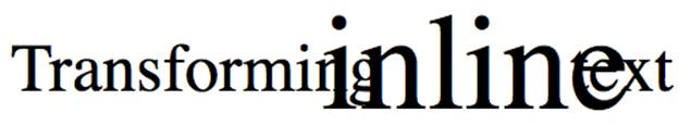
Figure 8.3. Using the scale function on inline text can have unwanted results
In our example, however, we want the text to pop out of the ad without reflowing the surrounding text, so the scale does exactly what we need it to do. Figure 8.4 shows what our hover state looks like with the scale added to the existing translation.

Figure 8.4. Our ad now has plenty of pop
It’s looking good, but there’s still more to add.
Rotation
The rotate() function rotates an element around the point of origin by a specified angle value. As with scale, by default the point of origin is the element’s center. Generally, angles are declared in degrees, with positive degrees moving clockwise and negative moving counterclockwise. In addition to degrees, values can be provided in grads, radians, or turns, but we’ll just be sticking with degrees.
Let’s add a rotate transform to our “dukes”:
.ad-ad2 h1:hover span {
color: #484848;
transform: rotate(10deg) translateX(40px) scale(1.5);
}
We’re rotating our span by ten degrees clockwise—adding to the effect of text that’s just been dealt a powerful uppercut. We are declaring the rotation before the translate so that it’s applied first—remember that transforms are applied in the order provided. In this case, the span will be rotated 10 degrees, and then moved 40px along the rotated x axis.
The final transformed text is shown in Figure 8.5.

Figure 8.5. Our text has now been translated, scaled, and rotated—that’s quite a punch!
There’s one more type of transform we’re yet to visit. It won’t be used on The HTML5 Herald, but let’s take a look anyway.
Skew
The skew(x,y) function specifies a skew along the x and y axes. As you’d expect, the x specifies the skew on the x axis, and the y specifies the skew on the y axis. If the second parameter is omitted, the skew will only occur on the x axis:
transform: skew(15deg, 4deg);
Applying these styles to a heading, for example, results in the skew shown in Figure 8.6.
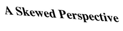
Figure 8.6. Some text with a skew transform applied
As with translate and scale, there are axis-specific versions of the skew transform: skewX() and skewY().
Changing the Origin of the Transform
As we hinted at earlier, you can control the origin from which your transforms are applied. This is done using the transform-origin property. It has the same syntax as the background-position property, and defaults to the center of the object (so that scales and rotations will be around the center of the box by default).
Let’s say that you were transforming a circle. Because the default transform-origin is the center of the circle, applying a rotate() transform to a circle would have no visible effect—a circle rotated 90 degrees still looks exactly the same as it did before being rotated. An ellipse rotated 180 degrees around its center would also look the same as it did before being rotated upside down. However, if you gave your circle or ellipse a transform-origin of 10% 10% or top center, you would notice the rotation as Figure 8.7 illustrates.
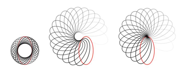
Figure 8.7. Rotating an ellipse is more noticeable if the transform-origin is set to something other than the default 50% 50%
Browser support for the transform-origin property is the same as for transform—prefixing being required when the transform property requires it:
transform-origin: 0 0;
Note: Choose Your Ordering Carefully
The order of transform functions does matter: if you rotate before translating, your translate direction will be on the rotated axis. The rightmost square in Figure 8.8 was translated then rotated with transform: translateX(200px) rotate(135deg);. The leftmost square was rotated first then translated along the newly rotated axis: transform: rotate(135deg) translateX(200px);.
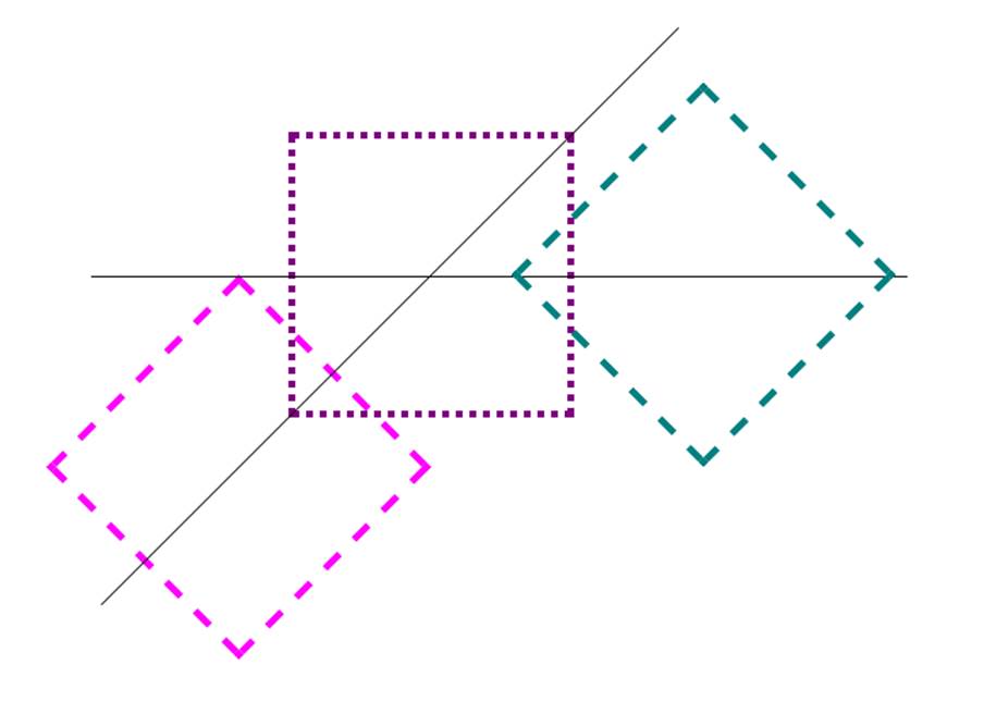
Figure 8.8. The order of transform functions makes a difference
Support for Internet Explorer 8 and Earlier
While CSS3 transforms are unsupported in IE before version 9, you can mimic these effects with other CSS properties, including filters. To mimic translation use position: relative;, and top and left values:
.translate {
position: relative;
top: 200px;
left: 200px;
}
You can also scale an element by altering its width and height, or changing the font-size. Remember, though, that while transformed elements still take up the space they did before being scaled, altering a width, height or font-size alters the space allocated for the element and can affect the layout.
You can use filters to rotate an element in older versions of Internet Explorer, but it’s ugly and performs poorly:
.rotate {
transform: rotate(15deg);
filter: progid:DXImageTransform.Microsoft.Matrix(
sizingMethod='auto expand', M11=0.9659258262890683,
M12=-0.25881904510252074, M21=0.25881904510252074,
M22=0.9659258262890683);
-ms-filter: "progid:DXImageTransform.Microsoft.Matrix(
M11=0.9659258262890683, M12=-0.25881904510252074,
M21=0.25881904510252074, M22=0.9659258262890683,
sizingMethod='auto expand')";
zoom: 1;
}
This filter’s syntax isn’t worth going into here. If you want to rotate an element in Internet Explorer, go to http://www.useragentman.com/IETransformsTranslator/ for cross-browser code for a given transform. Just edit the original transform expression; the older IE version will be updated accordingly. This page provides prefixed transform declarations that are outdated, but the IE filter is accurate.
Transitions
Animation has certainly been possible for some time with JavaScript, but native CSS transitions generally require less client-side processing, so they’ll usually appear smoother. On mobile devices with limited computing power, this can be a lifesaver.
As much fun as it’s been to have a feature work in IE9, it’s time to again leave that browser behind. IE10 and all other browsers support CSS transitions, and transitions are UI enhancements, and fail accessibly, so we need not worry about archaic IE browsers.
Transitions allow the values of CSS properties to change over time, essentially providing simple animations. For example, if a link changes color on hover, you can have it gradually fade from one color to the other instead of a sudden change. They’re both transitions, but with the CSStransition property the color transition can be gradual. If the browser lacks support for transitions, the change will be immediate instead of gradual, which is fine and accessible.
We can animate any of the transforms we’ve just seen, so that our pages feel more dynamic.
CSS transitions are declared along with the regular styles on an element. Whenever the target properties change, the browser will apply the transition making the change gradual. Often the change will be due to different styles applied to a hover state; however, transitions will work equally well if the property in question is changed by adding a class, or otherwise using JavaScript to change state. This is significant: rather than writing out an animation in JavaScript, you can simply switch a property value and rely on the browser to do all the heavy lifting.
Here are the steps to create a simple transition using only CSS:
1. Declare the original state of the element in the default style declaration.
2. Declare the final state of your transitioned element; for example, a :hover state.
3. Include the transition functions in your default style declaration using the transition properties, including: transition-property, transition-duration, transition-timing-function, and transition-delay. We’ll look at each of these and how they work shortly.
The important point to note is that the transition is declared in the default or originating state. The -webkit- vendor prefix is still needed for older mobile devices, including iOS6.1, BlackBerry10, Android 4.3 and UC Browser for Android. All other browsers, including IE10 and Android 4.4 browser support the unprefixed syntax.
This may be a lot to grasp, so let’s go over the various transition properties. As we go, we’ll apply a transition to the transforms we added to our ad in the last section, so that the word “dukes” moves smoothly into its new position when hovered.
transition-property
The transition-property property defines the CSS properties of the element that should be transitioned, with all for all properties being the default.
Any property changing from one value to another for which you can find a valid midpoint can be transitioned. For example, in transitioning from a 1px red border to a 15px blue border, we transition the color and width of the border. The midpoint of 1px and 15px is obvious (8px), so we know that is a transitionable property value. The midpoint between red and blue might not seem obvious, but the browser converts named colors to their numeric values, which have a midpoint. If the border-style were declared as changing from solid to dashed, that would not be a transitionable property as there is no midpoint between these key terms.
It is important to include a pre-state and a post-state. For example, to transition from rectangular corners to rounded corners, set the original state to border-radius: 0;.
The exception to this “if there is a valid midpoint, it can be transitioned” rule is visibility: although there is no valid midpoint between the values visible and hidden, when transitioned, the value changes at the endpoint of the transition. The list of properties that can be animated is found athttps://developer.mozilla.org/en-US/docs/Web/CSS/CSS_animated_properties.
You can provide any number of CSS properties to the transition-property declaration, separated by commas. Alternatively, you can use the keyword all to indicate that every supported property should be animated as it transitions.
In the case of our ad, we’ll apply the transition to the transform property:
.ad-ad2 h1 span {
transition-property: transform;
}
Note: Supporting Older Browsers
To support older WebKit browsers, you need to include the -webkit- prefix for all of your transition properties. You may also need to specify the -webkit- prefixed forms of properties. For example, you’re unable to animate transform in a browser that only understands -webkit-transform:
.ad-ad2 h1 span {
-webkit-transition-property: -webkit-transform;
transition-property: transform;
}
Include the -webkit- prefix for all the transition properties, not just the transition-property property. There’s no need to include -ms-transform:; although IE9 does understand prefixed transforms, it doesn’t understand transitions. IE9 will get the transformed look, but will not animate it as it transitions to the new value.
As new properties gain browser transition support, be careful what you include as the value for the transition-property: it’s possible that a property that doesn’t animate at the time you’re writing your page eventually will, so be selective in the properties you specify, and only use or default to all if you really want to animate every property. If you want to transition more than one property, but not all, comma-separate them:
.foo {
transition-property: transform, color;
}
In itself, the transition-property property has no effect; that’s because we still need to specify the duration of the transition.
The transition-duration Property
The transition-duration property sets how long the transition will take: the duration of time it takes to go from the default state to the transitioned state. You can specify this either in seconds (s) or milliseconds (ms). We’d like our animation to be fairly quick, so we’ll specify 0.2 seconds (0.2s), or 200 milliseconds (200ms):
transition-duration: 0.2s;
200ms is generally considered the optimum time for a transition: anything slower will make the website seem slow, drawing generally unwanted attention to what was supposed to be a subtle effect. Anything faster may be too subtle.
With those styles in place, our span will transition on hover. Notice that by default the “reverse” transition also takes place over the same duration—the element returns to its previous position.
Note: Automatic Graceful Degradation
While transitions are supported in all modern browsers, the fact that they’re declared separately from the properties that are changing means that those changes will still be apparent in older browsers without support for transitions. Those browsers will still apply the :hover (or other) state, except that the changes will happen instantly rather than transitioning over time.
The transition-timing-function Property
The transition-timing-function lets you control the pace of the transition in even more granular detail. Do you want your animation to start off slow and become faster, start off fast and end slower, advance at an even keel, or some other variation?
The most common timing functions include the key terms ease, linear, ease-in, ease-out, or ease-in-out. The default ease has a slow start, then it speeds up, and ends slowly. ease-in-out is similar to ease, but accelerates more sharply at the beginning. linear creates a transition that animates at a constant speed. ease-in creates a transition that is slow to start but gains speed, then stops abruptly. The opposite, ease-out, starts at full speed, then slows progressively as it reaches the conclusion of the transition. The best way to familiarize yourself with them is to play around and try them all. Most often, one will just feel right for the effect you’re aiming to create. It’s helpful to set a relatively long transition-duration when testing timing functions—if it’s too fast, you may not be able to tell the difference.
You can also describe your timing function more precisely by defining your own cubic-bezier function. It accepts four numeric parameters; for example, linear is the same as cubic-bezier(0, 0, 1, 1). If you’ve studied six years of calculus, the method of writing a cubic Bézier function might make sense; otherwise, it’s likely you’ll want to stick to one of the five basic timing functions. You can also look at online tools that let you play with different values, such as http://cubic-bezier.com/, which lets you compare the common key terms against each other or against your own cubic Bézier function. Another document, http://estelle.github.io/animation/files/cubicbezierprint.html, allows you to set the timing function and time to watch it, visualizing how Bézier curves work.
In addition to the predefined timing functions and developer-defined cubic Bézier function, you can divide the transition over equidistant steps. With the steps function, you define the number of steps and the direction of either start or end, where either the first step happens at the animation start, or the last step happens at the animation end respectively. For example, steps(5, start) would jump through the equidistant steps of 0%, 20%, 40%, 60%, and 80%, and steps(5, end) would jump throught the equidistant steps of 20%, 40%, 60%, 80%, and 100%. We will use thesteps(n, end) timing function when we animate our bicycle with CSS animation later on in this chapter.
For our transition, we’ll use ease-out:
transition-timing-function: ease-out;
This makes the transition fast to start with, becoming slower as it progresses. Of course, with a 0.2 second duration, the difference is barely perceptible.
The transition-delay Property
Finally, by using the transition-delay property, it’s possible to introduce a delay before the transition begins. Normally a transition begins immediately, so the default is 0. Include the number of milliseconds (ms) or seconds (s) to delay the transition. We don’t want our transition to start immediately, because that might be a bad user experience if the user accidentally mouses through our ad on the way from one part of the document to the next. A 50ms delay is enough time to wait to be sure they are intentionally hovering over our advertisement:
-webkit-transition-delay: 50ms;
transition-delay: 50ms;
Tip: Negative Delays
Interestingly, a negative time delay that’s less than the duration of the entire transition will cause it to start immediately, but it will start partway through the animation. For example, if you have a delay of -500ms on a 2s transition, the transition will start a quarter of the way through, and will last 1.5 seconds. On the way back, it will jump 75% of the way through the transition, and then transition back to the default state. This might be used to create some interesting effects, so it’s worth being aware of.
The transition Shorthand Property
With four transition properties and a vendor prefix, you could wind up with eight lines of CSS for a single transition. Fortunately, as with other properties such as border, there’s a shorthand available. The transition property is shorthand for the four transition properties just described.
Let’s take another look at our transition so far:
.ad-ad2 h1 span {
transition-property: transform;
transition-duration: 0.2s;
transition-timing-function: ease-out;
transition-delay: 50ms;
}
Now let’s combine all those values into a shorthand declaration:
.ad-ad2 h1 span {
transition: transform 0.2s ease-out 50ms;
}
Note that the properties in the shorthand syntax can be in any order, however, if a delay is included, you must also include a duration, and the duration must precede the delay.
Multiple Transitions
The transition properties allow for multiple transitions in one call. For example, if we want to change the color at the same time as changing the rotation and size, we can.
Let’s say instead of just transitioning the rotation, we transition the text’s color property as well. We’d have to first include a color property in the transitioned style declaration, and then either add the color property in the transition-property value list, or use the key term all:
transition-property: transform, color;
transition-duration: 0.2s;
transition-timing-function: ease-out;
transition-delay: 50ms;
If you want your properties to transition at different rates, or if you just want a select few to have a transition effect, include them as a comma-separated list containing, at minimum, the transition-property and transition-duration for each. Simply include each value in a comma-separated list using the same order as the transition-property for all your longhand transition property declarations:
transition-property: transform, color;
transition-duration: 0.2s, 0.1s;
transition-timing-function: ease-out, linear;
transition-delay: 50ms;
These properties will apply an ease-out transition over 0.2 seconds to the transform, but a linear transition over 0.1 seconds to the color. Both have a delay of 50ms before transition initiation.
You can also use the shorthand to specify multiple transitions at different durations, delays, and timing functions. In this case, specify all the transition values as a shorthand for each transition, and separate each property’s transition with a comma:
transition: transform 0.2s ease-out 50ms, color 0.1s linear 50ms;
If you want to change both properties at the same rate and delay, you can include both property names or—since you are transitioning all the properties listed in the hover state anyway—you can employ the all keyword.
When using the all keyword, all the properties transition at the same rate, speed, and delay:
transition: all 0.2s ease-out 50ms;
How do we know when a transition has ended? A transitionend event—prefixed and camel-cased as webkitTransitionEnd for older mobile browsers—is fired upon completion of a CSS transition in both directions. The event is fired once per direction for each completed transformed property. In the case where the transition fails to complete, such as if you mouseout before our 250ms transition is over in the example above, it will not fire when it has only partially moved and started changing color, but will fire when it returns to the original default state. If you have more than one property being transitioned, the transitionend event will fire multiple times. In our case, it will fire twice when both the color and transform reach their transitioned state, and twice again when color and transform return to the original state.
Animations
Transitions animate elements over time; however, they’re limited in what they can do. You can define starting and ending states, but there’s no fine-grained control over any intermediate states. CSS animations, unlike transitions, allow you to control each step of an animation via keyframes.
If you’ve ever worked with Flash, you’re likely very familiar with the concept of keyframes; if not, don’t worry, it’s fairly straightforward. A keyframe is a snapshot that defines a starting or end point of any smooth transition. With CSS transitions, we’re essentially limited to defining a first and a last keyframe. CSS animations allow us to add any number of keyframes in between, to guide our animation in more complex ways.
All modern browsers support CSS animation, starting with IE10, though we still require the -webkit- prefix in iOS8, Android 4.4.3, and BlackBerry 10. IE10 is unprefixed. Firefox 16, Chrome 39, and Opera 26 dropped their need for a prefix for CSS animations.
The lack of powerful processors on many mobile devices makes CSS animations a great alternative to weighty, CPU-intensive JavaScript animation. Generally, it is best to use CSS for simple-state changes in a mobile environment. But it’s still better to employ JavaScript for intricate, stateful UIs, and when you do, you’ll likely want to use a JavaScript animation library to help with manageability and performance.
We do have a subtle animation in our Herald, so we’ll use CSS for our animations.
Keyframes
To animate an element in CSS, you first create a named animation, then attach it to an element in that element’s property declaration block. Animations in themselves don’t do anything; in order to animate an element, you’ll need to associate the animation with that element.
To create an animation, use the @keyframes rule for IE10+ and FF16+. Include @-webkit-keyframes for all WebKit implementations followed by a name of your choosing, which will serve as the identifier for the animation. Then, you can specify your keyframes.
For an animation called myAnimation, the @keyframes rule would look like this:
@-webkit-keyframes myAnimation {
/* put animation keyframes here */
}
@keyframes myAnimation {
/* put animation keyframes here */
}
Do not quote the animation name.
Each keyframe looks like its own nested CSS declaration block. Instead of a traditional selector, though, you use a percentage value, or a comma-separated list of percentage values. There are two keyterms―from and to―which evaluate to 0% and 100% respectively. These values specify how far along the animation each keyframe is located.
Inside each keyframe include the properties you want to animate, along with the animated values. The values will be smoothly interpolated by the browser’s animation engine between each keyframe.
Keyframes can be specified in any order; it’s the percentage values rather than the order of the declarations that determine the sequence of keyframes in the animation.
Here are a few simple animations:
@keyframes moveRight {
from {
transform: translateX(-50%);
}
to {
transform: translateX(50%);
}
}
@keyframes appearDisappear {
0%, 100% {
opacity: 0;
}
20%, 80% {
opacity: 1;
}
}
@keyframes bgMove {
100% {
background-position: 120% 0;
}
}
The second animation is worth paying extra attention to: we’ve applied the same styles to 0% and 100%, and to 20% and 80%. In this case, it means the element will start out invisible (opacity: 0;), fade in to visible by 20% of the way through the duration, remain visible until 80%, then fade out.
We’ve created three animations, but nothing in our document will animate yet. An element must have at minimum an animation name for there to be an animation, and must also have a duration declared for the animation to be perceptible. Once we have defined our keyframe animations, the next step is to apply it to one or more elements using the various animation properties.
Animation Properties
The animation properties, remembering that you will need two declarations for each property as the -webkit- prefix is still needed in WebKit browsers, are as follows:
animation-name
This property is used to attach an animation (previously defined using the @keyframes syntax) to an element:
animation-name: appearDisappear;
Note that you should not put quotes around the animation name in either the property value or the @keyframes at-rule, as the specifications state the name is an identifier and not a string, so browsers don’t support quoted animation names.
animation-duration
The animation-duration property defines the length of time (in seconds or milliseconds) an animation takes to complete one iteration (all the way through, from 0% to 100%):
animation-duration: 300ms;
While animation-name is the only required animation property to create an animation, the animation-duration should be considered required to animate an element. Without declaring the duration it defaults to 0s, which is imperceptible, but still fires the animationstart and animationendevents. The other animation properties, while they enable you to better control your animation, are optional.
animation-timing-function
Like the transition-timing-function property, the animation-timing-function determines how the animation will progress over its duration. The options are the same as for transition-timing-function: ease, linear, ease-in, ease-out, ease-in-out, a developer-defined cubic-bezier()function, step-start, step-end, or a developer-defined number of steps with the steps(number, direction) function:
animation-timing-function: linear;
The bicycle in the advertisement on the right is animated in browsers that support animation. The bicycle is a background image, and while background images aren’t able to be animated, background-position is. We’ve created a sprite of four images with our silhouetted man pedaling, as shown in Figure 8.9.

Figure 8.9. The sprite image we'll use to create the animation
To make it look like he is pedaling along, we show the different images of the sprite in succession. To do this, we use the steps() function, moving the background image sprite through the sized background box in four steps. We move the background image to the left so that each image within the sprite is displayed in succession:
.ad-ad3 :after {
content: '';
width: 90px;
height: 92px;
background-image: url(../Images/bike_sprite.png);
display: block;
margin: auto;
}
@keyframes bike {
0% {
background-position: 0 0;
}
100% {
background-position: -360px 0;
}
}
Our background image is 360px wide and our container is 90px wide. We want to show the background images in quick succession, with the background-position at 0 0, -90px 0, -180px 0, and -270px 0. Using steps(4, direction), if the direction is start we’ll see the 25%, 50%, 75%, and 100% keyframes. If the direction is end we’ll see the 0%, 25%, 50%, and 75% keyframes. At the 100% keyframe, the background image is completely off to the left—we don’t want to see this. At the 0% keyframe, the background image is at 0 0, which is the default value for background-position, and which will display the first image in our sprite. This is what we want:
animation-timing-function: steps(4, end);
animation-iteration-count
The animation-iteration-count property lets you define how many times the animation will play through. The value is generally an integer, but you can also use numbers with decimal points (in which case, the animation will end partway through an iteration), or the value infinite for endlessly repeating animations. If omitted, it will default to 1, in which case the animation will occur only once. The following is an example of using this property:
animation-iteration-count: infinite;
animation-direction
When the animation iterates, it normally goes from the 0% to the 100% keyframe, jumping back to the 0% when it starts a new iteration (if the animation-iteration-count is greater than 1). This is the default or normal value for animation-direction. You can use the animation-directionproperty to change this behavior.
The value of reverse will cause the animation to start at the 100% keyframe and work its way to the 0% keyframe for every iteration. With the alternate value, the initial iteration and odd-numbered iterations after that will go in the normal 0% to 100% direction, but the second iteration and every even iteration after that will go in the reverse direction of 100% to 0%. Similarly, the alternate-reverse animation-direction value causes the animation to alternate direction at every iteration, but it starts in reverse.
An animation of a snowflake falling will always be normal, though, you could use the same “falling” animation and employ alternate to reverse it, making it bounce up on every second playthrough. If you were to animate two kids playing on a seesaw, one kid could be tagged alternate and the other, alternate-reverse:
animation-direction: alternate;
When animations are played in reverse, timing functions are also reversed; for example, ease-in becomes ease-out.
animation-delay
The animation-delay property is used to define how many milliseconds or seconds to wait before the browser begins the animation:
animation-delay: 50ms;
animation-fill-mode
The animation-fill-mode property defines what happens before the first animation iteration begins and after the last animation iteration concludes. By default, an animation has no effect on property values outside of when it’s iterating, but we can override this default behavior of animation-fill-mode: none.
The available values are none, forwards, backwards, or both. The default is none, in which case the animation proceeds and ends as expected, not inheriting the initial keyframe properties until after the delay has expired; it reverts to no longer being impacted by any of the keyframe property values when the animation completes its final iteration.
We can tell the animation to sit and wait on the first keyframe from the moment the animation is applied to the element, through the duration of the animation delay, until the animation starts iterating with animation-fill-mode: backwards. We can also hold the element at the last keyframe, with last keyframe property values overriding the element's original property values, without reverting to the original values at the conclusion of the last animation iteration with animation-fill-mode: forwards. We can also achieve both of these with animation-fill-mode: both.
As an example, let’s say we animate four green elements from red to blue over one second, include a one-second delay for each, and set each with a different value for the animation-fill-mode property. The elements with animation-fill-mode set to backwards or both will be set to red as soon as the animation is attached to the element. When the animation-delay expires, all four elements will be red, changing to blue over one second. When the animation ends, the elements with animation-fill-mode set to forwards and both will stay blue, but those without the property set, or if it’s set to none or backwards, will jump back to green.
Table 8.1. Examples of animation-fill-mode in effect
|
Fill mode |
page load |
1s |
2s |
after 2s |
|
none |
green |
red |
blue |
green |
|
backwards |
red |
red |
blue |
green |
|
forwards |
green |
red |
blue |
blue |
|
both |
red |
red |
blue |
blue |
When set to forwards, the animation continues to apply the values of the last keyframes after the animation ends. When set to backwards, the animation’s initial keyframes are applied as soon as the animation style is applied to an element. As you’d expect, a value of both applies both thebackwards and forwards effects:
animation-fill-mode: both;
animation-play-state
The animation-play-state property defines whether the animation is running or paused. A paused animation displays the current state of the animation statically. When a paused animation is resumed, it restarts from the current position. This provides a simple way to control CSS animations from within your CSS or with JavaScript.
The Shorthand animation Property
Fortunately, there’s a shorthand for all of these animation properties, especially since we’re still including the -webkit- prefix. The animation property takes as its value a space-separated list of values for the longhand animation-name, animation-duration, animation-timing-function,animation-delay, animation-iteration-count, animation-direction, animation-fill-mode, and animation-play-state properties:
.verbose {
animation-name: appearDisappear;
animation-duration: 300ms;
animation-timing-function: ease-in;
animation-iteration-count: 1;
animation-direction: alternate;
animation-delay: 5s;
animation-fill-mode: backwards;
animation-play-state: running;
}
/* shorthand */
.concise {
animation: 300ms ease-in alternate 5s backwards appearDisappear;
}
Note that in the shorthand version, we’ve left out the animation-iteration-count and animation-play-state since both were set to default.
Warning: Be Careful with Naming
If using the shorthand property, be careful with your animation-name. You want to avoid accidentally using any animation property key term such as forwards, running, or alternate. Those three key terms in particular have caused many developers hours of debugging. If you include a key term, the browser will assume that the first occurrence of a valid value for any of the longhand properties is the value for that property, not the value for the animation-name property.
To declare multiple animations on an element, include a grouping for each animation name, with each shorthand grouping separated by a comma. For example:
.target {
animation:
animationOne 300ms ease-in backwards,
animationTwo 600ms ease-out 1s forwards;
}
For our bicycle, we want to translate it to the right while animating the sprite to make it seem as if the man is pedaling, using the steps() timing function to change the background image:
@keyframes bike {
0% {
background-position: 0 0;
}
100% {
background-position: -360px 0;
}
}
@keyframes move {
0% {
transform: translateX(-100px);
}
100% {
transform: translateX(100px);
}
}
h1:after {
content: '';
width: 90px;
height: 92px;
background-image: url(../Images/bike_sprite.png);
display: block;
margin: auto;
animation:
0.4s steps(4, end) infinite 50ms bike,
8s linear infinite 50ms move;
animation-play-state: paused;
}
h1:hover:after {
animation-play-state: running;
}
We’ve created two keyframe animations: one to animate the bicycle pedals using an animated sprite, and a second to move the animated bicycle across the advertisement using translated transform functions.
In its default state we have paused the animation. On hover, the animation comes alive with animation-play-state of running. There's no need to include the animation-fill-mode property as our animations iterate infinitely, and there's a 50ms delay before the animation starts so that it doesn't start if the user accidentally mouses through the ad.
Moving On
With transforms, transitions, and animations, our site is looking more dynamic. Remember the old maxim, though: just because you can, doesn’t mean you should. Animations were aplenty on the Web in the late 90s; a lot of us remember flashing banners and scrolling marquees, and animated gifs were less entertaining than those that are popular today. Use animations and transitions where it makes sense, enhancing the user experience—and skip it everywhere else.
We still have a few lessons to learn in CSS3 to make our website look more like an old-time newspaper. In the next chapter, we’ll we’ll learn about typography and how to include fancy fonts not installed by default on our users’ computers. We'll also look at how you can span text across multiple columns without scripts or extra HTML.
All materials on the site are licensed Creative Commons Attribution-Sharealike 3.0 Unported CC BY-SA 3.0 & GNU Free Documentation License (GFDL)
If you are the copyright holder of any material contained on our site and intend to remove it, please contact our site administrator for approval.
© 2016-2026 All site design rights belong to S.Y.A.