A Smarter Way To Learn HTML & CSS(2015)
62
Layout:
div widths and centering
Let’s talk about the div that contains most of the content of the page, the one that, in our example, creates the Main box. It’s the third box down in the diagram shown in the last chapter. Sticking with the name I used in the diagram, we’ll give the div an id of “main.”
Usually, you don’t want the contents of a section to bump up against the left and right edges of the window. As in a book, you create some whitespace on the left and right. A good way to do it is to specify a width for the section, like this.
div#main {
width: 90%;
}
This style adds a minimum amount of whitespace on the side.
But 90% of what? Well, when you specify ems or percentages, these values are always relative to what’s “normal”—either the browser’s default or a style you’ve overridden with CSS styling. In our example, we created a default width in the body styling, width: 100%. This style tells the browser to make the body width the full width of the browser window. That’s the browser’s default, so we’re just telling it to do what it would do anyway. But by making it explicit, we tell any human readers trying to understand our CSS that we’re accepting the browser’s default.
So when you specify width: 90% for the main section, you’re telling the browser to make the section only 90% as wide as the browser window. If we had specified width: 60% for the body, specifying width: 90% for the main section would make the section 60% times 90%, or 54% of the full window width.
But there’s a problem. By default, browsers place things on the left. This means that if we make the main section narrower than the body, the main section will bump up against the left edge of the browser window, and all the whitespace will wind up on the right. That’s not what we want. We want the section centered. So we add a line.
div#main {
width: 90%;
margin: 0 auto 0 auto;
}
Once we’ve told the browser how wide to make the div, specifying auto for left and right margins tells the browser that if there’s any width left over—in this case 10%—to split the difference. Now there’ll be a margin on the left that’s equal to 5% of the browser window width and a margin on the right of the same width. That is, the section will be centered.
You can make the section narrower, with wider margins, by reducing the percentage you specify for the width.
You can add whitespace above and/or below the section by replacing the zeros with em values.
div#main {
width: 90%;
margin: 1.5em auto 1% auto;
}
You’ll have to play around with the em values to get the margins to suit you.
Now suppose you have several different divs within the main div, and you want to give these proportionally the same margins that you’ve assigned to the main div (not that the margins have to be proportional). You could do this by using exactly the same specifications you used for the main div.
div.inset {
width: 90%;
margin 0 auto 0 auto;
}
Since all values of the inner div are relative to the values of the outer div, the divs of the class “inset” will have 90% of the width of the outer div. This is the result.
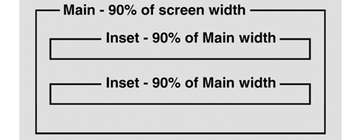
Of course, the inner div’s width value doesn’t have to be the same as the width value of the outer div. I just did it this way so you can see that the width of the inner div, though it shares the same value, is narrower than the outer div, since it’s 90% of 90% of the body width, whereas the outer div is 90% of the full body width.
In Chapter 60 I promised to discuss two specifications in the body styling:
body {
width: 100%;
font-family: Georgia, "Times New Roman", Times, serif;
font-size: 1em;
background-color: white;
color: black;
}
A moment ago, I discussed the width: 100% specification for the body style, saying that it’s redundant in the sense that you’re telling the browser to do what it would do anyway. The purpose is to help other coders, by explicitly saying that you’re accepting the default width—the full width of the browser window—as the body width that the styles that follow will be based on. The same applies to font-size: 1em. You’re letting other coders know that you’re accepting the browser’s default size as the value that all other styles will be based on.
In your CSS file code a div id that’s 20% wide and centered. In your HTML file code the div and put a paragraph in it. Save the files. Display the page.
Sample CSS code is at:
http://asmarterwaytolearn.com/htmlcss/practice-62-1.html.
Sample HTML code is at:
http://asmarterwaytolearn.com/htmlcss/practice-62-2.html.
Find the interactive coding exercises for this chapter at:
http://www.ASmarterWayToLearn.com/htmlcss/62.html