A Smarter Way To Learn HTML & CSS(2015)
63
Side-by-side divs
Look at the box diagram again. I’ve made a small change to it. I’ve nudged the Content section left, so it’s up against the left side of the Main box, and the Sidebar section right, so it’s up against the right side of the Main box. In the original diagram, I left some space between these two sections and the Main section so you could see all the boxes clearly, but I don’t really want any extra whitespace on the left and right between the outer box and the two inner boxes.
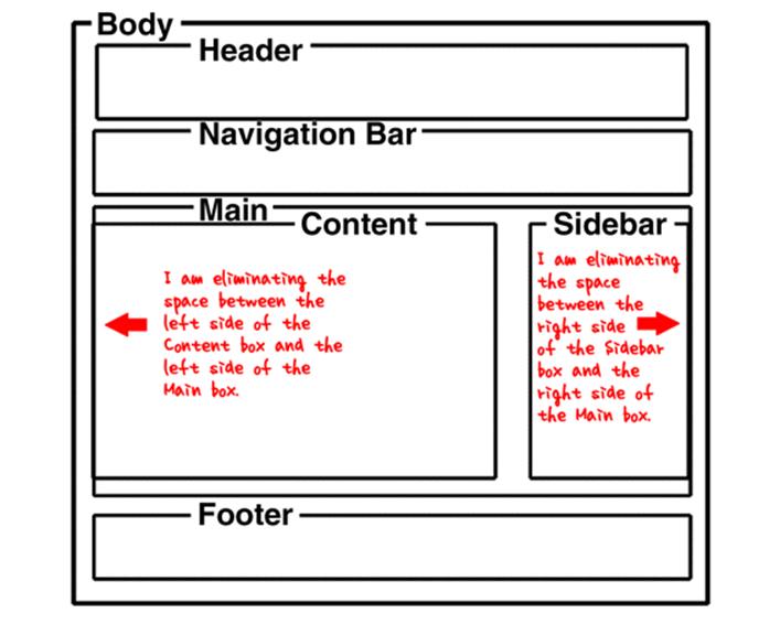
I want the two sections to sit side-by-side. I want no extra whitespace on the left or right, separating them from the outer Main box. This is how we do it.
First, we specify a width for each of the two inner boxes so when their widths are added together they don’t add up to more than 100% of the width of the div that contains them, the Main box. But since I don’t want them bumping up against each other in the middle, I’m going to give them widths that add up to just 97%. This leaves the remaining 3% for a center gutter between them. Here’s the code.
div#content {
width: 68%;
}
div#sidebar {
width: 29%;
}
So far, this styling doesn’t prevent the browser from placing one element underneath the other. If we don’t do something about it, the second div will go right underneath the first div, since a div is a block element. Both of them will be flush with the left edge of the Main box. So we need to do one more thing. Remember how you learned to write float: left and float: right to style an image so text wraps around it? We use the same language to place the two divs side-by-side.
div#content {
width: 68%;
float: left;
}
div#sidebar {
width: 29%;
float: right;
}
Now they’re side-by-side, and there’s a gutter between them that’s 3% of the width of their containing element, the Main box.
Let me give you another example. Suppose you want three divs of equal width placed side-by-side.
div#d1 {
width: 31%;
float: left;
}
div#d2 {
width: 31%;
float: left;
margin: 0 0 0 3.5%;
}
div#d3 {
width: 31%;
float: right;
}
The first two divs are floated left. The third div is floated right. Each div is 31% wide, adding up to a total of 93% of the width of the containing Main box. That leaves 7% for the two gutters. I specify a left margin of 3.5% for the second div, forcing it to the right. This leaves 3.5% for the second gutter. Now the three sections are spaced evenly. Remember learning in Chapter 27 that you need to clear image floats to avoid unintended wraps? You do the same thing with div floats.
.no-wrap {
clear: both;
}
After coding side-by-side divs in HTML, you’d code an empty div whose only purpose is to clear the float above it.
<div class="no-wrap"></div>
Or you could do it with a paragraph that clears the float.
In your CSS file create two div ids that will place the divs side-by-side, with a gutter of whitespace between them. In your HTML file code the two divs and put a paragraph in each one. Save the files. Display the page.
Sample CSS code is at:
http://asmarterwaytolearn.com/htmlcss/practice-63-1.html.
Sample HTML code is at:
http://asmarterwaytolearn.com/htmlcss/practice-63-2.html.
Find the interactive coding exercises for this chapter at:
http://www.ASmarterWayToLearn.com/htmlcss/63.html