D3.js in Action (2015)
Part 1. D3.js fundamentals
Chapter 3. Data-driven design and interaction
This chapter covers
· Enabling interactivity for graphical elements
· Working with color effectively
· Loading traditional HTML for use as pop-ups
· Loading external SVG icons into charts
Data visualization frameworks have existed in a form that separates them from the rest of web development. Flash or Java apps are dropped into a web page, and the only design necessary is to make sure the <div> is big enough or to take into account that it may be resized. D3 changes that, and gives you the opportunity to integrate the design of your data visualization with the design of your more traditional web elements.
You can and should style content you generate with D3 with all the same CSS settings as traditional HTML content. You can easily maintain those styles and have a consistent look and feel. This can be done by using the same style sheet classes for what you create with D3 as the ones you use with your traditional page elements when possible, and by following thoughtful use of color and interactivity with the graphics you create using D3.
This chapter deals with design broadly speaking, and it touches not only on graphical design but on interaction design, project architecture, and the integration of pregenerated content. It highlights the connections between D3 and other methods of development, whether we’re identifying libraries typically used alongside D3 or integrating HTML and SVG resources created using other tools. We can’t cover all the principles of design (which isn’t one field but many). Instead, we’ll focus on how to use particular D3 functionality to follow the best practices established by design professionals to create some simple data visualization based on the statistics associated with the 2010 World Cup, as seen in figure 3.1.
Figure 3.1. This chapter covers loading HTML from an external file and updating it (section 3.3.2), as well as loading external images for icons (section 3.3.1), animating transitions (section 3.2.2), and working with color (section 3.2.4).
3.1. Project architecture
When you create a single web page with an interesting information visualization on it, you don’t need to think too much about where all your files are going to live. But if you build an application that provides multiple points of interaction and different states, then you should identify the resources that you need and plan your project accordingly.
3.1.1. Data
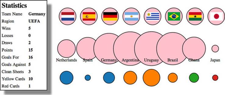
Your data will tend to come in one of two forms: either dynamically delivered via server/API or in static files. If you’re pulling data dynamically from a server or API, it’s possible that you’ll have static files as well. A good example of this is building maps, where the base data layer (such as a map of countries) is from a static file and the dynamic data layer (such as the places where tweets are made) comes from a server. For this chapter, we’ll use the file worldcup.csv to represent statistics for the 2010 World Cup:
"team","region","win","loss","draw","points","gf","ga","cs","yc","rc"
"Netherlands","UEFA",6,0,1,18,12,6,2,23,1
"Spain","UEFA",6,0,1,18,8,2,5,8,0
"Germany","UEFA",5,0,2,15,16,5,3,10,1
"Argentina","CONMEBOL",4,0,1,12,10,6,2,8,0
"Uruguay","CONMEBOL",3,2,2,11,11,8,3,13,2
"Brazil","CONMEBOL",3,1,1,10,9,4,2,9,2
"Ghana","CAF",2,2,1,8,5,4,1,12,0
"Japan","AFC",2,1,1,7,4,2,2,4,0
That’s a lot of data for each team. We could try to come up with a graphical object that encodes all nine data points simultaneously (plus labels), but instead we’ll use interactive and dynamic methods to provide access to the data.
3.1.2. Resources
Pregenerated content, like hand-drawn SVG and HTML components, comes as an external file that you’ll need to know how to load. You’ll see examples of these later on in the chapter. Each file contains enough code to draw the shape or traditional DOM elements we’ll add to our page. We’ll spend more time with the contents of this folder later on in sections 3.3.2 and 3.3.3 when we deal with loading pregenerated content.
3.1.3. Images
Later on, we’ll use a set of Portable Network Graphics (PNGs) with the flags of each team represented in your dataset. We’ll name the PNGs the same as the teams, so that it’s easier to use the images with D3, as you’ll see later. Every digital file consists of code, but we think of images as fundamentally different. This distinction breaks down when you work with SVG and you’re accustomed to treating SVG as images. If you’re working with SVG images as images and not as code that you want to manipulate in D3, then you should put them in your image directory and keep the SVG files that you intend to deal with as code in your resources directory.
3.1.4. Style sheets
Although we won’t focus on CSS in this chapter too much, you should be aware that you can use CSS compilers to support variables in CSS and other improved functionality. Our style sheet shown in listing 3.1 has classes for the different states of the SVG elements we’re dealing with, including SVG text elements that use a different syntax than traditional DOM elements for font.
Listing 3.1. d3ia.css
text {
font-size: 10px;
}
g > text.active {
font-size: 30px;
}
circle {
fill: pink;
stroke: black;
stroke-width: 1px;
}
circle.active {
fill: red;
}
circle.inactive {
fill: gray;
}
3.1.5. External libraries
For the example in this chapter, we’ll use two more .js files besides d3.min.js, which is the minified D3 library. The first is soccerviz.js, which stores the functions we’ll build and use in this chapter. The second is colorbrewer.js, which also comes bundled with D3 and provides a set of predefined color palettes that we’ll find useful.
We reference these files in the much cleaner d3ia_2.html.
Listing 3.2. d3ia_2.html
<html>
<head>
<title>D3 in Action Examples</title>
<meta charset="utf-8" />
<link type="text/css" rel="stylesheet" href="d3ia.css" />
</head>
<script src="d3.v3.min.js" type="text/javascript"></script>
<script src="colorbrewer.js" type="text/javascript"></script>
<script src="soccerviz.js" type="text/javascript"></script>
<body onload="createSoccerViz()">
<div id="viz">
<svg style="width:500px;height:500px;border:1px lightgray solid;" />
</div>
<div id="controls" />
</body>
</html>
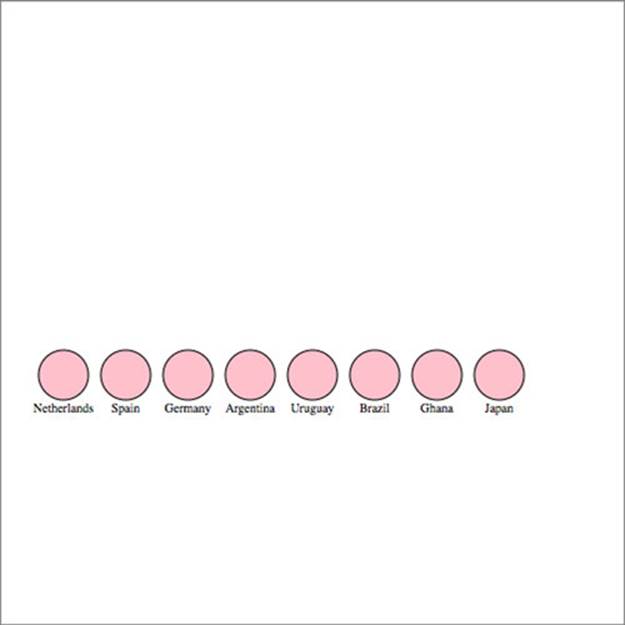
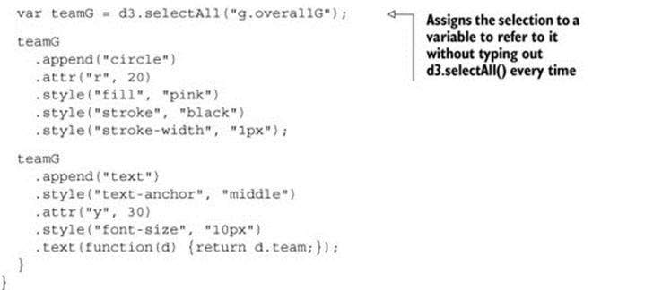
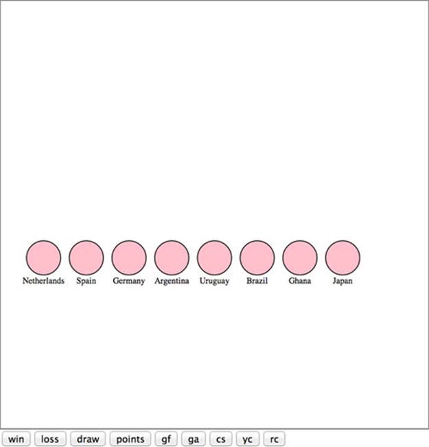
The <body> has two <div> elements, one with the ID viz and the other with the ID controls. Notice that the <body> element has an onload property that runs createSoccerViz(), one of our functions in soccerviz.js (shown in the following listing). This loads the data and binds it to create a labeled circle for each team. It’s not much, as you can see in figure 3.2, but it’s a start.
Figure 3.2. Circles and labels created from a CSV representing 2010 World Cup Statistics
Listing 3.3. soccerviz.js
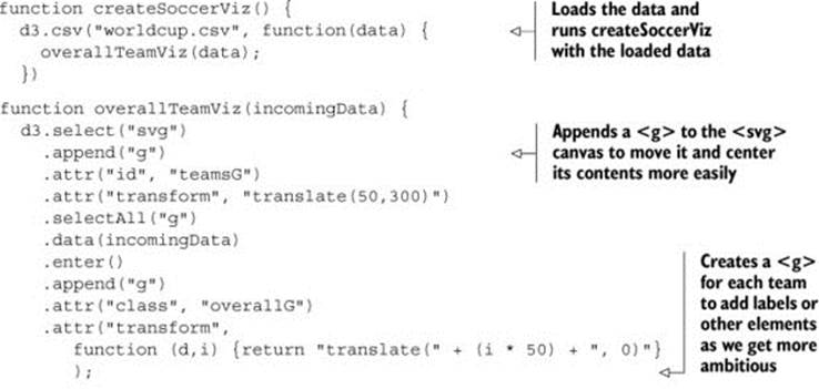
Although you might write an application entirely with D3 and your own custom code, for large-scale sustainable projects you’ll have to integrate more external libraries. We’ll only use one of those, colorbrewer.js, which isn’t intimidating. The colorbrewer library is a set of arrays of colors, which are useful in information visualization and mapping. You’ll see this library in action in section 3.3.2.
3.2. Interactive style and DOM
Creating interactive information visualization is necessary for your users to deal with large and complex datasets. And the key to building interactivity into your D3 projects is the use of events, which define behaviors based on user activity. After you learn how to make your elements interactive, you’ll need to understand D3 transitions, which allow you to animate the change from one color or size to another. With that in place, you’ll turn to learning how to make changes to an element’s position in the DOM so that you can draw your graphics properly. Finally, we’ll look more closely at color, which you’ll use often in response to user interaction.
3.2.1. Events
To get started, let’s update our visualization to add buttons that change the appearance of our graphics to correspond with different data. We could handcode the buttons in HTML and tie them to functions as in traditional web development, but we can also use D3 to discover and examine the attributes in the data and create buttons dynamically. This has the added benefit of scaling to the data, so that if we add more attributes to our dataset, then this function automatically creates the necessary buttons.
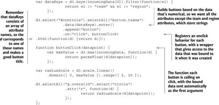
We use d3.keys and pass it one of the objects from our array. The d3.keys function returns the names of the attributes of an object as an array. We’ve filtered this array to remove the team and region attributes because these have nonnumerical data and won’t be suitable for thebuttonClick functionality we define. Obviously, in a larger or more complex system, we’ll want to have more robust methods for designating attributes than listing them by hand like this. You’ll see that later when we deal with more complex datasets. In this case, we bind this filtered array to a selection to create buttons for all the remaining attributes, and give the buttons labels for each of the attributes, as shown in figure 3.3.
Figure 3.3. Buttons for each numerical attribute are appended to the controls div behind the viz div. When a button is clicked, the code runs buttonClick.
The .on function is a wrapper for the traditional HTML mouse events, and accepts "click", "mouseover", "mouseout", and so on. We can also access those same events using .attr, for example, using .attr("onclick", "console.log('click')"), but notice that we’re passing a string in the same way we would using traditional HTML. There’s a D3-specific reason to use the .on function: it sends the bound data to the function automatically and in the same format as the anonymous inline functions we’ve been using to set style and attribute.
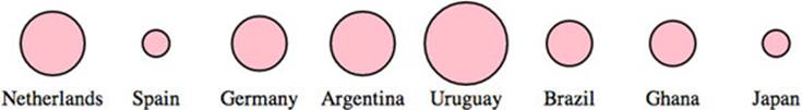
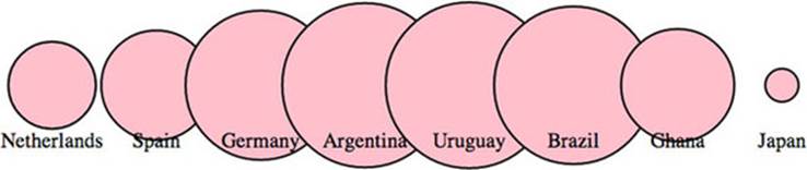
We can create buttons based on the attributes of the data and dynamically measure the data based on the attribute bound to the button. Then we can resize the circles representing each team to reflect the teams with the highest and lowest values in each category, as shown in figure 3.4.
Figure 3.4. Our initial buttonClick function resizes the circles based on the numerical value of the associated attribute. The radius of each circle reflects the number of goals scored against each team, kept in the ga attribute of each datapoint.
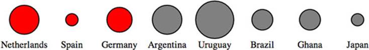
We can use .on() to tie events to any object, so let’s add interactivity to the circles by having them indicate whether teams are in the same FIFA region:
teamG.on("mouseover", highlightRegion);
function highlightRegion(d) {
d3.selectAll("g.overallG").select("circle")
.style("fill", function(p) {
return p.region == d.region ? "red" : "gray";
});
};
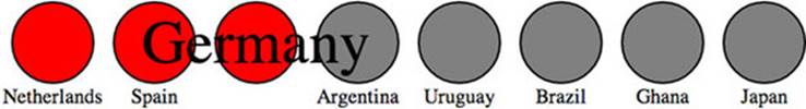
This time we used d as our variable, which is typical in the examples you’ll see online for D3 functionality. As a result, we changed the inline function variable to p, so that it wouldn’t conflict. Here you see an “ifsie,” which is an inline if statement that compares the region of each element in the selection to the region of the element that you moused over, with results like those in figure 3.5.
Figure 3.5. The effect of our initial highlightRegion selects elements with the same region attribute and colors them red, while coloring gray those that aren’t in the same region.
Restoring the circles to their initial color on mouseout is simple enough that the function can be declared inline with the .on function:
teamG.on("mouseout", function() {
d3.selectAll("g.overallG").select("circle").style("fill", "pink");
});
If you want to define custom event handling, you use d3.dispatch, which you’ll see in action in chapter 9.
3.2.2. Graphical transitions
One of the challenges of highly interactive, graphics-rich web pages is to ensure that the experience of graphical change isn’t jarring. The instantaneous change in size or color that we’ve implemented doesn’t just look clumsy, it can actually prevent a reader from understanding the information we’re trying to relay. To smooth things out a bit, I’ll introduce transitions, which you saw briefly at the end of chapter 1.
Transitions are defined for a selection, and can be set to occur after a certain delay using delay() or to occur over a set period of time using duration(). We can easily implement a transition in our buttonClick function:
d3.selectAll("g.overallG").select("circle").transition().duration(1000)
.attr("r", function(p) {
return radiusScale(d[datapoint]);
});
Now when we click our buttons, the sizes of the circles change, and the change is also animated. This isn’t just for show. We’re encoding new data, indicating the change between two datapoints using animation. When there was no animation, the reader had to remember if there was a difference between the ranking in draws and wins for Germany. Now the reader has an animated indication that shows Germany visibly shrink or grow to indicate the difference between these two datapoints.
The use of transitions also allows us to delay the change through the .delay() function. Like the .duration() function, .delay() is set with the wait in milliseconds before implementing the change. Slight delays in the firing of an event from an interaction can be useful to improve the legibility of information visualization, allowing users a moment to reorient themselves to shift from interaction to reading. But long delays will usually be misinterpreted as poor web performance.
Why else would you delay the firing of an animation? Delays can also draw attention to visual elements when they first appear. By making the elements pulse when they arrive onscreen, you let users know that these are dynamic objects and tempt users to click or otherwise interact with them. Delays, like duration, can be dynamically set based on the bound data for each element. You can use delays with another feature: transition chaining. This sets multiple transitions one after another, and each is activated after the last transition has finished. If we amend the code inoverallTeamViz() that first appends the <circle> elements to our <g> elements, we can see transitions of the kind that produce the screenshot in figure 3.6:
teamG
.append("circle").attr("r", 0)
.transition()
.delay(function(d,i) {return i * 100})
.duration(500)
.attr("r", 40)
.transition()
.duration(500)
.attr("r", 20);
Figure 3.6. A screenshot of your data visualization in the middle of its initial drawing, showing the individual circles growing to an exaggerated size and then shrinking to their final size in the order in which they appear in the bound dataset.
This causes a pulse because it uses transition chaining to set one transition, followed by a second after the completion of the first. You start by drawing the circles with a radius of 0, so they’re invisible. Each element has a delay set to its array position i times 0.1 seconds (100 ms), after which the transition causes the circle to grow to a radius of 40 px. After each circle grows to that size, a second transition shrinks the circles to 20 px. The effect, which isn’t easy to present with a screenshot, causes the circles to pulse sequentially.
3.2.3. DOM manipulation
Because these visual elements and buttons are all living in the DOM, it’s important to know how to access and work with them both with D3 and using built-in JavaScript functionality.
Although D3 selections are extremely powerful, you sometimes want to deal specifically with the DOM element that’s bound to the data. These DOM elements come with a rich set of built-in functionality in JavaScript. Getting access to the actual DOM element in the selection can be accomplished in one of two ways:
1. Using this in the inline functions
2. Using the .node() function
Inline functions always have access to the DOM element along with the datapoint and array position of that datapoint in the bound data. The DOM element, in this case, is represented by this. We can see it in action using the .each() function of a selection, which performs the same code for each element in a selection. We’ll make a selection of one of our circles and then use .each() to send d, i, and this to the console to see what each corresponds to (which should look similar to the results in figure 3.7):
d3.select("circle").each(function(d,i) {
console.log(d);console.log(i);console.log(this);
});
Figure 3.7. The console results of inspecting a selected element, which show first the datapoint in the selection, then its position in the array, and then the SVG element itself.
Unpacking this a bit, we can see the first thing echoed, d, is the data bound to the circle, which is a JSON object representing the Netherlands team. The second thing echoed, i, is the array position of that object in the array we used to create these elements, which in this case is 0 and means that incomingData[0] is the Netherlands JSON object. The last thing echoed to the console, this, is the <circle> DOM element itself.
We can also access this DOM element using the .node() function of a selection:
d3.select("circle").node();
Getting to the DOM element, as shown in figure 3.8, lets you take advantage of built-in JavaScript functionality to do things like measure the length of a <path> element or clone an element. One of the most useful built-in functions of nodes when working with SVG is the ability to re-append a child element. Remember that SVG has no Z-levels, which means that the drawing order of elements is determined by their DOM order. Drawing order is important because you don’t want the graphical objects you interact with to look like they’re behind the objects that you don’t interact with. To see what this means, let’s first adjust our highlighting function so that it increases the size of the label when we mouse over each element:
Figure 3.8. The results of running the node function of a selection in the console, which is the DOM element itself—in this case, an SVG <circle> element.
![]()
Because we’re doing a bit more, we should change the mouseout event to point to a function, which we’ll call unHighlight:
teamG.on("mouseout", unHighlight)
function unHighlight() {
d3.selectAll("g.overallG").select("circle").attr("class", "");
d3.selectAll("g.overallG").select("text")
.classed("highlight", false).attr("y", 30);
};
As shown in figure 3.9, Germany was appended to the DOM before Argentina. As a result, when we increase the size of the graphics associated with Germany, those graphics remain behind any graphics for Argentina, creating a visual artifact that looks unfinished and distracting. We can rectify this by re-appending the node to the parent <g> during that same highlighting event, which results in the label being displayed above the other elements, as shown in figure 3.10:
function highlightRegion2(d,i) {
d3.select(this).select("text").classed("highlight", true).attr("y", 10);
d3.selectAll("g.overallG").select("circle")
.each(function(p, i) {
p.region == d.region ?
d3.select(this).classed("active", true) :
d3.select(this).classed("inactive", true);
});
this.parentElement.appendChild(this);
};
Figure 3.9. The <text> element “Germany” is drawn at the same DOM level as the parent <g>, which, in this case, is behind the element to its right.
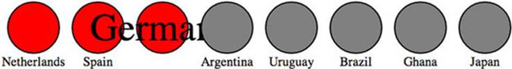
Figure 3.10. Re-appending the <g> element for Germany to the <svg> element moves it to the end of that DOM region and therefore it’s drawn above the other <g> elements.
You’ll see in this example that the mouseout event becomes less intuitive because the event is attached to the <g> element, which includes not only the circle but the text as well. As a result, mousing over the circle or the text fires the event. When you increase the size of the text, and it overlaps a neighboring circle, it doesn’t trigger a mouseout event. We’ll get into event propagation later, but one thing we can do to easily disable mouse events on elements is to set the style property "pointer-events" of those elements to "none":
teamG.select("text").style("pointer-events","none");
3.2.4. Using color wisely
Color seems like a small and dull subject, but when you’re representing data with graphics, color selection is of primary importance. There’s a lot of good research on the use of color in cognitive science and design, but that’s an entire library. Here, we’ll deal with a few fundamental issues: mixing colors in color ramps, using discrete colors for categorical data, and designing for accessibility factors related to colorblindness.
Infoviz term: color theory
Artists, scholars, and psychologists have been thinking critically about the use of color for centuries. Among them, Josef Albers—who has influenced modern information visualization leaders like Edward Tufte—noted that in the visual realm, one plus one can equal three. The study of color, referred to as color theory, has proved that placing certain colors and shapes next to each other has optical consequences, resulting in simultaneous and successive contrast as well as accidental color.
It’s worth studying the properties of color—hue, value, intensity, and temperature—to ensure the most harmonious color relationships in a visualization. Leonardo da Vinci organized colors into psychological primaries, the colors the eye sees unmixed, but the modern exploration of color theory, as with many other phenomena in physics, can be attributed to Sir Isaac Newton. Newton observed the separation of sunlight into bands of color via a prism in 1666 and called it a color spectrum. Newton also devised a color circle of seven hues, a precursor to the many future visualizations that would organize colors and their relationships. About a century later, J. C. Le Blon identified the primary colors as red, yellow, and blue, and their mixes as the secondaries. The work of other more modern color theoreticians like Josef Albers, who emphasized the effects of color juxtaposition, influences the standards for presentation in print and on the web.
Color is typically represented on the web in red, green, and blue, or RGB, using one of three formats: hex, RGB, or CSS color name. The first two represent the same information, the level of red, green, and blue in the color, but do so with either hexadecimal or comma-delimited decimal notation. CSS color names use vernacular names for its 140 colors (you can read all about them at http://en.wikipedia.org/wiki/Web_colors#X11_color_names). Red, for instance, can be represented as
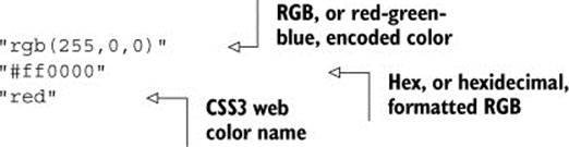
D3 has a few helper functions for working with colors. The first is d3.rgb(), which allows us to create a more feature-rich color object suitable for data visualization. To use d3.rgb(), we need to give it the red, green, and blue values of our color:
teamColor = d3.rgb("red");
teamColor = d3.rgb("#ff0000");
teamColor = d3.rgb("rgb(255,0,0)");
teamColor = d3.rgb(255,0,0);
These color objects have two useful methods, .darker() and .brighter(). They do exactly what you’d expect: return a color that’s darker or brighter than the color you started with. In our case, we can replace the gray and red that we’ve been using to highlight similar teams with darker and brighter versions of pink, the color we started with:
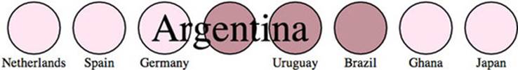
function highlightRegion2(d,i) {
var teamColor = d3.rgb("pink")
d3.select(this).select("text").classed("highlight", true).attr("y", 10)
d3.selectAll("g.overallG").select("circle")
.style("fill", function(p) {return p.region == d.region ?
teamColor.darker(.75) : teamColor.brighter(.5)})
this.parentElement.appendChild(this);
}
Notice that you can set the intensity for how much brighter or darker you want the color to be. Our new version (shown in figure 3.11) now maintains the palette during highlighting, with darker colors coming to the foreground and lighter colors receding. Unfortunately, you lose the ability to style with CSS because you’re back to using inline styles. As a rule, you should use CSS whenever you can, but if you want access to things like dynamic colors and transparency using D3 functions, then you’ll need to use inline styling.
Figure 3.11. Using the darker and brighter functions of a d3.rgb object in the highlighting function produces a darker version of the set color for teams from the same region and lighter colors for teams from different regions.
You can represent color in other ways with various benefits, but we’ll only deal with HSL, which stands for hue, saturation, and lightness. The corresponding d3.hsl() allows you to create HSL color objects in the same way that you would with d3.rgb(). The reason why you may want to use HSL is to avoid the muddying when you darken pink, which can also happen when you build color ramps and mix colors using D3 functions.
Color mixing
In chapter 2, we mapped a color ramp to numerical data to generate a spectrum of color representing our datapoints. But the interpolated values for colors created by these ramps can be quite poor. As a result, a ramp that includes, say, yellow, can end up interpolating values that are muddy and hard to distinguish. You may think this isn’t important, but when you’re using a color ramp to indicate a value and your color ramp doesn’t interpolate the color in a way that your reader expects, then you can end up showing wrong information to your users. Let’s add a color ramp to ourbuttonClick function and use the color ramp to show the same information we did with the radius.
![]()
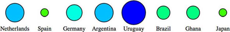
You’d be forgiven if you expected the colors in figure 3.12 to range from yellow to green to blue. The problem is that the default interpolator in the scale we used is mixing the red, green, and blue channels numerically. We can change the interpolator in the scale by designating one specifically, for instance, using the HSL representation of color (figure 3.13) that we looked at earlier:
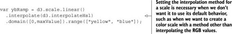
Figure 3.12. Color mixing between yellow and blue in the RGB scale results in muddy, grayish colors displayed for the values between yellow and blue.
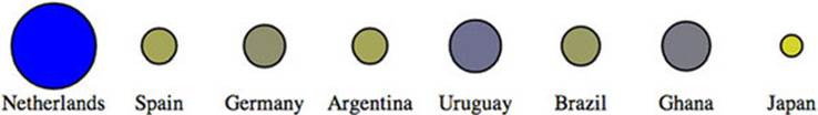
Figure 3.13. Interpolation of yellow to blue based on hue, saturation, and lightness (HSL) results in a different set of intermediary colors from the same two starting values.
D3 supports two other color interpolators, HCL (figure 3.14) and LAB (figure 3.15), which each deal in a different manner with the question of what colors are between blue and yellow. First, the HCL ramp:
var ybRamp = d3.scale.linear()
.interpolate(d3.interpolateHcl)
.domain([0,maxValue]).range(["yellow", "blue"]);
Figure 3.14. Interpolation of color based on hue, chroma, and luminosity (HCL) provides a different set of intermediary colors between yellow and blue.
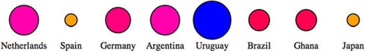
Figure 3.15. Interpolation of color based on lightness and color-opponent space (known as LAB; L stands for lightness and A-B stands for the color-opponent space) provides yet another set of intermediary colors between yellow and blue.
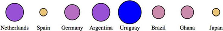
Finally, the LAB ramp:
var ybRamp = d3.scale.linear()
.interpolate(d3.interpolateLab)
.domain([0,maxValue]).range(["yellow", "blue"]);
As a general rule, you’ll find that the colors interpolated in RGB tend toward muddy and gray, unless you break the color ramp into multiple stops. You can experiment with different color ramps, or stick to ramps that emphasize hue or saturation (by using HSL). Or you can rely on experts by using the built-in D3 functions for color ramps that are proven to be easier for a reader to distinguish, which we’ll look at now.
Discrete colors
Oftentimes, we use color ramps to try to map colors to categorical elements. It’s better to use the discrete color scales available in D3 for this purpose. The popularity of these scales is the reason why so many D3 examples have the same palette. To get started, we need to use a new D3 scale,d3.scale.category10, which is built to map categorical values to particular colors. It works like a quantizing scale where you can’t change the domain, because the domain is already defined as 10 highly distinct colors. Instead, you instantiate your scale with the values you want mapped to those colors. In our case, we want to distinguish the various regions in our dataset, which consists of the top eight FIFA teams from the 2010 World Cup, representing four global regions. We want to represent these as different colors, and to do so, we need to create a scale with those values in an array.
function buttonClick(datapoint) {
var maxValue = d3.max(incomingData, function(el) {
return parseFloat(el[datapoint ]);
});
var tenColorScale = d3.scale.category10(
["UEFA", "CONMEBOL", "CAF", "AFC"]);
var radiusScale = d3.scale.linear().domain([0,maxValue]).range([2,20]);
d3.selectAll("g.overallG").select("circle").transition().duration(1000)
.style("fill", function(p) {return tenColorScale(p.region)})
.attr("r", function(p) {return radiusScale(p[datapoint ])});
};
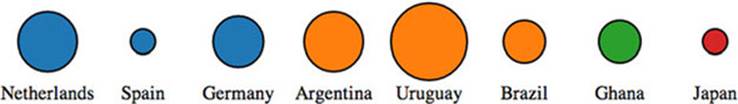
The application of this scale is visible when we click one of our buttons, which now resizes the circles as it always has, but also applies one of these distinct colors to each team (figure 3.16).
Figure 3.16. Application of the category10 scale in D3 assigns distinct colors to each class applied, in this case, the four regions in your dataset.
Color ramps for numerical data
Another option is to use color schemes based on the work of Cynthia Brewer, who has led the way in defining effective color use in cartography. Helpfully, d3js.org provides colorbrewer.js and colorbrewer.css for this purpose. Each array in colorbrewer.js corresponds to one of Brewer’s color schemes, designed for a set number of colors. For instance, the reds scale looks like this:
Reds: {
3: ["#fee0d2","#fc9272","#de2d26"],
4: ["#fee5d9","#fcae91","#fb6a4a","#cb181d"],
5: ["#fee5d9","#fcae91","#fb6a4a","#de2d26","#a50f15"],
6: ["#fee5d9","#fcbba1","#fc9272","#fb6a4a","#de2d26","#a50f15"],
7: ["#fee5d9","#fcbba1","#fc9272","#fb6a4a","#ef3b2c","#cb181d","#99000d"],
8: ["#fff5f0","#fee0d2","#fcbba1","#fc9272",
"#fb6a4a","#ef3b2c","#cb181d","#99000d"],
9: ["#fff5f0","#fee0d2","#fcbba1","#fc9272","#fb6a4a",
"#ef3b2c","#cb181d","#a50f15","#67000d"]
}
This provides high-legibility, discrete colors in the red spectrum for our elements. Again, we’ll color your circles by region, but this time, we’ll color them by their magnitude using our buttonClick function. We need to use the quantize scale that you saw earlier in chapter 2, because the colorbrewer scales, despite being discrete scales, are designed for quantitative data that has been separated into categories. In other words, they’re built for numerical data, but numerical data that has been sorted into ranges, such as when you break down all the ages of adults in a census into categories of 18–35, 36–50, 51–65, and 65+.
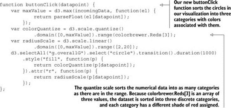
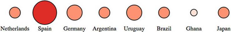
One of the conveniences of using colorbrewer.js dynamically paired to a quantizing scale is that if we adjust the number of colors, for instance, from colorbrewer.Reds[3] (shown in figure 3.17) to colorbrewer.Reds[5], the range of numerical data is represented with five colors instead of three.
Figure 3.17. Automatic quantizing linked with the ColorBrewer 3-red scale produces distinct visual categories in the red family.
function buttonClick(datapoint) {
var maxValue = d3.max(incomingData, function(el) {
return parseFloat(el[datapoint ]);
});
var colorQuantize = d3.scale.quantize()
.domain([0,maxValue]).range(colorbrewer.Reds[3]);
var radiusScale = d3.scale.linear()
.domain([0,maxValue]).range([2,20]);
d3.selectAll("g.overallG").select("circle").transition()
.duration(1000).style("fill", function(p) {
return colorQuantize(p[datapoint ]);
}).attr("r", function(p) {
return radiusScale(p[datapoint ]);
});
};
Color is important, and it can behave strangely on the web. Colorblindness, for instance, is a key accessibility issue that most of the colorbrewer scales address. But even though color use and deployment is complex, smart people have been thinking about color for a while, and D3 takes advantage of that.
3.3. Pregenerated content
It’s neither fun nor smart to create all your HTML elements using D3 syntax with nested selections and appending. More importantly, there’s an entire ecosystem of tools out there for creating HTML, SVG, and static images that you’d be foolish to ignore just because you’re using D3 for your general DOM manipulation and information visualization. Fortunately, it’s straightforward and easy to load externally generated resources—like images, HTML fragments, and pregenerated SVG—and tie them into your graphical elements.
3.3.1. Images
In chapter 1, I noted that GIFs, despite their resurgent popularity, aren’t useful for a rich interactive site. But that doesn’t mean you should get rid of images entirely. You’ll find that adding images to your data visualizations can vastly improve them. In SVG, the image element is <image>, and its source is defined using the xlink:href attribute if it’s located in your directory structure.
We have files in our images directory that are PNGs of the respective flags of each national team. To add them to our data visualization, select the <g> elements that have the team data already bound to them, and add an SVG image:
d3.selectAll("g.overallG").insert("image", "text")
.attr("xlink:href", function(d) {
return "images/" + d.team + ".png";
})
.attr("width", "45px").attr("height", "20px").attr("x", "-22")
.attr("y", "-10");
To make the images show up successfully, use insert() instead of append() because that gives us the capacity to tell D3 to insert the images before the text elements. This keeps the labels from being drawn behind the newly added images. Because each image name is the same as the team name of each data point, we can use an inline function to point to that value, combined with strings for the directory and file extension. We also need to define the height and width of the images because SVG images, by default, have no setting for height and width and won’t display until these are set. We also need to manually center SVG images—here the x and y attributes are set to a negative value of one-half the respective height and width, which centers the images in their respective circles, as shown in figure 3.18.
Figure 3.18. Our graphical representations of each team now include a small PNG national flag, downloaded from Wikipedia and loaded using an SVG <image> element.

You can tie image resizing to the button events, but raster images don’t resize particularly well, and so you’ll want to use them at fixed sizes.
Infoviz term: chartjunk
Now that you’re learning how to add images and icons to everything, let’s remember that just because you can do something doesn’t mean you should. When building information visualization, the key aesthetic principle is to avoid cluttering your charts and interfaces with distracting and useless “chartjunk” like unnecessary icons, decoration, or skeuomorphic paneling. Remember, simplicity is force.
The term chartjunk comes from Tufte, and in general refers to the kind of generic and useless clip art that typifies PowerPoint presentations. Although icons and images are useful and powerful in many situations, and thus shouldn’t be avoided just to maintain an austere appearance, you should always make sure that your graphical representations of data are as uncluttered as you can make them.
3.3.2. HTML fragments
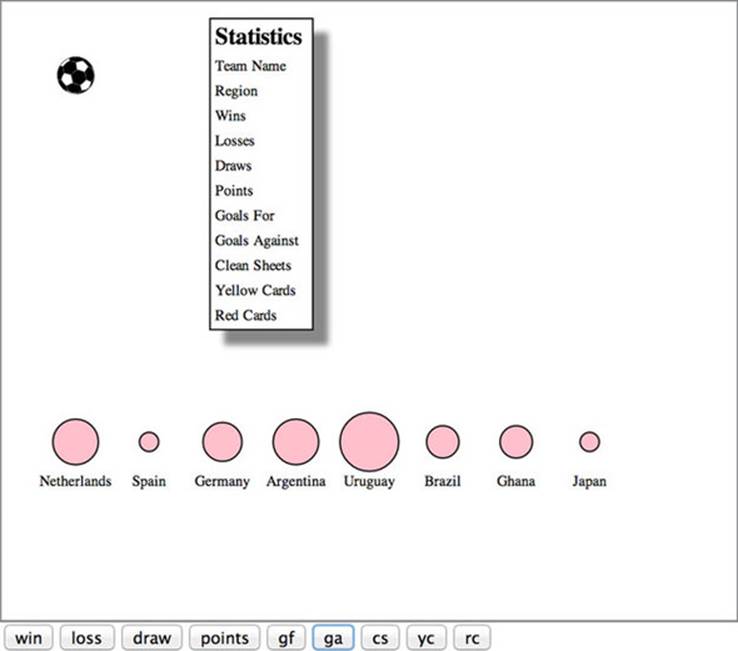
We’ve created traditional DOM elements in this chapter using D3 data-binding for our buttons. If you want to, you can use the D3 pattern of selecting and appending to create complex HTML objects, such as forms and tables, on the fly. But HTML has better authoring tools, and you’ll likely be working with designers and other developers who want to use those tools and require that those HTML components be included in your application. For instance, let’s build a modal dialog box into which we can put the numbers associated with the teams. Say we want to see the stats on our teams—one of the best ways to do this is to build a dialog box that pops up as you click each team. A modal dialog is another way of referring to that “floating” area that typically only shows up when you click an element. We can write only the HTML we need for the table itself in a separate file.
Listing 3.4. modal.html
<table>
<tr>
<th>Statistics</th>
</tr>
<tr><td>Team Name</td><td class="data"></td></tr>
<tr><td>Region</td><td class="data"></td></tr>
<tr><td>Wins</td><td class="data"></td></tr>
<tr><td>Losses</td><td class="data"></td></tr>
<tr><td>Draws</td><td class="data"></td></tr>
<tr><td>Points</td><td class="data"></td></tr>
<tr><td>Goals For</td><td class="data"></td></tr>
<tr><td>Goals Against</td><td class="data"></td></tr>
<tr><td>Clean Sheets</td><td class="data"></td></tr>
<tr><td>Yellow Cards</td><td class="data"></td></tr>
<tr><td>Red Cards</td><td class="data"></td></tr>
</table>
And now we’ll add CSS rules for the table and the div that we want to put it in. As you see in the following listing, we can use the position and z-index CSS styles because this is a traditional DOM element.
Listing 3.5. Update to d3ia.css
#modal {
position:fixed;
left:150px;
top:20px;
z-index:1;
background: white;
border: 1px black solid;
box-shadow: 10px 10px 5px #888888;
}
tr {
border: 1px gray solid;
}
td {
font-size: 10px;
}
td.data {
font-weight: 900;
}
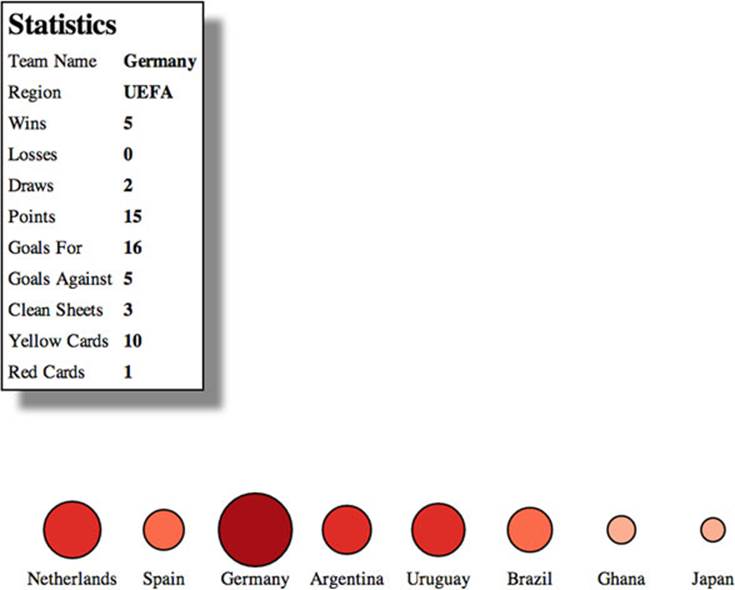
Now that we have the table, all we need to do is add a click listener and associated function to populate this dialog, as well as a function to create a div with ID "modal" into which we add the loaded HTML code using the .html() function:

The results are immediately apparent when you reload the page. A div with the defined table in modal.html is created, and when you click it, it populates the div with values from the data bound to the element you click (figure 3.19).
Figure 3.19. The modal dialog is styled based on the defined style in CSS. It’s created by loading the HTML data from modal.html and adding it to the content of a newly created div.
We used d3.text() in this case because when working with HTML, it can be more convenient to load the raw HTML code like this and drop it into the .html() function of a selected element that you’ve created. If you use d3.html(), then you get HTML nodes that allow you to do more sophisticated manipulation, which you’ll see now as we work with pregenerated SVG.
3.3.3. Pregenerated SVG
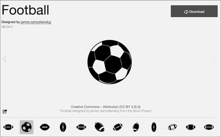
SVG has been around for a while, and there are, not surprisingly, robust tools for drawing SVG, like Adobe Illustrator and the open source tool Inkscape. You’ll likely want pregenerated SVG for icons, interface elements, and other components of your work. If you’re interested in icons, The Noun Project (http://thenounproject.com/) has an extensive repository of SVG icons, including the football in figure 3.20.
Figure 3.20. An icon for a football created by James Zamyslianskyj and available at http://thenounproject.com/term/football/1907/ from The Noun Project
When you download an icon from The Noun Project, you get it in two forms: SVG and PNG. You’ve already learned how to reference images, and you can do the same with SVG by pointing the xlink:href attribute of an <image> element at an SVG file. But loading SVG directly into the DOM gives you the capacity to manipulate it like any SVG elements that you create in the browser with D3.
Let’s say we decide to replace our boring circles with balls, and we don’t want them to be static images because we want to be able to modify their color and shape like other SVG. In that case, we’ll need to find a suitable ball icon and download it. In the case of downloads from The Noun Project, this means we’ll need to go through the hassle of creating an account, and we’ll need to properly attribute the creator of the icon or pay a fee to use the icon without attribution. Regardless of where we get our icon, we might need to modify it before using it in our data visualization. In the case of the football icon in this example, we need to make it smaller and center the icon on the 0,0 point of the canvas. This kind of preparation is going to be different for every icon, depending on how it was originally drawn and saved.
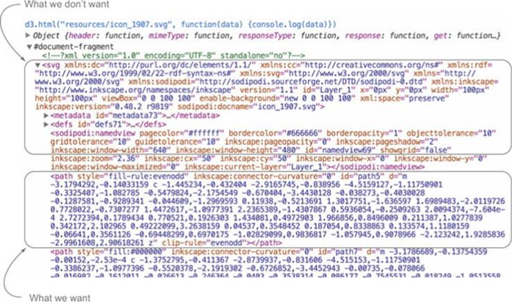
With the modal table we used earlier, we assumed that we pulled in all the code found in modal.html, and so we could bring it in using d3.text() and drop the raw HTML as text into the .html() function of a selection. But in the case of SVG, especially SVG that you’ve downloaded, you often want to ignore the verbose settings in the document, which will include its own <svg> canvas as well as any <g> elements that have been not-so-helpfully added. You probably want to deal only with the graphical elements. With our soccer ball, we want to get only the <path>elements. If we load the file using d3.html(), then the results are DOM nodes loaded into a document fragment that we can access and move around using D3 selection syntax. Using d3.html() is the same as using any of the other loading functions, where you designate the file to be loaded and the callback. You can see the results of this command in figure 3.21:
d3.html("resources/icon_1907.svg", function(data) {console.log(data);});
Figure 3.21. An SVG loaded using d3.html() that was created in Inkscape. It consists not only of the graphical <path> elements that make up the SVG but also much data that’s often extraneous.
After we load the SVG into the fragment, we can loop through the fragment to get all the paths easily using the .empty() function of a selection. The .empty() function checks to see if a selection still has any elements inside it and eventually fires true after we’ve moved the paths out of the fragment into our main SVG. By including .empty() in a while statement, we can move all the path elements out of the document fragment and load them directly onto the SVG canvas.
Notice how we’ve added a transform attribute to offset the paths so that they won’t be clipped in the top-right corner. Instead, you clearly see a football in the top corner of your <svg> canvas. Document fragments aren’t a normal part of your DOM, so you don’t have to worry about accidentally selecting the <svg> canvas in the document fragment, or any other elements.
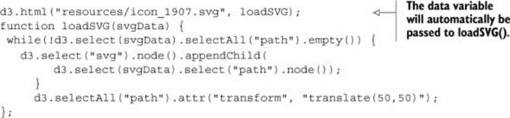
A while loop like this is sometimes necessary, but typically the best and most efficient method is to use .each() with your selection. Remember, .each() runs the same code on every element of a selection. In this case, we want to select our <svg> canvas and append the path to that canvas.
function loadSVG(svgData) {
d3.select(svgData).selectAll("path").each(function() {
d3.select("svg").node().appendChild(this);
});
d3.selectAll("path").attr("transform", "translate(50,50)");
};
We end up with a football floating in the top-left corner of our canvas, as shown in figure 3.22.
Figure 3.22. A hand-drawn football icon is loaded onto the <svg> canvas, along with the other SVG and HTML elements we created in our code.
Loading elements from external data sources like this is useful if you want to move individual nodes out of your loaded document fragment, but if you want to bind the externally loaded SVG elements to data, it’s an added step that you can skip. We can’t set the .html() of a <g> element to the text of our incoming elements like we did with the <div> when we populated it with the contents of modal.html. That’s because SVG doesn’t have a corresponding property to innerHTML, and therefore the .html() function on a selection of SVG elements has no effect. Instead, we have to clone the paths and append them to each <g> element representing our teams:
d3.html("resources/icon_1907.svg", loadSVG);
function loadSVG(svgData) {
d3.selectAll("g").each(function() {
var gParent = this;
d3.select(svgData).selectAll("path").each(function() {
gParent.appendChild(this.cloneNode(true))
});
});
};
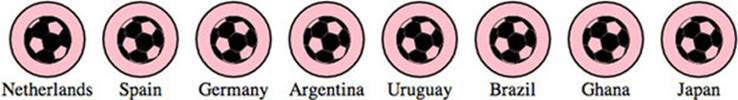
It may seem backwards to select each <g> and then select each loaded <path>, until you think about how .cloneNode() and .appendChild() work. We need to take each <g> element and go through the <path>-cloning process for every path in the loaded icon, which means we use nested .each() statements (one for each <g> element in our DOM and one for each <path> element in the icon). By setting gParent to the actual <g> node (the this variable), we can then append a cloned version of each path in order. The results are soccer balls for each team, as shown in figure 3.23.
Figure 3.23. Each <g> element has its own set of paths cloned as child nodes, resulting in football icons overlaid on each element.
We can easily do the same thing using the <image> syntax from the first example in this section, but with our SVG elements individually added to each. And now we can style them in the same way as any path element. We could use the national colors for each ball, but we’ll settle for making them red, with the results shown in figure 3.24.
Figure 3.24. Football icons with a fill and stroke set by D3
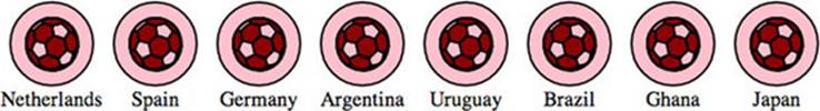
d3.selectAll("path").style("fill", "darkred")
.style("stroke", "black").style("stroke-width", "1px");
One drawback with this method is that the paths can’t take advantage of the D3 .insert() method’s ability to place the elements behind the labels or other visual elements. To get around this, we’ll need to either append icons to <g> elements that have been placed in the proper order, or use the parentNode and appendChild functions to move the paths around the DOM like we described earlier in this chapter.
The other drawback is that because these paths were added using cloneNode and not selection#append syntax, they have no data bound to them. We looked at rebinding data back in chapter 1. If we select the <g> elements and then select the <path> element, this will rebind data. But we have numerous <path> elements under each <g> element, and selectAll doesn’t rebind data. As a result, we have to take a more involved approach to bind the data from the parent <g> elements to the child <path> elements that have been loaded in this manner. The first thing we do is select all the <g> elements and then use .each() to select all the path elements under each <g>. Then, we separately bind the data from the <g> to each <path> using .datum(). What’s .datum()? Well, datum is the singular of data, so a piece of data is a datum. The datum function is what you use when you’re binding just one piece of data to an element. It’s the equivalent of wrapping your variable in an array and binding it to .data(). After we perform this action, we can dust off our old scale from earlier and apply it to our new <path> elements. We can run this code in the console to see the effects, which should look like figure 3.25.
Figure 3.25. The paths now have the data from their parent element bound to them and respond accordingly when a discrete color scale based on region is applied.
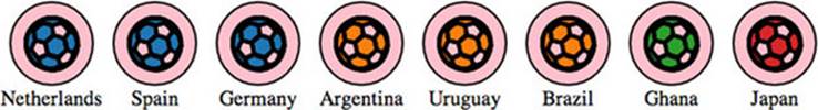
d3.selectAll("g.overallG").each(function(d) {
d3.select(this).selectAll("path").datum(d)
});
var tenColorScale = d3.scale
.category10(["UEFA", "CONMEBOL", "CAF", "AFC"]);
d3.selectAll("path").style("fill", function(p) {
return tenColorScale(p.region)
}).style("stroke", "black").style("stroke-width", "2px");
Now you have data-driven icons. Use them wisely.
3.4. Summary
Throughout this chapter, we dealt with methods and functionality that typically are glossed over in D3 tutorials, such as the color functions and loading external content like external SVG and HTML. We also saw common D3 functionality, like animated transitions tied to mouse events. Specifically, we covered
· Planning project file structure and placing your D3 code in the context of traditional web development
· External libraries you want to be aware of for D3 applications
· Using transitions and animation to highlight change and interaction
· Creating event listeners for mouse events on buttons and graphical elements
· Using color effectively for categories and numerical data, and being aware of how color is treated in interpolations
· Accessing the DOM element itself from a selection
· Loading external resources, specifically images, HTML fragments, and pregenerated SVG
D3 is a powerful library that can handle much of the needs of an interactive site, but you need to know when to rely on core HTML5 functionality or other libraries when that would be more efficient. Moving forward, we’ll transition from the core functions of D3 and get into the higher-level features of the library that allow you to build fully functional charts and chart components. We’ll start in the next chapter by looking at generating SVG lines and areas from data as well as preformatted axis components for your charts. We’ll also go into more detail about creating complex multipart graphical objects from your data and use those techniques to produce complex examples of information visualization.
All materials on the site are licensed Creative Commons Attribution-Sharealike 3.0 Unported CC BY-SA 3.0 & GNU Free Documentation License (GFDL)
If you are the copyright holder of any material contained on our site and intend to remove it, please contact our site administrator for approval.
© 2016-2026 All site design rights belong to S.Y.A.