D3.js in Action (2015)
Part 1. D3.js fundamentals
Chapter 2. Information visualization data flow
This chapter covers
· Loading data from external files of various formats
· Working with D3 scales
· Formatting data for analysis and display
· Creating graphics with visual attributes based on data attributes
· Animating and changing the appearance of graphics
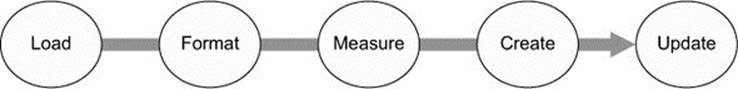
Toy examples and online demos sometimes present data in the format of a JavaScript-defined array, the same way we did in chapter 1. But in the real world, your data is going to come from an API or a database and you’re going to need to load it, format it, and transform it before you start creating web elements based on that data. This chapter describes this process of getting data into a suitable form and touches on the basic structures that you’ll use again and again in D3: loading data from an external source; formatting that data; and creating graphical representations of that data, like you see in figure 2.1.
Figure 2.1. Examples from this chapter, including a diagram of how data-binding works (left) from section 2.3.3, a scatterplot with labels (center) from section 2.3, and the bar chart (right) we’ll build in section 2.2

2.1. Working with data
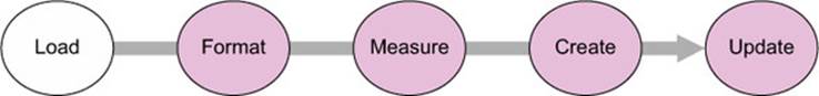
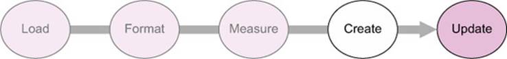
We’ll deal with two small datasets in this chapter and take them through a simplified five-step process (figure 2.2) that will touch on everything you need to do with and to data to turn it into a data visualization with D3. One dataset consists of a few cities and their geographic location and population. The other is a few fictional tweets with information about who made them and who reacted to them. This is the kind of data you’re often presented with. You’re tasked with finding out which tweets have more of an impact than others, or which cities are more susceptible to natural disasters than others. In this chapter you’ll learn how to measure data in D3 in a number of ways, and how to use those methods to create charts.
Figure 2.2. The data visualization process that we’ll explore in this chapter assumes we begin with a set of data and want to create (and update) an interactive or dynamic data visualization.
Out in the real world, you’ll deal with much larger datasets, with hundreds of cities and thousands of tweets, but you’ll use the same principles outlined in this chapter. This chapter doesn’t teach you how to create complex data visualizations, but it does explain in detail some of the most important core processes in D3 that you’ll need to do so.
2.1.1. Loading data
As we touched on in chapter 1, our data will typically be formatted in various but standardized ways. Regardless of the source of the data, it will likely be formatted as single-document data files in XML, CSV, or JSON format. D3 provides several functions for importing and working with this data (the first step shown in figure 2.3). One core difference between these formats is how they model data. JSON and XML provide the capacity to encode nested relationships in a way that delimited formats like CSV don’t. Another difference is that d3.csv() and d3.json() produce an array of JSON objects, whereas d3.xml() creates an XML document that needs to be accessed in a different manner.
Figure 2.3. The first step in creating a data visualization is getting the data.
File formats
D3 has five functions for loading data that correspond to the five types of files you’ll likely encounter: d3.text(), d3.xml(), d3.json(), d3.csv(), and d3.html(). We’ll spend most of our time working with d3.csv() and d3.json(). You’ll see d3.html() in the next chapter, where we’ll use it to create complex DOM elements that are written as prototypes. You may find d3.xml() and d3.text() more useful depending on how you typically deal with data. You may be comfortable with XML rather than JSON, in which case you can rely on d3.xml() and format your data functions accordingly. If you prefer working with text strings, then you can use d3.text() to pull in the data and process it using another library or code.
Both d3.csv() and d3.json() use the same format when calling the function, by declaring the path to the file being loaded and defining the callback function:
d3.csv("cities.csv",function(error,data) {console.log(error,data)});
The error variable is optional, and if we only declare a single variable with the callback function, it will be the data:
d3.csv("cities.csv",function(d) {console.log(d)});
You first get access to the data in the callback function, and you may want to declare the data as a global variable so that you can use it elsewhere. To get started, you need a data file. For this chapter we’ll be working with two data files: a CSV file that contains data about cities and a JSON file that contains data about tweets, as shown in the following listings.
Listing 2.1. File contents of cities.csv
"label","population","country","x","y"
"San Francisco", 750000,"USA",122,-37
"Fresno", 500000,"USA",119,-36
"Lahore",12500000,"Pakistan",74,31
"Karachi",13000000,"Pakistan",67,24
"Rome",2500000,"Italy",12,41
"Naples",1000000,"Italy",14,40
"Rio",12300000,"Brazil",-43,-22
"Sao Paolo",12300000,"Brazil",-46,-23
Listing 2.2. File contents of tweets.json
{
"tweets": [
{"user": "Al", "content": "I really love seafood.",
"timestamp": " Mon Dec 23 2013 21:30 GMT-0800 (PST)",
"retweets": ["Raj","Pris","Roy"], "favorites": ["Sam"]},
{"user": "Al", "content": "I take that back, this doesn't taste so good.",
"timestamp": "Mon Dec 23 2013 21:55 GMT-0800 (PST)",
"retweets": ["Roy"], "favorites": []},
{"user": "Al",
"content": "From now on, I'm only eating cheese sandwiches.",
"timestamp": "Mon Dec 23 2013 22:22 GMT-0800 (PST)",
"retweets": [],"favorites": ["Roy","Sam"]},
{"user": "Roy", "content": "Great workout!",
"timestamp": " Mon Dec 23 2013 7:20 GMT-0800 (PST)",
"retweets": [],"favorites": []},
{"user": "Roy", "content": "Spectacular oatmeal!",
"timestamp": " Mon Dec 23 2013 7:23 GMT-0800 (PST)",
"retweets: [],"favorites": []},
{"user": "Roy", "content": "Amazing traffic!",
"timestamp": " Mon Dec 23 2013 7:47 GMT-0800 (PST)",
"retweets": [],"favorites": []},
{"user": "Roy", "content": "Just got a ticket for texting and driving!",
"timestamp": " Mon Dec 23 2013 8:05 GMT-0800 (PST)",
"retweets": [],"favorites": ["Sam", "Sally", "Pris"]},
{"user": "Pris", "content": "Going to have some boiled eggs.",
"timestamp": " Mon Dec 23 2013 18:23 GMT-0800 (PST)",
"retweets": [],"favorites": ["Sally"]},
{"user": "Pris", "content": "Maybe practice some gymnastics.",
"timestamp": " Mon Dec 23 2013 19:47 GMT-0800 (PST)",
"retweets": [],"favorites": ["Sally"]},
{"user": "Sam", "content": "@Roy Let's get lunch",
"timestamp": " Mon Dec 23 2013 11:05 GMT-0800 (PST)",
"retweets": ["Pris"], "favorites": ["Sally", "Pris"]}
]
}
With these two files, we can access the data by using the appropriate function to load them:
![]()
In both cases, the data file is loaded as an array of JSON objects. For tweets.json, this array is found at data.tweets, whereas for cities.csv, this array is data. The function d3.json() allows you to load a JSON-formatted file, which can have objects and attributes in a way that a loaded CSV can’t. When you load a CSV, it returns an array of objects, which in this case is initialized as data. When you load a JSON file, it could return an object with several name/value pairs. In this case, the object that’s initialized as data has a name/value pair of tweets: [Array of Data]. That’s why we need to refer to data.tweets after we’ve loaded tweets.json, but refer to data when we load cities.csv. The structure of tweets.json highlights this distinction.
Both d3.csv and d3.json are asynchronous, and will return after the request to open the file and not after processing the file. Loading a file, which is typically an operation that takes more time than most other functions, won’t be complete by the time other functions are called. If you call functions that require the loaded data before it’s loaded, then they’ll fail. You can get around this asynchronous behavior in two ways. You can nest the functions operating on the data in the data-loading function:
d3.csv("somefiles.csv", function(data) {doSomethingWithData(data)});
Or you can use a helper library like queue.js (which we’ll use in chapter 7) to trigger events upon completion of the loading of one or more files. You’ll see queue.js in action in later chapters. Note that d3.csv() has a method .parse() that you can use on a block of text rather than an external file. If you need more direct control over getting data, you should review the documentation for d3.xhr(), which allows for more fine-grained control of sending and receiving data.
2.1.2. Formatting data
After you load the datasets, you’ll need to define methods so that the attributes of the data directly relate to settings for color, size, and position graphical elements. If you want to display the cities in the CSV, you probably want to use circles, size those circles based on population, and then place them according to their geographic coordinates. We have long-established conventions for representing cities on maps graphically, but the same can’t be said about tweets. What graphical symbol to use to represent a single tweet, how to size it, and where to place it are all open questions. To answer these questions, you need to understand the forms of data you’ll encounter when doing data visualization. Programming languages and ontologies define numerous datatypes, but it’s useful to think of them as quantitative, categorical, geometric, temporal, topological, or raw.
Quantitative
Numerical or quantitative data is the most common type in data visualization. Quantitative data can be effectively represented with size, position, or color. You’ll typically need to normalize quantitative data (the second step in creating data visualization shown in figure 2.4) by defining scales using d3.scale(), as explained in section 2.1.3, or by transforming your quantitative data into categorical data using techniques like quantiles, which group numeric values.
Figure 2.4. After loading data, you need to make sure that it’s formatted in such a way that it can be used by various JavaScript functions to create graphics.
For one of our datasets, we have readily accessible quantitative data: the population figures in the cities.csv table. For the tweets dataset, though, it seems like we don’t have any quantitative data available, which is why we’ll spend time in section 2.1.3 looking at how to transform data.
Categorical
Categorical data falls into discrete groups, typically represented by text, such as nationality or gender. Categorical data is often represented using shape or color. You map the categories to distinct colors or shapes to identify the pattern of the groups of elements positioned according to other attributes.
The tweets data has categorical data in the form of the user data, which you can recognize by intuitively thinking of coloring the tweets by the user who made them. Later, we’ll discuss methods to derive categorical data.
Topological
Topological data describes the relationship of one piece of data with another, which can also be another form of location data. The genealogical connection between two people or the distance of a shop from a train station each represent a way of defining relationships between objects. Topological attributes can be represented with text referring to unique ID values or with pointers to the other objects. Later in this chapter we’ll create topological data in the form of nested hierarchies.
For the cities data, it seems like we don’t have topological data. However, we could easily produce it by designating one city, such as San Francisco, to be our frame of reference. We could then create a distance-to-San-Francisco measure that would give us topological data if we needed it. The tweets data has its topological component in the favorites and retweets arrays, which provide the basis for a social network.
Geometric
Geometric data is most commonly associated with the boundaries and tracks of geographic data, such as countries, rivers, cities, and roads. Geometric data might also be the SVG code to draw a particular icon that you want to use, the text for a class of shape, or a numerical value indicating the size of the shape. Geometric data is, not surprisingly, most often represented using shape and size, but can also be transformed like other data, for example, into quantitative data by measuring area and perimeter.
The cities data has obvious geometric data in the form of traditional latitude and longitude coordinates that allow the points to be placed on a map. The tweets data, on the other hand, has no readily accessible geometric data.
Temporal
Dates and time can be represented using numbers for days, years, or months, or with specific date-time encoding for more complex calculations. The most common format is ISO 8601, and if your data comes formatted that way as a string, it’s easy to turn it into a date datatype in JavaScript, as you’ll see in section 2.1.4. You’ll work with dates and times often. Fortunately, both the built-in functions in JavaScript and a few helper functions in D3 are available to handle data that’s tricky to measure and represent.
Although the cities dataset has no temporal data, keep in mind that temporal data for common entities like cities and countries is often available. In situations where you can easily expand your dataset like this, you need to ask yourself if it makes sense given the scope of your project. In contrast, the tweets data has a string that conforms to RFC 2822 (supported by JavaScript for representing dates along with ISO 8601) and can easily be turned into a date datatype in JavaScript.
Raw
Raw, free, or unstructured data is typically text and image content. Raw data can be transformed by measuring it or using sophisticated text and image analysis to derive attributes more suited to data visualization. In its unaltered form, raw data is used in the content fields of graphical elements, such as in labels or snippets.
The city names provide convenient labels for that dataset, but how would we label the individual tweets? One way is to use the entire content of the tweet as a label, as we’ll do in chapter 5, but when dealing with raw data, the most difficult and important task is coming up with ways of summarizing and measuring it effectively.
2.1.3. Transforming data
As you deal with different forms of data, you’ll change data from one type to another to better represent it. You can transform data in many ways. Here we’ll look at casting, normalizing (or scaling), binning (or grouping), and nesting data.
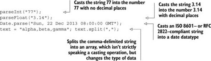
Casting: changing datatypes
The act of casting data refers to turning one datatype into another from the perspective of your programming language, which in this case is JavaScript. When you load data, it will often be in a string format, even if it’s a date, integer, floating-point number, or array. The date string in the tweets data, for instance, needs to be changed from a string into a date datatype if you want to work with the date methods available in JavaScript. You should familiarize yourself with the JavaScript functions that allow you to transform data. Here are a few:
Note
JavaScript defaults to type conversion when using the == test, whereas it forces no type conversion when using === and the like, so you’ll find your code will often work fine without casting. But this will come back to haunt you in situations where it doesn’t default to the type you expect, for example, when you try to sort an array and JavaScript sorts your numbers alphabetically.
Scales and scaling
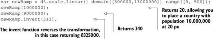
Numerical data rarely corresponds directly to the position and size of graphical elements onscreen. You can use d3.scale() functions to normalize your data for presentation on a screen (among other things). The first scale we’ll look at is d3.scale().linear(), which makes a direct relationship between one range of numbers and another. Scales have a domain setting and a range setting that accept arrays, with the domain determining the ramp of values being transformed and the range referring to the ramp to which those values are being transformed. For example, if you take the smallest population figure in cities.csv and the largest population figure, you can create a ramp that scales from the smallest to the largest so that you can display the difference between them easily on a 500-px canvas. In figure 2.5 and the code that follows, you can see that the same linear rate of change from 500,000 to 13,000,000 maps to a linear rate of change from 0 to 500.
Figure 2.5. Scales in D3 map one set of values (the domain) to another set of values (the range) in a relationship determined by the type of scale you create.
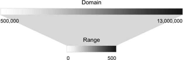
You create this ramp by instantiating a new scale object and setting its domain and range values:
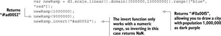
You can also create a color ramp by referencing CSS color names, RGB colors, or hex colors in the range field. The effect is a linear mapping of a band of colors to the band of values defined in the domain, as shown in figure 2.6.
Figure 2.6. Scales can also be used to map numerical values to color bands, to make it easier to denote values using a color scale.
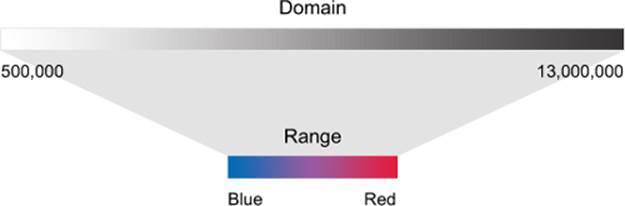
The code to create this ramp is the same, except for the reference to colors in the range array:
You can also use d3.scale.log(), d3.scale.pow(), d3.scale.ordinal(), and other less common scales to map data where these scales are more appropriate to your dataset. You’ll see these in action later on in the book as we deal with those kinds of datasets. Finally,d3.time.scale() provides a linear scale that’s designed to deal with date datatypes, as you’ll see later in this chapter.
Binning: categorizing data
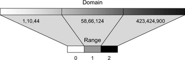
It’s useful to sort quantitative data into categories, placing the values in a range or “bin” to group them together. One method is to use quantiles, by splitting the array into equalsized parts. The quantile scale in D3 is, not surprisingly, called d3.scale.quantile(), and it has the same settings as other scales. The number of parts and their labels are determined by the .range() setting. Unlike other scales, it gives no error if there’s a mismatch between the number of .domain() values and the number of .range() values in a quantile scale, because it automatically sorts and bins the values in the domain into a smaller number of values in the range.
The scale sorts the array of numbers in its .domain() from smallest to largest and automatically splits the values at the appropriate point to create the necessary categories. Any number passed into the quantile scale function returns one of the set categories based on these break points.
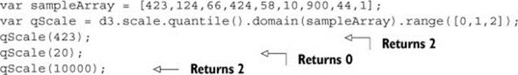
Notice that the range values in figure 2.7 are fixed, and can accept text that may correspond to a particular CSS class, color, or other arbitrary value.
Figure 2.7. Quantile scales take a range of values and reassign them into a set of equally sized bins.
Nesting
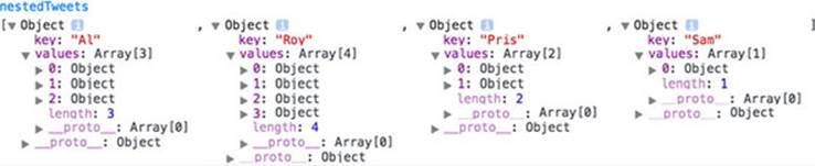
Hierarchical representations of data are useful, and aren’t limited to data with more traditional or explicit hierarchies, such as a dataset of parents and their children. We’ll get into hierarchical data and representation in more detail in chapters 4 and 5, but in this chapter we’ll use the D3 nesting function, which you can probably guess is called d3.nest().
The concept behind nesting is that shared attributes of data can be used to sort them into discrete categories and subcategories. For instance, if we want to group tweets by the user who made them, then we’d use nesting:
d3.json("tweets.json",function(data) {
var tweetData = data.tweets;
var nestedTweets = d3.nest()
.key(function(el) {return el.user})
.entries(tweetData);
});
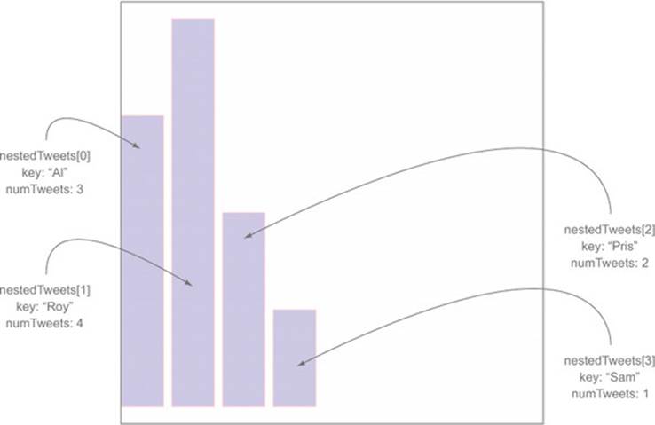
This nesting function combines the tweets into arrays under new objects labeled by the unique user attribute values, as shown in figure 2.8.
Figure 2.8. Objects nested into a new array are now child elements of a values array of newly created objects that have a key attribute set to the value used in the d3.nest.key function.
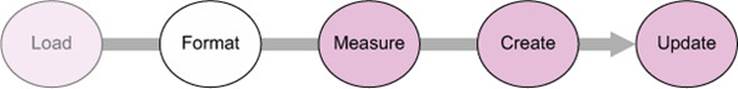
Now that we’ve loaded our data and transformed it into types that are accessible, we’ll investigate the patterns of that data by measuring the data (the third step shown in figure 2.9).
Figure 2.9. After formatting your data, you’ll need to measure it to ensure that the graphics you create are appropriately sized and positioned based on the parameters of the dataset.

2.1.4. Measuring data
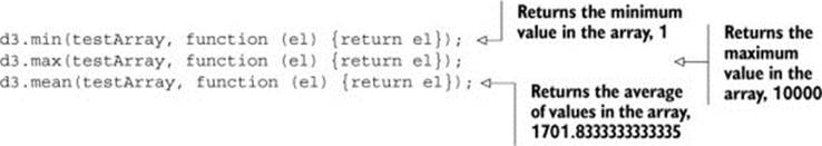
After loading your data array, one of the first things you should do is measure and sort it. It’s particularly important to know the distribution of values of particular attributes, as well as the minimum and maximum values and the names of the attributes. D3 provides a set of array functions that can help you understand your data.
You’ll always have arrays filled with data that you’ll want to size and position based on the relative value of an attribute compared to the distribution of the values in the array. You should therefore familiarize yourself with the ways to determine the distributions of values in an array in D3. You’ll work with an array of numbers first before you see these functions in operation with more complex and more data-rich JSON object arrays:
var testArray = [88,10000,1,75,12,35];
Nearly all the D3 measuring functions follow the same pattern. First, you need to designate the array and an accessor function for the value that you want to measure. In our case, we’re working with an array of numbers and not an array of objects, so the accessor only needs to point at the element itself.
If you’re dealing with a more complex JSON object array, then you’ll need to designate the attribute you want to measure. For instance, if we’re working with the array of JSON objects from cities.csv, we may want to derive the minimum, maximum, and average populations:
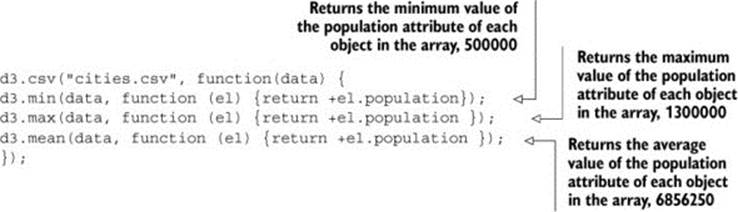
Finally, because dealing with minimum and maximum values is a common occurrence, d3.extent() conveniently returns d3.min() and d3.max() in a two-piece array:
![]()
You can also measure nonnumerical data like text by using the JavaScript .length() function for strings and arrays. When dealing with topological data, you need more robust mechanisms to measure network structure like centrality and clustering. When dealing with geometric data, you can calculate the area and perimeter of shapes mathematically, which can become rather difficult with complex shapes.
Now that we’ve loaded, formatted, and measured our data, we can create data visualizations. This requires us to use selections and the functions that come with them, which we’ll examine in more detail in the next section.
2.2. Data-binding
We touched on data-binding in chapter 1, but here we’ll go into it in more detail, explaining how selections work with data-binding to create elements (the fourth step shown in figure 2.10) and also to change those elements after they’ve been created. Our first example uses the data from cities.csv. After that we’ll see the process using this data as well as simple numerical arrays, and later we’ll do more interesting things with the tweets data.
Figure 2.10. To create graphics in D3, you use selections that bind data to DOM elements.
2.2.1. Selections and binding
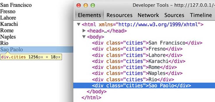
You use selections to make changes to the structure and appearance of your web page with D3. Remember that a selection consists of one or more elements in the DOM as well as the data, if any, associated with them. You can also create or delete elements using selections, and change the style and content. You’ve seen how to use d3.select() to change a DOM element, and now we’ll focus on creating and removing elements based on data. For this example, we’ll use cities.csv as our data source, and so we’ll need to load cities.csv and trigger our data visualization function in the callback to create a set of new <div> elements on the page using this code, with the results shown in figure 2.11.
Figure 2.11. When our selection binds the cities.csv data to our web page, it creates eight new divs, each of which is classed with "cities" and with content drawn from our data.
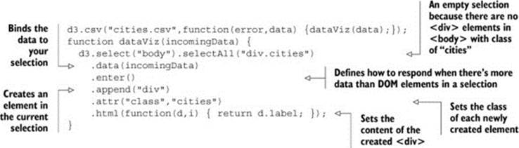
The selection and binding procedure shown here is a common pattern throughout the rest of this book. A subselection is created when you first select one element and then select the elements underneath it, which you’ll see in more detail later. First, let’s take a look at each individual part of this example.
d3.selectAll()
The first part of any selection is d3.select() or d3.selectAll() with a CSS identifier that corresponds to a part of the DOM. Often no elements match the identifier, which is referred to as an empty selection, because you want to create new elements on the page using the .enter()function. You can make a selection on a selection to designate how to create and modify child elements of a specific DOM element. Note that a subselection won’t automatically generate a parent. The parent must already exist, or you’ll need to create one using .append().
.data()
Here you associate an array with the DOM elements you selected. Each city in our dataset is associated with a DOM element in the selection, and that associated data is stored in a data attribute of the element. We could access these values manually using JavaScript like so:
![]()
Later in this chapter we’ll work with those values in a more sophisticated way using D3.
.enter() and .exit()
When binding data to selections, there will be either more, less, or the same number of DOM elements as there are data values. When you have more data values than DOM elements in the selection, you trigger the .enter() function, which allows you to define behavior to perform for every value that doesn’t have a corresponding DOM element in the selection. In our case, .enter() fires four times, because no DOM elements correspond to "div.cities" and our incomingData array contains eight values. When there are fewer data elements, then .exit() behavior is triggered, and when there are equal data values and DOM elements in a selection, then neither .exit() nor .enter() is fired.
.append() and .insert()
You’ll almost always want to add elements to the DOM when there are more data values than DOM elements. The .append() function allows you to add more elements and define which elements to add. In our example, we add <div> elements, but later in this chapter we’ll add SVG shapes, and in other chapters we’ll add tables and buttons and any other element type supported in HTML. The .insert() function is a sister function to .append(), but .insert() gives you control over where in the DOM you add the new element. You can also perform an append or insert directly on a selection, which adds one DOM element of the kind you specify for each DOM element in your selection.
.attr()
You’re familiar with changing styles and attributes using D3 syntax. The only thing to note is that each of the functions you define here will be applied to each new element added to the page. In our example, each of our four new <div> elements will be created with class="cities". Remember that even though our selection referenced "div.cities", we still have to manually declare that we’re creating <div> elements and also manually set their class to "cities".
.html()
For traditional DOM elements, you set the content with a .html() function. In the next section, you’ll see how to set content based on the data bound to the particular DOM element.
2.2.2. Accessing data with inline functions
If you ran the code in the previous example, you saw that each <div> element was set with different content derived from the data array that you bound to the selection. You did this using an inline anonymous function in your selection that automatically provides access to two variables that are critical to representing data graphically: the data value itself and the array position of the data. In most examples you’ll see these represented as d for data and i for array index, but they could be declared using any available variable name.
The best way to see this in action is to use our data to create a simple data visualization. We’ll keep working with d3ia.html, which we created in chapter 1, and which is a simple HTML page with minimal DOM elements and styles. A histogram or bar chart is one of the most simple and effective ways of expressing numerical data broken down by category. We’ll avoid the more complex datasets for now and start with a simple array of numbers:
[15, 50, 22, 8, 100, 10]
If we bind this array to a selection, we can use the values to determine the height of the rectangles (our bars in a bar chart). We need to set a width based on the space available for the chart, and we’ll start by setting it to 10 px:
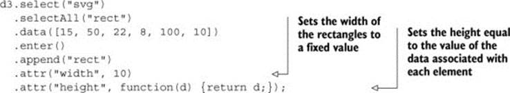
When we used the label values of our array to create <div> content with labels in section 2.2.1, we pointed to the object’s label attribute. Here, because we’re dealing with an array of number literals, we use the inline function to point directly at the value in the array to determine the height of our rectangles. The result, shown in figure 2.12, isn’t nearly as interesting as you might expect.
Figure 2.12. The default setting for any shape in SVG is black fill with no stroke, which makes it hard to tell when the shapes overlap each other.
![]()
All the rectangles overlap each other—they have the same default x and y positions. The drawing is easier to see if the outline, or stroke, of your rectangles is different from their fill. We can also make them transparent by adjusting their opacity style, as shown in figure 2.13.
Figure 2.13. By changing the fill, stroke, and opacity settings, you can see the overlapping rectangles.
![]()
d3.select("svg")
.selectAll("rect")
.data([15, 50, 22, 8, 100, 10])
.enter()
.append("rect")
.attr("width", 10)
.attr("height", function(d) {return d;})
.style("fill", "blue")
.style("stroke", "red")
.style("stroke-width", "1px")
.style("opacity", .25);
You may wonder about practical use of the second variable in the inline function, typically represented as i. One use of the array position of a data value is to place visual elements. If we set the x position of each rectangle based on the i value (multiplied by the width of the rectangle), then we get a step closer to a bar chart:
d3.select("svg")
.selectAll("rect")
.data([15, 50, 22, 8, 100, 10])
.enter()
.append("rect")
.attr("width", 10)
.attr("height", function(d) {return d;})
.style("fill", "blue")
.style("stroke", "red")
.style("stroke-width", "1px")
.style("opacity", .25)
.attr("x", function(d,i) {return i * 10});
Our histogram seems to be drawn from top to bottom, as seen in figure 2.14, because SVG draws rectangles down and to the right from the 0,0 point that we specify. To adjust this, we need to move each rectangle so that its y position corresponds to a position that is offset based on its height. We know that the tallest rectangle will be 100. The y position is measured based on the distance from the top left of the canvas, so if we set the y attribute of each rectangle equal to its length minus 100, then the histogram is drawn in the manner we’d expect, as shown in figure 2.15.
Figure 2.14. SVG rectangles are drawn from top to bottom.
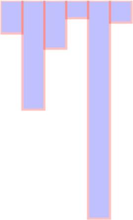
Figure 2.15. When we set the y position of the rectangle to the desired y position minus the height of the rectangle, the rectangle is drawn from bottom to top from that y position.
d3.select("svg")
.selectAll("rect")
.data([15, 50, 22, 8, 100, 10])
.enter()
.append("rect")
.attr("width", 10)
.attr("height", function(d) {return d;})
.style("fill", "blue")
.style("stroke", "red")
.style("stroke-width", "1px")
.style("opacity", .25)
.attr("x", function(d,i) {return i * 10;})
.attr("y", function(d) {return 100 - d;});
2.2.3. Integrating scales
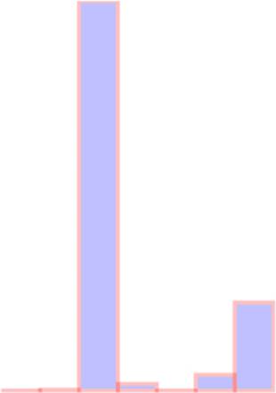
This way of building a chart works fine if you’re dealing with an array of values that correspond directly to the height of the rectangles relative to the height and width of your <svg> element. But if you have real data, then it tends to have widely divergent values that don’t correspond directly to the size of the shape you want to draw. The previous code doesn’t deal with an array of values like this:
[14, 68, 24500, 430, 19, 1000, 5555]
You can see how poorly it works in figure 2.16.
Figure 2.16. SVG shapes will continue to be drawn offscreen.
d3.select("svg")
.selectAll("rect")
.data([14, 68, 24500, 430, 19, 1000, 5555])
.enter()
.append("rect")
.attr("width", 10)
.attr("height", function(d) {return d})
.style("fill", "blue")
.style("stroke", "red")
.style("stroke-width", "1px")
.style("opacity", .25)
.attr("x", function(d,i) {return i * 10;})
.attr("y", function(d) {return 100 - d;});
And it works no better if you set a y offset equal to the maximum:
d3.select("svg")
.selectAll("rect")
.data([14, 68, 24500, 430, 19, 1000, 5555])
.enter()
.append("rect")
.attr("width", 10)
.attr("height", function(d) {return d})
.style("fill", "blue")
.style("stroke", "red")
.style("stroke-width", "1px")
.style("opacity", .25)
.attr("x", function(d,i) {return i * 10;})
.attr("y", function(d) {return 24500 - d;});
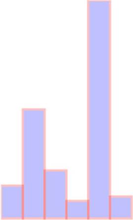
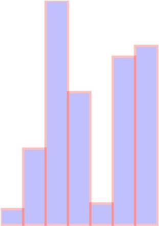
There’s no need to bother with a screenshot. It’s just a single bar running vertically across your canvas. In this case, it’s best to use D3’s scaling functions to normalize the values for display. We’ll use the relatively straightforward d3.scale.linear() for this bar chart. A D3 scale has two primary functions: .domain() and .range(), both of which expect arrays and which must have arrays of the same length to get the right results. The array in .domain() indicates the series of values being mapped to .range(), which will make more sense in practice. First, we make a scale for the y-axis:
As you can see, yScale now allows us to map the values in a way suitable for display. If we then use yScale to determine the height and y position of the rectangles, we end up with a bar chart that’s more legible, as shown in figure 2.17.
Figure 2.17. A bar chart drawn using a linear scale
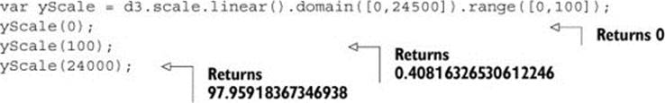
var yScale = d3.scale.linear() .domain([0,24500]).range([0,100]);
d3.select("svg")
.selectAll("rect")
.data([14, 68, 24500, 430, 19, 1000, 5555])
.enter()
.append("rect")
.attr("width", 10)
.attr("height", function(d) {return yScale(d);})
.style("fill", "blue")
.style("stroke", "red")
.style("stroke-width", "1px")
.style("opacity", .25)
.attr("x", function(d,i) {return i * 10;})
.attr("y", function(d) {return 100 - yScale(d);});
When you deal with such widely diverging values, it often makes more sense to use a polylinear scale. A polylinear scale is a linear scale with multiple points in the domain and range. Let’s suppose that for our dataset, we’re particularly interested in values between 1 and 100, while recognizing that sometimes we get interesting values between 100 and 1000, and occasionally we get outliers that can be quite large. We could express this in a polylinear scale as follows:
var yScale =
d3.scale.linear().domain([0,100,1000,24500]).range([0,50,75,100]);
The previous draw code produces a different chart with this scale, as shown in figure 2.18.
Figure 2.18. The same bar chart from figure 2.17 drawn with a polylinear scale
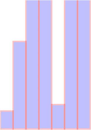
There may be a cutoff value, after which it isn’t so important to express how large a datapoint is. For instance, let’s say these datapoints represent the number of responses for a survey, and it’s deemed a success if there are more than 500 responses. We may only want to show the range of the data values between 0 and 500, while emphasizing the variation at the 0 to 100 level with a scale like this:
var yScale = d3.scale.linear()
.domain([0,100,500]).range([0,50,100]);
You may think that’s enough to draw a new chart that caps the bars at a maximum height of 100 if the datapoint has a value over 500. This isn’t the default behavior for scales in D3, though. In figure 2.19 you can see what would happen running the draw code with that scale.
Figure 2.19. A bar chart drawn with a linear scale where the maximum value in the domain is lower than the maximum value in the dataset
Notice the rectangles are still drawn above the canvas, as evidenced by the lack of a border on the top of the four rectangles with values over 500. We can confirm this is happening by putting a value greater than 500 into the scale function we’ve created:
![]()
By default, a D3 scale continues to extrapolate values greater than the maximum domain value and less than the minimum domain value. If we want it to set all such values to the maximum (for greater) or minimum (for lesser) range value, then we need to use the .clamp() function:
var yScale = d3.scale.linear()
.domain([0,100,500])
.range([0,50,100])
.clamp(true);
Running the draw code now produces rectangles that have a maximum value of 100 for height and position, as shown in figure 2.20.
Figure 2.20. A bar chart drawn with values in the dataset greater than the maximum value of the domain of the scale, but with the clamp() function set to true
We can confirm this by plugging a value into yScale() that’s greater than 500:
![]()
Scale functions are key to determining position, size, and color of elements in data visualization. As you’ll see later in this chapter and throughout the book, this is the basic process for using scales in D3.
2.3. Data presentation style, attributes, and content
Next, we’ll work with the cities and tweets data to create a second bar chart combining the techniques you’ve learned in this chapter and chapter 1. After that, we’ll deal with the more complicated methods necessary to represent the tweets data in a simple data visualization. Along the way, you’ll learn how to set styles and attributes based on the data bound to the elements, and explore how D3 creates, removes, and changes elements based on changes in the data.
2.3.1. Visualization from loaded data
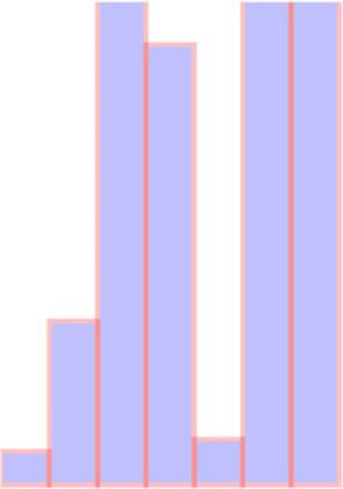
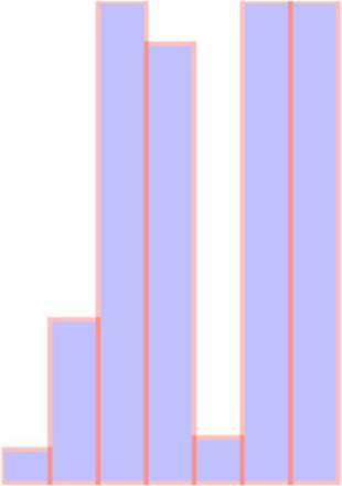
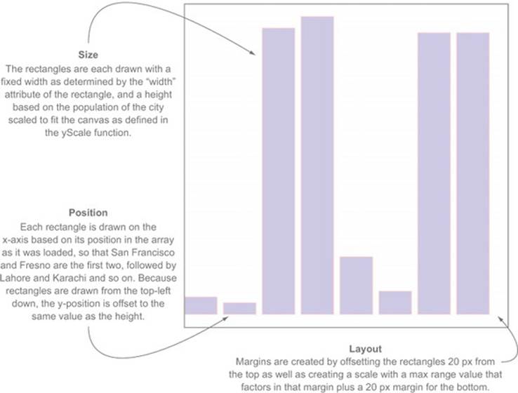
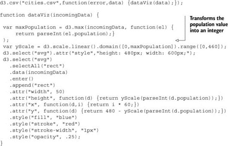
A bar chart based on the cities.csv data is straightforward, requiring only a scale based on the maximum population value, which we can determine using d3.max(), as shown in the following listing. This bar chart (shown annotated in figure 2.21) shows you the distribution of population sizes of the cities in our dataset.
Figure 2.21. The cities.csv data drawn as a bar chart using the maximum value of the population attribute in the domain setting of the scale
Listing 2.3. Loading data, casting it, measuring it, and displaying it as a bar chart
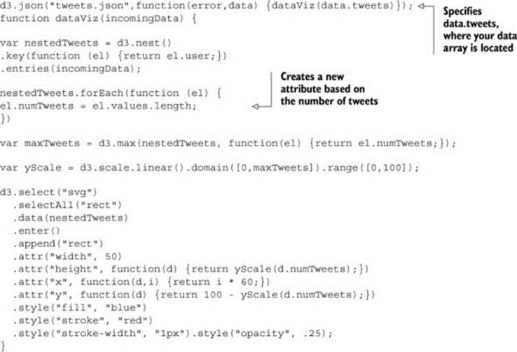
Creating a bar chart out of the Twitter data requires a bit more transformation. As shown in the following listing, we use d3.nest() to gather the tweets under the person making them, and then use the length of that array to create a bar chart of the number of tweets (shown annotated infigure 2.22).
Figure 2.22. By nesting data and counting the objects that are nested, we can create a bar chart out of hierarchical data.
Listing 2.4. Loading, nesting, measuring, and representing data
2.3.2. Setting channels
So far, we’ve only used the height of a rectangle to correspond to a point of data, and in cases where you’re dealing with one piece of quantitative data, that’s all you need. That’s why bar charts are so popular in spreadsheet applications. But most of the time you’ll use multivariate data, such as census data for counties or medical data for patients.
“Multivariate” is another way of saying that each datapoint has multiple data characteristics. For instance, your medical history isn’t a single score between 0 and 100. Instead, it consists of multiple measures that explain different aspects of your health. In cases with multivariate data like that, you need to develop techniques to represent multiple data points in the same shape. The technical term for how a shape visually expresses data is channel, and depending on the data you’re working with, different channels are better suited to express data graphically.
Infoviz term: channels
When you represent data using graphics, you need to consider the best visual methods to represent the types of data you’re working with. Each graphical object, as well as the whole display, can be broken down into component channels that relay information visually. These channels, such as height, width, area, color, position, and shape, are particularly well suited to represent different classes of information. For instance, if you represent magnitude by changing the size of a circle, and if you create a direct correspondence between radius and magnitude, then your readers will be confused, because we tend to recognize the area of a circle rather than its radius. Channels also exist at multiple levels, and some techniques use hue, saturation, and value to represent three different pieces of information, rather than just using color more generically.
The important thing here is to avoid using too many channels, and instead focus on using the channels most suitable to your data. If you aren’t varying shape, for instance, if you’re using a bar chart where all the shapes are rectangles, then you can use color for category and value (lightness) to represent magnitude.
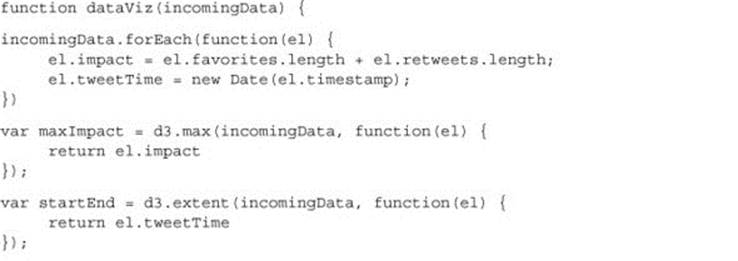
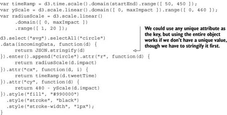
Going back to the tweets.json data, it may seem like there’s not much data available to put on a chart, but depending on what factors we want to measure and display, we can take a couple different approaches. Let’s imagine we want to measure the impact factor of tweets, treating tweets that are favorited or retweeted as more important than tweets that aren’t. This time, instead of a bar chart, we’ll create a scatterplot, and instead of using array position to place it along the x-axis, let’s use time, because there’s good evidence that tweets made at certain times are more likely to be favorited or retweeted. We’ll place each tweet along the y-axis using a scale based on the maximum impact factor of our set of tweets. From this point on, we’ll focus on the dataViz() function as in the following listing, because you should be familiar now with getting your data in and sending it to such a function.
Listing 2.5. Creating a scatterplot
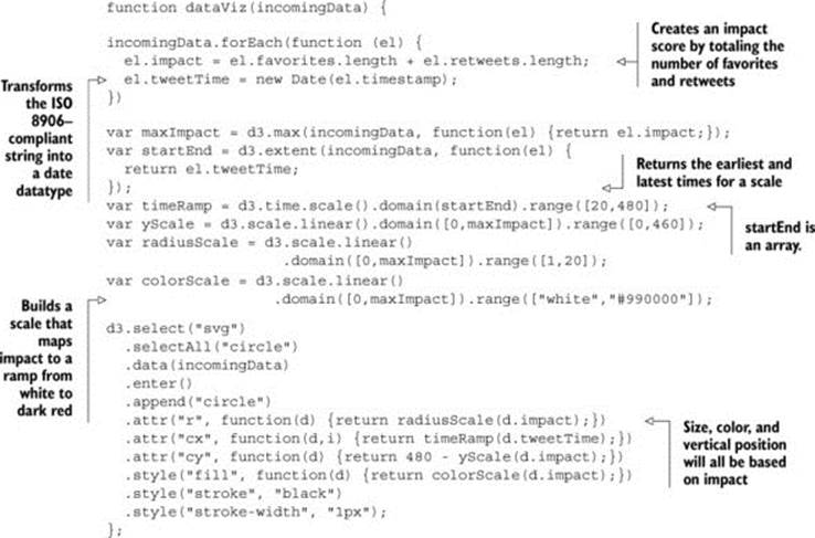
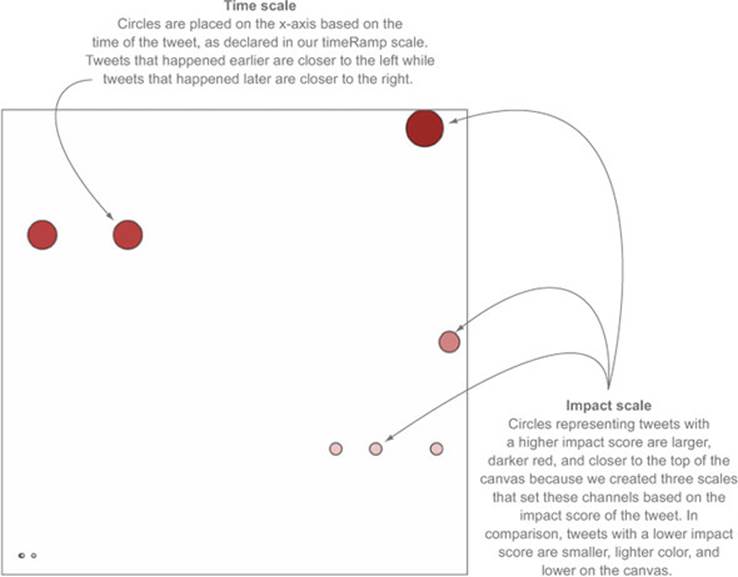
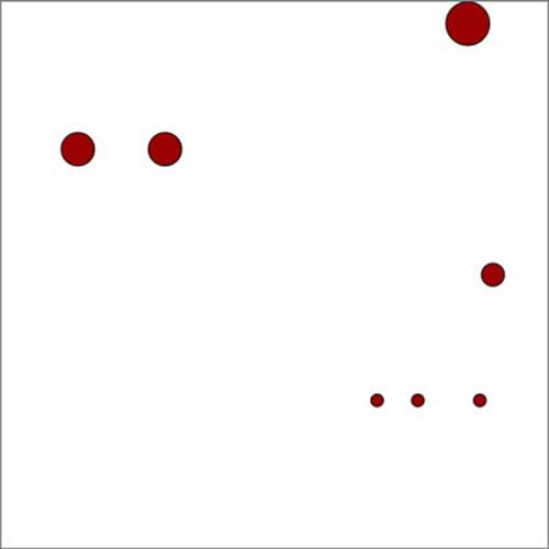
As shown in figure 2.23, each tweet is positioned vertically based on impact and horizontally based on time. Each tweet is also sized by impact and colored darker red based on impact. Later on we’ll want to use color, size, and position for different attributes of the data, but for now we’ll tie most of them to impact.
Figure 2.23. Tweets are represented as circles sized by the total number of favorites and retweets, and are placed on the canvas along the x-axis based on the time of the tweet and along the y-axis according to the same impact factor used to size the circles. Two tweets with the same impact factor that were made at nearly the same time are shown overlapping at the bottom left.
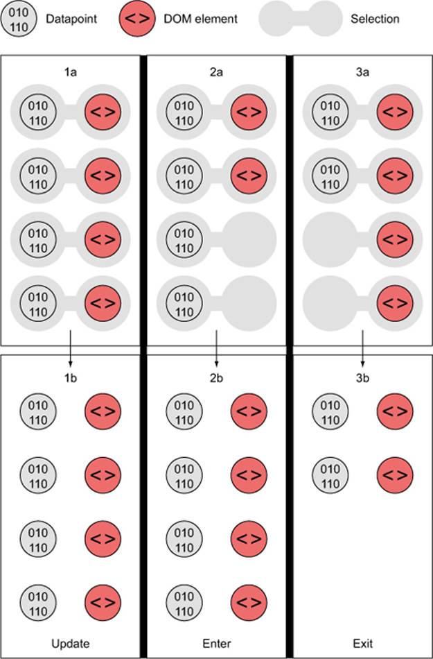
2.3.3. Enter, update, and exit
You’ve used the .enter() behavior of a selection many times already. Now let’s take a closer look at it and its counterpart, .exit(). Both of these functions operate when there’s a mismatch between the number of data values bound to a selection and the number of DOM elements in the selection. If there are more data values than DOM elements, then .enter() fires, whereas if there are fewer data values than DOM elements, then .exit() fires, as in figure 2.24. You use selection.enter() to define how you want to create new elements based on the data you’re working with, and you use selection.exit() to define how you want to remove existing elements in a selection when the data that corresponds to them has been deleted. Updating data, as you’ll see in the next example, is accomplished through reapplying the functions you used to create the graphical elements based on your data.
Figure 2.24. Selections where the number of DOM elements and number of values in an array don’t match will fire either an .enter() event or an .exit() event, depending on whether there are more or fewer data values than DOM elements, respectively.
Each .enter() or .exit() event can include actions taken on child elements. This is mostly useful with .enter() events, where you use the .append() function to add new elements. If you declare this new appended element as a variable, and if that element is amenable to child elements, like a <g> element is, then you can include any number of child elements. In the case of SVG elements, only <svg>, <g>, and <text> can have child elements, but if you’re using D3 with traditional DOM manipulation, then you can use this method to add <p> elements to <div>elements and so on.
For example, let’s say we want to show a bar chart based on our newly measured impact score, and we want the bars on the bar chart to have labels. We need to append <g> elements, and not shapes, to the <svg> canvas in our initial selection. Because the data is bound to these elements, we can use the same syntax when we add child elements. Because we’re using <g> elements, we need to set the position using the transform attribute. We add child elements to the .append() function, and we need to declare it as a variable tweetG. This allows tweetG to stand in ford3.select("svg").selectAll("g") so we don’t have to retype it throughout the example. The following listing uses all the same scales to determine size and position as the previous example.
Listing 2.6. Creating labels on <g> elements

In figure 2.25 you can see the result of our code, along with some annotation. The same circles in the same position show that translate works much like changing cx and cy for circles, but now we can add other SVG elements, like <text> for labels.
Figure 2.25. Each tweet is a <g> element with a circle and a label appended to it. The various tweets by Roy at 7 A.M. happen so close to each other that they’re difficult to label.
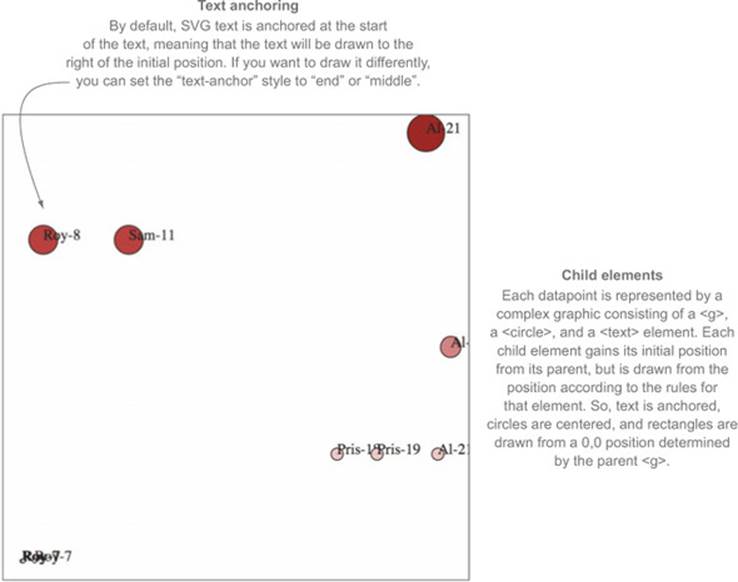
The labels are illegible in the bottom left, but they’re not much better for the rest. Later on, you’ll learn how to make better labels. The inline functions such as .text(function(d) {return d.user + "-" + d.tweetTime.getHours()}) set the label to be the name of the person making the tweet, followed by a dash, followed by the hour of the tweet. These functions all refer to the same data elements, because the child elements inherit their parents’ data functions. If one of your data elements is an array, you may think you could bind it to a selection on the child element, and you’d be right. You’ll see that in the next chapter and later in the book.
Exit
Corresponding to the .append() function is the .remove() function available with .exit(). To see .exit() in action, you need to have some elements in the DOM, which could already exist, depending on what you put in your HTML, or which could have been added with D3. Let’s stick with the state that the previous code creates, which provides us with ample opportunity to test the .exit() function. DOM element styles and attributes aren’t updated if we make a change to the array unless we call the necessary .style() and .attr() functions. If we bind any array to the existing <g> elements in your DOM, then we can use .exit() to remove them:
d3.selectAll("g").data([1,2,3,4]).exit().remove();
This code deleted all but four of our <g> elements, because there are only four values in our array. In most of the explanations of D3’s .enter() and .exit() behavior, you won’t see this kind of binding of an entirely different array to a selection. Instead, you’ll see a rebinding of the initial data array after it’s been filtered to represent a change via user interaction or other behavior. You’ll see an example like this next, and throughout the book. But it’s important to understand the difference between your data, your selection, and your DOM elements. The data that’s bound to our DOM elements has been overwritten, so our data-rich objects from tweets.csv have now been replaced with boring numbers. But the only change to the visual representation is that the number has been reduced to reflect the size of the array we’ve bound. D3 doesn’t follow the convention that when the data changes, the corresponding display is updated; you need to build that functionality yourself. Because it doesn’t follow that convention, it gives you greater flexibility that we’ll explore in later chapters.
Updating
You can see how the visual attributes of an element can change to reflect changes in data by updating the <text> elements in each g to reflect the newly bound data:
d3.selectAll("g").select("text").text(function(d) {return d});
Figure 2.26 shows our long labels replaced by the numbers we bound to the data.
Figure 2.26. Only four <g> elements remain, corresponding to the four data values in the new array, with their <text> labels reset to match the new values in the array. But when you inspect the <g> element, you see that its __data__ property, where D3 stores the bound data, is different from that of its <circle> child element, which still has the JSON object we bound when we first created the visualization.
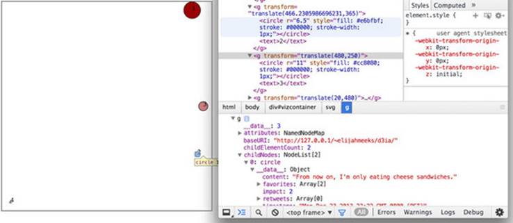
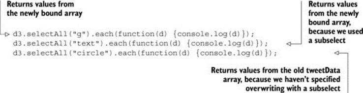
In this example we had to .selectAll() the parent elements and then subselect the child elements to re-initialize the data-binding for the child elements. Whenever you bind new data to a selection that utilizes child elements, you’ll need to follow this pattern. You can see that, because we didn’t update the <circle> elements, they still have the old data bound to each element:
The .exit() function isn’t intended to be used for binding a new array of completely different values like this. Instead, it’s meant to update the page based on the removal of elements from the array that’s been bound to the selection. But if you plan to do this, you need to specify how the.data() function binds data to your selected elements. By default, .data() binds based on the array position of the data value. This means, in the previous example, that the first four elements in our selection are maintained and bound to the new data, while the rest are subject to the.exit() function. In general, though, you don’t want to rely on array position as your binding key. Rather, you should use something meaningful, such as the value of the data object itself. The key requires a string or number, so if you pass a JSON object without using JSON.stringify, it treats all objects as "[object object]" and only returns one unique value. To manually set the binding key, we use the second setting in the .data() function and use the inline syntax typical in D3.
Listing 2.7. Setting the key value in data-binding
The visual results are the same as our earlier scatterplot with the same settings, but now if we filter the array we used for the data, and bind that to the selection, we can get to the state shown in figure 2.27 by defining some useful .exit() 'margin-top:12.0pt;margin-right:0cm;margin-bottom: 12.0pt;margin-left:8.75pt;line-height:normal'>var filteredData = incomingData.filter(
function(el) {return el.impact > 0}
);
d3.selectAll("circle")
.data(filteredData, function(d) {return JSON.stringify(d)})
.exit()
.remove();
Figure 2.27. All elements corresponding to tweets that were not favorited and not retweeted were removed.
Using the stringified object won’t work if you change the data in the object, because then it no longer corresponds with the original binding string. If you plan to do significant changing and updating, then you’ll need a unique ID of some sort for your objects to use as your binding key.
2.4. Summary
In this chapter we looked closely at the core elements for building data visualizations using D3:
· Loading data from external files in CSV and JSON format
· Formatting and transforming data using D3 scales and built-in JavaScript functions
· Measuring data to build graphically useful visualizations
· Binding data to create graphics based on the attributes of the data
· Using subselections to create complex graphical objects made of multiple shapes using the <g> element
· Understanding how to create, change, and move elements using enter(), exit(), and selections
Almost all the code you’ll write using D3 is a variation of or elaboration on the material covered in this chapter. In the next chapter we’ll focus on the design details necessary for a successful D3 project, while exploring how D3 implements interaction, animation, and the use of pregenerated content.