jQuery and JavaScript Phrasebook (2014)
11. Adding jQuery UI Elements
jQuery UI is an additional library built on top of jQuery. The purpose of jQuery UI is to provide a set of extensible interactions, effects, widgets, and themes that make it easier to incorporate professional user interface (UI) elements in your web pages.
The jQuery UI library provides a lot of functionality. The phrases in this chapter are designed to get you started using jQuery UI. Although these concepts are not comprehensive, you can apply them to additional UI elements and interactions.
Adding the jQuery UI Library
<script type="text/javascript"
src="jquery-ui-1.10.3.min.js"></script>
<link rel="stylesheet" type="text/css"
href="jquery-ui-1.10.3.min.css">
To get going with jQuery, download the library, add it to a location where your web pages can see it, and then load the JS and CSS files in the web page. The process of adding the jQuery UI library is described in the following steps.
1. Download the library from http://jqueryui.com/download/.
2. Unzip the contents of the downloaded files.
3. Copy the jquery-ui-###.js, jquery-ui-###.css, and images folder in the download to a location in your web site where your pages can access them. The images folder needs to be in the same location as the .css file.
4. Add the following lines to the header of your web pages to load the jQuery UI code. You need to replace the version numbers to match those you downloaded and set the appropriate paths in the src and href attributes:
<script type="text/javascript"
src="jquery-ui-1.10.3.min.js"></script>
<link rel="stylesheet" type="text/css"
href="jquery-ui-1.10.3.min.css">
By the way
The jQuery UI library is based on the jQuery library, so you need to load the jQuery library first.
Implementing an Autocomplete Input
. . . jQuery . . .
$( "#autocomplete" ).autocomplete({
source: ["Monday", "Tuesday", "Wednesday", "Thursday", "Friday"]
});
. . . HTML . . .
<input id="autocomplete">
The autocomplete widget is attached to text input elements. As the user types in the text input, suggestions from a list are displayed. This is especially helpful when you have a finite set of possibilities that can be typed in and you want to make sure the correct spelling is used.
To apply the autocomplete widget, define a source array that contains the strings available to autocomplete in the text input. Then call the .autoComplete({source:array}) method on the input element. For example:
$( "#autocomplete" ).autocomplete({
source: ["Monday", "Tuesday", "Wednesday", "Thursday", "Friday"]
});
The following code illustrates an example of using autocomplete by adding a day array autocomplete widget to an <input> element named #autocomplete. The autocomplete is illustrated in Figure 11.1. The set of days to autocomplete is added by setting the source attribute to an array of day names in lines 16 and 17:
01 <html>
02 <head>
03 <title>Python Phrasebook</title>
04 <meta charset="utf-8" />
05 <script type="text/javascript"
06 src="../js/jquery-2.0.3.min.js"></script>
07 <script type="text/javascript"
08 src="../js/jquery-ui-1.10.3.min.js"></script>
09 <link rel="stylesheet" type="text/css"
10 href="../js/css/jquery-ui-1.10.3.min.css">
11 <script>
12 function dateChanged(dateStr, Object){
13 $("span").html("Updated to" + dateStr); }
14 $(document).ready(function(){
15 $( "#autocomplete" ).autocomplete({
16 source: ["Monday", "Tuesday", "Wednesday",
17 "Thursday", "Friday"]
18 });
19 });
20 </script>
21 <style>
22 input { border:2px ridge blue; border-radius:5px;
23 padding:3px; }
24 </style>
25 </head>
26 <body>
27 <label for="autocomplete">Day of Week: </label>
28 <input id="autocomplete">
29 </body>
30 </html>
ch1101.html
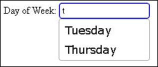
Figure 11.1 Using jQuery UI code to implement an autocomplete text input in ch1101.html.
Implementing Drag and Drop
$("#drag1, #drag2, #drag3").draggable(
{helper:"clone", cursor:"move",
opacity:.7, zIndex:99});
$("#drop").droppable({accept:"img",
tolerance:"intersect", hoverClass:"drop-hover"});
$("#drop").on("drop", function(e,ui){
var item = $("<div></div>");
item.append($("<img></img>").attr("src",
ui.draggable.attr("src")));
item.append($("<span></span>").html(
ui.draggable.attr("src")));
$(this).append(item);
});
You can define one element to be draggable and then another to be droppable. When draggable elements are dropped on droppable widgets, you can add JavaScript and jQuery code that provides whatever interaction necessary when draggable elements are dropped on droppable widgets.
The draggable widget provides the necessary interactivity for elements when dragging them with the mouse. For example, moving an element to another position in the browser window by dragging it with the mouse.
Table 11.1 describes the more common draggable options. The following code shows an example of attaching the draggable widget to an element with the cursor and opacity options:
$("#img1").draggable({cursor:"move", opacity:.5});
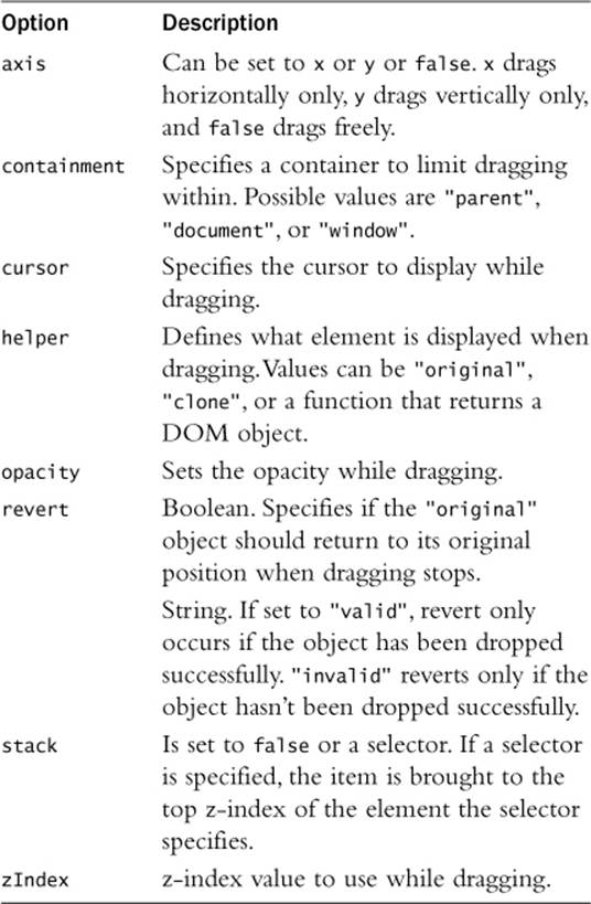
Table 11.1 Common Draggable Widget Options
The draggable widget also provides the additional events so handlers can be attached to the element when dragging starts, is in progress, and stops. Table 11.2 lists the events that you can access on draggable items. The following code shows an example of adding a dragstop event to apply a bounce effect when the item is dropped:
$("#drag1").draggable({cursor:"move", opacity:.5});
$("#drag1").on("dragstop", function(){$(this).effect("bounce", 1000); });
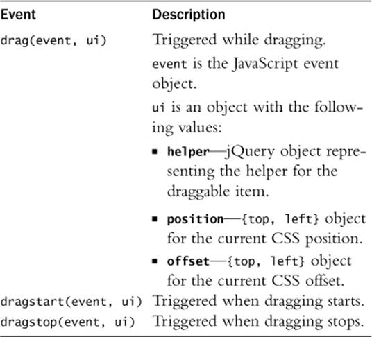
Table 11.2 Draggable Widget Events
The droppable widget defines an element as a valid drop container usable by draggable items. This allows you to provide interactions between elements using simple mouse controls.
The droppable widget allows you to specify an accept function that can process information about the event, such as mouse coordinates and the draggable item involved. Table 11.3 describes the more common droppable options. The following code shows an example of attaching the droppable widget to an element and specifying the tolerance level:
$("#div1"). droppable ({tolerance:"touch"});
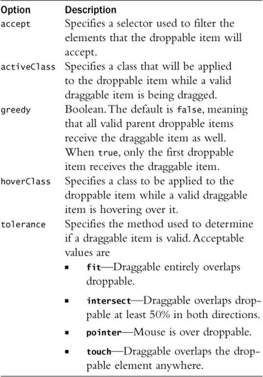
Table 11.3 Common Droppable Widget Options
The droppable widget also provides the additional events so handlers can be attached to the element when dragging and dropping. Table 11.4 lists the events that you can access on droppable items. The following code shows an example of adding a dropactivate event to apply a shakeeffect when a drag start activates a droppable item:
$("#drop1").droppable({tolerance:"pointer"});
$("# drop1").on("dropactivate", function(){$(this).effect("shake", 1000); });
Table 11.4 Droppable Widget Events
Now I’ll try to put all this together in a practical way. The following code makes three image elements draggable and then a <div> element droppable. I use the "clone" option in line 14 so that I can move a copy of the image and leave the original in place. The drop event handler uses the image information to create a new <div> element that contains the image and filename, as shown in Figure 11.2:
01 <html>
02 <head>
03 <title>Python Phrasebook</title>
04 <meta charset="utf-8" />
05 <script type="text/javascript"
06 src="../js/jquery-2.0.3.min.js"></script>
07 <script type="text/javascript"
08 src="../js/jquery-ui-1.10.3.min.js"></script>
09 <link rel="stylesheet" type="text/css"
10 href="../js/css/jquery-ui-1.10.3.min.css">
11 <script>
12 $(document).ready(function(){
13 $("#drag1, #drag2, #drag3").draggable(
14 {helper:"clone", cursor:"move",
15 opacity:.7, zIndex:99});
16 $("#drop").droppable({accept:"img",
17 tolerance:"intersect", hoverClass:"drop-hover"});
18 $("#drop").on("drop", function(e,ui){
19 var item = $("<div></div>");
20 item.append($("<img></img>").attr("src",
21 ui.draggable.attr("src")));
22 item.append($("<span></span>").html(
23 ui.draggable.attr("src")));
24 $(this).append(item);
25 });
26 });
27 </script>
28 <style>
29 div {display:inline-block; vertical-align:top;
30 margin:10px;}
31 img {width:100px; margin:0px; }
32 #images { width:100px; height:300px; }
33 #drop { width:300px; min-height:150px; padding:3px;
34 border:3px ridge white; box-shadow:
35 5px 5px 5px #888888; }
36 #drop div{ height:80px; width:280px; padding:4px;
37 border:2px dotted; margin-top:5px; }
38 #drop div img {height:80px; margin-right:10px; }
39 #drop div span { display:inline-block;
40 vertical-align:top; font:16px/70px arial; }
41 .drop-hover { background-color:#BBDDFF; }
42 </style>
43 </head>
44 <body>
45 <div id="images">
46 <img id="drag1" src="lake.jpg" />
47 <img id="drag2" src="tiger.jpg" />
48 <img id="drag3" src="volcano.jpg" />
49 </div>
50 <div id="drop"></div>
51 </body>
52 </html>
ch1102.html
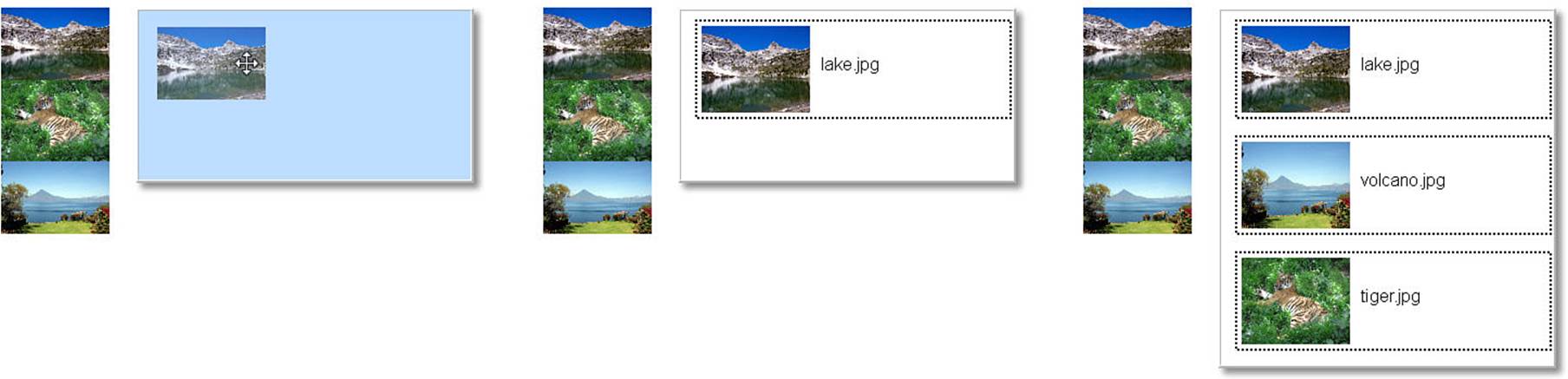
Figure 11.2 Applying draggable and droppable to elements using jQuery UI code in ch1102.html.
Adding Datepicker Element
$( "#month" ).datepicker({
onSelect:dateChanged,
showOn: "button",
buttonImage: "calendar.png",
buttonImageOnly: true,
numberOfMonths:2,
showButtonPanel:true,
dateFormat: "yy-mm-dd"
});
The datepicker widget provided with jQuery allows you to implement a calendar interface so users can select a specific day using a simple click of the mouse. This can prevent a lot of problems when users input dates incorrectly because they are typing them by hand.
The datepicker widget is attached to a text, date, or datetime <input> element by calling the .datepicker() method. When the user clicks on the <input>, the calendar is displayed. You can also add an icon image to launch the datepicker using the buttonImage attribute.
The following code creates a date with an image icon, as seen in Figure 11.3. To illustrate some of the available options, I’ve added settings for the following:
 onSelect—Specifies a function that is called each time a new date is selected.
showOn—This is set to “button” so that the datepicker is launched when the button icon is clicked.
buttonImage—Specifies the location of the image file to use.
buttonImageOnly—When true, the datepicker is only launched when the button icon is clicked and not the <input>.
numberOfMonths—Specifies the number of months to display.
showButtonPanel—When true, the Today and Done buttons are displayed on the bottom of the datepicker.
dateFormat—String that describes the format to be placed in the <input> field.
01 <html>
02 <head>
03 <title>Python Phrasebook</title>
04 <meta charset="utf-8" />
05 <script type="text/javascript"
06 src="../js/jquery-2.0.3.min.js"></script>
07 <script type="text/javascript"
08 src="../js/jquery-ui-1.10.3.min.js"></script>
09 <link rel="stylesheet" type="text/css"
10 href="../js/css/jquery-ui-1.10.3.min.css">
11 <script>
12 function dateChanged(dateStr, Object){
13 $("span").html("Updated to" + dateStr); }
14 $(document).ready(function(){
15 $( "#month" ).datepicker({
16 onSelect:dateChanged,
17 showOn: "button",
18 buttonImage: "calendar.png",
19 buttonImageOnly: true,
20 numberOfMonths:2,
21 showButtonPanel:true,
22 dateFormat: "yy-mm-dd"
23 });
24 });
25 </script>
26 <style>
27 input { border:2px ridge blue; border-radius:5px; }
28 </style>
29 <body>
30 <label>Date: </label>
31 <input type="text" id="month"></input>
32 <span></span>
33 </body>
34 </html>
ch1103.html
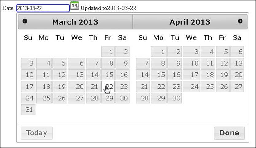
Figure 11.3 Implementing a datepicker widget in jQuery UI code in ch1103.html.
Using Sliders to Manipulate Elements
$( "#red, #green, #blue" ).slider({
orientation: "horizontal",
range: "min",
max: 255,
value: 127,
slide: refreshSwatch,
change: refreshSwatch
});
$("#red").slider("value", 128);
$("#green").slider("value", 128);
$("#blue").slider("value", 128);
The slider widget allows you to create slider controls that adjust a value by dragging the mouse. The slider has two components: the slide and the handle. The slide is styled by the .ui-slider-range class, and the handle is styled by the .ui-slider-handle class.
Did you know?
You can define both a min and a max handle that allows you to use a single slider control to define a range instead of a single value.
The following code provides an example of implementing a set of sliders to adjust the background color of another element. The slider is applied to the <div> elements in lines 23–33, and the following options are set:
orientation—Can be set to "horizontal" or "vertical".
range—Can be set to true, "min", or "max". Used to define the range. "min" goes from the slider min to a handler, and "max" goes from the slider max to a handle.
max—Specifies the maximum value.
value—Specifies the current value.
slide—Event handler to call when the slide moves.
change—Event handler to call when the slide value changes.
Also, pay attention to the class settings in lines 41–46 of the CSS, which alter the appearance of the slider and handler. Figure 11.4 shows the sliders:
01 <html>
02 <head>
03 <title>Python Phrasebook</title>
04 <meta charset="utf-8" />
05 <script type="text/javascript"
06 src="../js/jquery-2.0.3.min.js"></script>
07 <script type="text/javascript"
08 src="../js/jquery-ui-1.10.3.min.js"></script>
09 <link rel="stylesheet" type="text/css"
10 href="../js/css/jquery-ui-1.10.3.min.css">
11 <script>
12 function cValue(selector){
13 var v = $(selector).slider("value").toString( 16 );
14 if (v.length ===1) { v = "0" + v;}
15 return v;
16 }
17 function refreshSwatch() {
18 $("#mix").css("background-color", "#" +
19 cValue("#red")+cValue("#green")+cValue("#blue"));
20 $("#mix").html($("#mix").css("background-color"));
21 }
22 $(document).ready(function(){
23 $( "#red, #green, #blue" ).slider({
24 orientation: "horizontal",
25 range: "min",
26 max: 255,
27 value: 127,
28 slide: refreshSwatch,
29 change: refreshSwatch
30 });
31 $("#red").slider("value", 128);
32 $("#green").slider("value", 128);
33 $("#blue").slider("value", 128);
34 });
35 </script>
36 <style>
37 #mix { width:160px; height:100px; text-align:center;
38 font:18px/100px arial; }
39 #red, #green, #blue { float: left; clear: left;
40 width:150px; margin:15px; }
41 #red .ui-slider-range { background:red; }
42 #red .ui-slider-handle { border-color:red; }
43 #green .ui-slider-range { background:green; }
44 #green .ui-slider-handle { border-color:green; }
45 #blue .ui-slider-range { background:blue; }
46 #blue .ui-slider-handle { border-color:blue; }
47 </style>
48 <body>
49 <div id="mix"></div>
50 <div id="red"></div>
51 <div id="green"></div>
52 <div id="blue"></div>
53 </body>
54 </html>
ch1104.html
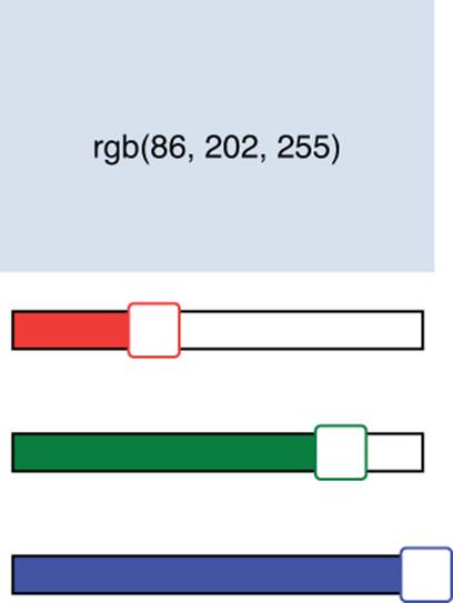
Figure 11.4 Adding sliders in jQuery UI code in ch1104.html.
Creating a Menu
. . . jQuery . . .
$( "#menu" ).menu();
$( "#menu" ).on("menuselect", function(e, ui){
$("p").html("Selected " +
ui.item.children("a:first").html());
});
. . . HTML . . .
<ul id="menu">
<li><a href="#">Open</a></li>
<li><a href="#">Recent</a><ul>
. . .
<li class="ui-state-disabled"><a href="#">
One of the most often used jQuery UI widgets is the menu widget. The menu widget allows you to turn an element tree into an expanding menu. Typically, menus are created by using cascading sets of <ul>/<li> elements with an <a> element that defines the link behavior and menu text.
Did you know?
You can customize the element tags that are used to build the element using the menus option; for example: menus:"div.menuItem".
The following code creates a jQuery UI menu from a set of lists. Notice in the HTML that some of the <li> fields include a <span> that has class="ui-icon ui-icon-{type}". These items will include the jQuery UI icon specified along with the menu text.
The selected item is displayed in the <p> element to show how the selection handler works using the menuselect event handler defined in line 14. The width of the menu is defined in the CSS code on line 21 by setting the width value in the .ui-menu class. The menu action is illustrated in Figure 11.5:
01 <html>
02 <head>
03 <title>Python Phrasebook</title>
04 <meta charset="utf-8" />
05 <script type="text/javascript"
06 src="../js/jquery-2.0.3.min.js"></script>
07 <script type="text/javascript"
08 src="../js/jquery-ui-1.10.3.min.js"></script>
09 <link rel="stylesheet" type="text/css"
10 href="../js/css/jquery-ui-1.10.3.min.css">
11 <script>
12 $(document).ready(function(){
13 $( "#menu" ).menu();
14 $( "#menu" ).on("menuselect", function(e, ui){
15 $("p").html("Selected " +
16 ui.item.children("a:first").html());
17 });
18 });
19 </script>
20 <style>
21 .ui-menu { width: 200px; }
22 p { border:3px ridge red; color:red;
23 display:inline-block; height:80px; width:100px; }
24 </style>
25 <body>
26 <ul id="menu">
27 <li><a href="#">Open</a></li>
28 <li><a href="#">Recent</a><ul>
29 <li><a href="#">Some File</a></li>
30 <li><a href="#">Another File</a></li>
31 </ul></li>
32 <li><a href="#">Save</a></li>
33 <li class="ui-state-disabled"><a href="#">
34 <span class="ui-icon ui-icon-print">
35 </span>Print...</a></li>
36 <li><a href="#">Playback</a><ul>
37 <li><a href="#">
38 <span class="ui-icon ui-icon-seek-start"></span>
39 Prev</a></li>
40 <li><a href="#">
41 <span class="ui-icon ui-icon-stop"></span>
42 Stop</a></li>
43 <li><a href="#">
44 <span class="ui-icon ui-icon-play"></span>
45 Play</a></li>
46 <li><a href="#">
47 <span class="ui-icon ui-icon-seek-end"></span>
48 Next</a></li>
49 </ul></li>
50 </ul>
51 <p></p>
52 </body>
53 </html>
ch1105.html
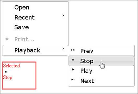
Figure 11.5 Implementing a jQuery UI menu using the code in ch1105.html.
Adding Tooltips
$(document).tooltip({
items: "img, input",
position: {my:"left+15 top", at:"left bottom",
collision:"flipfit" },
content: function() {
var obj = $(this);
if (obj.is("input")) {
return obj.attr( "title" ); }
if (obj.is("img")) {
var img = $("<img></img>").addClass(
"mini").attr("src", obj.attr("src"));
var span = $("<span></span>").html(
obj.attr( "alt" ));
return $("<div></div>").append(img, span); }
}});
The tooltips widget allows you to easily add tooltips to form input, images, and just about any other page element. To implement the tooltips, apply .tooltip(options) to the document or other container. Inside the options, specify the items that should include tooltips and then the tooltip content handler.
As the mouse hovers over an item supported by the tooltip, the tooltip message is displayed. The following code provides an example of implementing tooltips on <input> and <img> elements, as shown in Figure 11.6.
items—Specifies the selector used to determine if the page element supports tooltips.
content—Tooltip handler function called when a supported element is hovered over. The function should return the content to be displayed. Notice that for the image, a mini version is displayed in the tooltip.
position—Specifies the position to place the tooltip; for example:
01 <html>
02 <head>
03 <title>Python Phrasebook</title>
04 <meta charset="utf-8" />
05 <script type="text/javascript"
06 src="../js/jquery-2.0.3.min.js"></script>
07 <script type="text/javascript"
08 src="../js/jquery-ui-1.10.3.min.js"></script>
09 <link rel="stylesheet" type="text/css"
10 href="../js/css/jquery-ui-1.10.3.min.css">
11 <script>
12 $(document).ready(function(){
13 $(document).tooltip({
14 items: "img, input",
15 position: {my:"left+15 top", at:"left bottom",
16 collision:"flipfit" },
17 content: function() {
18 var obj = $(this);
19 if (obj.is("input")) {
20 return obj.attr( "title" ); }
21 if (obj.is("img")) {
22 var img = $("<img></img>").addClass(
23 "mini").attr("src", obj.attr("src"));
24 var span = $("<span></span>").html(
25 obj.attr( "alt" ));
26 return $("<div></div>").append(img, span); }
27 }});
28 });
29 </script>
30 <style>
31 input { border:2px ridge blue; border-radius: 5px;
32 padding:3px; }
33 img { height:200px; margin:15px; }
34 .mini {height:30px;}
35 </style>
36 <body>
37 <label for="size">Who are you? </label>
38 <input id="size"
39 title="Nosce te ipsum (Know Thyself)" /><br>
40 <img src="someday.jpg"
41 alt="I'm going there someday"/>
42 </body>
43 </html>
ch1106.html
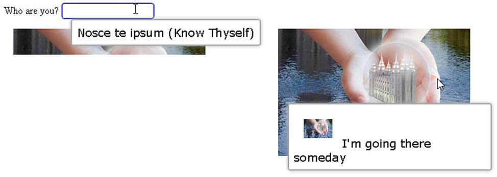
Figure 11.6 Adding tooltips to elements using jQuery UI code in ch1106.html.