Hands-On Sencha Touch 2 (2014)
Part I. Sencha Touch Essentials
Chapter 5. The Layout System
In Sencha Touch there are two basic building blocks: components and containers. When you instantiate both with no configuration, they look the same. However, there is one important difference: containers can contain components (or other containers):
var container = Ext.create('Ext.Container', {
items: [{
xtype: 'component',
html: 'Nested component'
}, {
xtype: 'container',
items: [{
xtype: 'component',
html: 'Nested container with component'
}]
}]
});
Usually when containers hold other components, you want to think about how to position these multiple components. Maybe you want to position the components on top of each other, or maybe next to each other. In other words, you want to give the container a layout.
Under the hood, Sencha Touch uses the CSS3 flexbox layout. This is different from Ext JS 4, which uses JavaScript to dynamically calculate absolute CSS positions. The reason for the difference is because Ext JS needs to support old legacy browsers (IE6, ouch!). CSS3 flexbox layouts work only in modern browsers, and even here, there are multiple implementations required to support multiple browsers. To understand CSS3 flexbox layouts, take a look at “A Complete Guide to Flexbox”.
While implementing layouts in Sencha Touch (and in Ext JS), you do not need to worry about the underlying CSS techniques—the framework takes care of it. That said, some concepts, like flexing boxes in Sencha Touch (dynamic sizing), are similar to the CSS3 flexbox techniques.
Ext.Component is the base class for any Sencha Touch view component (widget). Ext.Container is the base class for any Sencha Touch component that may visually contain other components. The most commonly used container classes for Sencha Touch are Ext.Panel,Ext.tab.Panel, and Ext.form.Panel. Containers handle the basic behavior for containing, inserting, showing, removing, and hiding items. Speaking of containing items, you might want to position items next to each other, or even on top of each other. Some items should be bigger than others. You might want to give those a fixed width and height, or even better, a height and width relative to the screen size. You can achieve all of this while working with layouts. To make this concept clear, we’ll see some screenshots of all the different layout types. The next examples explain all the different layout types provided by the layout package.
In this chapter, you’ll learn:
§ How to implement a horizontal layout
§ How to implement a vertical layout
§ How to implement a full screen (fit) layout
§ How to implement a card layout
§ How to implement the default layout (no layout)
§ How to dock components
Implementing a Horizontal Layout
When you want to position components horizontally, use the horizontal box layout. The layout type hbox positions items next to each other.
At the top of your container view class, you will require Ext.layout.HBox, so the Ext.Loader knows to load the hbox framework class first. Next, you will create a layout object that sets the type to hbox. Follow up by creating an array with items; this array can contain all the items that need to be positioned next to each other. Here’s the full example:
Ext.define('MyApp.view.MainInterface', {
extend: 'Ext.Container',
requires: ['Ext.layout.HBox'],
layout: {
type: 'hbox',
},
items: [{
xtype: 'component',
html: 'box 1'
},{
xtype: 'component',
html: 'box 2'
}]
});
If you want to learn more about nesting components, see Instantiating a Basic Component.
You can set the align config to position items vertically on the screen. The options for the align config are start (top), center (middle), end (bottom), and stretch. The last option stretches a component to give it the full container height. Then there is the pack config—start (left),center (middle), and end (right)—which positions the set of items horizontally on the screen.
Here are some of the hbox layouts, each of which is followed by its corresponding illustration (Figure 5-1 through Figure 5-7).
layout: {
type: 'hbox',
align: 'start',
pack: 'start'
},
items: [{
xtype: 'component',
html: 'width: 150'
width: 150
},{
xtype: 'component',
html: 'width: 150'
width: 150
}]
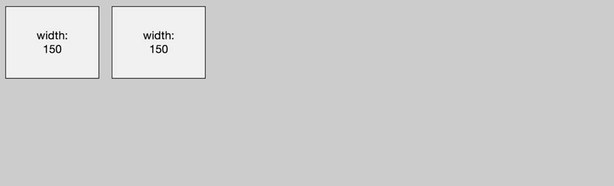
Figure 5-1. Layout type: hbox; (vertical) align: start; and (horizontal) pack: start
layout: {
type: 'hbox',
align: 'center',
pack: 'center'
},
items: [{
xtype: 'component',
html: 'width: 150'
width: 150
}, {
xtype: 'component',
html: 'width: 150'
width: 150
}]

Figure 5-2. Layout type: hbox; (vertical) align: center; and (horizontal) pack: center
layout: {
type: 'hbox',
align: 'center',
pack: 'end'
},
items: [{
xtype: 'component',
html: 'width: 150'
width: 150
},{
xtype: 'component',
html: 'width: 150'
width: 150
}]
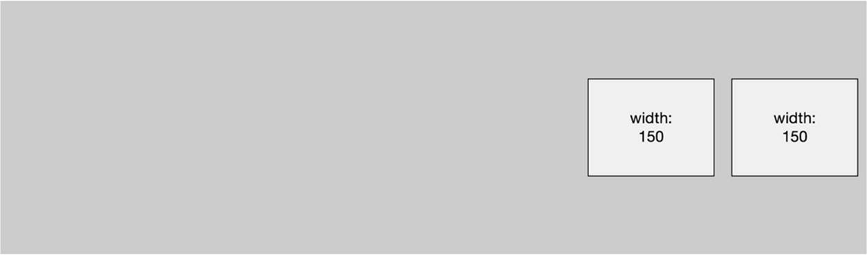
Figure 5-3. Layout type: hbox; (vertical) align: center; and (horizontal) pack: end
layout: {
type: 'hbox',
align: 'end',
pack: 'start'
},
items: [{
xtype: 'component',
html: 'width: 150'
width: 150
},{
xtype: 'component',
html: 'width: 150'
width: 150
}]
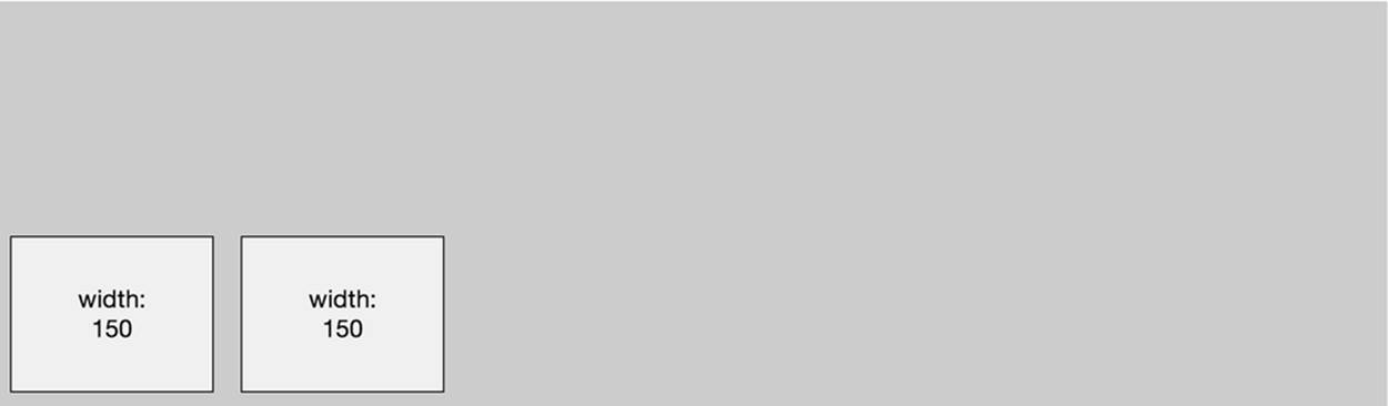
Figure 5-4. Layout type: hbox; (vertical) align: end; and (horizontal) pack: start
layout: {
type: 'hbox',
align: 'stretch',
pack: 'start'
},
items: [{
xtype: 'component',
html: 'width: 150'
width: 150
},{
xtype: 'component',
html: 'width: 150'
width: 150
}]
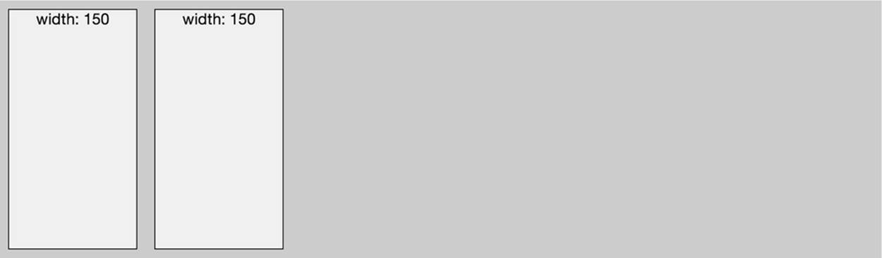
Figure 5-5. Layout type: hbox; (vertical) align: stretch; and (horizontal) pack: start
The preceding examples used a width config for every item. When you want more dynamic sizes, you can use the flex config. Flexing means that you divide the available area based on the flex of each child component. The next example, illustrated in Figure 5-6, shows a horizontal flexlayout:
layout: {
type: 'hbox',
},
items: [{
xtype: 'component',
flex: 2,
html: 'flex: 2',
},{
xtype: 'component',
flex: 1,
html: 'flex: 1',
}]
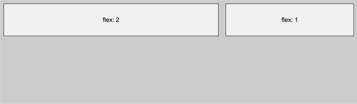
Figure 5-6. Layout type: hbox, and items with flexes
This is a container with two items; the left item takes one-third of the container, and the right item takes two-thirds. This would be translated with the following flex setup: left item has flex:1, and right item has flex:2. (Because the total of both flexes, 1+2, equals 3.)
Now let’s say you have three items. The first item has flex: 2, the second item has flex:1, and the third item has a fixed pixel width, width: 100px. How will the layout be calculated? First, the 100px will be subtracted from the 100%. The remainder will be divided into two-thirds and one-third (see Figure 5-7).
layout: {
type: 'hbox',
},
items: [{
xtype: 'component',
flex: 2,
html: 'flex: 2',
},{
xtype: 'component',
flex: 1,
html: 'flex: 1',
},{
xtype: 'component',
width: 100,
html: 'width: 100'
}]
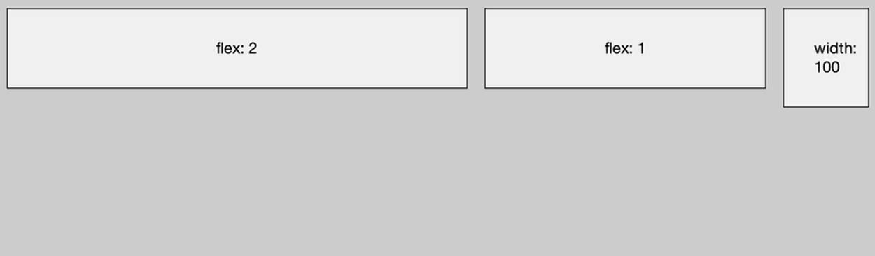
Figure 5-7. Layout type: hbox, and items with flexes and widths
Implementing a Vertical Layout
When you want to position components vertically, you will use the vertical box layout. The layout type vbox positions items on top of each other.
At the top of your container view class, you will require Ext.layout.VBox, so the Ext.Loader knows to load the vbox framework class first. Next, you will create a layout object that sets the type to vbox. Follow up by creating an array with items; this array will contain all the items that need to be positioned on top of each other. Here’s the full example:
Ext.define('MyApp.view.MainInterface', {
extend: 'Ext.Container',
requires: ['Ext.layout.VBox'],
layout: {
type: 'vbox',
},
items: [{
xtype: 'component',
html: 'box 1'
},{
xtype: 'component',
html: 'box 2'
}]
});
You can set the align config to position items horizontally on the screen. The options for the align property are start (left), center (middle), end (right), or stretch. The last option stretches a component to give it the full container width. Then there is the pack property—start(top), center (middle), and end (bottom)—which positions the set of items vertically on the screen.
Here are some of the vbox layouts, each of which is followed by its corresponding illustration (Figure 5-8 through Figure 5-14):
layout: {
type: 'vbox',
align: 'start',
pack: 'start'
},
items: [{
xtype: 'component',
html: 'height: 50'
height: 50
},{
xtype: 'component',
html: 'height: 50'
height: 50
}]
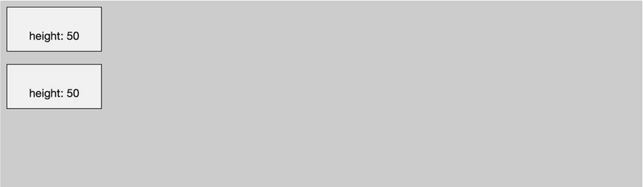
Figure 5-8. Layout type: vbox; (horizontal) align: start; and (vertical) pack: start
layout: {
type: 'vbox',
align: 'center',
pack: 'center'
},
items: [{
xtype: 'component',
html: 'height: 50'
height: 50
},{
xtype: 'component',
html: 'height: 50'
height: 50
}]

Figure 5-9. Layout type: vbox; (horizontal) align: center; and (vertical) pack: center
layout: {
type: 'vbox',
align: 'center',
pack: 'end'
},
items: [{
xtype: 'component',
html: 'height: 50'
height: 50
},{
xtype: 'component',
html: 'height: 50'
height: 50
}]

Figure 5-10. Layout type: vbox; (horizontal) align: center; and (vertical) pack: end
layout: {
type: 'vbox',
align: 'end',
pack: 'start'
},
items: [{
xtype: 'component',
html: 'height: 50'
height: 50
},{
xtype: 'component',
html: 'height: 50'
height: 50
}]
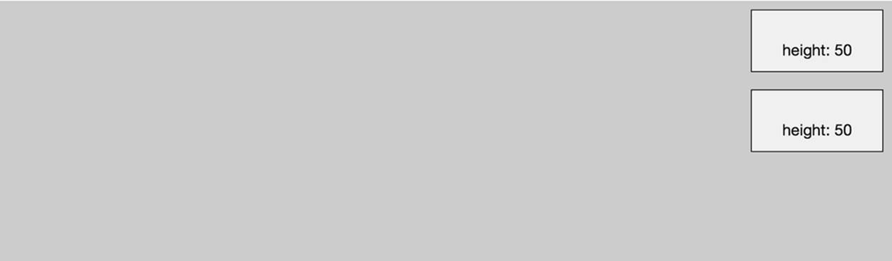
Figure 5-11. Layout type: vbox; (horizontal) align: end; and (vertical) pack: start
layout: {
type: 'vbox',
align: 'stretch',
pack: 'center'
},
items: [{
xtype: 'component',
html: 'height: 50'
height: 50
},{
xtype: 'component',
html: 'height: 50'
height: 50
}]
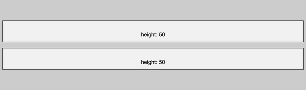
Figure 5-12. Layout type: vbox; (horizontal) align: stretch; and (vertical) pack: center
If you want to set a fixed height for one of the items, you use the height config. When you want more dynamic sizes, you use the flex config. Flexing means that you divide the available area based on the flex of each child component. The next example, illustrated in Figure 5-13, shows avertical flex layout:
layout: {
type: 'vbox',
},
items: [{
xtype: 'component',
html: 'flex: 1',
flex: 1
},{
xtype: 'component',
html: 'flex: 3',
flex: 3
}]
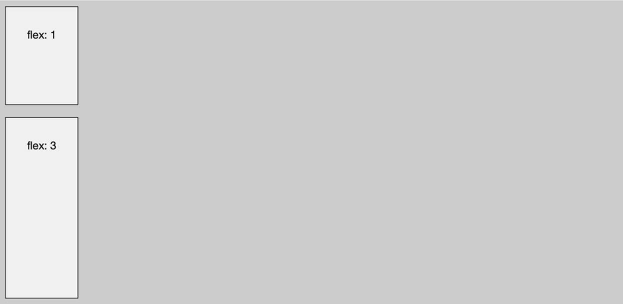
Figure 5-13. Layout type: vbox, and items with flexes
This is a container with two items; the top item takes one-quarter of the container, and the bottom item takes three-quarters. This would be translated with the following flex setup: top item has flex:1, and bottom item has flex:3. (Beause the total of both flexes, 1+3, is 4.)
Now let’s say you have three items. The first item has flex: 1, the second item has flex:3, and the third item has a fixed pixel height, height: 50px. How will the layout be calculated? First, the 50px will be subtracted from the 100%. The remainder will be divided into one-quarter and three-quarters (see Figure 5-14):
layout: {
type: 'vbox',
},
items: [{
xtype: 'component',
html: 'flex: 1',
flex: 1
},{
xtype: 'component',
html: 'flex: 3',
flex: 3
},{
xtype: 'component',
html: 'height: 50',
height: 50
}]
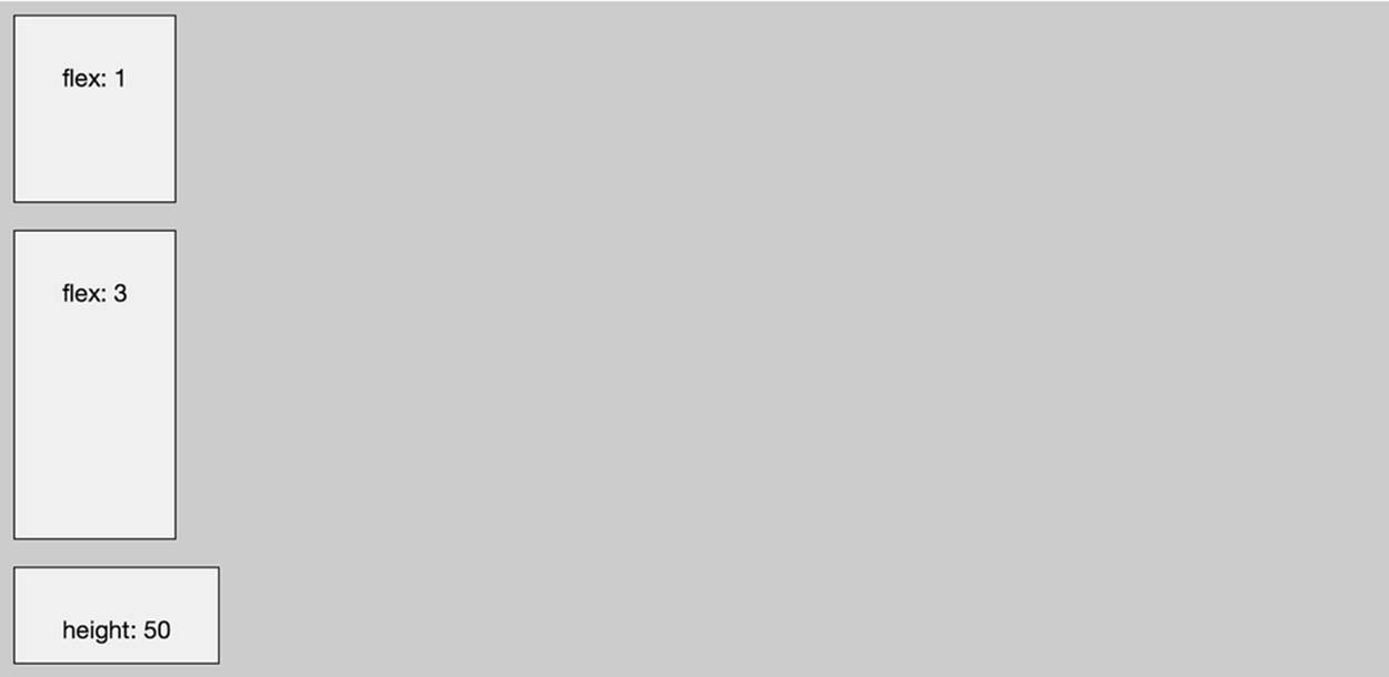
Figure 5-14. Layout type: vbox, and items with flexes and widths
Implementing a Full-Screen (Fit) Layout
When you want to position a component full screen, you use the fit layout. The layout type fit makes a child item fit to the full size of its parent container.
layout: 'fit',
items: [{
html: 'Item 1'
}]
At the top of your container view class, you will require Ext.layout.Fit, so the Ext.Loader knows to load the fit framework class first. Next, you will create a layout object that sets the type to fit. Follow up by creating an items array; this array can contain only one item. Here’s the full example (see Figure 5-15):
Ext.define('MyApp.view.MainInterface', {
extend: 'Ext.Container',
requires: ['Ext.layout.Fit'],
layout: {
type: 'fit',
},
items: [{
xtype: 'component',
html: 'layout: fit'
}]
});
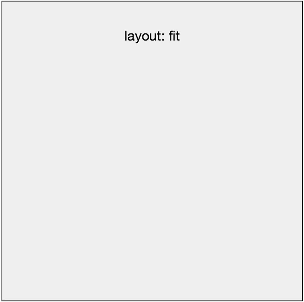
Figure 5-15. Layout type: fit; the container has dimensions of 400×400px
The container has a height and width of 400×400 pixels. The nested item (component) takes the full width and height that has been set in the parent container, so it has the same 400×400 pixel dimension.
Here’s another example of the same fit layout. The container has a 400×400px dimension, but this time the nested component has a margin of 25px on each side (see Figure 5-16):
layout: {
type: 'fit',
},
items: [{
xtype: 'component',
margin: 25,
html: 'layout: fit'
}]
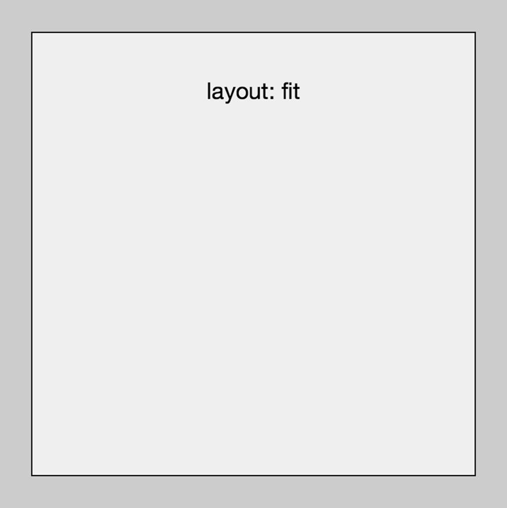
Figure 5-16. Layout type: fit; the container has a 400×400px dimension, but the item has a margin of 25px on each side
Implementing a Card Layout
You can create a more complex layout by using cards. A card layout allows you to fit multiple components in one space, and show only one at a time, just like a stack of cards. To do this, set the layout type to card .
At the top of your container view class, you will require Ext.layout.Card, so the Ext.Loader knows to load the card framework class first. Next, you will create a layout object that sets the type to card. Follow up by creating an array with items; this array can contain all the items that need to be positioned as a stack of cards.
Here’s the full example (see Figure 5-17):
Ext.define('MyApp.view.MainInterface', {
extend: 'Ext.Container',
requires: ['Ext.layout.Card'],
layout: {
type: 'card',
},
items: [{
xtype: 'component',
html: 'card 1'
},{
xtype: 'component',
html: 'card 2'
},
{
xtype: 'component',
html: 'card 3'
}]
});
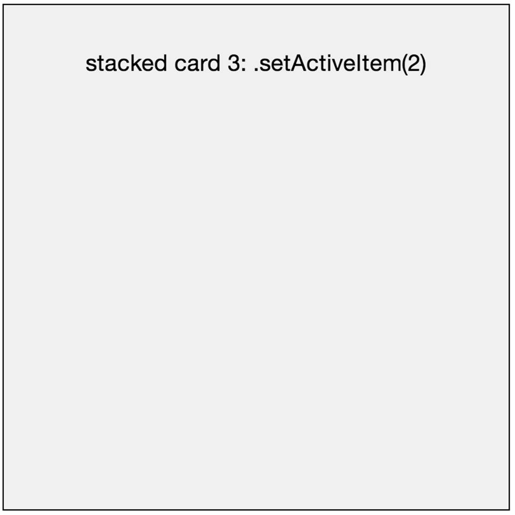
Figure 5-17. Layout type: card
This layout has the same visual look as a fit layout; it also takes the size of the container. But there is one important difference with this layout type. When the container contains multiple items, they will be stacked on top of each other, like a deck of cards. See Figure 5-18.
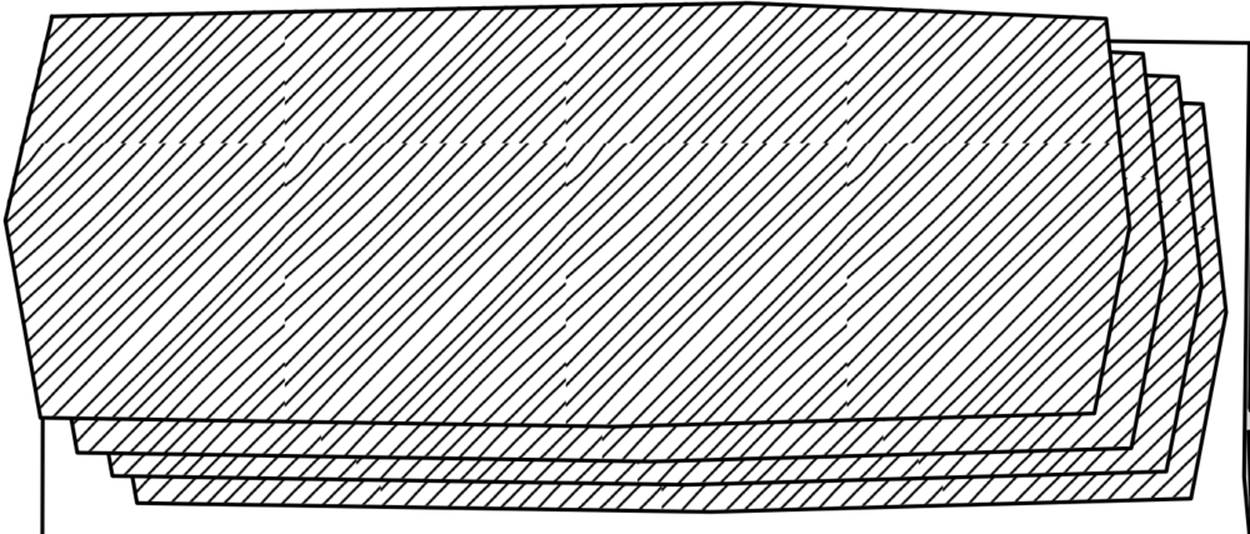
Figure 5-18. Layout type: card; this layout resembles a deck of cards
With the method setActiveItem(), you can set the item to be displayed at the top of the cards stack. All the other items won’t be visible. Carousels (a Sencha Touch component for cards that you can slide with your fingers) and tabpanels (a Sencha Touch component for cards that you can activate with tabs) both use a card layout.
NOTE
Ext.Container.setActiveItem(activeItem) and Ext.Container.getActiveItem() set or return an activeItem number. The number 0 points to the first container item, the number 1 to the second container item, and so on. For example, stack.setActiveItem(2) displays the third container item and hides all the other items.
A nice extra that comes with the card layout is the ability to add an animation while changing the active slide. You can set an animation object with a type and a direction. The supported types are:
§ slide (Ext.fx.layout.card.Slide)
§ fade (Ext.fx.layout.card.Fade)
§ cover (Ext.fx.layout.card.Cover)
§ reveal (Ext.fx.layout.card.Reveal)
§ pop (Ext.fx.layout.card.Pop)
§ flip (Ext.fx.layout.card.Flip)
§ scroll (Ext.fx.layout.card.Scroll)
§ cube (Ext.fx.layout.card.Cube)
Here’s an example of how you can include an animation for a page transition in a card layout. Please note the animation subject:
layout: {
type: 'card',
animation: {
type: 'slide',
direction: 'left'
}
}
WARNING
Android 2 supports only scroll and fade; otherwise, it forces the animation to slide.
Implementing the Default Layout
When you do not want to set a layout or you want to fall back to the default browser behavior, you can use the default/auto layout.
When you do not specify the layout object, or you set the layout to auto or default, your design will take the Ext.layout.Default layout. Maybe you are using this layout for a reason. For example, say you want to design your own custom layouts with self-written CSS. In that case, you might set this layout purposely to improve readability/maintainabily. When you read it back later, you will understand why you set it.
At the top of your container view class, you will require Ext.layout.Default, so the Ext.Loader knows to load the default framework class first. Next, you will create a layout object that sets the type to auto or default. Follow up by creating an array with items; this array can contain all the items that you can position by yourself. Here’s the full example (see Figure 5-19):
Ext.define('MyApp.view.MainInterface', {
extend: 'Ext.Container',
requires: ['Ext.layout.Default'],
layout: {
type: 'auto',
},
items: [{
xtype: 'component',
cls: 'component1',
html: 'component 1'
},{
xtype: 'component',
cls: 'component2',
html: 'component 2'
}]
});
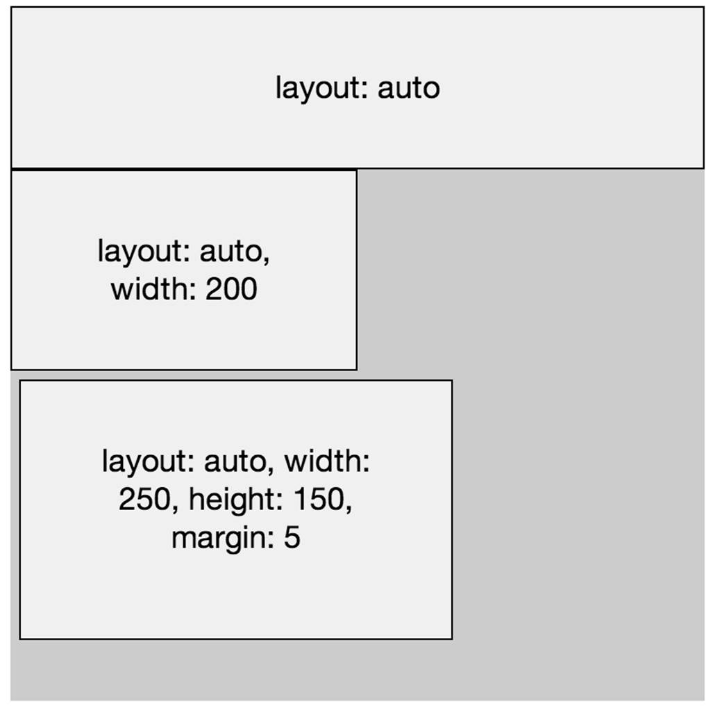
Figure 5-19. Layout type: default, like the default browser block-level behavior
This layout tiles your elements directly beneath each other. It takes the full available width to fill its parent container unless a width is set. If no height is set, it will expand naturally to fit itself or its child items. It’s the same behavior as how a browser positions block-level elements.
TIP
Impressive Webs has a helpful article about browser block-level elements versus inline-elements.
All other layouts inherit from Ext.layout.Default, and the default layout also supports docking items, which we’ll cover next.
Docking Components
Instead of using the layout system, you can also dock a component so it “sticks” to one side. To dock a component, add the docked variable; it works in combination with any layout type.
With docking, you can set an item to dock left, top, right, or bottom from its container. A good example is a toolbar that is docked to the top of the screen. (Some people call this a sticky header.)
Here’s a full example where I dock the toolbar to the top of the screen (see Figure 5-20):
Ext.define('MyApp.view.MainInterface', {
extend: 'Ext.Container',
items: [{
docked: 'top'
html: 'docked: top',
},{
html: ''
}]
});
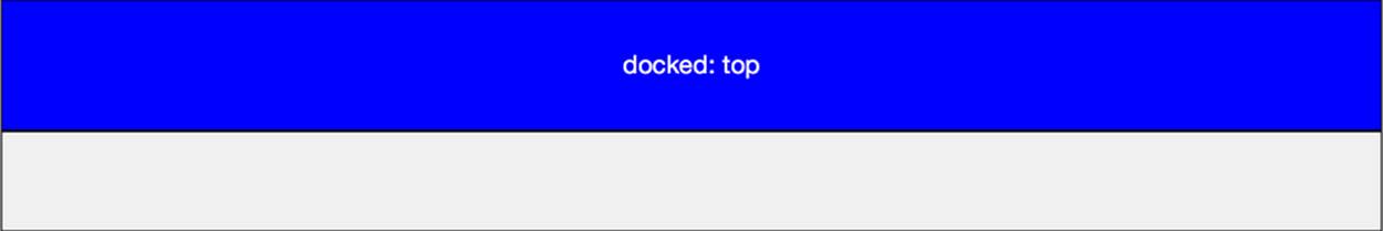
Figure 5-20. A panel docked to the top of the screen
You must use an HTML5 doctype for a docked bottom to work. To do this, simply add the following code to the top of the HTML file: <!doctype html>.
Let’s take a look at the other docked settings, each of which is followed by its corresponding illustration (Figures Figure 5-21 through Figure 5-23):
Ext.define('MyApp.view.MainInterface', {
extend: 'Ext.Container',
items: [{
docked: 'left'
html: 'docked: left',
},{
html: ''
}]
});
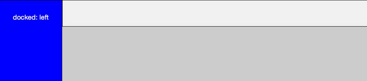
Figure 5-21. Layout type: a panel docked to the left side of the screen
Ext.define('MyApp.view.MainInterface', {
extend: 'Ext.Container',
items: [{
docked: 'right'
html: 'docked: right',
},{
html: ''
}]
});
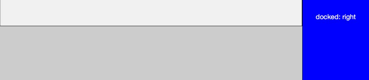
Figure 5-22. Layout type: a panel docked to the right side of the screen
Ext.define('MyApp.view.MainInterface', {
extend: 'Ext.Container',
items: [{
docked: 'bottom'
html: 'docked: bottom',
},{
html: ''
}]
});
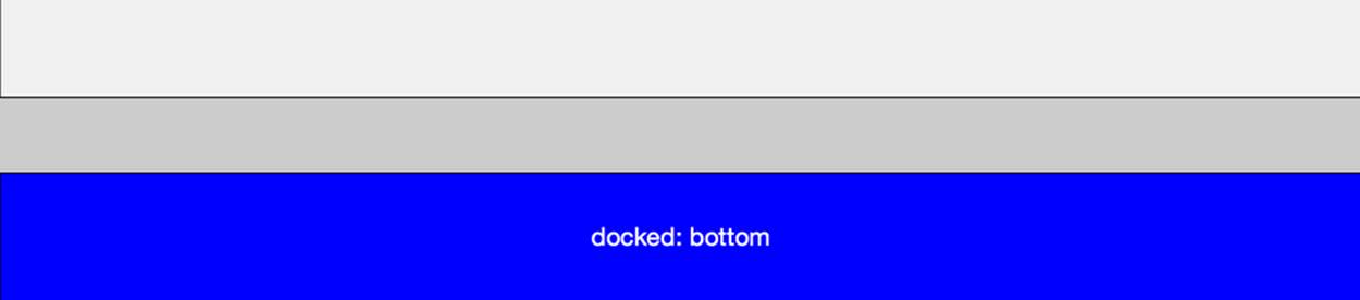
Figure 5-23. Layout type: a panel docked to the bottom of the screen
TIP
For more information (and a video tutorial), check out the Sencha 2.3 docs.
Summary
As you can see, there are many ways to position components in Sencha Touch. The best way of creating interfaces is by prototyping the application before you implement it in your app. You could do this with code, as with the code snippets in this chapter, or you could use Sencha Architect, Sencha’s visual design tool.
The Sencha layout system supports the following layout types: hbox (horizontal box layout), vbox (vertical box layout), fit (take the size of the container layout), card (stacked layout), and default, the browser’s, block-level layout. All of these types have a set of additional configurations, such as align, pack, and animation.
What about layouts for different devices? What about responsive design? Sencha Touch 2 doesn’t need a responsive design, like the HTML5/CSS3 responsive layouts we are familiar with for the Web (e.g., media queries). Sencha Touch sizes your layouts/UI to the full viewport.
The Ext.Viewport is an instance created when you use Ext.application(). Ext.Viewport extends from Ext.Container, so it has a layout (which defaults to the card layout). This means you can add items to it at any time, from anywhere in your code. The viewport fullscreen configuration is true by default, so it will take up your whole screen, and thus it matches any device to its screen size.
However, I imagine you would like the main layout for your tablet to be different from that of your phone. Sencha Touch handles this with device profiles, which create different mobile experiences. With a device profile, you can share code (like layouts and views, but also logics and controllers) between device types, to customize the appearance, behavior, or workflows for each device. Device profiles can be generated with Sencha Cmd. These classes will be stored in the app/profile directory. For more information about device profiles, read the online guide.
Now that we’ve covered some of the fundamentals of Sencha Touch, including its class system and layout system, we’re finally ready to start building a real-world application: the FindACab app.
In the next part of the book, you can read more about the MVC pattern, how to start building our application, and working with a lot of code.