JavaScript and jQuery for Data Analysis and Visualization (2015)
PART IV Interactive Analysis and Visualization Projects
Chapter 16 D3 in Practice
What's in This Chapter
· Styling D3 charts
· Rendering axes in D3
· Working with Voronoi maps
· Creating reusable visualizations
CODE DOWNLOAD The wrox.com code downloads for this chapter are found at www.wrox.com/go/javascriptandjqueryanalysis on the Download Code tab. The code is in the chapter 16 download and individually named according to the names throughout the chapter.
If you choose to incorporate D3-based charts into your application, you will have to deal with challenges inherent in general web design:
· Will the person implementing the visualization also be styling it? If not, you have to be mindful of the separation of styles and visual logic. You also need to create some standards around what class names you use.
· Will visualizations be one-off or will they be reused in many places? Making visualizations reusable requires more care than making one-off examples. This chapter explores an example of how to make a reusable visualization.
· How much control do you have over the data that will be displayed?
Unless you are making a visualization on top of a specific data set, you need to make sure your code works with extreme values.
Making D3 Look Perfect
This section covers some techniques that come in very handy when working with D3.
Inline Styles Versus CSS
An SVG (or HTML) element's appearance can be set in two ways: using a .style() operator that modifies the element's own style or using a CSS selector to assign styles to the element.
It can be tempting to use the .style() operator to declare all the styles—especially because in D3 it is so easy to operate on entire selections of elements—but this method is not ideal. You should use the .style() operator when the element's style is data-driven. Non-data-driven styles are best placed in a style sheet. Putting data-independent styles into style sheets forces you to assign meaningful classes to elements and allows non-D3-savvy people to change the styles.
A drawback of placing styles into a style sheet used to be the inability to offer a user an SVG download of the visualization; this can now be overcome using the SVG Crowbar tool (https://nytimes.github.io/svg-crowbar/) developed to work with D3. SVG Crowbar collects all the relevant styles from the style sheet and bundles them up for a self-contained SVG.
Margin
Any content rendered outside of the area of the SVG element will not be shown onscreen. This is problematic if you want to have labels or axes that are positioned outside of the area dedicated to the visualization itself. To solve this common problem, Mike Bostock introduced the Margin Convention (http://bl.ocks.org/mbostock/3019563), which is employed in almost every D3 example.
var margin = {top: 20, right: 20, bottom: 20, left: 20}
var width = outerWidth - margin.left - margin.right
var height = outerHeight - margin.top - margin.bottom
var mainContainer = d3.select("body").append("svg")
.attr("width", outerWidth)
.attr("height", outerHeight)
.append("g")
.attr("transform", "translate(" + margin.left + "," + margin.top + ")")
The margins are declared as an object. You calculate the effective width and height by subtracting the margins from the outer dimensions. A <g> element is added to the <svg> and offset by (margin.left, margin.top); every subsequent element is then appended to this container.
var xScale = d3.scale.linear()
.range([0, width])
var yScale = d3.scale.linear()
.range([height, 0])
Any scales can be created using the width and height of the mainContainer.
NOTE The mainContainer variable is commonly given the name svg despite being a selection of a <g> element.
g elements do not need to be sized with .attr("width", width), and so on as they have no meaningful boundary; they only perform a coordinate transformation.
Ordering
In SVG, the order of the elements within their parent container determines the order in which they will be rendered onto the screen. Unlike HTML there is no z-index (or equivalent) style to control the ordering. This can lead to some problems.
Consider the following code to render a bar chart with a label over each bar:
var svg = d3.select("body").append("svg")
function render(barData) {
// Create the bars
var rectSelection = svg.selectAll('rect').data(barData)
rectSelection.enter().append('rect')
rectSelection
.attr('x', ...) // Define the rectangles
rectSelection.exit().remove()
// Create the labels (on top)
var textSelection = svg.selectAll('text').data(barData)
textSelection.enter().append('text')
textSelection
.attr('x', ...) // Define the labels
textSelection.exit().remove()
}
This code seems to work at first, but if render is called again with more data, the new bars will be on top of the existing labels. This glitch is only seen if the labels ever overlap with bars other than their own.
The solution is to create separate <g> elements for each logical layer of the visualization:
var svg = d3.select("body").append("svg")
var rectContainer = svg.append('g').attr('class', 'bars')
var labelContainer = svg.append('g').attr('class', 'labels')
function render(barData) {
// Create the bars
var rectSelection = rectContainer.selectAll('rect').data(barData)
rectSelection.enter().append('rect')
rectSelection
.attr('x', ...) // Define the rectangles
rectSelection.exit().remove()
// Create the labels on a higher 'layer'
var textSelection = labelContainer.selectAll('text').data(barData)
textSelection.enter().append('text')
textSelection
.attr('x', ...) // Define the labels
textSelection.exit().remove()
}
Now all labels are always on top of the bars.
One issue that might occur with such a layering approach is that the overlapping labels block mouse events from reaching the bars. This could prevent a detail-on-demand hover from appearing on a bar if the cursor is placed on top of a label that is obscuring the bar. This can be solved using the pointer-events style deceleration examined in the next section.
Pointer Events
An advantage of making visualizations in SVG (or HTML) over Canvas is that each visual element can receive its own mouse and touch (collectively known as pointer) events.
By default, the top element at a given pointer location receives pointer events. This occasionally leads to undesired effects as detailed in the previous section.
Thankfully, elements can be told to ignore all pointer events by setting the pointer-events style to none (see https://developer.mozilla.org/en-US/docs/Web/CSS/pointer-events for more information about the other values this style can have). This also speeds up the visualization by simplifying the internal pointer event resolution process of the renderer.
It is recommended that you turn off pointer events for all elements that do not need them.
Crisp Edges
The following is another style that deserves a special mention:
line, rect {
shape-rendering: crispEdges;
}
This declaration tells the SVG renderer to turn off anti-aliasing for that element, which is useful if you are creating axes-aligned shapes such as vertical/horizontal lines and rectangles. Anti-aliasing can cause your elements to have blurry edges. If you are dealing with an axis-aligned element then try setting shape-rendering to crispEdges. You can read more about it here:
1. https://developer.mozilla.org/en-US/docs/Web/SVG/Attribute/shape-rendering
Working with Axes
An informative visualization must have axes that describe the scales used to plot the data on the screen. Because rendering axes is such a common operation, D3 actually provides a convenient helper for rendering axes.
Chapter 12 examines two types of helper functions. Simple helpers such as d3.scale.linear() and d3.svg.line() generate functions that help you render the data. Layout helpers such as d3.layout.treemap operate on the data and add metadata to it to allow you to render it in novel ways. The d3.svg.axis() helper does not fall into either of those categories; instead, it draws an entire visualization for you in the container of your choosing.
Using the axis helper, you can quickly create a scatterplot visualization complete with axis.
For this example, we used a data set of car miles-per-gallon (MPG) ratings. This dataset contains a subset of the fuel economy data that the EPA makes available on http://fueleconomy.gov. It contains only models that had a new release every year between 1999 and 2008; this was used as a proxy for the popularity of the car. The data look like so:
var mpg = [
{
"manufacturer": "Audi",
"model": "a4",
"displ": 1.8,
"year": 1999,
"cyl": 4,
"city": 18.2,
"highway": 28.6,
"drive": "f"
},
// ... 233 data points omitted ...
]
You can find the full file of the preceding code on the companion website in the examples/scatterplot-axis/mpg.js file.
Examine the relationship between highway and city MPG:
var margin = {top: 20, right: 20, bottom: 30, left: 40}
var width = 700 - margin.left - margin.right
var height = 600 - margin.top - margin.bottom
var xScale = d3.scale.linear()
.range([0, width])
var yScale = d3.scale.linear()
.range([height, 0])
var xAxis = d3.svg.axis()
.orient('bottom')
.scale(xScale)
var yAxis = d3.svg.axis()
.orient('left')
.scale(yScale)
var mainContainer = d3.select('body').append('svg')
.attr('width', width + margin.left + margin.right)
.attr('height', height + margin.top + margin.bottom)
.append('g')
.attr('transform', 'translate(' + margin.left + ',' + margin.top + ')')
var xAxisContainer = mainContainer.append('g')
.attr('class', 'x axis')
.attr('transform', 'translate(0,' + height + ')')
xAxisContainer.append('text')
.attr('class', 'label')
.attr('x', width)
.attr('y', -6)
.style('text-anchor', 'end')
var yAxisContainer = mainContainer.append('g')
.attr('class', 'y axis')
yAxisContainer.append('text')
.attr('class', 'label')
.attr('transform', 'rotate(-90)')
.attr('dy', '1.2em')
.style('text-anchor', 'end')
var pointContainer = mainContainer.append('g')
.attr('class', 'points')
function renderScatterplot(data, xMetric, yMetric) {
xScale
.domain(d3.extent(data, function(d) { return d[xMetric] }))
.nice()
yScale
.domain(d3.extent(data, function(d) { return d[yMetric] }))
.nice()
xAxisContainer.call(xAxis)
xAxisContainer.select('.label').text(xMetric)
yAxisContainer.call(yAxis)
yAxisContainer.select('.label').text(yMetric)
var pointSelection = pointContainer.selectAll('.point').data(data)
pointSelection.enter().append('circle')
.attr('class', 'point')
.attr('r', 2.5)
pointSelection
.attr('cx', function(d) { return xScale(d[xMetric]) })
.attr('cy', function(d) { return yScale(d[yMetric]) })
pointSelection.exit().remove()
}
renderScatterplot(mpg, 'highway', 'city')
The preceding code is on the companion website in the examples/scatterplot-axis/script.js file.
At the core, the scatterplot visualization consists of a single data binding to create the .points. The x and y axes on the chart, however, require a few visual elements to render. The scale ticks—the human-friendly marks such as 10, 15, 20, and so on—need to be represented using text labels and little lines. All this is done by the axis helper:
var xScale = d3.scale.linear()
.range([0, width])
var yScale = d3.scale.linear()
.range([height, 0])
First you create two scales for the x and y axes. The scales' range is set to the visualization size and their domains (the data extent) will be configured later.
var xAxis = d3.svg.axis() .orient('bottom')
.scale(xScale)
var yAxis = d3.svg.axis()
.orient('left')
.scale(yScale)
You create two corresponding axis helpers, which are configured with the intended orientation and the scale that they will be operating on. The axis helper draws all the size and tick information from the scale itself.
var xAxisContainer = mainContainer.append('g')
.attr('class', 'x axis')
.attr('transform', 'translate(0,' + height + ')')
xAxisContainer.append('text')
.attr('class', 'label')
.attr('x', width)
.attr('y', -6)
.style('text-anchor', 'end')
You need to explicitly create and position the <g> element that will contain the scale. A class of .x.axis is applied, which enables you to apply styles from a style sheet. You also append a text.label to the container to hold the name of the metric projected onto this axis.
xAxisContainer.call(xAxis)
xAxisContainer.select('.label').text(xMetric)
yAxisContainer.call(yAxis)
yAxisContainer.select('.label').text(yMetric)
Later, when you want to render the axis, all you have to do is .call() the axis function. The D3 .call operator is a convenience method to call the given function with the selection as the argument and the this object. It is equivalent to xAxis.call(xAxisContainer, xAxisContainer).
.axis path,
.axis line {
fill: none;
stroke: black;
shape-rendering: crispEdges;
}
You can customize the look and feel of the axis by manipulating the style sheet. In this example, I set the style of <line>s (the tick markers) and the <path> (the margin) to be black and precisely aligned on the pixels.
The axes-enabled scatterplot is in Figure 16.1.
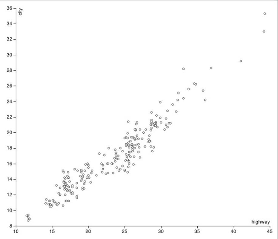
Figure 16.1 This scatterplot utilizes the axis helper function.
In effect, the axis helper is a subvisualization, and this section showed you how D3 has neatly packaged it. Later, you will see how to build on top of this concept and package your own visualizations in a similar way.
Working with the Voronoi Map
The Voronoi tessellation, named after Georgy Voronoi, is a method to subdivide a space around a number of centers. The space is divided into polygons, one for each center, such that each point in the polygon is closest to that polygons' center.
D3 is very amenable to extension with beautiful algorithms. Helpfully, D3 comes with a Voronoi tessellation algorithm, which is used for this section to create a pretty picture and a powerful selection user interface (UI). This section also describes how best to package D3 helper functions if you decide to write one.
A Basic Voronoi Map
This example shows how to contract a basic Voronoi map. (See the examples/voronoi-basic/data.js file on the companion website.) Given a list of centers in the following format:
var centers = [
{ x: 0.17059, y: 0.51567 },
{ x: 0.89967, y: 0.59811 },
// ... 54 data points omitted ...
{ x: 0.74111, y: 0.30413 },
{ x: 0.44484, y: 0.63658 }
]
generate a Voronoi map from these centers and also mark the centers themselves for clarity:
var width = 700
var height = 500
var voronoi = d3.geom.voronoi()
.x(function(d) { return d.x * width })
.y(function(d) { return d.y * height })
.clipExtent([[0, 0], [width, height]])
var svg = d3.select('body').append('svg')
.attr('width', width)
.attr('height', height)
var polygonContainer = svg.append('g')
var centerContainer = svg.append('g')
var colors = d3.scale.category20b()
function polygonToString(d) {
if (!d) return 'M0,0Z' // In case of duplicates
return 'M' + d.join('L') + 'Z'
}
function render() {
// Polygons
var pathSelection = polygonContainer.selectAll('path')
.data(voronoi(centers))
pathSelection.enter().append('path')
.style('stroke', 'white')
.style('fill', function(d, i) { return colors(i) })
pathSelection
.attr('d', polygonToString)
pathSelection.exit().remove()
// Centers
var center Selection = centerContainer.selectAll('circle')
.data(centers)
center Selection.enter().append('circle')
.attr('r', 1.5)
center Selection
.attr('cx', function(d) { return d.x * width })
.attr('cy', function(d) { return d.y * height })
center Selection.exit().remove()
}
render()
You can find the preceding code in the examples/voronoi-basic/script.js file on the companion website.
As you can see, the code to generate the beautiful visual in Figure 16.2 is hardly more complex than the code used previously to generate a bar chart. All the hard space division is neatly encapsulated in the d3.geom.voronoi() helper function.
var voronoi = d3.geom.voronoi()
.x(function(d) { return d.x * width })
.y(function(d) { return d.y * height })
.clipExtent([[0, 0], [width, height]])
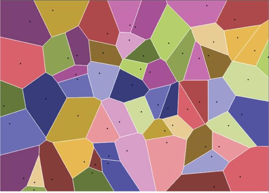
Figure 16.2 This Voronoi tessellation shows the centers.
As is standard for D3 helper functions, calling d3.geom.voronoi() returns a function that takes an array of centers and computes the polygons that represent the Voronoi tessellation. In accordance to the informal D3 standard, the voronoi function can be configured using setter/getter methods. Calling .x(function(d) { return d.x * width }) on voronoi tells the algorithm what function to use to compute the x coordinate of the center; the return value is the voronoi function itself so you can keep chaining these setters. Callingvoronoi.x() would, conversely, return the current x coordinate function.
var svg = d3.select('body').append('svg')
.attr('width', width)
.attr('height', height)
var polygonContainer = svg.append('g')
var centerContainer = svg.append('g')
var colors = d3.scale.category20b()
You create an <svg> element and two containers: one for the polygons and one for the center dots. Finally, you create a categorical color scale. The scale created by d3.scale.category20b() does not need to be given an explicit domain (although it could). Instead, it just allocates a new color every time it is given a new value.
function polygonToString(d) {
if (!d) return 'M0,0Z' // In case of duplicates
return 'M' + d.join('L') + 'Z'
}
You define polygonToString to convert the arrays of points returned from the voronoi function into SVG drawing strings. Each polygon is represented as an array of points where a point is an array of two elements [x,y]. Because arrays are natively converted to strings by comma concatenation, the expression d.join('L') neatly produces an SVG drawing command. Note that the Voronoi shape is undefined for duplicate centers; you account for that by returning a drawing string that produces no output in that case.
polygonToString([[1,1], [2,2], [3,0]])
// =>"M1,1L2,2L3,0Z"
If given duplicate centers, the voronoi function produces an undefined result for all but the first of the duplicates. You guard against that by adding a fallback to the ‘M0,0Z' no-op path.
Finally, you make two selections to create the visual elements: one for the polygons and one for the center points. The data for the polygons comes from the voronoi function and the data for the center points are the centers themselves.
Voronoi Point Picking
The simplest (and arguably the most useful) interaction that a visualization can offer is the ability for the user to hover over a visual element and get some extra details about the underlying data.
This example covers the ways a hover label could be added to the MGP scatterplot that was built previously. As with most things in software development, there are several different approaches that you can take. Several are offered here so you can compare their differences.
Naive Hover
First, consider the naive solution. The simplest way to add a hover behavior is to instrument the elements with mouseenter and mouseenter handlers to detect the start and end of the hover action.
You can extend the previous scatterplot example to see how it is done. The code is not printed in full due to its similarity to the previous example. The full listing can be found in the examples/scatterplot-voronoi/script.js file on the companion website.
var hoverContainer = mainContainer.append('g')
.attr('class', 'hover')
hoverContainer.append('text')
.style('display', 'none')
.attr('dx', '0.5em')
.attr('dy', '0.2em')
You start by adding a container and a text label that will be used to display the hover information. The label is hidden by default. The actual positioning of the text relative to the origin of the label is fine-tuned using the dy and dx attributes.
function setHover(hover, i) {
hoverContainer.select('text')
.style('display', null) .attr('x', xScale(hover[xMetric]))
.attr('y', yScale(hover[yMetric]))
.text(hover.manufacturer + ' ' + hover.model + ' (' + hover.year + ')')
}
function dropHover() {
hoverContainer.select('text')
.style('display', 'none')
}
The hover can be triggered on any datum. You position the text label using the same scales as you use for the data, ensuring that it is positioned in the correct place. Alternatively, you could have extracted the position attributes from the element itself or from the mouse position.
pointSelection.enter().append('circle')
.attr('class', 'point')
.attr('r', 2.5)
.on('mouseenter', setHover)
.on('mouseleave', dropHover)
Finally, you add two event handlers to every point during creation. The handlers will make the hover text appear and disappear as the user's mouse moves in and out of the element boundary.
The hover label, as it would appear when the user hovers over a data point, is shown in Figure 16.3. Please check out examples/scatterplot-voronoi/index.html on the companion website and play with the hover behavior. It should become apparent that this hover technique, although very easy to implement, possesses a critical flaw: the scatterplot points are too small to be adequate hover targets. This issue is addressed in the next section.
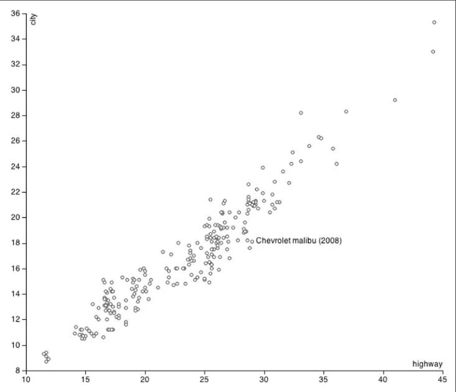
Figure 16.3 The scatterplot is shown with hover on a data point.
Voronoi Hover
To address the problem of having a small hover target, you could divide the space into (invisible) bounded Voronoi sections and have those serve as hover targets. In a sense, you are creating a little Voronoi halo around each point and assigning the mouse events to it.
You can find the full code in the examples/scatterplot-voronoi folder on the companion website. Following are the additions needed to create the Voronoi halos:
var voronoi = d3.geom.voronoi()
.clipExtent([[0, 0], [width, height]])
Create a Voronoi helper:
var haloClipContainer = mainContainer.append('g')
.attr('class', 'halo-clip')
var haloContainer = mainContainer.append('g')
.attr('class', 'halo')
Two new containers are required: one to contain the clip paths that prevent the Voronoi polygons from taking over the entire screen and one for the Voronoi polygons themselves.
var haloClipSelection = haloClipContainer.selectAll('clipPath').data(data)
haloClipSelection.enter().append('clipPath')
.attr('id', function(d, i) { return 'clip-' + i })
.append('circle')
.attr('r', 16)
haloClipSelection.select('circle')
.attr('cx', function(d) { return xScale(d[xMetric]) })
.attr('cy', function(d) { return yScale(d[yMetric]) })
haloClipSelection.exit().remove()
For every data point, a <clipPath> element is created with a <circle> positioned on the data point inside of it. The contents of a <clipPath> element act as a mask for any element with a reference to its id; a unique id is assigned to each <clipPath> element.
voronoi
.x(function(d) { return xScale(d[xMetric]) })
.y(function(d) { return yScale(d[yMetric]) })
haloSelection = haloContainer.selectAll('path').data(voronoi(data))
haloSelection.enter().append('path')
.attr('clip-path', function(d, i) { return 'url(#clip-' + i +')' })
.on("mouseover", setHover)
.on("mouseout", dropHover)
haloSelection
.attr('d', polygonToString)
haloSelection.exit().remove()
The <path> elements that represent the Voronoi segments are created. Each element is assigned a corresponding clip path id via the function function(d, i) { return ‘url(#clip-’ + i +')’ } to constrain them within the clip circle. Finally the setHover and dropHoverevent handlers are attached to the halo.
The result of a hover is shown in Figure 16.4. Normally, when using this technique you would not assign a fill or stroke to the hover targets, leaving them invisible so as not to distract from the data. With some style-sheet tweaks, the hover targets can be made visible. The hover behavior is now greatly improved. Please try out the example yourself at: examples/scatterplot-voronoi/index.html.
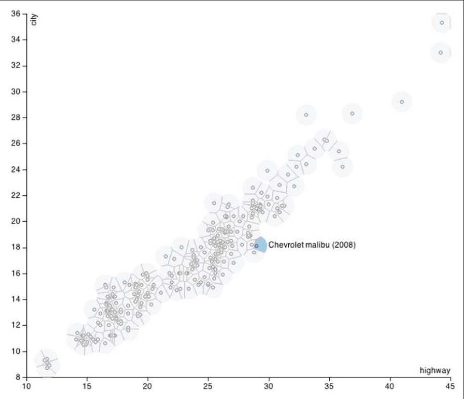
Figure 16.4 The Voronoi map is used as a hover aid.
Making Reusable Visualizations
So far, none of the D3 examples in this chapter and Chapter 11 have been reusable. Every example starts with a d3.select('body'), which implicitly assumes that the visualization needs to be created directly on the <body> element. This is not practical for actual visualizations that need to live within a larger application such as a dashboard.
This section examines the best practices for creating reusable D3 visualizations by packaging up the scatterplot example used in previous chapters.
The best strategy for packaging a charting function in D3 is to have it work similarly to the helper function such as d3.scale.linear and d3.svg.axis. Mike Bostock, the creator of D3, wrote up a short article explaining the merits of this approach; you can find it athttp://bost.ocks.org/mike/chart/.
In this example you call the scatterplot chart like so:
// Create and configure the charts
var highwayCityChart = scatterplot()
.width(300)
.height(300)
.x(function(d) { return d.highway })
.xLabel('Highway / mpg')
.y(function(d) { return d.city })
.yLabel('City / mpg')
var displacementCityChart = scatterplot()
.width(300)
.height(300)
.x(function(d) { return d.displ })
.xLabel('Displacement / L')
.y(function(d) { return d.city })
.yLabel('City / mpg')
// Attach the data to the element that will hold the chart and 'call' it.
d3.select('#chart1').datum(mpg)
.call(highwayCityChart)
d3.select('#chart2').datum(mpg)
.call(displacementCityChart)
This code, which you can find in the examples/scatterplot-reuse/script.js file on the companion website, creates two scatterplots depicting the relationship between two different pairs of variables, as shown in Figure 16.5.
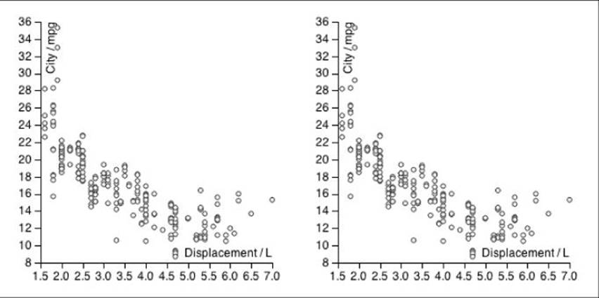
Figure 16.5 Two scatterplots are created with the same reusable component.
The advantages of following this method include
· A chart can be easily configured and reconfigured using the setter/getter operators.
· No chart state needs to be maintained by the caller.
· The instance of a chart is a template that can be applied to any data-bound selection and can be applied over a selection containing multiple elements filling each of them individually.
· It follows the conventions set by native D3 methods such as d3.svg.axis.
The following code, which is in the examples/scatterplot-reuse/scatterplot.js file on the companion website, shows you how it might actually be implemented:
function scatterplot() {
var options = {
width: 700,
height: 600,
margin: {top: 20, right: 20, bottom: 30, left: 40},
xLabel: null,
yLabel: null,
x: function(d) { return d[0] },
y: function(d) { return d[1] }
}
var xScale = d3.scale.linear()
var yScale = d3.scale.linear()
var xAxis = d3.svg.axis()
.orient('bottom')
.scale(xScale)
var yAxis = d3.svg.axis()
.orient('left')
.scale(yScale)
function render(selection) {
var margin = options.margin
var innerWidth = options.width - margin.left - margin.right
var innerHeight = options.height - margin.top - margin.bottom
xScale.range([0, innerWidth])
yScale.range([innerHeight, 0])
selection.each(function(data) {
xScale.domain(d3.extent(data, options.x)).nice()
yScale.domain(d3.extent(data, options.y)).nice()
// -------------
var svgContainer = d3.select(this).selectAll('svg.scatterplot').data([data])
svgContainer.enter().append('svg').attr('class', 'scatterplot')
svgContainer
.attr('width', options.width)
.attr('height', options.height)
// -------------
var mainContainer = svgContainer.selectAll('g.main').data([data])
mainContainer.enter().append('g').attr('class', 'main')
mainContainer
.attr('transform', 'translate(' + margin.left + ',' + margin.top + ')')
// -------------
var xAxisContainer = mainContainer.selectAll('g.x.axis').data([data])
xAxisContainer.enter().append('g').attr('class', 'x axis')
xAxisContainer
.attr('transform', 'translate(0,' + innerHeight + ')')
.call(xAxis)
// -------------
var xLabelSelection = xAxisContainer.selectAll('text.label').data([data])
xLabelSelection.enter().append('text').attr('class', 'label')
.attr('y', -6)
.style('text-anchor', 'end')
xLabelSelection
.attr('x', innerWidth)
.text(options.xLabel)
// -------------
var yAxisContainer = mainContainer.selectAll('g.y.axis').data([data])
yAxisContainer.enter().append('g').attr('class', 'y axis')
yAxisContainer
.call(yAxis)
// -------------
var yLabelSelection = yAxisContainer.selectAll('text.label').data([data])
yLabelSelection.enter().append('text').attr('class', 'label')
.attr('transform', 'rotate(-90)')
.attr('dy', '1.2em')
.style('text-anchor', 'end')
yLabelSelection
.text(options.yLabel)
// -------------
var pointContainer = mainContainer.selectAll('g.points').data([data])
pointContainer.enter().append('g').attr('class', 'points')
// -------------
var pointSelection = pointContainer.selectAll('.point').data(data)
pointSelection.enter().append('circle').attr('class', 'point')
.attr('r', 2.5)
pointSelection
.attr('cx', function(d) { return xScale(options.x(d)) })
.attr('cy', function(d) { return yScale(options.y(d)) })
pointSelection.exit().remove()
})
}
// Make options configurable
Object.keys(options).forEach(function(optionName) {
render[optionName] = function(value) {
if (!arguments.length) return options[optionName]
options[optionName] = value
return render
}
})
return render
}
Let's break this code down step by step:
var options = {
width: 700,
height: 600,
margin: {top: 20, right: 20, bottom: 30, left: 40},
xLabel: null,
yLabel: null,
x: function(d) { return d[0] },
y: function(d) { return d[1] }
}
Define all the configurable options and give each a meaningful default. The D3 standard is to express data points as [x, y] pairs; hence function(d) { return d[0] } and function(d) { return d[1] } are a good default choice for the x and y options.
var xScale = d3.scale.linear()
var yScale = d3.scale.linear()
var xAxis = d3.svg.axis()
.orient('bottom')
.scale(xScale)
var yAxis = d3.svg.axis()
.orient('left')
.scale(yScale)
Set up the scales and axes that will be used in the rendering:
function render(selection) {
var margin = options.margin
var innerWidth = options.width - margin.left - margin.right
var innerHeight = options.height - margin.top - margin.bottom
xScale.range([0, innerWidth])
yScale.range([innerHeight, 0])
...
}
Create the render function that will be returned. You expect this function to be used in a selection.call(...) so the first argument is assumed to be the selection within which to create or update the scatterplot. At this point, you can inspect the options object to determine the physical size of the visualization.
selection.each(function(data) {
xScale.domain(d3.extent(data, options.x)).nice()
yScale.domain(d3.extent(data, options.y)).nice()
...
})
The render function receives a selection that you assume to be bound to the chart's data. Because you want your chart to work in the event of a selection containing multiple elements, filling each with its own scatterplot, you need to use the .each method that executes the code for each element of the selection, setting data accordingly each time.
var svgContainer = d3.select(this).selectAll('svg.scatterplot').data([data])
svgContainer.enter().append('svg').attr('class', 'scatterplot')
svgContainer
.attr('width', options.width)
.attr('height', options.height)
One constraint that you have not encountered before is that there is no way to know whether there already is a chart within this element. You can leverage the D3 selection mechanism to take care of that. By performing a data bind with an array of one element [data]you guarantee that you will create at most one <svg> within each selection element. This pattern is followed throughout to create or update every part of the visualization.
var pointSelection = pointContainer.selectAll('.point').data(data)
pointSelection.enter().append('circle').attr('class', 'point')
.attr('r', 2.5)
pointSelection
.attr('cx', function(d) { return xScale(options.x(d)) })
.attr('cy', function(d) { return yScale(options.y(d)) })
pointSelection.exit().remove()
The points are created or updated as before. You use the x and y getters within options to extract the x and y dimensions of the data.
Object.keys(options).forEach(function(optionName) {
render[optionName] = function(value) {
if (!arguments.length) return options[optionName]
options[optionName] = value
return render
}
})
You take the options and create getter/setter functions for every key in it. When called without a parameter !arguments.length evaluates to true and the option value is returned. Otherwise, the parameter is set as the value of the option options[optionName] = value and the render function is returned, which allows for method chaining. This creates an application programming interface (API) that is consistent with the built-in D3 helper functions.
return render
The render function is returned to the caller. The render function forms a closure over the options variable, which allows the render function to refer to the options whenever the function is called. The chart can now maintain its own parameterization.
svg.scatterplot {
font: 12px sans-serif;
}
svg.scatterplot .axis path,
svg.scatterplot .axis line {
fill: none;
stroke: black;
shape-rendering: crispEdges;
}
svg.scatterplot .point {
fill: #F3F3F3;
stroke: #333333;
}
You can find the preceding code in the examples/scatterplot-reuse/scatterplot.css file on the companion website.
Finally, you should define some default style sheet for the cart. You could have placed all the styles inline, but that would have made the chart much less amenable to styling by the end user.
This example is purposefully made very simple. In practice, you might want to extend the capabilities of the scatterplot with the following:
· Ability for the user to define the point size
· An option to color the dots by a categorical dimension
· An option to use different symbols to express a categorical dimension (look up the d3.svg.symbol() helper function)
· Ability to add transitions to the chart; note that a key function needs to be supplied (See the “Key Functions” section in Chapter 11)
All of the preceding possibilities are great exercises to hone and test your D3 skills.
Summary
This chapter built on the information in Chapter 11 and showed you some more advanced techniques for creating great visualizations:
· You learned the considerations of separating style from visualization logic.
· You learned about the D3 margin convention that enables you to leave room for other necessities, such as axes and legends.
· You learned how groups (<g>) can be used to enforce render ordering in a complex, multi-element visualization.
· You learned about some useful yet lesser known CSS properties, such as pointer-events and crisp-edges, that allow your visualization to look and function at its best.
· You learned about the D3 helper functions for creating complete axes.
· You saw how easy it is to build a basic scatterplot chart by utilizing built-in helper functions.
· You saw how the Voronoi layout can be used to divide the space between a given number of points.
· You learned about SVG's <clipPath> element.
· You learned how to implement an advanced hover behavior by utilizing the Voronoi layout.
· You have seen how to convert one-off visualizations into reusable, modular, data-schema-agnostic components.