Data Visualization with JavaScript (2015)
Chapter 2. Making Charts Interactive
In Chapter 1 we saw how to create a wide variety of simple, static charts. In many cases such charts are the ideal visualization, but they don’t take advantage of an important characteristic of the Web—interactivity. Sometimes you want to do more than just present data to your users; you want to give them a chance to explore the data, to focus on the elements they find particularly interesting, or to consider alternative scenarios. In those cases we can take advantage of the Web as a medium by adding interactivity to our visualizations.
Because they’re designed for the Web, virtually all of the libraries and toolkits we examine in this book include support for interactivity. That’s certainly true of the Flotr2 library used in Chapter 1. But let’s take the opportunity to explore an alternative. In this chapter, we’ll use the Flot library (http://www.flotcharts.org/), which is based on jQuery and features exceptionally strong support for interactive and real-time charts.
For this chapter, we’re also going to stick with a single data source: the gross domestic product (GDP) for countries worldwide. This data is publicly available from the World Bank (http://data.worldbank.org/). It may not seem like the most exciting data to work with, but effective visualizations can bring even the most mundane data alive. Here’s what you’ll learn:
§ How to let users select the content for a chart
§ How to let users zoom into a chart to see more details
§ How to make a chart respond to user mouse movements
§ How to dynamically get data for a chart using an AJAX service
Selecting Chart Content
If you’re presenting data to a large audience on the Web, you may find that different users are especially interested in different aspects of your data. With global GDP data, for example, we might expect that individual users would be most interested in the data for their own region of the world. If we can anticipate inquiries like this from the user, we can construct our visualization to answer them.
In this example, we’re targeting a worldwide audience, and we want to show data for all regions. To accommodate individual users, however, we can make the regions selectable; that is, users will be able to show or hide the data from each region. If some users don’t care about data for particular regions, they can simply choose not to show it.
Interactive visualizations usually require more thought than simple, static charts. Not only must the original presentation of data be effective, but the way the user controls the presentation and the way the presentation responds must be effective as well. It usually helps to consider each of those requirements explicitly.
1. Make sure the initial, static presentation shows the data effectively.
2. Add any user controls to the page and ensure they make sense for the visualization.
3. Add the code that makes the controls work.
We’ll tackle each of these phases in the following example.
Step 1: Include the Required JavaScript Libraries
Since we’re using the Flot library to create the chart, we need to include that library in our web pages. And since Flot requires jQuery, we’ll include that in our pages as well. Fortunately, both jQuery and Flot are popular libraries, and they are available on public content distribution networks (CDNs). That gives you the option of loading both from a CDN instead of hosting them on your own site. There are several advantages to relying on a CDN:
§ Better performance. If the user has previously visited other websites that retrieved the libraries from the same CDN, then the libraries may already exist in the browser’s local cache. In that case the browser simply retrieves them from the cache, avoiding the delay of additional network requests. (See the second disadvantage in the next list for a different view on performance.)
§ Lower cost. One way or another, the cost of your site is likely based on how much bandwidth you use. If your users are able to retrieve libraries from a CDN, then the bandwidth required to service their requests won’t count against your site.
Of course there are also disadvantages to CDNs as well.
§ Loss of control. If the CDN goes down, then the libraries your page needs won’t be available. That puts your site’s functionality at the mercy of the CDN. There are approaches to mitigate such failures. You can try to retrieve from the CDN and fall back to your own hosted copy if the CDN request fails. Implementing such a fallback is tricky, though, and it could introduce errors in your code.
§ Lack of flexibility. With CDN-hosted libraries, you’re generally stuck with a limited set of options. For example, in this case we need both the jQuery and Flot libraries. CDNs provide those libraries only as distinct files, so to get both we’ll need two network requests. If we host the libraries ourselves, on the other hand, we can combine them into a single file and cut the required number of requests in half. For high-latency networks (such as mobile networks), the number of requests may be the biggest factor in determining the performance of your web page.
There isn’t a clear-cut answer for all cases, so you’ll have to weigh the options against your own requirements. For this example (and the others in this chapter), we’ll use the CloudFlare CDN.
In addition to the jQuery library, Flot relies on the HTML canvas feature. To support IE8 and earlier, we’ll include the excanvas.min.js library in our pages and make sure that only IE8 and earlier will load it, just like we did for our bar chart in Chapter 1. Also, since excanvas isn’t available on a public CDN, we’ll have to host it on our own server. Here’s the skeleton to start with:
<!DOCTYPE html>
<html lang="en">
<head>
<meta charset="utf-8">
<title></title>
</head>
<body>
<!-- Content goes here -->
<!--[if lt IE 9]><script src="js/excanvas.min.js"></script><![endif]-->
<script src="//cdnjs.cloudflare.com/ajax/libs/jquery/1.8.3/jquery.min.js">
</script>
<script src="//cdnjs.cloudflare.com/ajax/libs/flot/0.7/jquery.flot.min.js">
</script>
</body>
</html>
As you can see, we’re including the JavaScript libraries at the end of the document. This approach lets the browser load the document’s entire HTML markup and begin laying out the page while it waits for the server to provide the JavaScript libraries.
Step 2: Set Aside a <div> Element to Hold the Chart
Within our document, we need to create a <div> element to contain the chart we’ll construct. This element must have an explicit height and width, or Flot won’t be able to construct the chart. We can indicate the element’s size in a CSS style sheet, or we can place it directly on the element itself. Here’s how the document might look with the latter approach.
<!DOCTYPE html>
<html lang="en">
<head>
<meta charset="utf-8">
<title></title>
</head>
<body>
➊ <div id="chart" style="width:600px;height:400px;"></div>
<!--[if lt IE 9]><script src="js/excanvas.min.js"></script><![endif]-->
<script src="//cdnjs.cloudflare.com/ajax/libs/jquery/1.8.3/jquery.min.js">
</script>
<script src="//cdnjs.cloudflare.com/ajax/libs/flot/0.7/jquery.flot.min.js">
</script>
</body>
</html>
Note at ➊ that we’ve given the <div> an explicit id so we can reference it later.
Step 3: Prepare the Data
In later examples we’ll see how to get the data directly from the World Bank’s web service, but for this example, let’s keep things simple and assume we have the data already downloaded and formatted for JavaScript. (For brevity, only excerpts are shown here. The book’s source code includes the full data set.)
var eas = [[1960,0.1558],[1961,0.1547],[1962,0.1574], // Data continues...
var ecs = [[1960,0.4421],[1961,0.4706],[1962,0.5145], // Data continues...
var lcn = [[1960,0.0811],[1961,0.0860],[1962,0.0990], // Data continues...
var mea = [[1968,0.0383],[1969,0.0426],[1970,0.0471], // Data continues...
var sas = [[1960,0.0478],[1961,0.0383],[1962,0.0389], // Data continues...
var ssf = [[1960,0.0297],[1961,0.0308],[1962,0.0334], // Data continues...
This data includes the historical GDP (in current US dollars) for major regions of the world, from 1960 to 2011. The names of the variables are the World Bank region codes.
NOTE
At the time of this writing, World Bank data for North America was temporarily unavailable.
Step 4: Draw the Chart
Before we add any interactivity, let’s check out the chart itself. The Flot library provides a simple function call to create a static graph. We call the jQuery extension plot and pass it two parameters. The first parameter identifies the HTML element that should contain the chart, and the second parameter provides the data as an array of data sets. In this case, we pass in an array with the series we defined earlier for each region.
$(function () {
$.plot($("#chart"), [ eas, ecs, lcn, mea, sas, ssf ]);
});
Figure 2-1 shows the resulting chart.
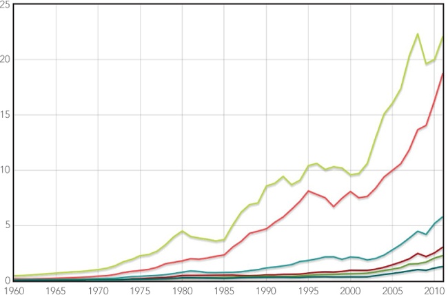
Figure 2-1. Flot can show a static line chart well with just default options.
It looks like we’ve done a good job of capturing and presenting the data statically, so we can move on to the next phase.
Step 5: Add the Controls
Now that we have a chart we’re happy with, we can add the HTML controls to interact with it. For this example, our goal is fairly simple: our users should be able to pick which regions appear on the graph. We’ll give them that option with a set of checkboxes, one for each region. Here’s the markup to include the checkboxes.
<label><input type="checkbox"> East Asia & Pacific</label>
<label><input type="checkbox"> Europe & Central Asia</label>
<label><input type="checkbox"> Latin America & Caribbean</label>
<label><input type="checkbox"> Middle East & North Africa</label>
<label><input type="checkbox"> South Asia</label>
<label><input type="checkbox"> Sub-Saharan Africa</label>
You may be surprised to see that we’ve placed the <input> controls inside the <label> elements. Although it looks a little unusual, that’s almost always the best approach. When we do that, the browser interprets clicks on the label as clicks on the control, whereas if we separate the labels from the controls, it forces the user to click on the tiny checkbox itself to have any effect.
On our web page, we’d like to place the controls on the right side of the chart. We can do that by creating a containing <div> and making the chart and the controls float (left) within it. While we’re experimenting with the layout, it’s easiest to simply add the styling directly in the HTML markup. In a production implementation, you might want to define the styles in an external style sheet.
<div id="visualization">
<div id="chart" style="width:500px;height:333px;float:left"></div>
<div id="controls" style="float:left;">
<label><input type="checkbox"> East Asia & Pacific</label>
<label><input type="checkbox"> Europe & Central Asia</label>
<label><input type="checkbox"> Latin America & Caribbean</label>
<label><input type="checkbox"> Middle East & North Africa</label>
<label><input type="checkbox"> South Asia</label>
<label><input type="checkbox"> Sub-Saharan Africa</label>
</div>
</div>
We should also add a title and instructions and make all the <input> checkboxes default to checked. Let’s see the chart now, to make sure the formatting looks okay (Figure 2-2).
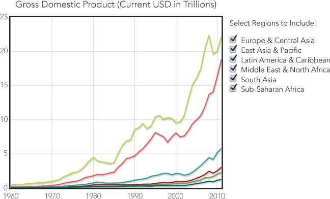
Figure 2-2. Standard HTML can create controls for chart interaction.
Now we see how the controls look in relation to the chart in Figure 2-2, and we can verify that they make sense both for the data and for the interaction model. Our visualization lacks a critical piece of information, though: it doesn’t identify which line corresponds to which region. For a static visualization, we could simply use the Flot library to add a legend to the chart, but that approach isn’t ideal here. You can see the problem in Figure 2-3, as the legend looks confusingly like the interaction controls.
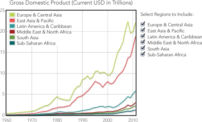
Figure 2-3. The Flot library’s standard legend doesn’t match the chart styles well.
We can eliminate the visual confusion by combining the legend and the interaction controls. The checkbox controls will serve as a legend if we add color boxes that identify the chart lines.
We can add the colored boxes using an HTML <span> tag and a bit of styling. Here is the markup for one such checkbox with the styles inline. (Full web page implementations might be better organized by having most of the styles defined in an external style sheet.)
<label class="checkbox">
<input type="checkbox" checked>
<span style="background-color:rgb(237,194,64);height:0.9em;
width:0.9em;margin-right:0.25em;display:inline-block;"/>
East Asia & Pacific
</label>
In addition to the background color, the <span> needs an explicit size, and we use an inline-block value for the display property to force the browser to show the span even though it has no content. As you can also see, we’re using ems instead of pixels to define the size of the block. Since ems scale automatically with the text size, the color blocks will match the text label size even if users zoom in or out on the page.
A quick check in the browser can verify that the various elements combine effectively (Figure 2-4).
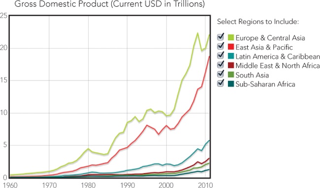
Figure 2-4. Interaction controls can also serve as chart elements such as legends.
That looks pretty good, so now we can move on to the interaction itself.
Step 6: Define the Data Structure for the Interaction
Now that the general layout looks good, we can turn back to JavaScript. First we need to expand our data to track the interaction state. Instead of storing the data as simple arrays of values, we’ll use an array of objects. Each object will include the corresponding data values along with other properties.
var source = [
{ data: eas, show: true, color: "#FE4C4C", name: "East Asia & Pacific" },
{ data: ecs, show: true, color: "#B6ED47", name: "Europe & Central Asia" },
{ data: lcn, show: true, color: "#2D9999",
name: "Latin America & Caribbean" },
{ data: mea, show: true, color: "#A50000",
name: "Middle East & North Africa" },
{ data: sas, show: true, color: "#679A00", name: "South Asia" },
{ data: ssf, show: true, color: "#006363", name: "Sub-Saharan Africa" }
];
Each object includes the data points for a region, and it also gives us a place to define additional properties, including the label for the series and other status information. One property that we want to track is whether the series should be included on the chart (using the key show). We also need to specify the color for each line; otherwise, the Flot library will pick the color dynamically based on how many regions are visible at the same time, and we won’t be able to match the color with the control legend.
Step 7: Determine Chart Data Based on the Interaction State
When we call plot() to draw the chart, we need to pass in an object containing the data series and the color for each region. The source array has the information we need, but it contains other information as well, which could potentially make Flot behave unexpectedly. We want to pass in a simpler object to the plot function. For example, the East Asia & Pacific series would be defined this way:
{
data: eas,
color: "#E41A1C"
}
We also want to be sure to show the data only for regions the user has selected. That may be only a subset of the complete data set. Those two operations—transforming array elements (in this case, to simpler objects) and filtering an array to a subset—are very common requirements for visualizations. Fortunately, jQuery has two utility functions that make both operations easy: $.map() and $.grep().
Both .grep() and .map() accept two parameters. The first parameter is an array or, more precisely, an “array-like” object. That’s either a JavaScript array or another JavaScript object that looks and acts like an array. (There is a technical distinction, but it’s not something we have to worry about here.) The second parameter is a function that operates on elements of the array one at a time. For .grep(), that function returns true or false to filter out elements accordingly. In the case of .map(), the function returns a transformed object that replaces the original element in the array. Figure 2-5 shows how these functions convert the initial data into the final data array.
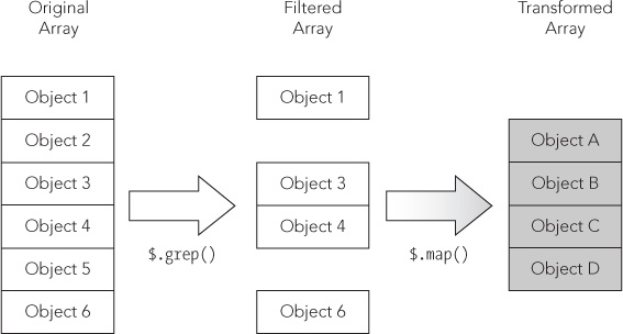
Figure 2-5. The jQuery library has utility functions to help transform and filter data.
Taking these one at a time, here’s how to filter out irrelevant data from the response. We use .grep() to check the show property in our source data so that it returns an array with only the objects where show is set to true.
$.grep(
source,
function (obj) { return obj.show; }
)
And here’s how to transform the elements to retain only relevant properties:
$.map(
source,
function (obj) { return { data: obj.data, color: obj.color }; }
)
There’s no need to make these separate steps. We can combine them in a nice, concise expression as follows:
$.map(
$.grep(
source,
function (obj) { return obj.show; }
),
function (obj) { return { data: obj.data, color: obj.color }; }
)
That expression in turn provides the input data to Flot’s plot() function.
Step 8: Add the Controls Using JavaScript
Now that our new data structure can provide the chart input, let’s use it to add the checkbox controls to the page as well. The jQuery .each() function is a convenient way to iterate through the array of regions. Its parameters include an array of objects and a function to execute on each object in the array. That function takes two parameters, the array index and the array object.
$.each(source, function(idx, region) {
var input = $("<input>").attr("type","checkbox").attr("id","chk-"+idx);
if (region.show) {
$(input).prop("checked",true);
}
var span = $("<span>").css({
"background-color": region.color,
"display": "inline-block",
"height": "0.9em",
"width": "0.9em",
"margin-right": "0.25em",
});
var label = $("<label>").append(input).append(span).append(region.name);
$("#controls").append(label);
});
Within the iteration function we do four things. First, we create the checkbox <input> control. As you can see, we’re giving each control a unique id attribute that combines the chk- prefix with the source array index. If the chart is showing that region, the control’s checked property is set to true. Next we create the <span> for the color block. We’re setting all the styles, including the region’s color, using the css() function. The third element we create in the function is the <label>. To that element we append the checkbox <input> control, the color box <span>, and the region’s name. Finally, we add the <label> to the document.
Notice that we don’t add the intermediate elements (such as the <input> or the <span>) directly to the document. Instead, we construct those elements using local variables. We then assemble the local variables into the final, complete <label> and add that to the document. This approach significantly improves the performance of web pages. Every time JavaScript code adds elements to the document, the web browser has to recalculate the appearance of the page. For complex pages, that can take time. By assembling the elements before adding them to the document, we’ve only forced the browser to perform that calculation once for each region. (You could further optimize performance by combining all of the regions in a local variable and adding only that single local variable to the document.)
If we combine the JavaScript to draw the chart with the JavaScript to create the controls, we need only a skeletal HTML structure.
<div id="visualization">
<div id="chart" style="width:500px;height:333px;float:left"></div>
<div id="controls" style="float:left;">
<p>Select Regions to Include:</p>
</div>
</div>
Our reward is the visualization in Figure 2-6—the same one as shown in Figure 2-4—but this time we’ve created it dynamically using JavaScript.
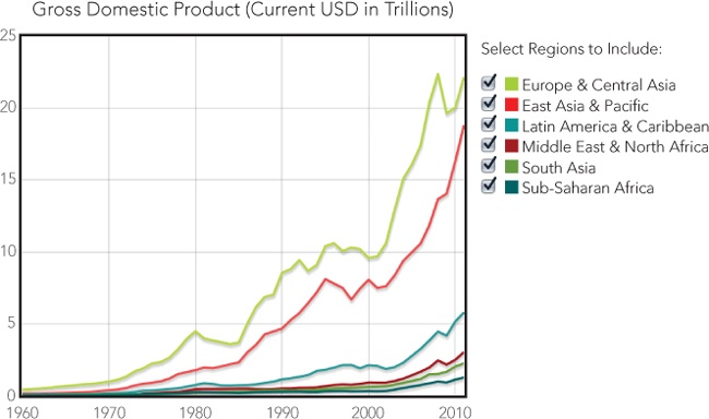
Figure 2-6. Setting the chart options ensures that the data matches the legend.
Step 9: Respond to the Interaction Controls
We still haven’t added any interactivity, of course, but we’re almost there. Our code just needs to watch for clicks on the controls and redraw the chart appropriately. Since we’ve conveniently given each checkbox an id attribute that begins with chk-, it’s easy to watch for the right events.
$("input[id^='chk-']").click(function(ev) {
// Handle the click
})
When the code sees a click, it should determine which checkbox was clicked, toggle the show property of the data source, and redraw the chart. We can find the specific region by skipping past the four-character chk- prefix of the event target’s id attribute.
idx = ev.target.id.substr(4);
source[idx].show = !source[idx].show
Redrawing the chart requires a couple of calls to the chart object that plot() returns. We reset the data and then tell the library to redraw the chart.
plotObj.setData(
$.map(
$.grep(source, function (obj) { return obj.show; }),
function (obj) { return { data: obj.data, color: obj.color }; }
)
);
plotObj.draw();
And that’s it. We finally have a fully interactive visualization of regional gross domestic product, as shown in Figure 2-7.
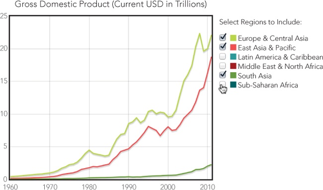
Figure 2-7. An interactive chart gives users control over the visualization.
The visualization we’ve created engages users more effectively than a static chart. They can still see the overall picture, but the interaction controls let them focus on aspects of the data that are especially important or interesting to them.
There is still a potential problem with this implementation. Two data sets (Europe and East Asia & Pacific) dominate the chart. When users deselect those regions, the remaining data is confined to the very bottom of the chart, and much of the chart’s area is wasted. You could address this by rescaling the chart every time you draw it. To do this, you would call plotObj.setupGrid() before calling plotObj.draw(). On the other hand, users may find this constant rescaling disconcerting, because it changes the whole chart, not just the region they selected. In the next example, we’ll address this type of problem by giving users total control over the scale of both axes.
Zooming In on Charts
So far, we’ve given users some interaction with the visualization by letting them choose which data sets appear. In many cases, however, you’ll want to give them even more control, especially if you’re showing a lot of data and details are hard to discern. If users can’t see the details they need, our visualization has failed. Fortunately, we can avoid this problem by giving users a chance to inspect fine details within the data. One way to do that is to let users zoom in on the chart.
Although the Flot library in its most basic form does not support zooming, there are at least two library extensions that add this feature: the selection plug-in and the navigation plug-in. The navigation plug-in acts a bit like Google Maps. It adds a control that looks like a compass to one corner of the plot and gives users arrows and buttons to pan or zoom the display. This interface is not especially effective for charts, however. Users cannot control exactly how much the chart pans or zooms, which makes it difficult for them to anticipate the effect of an action.
The selection plug-in provides a much better interface. Users simply drag their mouse across the area of the chart they want to zoom in on. The effect of this gesture is more intuitive, and users can be as precise as they like in those actions. The plug-in does have one significant downside, however: it doesn’t support touch interfaces.
For this example, we’ll walk through the steps required to support zooming with the selection plug-in. Of course, the best approach for your own website and visualizations will vary from case to case.
Step 1: Prepare the Page
Because we’re sticking with the same data, most of the preparation is identical to the last example.
<!DOCTYPE html>
<html lang="en">
<head>
<meta charset="utf-8">
<title></title>
</head>
<body>
<!-- Content goes here -->
<!--[if lt IE 9]><script src="js/excanvas.min.js"></script><![endif]-->
<script src="//cdnjs.cloudflare.com/ajax/libs/jquery/1.8.3/jquery.min.js">
</script>
<script src="//cdnjs.cloudflare.com/ajax/libs/flot/0.7/jquery.flot.min.js">
</script>
➊ <script src="js/jquery.flot.selection.js"></script>
</body>
</html>
As you can see, we do, however, have to add the selection plug-in to the page. It is not available on common CDNs, so we host it on our own server, as shown at ➊.
Step 2: Draw the Chart
Before we add any interactivity, let’s go back to a basic chart. This time, we’ll add a legend inside the chart since we won’t be including checkboxes next to the chart.
$(function () {
$.plot($("#chart") [
{ data: eas, label: "East Asia & Pacific" },
{ data: ecs, label: "Europe & Central Asia" },
{ data: lcn, label: "Latin America & Caribbean" },
{ data: mea, label: "Middle East & North Africa" },
{ data: sas, label: "South Asia" },
{ data: ssf, label: "Sub-Saharan Africa" }
], {legend: {position: "nw"}});
});
Here, we call the jQuery extension plot (from the Flot library) and pass it three parameters. The first parameter identifies the HTML element that should contain the chart, and the second parameter provides the data as an array of data series. These series contain regions we defined earlier, plus a label to identify each series. The final parameter specifies options for the plot. We’ll keep it simple for this example—the only option we’re including tells Flot to position the legend in the top-left (northwest) corner of the chart.
Figure 2-8 shows the resulting chart.
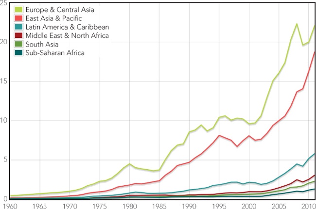
Figure 2-8. The starting point for most interactive charts is a good static chart.
It looks like we’ve done a good job of capturing and presenting the data statically, so we can move on to the next phase.
Step 3: Prepare the Data to Support Interaction
Now that we have a working static chart, we can plan how to support interaction. As part of that support, and for the sake of convenience, we’ll store all the parameters we’re passing to plot() in local variables.
➊ var $el = $("#chart"),
➋ data = [
{ data: eas, label: "East Asia & Pacific" },
{ data: ecs, label: "Europe & Central Asia" },
{ data: lcn, label: "Latin America & Caribbean" },
{ data: mea, label: "Middle East & North Africa" },
{ data: sas, label: "South Asia" },
{ data: ssf, label: "Sub-Saharan Africa" }
],
➌ options = {legend: {position: "nw"}};
➍ var plotObj = $.plot($el, data, options);
Before we call plot(), we create the variables $el ➊, data ➋, and options ➌. We’ll also need to save the object returned from plot() at ➍.
Step 4: Prepare to Accept Interaction Events
Our code also has to prepare to handle the interaction events. The selection plug-in signals the user’s actions by triggering custom plotselected events on the element containing the chart. To receive these events, we need a function that expects two parameters—the standard JavaScript event object and a custom object containing details about the selection. We’ll worry about how to process the event shortly. For now let’s focus on preparing for it.
$el.on("plotselected", function(ev, ranges) {
// Handle selection events
});
The jQuery .on() function assigns a function to an arbitrary event. Events can be standard JavaScript events such as click, or they can be custom events like the one we’re using. The event of interest is the first parameter to .on(). The second parameter is the function that will process the event. As noted previously, it also takes two parameters.
Now we can consider the action we want to take when our function receives an event. The ranges parameter contains both an xaxis and a yaxis object, which have information about the plotselected event. In both objects, the from and to properties specify the region that the user selected. To zoom to that selection, we can simply redraw the chart by using those ranges for the chart’s axes.
Specifying the axes for the redrawn chart requires us to pass new options to the plot() function, but we want to preserve whatever options are already defined. The jQuery .extend() function gives us the perfect tool for that task. The function merges JavaScript objects so that the result contains all of the properties in each object. If the objects might contain other objects, then we have to tell jQuery to use “deep” mode when it performs the merge. Here’s the complete call to plot(), which we place inside the plotselected event handler.
plotObj = $.plot($el, data,
$.extend(true, {}, options, {
xaxis: { min: ranges.xaxis.from, max: ranges.xaxis.to },
yaxis: { min: ranges.yaxis.from, max: ranges.yaxis.to }
})
);
When we use .extend(), the first parameter (true) requests deep mode, the second parameter specifies the starting object, and subsequent parameters specify additional objects to merge. We’re starting with an empty object ({}), merging the regular options, and then further merging the axis options for the zoomed chart.
Step 5: Enable the Interaction
Since we’ve included the selections plug-in library on our page, activating the interaction is easy. We simply include an additional selection option in our call to plot(). Its mode property indicates the direction of selections the chart will support. Possible values include "x" (for x-axis only), "y" (for y-axis only), or "xy" (for both axes). Here’s the complete options variable we want to use.
var options = {
legend: {position: "nw"},
selection: {mode: "xy"}
};
And with that addition, our chart is now interactive. Users can zoom in to see as much detail as they want. There is a small problem, though: our visualization doesn’t give users a way to zoom back out. Obviously we can’t use the selection plug-in to zoom out, since that would require users to select outside the current chart area. Instead, we can add a button to the page to reset the zoom level.
<!DOCTYPE html>
<html lang="en">
<head>
<meta charset="utf-8">
<title></title>
</head>
<body>
<div id="chart" style="width:600px;height:400px;"></div>
➊ <button id="unzoom">Reset Zoom</button>
<!--[if lt IE 9]><script src="js/excanvas.min.js"></script><![endif]-->
<script src="//cdnjs.cloudflare.com/ajax/libs/jquery/1.8.3/jquery.min.js">
</script>
<script src="//cdnjs.cloudflare.com/ajax/libs/flot/0.7/jquery.flot.min.js">
</script>
<script src="js/jquery.flot.selection.js"></script>
</body>
</html>
You can see the button in the markup at ➊; it’s right after the <div> that holds the chart.
Now we just need to add code to respond when a user clicks the button. Fortunately, this code is pretty simple.
$("#unzoom").click(function() {
plotObj = $.plot($el, data, options);
});
Here we just set up a click handler with jQuery and redraw the chart using the original options. We don’t need any event data, so our event handling function doesn’t even need parameters.
That gives us a complete, interactive visualization. Users can zoom in to any level of detail and restore the original zoom with one click. You can see the interaction in Figure 2-9.
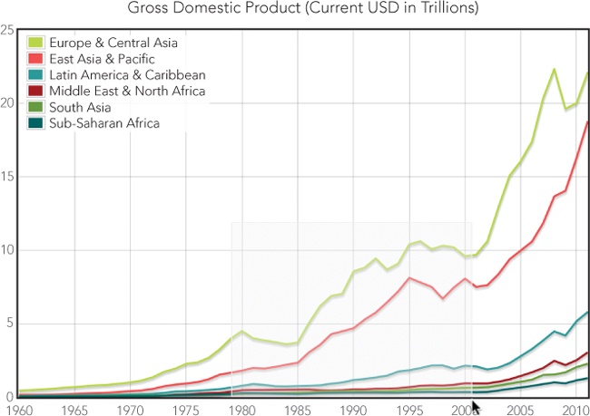
Figure 2-9. Interactive charts let users focus on data relevant to their needs.
Figure 2-10 shows what the user sees after zooming in.
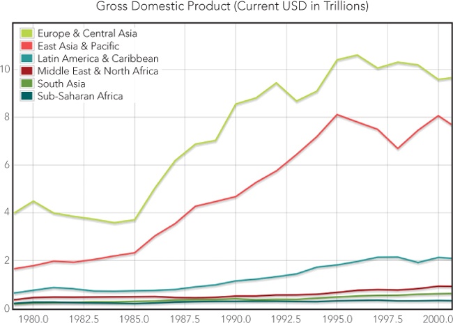
Figure 2-10. Users can zoom in on a section of particular interest.
If you experiment with this example, you’ll soon see that users cannot select an area of the chart that includes the legend. That may be okay for your visualization, but if it’s not, the simplest solution is to create your own legend and position it off the chart’s canvas, like we did for the first example in this chapter.
Tracking Data Values
A big reason we make visualizations interactive is to give users control over their view of the data. We can present a “big picture” view of the data, but we don’t want to prevent users from digging into the details. Often, however, this can force an either/or choice on users: they can see the overall view, or they can see a detailed picture, but they can’t see both at the same time. This example looks at an alternative approach that enables users to see overall trends and specific details at once. To do that, we take advantage of the mouse as an input device. When the user’s mouse hovers over a section of the chart, our code overlays details relevant to that part of the chart.
This approach does have a significant limitation: it works only when the user has a mouse. If you’re considering this technique, be aware that users on touchscreen devices won’t be able to take advantage of the interactive aspect; they’ll see only the static chart.
Since simple GDP data doesn’t lend itself well to the approach in this example, we’ll visualize a slightly different set of data from the World Bank. This time we’ll look at exports as a percentage of GDP. Let’s start by considering a simple line chart, shown in Figure 2-11, with data for each world region.
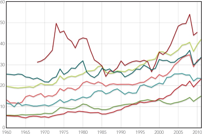
Figure 2-11. Plotting multiple data sets on a single chart can be confusing for users.
There are a couple of ways this chart falls short. First, many of the series have similar values, forcing some of the chart’s lines to cross back and forth over each other. That crisscrossing makes it hard for users to follow a single series closely to see detailed trends. Second, it’s hard for users to compare specific values for all of the regions at a single point in time. Most chart libraries, including Flot, have options to display values as users mouse over the chart, but that approach shows only one value at a time. We’d like to give our users a chance to compare the values of multiple regions.
In this example we’ll use a two-phase approach to solve both of those problems. First, we’ll change the visualization from a single chart with multiple series to multiple charts, each with a single series. That will isolate each region’s data, making it easier to see a particular region’s trends. Then we’ll add an advanced mouse tracking feature that spans all of the charts. This feature will let users see individual values in all of the charts at once.
Step 1: Set Aside a <div> Element to Hold the Charts
Within our document, we need to create a <div> element to contain the charts we’ll construct. This element won’t contain the charts directly; rather, we’ll be placing other <div>s within it, which will each contain a chart.
<!DOCTYPE html>
<html lang="en">
<head>
<meta charset="utf-8">
<title></title>
</head>
<body>
➊ <div id="charts"></div>
<!--[if lt IE 9]><script src="js/excanvas.min.js"></script><![endif]-->
<script src="//cdnjs.cloudflare.com/ajax/libs/jquery/1.8.3/jquery.min.js">
</script>
<script src="//cdnjs.cloudflare.com/ajax/libs/flot/0.7/jquery.flot.min.js">
</script>
</body>
</html>
The "charts" <div> is added at ➊. We’ve also included the required JavaScript libraries here, just as in the previous examples.
We’ll use JavaScript to create the <div>s for the charts themselves. These elements must have an explicit height and width, or Flot won’t be able to construct the charts. You can indicate the element’s size in a CSS style sheet, or you can define it when we create the <div> (as in the following example). This creates a new <div>, sets its width and height, saves a reference to it, and then appends it to the containing <div> already in our document.
$.each(exports, function(idx,region) {
var div = $("<div>").css({
width: "600px",
height: "60px"
});
region.div = div;
$("#charts").append(div);
});
To iterate through the array of regions, we use the jQuery .each() function. That function accepts two parameters: an array of objects (exports) and a function. It iterates through the array one object at a time, calling the function with the individual object (region) and its index (idx) as parameters.
Step 2: Prepare the Data
We’ll see how to get data directly from the World Bank’s web service in the next section, but for now we’ll keep things simple again and assume we have the data downloaded and formatted for JavaScript already. (Once again, only excerpts are shown here. The book’s source code includes the full data set.)
var exports = [
{ label: "East Asia & Pacific",
data: [[1960,13.2277],[1961,11.7964], // Data continues...
{ label: "Europe & Central Asia",
data: [[1960,19.6961],[1961,19.4264], // Data continues...
{ label: "Latin America & Caribbean",
data: [[1960,11.6802],[1961,11.3069], // Data continues...
{ label: "Middle East & North Africa",
data: [[1968,31.1954],[1969,31.7533], // Data continues...
{ label: "North America",
data: [[1960,5.9475],[1961,5.9275], // Data continues...
{ label: "South Asia",
data: [[1960,5.7086],[1961,5.5807], // Data continues...
{ label: "Sub-Saharan Africa",
data: [[1960,25.5083],[1961,25.3968], // Data continues...
];
The exports array contains an object for each region, and each object contains a label and a data series.
Step 3: Draw the Charts
With the <div>s for each chart now in place on our page, we can draw the charts using Flot’s plot() function. That function takes three parameters: the containing element (which we just created), the data, and chart options. To start, let’s look at the charts without any decoration—such as labels, grids, or checkmarks—just to make sure the data is generally presented the way we want.
$.each(exports, function(idx,region) {
region.plot = $.plot(region.div, [region.data], {
series: {lines: {fill: true, lineWidth: 1}, shadowSize: 0},
xaxis: {show: false, min:1960, max: 2011},
yaxis: {show: false, min: 0, max: 60},
grid: {show: false},
});
});
The preceding code uses several plot() options to strip the chart of all the extras and set the axes the way we want. Let’s consider each option in turn.
§ series. Tells Flot how we want it to graph the data series. In our case we want a line chart (which is the default type), but we want to fill the area from the line down to the x-axis, so we set fill to true. This option creates an area chart instead of a line chart. Because our charts are so short, an area chart will keep the data visible. For the same reason, we want the line itself to be as small as possible to match, so we set lineWidth to 1 (pixel), and we can dispense with shadows by setting shadowSize to 0.
§ xaxis. Defines the properties of the x-axis. We don’t want to include one on these charts, so we set show to false. We do, however, need to explicitly set the range of the axis. If we don’t, Flot will create one automatically, using the range of each series. Since our data doesn’t have consistent values for all years (the Middle East & North Africa data set, for example, doesn’t include data before 1968), we need to make Flot use the exact same x-axis range on all charts, so we specify a range from 1960 to 2011.
§ yaxis. Works much like the xaxis options. We don’t want to show one, but we do need to specify an explicit range so that all of the charts are consistent.
§ grid. Tells Flot how to add grid lines and checkmarks to the charts. For now, we don’t want anything extra, so we turn off the grid completely by setting show to false.
We can check the result in Figure 2-12 to make sure the charts appear as we want.

Figure 2-12. Separating individual data sets into multiple charts can make it easier to see the details of each set.
Next we turn to the decoration for the chart. We’re obviously missing labels for each region, but adding them takes some care. Your first thought might be to include a legend along with each chart in the same <div>. Flot’s event handling, however, will work much better if we can keep all the charts—and only the charts—in their own <div>. That’s going to require some restructuring of our markup. We’ll create a wrapper <div> and then place separate <div>s for the charts and the legends within it. We can use the CSS float property to position them side by side.
<div id="charts-wrapper">
<div id="charts" style="float:left;"></div>
<div id="legends" style="float:left;"></div>
<div style="clear:both;"></div>
</div>
When we create each legend, we have to be sure it has the exact same height as the chart. Because we’re setting both explicitly, that’s not hard to do.
$.each(exports, function(idx,region) {
var legend = $("<p>").text(region.label).css({
"height": "17px",
"margin-bottom": "0",
"margin-left": "10px",
"padding-top": "33px"
});
$("#legends").append(legend);
});
Once again we use .each, this time to append a legend for each region to the legends element.
Now we’d like to add a continuous vertical grid that spans all of the charts. Because the charts are stacked, grid lines in the individual charts can appear as one continuous line as long as we can remove any borders or margins between charts. It takes several plot() options to achieve that, as shown here.
$.plot(region.div, [region.data], {
series: {lines: {fill: true, lineWidth: 1}, shadowSize: 0},
xaxis: {show: true, labelHeight: 0, min:1960, max: 2011,
tickFormatter: function() {return "";}},
yaxis: {show: false, min: 0, max: 60},
grid: {show: true, margin: 0, borderWidth: 0, margin: 0,
labelMargin: 0, axisMargin: 0, minBorderMargin: 0},
});
We enable the grid by setting the grid option’s show property to true. Then we remove all the borders and padding by setting the various widths and margins to 0. To get the vertical lines, we also have to enable the x-axis, so we set its show property to true as well. But we don’t want any labels on individual charts, so we specify a labelHeight of 0. To be certain that no labels appear, we also define a tickFormatter() function that returns an empty string.
The last bits of decoration we’d like to add are x-axis labels below the bottom chart. To do that, we can create a dummy chart with no visible data, position that dummy chart below the bottom chart, and enable labels on its x-axis. The following three sections create an array of dummy data, create a <div> to hold the dummy chart, and plot the dummy chart.
var dummyData = [];
for (var yr=1960; yr<2012; yr++) dummyData.push([yr,0]);
var dummyDiv = $("<div>").css({ width: "600px", height: "15px" });
$("#charts").append(dummyDiv);
var dummyPlot = $.plot(dummyDiv, [dummyData], {
xaxis: {show: true, labelHeight: 12, min:1960, max: 2011},
yaxis: {show: false, min: 100, max: 200},
grid: {show: true, margin: 0, borderWidth: 0, margin: 0,
labelMargin: 0, axisMargin: 0, minBorderMargin: 0},
});
With the added decoration, our chart in Figure 2-13 looks great.
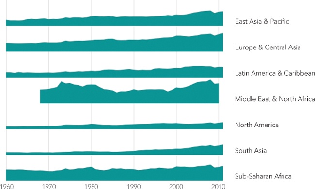
Figure 2-13. Carefully stacking multiple charts creates the appearance of a unified chart.
Step 4: Implement the Interaction
For our visualization, we want to track the mouse as it hovers over any of our charts. The Flot library makes that relatively easy. The plot() function’s grid options include the hoverable property, which is set to false by default. If you set this property to true, Flot will trigger plothover events as the mouse moves over the chart area. It sends these events to the <div> that contains the chart. If there is code listening for those events, that code can respond to them. If you use this feature, Flot will also highlight the data point nearest the mouse. That’s a behavior we don’t want, so we’ll disable it by setting autoHighlight to false.
$.plot(region.div, [region.data], {
series: {lines: {fill: true, lineWidth: 1}, shadowSize: 0},
xaxis: {show: true, labelHeight: 0, min: 1960, max: 2011,
tickFormatter: function() {return "";}},
yaxis: {show: false, min: 0, max: 60},
grid: {show: true, margin: 0, borderWidth: 0, margin: 0,
labelMargin: 0, axisMargin: 0, minBorderMargin: 0,
hoverable: true, autoHighlight: false},
});
Now that we’ve told Flot to trigger events on all of our charts, you might think we would have to set up code to listen for events on all of them. There’s an even better approach, though. We structured our markup so that all the charts—and only the charts—are inside the containing charts <div>. In JavaScript, if no code is listening for an event on a specific document element, those events automatically “bubble up” to the containing elements. So if we just set up an event listener on the charts <div>, we can capture the plothover events on all of the individual charts. We’ll also need to know when the mouse leaves the chart area. We can catch those events using the standard mouseout event as follows:
$("charts").on("plothover", function() {
// The mouse is hovering over a chart
}).on("mouseout", function() {
// The mouse is no longer hovering over a chart
});
To respond to the plothover events, we want to display a vertical line across all of the charts. We can construct that line using a <div> element with a border. In order to move it around, we use absolute positioning. It also needs a positive z-index value to make sure the browser draws it on top of the chart. The marker starts off hidden with a display property of none. Since we want to position the marker within the containing <div>, we set the containing <div>’s position property to relative.
<div id="charts-wrapper" style="position:relative;">
<div id="marker" style="position:absolute;z-index:1;display:none;
width:1px;border-left: 1px solid black;"></div>
<div id="charts" style="float:left;"></div>
<div id="legends" style="float:left;"></div>
<div style="clear:both;"></div>
</div>
When Flot calls the function listening for plothover events, it passes that function three parameters: the JavaScript event object, the position of the mouse expressed as x- and y-coordinates, and, if a chart data point is near the mouse, information about that data point. In our example we need only the x-coordinate. We can round it to the nearest integer to get the year. We also need to know where the mouse is relative to the page. Flot will calculate that for us if we call the pointOffset() of any of our plot objects. Note that we can’t reliably use the third parameter, which is available only if the mouse is near an actual data point, so we can ignore it.
$("charts").on("plothover", function(ev, pos) {
var year = Math.round(pos.x);
var left = dummyPlot.pointOffset(pos).left;
});
Once we’ve calculated the position, it’s a simple matter to move the marker to that position, make sure it’s the full height of the containing <div>, and turn it on.
$("#charts").on("plothover", function(ev, pos) {
var year = Math.round(pos.x);
var left = dummyPlot.pointOffset(pos).left;
➊ var height = $("#charts").height();
$("#marker").css({
"top": 0,
➋ "left": left,
"width": "1px",
➌ "height": height
}).show();
});
In this code, we calculate the marker height at ➊, set its position at ➋, and set the height at ➌.
We also have to be a little careful on the mouseout event. If a user moves the mouse so that it is positioned directly on top of the marker, that will generate a mouseout event for the charts <div>. In that special case, we want to leave the marker displayed. To tell where the mouse has moved, we check the relatedTarget property of the event. We hide the marker only if the related target isn’t the marker itself.
$("#charts").on("mouseout", function(ev) {
if (ev.relatedTarget.id !== "marker") {
$("#marker").hide();
}
});
There’s still one hole in our event processing. If the user moves the mouse directly over the marker, and then moves the mouse off the chart area entirely (without moving it off the marker), we won’t catch the fact that the mouse is no longer hovering on the chart. To catch this event, we can listen for mouseout events on the marker itself. There’s no need to worry about the mouse moving off the marker and back onto the chart area; the existing plothover event will cover that scenario.
$("#marker").on("mouseout", function(ev) {
$("#marker").hide();
});
The last part of our interaction shows the values of all charts corresponding to the horizontal position of the mouse. We can create <div>s to hold these values back when we create each chart. Because these <div>s might extend beyond the chart area proper, we’ll place them in the outer charts-wrapper <div>.
$.each(exports, function(idx,region) {
var value = $("<div>").css({
"position": "absolute",
"top": (div.position().top - 3) + "px",
➊ "display": "none",
"z-index": 1,
"font-size": "11px",
"color": "black"
});
region.value = value;
$("#charts-wrapper").append(value);
});
Notice that as we create these <div>s, we set all the properties except the left position, since that will vary with the mouse. We also hide the elements with a display property of none at ➊.
With the <div>s waiting for us in the document, our event handler for plothover sets the text for each, positions them horizontally, and shows them on the page. To set the text value, we can use the jQuery .grep() function to search through the data for a year that matches. If none is found, the text for the value <div> is emptied.
$("#charts").on("plothover", function(ev, pos) {
$.each(exports, function(idx, region) {
matched = $.grep(region.data, function(pt) { return pt[0] === year; });
if (matched.length > 0) {
region.value.text(year + ": " + Math.round(matched[0][1]) + "%");
} else {
region.value.text("");
}
region.value.css("left", (left+4)+"px").show();
});
});
Finally, we need to hide these <div>s when the mouse leaves the chart area. We should also handle the case of the mouse moving directly onto the marker, just as we did before.
$("#charts").on("plothover", function(ev, pos) {
// Handle plothover event
}).on("mouseout", function(ev) {
if (ev.relatedTarget.id !== "marker") {
$("#marker").hide();
$.each(exports, function(idx, region) {
region.value.hide();
});
}
});
$("#marker").on("mouseout", function(ev) {
$("#marker").hide();
$.each(exports, function(idx, region) {
region.value.hide();
});
});
We can now enjoy the results of our coding, in Figure 2-14. Our visualization clarifies the trends in exports for each region, and it lets users interact with the charts to compare regions and view detailed values.
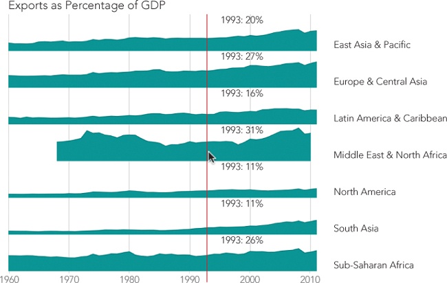
Figure 2-14. The final visualization combines multiple charts with mouse tracking to more clearly present the data.
As users move their mouse across the charts, the vertical bar moves as well. The values corresponding to the mouse position also appear to the right of the marker for each chart. The interaction makes it easy and intuitive to compare values for any of the regions.
The chart we’ve created in this example is similar to the small multiples approach for letting users compare many values. In our example the chart takes up the full page, but it could also be designed as one element in a larger presentation such as a table. Chapter 3 gives examples of integrating charts in larger web page elements.
Retrieving Data Using AJAX
Most of the examples in this book emphasize the final product of data visualization: the graphs, charts, or images that our users see. But effective visualizations often require a lot of work behind the scenes. After all, effective data visualizations need data just as much as they need the visualization. This example focuses on a common approach for accessing data—Asynchronous JavaScript and XML, more commonly known as AJAX. The example here details AJAX interactions with the World Bank, but both the general approach and the specific techniques shown here apply equally well to many other data sources on the Web.
Step 1: Understand the Source Data
Often, the first challenge in working with remote data is to understand its format and structure. Fortunately, our data comes from the World Bank, and its website thoroughly documents its application programming interface (API). We won’t spend too much time on the particulars in this example, since you’ll likely be using a different data source. But a quick overview is helpful.
The first item of note is that the World Bank divides the world into several regions. As with all good APIs, the World Bank API allows us to issue a query to get a list of those regions.
http://api.worldbank.org/regions/?format=json
Our query returns the full list as a JSON array, which starts as follows:
[ { "page": "1",
"pages": "1",
"per_page": "50",
"total": "22"
},
[ { "id": "",
"code": "ARB",
"name": "Arab World"
},
{ "id": "",
"code": "CSS",
"name": "Caribbean small states"
},
{ "id": "",
"code": "EAP",
"name": "East Asia & Pacific (developing only)"
},
{ "id": "1",
"code": "EAS",
"name": "East Asia & Pacific (all income levels)"
},
{ "id": "",
"code": "ECA",
"name": "Europe & Central Asia (developing only)"
},
{ "id": "2",
"code": "ECS",
"name": "Europe & Central Asia (all income levels)"
},
The first object in the array supports paging through a large data set, which isn’t important for us now. The second element is an array with the information we need: the list of regions. There are 22 regions in total, but many overlap. We’ll want to pick from the total number of regions so that we both include all the world’s countries and don’t have any country in multiple regions. The regions that meet these criteria are conveniently marked with an id property, so we’ll select from the list only those regions whose id property is not null.
Step 2: Get the First Level of Data via AJAX
Now that you understand the data format (so far), let’s write some code to retrieve the data. Since we have jQuery loaded, we’ll take advantage of many of its utilities. Let’s start at the simplest level and work up to a full implementation.
As you might expect, the $.getJSON() function will do most of the work for us. The simplest way to use that function might be something like the following:
$.getJSON(
"http://api.worldbank.org/regions/",
➊ {format: "json"},
function(response) {
// Do something with response
}
);
Note that we’re adding format: "json" to the query at ➊ to tell the World Bank what format we want. Without that parameter, the server returns XML, which isn’t at all what getJSON() expects.
Unfortunately, that code won’t work with the current web servers supplying the World Bank data. In fact, this problem is very common today. As is often the case with the Web, security concerns are the source of the complication. Consider the information flow we’re establishing, shown in Figure 2-15.
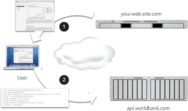
Figure 2-15. Our server (your.web.site.com) sends a web page—including scripts—to the user, and those scripts, executing in the user’s browser, query the World Bank site (api.worldbank.com).
Getting data using AJAX often requires the cooperation of three different systems.
The script’s communication with the World Bank is invisible to users, so they have no chance to approve or refuse the exchange. In the case of the World Bank, it’s hard to imagine any reason for users to reject the query, but what if our script were accessing users’ social network profile or, more seriously, their online banking site? In such cases user concerns would be justified. Because the communication is invisible to the user, and because the web browser cannot guess which communications might be sensitive, the browser simply prohibits all such communications. The technical term for this is same-origin policy. This policy means that web pages that our server provides cannot directly access the World Bank’s JSON interface.
Some websites address this problem by adding an HTTP header in their responses. The header tells the browser that it’s safe for any web page to access this data:
Access-Control-Allow-Origin: *
Unfortunately, as of this writing, the World Bank has not implemented this header. The option is relatively new, so it’s missing from many web servers. To work within the constraints of the same-origin policy, therefore, we rely on jQuery’s help and a small bit of trickery. The trick relies on the one exception to the same-origin policy that all browsers recognize: third-party JavaScript files. Browsers do allow web pages to request JavaScript files from third-party servers (that is, after all, how services such as Google Analytics can work). We just need to make the response data from the World Bank look like regular JavaScript instead of JSON. Fortunately, the World Bank cooperates with us in this minor deception. We simply add two query parameters to our request:
?format=jsonP&prefix=Getdata
The format parameter with a value of jsonP tells the World Bank that we want the response formatted as JSON with padding, which is a variant of JSON that is also regular JavaScript. The second parameter, prefix, tells the World Bank the name of the function that will accept the data. (Without that information, the JavaScript that the World Bank constructs wouldn’t know how to communicate with our code.) It’s a bit messy, but jQuery handles most of the details for us. The only catch is that we have to add ?something=? to the URL we pass to .getJSON(), where something is whatever the web service requires for its JSONP response. The World Bank expects prefix, but a more common value is callback.
Now we can put together some code that will work with the World Bank and many other web servers, although the parameter prefix is specific to the World Bank.
$.getJSON(
➊ "http://api.worldbank.org/regions/?prefix=?",
➋ {format: "jsonp"},
function(response) {
// Do something with response
}
);
We’ve added the prefix directly in the URL at ➊, and we’ve changed the format to jsonp at ➋.
JSONP does suffer from one major shortcoming: there is no way for the server to indicate an error. That means we should spend extra time testing and debugging any JSONP requests, and we should be vigilant about any changes in the server that might cause previously functioning code to fail. Eventually the World Bank will update the HTTP headers in its responses (perhaps even by the time of this book’s publication), and we can switch to the more robust JSON format.
NOTE
At the time of this writing, the World Bank has a significant bug in its API. The server doesn’t preserve the case (uppercase versus lowercase) of the callback function. The full source code for this example includes a work-around for the bug, but you’re unlikely to need that for other servers. Just in case, though, you can look at the comments in the source code for a complete documentation of the fix.
Now let’s get back to the code itself. In the preceding snippet, we’re defining a callback function directly in the call to .getJSON(). You’ll see this code structure in many implementations. This certainly works, but if we continue along these lines, things are going to get quite messy very soon. We’ve already added a couple of layers of indentation before we even start processing the response. As you can guess, once we get this initial response, we’ll need to make several more requests for additional data. If we try to build our code in one monolithic block, we’ll end up with so many levels of indentation that there won’t be any room for actual code. More significantly, the result would be one massive interconnected block of code that would be challenging to understand, much less debug or enhance.
Fortunately, jQuery gives us the tool for a much better approach: the $.Deferred object. A Deferred object acts as a central dispatcher and scheduler for events. Once the Deferred object is created, different parts of our code indicate that they want to know when the event completes, while other parts of our code signal the event’s status. Deferred coordinates all those different activities, letting us separate how we trigger and manage events from dealing with their consequences.
Let’s see how to improve our AJAX request with Deferred objects. Our main goal is to separate the initiation of the event (the AJAX request) from dealing with its consequences (processing the response). With that separation, we won’t need a success function as a callback parameter to the request itself. Instead, we’ll rely on the fact that the .getJSON() call returns a Deferred object. (Technically, the function returns a restricted form of the Deferred object known as a promise; the differences aren’t important for us now, though.) We want to save that returned object in a variable.
// Fire off the query and retain the deferred object tracking it
deferredRegionsRequest = $.getJSON(
"http://api.worldbank.org/regions/?prefix=?",
{format: "jsonp"}
);
That’s simple and straightforward. Now, in a different part of our code, we can indicate our interest in knowing when the AJAX request is complete.
deferredRegionsRequest.done(function(response) {
// Do something with response
});
The done() method of the Deferred object is key. It specifies a new function that we want to execute whenever the event (in this case the AJAX request) successfully completes. The Deferred object handles all the messy details. In particular, if the event is already complete by the time we get around to registering the callback via done(), the Deferred object executes that callback immediately. Otherwise, it waits until the request is complete. We can also express an interest in knowing if the AJAX request fails; instead of done(), we use the fail() method for this. (Even though JSONP doesn’t give the server a way to report errors, the request itself could still fail.)
deferredRegionsRequest.fail(function() {
// Oops, our request for region information failed
});
We’ve obviously reduced the indentation to a more manageable level, but we’ve also created a much better structure for our code. The function that makes the request is separate from the code that handles the response. That’s much cleaner, and it’s definitely easier to modify and debug.
Step 3: Process the First Level of Data
Now let’s tackle processing the response. The paging information isn’t relevant, so we can skip right to the second element in the returned response. We want to process that array in two steps.
1. Filter out any elements in the array that aren’t relevant to us. In this case we’re interested only in regions that have an id property that isn’t null.
2. Transform the elements in the array so that they contain only the properties we care about. For this example, we need only the code and name properties.
This probably sounds familiar. In fact, it’s exactly what we needed to do in this chapter’s first example. As we saw there, jQuery’s $.map() and $.grep() functions are a big help.
Taking these steps one at a time, here’s how to filter out irrelevant data from the response.
filtered = $.grep(response[1], function(regionObj) {
return (regionObj.id !== null);
});
And here’s how to transform the elements to retain only relevant properties. And as long as we’re doing that, let’s get rid of the parenthetical “(all income levels)” that the World Bank appends to some region names. All of our regions (those with an id) include all income levels, so this information is superfluous.
regions = $.map(filtered, function(regionObj) {
return {
code: regionObj.code,
name: regionObj.name.replace(" (all income levels)","")
};
}
);
There’s no need to make these separate steps. We can combine them in a nice, concise expression.
deferredRegionsRequest.done(function(response) {
regions = $.map(
$.grep(response[1], function(regionObj) {
return (regionObj.id !== null);
}),
function(regionObj) {
return {
code: regionObj.code,
name: regionObj.name.replace(" (all income levels)","")
};
}
);
});
Step 4: Get the Real Data
At this point, of course, all we’ve managed to retrieve is the list of regions. That’s not the data we want to visualize. Usually, getting the real data through a web-based interface requires (at least) two request stages. The first request just gives you the essential information for subsequent requests. In this case, the real data we want is the GDP, so we’ll need to go through our list of regions and retrieve that data for each one.
Of course we can’t just blindly fire off the second set of requests, in this case for the detailed region data. First, we have to wait until we have the list of regions. In Step 2 we dealt with a similar situation by using .getJSON() with a Deferred object to separate event management from processing. We can use the same technique here; the only difference is that we’ll have to create our own Deferred object.
var deferredRegionsAvailable = $.Deferred();
Later, when the region list is available, we indicate that status by calling the object’s resolve() method.
deferredRegionsAvailable.resolve();
The actual processing is handled by the done() method.
deferredRegionsAvailable.done(function() {
// Get the region data
});
The code that gets the actual region data needs the list of regions, of course. We could pass that list around as a global variable, but that would be polluting the global namespace. (And even if you’ve properly namespaced your application, why pollute your own namespace?) This problem is easy to solve. Any arguments we provide to the resolve() method are passed straight to the done() function.
Let’s take a look at the big picture so we can see how all the pieces fit together.
// Request the regions list and save status of the request in a Deferred object
➊ var deferredRegionsRequest = $.getJSON(
"http://api.worldbank.org/regions/?prefix=?",
{format: "jsonp"}
);
// Create a second Deferred object to track when list processing is complete
➋ var deferredRegionsAvailable = $.Deferred();
// When the request finishes, start processing
➌ deferredRegionsRequest.done(function(response) {
// When we finish processing, resolve the second Deferred with the results
➍ deferredRegionsAvailable.resolve(
$.map(
$.grep(response[1], function(regionObj) {
return (regionObj.id != "");
}),
function(regionObj) {
return {
code: regionObj.code,
name: regionObj.name.replace(" (all income levels)","")
};
}
)
);
});
deferredRegionsAvailable.done(function(regions) {
➎ // Now we have the regions, go get the data
});
First, starting at ➊, we request the list of regions. Then, at ➋, we create a second Deferred object to track our processing of the response. In the block starting at ➌, we handle the response from our initial request. Most importantly, we resolve the second Deferred object, at ➍, to signal that our processing is complete. Finally, starting at ➎, we can begin processing the response.
Retrieving the actual GDP data for each region requires a new AJAX request. As you might expect, we’ll save the Deferred objects for those requests so we can process the responses when they’re available. The jQuery .each() function is a convenient way to iterate through the list of regions to initiate these requests.
deferredRegionsAvailable.done(function(regions) {
$.each(regions, function(idx, regionObj) {
regionObj.deferredDataRequest = $.getJSON(
"http://api.worldbank.org/countries/"
+ regionObj.code
➊ + "/indicators/NY.GDP.MKTP.CD"
+ "?prefix=?",
{ format: "jsonp", per_page: 9999 }
);
});
});
The “NY.GDP.MKTP.CD” part of each request URL at ➊ is the World Bank’s code for GDP data.
As long as we’re iterating through the regions, we can include the code to process the GDP data. By now it won’t surprise you that we’ll create a Deferred object to track when that processing is complete. The processing itself will simply store the returned response (after skipping past the paging information) in the region object.
deferredRegionsAvailable.done(function(regions) {
$.each(regions, function(idx, regionObj) {
regionObj.deferredDataRequest = $.getJSON(
"http://api.worldbank.org/countries/"
+ regionObj.code
+ "/indicators/NY.GDP.MKTP.CD"
+ "?prefix=?",
{ format: "jsonp", per_page: 9999 }
);
regionObj.deferredDataAvailable = $.Deferred();
regionObj.deferredDataRequest.done(function(response) {
➊ regionObj.rawData = response[1] || [];
regionObj.deferredDataAvailable.resolve();
});
});
});
Note that we’ve also added a check at ➊ to make sure the World Bank actually returns data in its response. Possibly due to internal errors, it may return a null object instead of the array of data. When that happens, we’ll set the rawData to an empty array instead of null.
Step 5: Process the Data
Now that we’ve requested the real data, it’s almost time to process it. There is a final hurdle to overcome, and it’s a familiar one. We can’t start processing the data until it’s available, which calls for defining one more Deferred object and resolving that object when the data is complete. (By now it’s probably sinking in just how handy Deferred objects can be.)
There is one little twist, however. We’ve now got multiple requests in progress, one for each region. How can we tell when all of those requests are complete? Fortunately, jQuery provides a convenient solution with the .when() function. That function accepts a list of Deferred objects and indicates success only when all of the objects have succeeded. We just need to pass that list of Deferred objects to the .when() function.
We could assemble an array of Deferred objects using the .map() function, but .when() expects a parameter list, not an array. Buried deep in the JavaScript standard is a technique for converting an array to a list of function parameters. Instead of calling the function directly, we execute the .when() function’s apply() method. That method takes, as its parameters, the context (this) and an array.
Here’s the .map() function that creates the array.
$.map(regions, function(regionObj) {
return regionObj.deferredDataAvailable
})
And here’s how we pass it to when() as a parameter list.
$.when.apply(this,$.map(regions, function(regionObj) {
return regionObj.deferredDataAvailable
}));
The when() function returns its own Deferred object, so we can use the methods we already know to process its completion. Now we finally have a complete solution for retrieving the World Bank data.
With our data safely in hand, we can now coerce it into a format that Flot accepts. We extract the date and value properties from the raw data. We also have to account for gaps in the data. The World Bank doesn’t have GDP data for every region for every year. When it’s missing data for a particular year, it returns null for value. The same combination of .grep() and .map() that we used before will serve us once again.
deferredAllDataAvailable.done(function(regions) {
➊ $.each(regions, function(idx, regionObj) {
➋ regionObj.flotData = $.map(
➌ $.grep(regionObj.rawData, function(dataObj) {
return (dataObj.value !== null);
}),
➍ function(dataObj) {
return [[
➎ parseInt(dataObj.date),
➏ parseFloat(dataObj.value)/1e12
]];
}
)
})
});
As you can see, we’re iterating through the list of regions with the .each() function at ➊. For each region, we create an object of data for the Flot library. (No points for originality in naming that object flotData at ➋.) Then we filter the data starting at ➌ to eliminate any data points with null values. The function that creates our Flot data array starts at ➍. It takes, as input, a single data object from the World Bank, and returns the data as a two-dimensional data point. The first value is the date, which we extract as an integer at ➎, and the second value is the GDP data, which we extract as a floating-point number at ➏. Dividing by 1e12 converts the GDP data to trillions.
Step 6: Create the Chart
Since we’ve made it this far with a clear separation between code that handles events and code that processes the results, there’s no reason not to continue the approach when we actually create the chart. Yet another Deferred object creates that separation.
var deferredChartDataReady = $.Deferred();
deferredAllDataAvailable.done(function(regions) {
$.each(regions, function(idx, regionObj) {
regionObj.flotData = $.map(
$.grep(regionObj.rawData, function(dataObj) {
return (dataObj.value !== null);
}),
function(dataObj) {
return [[
parseInt(dataObj.date),
parseFloat(dataObj.value)/1e12
]];
}
)
})
➊ deferredChartDataReady.resolve(regions);
});
deferredChartDataReady.done(function(regions) {
// Draw the chart
});
Here we’ve taken the preceding code fragments and wrapped them in Deferred object handling. Once all of the data has been processed, we resolve that Deferred object at ➊.
The entire process is reminiscent of a frog hopping between lily pads in a pond. The pads are the processing steps, and Deferred objects are the bridges between them (Figure 2-16).
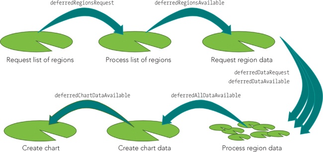
Figure 2-16. Deferred objects help keep each bit of code isolated to its own pad.
The real benefit to this approach is its separation of concerns. Each processing step remains independent of the others. Should any step require changes, there’s no need to look at the others. Each lily pad, in effect, remains its own island without concern for the rest of the pond.
Once we’re at the final step, we can use any or all of the techniques from this chapter’s other examples to draw the chart. Once again, the .map() function can easily extract relevant information from the region data. Here is a basic example:
deferredChartDataReady.done(function(regions) {
$.plot($("#chart"),
$.map(regions, function(regionObj) {
return {
label: regionObj.name,
data: regionObj.flotData
};
})
,{ legend: { position: "nw"} }
);
});
Our basic chart now gets its data directly from the World Bank. We no longer have to manually process its data, and our charts are updated automatically whenever the World Bank updates its data (Figure 2-17).
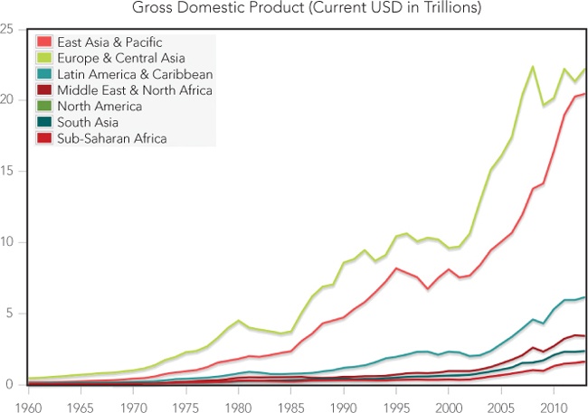
Figure 2-17. With AJAX we can graph live data from another site in the user’s browser.
In this example you’ve seen how to access the World Bank’s application programming interface. The same approach works for many other organizations that provide data on the Internet. In fact, there are so many data sources available today that it can be difficult to keep track of them all.
Here are two helpful websites that serve as a central repository for both public and private APIs accessible on the Internet:
§ APIhub (http://www.apihub.com/)
§ ProgrammableWeb (http://www.programmableweb.com/)
Many governments also provide a directory of available data and APIs. The United States, for example, centralizes its resources at the Data.gov website (http://www.data.gov/).
This example focuses on the AJAX interaction, so the resulting chart is a simple, static line chart. Any of the interactions described in the other examples from this chapter could be added to increase the interactivity of the visualization.
Summing Up
As the examples in this chapter show, we don’t have to be satisfied with static charts on our web pages. A little JavaScript can bring charts to life by letting users interact with them. These interactions give users a chance to see a “big picture” view of the data and, on the same page, look into the specific aspects that are most interesting and relevant to them. We’ve considered techniques that let users select which data series appear on our charts, zoom in on specific chart areas, and use their mouse to explore details of the data without losing sight of the overall view. We’ve also looked at how to get interactive data directly from its source using AJAX and asynchronous programming.
All materials on the site are licensed Creative Commons Attribution-Sharealike 3.0 Unported CC BY-SA 3.0 & GNU Free Documentation License (GFDL)
If you are the copyright holder of any material contained on our site and intend to remove it, please contact our site administrator for approval.
© 2016-2026 All site design rights belong to S.Y.A.