Data Visualization with JavaScript (2015)
Chapter 3. Integrating Charts on a Page
You might expect a data visualization for the Web to be featured very prominently on the page, or even make up the entire web page. That’s not always the right approach, though. The best visualizations are effective because they help the user understand the data, not because they “look pretty” on the page.
Some data may be straightforward enough to present without context, but meaningful data probably isn’t. And if our presentation requires context, its visualizations are likely sharing the page with other content. When we design web pages, we should take care to balance any individual component with the page as a whole. If a single visualization is not the entire story, it shouldn’t take up all (or even most) of the space on the page. It can be challenging, however, to minimize the space a traditional chart requires. There are, after all, axes, labels, titles, legends, and more to place.
Edward Tufte considered this problem in his groundbreaking work The Visual Display of Quantitative Information (Graphics Press, 1983), and he proposed a novel solution he called sparklines. Sparklines are charts stripped to their bare essentials, presented without the aforementioned elements we often see in a chart. Sparklines can present a lot of information in very little space, even to the point where it is possible to include a chart right in the middle of a sentence. There is no need for “See figure below” or “Click for larger view.” One of Tufte’s earliest examples presents the glucose level of a medical patient; Figure 3-1 shows a reproduction.
![]()
Figure 3-1. Tufte’s classic sparkline example shows a lot of information in a small space.
In a mere 154×20 pixels, we’ve shown the patient’s current glucose level, its trend for more than two months, high and low values, and the range of normal values. This high information density makes sparklines effective anytime space is a premium—inline in textual paragraphs, as cells in tables, or as part of information dashboards. Sparklines do have disadvantages, of course. They cannot provide as much fine-grained detail as a full-size chart with axes and labels. They also cannot support significant interactivity, so we can’t give users a lot of flexibility in selecting data or zooming in for detail. But for many visualizations, these aren’t major concerns. Plus, as we’ll see in this chapter’s examples, the Web gives us the chance to augment sparklines in ways that aren’t possible in print. There are a few JavaScript libraries and toolkits for creating sparklines, but we’ll focus on the most popular of them: jQuery sparklines (http://omnipotent.net/jquery.sparkline/). As the name implies, this open source library is an extension to jQuery. The examples in this chapter look closely at how to use these tools to incorporate dense visualizations into your web page. Here’s what you’ll learn:
§ How to create a classic sparkline for integration directly into text
§ How to combine multiple sparklines to show comparisons
§ How to annotate sparklines with additional details
§ How to create composite charts
§ How to respond to click events on the page
§ How to update charts in real time
Creating a Classic Sparkline
As later examples will demonstrate, the sparklines library is both flexible and powerful, and we can use it in many different contexts. As a start, though, we’ll use the library to create a sparkline exactly as Edward Tufte first defined it. The process is quite straightforward and takes only four simple steps.
Step 1: Include the Required JavaScript Libraries
Since we’re using the jQuery sparklines library to create the chart, we need to include that library in our web pages, along with jQuery. Both jQuery and sparklines are available on public CDNs. For this example (and the others in this chapter), we’ll use the CloudFlare CDN. For some notes on the advantages and disadvantages of using CDNs, see Step 1: Include the Required JavaScript Libraries.
Here’s the skeleton with which we start:
<!DOCTYPE html>
<html lang="en">
<head>
<meta charset="utf-8">
<title></title>
</head>
<body>
<!-- Content goes here -->
➊ <!--[if lt IE 9]><script src="js/excanvas.min.js"></script><![endif]-->
<script src="//cdnjs.cloudflare.com/ajax/libs/jquery/1.8.3/jquery.min.js">
</script>
<script src="//cdnjs.cloudflare.com/ajax/libs/jquery-sparklines/2.0.0/
jquery.sparkline.min.js"></script>
</body>
</html>
As you can see, we’re including the JavaScript libraries at the end of the document. This approach lets the browser load all of the document’s HTML markup and begin laying out the page while waiting for the server to provide the JavaScript libraries.
In addition to the jQuery library, sparklines rely on the HTML canvas feature. Since Internet Explorer didn’t support canvas until version 9, we use some special markup at ➊ to ensure that IE 8 and earlier will load an additional library (excanvas .min.js), just like we did in Chapter 2.
Step 2: Create the HTML Markup for the Sparkline
Because we’re closely integrating the sparkline chart with other elements, we simply use a <span> tag to hold the HTML markup for our visualization, rather than using a <div>. In addition to the chart itself, we include the final value and a label as standard HTML. Here is the HTML for the glucose sparkline:
<p>
<span class="sparkline">
170,134,115,128,168,166,122,81,56,39,97,114,114,130,151,
184,148,145,134,145,145,145,143,148,224,181,112,111,129,
151,131,131,131,114,112,112,112,124,187,202,200,203,237,
263,221,197,184,185,203,290,330,330,226,113,148,169,148,
78,96,96,96,77,59,22,22,70,110,128
</span>
128 Glucose
</p>
Compared to other visualizations, two characteristics of our sparkline chart are unusual.
§ We include the data right in the HTML itself, not in the JavaScript that creates the chart.
§ The <span> for the chart does not have a unique id attribute.
Both of these differences are optional; we could construct the chart as in other visualizations by passing data to a JavaScript function and identifying its container with a unique id. For sparklines, however, the approach we’re using here often makes more sense. By including the chart data directly in the HTML, we can easily see the data’s relation to other content on the page. It’s clear, for example, that the final value of our chart (128) is the same as the value we’re using for the label. If we had made a mistake and used a different value for the label, the error would be much easier to spot and correct. Using a common class for all sparklines instead of unique ids simplifies how we might use the library to create multiple charts on one page. With unique ids, we would have to call a library function for every chart. With a common class, on the other hand, we need only call a single library function to create multiple charts. That’s especially helpful when a web page contains a lot of sparklines.
Step 3: Draw the Sparkline
Now that we’ve included the necessary libraries and set up our HTML, it’s remarkably easy to draw the charts. In fact, a single line of JavaScript is sufficient. We simply select the containing element(s) using jQuery—$(".sparkline")—and call the sparklines plug-in.
$(function() {
$(".sparkline").sparkline();
}
As you can see in Figure 3-2, the sparklines library creates a standard sparkline from our data.
![]()
Figure 3-2. The default sparkline options differ slightly from the classic example.
The library’s default options differ from Tufte’s classic sparkline in color, chart type, and density. We’ll tweak those next.
Step 4: Adjust the Chart Style
To make our sparkline match Tufte’s definition exactly, we can specify new values for some of the default options. To pass these options to sparklines, we construct a JavaScript object and include it as the second parameter in the sparkline function call. The function’s first parameter is the data itself, which here we specify with "html" because our data is included in the HTML markup.
$(".sparkline").sparkline("html",{
➊ lineColor: "dimgray",
➋ fillColor: false,
➌ defaultPixelsPerValue: 1,
➍ spotColor: "red",
minSpotColor: "red",
maxSpotColor: "red",
➎ normalRangeMin: 82,
normalRangeMax: 180,
});
To complete our transformation to Tufte’s original, we can style the HTML content as well. Making the final value the same color as the key data points clarifies that connection, and making the chart label bold emphasizes it as a title.
<p>
<span class="sparkline">
170,134,115,128,168,166,122,81,56,39,97,114,114,130,151,
184,148,145,134,145,145,145,143,148,224,181,112,111,129,
151,131,131,131,114,112,112,112,124,187,202,200,203,237,
263,221,197,184,185,203,290,330,330,226,113,148,169,148,
78,96,96,96,77,59,22,22,70,110,128
</span>
<span style="color:red"> 128 </span>
<strong> Glucose </strong>
</p>
Let’s walk through the changes we just made:
§ Tufte’s classic sparklines are black and white except for key data points (minimum, maximum, and final values). His color scheme adds extra emphasis to those points. To change the library’s default (blue), we can set a lineColor. For screen displays, we might choose a dark gray rather than pure black. That’s what we’re using at ➊.
§ Tufte doesn’t fill the area below the line so that he can use shading to indicate a normal range. To eliminate the library’s light blue shading, we set fillColor to false ➋.
§ By default, the library uses 3 pixels as the width for each data point. To maximize information density, Tufte would likely suggest using only a single pixel. Setting the defaultPixelsPerValue option at ➌ makes that change.
§ Tufte uses red for key data points. To change the library’s default (orange), we set spotColor, minSpotColor, and maxSpotColor at ➍.
§ Finally, Tufte’s sparklines can include shading to mark the normal range for a value. To show, for example, a range of 82–180 mg/dL, we set the normalRangeMin and normalRangeMax options at ➎.
With these changes, we have the classic Tufte sparkline on our web page. We can even include it within a text paragraph, like this, ![]() , so that the visualization enhances the content of the text.
, so that the visualization enhances the content of the text.
Charting Many Variables
By design, sparklines take up very little space on a page, and that makes them ideal for another visualization challenge: showing many variables at once. Of course, regular line charts and bar charts can plot multiple data sets simultaneously; however, these multiple-series charts rapidly grow unwieldy if the number of data sets exceeds four or five. Some visualization projects show dozens of different variables, far beyond what a multiple-series chart can accommodate. A small-multiples approach turns the standard chart approach completely around. Instead of showing one chart with multiple data sets, we can show multiple charts, each with a single data set. Placing lots of charts on a page means that each individual chart cannot take up much space. That is exactly the problem that sparklines solve.
We won’t go too crazy here, to keep the code examples manageable, but it’s easy to extend this approach to many more variables. In our case, we’ll construct a visualization for analyzing stock market performance. The companies in our analysis will include the 10 largest American companies in 2012 (http://money.cnn.com/magazines/fortune/fortune500/2012/full_list/), also known as the Fortune 500 Top 10; Barclay’s best technology stocks for 2012 (http://www.marketwatch.com/story/barclays-best-tech-stocks-for-2012-2011-12-20/), as identified in December 2011; and Bristol-Myers Squibb, which CR Magazine named the top company in America for corporate responsibility (http://www.thecro.com/files/100Best2012_List_3.8.pdf/). Those selections are completely arbitrary, but the example is designed to include three different cases that we will style differently in our visualization. We’ll treat one as a general case (the Fortune 500 Top 10 list), one as a special class (the Barclay’s list), and one as a unique variable (Bristol-Myers Squibb). Just as in this chapter’s first example, we need to include the sparklines and jQuery libraries in our web page.
Step 1: Prepare the HTML Markup
The sparklines library makes it easy to embed the data directly inside the HTML markup. For this example, an HTML table is the most appropriate structure for the data. Here’s how such a table could begin. (For brevity’s sake, the following excerpt doesn’t include the full HTML, but the complete example is available in the book’s source code at http://jsDataV.is/source/.)
<table>
<thead>
<tr>
<th>Symbol</th>
<th>Company</th>
<th>2012 Performance</th>
<th>Gain</th>
</tr>
</thead>
<tbody>
<tr class="barclays">
<td>AAPL</td>
<td>Apple Inc.</td>
<td class="sparkline">
418.68,416.11,416.6,443.34,455.63,489.08,497.7,517.81,...
</td>
<td>27%</td>
</tr>
<tr class="barclays">
<td>ALTR</td>
<td>Altera Corporation</td>
<td class="sparkline">
37.1,36.92,39.93,39.81,40.43,39.76,39.73,38.55,36.89,...
</td>
<td>-7%</td>
</tr>
// Markup continues...
</tbody>
</table>
The table has three important characteristics relevant to our visualization.
§ Each stock is a single table row (<tr>).
§ Stocks from Barclay’s technology list have the class attribute "barclays" added to that <tr> element.
§ The top corporate responsibility stock has no special attributes or characteristics (yet).
Step 2: Draw the Charts
Just as in this chapter’s first example, creating the sparklines using default options is amazingly simple: it takes only a single line of JavaScript. We use jQuery to select all the elements that contain sparkline data, and we call the sparkline() function to generate the charts.
$(function() {
$(".sparkline").sparkline();
}
Notice that we only have to make one call to sparkline(), even though each chart has unique data. That’s a major benefit of placing the data within the HTML itself.
The resulting charts, shown in Figure 3-3, all have identical styles, but we’ll fix that in the next few steps.
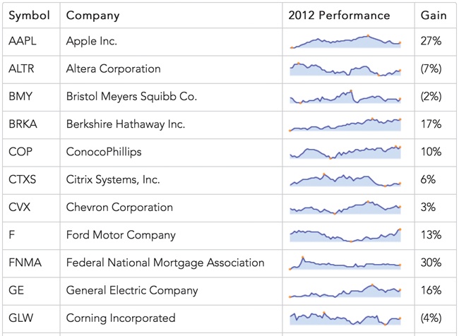
Figure 3-3. Sparklines can be a good visualization to include within page elements such as tables.
Step 3: Establish a Default Style for the Charts
If we don’t like the sparklines library’s default style, it’s easy to change it using an options object, as shown next.
$(".sparkline").sparkline("html",{
lineColor: "#006363",
fillColor: "#2D9999",
spotColor: false,
minSpotColor: false,
maxSpotColor: false
});
The object is the second parameter to the sparkline() function, and here it changes the color for the charts and disables the highlights on the minimum, maximum, and final values. The first parameter, the string "html", indicates to the library that the data is already present in our HTML.
Figure 3-4 shows the result for one row. We’ll use this style as the default for all our charts.
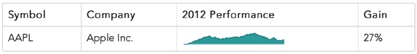
Figure 3-4. The sparkline options let us adjust the chart styles.
Step 4: Modify the Default Style for Special Classes
With a default style in place, we can turn our attention to the special class of charts for stocks in Barclay’s technology list. For our example, let’s change the color of the chart without any other changes to our default style. That final clause is important. We could just copy and paste the options, but that would be setting ourselves up for problems in the future. You can see why in the following example code.
$("tr:not(.barclays) .sparkline").sparkline("html",{
lineColor: "#006363",
fillColor: "#2D9999",
spotColor: false,
minSpotColor: false,
maxSpotColor: false
});
$("tr.barclays .sparkline").sparkline("html",{
lineColor: "#A50000",
fillColor: "#FE4C4C",
spotColor: false,
minSpotColor: false,
maxSpotColor: false
});
Notice that the second call to sparklines() duplicates options from the first call that haven’t changed, specifically for the spot colors. This makes the code harder to maintain if, in the future, we decide to turn spot colors back on for all our charts, since we would have to make changes to our code in two places. There is a better way.
To avoid duplication, we first define a variable that holds our default options.
var sparkline_default = {
lineColor: "#006363",
fillColor: "#2D9999",
spotColor: false,
minSpotColor: false,
maxSpotColor: false
};
Next we create a new variable for the Barclay’s styles. To create this new variable, we can use the jQuery .extend() function to avoid duplication.
var sparkline_barclays = $.extend( {}, sparkline_default, {
lineColor: "#A50000",
fillColor: "#FE4C4C"
});
In this code, we pass three parameters to .extend(). The first parameter is the target. It’s an object that the function will modify, and we start with an empty object ({}). The next parameters are objects that .extend() will merge into the target. The merge process adds new properties to the target and updates any properties in the target object with new values. Since we’re passing two additional parameters, we’re asking for two merges.
You can think of the call to .extend() as a two-stage process.
1. Since our target is initially empty, the first merge will add all of the properties from sparkline_default to the target.
2. Our target now has the same properties as sparkline_default, and the second merge will modify it by updating the two properties in the last parameter, lineColor and fillColor.
The resulting object will hold the options we want for charts of Barclay’s technology stocks. Here’s a complete code listing, using these objects to create the charts.
var sparkline_default = {
lineColor: "#006363",
fillColor: "#2D9999",
spotColor: false,
minSpotColor: false,
maxSpotColor: false
};
var sparkline_barclays = $.extend( {}, sparkline_default, {
lineColor: "#A50000",
fillColor: "#FE4C4C"
});
➊ $("tr:not(.barclays) .sparkline").sparkline("html",sparkline_default);
➋ $("tr.barclays .sparkline").sparkline("html",sparkline_barclays);
Notice at ➊ that we create the nontechnology sparklines by selecting table rows (<tr>) that don’t have the "barclays" class. At ➋ we create the technology sparklines. Because we’ve defined the technology options based on the default, we have an easy way to maintain both default styles and styles for special classes. The chart colors in Figure 3-5 clearly distinguish the stock types in our table.
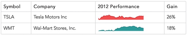
Figure 3-5. Different visual styles distinguish different types of data.
Step 5: Create a Unique Style for a Specific Chart
For the final step in this example, let’s consider the single stock at the top of CR Magazine’s list. Suppose we want to add distinct styles to its chart, and we know those styles only when we’re generating the HTML, not when we’re writing the JavaScript. How can we adjust the chart style if we can’t modify any JavaScript?
Sparklines let you add special attributes directly to the HTML element containing a chart. To set the line color, for example, you need to specify the attribute sparkLineColor. The problem is that if we were to enter this attribute directly in the HTML, the result wouldn’t be valid HTML, because the HTML specification doesn’t recognize the sparkLineColor attribute. To conform to the HTML standard, custom attributes must have names that begin with the prefix data-.
<tr>
<td>BMY</td>
<td>Bristol Meyers Squibb Co.</td>
➊ <td class="sparkline" data-LineColor="#679A00"
data-FillColor="#B6ED47">32.86,32.46,31.36,...</td>
<td>(2%)</td>
</tr>
To use HTML-compliant names to refer to sparklines’ custom attributes, we just need to tell the sparklines library how to find those names. For our HTML, we use the standard data- prefix instead of spark in at ➊.
Now we have to add a couple more options in our call to sparkline(). First we set enableTagOptions to true to tell the library that we’re including options directly in the HTML. Then we set tagOptionsPrefix to "data-" to specify the prefix we’re using for those attributes.
NOTE
As of this writing, the jQuery sparklines documentation for tagOptionsPrefix is not correct. The documentation lists the option as tagOptionPrefix, where option is singular instead of plural. The library’s code, however, expects the plural form.
If we use these options correctly, one of our charts will have the distinct color in Figure 3-6.
![]()
Figure 3-6. The sparklines library supports unique styling options for individual charts.
To pass the appropriate options to sparkline(), we can take advantage of the work we did in Step 5. Since we created a special object for default options, that’s the only object we have to change.
var sparkline_default = {
lineColor: "#006363",
fillColor: "#2D9999",
spotColor: false,
minSpotColor: false,
maxSpotColor: false,
enableTagOptions: true,
tagOptionsPrefix: "data-"
};
We only need to make the change in one place, and all of our calls to sparkline() use the new options. Here is the final, complete JavaScript code for this example.
$(function() {
var sparkline_default = {
lineColor: "#006363",
fillColor: "#2D9999",
spotColor: false,
minSpotColor: false,
maxSpotColor: false,
enableTagOptions: true,
tagOptionsPrefix: "data-"
};
var sparkline_barclays = $.extend( {}, sparkline_default, {
lineColor: "#A50000",
fillColor: "#FE4C4C"
});
$("tr:not(.barclays) .sparkline").sparkline("html",sparkline_default);
$("tr.barclays .sparkline").sparkline("html",sparkline_barclays);
}
Figure 3-7 shows the final result. We have a table that integrates text and charts, and we can style those charts appropriately and efficiently for the default case, for a special class, and for a unique value.
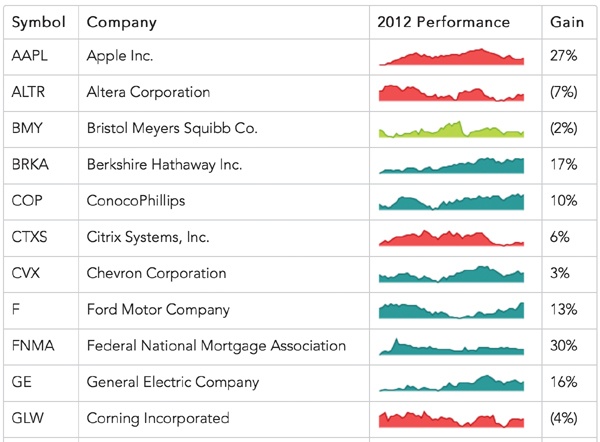
Figure 3-7. A complete example distinguishes different individual data sets in a larger collection.
Tracking Data Values uses a full-featured charting package for a similar result. If you don’t need the space efficiency of sparklines, consider that approach as an alternative.
Annotating Sparklines
Because they’re designed to maximize information density, sparklines omit many traditional chart components such as axes and labels. This approach certainly focuses on the data itself, but it can sometimes leave users without enough context to understand the data. Print versions usually rely on traditional text to supply this context, but on the Web we have more flexibility. We can present the data by itself in a sparkline, and we can give users the chance to explore the data’s context through interactions. Tool tips, which show additional information as a user hovers their mouse pointer over sections of a web page, can be an effective way to annotate a sparkline, so long as the users are accessing the page from a desktop computer. (Touch-based devices such as smartphones and tablets don’t typically support the concept of hover.) We’ll walk through a visualization that includes tool tips in this example; other examples in the chapter consider alternative approaches that may be more effective for touch devices. Let’s see how we can use a customized form of tool tips by enhancing the charts in the previous example. Just as in this chapter’s first example, we need to include the sparklines and jQuery libraries in our web page.
Step 1: Prepare the Data
In the previous examples, we’ve embedded the data directly in the HTML markup. That’s convenient since it lets us separate the data from our code. In this example, however, the JavaScript code will need more-detailed knowledge of the data so it can present the right tool tip information. This time we’ll use a JavaScript array to store our data so that all the relevant information is in one place. For this example, we can focus on a single stock. And even though we’re graphing only the adjusted closing price, the array will track additional data that we can include in the tool tips. Here’s an excerpt of the data for one of the stocks.
var stock = [
{ date: "2012-01-03", open: 409.40, high: 422.75, low: 409.00, close: 422.40,
volume: 10283900, adj_close: 416.26 },
{ date: "2012-01-09", open: 425.50, high: 427.75, low: 418.66, close: 419.81,
volume: 9327900, adj_close: 413.70 },
{ date: "2012-01-17", open: 424.20, high: 431.37, low: 419.75, close: 420.30,
volume: 10673200, adj_close: 414.19 },
// Data set continues...
Step 2: Prepare the HTML Markup
Our visualization will include three distinct areas, each in a <div> element.
<div id="stock">
<div style="float:left">
➊ <div class="chart"></div>
➋ <div class="info"></div>
</div>
<div style="float:left">
➌ <div class="details"></div>
</div>
</div>
The primary <div> created at ➊ will hold the chart. Underneath the chart we’ll add the primary tool tip information in its own <div> ➋, and we’ll include supplementary details to the right ➌. This example uses inline styles for clarity; a production site might prefer to use CSS style sheets.
Step 3: Add the Chart
Adding the chart to our markup is easy with the sparklines library. We can use the jQuery .map() function to extract the adjusted close value from our stock array. The minSpotColor and maxSpotColor options tell the library how to highlight the lowest and highest values for the year.
$("#stock .chart").sparkline(
$.map(stock, function(wk) { return wk.adj_close; }),
{
lineColor: "#006363",
fillColor: "#2D9999",
spotColor: false,
minSpotColor: "#CA0000",
maxSpotColor: "#CA0000"
}
);
The static chart of Figure 3-8 shows the stock performance nicely.

Figure 3-8. A static sparkline shows the change in the data set over time.
Step 4: Add the Primary Annotation
The sparklines library adds a simple tool tip to all of its charts by default. Although that tool tip shows the value over which the user’s mouse is hovering, the presentation isn’t particularly elegant, and, more importantly, it doesn’t provide as much information as we would like. Let’s enhance the default behavior to meet our needs.
Looking at the library’s defaults, we can retain the vertical marker, but we don’t want the default tool tip. Adding the option disableTooltips with a value of true will turn off the undesired tool tip.
For our own custom tool tip, we can rely on a handy feature of the sparklines library. The library generates a custom event whenever the user’s mouse moves over a chart region. That event is the sparklineRegionChange event. The library attaches a custom property, sparklines, to those events. By analyzing that property, we can determine the mouse’s location relative to the data.
$(".chart")
.on("sparklineRegionChange", function(ev) {
var idx = ev.sparklines[0].getCurrentRegionFields().offset;
➊ /* If it's defined, idx has the index into the
data array corresponding to the mouse pointer */
});
As the comment at ➊ indicates, the library sometimes generates the event when the mouse leaves the chart area. In those cases, a defined value for the offset will not exist.
Once we have the mouse position, we can place our tool tip information in the <div> we set aside for it.
if (idx) {
$(".info").html(
➊ "Week of " + stock[idx].date
+ " "
➋ + "Close: $" + stock[idx].adj_close);
}
We get the information at ➊ and ➋ from the stock array using the index value from the sparklineRegionChange event.
The sparklines library isn’t completely reliable in generating events when the mouse leaves the chart area. Instead of using the custom event, therefore, we can use the standard JavaScript mouseout event. When the user moves the mouse off the chart, we’ll turn off the custom tool tip by setting its content to a blank space. We use the HTML nonbreaking space ( ) so the browser doesn’t think the <div> is completely empty. If we used a standard space character, the browser would treat the <div> as empty and recalculate the height of the page, causing an annoying jump in the page contents. (For the same reason, we should initialize that <div> with instead of leaving it blank.)
.on("mouseout", function() {
$(".info").html(" ");
});
For the cleanest implementation, we combine all of these steps using method chaining. (To keep it concise, I’ve omitted the chart styling options in the following excerpt.)
$("#stock .chart")
.sparkline(
$.map(stock, function(wk) { return wk.adj_close; }),
{ disableTooltips: true }
).on("sparklineRegionChange", function(ev) {
var idx = ev.sparklines[0].getCurrentRegionFields().offset;
if (idx) {
$(".info").html(
"Week of " + stock[idx].date
+ " "
+ "Close: $" + stock[idx].adj_close);
}
}).on("mouseout", function() {
$(".info").html(" ");
});
Now with Figure 3-9 we have a nice, interactive tool tip that tracks the user’s mouse as it moves across the chart.
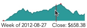
Figure 3-9. An interactive sparkline tracks the user’s mouse and provides information relevant to the mouse position.
Step 5: Provide Additional Information
The tool tip information we’ve added so far shows the immediately relevant information to the user: the week and the adjusted closing price of the stock. Our data, however, contains additional information that might be useful to the user. We can expand on the original tool tip by displaying that as well.
At the same time we update the primary tool tip region, let’s add the extra data.
$(".details").html(
"Open: $" + stock[idx].open + "<br/>"
+ "High: $" + stock[idx].high + "<br/>"
+ "Low: $" + stock[idx].low + "<br/>"
+ "Volume: " + stock[idx].volume
);
When we clear the primary tool tip region, we’ll clear this area as well.
$(".details").html("");
Because it won’t affect the vertical size of the page, we don’t need to fill this <div> with a dummy .
With Figure 3-10 we have the visualization we want. The chart clearly shows the overall trend for the stock during the year, but it takes up only a small amount of space on the web page. At first glance the chart is also free of distracting elements such as labels and axes. For users who just want a general sense of the stock’s performance, those elements are superfluous. Users who want the full details need only hover their mouse over the chart, and it reveals the complete market information.
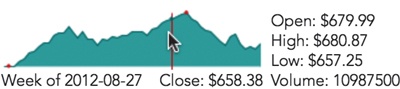
Figure 3-10. Interactive sparklines can show additional information in many ways.
Because we’ve managed to display the information while retaining the compact nature of sparklines, the technique in this example works well when combined with the small-multiples approach of this chapter’s second example. The next example includes an alternate method for showing the extra details.
Drawing Composite Charts
So far in this chapter, we’ve seen how sparklines can provide a lot of visual information in a very small space. That characteristic makes them perfect for integrating charts in a complete web page that includes text, tables, and other elements. We haven’t yet exhausted the capabilities of sparklines, however. We can increase the information density of our visualizations still further by creating composite charts—in effect, drawing multiple charts in the same space.
To see an example of this technique, we can build on the previous example. In that example we used a sparkline to show the closing price of a stock over an entire year. Price is indeed the most relevant data about a stock, but there’s another quantity that many investors like to see: the stock’s trading volume. And just as with price, it can be important to understand the trend for trading volume at a glance. That makes the value an excellent candidate for a chart.
Just as in this chapter’s first example, we need to include the sparklines and jQuery libraries in our web page. Because we’re visualizing the same data as in the previous example, we’ll also want to set up the data array and the HTML markup exactly as in that example.
Step 1: Draw the Trading Volume Chart
Even though we’re including a chart of trading volume, the most important quantity is the stock price. To keep the emphasis on stock price, we want to draw that chart on top of the chart for trading volume. That means we need to draw the trading volume chart first.
The code for trading volume is very similar to that of the stock price from the previous example. Instead of an area chart, however, we’ll use a bar chart.
$("#stock .chart").sparkline(
$.map(stock, function(wk) { return wk.volume; }),
➊ { type: "bar" }
);
We use the jQuery .map() function to extract the volume property from our data array. Setting the type option to "bar" at ➊ is all it takes to tell the sparklines library to create a bar chart.
Figure 3-11 shows the results.
![]()
Figure 3-11. The sparklines library can create bar charts as well as line charts.
Step 2: Add the Closing Price Chart
To add the price chart on top of the volume chart, we can call the sparklines library once again.
$("#stock .chart")
.sparkline(
$.map(stock, function(wk) { return wk.volume; }),
{
type: "bar"
}
).sparkline(
$.map(stock, function(wk) { return wk.adj_close; }),
{
➊ composite: true,
lineColor: "#006363",
fillColor: "rgba(45, 153, 153, 0.3)",
disableTooltips: true
}
);
We give it the same containing element and, most importantly, set the composite option to true at ➊. This parameter tells the library not to erase any existing chart in the element but to simply draw over it.
Notice the way we specify the fill color for the second chart. We set a transparency (or alpha) value of 0.3. This value makes the chart area nearly transparent, so the volume chart will show through. Note, though, that some older web browsers, notably IE8 and earlier, do not support the transparency standard. If your site has a significant number of users with those browsers, you might consider simply setting the fillColor option to false, which will disable filling the area entirely.
As Figure 3-12 shows, the result combines both charts in the same space.
![]()
Figure 3-12. Multiple charts may be combined in the same space.
Step 3: Add the Annotations
We can add annotations to the chart using the same approach as in the previous example. Because our charts now include the trading volume, it’s appropriate to move that value from the details area into the primary annotation <div>. The code to do that is a simple adjustment from the prior example.
.on("sparklineRegionChange", function(ev) {
➊ var idx = ev.sparklines[1].getCurrentRegionFields().offset;
if (idx) {
$(".info").html(
"Week of " + stock[idx].date
+ " Close: $" + stock[idx].adj_close
➋ + " Volume: "
+ Math.round(stock[idx].volume/10000)/100 + "M"
);
$(".details").html(
"Open: $" + stock[idx].open + "<br/>"
+ "High: $" + stock[idx].high + "<br/>"
+ "Low: $" + stock[idx].low
);
}
In addition to moving the text from one area to the other, we’ve made two significant changes.
§ We get the idx value from the second element of the event’s sparklines array (sparklines[1]) at ➊. That’s because the first element of that array is the first chart. The sparklines library doesn’t really return any useful information about bar charts in the sparklineRegionChange event. Fortunately, we can get all the information we need from the line bchart.
§ We show the trading volume in millions, rounded to two decimal places. The calculation is in at ➋. It’s much easier for users to quickly grasp “24.4M” than “24402100.”
As in the previous example, the annotations in our chart (shown in Figure 3-13) provide additional details.
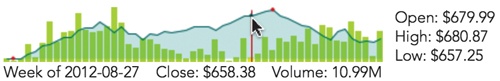
Figure 3-13. Tracking the mouse position makes it possible to interactively annotate the charts.
Step 4: Show Details as a Chart
So far we’ve shown the additional details for the stock (open, close, high, and low) as text values. As long as we’re drawing multiple charts, we can show those values graphically as well. The statistical box plot serves as a useful model for us. Traditionally, that plot type shows the range of a distribution, including deviations, quartiles, and medians. Visually, however, it provides a perfect model of a stock’s trading performance. We can use it to show the opening and closing prices, as well as the high and low values during the period.
The sparklines library can draw a box plot for us, but normally it calculates the values to display given the distribution as input data. In our case we don’t want to use the standard statistical calculations. Instead, we can use an option that tells the library to use precomputed values. The library expects at least five values:
§ The lowest sample value
§ The first quartile
§ The median
§ The third quartile
§ The highest sample value
For our example, we’ll provide the following values instead:
§ The lowest price
§ Whichever is less of the opening and closing prices
§ The adjusted closing price
§ Whichever is greater of the opening and closing prices
§ The highest price
We’ll also color the median bar red or green depending on whether the stock gained or lost value during the period.
This code creates that chart in response to the sparklineRegionChange event:
$("#composite-chart4 .details")
.sparkline([
➊ stock[idx].low,
Math.min(stock[idx].open,stock[idx].close),
stock[idx].adj_close,
Math.max(stock[idx].open,stock[idx].close),
stock[idx].high
], {
type: "box",
showOutliers: false,
➋ medianColor: (stock[idx].open < stock[idx].close)
➌ ? "green" : "red"
});
The data for the chart (shown at ➊) is simply the five values extracted from the stock data for the appropriate week. As ➋ and ➌ demonstrate, we can change the color of the median bar depending on whether the stock finished higher or lower for the day.
When the mouse leaves the chart region, we can remove the box plot by emptying its container.
$(".details").empty();
Now as our users mouse over the chart area, they can see a visual representation of the stock’s price range during each period (Figure 3-14).
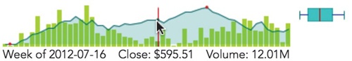
Figure 3-14. Interactive annotations can be charts themselves in addition to text.
Responding to Click Events
Throughout this chapter we’ve looked at how to include a lot of visual information in a small space, making it easier to integrate a visualization within a web page. The basic sparkline by itself is very efficient, and previous examples have added annotations and composites to increase the information density further. Sometimes, however, there’s just no way to fit all the possible data in a small enough space. Even in these cases, though, the interactive nature of the Web can help us out. Our web page can start with a compact visualization but expand to a different view—one with richer details—with a simple click or tap.
Indeed, the compact quality of sparklines seems to invite interaction. In every usability test I’ve performed that included sparklines on a web page, the participants invariably clicked on the chart. That was true even when there were no other details that the page could provide and the participants had no idea what to expect in response to their clicks. They clicked just to see what would happen.
This example continues our stock market example. We’ll begin with the same basic stock price chart we’ve seen before, but enhance it to provide details when users click on the chart region.
Just as in this chapter’s first example, we need to include the sparklines and jQuery libraries in our web page. Because we’re visualizing the same data as in the previous example, we’ll also want to set up the data array exactly as in that example. The HTML markup, however, can be much simpler. All we need is a <div> to hold the chart.
<div id="stock"></div>
Step 1: Add the Chart
Adding the chart to our markup is easy with the sparklines library. We can use the jQuery .map() function to extract the adjusted close value from our stock array.
$("#stock").sparkline($.map(stock, function(wk) { return wk.adj_close; }));
The static chart of Figure 3-15, which shows the stock performance, probably looks familiar by now.

Figure 3-15. Starting with a static chart ensures that the visualization is sound.
Step 2: Handle Click Events
The sparklines library makes it easy for us to handle click events. When users click on a chart region, the library generates a custom sparklineClick event. The event data includes all of the normal click properties, plus information about where on the chart the user clicked. To be notified of clicks, we define a handler for that custom event.
$("#stock")
.sparkline($.map(stock, function(wk) { return wk.adj_close; }))
.on("sparklineClick", function(ev) {
var sparkline = ev.sparklines[0],
region = sparkline.getCurrentRegionFields();
/* region.x and region.y are the coordinates of the click */
});
Now that we’re set up to receive sparklineClick events, we can write the code to respond to them. For our example, let’s reveal a detailed financial analysis widget. Many web services, including Yahoo and Google, have similar widgets, but we’ll use one from WolframAlpha. As is typical, WolframAlpha provides code for the widget as an HTML <iframe>. We can wrap that <iframe> in our own <div> and place it immediately after the chart. We set a display property of none so that the contents are initially hidden. (The following snippet omits the details of the <iframe> element for clarity.)
<div id="stock"></div>
<div id="widget" style="display:none"><iframe></iframe></div>
Now our event handling code can reveal the widget using the jQuery show() function.
.on("sparklineClick", function(ev) {
$("#widget").show();
});
That works to reveal the details, but as Figure 3-16 shows, the resulting presentation isn’t as elegant as it could be since the details appear so abruptly.
Figure 3-16. Mouse clicks can reveal more details for a chart.
Step 3: Improve the Transitions
Instead of simply revealing the widget beneath the chart, it would be better to have the widget replace the chart. And if we’re going to do that, we’ll also want to give users a chance to restore the chart and hide the widget.
<div id="stock"></div>
➊ <div id="widget-control" style="width:600px;display:none">
<a href="#" style="float:right">×</a>
</div>
<div id="widget" style="width:600px;display:none">
<iframe></iframe>
</div>
Here, we include a "widget-control" <div> ➊ for controlling the widget’s visibility. The only content we need for this controller is a close symbol floated right. Just like the widget itself, the controller is initially hidden.
Now when the user clicks on the chart, we reveal the widget, reveal the controller, and hide the chart.
.on("sparklineClick", function(ev) {
$("#widget").show();
$("#widget-control").show();
$("#stock").hide();
});
Next we intercept clicks on the close symbol in the widget controller. We first prevent default event handling; otherwise, the browser will jump disconcertingly to the top of the page. Then we hide the widget and its controller while revealing the chart again.
$("#widget-control a").click(function(ev) {
ev.preventDefault();
$("#widget").hide();
$("#widget-control").hide();
$("#stock").show();
})
Finally, we need to give the user some indication that this interaction is possible.
$("#stock")
.sparkline(
$.map(stock, function(wk) { return wk.adj_close; }),
➊ { tooltipFormatter: function() {return "Click for details"; } }
);
On the chart, we override the sparklines library’s default tool tip at ➊ to let users know that more details are available.
And now for the widget controller:
<div id="stock"></div>
<div id="widget-control" style="width:600px;display:none">
➊ <a href="#" title="Click to hide" style="float:right;">×</a>
</div>
<div id="widget" style="width:600px;display:none">
<iframe></iframe>
</div>
Here, we simply add a title attribute at ➊ to tell users how to hide the widget.
These additions give us the simple sparkline chart in Figure 3-17, which expands to offer a wealth of details with a single click. The close symbol in the upper-right corner lets users return to the more compact sparkline.
Figure 3-17. Mouse clicks can reveal more details for a chart.
Step 4: Animate
For the final touch to our visualization, let’s do something about the abrupt hiding and revealing of the visualization components. A smoother animation will help our users follow the transition, and jQuery makes it easy enough to implement. There are lots of animation effects available in the jQuery UI library, but the basic functionality of jQuery’s core is fine for this example. We simply replace the show() and hide() functions with slideDown() and slideUp(), respectively.
.on("sparklineClick", function(ev) {
$("#widget").slideDown();
$("#widget-control").slideDown();
$("#stock").slideUp();
});
$("#widget-control a").click(function(ev) {
ev.preventDefault();
$("#widget").slideUp();
$("#widget-control").slideUp();
$("#stock").slideDown();
})
At this point we can call our visualization complete; the final product is shown in Figure 3-18. The compact sparkline smoothly transitions to reveal detailed information when the user clicks, and those details transition back to the sparkline when the user closes them.
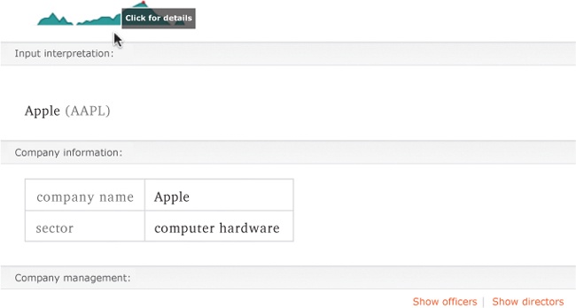
Figure 3-18. Animating transitions can make the visualization less jarring to users.
Updating Charts in Real Time
As we’ve seen in this chapter’s other examples, sparklines are great for integrating visualizations in a complete web page. They can be embedded in text content or used as table elements. Another application that suits sparklines well is an information dashboard. Effective dashboards summarize the health of the underlying system at a glance. When users don’t have the time to read through pages of texts or detailed graphics, the information density of sparklines makes them an ideal tool.
In addition to high information density, most dashboards have another requirement: they must be up-to-date. For web-based dashboards, that means the contents should be continuously updated, even while users are viewing the page. There is no excuse for requiring users to refresh their browsers. Fortunately, the sparklines library makes it easy to accommodate this requirement as well.
Just as in this chapter’s first example, we need to include the sparklines and jQuery libraries in our web page. For this visualization we’ll show both a chart and the most recent value of the data. We define <div> elements for each and place both in a containing <div>. The following code includes some styles inline, but you could place them in an external style sheet. Here the styles are just meant to position the value immediately to the right of the chart rather than on a separate line.
<div id="dashboard">
<div id="chart" style="float:left"></div>
<div id="value" style="float:left"></div>
</div>
Step 1: Retrieve the Data
In a real dashboard example, the server would provide the data to display and updates to that data. As long as the frequency of the updates was modest (not faster than once every five seconds or so), we could simply poll the server for updates on a regular interval. It’s probably not a good idea, however, to use the JavaScript setInterval() function to control the polling interval. That may seem strange at first because setInterval() executes a function periodically, which would seem to meet the requirements exactly. The situation is not quite that simple, however. If the server or network encounters a problem, then requests triggered by setInterval() will continue unabated, stacking up in a queue. Then, when communication with the server is restored, all of the pending requests will immediately finish, and we’d have a flood of data to handle.
To avoid this problem, we can use the setTimeout() function instead. That function executes only once, so we’ll have to keep calling it explicitly. By doing that, though, we can make sure that we send a request to the server only after the current one finishes. This approach avoids stacking up a queue of requests.
(function getData(){
setTimeout(function(){
// Request the data from the server
$.ajax({ url: "/api/data", success: function(data) {
// Data has the response from the server
// Now prepare to ask for updated data
➊ getData();
}, dataType: "json"});
}, 30000); // 30000: wait 30 seconds to make the request
➋ })();
Notice that the structure of the code defines the getData() function and immediately executes it. The closing pair of parentheses at ➋ triggers the immediate execution.
Within the success callback, we set up a recursive call to getData() at ➊ so the function executes again whenever the server responds with data.
Step 2: Update the Visualization
Whenever we receive updated information from the server, we can simply update the chart and value.
(function getData(){
setTimeout(function(){
// Request the data from the server
$.ajax({ url: "/api/data", success: function(data) {
➊ $("#chart").sparkline(data);
➋ $("#value").text(data.slice(-1));
getData();
}, dataType: "json"});
}, 30000); // 30000: wait 30 seconds to make the request
})();
The code needs only a straightforward call to the sparklines library and a jQuery function to update the value. We’ve added that to the code here at ➊ and ➋.
Figure 3-19 shows what a default chart looks like. Of course, you can specify both the chart and text styles as appropriate for your own dashboard.
![]()
Figure 3-19. A live updating chart can show real-time data.
Summing Up
In this chapter, we’ve considered various techniques for integrating visualizations within a web page. We’ve seen that sparklines are an excellent tool. Because they provide a lot of visual information in a small space, they leave room for other elements of the page, including text blocks, tables, and dashboards. We’ve considered several ways to increase the information density even further with annotations, composite charts, and click events. Finally, we looked at how to create charts that update in real time, accurately visualizing the up-to-the-minute status of an underlying system.
All materials on the site are licensed Creative Commons Attribution-Sharealike 3.0 Unported CC BY-SA 3.0 & GNU Free Documentation License (GFDL)
If you are the copyright holder of any material contained on our site and intend to remove it, please contact our site administrator for approval.
© 2016-2025 All site design rights belong to S.Y.A.