Data Visualization with JavaScript (2015)
Chapter 4. Creating Specialized Graphs
The first three chapters looked at different ways to create many common types of charts with JavaScript. But if your data has unique properties or if you want to show it in an unusual way, a more specialized chart might be more appropriate than a typical bar, line, or scatter chart.
Fortunately, there are many JavaScript techniques and plug-ins to expand our visualization vocabulary beyond the standard charts. In this chapter, we’ll look at approaches for several specialized chart types, including the following:
§ How to combine hierarchy and dimension with tree maps
§ How to highlight regions with heat maps
§ How to show links between elements with network graphs
§ How to reveal language patterns with word clouds
Visualizing Hierarchies with Tree Maps
Data that we want to visualize can often be organized into a hierarchy, and in many cases that hierarchy is itself an important aspect of the visualization. This chapter considers several tools for visualizing hierarchical data, and we’ll begin the examples with one of the simplest approaches: tree maps. Tree maps represent numeric data with two-dimensional areas, and they indicate hierarchies by nesting subordinate areas within their parents.
There are several algorithms for constructing tree maps from hierarchical data; one of the most common is the squarified algorithm developed by Mark Bruls, Kees Huizing, and Jarke J. van Wijk (http://www.win.tue.nl/~vanwijk/stm.pdf). This algorithm is favored for many visualizations because it usually generates visually pleasing proportions for the tree map area. To create the graphics in our example, we can use Imran Ghory’s treemap-squared library (https://github.com/imranghory/treemap-squared). That library includes code for both calculating and drawing tree maps.
Step 1: Include the Required Libraries
The treemap-squared library itself depends on the Raphaël library (http://raphaeljs.com/) for low-level drawing functions. Our markup, therefore, must include both libraries. The Raphaël library is popular enough for public CDNs to support.
<!DOCTYPE html>
<html lang="en">
<head>
<meta charset="utf-8">
<title></title>
</head>
<body>
<div id="treemap"></div>
➊ <script src="//cdnjs.cloudflare.com/ajax/libs/raphael/2.1.0/raphael-min.js">
</script>
➋ <script src="js/treemap-squared-0.5.min.js"></script>
</body>
</html>
As you can see, we’ve set aside a <div> to hold our tree map. We’ve also included the JavaScript libraries as the last part of the <body> element, as that provides the best browser performance. In this example, we’re relying on CloudFlare’s CDN ➊. We’ll have to use our own resources, however, to host the treemap-squared library ➋.
NOTE
See Step 1: Include the Required JavaScript Libraries for a more extensive discussion of CDNs and the tradeoffs involved in using them.
Step 2: Prepare the Data
For our example we’ll show the population of the United States divided by region and then, within each region, by state. The data is available from the US Census Bureau (http://www.census.gov/popest/data/state/totals/2012/index.html). We’ll follow its convention and divide the country into four regions. The resulting JavaScript array could look like the following snippet.
census = [
{ region: "South", state: "AL", pop2010: 4784762, pop2012: 4822023 },
{ region: "West", state: "AK", pop2010: 714046, pop2012: 731449 },
{ region: "West", state: "AZ", pop2010: 6410810, pop2012: 6553255 },
// Data set continues...
We’ve retained both the 2010 and the 2012 data.
To structure the data for the treemap-squared library, we need to create separate data arrays for each region. At the same time, we can also create arrays to label the data values using the two-letter state abbreviations.
var south = {};
south.data = [];
south.labels = [];
for (var i=0; i<census.length; i++) {
if (census[i].region === "South") {
south.data.push(census[i].pop2012);
south.labels.push(census[i].state);
}
}
This code steps through the census array to build data and label arrays for the "South" region. The same approach works for the other three regions as well.
Step 3: Draw the Tree Map
Now we’re ready to use the library to construct our tree map. We need to assemble the individual data and label arrays and then call the library’s main function.
var data = [ west.data, midwest.data, northeast.data, south.data ];
var labels = [ west.labels, midwest.labels, northeast.labels, south.labels ];
➊ Treemap.draw("treemap", 600, 450, data, labels);
The first two parameters at ➊ are the width and height of the map.
The resulting chart, shown in Figure 4-1, provides a simple visualization of the US population. Among the four regions, it is clear where most of the population resides. The bottom-right quadrant (the South) has the largest share of the population. And within the regions, the relative size of each state’s population is also clear. Notice, for example, how California dominates the West.
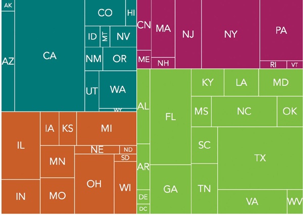
Figure 4-1. Tree maps show the relative size of data values using rectangular area.
Step 4: Vary the Shading to Show Additional Data
The tree map in Figure 4-1 does a nice job of showing the US population distribution in 2012. The population isn’t static, however, and we can enhance our visualization to indicate trends by taking advantage of the 2010 population data that’s still lurking in our data set. When we iterate through the census array to extract individual regions, we can also calculate a few additional values.
Here’s an expanded version of our earlier code fragment that includes these additional calculations.
var total2010 = 0;
var total2012 = 0;
var south = {
data: [],
labels: [],
growth: [],
minGrowth: 100,
maxGrowth: -100
};
for (var i=0; i<census.length; i++) {
➊ total2010 += census[i].pop2010;
➋ total2012 += census[i].pop2012;
➌ var growth = (census[i].pop2012 - census[i].pop2010)/census[i].pop2010;
if (census[i].region === "South") {
south.data.push(census[i].pop2012);
south.labels.push(census[i].state);
south.growth.push(growth);
➍ if (growth > south.maxGrowth) { south.maxGrowth = growth; }
➎ if (growth < south.minGrowth) { south.minGrowth = growth; }
}
// Code continues...
}
Let’s walk through those additional calculations:
§ We accumulate the total population for all states, both in 2010 and in 2012, at ➊ and ➋, respectively. These values let us calculate the average growth rate for the entire country.
§ For each state, we can calculate its growth rate at ➌.
§ For each region, we save both the minimum and maximum growth rates at ➍ and ➎.
In the same way that we created a master object for the data and the labels, we create another master object for the growth rates. Let’s also calculate the total growth rate for the country.
var growth = [ west.growth, midwest.growth, northeast.growth, south.growth ];
var totalGrowth = (total2012 - total2010)/total2010;
Now we need a function to calculate the color for a tree-map rectangle. We start by defining two color ranges, one for growth rates higher than the national average and another for lower growth rates. We can then pick an appropriate color for each state, based on that state’s growth rate. As an example, here’s one possible set of colors.
var colorRanges = {
positive: [ "#FFFFBF","#D9EF8B","#A6D96A","#66BD63","#1A9850","#006837" ],
negative: [ "#FFFFBF","#FEE08B","#FDAE61","#F46D43","#D73027","#A50026" ]
};
Next is the pickColor() function that uses these color ranges to select the right color for each box. The treemap-squared library will call it with two parameters—the coordinates of the rectangle it’s about to draw, and the index into the data set. We don’t need the coordinates in our example, but we will use the index to find the value to model. Once we find the state’s growth rate, we can subtract the national average. That calculation determines which color range to use. States that are growing faster than the national average get the positive color range; states growing slower than the average get the negative range.
The final part of the code calculates where on the appropriate color range to select the color.
function pickColor(coordinates, index) {
var regionIdx = index[0];
var stateIdx = index[1];
var growthRate = growth[regionIdx][stateIdx];
var deltaGrowth = growthRate - totalGrowth;
if (deltaGrowth > 0) {
colorRange = colorRanges.positive;
} else {
colorRange = colorRanges.negative;
deltaGrowth = -1 * deltaGrowth;
}
var colorIndex = Math.floor(colorRange.length*(deltaGrowth-minDelta)/
(maxDelta-minDelta));
if (colorIndex >= colorRange.length) { colorIndex = colorRange.length - 1;
}
color = colorRange[colorIndex];
return{ "fill" : color };
}
The code uses a linear scale based on the extreme values from among all the states. So, for example, if a state’s growth rate is halfway between the overall average and the maximum growth rate, we’ll give it a color that’s halfway in the positive color range array.
Now when we call TreeMap.draw(), we can add this function to its parameters, specifically by setting it as the value for the box key of the options object. The treemap-squared library will then defer to our function for selecting the colors of the regions.
Treemap.draw("treemap", 600, 450, data, labels, {"box" : pickColor});
The resulting tree map of Figure 4-2 still shows the relative populations for all of the states. Now, through the use of color shades, it also indicates the rate of population growth compared to the national average. The visualization clearly shows the migration from the Northeast and Midwest to the South and West.
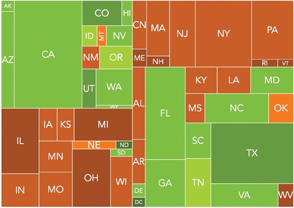
Figure 4-2. Tree maps can use color as well as area to show data values.
Highlighting Regions with a Heat Map
If you work in the web industry, heat maps may already be a part of your job. Usability researchers often use heat maps to evaluate site designs, especially when they want to analyze which parts of a web page get the most attention from users. Heat maps work by overlaying values, represented as semitransparent colors, over a two-dimensional area. As the example in Figure 4-3 shows, different colors represent different levels of attention. Users focus most on areas colored red, and less on yellow, green, and blue areas.
For this example, we’ll use a heat map to visualize an important aspect of a basketball game: from where on the court the teams are scoring most of their points. The software we’ll use is the heatmap.js library from Patrick Wied (http://www.patrick-wied.at/static/heatmapjs/). If you need to create traditional website heat maps, that library includes built-in support for capturing mouse movements and mouse clicks on a web page. Although we won’t use those features for our example, the general approach is much the same.
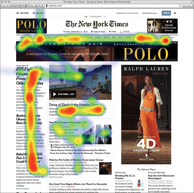
Figure 4-3. Heat maps traditionally show where web users focus their attention on a page.
Step 1: Include the Required JavaScript
For modern browsers, the heatmap.js library has no additional requirements. The library includes optional additions for real-time heat maps and for geographic integration, but we won’t need these in our example. Older browsers (principally IE8 and older) can use heatmap.js with the explorer canvas library. Since we don’t need to burden all users with this library, we’ll use conditional comments to include it only when it’s needed. Following current best practices, we include all script files at the end of our <body>.
<!DOCTYPE html>
<html lang="en">
<head>
<meta charset="utf-8">
<title></title>
</head>
<body>
<!--[if lt IE 9]><script src="js/excanvas.min.js"></script><![endif]-->
<script src="js/heatmap.js"></script>
</body>
</html>
Step 2: Define the Visualization Data
For our example, we’ll visualize the NCAA Men’s Basketball game on February 13, 2013, between Duke University and the University of North Carolina. Our data set (http://www.cbssports.com/collegebasketball/gametracker/live/NCAAB_20130213_UNC@DUKE) contains details about every point scored in the game. To clean the data, we convert the time of each score to minutes from the game start, and we define the position of the scorer in x- and y-coordinates. We’ve defined these coordinates using several important conventions:
§ We’ll show North Carolina’s points on the left side of the court and Duke’s points on the right side.
§ The bottom-left corner of the court corresponds to position (0,0), and the top-right corner corresponds to (10,10).
§ To avoid confusing free throws with field goals, we’ve given all free throws a position of (–1, –1).
Here’s the beginning of the data; the full data is available with the book’s source code (http://jsDataV.is/source/).
var game = [
{ team: "UNC", points: 2, time: 0.85, unc: 2, duke: 0, x: 0.506, y: 5.039 },
{ team: "UNC", points: 3, time: 1.22, unc: 5, duke: 0, x: 1.377, y: 1.184 },
{ team: "DUKE", points: 2, time: 1.65 unc: 5, duke: 2, x: 8.804, y: 7.231 },
// Data set continues...
Step 3: Create the Background Image
A simple diagram of a basketball court, like that in Figure 4-4, works fine for our visualization. The dimensions of our background image are 600×360 pixels.
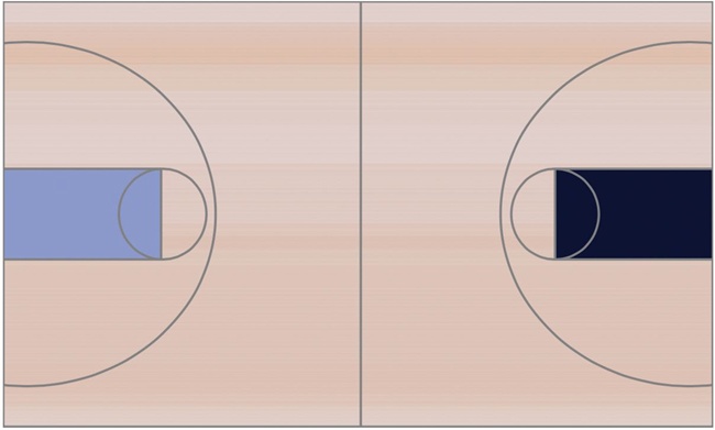
Figure 4-4. A background image sets the context for the visualization.
Step 4: Set Aside an HTML Element to Contain the Visualization
In our web page, we need to define the element (generally a <div>) that will hold the heat map. When we create the element, we specify its dimensions, and we define the background. The following fragment does both of those using inline styles to keep the example concise. You might want to use a CSS style sheet in an actual implementation.
<div id="heatmap"
style="position:relative;width:600px;height:360px;
background-image:url('img/basketball.png');">
</div>
Notice that we’ve given the element a unique id. The heatmap.js library needs that id to place the map on the page. Most importantly, we also set the position property to relative. The heatmap.js library positions its graphics using absolute positioning, and we want to contain those graphics within the parent element.
Step 5: Format the Data
For our next step, we must convert the game data into the proper format for the library. The heatmap.js library expects individual data points to contain three properties:
§ The x-coordinate, measured in pixels from the left of the containing element
§ The y-coordinate, measured in pixels from the top of the containing element
§ The magnitude of the data point (specified by the count property)
The library also requires the maximum magnitude for the entire map, and here things get a little tricky. With standard heat maps, the magnitudes of all the data points for any particular position sum together. In our case, that means that all the baskets scored from layups and slam dunks—which are effectively from the same position on the court—are added together by the heat-map algorithm. That one position, right underneath the basket, dominates the rest of the court. To counteract that effect, we specify a maximum value far less than what the heat map would expect. In our case, we’ll set the maximum value to 3, which means that any location where at least three points were scored will be colored red, and we’ll easily be able to see all the baskets.
We can use JavaScript to transform the game array into the appropriate format.
➊ var docNode = document.getElementById("heatmap");
➋ var height = docNode.clientHeight;
➌ var width = docNode.clientWidth;
➍ var dataset = {};
➎ dataset.max = 3;
➏ dataset.data = [];
for (var i=0; i<game.length; i++) {
var currentShot = game[1];
➐ if ((currentShot.x !== -1) && (currentShot.y !== -1)) {
var x = Math.round(width * currentShot.x/10);
var y = height - Math.round(height * currentShot.y/10);
dataset.data.push({"x": x, "y": y, "count": currentShot.points});
}
}
We start by fetching the height and width of the containing element at ➊, ➋, and ➌. If those dimensions change, our code will still work fine. Then we initialize the dataset object ➍, with a max property ➎and an empty data array ➏. Finally, we iterate through the game data and add relevant data points to this array. Notice that we’re filtering out free throws at ➐.
Step 6: Draw the Map
With a containing element and a formatted data set, it’s a simple matter to draw the heat map. We create the heat-map object (the library uses the name h337 in an attempt to be clever) by specifying the containing element, a radius for each point, and an opacity. Then we add the data set to this object.
var heatmap = h337.create({
element: "heatmap",
radius: 30,
opacity: 50
});
heatmap.store.setDataSet(dataset);
The resulting visualization in Figure 4-5 shows where each team scored its points.
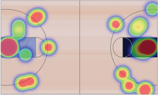
Figure 4-5. The heat map shows successful shots in the game.
Step 7: Adjust the Heat Map z-index
The heatmap.js library is especially aggressive in its manipulation of the z-index property. To ensure that the heat map appears above all other elements on the page, the library explicitly sets this property to a value of 10000000000. If your web page has elements that you don’t want the heat map to obscure (such as fixed-position navigation menus), that value is probably too aggressive. You can fix it by modifying the source code directly. Or, as an alternative, you can simply reset the value after the library finishes drawing the map.
If you’re using jQuery, the following code will reduce the z-index to a more reasonable value.
$("#heatmap canvas").css("z-index", "1");
Showing Relationships with Network Graphs
Visualizations don’t always focus on the actual data values; sometimes the most interesting aspects of a data set are the relationships among its members. The relationships between members of a social network, for example, might be the most important feature of that network. To visualize these types of relationships, we can use a network graph. Network graphs represent objects, generally known as nodes, as points or circles. Lines or arcs (technically called edges) connect these nodes to indicate relationships.
Constructing network graphs can be a bit tricky, as the underlying mathematics is not always trivial. Fortunately, the Sigma library (http://sigmajs.org/) takes care of most of the complicated calculations. By using that library, we can create full-featured network graphs with just a little bit of JavaScript. For our example, we’ll consider one critic’s list of the top 25 jazz albums of all time (http://www.thejazzresource.com/top_25_jazz_albums.html). Several musicians performed on more than one of these albums, and a network graph lets us explore those connections.
Step 1: Include the Required Libraries
The Sigma library does not depend on any other JavaScript libraries, so we don’t need any other included scripts. It is not, however, available on common content distribution networks. Consequently, we’ll have to serve it from our own web host.
<!DOCTYPE html>
<html lang="en">
<head>
<meta charset="utf-8">
<title></title>
</head>
<body>
➊ <div id="graph"></div>
➋ <script src="js/sigma.min.js"></script>
</body>
</html>
As you can see, we’ve set aside a <div> to hold our graph at ➊. We’ve also included the JavaScript library as the last part of the <body> element at ➋, as that provides the best browser performance.
NOTE
In most of the examples in this book, I included steps you can take to make your visualizations compatible with older web browsers such as IE8. In this case, however, those approaches degrade performance so severely that they are rarely workable. To view the network graph visualization, your users will need a modern browser.
Step 2: Prepare the Data
Our data on the top 25 jazz albums looks like the following snippet. I’m showing only the first couple of albums, but you can see the full list in the book’s source code (http://jsDataV.is/source/).
var albums = [
{
album: "Miles Davis - Kind of Blue",
musicians: [
"Cannonball Adderley",
"Paul Chambers",
"Jimmy Cobb",
"John Coltrane",
"Miles Davis",
"Bill Evans"
]
},{
album: "John Coltrane - A Love Supreme",
musicians: [
"John Coltrane",
"Jimmy Garrison",
"Elvin Jones",
"McCoy Tyner"
]
// Data set continues...
That’s not exactly the structure that Sigma requires. We could convert it to a Sigma JSON data structure in bulk, but there’s really no need. Instead, as we’ll see in the next step, we can simply pass data to the library one element at a time.
Step 3: Define the Graph’s Nodes
Now we’re ready to use the library to construct our graph. We start by initializing the library and indicating where it should construct the graph. That parameter is the id of the <div> element set aside to hold the visualization.
var s = new sigma("graph");
Now we can continue by adding the nodes to the graph. In our case, each album is a node. As we add a node to the graph, we give it a unique identifier (which must be a string), a label, and a position. Figuring out an initial position can be a bit tricky for arbitrary data. In a few steps, we’ll look at an approach that makes the initial position less critical. For now, though, we’ll simply spread our albums in a circle using basic trigonometry.
for (var idx=0; idx<albums.length; idx++) {
var theta = idx*2*Math.PI / albums.length;
s.graph.addNode({
id: ""+idx, // Note: 'id' must be a string
label: albums[idx].album,
x: radius*Math.sin(theta),
y: radius*Math.cos(theta),
size: 1
});
}
Here, the radius value is roughly half of the width of the container. We can also give each node a different size, but for our purposes it’s fine to set every album’s size to 1.
Finally, after defining the graph, we tell the library to draw it.
s.refresh();
With Figure 4-6, we now have a nicely drawn circle of the top 25 jazz albums of all time. In this initial attempt, some of the labels may get in one another’s way, but we’ll address that shortly.
If you try out this visualization in the browser, you’ll notice that the Sigma library automatically supports panning the graph, and users can move their mouse pointer over individual nodes to highlight the node labels.
Figure 4-6. Sigma draws graph nodes as small circles.
Step 4: Connect the Nodes with Edges
Now that we have the nodes drawn in a circle, it’s time to connect them with edges. In our case, an edge—or connection between two albums—represents a musician who performed on both of the albums. Here’s the code that finds those edges.
➊ for (var srcIdx=0; srcIdx<albums.length; srcIdx++) {
var src = albums[srcIdx];
➋ for (var mscIdx=0; mscIdx<src.musicians.length; mscIdx++) {
var msc = src.musicians[mscIdx];
➌ for (var tgtIdx=srcIdx+1; tgtIdx<albums.length; tgtIdx++) {
var tgt = albums[tgtIdx];
➍ if (tgt.musicians.some(function(tgtMsc) {return tgtMsc === msc;}))
{
s.graph.addEdge({
id: srcIdx + "." + mscIdx + "-" + tgtIdx,
source: ""+srcIdx,
target: ""+tgtIdx
})
}
}
}
}
To find the edges, we iterate through the albums in four stages.
1. Loop through each album as a potential source of a connection at ➊.
2. For the source album, loop through all musicians at ➋.
3. For each musician, loop through all of the remaining albums as potential targets for a connection at ➌.
4. For each target album, loop through all the musicians at ➍, looking for a match.
For the last step we’re using the .some() method of JavaScript arrays. That method takes a function as a parameter, and it returns true if that function itself returns true for any element in the array.
We’ll want to insert this code before we refresh the graph. When we’ve done that, we’ll have a connected circle of albums, as shown in Figure 4-7.
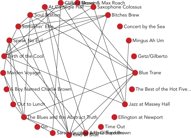
Figure 4-7. Sigma can then connect graph nodes using lines to represent edges.
Again, you can pan and zoom in on the graph to focus on different parts.
Step 5: Automate the Layout
So far we’ve manually placed the nodes in our graph in a circle. That’s not a terrible approach, but it can make it hard to discern some of the connections. It would be better if we could let the library calculate a more optimal layout than the simple circle. That’s exactly what we’ll do now.
The mathematics behind this approach is known as force-directed graphing. In a nutshell, the algorithm proceeds by treating the graph’s nodes and edges as physical objects subject to real forces such as gravity and electromagnetism. It simulates the effect of those forces, pushing and prodding the nodes into new positions on the graph.
The underlying algorithm may be complicated, but Sigma makes it easy to employ. First we have to add the optional forceAtlas2 plug-in to the Sigma library.
<!DOCTYPE html>
<html lang="en">
<head>
<meta charset="utf-8">
<title></title>
</head>
<body>
<div id="graph"></div>
<script src="js/sigma.min.js"></script>
<script src="js/sigma.layout.forceAtlas2.min.js"></script>
</body>
</html>
Mathieu Jacomy and Tommaso Venturini developed the specific force-direction algorithm employed by this plug-in; they document the algorithm, known as ForceAtlas2, in the 2011 paper “ForceAtlas2, A Graph Layout Algorithm for Handy Network Visualization” (http://webatlas.fr/tempshare/ForceAtlas2_Paper.pdf). Although we don’t have to understand the mathematical details of the algorithm, knowing how to use its parameters does come in handy. There are three parameters that are important for most visualizations that use the plug-in:
§ gravity. This parameter determines how strongly the algorithm tries to keep isolated nodes from drifting off the edges of the screen. Without any gravity, the only force acting on isolated nodes will be one that repels them from other nodes; undeterred, that force will push the nodes off the screen entirely. Since our data includes several isolated nodes, we’ll want to set this value relatively high to keep those nodes on the screen.
§ scalingRatio. This parameter determines how strongly nodes repel each other. A small value draws connected nodes closer together, while a large value forces all nodes farther apart.
§ slowDown. This parameter decreases the sensitivity of the nodes to the repulsive forces from their neighbors. Reducing the sensitivity (by increasing this value) can help reduce the instability that may result when nodes face competing forces from multiple neighbors. In our data there are many connections that will tend to draw the nodes together and compete with the force pulling them apart. To dampen the wild oscillations that might otherwise ensue, we’ll set this value relatively high as well.
The best way to settle on values for these parameters is to experiment with the actual data. The values we’ve settled on for this data set are shown in the following code.
s.startForceAtlas2({gravity:100,scalingRatio:70,slowDown:100});
setTimeout(function() { s.stopForceAtlas2(); }, 10000);
Now, instead of simply refreshing the graph when we’re ready to display it, we start the force-directed algorithm, which periodically refreshes the display while it performs its simulation. We also need to stop the algorithm after it’s had a chance to run for a while. In our case, 10 seconds (10000 milliseconds) is plenty of time.
As a result, our albums start out in their original circle, but quickly migrate to a position that makes it much easier to identify the connections. Some of the top albums are tightly connected, indicating that they have many musicians in common. A few, however, remain isolated. Their musicians make the list only once.
As you can see in Figure 4-8, the labels for the nodes still get in the way of one another; we’ll fix that in the next step. What’s important here, however, is that it’s much easier to identify the albums with lots of connections. The nodes representing those albums have migrated to the center of the graph, and they have many links to other nodes.
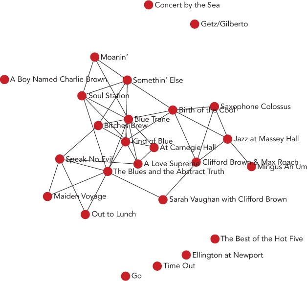
Figure 4-8. Force direction positions the graph nodes automatically.
Step 6: Add Interactivity
To keep the labels from interfering with one another, we can add some interactivity to the graph. By default, we’ll hide the labels entirely, giving users the chance to appreciate the structure of the graph without distractions. We’ll then allow them to click on individual nodes to reveal the album title and its connections.
for (var idx=0; idx<albums.length; idx++) {
var theta = idx*2*Math.PI / albums.length;
s.graph.addNode({
id: ""+idx, // Note: 'id' must be a string
➊ label: "",
➋ album: albums[idx].album,
x: radius*Math.sin(theta),
y: radius*Math.cos(theta),
size: 1
});
}
To suppress the initial label display, we modify the initialization code at ➊ so that nodes have blank labels. We save a reference to the album title, though, at ➋.
Now we need a function that responds to clicks on the node elements. The Sigma library supports exactly this sort of function with its interface. We simply bind to the clickNode event.
s.bind("clickNode", function(ev) {
var nodeIdx = ev.data.node.id;
// Code continues...
});
Within that function, the ev.data.node.id property gives us the index of the node that the user clicked. The complete set of nodes is available from the array returned by s.graph.nodes(). Since we want to display the label for the clicked node (but not for any other), we can iterate through the entire array. At each iteration, we either set the label property to an empty string (to hide it) or to the album property (to show it).
s.bind("clickNode", function(ev) {
var nodeIdx = ev.data.node.id;
var nodes = s.graph.nodes();
nodes.forEach(function(node) {
➊ if (nodes[nodeIdx] === node) {
node.label = node.album;
} else {
node.label = "";
}
});
});
Now that users have a way to show the title of an album, let’s give them a way to hide it. A small addition at ➊ is all it takes to let users toggle the album display with subsequent clicks.
if (nodes[nodeIdx] === node && node.label !== node.album) {
As long as we’re making the graph respond to clicks, we can also take the opportunity to highlight the clicked node’s connections. We do that by changing their color. Just as s.graph.nodes() returns an array of the graph nodes, s.graph.edges() returns an array of edges. Each edge object includes target and source properties that hold the index of the relevant node.
s.graph.edges().forEach(function(edge) {
if ((nodes[nodeIdx].label === nodes[nodeIdx].album) &&
➊ ((edge.target === nodeIdx) || (edge.source === nodeIdx))) {
➋ edge.color = "blue";
} else {
➌ edge.color = "black";
}
});
Here we scan through all the graph’s edges to see if they connect to the clicked node. If the edge does connect to the node, we change its color at ➋ to something other than the default. Otherwise, we change the color back to the default at ➌. You can see that we’re using the same approach to toggle the edge colors as we did to toggle the node labels on successive clicks at ➊.
Now that we’ve changed the graph properties, we have to tell Sigma to redraw it. That’s a simple matter of calling s.refresh().
s.refresh();
Now we have a fully interactive network graph in Figure 4-9.
Revealing Language Patterns with Word Clouds
Data visualizations don’t always focus on numbers. Sometimes the data for a visualization centers on words instead, and a word cloud is often an effective way to present this kind of data. Word clouds can associate any quantity with a list of words; most often that quantity is a relative frequency. This type of word cloud, which we’ll create for our next example, reveals which words are common and which are rare.
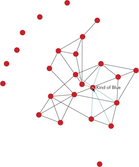
Figure 4-9. An interactive graph gives users the chance to highlight specific nodes.
To create this visualization, we’ll rely on the wordcloud2 library (http://timdream.org/wordcloud2.js), a spin-off from author Tim Dream’s HTML5 Word Cloud project (http://timc.idv.tw/wordcloud/).
NOTE
As is the case with a few of the more advanced libraries we’ve examined, wordcloud2 doesn’t function very well in older web browsers such as IE8 and earlier. Since wordcloud2 itself requires a modern browser, for this example we won’t worry about compatibility with older browsers. This will free us to use some other modern JavaScript features, too.
Step 1: Include the Required Libraries
The wordcloud2 library does not depend on any other JavaScript libraries, so we don’t need any other included scripts. It is not, however, available on common content distribution networks, so we’ll have to serve it from our own web host.
<!DOCTYPE html>
<html lang="en">
<head>
<meta charset="utf-8">
<title></title>
</head>
<body>
<script src="js/wordcloud2.js"></script>
</body>
</html>
To keep our example focused on the visualization, we’ll use a word list that doesn’t need any special preparation. If you’re working with natural language as spoken or written, however, you might wish to process the text to identify alternate forms of the same word. For example, you might want to count hold, holds, and held as three instances of hold rather than three separate words. This type of processing obviously depends greatly on the particular language. If you’re working in English and Chinese, though, the same developer that created wordcloud2 has also released the WordFreq JavaScript library (http://timdream.org/wordfreq/), which performs exactly this type of analysis.
Step 2: Prepare the Data
For this example, we’ll look at the different tags users associate with their questions on the popular Stack Overflow (http://stackoverflow.com/). That site lets users pose programming questions that the community tries to answer. Tags provide a convenient way to categorize the questions so that users can browse other posts related to the same topic. By constructing a word cloud (perhaps better named a tag cloud), we can quickly show the relative popularity of different programming topics.
If you wanted to develop this example into a real application, you could access the Stack Overflow data in real time using the site’s API. For our example, though, we’ll use a static snapshot. Here’s how it starts:
var tags = [
["c#", 601251],
["java", 585413],
["javascript", 557407],
["php", 534590],
["android", 466436],
["jquery", 438303],
["python", 274216],
["c++", 269570],
["html", 259946],
// Data set continues...
In this data set, the list of tags is an array, and each tag within the list is also an array. These inner arrays have the word itself as the first item and a count for that word as the second item. You can see the complete list in the book’s source code (http://jsDataV.is/source/).
The format that wordcloud2 expects is quite similar to how our data is already laid out, except that in each word array, the second value needs to specify the drawing size for that word. For example, the array element ["javascript", 56] would tell wordcloud2 to draw javascript with a height of 56 pixels. Our data, of course, isn’t set up with pixel sizes. The data value for javascript is 557407, and a word 557,407 pixels high wouldn’t even fit on a billboard. As a result, we must convert counts to drawing sizes. The specific algorithm for this conversion will depend both on the size of the visualization and on the raw values. A simple approach that works in this case is to divide the count values by 10,000 and round to the nearest integer.
var list = tags.map(function(word) {
return [word[0], Math.round(word[1]/10000)];
});
In Chapter 2, we saw how jQuery’s .map() function makes it easy to process all the elements in an array. It turns out that modern browsers have the same functionality built in, so here we use the native version of .map() even without jQuery. (This native version won’t work on older browsers like jQuery will, but we’re not worrying about that for this example.)
After this code executes, our list variable will contain the following:
[
["c#", 60],
["java", 59],
["javascript", 56],
["php", 53],
["android", 47],
["jquery", 44],
["python", 27],
["c++", 27],
["html", 26],
// Data set continues...
Step 3: Add the Required Markup
The wordcloud2 library can build its graphics either using the HTML <canvas> interface or in pure HTML. As we’ve seen with many graphing libraries, <canvas> is a convenient interface for creating graphic elements. For word clouds, however, there aren’t many benefits to using <canvas>. Native HTML, on the other hand, lets us use all the standard HTML tools (such as CSS style sheets or JavaScript event handling). That’s the approach we’ll take in this example.
<!DOCTYPE html>
<html lang="en">
<head>
<meta charset="utf-8">
<title></title>
</head>
<body>
➊ <div id="cloud" style="position:relative;"></div>
<script src="js/wordcloud2.js"></script>
</body>
</html>
When using native HTML, we do have to make sure that the containing element has a position: relative style, because wordcloud2 relies on that when placing the words in their proper location in the cloud. You can see that here we’ve set that style inline at ➊.
Step 4: Create a Simple Cloud
With these preparations in place, creating a simple word cloud is about as easy as it can get. We call the wordcloud2 library and tell it the HTML element in which to draw the cloud, and the list of words for the cloud’s data.
WordCloud(document.getElementById("cloud"), {list: list});
Even with nothing other than default values, wordcloud2 creates the attractive visualization shown in Figure 4-10.
The wordcloud2 interface also provides many options for customizing the visualization. As expected, you can set colors and fonts, but you can also change the shape of the cloud (even providing a custom polar equation), rotation limits, internal grid sizing, and many other features.

Figure 4-10. A word cloud can show a list of words with their relative frequency.
Step 5: Add Interactivity
If you ask wordcloud2 to use the <canvas> interface, it gives you a couple of callback hooks that your code can use to respond to user interactions. With native HTML, however, we aren’t limited to just the callbacks that wordcloud2 provides. To demonstrate, we can add a simple interaction to respond to mouse clicks on words in the cloud.
First we’ll let users know that interactions are supported by changing the cursor to a pointer when they hover the mouse over a cloud word.
#cloud span {
cursor: pointer;
}
Next let’s add an extra element to the markup where we can display information about any clicked word.
<!DOCTYPE html>
<html lang="en">
<head>
<meta charset="utf-8">
<title></title>
</head>
<body>
<div id="cloud" style="position:relative;"></div>
➊ <div id="details"><div>
<script src="js/wordcloud2.js"></script>
</body>
</html>
Here we’ve added the <div> with the id details at ➊.
Then we define a function that can be called when the user clicks within the cloud.
var clicked = function(ev) {
➊ if (ev.target.nodeName === "SPAN") {
// A <span> element was the target of the click
}
}
Because our function will be called for any clicks on the cloud (including clicks on empty space), it first checks to see if the target of the click was really a word. Words are contained in <span> elements, so we can verify that by looking at the nodeName property of the click target. As you can see at ➊, JavaScript node names are always uppercase.
If the user did click on a word, we can find out which word by looking at the textContent property of the event target.
var clicked = function(ev) {
if (ev.target.nodeName === "SPAN") {
➊ var tag = ev.target.textContent;
}
}
After ➊, the variable tag will hold the word on which the user clicked. So, for example, if a user clicks on the word javascript, then the tag variable will have the value "javascript".
Since we’d like to show users the total count when they click on a word, we’re going to need to find the word in our original data set. We have the word’s value, so that’s simply a matter of searching through the data set to find a match. If we were using jQuery, the .grep() function would do just that. In this example, we’re sticking with native JavaScript, so we can look for an equivalent method in pure JavaScript. Unfortunately, although there is such a native method defined—.find()—very few browsers, even modern ones, currently support it. We could resort to a standard for or forEach loop, but there is an alternative that many consider an improvement over that approach. It relies on the .some() method, an array method that modern browsers support. The .some() method passes every element of an array to an arbitrary function and stops when that function returns true. Here’s how we can use it to find the clicked tag in our tags array.
var clicked = function(ev) {
if (ev.target.nodeName === "SPAN") {
var tag = ev.target.textContent;
var clickedTag;
➊ tags.some(function(el) {
➋ if (el[0] === tag) {
clickedTag = el;
return true; // This ends the .some() loop
}
➌ return false;
➍ });
}
}
The function that’s the argument to .some() is defined beginning at ➊ and ending at ➍. It is called with the parameter el, short for an element in the tags array. The conditional statement at ➋ checks to see if that element’s word matches the clicked node’s text content. If so, the function sets the clickedTag variable and returns true to terminate the .some() loop.
If the clicked word doesn’t match the element we’re checking in the tags array, then the function supplied to .some() returns false at ➌. When .some() sees a false return value, it continues iterating through the array.
We can use the return value of the .some() method to make sure the clicked element was found in the array. When that’s the case, .some() itself returns true.
var clicked = function(ev) {
var details = "";
if (ev.target.nodeName === "SPAN") {
var tag = ev.target.textContent,
clickedTag;
if (tags.some(function(el) {
if (el[0] === tag) {
clickedTag = el;
return true;
}
return false;
})) {
➊ details = "There were " + clickedTag[1] +
➋ " Stack Overflow questions tagged \"" + tag + "\"";
}
}
➌ document.getElementById("details").innerText = details;
}
At ➊ and ➋ we update the details variable with extra information. At ➌ we update the web page with those details.
And finally we tell the browser to call our handler when a user clicks on anything in the cloud container.
document.getElementById("cloud").addEventListener("click", clicked)
With these few lines of code, our word cloud is now interactive, as shown in Figure 4-11.

Figure 4-11. Because our word cloud consists of standard HTML elements, we can make it interactive with simple JavaScript event handlers.
Summing Up
In this chapter, we’ve looked at several different special-purpose visualizations and some JavaScript libraries that can help us create them. Tree maps are handy for showing both hierarchy and dimension in a single visualization. Heat maps can highlight varying intensities throughout a region. Network graphs reveal the connections between objects. And word clouds show relative relationships between language properties in an attractive and concise visualization.
All materials on the site are licensed Creative Commons Attribution-Sharealike 3.0 Unported CC BY-SA 3.0 & GNU Free Documentation License (GFDL)
If you are the copyright holder of any material contained on our site and intend to remove it, please contact our site administrator for approval.
© 2016-2025 All site design rights belong to S.Y.A.