Wrox Press Java Programming 24-Hour Trainer 2nd (2015)
Lesson 18. Introduction to GUI with JavaFX
JavaFX was created to compete with formerly popular Rich Internet Application (RIA) frameworks, such as Adobe Flex and Microsoft Silverlight. In reality JavaFX never became competitive in the RIA space, but it presents a better and more modern alternative for Swing when it comes to developing a graphical user interface (GUI) in Java. Whereas Swing was built on top of the old AWT library, JavaFX is not. Also, while JavaFX is bundled with Java SE 8, it’s not a part of it.
With JavaFX you can develop the GUI either in Java or use a mix of FXML and Java. The FXML is an XML-based markup language that enables you to define GUI components in a declarative way. The sources of such GUI definitions would be stored in a text files with the extension .fxml, which represent a view in the Model View Controller (MVC) architecture. The business code and access to data would be still written in Java using a rich library of JavaFX components. Using FXML for GUI promotes the clean separation of the code between the MVC layers. JavaFX offers a design tool called Scene Builder that allows designing the GUI by dragging the GUI components from a toolbar onto the window’s real estate.
In this lesson you’ll learn how to program JavaFX application in Java. In Lesson 19 you’ll see how to use Scene Builder to make a GUI design process a lot more enjoyable and simple by using FXML.
You can find JavaFX documentation at the following Oracle website: http://docs.oracle.com/javase/8/javase-clienttechnologies.htm.
In this lesson you discover the basics of creating GUI with JavaFX 8. In the next lesson you create a tic-tac-toe game with JavaFX .
JavaFX Application Basics
JavaFX uses theater terminology. To create an application, you instantiate a stage object first. Pretend that you’re a play director and need to set up one or more scenes (think views). The backbone of each scene is a scene graph—a hierarchical tree of GUI nodes (think GUI containers and components). Each node can be styled using the Cascading Style Sheet (CSS) file. You can also apply effects and transitions to nodes. You can assign event handlers to nodes if need be. On the top of the scene graph you create a root node.
JavaFX classes are located in the packages javafx.stage and javafx.scene. The main class of a JavaFX application extends Application and has the following structure:
public class Main extends Application {
public void start(Stage primaryStage) {
// Create your stage and scenes here
}
public static void main(String[] args) {
launch(args);
}
}
The JavaFX framework calls the Application ’s methods launch(), init() , and then start(). The method init() is called on the launcher thread, and is the right place to create all required GUI components. The start() method is the main entry point to the JavaFX application. The start() method is called on the application thread and is the right place for creating objects to be placed on the first scene of the stage, which plays a similar role as JFrame or JDialog in Swing.
Embedding Swing in JavaFX
Swing and the Java FX application run on different threads. To reuse existing Swing components inside JavaFX applications, use the class SwingNode.
Using the E(fx)clipse Plug-in
Modern IDE speed up JavaFX programming by providing code generators, embedded Scene Builder and good support of FXML. The best IDE for developing JavaFX application is NetBeans. IntelliJ IDEA goes next. Since we use Eclipse IDE in this book, we’ll need to install an Eclipse plug-in called E(fx)clipse.
Open the Eclipse menu Help → Install New Software. Click the Add button and include the following URL in the location field to get the latest version: http://download.eclipse.org/efxclipse/updates-nightly/site as shown in Figure 18-1.
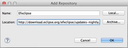
Figure 18-1: Adding the location of the E(fx)clipse plug-in
Click OK, and check all components as shown in Figure 18-2.
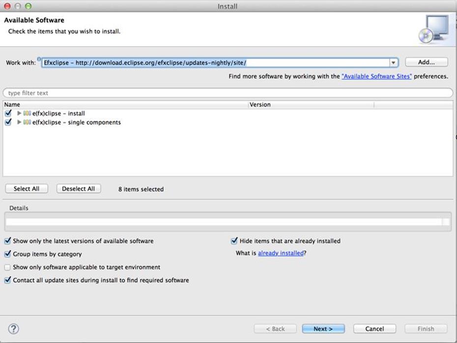
Figure 18-2: Selecting the plug-in’s components for installation
Complete the install by clicking Next and then clicking Finish. Eclipse restarts and you’re ready to create JavaFX projects.
Create a new HelloFX project. Select File→New→Other→JavaFX→JavaFX Project and give your project a name HelloFX. You see a new project with content like that shown in Figure 18-3.
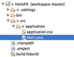
Figure 18-3: The newly generated JavaFX project
This project has auto-generated a Main class that launches the application; it also auto-generated the empty file application.css, where you can add styles. The generated class Main looks like this:
public class Main extends Application {
@Override
public void start(Stage primaryStage) {
try {
BorderPane root = new BorderPane();
Scene scene = new Scene(root,400,400);
scene.getStylesheets().add(getClass()
.getResource("application.css").toExternalForm());
primaryStage.setScene(scene);
primaryStage.show();
} catch(Exception e) {
e.printStackTrace();
}
}
public static void main(String[] args) {
launch(args);
}
}
Run the Main program, and a window with no title and no content opens. This windows has a width and height of 400 pixels. The reference to the stage is given by the Application to the method start() as an argument. After that the code assigns the BorderPane layout (see the Layouts section) to the root node and creates a 400 x 400 scene with this empty node. The auto-generated file application.css is empty, but if it had some styles defined, the scene would be styled accordingly.
In the next section you modify this code to use JavaFX layouts.
Layouts
Similarly to Java Swing layout managers (see Lesson 9), JavaFX has layouts that help with arranging GUI controls on the scene and keeping the arrangement for different stage sizes. In addition to using the built-in layouts, you can customize the positioning of the nodes on the scene using CSS.
This section includes only two code samples of using layouts, and it assumes that you’ve mastered Lessons 8 and 9 and understand the concept. Refer to the product documentation to see how other layouts work.
JavaFX has the following layout container classes (layout panes):
· HBox
· VBox
· FlowPane
· GridPane
· BorderPane
· StackPane
· TilePane
· AnchorPane
The HBox class (the horizontal box) places controls in a row next to each other. The vertical box VBox places controls vertically. The FlowPane places the nodes in a row and then wraps to the next row if there is no room in the current one.
The GridPane is similar to Swing’s GridBagLayout described in Lesson 8. It enables you to arrange user interface (UI) controls in rows and columns and assign constraints to each cell.
The BorderPane can split the scene into as many as five regions, similar to Swing’s BorderLayout, but in JavaFX these areas are called left, top, right, bottom, and center.
The TilePane layout is similar to the FlowPane, but it places each node in a cell of the same size (like tiles on the wall). Say, you need to display several images in a tile layout. Adding the ImageView nodes to the TilePane shows them as tiles next to each other.
The StackPane layout is similar to the Swing’s CardLayout. Only one child node is shown at a time covering the other nodes.
The AnchorPane enables you to anchor nodes at the left, top, right, and bottom of the scene. Imagine a music player application with the Rewind button on the left and the Fast Forward button on the right. Say you want to ensure that the Rewind button always remains 20 pixels away from the left border of the window and 10 pixels from the bottom. You want to maintain this positioning even if the user resizes the window. For that you can use the leftAnchor and bottomAnchor properties. For example,
AnchorPane.setLeftAnchor(rewindBtn, 20);
AnchorPane.setBottomAnchor(rewindBtn, 10);
Each of these layouts can be configured in terms of alignments, padding, margins and other properties.
Typically you’ll be going through the following steps with any layout:
1. Create instances of child nodes to be used within the layout container.
2. Create an instance of the selected layout class (for example, HBox). This instance serves as a container and a layout manager for all child nodes that you add to it.
3. Add the child nodes to the container using either the add() or addAll() method.
4. If this layout instance needs to be used inside another layout (for example, an HBox can be placed inside the BorderPane), add the instance created in Step 1 to the parent container by using the method add().
Let’s see how it works using the HBox example.
A Sample Application with the HBox Layout
Say you need to ask the user to enter his or her e-mail and send it to some Java code that knows how to process it. This example use sthe following JavaFX components: Label, Button, and TextField, which are located in the javafx.scene.control package.
With the help of the E(fx)clipse plug-in, create a new JavaFX Main class HBoxSample (use File→New→Other→JavaFX→Classes). It creates the following class:
public class HBoxSample extends Application {
public void start(Stage primaryStage) {
}
public static void main(String[] args) {
launch(args);
}
}
Now you need to create instances of Label, TextField, and Button set their properties, and add them to the instance of HBox. Add the following code to the start() method:
Label emailLbl = new Label("Email:");
TextField emailTxt = new TextField();
emailTxt.setPrefColumnCount(20);
emailTxt.setPromptText("Your email");
Button submitBtn = new Button("Submit");
HBox emailBox = new HBox(5); // spacing between children 5 px
emailBox.setPadding(new Insets(3)); // space around HBox
emailBox.getChildren().addAll(emailLbl, emailTxt, submitBtn);
Scene scene = new Scene(emailBox,750,100);
primaryStage.setScene(scene);
primaryStage.show();
Run the HBoxSample program, and you see a window similar to the one shown in Figure 18-4.

Figure 18-4: Running the HBoxSample
The prompt “Your email” is not shown in the text field because it has focus, but as soon as this control loses focus you see it.
Make a small change to this program by replacing instantiation of the HBox with VBox, and these components will be laid out vertically one under another (you need to increase the height of the scene to see all three components).
A Sample Application with the GridPane Layout
GridPane divides the selected scene area into rows and columns and places nodes into the grid cells. Cells don’t have to be of the same size—nodes can span. If the screen size changes, the content doesn’t wrap and maintains the grid.
Before placing the node into a cell, you have to specify grid constraints, such as rowIndex and columnIndex (the coordinate of the cell, which starts with 0,0). The rowSpan and columnSpan allow to make the cell as wide (or as tall) as several other cells. The GridPane documentationdescribes lots of various constraints that can define the behavior of each cell’s content if the windows are resized. This section shows you a basic example that uses some of the constraints.
This example creates a login window where the user can enter the ID and password, and then press the Sign In button. The scene uses the GridPane layout. The first row contains a Label and TextField for the user ID; the second row has a setup for the password; and the third row of the grid has one button (Sign In) that should span two columns. Figure 18-5 below shows how the window should look.
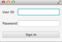
Figure 18-5: The Sign In window
Following is the code of the class GridPaneSample that rendered this window:
public class GridPaneSample extends Application {
public void start(Stage primaryStage) {
final int TWO_COLUMN_SPAN = 2;
Label userIdLbl = new Label("User ID:");
TextField userIdTxt = new TextField();
Label userPwdLbl = new Label("Password:");
PasswordField userPwdTxt = new PasswordField();
GridPane root = new GridPane();
root.setVgap(20);
root.setPadding(new Insets(10));
root.setAlignment(Pos.CENTER);
// Using static methods for setting node constraints
GridPane.setConstraints(userIdLbl, 0, 0);
GridPane.setConstraints(userIdTxt, 1, 0);
GridPane.setConstraints(userPwdLbl, 0, 1);
GridPane.setConstraints(userPwdTxt, 1, 1);
root.getChildren().addAll(userIdLbl, userIdTxt,
userPwdLbl, userPwdTxt);
Button signInBtn = new Button ("Sign In");
// Allow the button to be wider overriding preferred width
signInBtn.setPrefWidth(Double.MAX_VALUE);
// using instance method for directly adding the node
root.add(signInBtn,0,2,TWO_COLUMN_SPAN,1);
Scene scene = new Scene(root,250,150);
primaryStage.setScene(scene);
primaryStage.show();
}
public static void main(String[] args) {
launch(args);
}
}
The code creates two instances of the Label , one TextField and one PasswordField, to mark entered characters. I could have created the instance of the Button too, but decided to do it a bit later to demonstrate a different way of setting constraints.
Then the code calls a static method setConstraints() on the class GridPane to allocate the GUI controls to the appropriate cells. The coordinates of the top-left cell are (0,0). The label User ID goes there. The next cell to the right has the coordinates (1,0). Note that the column’s number goes first. The label Password goes to the cell (0,1), and the text field for the password is placed in the cell (1,1).
Note that the width of the second column is noticeably wider than the first one. The width of the column is automatically determined to accommodate the widest node. The same applies to the height of the rows.
After that the code creates an instance of a Button and sets its preferred width to large. Without setting the width, I was not able to specify that this button should span two columns. To demonstrate a different syntax of setting constraints, I’ve placed the button to the cell (0,2) using theGridPane instance method add(). The third and fourth arguments are for specifying the row and column spans. My button’s cell is twice as wide as regular cells of this grid.
The examples in the next sections further modify the class GridPaneSample to demonstrate event handling and skinning.
Skinning with CSS
Using CSS became a de facto standard way of styling UI in web applications. This process is known as skinning. You can apply different skins on the same GUI components to change the look of the UI. Applying the skin comes down to loading the CSS file into your JavaFX application. Even though you can style JavaFX GUI components programmatically (for example, using setFont() or setFill()) separating styling from programming allows professional web designers to take care of the look and feel while software developers implement application logic. Besides, changing the style doesn’t require recompilation and redeployment of your application.
Covering CSS is out of scope of this book, but you can get familiar with the CSS syntax by going through the CSS specification (JavaFX supports CSS 2.1) or by reading a CSS books. This section shows you a simple example of how the look of the GUI can be changed without the need to modify the Java code. Keep in mind, though, that JavaFX style names are similar, but they’re not the same as those defined in the CSS specification. JavaFX styles start with the prefix fx-.
You can create CSS selectors to style a specific GUI component, a type of components (for example, all labels ), or create a reusable style that can be applied programmatically to selected components.
To style a specific component, the component has to have a unique ID, which can be set in your Java code using the method setId(). For example, if a button has an ID of submitBtn, you can add the following section to the CSS file to make its background color red (you can find the names of the main CSS colors online) :
#submitBtn{
-fx-background-color: red;
}
In CSS, the ID type selectors start with the # sign. To make the style in the preceding code work, your Java code should have something like this:
Button signInBtn = new Button ("Sign In");
signInBtn.setId("submitBtn");
If you want to apply a style to several components of the same type, you need to define a type selector. For example, to make the text of all Label components red, you can define the following CSS type selector:
.label{
-fx-text-fill: red;
}
Note that CSS type selectors start with the dot. To create a CSS class selector that can be applied to any component, define under the selector under an arbitrary name and apply it programmatically to the components of your choice. For example, you can specify the following class selector:
.bluelabel{
-fx-text-fill: blue;
-fx-font-weight: bold;
-fx-font-family:verdana;
-fx-font-style:italic;
}
This class selector defines rules that displays the text of the label in blue bold verdana font in italic style. To apply this class selector to a specific label, your Java code should have something like this:
Label userPwdLbl = new Label("Password:");
userPwdLbl.getStyleClass().add("bluelabel");
For this particular label, the style bluelabel overrides the type selector that may have been applied to all other labels on stage.
You may ask, “How am I supposed to know which style properties are available for a given JavaFX component?" For styles that are supported by JavaFX, refer to the online document titled "JavaFX CSS Reference Guide."
It’s time to find out how to apply all these styling techniques to the GridPaneSample from the previous section. I named the new version of this class GridPaneSampleCSS, and its code is shown next. I’ve added only three lines to the GridPaneSample code, which are shown in bold.
public class GridPaneSampleCSS extends Application {
public void start(Stage primaryStage) {
final int TWO_COLUMN_SPAN = 2;
Label userIdLbl = new Label("User ID:");
TextField userIdTxt = new TextField();
Label userPwdLbl = new Label("Password:");
userPwdLbl.getStyleClass().add("bluelabel");
PasswordField userPwdTxt = new PasswordField();
GridPane root = new GridPane();
root.setVgap(20);
root.setPadding(new Insets(10));
root.setAlignment(Pos.CENTER);
// Using static methods for setting node constraints
GridPane.setConstraints(userIdLbl, 0, 0);
GridPane.setConstraints(userIdTxt, 1, 0);
GridPane.setConstraints(userPwdLbl, 0, 1);
GridPane.setConstraints(userPwdTxt, 1, 1);
root.getChildren().addAll(userIdLbl, userIdTxt,
userPwdLbl, userPwdTxt);
Button signInBtn = new Button ("Sign In");
signInBtn.setId("submitBtn"); // used in CSS
// Allow the button to be wider overriding preferred width
signInBtn.setPrefWidth(Double.MAX_VALUE);
// using instance method for directly adding the node
root.add(signInBtn,0,2,TWO_COLUMN_SPAN,1);
Scene scene = new Scene(root,250,180);
scene.getStylesheets().add(getClass()
.getResource("application.css").toExternalForm());
primaryStage.setScene(scene);
primaryStage.show();
}
public static void main(String[] args) {
launch(args);
}
}
This application loads the application.css file with the following content:
#submitBtn{
-fx-background-color: lightskyblue;
-fx-font-family:verdana;
-fx-font-size:20;
-fx-font-weight: bold;
-fx-stroke:navy;
-fx-font-style:italic;
-fx-border-radius: 20;
-fx-background-radius: 20;
-fx-padding: 5;
}
.label{
-fx-text-fill: red;
}
.bluelabel{
-fx-text-fill: blue;
-fx-font-weight: bold;
-fx-font-family:verdana;
-fx-font-style:italic;
}
First, it defines the style for the JavaFX component with the ID submitBtn. Then it defines a rule that all labels should be red. There is no need to write any JavaFX code to apply these styles. There is also a class selector named bluelabel, which can be applied selectively. Note that you need to add a -fx- prefix to the standard CSS properties for them to be recognizable by JavaFX applications. Running the program GridPanelSampleCSS produces the output shown in Figure 18-6.
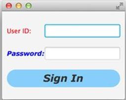
Figure 18-6: The styled Sign In window
For further details of skinning the JavaFX GUI, read Oracle’s online tutorial "Skinning JavaFX Applications with CSS."
Event Handling
Similarly to the Swing framework events covered in Lesson 9, JavaFX applications are also event-driven. In JavaFX, an event object is represented by the instance of the class javafx.event.Event. There are different ways of handling events. Depending on how you structured your application, you can assign event handlers either in Java or in FXML. Lesson 19 shows you how to hook up event handlers to GUI components declared in FXML. But if your program is written in purely in Java, you’ll be assigning event handlers in Java as well. But in any case, the code that handles events will be always written in Java.
Before writing event handlers for your application you need to decide which events are important and have to be handled in your application. For example, there is no need to write and event handler for the label from the Sign In application. But we do need to handle the Sign In and Cancel button click events. If the user ID would be represented by an email, we would need to intercept and handle the moment when the text field loses focus. In this lesson I’ll only show you how to handle the button clicks. For detailed coverage of handling JavaFX events read the Oracle tutorial.
You can handle events using one of the following techniques:
· Create an instance of an anonymous class overriding its handle() callback method. Pass it to the the event handler for a specific event.
· Use lambda expressions.
· Use Java method references.
This example creates yet another version of the Sign In window, but this time the window has the Sign In and Cancel buttons as well as the Forgot Password hyperlink. Each of these controls use a different way of handling the click event. The new Sign In window will look like the one inFigure 18-7.
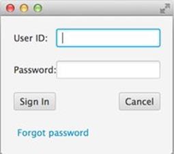
Figure 18-7: The Sign In window with event handlers
The event handler for the Sign In button is implemented using an anonymous inner class. The event handler for the Cancel button is implemented using a lambda expression. Finally, I implement the click handler for the Forgot Password hyperlink using a method reference. The code of the class GridPaneSampleEvents is shown next.
public class GridPaneSampleEvents extends Application {
public void start(Stage primaryStage) {
Label userIdLbl = new Label("User ID:");
TextField userIdTxt = new TextField();
Label userPwdLbl = new Label("Password:");
PasswordField userPwdTxt = new PasswordField();
Button signInBtn = new Button ("Sign In");
Button cancelBtn = new Button ("Cancel");
Hyperlink forgotPwdLink = new Hyperlink("Forgot password");
GridPane root = new GridPane();
root.setVgap(20);
root.setPadding(new Insets(10));
root.setAlignment(Pos.CENTER);
// Using static methods for setting node constraints
GridPane.setConstraints(userIdLbl, 0, 0);
GridPane.setConstraints(userIdTxt, 1, 0);
GridPane.setConstraints(userPwdLbl, 0, 1);
GridPane.setConstraints(userPwdTxt, 1, 1);
GridPane.setConstraints(signInBtn, 0, 2);
//Cancel button: span 1, right aligned
GridPane.setConstraints(cancelBtn, 1,2, 1, 1, HPos.RIGHT,
VPos.CENTER);
GridPane.setConstraints(forgotPwdLink, 0, 3,2,1);
root.getChildren().addAll(userIdLbl, userIdTxt, userPwdLbl,
userPwdTxt,signInBtn, cancelBtn, forgotPwdLink);
// Event handlers
//1. Anonymous class
signInBtn.setOnAction(new EventHandler<ActionEvent>(){
public void handle(ActionEvent evt){
System.out.println(
"Anonymous class handler. Sign in clicked.");
}
});
// lambda expression
cancelBtn.setOnAction(evt ->
System.out.println("Lambda handler. Cancel clicked.")
);
// method reference
forgotPwdLink.setOnAction(this::forgotPwdHandler);
// Show the window
Scene scene = new Scene(root,250,200);
primaryStage.setScene(scene);
primaryStage.show();
}
private void forgotPwdHandler(ActionEvent evt){
System.out.println(
"Method reference handler. Forgot password clicked");
}
public static void main(String[] args) {
launch(args);
}
}
If you run this program, and click Sign In, Cancel, or Forgot Password, the console output shows the following:
Anonymous class handler. Sign in clicked.
Lambda handler. Cancel clicked.
Method reference handler. Forgot password clicked.
Although each of the event handlers works the same, I prefer the lambda expression version because it’s concise and is easy to read. Each of the JavaFX GUI controls has a set of setOnXXX() methods (for example, setOnAction() and setOnMouseMoved()) that should be called for the events you’re interested in handling.
Properties and Binding
Although Java developers casually use the words properties referring to class attributes, JavaFX properties are more than just class attributes. JavaFX defines an interface javafx.beans.property.Property, which has a very useful functionality enabling you to bind the GUI components (the view) with properties of the Java classes (the model) and automate notifications of the GUI components when the value in the model changes or vice versa.
Imagine that you’re developing a financial application that receives notification from the server about the stock price changes. When a Java object receives a new price, you need to modify the content of the corresponding GUI component. With JavaFX you can simply bind a property price of a Java class to the property of, say, a Label component. No more coding is required. As soon as the price value changes, the Label is automatically updated. JavaFX properties greatly simplify the process of synchronization of the data and the GUI.
Existing implementations of the Property interface serve as wrappers to Java attributes adding the change notification functionality. The interface Property declares the following methods: bind(), unbind(), bindBidirectional() , unbindBidirctional(), and isBound(). Can you bind any value to a JavaFX property? No—the value has to be of an ObservableValue type.
Observer Design Pattern
In software development there is a design pattern called Observer. It’s used to implement scenarios when one object (the observer) wants to watch changes in other object(s) (the observables). For example, if a Twitter user (the observable) posts a tweet, all of his followers (observers) are notified. You can read more about this and other design patterns at http://www.javacamp.org/designPattern.
JavaFX property classes are located in the package javafx.beans.property. For each property type there are two classes: read-only and read-write. For example, if you need to work with a String property, use either SimpleStringProperty or ReadOnlyStringWrapper. Both of these implement theStringProperty interface. Similarly named classes exist for other data types and some collections too.
As you always do in this book, you can learn by coding. This time you’re going to modify the GridPaneSampleEvents class from the previous section by placing an additional Label component at the bottom of the Sign In window. It’ll display the messages about the events as the user clicks the buttons and the hyperlink. Initially this label does not have any text:
Label messageLbl = new Label();
JavaFX properties are observables. Hence you can add a listener (observer) to the property to be notified when the property value changes. But it’s much easier to simply use a property in a binding expressions. You bind this label to the string property, and as soon as the value of this property changes, the label component messageLbl displays this value.
private StringProperty message = new SimpleStringProperty();
messageLbl.textProperty().bind(message);
In the previous section, the class GridePaneSampleEvents was just printing messages on the system console when the user clicked the buttons or the hyperlink. The new class GridPaneSampleBinding modifies the property message instead, for example:
cancelBtn.setOnAction(evt ->
message.set("Cancel clicked.")
);
The click on the cancelBtn changes the value of the the message property, which was bound to the text property of messageLbl; the GUI changes automatically! Figure 18-8 below shows how the Sign In window will look like after the user has pressed the Cancel button.
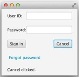
Figure 18-8: Binding in action
The complete code of the GridPaneSampleBinding class is shown here:
public class GridPaneSampleBinding extends Application {
//Declaring a JavaFX property
private StringProperty message = new SimpleStringProperty();
public void start(Stage primaryStage) {
Label userIdLbl = new Label("User ID:");
TextField userIdTxt = new TextField();
Label userPwdLbl = new Label("Password:");
PasswordField userPwdTxt = new PasswordField();
Button signInBtn = new Button ("Sign In");
Button cancelBtn = new Button ("Cancel");
Hyperlink forgotPwdLink = new Hyperlink("Forgot password");
// A label to display messages using binding
Label messageLbl = new Label();
// binding the StringProperty to a GUI component
messageLbl.textProperty().bind(message);
GridPane root = new GridPane();
root.setVgap(20);
root.setPadding(new Insets(10));
root.setAlignment(Pos.CENTER);
// Using static methods for setting node constraints
GridPane.setConstraints(userIdLbl, 0, 0);
GridPane.setConstraints(userIdTxt, 1, 0);
GridPane.setConstraints(userPwdLbl, 0, 1);
GridPane.setConstraints(userPwdTxt, 1, 1);
GridPane.setConstraints(signInBtn, 0, 2);
//Cancel button: span 1, right aligned
GridPane.setConstraints(cancelBtn, 1,2, 1, 1,
HPos.RIGHT, VPos.CENTER);
GridPane.setConstraints(forgotPwdLink, 0, 3,2,1);
// Message label: span 2
GridPane.setConstraints(messageLbl, 0,4,2,1);
root.getChildren().addAll(userIdLbl, userIdTxt, userPwdLbl,
userPwdTxt,signInBtn, cancelBtn, forgotPwdLink, messageLbl);
// event handlers
//1. Anonymous class
signInBtn.setOnAction(new EventHandler<ActionEvent>(){
public void handle(ActionEvent evt){
message.set("Sign in clicked.");
}
});
// lambda expression
cancelBtn.setOnAction(evt ->
message.set("Cancel clicked.")
);
// method reference
forgotPwdLink.setOnAction(this::forgotPwdHandler);
// Show the window
Scene scene = new Scene(root,250,220);
primaryStage.setScene(scene);
primaryStage.show();
}
private void forgotPwdHandler(ActionEvent evt){
message.set("Forgot password clicked");
}
public static void main(String[] args) {
launch(args);
}
}
The binding can be bidirectional. If the value of the GUI component changes, it can change the value of the underlying model (remember MVC?), and if the value of the model changes then the GUI is updated, too. If you want to stop binding at any time, use the method unbind()—for example:
messageLbl.textProperty().unbind();
I tried to fit as much information as possible in this introductory lesson so you can start working on the assignment. In Lesson 19 you apply all these techniques while developing a game.
Try It
Re-create the the calculator from Chapter 8 as a JavaFX application.
Lesson Requirements
You should have Java installed.
NOTE You can download the code samples from this lesson from the book’s web page at www.wrox.com/go/javaprog24hr2e. You can find them in the Lesson18.zip.
Step-by-Step
1. Create a new JavaFX project in Eclipse.
2. Create a class Calculator that extends Application (you can rename the Main class).
3. Using JavaFX layouts, re-create the Calculator GUI.
4. Create the class CalculatorController that implements EventHandler to process clicks on the buttons with digits.
5. Use JavaFX binding between the display field of the Calculator and a String property of the CalculatorController to display the entered number
6. Implement at least one operation (e.g., addition) and display the result using binding. See Try It section of Lesson 19 for a sample implementation of calculator’s functionality.
TIP Please select the videos for Lesson 18 online at www.wrox.com/go/javaprog24hr2e. You will also be able to download the code and resources for this lesson from the website.
All materials on the site are licensed Creative Commons Attribution-Sharealike 3.0 Unported CC BY-SA 3.0 & GNU Free Documentation License (GFDL)
If you are the copyright holder of any material contained on our site and intend to remove it, please contact our site administrator for approval.
© 2016-2026 All site design rights belong to S.Y.A.