Excel 2016 for Windows Pivot Tables (2016)
1. Pivot Table Basics
You can use Excel’s pivot tables to quickly create concise, flexible summaries of long lists of raw values, without having to write new formulas, copy and paste cells, or reorganize rows and columns. Pivot tables are dynamic: if you create a pivot table from, say, census data, then you can drag your mouse to rearrange the table so that it summarizes any variables of interest—age, gender, location, education, income, and so on. Rearranging a pivot table by swapping or moving rows and columns is called pivoting: turning the same information to view it at different angles. The jargon associated with pivot tables (“n-dimensional cross tabulations”) makes them look complex, but they’re really no more than an easy way to build flexible summary tables.
Excel offers other features for analyzing large amounts of data—including outlines, automatic subtotals, and statistical functions—but if you’re working with hundreds (or hundreds of thousands) of rows, then pivot tables are the best way to look at the same information in different ways, summarize data on the fly, and spot trends and relationships.
Downloading the Sample Workbook
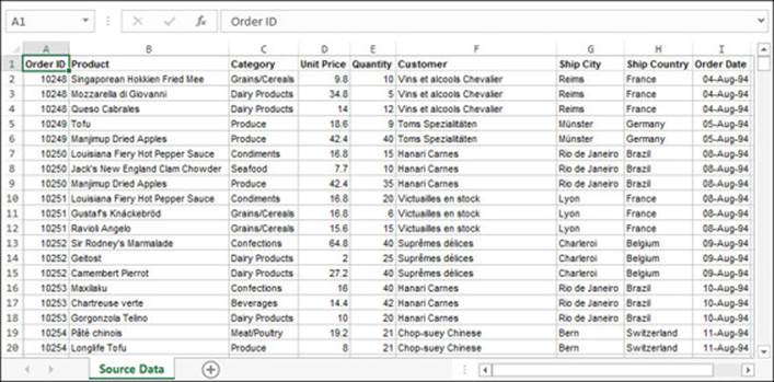
To create a pivot table, you need a long list of raw data values to summarize. (A short list works too but doesn’t show the real power of pivot tables.) To follow along with the examples in this book, download the Excel workbook orders16.xlsx from questingvolepress.com ![]() . In orders16.xlsx, the worksheet named Source Data contains a list of 2155 records (rows) from grocery-item orders.
. In orders16.xlsx, the worksheet named Source Data contains a list of 2155 records (rows) from grocery-item orders.
Data Requirements for Pivot Tables
Pivot tables let you make comparisons and answer specific questions. To work well with pivot tables, a data list needs to meet the following criteria.
At least one column has duplicate values
Pivot tables are used to divide a list into logical levels (categories) and calculate statistics for each level. In the sample orders list, the column Customer, for example, has multiple records with the same value (denoting repeat customers). You can summarize the items ordered by each customer where each distinct customer is one level. In real-life data, the number of distinct values in a categorical column ranges from a few (gender or marital status, for example) to a few hundred (geographic location or part number); beyond a few hundred distinct values, analysis becomes unwieldy unless you group or filter categories.
At least one column has numerical values
Numerical values are used to calculate statistics (sum, count, average, maximum, percentage, rank, custom formula, and more) for each column and level of interest. For non-numerical columns, the only statistics that you can calculate are frequency tabulations: counts of the number of levels (distinct values) in the column.
Sample Workbook Columns
The orders list in the sample workbook contains the following columns.
Order ID
Categorical. Identifies an order uniquely. An order for multiple products spans multiple rows. Order 10248, for example, spans rows 2, 3, and 4 (one product per row). Though the order IDs are numbers (10248, 10249,...), this column is actually categorical because it makes no sense to do mathematical operations on its values (summing IDs is meaningless, for example).
Product
Categorical. The brand name of the ordered product (Jack’s New England Clam Chowder, Manjimup Dried Apples, and so on).
Category
Categorical. The type of the ordered product (Seafood, Produce, and so on).
Unit Price
Numerical. The selling price of a single unit of the ordered product.
Quantity
Numerical. The number of units of the product sold in the order.
Customer
Categorical. The name of the buyer.
Ship City
Categorical. The city (in Ship Country) where the order was shipped.
Ship Country
Categorical. The country where the order was shipped.
Order Date
Categorical. The date that the order was placed.
Creating Pivot Tables
To create a new pivot table, you run the Create PivotTable wizard, which lets you select the data to summarize and position the pivot table on a worksheet. You can then structure the pivot table and organize and filter your data however you like.
To create a pivot table:
1. Select the range of cells (including column titles) that you want to use for the pivot table. Alternatively, select a single cell in the range and Excel will expand the range automatically; if Excel misidentifies the range, you can fix it in the next step.
It’s actually preferable to use a table (Insert tab > Tables group > Table, or press Ctrl+T) instead of selecting a range of cells. That way, Excel automatically accounts for any new rows that you add to the source data when you refresh the pivot table. If you use a range instead of a table, then you must redefine the data source if you add new rows to the end of the range (PivotTable Tools > Analyze tab > Data group > Change Data Source).
2. Choose Insert tab > Tables group > PivotTable.
Alternatively, if you’re creating a pivot table for a table that you defined with Insert tab > Tables group > Table, you can select any cell in the table and then choose Table Tools > Design tab > Tools group > Summarize with PivotTable.
The Create PivotTable dialog box opens. Excel automatically chooses “Select a table or range”, with the table name or cell range that you selected. (To create a pivot table based on an external database, you must first configure your database as an external data source: choose Data tab > Connections group.)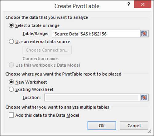
3. Select “New Worksheet” to create a new worksheet for the pivot table (typically the best option).
Alternatively, choose “Existing Worksheet” to insert the pivot table on a worksheet that’s already in your workbook. Specify the cell reference for the top-left corner of the pivot table. Excel overwrites any values in the target cells when it creates the pivot table.
In general, it’s safest to place a pivot table on its own new worksheet. If you restructure the pivot table, it can grow to overwrite other values on the sheet (Excel warns you before overwriting existing data).
4. Click OK.
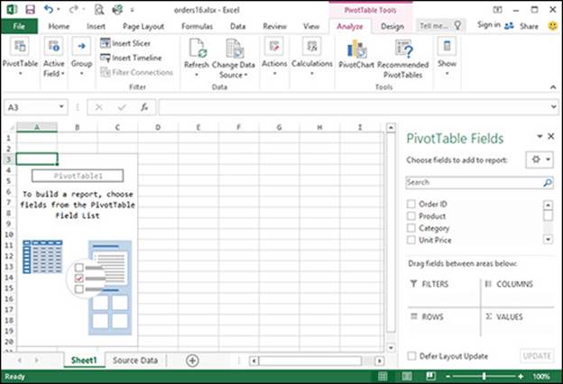
Excel inserts the new pivot table. The pivot table appears as an empty placeholder until you define the rows, columns, and values to use to summarize the source data. When you select a cell inside the pivot table, Excel displays the PivotTable Fields pane on the right, which lists all the columns in the source data.
If you chose to create a new worksheet, Excel gives the sheet a generic name (Sheet1 or whatever) and then places it before the worksheet that contains the source data. You can rename the new worksheet (double-click its worksheet tab) or drag its worksheet tab left or right to reposition it.
Data Models
In the Create PivotTable dialog box, the “Add this data to the Data Model” checkbox lets you build a pivot table that combines data from multiple, related tables. You can build a data model within Excel or choose Data tab > Get External Data group to import tables from files, webpages, or database management systems such as Microsoft Access, SQL Server, or Oracle. To add or edit table relationships (common fields, such as IDs or standard abbreviations, that link the tables), choose PivotTable Tools > Analyze tab > Calculations group > Relationships. To set data-model options, choose File tab > Options > Advanced (on the left) > Data section. The pivot tables in this book use a single table as the underlying data source, but multi-table data sources work similarly after you set up relationships.
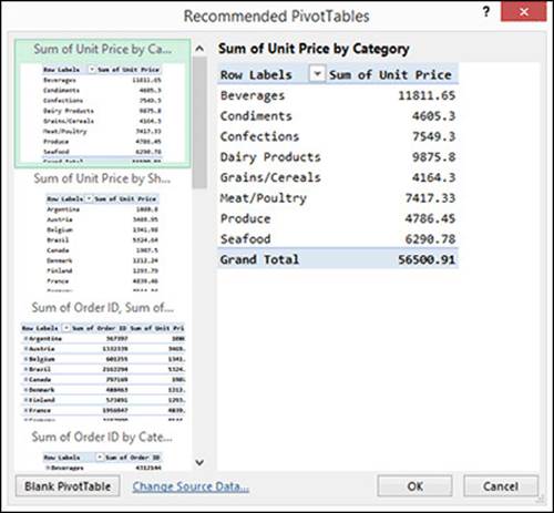
Recommended Pivot Tables
The Recommended PivotTables feature lets you create a new pivot table quickly based on Excel’s analysis of your data. Select the source data and then choose Insert tab > Tables group > Recommended PivotTables. Excel displays previews of recommended pivot tables based on the data. If you don’t like any of Excel’s suggestions, click Blank PivotTable.
Deleting a Pivot Table
A pivot table is a monolithic grid, meaning deletion is all-or-nothing. Excel won’t let you insert or delete individual cells, rows, or columns in a pivot table.
To delete a pivot table:
1. Select the entire pivot table.
To select the entire pivot table, drag to select all the pivot table’s cells (including headers). Or select any cell in the pivot table and then choose PivotTable Tools > Analyze tab > Actions group > Select arrow > Entire PivotTable.
2. Press Delete.
Tip: Deleting a pivot table turns any of its associated pivot charts into standard charts that you can no longer pivot or update.
Laying Out Pivot Tables
To lay out a pivot table, you use the PivotTable Fields pane. Drag columns, called fields, from the “Choose fields to add to report” list into any of the four boxes underneath (use the search box to find fields quickly in long lists). You can also select the checkbox next to a field; Excel will place it in a box depending on the field’s data type (if Excel guesses wrong, drag the field to the correct box). Excel updates the pivot table dynamically as you add, rearrange, or remove fields in the four lower boxes.
The PivotTable Fields pane appears when you select any cell in a pivot table. If it doesn’t appear, choose PivotTable Tools > Analyze tab > Show group > Field List.
Tip: The examples in this book use the default view (“Fields Section and Areas Section Stacked”) of the PivotTable Fields pane. To change the view, click ![]() near the top-right corner of the pane. The default view is designed for a small number of fields. The other views are optimized for adding, removing, or rearranging many fields.
near the top-right corner of the pane. The default view is designed for a small number of fields. The other views are optimized for adding, removing, or rearranging many fields.
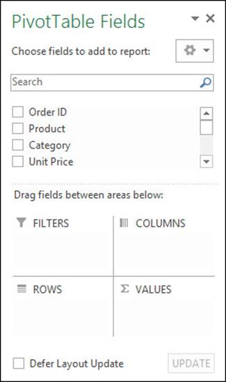
A pivot table has four areas:
Values
These fields are the numerical values for which you want to display sums, averages, counts, and other statistics. You can drag the Unit Price field here, for example, to calculate price statistics. (If you drag a non-numerical field to Values, only counts are calculated.) For details, seeCalculations and Custom Formulas.
Rows
These fields group the data into levels, one level per row. You can drag the Category field here, for example, to show product categories (Beverages, Condiments, and so on).
Columns
These fields also create levels, one level per column. You can use both Rows and Columns to divide your data in multiple ways in the same pivot table. Drag Ship Country to Rows, Category to Columns, and Quantity to Values, for example. The pivot table divides sales figures into rows by country and columns by product category, answering the question, “Which types of products sell best in each country?”.
Filters
These fields limit the data displayed in the pivot table. To show a breakdown of U.S.-only sales by product category, for example, drag Ship Country to Filters and then configure the filter to show only “USA” values. For details, see Report Filters.
Rearranging (Pivoting) a Pivot Table
In the PivotTable Fields pane, you can remove or move fields at any time to rearrange (pivot) the pivot table.
To remove a field from a pivot table:
· Do any of the following:
» Drag the field from any box out of the PivotTable Fields pane (the mouse pointer changes to × as you drag).
» Click the field in a box and then choose Remove Field from the pop-up menu.
» Clear the checkbox next to the field name in the field list.
To move a field from one area to another:
· Do any of the following:
» Drag the field from one box to another.
» Click the field in a box and then choose a “Move to” command from the pop-up menu.
Row or Column Label?
Choosing whether a field appears as a row or column label is a matter of formatting and readability (either way, the same data are displayed). Fields with long category names or many distinct values typically work better as row labels (as column labels, they stretch or proliferate columns). The Product field, for example, works best as a row label; as a column label, the pivot table would be 77 columns wide (Alice Mutton, Aniseed Syrup,..., Zaanse koeken) and hard to read and print.
Moving a Pivot Table
You can move a pivot table to a new worksheet or an existing one. Select any cell in the pivot table and then choose PivotTable Tools > Analyze tab > Actions group > Move PivotTable.
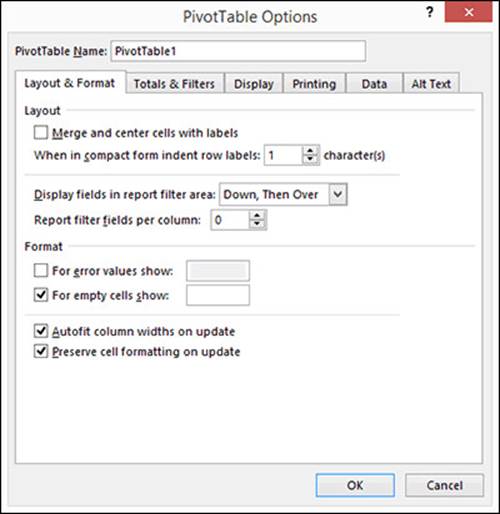
PivotTable Options
You can change the most common pivot-table settings by using the ribbon or the PivotTable Fields pane, but you can find many others in the PivotTable Options dialog box. To open it, right-click any cell in the pivot table and then choose PivotTable Options (or choose PivotTable Tools > Analyze tab > PivotTable group > Options).
Tip: Settings changed in the PivotTable Options dialog box apply to only the active pivot table.
Layout Examples
The following example creates a summary that compares products and shipping locations. The result is a two-dimensional pivot table. Most pivot tables seen in practice are two-dimensional, meaning that they summarize two different fields.
Tip: If you’re using the sample workbook to follow along, the look of your pivot tables depends on which report layout (compact, outline, or tabular form) you choose.
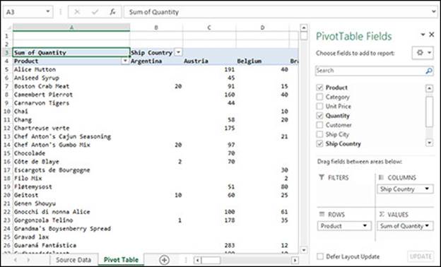
To compare products and shipping locations:
1. If necessary, create a new pivot table.
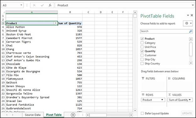
2. In the PivotTable Fields pane, drag the Product field to the Rows box underneath.
Excel fills in all the product names from the source data from top to bottom (in alphabetical order), one product per row.
3. Drag the Ship Country field to the Columns box.
Excel fills in all the country names from the source data from left to right (in alphabetical order), one country per column.
4. Drag the Quantity field to the Values box.
This step chooses which data to examine. Excel fills the pivot table with the numbers of products that were ordered by customers in various countries. The default calculation for pivot tables is the sum of each field in the Values box (note the label “Sum of Quantity” in the Values box). In this example, each value is the total number of units of a specific product shipped to a specific country.
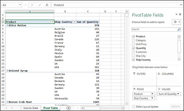
Pivot tables also calculate subtotals and grand totals. To see them, scroll to rightmost or bottommost end of the pivot table. The grand total is in the bottom-right corner.
You can also nest fields by placing them together in the Rows or Columns box. For example, starting with an empty pivot table, drag Product to the Rows box, drag Ship Country to the same box (placing it below Product), and then drag Quantity to the Values box. The order of fields within a box determines their nesting order in the pivot table (here, Ship Country is nested within Product). For details, see Nesting Fields.
A one-dimensional pivot table has a single field in either the Columns or Rows box (but not both). For example, starting with an empty pivot table, drag Product to the Rows box and then drag Quantity to the Values box. The resulting pivot table simply totals the number of units sold by product.
Refreshing Pivot Tables
Unlike formulas, charts, and most other elements in Excel, pivot tables don’t auto-update when the underlying data change. If you change the source data, the pivot table can show out-of-date calculations. A refresh makes Excel scan the source data and recalculate the pivot table.
To refresh a pivot table manually:
· Do any of the following:
» Right-click the pivot table and then choose Refresh.
» Select any cell in the pivot table and then press Alt+F5.
» Select any cell in the pivot table and then choose PivotTable Tools > Analyze tab > Data group > Refresh (or click Refresh All to refresh all pivot tables in the active workbook).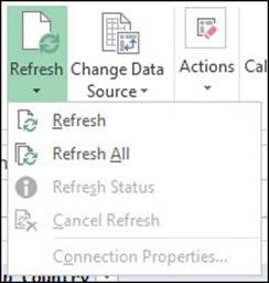
To autorefresh a pivot table when you open a workbook:
· Select any cell in the pivot table and then choose PivotTable Tools > Analyze tab > PivotTable group > Options > Data tab > select “Refresh data when opening the file”.
Tip: A refresh can take a long time depending on the amount of source data, the complexity of the pivot table, the speed of your computer, and other factors. After starting a refresh, you can review its status or cancel it at any time by choosing Refresh Status or Cancel Refresh from the Refresh menu.
Autoformatting on Refresh
If a pivot table becomes misformatted when you refresh it, select the “Autofit column widths on update” and “Preserve cell formatting on update” checkboxes on the Layout & Format tab in the PivotTable Options dialog box (PivotTable Tools > Analyze tab > PivotTable group > Options).
Deferring Updates
By default, Excel regenerates a pivot table—and any associated pivot charts—every time that you drag a field to or from a box in the PivotTable Fields pane. If pivot-table calculations involve a large data source or many nested fields, then refresh can be intolerably slow.
To disable autorefresh, select the Defer Layout Update checkbox at the bottom of the PivotTable Fields pane. When this setting is turned on, Excel doesn’t refresh the pivot table as you change it. To see the effects of your changes, refresh the pivot table manually by clicking the Update button (next to the checkbox), or clear the Defer Layout Update checkbox to go back to automatic refresh.
Disabling Undo for Large Data Sources
If a pivot table is linked to a large data source, then undoing refresh operations slows performance because Excel must track and recalculate the pivot table’s prior states. You can turn off undo for time-consuming refreshes without affecting minor refreshes or other types of undo operations. Choose File tab > Options > Advanced (on the left) > Data section. To turn off undo for large data sources, lower the undo threshold for “Disable undo for PivotTables with at least this number of data source rows (in thousands)”. To disable undo for all pivot tables, set this value to zero.
On the other hand, you can enable undo for all pivot tables (which is convenient but can significantly slow Excel): clear “Disable undo for large PivotTable refresh operations to reduce refresh time”.
Formatting Pivot Tables
When you select a cell in a pivot table, the ribbon sprouts two new tabs under the PivotTable Tools heading: Analyze and Design. These tabs are similar to the ones that appear when you select a chart, table, or picture.
The Analyze tab accesses advanced features like custom calculations, filtering, and pivot charts. The Design tab changes the appearance of the active pivot table.
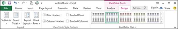
The Design tab has three groups:
PivotTables Styles
Click a style to change the colors and shading of the pivot table. The colors come from the workbook theme that you’re using. To use different colors, choose Page Layout tab > Themes group > Themes.
PivotTables Style Options
If you don’t want shading to alternate from one row or column to the next, clear the Banded Rows or Banded Columns checkboxes. If you don’t want to apply the style formatting to headers, clear the Row Headers or Column Headers checkboxes.
Layout
Choose a preset option that controls spacing and subtotals.
Grand Totals. Show or hide totals at the end of each row or column.
Subtotals. Show or hide subtotals at the end of each level. This setting applies only if fields are nested; that is, the Rows or Columns box contains more than one field. Otherwise, the levels’ “subtotals” are actually grand totals.
Report Layout. By default, pivot tables are shown in compact form: all row labels are merged into a single column, and each column just wide enough to fit that column’s widest entry. In outline form, each row label gets its own column, and each column is as wide as the widest column in the whole pivot table (which occupies much more space). Tabular form is like outline form but shows subtotals (extra rows) at the bottom of each level or group. You can also repeat labels to show values of nested fields in all row and column labels.
Blank Rows. Show or hide blank lines between levels or groups. This option applies only if the Rows box contains more than one field.
Tip: If you’re going to copy or export a pivot table from Excel to another program (such as a database or accounting program), use outline form and repeating labels.
Showing a Value’s Source Data
If you spot a trend, unexpected relationship, or an outlier (suspicious observation) in a pivot table, you can “drill down” to see exactly how the value was calculated. To do so, double-click any value cell in a pivot table. Excel creates a new worksheet containing copies of only the records that were used to calculate that cell’s value. This method is superior to the tedious alternative: switching to the worksheet that contains the original source data and then searching for the corresponding records.
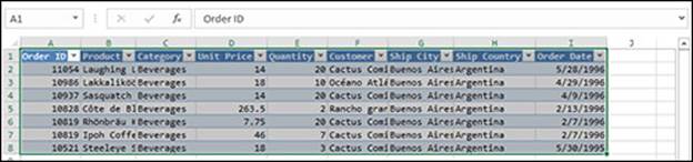
The following pivot table shows how product categories (rows) perform in each country (columns). Double-click cell B5...
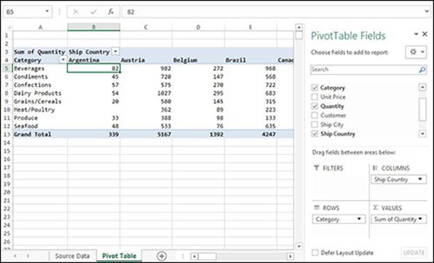
...and Excel adds a worksheet containing copies of the seven records (in a formatted table) whose Quantity values were summed to produce Argentine beverage sales.
After you finish examining the data, you can delete the worksheet that contains the copied records (right-click the worksheet tab at the bottom of the window and then choose Delete). The original source data aren’t touched when you delete the copy.
If you spot an error in the copied records, you must flip to the original source data to fix it. Obvious, yes, but it’s easy to absentmindedly change the copied records and then wonder why the refreshed pivot table doesn’t change.
Changing a Pivot Table’s Source Data
If you add rows to the bottom of a range of source data, you can redefine the pivot table’s source data to include those rows. Select any cell in the pivot table and then choose PivotTable Tools > Analyze tab > Data group > Change Data Source. The same fix applies if you add columns to the right edge of the source data.
Tip: If the source data are in an Excel table (Insert tab > Tables group > Table), then you don’t have to change the range—newly added rows are displayed automatically when you refresh the pivot table.
All materials on the site are licensed Creative Commons Attribution-Sharealike 3.0 Unported CC BY-SA 3.0 & GNU Free Documentation License (GFDL)
If you are the copyright holder of any material contained on our site and intend to remove it, please contact our site administrator for approval.
© 2016-2025 All site design rights belong to S.Y.A.