Marketing Analytics: Data-Driven Techniques with Microsoft Excel (2014)
Part I. Using Excel to Summarize Marketing Data
Chapter 3. Using Excel Functions to Summarize Marketing Data
In Chapter 1, “Slicing and Dicing Marketing Data with PivotTables,” and Chapter 2, “Using Excel Charts to Summarize Marketing Data,” you learned how to summarize marketing data with PivotTables and charts. Excel also has a rich library of powerful functions that you can use to summarize marketing data. In this chapter you will learn how these Excel functions enable marketers to gain insights for their data that can aid them to make informed and better marketing decisions.
This chapter covers the following:
· Using the Excel Table feature to create dynamic histograms that summarize marketing data and update automatically as new data is added.
· Using Excel statistical functions such as AVERAGE, STDEV, RANK, PERCENTILE, and PERCENTRANK to summarize marketing data.
· Using the powerful “counting and summing functions” (COUNTIF, COUNTIFS, SUMIF, SUMIFS, AVERAGEIF, and AVERAGEIFS) to summarize marketing data.
· Writing array formulas to perform complicated statistical calculations on any subset of your data.
Summarizing Data with a Histogram
A histogram is a commonly used tool to summarize data. A histogram essentially tells you how many data points fall in various ranges of values. Several Excel functions, including array functions such as the TRANSPOSE and the FREQUENCY function, can be used to create a histogram that automatically updates when new data is entered into the spreadsheet.
When using an array function, you need to observe the following rules:
1. Select the range of cells that will be populated by the array function. Often an array function populates more than one cell, so this is important.
2. Type in the function just like an ordinary formula.
3. To complete the entry of the formula, do not just press Enter; instead press Control+Shift+Enter. This is called array entering a formula.
Because the FREQUENCY function is a rather difficult array function, let's begin with a discussion of a simpler array function, the TRANSPOSE function.
Using the TRANSPOSE Function
The TRANSPOSE function is a great place to start when illustrating the use of array functions. To begin, take a look at the Histogram worksheet in the Chapter3bakery.xlsx file. In Figure 3.1, cells N27:Q27 list some of my best students. This list would be easier to digest though if the names were listed in a column. To do this, copy N27:Q27 and move the cursor to R28, then right-click and select Paste Special… Select the Transpose checkbox to paste the names in a column.
Figure 3-1: Use of the Transpose function
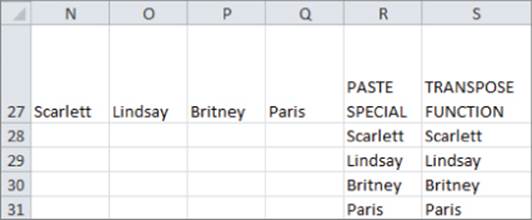
Unfortunately, if you change the source data (for example, Scarlett to Blake) the transposed data in column R does not reflect the change. If you want the transposed data to reflect changes in the source data, you need to use the TRANSPOSE function. To do so perform the following steps:
1. Select S28:S31.
2. Enter in cell S28 the formula =TRANSPOSE(N27:Q27) and press Control+Shift+Enter. You will know an array formula has been entered when you see a { in the Formula bar.
3. Change Scarlett in N27 to Blake, and you can see that Scarlett changes to Blake in S28 but not in R28.
Using the FREQUENCY Function
The FREQUENCY function can be used to count how many values in a data set fit into various ranges. For example, given a list of heights of NBA basketball players the FREQUENCY function could be used to determine how many players are at least 7' tall, how many players are between 6' 10” and 7' tall, and so on. The syntax of the FREQUENCY function is FREQUENCY(array,bin range). In this section you will utilize the FREQUENCY function to create a histogram that charts the number of days in which cake sales fall into different numerical ranges. Moreover, your chart will automatically update to include new data.
On the Histogram worksheet you are given daily sales of cakes at La Petit Bakery. You can summarize this data with a histogram. The completed histogram is provided for you in the worksheet, but if you want to follow along with the steps simply copy the data in D7:E1102 to the same cell range in a blank worksheet. Begin by dividing a range of data into 5–15 equal size ranges (called a bin range) to key a histogram. To do so, perform the following steps:
1. Select your data (the range D7:E1102) and make this range a table by selecting Insert &cmdarr; Table. If a cell range is already a table then under Insert the table option will be grayed out.
2. In cell E5, point to all the data and compute the minimum daily cake sales with the formula =MIN(Table1[Cakes]).
3. Similarly, determine the maximum daily cake sales in E6. The range of daily cake sales is between 32 and 165. Select your bin ranges to be<= 30, 31–50, 51–70, …, 151–170…, > 170 cakes.
4. List the boundaries for these bin ranges in the cell range I9:I17. Figure 3.2 shows this process in action.
Figure 3-2: Dynamic histogram for cake sales
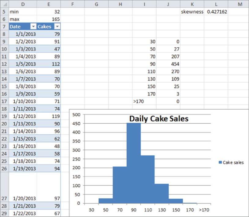
You can now use the FREQUENCY function to count the number of days in which cake sales fall in each bin range. The syntax of the FREQUENCY function is FREQUENCY(array,bin range). When an array is entered, this formula can count how many values in the array range fall into the bins defined by the bin range. In this example the function will count the number of days in which cake sales fall in each bin range. This is exemplified in Figure 3.2. To begin using the FREQUENCY function, perform the following steps:
1. Select the range J9:J17 in the Histogram worksheet and type the formula=FREQUENCY(E8:E1102,I9:I17).
2. Array enter this formula by pressing Control+Shift+Enter. This formula computes how many numbers in the table are ≤30, between 31 and 50,…, between 151 and 170, and more than 170.
For example, you can find that there were three days in which between 151 and 170 cakes were sold. The counts update automatically if new days of sales are added.
3. Select the range I9:J17, and from the Insert tab, select the first Column Graph option.
4. Right-click any column, select Format Data Series…, and change Gap Width to 0. This enables you to obtain the histogram, as shown in Figure 3.2.
5. If you enter more data in Column E (say 10 numbers >170) you can see that the histogram automatically updates to include the new data. This would not have happened if you had failed to make the data a Table.
Skewness and Histogram Shapes
There are a variety of histograms that are seen when examining marketing data, but the three most commonly seen histogram shapes are listed here (see Figure 3.3 and file Skewexamples.xlsx):
· Symmetric histogram: A histogram is symmetric and looks approximately the same to the left of the peak and the right of the peak. In Figure 3.3 the IQ scores yield an asymmetric histogram.
Figure 3-3: Symmetric, positively skewed, and negatively skewed histograms
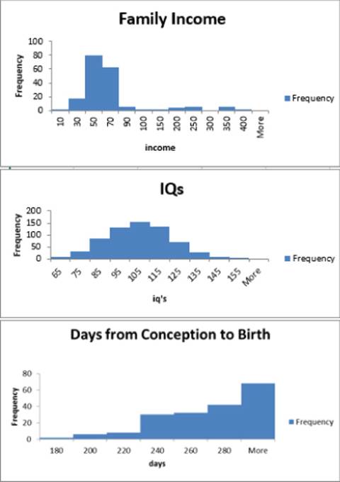
· Positively skewed: (skewed right) A histogram is positively skewed (or skewed right) if it has a single peak and the values of the data set extend much further to the right of the peak than to the left of the peak. In Figure 3.3 the histogram of family income is positively skewed.
· Negatively skewed: (skewed left) A histogram is negatively skewed if it has a single peak and the values of the data set extend much further to the left of the peak than to the right of the peak. In Figure 3.3, the histogram of Days from Conception to Birth is negatively skewed.
The Excel SKEW function provides a measure of the skewness of a data set. A skewness value > +1 indicates mostly positive skewness, < –1 mostly negative skewness, and a skewness value between –1 and +1 indicates a mostly symmetric histogram. This function can be used to obtain a quick characterization of whether a histogram is symmetric, positively skewed, or negatively skewed. To see this function in action, enter the formula =SKEW(Table1[Cakes]) into cell L5 in the Histogram worksheet to yield a skewness of .43, implying that cake cells follow a symmetric distribution. Because you made the source data an Excel table, the skewness calculation in L5 would automatically update if new data is added.
In the next section you will see that the degree of skewness (or lack thereof) in a data set enables the marketing analyst to determine how to best describe the typical value in a data set.
Using Statistical Functions to Summarize Marketing Data
In her daily work the marketing analyst will often encounter large datasets. It is often difficult to make sense of these data sets because of their vastness, so it is helpful to summarize the data on two dimensions:
· A typical value of the data: For example, what single number best summarizes the typical amount a customer spends on a trip to the supermarket.
· Spread or variation about the typical value: For example, there is usually much more spread about the typical amount spent on a visit to a grocery superstore than a visit to a small convenience store.
Excel contains many statistical functions that can summarize a data set's typical value and the spread of the data about its mean. This section discusses these statistical functions in detail.
Using Excel Functions to Compute the Typical Value for a Data Set
The file Chapter3bakery.xlsx contains the La Petit Bakery sales data that was discussed in Chapter 1. For each product, suppose you want to summarize the typical number of that product sold in a day. Three measures are often used to summarize the typical value for a data set.
· The mean, or average, is simply the sum of the numbers in the data set divided by the number of values in the dataset. The average is computed with the Excel AVERAGE function. For example, the average of the numbers 1, 3, and 5 is ![]() . You can often use to denote the mean or average of a data set.
. You can often use to denote the mean or average of a data set.
· The median is approximately the 50th percentile of the data set. Roughly one-half the data is below the median and one-half the data is above the median. More precisely, suppose there are n values that when ordered from smallest to largest are x1,x2,…,xn. If n is odd the median is x.5(n+1), and if n is even, the median is (x.5n+x.5n+1)/2. For example, for the data set 1, 3, 5, the median is 3, and for the data set 1, 2, 3, 4 the median is 2.5. The MEDIAN function can be used to compute the median for a data set.
· The mode of a data set is simply the most frequently occurring value in the data set. If no value appears more than once, the data set has no mode. The MODE function can be used to compute the mode of a data set. A data set can have more than one mode. If you have Excel 2010 or later, then the array function MODE.mult (see Excel 2010 Data Analysis and Business Modeling by Wayne Winston [Microsoft Press, 2011]) can be used to compute all modes. For example, the data set 1, 3, and 5 has no mode, whereas the data set 1, 2, 2, 3 has a mode of 2.
The Descriptive stats worksheet uses Excel functions to compute three measures of typical value for daily sales of cakes, pies, cookies, smoothies, and coffee. Complete the following steps and see Figure 3.4 for details.
1. To compute the average for daily cake sales in cell H5, enter the formula =AVERAGE(H12:H1106).
2. To compute the median for daily cake sales in cell H6, enter the formula =MEDIAN(H12:H1106).
3. To, compute the mode of daily cake sales in cell H7, enter the formula =MODE(H12:H1106).
4. Copy these formulas to the range I5:L7 to compute these measures for La Petit Bakery's other products.
Figure 3-4: Descriptive statistics
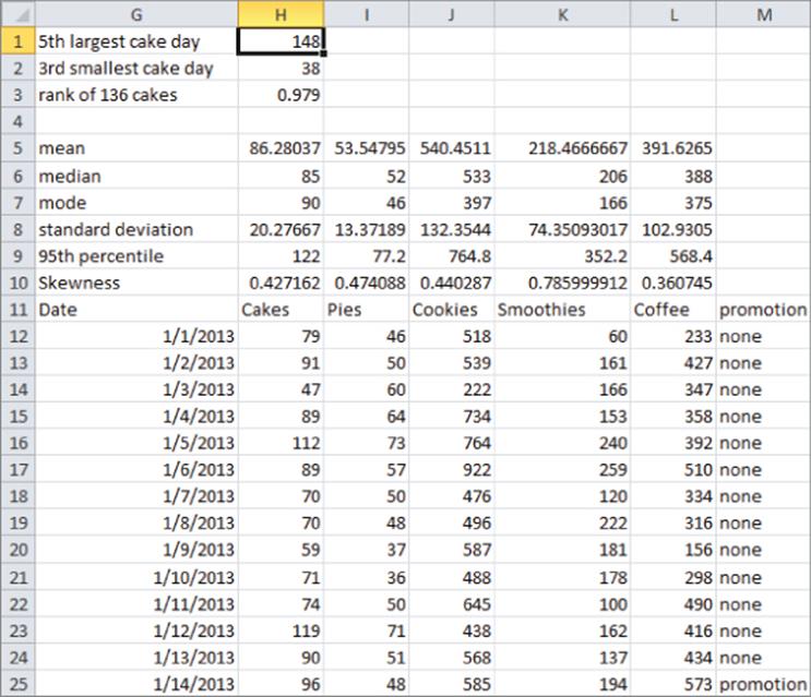
You find, for example, that on average 86.28 cakes were sold each day, around one-half the time fewer than 85 cakes were sold, and the most frequently occurring number of cakes sold in a day is 90.
Which Measure of Typical Value Is Best?
Although there is no single best answer to this question, there are a few rules of thumb that are summarized here. The mode might be relevant if a hat store wanted to maximize sales and was going to stock only one size of hats. In most cases, however, the analyst who wants to summarize a data set by a single number must choose either the mean or the median. In the presence of substantial positive or negative skewness, extreme values tend to distort the mean, and the median is a better choice as a summary of a typical data value. In other situations using the median throws out important information, so the mean should be used to summarize a data set. To summarize:
· If a skew statistic is greater than 1 or less than –1, substantial skewness exists and you should use median as a measure of typical value.
· If skew statistic is between –1 and 1, use mean as a measure of typical value.
For the cake example, data skewness is between –1 and 1, so you would use the mean of 86.28 cakes as a summary value for daily cake sales.
For an example of how skewness can distort the mean, consider the starting salaries of North Carolina students who graduated in 1984. Geography majors had by far the highest average starting salary. At virtually every other school, business majors had the highest average starting salary. You may guess that Michael Jordan was a UNC geography major, and his multimillion dollar salary greatly distorted the average salary for geography majors. The median salary at UNC in 1984 was, as expected, highest for business majors.
Using the VAR and STDEV Functions to Summarize Variation
Knowledge of the typical value characterizing a data set is not enough to completely describe a data set. For example, suppose every week Customer 1 spends $40 on groceries and during a week Customer 2 is equally likely to spend $10, $20, $30, or $100 on groceries. Each customer spends an average of $40 per week on groceries but we are much less certain about the amount of money Customer 2 will spend on groceries during a week. For this reason, the description of a data set is not complete unless you can measure the spread of a data set about its mean. This section discusses how the variance and standard deviation can be used to measure the spread of a data set about its mean.
Given a data set x1,x2,…,xn the sample variance (s2) of a data set is approximately the average squared deviation of the mean and may be computed with the formula ![]() . Here is the average of the data values. For example, for the data set 1, 3, 5 the average is 3, so the sample variance is as follows:
. Here is the average of the data values. For example, for the data set 1, 3, 5 the average is 3, so the sample variance is as follows:
![]()
Note that if all data points are identical, then the sample variance is 0. You should square deviations from the mean to ensure that positive and negative deviations from the mean will not cancel each other out.
Because variance is not in the same units as dollars, the analyst will usually take the square root of the sample variance to obtain the sample standard deviation(s). Because the data set 1, 3, and 5, has a sample variance of 4, s = 2.
The Excel VAR function computes sample variance, and the Excel STDEV function computes sample standard deviation. As shown in Figure 3.4 (see Descriptive stats worksheet), copying the formula =STDEV(H12:H1106) from H8 to K8:L8 computes the standard deviation of each product's daily sales. For example, the standard deviation of daily cake sales was 20.28 cakes.
The Rule of Thumb for Summarizing Data Sets
If a data set does not exhibit substantial skewness, then the statisticians' interesting and important rule of thumb lets you easily characterize a data set. This rule states the following:
· Approximately 68 percent of all data points are within 1 sample standard deviation of the mean.
· Approximately 95 percent of all data points are within 2 standard deviations (2s) of the mean.
· Approximately 99.7 percent of the data points are within 3 standard deviations of the mean.
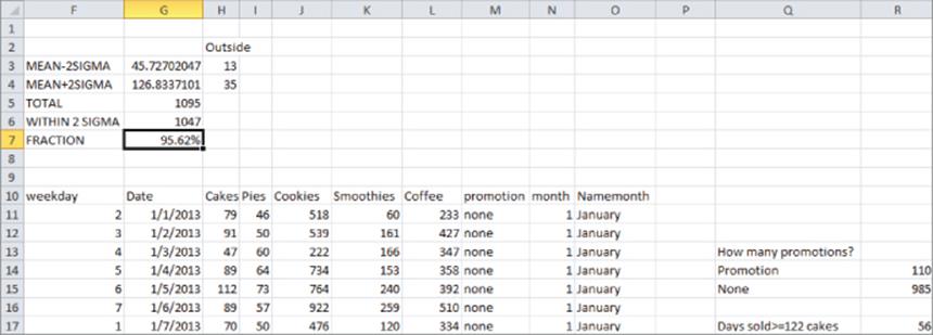
Any data point that is more than two sample standard deviations (2s) from the mean is unusual and is called an outlier. Later in the chapter (see the “Verifying the Rule of Thumb” section) you can find that for daily cake sales, the rule of thumb implies that 95 percent of all daily cake sales should be between 45.3 and 126.83. Thus cake sales less than 45 or greater than 127 would be an outlier. You can also find that 95.62 percent of all daily cake sales are within 2s of the mean. This is in close agreement with the rule of thumb.
The Percentile.exc and Percentrank.exc Functions
A common reorder policy in a supply chain is to produce enough to have a low percent chance, say, a 5 percent, of running out of a product. For cakes, this would imply that you should produce x cakes, where there is a 5 percent chance demand for cakes that exceed x or a 95 percent chance demand for cakes that is less than or equal to x. The value x is defined to be the 95th percentile of cake demand. The Excel 2010 and later function PERCENTILE.EXC(range, k) (here k is between 0 and 1) returns the 100*kth percentile for data in a range. In earlier versions of Excel, you should use the PERCENTILE function. By copying the formula =PERCENTILE.EXC(H12:H1106,0.95) from H9 to I9:L9 of the Descriptive stats worksheet you can obtain the 95th percentile of daily sales for each product. For example, there is a 5 percent chance that more than 122 cakes will be sold in a day.
Sometimes you want to know how unusual an observation is. For example, on December 27, 2015, 136 cakes were sold. This is more than two standard deviations above average daily cake sales, so this is an outlier or unusual observation. The PERCENTRANK.EXC function in Excel 2010 or later (or PERCENTRANK in earlier versions of Excel) gives the ranking of an observation relative to all values in a data set. The syntax of PERCENTRANK.EXC is PERCENTRANK(range, x,[significance]). This returns the percentile rank (as a decimal) of x in the given range. Significance is an optional argument that gives the number of decimal points returned by the function. Entering in cell H3 the formula =PERCENTRANK.EXC(H12:H1106,H1102), you find that you sold more than 136 cakes on only 2.1 percent of all days.
The LARGE and SMALL Functions
Often you want to find, say, the fifth largest or third smallest value in an array. The function LARGE(range,k) returns the kth largest number in a range, whereas the function SMALL(range,k) returns the kth smallest number in a range. As shown in Figure 3.4, entering in cell H1 the formula=LARGE(H12:H1106,5) tells you the fifth largest daily sales of cakes was 148. Similarly, entering in cell H2 the formula =SMALL(H12:H1106,3) tells you the third smallest daily demand for cakes was 38.
These same powerful statistical functions can be used by marketing managers to gain important insights such as who are the 5 percent most profitable customers, who are the three most costly customers, or even what percentage of customers are unprofitable.
Using the COUNTIF and SUMIF Functions
In addition to mathematical functions such as SUM and AVERAGE, the COUNTIF and SUMIF functions might be (or should be!) two of the most used functions by marketing analysts. These functions provide powerful tools that enable the analyst to select a subset of data in a spreadsheet and perform a calculation (count, sum, or average) on any column in the spreadsheet. The wide variety of computations performed in this section should convince the marketer that these functions are a necessary part of your toolkit.
The first few examples involve the COUNTIF and SUMIF functions. The COUNTIF function has the syntax COUNTIF(range, criteria). Then the COUNTIF function counts how many cells in the range meet the criteria. The SUMIF function has the syntax SUMIF (range, criteria, and sum_range). Then theSUMIF function adds up the entries in the sumrange column for every row in which the cell in the range column meets the desired criteria.
The following sections provide some examples of these functions in action. The examples deal with the La Petit Bakery data, and the work is in the Sumif Countif worksheet. The work is also shown in Figure 3.5. The Create From Selection feature (discussed in Chapter 2) is used in the examples to name columns F through O with their row 10 headings.
Figure 3-5: Illustrating the Rule of Thumb
Counting the Number of Promotions
The Excel COUNTIF function can be used to count the number of rows in a range of cells that meet a single criterion. For example, you can compute the number of days on which La Petit Bakery had a promotion and did not have a promotion by using the COUNTIF function. Simply copy the formula=COUNTIF(promotion,Q14) from R14 to R15. You will see that there were 110 days with a promotion and 985 without a promotion. Note that Q14 as a criterion ensures that you only count days on which there was a promotion and Q15 as a criterion ensures that you only count days on which there was no promotion.
Verifying the Rule of Thumb
In the “Rule of Thumb” section of this chapter you learned that the rule of thumb tells you that for approximately 95 percent of all days, cake sales should be within 2s of the mean. You can use the COUNTIF function to check if this is the case. In cell G3 you can compute for daily cake sales the Average –2s with the formula AVERAGE(Cakes)−2*STDEV(Cakes). In G4 you can compute the Average +2s with the formula AVERAGE(Cakes)+2*STDEV(Cakes).
You can also find the number of days (13) on which cakes were more than 2s below the mean. To do so, enter in cell H3 the formula COUNTIF(Cakes,"<"&G3). The & (or concatenate) sign combines with the less than sign (in quotes because < is text) to ensure you only count entries in the Cakes column that are more than 2s (s = sample standard deviation) below the mean.
In cell H4 the formula COUNTIF(Cakes,">"&G4) computes the number of days (35) on which cake sales were more than 2s above the mean. Any data point that differs from the dataset's mean by more than 2s is called an outlier. Chapters 10 and 11 will make extensive use of the concept of an outlier.
The COUNT function can be used to count the number of numeric entries in a range while the COUNTA function can be used to count the number of non-blanks in a range. Also the COUNTBLANK function counts the number of blank cells in a range. For example, the function =COUNT(Cakes) in cell G5 counts how many numbers appear in the Cake column (1095). The COUNTA function counts the number of nonblank (text or numbers) cells in a range, and the COUNTBLANK function counts the number of blanks in a range. In G6 compute (with formula =G5−H3−H4) the number of cells (1047) within 2s of the mean. In G7 you find that 95.62 percent of the days had cake cells within 2s of the mean. This is in close agreement with the rule of thumb.
Computing Average Daily Cake Sales
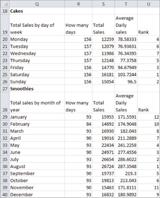
You can also use SUMIF and COUNTIF functions to calculate the average sales of cakes for each day of the week. To do so, perform the following steps:
1. Copy the formula =SUMIF(daywk,Q20,Cakes) from S20 to S21:S26 to compute the total cake sales for each day of the week.
2. Copy the formula =COUNTIF(daywk,Q20) from R20 to R21:R:26 to compute for each day of the week the number of times the day of the week occurs in your data set.
3. Finally, in Column T, divide the SUMIF result for each day by the COUNTIF result, and this gives the average cake sales for each day of the week.
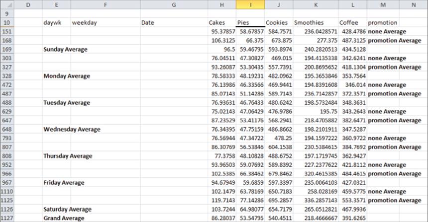
To rank the average cake sales for each day of the week, copy the formula =RANK(T20,$T$20:$T$26,0) from U20 to U21:U26. The formula in U20 ranks the Monday average sales among all days of the week. Dollar signing the range T20:T26 ensures that when you copy the formula in U21, each day's average sales is ranked against all 7 days of the week. If you had not dollar signed the range T20:T26, then in U21 the range would have changed to T21:T27, which would be incorrect because this range excludes Monday's average sales. The last argument of 0 ensures that the day of the week with the largest sales is given a rank of 1. If you use a last argument of 1, then sales are ranked on a basis that makes the smallest number have a rank of 1, which is not appropriate in this situation. Note that Saturday is the best day for sales and Wednesday was the worst day for sales.
In an identical manner, as shown in Figure 3.6 you can compute the average daily sales of smoothies during each month of the year in the cell range Q28:U40. The results show that the summer months (June–August) are the best for smoothie sales.
Figure 3-6: Daily summary of cake sales
In the next section you will learn how the AVERAGEIF function makes these calculations a bit simpler.
Using the COUNTIFS, SUMIFS, AVERAGEIF, and AVERAGEIFS Functions
COUNTIF and SUMIF functions are great, but they are limited to calculations based on a single criteria. The next few examples involve the use of four Excel functions that were first introduced in Excel 2007: COUNTIFS, SUMIFS, AVERAGEIF, and AVERAGEIFS (see the New 2007 Functions worksheet). These functions enable you to do calculations involving multiple (up to 127!) criteria. A brief description of the syntax of these functions follows:
· The syntax of COUNTIFS is COUNTIFS(range1,criteria1, range2,critieria2, .. range_n, criteria_n). COUNTIFS counts the number of rows in which the range1 entry meets criteria1, the range2 entry meets criteria2, and … the range_n entry meets criteria_n.
· The syntax of SUMIFS is SUMIFS(sum_range, range1, criteria1, range2, criteria2, …,range_n,criteria_n). SUMIFS sums up every entry in the sum_range for which criteria1 (based on range1), criteria2 (based on range2), … criteria_n (based on range_n) are all met.
· The AVERAGEIF function has the syntax AVERAGEIF(range, criteria, average_range). AVERAGEIF averages the range of cells in the average range for which the entry in the range column meets the criteria.
· The syntax of AVERAGEIFS is AVERAGEIFS(average_range, criteria_range1, criteria_range2, …, criteria_range_n). AVERAGEIFS averages every entry in the average range for which criteria1 (based on range1), criteria2 (based on range2), … criteria_n (based on range_n) are all met.
Now you can use these powerful functions to perform many important computations. The following examples are shown in the New 2007 Functions worksheet. The work is shown in Figure 3.7.
Figure 3-7: Monthly sales summary
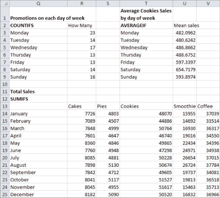
Calculating the Number of Promotions on Each Day of the Week
In R3 the formula COUNTIFS(daywk,Q3,promotion,"promotion") counts the number of promotions (23) on Monday. Copying this formula to R4:R9 calculates the number of promotions on each day of the week.
Calculating the Average Cookie Sales on Each Day of the Week
The formula in U3 =AVERAGEIF(daywk,T3,Cookies) averages the number of cookie sales on Monday. Copying this formula to the range U4:U9 calculates average cookie sales for all other days of the week.
Computing Monthly Sales for each Product
The formula =SUMIFS(INDIRECT(R$13),Namemonth,$Q14) in cell R14 computes total cake sales in January (7726).
1. Place the INDIRECT function before the reference to R13 to enable Excel to recognize the word “Cakes” as a range name.
2. Copy this formula to the range R14:V25. This calculates the total sales for each product during each month.
NOTE
Note the INDIRECT function makes it easy to copy formulas involving range names. If you do not use the INDIRECT function then Excel will not recognize text in a cell such as R13 as a range name.
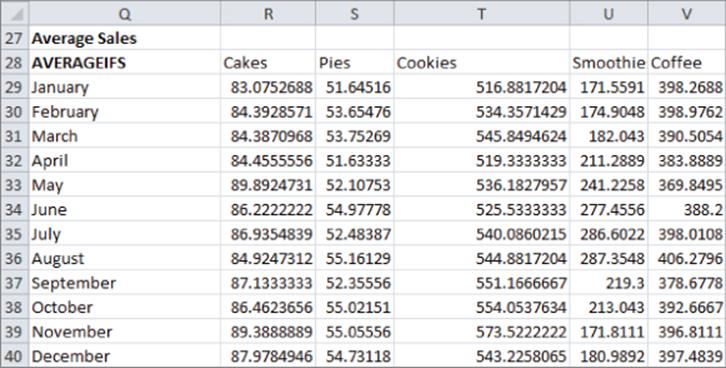
Computing Average Daily Sales by Month for Each Product
The formula =AVERAGEIFS(INDIRECT(R$28),Namemonth,$Q29) in cell R29 computes average cake sales in January. Copying this formula to the range R29:V40 calculates average sales during each month for each product. Figure 3.8 shows this example.
Figure 3-8: Using AVERAGEIFS to summarize monthly sales
Summarizing Data with Subtotals
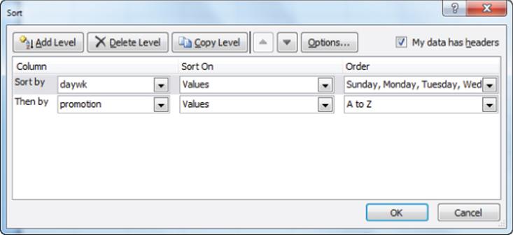
The final method to summarize market data discussed in this chapter is with subtotals. The subtotals feature yields a great looking summary of data. Unfortunately, if new data is added, subtotals are difficult to update. Suppose you want to get a breakdown for each day of the week and for each product showing how sales differ on days with and without promotions (see the Subtotals Bakery worksheet). Before computing subtotals you need to sort your data in the order in which you want your subtotals to be computed. In the subtotals you want to see the day of the week, and then “promotion” or “not promotion.” Therefore, begin by sorting the data in this order. The dialog box to create this sort is shown in Figure 3.9.
Figure 3-9: Sorting in preparation for subtotals
After performing the sort you see all the Sundays with no promotion, followed by the Sundays with a promotion, then the Mondays with no promotion days, and so on. Perform the following steps to continue:
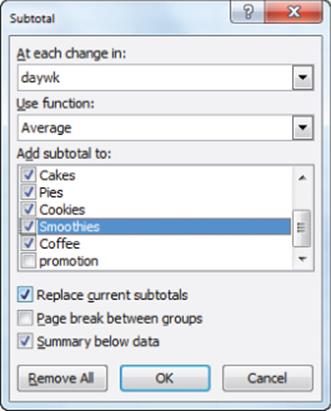
1. Place your cursor anywhere in the data and select Subtotal from the Data tab on the ribbon.
2. Compute Subtotals for each product for each day of the week by filling in the Subtotals dialog box, as shown in Figure 3.10.
Figure 3-10: Subtotals settings for daily summary
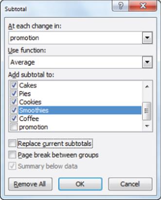
3. Next you “nest” these subtotals with totals each day of the week for no promotion and promotion days. To compute the nested subtotals giving the breakdown of average product sales for each day of the week on promotion and no promotion days, select Subtotal from the Data tab and fill in the dialog box, as shown in Figure 3.11.
Figure 3-11: Final subtotals dialog box
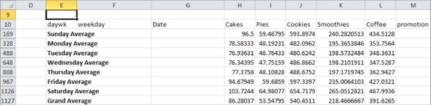
4. Select OK and the Subtotals feature creates for each day of the week total sales for each product. This summary (as shown in Figure 3.12) can be seen by clicking the number 2 in the upper left corner of your screen.
Figure 3-12: Daily subtotals summary
By unchecking Replace Current Subtotals, you ensure that the subtotals on Promotions will build on and not replace the daily calculations. By clicking the 3 in the upper-left corner of the screen, you can find the final breakdown (see Figure 3.13) of average sales on no promotion versus promotion sales for each day of the week. It is comforting to note that for each product and day of week combination, average sales are higher with the promotion than without.
Figure 3-13: Final subtotals summary
USING EXCEL OUTLINES WITH THE SUBTOTALS FEATURE
Whenever you use the Subtotals feature you will see numbers (in this case 1,2, 3, and 4) in the upper left hand corner of your spreadsheet. This is an example of an Excel outline. The higher the number in the outline, the less aggregated is the data. Thus selecting 4 gives the original data (with subtotals below the relevant data), selecting 3 gives a sales breakdown by day of week and promotion and lack thereof, selecting 2 gives a sales breakdown by day of the week, and selecting 1 gives an overall breakdown of average sales by product. If your cursor is within the original data you can click the Remove All button in the dialog box to remove all subtotals.
Using Array Formulas to Summarize ESPN The Magazine Subscriber Demographics
The six wonderful functions previously discussed are great ways to calculate conditional counts, sums, and averages. Sometimes, however, you might want to compute a conditional median, standard deviation, percentile, or some other statistical function. Writing your own array formulas you can easily create your own version of a MEDIANIF, STDEVIF, or other conditional statistical functions.
NOTE
The rules for array formulas discussed in “Summarizing Data with a Histogram” also apply to array formulas that you might write.
To illustrate the idea, look at the Chapter 1 data on ESPN subscribers located in the Slicing with arrays worksheet (see also Figure 3.14).
Figure 3-14: Using arrays to compute conditional medians and standard deviations
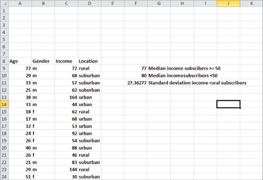
Suppose you have been asked to determine the median income for subscribers over 50. To accomplish this goal, perform the following steps:
1. Array enter in cell F9 the formula =MEDIAN(IF(Age>=50,Income,"")). This formula loops through the Income column and creates an array as follows: whenever the Age column contains a number greater than or equal to 50, the array returns the income value; otherwise the array returns a blank. Now the MEDIAN function is simply being applied to the rows corresponding to subscribers who are at least 50 years old. The median income for subscribers who are at least 50 is $77,000. Note that since your array formula populates a single cell you do not need to select a range containing more than one cell before typing in the formula.
2. In a similar fashion, array enter in cell F10 the formula =MEDIAN(IF(Age<50,Income,"")) to compute the median salary ($80,000) for subscribers who are under 50 years old.
3. Finally, in cell F11, array enter the formula =STDEV(IF(Location="rural",Income,"")) to compute (27.36) the standard deviation of the Income for Rural subscribers. This formula produces an array that contains only the Income values for rural subscribers and takes the standard deviation of the values in the new array.
Summary
In this chapter you learned the following:
· Using the FREQUENCY array function and the TABLE feature, you can create a histogram that summarizes data and automatically updates to include new data.
· The median (computed with the MEDIAN function) is used to summarize a typical value for a highly skewed data set. Otherwise, the mean (computed with the AVERAGE function) is used to summarize a typical value from a data set.
· To measure a data set's spread about the mean, you can use either variance (computed with the Excel VAR function) or standard deviation (computed with the Excel STDEV function). Standard deviation is the usual measure because it is in the same units as the data.
· For data sets that do not exhibit significant skewness, approximately 95 percent of your data is within two standard deviations of the mean.
· The PERCENTILE.EXC function returns a given percentile for a data set.
· The PERCENTRANK.EXC function returns the percentile rank for a given value in a data set.
· The LARGE and SMALL functions enable you to compute either the kth largest or kth smallest value in a data set.
· The COUNTIF and COUNTIFS functions enable you to count how many rows in a range meet a single or multiple criteria.
· The SUMIF and SUMIFS enable you to sum a set of rows in a range that meets a single or multiple criteria.
· The AVERAGEIF and AVERAGEIFS functions enable you to average a set of rows in a range that meets a single or multiple criteria.
· The SUBTOTALS feature enables you to create an attractive summary of data that closely resembles a PivotTable. Data must be sorted before you invoke the SUBTOTALS feature.
· Using array functions you can create formulas that mimic a STDEVIF, MEDIANIF, or PERCENTILEIF function.
Exercises
1. Exercises 1-6 use the data in the Descriptive stats worksheet of the Chapter3bakery.xlsx workbook. Create a dynamically updating histogram for daily cookie sales.
2. Are daily cookie sales symmetric or skewed?
3. Fill in the blank: By the rule of thumb you would expect on 95 percent of all days daily smoothie demand will be between ___ and ___.
4. Determine the fraction of days for which smoothie demand is an outlier.
5. Fill in the blank: There is a 10 percent chance daily demand for smoothies will exceed ____.
6. Fill in the blank: There is a____ chance that at least 600 cookies will be sold in a day.
7. Exercises 7 and 8 use the data in the Data worksheet of the ESPN.xlsx workbook. Find the average age of all ESPN subscribers who make at least $100,000 a year.
8. For each location and age group (under 25, 25–39, 40–54, 55, and over) determine the fraction of ESPN subscribers for each location that are in each age group.
9. Exercises 9-12 use the data in the Descriptive stats worksheet of the Chapter3bakery.xlsx workbook. Determine the percentage of La Petit Bakery cookie sales for each day of the week and month combination. For example, your final result should tell you the fraction of cookie sales that occur on a Monday in January, and so on.
10. Determine the average profit earned for each day of the week and month combination. Assume the profit earned by La Petit Bakery on each product is as follows:
· Cakes: $2
· Cookie: $0.50
· Pie: $1.50
· Smoothie: $1.00
· Coffee: $0.80
11. Find the median cake sales on days in which at least 500 cookies were sold.
12. Fill in the blank: On days in which at least 500 cookies are sold there is a 5 percent chance at least _____ cookies are sold.
13. In the years 1980–2012 median U.S. family income (after inflation) has dropped but mean family income has sharply increased. Can you explain this seeming anomaly?
14. Compute and interpret the skewness for the three data sets in the file Skewexamples.xlsx.
All materials on the site are licensed Creative Commons Attribution-Sharealike 3.0 Unported CC BY-SA 3.0 & GNU Free Documentation License (GFDL)
If you are the copyright holder of any material contained on our site and intend to remove it, please contact our site administrator for approval.
© 2016-2026 All site design rights belong to S.Y.A.