Marketing Analytics: Data-Driven Techniques with Microsoft Excel (2014)
Part I. Using Excel to Summarize Marketing Data
Chapter 2. Using Excel Charts to Summarize Marketing Data
An important component of using analytics in business is a push towards “visualization.” Marketing analysts often have to sift through mounds of data to draw important conclusions. Many times these conclusions are best represented in a chart or graph. As Confucius said, “a picture is worth a thousand words.” This chapter focuses on developing Excel charting skills to enhance your ability to effectively summarize and present marketing data. This chapter covers the following skills:
· Using a combination chart and a secondary axis
· Adding a product picture to your column graphs
· Adding labels and data tables to your graphs
· Using the Table feature to ensure your graphs automatically update when new data is added
· Using PivotCharts to summarize a marketing survey
· Making chart labels dynamic
· Using Sparklines to summarize sales at different stores
· Using Custom Icon Sets to summarize trends in sales force performance
· Using a check box to control the data series that show in a graph
· Using the Table feature and GETPIVOTDATA function to automate creation of end-of-month sales reports
Combination Charts
Companies often graph actual monthly sales and targeted monthly sales. If the marketing analyst plots both these series with straight lines it is difficult to differentiate between actual and target sales. For this reason analysts often summarize actual sales versus targeted sales via a combination chart in which the two series are displayed using different formats (such as a line and column graph.) This section explains how to create a similar combination chart.
All work for this chapter is located in the file Chapter2charts.xlsx. In the worksheet Combinations you see actual and target sales for the months January through July. To begin charting each month's actual and target sales, select the range F5:H12 and choose a line chart from the Insert tab. This yields a chart with both actual and target sales displayed as lines. This is the second chart shown in Figure 2.1; however, it is difficult to see the difference between the two lines here. You can avoid this by changing the format of one of the lines to a column graph. To do so, perform the following steps:
1. Select the Target sales series line in the line graph by moving the cursor to any point in this series.
2. Then right-click, and choose Change Series Chart Type…
3. Select the first Column option and you obtain the first chart shown in Figure 2.1.
Figure 2-1: Combination chart
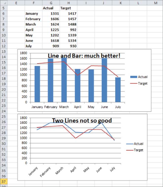
With the first chart, it is now easy to distinguish between the Actual and Target sales for each month. A chart like this with multiple types of graphs is called a combination chart.
You'll likely come across a situation in which you want to graph two series, but two series differ greatly in magnitude, so using the same vertical axis for each series results in one series being barely visible. In this case you need to include a secondary axis for one of the series. When you choose a secondary axis for a series Excel tries to scale the values of the axis to be consistent with the data values for that series. To illustrate the creation of a secondary axis, use the data in the Secondary Axis worksheet. This worksheet gives you monthly revenue and units sold for a company that sells expensive diamonds.
Because diamonds are expensive, naturally the monthly revenue is much larger than the units sold. This makes it difficult to see both revenue and units sold with only a single vertical axis. You can use a secondary axis here to more clearly summarize the monthly units sold and revenue earned. To do so, perform the following steps:
1. In the Secondary Axis worksheet select D7:F16, click the Insert tab, click the Line menu in the Charts section, and select the first Line chart option. You obtain the chart shown in Figure 2.2.
Figure 2-2: Line graph shows need for Secondary Axis
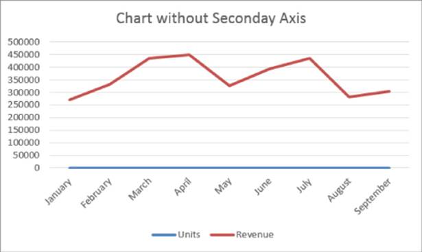
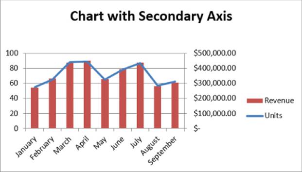
2. You cannot see the units' data though, because it is so small relative to the revenue. To remedy this problem, select the Revenue series line in the graph and right-click.
3. Choose Format Data Series, and select Secondary Axis.
4. Then select any point in the Revenue series, right-click, and change the chart type for the Revenue series to a column graph.
The resulting chart is shown in Figure 2.3, and you can now easily see how closely units and revenue move together. This occurs because Revenue=Average price*units sold, and if the average price during each month is constant, the revenue and units sold series will move in tandem. Your chart indeed indicates that average price is consistent for the charted data.
Figure 2-3: Chart with a secondary axis
Adding Bling to a Column Graph with a Picture of Your Product
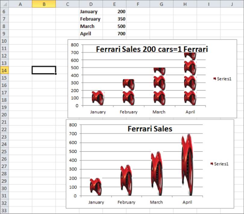
While column graphs are quite useful for analyzing data, they tend to grow dull day after day. Every once in a while, perhaps in a big presentation to a potential client, you might want to spice up a column graph here and there. For instance, in a column graph of your company's sales you could add a picture of your company's product to represent sales. Therefore if you sell Ferraris, you could use a .bmp image of a Ferrari in place of a bar to represent sales. To do this, perform the following steps:
1. Create a Column graph using the data in the Picture worksheet. This data shows monthly sales of cars at an L.A. Ferrari dealer.
2. After creating a Column graph, right-click on any column and choose Format Data Series… followed by Fill.
3. Click Picture or texture fill, as shown in Figure 2.4.
Figure 2-4: Dialog box for creating picture graph
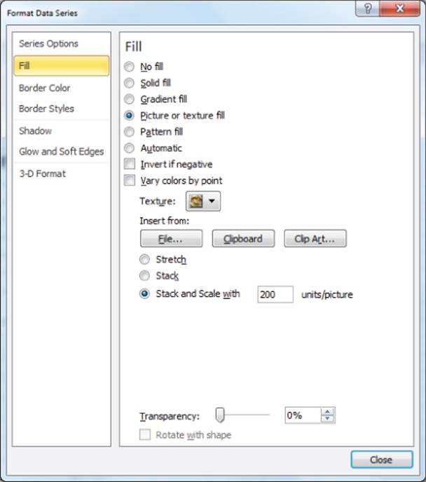
4. Next click File below the Insert from query and choose the Ferrari.bmp file (available for download from the companion site).
5. Choose Stack and Scale with 200 units per picture. This ensures each car represents sales of 200 cars.
The resulting chart is shown in Figure 2.5, as well as in the Picture worksheet.
Figure 2-5: Ferrari picture graph
NOTE
If you choose Stretch in the Fill tab of the Format Data Series dialog, you can ensure that Excel represents each month's sales by a single car whose size is proportional to that month's sales.
Adding Labels or Tables to Your Charts
Often you want to add data labels or a table to a graph to indicate the numerical values being graphed. You can learn to do this by using example data that shows monthly sales of product lines at the True Color Department Store. Refer to the Labels and Tables worksheet for this section's examples.
To begin adding labels to a graph, perform the following steps:
1. Select the data range C5:D9 and choose the first Column chart option (Clustered Column) from the Charts section of the Insert tab.
2. Now click on any column in the graph and choose Layout from the Chart Tools section of the ribbon.
3. Choose the Data Labels option from the Layout section of Chart Tools and select More Data Label Options… Fill in the dialog boxes as shown in Figure 2.6.
Figure 2-6: Dialog Box for creating chart with data labels
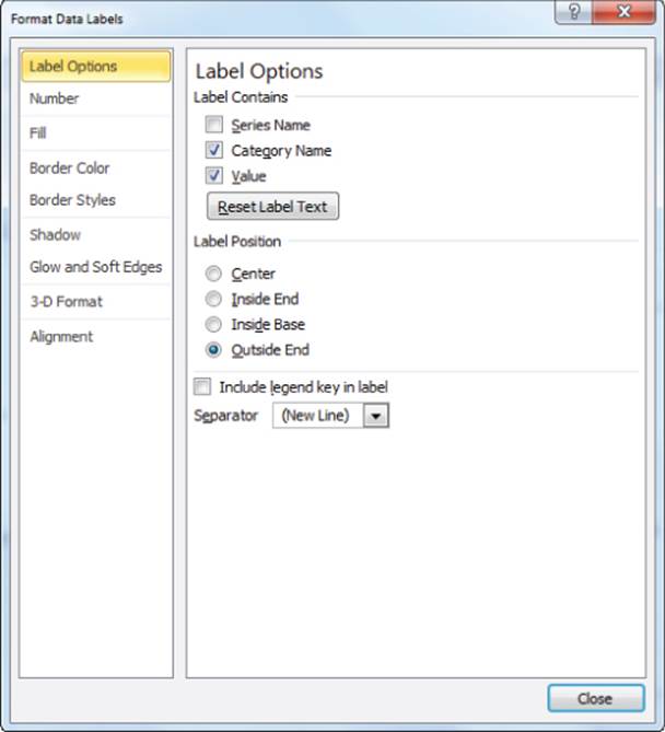
4. Include the Value and Category Name in the label, and put them on a different line.
The resulting graph with data labels is shown in Figure 2.7.
Figure 2-7: Chart with data labels or data tables
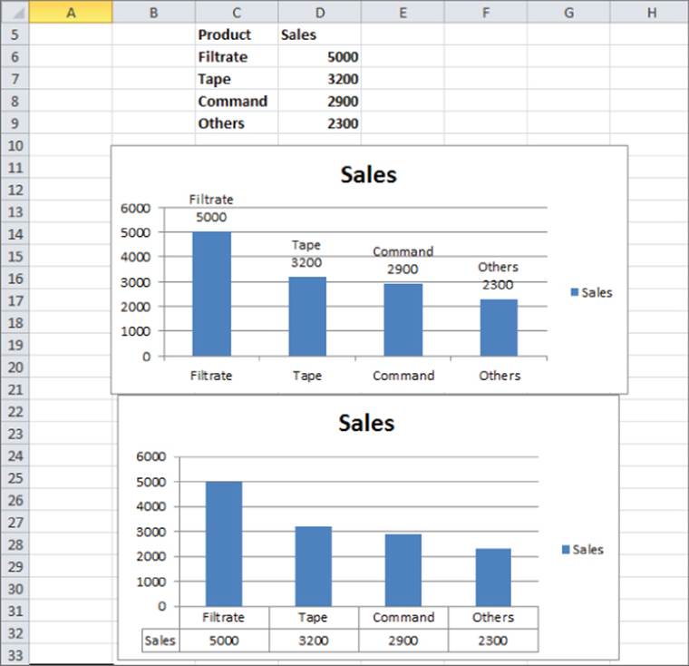
You can also add a Data Table to a column graph. To do so, again select any of the columns within the graph and perform the following steps:
1. From the Chart Tools tab, select Layout.
2. Choose Data Table.
3. Choose the Show Data Table option to create the table shown in the second chart in Figure 2.7.
Using a PivotChart to Summarize Market Research Surveys
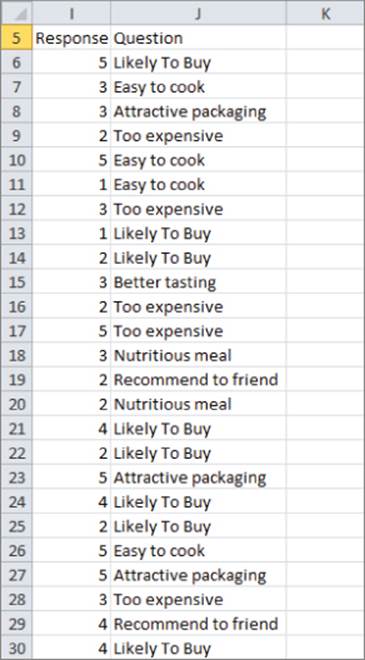
To determine a new product's viability, market researchers often ask potential customers questions about a new product. PivotTables (discussed in Chapter 1, “Slicing and Dicing Marketing Data with PivotTables”) are typically used to summarize this type of data. A PivotChart is a chart based on the contents of a PivotTable. As you will see, a PivotChart can be a highly effective tool to summarize any data gathered from this type of market research. The Survey PivotChart worksheet in the Chapter2chart.xlsx file uses a PivotChart to summarize a market research survey based on the data from the Survey Data worksheet (see Figure 2.8). The example data shows the answer to seven questions about a product (such as Likely to Buy) that was recorded on a 1–5 scale, with a higher score indicating a more favorable view of the product.
Figure 2-8: Data for PivotChart example
To summarize this data, you can perform the following steps:
1. Select the data from the Survey Data worksheet and from the Tables section of the Insert tab choose PivotTable &cmdarr; PivotTable and click OK.
2. Next drag the Question field heading to the Row Labels zone and the Response field heading to the Column Labels and Values zones.
3. Assume you want to chart the fraction of 1, 2, 3, 4, and 5 responses for each question. Therefore, use Value Field Settings to change the Summarize Values By tab field to Count and change the Show Values As tab field to % of Row Total. You then obtain the PivotTable shown first inFigure 2.9.
Figure 2-9: PivotTable and cluttered PivotChart
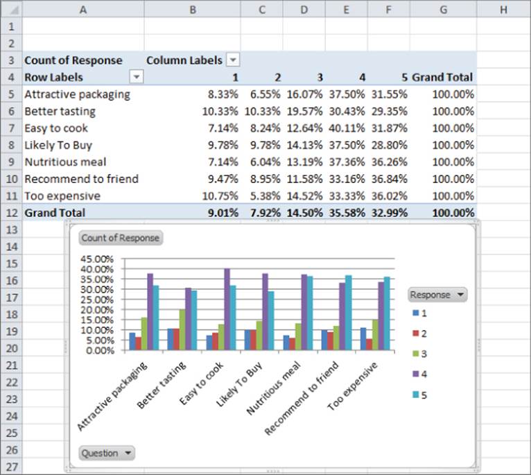
4. You can now create a Pivot Chart from this table. Select PivotChart from the Options tab and choose the first Column chart option. This process yields the PivotChart shown second in Figure 2.9.
5. This chart is a bit cluttered however, so click the drop-down arrow by the Question button, and choose to display only responses to Likely to Buy and Recommend to a Friend. The resulting uncluttered chart is shown in Figure 2.10.
Figure 2-10: Uncluttered PivotChart
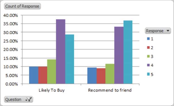
You can see that for both questions more than 60 percent of the potential customers gave the new product a 4 or 5, which is quite encouraging.
Ensuring Charts Update Automatically When New Data is Added
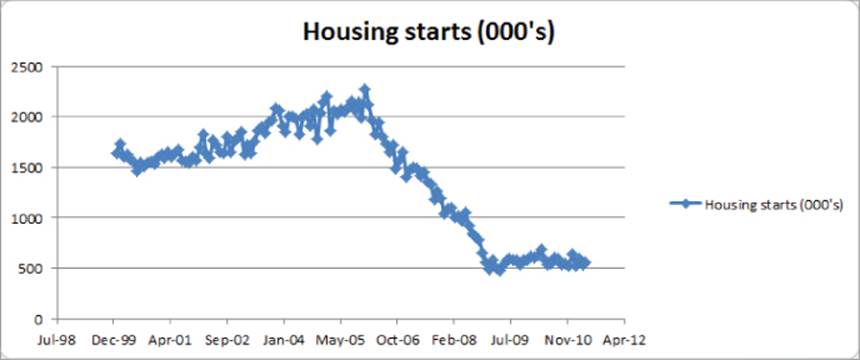
Most marketing analysts download sales data at the end of each month and individually update a slew of graphs that include the new data. If you have Excel 2007 or later, an easy way to do this is to use the TABLE feature to cause graphs to automatically update to include new data. To illustrate the idea, consider the Housing starts worksheet, which contains U.S. monthly housing starts (in 000s) for the time period January 2000 through May 2011. From the Insert tab, you can create the X-Y scatter chart, as shown in Figure 2.11. Just click anywhere in the data and then choose the first scatter plot option.
Figure 2-11: Housing chart through May 2011
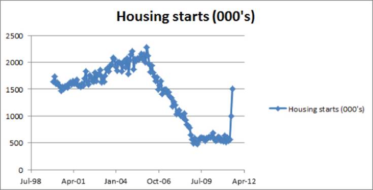
If you add new data in columns D and E as it currently stands, the chart does not automatically incorporate the new data. To ensure that new data is automatically charted, you can instead make your data a TABLE before you create the chart. To do this, simply select the data (including headers) and press Ctrl+T. You can try this for yourself in the New Data worksheet by following these steps:
1. Select the data (D2:E141) and press Ctrl+T to make it a table.
2. Insert a scatter chart.
3. Add two new data points for June 2011 and July 2011 in Row 142 and Row 143.
4. The chart (as shown in Figure 2.12) automatically updates to include the new data. The difference between the two charts is apparent because June and July 2011 housing starts are much larger than April and May 2011 housing starts. Imagine the time-savings if you have 15 or 20 charts keying off this data series!
Figure 2-12: Housing chart through July 2011
You can use the Ctrl+T trick for PivotTables too. If you use data to create a PivotTable, you should make the data a TABLE before creating the PivotTable. This ensures that when you right-click and select Refresh (to update a PivotTable) the PivotTable automatically incorporates the new data.
Making Chart Labels Dynamic
Data in your charts comes from data in your spreadsheet. Therefore changes to your spreadsheet will often alter your chart. If you do not set up the chart labels to also change, your chart will certainly confuse the user. This section shows how to make chart labels dynamically update to reflect changes in the chart.
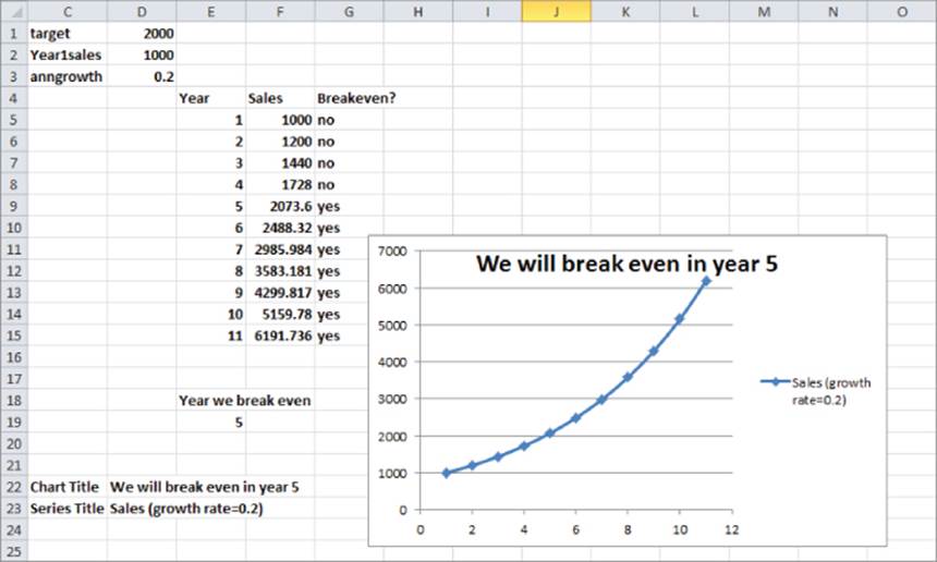
Suppose you have been asked to project sales of a new product. If sales in a year are at least 2,000 units, the company will break even. There are two inputs in the Dynamic Labels worksheet: Year 1 sales (in cell D2) and annual growth in sales (in cell D3). The break-even target is given in cell D1. Use the Excel Create from Selection feature to name the data in D1:D3 with the names in the cell range C1:C3. To accomplish this, perform the following steps:
1. Select the cell range D1:D3.
2. Under the Formulas tab in the Defined Names section, select Create from Selection.
3. Choose the Left Column. Now, for example, when you use the name Year1sales in a formula, Excel knows you are referring to D2.
NOTE
A important reason for using range names is the fact that you can use the F3 key to Paste Range Names in formulas. This can save you a lot of time moving back and forth in your spreadsheet. For example, if your data is in Column A and you have named it you can use the F3 key to quickly and easily paste the data into a formula that is far away from Column A (for example, Column HZ.)
You can continue by graphing the annual sales that are based on initial sales and annual sales growth. As these assumptions change, the graph title and vertical axis legend need to reflect those changes. To accomplish this goal proceed as follows:
4. Enter the Year 1 sales in cell F5 with the formula =Year1sales. Copy the formula =F5*(1+anngrowth) from F6 to F7:F15 to generate sales in Years 2–11.
5. You want to find the year in which you break even, so copy the formula =IF(F5>=target,"yes","no") from G5 to G6:G15 to determine if you have broken even during the current year. For example, you can see that during Years 5–11 you broke even.
The key to creating dynamic labels that depend on your assumed initial sales and annual sales growth is to base your chart title and series legend key off formulas that update as your spreadsheet changes.
Now you need to determine the first year in which you broke even. This requires the use of the Excel MATCH function. The MATCH function has the following syntax: MATCH(lookup_value,lookup_range,0). The lookup_range must be a row or column, and the MATCH function will return the position of the first occurrence of the lookup_value in the lookup_range. If the lookup_value does not occur in the lookup_range, the MATCH function returns an #N/A error. The last argument of 0 is necessary for the MATCH function to work properly.
In cell E19 the formula =MATCH("yes",G5:G15,0) returns the first year (in this case 5) in which you meet the breakeven target. In cell D22 several Excel functions are used to create the text string that will be the dynamic chart title. The formula entered in cell D22 is as follows:
=IFERROR("We will break even in year "&TEXT(E19,"0"),"Never break even")
The functions used in this formula include the following:
· IFERROR evaluates the formula before the comma. If the formula does not evaluate to an error, IFERROR returns the formula's result. If the formula evaluates to an error, IFERROR returns what comes after the comma.
· The & or concatenate sign combines what is before the & sign with what comes after the & sign.
· The TEXT function converts the contents of a cell to text in the desired format. The two most commonly used formats are “0”, which that indicates an integer format, and “0.0%”, which indicates a percentage format.
If the MATCH formula in cell E19 does not return an error, the formula in cell D22 returns the text string We Will Break Even in Year followed by the first year you break even. If you never make it to break even, the formula returns the phrase Never Break Even. This is exactly the chart title you need.
You also need to create a title for the sales data that includes the annual sales growth rate. The series title is created in cell D23 with the following formula:
="Sales (growth rate="&TEXT(anngrowth,"0.0")&")".
NOTE
Note that the growth rate has been changed to a single decimal.
Now you are ready to create the chart with dynamic labels. To do so, perform the following steps:
1. Select the source data (cell range E4:F15 in the Dynamic Labels worksheet) from the chart.
2. Navigate to the Insert tab and choose an X-Y Scatter Chart (the second option).
3. Go to the Layout section of the Chart Tools Group and select Chart Title and Centered Overlay Chart.
4. Place the cursor in the formula bar and type an equal sign (=), point to the chart title in D22, and press Enter. You now have a dynamic chart title that depends on your sales assumptions.
5. To create the series title, right-click any plotted data point, and choose Select Data.
6. Click Edit and choose Series name.
7. Type an equals sign, point to the title in D23, and press Enter. You now have a dynamic series label. Figure 2.13 shows the resulting chart.
Figure 2-13: Chart with dynamic labels
Summarizing Monthly Sales-Force Rankings
If you manage a sales force, you need to determine if a salesperson's performance is improving or declining. Creating customized icon sets provides an easy way to track a salesperson's performance over time.
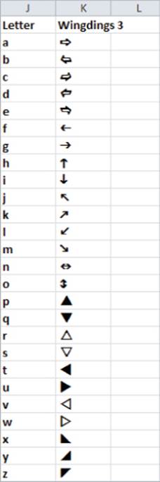
The data in the Sales Tracker worksheet list sales of salespeople during each month (see Figure 2.14). You can track each month with icons (up arrow, down arrow, or flat arrow) to determine whether a salesperson's ranking has improved, worsened, or stayed the same. You could use Excel's Conditional Formatting icon sets (see Chapter 24 of Winston's Data Analysis and Business Modeling with Excel 2010 for a description of the Conditional Formatting icon sets), but then you would need to insert a set of icons separately for each column. A more efficient (although not as pretty) way to create icons is to use Wingdings 3 font and choose an “h” for an up arrow, an “i” for a down arrow, and a “g” for a flat arrow (see Figure 2.15).
Figure 2-14: Monthly sales data
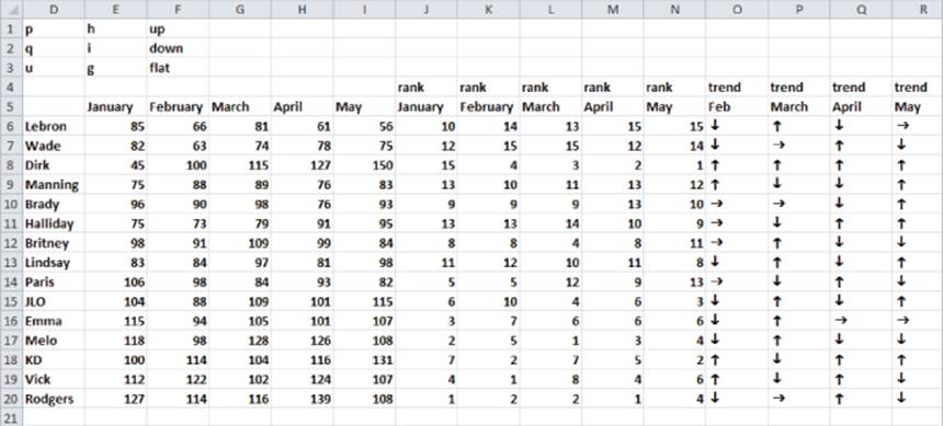
Figure 2-15: Icon sets created with Wingdings 3 font
To begin creating up, down, or flat arrows that reflect monthly changes in each salesperson's performance, perform the following steps:
1. Create each salesperson's rank during each month by copying the formula =RANK(E6,E$6:E$20,0) from J6 to J6:N20.
The last argument of 0 in the RANK function indicates that the largest number in E6:E20 will receive a rank of 1, the second largest number a rank of 2, and so on. If the last argument of the RANK function is 1, the smallest number receives a RANK of 1.
2. Next create the h, i, and g that correspond to the arrows by copying the formula =IF(K6<J6,"h",IF(K6>J6,"i","g")) from O6 to O6:R20.
3. Finally change the font in O6:R20 to Wingdings3.
You can now follow the progress of each salesperson (relative to her peers). For example, you can now see that Dirk Nowitzki improved his ranking each month.
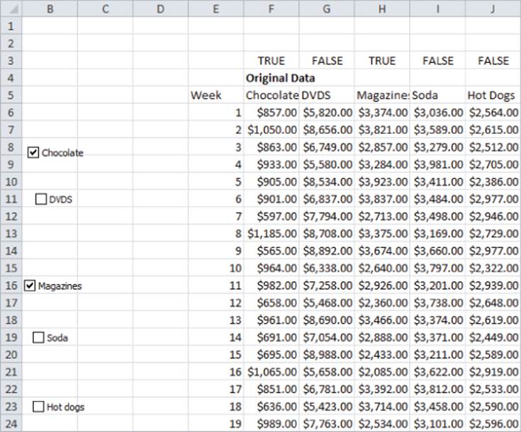
Using Check Boxes to Control Data in a Chart
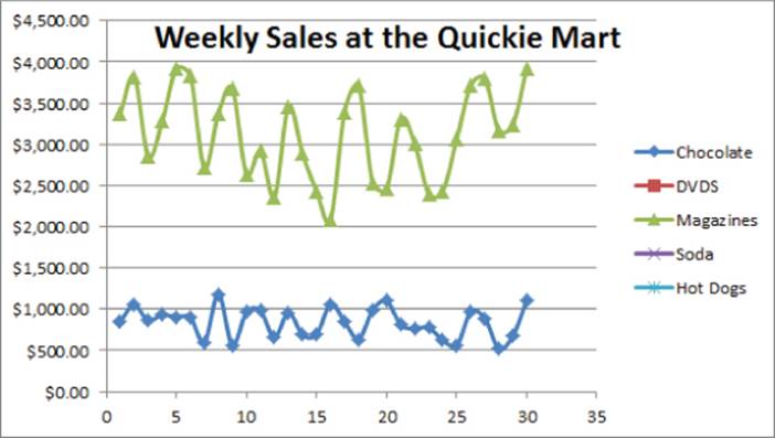
Often the marketing analyst wants to plot many series (such as sales of each product) in a single chart. This can result in a highly cluttered chart. Often it is convenient to use check boxes to control the series that are charted. The Checkboxes worksheet illustrates this idea. The data here shows weekly sales of chocolates, DVDs, magazines, soda, and hot dogs at the Quickie Mart convenience store. You can easily summarize this data in a single chart with five lines, as shown in Figure 2.16
Figure 2-16: Sales at Quickie Mart
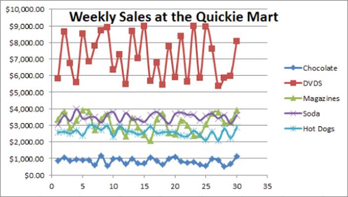
Now this chart is a good start, however, you might notice that the presence of five series appears cluttered, and therefore you would probably be better off if you did not show the sales of every product. Check boxes make it easy to control which series show up in a chart. To create a check box, perform the following steps:
1. Ensure you see the Developer tab on the ribbon. If you do not see the Developer tab in Excel 2010 or 2013, select File &cmdarr; Options, and from Customize Ribbon select the Developer tab.
2. To place a check box in a worksheet, select the Developer tab and chose Insert.
3. From the Form Controls (Not ActiveX) select the check box that is third from the left in the top row.
4. After releasing the left mouse in the worksheet, you see a drawing tool. Hold down the left mouse to size the check box. If you want to resize the check box again later, simply hold down the control key and click the check box.
A check box simply puts a TRUE or FALSE in a cell of your choosing. It serves as a Toggle switch that can be used to turn Excel features (such as a Function argument or Conditional Formatting) on or off.
5. Next, select the cell controlled by the check box by moving the cursor to the check box until you see the Pointer (a hand with a pointing finger).
6. Right-click, select the Format Control dialog box, and select cell F3 (by pointing) as the cell link. Click OK.
7. Now when this check box is selected, F3 shows TRUE, and when the check box is not selected, cell F3 shows FALSE. Label this check box with the name of the series it controls, Chocolate in this case.
In a similar fashion four more check boxes were created that control G3, H3, I3, and J3. These check boxes control the DVDs, magazines, sodas, and hot dogs series, respectively. Figure 2.17 shows these check boxes.
Figure 2-17: Check boxes for controlling which products show in chart
After you have created the necessary check boxes, the trick is to not chart the original data but chart data controlled by the check boxes. The key idea is that Excel will ignore a cell containing an #N/A error when charting. To get started, copy the formula = IF(F$3,F6,NA()) from O6 to O6:S35 to ensure that a series will only be charted when its check box is checked. For instance, check the Chocolate check box and a TRUE appears in F3, so O6 just picks up the actual week 1 chocolate sales in F6. If you uncheck the Chocolate check box, you get a FALSE in F3, O6 returns #N/A, and nothing shows up in the chart. To chart the data in question, select the modified data in the range O5:S35 and choose from the Insert tab the second X Y Scatter option. If you check only the Chocolate and Magazines check boxes, you can obtain the chart shown in Figure 2.18, which shows only sales of Chocolate and Magazines.
Figure 2-18: Charting only selected data
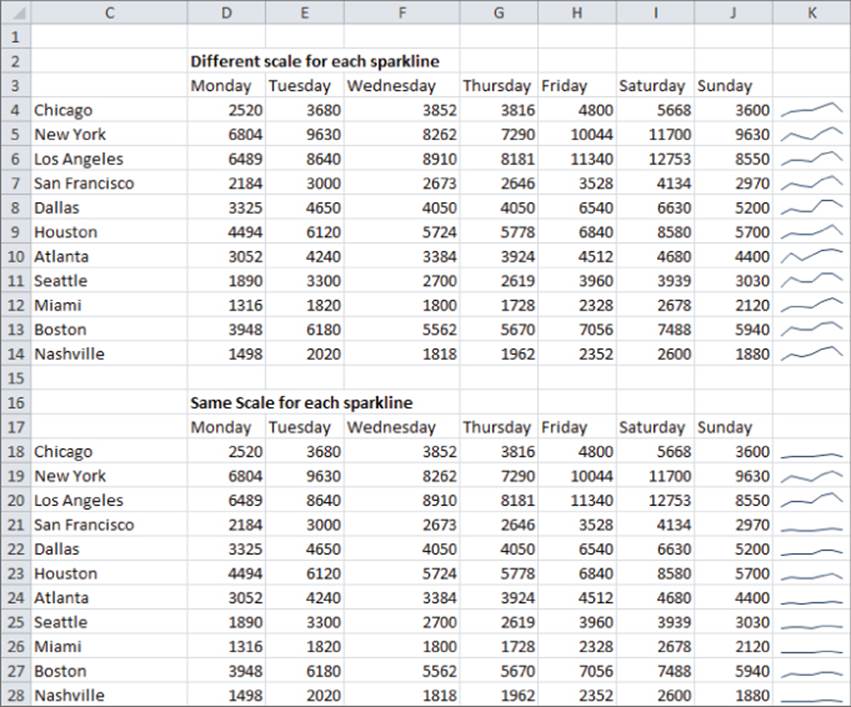
Using Sparklines to Summarize Multiple Data Series
Suppose you are charting daily sales of French Fries at each of the over 12,000 US McDonald's. Showing the sales for each restaurant in a single chart would result in a useless, cluttered graph. But think of the possibilities if you could summarize daily sales for each restaurant in a single cell! Fortunately, Excel 2010 and later enables you to create sparklines. A sparkline is a graph that summarizes a row or column of data in a single cell. This section shows you how to use Excel 2010 to easily create sparklines.
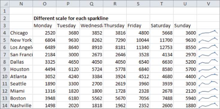
The Sparklines worksheet contains data that can be used to illustrate the concept of Sparklines. The data gives the number of engagement rings sold each day of the week in each city for a national jewelry store chain (see Figure 2.19).
Figure 2-19: Sparklines Example
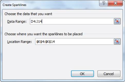
You can summarize the daily sales by graphing the daily counts for each city in a single cell. To do so, perform the following steps:
1. First, select where you want your Sparklines to go (the Sparklines worksheet uses K4:K14: you can use L4:L14) and then from the Insert tab, select Line from the Sparklines section.
2. Fill in the dialog box shown in Figure 2.20 with the data range on which the Sparklines are based (D4:J14).
Figure 2-20: Sparkline dialog box
You now see a line graph (refer to Figure 2.19) that summarizes the daily sales in each city. The Sparklines make it clear that Saturday is the busiest day of the week.
If you click in any cell containing a Sparkline, the Sparkline Tools Design tab appears. Here, after selecting the Design tab, you can make many changes to your Sparklines. For example, Figure 2.21 shows selections for the high and low points to be marked and Figure 2.22 shows the Sparklines resulting from these selections.
Figure 2-21: Selecting High and Low Point Markers
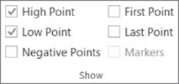
Figure 2-22: Sparklines with High and Low Markers
These Sparklines make it clear that Saturday was the busiest day for each branch and Monday was the slowest day.
The Design tab enables you to make the following changes to your Sparklines:
· Alter the type of Sparkline (Line, Column, or Win-Loss). Column and Win-Loss Sparklines are discussed later in the chapter.
· Use the Edit Data choice to change the data used to create the Sparkline. You can also change the default setting so that hidden data is included in your Sparkline.
· Select any combination of the high point, low point, negative points, first point, or last point to be marked.
· Change the style or color associated with the Sparklines and markers.
· Use the Axis menu to change the way the axes are set for each Sparkline. For example, you may make the x-axis or y-axis scale the same for each Sparkline. This is the scaling used in the cell range K18:K28. Note this choice shows that Nashville, for example, sells fewer rings than the other cities. The default is for the scale for each axis to be based on the data for the individual Sparkline. This is the scaling used in the Sparklines in the cell range K4:K14 of Figure 2.22. The Custom Value choice enables you to pick an upper and lower limit for each axis.
· When data points occur at irregularly spaced dates, you can select Data Axis Type from the Axis menu so that the graphed points are separated by an amount of space proportional to the differences in dates.
NOTE
By clicking any of the Sparklines, you could change them to Column Sparklines simply by selecting Column from the Sparklines Design tab.
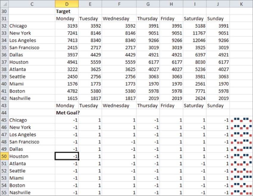
Excel also can create Win-Loss Sparklines. A Win-Loss Sparkline treats any positive number as an up block and any negative number as a down block. Any 0s are graphed as a gap. A Win-Loss Sparkline provides a perfect way to summarize performance against sales targets. In the range D32:J42 you can see a list of the daily targets for each city. By copying the formula = IF(D18>D32-1-1) from D45 to D45:J55, you can create a 1 when a target is met and a –1 when a target is not met. To create the Win-Loss Sparklines, select the range where the Sparklines should be placed (cell range K45:K55) and from the Insert menu, select Win-Loss Sparklines. Then choose the data range D45:J55. Figure 2.23 shows your Win-Loss Sparklines.
Figure 2-23: Win-Loss Sparklines
NOTE
If you want your Sparklines to automatically update to include new data, you should make the data a table.
Using GETPIVOTDATA to Create the End-of-Week Sales Report
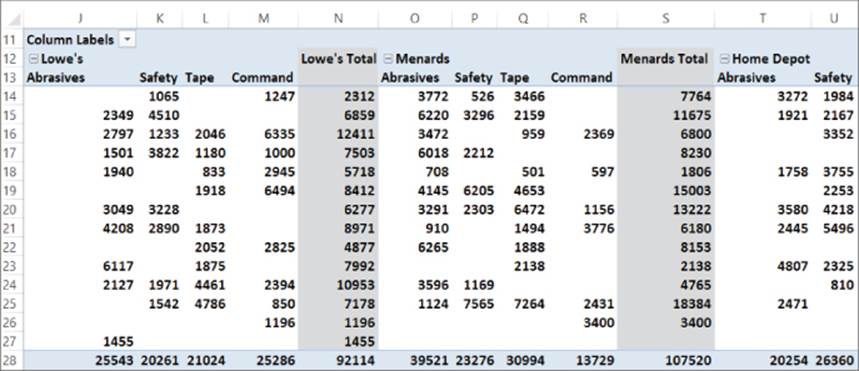
Many marketing analysts download weekly sales data and want to summarize it in charts that update as you download the new data. The Excel Table feature and GETPIVOTDATA function can greatly ease this process. To illustrate this process, download the source data in columns D through G in theEnd of Month dashboard worksheet. Each row (see Figure 2.24) gives the week of sales, the sales category, the store in which sales were made, and the revenue generated. The goal is to create a line graph to summarize sales of selected product categories (for each store) that automatically update when new data is downloaded. The approach is as follows:
1. Make the source data a table; in this example you can do so by selecting Table from the Insert tab after selecting the range D4:G243.
2. Create a PivotTable based on the source data by dragging Week to the Row Labels zone, Store and Category to the Column Labels zone, and Revenue to the Values zone. This PivotTable summarizes weekly sales in each store for each product category. Figure 2.25 shows a portion of this PivotTable.
Figure 2-24: Weekly sales data
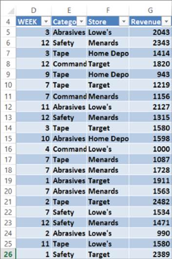
Figure 2-25: PivotTable for Weekly sales report
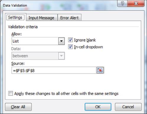
3. Create a drop-down box in cell AG8 from which a store can be selected. To accomplish this, navigate to the Data tab and select Data Validation from the Data Tools group.
4. Choose Settings and fill in the Data Validation dialog box, as shown in Figure 2.26. This ensures that when the cursor is placed in cell AG8 you can see a drop-down box that lists the store names (pulled from cell range F5:F8)
Figure 2-26: Creating Data Validation drop-down box
5. Enter week numbers in the range AG11:AG24 and product categories in AG10:AK10. Then use the GETPIVOTDATA function to pull the needed data from the PivotTable. Before entering the key formula, simply click anywhere in the PivotTable to get a GETPIVOTDATA function. Then copy that function and paste it in the following formula to modify the arguments for Week, Category, and Store, as shown here. Enter this important formula in cell AH11:
=IF(AH$9=FALSE,NA(),IFERROR(GETPIVOTDATA("Revenue",$I$11,"WEEK",$AG11,"Category",AH$10,"Store",$AG$8)," ")).
6. Copy this formula to the range AH11:AK24. This formula uses GETPIVOTDATA to pull revenue for the store listed in AG8 and the category listed in row 10 if row 9 has a TRUE. The use of IFERROR ensures a blank is entered if the category were not sold in the selected store during the given week.
7. Make the source data for the chart, AG10:AK24, a table, so new data is automatically included in the graph. The Table feature can also ensure that when you enter a new week the GETPIVOTDATA formulas automatically copy down and pull needed information from the updated PivotTable.
8. Use check boxes to control the appearance of TRUE and FALSE in AH9:AK9. After making the range AG10:AK24 a table, the chart is simply an X-Y scatter graph with source data AG10:AK24. Figure 2.27 shows the result.
Figure 2-27: Sales summary report
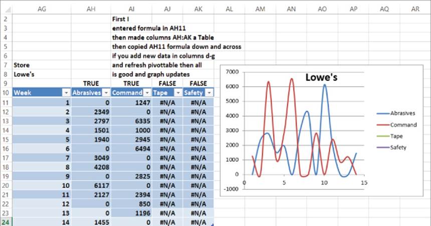
9. Now add new data for Week 15 and refresh the PivotTable. If you add Week 15 in cell AG25, the graph automatically updates. Because you made the source data for the chart a table, when you press Enter Excel “knows” you want the formulas copied down.
Summary
In this chapter you learned the following:
· Right-clicking a series in a chart enables you to change the series' chart type and create a Combination chart.
· Right-clicking a chart series and choosing Format Data Series enables you to create a secondary axis for a chart.
· Right-clicking a chart series in a Column graph and selecting Fill followed by Picture or Texture Fill enables you to replace a bland column with a picture from a file or Clip Art.
· On Chart Tools from the Layout tab, you can easily insert Data Labels and a Data Table in the chart.
· If you make the source data for a chart a table (from the Insert tab choose Table) before creating a chart, the chart automatically updates to include new data.
· PivotCharts are a great way to summarize a lengthy market research survey. Filtering on the questions enables you customize the results shown in your chart.
· If you base your chart title and series labels on cell formulas, they dynamically update as you change the inputs or assumptions in your spreadsheet.
· Clever use of IF formulas and the Wingdings 3 font can enable you to create a visually appealing summary of trends over time in sales data.
· Use check boxes to control the series that appear in a chart.
· Combining the Table feature, PivotTables, GETPIVOTDATA, check boxes, and Data Validation drop-down boxes makes it easy to create charts with customized views that automatically update to include new data.
Exercises
Exercises 1–6 use data in the file Chapter2exercisesdata.xlsx.
1. The Weather worksheet includes monthly average temperature and rainfall in Bloomington, Indiana. Create a combination chart involving a column and line graph with a secondary axis to chart the temperature and rainfall data.
2. The Weather worksheet includes monthly average temperature and rainfall in Bloomington, Indiana. Create a combination chart involving a column and area graph with a secondary axis to chart the temperature and rainfall data.
3. The Pictures and Labels worksheet includes monthly tomato sales on Farmer Smith's farm. Summarize this data with pictures of tomatoes, data labels, and a data table.
4. The Survey worksheet contains results evaluating a training seminar for salespeople. Use a PivotChart to summarize the evaluation data.
5. The data in the checkboxes worksheet contains monthly sales during 2010 and 2011. Use check boxes to set up a chart in which the user can choose which series are charted.
6. The Income worksheet contains annual data on median income in each state for the years 1984–2010. Use Sparklines to summarize this data.
7. Jack Welch's GE performance evaluation system requires management to classify the top 20 percent of all workers, middle 70 percent of all workers, and bottom 10 percent of all workers. Use Icon sets to classify the salespeople in the Sales Tracker worksheet of file Chapter2data.xlsxaccording to the 20-70-10 rule.
NOTE
You need the PERCENTILE function. For example, the function PERCENTILE(A1:A50,.9) would return the 90th percentile of the data in the cell range A1:A50.
Exercises 8 and 9 deal with the data in the file LaPetitbakery.xlsx that was discussed in Chapter 1.
8. Use the Excel Table feature to set up a chart of daily cake sales that updates automatically when new data is included.
9. Set up a chart that can be customized to show total monthly sales for any subset of La Petit Bakery's products. Of course, you want the chart to update automatically when new data appears in the worksheet.
10. The marketing product life cycle postulates that sales of a new product will increase for a while and then decrease. Specify the following five inputs:
· Year 1 sales
· Years of growth
· Years of decline
· Average annual growth rate during growth period
· Average annual decline during decline period
Set up a Data Validation drop-down box that allows years of growth and decline to vary between 3 and 10. Then determine sales during Years 1–20. Suppose 10,000 units need to be sold in a year to break even. Chart your annual sales, and set up a dynamic chart title that shows the year (if any) in which you break even. Your series label should include the values of the five input parameters.
All materials on the site are licensed Creative Commons Attribution-Sharealike 3.0 Unported CC BY-SA 3.0 & GNU Free Documentation License (GFDL)
If you are the copyright holder of any material contained on our site and intend to remove it, please contact our site administrator for approval.
© 2016-2026 All site design rights belong to S.Y.A.