Excel 2016 All-in-One For Dummies (2016)
Book V
Charts and Graphics
 Discover how to spice up a worksheet with WordArt in the article “Adding WordArt in Excel 2016” online at www.dummies.com/extras/excel2016aio.
Contents at a Glance
1. Chapter 1: Charting Worksheet Data
1. Worksheet Charting 101
2. Adding Sparkline Graphics to a Worksheet
3. Printing Charts
2. Chapter 2: Adding Graphic Objects
1. Graphic Objects 101
2. Inserting Different Types of Graphics
3. Drawing Graphics
4. Adding Screenshots of the Windows Desktop
5. Using Themes
Chapter 1
Charting Worksheet Data
In This Chapter
![]() Understanding how to chart worksheet data
Understanding how to chart worksheet data
![]() Creating an embedded chart or one on its own chart sheet
Creating an embedded chart or one on its own chart sheet
![]() Editing an existing chart
Editing an existing chart
![]() Formatting the elements in a chart
Formatting the elements in a chart
![]() Saving customized charts as templates and using these templates to create new charts
Saving customized charts as templates and using these templates to create new charts
![]() Adding sparklines to worksheet data
Adding sparklines to worksheet data
![]() Printing a chart alone or with its supporting data
Printing a chart alone or with its supporting data
Charts present the data from your worksheet visually by representing the data in rows and columns as bars on a chart, for example, or as pieces of a pie in a pie chart. For a long time, charts and graphs have gone hand-in-hand with spreadsheets because they allow you to see trends and patterns that you often can’t readily visualize from the numbers alone. Which has more consistent sales, the Southeast region or the Northwest region? Monthly sales reports may contain the answer, but a bar chart based on the data shows it more clearly.
In this chapter, you first become familiar with the terminology that Excel uses as it refers to the parts of a chart — terms that may be new, such as data marker and chart data series, as well as terms that are probably familiar already, such as axis. After you get acquainted with the terms, you begin to put them to use going through the simple steps required to create the kind of chart that you want, either as part of the worksheet or a separate chart sheet.
The art of preparing a chart (and much of the fun) is matching a chart type to your purposes. To help you with this, I guide you through a tour of all the chart types available in Excel 2016, from old standbys, such as bar and column charts, to ones that may be new to you, such as radar charts and surface charts. Finally, you discover how to print charts, either alone or as part of the worksheet.
Worksheet Charting 101
The typical Excel chart is comprised of several distinct parts. Figure 1-1 shows an Excel clustered column chart added to a worksheet with labels identifying the parts of this chart. Table 1-1 summarizes the parts of the typical chart.
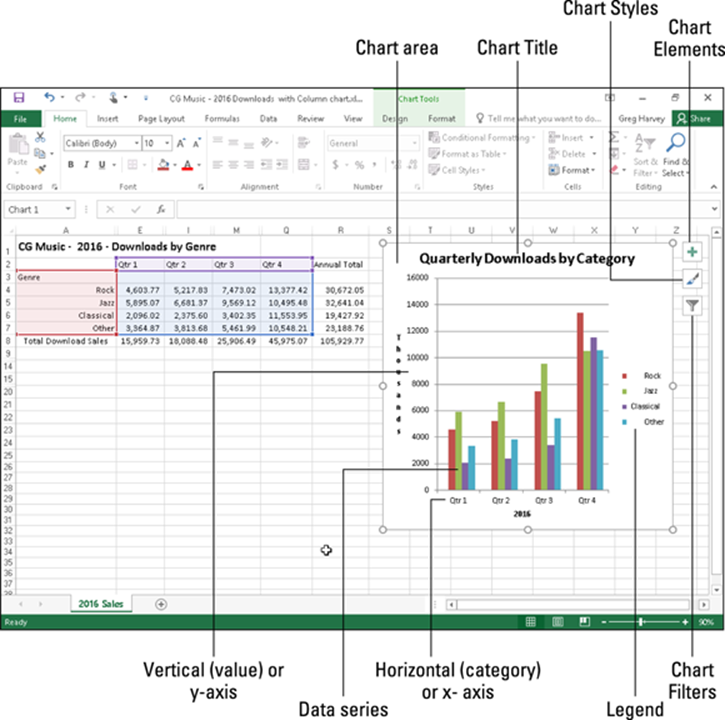
Figure 1-1: A typical clustered column chart containing a variety of standard chart elements.
Table 1-1 Parts of a Typical Chart
|
Part |
Description |
|
Chart area |
Everything inside the chart window, including all parts of the chart (labels, axes, data markers, tick marks, and other elements in this table). |
|
Data marker |
A symbol on the chart that represents a single value in the spreadsheet. A symbol may be a bar in a bar chart, a pie in a pie chart, or a line on a line chart. Data markers with the same shape or pattern represent a single data series in the chart. |
|
Chart data series |
A group of related values, such as all the values in a single row in the chart — all the quarterly sales for Rock CDs in the sample chart, for example. A chart can have just one data series (shown in a single bar or line), but it usually has several. |
|
Series formula |
A formula describing a given data series. The formula includes a reference to the cell that contains the data series name, references to worksheet cells containing the categories and values plotted in the chart, and the plot order of the series. The series formula can also have the actual data used to plot the chart. You can edit a series formula and control the plot order. |
|
Axis |
A line that serves as a major reference for plotting data in a chart. In two-dimensional charts, there are two axes: the x (horizontal/category) axis and the y (vertical/value) axis. In most two-dimensional charts (except, notably, column charts), Excel plots categories (labels) along the x-axis and values (numbers) along the y-axis. Bar charts reverse the scheme, plotting values along the y-axis. Pie charts have no axes. Three-dimensional charts have an x-axis, a y-axis, and a z-axis. The x- and y-axes delineate the horizontal surface of the chart. The z-axis is the vertical axis, showing the depth of the third dimension in the chart. |
|
Tick mark |
A small line intersecting an axis. A tick mark indicates a category, scale, or chart data series. A tick mark can have a label attached. |
|
Plot area |
The area where Excel plots your data, including the axes and all markers that represent data points. |
|
Gridlines |
Optional lines extending from the tick marks across the plot area, thus making it easier to view the data values represented by the tick marks. |
|
Chart text |
A label or title that you add to the chart. Attached text is a title or label linked to an axis such as the Chart Title, Vertical Axis Title, and Horizontal Axis Title that you can’t move independently of the chart. Unattached text is text that you add such as a text box with the Text Box command button on the Insert tab of the Ribbon. |
|
Legend |
A key that identifies patterns, colors, or symbols associated with the markers of a chart data series. The legend shows the data series name corresponding to each data marker (such as the name of the red columns in a column chart). |
Embedded charts versus charts on separate chart sheets
An embedded chart is a chart that appears right within the worksheet (like the one shown in Figure 1-1) so that when you save or print the worksheet, you save or print the chart along with it. Note that your charts don’t have to be embedded. You can also choose to create a chart in its own chart sheet in the workbook at the time you create it. Embed a chart on the worksheet when you want to be able to print the chart along with its supporting worksheet data. Place a chart on its own sheet when you intend to print the charts of the worksheet data separately.
 Keep in mind that all charts (embedded or on their own sheets) are dynamically linked to the worksheet that they represent. This means that if you modify any of the values that are plotted in the chart, Excel immediately redraws the chart to reflect the change, assuming that the worksheet still uses automatic recalculation. When Manual recalculation is turned on, you must remember to press F9 or click the Calc Now (F9) command button on the Formulas tab of the Ribbon (Alt+MB) in order to get Excel to redraw the chart to reflect any changes to the worksheet values it represents.
 You can print any chart that you’ve embedded in a worksheet by itself without any worksheet data (as though it were created on its own chart sheet) by selecting it before you open the Print dialog box.
Moving an embedded chart onto its own chart sheet
If it’s really important that the chart remain a separate element in the workbook, you can move the embedded chart onto its own chart sheet. Simply click the embedded chart if it’s not already selected in the worksheet and then click the Move Chart command button in the Location group on the Design tab of the Chart Tools contextual tab on the Ribbon. Excel then opens the Move dialog box, where you then click the New Sheet option button and click OK to switch the embedded chart to a chart on a separate chart sheet.
Inserting recommended charts
My personal favorite way to create a new embedded chart from selected data in a worksheet in Excel 2016 is with the Recommended Charts command button on the Insert tab of the Ribbon (Alt+NR).
When you use this method, Excel opens the Insert Chart dialog box with the Recommended Charts tab selected similar to the one shown in Figure 1-2. Here, you can preview how the selected worksheet data will appear in different types of charts simply by clicking its thumbnail in the list box on the left. When you find the type of chart you want to create, you then simply click the OK button to have it embedded into the current worksheet.
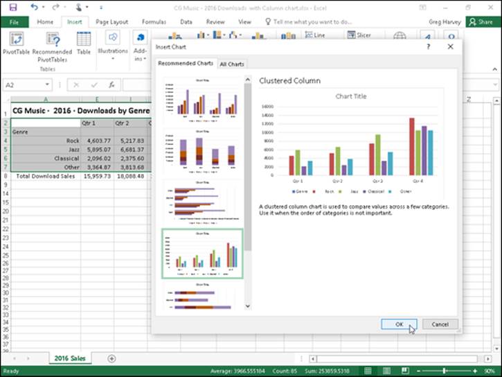
Figure 1-2: Insert Chart dialog box with the Recommended Charts tab selected.
Inserting specific chart types from the Ribbon
To the right of the Recommended Charts button in the Charts group of the Ribbon’s Insert tab, you find particular command buttons with galleries for creating the following particular types and styles of charts:
· Insert Column or Bar Chart to preview your data as a 2-D or 3-D vertical column or bar chart
· Insert Hierarchy Chart to preview your data in a Treempa or Sunburst hierarchy chart
· Insert Waterfall or Stock to preview your data as a 2-D waterfall or stock chart (using typical stock symbols)
· Insert Line or Area Chart to preview your data as a 2-D or 3-D line or area chart
· Insert Statistic Chart to preview your data as a 2-D histogram or box and whiskers chart
· Insert Combo Chart to preview your data as a 2-D combo clustered column and line chart or clustered column and stacked area chart
· Insert Pie or Doughnut Chart to preview your data as a 2-D or 3-D pie chart or 2-D doughnut chart
· Insert Scatter (X,Y) or Bubble Chart to preview your data as a 2-D scatter (X,Y) or bubble chart
· Insert Surface or Radar Chart to preview your data as a 2-D or 3-D surface chart or as a 2-D radar chart
· PivotChart to preview your data as a PivotChart (see Book VII, Chapter 2 for more on creating this special type of interactive summary chart)
When using the galleries attached to these chart command buttons on the Insert tab to preview your data as a particular style of chart, you can embed the chart in your worksheet simply by clicking its chart icon.
If you’re not sure what type of chart best represents your data, rather than go through the different chart type buttons on the Ribbon’s Insert tab, you can use the All Charts tab of the Insert Chart dialog box shown in Figure 1-3 to “try out” your data in different chart types and styles. You can open the Insert Chart dialog box by clicking the Dialog Box launcher in the lower-right corner of the Charts group on the Insert tab and then display the complete list of chart types by clicking the All Charts tab in this dialog box.
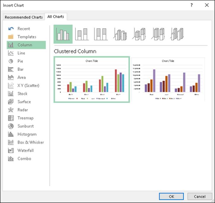
Figure 1-3: Insert Chart dialog box with the All Charts tab selected.
Inserting charts with the Quick Analysis tool
For those times when you need to select a subset of a data table as the range to be charted (as opposed to selecting a single cell within a data table), you can use the Quick Analysis tool to create your chart. Just follow these steps:
1. Click the Quick Analysis tool that appears at the lower-right corner of the current cell selection.
Doing this opens the palette of Quick Analysis options with the initial Formatting tab selected and its various conditional formatting options displayed.
2. Click the Charts tab at the top of the Quick Analysis options palette.
Excel selects the Charts tab and displays buttons for different types of charts that suit the selected data, such as Column, Stacked Bar and Clustered Bar, followed by a More Charts option buttons. The different types of chart buttons preview the selected data in that kind of chart. The final More Charts button opens the Insert Chart dialog box with the Recommended Charts tab selected. Here you can preview and select a chart from an even wider range of chart types.
3. In order to preview each type of chart that Excel 2016 can create using the selected data, highlight its chart type button in the Quick Analysis palette.
As you highlight each chart type button in the options palette, Excel’s Live Preview feature displays a large thumbnail of the chart that will be created from your table data. (See Figure 1-4.) This thumbnail appears above the Quick Analysis options palette for as long as the mouse or Touch pointer is over its corresponding button.
4. When a preview of the chart you actually want to create appears, click its button in the Quick Analysis options palette to create it.
Excel 2016 then creates and inserts an embedded chart of the selected type in the current worksheet. This embedded chart is active so that you can immediately move it and edit it as you wish.
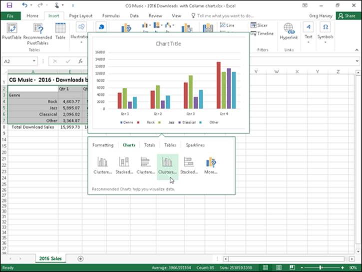
Figure 1-4: Previewing the embedded chart to insert from the Quick Analysis tool.
Creating a chart on a separate chart sheet
Sometimes you know you want your new chart to appear on its own separate sheet in the workbook and you don’t have time to fool around with moving an embedded chart created with the Quick Analysis tool or the various chart command buttons on the Insert tab of the Ribbon to its own sheet. In such a situation, simply position the cell pointer somewhere in the table of data to be graphed (or select the specific cell range in a larger table) and then just press F11.
Excel then creates a clustered column chart using the table’s data or cell selection on its own chart sheet (Chart1) that precedes all the other sheets in the workbook as shown in Figure 1-5. You can then customize the chart on the new chart sheet as you would an embedded chart that’s described later in the chapter.
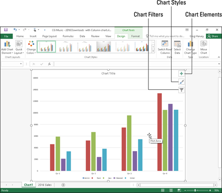
Figure 1-5: Clustered column chart created on its own chart sheet.
Refining the chart from the Design tab
You can use the command buttons on the Design tab of the Chart Tools contextual tab to make all kinds of changes to your new chart. This tab contains the following command buttons:
· Chart Layouts: Click the Add Chart Element button to select the type of chart element you want to add. (You can also do this by selecting the Chart Elements button in the upper-right corner of the chart itself.) Click the Quick Layout button and then click the thumbnail of the new layout style you want applied to the selected chart on the drop-down gallery.
· Chart Styles: Click the Change Colors button to open a drop-down gallery and then select a new color scheme for the data series in the selected chart. In the Chart Styles gallery, highlight and then click the thumbnail of the new chart style you want applied to the selected chart. Note that you can select a new color and chart style in the opened galleries by clicking the Chart Styles button in the upper-right corner of the chart itself.
· Switch Row/Column: Click this button to immediately interchange the worksheet data used for the Legend Entries (series) with that used for the Axis Labels (Categories) in the selected chart.
· Select Data: Click this button to open the Select Data Source dialog box, where you can not only modify which data is used in the selected chart but also interchange the Legend Entries (series) with the Axis Labels (Categories), but also edit out or add particular entries to either category.
· Change Chart Type: Click this button to change the type of chart and then click the thumbnail of the new chart type on the All Charts tab in the Change Chart dialog box, which shows all kinds of charts in Excel.
· Move Chart: Click this button to open the Move Chart dialog box, where you move an embedded chart to its own chart or move a chart on its own sheet to one of the worksheets in the workbook as an embedded chart.
Modifying the chart layout and style
As soon as Excel draws a new chart in your worksheet, the program selects your chart and adds the Chart Tools contextual tab to the end of the Ribbon and selects its Design tab. You can then use the Quick Layout and Chart Styles galleries to further refine the new chart.
Figure 1-6 shows the original clustered column chart (created in Figure 1-5) after selecting Layout 9 on the Quick Layout button’s drop-down gallery and then selecting the Style 8 thumbnail on the Chart Styles drop-down gallery. Selecting Layout 9 adds Axis Titles to both the vertical and horizontal axes as well as creating the Legend on the right side of the graph. Selecting Style 8 gives the clustered column chart its dark background and contoured edges on the clustered columns themselves.
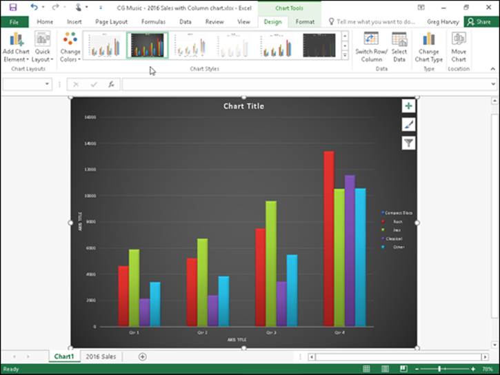
Figure 1-6: Clustered column chart on its own chart sheet after selecting a new layout and style from the Design tab.
Trying on all your choices in the Chart Styles gallery
When selecting a new style for your chart, you can display all the style choices by clicking that gallery’s More button (the one with the horizontal bar directly over a triangle pointing downward). Doing this displays the thumbnails of all your layout and style choices for the new chart. You can also scroll through the rows of style choices by clicking the Previous Row or Next Row buttons immediately above it with the respective upward- or downward-pointing triangles.
Switching the rows and columns in a chart
Normally when Excel creates a new chart, it automatically graphs the data by rows in the cell selection so that the column headings appear along the horizontal (category) axis at the bottom of the chart and the row headings appear in the legend (assuming that you’re dealing with a chart type that utilizes an x- and y-axis).
You can click the Switch Row/Column command button on the Design tab of the Chart Tools contextual tab to switch the chart so that row headings appear on the horizontal (category) axis and the column headings appear in the legend (or you can press Alt+JCW).
Figure 1-7 demonstrates how this works. This figure shows the same clustered column chart after selecting the Switch Row/Column command button on the Design tab. Now, column headings (Qtr 1, Qtr 2, Qtr 3, and Qtr 4) are used in the legend on the right and the row headings (Genre, Rock, Jazz, Classical, and Other) appear along the horizontal (category) axis.
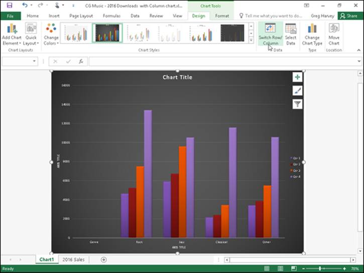
Figure 1-7: The clustered column chart after switching the columns and rows.
Editing the source of the data graphed in the chart
When you click the Select Data command button on the Design tab of the Chart Tools contextual tab (or press Alt+JCE), Excel opens a Select Data Source dialog box similar to the one shown in Figure 1-8. The controls in this dialog box enable you to make the following changes to the source data:
· Modify the range of data being graphed in the chart by clicking the Chart Data Range text box and then making a new cell selection in the worksheet or typing in its range address.
· Switch the row and column headings back and forth by clicking its Switch Row/Column button.
· Edit the labels used to identify the data series in the legend or on the horizontal (category) by clicking the Edit button on the Legend Entries (Series) or Horizontal (Categories) Axis Labels side and then selecting the cell range with appropriate row or column headings in the worksheet.
· Add additional data series to the chart by clicking the Add button on the Legend Entries (Series) side and then selecting the cell containing the heading for that series in the Series Name text box and the cells containing the values to be graphed in that series in the Series Values text box.
· Delete a label from the legend by clicking its name in the Legend Entries (Series) list box and then clicking the Remove button.
· Modify the order of the data series in the chart by clicking the series name in the Legend Entries (Series) list box and then clicking the Move Up button (the one with the arrow pointing upward) or the Move Down button (the one with the arrow pointing downward) until the data series appears in the desired position in the chart.
· Indicate how to deal with empty cells in the data range being graphed by clicking the Hidden and Empty Cells button and then selecting the appropriate Show Empty Cells As option button (Gaps, the default; Zero and Connect Data Points with Line, for line charts). Click the Show Data in Hidden Rows and Columns check box to have Excel graph data in the hidden rows and columns within the selected chart data range.
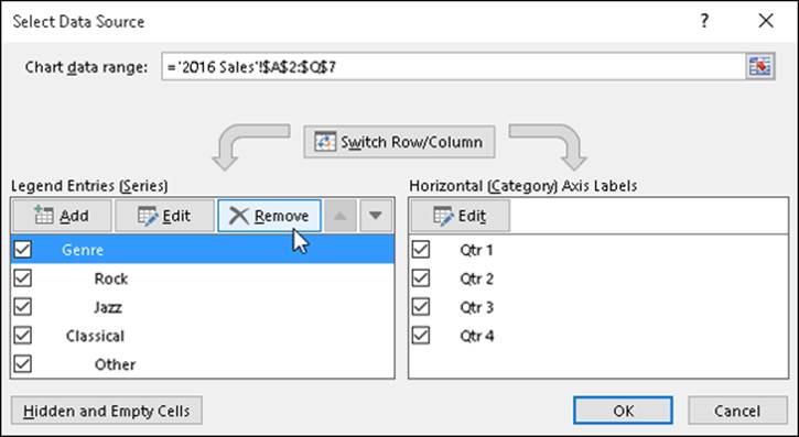
Figure 1-8: Using the Select Data Source dialog box to remove the empty Genre label from the legend of the clustered column chart.
The example clustered column chart in Figures 1-6 and 1-7 illustrates a common situation where you need to use the options in the Source Data Source dialog box. The worksheet data range for this chart, A2:Q7, includes the Genre row heading in cell A3 that is essentially a heading for an empty row (E3:Q3). As a result, Excel includes this empty row as the first data series in the clustered column chart. However, because this row has no values in it (the heading is intended only to identify the type of music download recorded in that column of the sales data table), its cluster has no data bars (columns) in it — a fact that becomes quite apparent when you switch the column and row headings, as shown earlier in Figure 1-7.
To remove this empty data series from the clustered column chart, you follow these steps:
1. Click the Chart1 sheet tab and then click somewhere in the chart area to select the clustered column chart; click the Design tab under Chart Tools on the Ribbon and then click the Select Data command button on the Design tab of the Chart Tools contextual tab.
Excel opens the Select Data Source dialog box in the 2016 Sales worksheet similar to the one shown in Figure 1-8.
2. Click the Switch Row/Column button in the Select Data Source dialog box to place the row headings (Genre, Rock, Jazz, Classical, and Other) in the Legend Entries (Series) list box.
3. Click Genre at the top of the Legend Entries (Series) list box and then click the Remove button.
Excel removes the empty Genre data series from the clustered column chart as well as removing the Genre label from the Legend Entries (Series) list box in the Select Data Source dialog box.
4. Click the Switch Row/Column button in the Select Data Source dialog box again to exchange the row and column headings in the chart and then click the Close button to close the Select Data Source dialog box.
After you close the Select Data Source dialog box, you will notice that the various colored outlines in the chart data range no longer include row 3 with the Genre row heading (A3) and its empty cells (E3:Q3).
Instead of going through all those steps in the Select Data Source dialog box to remove the empty Genre data series from the example clustered column chart, you can simply remove the Genre series from the chart on the Chart Filters button pop-up menu. When the chart’s selected, click the Chart Filters button in the upper-right corner of the chart (with the cone filter icon) and then deselect the Genre check box that appears under the SERIES heading on the pop-up menu before clicking the Apply button. As soon as you click the Chart Filters button to close its menu, you see that Excel has removed the empty data series from the redrawn clustered column chart.
 Adding hidden rows and columns of data to a chart
The sales data graphed in the sample clustered column chart shown in Figures 1-6 through 1-8 only includes the quarterly download totals in each music category. To do this, I outlined the data in this entire table and then collapsed the outlined columns down to their second level so that only the quarterly subtotals and yearly grand totals were displayed (see Book II, Chapter 4 for details) before selecting the range A2:Q7 as the clustered column chart’s data range. Because all the columns with the monthly download data in each quarter were hidden at the time I originally created the chart (as a result of collapsing the outlined columns to the second level), Excel didn’t include their data as part of it.
If I decide that I do want to see the monthly downloads represented in the clustered column chart, to accomplish this, all I have to do is open the Select Data Source dialog box (by clicking the Select Data button on the Chart Tools Design tab) and then click its Hidden and Empty Cells command button. Excel then opens a Hidden and Empty Cell Settings dialog box, where I click the Show Data in Hidden Rows and Columns check box and then click OK. Excel then immediately redraws the chart adding columns representing the monthly sales to those for the quarterly subtotals in all four of its clusters.
Customizing chart elements from the Format tab
The command buttons on the Format tab on the Chart Tools contextual tab make it easy to customize particular parts of your chart. Table 1-2 shows you the options that appear on the Format tab. Note that depending on the type of chart that’s selected at the time, some of these options may be unavailable.
Table 1-2 Format Tab Options
|
Tab Group |
Option Name |
Purpose |
|
Current Selection |
Chart Elements |
Click this command button to select a new chart element by choosing its name from the button’s drop-down menu. |
|
Format Selection |
Click this command button to open a Format dialog box for the currently selected chart element as displayed on the Chart Elements drop-down list button. |
|
|
Reset to Match Style |
Click this command button to remove all custom formatting from the selected chart and to return it to the original formatting bestowed by the style selected for the chart. |
|
|
Insert Shapes |
Click the thumbnail of the shape you want to add to your chart on the drop-down gallery with a whole bunch of preset graphic shapes. (See Book V, Chapter 2 for details.) |
|
|
Shape Styles |
Shape Styles |
Click the Shape Styles’ More button to display a drop-down gallery in which you can preview and select new colors and shapes for the currently selected chart element as displayed on the Chart Elements drop-down list button. |
|
Shape Fill |
Click this command button to display a drop-down color palette in which you can preview and select a new fill color for the currently selected chart element as displayed on the Chart Elements drop-down list button. |
|
|
Shape Outline |
Click this command button to display a drop-down color palette in which you can preview and select an outline color for the currently selected chart element as displayed on the Chart Elements drop-down list button. |
|
|
Shape Effects |
Click this command button to display a drop-down menu containing a variety of graphics effect options (including Shadow, Glow, Soft Edges, Bevel, and 3-D Rotation), many of which have their own pop-up palettes that allow you to preview their special effects, where you can select a new graphics effect for the currently selected chart element as displayed on the Chart Elements drop-down list button. |
|
|
WordArt Styles |
WordArt Styles |
Click the WordArt Styles More button to display a drop-down WordArt gallery in which you can preview and select a new WordArt text style for the titles selected in the chart. If the Chart Area is the currently selected chart element as displayed on the Chart Elements drop-down list button, the program applies the WordArt style you preview or select to all titles in the chart. |
|
Text Fill |
Click this command button to display a drop-down color palette in which you can preview and select a new text fill color for the titles selected in the chart. If the Chart Area is the currently selected chart element as displayed on the Chart Elements drop-down list button, the program applies the WordArt style you preview or select to all titles in the chart. You can also select an image to be used as the text fill rather than a color by selecting the Picture option below the color palette. |
|
|
Text Outline |
Click this command button to display a drop-down color palette in which you can preview and select a new text outline color for the titles selected in the chart. If the Chart Area is the currently selected chart element as displayed on the Chart Elements drop-down list button, the program applies the WordArt style you preview or select to all titles in the chart. |
|
|
Text Effects |
Click this command button to display a drop-down menu with the Shadow, Reflection, Glow, Bevel, 3-D Rotation, and Transform graphics effect options active, each of which have their own pop-up palettes that you can use to preview and select special effects for the titles selected in the chart. If the Chart Area is the currently selected chart element as displayed on the Chart Elements drop-down list button, the program applies the WordArt style you preview or select to all titles in the chart. |
|
|
Arrange |
Bring Forward |
Click this button to move the object to a higher layer in the stack or choose the Bring to Front option from the button’s drop-down menu to bring the selected embedded chart or other graphic object to the top of its stack. (See Book V, Chapter 2 for details.) |
|
Send Backward |
Click this button to move the object to a lower level in the stack or choose the Send to Back option from the button’s drop-down menu to send the selected embedded chart or other graphic object to the bottom of its stack. (See Book V, Chapter 2 for details.) Note that this command button and its options are available only when more than one embedded chart or other graphic object is selected in the worksheet. |
|
|
Selection Pane |
Click this command button to display and hide the Selection and Visibility task pane that shows all the graphic objects in the worksheet and enables you to hide and redisplay them as well as promote or demote them to different layers. (See Book V, Chapter 2 for details.) Note that this command button and its options are available only when more than one embedded chart or other graphic object is selected in the worksheet. |
|
|
Align |
Click this button to display a drop-down menu that enables you to snap the selected chart to an invisible grid on another graphic object as well as to choose between a number of different alignment options when multiple graphic objects are selected. (See Book V, Chapter 2 for details.) |
|
|
Group |
Click this button to display a drop-down menu that enables you to group the selected embedded chart with other graphic objects (such as text boxes or predefined shapes) for purposes of positioning and formatting. (See Book V, Chapter 2 for details.) Note that this command button and its options are available only when more than one embedded chart or other graphic object is selected in the worksheet. |
|
|
Rotate |
Click this button to display a drop-down menu with options that enable you to rotate or flip a selected graphic object. Note that this command button and its options are available only when graphic objects other than embedded charts are selected in the worksheet. |
|
|
Size |
Shape Height |
Use this text box to modify the height of the selected embedded chart by typing a new value in it or selecting one with the spinner buttons. |
|
Shape Width |
Use this text box to modify the width of the selected embedded chart by typing a new value in it or selecting one with the spinner buttons. |
Customizing the elements of a chart
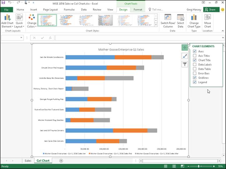
The Chart Elements button (with the plus sign icon) that appears in the upper-right corner of your chart when it’s selected contains a list of the major chart elements that you can add to your chart. To add a particular element missing from the chart, select the element’s check box in the list to put a check mark in it. To remove a particular element currently displayed in the chart, deselect the element’s check box to remove its check mark.
To add or remove just part of a particular chart element or, in some cases as with the Chart Title, Data Labels, Data Table, Error Bars, Legend, and Trendline, to also specify its layout, you select the desired option on the element’s continuation menu. (See Figure 1-9.)
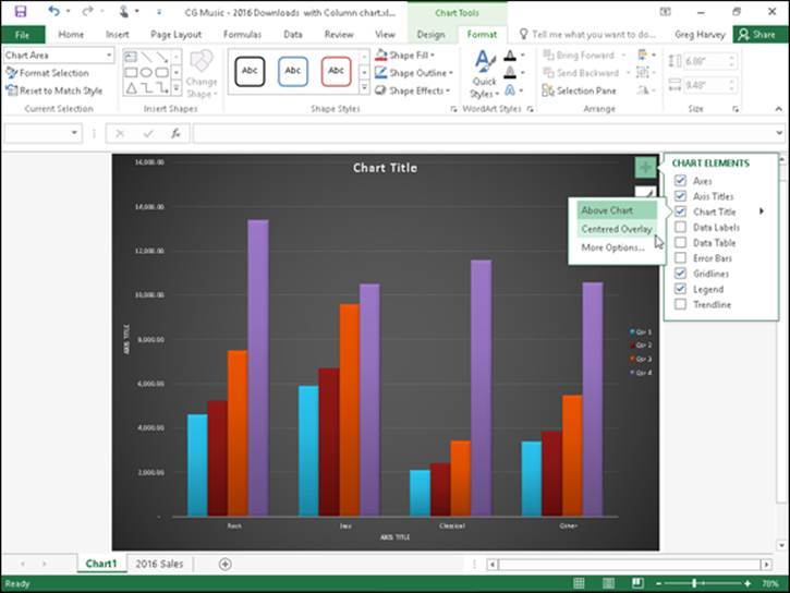
Figure 1-9: Repositioning the chart title in the example clustered column using the Chart Element button’s menus.
So, for example, to reposition a chart’s title, you click the continuation button attached to Chart Title on the Chart Elements menu to display and select from among the following options on its continuation menu:
· Above Chart to add or reposition the chart title so that it appears centered above the plot area
· Centered Overlay to add or reposition the chart title so that it appears centered at the top of the plot area
· More Options to open the Format Chart Title task pane on the right side of the Excel window so you can use the options that appear when you select the Fill & Line, Effects, and Size and Properties buttons under Title Options and the Text Fill & Outline, Text Effects, and the Textbox buttons under Title Options in this task pane to modify almost any aspect of the title’s formatting
Adding data labels to the series in a chart
Data labels identify the data points in your chart (that is, the columns, lines, and so forth used to graph your data) by displaying values from the cells of the worksheet represented next to them. To add data labels to your selected chart and position them, click the Chart Elements button next to the chart and then select the Data Labels check box before you select one of the following options on its continuation menu:
· Center to position the data labels in the middle of each data point
· Inside End to position the data labels inside each data point near the end
· Inside Base to position the data labels at the base of each data point
· Outside End to position the data labels outside of the end of each data point
· Data Callout to add text labels as well as values that appear within text boxes that point to each data point
· More Options to open the Format Data Labels task pane on the right side where you can use the options that appear when you select the Fill & Line, Effects, Size & Properties, and Label Options buttons under Label Options and the Text Fill & Outline, Text Effects, and Textbox buttons under Text Options in the task pane to customize almost any aspect of the appearance and position of the data labels
To remove all data labels from the data points in a selected chart, clear the Data Labels check box on the Chart Elements menu.
Adding a data table to a chart
Sometimes, instead of data labels that can easily obscure the data points in the chart, you’ll want Excel to draw a data table beneath the chart showing the worksheet data it represents in graphic form.
To add a data table to your selected chart and position and format it, click the Chart Elements button next to the chart and then select the Data Table check box before you select one of the following options on its continuation menu:
· With Legend Keys to have Excel draw the table at the bottom of the chart, including the color keys used in the legend to differentiate the data series in the first column
· No Legend Keys to have Excel draw the table at the bottom of the chart without any legend
· More Options to open the Format Data Table task pane on the right side where you can use the options that appear when you select the Fill & Line, Effects, Size & Properties, and Table Options buttons under Table Options and the Text Fill & Outline, Text Effects, and Textbox buttons under Text Options in the task pane to customize almost any aspect of the data table
Figure 1-10 illustrates how the sample clustered column chart (introduced in Figure 1-6) looks with a data table added to it. This data table includes the legend keys as its first column.
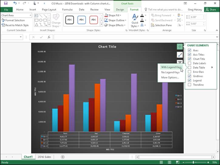
Figure 1-10: Embedded clustered column chart with data table and legend keys.
If you decide that having the worksheet data displayed in a table at the bottom of the chart is no longer necessary, simply click to deselect the Data Table check box on the Chart Elements menu.
Editing the chart titles
When Excel first adds any title to a new chart, the program gives it a generic name, such as Chart Title or AXIS TITLE (for both the x- and y-axis title). To replace such generic titles with the actual chart titles, click the title in the chart or click the name of the title on the Chart Elements drop-down list. (Chart Elements is the first drop-down button in the Current Selection group on the Format tab under Chart Tools. Its text box displays the name of the element currently selected in the chart.) Excel lets you know that a particular chart title is selected by placing selection handles around its perimeter.
After you select a title, you can click the insertion point in the text and then edit as you would any worksheet text, or you can click to select the title, type the new title, and press Enter to completely replace it with the text you type. To force part of the title onto a new line, click the insertion point at the place in the text where the line break is to occur. After the insertion point is positioned in the title, press Enter to start a new line.
After selecting a title, you can then click the insertion point in the text and then edit as you would any worksheet text, or you can triple-click to select the entire title and completely replace it with the text you type. To force part of the title onto a new line, click the insertion point at the place in the text where the line break is to occur. After the insertion point is positioned in the title, press Enter to start a new line. After you finish editing the title, click somewhere else on the chart area to deselect it (or a worksheet cell, if you’ve finished formatting and editing the chart).
Double-click anywhere in a word in the chart title to completely select that word. Triple-click anywhere in the title text to completely select that chart title. When you double- or triple-click a chart title, a mini-bar appears above the title with buttons for modifying the selected text’s font, font size, and alignment, as well as for adding text enhancements such as bold, italic, and underlining.
If you want, you can instantly create a title for your chart by linking it to a heading that’s been entered into one of the cells in your worksheet. That way, if you update the heading in the worksheet, it’s automatically updated in your chart. To link a chart title to a heading in a worksheet cell, click the title in the chart to select it, then type = on the Formula bar, click the cell in the worksheet that contains the text you want to use as the chart title, and press Enter. Excel shows that the chart title is now dynamically linked to the contents of the cell by displaying its absolute cell reference whenever that title is selected in the chart.
Formatting elements of a chart
Excel 2016 offers you several methods for formatting particular elements of any chart that you create. The most direct way is to right-click the chart element (title, plot area, legend, data series, and so forth) in the chart itself. Doing so displays a mini-bar with options such as Fill, Outline, and (in the case of chart titles), Style. You can then use the drop-down galleries and menus attached to these buttons to connect the selected chart element.
If the mini-bar formatting options aren’t sufficient for the kind of changes you want to make to a particular chart element, you can open a task bar for the element. The easiest way to do this is by right-clicking the element in the chart and then selecting the Format option at the bottom of the shortcut menu that appears. This Format option, like the task pane that opens on the right side of the worksheet window, is followed by the name of the element selected so that when the Chart Title is selected, this menu option is called Format Chart Title, and the task pane that opens when you select this option is labeled Format Chart Title. (See Figure 1-11.)
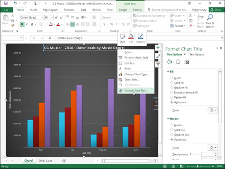
Figure 1-11: Formatting the Chart Title with the options in the Format Chart Title task pane.
The element’s task pane contains groups of options, often divided into two categories: Options for the selected element on the left — such as Title Options in the Format Chart Title task pane or Legend Options in the Format Legend task pane — and Text Options on the right. Each group, when selected, then displays its own cluster of buttons and each button, when selected has its own collection of formatting options, often displayed only when expanded by clicking the option name.
You can click the drop-down button found to the immediate right of any Options group in any Format task pane to display a drop-down menu with a complete list of all the elements in that chart. To select another element for formatting, simply select its name from this drop-down list. Excel then selects that element in the chart and switches to its Format task pane so that you have access to all its groups of formatting options.
Keep in mind that the Format tab on the Chart Tools contextual tab also contains a Shape Styles and WordArt Styles group of command buttons that you can sometimes use to format the element you’ve selected in the chart. Table 1-2, shown earlier in this chapter, gives you the lowdown on the command buttons in these groups on the Format tab.
Formatting chart titles with the Format Chart Title task pane
When you choose the Format Chart Title option from a chart title’s shortcut menu, Excel displays a Format Chart Title task pane similar to the one shown in Figure 1-11. The Title Options group is automatically selected as is the Fill & Line button (with the paint can icon).
As you can see in Figure 1-11, there are two groups of Fill & Line options: Fill and Border (neither of whose particular options are initially displayed when you first open the Format Chart Title task pane — in this figure, I clicked both Fill and Border so that you could see all of the Fill options and the first part of the Border options). Next to the Line & Fill button is the Effects button (with the pentagon icon). This button has four groups of options associated with it: Shadow, Glow, Soft Edges, and 3-D Format.
You would use the formatting options associated with the Fill & Line and Effects buttons in the Title Options group when you want to change the look of the text box that contains the select chart title. More likely when formatting most chart titles, you will want to use the commands found in the Text Options group to actually change the look of the title text.
When you click Text Options in the Format Chart Title task pane, you find three buttons with associated options:
· Text Fill & Outline (with a filled A with an outlined underline at the bottom icon): When selected, it displays a Text Fill and Text Outline group of options in the task pane for changing the type and color of the text fill and the type of outline.
· Text Effects (with the outlined A with a circle at the bottom icon): When selected, it displays a Shadow, Reflection, Glow, Soft Edges, and 3-D Format and 3-D Rotation group of options in the task pane for adding shadows to the title text or other special effects.
· Textbox (with the A in the upper-left corner of a text box icon): When selected, it displays a list of Text Box options for controlling the vertical alignment, text direction (especially useful when formatting the Vertical [Value]Axis title), and angle of the text box containing the chart title. It also includes options for resizing the shape to fit the text and how to control any text that overflows the text box shape.
Formatting chart axes with the Format Axis task pane
The axis is the scale used to plot the data for your chart. Most chart types will have axes. All 2-D and 3-D charts have an x-axis known as the horizontal axis and a y-axis known as the vertical axis with the exception of pie charts and radar charts. The horizontal x-axis is also referred to as the category axis and the vertical y-axis as the value axis except in the case of XY (Scatter) charts, where the horizontal x-axis is also a value axis just like the vertical y-axis because this type of chart plots two sets of values against each other.
When you create a chart, Excel sets up the category and values axes for you automatically, based on the data you are plotting, which you can then adjust in various ways. The most common ways you will want to modify the category axis of a chart is to modify the interval between its tick marks and where it crosses the value axis in the chart. The most common ways you will want to modify a value axis of a chart is to change the scale that it uses and assign a new number formatting to its units.
To make such changes to a chart axis in the Format Axis task pane, right-click the axis in the chart and then select the Format Axis option at the very bottom of its shortcut menu. Excel opens the Format Axis task pane with the Axis Options group selected, displaying its four command buttons: Fill & Line, Effects, Size & Properties, and Axis Options. You then select the Axis Options button (with the clustered column data series icon) to display its four groups of options: Axis Options, Tick Marks, Labels, and Number.
Then, click Axis Options to expand and display its formatting options for the particular type of axis selected in the chart. Figure 1-12 shows the formatting options available when you expand this and the vertical (value) or y-axis is selected in the sample chart.
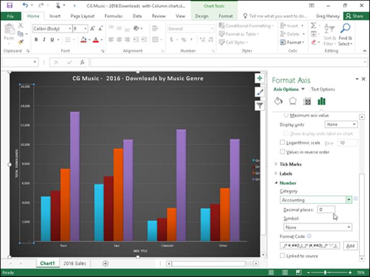
Figure 1-12: Formatting the Vertical (Value) Axis with the options in the Format Axis task pane.
The Axis Options for formatting the Vertical (Value) Axis include:
· Bounds to determine minimum and maximum points of the axis scale. Use the Minimum option to reset the point where the axis begins — perhaps $4,000 instead of the default of $0 — by clicking its Fixed option button and then entering a value higher than 0.0 in its text box. Use the Maximum to determine the highest point displayed on the vertical axis by clicking its Fixed option button and then entering the new maximum value in its text box — note that data values in the chart greater than the value you specify here simply aren’t displayed in the chart.
· Units to change the units used in separating the tick marks on the axis. Use the Major option to modify the distance between major horizontal tick marks (assuming they’re displayed) in the chart by clicking its Fixed option button and then entering the number of the new distance in its text box. Use the Minor option to modify the distance between minor horizontal tick marks (assuming they’re displayed) in the chart by clicking its Fixed option button and then entering the number of the new distance in its text box.
· Horizontal Axis Crosses to reposition the point at which the horizontal axis crosses the vertical axis by clicking the Axis Value option button and then entering the value in the chart at which the horizontal axis is to cross or by clicking the Maximum Axis Value option button to have the horizontal axis cross after the highest value, putting the category axis labels at the top of the chart’s frame.
· Logarithmic Scale to base the value axis scale upon powers of ten and recalculate the Minimum, Maximum, Major Unit, and Minor Unit accordingly by selecting its check box to put a check mark in it. Enter a new number in its text box if you want the logarithmic scale to use a base other than 10.
· Values in Reverse Order to place the lowest value on the chart at the top of the scale and the highest value at the bottom (as you might want to do in a chart to emphasize the negative effect of the larger values) by selecting its check box to put a check mark in it.
The Axis Options for formatting the Horizontal (Category) Axis include
· Axis Type to indicate for formatting purposes that the axis labels are text entries by clicking the Text Axis option button, or indicate that they are dates by clicking the Date Axis option button.
· Vertical Axis Crosses to reposition the point at which the vertical axis crosses the horizontal axis by clicking the At Category Number option button. Then enter the number of the category in the chart (with 1 indicating the leftmost category) after which the vertical axis is to cross or by clicking the At Maximum option button to have the vertical axis cross after the very last category on the right edge of the chart’s frame.
· Axis Position to reposition the horizontal axis so that its first category is located at the vertical axis on the left edge of the chart’s frame and the last category is on the right edge of the chart’s frame by selecting the On Tick Marks option button rather than between the tick marks (the default setting).
· Categories in Reverse Order to reverse the order in which the data markers and their categories appear on the horizontal axis by clicking its check box to put a check mark in it.
The Tick Marks options in the Format Axis task pane include the following two options whether the Horizontal (Category) Axis or the Vertical (Value) Axis is selected:
· Major Type to change how the major horizontal or vertical tick marks intersect the opposite axis by selecting the Inside, Outside, or Cross option from its drop-down list.
· Minor Type to change how the minor horizontal or vertical tick marks intersect the opposite axis by selecting the Inside, Outside, or Cross option from its drop-down list.
Note that when modifying the Horizontal (Category) Axis, Excel offers an Interval Between Marks Tick Marks option that enables you to change the span between the tick marks that appear on this x-axis.
In addition to changing y- and x-axis formatting settings with the options found in the Axis Options and Tick Marks sections in the Format Axis task pane, you can modify the position of the axis labels with the Label Position option under Labels and number formatting assigned to the values displayed in the axis with Category option under Number.
To reposition the axis labels, click Labels in the Format Axis task pane to expand and display its options. When the Vertical (Value) Axis is the selected chart element, you can use the Label Position option to change the position to beneath the horizontal axis by selecting the Low option, to above the chart’s frame by selecting the High option, or to completely remove their display in the chart by selecting the None option on its drop-down list.
When the Horizontal (Category) Axis is selected, you can also specify the Interval between the Labels on this axis, specify their Distance from the Axis (in pixels), and even modify the Label Position with the same High, Low, and None options.
To assign a new number format to a value scale (General being the default), click Number in the Format Axis task pane to display its formatting options. Then, select the number format from the Category drop-down list and specify the number of decimal places and symbols (where applicable) as well as negative number formatting that you want applied to the selected axis in the chart.
Saving a customized chart as a template
After going through extensive editing and formatting of one of Excel’s basic chart types, you may want to save your work of art as a custom chart type that you can then use again with different data without having to go through all the painstaking steps to get the chart looking just the way you want it. Excel makes it easy to save any modified chart that you want to use again as a custom chart type.
To convert a chart on which you’ve done extensive editing and formatting into a custom chart type, you take these steps:
1. Right-click the customized chart in the worksheet or on its chart sheet to select its chart area and display its shortcut menu.
You can tell that the chart area (as opposed to any specific element in the chart) is selected because the Format Chart Area option appears near the bottom of the displayed shortcut menu.
2. Choose the Save As Template option from the shortcut menu.
Excel opens the Save Chart Template dialog box. The program automatically suggests Chart1.crtx as the filename, Chart Template Files (*.crtx) as the file type, and the Charts folder in the Microsoft Templates folder as the location.
3. Edit the generic chart template filename in the File Name text box to give the chart template file a descriptive name without removing the .crtx filename extension.
4. Click the Save button to close the Save Chart Template dialog box.
After creating a custom chart template in this manner, you can then use the template anytime you need to create a new chart that requires similar formatting by following these steps:
1. Select the data in the worksheet to be graphed in a new chart using your chart template.
2. Click the Dialog Box launcher in the lower-right corner of the Charts group on the Insert tab of the Ribbon.
The Insert Chart dialog box appears with the Recommended Charts tab selected.
3. Click the All Charts tab and then select the Templates option in the Navigation pane of the Insert Chart dialog box.
Excel then displays thumbnails for all the chart templates you’ve saved in the main section of the Create Chart dialog box. To identify these thumbnails by filename, position the mouse pointer over the thumbnail image.
4. Click the thumbnail for the chart template you want to use to select it and then click OK.
As soon as you click OK, Excel applies the layout and all the formatting saved as part of the template file to the new embedded chart created with the data in the current cell selection.
Adding Sparkline Graphics to a Worksheet
Excel 2016 supports a type of information graphic called sparklines that represents trends or variations in collected data. Sparklines — invented by Edward Tufte — are tiny graphs (generally about the size of text that surrounds them). In Excel 2016, sparklines are the height of the worksheet cells whose data they represent and can be any one of following three chart types:
· Line that represents the selected worksheet data as a connected line showing whose vectors display their relative value
· Column that represents the selected worksheet data as tiny columns
· Win/Loss that represents the selected worksheet data as a win/loss chart whereby wins are represented by blue squares that appear above the red squares representing the losses
To add sparklines to the cells of your worksheet, you follow these general steps:
1. Select the cells in the worksheet with the data you want represented by a sparkline.
2. Click the type of chart you want for your sparkline (Line, Column, or Win/Loss) in the Sparklines group of the Insert tab or press Alt+NSL for Line, Alt+NSO for Column, or Alt+NSW for Win/Loss.
Excel opens the Create Sparklines dialog box, which contains two text boxes: Data Range, which shows the cells you selected with the data you want graphed, and Location Range, where you designate the cell or cell range where you want the sparkline graphic to appear.
3. Select the cell or range of cells where you want your sparkline to appear in the Location Range text box and then click OK.
When creating a sparkline that spans more than a single cell, the Location Range must match the Data Range in terms of the same amount of rows and columns. (In other words, they need to be arrays of equal size and shape.)
Because sparklines are so small, you can easily add them to the cells in the final column of a table of data. That way, the sparklines can depict the data visually and enhance their meaning while remaining an integral part of the table whose data they epitomize.
Figure 1-13 shows you a worksheet data table after adding sparklines to the table’s final column. These sparklines depict the variation in the sales over four quarters as tiny line graphs. As you can see in this figure, when you add sparklines to your worksheet, Excel 2016 adds a Design tab to the Ribbon under Sparkline Tools.
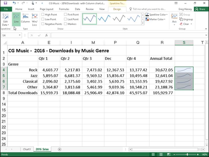
Figure 1-13: Sparklines graphics representing the variation in the data in a worksheet table as tiny Line charts.
This Design tab contains buttons that you can use to edit the type, style, and format of the sparklines. The final group (called Group) on this Design tab enables you to band together a range of sparklines into a single group that can share the same axis and/or minimum or maximum values (selected using the options on its Axis drop-down button). This is very useful when you want a collection of different sparklines to all share the same charting parameters so that they equally represent the trends in the data.
Printing Charts
To print an embedded chart as part of the data on the worksheet, you simply print the worksheet from the Print Settings screen in the Backstage view by pressing Ctrl+P. To print an embedded chart by itself without the supporting worksheet data, click the chart to select it before you press Ctrl+P to open the Print screen in the Backstage view. In the Print screen, the Print Selected Chart appears as the default selection in the very first drop-down list box under the Settings heading and a preview of the embedded chart appears in the Preview pane on the right.
To print a chart that’s on a separate chart sheet in the workbook file, activate the chart sheet by clicking its sheet tab and then press Ctrl+P to open the Print panel, where Print Active Sheet(s) appears in as the default selection for the Settings drop-down list box and the chart itself appears in the Preview pane on the right.
 When you want to print an embedded chart alone — that is, without its supporting data or in its own chart sheet — you may want to select the print quality options on the Chart tab of the Page Setup dialog box (which you can open by clicking the Page Setup link in the Print screen in the Backstage view or by clicking the Dialog Box launcher on the Page Layout tab) before sending the chart to the printer. The Print Quality options on the Chart tab include the following:
· Draft Quality: Select this check box to print the chart using your printer’s draft-quality setting.
· Print in Black and White: Select this check box to have your color printer print the chart in black and white.