Programming Windows Store Apps with HTML CSS and JavaSript(2014)
Chapter 5
Controls and Control Styling
Controls are one of those things you just can’t seem to get away from, especially within technology-addicted cultures like those that surround many of us. Even low-tech devices like bicycles and various gardening tools have controls. But this isn’t a problem—it’s actually a necessity. Controls are the means through which human intent is translated into the realm of mechanics and electronics, and they are entirely made to invite interaction. As I write this, in fact, I’m sitting on an airplane and noticing all the controls that are in my view. The young boy in the row ahead of me seems to be doing the same, and that big “call attendant” button above him is just begging to be pressed!
Controls are certainly essential to Windows Store apps, and they will invite consumers to poke, prod, touch, click, and swipe them. (They will also invite the oft-soiled hands of many small toddlers as well; has anyone made a dishwasher-safe tablet PC yet?) Windows, of course, provides a rich set of controls for apps written in HTML, CSS, and JavaScript. What’s most notable in this context is that from the earliest stages of design, Microsoft wanted to avoid forcing HTML/JavaScript developers to use controls that were incongruous with what those developers already know—namely, the use of HTML control elements like <button> that can be styled with CSS and wired up in JavaScript by using functions like addEventListener and on<event> properties.
You can, of course, use those intrinsic HTML controls in a Store app because those apps run on top of the same HTML/CSS rendering engine as Internet Explorer. No problem. There are even special classes, pseudo-classes, and pseudo-elements that give you fine-grained styling capabilities, as we’ll see. But the real question was how to implement Windows-specific controls like the toggle switch and list view that would allow you to work with them in the same way—that is, declare them in markup, style them with CSS, and wire them up in JavaScript withaddEventListener and on<event>properties.
The result of all this is that for you, the HTML/JavaScript developer, you’ll be looking to WinJS for these controls rather than WinRT. Let me put it another way: if you’ve noticed the large collection of APIs in the Windows.UI.Xaml namespace (which constitutes about 40% of WinRT), guess what? You get to completely ignore all of them! Instead, you’ll use the WinJS controls that support declarative markup, styling with CSS, and so on, which means that Windows controls (and custom controls that follow the same model) ultimately show up in the DOM along with everything else, making them accessible in all the ways you already know and understand.
The story of Windows controls is actually larger than a single chapter. We’ve already explored the webview control in Chapter 4, “Web Content and Services.” Here we’ll now look primarily at those controls that represent or work with simple data (single values) and that participate in page layout as elements in the DOM. Participating in the DOM, in fact, is exactly why you can style and manipulate all the controls (HTML and WinJS alike) through standard mechanisms, and a big part of this chapter is to just visually show the styling options you have available.
In Chapter 6, “Data Binding, Templates, and Collections,” we’ll explore the related subject of data binding: creating relationships between properties of data objects and properties of controls (including styles) so that the controls reflect what’s happening in the data. Binding is frequently used with collections of data objects, so Chapter 6 will also delve into those details along with the WinJS templating mechanism that’s often used to render data items.
That brings us to the next part of the story in Chapter 7, “Collection Controls,” where we meet those controls that exist to display and interact with potentially large data sets. These are the Repeater, ItemContainer, FlipView, and ListView controls. Later on we’ll also give special attention to media elements (image, audio, and video) and their unique considerations in Chapter 13, aptly titled “Media,” and pick up the details of the SearchBox control in Chapter 15, “Contracts.” Similarly, those elements that are primary for defining layout (like grid and flexbox) are the subject of Chapter 8, “Layout and Views,” and we also have a number of UI elements that don’t participate in layout at all, like app bars, navigation bars, and flyouts, as we’ll see in Chapter 9, “Commanding UI.”
In short, having covered much of the wiring, framing, and plumbing of an app in Chapter 3, “App Anatomy and Performance Fundamentals,” and obtaining content from remote sources in Chapter 4, we’re ready to start enjoying the finish work like light switches, doorknobs, and faucets—the things that make an app and its content really come to life and engage with human beings.
Sidebar: Essential References for Controls
Before we go on, you’ll want to know about two essential topics on the Windows Developer Center that you’ll likely refer to time and time again. First is the comprehensive Controls listthat identifies all the controls that are available to you, as we’ll summarize later in this chapter. The second are comprehensive UX Guidelines for Windows Store apps, which describes the best use cases for most controls and scenarios in which not to use them. This is a very helpful resource for both you and your designers.
The Control Model for HTML, CSS, and JavaScript
Again, when Microsoft designed the developer experience for Windows Store apps, we strove for a high degree of consistency between intrinsic HTML control elements, WinJS controls, and custom controls. I like to refer to all of these as “controls” because they all result in a similar user experience: some kind of widget with which the user interacts with an app. In this sense, every such control has three parts:
• Declarative markup (producing elements in the DOM).
• Applicable CSS (styles as well as special pseudo-class and pseudo-element selectors); also see the sidebar coming up on WinJS stylesheets.
• Methods, properties, and events accessible through JavaScript.
Standard HTML controls, of course, already have dedicated markup to declare them, like <button>,<input>, and <progress>. Styles are applied to them as with any other HTML element, and once you obtain the control’s object in JavaScript you can programmatically set styles, modify properties, call methods, and attach events handlers, as you well know.
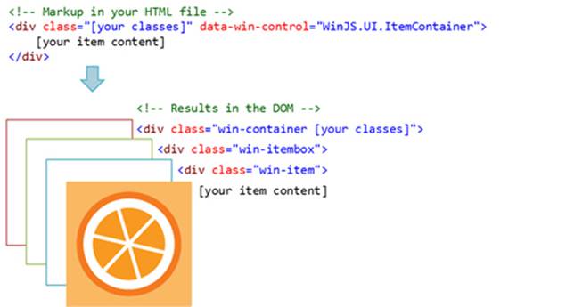
WinJS and custom controls follow nearly all of these same conventions with the exception that they don’t have dedicated markup. You instead declare these controls by using some root element, typically a <div> or <span>, with two custom data-* attributes: data-win-control and data-win-options. The value of data-win-control (required) specifies the fully qualified name of a public constructor function that creates the necessary child elements of the root that make up the control. The second, data-win-options, is an optional JSON string containing key-value pairs separated by commas: { <key1>: <value1>, <key2>: <value2>, ... }. These values are used to initialize the control.
Headache relief #1 Avoid using self-closing div or span elements for controls. Self-closing tags, like <div … />are not valid HTML5 and will behave as if you left off the / entirely. This will cause great confusion when subsequent controls aren’t instantiated properly. In short, always match <div> with </div> and <span> with </span>.
Headache relief #2 If you’ve just made changes to data-win-options and your app seems to terminate without reason (and without an exception) when you next launch it, check for syntax errors in the options string. Forgetting the closing }, for example, will cause this behavior.
The constructor function itself takes two parameters: the root (parent) element and an options object. Conveniently, WinJS.Class.define produces functions that look exactly like this, making it very handy for defining controls. Indeed, WinJS defines all of its controls usingWinJS.Class.define, and you can do the same for custom controls. The only real difference, in fact, between WinJS controls and custom controls is that the former’s constructors already exist in WinJS whereas you need to implement the latter’s.
Because data-* attributes are, according to the HTML5 specifications, completely ignored by the HTML/CSS rendering engine, some additional processing is necessary to turn an element with these attributes into an actual control in the DOM. And this, as I’ve hinted at before, is exactly the life purpose of the WinJS.UI.process and WinJS.UI.processAll methods. As we’ll see shortly, these methods parse the data-win-options string and pass the resulting object and the root element to the constructor function identified in data-win-control. The constructor then does all the rest.
The result of this simple declarative markup plus WinJS.UI.process/processAll is that WinJS and custom controls are just elements in the DOM like any others. They can be referenced by DOM-traversal APIs and targeted for styling using the full extent of CSS selectors (as we’ll see in the styling gallery later on). They can listen for external events like other elements and can surface events of their own by implementing [add/remove]EventListener and on<event> properties. (WinJS again provides standard implementations of addEventListener, removeEventListener, anddispatchEvent for this purpose.)
Let’s now look at the controls we have available for Windows Store apps, starting with the HTML controls and then the WinJS controls. In both cases we’ll look at their basic appearance, how they’re instantiated, and the options you can apply to them.
Sidebar: WinJS stylesheets: ui-light.css, ui-dark.css, and win-* styles
As you’ve seen by now with various code samples, WinJS comes with two parallel stylesheets that provide many default styles and style classes for Windows Store apps: ui-light.css and ui-dark.css. You’ll typically use one or the other; however, as described in Chapter 3 in the section “Page Specific Styling,” you can apply them to specific pages. In any case, the light stylesheet is intended for apps that are oriented around text, because dark text on a light background is generally easier to read (so this theme is often used for news readers, books, magazines, etc., including figures in published books like this!). The dark theme, on the other hand, is intended for media-centric apps like picture and video viewers where you want the richness of the media to stand out.
Both stylesheets define a number of win-* style classes, which I like to think of as style packages (containing styles and CSS-based behaviors like the :hover pseudo-class). Most of these classes apply only to WinJS controls, but some specifically turn standard HTML controls into a Windows-specific variant. These are win-backbutton and win-navigation-backbutton for buttons, win-ring, win-medium, and win-large for circular progress controls, win-error and win-paused for progress controls generally, win-small for a rating control, win-vertical for a vertical slider (range) control, and win-textarea for a content editable div. There are also a number of win-type-* classes to centralize font sizes. If you want to see the details, search on their names in the Style Rules tab in Blend.
HTML Controls
HTML controls, I hope, don’t need much explaining. They are described in HTML5 references, such as http://www.w3schools.com/html/html5_intro.asp, and shown with default “light” styling in Figure 5-1 and Figure 5-2. (See the next section for more on WinJS stylesheets.) It’s worth mentioning that most embedded objects are not supported, except for specific ActiveX controls; see Migrating a web app.
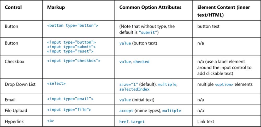
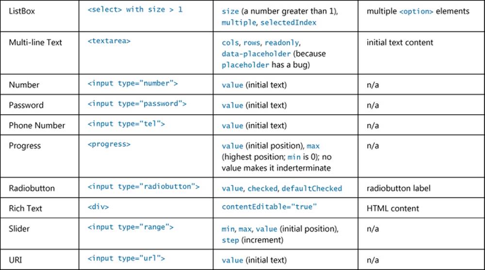
Creating or instantiating HTML controls works as you would expect. You can declare them in markup by using attributes to specify options, the rundown of which is given in the table following Figure 5-2. You can also create them procedurally from JavaScript by calling new with the appropriate constructor, configuring properties and listeners as desired, and adding the element to the DOM wherever it’s needed. Nothing new here at all where Store apps are concerned.
For examples of creating and using these controls, refer to the HTML essential controls sample in the Windows SDK, from which the images in Figure 5-1 and Figure 5-2 were obtained. In the sample you’ll find different scenarios that show many variations for the individual controls, including styling options as I’ll summarize later in the chapter. Note also that scenario 13 shows how to layout a form, and all the scenarios provide a radiobutton to toggle between the light and dark stylesheets (modifying the CSS links as discussed in Chapter 3). Scenario 14 lets you also see how this looks any page background color of your choice.
Tip For more on creating, validating, and submitting forms built with HTML controls, refer to the HTML5 form validation sample.
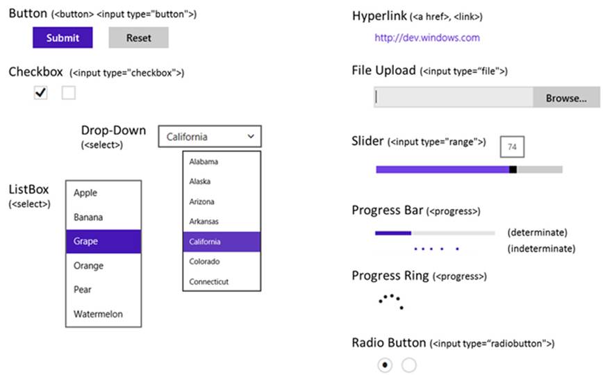
FIGURE 5-1 Standard HTML5 controls with default “light” styles (the ui-light.css stylesheet of WinJS).
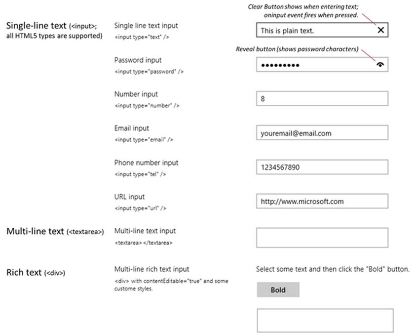
FIGURE 5-2 Standard HTML5 text input controls with default “light” styles (the ui-light.css stylesheet of WinJS).
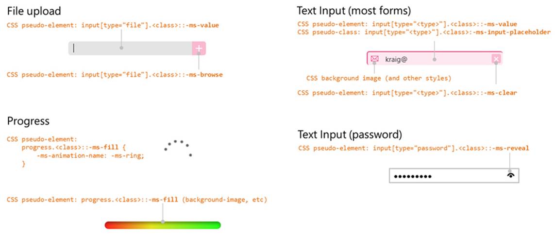
When to show progress controls? A progress element is clearly intended to inform the user that something is happening in the app. They can be used to indicate background progress, like syncing, or to indicate that some processing is blocking further interactivity. The latter case is best avoided entirely, if possible, so that the app is always interactive. If you must block interactivity, however, the recommendation is to show a progress indicator after two seconds and then provide a means to cancel the operation after ten seconds.
Extensions to HTML Elements
As you probably know already, there are many developing standards for HTML and CSS. Until these are brought to completion, implementations of those standards in various browsers are typically made available ahead of time with vendor-prefixed names. In addition, browser vendors sometimes add their own extensions to the DOM API for various elements.
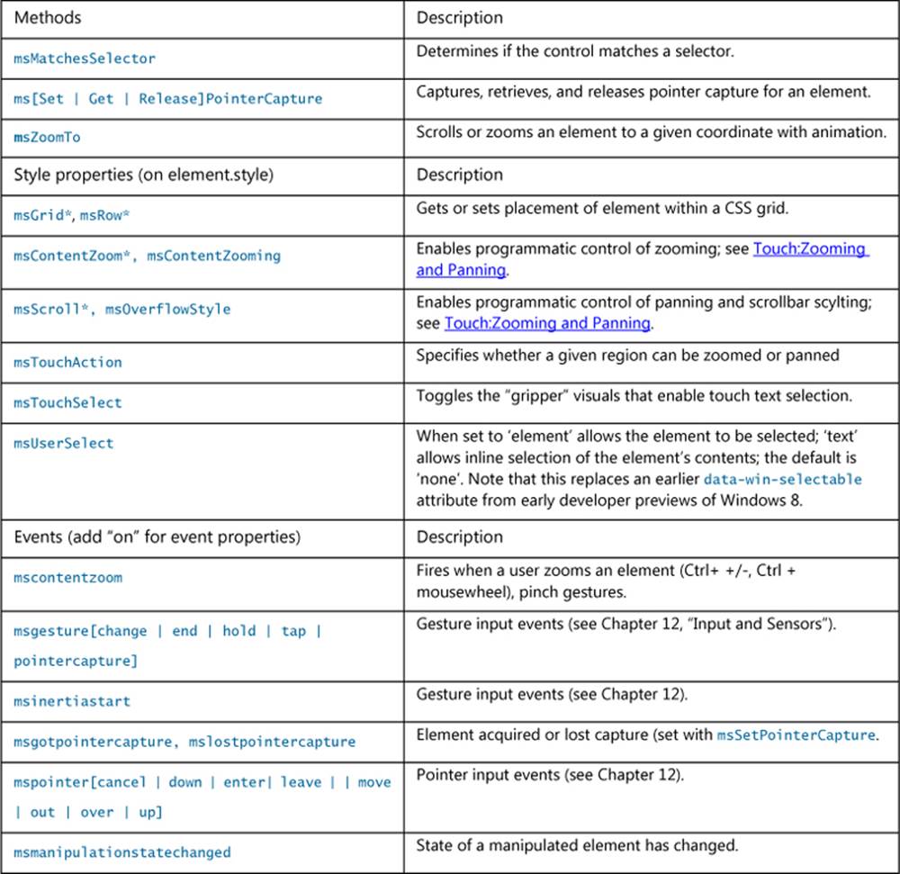
With Windows Store apps, of course, you don’t need to worry about the variances between browsers, but because these apps essentially run on top of the Internet Explorer engine, it helps to know about those extensions that still apply. The key ones are summarized in the table below, and you can find the full details in the Elements and Cascading Style Sheets references in the documentation. We’ll also encounter a few others in later chapters. Another simple way to determine what extensions are available on any given object is to examine that object directly in the Visual Studio debugger at run time. Visual Studio will show the properties directly; expand the object’s Methods node to see all the functions it supports, and expand its styles node for style-related properties.
If you’ve been working with HTML5 and CSS3 in Internet Explorer already (especially Internet Explorer 9), you might be wondering why the table doesn’t show the various animation (msAnimation*), transition (msTransition*), and transform properties (msPerspective* andmsTransformStyle), along with msBackfaceVisibility and msFlex* (among others). This is because these standards are now far enough along that they no longer need vendor prefixes with Internet Explorer 10+ or Store apps (though the ms* variants still work).
WinJS Controls
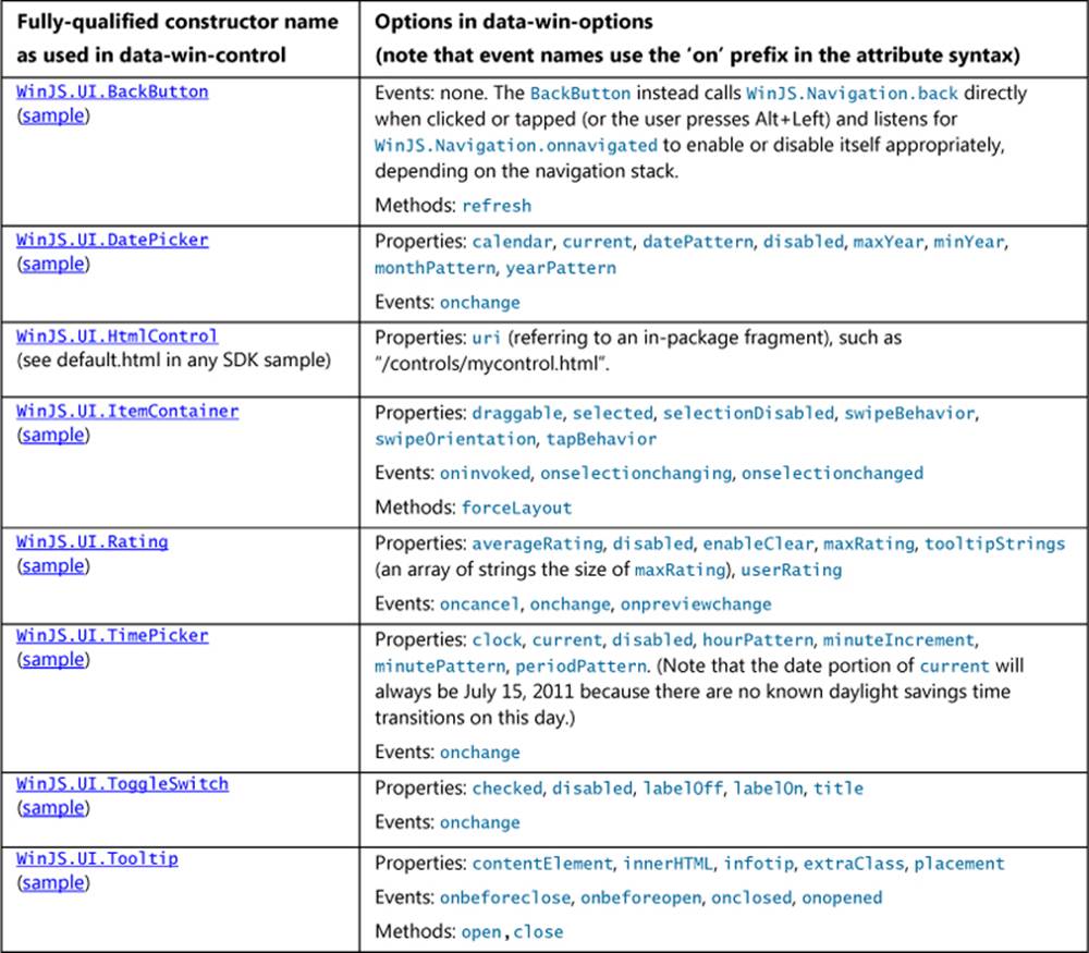
Windows defines a number of controls that help apps fulfill various design guidelines. As noted before, these are implemented in WinJS for apps written in HTML, CSS, and JavaScript, rather than WinRT; this allows those controls to integrate naturally with other DOM elements. Each control is defined as part of the WinJS.UI namespace using WinJS.Class.define, where the constructor name matches the control name. So the full constructor name for a control like the Rating is WinJS.UI.Rating. As noted before in the control model, this is the name you specify within adata-win-control attribute for the control’s root element such that WinJS.UI.process/processAll can instantiate that control.
Tip Once a WinJS control is instantiated, the root element object will have a winControl property attached to it. This winControl object is the result of calling new on the control’s constructor and gives access to the control’s specific methods, properties, and events. The winControlobject also has an element property to go the other direction.
The simpler UI controls are BackButton, DatePicker, Rating, TimePicker, and ToggleSwitch, the default styling for which are shown in Figure 5-3. I trust that the purpose of each control is obvious!
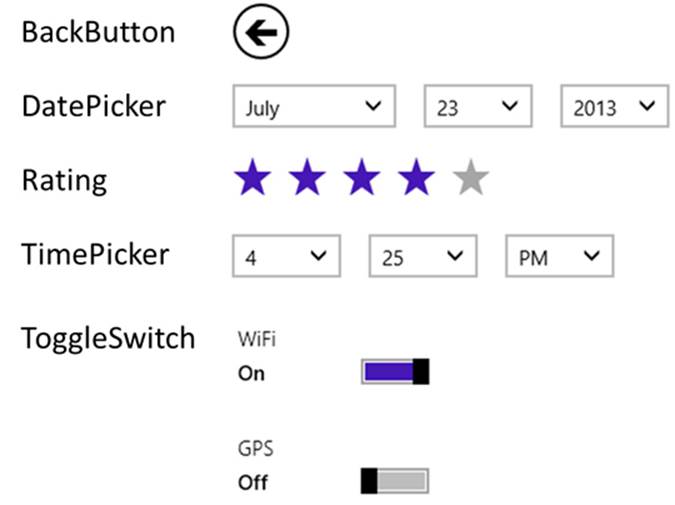
FIGURE 5-3 Default (light) styles for the simple WinJS controls.
There are then three other WinJS controls whose purpose is to contain other content and provide some other behavior around it. These are HtmlControl, Tooltip, and ItemContainer.46
WinJS controls on Windows Phone As of this writing, the WinJS library that’s available for Windows Phone 8.1 includes the HtmlControl, ToggleSwitch, and ItemContainer controls but not the others described in this chapter. It does include the collection controls described in other chapters, including the FlipView, ListView, Repeater, and SemanticZoom, along with the AppBar and its unique Pivot control (which you use instead of Hub). For full details, refer to the documentation for the WinJS.UI namespace.
The HtmlControl is a simpler form of the page controls we saw in Chapter 3, allowing you to easily load some HTML fragment from your app package (along with its referenced CSS and JavaScript) as a control. The WinJS.UI.HtmlControl constructor, in fact, simply callsWinJS.UI.Pages.render, loading that content into the control. Indeed, page controls themselves can be used in the same way—you can, for example, load up multiple page controls within the same host page. I prefer to keep these ideas separate, however, using page controls for full-page DOM replacement and the HtmlControl for control-like fragments.
Because the purpose of the HtmlControl is to simply encapsulate other pieces of HTML, the control itself has no inherent visuals or styling. If you want an example, simply look at the header and footer of any Windows SDK sample!
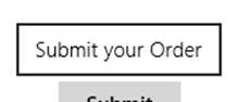
The Tooltip control, for its part, is a step above the plain text tooltip that HTML provides automatically for the title attribute. Its behavior is such that when you attach it to some other control, it will appear automatically for hover states. With default styling and text, it appears just like the default tooltips (I’ve cropped the button to which the tooltip is attached—it’s not part of the tooltip):
Unlike the default tooltip, however, the WinJS Tooltip control can use any HTML including other controls. We’ll see this shortly in the section “Example: WinJS.UI.Tooltip.” The default rectangle share can also be fully styled, but I’ll also make you wait for that!
The ItemContainer control is also a container—as befits its name!—for some other piece of HTML that acts as a single unit. The HTML within it can again include other controls, but the behaviors apply to the item as a whole. Those behaviors, as determined by various options, include swipe (to select), tap (to invoke), and HTML5 drag-and-drop support. Here’s an example item in both selection states:

We’ll see more about these options a little later with specific examples.
As noted in this chapter’s introduction, I’m saving other WinJS controls for later chapters because they each need additional context. We’ll see the Repeater in Chapter 6; the FlipView, ListView, and SemanticZoom that work with collections are covered in Chapter 7; the Hub we’ll see inChapter 8 as it’s pertinent to layout; AppBar, NavBar, and Flyout are transient commanding UI that we’ll come to in Chapter 9 (because they don’t participate in layout); and media controls and the SearchBox we’ll encounter in Chapters 13, and 15, respectively. Much to look forward to!
Now to reiterate the control model, a WinJS control is declared in markup by attaching data-win-control and data-win-options attributes to some root element. That element is typically a div (block element) or span (inline element), because these don’t bring much other baggage, but any element, such as a button, can be used. These elements can, of course, have id and class attributes as needed.
The available options for the WinJS controls we’re discussing in this chapter are summarized in the table below. The table includes those events that can be wired up declaratively through the data-win-options string, if desired, or through JavaScript. For full documentation on all these options, start with the Controls list in the documentation and go to the control-specific topics linked from there, or use the links given below. For details on the syntax of the data-win-options string, see the next section in this chapter.
Note All WinJS controls have the methods addEventListener, removeEventListener, dispatchEvent, and dispose, along with an element property that identifies the control’s root element.
When setting WinJS control options from JavaScript, be sure to set them on the winControl object and not on the containing element itself. (This is very important to remember when doing data-binding to control properties, as we’ll see in Chapter 6.) Event handlers can be assigned through winControl.on<event> properties or through winControl.addEventListener. If you want to set multiple options at the same time, you can use the WinJS.UI.setOptions method, which accepts the winControl object (not the root element) and a second object containing the options. Such an object is exactly what WinJS produces when it parses a data-win-options string.
Sidebar: The Ubiquitous dispose Method
If you look at the documentation for any of these controls, you’ll see that they each have a method named dispose whose purpose is to release any resources held by the control. In addition, every page control you define through WinJS.UI.Pages.define also has a dispose method. All together, these methods allow WinJS to make sure that the pages and the controls on those pages release any necessary resources when they’re removed from the DOM (correcting memory leaks that were observed in Windows 8). That is, when you navigate away from a page, thePageControlNavigator we learned about in Chapter 3 calls the page’s dispose method, which in turn calls WinJS.Utilities.disposeSubTree on its root element. That method calls dispose on every child control that is marked with the win-disposable class (as all WinJS controls are) and that has a dispose method (as all WinJS controls do).
If you are using PageControlNavigator, then, you don’t need to worry much about calling dispose yourself. However, if you implement your own navigation controller or page-loading mechanism, be sure to replicate this behavior and call dispose on any controls that are being removed from the DOM. Additionally, custom controls should also implement a dispose method and mark themselves with the win-disposable class to participate in the process. Custom controls that can contain other controls (like a ListView or the PageControlNavigator) must also be mindful to manage control disposal. We’ll talk more of this later with custom controls, but if you want a quick demonstration refer to the Dispose model sample.
Syntax for data-win-options
As noted earlier, the data-win-options attribute is a string containing key-value pairs, one for each property or event, separated by commas, in the form { <key1>: <value1>, <key2>: <value2>, ... }. When a control is instantiated through WinJS.UI.process[All], WinJS parses the options string into the equivalent JavaScript object and passes it to the control’s constructor. Easy enough! (Remember to be mindful of syntax errors in your data-win-options string, though, because such errors will cause an app to abruptly terminate during control instantiation.)
Most of the time you’ll just be using literal values in the options string, as with this example that we’ll see again later for the WinJS.UI.Rating control:
<div id="rating1" data-win-control="WinJS.UI.Rating"
data-win-options="{averageRating: 3.4, userRating: 4, onchange: changeRating}">
</div>
Notice how WinJS control events use key names in the form of on<event>—those are the equivalent JavaScript property names on the control object.
There are other possibilities for values, however, many of which you can find if you search through the SDK JavaScript samples for "data-win-options". To summarize:
• Values can dereference objects, namespaces, and arrays by using dot notation, brackets ([ ]'s), or both.
• Values can be array literals as well as objects surrounded by { }, which is how you assign values to complex properties.
• Values can be an id of another element in the DOM, provided that element has an id attribute.
• Values can use the syntax select('<selector>') to declaratively reference an element in the DOM.
Let’s see some examples. Dot notation is typically used to reference members of an enumeration or a namespace. The latter is common with ListView controls(see Chapter 7), where the data source is defined in a separate namespace, or with app bars (see Chapter 9), where its event handlers are defined in a namespace:
data-win-options="{selectionMode: WinJS.UI.SelectionMode.multi,
tapBehavior: WinJS.UI.TapBehavior.toggleSelect }"
data-win-options="{itemDataSource: DefaultData.bindingList.dataSource }"
data-win-options="{id: 'tenDay', label: 'Ten day', icon: 'calendarweek', type: 'toggle',
onclick: FluidAppLayout.transitionPivot }"
TheAdaptive layout with CSS samplein html/app.html shows the use of both dot notation and array deferences together:
data-win-options ="{data: FluidAppLayout.Data.mountains[0].weatherData[0] }"
data-win-options ="{ data: FluidAppLayout.Data.mountains[0].weatherData }"
Object notation is commonly used with ListViews to specify its layout object, along with dot notation to identify the layout object:
data-win-options ="{ layout: {type: WinJS.UI.GridLayout} }"
data-win-options ="{ selectionMode: 'none', tapBehavior: 'none', swipeBehavior: 'none',
layout: { type: WinJS.UI.GridLayout, maxRows: 2 } }
data-win-options ="{ itemDataSource: Data.list.dataSource,
layout: {type: SDKSample.Scenario1.StatusLayout} }
To declaratively refer to another element in the DOM—which must be instantiated before the control that’s trying to reference it, of course—you have two choices.
First is to use the id of the element—that is, the same name that is in that element’s id attribute. Note that you do not make that name a string literal, but you specify it directly as an identifier. For example, if somewhere earlier in markup we declare a binding template (as we’ll see inChapter 6):
<div id="smallListItemTemplate" data-win-control="WinJS.Binding.Template"><!-- ... --></div>
then we can reference that control’s root element in an options string as follows:
data-win-options = "{ itemTemplate: smallListItemTemplate }"
This works because the app host automatically creates variables in the global namespace for elements with id attributes, and thus the value we’re using is that variable.
The other way is using the selectsyntax, which is a way of inserting the equivalent of document.querySelector into the options string (technically WinJS.UI.scopedSelect, which calls querySelector). So the previous options string could also be written like this:
data-win-options = "{ itemTemplate: select('smallListItemTemplate') }"
Alternately, if we declared a template with a class instead of an id:
<div class="templateSmall" data-win-control="WinJS.Binding.Template"><!-- ... --></div>
then we can refer to it as follows:
data-win-options = "{ itemTemplate: select('templateSmall') }"
The HTML AppBar control sample in html/custom-content.html and the HTML flyout control sample in html/appbar-flyout.html provide a couple more examples:
data-win-options = "{ id: 'list', type: 'content', section: 'selection',
firstElementFocus:select('.dessertType'), lastElementFocus:select('.dessertType') }"
data-win-options = "{ id:'respondButton',label:'Respond',icon:'edit',type:'flyout',
flyout:select('#respondFlyout') }"
If you’re wondering, select is presently the only method that you can use in this way.
WinJS Control Instantiation
As we’ve seen a number of times already, WinJS controls declared in markup with data-* attributes are not instantiated until you call WinJS.UI.process(<element>) for a single control or WinJS.UI.processAll for all such elements currently in the DOM or, optionally, for all elements contained in a given element. In the case of processAll, if you’ve just added a bunch of markup to the DOM (through an innerHTML assignment or WinJS.UI.Pages.render, for instance), you can call WinJS.UI.processAll to instantiate any WinJS controls in that markup.
To understand this process, here’s what WinJS.UI.process does for a single element:
11. Parse the data-win-options string into an options object, throwing exceptions if parsing fails.
12. Extract the constructor specified in data-win-control and call new on that function passing the root element and the options object.
13. The constructor creates whatever child elements it needs within the root element.
14. The object returned from the constructor—the control object—is stored in the root element’s winControl property.
Clearly, then, the bulk of the work really happens in the constructor. Once this takes place, other JavaScript code (as in your app’s activated method or a page control’s ready method) can call methods, manipulate properties, and add listeners for events on both the root element and thewinControl object.
WinJS.UI.processAll, for its part, simply traverses the DOM (starting at the document root or an optional element, if given) looking for data-win-control attributes and does WinJS.UI.process for each. How you use both of these is really your choice: processAll does a deep traversal whereas process lets you instantiate controls one at a time as you dynamically insert markup. Note that in both cases the return value is a promise, so if you need to take additional steps after processing is complete, provide a completed handler to the promise’s then or done method.
It’s also good to understand that process and processAll are really just helper functions. If you need to, you can just directly callnewon a control constructor with an element and options object. This will create the control and attach it to the given element automatically. You can also passnull for the element, in which case the WinJS control constructors create a new div element to contain the control that is otherwise unattached to the DOM. This would allow you, for instance, to build up a control offscreen and attach it to the DOM only when needed.
Also note that process and processAll will check whether any given control has already been instantiated (the element already has a winControl property), so you can call either method repeatedly on the same root element or the whole document without issue.
To see all this in action, we’ll look at some examples in a moment. First, however, we need to discuss a matter referred to as strict processing.
Strict Processing and processAll Functions
WinJS has three DOM-traversing functions: WinJS.UI.processAll, WinJS.Binding.processAll (which we’ll see later in Chapter 6), and WinJS.Resources.processAll (which we’ll see in Chapter 19, “Apps for Everyone, Part 1”). Each of these looks for specific data-win-* attributes and then takes additional actions using those contents. Those actions, however, can involve calling a number of different types of functions:
• Functions appearing in a “dot path” for control processing and binding sources
• Functions appearing in the left-hand side for binding targets, resource targets, or control processing
• Control constructors and event handlers
• Binding initializers or functions used in a binding expression
• Any custom layout used for a ListView control
Such actions introduce a risk of injection attack if a processAll function is called on untrusted HTML, such as arbitrary markup obtained from the web. To mitigate this risk, WinJS has a notion of strict processing that is enforced within all HTML/JavaScript apps. The effect of strict processing is that any functions indicated in markup that processAll methods might encounter must be “marked for processing” or else processing will fail. The mark itself is simply a property named supportedForProcessing on the function object that is set to true.
Functions returned from WinJS.Class.define, WinJS.Class.derive, WinJS.UI.Pages.define, and WinJS.Binding.converter are automatically marked in this manner. For other functions, you can either set a supportedForProcessing property to true directly or use any of the following marking functions:
WinJS.Utilities.markSupportedForProcessing(myfunction);
WinJS.UI.eventHandler(myHandler);
WinJS.Binding.initializer(myInitializer);
//Also OK
<namespace>.myfunction = WinJS.UI.eventHandler(function () {
});
Note also that appropriate functions coming directly from WinJS, such as all WinJS.UI.* control constructors, as well as WinJS.Binding.* functions, are marked by default.
So, if you reference custom functions from your markup, be sure to mark them accordingly. But this is only for references from markup: you don’t need to mark functions that you assign to on<event> properties in JavaScript or pass to addEventListener.
Example: WinJS.UI.HtmlControl
OK, now that we got the strict processing stuff covered, let’s see some concrete examples of working with a WinJS control.
For starters, you can find examples of using the HtmlControl in the default.html file of just about any Windows SDK sample (such as the HTML Rating control sample). In that file you’ll see the following construct:
<div id="header" data-win-control="WinJS.UI.HtmlControl"
data-win-options="{uri: '/sample-utils/header.html'}"></div>
<div id="content">
<h1 id="featureLabel"></h1>
<div id="contentHost">
<!-- Sample-specific content -->
</div>
</div>
<div id="footer" data-win-control="WinJS.UI.HtmlControl"
data-win-options="{uri: '/sample-utils/footer.html'}"></div>
This uses two HtmlControl instances for static header and footer content, while the sample’s JavaScript builds up its scenario selectors within the contentHost element. Clearly, each HtmlControl allows the app to keep certain content isolated in separate files; in the case of the SDK samples, it makes it very easy to globally update the headers and footers of hundreds of samples.
Example: WinJS.UI.Rating (and Other Simple Controls)
For starters, here’s some markup for a WinJS.UI.Rating control, where the options specify two initial property values and an event handler:
<div id="rating1" data-win-control="WinJS.UI.Rating"
data-win-options="{averageRating: 3.4, userRating: 4, onchange: changeRating}">
</div>
To instantiate this control, we need either of the following calls:
WinJS.UI.process(document.getElementById("rating1"));//Or any ancestor element
WinJS.UI.processAll();
Again, both of these functions return a promise, but it’s unnecessary to call then/done unless we need to do additional post-instantiation processing or handle exceptions that might have occurred (and that are otherwise swallowed). Also, note that the changeRating function specified in the markup must be globally visible and marked for processing, or else the control will fail to instantiate.
Alternately, we can instantiate the control and set the options procedurally. In markup:
<div id="rating1" data-win-control="WinJS.UI.Rating"></div>
And in code:
var element = document.getElementById("rating1");
WinJS.UI.process(element);
element.winControl.averageRating = 3.4;
element.winControl.userRating = 4;
element.winControl.onchange = changeRating;
The last three lines above could also be written as follows using the WinJS.UI.setOptions method, but this isn’t recommended because it’s harder to debug:
var options = { averageRating: 3.4, userRating: 4, onchange: changeRating };
WinJS.UI.setOptions(element.winControl, options);
We can also just instantiate the control directly. In this case the markup is nonspecific:
<div id="rating1"></div>
and we call new on the constructor ourselves:
var newControl = new WinJS.UI.Rating(document.getElementById("rating1"));
newControl.averageRating = 3.4;
newControl.userRating = 4;
newControl.onchange = changeRating;
Or, as mentioned before, we can skip the markup entirely, have the constructor create an element for us (a div), and attach it to the DOM at our leisure:
var newControl = new WinJS.UI.Rating(null,
{ averageRating: 3.4, userRating: 4, onchange: changeRating });
newControl.element.id = "rating1";
document.body.appendChild(newControl.element);
Hint If you see strange errors on instantiation with these latter two cases, check whether you forgot the new and are thus trying to directly invoke the constructor function.
Note also in these last two cases that the rating1 element will have a winControl property that is the same as the newControl returned from the constructor.
To see this control in action, refer to the HTML Rating control sample.
The other simple controls—namely the DatePicker, TimePicker, and ToggleSwitch—are very similar to what we just saw with Ratings. All that changes are the specific properties and events involved; again, start with the Controls list page and navigate to any given control for all the specific details. For working samples refer to the HTML DatePicker and TimePicker controls and the HTML ToggleSwitch control samples.
Example: WinJS.UI.Tooltip
The WinJS.UI.Tooltip control works a little differently from the other simple controls. First, to attach a tooltip to a specific element, you can either add a data-win-control attribute to that element or place the element itself inside the control:
<!-- Directly attach the Tooltip to its target element -->
<targetElement data-win-control="WinJS.UI.Tooltip">
</targetElement>
<!-- Place the element inside the Tooltip -->
<span data-win-control="WinJS.UI.Tooltip">
<!-- The element that gets the tooltip goes here -->
</span>
<div data-win-control="WinJS.UI.Tooltip">
<!-- The element that gets the tooltip goes here -->
</div>
Second, the contentElement property of the tooltip control can name another element altogether, which will be displayed when the tooltip is invoked. For example, consider this piece of hidden HTML in our markup that contains other controls:
<div style=" display: none;">
<!--Here is the content element. It's put inside a hidden container
so that it's invisible to the user until the tooltip takes it out.-->
<div id="myContentElement">
<div id="myContentElement_rating">
<div data-win-control="WinJS.UI.Rating" class="win-small movieRating"
data-win-options="{userRating: 3}">
</div>
</div>
<div id="myContentElement_description">
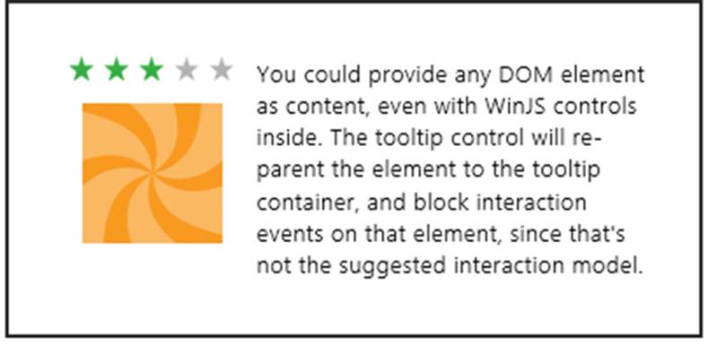
<p>You could provide any DOM element as content, even with WinJS controls inside. The tooltip control will re-parent the element to the tooltip container, and block interaction events on that element, since that's not the suggested interaction model.</p>
</div>
<div id="myContentElement_picture">
</div>
</div>
</div>
We can reference it like so:
<div data-win-control="WinJS.UI.Tooltip"
data-win-options="{infotip: true, contentElement: myContentElement}">
<span>My piece of data</span>
</div>
When you hover over the text (with a mouse or hover-enabled touch hardware), this tooltip will appear:
This example is taken directly from the HTML Tooltip control sample, so you can go there to see how all this works, including other options like placement and infotip. Do be aware, as the sample indicated, that controls within a Tooltip cannot themselves be interactive.
Example: WinJS.UI.ItemContainer
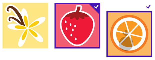
Like the Tooltip, the ItemContainer control wraps behaviors around some other piece of HTML, namely whatever is declared as children of the ItemContainer. For example, the following code from scenario 1 of the HTML ItemContainer sample wraps three img elements in separate containers (html/scenario1.html):
<div id="flavorSelector">
<div class="scenario1Containers" id="scen1-item1" data-win-control="WinJS.UI.ItemContainer"
data-win-options="{swipeBehavior: 'select', tapBehavior: 'toggleSelect'}">
<img src="/images/110Vanilla.png" alt="Vanilla" draggable="false"/>
</div>
<div class="scenario1Containers" id="scen1-item2" data-win-control="WinJS.UI.ItemContainer"
data-win-options="{swipeBehavior: 'select', tapBehavior: 'toggleSelect'}">
<img src="/images/110Strawberry.png" alt="Strawberry" draggable="false"/>
</div>
<div class="scenario1Containers" id="scen1-item3" data-win-control="WinJS.UI.ItemContainer"
data-win-options="{swipeBehavior: 'select', tapBehavior: 'toggleSelect'}">
<img src="/images/110Orange.png" alt="Orange" draggable="false"/>
</div>
</div>
Note that each is marked with the swipeBehavior of select and the tapBehavior of toggleSelect. The other option for swipeBehavior is none (these come from the WinJS.UI.SwipeBehavior enumeration); the other options for tapBehavior are none, directSelect, and invokeOnly (from theWinJS.UI.TabBehavior enumeration). You can also set selectionDisabled to true to turn off selection completely.
In the graphic below, the left ItemContainer is unselected, the middle is selected, and the rightmost is in the process of being selected from a top-down swipe gesture (indicated by the arrow and circle). This is shown more dynamically in Video 5-1:
In all these cases the default swipeOrientation is vertical; the other option in WinJS.UI.Orientation is horizontal, which is demonstrated in scenario 3 of the sample.
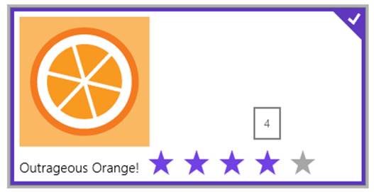
Scenario 4 demonstrates using other controls within the ItemContainer, such as a Rating control (html/scenario4.html):
<div id="scen4Item1" data-win-control="WinJS.UI.ItemContainer"
data-win-options="{swipeBehavior: 'select', tapBehavior:'toggleSelect'}">
<div id="itemContent">
<img src="/images/110Orange.png"/>
<div id="itemDetail">
Outrageous Orange!
<div id="myRatingControl" class="win-interactive"
data-win-control="WinJS.UI.Rating"></div>
</div>
</div>
</div>
Take special note of the win-interactive class given to the Rating control—this is what tells the parent element (the ItemContainer) to pass interaction events down to the child control. This allows you to directly change the rating, where the rating’s tooltip appears as it should for mouse hover:
By setting an ItemContainer.draggable option to true, you enable that item to be dragged away and received by other HTML5 drag-and-drop targets. Scenario 2 of the sample does this with six ItemContainer controls, making sure to disable default dragging on the img elements within them (html/scenario2.html):
<div class="scenario2Containers" id="scen2-item1" data-win-control="WinJS.UI.ItemContainer"
data-win-options="{draggable: true, selectionDisabled: true,
oninvoked:Scenario2.invokedHandler}">
<img src="/images/60SauceCaramel.png" draggable="false"/>
</div>
<!-- And so on -->
The drop target just registers for the standard HTML5 drag and drop events (dragenter, dragover, dragleave, and drop) to create an interactive ice cream cone builder:
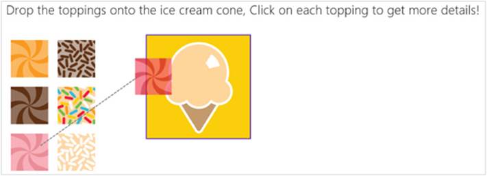
You can see that each item also has an oninvoked handler (marked for processing of course!) that displays some details for that topping. See Video 5-2 for a short demonstration.
If you’ve played with Windows 8 or Windows 8.1 at all, you’ll probably recognize that the behaviors of the ItemContainer show up in a collection control like the WinJS.UI.ListView. And in fact, the ListView in Windows 8.1 uses the ItemContainer unabashedly! It was part of overhauling the ListView for Windows 8.1 that created the ItemContainer as a separate entity that can be used for single items outside of a collection.
Working with Controls in Blend
Before we move onto the subject of control styling, it’s a good time to highlight a few additional features of Blend for Visual Studio where controls are concerned. As I mentioned in Video 2-2, the Assets tab in Blend gives you quick access to all the HTML elements and WinJS controls (among many other elements) that you can just drag and drop into whatever page is showing in the artboard. (See Figure 5-4.) This will create basic markup, such as a div with a data-win-control attribute for WinJS controls; then you can go to the HTML Attributes pane (on the right) to set options in the markup. (See Figure 5-5.)
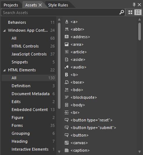
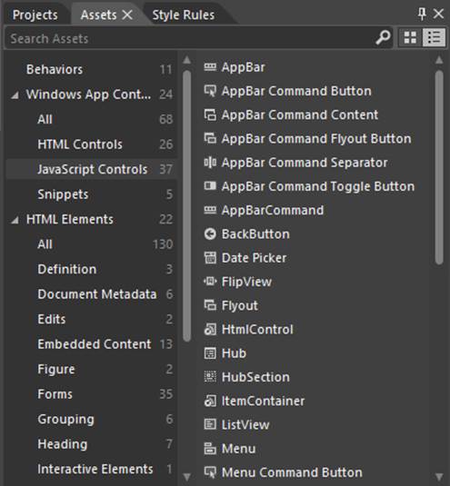
FIGURE 5-4 HTML elements (left) and WinJS control (right) as shown in Blend’s Assets tab.
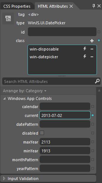
FIGURE 5-5 Blend’s HTML Attributes tab shows WinJS control options, and editing them will affect the data-win-options attribute in markup.
Next, take a moment to load up the HTML essential controls sample into Blend. This is a great opportunity to try out Blend’s Interactive Mode to navigate to a particular page and explore the interaction between the artboard and the Live DOM. (See Figure 5-6.) Once you open the project, go into interactive mode by selecting View -> Interactive Mode on the menu, pressing Ctrl+Shift+I, or clicking the small leftmost button on the upper right corner of the artboard. Then select scenario 5 (Progress introduction) in the listbox, which will take you to the page shown inFigure 5-6. Then exit interactive mode (same commands), and you’ll be able to click around on that page. A short demonstration of using interactive mode in this way is given in Video 5-3.
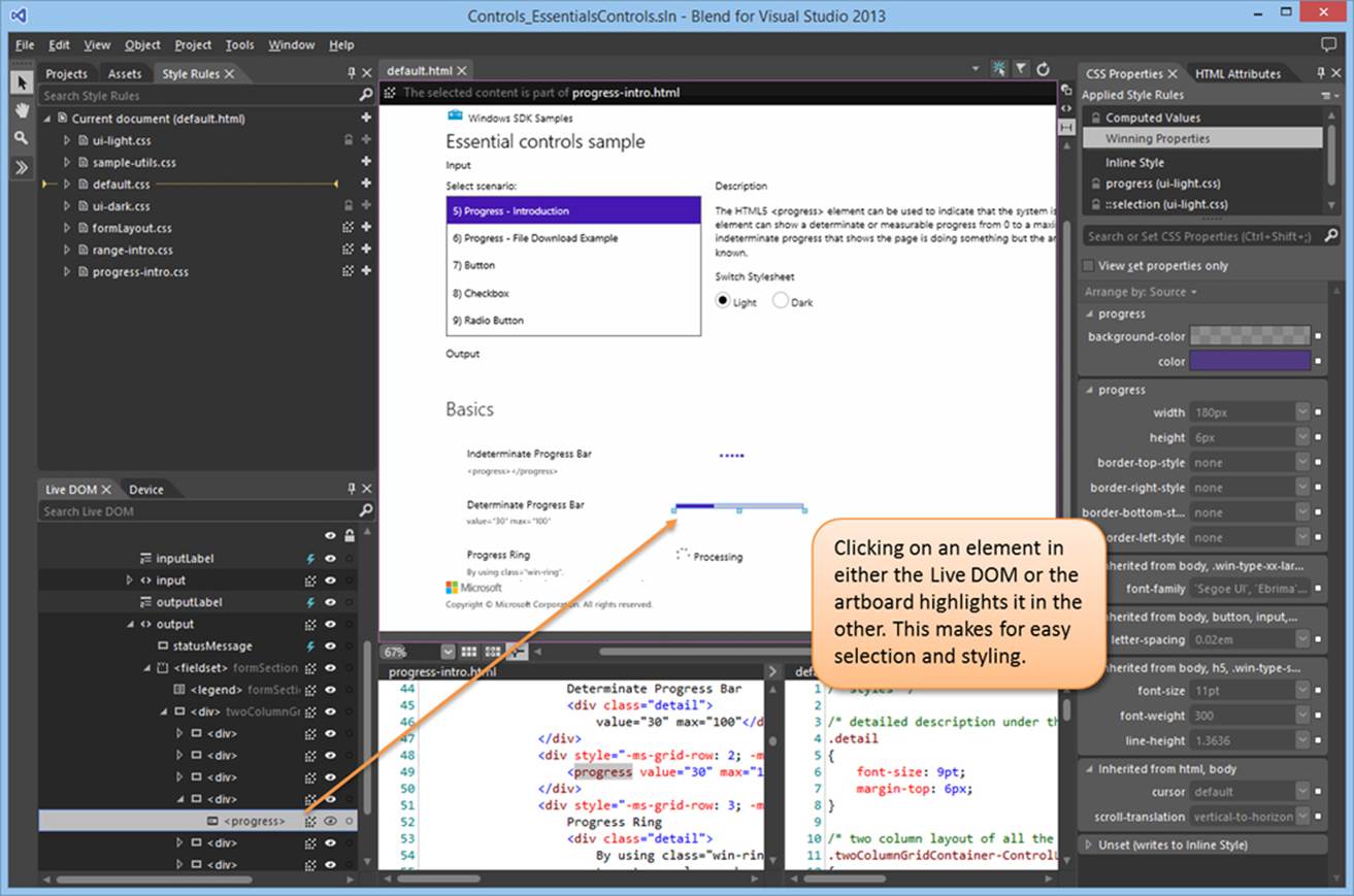
FIGURE 5-6 Blend’s interaction between the artboard and the Live DOM.
With the HTML essential controls sample, you’ll see that there’s just a single element in the Live DOM for intrinsic controls, as there should be, because all the internal details are part and parcel of the HTML/CSS rendering engine. On the other hand, load up the HTML Rating control sample instead and expand the div that contains one such control. There you’ll see all the additional child elements that make up this control (shown in Figure 5-7), and you can refer to the right-hand pane for HTML attributes and CSS properties. You can see something similar (with even more detailed information), in the DOM Explorer of Visual Studio when the app is running. (See Figure 5-8.)
Tip To take a peek at what win-* and other classes are added to various WinJS controls, run a suitable app inside Visual Studio. In the DOM Explorer pane, navigate to the controls you’re interested in and you’ll see both their internal structure and the classes that are being applied. You can then also modify styles within the DOM Explorer to see their immediate effects, which shortcuts the usual trial-and-error experience with CSS (as you can also do in Blend). Once you know the styles you need, you can write them into your CSS files. For a short demonstration, see Video 5-4.
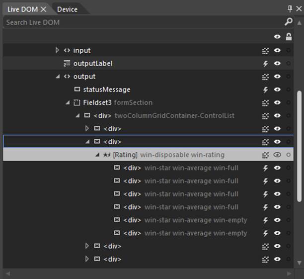
FIGURE 5-7 Expanding a WinJS control in Blend’s Live DOM reveals the elements that are used to build it.
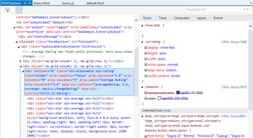
FIGURE 5-8 Expanding a WinJS control in Visual Studio’s DOM Explorer also shows complete details for a control.
Control Styling
Now we come to a topic where we’ll mostly get to look at lots of pretty pictures: the various ways in which HTML and WinJS controls can be styled. As we’ve discussed, this happens through CSS all the way, either in a stylesheet or by assigning style.* properties, meaning that apps have full control over the appearance of controls. In fact, absolutely everything that’s visually different between HTML controls in a Windows Store app and the same controls on a web page is due to styling and styling alone.
Design help Some higher-level design guidance for styling is available in the documentation: Branding your Windows Store apps.
For both HTML and WinJS controls, CSS standards apply including pseudo-selectors like :hover, :active, :checked, and so forth, along with -ms-* prefixed styles for emerging standards.
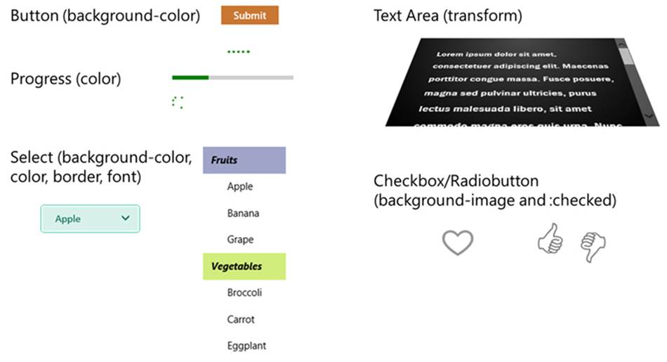
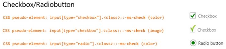
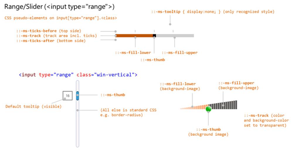
For HTML controls, there are also additional -ms-* styles—that aren’t part of CSS3—to isolate specific parts of those controls. This is because the constituent parts of such controls don’t exist separately in the DOM. So pseudo-selectors—like ::-ms-check to isolate a checkbox mark and::-ms-fill-lower to isolate the left or bottom part of a slider—allow you to communicate styling to the depths of the rendering engine. In contrast, all parts of WinJS controls are addressable in the DOM, so they are just styled with specific win-* classes defined in the WinJS stylesheets and the controls are simply rendered with those style classes. Default styles are defined in the WinJS stylesheets, but apps can override any aspect of those to style the controls however you want.
In a few cases, as already pointed out, certain win-* classes define style packages for use with HTML controls, such as win-backbutton, win-vertical (for a slider) and win-ring (for a progress control). These are intended to style standard HTML controls to look like special system controls.
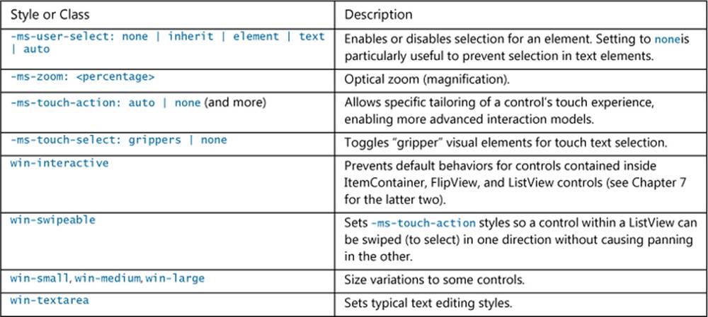
There are also a few general purpose -ms-* styles (not selectors) that can be applied to many controls (and elements in general), along with some general WinJS win-* style classes. These are summarized in the following table.
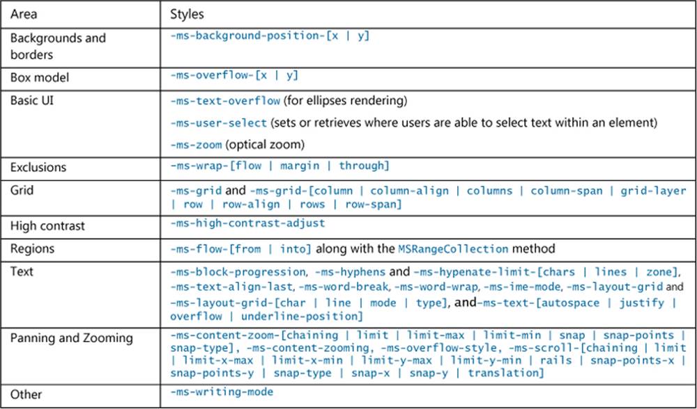
For all of these and more, spend some time with these three reference topics: WinJS CSS classes for typography, WinJS CSS classes for HTML controls, and CSS classes for WinJS controls. I also wanted to provide you with a summary of all the other vendor-prefixed styles (or selectors) that are supported within the CSS engine for Store apps; see the next table. Vendor-prefixed styles for animations, transforms, and transitions are still supported, though no longer necessary, because these standards have recently been finalized. I made this list because the documentation here can be hard to penetrate: you have to click through the individual pages under the Cascading Style Sheets topic in the docs to see what little bits have been added to the CSS you already know.
Styling Gallery: HTML Controls
Now we get to enjoy a visual tour of styling capabilities for Windows Store apps. Much can be done with standard styles, and then there are all the things you can do with special styles and pseudo-elements as shown in the graphics in this section. The specifics of all these examples can be seen in the HTML essential controls sample.
Also check out the very cool Applying app theme color (theme roller) sample. This beauty lets you configure the primary and secondary colors for an app, shows how those colors affect different controls, and produces about 200 lines of precise CSS that you can copy into your own stylesheet; you can also copy the appropriate color code into the branding fields of your manifest and use them in other branding graphics. This very much helps you create a color theme for your app, which we very much encourage to establish an app’s own personality within the overall Windows design guidelines and not try to look like the system itself. (Do note that controls in system-provided UI, like the confirmation flyout when creating secondary tiles, system toast notifications, and message dialogs, will be styled with system colors. These cannot be controlled or duplicated by the app.)
Note Though not shown here, you can also use the -ms-scrollbar-* styles for scrollbars that appear on pannable content in your app.
Styling Gallery: WinJS Controls
Similarly, here is a visual rundown of styling for WinJS controls, drawing again from the samples in the SDK: HTML DatePicker and TimePicker controls, HTML Rating control, HTML ToggleSwitch control, HTML Tooltip control, a modified version of the HTML Item Container sample (in the companion content), and the Navigation and navigation history sample. The latter specifically shows a little styling of the BackButton control. Scenario 4 (css/4_BackButton.css) overrides a few styles in the win-navigation-backbutton class to change the control’s size. More generally, the back button control itself is made up of a <button> with the class win-navigation-backbutton (for the overall control, including pseudo-selectors) and a <span> with the class win-back (that isolates the ring and the arrow character). You can use these to change the coloration of the control:
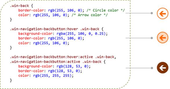
Note that if you set the background-color for win-navigation-backbutton, you’ll set that color for the control’s entire rectangle. By default that background is transparent, so you’ll typically just style the inner part of the circle, as shown above.
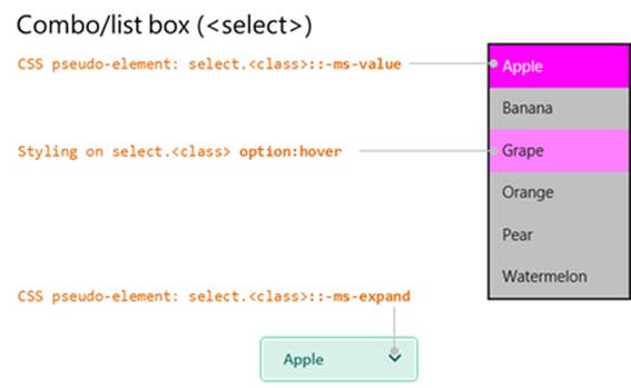
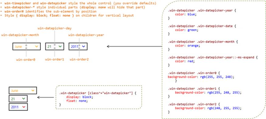
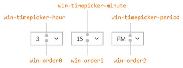
For the DatePicker and TimePicker, refer to styling for the HTML select element along with the ::-ms-value and ::-ms-expand pseudo-elements. I will note that the sample isn’t totally comprehensive, so the visuals below highlight the finer points:
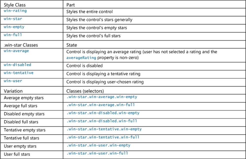
The ItemContainercontrol has both constituent parts as well as two selection states, all of which have win-* classes to identify them.
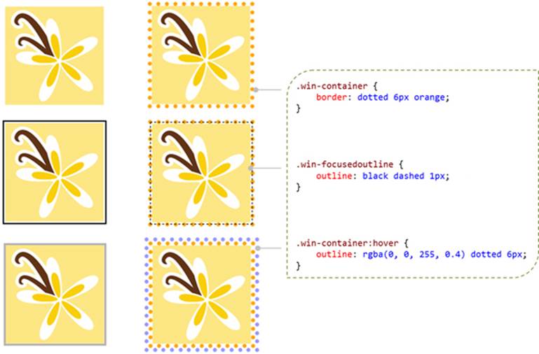
First, the two selections classes are win-selectionstylefilled and (the default) win-selectionstyleoutlined. Adding these to the root element results in the standard WinJS styling below:47
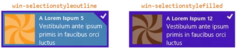
Typically you’ll use these selection style classes to create specific selectors for styling the control’s individual parts, which are also identified with specific win-* classes:
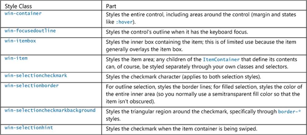
The win-container, win-itembox, and win-item classes identify successive layers of the control as it’s built up by its constructor. That is, in your markup you’ll have one root element for the ItemContainer control that contains the item contents. When that control is instantiated, the win-container class is added to that root element and two more div elements with win-itembox and win-item are inserted before the item contents. The classes let you target each layer for styling. Note that the layers shown below all overlap one another; the offset is added only for visualization purposes:
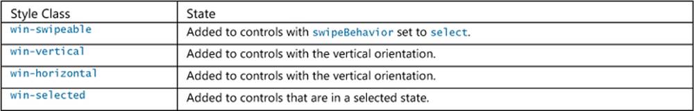
In addition, a few more classes identify on the root element different control states or options:
The following series of images are taken from the modified HTML ItemContainer sample found in this chapter’s companion content. First are some of the outline styles you can use. (Default styles are on the left, and somewhat ridiculous custom styles are shown on the right side with the applicable CSS.)
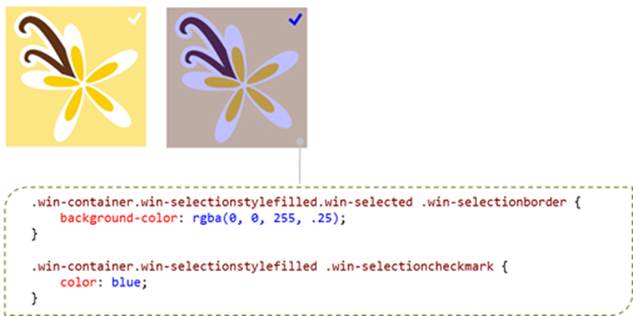
With the win-selectionstylefilled option, the default styling is shown below left and some custom styling on the right. Notice that in the win-selectionborder class we style a semitransparent background-color as it overlays the whole item:
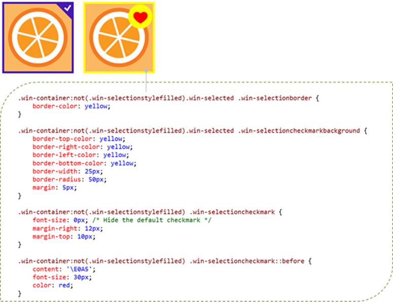
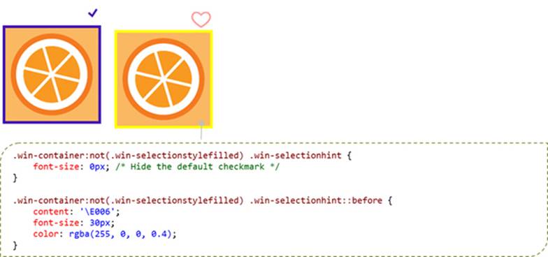
The following example shows default outline selection styling (left) and custom styling (right). To change the checkmark character itself, notice how we need to set the font-size of the default checkmark to 0px and then use the ::before pseudo-element to insert a different character. With the win-selectioncheckmarkbackground border, the default size is set to match the size of the checkmark box, and the left and bottom borders are colored with transparent: this is what produces the triangle. By setting the border-width larger, coloring all the borders, and adding a radius, we create the circle. The margin on the background separates the circle from the edge outline, and the margin on the ::before character centers it in the circle.
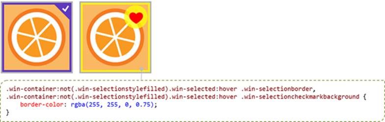
When changing the border styles, be sure to do it also for the selected hover state as well:
To finish up with ItemContainer, here’s how we can style the selection hint (default again shown on the left)—in these cases the item is in the process of being swiped from top to bottom (see Video 5-5 for the full experience):
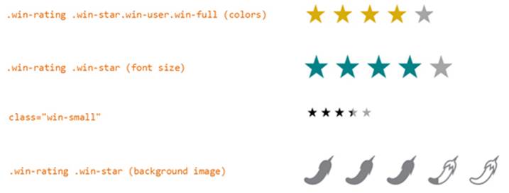
The Rating control similarly has states that can be styled in addition to its stars and the overall control. Again, win-* classes identify these individually and combinations style the variations:
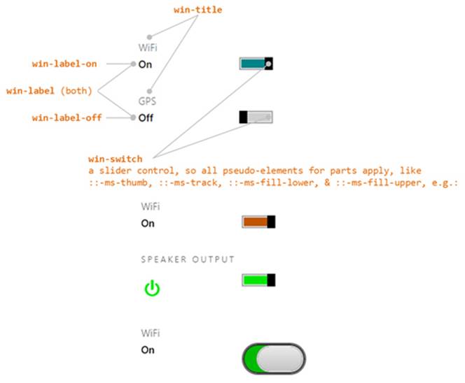
For the ToggleSwitch, win-* classes identify parts of the control; states are implicit. Note that the win-switch part is just an HTML slider control (<input type="range">), so you can utilize all the pseudo-elements for its parts as shown in the “Styling Gallery: HTML Controls” section earlier.
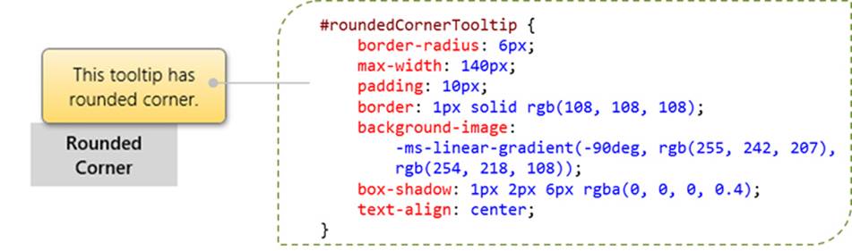
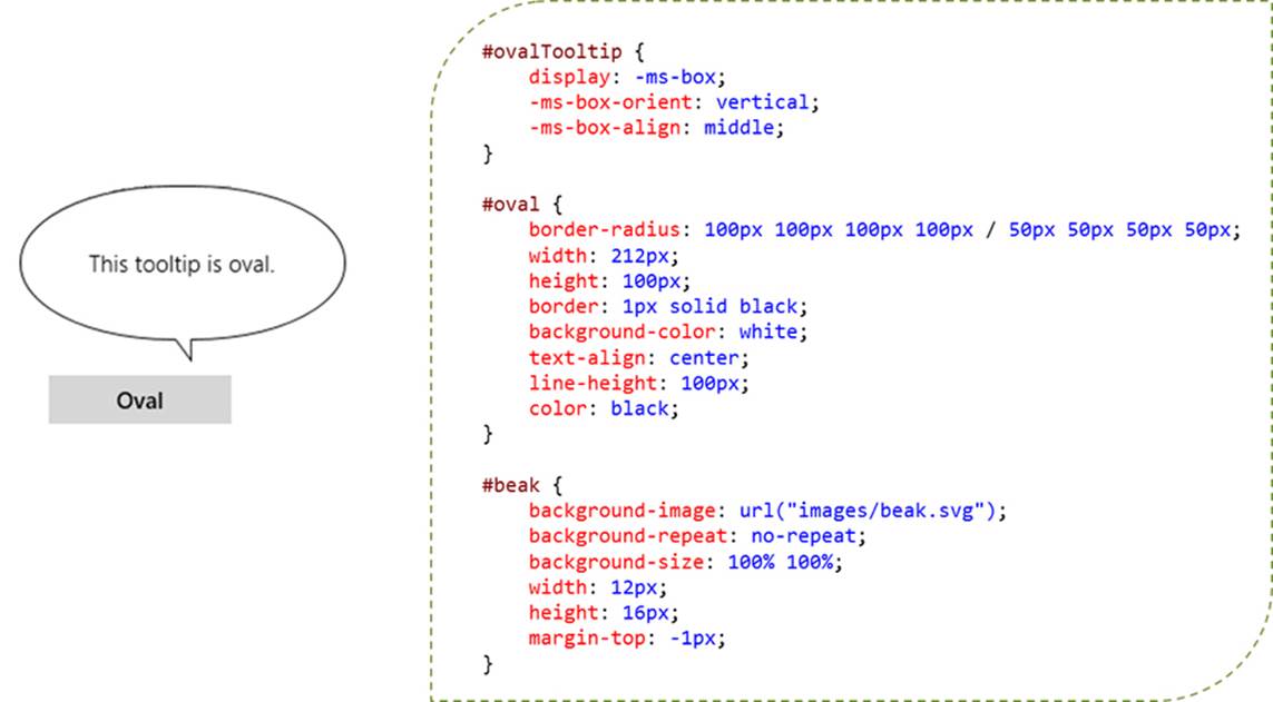
And finally, for Tooltip, win-tooltip is a single class for the tooltip as a whole; the control can then contain any other HTML to which CSS applies using normal selectors. The tooltips shown here appear in relation to a gray button to which the tooltip applies:
Some Tips and Tricks
• The automatic tooltips on a slider (<input type="range">) are always numerical values; there isn’t a means to display other forms of text, such as Low, Medium, and High. For something like this, you could consider a Rating control with three values, using the tooltipStrings property to customize the tooltips.
• The ::-ms-tooltip pseudo-selector for the slider affects only visibility (with display: none); it cannot be used to style the tooltip generally. This is useful to hide the default tooltips if you want to implement custom UI of your own.
• There are additional types of input controls (different values for the type attribute) that I haven’t mentioned. This is because those types have no special behaviors and just render as a text box. Those that have been specifically identified might also just render as a text box, but they can affect, for example, what on-screen keyboard configuration is displayed on a touch device (see Chapter 12) and also provide specific input validation (e.g., the number type only accepts digits).
• The WinJS attribute, data-win-selectable, when set to true, specifies that an element is selectable in the same way that all input and contenteditable elements are.
• If you don’t find width and height properties working for a control, try using style.width and style.height instead.
• You’ll notice that there are two kinds of button controls: <button> and <input type="button">. They’re visually the same, but the former is a block tag and can display HTML inside itself, whereas the latter is an inline tag that displays only text. A button also defaults to <input type="submit">, which has its own semantics, so you generally want to use <button type="button"> to be sure.
• If a Tooltip is getting clipped, you can override the max-width style in the win-tooltip class, which is set to 30em in the WinJS stylesheets. Again, peeking at the style in Blend’s Style Rules tab is a quick way to see the defaults.
• The HTML5 meter element is not supported for Store apps.
• There’s a default dotted outline for a control when it has the focus (tabbing to it with the keyboard or calling the focus method in JavaScript). To turn off this default rectangle for a control, use <selector>:focus { outline: none; } in CSS.
• Store apps can use the window.getComputedStyle method to obtain a currentStyle object that contains the applied styles for an element, or for a pseudo-element. This is very helpful, especially for debugging, because pseudo-elements like ::-ms-thumb for an HTML slider control never appear in the DOM, so the styling is not accessible through the element’s style property nor does it surface in tools like Blend. Here’s an example of retrieving the background color style for a slider thumb:
var styles = window.getComputedStyle(document.getElementById("slider1"), "::-ms-thumb");
styles.getPropertyValue("background-color");
Custom Controls
As extensive as the HTML and WinJS controls are, there will always be something you wish the system provided but doesn’t. “Is there a calendar control?” is a question I’ve often heard. “What about charting controls?” These clearly aren’t included directly in the Windows SDK, and despite any wishing to the contrary, it means you or another third-party will need to create a custom control.
You can find a list of third-party control libraries on the Windows Partner Directory: visit http://services.windowsstore.com/ and click the “Control & Frameworks” filter on the left-hand side. Be sure to check for those that specifically offer HTML controls. Telerik, for example, provides calendar, chart, and gauge controls, among others.
Tip One advantage of using built-in and professional third-party controls is that they implement Accessibility features like keyboarding and high contrast support (see Chapter 19). If you create a custom control that you might share with others, be sure to add similar support.
If none of those libraries meet your needs, you’ll need to write a control of your own. Do consider using the HtmlControl or even WinJS.UI.Pages if what you need is mostly a reusable block of HTML/CSS/JavaScript without custom methods, properties, and events. Along similar lines, if what you need is a reusable block of HTML in which you want to do run-time data binding, check out WinJS.Binding.Template, which we’ll see in Chapter 6. The Template isn’t a control as we’ve been describing here—it doesn’t support events, for instance—but it might be exactly what you need.
When you do need to implement a custom control, everything we’ve learned about WinJS controls applies. WinJS, in fact, uses the exact same control model, so you can look at the WinJS source code anytime you like for a bunch of reference implementations.
But let’s spell out the pattern explicitly, recalling from our earlier definition that a control is just declarative markup (creating elements in the DOM) plus applicable CSS, plus methods, properties, and events accessible from JavaScript. Here are the steps:
1. Define a namespace for your control(s) by using WinJS.Namespace.define to both provide a naming scope and to keep excess identifiers out of the global namespace. (Do not add controls to the WinJS namespace.) Remember that you can call WinJS.Namespace.define many times for the same namespace to add new members, so typically an app will just have a single namespace for all its custom controls no matter where they’re defined.
2. Within that namespace, define the control constructor by using WinJS.Class.define (or derive), assigning the return value to the name you want to use in data-win-control attributes. That fully qualified name will be <namespace>.<constructor>.
3. Within the constructor (of the form <constructor>(element, options) ):
a. You can recognize any set of options you want; these are arbitrary. Simply ignore any that you don’t recognize.
b. If element is nullor undefined, create a div to use in its place.
c. Assuming element is the root element containing the control, be sure to set element.winControl=this and this.element=element to match the WinJS pattern.
d. Call WinJS.Utilities.addClass(this.element, "win-disposable") to indicate that the control implements the dispose pattern (see #5 below). Also set this._disposed = false. Alternately, use WinJS.Utilities.markDisposable (see the next section, “Implementing the Dispose Pattern”), which encapsulates these steps and parts of #5.
4. Within WinJS.Class.define, the second argument is an object containing your public methods and properties (those accessible through an instantiated control instance); the third argument is an object with static methods and properties (those accessible through the class name without needing to call new).
5. Implement a public method named dispose. As described in “Sidebar: The Ubiquitous dispose method” earlier in this chapter, this method is called when whatever is hosting your control is doing its cleanup. In response, the control should do the following (a generic structure is given in the next section):
a. Mark itself as disposed by setting this._disposed = true (dispose should check if this is set to prevent reentrancy).
b. Call removeEventListener for any event handlers added earlier.
c. Call dispose on any child controls marked with the win-disposable class, if the method is available. This can be done with WinJS.Utilities.disposeSubTree.
d. Cancel any outstanding async operations.
e. Release object references, disconnect event listeners, release connections, and otherwise clean up any other allocations or resources (generally setting them to null so that the JavaScript garbage collector finds them).
6. For your events, mix (WinJS.Class.mix) your class with the results from WinJS.Utilities.createEventProperties(<events>) where <events> is an array of your event names (without on prefixes). This will create on<event> properties in your class for each name in the list.
7. Also mix your class with WinJS.UI.DOMEventMixin to add standard implementations of addEventListener, removeEventListener, dispatchEvent, and setOptions.48
8. In your implementation (markup and code), refer to classes that you define in a default stylesheet but that can be overridden by consumers of the control. Consider using existing win-* classes to align with general styling.
9. A typical best practice is to organize your custom controls in per-control folders that contain all the html, js, and css files for that control. Again, calls to WinJS.Namespace.define for the same namespace are additive, so you can populate a single namespace with controls that are defined in separate files.
Note Everything in WinJS—like WinJS.Class.define and WinJS.UI.DOMEventMixin—are just helpers for common patterns. You’re not in any way required to use these, because in the end, custom controls are just elements in the DOM like any others and you can create and manage them however you like. The WinJS utilities just make most jobs cleaner, easier, and more consistent.
For more about WinJS.Class methods and mixins, see Appendix B, “WinJS Extras.” Other sections of the appendix outline some obscure WinJS features that might be helpful when implementing custom controls.
Implementing the DisposePattern
The common pattern for the implementation of the dispose method looks like the following, which assumes that this._disposed was set to false in the constructor:
dispose: function () {
if (this._disposed) { return; }
this._disposed = true;
// Call dispose on all children
WinJS.Utilities.disposeSubTree(this.element);
// Disconnect listeners. A simple button.onclick case is shown here.
if (this._button &&this._clickListener) {
this._button.removeEventListener("click", this._clickListener, false);
}
// Cancel outstanding promises
this._somePromise &&this._somePromise.cancel();
this._somePromise = null;
//Null out other resources (however many there are)
this._someOtherResource = null;
}
An example of this can be found in scenario 1 of the Dispose model sample.
A simpler way of implementing the pattern—and one that relieves you from having to remember certain details—is to use the WinJS.Utilities.markDisposable method. This adds the standard win-disposable class to an element and automatically provides a this._disposed flag. The part you provide is a function that contains your specific disposal code. Here’s how markDisposable is implemented:
markDisposable: function (element, disposeImpl) {
var disposed = false;
WinJS.Utilities.addClass(element, "win-disposable");
var disposable = element.winControl || element;
disposable.dispose = function () {
if (disposed) {
return;
}
disposed = true;
WinJS.Utilities.disposeSubTree(element);
if (disposeImpl) {
disposeImpl();
}
};
The benefit of markDisposable is that it gives you a way to put the dispose code right inside your constructor, where you can more easily match the construction and disposal steps. Scenario 2 of the Dispose model sample shows how to use this construct, and we’ll see another example in the next section that gives us more context for discussion.
Sidebar: Using the WinJS Scheduler in Custom Controls
If you do any kind of async work in a custom control, be sure to employ the WinJS.Utilities.Scheduler API to appropriately mark each async task’s relative priority. Typically, UI refresh work gets a higher priority, whereas secondary work like preloading additional content can be scheduled at low priority. If you search for “Scheduler” in the WinJS source file ui.js, you’ll see many examples, and refer back to Chapter 3 for the general discussion of the Scheduler.
Custom Control Examples
To see this pattern in action, here are a couple of examples. First is what Chris Tavares, one of the WinJS engineers who has been a tremendous help with this book, described as the “dumbest control you can imagine.” Yet it certainly shows the most basic structures (in this case dispose isn’t needed):
WinJS.Namespace.define("AppControls", {
HelloControl: WinJS.Class.define(function (element, options) {
element.winControl = this;
this.element = element;
if (options.message) {
element.innerText = options.message;
}
})
});
With this, you can then use the following markup so that WinJS.UI.process/processAll will instantiate an instance of the control (as an inline element because we’re using span as the root):
<span data-win-control="AppControls.HelloControl"
data-win-options="{ message: 'Hello, World'}">
</span>
Note that the control definition code must be executed before WinJS.UI.process/processAll so that the constructor function named in data-win-control actually exists at that point.
For a more complete control, you can take a look at the HTML SemanticZoom for custom controls sample. There is also a post on the Windows Developer blog that takes a patterns-oriented approach to this subject. As for us here, let’s work with the CalendarControl example in this chapter’s companion content, which was created by my friend Kenichiro Tanaka of Microsoft Tokyo and is shown in Figure 5-9. (Note that this is example is only partly sensitive to localized calendar settings and doesn’t support accessibility requirements; it is not meant to be full-featured.)
Following the steps given earlier, this control is defined using WinJS.Class.define within a Controls namespace (controls/calendar/calendar.js lines 4–12 shown here):
WinJS.Namespace.define("Controls", {
Calendar : WinJS.Class.define(
// constructor
function (element, options) {
this.element = element || document.createElement("div");
this.element.className = "control-calendar";
this.element.winControl = this;
The rest of the constructor (lines 14–72) builds up the child elements that define the control, making sure that each piece has a particular class name that, when scoped with the control-calendar class placed on the root element above, allows specific styling of the individual parts. The defaults for this are in controls/calendar/calendar.css; specific overrides that differentiate the two controls in Figure 5-9 are in css/default.css.
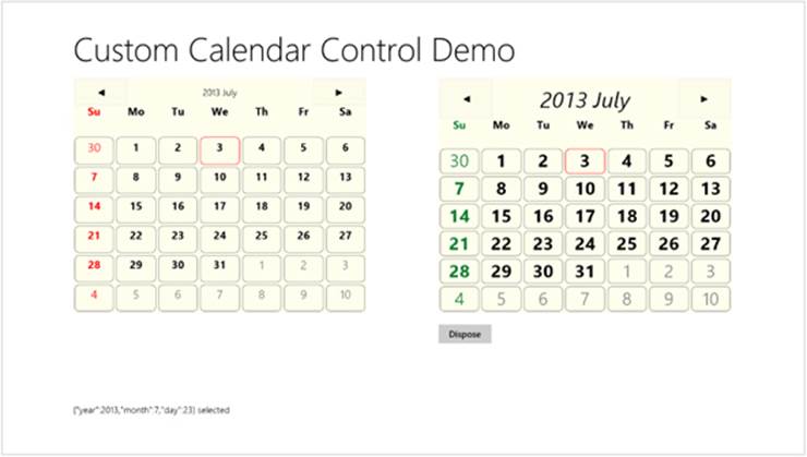
FIGURE 5-9 Output of the Calendar Control example.
Within the constructor you can also see that the control wires up its own event handlers for its child elements, such as the previous/next buttons and each date cell. In the latter case, clicking a cell uses dispatchEvent to raise a dateselected event from the overall control itself. The event handler we assign to this generates the output along the bottom of the screen.
Lines 74–169 then define the members of the control. There are two internal methods, _setClass and _update, followed by three public methods, dispose, nextMonth and prevMonth, followed by three public properties, year, month, and date. Those properties can be set through the data-win-options string in markup or directly through the control object as we’ll see in a moment.
To implement dispose, the Calendar Control uses WinJS.Utilities.markDisposable within the constructor:
WinJS.Utilities.markDisposable(this.element, disposeImpl.bind(this));
The disposeImpl function we pass to markDisposable, which is defined in the constructor itself, carefully reverses any allocations made in the constructor or elsewhere in the control’s methods (look especially for uses of new). This includes an instance of Windows.Globalization.calendar(which could be replaced in _update), an array of cells, and quite a number of child elements. It also added event listeners to most of those elements.
When implementing your disposal process, first copy and paste your constructor code and then modify it to reverse each action. This makes it easier to see everything that was done in the constructor so that you won’t forget anything. In the process, watch for any variables that you declared in the constructor with var<name> to access some part of the control, such as child elements. Because you’ll probably need these again in dispose, change each one from var <name> to this._<name> such that you’ll have it later on. For example, the calendar saves its header element like so:
this._header = document.createElement("div");
// Other initialization
this.element.appendChild(this._header);
Similarly, assign event handlers in this._<handler> properties. For example:
this._prevListener = function () {
this.prevMonth();
};
this.element.querySelector(".prev").addEventListener("click", this._prevListener.bind(this));
Looking at the control’s disposal code (the function passed to markDisposable), then, we can see how handy it is to have these instance properties around, especially for removeEventListener:49
function disposeImpl () {
//Reverse the constructor's steps
this._cal = null;
var prev = this.element.querySelector(".prev");
prev && prev.removeEventListener("click", this._prevListener);
var next = this.element.querySelector(".next");
next && next.removeEventListener("click", this._nextListener);
this.element.removeChild(this._header);
var that = this;
this._cells.forEach(function (cell) {
cell.removeEventListener("click", that._cellClickListener);
that._body.removeChild(cell);
});
this._cells = null;
this.element.removeChild(this._body);
};
To test all this, you can click the Dispose button underneath the right-hand calendar in Figure 5-9. This calls the right-hand calendar’s dispose method, after which the only thing left is the root div in which the control was created. The button’s click handler then hides that div.
Anyway, at the very end of controls/calendar/calendar.js you’ll see the two calls to WinJS.Class.mix to add properties for the events (there’s only one here), and the standard DOM event methods like addEventListener, removeEventListener, and dispatchEvent, along with setOptions:
WinJS.Class.mix(Controls.Calendar, WinJS.Utilities.createEventProperties("dateselected"));
WinJS.Class.mix(Controls.Calendar, WinJS.UI.DOMEventMixin);
Very nice that adding all these details is so simple—thank you, WinJS!50
Between controls/calendar/calendar.js and controls/calendar/calendar.css we thus have the complete definition of the control. In default.html and default.js we can then see how the control is used. In Figure 5-9, the control on the left is declared in markup and instantiated through the call to WinJS.UI.processAll in default.js.
<div id="calendar1" class="control-calendar" aria-label="Calendar 1"
data-win-control="Controls.Calendar"
data-win-options="{ year: 2012, month: 5, ondateselected: CalendarDemo.dateselected}">
</div>
You can see how we use the fully qualified name of the constructor as well as the event handler we’re assigning to ondataselected. But remember that functions referenced in markup like this have to be marked for strict processing. The constructor is automatically marked throughWinJS.Class.define, but the event handler needs extra treatment: we place the function in a namespace (to make it globally visible) and use WinJS.UI.eventHandler to do the marking:
WinJS.Namespace.define("CalendarDemo", {
dateselected: WinJS.UI.eventHandler(function (e) {
document.getElementById("message").innerText = JSON.stringify(e.detail) + " selected";
})
});
Again, if you forget to mark the function in this way, the control won’t be instantiated at all. (Remove the WinJS.UI.eventHandler wrapper to see this.)
To demonstrate creating a control outside of markup, the control on the right of Figure 5-9 is created as follows, within the calendar2div:
//Because we're creating this calendar in code, we're independent of WinJS.UI.processAll.
var element = document.getElementById("calendar2");
//Because we're providing an element, this will be automatically added to the DOM.
var calendar2 = new Controls.Calendar(element);
//Because this handler is not part of markup processing, it doesn't need to be marked.
calendar2.ondateselected = function (e) {
document.getElementById("message").innerText = JSON.stringify(e.detail) + " selected";
}
There you have it!
Note For a control you really intend to share with others, you’ll want to include the necessary comments that provide metadata for IntelliSense. See the “Sidebar: Helping Out IntelliSense” in Chapter 3 for more details. You’ll also want to make sure that the control fully supports considerations for accessibility and localization, as discussed in Chapter 19.
Custom Controls in Blend
Blend is an excellent design tool for working with controls directly on the artboard, so you might be wondering how custom controls integrate into that story.
First, because custom controls are just elements in the DOM, Blend works with them like all other parts of the DOM. Try loading the Calendar Control example into Blend to see for yourself.
Next, a control can determine if it’s running inside Blend’s design mode if the Windows.-ApplicationModel.DesignMode.designModeEnabledproperty is true. One place where this is very useful is when handling resource strings. We won’t cover resources in full until Chapter 19, but it’s important to know here that resource lookup through the data-win-res attribute works just fine in design mode but not through Windows.ApplicationModel.Resources.ResourceLoader (it throws exceptions). If you run into this, you can use the design-mode flag to just provide a suitable default instead of doing the lookup.
For example, one of the early partners I worked with had a method to retrieve a localized URI to their back-end services, which was failing in design mode. Using the design mode flag, then, we just had to change the code to look like this:
WinJS.Namespace.define("App.Localization", {
getBaseUri: function () {
if (Windows.ApplicationModel.DesignMode.designModeEnabled) {
return"www.default-base-service.com";
} else {
var resources = new Windows.ApplicationModel.Resources.ResourceLoader();
var baseUri = resources.getString("baseUrl");
return baseUri;
}
}
});
Alternately, you could create a hidden element in the DOM that uses data-win-res to load the string into itself and then have a function like the below retrieve that string:
<!—In markup -->
<div id="baseUri" data-win-res="textContent: 'baseUrl'" style=" display: none;"></div>
//In code
WinJS.Namespace.define("App.Localization", {
getBaseUri: function () {
return document.getElementById("baseUri").textContent;
}
});
Finally, it is possible to have custom controls show up in the Assets tab alongside the HTML elements and the WinJS controls. For this you’ll first need an OpenAjax Metadata XML (OAM) file that provides all the necessary information for the control, and you already have plenty of references to draw from. To find them, search for *_oam.xml files within Program Files (x86). You should find some under the Microsoft Visual Studio 12.0 folder and deep down within Microsoft SDKs where WinJS metadata lives.In both places you’ll also find plenty of examples of the 12x12 and 16x16 icons you’ll want for your control.
If you look in the controls/calendar folder of the CalendarControl example with this chapter, you’ll find calendar_oam.xml and two icons alongside the .js and .css files. The OAM file, which must have a filename ending in _oam.xml, tells Blend how to display the control in its Assets panel and what code it should insert when you drag and drop the control into an HTML file. Here are the contents of that file:
<?xml version="1.0"encoding="utf-8"?>
<!-- Use underscores or periods in the id and name, not spaces. -->
<widget version="2.0"
spec="2.0"
id="http://www.kraigbrockschmidt.com/schemas/ProgrammingWin_JS/Controls/Calendar"
name="ProgWin_JS.Controls.Calendar"
xmlns="http://openajax.org/metadata">
<author name="Kenichiro Tanaka" />
<!-- title provides the name that appears in Blend's Assets panel
(otherwise it uses the widget.name). -->
<title type="text/plain"><![CDATA[Calendar Control]]></title>
<!-- description provides the tooltip fir Assets panel. -->
<description type="text/plain"><![CDATA[A single month calendar]]></description>
<!-- icons (12x12 and 16x16 provide the small icon next to the control
in the Assets panel. -->
<icons>
<icon src="calendar.16x16.png"width="16"height="16" />
<icon src="calendar.12x12.png"width="12"height="12" />
</icons>
<!-- This element describes what gets inserted into the .html file;
comment out anything that's not needed -->
<requires>
<!-- The control's code -->
<require type="javascript"src="calendar.js" />
<!-- The control's stylesheet -->
<require type="css"src="calendar.css" />
<!-- Any inline script for the document head -->
<require type="javascript"><![CDATA[WinJS.UI.processAll();]]></require>
<!-- Inline CSS for the style block in the document head -->
<!--<require type="css"><![CDATA[.control-calendar{}]]></require>-->
</requires>
<!-- What to insert in the body for the control; be sure this is valid HTML
or Blend won't allow insertion -->
<content>
<![CDATA[
<div class="control-calendar" data-win-control="Controls.Calendar"
data-win-options="{ year: 2012, month: 6 }"></div>
]]>
</content>
</widget>
When you add all five files to a project in Blend, you’ll see the control’s icon and title in the Assets tab (and hovering over the control shows the tooltip):
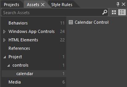
If you drag and drop that control onto an HTML page, you’ll then see the different bits added in:
<!DOCTYPE html>
<html>
<head>
<!-- ... -->
<script src="calendar.js" type="text/javascript"></script>
<link href="calendar.css" rel="stylesheet" type="text/css">
</head>
<body>
<div class="control-calendar" data-win-control="Controls.Calendar"
data-win-options="{month: 7, year:2013}"></div>
</body>
</html>
But wait! What happened to the WinJS.UI.processAll() call that the XML indicated to include within a script tag in the header? It just so happens that Blend singles out this piece of code to check if it’s already being called somewhere in the loaded script. If it is (as is typical with the project templates), Blend doesn’t repeat it. If it does include it, or if you specify other code here, Blend will insert it in a <script> tag in the header. Of course, you’ll probably want to move that call into a .js file.
Also, errors in your OAM file will convince Blend that it shouldn’t insert the control at all, so be careful with the details. When making changes, Blend won’t reload the metadata unless you reload the project or rename the OAM file (preserving the _oam.xml part). I found the latter is much easier, as Blend doesn’t care what the rest of the filename looks like. In this renaming process too, if you find that the control disappeared from the Assets panel, it means you have an error in the OAM XML structure itself, such as attribute values containing invalid characters. For this you’ll need to do some trial and error, and of course you can refer to all the OAM files already on your machine for details.
You can also make your control available to all projects in Blend. To do this, go to Program Files (x86)\Microsoft Visual Studio 12.0\Blend, create a folder called Addins if one doesn’t exist, create a subfolder therein for your control (using a reasonably unique name), and copy all your control assets there (that is, the same stuff in the /controls/calendar folder of the example). When you restart Blend, you’ll see the control listed under Addins in the Assets tab:
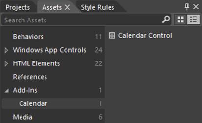
This would be appropriate if you create custom controls for other developers to use. In that case your desktop installation program would simply place your assets in the Addins folder. As for using such a control, when you drag and drop the control to an HTML file, its required assets (but not the icons nor the OAM file) are copied to the project into the root folder. You can then move them around however you like, patching up the file references as needed.
Sidebar: Custom Control Adorners
Controls that are built into Blend generally show small adorners that allow more interactivity with the control on the artboard. To do this, you implement an additional design-time DLL in C#/XAML using the Windows Presentation Foundation (WPF). More information can be found onWalkthrough: Creating a Design-time Adorner and especially Creating a Design-time adorner layer in Windows RT (Hungry Philosopher’s blog).
What We’ve Just Learned
• The overall control model for HTML and WinJS controls, where every control consists of declarative markup, applicable CSS, and methods, properties, and events accessible through JavaScript.
• Standard HTML controls have dedicated markup; WinJS controls use data-win-control and data-win-options attributes, which are processed using WinJS.UI.process or WinJS.UI.processAll.
• Both types of controls can also be instantiated programmatically using new and the appropriate constructor, such as button or WinJS.UI.Rating.
• All controls have various options that can be used to initialize them. These are given as intrinsic attributes for HTML controls and within the data-win-options attribute for WinJS controls.
• All controls have standard styling as defined in the WinJS stylesheets: ui-light.css and ui-dark.css. Those styles can be overridden as desired, and some style classes, like win-ring, are used to style a standard HTML control to look like a Windows-specific control.
• Windows Store apps have rich styling capabilities for both HTML and WinJS controls alike. For HTML controls, -ms-*-prefixed pseudo-selectors allow you to target specific pieces of those controls. For WinJS controls, specific parts are styled using win-* classes that you can override.
• Custom controls are implemented in the same way WinJS controls are, and WinJS provides standard implementations of methods like addEventListener. It’s important for custom controls to implement the WinJS dispose pattern and make use of the WinJS scheduler when asynchronous work is involved.
• Custom controls can also be shown in Blend’s Assets panel either for a single project or for all projects.
46 There is also the WinJS.UI.TabContainer control that is primarily used within the ListView control implementation. It has limited direct utility for apps and does not support declarative processing, so I won’t talk more of it here.
47 Technically speaking, the WinJS stylesheets contain no references to win-selectionstyleoutline as all selectors simply use :not(.win-selectionstylefilled).
48 Note that there is also aWinJS.Utilities.eventMixin that is similar (without setOptions) that is useful for noncontrol objects that won’t be in the DOM but still want to fire events. The implementations here don’t participate in DOM event bubbling/tunneling.
49 If you’re using markDisposable and write your disposal code within the constructor, you can depend on closures instead of instance variables. However, I prefer to keep instance variables clearly visible by referencing them through this.
50 Technically speaking, WinJS.Class.mix accepts a variable number of arguments, so you can actually combine the two calls into a single one. See Appendix B for more details.