PHP, MySQL, JavaScript & HTML5 All-in-One For Dummies (2013)
Book II: HTML and CSS
Chapter 2: Adding Style with CSS
In This Chapter
 Finding out what styling the page means
Exploring different methods of using CSS
Selecting certain elements for styling
Changing fonts and adding borders
Adding list styles
Modifying backgrounds
Working with layout
Adding a header and footer
In the preceding chapters, you learn a little about a lot and a lot about a few things. Namely, you learn how to install a web server and a database system and you learn a little about HTML. Although HTML is used to add text to a page, that text is pretty boring; it needs some style. Enter CSS.
In this chapter, you learn what Cascading Style Sheets (CSS) is and how to use it for various layout and style purposes. We recommend that you work through the chapter from beginning to end, because some exercises build on previous exercises.
Discovering What CSS Can and Can’t Do for Your Web Page
This section looks at CSS from a high level to give you a foundation on which you’ll learn how to use CSS on your website.
What is CSS?
CSS complements HTML by providing a look and feel to web pages. The HTML pages you created in the preceding chapter looked fairly plain, with a default font and font size. Using CSS, you can spice up that look, adding color and background images, changing fonts and font sizes, drawing borders around areas, and even changing the layout of the page itself.
CSS has its own language, separate from HTML, but you wouldn’t use CSS without the HTML page. In other words, although HTML can stand on its own and present a page to a browser, CSS can’t. You wouldn’t write a CSS page. Rather, you write HTML and then use CSS to help style that page to get it to look like you want it to.
 Like HTML, CSS is defined by specifications, with the latest being CSS version 3, known as CSS3.
Why use CSS?
Before CSS, an HTML developer changed fonts and colors by changing attributes on each element. If the developer wanted all the headings to look a certain way, he had to change each of those headings. Imagine doing this on a page with ten headings, and then imagine doing it on 50 pages. The task quickly becomes tedious. And then think of what happens when the site owner decides she wants all the headings changed back to the original way.
CSS alleviates this burden of individually updating elements and makes it so that you can apply one single style across one or more elements. You can apply multiple styles to the same element, and you can target a certain style down to the individual element. For example, if you want all headings to be bold font but a certain heading should have italic, you can do that with CSS.
 Use CSS to make changes to the layout, look, and feel of a web page. CSS makes managing these changes easy.
Limitations of CSS
CSS isn’t without limitations. The primary limitation of CSS is that not all web browsers support CSS in exactly the same way. One browser might interpret your layout in a slightly different manner, placing items higher or lower or in a different place entirely.
Also, older browsers don’t support newer versions of CSS, specifically the CSS3 specification. This means that those browsers can’t use some of the features of the CSS3 specification. To get around this, you can use older versions of the specification that are more widely supported by those older browsers.
The key when using CSS and, as you see later, when using JavaScript, is to test across multiple browsers. Web browsers such as Firefox, Chrome, and Safari are all free downloads, and Microsoft offers software called the Virtual PC for Application Compatibility, which are free, time-limited, versions of Windows that include older versions of Internet Explorer. You can run them inside of Microsoft’s free Virtual PC emulation software. By testing in other browsers, you can see how the site will look in those browsers and correct layout issues prior to deploying the site to the Internet.
Always test your pages in multiple browsers to ensure that they look and act like you intended.
Connecting CSS to a Page
You can add CSS to a page in a few different ways:
 Directly to an HTML element
With an internal style sheet
With an external style sheet
The most reusable way to add CSS to a page is by using an external style sheet, but the simplest is to add styling information directly on an element. We show each of these methods.
Adding styling to an HTML element
You add style to just about any HTML element with the style attribute, as in this example that makes all the text in the first paragraph into bold font:
<p style="font-weight: bold;">All of this text will be bold.</p>
When viewed in a browser the text is bold, as shown in Figure 2-1.
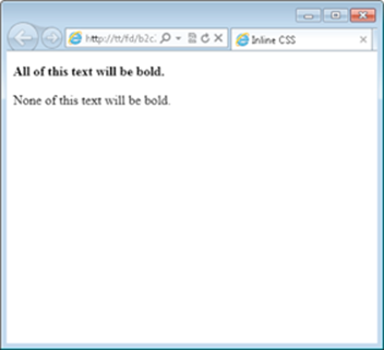
Figure 2-1: Bold text styled with CSS.
In Figure 2-1, the paragraph with bold text appears above a normal paragraph. That normal paragraph doesn’t use CSS for styling.
 When a style is applied within an HTML element, it’s called an inline style or inline CSS.
Here’s an example that you can try. You build some HTML first and then begin to add styling to it.
1. Open your text editor.
Create a new blank file. See Chapter 1 of this minibook for more information on text editors and creating a new text document.
2. Within the blank text document, place the following HTML:
<!doctype html>
<html>
<head>
<title>A CSS Exercise</title>
</head>
<body>
<div>This is my web page.</div>
<div>
This is the <span>nicest</span> page I've made yet.
</div>
<div>Here is some text on my page.</div>
</body>
</html>
3. Save the file as css.html.
Within the text editor, save the file using the name css.html, making sure there are no spaces or other characters in the filename. The file should be saved within your document root.
4. Open your web browser and view the page.
Within the web browser’s address bar, type http://localhost/css.html and you’ll see a page similar to that shown in Figure 2-2.
5. Close the browser.
Now that you’ve verified that the page is working, close the browser.
6. Switch to the text editor to edit the HTML.
Within the text editor, edit the HTML from Step 2 to add CSS. If you closed the file, reopen it in your text editor.
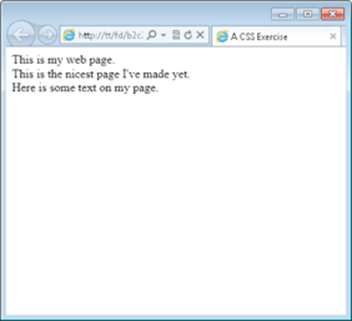
Figure 2-2: Creating a simple web page.
7. Change the HTML to add two different style attributes, as shown here:
<!doctype html>
<html>
<head>
<title>A CSS Exercise</title>
</head>
<body>
<div style="font-weight: bold;">This is my web page.</div>
<div>
This is the <span style="font-style: italic;">nicest</span> page I've made yet.
</div>
<div style="font-weight: bold;">Here is some text on my page.</div>
</body>
</html>
8. Save the file.
You can save it as css.html or save it as css2.html if you don't want to overwrite your original css.html file. The file should be saved in your document root.
9. Open your web browser and view the page.
Typing in http://localhost/css.html (or css2.html if you saved it as css2.html) reveals the file, now with inline styles applied to two areas. This is illustrated in Figure 2-3.

Figure 2-3: Adding inline styles to the HTML.
This exercise created an HTML file that used both <div> and <span> elements. The HTML was then styled using inline styles. The inline styles adjusted both the font-weight and the font-style to create bold text for two elements and italic text for one element.
When used with CSS, font-weight and font-style are known as properties. These properties are then given values, such as bold and italic. When you see terminology that a CSS property was changed, you know that the property is the name and that the value is what to change that property to.
Using an internal style sheet
Applying styles to individual elements quickly becomes cumbersome when you have a large web page. As you see in the preceding exercise, in order to make the text of the two <div> elements bold you needed to add a style attribute to each of the <div> elements. Luckily, there's a better way.
You can create a special area of the web page to store styling information. This styling information is then applied to the appropriate elements within the HTML. This alleviates the need to add a style attribute to each element.
You add internal styles within the <head> portion of a web page using the <style> element. Listing 2-1 shows HTML with a <style> element.
Listing 2-1: Using an Internal Style Sheet
<!doctype html>
<html>
<head>
<title>A CSS Exercise</title>
<style type="text/css">
div {
font-weight: bold;
}
span {
font-style: italic;
}
</style>
</head>
<body>
<div>This is my web page.</div>
<div>
This is the <span>nicest</span> page I've made yet.
</div>
<div>Here is some text on my page.</div>
</body>
</html>
The page adds an internal style sheet to add a bold font to <div> elements and an italic styled font to all <span> elements in the page.
<style type="text/css">
div {
font-weight: bold;
}
span {
font-style: italic;
}
</style>
The <style> element uses a type attribute to tell the browser what type of styling information to expect. In this case, we're using text/css type styling. Notice also the closing tag, which is required.
When this page is viewed in a browser, it displays like that in Figure 2-4.
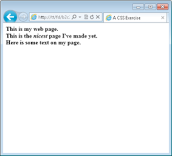
Figure 2-4: Using an internal style sheet.
Look closely at Figure 2-4; notice the slight difference with the display from Figure 2-3. In Figure 2-3, the second line (“This is the nicest page I’ve made yet.”) is not bold, but the line appears in a bold font in Figure 2-4.
This difference is present because the internal style sheet targets all <div> elements in the page rather than just the specific ones that were changed with the inline style method shown earlier. The next section, Targeting Styles, shows how to fix this.
Using an external style sheet
You’ve seen how inline styles, adding styling information to each element individually, can become tedious. You then saw how to use an internal style sheet to create styling information for the page as a whole. But what happens when you have 10 pages or 100 pages, all needing styling?
You can use external style sheets to share CSS among multiple pages. An external style sheet, just another type of text document, can be included on every page. The browser reads this external style sheet just as it would read styles applied within the page itself, and applies those styles accordingly.
You add or include an external style sheet with the <link> element, which goes in the <head> area of an HTML page.
A typical <link> element to add CSS looks like this:
<link rel="stylesheet" type="text/css" href="style.css">
That's it. That line includes a file called style.css in the current directory and incorporates it into the page. All the <style> information and inline styling can be removed in place of that one single line in the <head> section of the page.
Inside the external style sheet are the rules to apply — and only the rules to apply. You don't need to include the style attribute or even an opening or closing <style> element within an external style sheet. Looking back at the example in Listing 2-1, the external style sheet would contain only this information:
div {
font-weight: bold;
}
span {
font-style: italic;
}
Now that external style sheet can be shared among multiple HTML files. If you need to make a change to styling, you need to edit only the one CSS file, and it automatically applies the styles to all the pages that use that CSS file. As you can see, external CSS files make maintenance of websites much easier.
External style sheets are the recommended method for using CSS, and with only a few exceptions, the remainder of the book uses CSS included from an external style sheet.
Targeting Styles
Recall the problem identified earlier, where the bold font was applied to all the <div> elements on the page, when you might not necessarily want to apply it to all those elements. You can fix that problem by targeting or narrowing down the scope of the CSS rule using a more specific selector.
CSS uses selectors to determine the element or elements to which a rule will be applied. In the internal style sheet example earlier in this chapter, the selector was the <div> element, or all <div> elements on the page. In this section, we tell you how to select specific elements, and groups of elements, so that you can apply CSS styles to them.
Selecting HTML elements
Most any HTML element can be the target of a selector, even things like the <body> element. In fact, the <body> element is frequently used as a selector in order to target page-wide styles, such as what set of fonts to use for the page. You see an example of this in the next section, Changing Fonts.
You've already seen examples using HTML elements as selectors. You simply use the element name, with no brackets around it. Instead of <div> as it would be in HTML, you use div when using it as a CSS selector. Here's what that looks like:
div {
font-weight: bold;
}
As you can see, the name of the element, div, is followed by a brace. This indicates that the rule is beginning. Within the opening and corresponding closing brace, the property, font-weight, is selected, followed by a colon (:). The value is then set to bold. The line is terminated with a semicolon (;). This semicolon tells the browser that the line is done; in other words, the property/value pair are closed.
Multiple properties can be set in the same selector. Taking the preceding example, you could change the font’s style to be both bold and italic, like this:
div {
font-weight: bold;
font-style: italic;
}
Each line is ended with a semicolon, and the entire rule is enclosed in opening and closing curly braces.
Selecting individual elements
What you've seen so far in this section is that you can target all HTML elements by simply using their names. You've been seeing examples of that throughout the chapter. But what happens when you want to target one, and only one, element on a page? That's where the id selector comes into play.
The id (short for identifier) enables you to select one and only one element within a page. To do so, you need to modify the HTML to add an id attribute and provide a name for that element. For example, consider an HTML like this:
<div>Steve Suehring</div>
If you want to apply a bold font to that element, you could select all <div> elements but that would likely also apply a bold font to other <div> elements on the page, as you've already seen. Instead, the solution is to add an id to that particular <div>, like so:
<div id="myName">Steve Suehring</div>
The id's value is set to myName. Note the case used in this example, with an uppercase N. This case should be matched in the CSS.
To select this id within the CSS, you use a pound sign or hash character (#), like so:
#myName
With that in mind, making the #myName id bold looks exactly like the examples you've already seen, just substituting #myName for div:
#myName {
font-weight: bold;
}
Always match the case that you use in the HTML with the case that you use in the CSS. If you use all uppercase to name the ID in the HTML, then use all uppercase in the CSS. If you use all lowercase in the HTML, use lowercase in the CSS. If you use a combination, like the example, then match that combination in the CSS.
When using IDs in HTML, it’s important to realize that the ID should be used once and only once across an entire page. It’s fine to use the same ID in different pages, but the ID should appear only once within a page.
We can hear your protest now: “But what if I need to apply the same style to more than one element?” That’s where a CSS class comes in.
Selecting a group of elements
You’ve learned how to target HTML elements across a page and you’ve learned how to target just one individual element. A CSS class is used to select multiple elements and apply a style to them.
Unlike the selection that occurs when you select all <div> elements, a CSS class is applied only to the specific elements that you choose. The HTML elements don't even need to be of the same type; you can apply the same CSS class to a <div>, to an <img> tag, and to a <p> element alike.
CSS comments
Within the CSS rule shown nearby, there's a comment: /* CSS Goes Here */. Just like in HTML where you can use comments to help explain a certain piece of code, so too can you use comments in CSS to help explain the CSS. Like HTML comments, comments in CSS are not visible in the output of the page but, also like HTML comments, CSS comments are viewable by viewing the source of the HTML or CSS document itself. This means that visitors can see the comments too!
Comments in CSS are opened with /* and closed with */. Everything appearing between /* and */ is treated as a comment.
Like an id, a class is applied first to the HTML elements with an attribute. The attribute is the aptly titled class, as in this example:
<div class="boldText">This text has a class.<div>
As in the id example, the class is also case sensitive. The case used in the HTML should match that in the CSS.
Whereas an ID selector uses a pound sign (#) in the CSS, a class uses a single period or dot. In the preceding example, where the class is named boldText in the HTML, it would be referenced like this in the CSS:
.boldText {
/* CSS Goes Here */
}
In this example, the class boldText is selected.
Classes can be used to solve the problem discovered earlier in Figure 2-4 (in the Using an internal style sheet section), where the bold font was applied to all the <div> elements because the CSS used the div selector. You can use a class in the HTML to target only those elements that you want to target.
It’s time to test that theory. Follow these steps.
1. Open a text editor.
2. Open css.html.
Open the file that you created in a previous exercise. You may have named it css2.html.
3. Make changes to css.html to remove the CSS.
The page should look like this:
<!doctype html>
<html>
<head>
<title>A CSS Exercise</title>
<link rel="stylesheet" type="text/css" href="style.css">
</head>
<body>
<div class="boldText">This is my web page.</div>
<div>
This is the <span>nicest</span> page I've made yet.
</div>
<div class="boldText">Here is some text on my page.</div>
</body>
</html>
4. Save the file.
You can save it as css.html or rename it to css3.html. Save the file in your document root.
5. Create a new empty text file.
Using your text editor, create a new empty file.
6. Place the following CSS in the file.
.boldText {
font-weight: bold;
}
span {
font-style: italic;
}
7. Save the file.
Save the file as style.css within your document root. Note that you should ensure that the file is named with all lowercase and has the correct file extension, .css.
8. Open your browser and view the css.html file.
Type http://localhost/css.html in the browser's address bar. If you save the file as css3.html, then use that instead of css.html. The output should look like that in Figure 2-5.
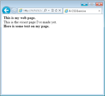
Figure 2-5: A page with an external style sheet.
Notice that the page in Figure 2-5 looks exactly like Figure 2-3. That's what we hoped would happen! This exercise implemented an external style sheet and used a CSS class to target the bold font-weight to only those elements that we wanted to be bold.
Changing Fonts
So far you’ve seen a good amount of changing font weight to make fonts appear bold and a little about font styling to make the font appear in italics. However, you can do a lot more with fonts on the web using CSS, including choose a font family and select font sizes and color.
Setting the font family
The term font family describes the typeface or look of the font used for the text. The font family can be changed using CSS but there’s a huge limitation: The fonts you use need to also be available on the visitor’s computer. In practical terms, this means that you have to use certain “web friendly” fonts that appear on most visitors’ computers. It also means that you can’t always guarantee what font the visitor will see. If a visitor doesn’t have the font that you specify, that visitor’s browser chooses a substitute.
The CSS property for the font is called font-family. When setting a font, the best practice is to provide a list of fonts from which the browser can choose, as in this example:
font-family: arial, helvetica, sans-serif;
You can set the recommended fonts for the entire HTML page by using the selector for the <body> element, as in this example:
body {
font-family: arial, helvetica, sans-serif;
}
Any page that uses that CSS rule will attempt to display its text first with the Arial font. If that font isn’t available, the Helvetica font is used next. If that font isn’t available, then a sans-serif font is used. If none of those are available, then the browser chooses a font to use all on its own.
Common values for font-family are
arial, helvetica, sans-serif
"Arial Black", Gadget, sans-serif
Georgia, serif
"Times New Roman", Times, serif
A concept called Web Fonts enables the use of additional fonts by allowing the browser to download the preferred fonts as part of the page. This concept is discussed at www.html5rocks.com/en/tutorials/webfonts/quick.
Listing 2-2 shows the CSS that you saw in an earlier example. This listing adds the font-family CSS property to the body of the page, meaning that this font-family setting will be applied across the entire page.
Listing 2-2: Setting the Font-Family Value with CSS
body {
font-family: arial,helvetica,sans-serif;
}
.boldText {
font-weight: bold;
}
span {
font-style: italic;
}
When viewed in a browser using the same HTML from the preceding exercise, the result looks like Figure 2-6.
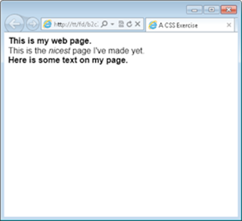
Figure 2-6: Changing the font family with CSS.
Setting font size
How large the text appears on a web page is its font size. You can set font sizes using the font-size CSS property. Font sizes can be set in one of four units:
Percentage
Pixels
Points
Em’s
Which of those you should use depends largely on whom you ask. If you ask four web developers which one to use, you’ll probably get four different answers. You can read the sidebar for more information, but this book uses either percentage or em’s. If you’re asking why, the short answer is that both of those methods work well for mobile devices and other scenarios where visitors may want to scale the text size according to their needs.
Em’s are a unit of sizing for fonts, much like points that you see in a word processor.
Font sizes are set like any other CSS property; for example, this sets the font size to 150% of its normal size:
font-size: 150%;
Choosing a font sizing method
When choosing a font sizing method, you can use percentage, em’s, points, and pixels. Points and pixels are fixed sizes and some browsers can have trouble resizing them, or more appropriately, the browsers don’t allow the visitor to resize the text without using a zoom tool. Percentages and em’s allow resizing.
It’s quite common to set a font size for the entire page and then change font sizes for individual elements in the page. For example, setting the font size for the body element — in other words, the entire page — looks like this:
body {
font-size: 90%;
}
With that CSS setting, the fonts across all elements on the page would be set to 90% of their default value. You could then change individual areas of the page to have a different font size. Using em’s for the other fonts allows you to change the font sizes relative to that initial setting of 90%. This allows for greater control over the page’s font sizes.
Like other CSS settings, visitors can override your CSS with their own settings. They may change the font sizes according to their needs.
Listing 2-3 shows a CSS file that depicts this functionality.
Listing 2-3: CSS to Change the Font Size
body {
font-size: 90%;
}
span {
font-size: 1.7em;
}
When combined with the HTML from the previous exercise, you get a page like that in Figure 2-7. Note the increased font size for the word nicest, thanks to the increased size set with an em.
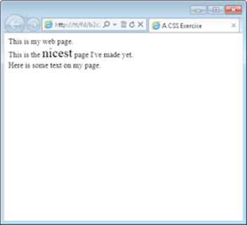
Figure 2-7: Changing font sizes with CSS.
When using em’s for font sizes, an em value of 1.0 corresponds to 100%. Therefore, 0.9em would be about 90%, while 1.7em (as in the example) is essentially 170%.
Fonts set with pixels or points use their abbreviations, as in these examples:
font-size: 12px;
font-size: 12pt;
Setting the font color
Just as font sizes can be set, so too can the colors used for fonts. Care should be taken when choosing font colors so as to make the text readable. For example, using white text on a white background makes it impossible for the reader to see the text!
Just as there are multiple options for how to change the font size, there are also multiple ways to change the font color. You can use a friendly name for common colors, like red, blue, green, and so on, or you can use a hexadecimal code, or hex code for short.
Hex codes are three- to six-character codes that correspond to the Red, Green, and Blue (RGB) color mix appropriate to obtain the desired color.
Table 2-1 shows some common hex codes and their corresponding color.
Table 2-1 Hex codes for colors
|
Code |
Color |
|
#FF0000 |
Red |
|
#00FF00 |
Green |
|
#0000FF |
Blue |
|
#666666 |
Dark Gray |
|
#000000 |
Black |
|
#FFFFFF |
White |
|
#FFFF00 |
Yellow |
|
#FFA500 |
Orange |
Hex codes are the more accurate and preferred way to set colors in HTML but they're hard to remember. A tool like Visibone's Color Lab at www.visibone.com/colorlab is essential to obtaining the hex code corresponding to the color that you want to use.
Font color is set using the color CSS property, as in this example (which is the code for red):
color: #FF0000;
Listing 2-4 shows CSS to change colors of a <span> element to blue using a hex code:
Listing 2-4: Coloring a Font Using CSS
span {
color: #0000FF;
}
When viewed in a browser with the HTML created earlier in this chapter, the output looks like Figure 2-8. Note the blue coloring (which may be a bit difficult to read in this black-and-white book) for the word “nicest” on the page.
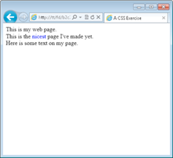
Figure 2-8: Changing the font color to blue.
Adding Borders
Borders can help provide visual separation between elements on a page. You can add borders around just about anything in HTML and there are a few border styles to choose from. Borders are added with the border CSS property.
When creating a border with CSS, you set three things:
Border thickness
Border style
Border color
These three items are set in a list, separated by a space, as in this example:
border: 1px solid black;
In this example, a border would be created and would be 1 pixel thick. The border would be solid and would be black in color.
Some common border styles are shown in Table 2-2.
Table 2-2 Border Styles in CSS
|
Style |
Description |
|
Solid |
A solid line |
|
Dotted |
A dotted line |
|
Dashed |
A line with a dash effect |
|
Double |
Two solid lines |
It’s time for an exercise to create a border around some elements. Follow these steps.
1. Open your text editor.
2. Verify the HTML file from the preceding exercise.
The HTML from the preceding exercise is the starting point for this exercise. If yours doesn't look like this, change it to look like this HTML. For those of you who had this file exactly as in the preceding exercise, the only thing you need to do is add a class called addBorder in the first<div> element.
<!doctype html>
<html>
<head>
<title>A CSS Exercise</title>
<link rel="stylesheet" type="text/css" href="style.css">
</head>
<body>
<div class="boldText addBorder">This is my web page.</div>
<div>
This is the <span>nicest</span> page I've made yet.
</div>
<div class="boldText">Here is some text on my page.</div>
</body>
</html>
3. Save the HTML file.
Save it as css-border.html and place it in your document root.
4. Open your CSS file.
You should have a CSS file from the preceding exercise. The CSS file from that exercise should contain a class called boldText and a CSS rule changing all <span> elements to italic. Within your CSS file, add and change your CSS so that it looks like the following:
.boldText {
font-weight: bold;
}
span {
font-style: italic;
}
.addBorder {
border: 3px double black;
}
5. Save the CSS file.
Save the file as style.css in your document root.
6. View the page in a browser.
Open your web browser and point to http://localhost/css-border.html to view the page. You should see a page like Figure 2-9.
Figure 2-9: Adding a border to a div element.
You may have noticed in this exercise that you now have two classes on the first <div> in the page. That's a great feature of classes because you can use more than one on an element to combine them.
You can experiment with the CSS from this exercise to add different styles of borders to different elements in the page.
You may not like how close the text is to the border in Figure 2-9. We sure don't. You can change this with CSS. The CSS padding property changes how close the text will come to the inside edge of the border. For example, you could change the CSS for the addBorder class to look like this:
.addBorder {
border: 3px double black;
padding: 5px;
}
When you do so, the resulting page will look like that in Figure 2-10.
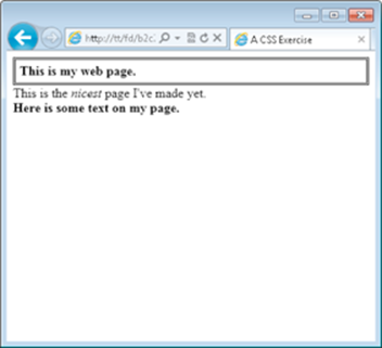
Figure 2-10: Adding padding within the addBorder class.
Padding can be added to move the text farther away from its borders. Padding can be applied to any element, regardless of whether it has borders, in order to move that element’s contents.
When you add padding, the contents of the element move away from all the edges. However, you can also add padding so that the contents move away from the top, bottom, right, or left, or any combination therein. This is accomplished with the padding-top, padding-bottom, padding-right, and padding-left properties, respectively.
There’s a shortcut method for setting padding that sees all the padding defined on one line. That shortcut isn’t used here, but you’ll see it in other people’s CSS.
Where padding moves elements from the inside, there’s also a property to move or shift elements around from the outside. This element is called margin, and we discuss it later in the chapter when we talk about creating page layouts.
Changing List Styles
Recall the example from Chapter 1 of this minibook that created a bulleted list. That section indicated that you can change or even remove the bullets from the list using CSS. Well, it's true. You can. The bullet style for a list is determined by the list-style-type CSS property.
There are numerous values for the list-style-type property. Table 2-3 shows some common ones.
Table 2-3 Common List Styles
|
Style |
Description |
|
circle |
Provides a circle type bullet. |
|
decimal |
The default style for <ol> lists, a simple number. |
|
disc |
The default style for <ul> lists, a filled in circle style. |
|
none |
Removes styling completely for the list. |
|
square |
A square bullet. |
|
upper-roman |
An uppercase Roman numeral, as in an outline. |
Changing bullet styles
The best way to see these styles in action is by trying them out. This exercise uses Listing 1-7 from the preceding chapter, and we show you all that code here in Step 3.
1. Open your text editor.
2. Change or create ul.html.
If you have a file called ul.html from the previous chapter, open it now. If you don't, you can create one now by creating a new empty text document.
Inside the file, use the following HTML. If you're using ul.html, then you merely need to add the <link> element to incorporate a CSS file.
<!doctype html>
<html>
<head>
<title>An unordered list</title>
<link rel="stylesheet" type="text/css" href="ul.css">
</head>
<body>
<ul>
<li>Pine</li>
<li>Oak</li>
<li>Elm</li>
</ul>
</body>
</html>
3. Save the file.
Save the file as ul.html in your document root.
4. Create a new file.
Create a new empty text document using your text editor.
5. Place the following CSS in the new document:
ul {
list-style-type: square;
}
6. Save the CSS file.
Save the file as ul.css in your document root.
7. Open your web browser and view the page.
In your web browser, type http://localhost/ul.html into the address bar and press Enter. You should see a page like the one in Figure 2-11.
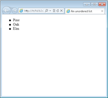
Figure 2-11: Changing the list style.
You can experiment with the list-style-type property to add or change bullet style.
Removing bullets
A common look for lists on web pages uses no bullets at all. This effect is created by setting the value of the list-style-type to none, as in this example, which can be used in the ul.css file you just created.
ul {
list-style-type: none;
}
When applied to the page you created in the preceding exercise, the result looks like Figure 2-12.
You apply the list-style-type property to the <ul> or <ol> and not to the individual list items (the <li> element).
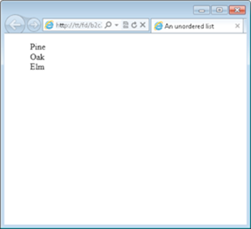
Figure 2-12: Removing the bullets from an HTML list.
Adding a Background
The pages you’ve created so far have a white background, or more exactly, they have the default background chosen by the browser. In old versions of web browsers, that background color was gray. You can change the color of the background using CSS, or use a background image.
Background colors and background images can be applied to the entire page or to individual elements. Changing background colors on individual elements helps to add highlight and color to certain areas of the page.
Changing the background color
The background color of an HTML element is changed with the background-color CSS property. The background color uses the same syntax (hex code) as font colors; refer to the discussion of font colors earlier in this chapter to see hex codes for common colors.
Here’s an example that changes the background color of the entire page:
body {
background-color: #FFFF00;
}
Figure 2-13 shows the resulting page. Note that the yellow color won’t come through very well in the book, but it’s there!
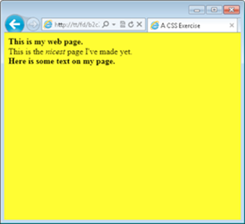
Figure 2-13: Adding a yellow background color to a page.
As previously stated, individual elements can also be changed and you can use all the different CSS selectors to focus that color change to a class, to an individual element (using an id), or to all elements by using the element name. For example, changing all the <div> elements to yellow looks like this:
div {
background-color: #FFFF00;
}
You can also use CSS to target elements by their hierarchy; in other words, you can target the elements when they appear as children of other elements. This calls for an example. Many of the examples in this book use HTML similar to that shown in Listing 2-5, so we use Listing 2-5 to show you how to target certain HTML elements.
Listing 2-5: HTML Used in Some Examples
<!doctype html>
<html>
<head>
<title>A CSS Exercise</title>
<link rel="stylesheet" type="text/css" href="style8.css">
</head>
<body>
<div class="boldText">This is my web page.</div>
<div>
This is the <span>nicest</span> page I've made yet.
</div>
<div class="boldText">Here is some text on my page.</div>
</body>
</html>
Focus on the <span> element inside the second <div> in this HTML. You could say that the <span> element is a child of the <div>. Using CSS, you can target this span by its position as a child of the <div>. This is helpful if you want to apply certain styling to all elements of a certain type but you don't (or can't) add a class to those elements. For example, if you wanted to make all <span> elements that appear within a <div> to have a red background, you could do so with this CSS:
div span {
background-color: #FF0000;
}
Applying this CSS to the CSS previously seen, including that for Figure 2-13, you get a result like Figure 2-14, which (trust us) shows the word nicest highlighted in red.
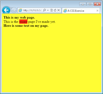
Figure 2-14: Targeting an element in order to apply a CSS rule.
This CSS targeting can be applied in any way that you’d like, whether that’s targeting a certain ID, a certain class, or certain elements, like the example does. You can create powerful (and sometimes confusing) combinations of CSS hierarchies in order to apply CSS rules.
You can use this CSS targeting to apply any CSS rule, not just background colors.
Adding a background image
Background images are a good way to create a nice looking HTML page. Using a background image, you can create a gradient effect, where one part of the page is a solid color and the color fades out or gets lighter as it stretches to the other side.
Background images appear behind other elements. This means that you can overlay all your HTML, including other images, on top of a background image.
You can find many free images through the Creative Commons. See http://search.creativecommons.org for more information. Be sure to choose an image that still allows for the text to be readable on the page; black text on a dark picture is not a good match.
Background images are added with the background-image CSS property, as described here and in the following sections.
background-image:url("myImage.jpg");
Adding a single background image
One of the features of background images is that you can tile or repeat them within a page. This means that no matter how large the visitor’s screen, the background image will always appear. Conversely, you can also choose to not repeat the background image. This section shows how to add a single, non-repeating image.
In order to complete this exercise, you need an image. The image will preferably be at least 800 pixels by 600 pixels. You can find out the image resolution by right-clicking the image and selecting Properties in Windows or choosing Get Info from the Finder window on a Mac.
1. Open your text editor.
Create a new empty text document in your text editor.
2. In the text editor, enter the following HTML:
<!doctype html>
<html>
<head>
<title>Background Image</title>
<link rel="stylesheet" type="text/css"
href="image-style.css">
</head>
<body>
</body>
</html>
3. Save the file.
Save the file as backimage.html in your document root.
4. Create a new text document.
Create a new empty text document with your text editor.
5. Place the following CSS in the new document.
Be sure to use the name of your image. In this example, we're using an image called large-snow.jpg. The image should be saved within your document root.
body {
background-image:url("large-snow.jpg");
background-repeat: no-repeat;
}
6. Save the CSS file.
Save the file as image-style.css and make sure it's saved within your document root.
7. Open your web browser and view the page.
Open your web browser and navigate to the page at http://localhost/backimage.html. You'll see the page with a background image. You can see a screenshot of our page, with the large-snow.jpg image, in Figure 2-15.
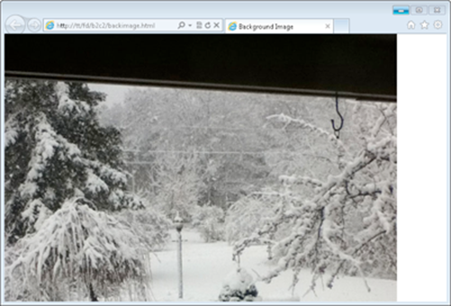
Figure 2-15: A single background image.
Depending on the size of your image and your screen, you may notice that the image ends, as it does along the right side of Figure 2-15. Additionally, you may notice that the image isn’t centered. Keep reading for a solution.
Improving the single background image page
A common approach used to create a better looking page is to add a background color that matches the edges of the image. In the case of our image, the top and bottom are black. Therefore, we could add a rule to the CSS to make the default background color black. This won’t have any effect where the image is located — the image takes precedence — but it will matter along the bottom where the image ends.
The CSS for this look is as follows:
body {
background-image:url("large-snow.jpg");
background-repeat: no-repeat;
background-color: #000000;
}
With that rule in place, the image will still end but the appearance won’t be quite as shocking or noticeable because it matches the color of the edge of the image, as shown in Figure 2-16.
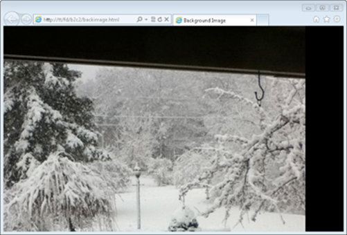
Figure 2-16: Adding a background color and a background image.
While the background color trick solves the problem with the edge of the image, it doesn’t solve the centering issue. The current background image is applied to the body — in other words, the entire page. In order to center the background image, another CSS property needs to be added, as shown in this CSS:
body {
background-image:url("large-snow.jpg");
background-repeat: no-repeat;
background-color: #000000;
background-position: center top;
}
This CSS adds the background-position rule and places it at the center at the top of the page. Other values include left, right, and bottom, and you can combine them so that the background image would appear at the bottom right, for example.
The CSS shown here places the image at the center of the page and at the top. This results in the page shown in Figure 2-17.
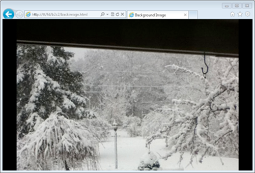
Figure 2-17: A centered background image on the top, with a background color.
With that image in place, you can then add any HTML to the page that you see fit. Note with an image like this (a dark top and light middle) you need to adjust the font colors so that the text is visible on the page.
Adding a repeating image
You can add an image that repeats. This is a common scenario for web pages because then the image doesn’t end along the sides, no matter how large your resolution is. This also alleviates the need for a background position because the background image applies to the entire element.
When applied to the entire page, as in the examples shown, you can also forego the background-repeat rule and the background color because the image continues throughout the entire page.
An ideal repeating image is one that doesn’t have noticeable borders because those borders will show up when the image is tiled or repeated on the page.
Figure 2-18 shows a small image (15 pixels x 15 pixels) used as a repeating image with the following CSS:
body {
background-image:url("back.jpg");
}
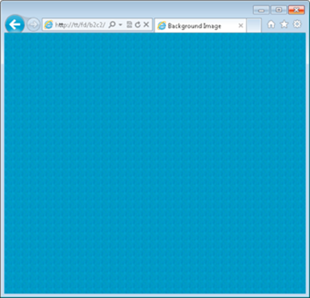
Figure 2-18: A repeating background image.
As in the example for a single image background, you can now add HTML atop the background, again choosing a font color that offsets the image so that visitors can easily read the text.
Creating Page Layouts
You’ve now learned a good amount of CSS to change the behavior and appearance of individual items, add background colors, style lists, and so on. All of this leads to creating pages by using CSS. CSS is used to create more complex appearances for web pages than you’ve seen so far. For example, you can create column effects, where there’s a menu on the left or right side and content in the other column, and we tell you how to do that here.
When working with alignment and column layouts, it’s sometimes helpful to add a border to the element to see where it begins and ends so that you can see how the layout looks.
Creating a single-column layout
Everything you’ve seen so far has been a single-column layout. There’s only one column, aligned on the left of the page. You can, however, control that alignment with CSS. Doing so means creating more complex HTML than you’ve seen so far but nothing in the HTML will be new; there’ll just be more HTML than before.
1. Open a text editor.
Open your text editor and create a new empty document.
2. Within the empty document, enter the following HTML:
<!doctype html>
<html>
<head>
<title>Single Column</title>
<link rel="stylesheet" type="text/css" href="single.css">
</head>
<body>
<div id="container">
<div id="content">
<h2>Here's some content</h2>
<p>This is where a story would go</p>
<h2>Here's more content</h2>
<p>This is another story</p>
</div> <!-- end content -->
</div> <!-- end container -->
</body>
</html>
3. Save the file.
Save the file as single.html in your document root.
4. Open your browser and view the page.
View the page by going to http://localhost/single.html in your browser. You’ll see a page similar to that in Figure 2-19.
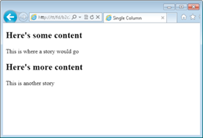
Figure 2-19: A basic page before adding CSS.
5. Create a new text document.
Create a new empty text document in your text editor.
6. In the document, place the following CSS:
body {
font-family: arial,helvetica,sans-serif;
}
#container {
margin: 0 auto;
width: 600px;
background: #FFFFFF;
}
#content {
clear: left;
padding: 20px;
}
7. Save the CSS file.
Save the file as single.css in your document root.
8. Open your web browser.
Navigate to http://localhost/single.html in your browser. If your browser is still open, reload the page with Ctrl+R on Windows or Command+R on Mac. You’ll see a page like that in Figure 2-20. See the paragraphs that follow for more information on what specific modifications you made in Step 6.
Figure 2-20: A single-column layout.
Later in this chapter, you see how to add a header and footer onto this layout in order to improve its look and functionality.
The HTML for this layout uses a <div> element as a container. The container helps to create the layout and doesn't hold any text content of its own. The CSS for this exercise uses three CSS properties that might be new to you: width, margin, and clear. Here's how they work:
width: Sets the horizontal width of an element. In this case, the container is set to 600px (pixels) wide. No matter how small the browser window is, your HTML will never get smaller than 600px.
margin: This is the complement to the padding property shown earlier in this chapter, in the Adding Borders section. The margin property defines the spacing on the outside of the element. In the case shown here (margin: 0 auto;), the shortcut method is used. See the sidebar for more information. The value "auto" means that the browser will choose the value.
clear: Makes it so that no elements can appear on the side of the element to which the rule applies. In the example, clear left was used on the <div> with the id of #content. This means that nothing could appear on the left side of that element. Other values for clear include "both," "none," "right," and "inherit."
You can experiment with the margins of your browser window to see how the layout created in the exercise reacts or moves along with the browser.
The layout created in this section is called a single-column fixed-width layout. Another option is a single-column liquid layout. A liquid layout can work better in certain devices. The fixed-width layout shown can sometimes result in a horizontal scroll bar at the bottom of the page.
To change the layout to a liquid layout, you only need to change a small amount of CSS in the #container, as shown here:
body {
font-family: arial,helvetica,sans-serif;
}
#container {
margin: 0 30px;
background: #FFFFFF;
}
#content {
clear: left;
padding: 20px;
}
Note the only changes are to remove the width property within the #container and also change the margin from "0 auto" to "0 30px." With that, the layout becomes a liquid layout and works better, especially in mobile devices.
Shortcuts for margin and padding
Rather than defining a rule for each of the top, bottom, right, and left elements of margin or padding, you can use a shortcut method that defines all of them on one line. For example:
margin: 0px 50px 200px 300px;
is equivalent to this:
margin-top: 0px;
margin-right: 50px;
margin-bottom: 200px;
margin-left: 300px;
When four numbers appear in the rule, the order is top, right, bottom, and left. To help remember the order, use the mnemonic “TrouBLe,” which takes the first letter of each of the Top, Right, Bottom, Left, and makes them into a word to remind you how much trouble it is remembering the order.
Instead of all four values, you sometimes see one, two, or three of the values present for margin or padding, as in the example shown earlier:
margin: 0 auto;
When two values are used, the first value corresponds to the top and bottom and the second value corresponds to the right and left. When three values are used, the first is the top, the second is the left and right, and the last is the bottom. Finally, when one value is used, it applies equally to the top, right, bottom, and left.
Creating a two-column layout
A two-column layout uses a bit more HTML to achieve the effect of multiple columns. This is frequently done to add a menu along the side of a page or links to other stories or content.
Listing 2-6 shows the HTML involved for a two-column fixed-width layout.
Listing 2-6: A Two-Column Fixed-Width Layout
<!doctype html>
<html>
<head>
<title>Two Column</title>
<link rel="stylesheet" type="text/css" href="double.css">
</head>
<body>
<div id="container">
<div id="mainContainer">
<div id="content">
<h2>Here's some content</h2>
<p>This is where a story would go</p>
<h2>Here's more content</h2>
<p>This is another story</p>
</div> <!-- end content -->
<div id="sidebar">
<h3>Menu</h3>
<ul>
<li>Menu item 1</li>
<li>Menu item 2</li>
<li>Menu item 3</li>
</ul>
</div> <!-- end sidebar -->
</div> <!-- end mainContainer -->
</div> <!-- end container -->
</body>
</html>
This HTML uses the container <div> from the single-column layout and adds another container <div> to hold the content. That <div>, called mainContainer, holds both the content and the sidebar. The other addition is the sidebar itself, aptly titled sidebar. That sidebar holds a menu with an unordered list (<ul>) in it.
The CSS for the two-column layout is shown in Listing 2-7.
Listing 2-7: CSS for a Two-Column Fixed-Width Layout
#container {
margin: 0 auto;
width: 900px;
}
#mainContainer {
float: left;
width: 900px;
}
#content {
clear: left;
float: left;
width: 500px;
padding: 20px 0;
margin: 0 0 0 30px;
display: inline;
}
#sidebar {
float: right;
width: 260px;
padding: 20px 0;
margin: 0 20px 0 0;
display: inline;
background-color: #CCCCCC;
}
This CSS uses several of the items that you've seen already, including margin, padding, clear, and background-color, among others. New to this CSS are the float and the display properties.
The float property defines whether an element will move or float within a layout, either to the left or to the right or whether it won't float at all (none), as is the default. However, because you want to create two columns next to each other, you need to float the content container to the left and the sidebar to the right. Therefore, if you want the sidebar to appear on the right, you simply need to swap float: left in the #content CSS with the float: right found in the #sidebar's CSS.
The display property sets how the element should be displayed. Certain elements are known as block-level elements and display the entire width of the page. The <div> element is a good example of this. Because you want to make the columns appear next to each other, you need to change this block display behavior to inline (we introduce inline elements in the preceding chapter), so that the element doesn't extend the full width of the page.
Hiding elements
Setting the CSS display property to none hides an element from a page. When you do so, the element is removed entirely from the page. You can also use another CSS property, visibility, to hide elements. When hiding an element with the visibility property (visibility: hidden;), the box or area on the page still remains in place but the element becomes invisible. Making the element visible again (visibility: visible;) shows the element.
Three frequently used values for the display property are block (to extend the element the full width), inline (to make the element use only its own width for display), and none (which removes the element from display entirely).
When viewed in a browser, the layout shown in Listings 2-6 and 2-7 produces a page like that in Figure 2-21.
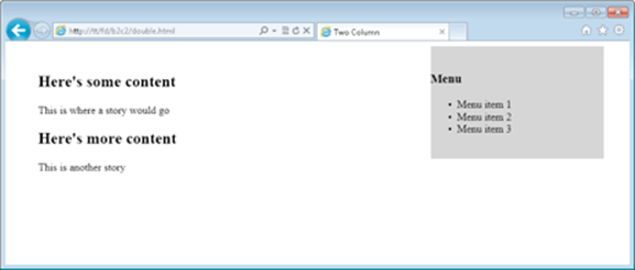
Figure 2-21: A two-column fixed-width layout.
The layout shown in Figure 2-21 is a fixed-width layout. Converting this to a liquid layout means changing the width and margin values in the CSS from pixels (px) to percentages (%). The CSS to convert into a liquid layout is shown in Listing 2-8.
Listing 2-8: Converting to a Two-Column Liquid Layout
#container {
margin: 0 auto;
width: 100%;
}
#mainContainer {
float: left;
width: 100%;
}
#content {
clear: left;
float: left;
width: 65%;
padding: 20px 0;
margin: 0 0 0 5%;
display: inline;
}
#sidebar {
float: right;
width: 20%;
padding: 20px 0;
margin: 0 2% 0 0;
display: inline;
background-color: #CCCCCC;
}
The changes occur in the #container, #mainContainer, #content, and #sidebar sections, to change the previous values that used pixels to percentages. This layout now changes with the width of the browser, as shown in Figure 2-22, where you'll notice that the width of the browser is much smaller.
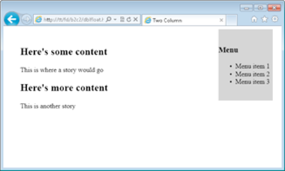
Figure 2-22: Creating a liquid layout with two columns.
Adding Headers and Footers to a Page
The layouts you’ve seen so far provide a good base from which you can build a more complex web page and indeed website. However, the page is missing two things: a header and a footer.
Headers are typically used to convey information such as the name of the site or to provide a menu; footers are used to provide additional information such as copyright and are also being used to provide a map of links within a site, known as a site map. Additionally, we tell you how to create a menu within the header.
Creating a header, header menu, and footer
You've seen how to create a multi-column layout with a main content area and a sidebar. To create this layout, you add a <div> element to hold the sidebar's content. You then apply CSS rules to the <div> to set its width and position. Creating a header and footer is accomplished in largely the same manner. An additional <div> is created to hold the content for each and then rules are applied to those <div> elements to position them.
This being the last example in the chapter, it serves as a capstone exercise.
1. Open your text editor.
Create a new blank text document.
2. Enter the following HTML in the text document:
<!doctype html>
<html>
<head>
<title>Two Column With Header and Footer</title>
<link rel="stylesheet" type="text/css" href="final.css">
</head>
<body>
<div id="container">
<div id="header">
<h1>This is my site!</h1>
</div> <!-- end header -->
<div id="menu">
<ul>
<li><a href="#">Home</a></li>
<li><A href="#">Services</a></li>
<li><a href="#">About Me</a></li>
<li><a href="#">Contact Me</a></li>
</ul>
</div> <!-- end menu -->
<div id="mainContainer">
<div id="content">
<h2>Here's some content</h2>
<p>This is where a story would go</p>
<h2>Here's more content</h2>
<p>This is another story</p>
</div> <!-- end content -->
<div id="sidebar">
<h3>Menu</h3>
<ul>
<li>Menu item 1</li>
<li>Menu item 2</li>
<li>Menu item 3</li>
</ul>
</div> <!-- end sidebar -->
<div id="footer">
<p>Copyright (c) 2012 Steve Suehring</p>
</div> <!-- end footer -->
</div> <!-- end mainContainer -->
</div> <!-- end container -->
</body>
</html>
3. Save the file.
Save the file as final.html in your document root.
4. Create a new text document.
Create a new empty text document. This one should hold the following CSS:
body {
font-family: arial,helvetica,sans-serif;
}
#container {
margin: 0 auto;
width: 100%;
}
#header {
background-color: #abacab;
padding: 10px;
}
#menu {
float: left;
width: 100%;
background-color: #0c0c0c;
}
#menu ul li {
list-style-type: none;
display: inline;
}
#menu li a {
display: block;
text-decoration: none;
border-right: 2px solid #FFFFFF;
padding: 3px 10px;
float: left;
color: #FFFFFF;
}
#menu li a:hover {
background-color: #CCCCCC;
}
#mainContainer {
float: left;
width: 100%;
}
#content {
clear: left;
float: left;
width: 65%;
padding: 20px 0;
margin: 0 0 0 5%;
display: inline;
}
#sidebar {
float: right;
width: 30%;
padding: 20px 0;
margin: 0;
display: inline;
background-color: #CCCCCC;
}
#footer {
clear: left;
background-color: #CCCCCC;
text-align: center;
padding: 20px;
height: 1%;
}
5. Save the file.
Save the CSS file as final.css in your document root.
6. Open your browser and view the page.
Open your web browser, navigate to http://localhost/final.html, and you'll see the page, like the one shown in Figure 2-23.
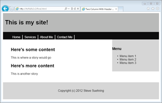
Figure 2-23: A two-column liquid layout with a header and footer.
Examining the HTML and CSS files
To create this layout, you use a more complex HTML file than you’ve used before but there isn’t anything in that file that you haven’t already seen. It’s just longer in order to create the additional HTML and content for the page!
The CSS does use some additional items, specifically to create the menu or links across the top. Note that this is separate from the contextual menu that appears on the right. The menu created for this page appears in the header and provides links to the areas of the site, such as Home, Services, About Me, and Contact Me.
The CSS for that section looks like this:
#menu ul li {
list-style-type: none;
display: inline;
}
That section uses a hierarchical structure to target only the <li> elements within the #menu area. The list-style-type was set to none, which you saw earlier in the chapter. However, the display was set to inline. When used with lists, it makes the lists flow horizontally rather than vertically, so you get the desired effect here.
The next section of CSS changed the behavior of the <a> elements within that menu and was again targeted using #menu li a so that the CSS rule applied only to those specific <a> elements.
#menu li a {
display: block;
text-decoration: none;
border-right: 2px solid #FFFFFF;
padding: 3px 10px;
float: left;
color: #FFFFFF;
}
This CSS rule uses the standard float, display, and border properties explained earlier in this chapter. Added here is a text-decoration CSS property, which changes the default behavior of the <a> link. Rather than being underlined and colored, changing the text-decoration to noneremoves that effect, giving the menu a cleaner look.
The final piece of the menu’s CSS is this:
#menu li a:hover {
background-color: #CCCCCC;
}
This CSS rule targets the hover behavior of the <a> element. When the visitor hovers over the link, it will change color, in this case to #CCCCCC, which is a shade of gray.