Data Science from Scratch: First Principles with Python (2015)
Chapter 3. Visualizing Data
I believe that visualization is one of the most powerful means of achieving personal goals.
Harvey Mackay
§ To explore data
§ To communicate data
matplotlib
frommatplotlibimportpyplotasplt
years=[1950,1960,1970,1980,1990,2000,2010]
gdp=[300.2,543.3,1075.9,2862.5,5979.6,10289.7,14958.3]
# create a line chart, years on x-axis, gdp on y-axisplt.plot(years,gdp,color='green',marker='o',linestyle='solid')
# add a titleplt.title("Nominal GDP")# add a label to the y-axisplt.ylabel("Billions of $")plt.show()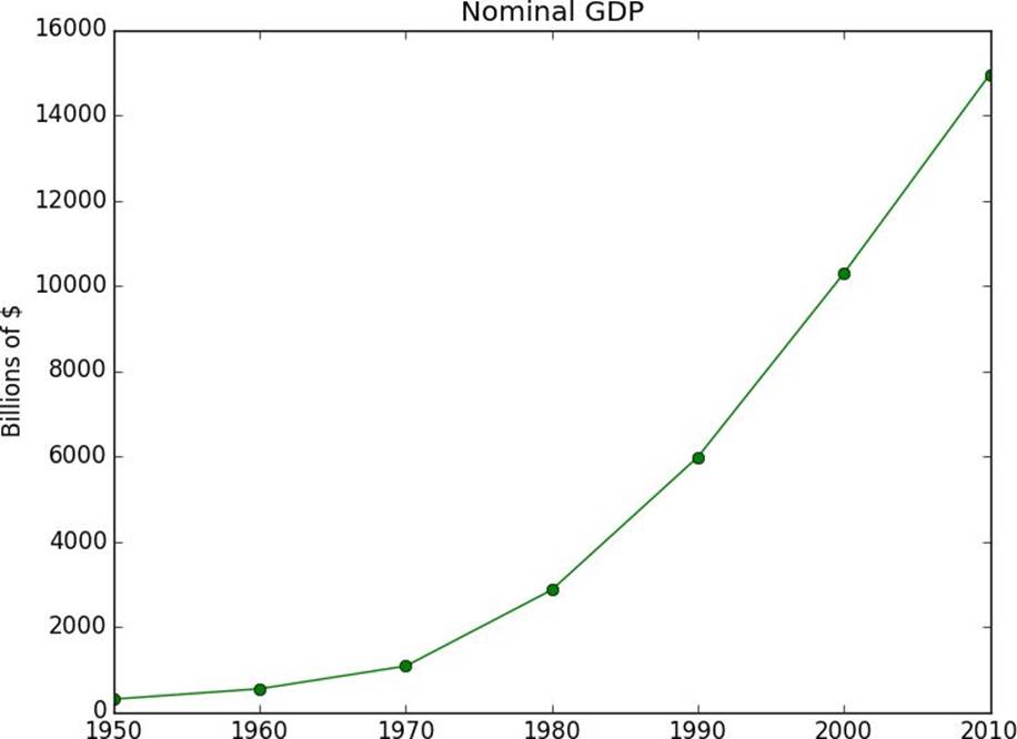
Figure 3-1. A simple line chart
NOTE
movies=["Annie Hall","Ben-Hur","Casablanca","Gandhi","West Side Story"]
num_oscars=[5,11,3,8,10]
# bars are by default width 0.8, so we'll add 0.1 to the left coordinates# so that each bar is centeredxs=[i+0.1fori,_inenumerate(movies)]
# plot bars with left x-coordinates [xs], heights [num_oscars]plt.bar(xs,num_oscars)
plt.ylabel("# of Academy Awards")plt.title("My Favorite Movies")# label x-axis with movie names at bar centersplt.xticks([i+0.5fori,_inenumerate(movies)],movies)
plt.show()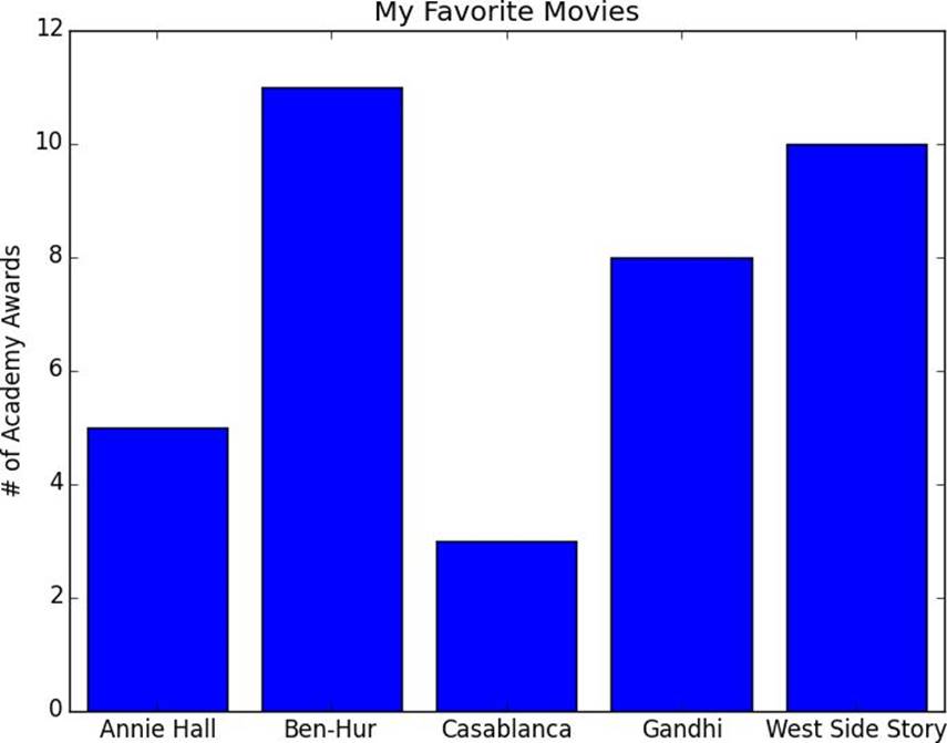
Figure 3-2. A simple bar chart
grades=[83,95,91,87,70,0,85,82,100,67,73,77,0]
decile=lambdagrade:grade//10*10
histogram=Counter(decile(grade)forgradeingrades)
plt.bar([x-4forxinhistogram.keys()],# shift each bar to the left by 4
histogram.values(),# give each bar its correct height
8)# give each bar a width of 8
plt.axis([-5,105,0,5])# x-axis from -5 to 105,
# y-axis from 0 to 5
plt.xticks([10*iforiinrange(11)])# x-axis labels at 0, 10, ..., 100
plt.xlabel("Decile")plt.ylabel("# of Students")plt.title("Distribution of Exam 1 Grades")plt.show()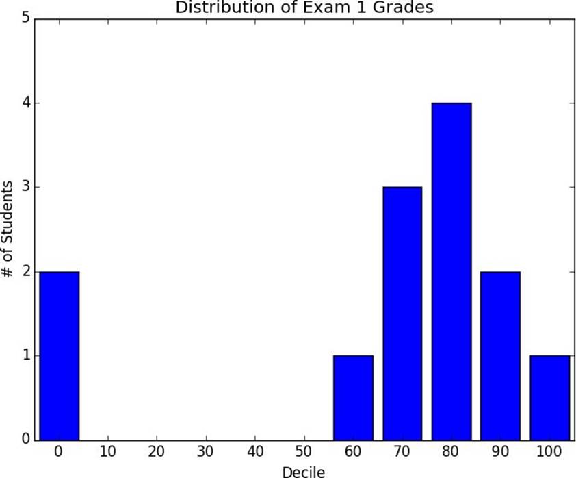
Figure 3-3. Using a bar chart for a histogram
mentions=[500,505]
years=[2013,2014]
plt.bar([2012.6,2013.6],mentions,0.8)
plt.xticks(years)plt.ylabel("# of times I heard someone say 'data science'")# if you don't do this, matplotlib will label the x-axis 0, 1# and then add a +2.013e3 off in the corner (bad matplotlib!)plt.ticklabel_format(useOffset=False)# misleading y-axis only shows the part above 500plt.axis([2012.5,2014.5,499,506])plt.title("Look at the 'Huge' Increase!")plt.show()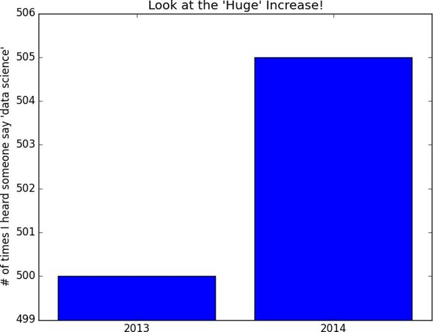
Figure 3-4. A chart with a misleading y-axis
plt.axis([2012.5,2014.5,0,550])plt.title("Not So Huge Anymore")plt.show()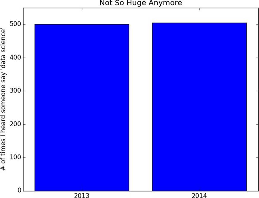
Figure 3-5. The same chart with a nonmisleading y-axis
variance=[1,2,4,8,16,32,64,128,256]
bias_squared=[256,128,64,32,16,8,4,2,1]
total_error=[x+yforx,yinzip(variance,bias_squared)]
xs=[ifori,_inenumerate(variance)]
# we can make multiple calls to plt.plot# to show multiple series on the same chartplt.plot(xs,variance,'g-',label='variance')# green solid line
plt.plot(xs,bias_squared,'r-.',label='bias^2')# red dot-dashed line
plt.plot(xs,total_error,'b:',label='total error')# blue dotted line
# because we've assigned labels to each series# we can get a legend for free# loc=9 means "top center"plt.legend(loc=9)plt.xlabel("model complexity")plt.title("The Bias-Variance Tradeoff")plt.show()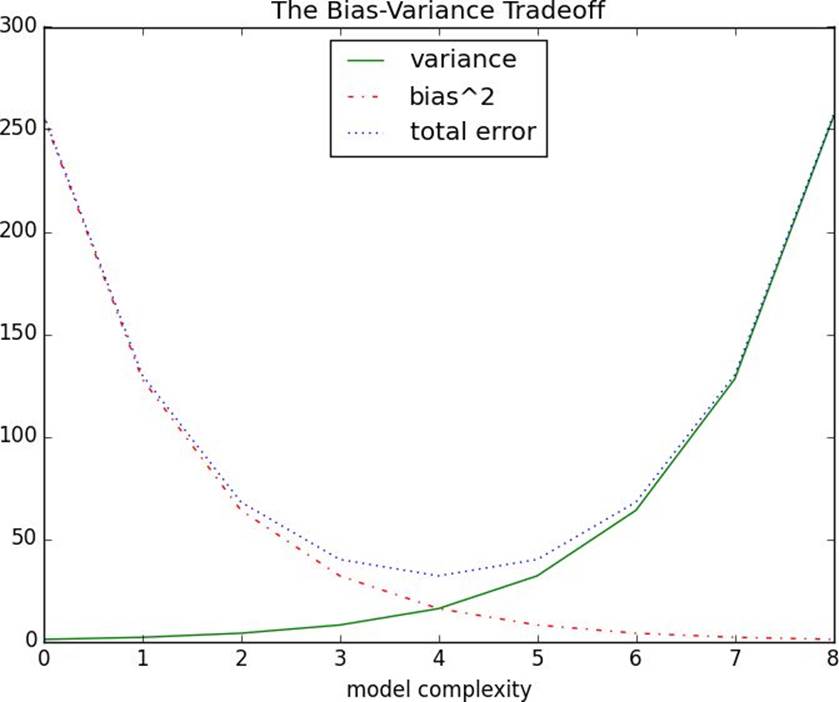
Figure 3-6. Several line charts with a legend
friends=[70,65,72,63,71,64,60,64,67]
minutes=[175,170,205,120,220,130,105,145,190]
labels=['a','b','c','d','e','f','g','h','i']
plt.scatter(friends,minutes)
# label each pointforlabel,friend_count,minute_countinzip(labels,friends,minutes):
plt.annotate(label,
xy=(friend_count,minute_count),# put the label with its point
xytext=(5,-5),# but slightly offset
textcoords='offset points')
plt.title("Daily Minutes vs. Number of Friends")plt.xlabel("# of friends")plt.ylabel("daily minutes spent on the site")plt.show()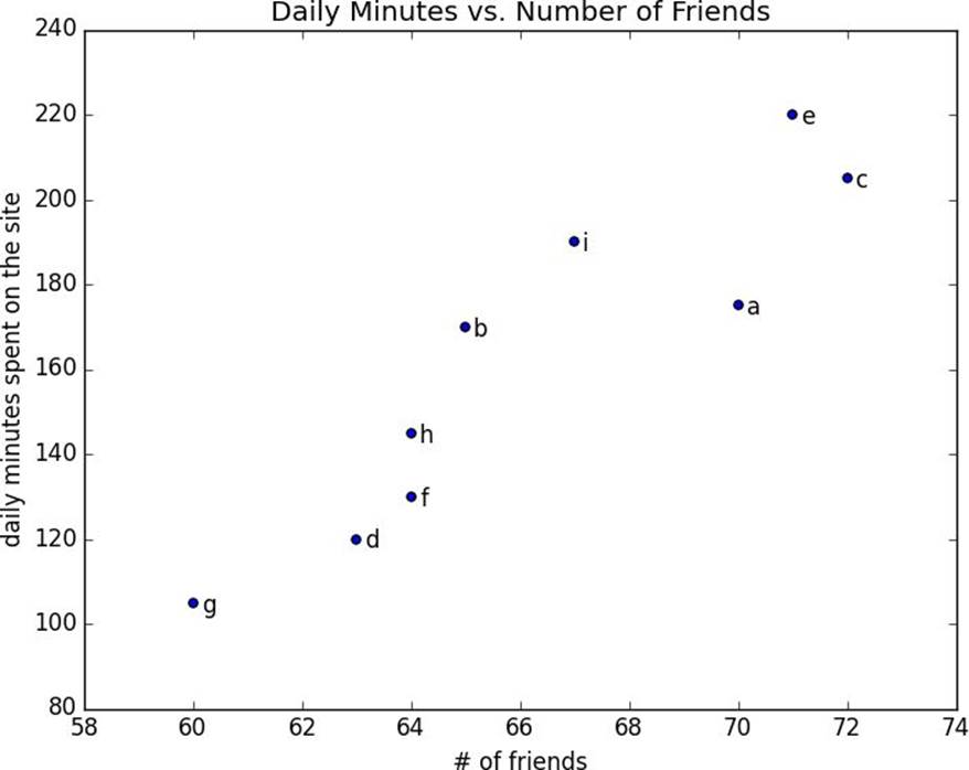
Figure 3-7. A scatterplot of friends and time on the site
test_1_grades=[99,90,85,97,80]
test_2_grades=[100,85,60,90,70]
plt.scatter(test_1_grades,test_2_grades)
plt.title("Axes Aren't Comparable")plt.xlabel("test 1 grade")plt.ylabel("test 2 grade")plt.show()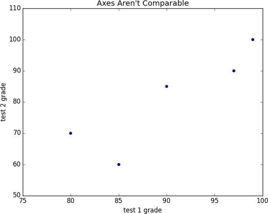
Figure 3-8. A scatterplot with uncomparable axes
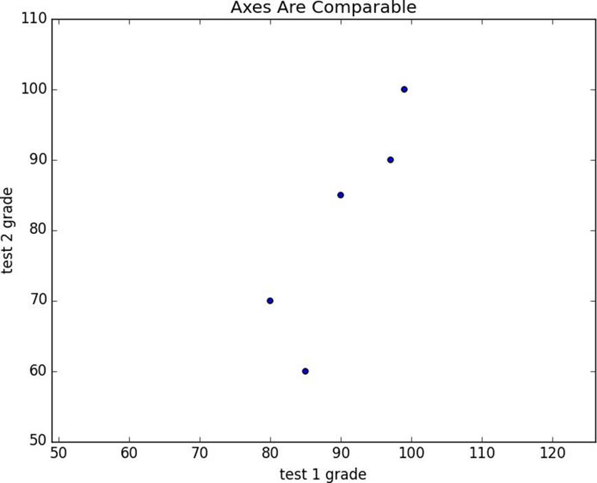
Figure 3-9. The same scatterplot with equal axes
§ seaborn is built on top of matplotlib and allows you to easily produce prettier (and more complex) visualizations.
§ D3.js is a JavaScript library for producing sophisticated interactive visualizations for the web. Although it is not in Python, it is both trendy and widely used, and it is well worth your while to be familiar with it.
§ Bokeh is a newer library that brings D3-style visualizations into Python.
§ ggplot is a Python port of the popular R library ggplot2, which is widely used for creating “publication quality” charts and graphics. It’s probably most interesting if you’re already an avid ggplot2 user, and possibly a little opaque if you’re not.
All materials on the site are licensed Creative Commons Attribution-Sharealike 3.0 Unported CC BY-SA 3.0 & GNU Free Documentation License (GFDL)
If you are the copyright holder of any material contained on our site and intend to remove it, please contact our site administrator for approval.
© 2016-2026 All site design rights belong to S.Y.A.