50 Android Hacks (2013)
Chapter 1. Working your way around layouts
In this chapter, we’ll cover tips and recommendations for Android layouts. You’ll learn how to create certain types of layouts from scratch as well as how to improve upon existing ones.
Hack 1 Centering views using weights: Android v1.6+
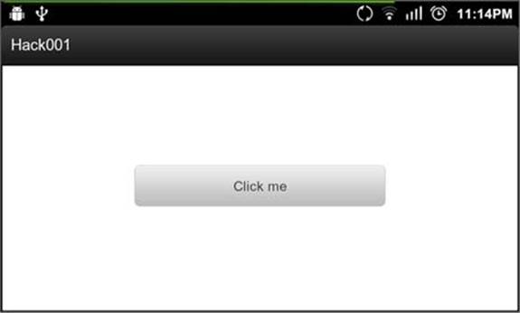
At an Android talk I gave to a group of developers, when I was explaining how to create a view using an XML file, someone asked, “What should I write if I want a button to be centered and 50% of its parent width?” At first I didn’t understand what he was asking, but after he drew it on the board, I understood. His idea is shown in figures 1.1 and 1.2.
Figure 1.1. Button with 50% of its parent width (portrait)
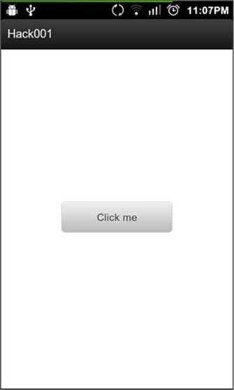
Figure 1.2. Button with 50% of its parent width (landscape)
It looks simple, right? Now take five minutes to try to achieve it. In this hack, we’ll look at how to solve this problem using the LinearLayout’s android:weightSum attribute in conjunction with the LinearLayout’s child android:layout_weight attribute. This might sound like a simple task, but it’s something I always ask about in interviews with developers because a lot of them don’t know the best way to do this.
1.1. Combining weightSum and layout_weight
Android devices have different sizes, and as developers we need to create XML in a way that works for different screen sizes. Hard-coding sizes isn’t an option, so we’ll need something else to organize our views.
We’ll use the layout_weight and weightSum attributes to fill up any remaining space inside our layout. The documentation for android:weightSum (see section 1.3) describes a scenario similar to what we’re trying to achieve:
Defines the maximum weight sum. If unspecified, the sum is computed by adding the layout_weight of all of the children. This can be used for instance to give a single child 50% of the total available space by giving it a layout_weight of 0.5 and setting the weightSum to 1.0.
Imagine we need to place stuff inside a box. The percentage of available space would be the weightSum and the layout_weight would be the percentage available for each item inside the box. For example, let’s say the box has a weightSum of 1 and we have two items, A and B. A has alayout_weight of 0.25 and B has a layout_weight of 0.75. So item A will have 25% of the box space, while B will get the remaining 75%.
The solution to the situation we covered at the beginning of this chapter is similar. We give the parent a certain weightSum and give the button half of that value as android:layout_weight. The resulting XML follows:
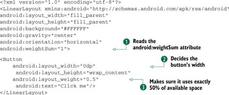
The LinearLayout reads the android:weightSum attribute  and learns that the sum of the weights of its children needs to be 1. Its first and only child is the Button and because the button has its android:layout_width set to 0dp
  , the LinearLayout knows that it must decide the button’s width by the available space given by the android:weightSum. Because the Button has the android:layout_weight set to 0.5
  , it will use exactly 50% of the available space.
A possible example would be a 200dp wide LinearLayout with its android:weightSum set to 1. The width of the Button would be calculated as follows:
Button's width + Button's weight * 200 / sum(weight)
Because the Button’s width is 0dp, the Button’s weight is 0.5. With the sum(weight) set to 1, the result would be the following:
0 + 0.5 * 200 / 1 = 100
1.2. The bottom line
Using LinearLayout’s weight is important when you want to distribute the available space based on a percentage rather than using hard-coded sizes. If you’re targeting Honeycomb and using Fragments, you’ll notice that most of the examples place the different Fragments in a layout using weights. Understanding how to use weights will add an important tool to your toolbox.
1.3. External links
http://developer.android.com/reference/android/widget/LinearLayout.html
Hack 2 Using lazy loading and avoiding replication: Android v1.6+
When you’re creating complex layouts, you may find yourself adding a lot of ViewGroups and Views. But making your view hierarchy tree taller will also make it slower. Creating optimized layouts is fundamental to building an application that runs fast and is responsive to the user.
In this hack, you’ll learn how to use the <include /> tag in your XML to avoid replication, and how to use the ViewStub class to lazy load views.
2.1. Avoid replication using the <include /> tag
Let’s imagine we want to add a footer to every view in our application—something simple, such as a TextView with our application’s name. If we have more than one Activity, we might have more than one XML file. Would we copy this TextView to every XML file? What happens if we need to edit it in the future? Copying and pasting would solve the problem, but it doesn’t sound efficient. The easiest way to add a footer to our application is to use the <include /> tag. Let’s look at how it can help us out.
We use the <include /> tag in XML to add another layout from another XML file. In our example, we’ll create our complete view, and at the bottom we’ll add the <include /> tag pointing to our footer’s layout. One of our Activity’s XML files would look like the following:
<RelativeLayout
xmlns:android="http://schemas.android.com/apk/res/android"
android:layout_width="fill_parent"
android:layout_height="fill_parent">
<TextView
android:layout_width="fill_parent"
android:layout_height="wrap_content"
android:layout_centerInParent="true"
android:gravity="center_horizontal"
android:text="@string/hello"/>
<include layout="@layout/footer_with_layout_properties"/>
</RelativeLayout/>
And the footer_with_layout_properties would look like the following:
<TextView xmlns:android="http://schemas.android.com/apk/res/android"
android:layout_width="fill_parent"
android:layout_height="wrap_content"
android:layout_alignParentBottom="true"
android:layout_marginBottom="30dp"
android:gravity="center_horizontal"
android:text="@string/footer_text"/>
In this first example, we’ve used the <include /> tag with the only required layout. You might be thinking, “OK, this works because we’re using a RelativeLayout for our main XML. What’ll happen if one of the XML files is a LinearLayout? android :layout_alignParentBottom="true" wouldn’t work because it’s a RelativeLayout attribute.” That’s true. Let’s look at the second way to use includes, where we’ll place android:layout_* attributes in the <include /> itself.
The following modified main.xml uses the <include /> tag with android:layout_* attributes:
<RelativeLayout
xmlns:android="http://schemas.android.com/apk/res/android"
android:layout_width="fill_parent"
android:layout_height="fill_parent">
<TextView
android:layout_width="fill_parent"
android:layout_height="wrap_content"
android:layout_centerInParent="true"
android:gravity="center_horizontal"
android:text="@string/hello"/>
<include
layout="@layout/footer"
android:layout_width="fill_parent"
android:layout_height="wrap_content"
android:layout_alignParentBottom="true"
android:layout_marginBottom="30dp"/>
</RelativeLayout/>
The following shows the modified footer.xml:
<TextView xmlns:android="http://schemas.android.com/apk/res/android"
android:layout_width="0dp"
android:layout_height="0dp"
android:gravity="center"
android:text="@string/footer_text"/>
In this second example, we’ve let the container of the included footer decide where to place it. Android’s issue tracker has reported an issue, which says that the <include /> tag is broken (overriding layout params never works). This is partially true. The problem is that the <include />tag must specify both android:layout_width and android:layout_height if we want to override any android:layout_* attributes.
Note a small detail about what we’ve done in this hack. As you can see in the second example, we moved every android:layout_* attribute to the <include /> tag. Take a look at the width and height we placed in the footer.xml file: they’re both 0dp. We did this to make users specify a width and height when used together with the <include /> tag. If users don’t add them, they won’t see the footer because the width and height are zero.
2.2. Lazy loading views with the ViewStub class
When designing your layouts, you may have thought about showing a view depending on the context or the user interactions. If you’ve ever found yourself making a view invisible and then making it visible afterward, you should keep on reading—you’ll want to use the ViewStub class.
As an introduction to the ViewStub class, let’s take a look at the Android documentation (see section 2.4):
A ViewStub is an invisible, zero-sized View that can be used to lazily inflate layout resources at runtime. When a ViewStub is made visible, or when inflate() is invoked, the layout resource is inflated. The ViewStub then replaces itself in its parent with the inflated View orViews.
You already know what a ViewStub is, so let’s see what you can do with it. In the following example you’ll use a ViewStub to lazy load a MapView. Imagine creating a view with the details about a place. Let’s look at two possible scenarios:
· Some venues don’t have GPS information
· The user might not need the map
If the venue doesn’t have GPS information, you can’t place a marker on the map, and if the user doesn’t need the map, why load it? Let’s place the MapView inside a ViewStub and let the user decide whether to load the map.
To achieve this, you’ll use the following layout:
<?xml version="1.0" encoding="utf-8"?>
<RelativeLayout
xmlns:android="http://schemas.android.com/apk/res/android"
android:layout_width="fill_parent"
android:layout_height="fill_parent">
<Button
android:layout_width="fill_parent"
android:layout_height="wrap_content"
android:text="@string/show_map"
android:onClick="onShowMap"/>
<ViewStub
android:id="@+id/map_stub"
android:layout_width="fill_parent"
android:layout_height="fill_parent"
android:layout="@layout/map"
android:inflatedId="@+id/map_view"/>
</RelativeLayout>
It might be obvious, but we’ll use the map_stub ID to get the ViewStub from the Activity, and the layout attribute tells the ViewStub which layout should inflate. For this example, we’ll use the following layout for the map:
<?xml version="1.0" encoding="utf-8"?>
<com.google.android.maps.MapView
xmlns:android="http://schemas.android.com/apk/res/android"
android:layout_width="fill_parent"
android:layout_height="fill_parent"
android:clickable="true"
android:apiKey="my_api_key"/>
The last attribute we need to discuss is inflatedId. The inflatedId is the ID that the inflated view will have after we call inflate() or setVisibility() in the ViewStub class. In this example, we’ll use setVisibility(View.VISIBLE) because we won’t do anything else with the MapView. If we want to get a reference to the view inflated, the inflate() method returns the view to avoid a second call to findViewById().
The code for the Activity is simple:
public class MainActivity extends MapActivity {
private View mViewStub;
@Override
public void onCreate(Bundle savedInstanceState) {
super.onCreate(savedInstanceState);
setContentView(R.layout.main);
mViewStub = findViewById(R.id.map_stub);
}
public void onShowMap(View v) {
mViewStub.setVisibility(View.VISIBLE);
}
...
}
As you can see, we only need to change the ViewStub visibility when we want to show the map.
2.3. The bottom line
The <include /> tag is a useful tool to order your layout. If you already created something with the Fragment class, you’ll notice that using includes is almost the same thing. As you need to do with fragments, your complete view can be a set of includes.
The <include /> tag offers a nice way to organize the content of your XML files. If you’re making a complex layout and the XML gets too big, try creating different parts using includes. The XML becomes easier to read and more organized.
ViewStub is an excellent class to lazy load your views. Whenever you’re hiding a view and making it visible, depending on the context, try using a ViewStub. Perhaps you won’t notice the performance boost with only one view, but you will if the view has a large view hierarchy.
2.4. External links
http://code.google.com/p/android/issues/detail?id=2863
http://android-developers.blogspot.com.ar/2009/03/android-layout-tricks-3-optimize-with.html
http://developer.android.com/reference/android/view/ViewStub.html
Hack 3 Creating a custom ViewGroup: Android v1.6+
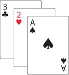
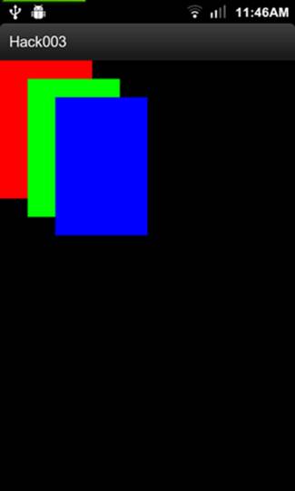
When you’re designing your application, you might have complex views that will show up in different activities. Imagine that you’re creating a card game and you want to show the user’s hand in a layout similar to figure 3.1. How would you create a layout like that?
Figure 3.1. User’s hand in a card game
You might say that playing with margins will be enough for that type of layout. That’s true. You can do something similar to the previous figure with a RelativeLayout and add margins to its children. The XML looks like the following:
<?xml version="1.0" encoding="utf-8"?>
<RelativeLayout
xmlns:android="http://schemas.android.com/apk/res/android"
android:layout_width="fill_parent"
android:layout_height="fill_parent" >
<View
android:layout_width="100dp"
android:layout_height="150dp"
android:background="#FF0000" />
<View
android:layout_width="100dp"
android:layout_height="150dp"
android:layout_marginLeft="30dp"
android:layout_marginTop="20dp"
android:background="#00FF00" />
<View
android:layout_width="100dp"
android:layout_height="150dp"
android:layout_marginLeft="60dp"
android:layout_marginTop="40dp"
android:background="#0000FF" />
</RelativeLayout>
</FrameLayout>
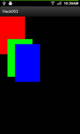
The result of the previous XML can be seen in figure 3.2.
Figure 3.2. Card layout created using the default Android widgets
In this hack, we’ll look at another way of creating the same type of layout—we’ll create a custom ViewGroup. The benefits of using a custom ViewGroup instead of adding margins by hand in an XML file are these:
· It’s easier to maintain if you’re using it in different activities.
· You can use custom attributes to customize the position of the ViewGroup children.
· The XML will be easier to understand because it’ll be more concise.
· If you need to change the margins, you won’t need to recalculate by hand every child’s margin.
Let’s take a look at how Android draws views.
3.1. Understanding how Android draws views
To create a custom ViewGroup, you’ll need to understand how Android draws views. I won’t go into the details, but you’ll need to understand the following paragraph from the documentation (see section 3.5), because it explains how you can draw a layout:
Drawing the layout is a two-pass process: a measure pass and a layout pass. The measuring pass is implemented in measure(int, int) and is a top-down traversal of the View tree. Each View pushes dimension specifications down the tree during the recursion. At the end of the measure pass, every View has stored its measurements. The second pass happens in layout(int, int, int, int) and is also top-down. During this pass each parent is responsible for positioning all of its children using the sizes computed in the measure pass.
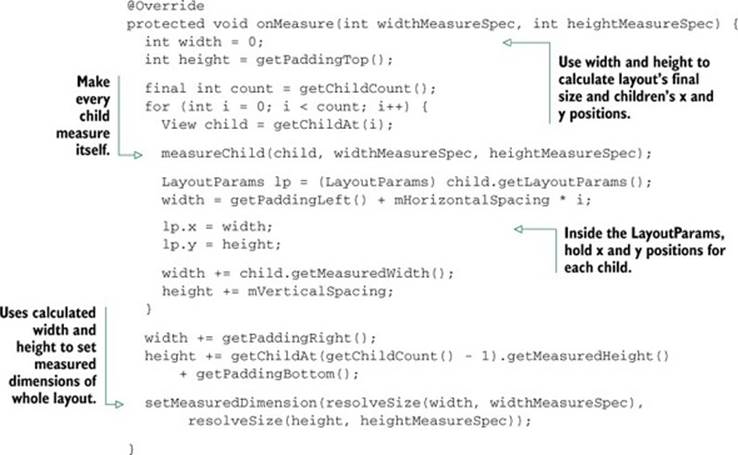
To understand the concept, let’s analyze the way to draw a ViewGroup. The first step is to measure its width and height, and we do this in the onMeasure() method. Inside that method, the ViewGroup will calculate its size by going through its children. We’ll make the final pass in theonLayout() method. Inside this second method, the ViewGroup will lay out its children using the information gathered in the onMeasure() pass.
3.2. Creating the CascadeLayout
In this section, we’ll code the custom ViewGroup. We’ll achieve the same result as figure 3.2. Call the custom ViewGroup: CascadeLayout. The XML using the CascadeLayout follows:
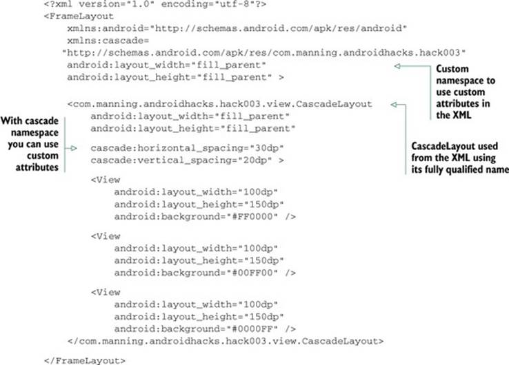
Now that you know what you need to build, let’s get started. The first thing we’ll do is define those custom attributes. To do this, we need to create a file called attrs.xml inside the res/values folder, with the following code:
<?xml version="1.0" encoding="utf-8"?>
<resources>
<declare-styleable name="CascadeLayout">
<attr name="horizontal_spacing" format="dimension" />
<attr name="vertical_spacing" format="dimension" />
</declare-styleable>
</resources>
We’ll also use default values for the horizontal and vertical spacing for those times when the user doesn’t specify them. We’ll place the default values inside a dimens.xml file inside the res/values folder. The contents of the dimens.xml file are as follows:
<?xml version="1.0" encoding="utf-8"?>
<resources>
<dimen name="cascade_horizontal_spacing">10dp</dimen>
<dimen name="cascade_vertical_spacing">10dp</dimen>
</resources>
After understanding how Android draws views, you might imagine that you need to write a class called CascadeLayout that extends ViewGroup and overrides the onMeasure() and onLayout() methods. Because the code’s a bit long, let’s analyze it in three separate parts: the constructor, the onMeasure() method, and the onLayout() method. The following code is for the constructor:
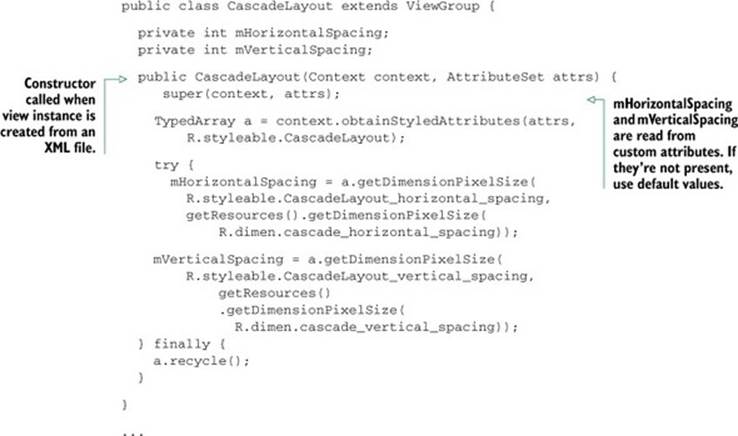
Before coding the onMeasure() method, we’ll create a custom LayoutParams. This class will hold the x,y position values of each child. We’ll have the LayoutParams class as a CascadeLayout inner class. The class definition is as follows:
public static class LayoutParams extends ViewGroup.LayoutParams {
int x;
int y;
public LayoutParams(Context context, AttributeSet attrs) {
super(context, attrs);
}
public LayoutParams(int w, int h) {
super(w, h);
}
}
To use our new CascadeLayout.LayoutParams class, we’ll need to override some additional methods in the CascadeLayout class. These are checkLayoutParams(), generateDefaultLayoutParams(), generateLayoutParams(AttributeSet attrs), andgenerateLayoutParams(ViewGroup.LayoutParams p). The code for these methods is almost always the same between ViewGroups. If you’re interested in its content, you’ll find it in the sample code.
The next step is to code the onMeasure() method. This is the key part of the class. The code follows:
The last step is to create the onLayout() method. Let’s look at the code:
@Override
protected void onLayout(boolean changed, int l, int t, int r, int b) {
final int count = getChildCount();
for (int i = 0; i < count; i++) {
View child = getChildAt(i);
LayoutParams lp = (LayoutParams) child.getLayoutParams();
child.layout(lp.x, lp.y, lp.x + child.getMeasuredWidth(), lp.y
+ child.getMeasuredHeight());
}
}
As you can see, the code is dead simple. It calls each child layout() method using the values calculated inside the onMeasure() method.
3.3. Adding custom attributes to the children
In this last section, you’ll learn how to add custom attributes to the children views. As an example, we’ll add a way to override the vertical spacing for a particular child. You can see a result of this in figure 3.3.
Figure 3.3. First child with different vertical spacing
The first thing we’ll need to do is add a new attribute to the attrs.xml file:
<declare-styleable name="CascadeLayout_LayoutParams">
<attr name="layout_vertical_spacing" format="dimension" />
</declare-styleable>
Because the attribute name starts with layout_ instead of containing a View attribute, it’s added to the LayoutParams attributes. We’ll read this new attribute inside the LayoutParams constructor as we did with the ones from CascadeLayout. The code is the following:
public LayoutParams(Context context, AttributeSet attrs) {
super(context, attrs);
TypedArray a = context.obtainStyledAttributes(attrs,
R.styleable.CascadeLayout_LayoutParams);
try {
verticalSpacing = a.getDimensionPixelSize(
R.styleable.CascadeLayout_LayoutParams_layout_vertical_spacing,
-1);
} finally {
a.recycle();
}
}
The verticalSpacing is a public field. We’ll use it inside the CascadeLayout’s onMeasure() method. If the child’s LayoutParams contains the verticalSpacing, we can use it. The source code looks like the following:
verticalSpacing = mVerticalSpacing;
...
LayoutParams lp = (LayoutParams) child.getLayoutParams();
if (lp.verticalSpacing >= 0) {
verticalSpacing = lp.verticalSpacing;
}
...
width += child.getMeasuredWidth();
height += verticalSpacing;
3.4. The bottom line
Using custom Views and ViewGroups is an excellent way to organize your application layouts. Customizing components will also allow you to provide custom behaviors. The next time you need to create a complex layout, decide whether or not it’d be better to use a custom ViewGroup. It might be more work at the outset, but the end result is worth it.
3.5. External links
http://developer.android.com/guide/topics/ui/how-android-draws.html
http://developer.android.com/reference/android/view/ViewGroup.html
http://developer.android.com/reference/android/view/ViewGroup.LayoutParams.html
Hack 4 Preferences hacks: Android v1.6+
One of the features I like about the Android SDK is the preferences framework. I prefer it to the iOS SDK because it makes it easier to create layouts. When you edit a simple XML file, you get an easy-to-use preferences screen.
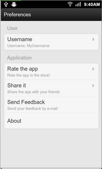
Although Android provides many settings widgets for you to use, sometimes you may need to customize the view. In this hack, you’ll find a couple of examples in which the settings framework has been customized. The finished preferences screen is shown in figure 4.1.
Figure 4.1. Preferences screen
Let’s first take a look at the XML:
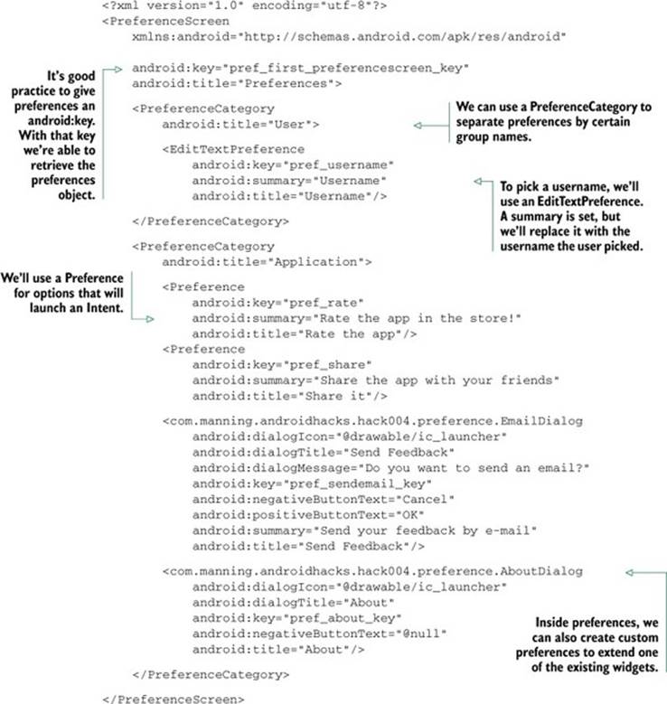
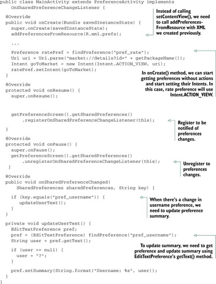
The XML we’ve created will take care of the UI. Now it’s time to add all of the logic. To do this, we’ll create an Activity, but instead of extending android.app.Activity, we’ll extend android.preference.PreferenceActivity. The code follows:
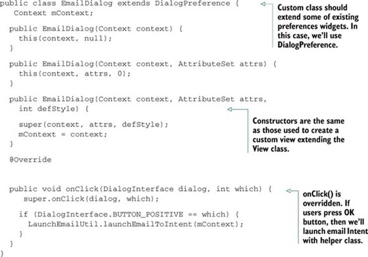
The code we want to create shows how to create custom preferences. It works as if we were creating a custom view. To understand it, let’s look at the following, where we create the code for the EmailDialog class:
4.1. The bottom line
Although the settings framework allows you to add some custom behavior, you need to remember that its purpose is to create simple preferences screens. If you’re thinking of adding more complex user interfaces or flows, I’d recommend you create a separate Activity, theming it as aDialog, and launching it from a preferences widget.
4.2. External links
http://developer.android.com/reference/android/preference/PreferenceActivity.html