Software Architecture for Developers: Technical leadership by coding, coaching, collaboration, architecture sketching and just enough up front design (2014)
IV. VISUALISING SOFTWARE
This part of the book is about visualising software architecture using a collection of lightweight, yet effective, sketches.
32 We have a failure to communicate
If you’re working in an agile software development team at the moment, take a look around at your environment. Whether it’s physical or virtual, there’s likely to be a story wall or Kanban board visualising the work yet to be started, in progress and done.
Why? Put simply, visualising your software development process is a fantastic way to introduce transparency because anybody can see, at a glance, a high-level snapshot of the current progress. Couple this with techniques like value stream mapping and you can start to design some complex Kanban boards to reflect that way that your team works. As an industry, we’ve become pretty adept at visualising our software development process.
However, it seems we’ve forgotten how to visualise the actual software that we’re building. I’m not just referring to post-project documentation, this also includes communication during the software development process.
Understanding software architecture is not the same as being able to communicate it. Those architecture diagrams that you have on the wall of your office; do they reflect the system that is actually being built or are they conceptual abstractions that bear no resemblance to the structure of the code. Having run architecture katas with thousands of people over a number of years, I can say with complete confidence that visualising the architecture of a software system is a skill that very few people have. People can draw diagrams, but those diagrams often leave much to the imagination. Almost nobody uses a formal diagramming notation to describe their solutions too, which is in stark contrast to my experience of working with software teams a decade ago.
Abandoning UML
If you cast your mind back in time, structured processes provided a reference point for both the software design process and how to communicate the resulting designs. Some well-known examples include the Rational Unified Process (RUP) and Structured Systems Analysis And Design Method (SSADM). Although the software development industry has moved on in many ways, we seem to have forgotten some of the good things that these prior approaches gave us.
As an industry, we do have the Unified Modelling Language (UML), which is a formal standardised notation for communicating the design of software systems. However, while you can argue about whether UML offers an effective way to communicate software designs or not, that’s often irrelevant because many teams have already thrown out UML or simply don’t know it. Such teams typically favour informal boxes and lines style sketches instead but often these diagrams don’t make much sense unless they are accompanied by a detailed narrative, which ultimately slows the team down. Next time somebody presents a software design to you focussed around one or more informal sketches, ask yourself whether they are presenting what’s on the sketches or whether they are presenting what’s in their head instead.
Boxes and lines sketches can work very well, but there are many pitfalls associated with communicating software architecture in this way
Abandoning UML is all very well but, in the race for agility, many software development teams have lost the ability to communicate visually. The example software architecture sketches (pictured) illustrate a number of typical approaches to communicating software architecture and they suffer from the following types of problems:
· Colour coding is usually not explained or is often inconsistent.
· The purpose of diagram elements (i.e. different styles of boxes and lines) is often not explained.
· Key relationships between diagram elements are sometimes missing or ambiguous.
· Generic terms such as “business logic” are often used.
· Technology choices (or options) are usually omitted.
· Levels of abstraction are often mixed.
· Diagrams often try to show too much detail.
· Diagrams often lack context or a logical starting point.
Boxes and lines sketches can work very well, but there are many pitfalls associated with communicating software architecture in this way. My approach is to use a collection of simple diagrams each showing a different part of the same overall story, paying close attention to the diagram elements if I’m not using UML.
Agility requires good communication
Why is this important? In today’s world of agile delivery and lean startups, many software teams have lost the ability to communicate what it is they are building and it’s no surprise that these same teams often seem to lack technical leadership, direction and consistency. If you want to ensure that everybody is contributing to the same end-goal, you need to be able to effectively communicate the vision of what it is you’re building. And if you want agility and the ability to move fast, you need to be able to communicate that vision efficiently too.
33 The need for sketches
I usually get a response of disbelief or amusement when I tell people that I travel around to teach people about software architecture and how to draw pictures. To be fair, it’s not hard to see why. Software architecture already has a poor reputation and the mention of “pictures” tends to bring back memories of analysis paralysis and a stack of UML diagrams that few people truly understand. After all, the software development industry has come a long way over the past decade, particularly given the influence of the agile manifesto and the wide range of techniques it’s been responsible for spawning.
Test driven development vs diagrams
Test-driven development (TDD) is an example and it’s one of those techniques that you either love or hate. Without getting into the debate of whether TDD is the “best way” to design software or not, there are many people out there that do use TDD as a way to design software. It’s not for everybody though and there’s nothing wrong with sketching out some designs on a whiteboard with a view to writing tests after you’ve written some production code. Despite what the evangelists say, TDD isn’t a silver bullet.
I’m very much a visual person myself and fall into latter camp. I like being able to visualise a problem before trying to find a solution. Describe a business process to me and I’ll sketch up a summary of it. Talk to me about a business problem and I’m likely to draw a high-level domain model. Visualising the problem is a way for me to ask questions and figure out whether I’ve understood what you’re saying. I also like sketching out solutions to problems, again because it’s a great way to get everything out into the open in a way that other people can understand quickly.
Why should people learn how to sketch?
Why is this a good skill for people to learn? Put simply, agility (and therefore moving fast) requires good communication. Sketching is a fantastic way to communicate a lot of information in a relatively short amount of time yet it’s a skill that we don’t often talk about in the software industry any more. There are several reasons for this:
1. Many teams instantly think of UML but they’ve dropped it as a communication method or never understood it in the first place. After all, apparently UML “isn’t cool”.
2. Many teams don’t do class design in a visual way anymore because they prefer TDD instead.
Sketching isn’t art
When I say “sketching”, I mean exactly that. At the age of 12 I was told that I would fail if I was to take Art as a subject at GCSE (high school) level, so ironically I can’t draw. But it’s not the ability to create a work of art that’s important. Rather, it’s the ability to get to bottom of something quickly and to summarise the salient points in a way that others can understand. It’s about communicating in a simple yet effective and efficient way.
Sketches are not comprehensive models
Just to be clear, I’m not talking about detailed modelling, comprehensive UML models or model-driven development. This is about effectively and efficiently communicating the software architecture of the software that you’re building through one or more simple sketches. This allows you to:
· Help everybody understand the “big picture” of what is being built.
· Create shared vision of what you’re building within the development team.
· Provide a focal point for the development team (e.g. by keeping the sketches on the wall) so that everybody in the development team remains focussed on what the software is and how it is being built.
· Provide a point of focus for those technical conversations about how new features should be implemented.
· Provide a map that can be used by software developers to navigate the source code.
· Help people understand how what they are building fits into the “bigger picture”.
· Help you to explain what you’re building to people outside of the development team (e.g. operations and support staff, non-technical stakeholders, etc).
· Fast-track the on-boarding of new software developers to the team.
· Provide a starting point for techniques such as risk-storming.
Rather than detailed class design, my goal for software architecture sketches is to ensure that the high-level structure is understood. It’s about creating a vision that everybody on the team can understand and commit to. Context, containers and components diagrams are usually sufficient.
Sketching can be a collaborative activity
As a final point, sketching can be a collaborative activity, particularly if done using a whiteboard or flip chart rather than a modelling tool. This fits much more with the concept of collaborative self-organising teams that many of us are striving towards but it does require that everybody on the team understands how to sketch.
Unfortunately, drawing diagrams seems to have fallen out of favour with many software development teams but it’s a skill that should be in every software developer’s toolbox because it paves the way for collaborative software design and makes collective code ownership easier. Every software development team can benefit from a few high-level sketches.
34 Ineffective sketches
Over the past few years, I’ve found that many software development teams struggle to visualise and communicate the software architecture of the systems they build. I see three major reasons for this.
1. In their haste to adopt agile approaches, many software teams have thrown out the baby with the bath water - modelling and documentation have been thrown out alongside traditional plan-driven processes and methodologies.
2. Teams that did see the value in documents and diagrams have typically abandoned the Unified Modeling Language (UML) (assuming that they used it in the first place, of course) in favour of an approach that is more lightweight and pragmatic. My anecdotal evidence, based upon meeting and speaking to thousands of software developers, suggests that as many as nine out of ten software developers don’t use UML.
3. There are very few people out there who teach software teams how to effectively visualise, model and communicate software architecture. And, based upon running workshops for some computer science students, this includes universities.
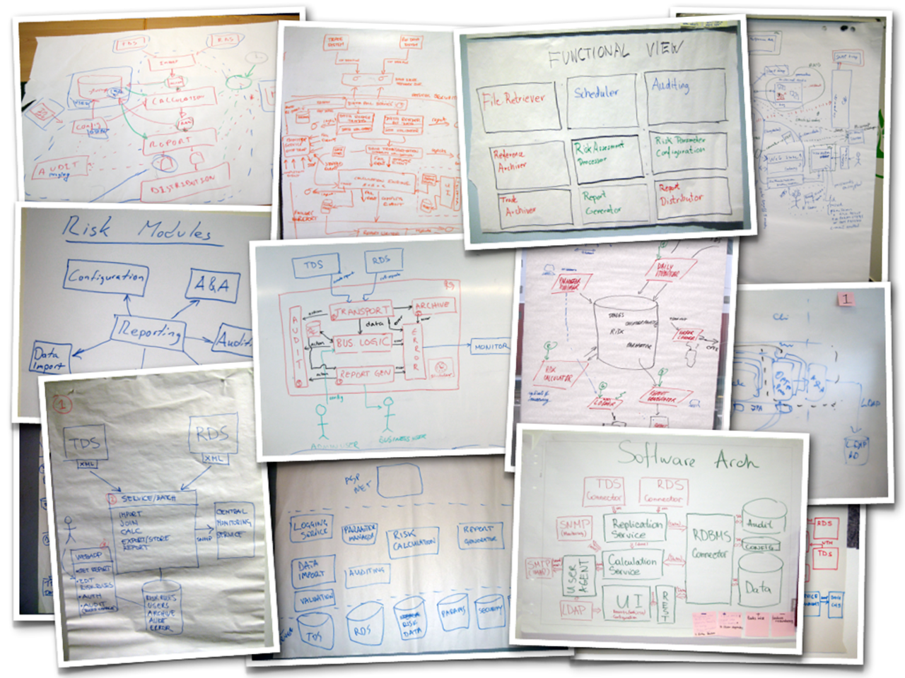
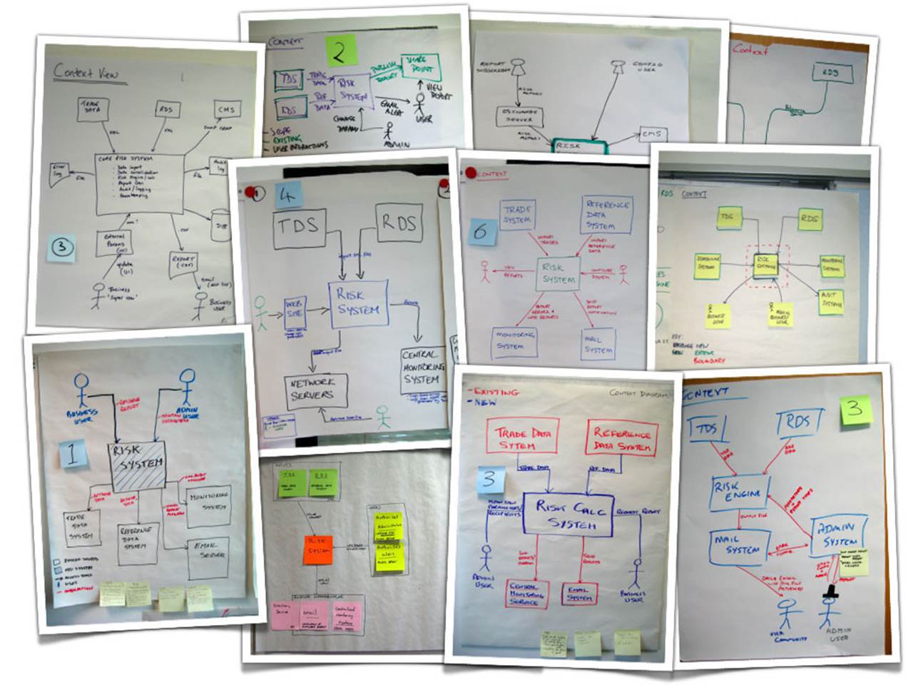
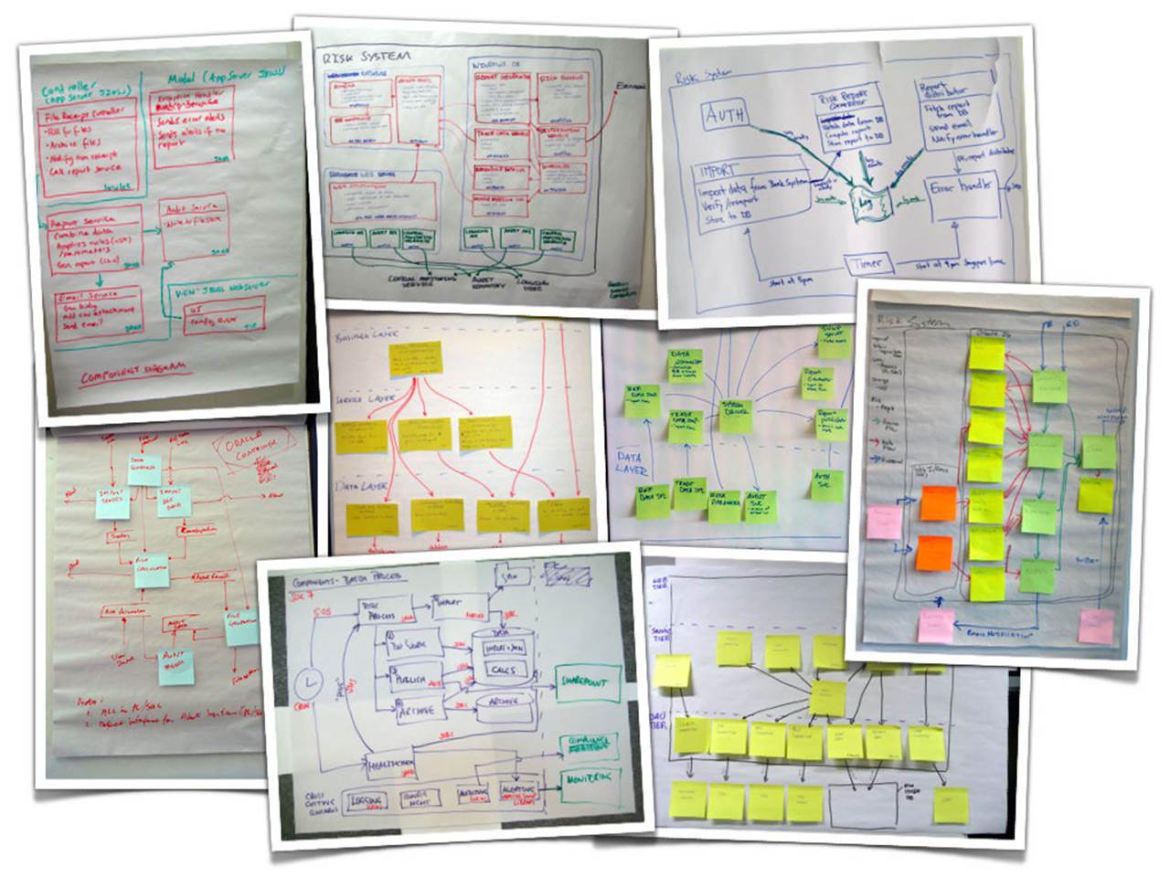
If you look around the offices of most software development teams for long enough, you’re sure to find some sketches, either on whiteboards or scraps of paper sitting on desks. Sketches are a great way to capture and present software architecture but they usually lack the formality and rigour of UML diagrams. This isn’t necessarily a bad thing, but the diagrams do need to be comprehensible and this is where things start to get tricky. Having run software architecture sketching workshops for thousands of people over the past few years, I can say without doubt that the majority of people do find this a very hard thing to do. The small selection of photos that follow are taken from these workshops, where groups of people have tried to communicate their software solution to the financial risk system case study. Have a look at each in turn and ask yourself whether they communicate the software architecture of the solution in an effective way. Some of the diagrams make use of colour, so apologies if you’re reading this on a black and white e-book reader.
The shopping list
Regardless of whether this is the software architecture diagram or one of a collection of software architecture diagrams, this diagram doesn’t tell you much about the solution. Essentially it’s just a shopping list of technologies.
There’s a Unix box and a Windows box, with some additional product selections that include JBoss (a Java EE application server) and Microsoft SQL Server. The problem is, I don’t know what those products are doing and there seems to be a connection missing between the Unix box and the Windows box. Since responsibilities and interactions are not shown, this diagram probably would have been better presented as a bulleted list.
Boxes and no lines
When people talk about software architecture, they often refer to “boxes and lines”. This next diagram has boxes, but no lines.
This is a three-tier solution (I think) that uses the Microsoft technology stack. There’s an ASP.NET web thing at the top, which I assume is being used for some sort of user interaction, although that’s not shown on the diagram. The bottom section is labelled “SQL Server” and there are lots of separate “database cans”. To be honest though, I’m left wondering whether these are separate database servers, schemas or tables.
Finally, in the middle, is a collection of boxes, which I assume are things like components, services, modules, etc. From one perspective, it’s great to see how the middle-tier of the overall solution has been decomposed into smaller chunks and these are certainly the types of components/services/modules that I would expect to see for such a solution. But again, there are no responsibilities and no interactions. Software architecture is about structure, which is about things (boxes) and how they interact (lines). This diagram has one, but not the other. It’s telling a story, but not the whole story.
The “functional view”
This is similar to the previous diagram and is very common, particularly in large organisations for some reason.
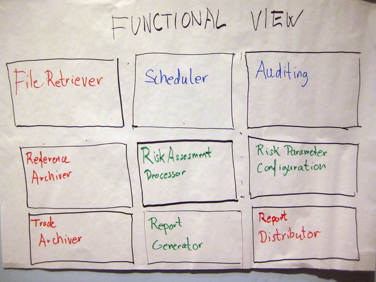
Essentially the group that produced this diagram has simply documented their functional decomposition of the solution into things, which I again assume are components, services, modules, etc but I could be wrong. Imagine a building architect drawing you a diagram of your new house that simply had a collection of boxes labelled “Cooking”, “Eating”, “Sleeping”, “Relaxing”, etc.
This diagram suffers from the same problem as the previous diagram (no responsibilities and no interactions) plus we additionally have a colour coding to decipher. Can you work out what the colour coding means? Is it related to input vs output functions? Or perhaps it’s business vs infrastructure? Existing vs new? Buy vs build? Or maybe different people simply had different colour pens! Who knows. I often get asked why the central “Risk Assessment Processor” box has a noticeably thicker border than the other boxes. I honestly don’t know, but I suspect it’s simply because the marker pen was held at a different angle.
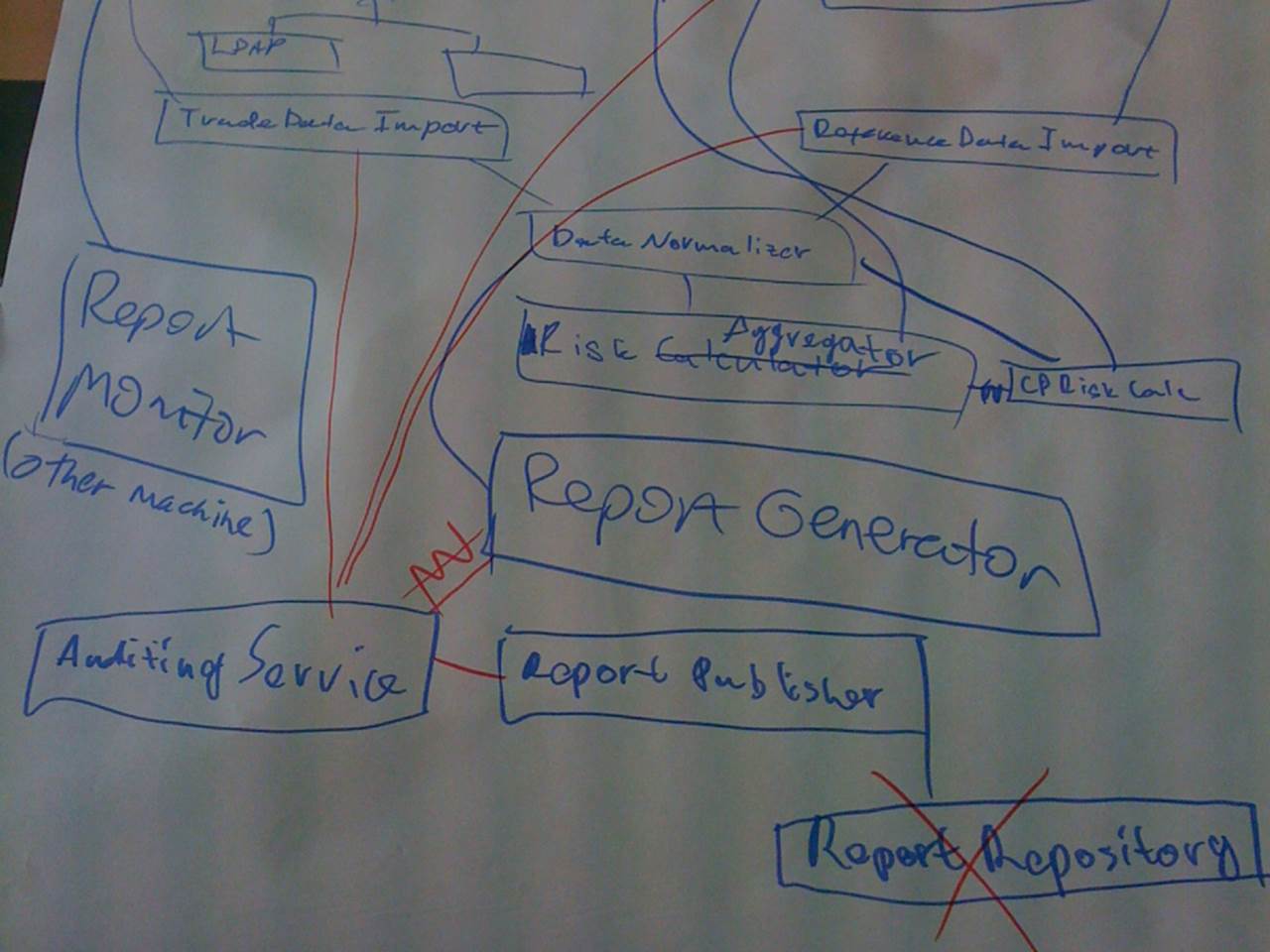
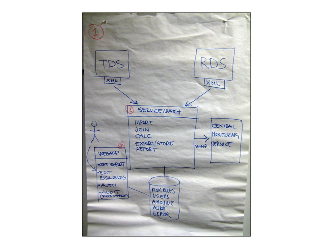
The airline route map
This is one of my all-time favourites. It was also the one and only diagram that this particular group used to present their solution.
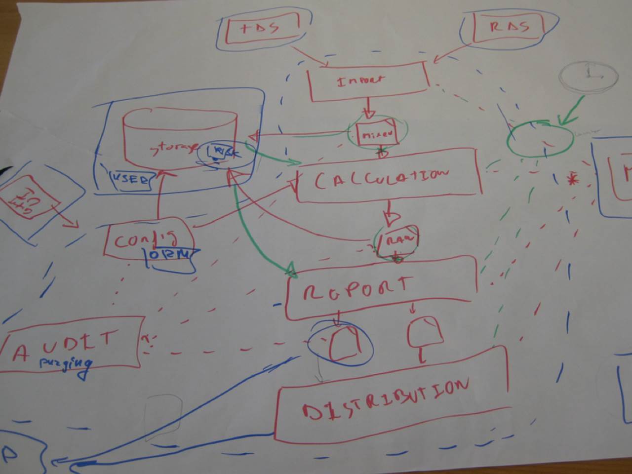
The central spine of this diagram is great because it shows how data comes in from the source data systems (TDS and RDS) and then flows through a series of steps to import the data, perform calculations, generate reports and finally distribute them. It’s a super-simple activity diagram that provides a nice high-level overview of what the system is doing. But then it all goes wrong.
I think the green circle on the right of the diagram is important because everything is pointing to it, but I’m not sure why. And there’s also a clock, which I assume means that something is scheduled to happen at a specific time. Let’s hope it’s not a time-bomb!
The left of the diagram is equally confusing, with various lines of differing colours and styles zipping across one another. If you look carefully you’ll see the letters “UI” upside-down. Perhaps this diagram makes more sense if you fold it like an Origami challenge?
Generically true
This is another very common style of diagram. Next time somebody asks you to produce a software architecture diagram of a system, present them this photo and you’re done!
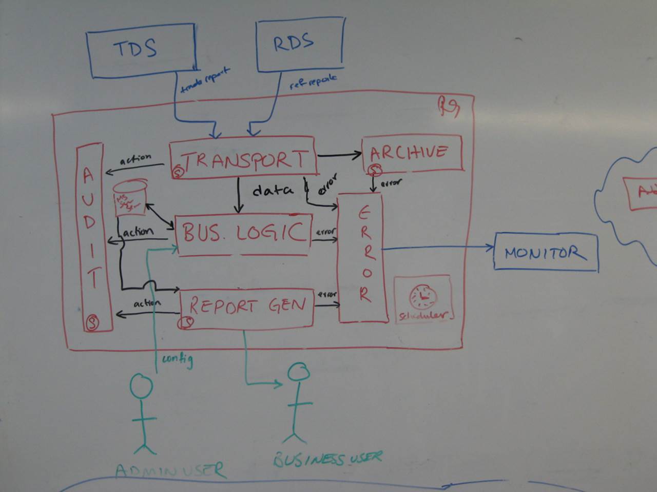
It’s a very “Software Architecture 101” style of diagram where most of the content is generic. Ignoring the source data systems at the top of the diagram (TDS and RDS), we have boxes generically labelled transport, archive, audit, report generation, error handling and arrows labelled error and action. Oh and look at the box in the centre - it’s labelled “business logic”. Do you ever build software that implements “business logic”?
There are a number of ways in which this diagram can be made more effective, but simply replacing the “business logic” box with “financial risk calculator” at least highlights the business domain in which we are operating. In Screaming Architecture, Uncle Bob Martin says that the organisation of a codebase should scream something about the business domain. The same is true of software architecture diagrams.
The “logical view”
This diagram is also relatively common. It shows the overall shape of the software architecture (including responsibilities, which I really like) but the technology choices are left to your imagination.
There’s a common misconception that “software architecture” diagrams should be “logical” in nature rather than include technology choices, especially before any code is written. After all, I’m often told that the financial risk system “is a simple solution that can be built with any technology”, so it doesn’t really matter anyway. I disagree this is the case and the issue of including or omitting technology choices is covered in more detail elsewhere in the book.
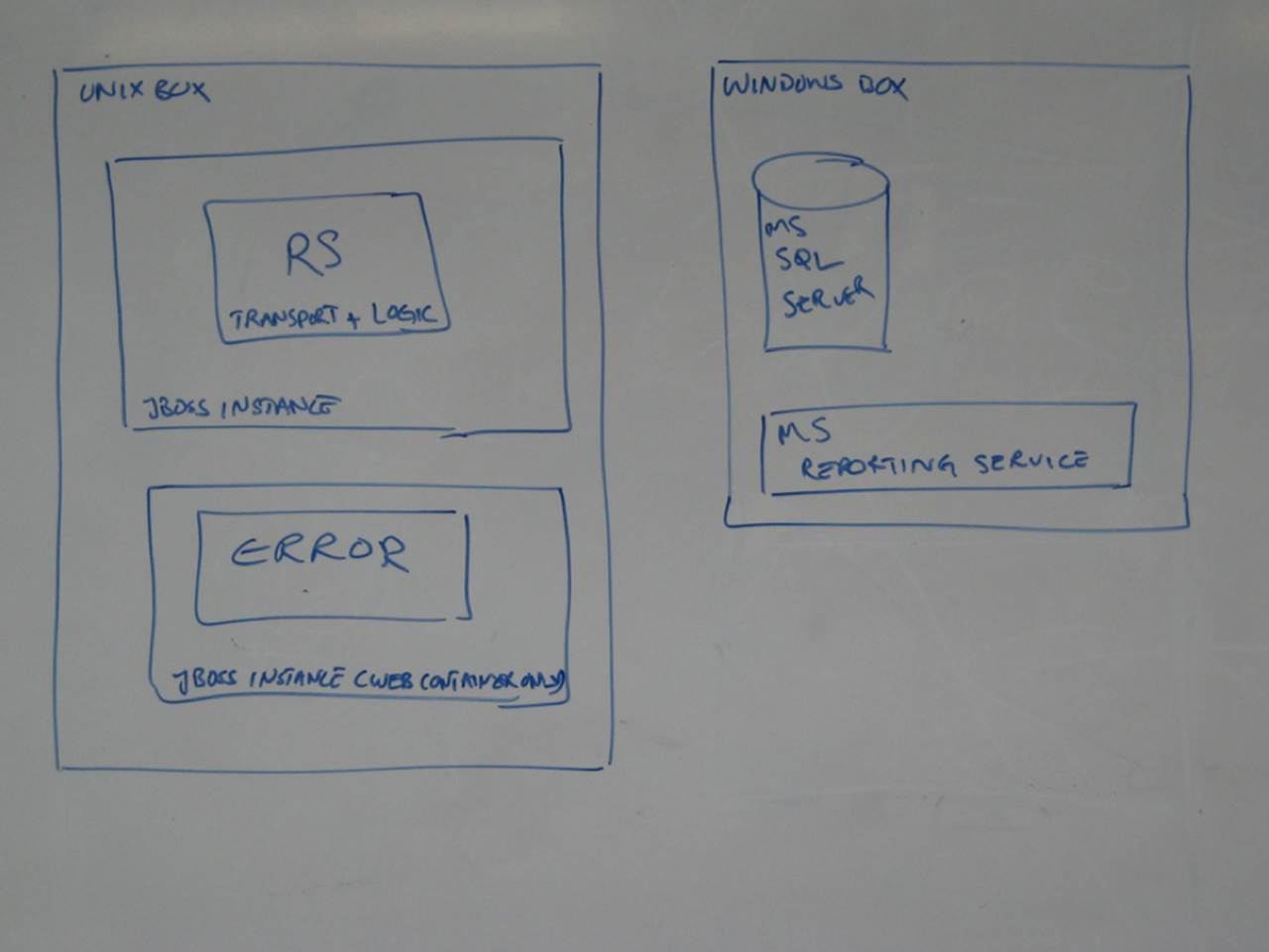
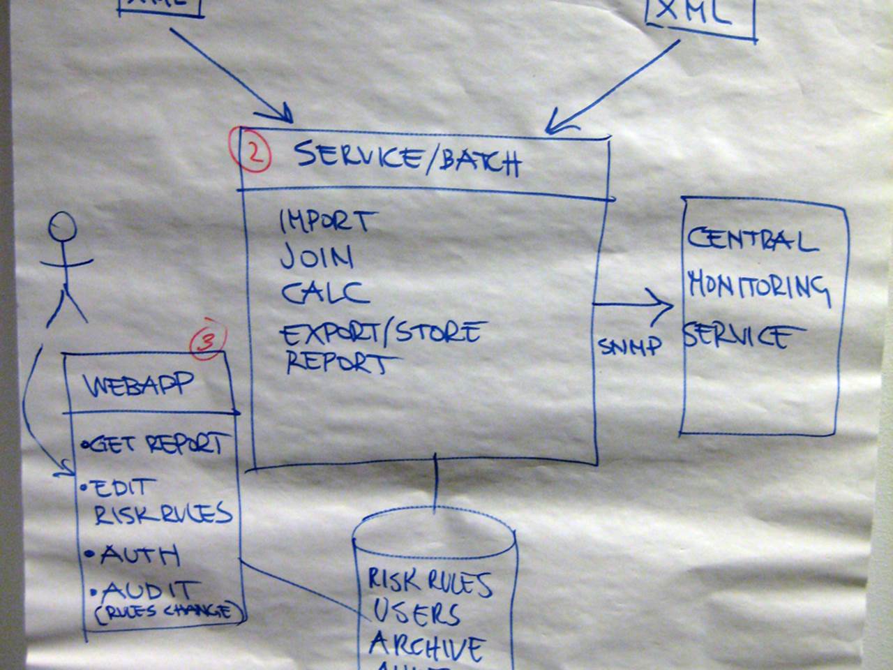
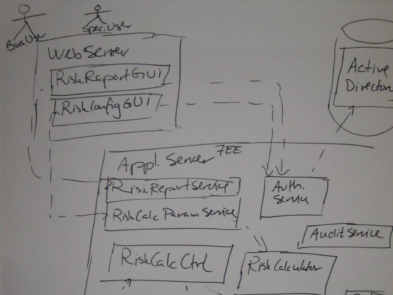
Deployment vs execution context
This next one is a Java solution consisting of a web application and a bunch of server-side components. Although it provides a simple high-level overview of the solution, it’s missing some information and you need to make some educated guesses to fill in the blanks.
If you look at the Unix box in the centre of the diagram, you’ll see two smaller boxes labelled “Risk Analysis System” and “Data Import Service”. If you look closely, you’ll see that both boxes are annotated “JAR”, which is the deployment mechanism for Java code (Java ARchive). Basically this is a ZIP file containing compiled Java bytecode. The equivalent in the .NET world is a DLL.
And herein lies the ambiguity. What happens if you put a JAR file on a Unix box? Well, the answer is not very much other than it takes up some disk space. And cron (the Unix scheduler) doesn’t execute JAR files unless they are really standalone console applications, the sort that have a “public static void main” method as a program entry point. By deduction then, I think both of those JAR files are actually standalone applications and that’s what I’d like to see on the diagram. Rather than the deployment mechanism, I want to understand the execution context.
Too many assumptions
This next diagram tells us that the solution is an n-tier Java EE system, but it omits some important details.
The lines between the web server and the application server have no information about how this communication occurs. Is it SOAP? RESTful services? XML over HTTP? Remote method invocation? Windows Communication Foundation? Asynchronous messaging? It’s not clear and this concerns me for three reasons:
1. Constraints: If you’re working in an environment with existing constraints, the technology choices may have be made for you already. For example, perhaps you have standards about inter-process communication or firewalls that only permit certain types of traffic through them.
2. Non-functional requirements: The choice of technology and protocol may have an impact on whether you meet your non-functional requirements, particularly if you are dealing with high performance, scalability or security.
3. Complexity: I’ve worked with software teams who have never created an n-tier architecture before and they are often under the illusion that this style of architecture can be created “for free”. In the real world, more layers means more complexity.
Granted there are many options and often teams don’t like committing early without putting together some prototypes. No problem, just annotate those lines on the diagram with the list of potential options instead so we can at least have a better conversation.
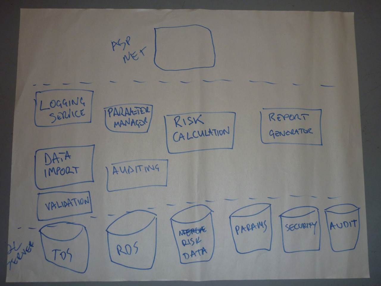
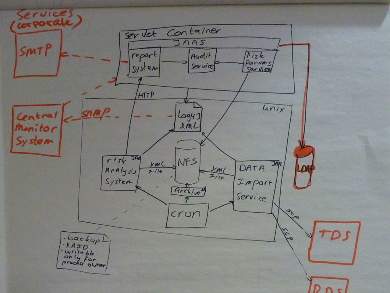
Homeless Old C# Object (HOCO)
If you’ve heard of “Plain Old C# Objects” (POCOs) or “Plain Old Java Objects” (POJOs), this is the homeless edition. This diagram mixes up a number of different levels of detail.
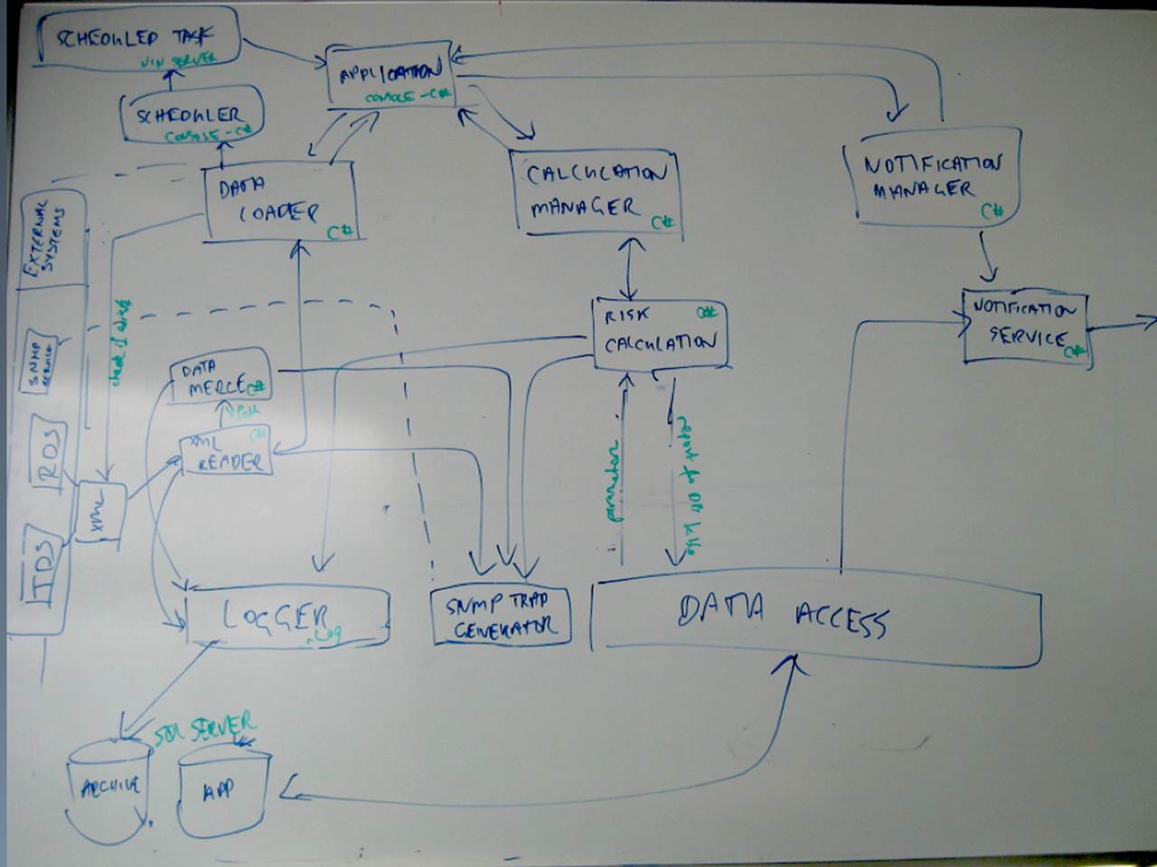
In the bottom left of the diagram is a SQL Server database, and at the top left of the diagram is a box labelled “Application”. Notice how that same box is also annotated (in green) “Console-C#”. Basically, this system seems to be made up of a C# console application and a database. But what about the other boxes?
Well, most of them seem to be C# components, services, modules or objects and they’re much like what we’ve seen on some of the other diagrams. There’s also a “data access” box and a “logger” box, which could be frameworks or architectural layers. Do all of these boxes represent the same level of granularity as the console application and the database? Or are they actually part of the application? I suspect the latter, but the lack of boundaries makes this diagram confusing. I’d like to draw a big box around most of the boxes to say “all of these things live inside the console application”. I want to give those boxes a home. Again, I do want to understand how the system has been decomposed into smaller components, but I also want to know about the execution context too.
Choose your own adventure
This is the middle part of a more complex diagram.
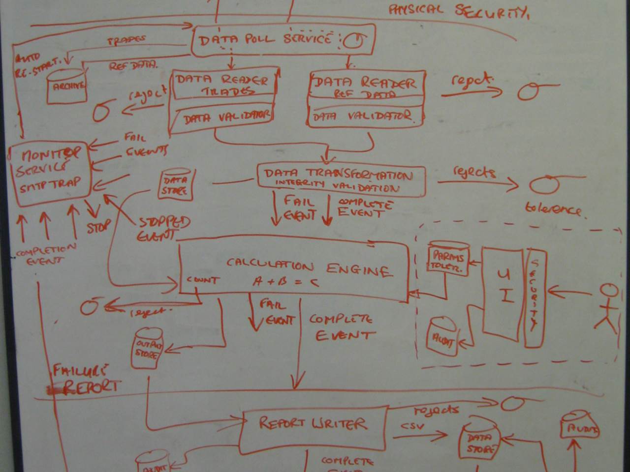
It’s a little like those “choose your own adventure” books that I used to read as a kid. You would start reading at page 1 and eventually arrive at a fork in the story where you decide what should happen next. If you want to attack the big scary creature you’ve just encountered, you turn to page 47. If you want to run away like a coward, it’s page 205 for you. You keep making similar choices and eventually, and annoyingly, your character ends up dying and you have to start over again.
This diagram is the same. You start at the top and weave your way downwards through what is a complex asynchronous and event-driven style of architecture. You often get to make a choice - should you follow the “fail event” or the “complete event”? As with the books, all paths eventually lead to the (SNMP) trap on the left of the diagram.
The diagram is complex, it’s trying to show everything and the single colour being used doesn’t help. Removing some information and/or using colour coding to highlight the different paths through the architecture would help tremendously.
Stormtroopers
To pick up on something you may have noticed from previous sketches, I regularly see diagrams that include unlabelled users/actors. Essentially they are faceless clones.
Should have used a whiteboard!
The final diagram is a great example of why whiteboards are such useful bits of kit!
Creating effective sketches
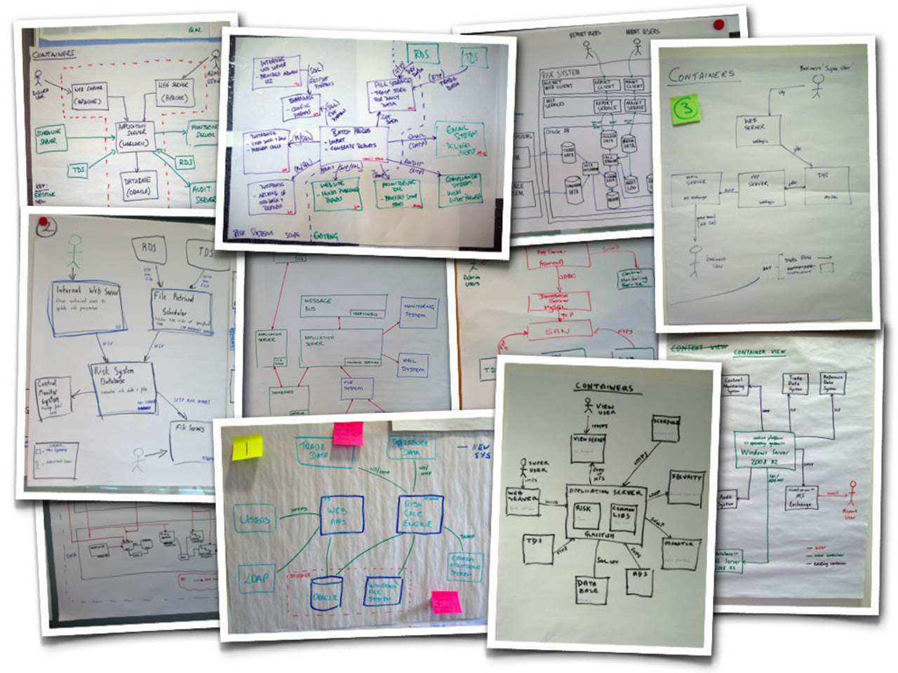
These example diagrams typify what I see when I initially work with software teams to help them better communicate software architectures visually. Oh, and don’t think that using Microsoft Visio will help! It often makes things worse because now people have the tool to struggle with too. I found the following images from a quick Google image search and they suffer from many of the same problems we’ve seen already. I’m sure you will have seen diagrams like this within organisations in the past. In my experience, centralised architecture teams love this sort of stuff.
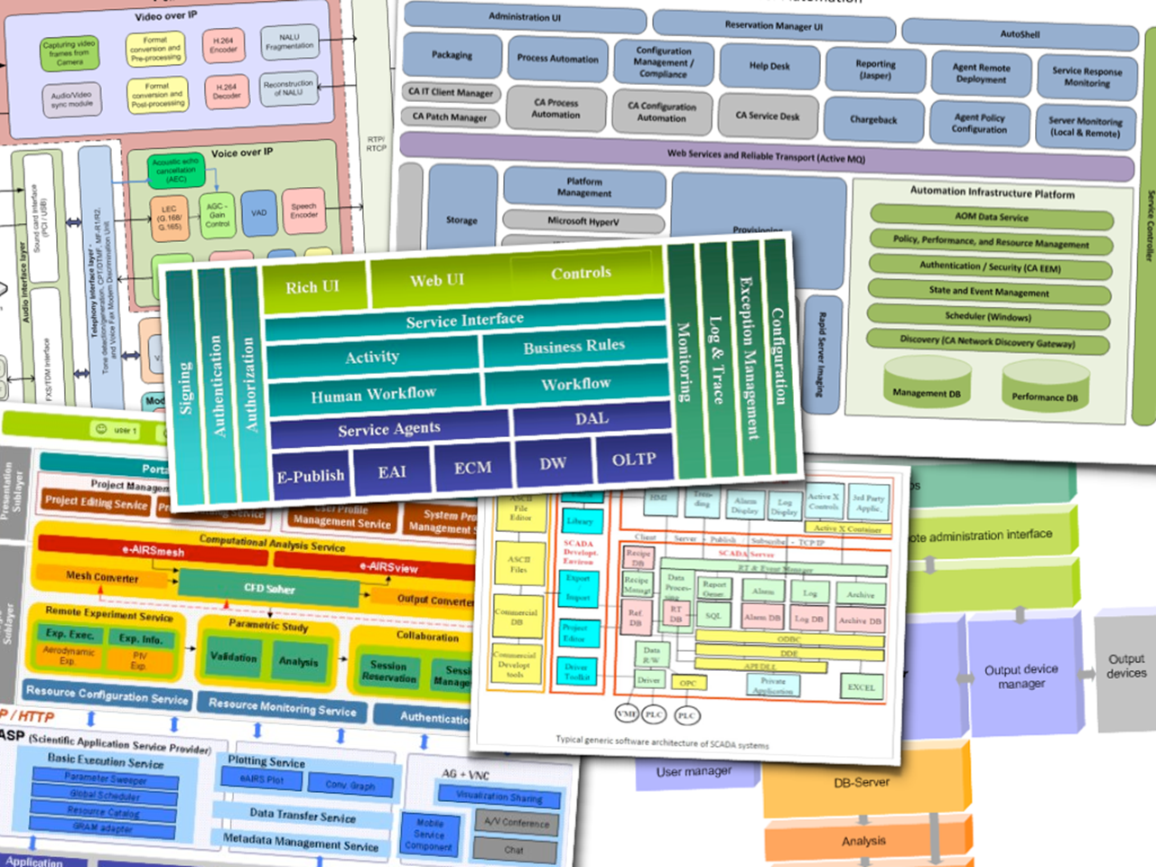
Some typical block diagrams from a Google Image search
Using UML would avoid many of these pitfalls but it’s not something that many people seem enthusiastic about learning these days. Simple and effective software architecture sketches are well within the reach of everybody though. All it takes is some simple advice and a common set of abstractions.
35 C4: context, containers, components and classes
The code for any software system is where most of the focus remains for the majority of the software development life cycle, and this makes sense because the code is the ultimate deliverable. But if you had to explain to somebody how that system worked, would you start with the code?
Unfortunately the code doesn’t tell the whole story and, in the absence of documentation, people will typically start drawing boxes and lines on a whiteboard or piece of paper to explain what the major building blocks are and how they are connected. When describing software through pictures, we have a tendency to create a single uber-diagram that includes as much detail as possible at every level of abstraction simultaneously. This may be because we’re anticipating questions or because we’re a little too focussed on the specifics of how the system works at a code level. Such diagrams are typically cluttered, complex and confusing. Picking up a tool such as Microsoft Visio, Rational Software Architect or Sparx Enterprise Architect usually adds to the complexity rather than making life easier.
A better approach is to create a number of diagrams at varying levels of abstraction. A number of simpler diagrams can describe software in a much more effective way than a single complex diagram that tries to describe everything.
A common set of abstractions
If software architecture is about the structure of a software system, it’s worth understanding what the major building blocks are and how they fit together at differing levels of abstraction.
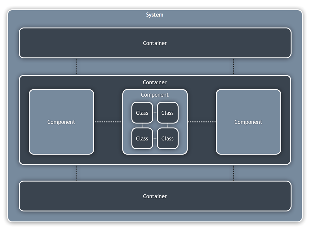
A simple model of architectural constructs
Assuming an OO programming language, the way that I like to think about structure is as follows … a software system is made up of a number of containers, which themselves are made up of a number of components, which in turn are implemented by one or more classes. It’s a simple hierarchy of logical building blocks that can be used to model most software systems.
· Classes: for most of us in an OO world, classes are the smallest building blocks of our software systems.
· Components: a component can be thought of as a logical grouping of one or more classes. For example, an audit component or an authentication service that is used by other components to determine whether access is permitted to a specific resource. Components are typically made up of a number of collaborating classes, all sitting behind a higher level contract.
· Containers: a container represents something in which components are executed or where data resides. This could be anything from a web or application server through to a rich client application or database. Containers are typically executables that are started as a part of the overall system, but they don’t have to be separate processes in their own right. For example, I treat each Java EE web application or .NET website as a separate container regardless of whether they are running in the same physical web server process. The key thing about understanding a software system from a containers perspective is that any inter-container communication is likely to require a remote interface such as a SOAP web service, RESTful interface, Java RMI, Microsoft WCF, messaging, etc.
· Systems: a system is the highest level of abstraction and represents something that delivers value to somebody. A system is made up of a number of separate containers. Examples include a financial risk management system, an Internet banking system, a website and so on.
It’s easy to see how we could take this further, by putting some very precise definitions behind each of the types of building block and by modelling the specifics of how they’re related. But I’m not sure that’s particularly useful because it would constrain and complicate what it is we’re trying to achieve here, which is to simply understand the structure of a software system and create a simple set of abstractions with which to describe it.
Summarising the static view of your software
With this set of abstractions in mind, I tend to draw the following types of diagrams when summarising the static view of my software:
1. Context: A high-level diagram that sets the scene; including key system dependencies and actors.
2. Container: A container diagram shows the high-level technology choices, how responsibilities are distributed across them and how the containers communicate.
3. Component: For each container, a component diagram lets you see the key logical components and their relationships.
4. Classes: This is an optional level of detail and I will draw a small number of high-level UML class diagrams if I want to explain how a particular pattern or component will be (or has been) implemented. The factors that prompt me to draw class diagrams for parts of the software system include the complexity of the software plus the size and experience of the team. Any UML diagrams that I do draw tend to be sketches rather than comprehensive models.
Common abstractions over a common notation
This simple sketching approach works for me and many of the software teams that I work with, but it’s about providing some organisational ideas and guidelines rather than creating a prescriptive standard. The goal here is to help teams communicate their software designs in an effective and efficient way rather than creating another comprehensive modelling notation.
UML provides both a common set of abstractions and a common notation to describe them, but I rarely find teams who use either effectively. I’d rather see teams able to discuss their software systems with a common set of abstractions in mind rather than struggling to understand what the various notational elements are trying to show. For me, a common set of abstractions is more important than a common notation.
Most maps are a great example of this principle in action. They all tend to show roads, rivers, lakes, forests, towns, churches, etc but they often use different notation in terms of colour-coding, line styles, iconography, etc. The key to understanding them is exactly that - a key/legend tucked away in a corner somewhere. We can do the same with our software architecture diagrams.
It’s worth reiterating that informal boxes and lines sketches provide flexibility at the expense of diagram consistency because you’re creating your own notation rather than using a standard like UML. My advice here is to be conscious of colour-coding, line style, shapes, etc and let a consistent notation evolve naturally within your team. Including a simple key/legend on each diagram to explain the notation will help. Oh, and if naming really is the hardest thing in software development, try to avoid a diagram that is simply a collection of labelled boxes. Annotating those boxes with responsibilities helps to avoid ambiguity while providing a nice “at a glance” view.
Diagrams should be simple and grounded in reality
There seems to be a common misconception that “architecture diagrams” must only present a high-level conceptual view of the world, so it’s not surprising that software developers often regard them as pointless. Software architecture diagrams should be grounded in reality, in the same way that the software architecture process should be about coding, coaching and collaboration rather than ivory towers. Including technology choices (or options) is a usually a step in the right direction and will help prevent diagrams looking like an ivory tower architecture where a bunch of conceptual components magically collaborate to form an end-to-end software system.
A single diagram can quickly become cluttered and confused, but a collection of simple diagrams allows you to effectively present the software from a number of different levels of abstraction. This means that illustrating your software can be a quick and easy task that requires little ongoing effort to keep those diagrams up to date. You never know, people might even understand them too.
36 Context diagram
A context diagram can be a useful starting point for diagramming and documenting a software system, allowing you to step back and look at the big picture.
Intent
A context diagram helps you to answer the following questions.
1. What is the software system that we are building (or have built)?
2. Who is using it?
3. How does it fit in with the existing IT environment?
Structure
Draw a simple block diagram showing your system as a box in the centre, surrounded by its users and the other systems that it interfaces with. For example, if you were diagramming a solution to the financial risk system, you would draw the following sort of diagram. Detail isn’t important here as it’s your wide angle view showing a big picture of the system landscape. The focus should be on people and systems rather than technologies and protocols.
Example context diagrams for the financial risk system (see appendix)
These example diagrams show the risk system sitting in the centre, surrounded by its users and the other IT systems that the risk system has a dependency on.
Users, actors, roles, personas, etc
These are the users of the system. There are two main types of user for the risk system:
· Business user (can view the risk reports that are generated)
· Admin user (can modify the parameters used in the risk calculation process)
IT systems
Depending on the environment and chosen solution, the other IT systems you might want to show on a context diagram for the risk system include:
· Trade Data System (the source of the financial trade data)
· Reference Data System (the source of the reference data)
· Central Monitoring System (where alerts are sent to)
· Active Directory or LDAP (for authenticating and authorising users)
· Microsoft SharePoint or another content/document management system (for distributing the reports)
· Microsoft Exchange (for sending e-mails to users)
Interactions
It’s useful to annotate the interactions (user <-> system, system <-> system, etc) with some information about the purpose rather than simply having a diagram with a collection of boxes and ambiguous lines connecting everything together. For example, when I’m annotating user to system interactions, I’ll often include a short bulleted list of the important use cases/user stories to summarise how that particular type of user interacts with the system.
Motivation
You might ask what the point of such a simple diagram is. Here’s why it’s useful:
· It makes the context explicit so that there are no assumptions.
· It shows what is being added (from a high-level) to an existing IT environment.
· It’s a high-level diagram that technical and non-technical people can use as a starting point for discussions.
· It provides a starting point for identifying who you potentially need to go and talk to as far as understanding inter-system interfaces is concerned.
A context diagram doesn’t show much detail but it does help to set the scene and is a starting point for other diagrams. Finally, a context diagram should only take a couple of minutes to draw, so there really is no excuse not to do it.
Audience
· Technical and non-technical people, inside and outside of the immediate software development team.
Example
Let’s look at an example. The techtribes.je website provides a way to find people, tribes (businesses, communities, interest groups, etc) and content related to the tech, IT and digital sector in Jersey and Guernsey, the two largest of the Channel Islands. At the most basic level, it’s a content aggregator for local tweets, news, blog posts, events, talks, jobs and more. Here’s a context diagram that provides a visual summary of this.
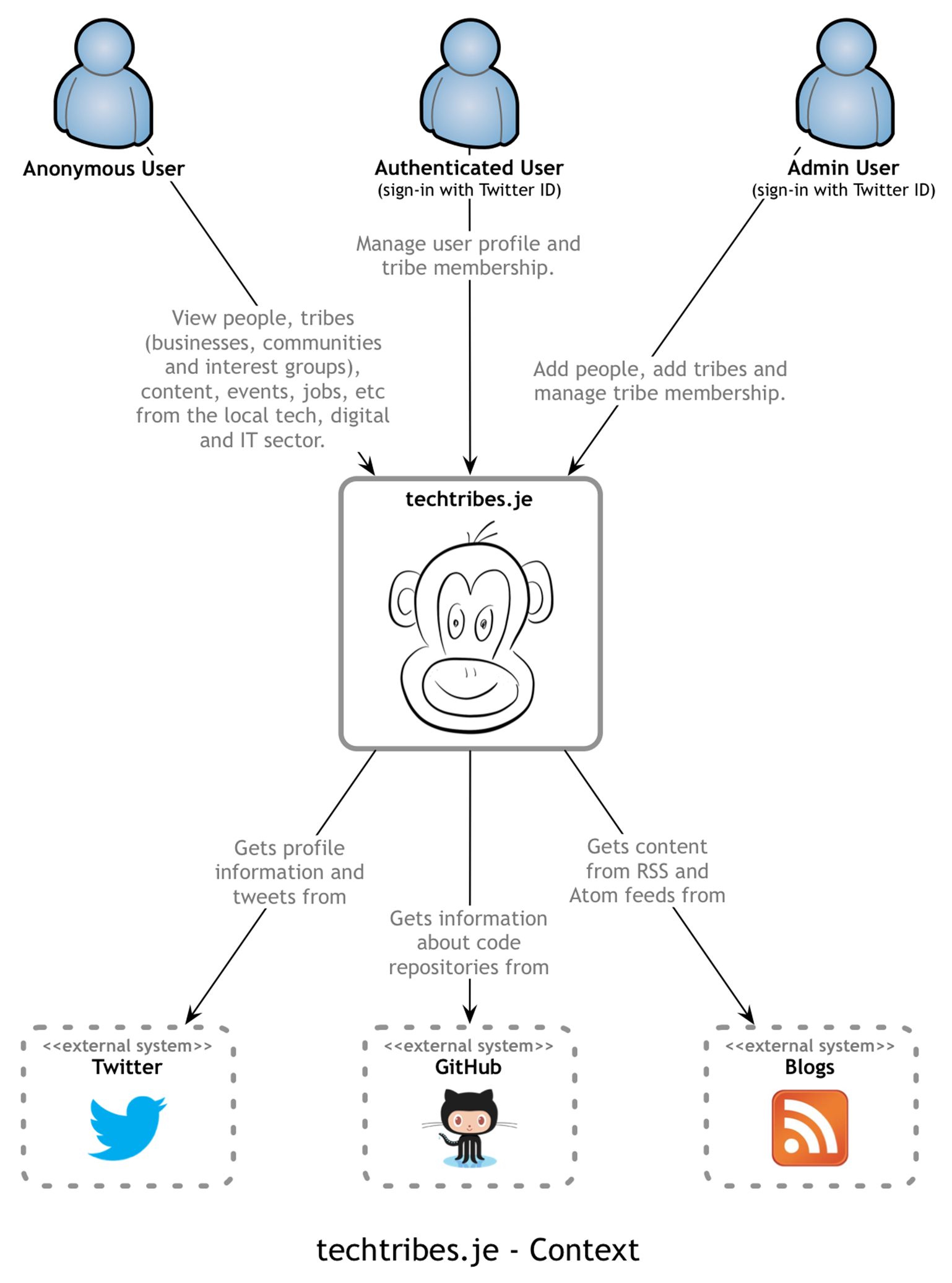
Again, detail isn’t important here as this is your zoomed out view. The focus should be on people (actors, roles, personas, etc) and software systems rather than technologies, protocols and other low-level details.
37 Container diagram
Once you understand how your system fits in to the overall IT environment with a context diagram, a really useful next step can be to illustrate the high-level technology choices with a container diagram.
Intent
A container diagram helps you answer the following questions.
1. What is the overall shape of the software system?
2. What are the high-level technology decisions?
3. How are responsibilities distributed across the system?
4. How do containers communicate with one another?
5. As a developer, where do I need to write code in order to implement features?
Structure
Draw a simple block diagram showing your key technology choices. For example, if you were diagramming a solution to the financial risk system, depending on your solution, you would draw the following sort of diagram.
Example container diagrams for the financial risk system (see appendix)
These example diagrams show the various web servers, application servers, standalone applications, databases, file systems, etc that make up the risk system. To enrich the diagram, often it’s useful to include some of the concepts from the context diagram diagram, such as users and the other IT systems that the risk system has a dependency on.
Containers
By “containers”, I mean the logical executables or processes that make up your software system; such as:
· Web servers1 (e.g. Apache HTTP Server, Apache Tomcat, Microsoft IIS, WEBrick, etc)
· Application servers (e.g. IBM WebSphere, BEA/Oracle WebLogic, JBoss AS, etc)
· Enterprise service buses and business process orchestration engines (e.g. Oracle Fusion middleware, etc)
· SQL databases (e.g. Oracle, Sybase, Microsoft SQL Server, MySQL, PostgreSQL, etc)
· NoSQL databases (e.g. MongoDB, CouchDB, RavenDB, Redis, Neo4j, etc)
· Other storage systems (e.g. Amazon S3, etc)
· File systems (especially if you are reading/writing data outside of a database)
· Windows services
· Standalone/console applications (i.e. “public static void main” style applications)
· Web browsers and plugins
· cron and other scheduled job containers
For each container drawn on the diagram, you could specify:
· Name: The logical name of the container (e.g. “Internet-facing web server”, “Database”, etc)
· Technology: The technology choice for the container (e.g. Apache Tomcat 7, Oracle 11g, etc)
· Responsibilities: A very high-level statement or list of the container’s responsibilities. You could alternatively show a small diagram of the key components that reside in each container, but I find that this usually clutters the diagram.
If you’re struggling to understand whether to include a box on a containers diagram, simply ask yourself whether that box will be (or can be) deployed on a separate piece of physical or virtual hardware. Everything that you show on a containers diagram should be deployable separately. This doesn’t mean that you must deploy them on separate infrastructure, but they should be able to be deployed separately.
Interactions
Typically, inter-container communication is inter-process communication. It’s very useful to explicitly identify this and summarise how these interfaces will work. As with any diagram, it’s useful to annotate the interactions rather than simply having a diagram with a collection of boxes and ambiguous lines connecting everything together. Useful information to add includes:
· The purpose of the interaction (e.g. “reads/writes data from”, “sends reports to”, etc).
· Communication method (e.g. Web Services, REST, Java Remote Method Invocation, Windows Communication Foundation, Java Message Service).
· Communication style (e.g. synchronous, asynchronous, batched, two-phase commit, etc)
· Protocols and port numbers (e.g. HTTP, HTTPS, SOAP/HTTP, SMTP, FTP, RMI/IIOP, etc).
System boundary
If you do choose to include users and IT systems that are outside the scope of what you’re building, it can be a good idea to draw a box around the appropriate containers to explicitly demarcate the system boundary. The system boundary corresponds to the single box that would appear on acontext diagram (e.g. “Risk System”).
Motivation
Where a context diagram shows your software system as a single box, a container diagram opens this box up to show what’s inside it. This is useful because:
· It makes the high-level technology choices explicit.
· It shows where there are relationships between containers and how they communicate.
· It provides a framework in which to place components (i.e. so that all components have a home).
· It provides the often missing link between a very high-level context diagram and (what is usually) a very cluttered component diagram showing all of the logical components that make up the entire software system.
As with a context diagram, this should only take a couple of minutes to draw, so there really is no excuse not to do it either.
Audience
· Technical people inside and outside of the immediate software development team; including everybody from software developers through to operational and support staff.
Example
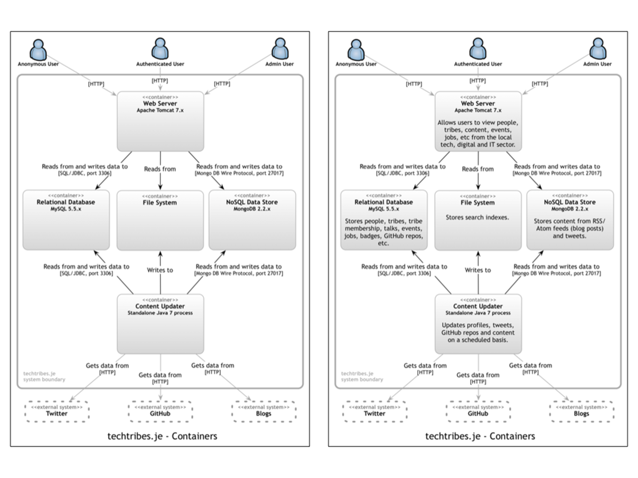
The following diagram shows the logical containers that make up the techtribes.je website.
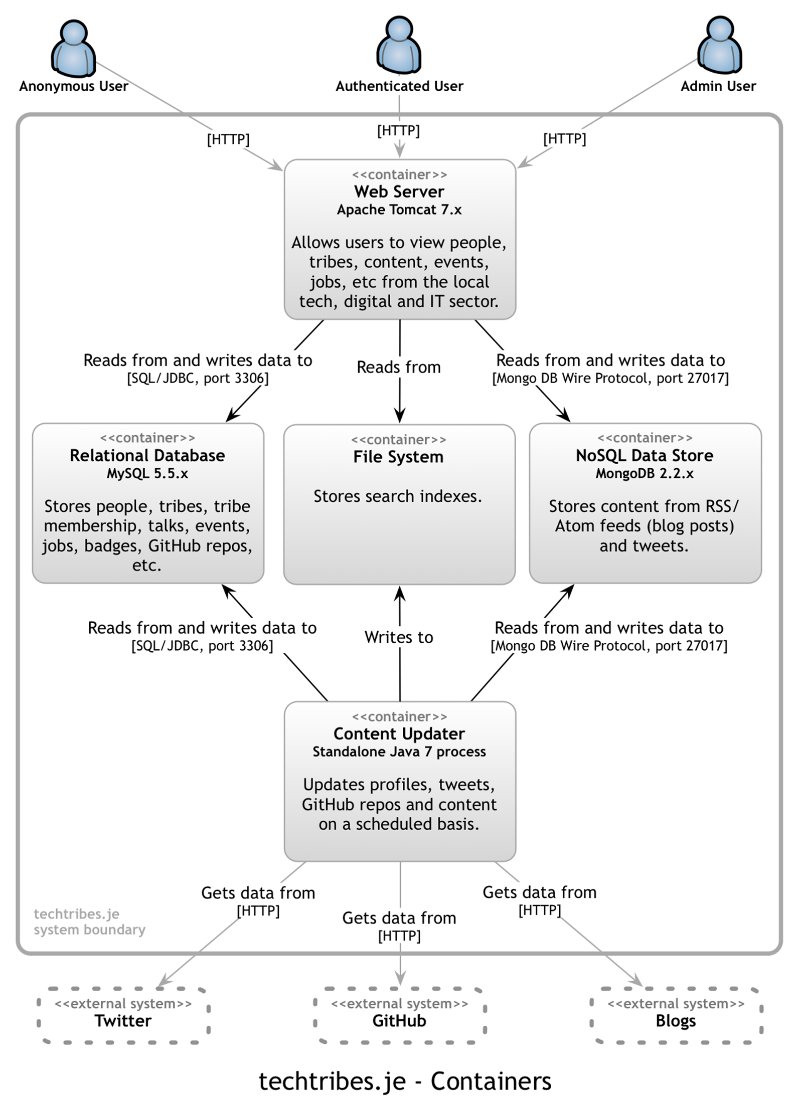
Put simply, techtribes.je is made up of an Apache Tomcat web server that provides users with information, and that information is kept up to date by a standalone content updater process. All data is stored either in a MySQL database, a MongoDB database or the file system. It’s worth pointing out that this diagram says nothing about the number of physical instances of each container. For example, there could be a farm of web servers running against a MongoDB cluster, but this diagram doesn’t show that level of information. Instead, I show physical instances, failover, clustering, etc on a separate deployment diagram. The containers diagram shows the high-level shape of the software architecture and how responsibilities are distributed across it. It also shows the major technology choices and how the containers communicate with one another. It’s a simple, high-level technology focussed diagram that is useful for software developers and support/operations staff alike.
38 Component diagram
Following on from a container diagram showing the high-level technology decisions, I’ll then start to zoom in and decompose each container further. However you decompose your system is up to you, but I tend to identify the major logical components and their interactions. This is about partitioning the functionality implemented by a software system into a number of distinct components, services, subsystems, layers, workflows, etc. If you’re following a “pure Object Oriented” or Domain-Driven Design approach, then this may or may not work for you.
Intent
A component diagram helps you answer the following questions.
1. What components/services is the system made up of?
2. It is clear how the system works at a high-level?
3. Do all components/services have a home (i.e. reside in a container)?
Structure
Whenever people are asked to draw “architecture diagrams”, they usually end up drawing diagrams that show the logical components that make up their software system. That is basically what this diagram is about, except we only want to see the components that reside within a singlecontainer at a time. Here are some examples of component diagrams if you were designing a solution to the financial risk system.
Example component diagrams for the financial risk system (see appendix)
Whenever I draw a component diagram, it typically only shows the components that reside within a single container. This is by no means a rule though and, for small software systems, often you can show all of the components across all of the containers on a single diagram. If that diagram starts to become too cluttered, maybe it’s time to break it apart.
Components
If you were designing a solution to the financial risk system, you might include components like:
· Trade data system importer
· Reference data system importer
· Risk calculator
· Authentication service
· System driver/orchestrator
· Audit component
· Notification component (e.g. e-mail)
· Monitoring service
· etc
These components are the coarse-grained building blocks of your system and you should be able to understand how a use case/user story/feature can be implemented across one or more of these components. If you can do this, then you’ve most likely captured everything. If, for example, you have a requirement to audit system access but you don’t have an audit component or responsibilities, then perhaps you’ve missed something.
For each of the components drawn on the diagram, you could specify:
· Name: The name of the component (e.g. “Risk calculator”, “Audit component”, etc).
· Technology: The technology choice for the component (e.g. Plain Old [Java|C#|Ruby|etc] Object, Enterprise JavaBean, Windows Communication Foundation service, etc).
· Responsibilities: A very high-level statement of the component’s responsibilities (e.g. either important operation names or a brief sentence describing the responsibilities).
Interactions
To reiterate the same advice given for other types of diagram, it’s useful to annotate the interactions between components rather than simply having a diagram with a collection of boxes and ambiguous lines connecting them all together. Useful information to add the diagram includes:
· The purpose of the interaction (e.g. “uses”, “persists trade data through”, etc)
· Communication style (e.g. synchronous, asynchronous, batched, two-phase commit, etc)
Motivation
Decomposing your software system into a number of components is software design at a slightly higher level of abstraction than classes and the code itself. An audit component might be implemented using a single class backing onto a logging framework (e.g. log4j, log4net, etc) but treating it as a distinct component lets you also see it for what it is, which is a key building block of your architecture. Working at this level is an excellent way to understand how your system will be internally structured, where reuse opportunities can be realised, where you have dependencies between components, where you have dependencies between components and containers, and so on. Breaking down the overall problem into a number of separate parts also provides you with a basis to get started with some high-level estimation, which is great if you’ve ever been asked for ballpark estimates for a new project.
A component diagram shows the logical components that reside inside each of the containers. This is useful because:
· It shows the high-level decomposition of your software system into components with distinct responsibilities.
· It shows where there are relationships and dependencies between components.
· It provides a framework for high-level software development estimates and how the delivery can be broken down.
Designing a software system at this level of abstraction is something that can be done in a number of hours or days rather than weeks or months. It also sets you up for designing/coding at the class and interface level without worrying about the overall high-level structure.
Audience
· Technical people within the software development team.
Example
As illustrated by the container diagram, techtribes.je includes a standalone process that pulls in content from Twitter, GitHub and blogs. The following diagram shows the high-level internal structure of the content updater in terms of components.
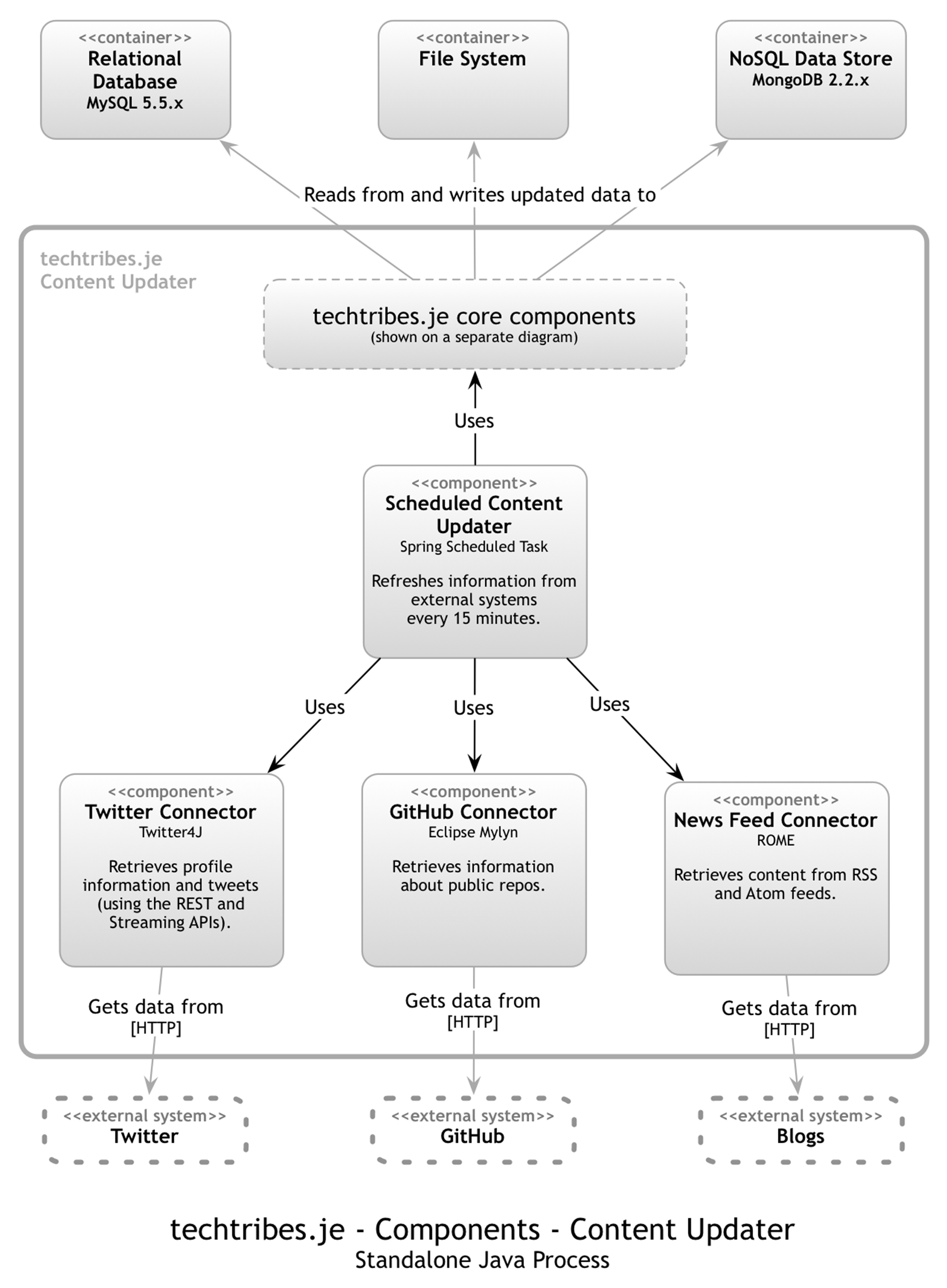
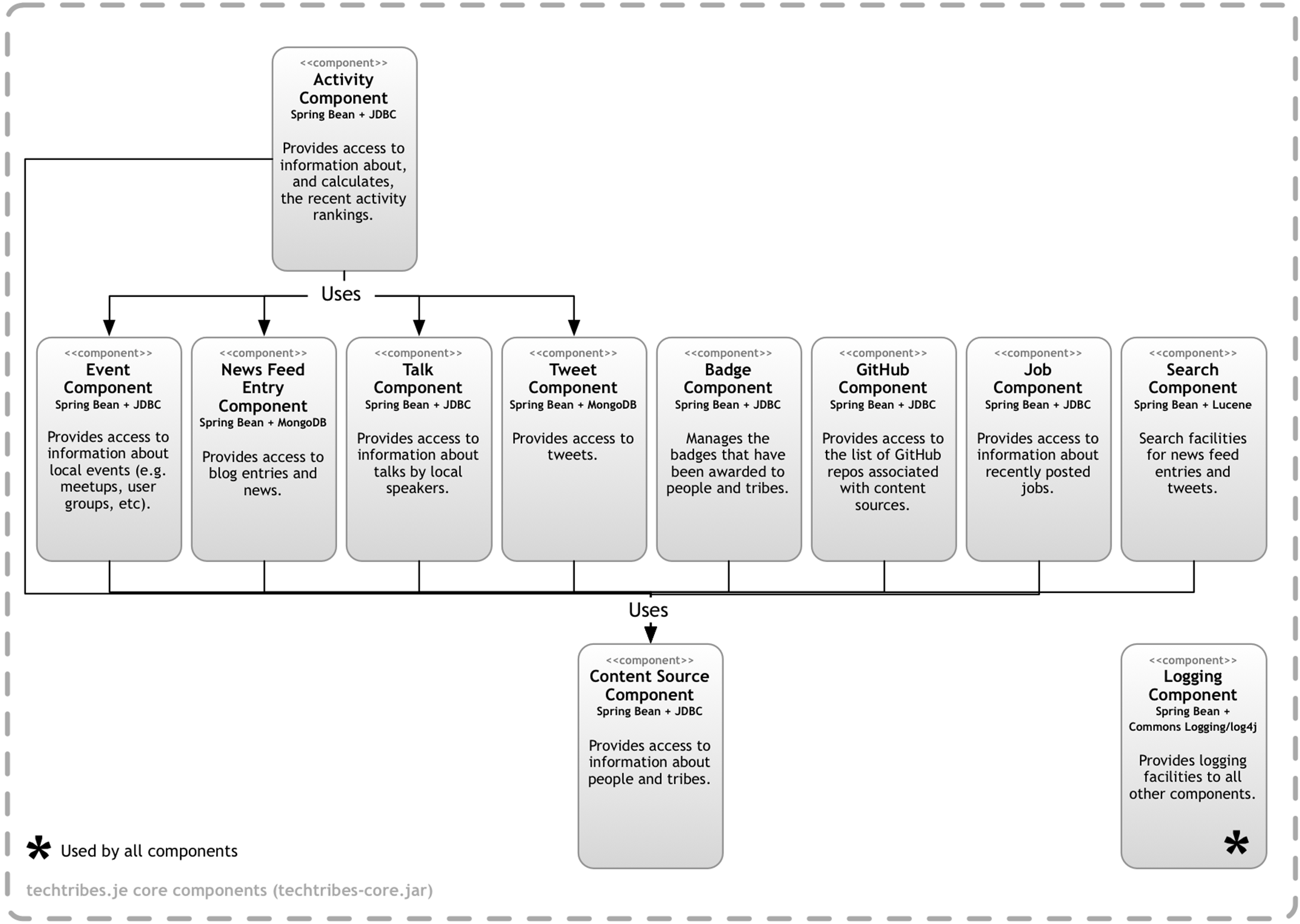
In addition to a number of core components (shown next), the content updater is made up of four components: a Scheduled Content Updater, a Twitter Connector, a GitHub Connector and a News Feed Connector. This diagram shows how the content updater is divided into components, what each of those components are, their responsibilities and the technology/implementation details. And here are the core components.
39 Technology choices included or omitted?
Think back to the last software architecture diagram that you saw. What did it look like? What level of detail did it show? Were technology choices included or omitted? In my experience, the majority of architecture diagrams omit any information about technology, instead focussing on illustrating the functional decomposition and major conceptual elements. Why is this?
Drawing diagrams during the design process
One of the main reasons for drawing software architecture diagrams is to communicate ideas during the process of designing software, much like you’d see blueprints drawn-up during the early stages of a building project.
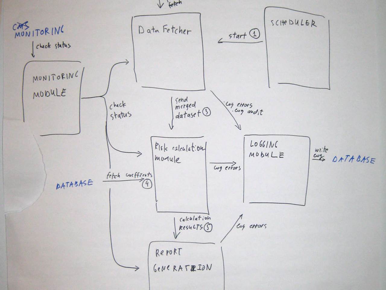
I regularly run training classes where I ask small groups of people to design a simple financial risk system and here’s a photo of an architecture diagram produced during one of those classes. Solution aside, the diagram itself is fairly typical of what I see. It shows a conceptual design rather than technical details.
Asking people why their diagrams don’t show any technology decisions results in a number of different responses:
· “the [financial risk system] solution is simple and can be built with any technology”.
· “we don’t want to force a solution on developers”.
· “it’s an implementation detail”.
· “we follow the ‘last responsible moment’ principle”.
Drawing diagrams retrospectively
If you’re drawing software architecture diagrams retrospectively, for documentation after the software has been built, there’s really no reason for omitting technology decisions. However, others don’t necessarily share this view and I often hear the following comments:
· “the technology decisions will clutter the diagrams”.
· “but everybody knows that we only use ASP.NET against an Oracle database”.
Architecture diagrams should be “conceptual”
It seems that regardless of whether diagrams are being drawn before, during or after the software has been built, there’s a common misconception that architecture diagrams should be conceptual in nature.
One of the reasons that software architecture has a bad reputation is because of the stereotype of ivory tower architects drawing very high-level pictures to describe their grandiose visions. I’m sure you’ve seen examples of diagrams with a big box labelled “Enterprise Service Bus” connected to a cloud, or perhaps diagrams showing a functional decomposition with absolutely no consideration as to whether the vision is implementable. If you truly do believe that software architecture diagrams should be fluffy and conceptual in nature, my advice is to hire people that don’t know about technology. That should do the trick.
Back to the real world, I like to see software architecture have a grounding in reality and technology choice shouldn’t be an implementation detail. One way to ensure that technology is considered is to simply show the technology choices by including them on software architecture diagrams.
Make technology choices explicit
Including technology choices on software architecture diagrams removes ambiguity, even if you’re working in an environment where all software is built using a standard set of technologies and patterns. Imagine that you’re designing a software system. Are you really doing this without thinking about how you’re actually going to implement it? Are you really thinking in terms of conceptual boxes and functional decomposition? If the answer to these questions is “not really”, then why not add this additional layer of information onto the diagrams. Doing so provides a better starting point for conversations, particularly if you have a choice of technologies to use. Forcing people to include technology choices on their software architecture diagrams also tends to lead to much richer and deeper conversations that are grounded in the real-world. A fluffy conceptual diagram tends to make a lot of assumptions, but factoring in technology forces the following types of questions to be asked:
· “how does this component communicate with that component if it’s running in separate process?”
· “how does this component get initiated, and where does that responsibility sit?”
· “why does this process need to communicate with that process?”
· “why is this component going to be implemented in technology X rather than technology Y”
· etc
As for technology decisions cluttering the diagrams, there are a number of strategies for dealing with this concern, including the use of a container diagram to separately show the major technology decisions.
Technology choices can help bring an otherwise ideal and conceptual software design back down to earth so that it is grounded in reality once again, while communicating the entirety of the big picture rather than just a part of it. Oh, and of course, the other side effect of adding technology choices to diagrams, particularly during the software design process, is that it helps to ensure the right people are drawing them.
40 Would you code it that way?
It’s a common misconception that software architecture diagrams need to be stuck in the clouds, showing high-level concepts and abstractions that present the logical rather than the physical. But it doesn’t have to be this way and bringing them back down to earth often makes diagrams easier to explain and understand. It can also make diagrams easier to draw too.
To illustrate why thinking about the implementation can help the diagramming process, here are a couple of scenarios that I regularly hear in my training classes.
Shared components
Imagine that you’re designing a 3-tier software system that makes use of a web server, an application server and a database. While thinking about the high-level components that reside in each of these containers, it’s not uncommon to hear a conversation like this:
· Attendee: “Should we draw the logging component outside of the web server and the application server, since it’s used by both?”
· Me: “Would you code it that way? Will the logging component be running outside of both the web server and application server? For example, will it really be a separate standalone process?”
· Attendee: “Well … no, it would probably be a shared component in a [JAR file|DLL|etc] that we would deploy to both servers.”
· Me: “Great, then let’s draw it like that too. Include the logging component inside of each server and label it as a shared component with an annotation, stereotype or symbol.”
If you’re going to implement something like a shared logging component that will be deployed to a number of different servers, make sure that your diagram reflects this rather than potentially confusing people by including something that might be mistaken for a separate centralised logging server. If in doubt, always ask yourself how you would code it.
Layering strategies
Imagine you’re designing a web application that is internally split up into a UI layer, a services layer and a data access layer.
· Attendee: “Should we show that all communication to the database from the UI goes through the services layer?”
· Me: “Is that how you’re going to implement it? Or will the UI access the database directly?”
· Attendee: “We were thinking of perhaps adopting the CQRS pattern, so the UI could bypass the services layer and use the data access layer directly.”
· Me: “In that case, draw the diagram as you’ve just explained, with lines from the UI to both the services and data access layers. Annotate the lines to indicate the intent and rationale.”
Again, the simple way to answer this type of question is to understand how you would code it.
Diagrams should reflect reality
If you’re drawing diagrams to retrospectively communicate a software system then the question becomes “is that how we coded it?”. The principle is the same though. Diagrams should present abstractions that reflect reality rather than provide conceptual representations that don’t exist. You should be able to see how the diagram elements are reflected in the codebase and vice versa. If you can understand how you would code it, you can understand how to visualise it.
41 Software architecture vs code
Although many software teams find it tricky to visualise the software architecture of their software systems, let’s assume that this isn’t the case and that you’re sketching some ideas related to the software architecture for a new system you’ve been tasked to build. An important aspect of just enough software architecture is to understand how the significant elements of a software system fit together.
Responsibility-driven design and decomposition into components
For me, this means going down to the level of components, services or modules that each have a specific set of responsibilities. It’s worth stressing this isn’t about understanding low-level implementation details, it’s about performing an initial level of decomposition. The Wikipedia page forComponent-based development has a good summary and a “component” might be something like a risk calculator, audit logger, report generator, data importer, etc. The simplest way to think about a component is that it’s a set of related behaviours behind an interface, which may be implemented using one or more collaborating classes (assuming an OO language, of course). Good components share a number of characteristics with good classes. They should have high cohesion, low coupling, a well-defined public interface, good encapsulation, etc.
There are a number of benefits to thinking about a software system in terms of components, but essentially it allows us to think and talk about the software as a small number of high-level abstractions rather than the hundreds and thousands of individual classes that make up most enterprise systems. The photo below shows a typical component diagram produced during the training classes we run. Groups are asked to design a simple financial risk system that needs to pull in some data, perform some calculations and generate an Excel report as the output.
We often think in terms of components
This sketch includes the major components you would expect to see for a system that is importing data, performing risk calculations and generating a report. These components provide us with a framework for partitioning the behaviour within the boundary of our system and it should be relatively easy to trace the major use cases/user stories across them. This is a really useful starting point for the software development process and can help to create a shared vision that the team can work towards.
But it’s also very dangerous at the same time. Without technology choices (or options), this diagram looks like the sort of thing an ivory tower architect might produce and it can seem very “conceptual” (or “fluffy”, depending on your point of view) for many people with a technical background.
We talk about components but write classes
People generally understand the benefit of thinking about software as a small number of high-level building blocks. After all, it’s a great way to partition responsibilities across a software system and you’ll often hear people talking in terms of components when they’re having architecture discussions. This is what component-based development is all about and although many people talk about their software systems in terms of components, that structure isn’t usually reflected in the code. This is one of the reasons why there is a disconnect between software architecture and coding as disciplines - the architecture diagrams on the wall say one thing, but the code says another.
When you open up a codebase, it will often reflect some other structure due to the organisation of the code. The mapping between the architectural view of a software system and the code are often very different. This is sometimes why you’ll see people ignore architecture diagrams (or documentation) and say “the code is the only single point of truth”. George Fairbanks calls this the “Model-code gap” in his book called Just Enough Software Architecture. The organisation of the codebase can really help or hinder architectural understanding.
Packaging code by layer
Many software teams structure their code by layer. In other words, if you open up a codebase, you’ll see a package for domain classes, one for UI stuff, one for “business services”, one for data access, another for integration points and so on. I’m using the Java terminology of a “package” here, but the same is applicable to namespaces in C#, etc.
The reason for this is very simple. We know that architectural layering is generally “a good thing” and many of the tutorials out there teach this packaging style as a way to structure code. If you do a Google search for tutorials related to Spring or ASP.NET MVC, for example, you’ll see this in the sample code. I spent most of my career building software systems in Java and I too used the same packaging approach for the majority of the projects that I worked on.
Although there’s nothing particularly wrong with packaging code in this way, this code structure never quite reflects the abstractions that we think about when we view the system from an architecture perspective. If you’re using an OO programming language, do you talk about “objects” when you’re having architecture discussions? In my experience, the answer is no. I typically hear people referring to concepts like components and services instead. The result is that a “component” on an architecture diagram is actually implemented by a combination of classes across a number of different layers. For example, you may find part of the component in a “services” package and the rest of the component inside the “data access” package.
Packaging by layer
In order to make this possible, the code in the lower layers (e.g. that “data access” package) often has public visibility, which means that it can be called directly from any other layer in the architecture too.
Packaging by feature
Packaging by layer isn’t the only answer though and Mark Needham has a great blog post called Coding: Packaging by vertical slice that talks about another approach to code organisation based upon vertical slices of functionality. A Google search for “package by feature vs package by layer” will throw up lots of other discussions on the same topic.
Packaging by component
Organising a codebase by layer makes it easy to see the overall structure of the software but there are trade-offs. For example, you need to delve inside multiple layers (e.g. packages, namespaces, etc) in order to make a change to a feature or user story. Also, many codebases end up looking eerily similar given the fairly standard approach to layering within enterprise systems.
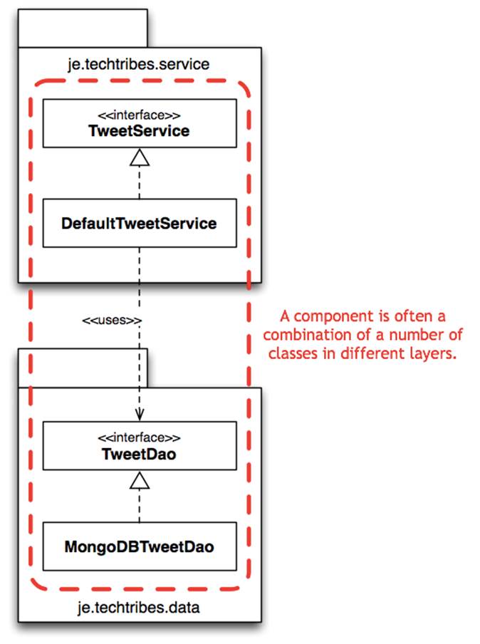
In Screaming Architecture, Uncle Bob Martin says that if you’re looking at a codebase, it should scream something about the business domain. Organising your code by feature rather than by layer gives you this, but again there are trade-offs. A slight variation I like is organising code explicitly by component. For example, if you take a look at the je.techtribes.component.tweet package on GitHub, you’ll see that it looks something like this.
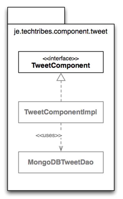
Packaging by component
This is similar to packaging by feature, but it’s more akin to the “micro services” that Mark Needham talks about in his blog post. Each sub-package of je.techtribes.component houses a separate component, complete with it’s own internal layering and configuration. As far as possible, all of the internals are package scoped. You could potentially pull each component out and put it in it’s own project or source code repository to be versioned separately. This approach will likely seem familiar to you if you’re building something that has a very explicit loosely coupled architecture such as a distributed messaging system made up of loosely coupled components.
I’m fairly confident that most people are still building something more monolithic in nature though, despite thinking about their system in terms of components. I’ve certainly packaged parts of monolithic codebases using a similar approach in the past but it’s tended to be fairly ad hoc. Let’s be honest, organising code into packages isn’t something that gets a lot of brain-time, particularly given the refactoring tools that we have at our disposal. Organising code by component lets you explicitly reflect the concept of “a component” from the architecture into the codebase. If your software architecture diagram screams something about your business domain (and it should), this will be reflected in your codebase too.
Aligning software architecture and code
Software architecture and coding are often seen as mutually exclusive disciplines and there’s often very little mapping from the architecture into the code and back again. Effectively and efficiently visualising a software architecture can help to create a good shared vision within the team, which can help it go faster. Having a simple and explicit mapping from the architecture to the code can help even further, particularly when you start looking at collaborative design and collective code ownership. Furthermore, it helps bring software architecture firmly back into the domain of the development team, which is ultimately where it belongs. Don’t forget though, the style of architecture you’re using needs to be reflected on your software architecture diagrams; whether that’s layers, components, micro-services or something else entirely.
Designing a software system based around components isn’t “the one true way” but if you are building monolithic software systems and think of them as being made up of a number of smaller components, ensure that your codebase reflects this. Consider organising your code by component (rather than by layer or feature) to make the mapping between software architecture and code explicit. If it’s hard to explain the structure of your software system, change it.
42 You don’t need a UML tool
When tasked with the job of designing a new software system, one of the first questions some people ask relates to the tooling that they should use. Such discussions usually focus around the Unified Modelling Language (UML) and whether their organisation has any licenses for some of the more well-known UML tools.
There are many types of UML tool
Unfortunately this isn’t an easy question to answer because there are lots of commercial and open source tools that can help you to do software architecture and design, all tending to approach the problem from a different perspective. At a high-level, they can be categorised as follows.
1. Diagrams only: There are many standalone UML tools and plug-ins for major IDEs that let you sketch simple UML diagrams. These are really useful if you want to be in control of your diagrams and what they portray but it’s easy for such diagrams to get out of date with reality over time. Microsoft Visio or OmniGraffle with UML templates installed are good starting points if you have access to them.
2. Reverse engineering: There are standalone UML tools and IDE plug-ins that allow you to create UML diagrams from code. This is great because you can quickly get the code and diagrams in sync, but often these diagrams become cluttered quickly because they typically include all of the detail (e.g. every property, method and relationship) by default.
3. Round-trip engineering: Many reverse engineering tools also allow you to do round-trip engineering, where changes made to the model are reflected in the code and vice versa. Again, this helps keeps code and diagrams in sync.
4. Model-driven: There are a few model-driven architecture (MDA) tools that let you drive the implementation of a software system from the model itself, usually by annotating the diagrams with desired characteristics and behaviours using languages such as Executable UML (xUML) or Object Constraint Language (OCL). These tools can offer a full end-to-end solution but you do need to follow a different and often rigid development process in order to benefit from them.
The simplest thing that could possibly work
Even this short summary of the categories of tools available makes for an overwhelming number of options. Rational Software Architect? Visio? PowerPoint? OmniGraffle? WebSequenceDiagrams.com? Which do you pick?!
The thing is though, you don’t need a UML tool in order to architect and design software. I’ve conducted a number of informal polls during my conference talks over the past few years and only 10-20% of the audience said that they regularly used UML in their day to day work. Often a blank sheet of paper, flip chart or whiteboard together with a set of sticky notes or index cards is all you need, particularly when you have a group of people who want to undertake the design process in a collaborative way. Have you ever tried to get three or four people collaborating around a laptop screen?
Agile methods have been using this low-tech approach for capturing user stories, story walls and Kanban boards for a while now. In many cases, it’s the simplest thing that could possibly work but nothing beats the pure visibility of having lots of stuff stuck to a whiteboard in the middle of your office. Unlike a Microsoft Project plan, nobody can resist walking past and having a look at all those sticky notes still in the “To do” column.
From a software design perspective, using a similarly low-tech approach frees you from worrying about the complexities of using the tooling and bending formal notation, instead letting you focus on the creative task of designing software. Simply start by sketching out the big picture and work down to lower levels of detail where necessary. Just remember that you need to explicitly think about things like traceability between levels of abstraction, conventions and consistency if you don’t use a tool. For example, UML arrows have meaning and without a key it might not be obvious whether your freehand arrows are pointing towards dependencies or showing the direction that data flows. You can always record your designs in a more formal way using a UML tool later if you need to do so.
Uses for UML
The main reason for using informal boxes and lines diagrams over UML to visualise software architecture is that, in my opinion, UML isn’t often a good fit for what I want to communicate. The information presented on my context, container and component diagrams can be achieved with a mix of use case, component and deployment diagrams but I personally don’t find that the resulting diagrams are as easy to interpret given the notation. My C4 approach for visualising software architectures might not make use of UML then, but I still do use it on the software projects that I work on.
The tools surrounding UML allow it to be used in a number of ways, including fully fledged comprehensive models with their associated repositories through to diagrams that are reverse engineered from existing code. UML can also be used as a simple diagramming notation, either sketched on a whiteboard or within tools such as Microsoft Visio or OmniGraffle that have installable UML templates. Here’s a summary of what I use UML for:
· Processes and workflows: If I’m building software that automates a process or is very workflow based, I’ll often draw a simple UML activity diagram to represent it. UML activity diagrams seem to be ignored by many people but I find that the simple flow chart style of notation works well for a broad range of audiences.
· Runtime behaviour: My C4 approach is really only focussed on visualising the static structure of a software system, but often it’s useful to present the system from a runtime perspective. UML sequence and collaboration diagrams are usually used to show how a number of classes collaborate at runtime to implement a particular user story, use case, feature, etc. These diagrams are still very useful even if you’re not doing design down to the class level. Instead of showing a collection of collaborating classes, you can show collaborating containers or components instead.
· Domain model: I’ll use a UML class diagram if I want to visualise a domain model, with the resulting diagrams typically only showing the most important attributes and relationships. I usually hide the method compartment of all classes on such diagrams.
· Patterns and principles: I’ll often need to explain how patterns or principles are implemented within the codebase (e.g. in the Code section of a software guidebook), and a UML class diagram is the obvious way to do this. My advice here is keep the diagram simple and don’t feel pressured into showing every last tiny piece of detail.
· State charts: UML state diagrams are a great way to visualise a state machine and the notation is fairly straightforward. Again, I find that people tend to forget UML state diagrams exist.
· Deployment: A UML deployment diagram can be a useful way to show how your containers or components are deployed. Often such a diagram is better presented as an informal boxes and lines diagram, but the option is there.
There is no silver bullet
Forget expensive tools. More often than not; a blank sheet of paper, flip chart or whiteboard is all you need, particularly when you have a group of people that want to undertake the design process in a collaborative way. Unfortunately there’s no silver bullet when it comes to design tools though because everybody and every organisation works in a different way. Once you’re confident that you understand how to approach software architecture and design, only then is it time to start looking at software tools to help improve the design process.
The use of UML doesn’t need to be an “adopt all or nothing” choice. A few well placed UML diagrams can really help you to present the more complex and detailed elements of a software system. If you’re unfamiliar with UML, perhaps now is a good opportunity to make yourself aware of the various diagrams that are available. You don’t need UML tools to do architecture and design, but they do have their uses. You don’t need to use every type of diagram though!
43 Effective sketches
The Unified Modelling Language (UML) is a formal, standardised notation for communicating the design of software systems although many people favour boxes and lines style sketches instead. There’s absolutely nothing wrong with this but you do trade-off diagram consistency for flexibility. The result is that many of these informal sketches use diagramming elements inconsistently and often need a narrative to accompany them.
If you are going to use “NoUML” diagrams (i.e. anything that isn’t UML), here are some things to think about, both when you’re drawing sketches on a whiteboard and if you decide to formalise them in something like Microsoft Visio afterwards.
Titles
The first thing that can really help people to understand a diagram is including a title. If you’re using UML, the diagram elements will provide some information as to what the context of the diagram is, but that doesn’t really help if you have a collection of diagrams that are all just boxes and lines. Try to make the titles short and meaningful. If the diagrams should be read in a specific order, make sure this is clear by numbering them.
Labels
You’re likely to have a number of labels on your diagrams; including names of software systems, components, etc. Where possible, avoid using acronyms and if you do need to use acronyms for brevity, ensure that they are documented in a project glossary or with a key somewhere on the diagram. While the regular project team members might have an intimate understanding of common project acronyms, people outside or new to the project probably won’t.
The exceptions here are acronyms used to describe technology choices, particularly if they are used widely across the industry. Examples include things like JMS (Java Message Service), POJO (plain old Java object) and WCF (Windows Communication Foundation). Let your specific context guide whether you need to explain these acronyms and if in doubt, play it safe and use the full name or include a key.
Shapes
Most boxes and lines style sketches that I’ve seen aren’t just boxes and lines, with teams using a variety of shapes to represent elements within their software architecture. For example, you’ll often see cylinders on a diagram and many people will interpret them to be a database of some description. Make sure that you include an explanation to confirm whether this is the case or not.
Responsibilities
If naming is one of the hardest things in software development, resist the temptation to have a diagram full of boxes that only contain names. A really simple way to add an additional layer of information to, and remove any ambiguity from, an architecture diagram is to annotate things like systems and components with a very short statement of what their responsibilities are. A bulleted list (7 ± 2 items) or a short sentence work well. Provided it’s kept short (and using a smaller font for this information can help too), adding responsibilities onto diagrams can help provide a really useful “at a glance” view of what the software system does and how it’s been structured. Take a look at the following diagrams - which do you prefer?
Adding responsibilities to diagram elements can remove ambiguity
Lines
Lines are an important part of most architecture sketches, acting as the glue that holds all of the boxes (systems, containers, components, etc) together. The big problem with lines is exactly this though, they tend to be thought of as the things that hold the other, more significant elements of the diagram together and don’t get much focus themselves. Whenever you’re drawing lines on sketches, ensure you use them consistently and that they have a clear purpose. For example:
· Line style (solid, dotted, dashed, etc): Is the line style relevant and, if so, what does it mean?
· Arrows: Do arrows point in the direction of dependencies (e.g. like UML “uses” relationships) or do they indicate the direction in which data normally flows?
Often annotations on the lines (e.g. “uses”, “sends data to”, “downloads report from”, etc) can help to clarify the direction in which arrows are pointing, but watch out for any lines that have arrows on both ends!
Colour
Software architecture diagrams don’t have to be black and white. Colour can be used to provide differentiation between diagram elements or to ensure that emphasis is/isn’t placed on them. If you’re going to use colour, and I recommend that you should, particularly when sketching, make sure that it’s obvious what your colour coding scheme is by including a reference to those colours in a key. Colour can make a world of difference. All you need are some different coloured whiteboard/marker pens and a little imagination.
Borders
Adding borders (e.g. double lines, coloured lines, dashed lines, etc) around diagram elements can be a great way to add emphasis or to group related elements together. If you do this, make sure that it’s obvious what the border means, either by labelling the border or by including an explanation in the diagram key.
Layout
Using electronic drawing tools such as Microsoft Visio or OmniGraffle makes laying out diagram elements easier since you can move them around as much as you want. Many people prefer to design software while stood in front of a whiteboard or flip chart though, particularly because it provides a better environment for collaboration. The trade-off here is that you have to think more about the layout of diagram elements because it can become a pain if you’re having to constantly draw, erase and redraw elements of your diagrams when you run out of space.
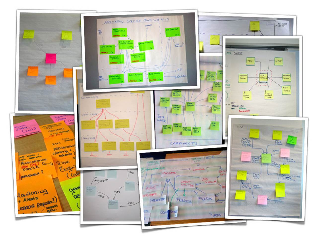
Examples of where sticky notes and index cards have been used instead of drawing boxes
Sticky notes and index cards can help to give you some flexibility if you use them as a substitute for drawing boxes. And if you’re using a Class-Responsibility-Collaboration style technique to identify candidate classes/components/services, you can use the resulting cards as a way to start creating your diagrams.
Need to move some elements? No problem, just move them. Need to remove some elements? No problem, just take them off the diagram and throw them away. Sticky notes and index cards can be a great way to get started with software architecture sketches, but I do tend to find that the resulting diagrams look cluttered. Oh, and sticky notes often don’t stick well to whiteboards, so have some blu-tack handy!
Orientation
Imagine you’re designing a 3-tier web application that consists of a web-tier, a middle-tier and a database. If you’re drawing a container diagram, which way up do you draw it? Users and web-tier at the top with the database at the bottom? The other way up? Or perhaps you lay out the elements from left to right?
Most of the architecture diagrams that I see have the users and web-tier at the top, but this isn’t always the case. Sometimes those same diagrams will be presented upside-down or back-to-front, perhaps illustrating the author’s (potentially subconscious) view that the database is the centre of their universe. Although there is no “correct” orientation, drawing diagrams “upside-down” from what we might consider the norm can either be confusing or used to great effect. The choice is yours.
Keys
One of the advantages of using UML is that it provides a standardised set of diagram elements for each type of diagram. In theory, if somebody is familiar with these elements, they should be able to understand your diagram. In the real world this isn’t always the case, but this certainly isn’tthe case with boxes and lines sketches where the people drawing the diagrams are inventing the notation as they go along. Again, there’s nothing wrong with this but make sure that you give everybody an equal chance of understanding your creations by including a small key somewhere on or nearby the diagram. Here are the sort of things that you might want to include explanations of:
· Shapes
· Lines
· Colours
· Borders
· Acronyms
You can sometimes interpret the use of diagram elements without a key (e.g. “the grey boxes seem to be the existing systems and red is the new stuff”) but I would recommend playing it safe and adding a key. Even the seemingly obvious can be misinterpreted by people with different backgrounds and experience.
Diagram review checklist
The software architecture process is about introducing structure and vision into software projects, so when reviewing architecture diagrams, here are a number of things that you might want to assert to ensure that this is the case. This checklist is applicable for diagrams produced during the initial architecture process, as well as those produced to retrospectively document an existing software system.
1. I can see and understand the solution from multiple levels of abstraction.
2. I understand the big picture; including who is going to use the system (e.g. roles, personas, etc) and what the dependencies are on the existing IT environment (e.g. existing systems).
3. I understand the logical containers and the high-level technology choices that have been made (e.g. web servers, databases, etc).
4. I understand what the major components are and how they are used to satisfy the important user stories/use cases/features/etc.
5. I understand what all of the components are, what their responsibilities are and can see that all components have a home.
6. I understand the notation, conventions, colour coding, etc used on the diagrams.
7. I can see the traceability between diagrams and diagramming elements have been used consistently.
8. I understand what the business domain is and can see a high-level view of the functionality that the software system provides.
9. I understand the implementation strategy (frameworks, libraries, APIs, etc) and can almost visualise how the system will be or has been implemented.
Listen for questions
As a final note, keep an ear open for any questions raised or clarifications being made while diagrams are being drawn. If you find yourself saying things like, “just to be clear, these arrows represent data flows”, make sure that this information ends up on a key/legend somewhere.
44 C4 - FAQ
Here are some of the questions I frequently get asked by people when they are drawing architecture diagrams based upon my C4 approach.
System names on context diagrams
Question: “You say that context diagrams should include as few technology details as necessary. But what about system names, should they be included?”
Answer: If you need to include a software system and everybody knows it by a particular name, then yes, I would include that name on the diagram. What I might also be tempted to do, just to avoid any confusion, is to add a brief statement of responsibilities to make it clear what that system does.
Mixing levels of abstraction
Question: “Since the container diagram for my system looks very simple, would you recommend mixing the container and component diagrams together? In other words, could I show all of the components inside all of the containers, on a single diagram?”
Answer: For simple systems, yes, that’s an option that you can experiment with. I tend to find that, even on small systems, a single diagram showing containers and their components gets too cluttered. My personal preference is to keep the container diagram as simple as possible, and to annotate each of the containers you show on the diagram with a short list of the responsibilities rather than show all of the components. Not only will this result in a clean and simple diagram, but it will also provide a nice high-level technology diagram that you can show to people like operations and support staff.
Shared components
Question: “My system is made up of a web server and a standalone application, and both use a shared database access layer. How should I show this on the diagrams?”
Answer: I would draw the shared database access components on each of the appropriate component diagrams and simply annotate them with a note that says something like “this is shared component”. If in doubt, always ask yourself how you would actually code and deploy the system. If your shared components will be deployed alongside all of the other components inside a container, just draw the diagram to reflect this.
Utility components
Question: “If I have something like a logging component that is used by all of the other components, how should I show this on the diagrams?”
Answer: You have a couple of options, although one tends to lead to much cleaner diagrams. Option 1 is to draw the logging component somewhere central on the diagram and show connections from every other component to it. While this is accurate, your diagram will become cluttered very quickly. Option 2 is to draw the logging component somewhere out of the way and simply annotate it with a note that says something like “this is a utility component that is used by all other components”.
Sketching the enterprise context from an IT perspective
Question: “I like the C4 approach but it only focusses on one software system at a time. How can we show more than one software system?”
Answer: In the real-world, software systems never live in isolation and it’s often useful to understand how all of the various software systems fit together within the bounds of an enterprise. To do this, I’ll simply add another diagram that sits on top of the C4 diagrams, to show the enterprise context from an IT perspective. C4 therefore becomes C5, with this extra diagram showing:
· The organisational boundary.
· Internal and external users.
· Internal and external systems (including a high-level summary of their responsibilities and data owned).
Essentially this becomes a high-level map of the software systems at the enterprise level, with a C4 drill-down for each software system of interest. As a caveat, I do appreciate that enterprise architecture isn’t simply about technology but, in my experience, many organisations don’t have an enterprise architecture view of their IT landscape. In fact, it shocks me how often I come across organisations of all sizes that lack such a holistic view, especially considering IT is usually a key part of the way they implement business processes and service customers. Sketching out the enterprise context from a technology perspective at least provides a way to think outside of the typical silos that form around IT systems.
45 Questions
1. Are you able to explain how your software system works at various levels of abstraction? What concepts and levels of abstraction would you use to do this?
2. Do you use UML to visualise the design of your software? If so, is it effective? If not, what notation do you use?
3. Are you able to visualise the software system that you’re working on? Would everybody on the team understand the notation that you use and the diagrams that you draw?
4. Should technology choices be included or omitted from “architecture” diagrams?
5. Do you understand the software architecture diagrams for your software system (e.g. on the office wall, a wiki, etc)? If not, what could make them more effective?
6. Do the software architecture diagrams that you have for your software system reflect the abstractions that are present in the codebase? If not, why not? How can you change this?
All materials on the site are licensed Creative Commons Attribution-Sharealike 3.0 Unported CC BY-SA 3.0 & GNU Free Documentation License (GFDL)
If you are the copyright holder of any material contained on our site and intend to remove it, please contact our site administrator for approval.
© 2016-2026 All site design rights belong to S.Y.A.