Understanding Context: Environment, Language, and Information Architecture (2014)
Part VI. Composing Context
Chapter 22. Models and Making
I always prefer making frames: making context rather than content.
—BRIAN ENO
A Fresh Look at Our Methods
THE METHODS WE USE for information architecture—and for design practice generally—are mostly sound and valuable. Attending to context doesn’t mean we throw everything out and start over. In fact, most of our tools and processes are suitable for figuring out context anyway, even if we haven’t been thinking of it that way until now.
Personas, Scenarios, Site Maps, Card Sorts, Journeys, Service Maps, Content Inventories—most of these tend to be focused on the elements they represent—the objects and events—but not as much on the relationships between those elements. We might mention them, but they’re often treated as the negative space between touch-points and interactions, not explicitly analyzed in the foreground.
Additionally, there are assumptions baked into a lot of our methods, models, and documentation. For example:
§ The typical approach to mental-model task analysis—extracting tasks from interview transcripts—not only leaves a lot of the really important context in the transcript, but also doesn’t account for ethnographic observational data and the distortions of user self-reporting.
§ Card Sorts, if considered from an embodied perspective, are really about how people sort words on cards, not how they will find their way through an environment using those labels as infrastructure.
§ Personas tend to identify goals, but as we’ve seen, goals are largely fictional—even if the people the personas represent tell us “these are my goals”—because they’re actually not very good judges of what motivates them in the immediacy of perception-action.
§ Journey Maps, although often impressive artifacts great for collaborative understanding, can often be linear happy-path descriptions that lull us into a comforting story.
These issues don’t mean these techniques aren’t useful. We just need to analyze them and be sure we aren’t treating them like wizard spells, which, when we say the words and do the right motions, compel the right design solution to magically appear. Understanding and shaping context requires deeper and broader attention beyond the immediate face of a problem or project. Most design teams have little appetite for the rigor necessary to get it right. Still, as the world becomes more complex, our approach has to meet that complexity on its own terms.
Observing Context
In my own work, I’ve come to realize that understanding context requires immersing myself to some degree in the full context for which I am designing. Trying to understand that context through surveys, testing, or analytics is like trying to understand the Grand Canyon through postcards and satellite data. You don’t really get it until you walk along its edge and experience its depths in person. As bebop inventor Charlie Parker once said, “If you don’t live it, it won’t come out of your horn.”
There are many great research methods for doing design work, all of which have their particular strengths. However, for a rich understanding of user context, the gold standard is applied ethnography. Ethnography, generally speaking, is a method used in social sciences, wherein a researcher will immerse herself in the world of the subjects being studied, usually over long periods of time. That’s a great approach for scientific purposes, but design projects don’t have years or even months for research. So, we have to use techniques in a more specific, applied manner. It doesn’t render the deep understanding that academic-grade ethnography gathers, but—if done well—it gets us much closer to understanding user context than any other approach.
A methodology called contextual design marries some of the best in human-computer-interaction science with applied-ethnography approaches.[420] Developed by Karen Holtzblatt and Hugh Beyer in the 1990s, it leads cross-disciplinary teams through stages of Inquiry, Interpretation, Consolidation, Visioning, Storyboarding, User Environment Design, and Prototyping. As you might guess from the method’s name, it is obsessed with context; and it keeps the integrity of the contextual “chain of evidence” from beginning to end. The method is comprehensive (and even exhaustive), but it is flexible enough to be adapted to nearly any scope or design challenge, as long the work follows the method’s principles.[421]
One of my favorite aspects of contextual design is how it requires collaborative analysis and ideation with designers, potential users, and other stakeholders. Different perspectives introduce differing opinions, but that “noise”—which might be considered merely inefficient and inaccurate in traditional process modeling—is actually a huge benefit. Just as we can’t really “see an object” in a two-dimensional picture in a lab, but need to be able to move around it from different angles in the flesh, various team-member perspectives give us a richer perception and understanding of how people live and work in their real-life environments.
Contextual design is well suited to understanding multiple perspectives—creating the collage of maps and journeys we need—because it can generate multiple models for each user-session interpretation. These models can illustrate cultural context, workplace layout, and off-screen habits, as well as the traditionally recorded workflows and task sequences. By doing this for each person observed and then combining them into a wide-angle view during the consolidation phase, you get a more three-dimensional understanding of the current state.
Contextual design doesn’t dwell on semantics as a major area of focus, but language plays an important role in the approach. Really watching and listening to users means paying attention to the language they use to learn how it informs, supports, and exerts pressures on how people do their work. For example, on one project in my past, we not only observed how customer service representatives did their jobs with the full environmental resources around them—from both the tools on-screen and the physical material in their cubes, such as folders and cork-boards—we also tracked the way they talked about the work: the keywords they used and the way they meant them. It allowed us to develop a new taxonomy for tagging calls that better matched the cultural map of how the workers understood the task. That taxonomy was the lynchpin connecting the quality of metrics, the clarity of customer communication, and even the information architecture of the call-center software. That’s why I tend to track the language I hear, alongside the other contextual design artifacts; the language is the spine that enables the entire organism to function as a coherent whole.
Regardless of how you learn to do it, taking an ethnographic approach is essential. Everything else is supplemental at best or misleading guesswork at worst. Unfortunately, many clients and employers still do not understand and value this approach. Sometimes, they fear designers will learn the wrong things from regular workers and customers, or they value measurable data over observation-based insight. I’ve found myself resorting to “sneaking in” some bits of ethnographic interaction during usability testing, or asking friends “off the clock” to show me how they go about some related task. By hook or by crook, even a taste of applied ethnography can go a long way toward enlightening a project.
Some years ago, I worked with a nonprofit that provides content and community services for people affected by breast cancer: patients and their families, friends, and caregivers. It had launched a website in the mid-1990s as a place where users could read and learn from medically sound, layperson-friendly content about the disease and its treatment. It published both original content and doctor-approved summaries of breast-cancer research. A few years after its launch, its creators had decided to add a simple discussion forum to see if users would find it helpful. To their surprise, the forum soon grew to be as important a part of the website as the published content. In fact, it turned into the busiest breast-cancer-related community on the Web.
There were two macro-contexts in play: an area providing top-down, officially edited and published content, and another area where users were creating their own, bottom-up, informally written and shared content. The two areas weren’t well-integrated, and didn’t yet officially inform one another. Likewise, the curator-edited area had grown unwieldy in its structure, unable to handle the varieties of content that were now being published as it expanded to cover more topics.
Through contextual interviews, we learned how users’ personal narratives had been violently disrupted by disease, changing the course of their personal stories. As an environment, the site had to provide a variety of paths and places for users to handle different emotional states, life-changing decisions, and mundane-yet-essential practicalities around the many facets of diagnosis and treatment.
One of the things we discovered was that people’s needs shifted considerably from one moment to the next, depending on what phase they were experiencing. A patient who was recently diagnosed with cancer was often in a state of high emotional arousal—a near panic—and unable to comprehend complicated, multifaceted information layouts or technical content. Yet, within a short time, that same person would often become an expert researcher, throwing herself (or himself) into a voracious “flow state” in which volume and complexity were suddenly welcome. The site needed to embrace these shifts of perspective, not resist them with rigid consistency.
Also, when we started, we wondered if the seemingly bifurcated nature of the website was a problem. However, it turned out that having the community side and the officially edited side of the site was a boon. They each addressed different needs. Interestingly, for some users, the forum would become their main home on the site, where they’d often ask their questions first before consulting the edited content. A review of the forum content found that it was surprisingly accurate when the full thread of a conversation was taken into account: its inhabitants did a great job of policing the neighborhood. Most users said they found better answers more quickly by asking a question in the forum than from querying Google.
The forum was also treated as a meaningful, real place. Some users were far-flung and had no access to in-person group support, so they relied on this community for that vital aspect of their care experience. And, when someone would be preparing to go into the hospital for a longer stay, their friends would create “care packages” of thoughts, pictures, prayers, and other virtual objects that were as cherished as any real gift basket could ever be.
Like other websites I had helped design in the past, I approached this one as a system of activity hubs (see Figure 22-1), with contextual connective tissue stitching them together. In this case, though, the information architecture strategy had to avoid the trap of seeing it as a big article repository with a forum attached. We had more success by thinking of the website as a participant in existing narratives—a supplement to personal storymaking.
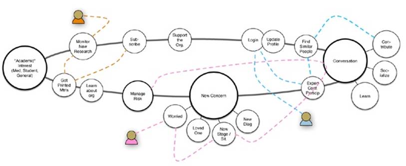
Figure 22-1. One of the architectural models used to think through the “hub” places users might visit, in whatever order necessary, to find their own way to sensemaking. The labels here were functional descriptors, not the final taxonomy. This was one of several artifacts used to work out the site’s information architecture[422]
There are plenty of sorts of design that don’t require research, and there are plenty of talented, experienced designers who can make an excellent phone app or consumer gadget without resorting to contextual inquiry. But, that’s because more often than not they already have tacit contextual knowledge sufficient for creating that design. I would still argue that getting at least a small taste of observing someone else would provide validation and a reality check, but success can still happen without it.
However, I can’t imagine devising an architecture for this nonprofit organization and its constituents without immersing myself to some degree in their lived experience, and seeing how they work through it.
Perspectives and Journeys
One contextual conundrum we run into is how users often reify their goals and stories when self-reporting their experiences. When we add to that the tendency of organizations to assume that people have nothing else going on in their lives but the specific task put before them, we miss out on a lot of context.
During the financial services Power of Attorney project described in Chapter 21, I developed a Situation-Need-Task (SNT) model (Figure 22-2). I have continued using it because it challenges my own assumptions about what people are doing and why, and it helps to keep my perspective honest.[423] It reminds me that people don’t just drop out of the sky to perform a task. They always begin in some situation that has emerged in their lives. They must then comprehend what they need—tacitly or explicitly or somewhere between—and only then, perhaps, locate and understand how to complete a task.
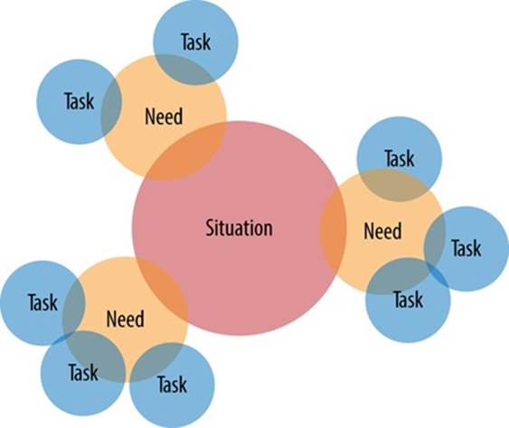
Figure 22-2. A Situation-Need-Task (SNT) model; situations spawn needs, which lead to tasks
Notice the model doesn’t use the word “goal” anywhere. As in a competitive game, a goal is something that you already know is there, something for which you aim. But, on the financial-site users often had to first discover what game they were playing, and they had no idea at the outset what the goal was. Either they didn’t know they needed to fill out a form, or they didn’t know which form it was, why it needed to be done, or how to do it properly.
Returning to our retail example from Chapter 20, if one person has a broken kitchen faucet, but another is renovating an entire kitchen, they might both enact a “task” of “typing ‘kitchen faucet’ into a search field.” The results of that search need to be shaped so that they accommodate the different perspectives that these two situations bring to the task, as illustrated in Figure 22-3. For a broken faucet, the customer might need parts or an instruction manual for the faucet bought at that store a year earlier. The renovator, however, might be wanting beautiful scenes of renovated kitchens, with showroom-designer faucets in the spotlight.
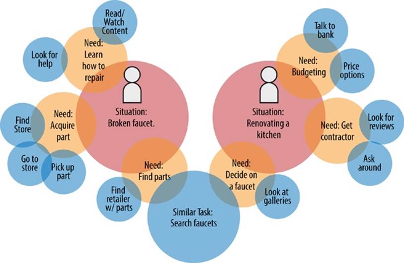
Figure 22-3. The same search phrase, generated by two different user needs
A digital system—object, service, site, application, or whatever—needs users to understand its workings in order to complete tasks. This next model (Figure 22-4) shows how, if we shift perspective just a bit, there’s a sort of continuum that must be bridged. Ultimately, this continuum comes back to the question of ontology and what something means to the agent. When the environment can address the organic, analog context of the human agent’s need, there can be adequate support for bridging between system and person.
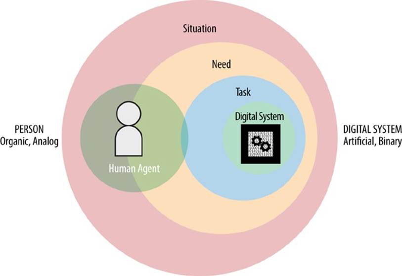
Figure 22-4. A different angle on situation-need-task
When we consider the cross-channel qualities of service design, or the growing complexity of objects, interfaces, and controls for interaction design, or the omni-platform challenges of content strategy, we have to map out entire systems and the contexts they influence. This includes the digital systems, but also the cultural and physical layers.
It’s important to name and define the key attributes of each of these systems, along with their functions. Yet, it’s also important to understand how they work as an integrated, distributed system, or “ecosystem”—what Resmini and Rosati call “ubiquitous ecologies.”[424] Even if the parts are not intended to be connected, or are created by completely different businesses, the user still experiences them all within the same environmental context. Just such a situation is described in the airport scenario from Chapter 1, and illustrated in Figure 22-5.
TripIt brought contextual information to the calendar; the Delta app brought contextual information to TripIt. The Delta app fed the boarding pass to the iPhone’s Passbook app—which seemed to be alerting a “calendar” event because it varied from the phone’s usual “invariant” event patterns. Plus the physical and semantic wayfinding within the airport itself contributed to the overlapping contextual information. For the person in the airport, it’s all one environment, even if the originators of these different services weren’t thinking that way when they created the software.
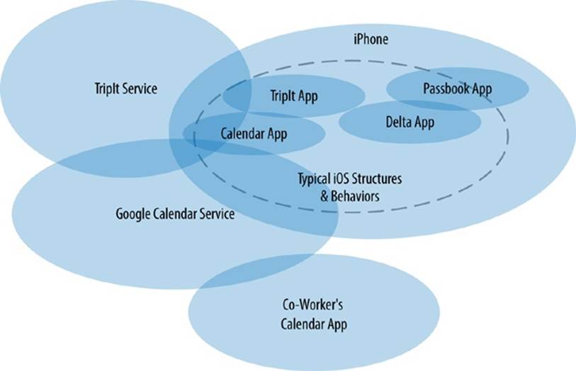
Figure 22-5. Contextual nesting, experienced as one ecology
I’ve mentioned collage several times already, but here is where the idea especially takes hold—in the way we accommodate so many contextual angles and perspectives. Real-life environments are collages of many parts, some of which are interconnected on purpose, some which are that way accidentally, and some of which clash when they should be complementary. Each element needs to do its best to be created with awareness and to complement the others.
For example, a typical User Journey map would be created for only one user at a time, normalizing user action across a linear timeline (Figure 22-6). A “journey” is typically a story, after all—but as we’ve seen, narrative can leave out a lot of contextual background.
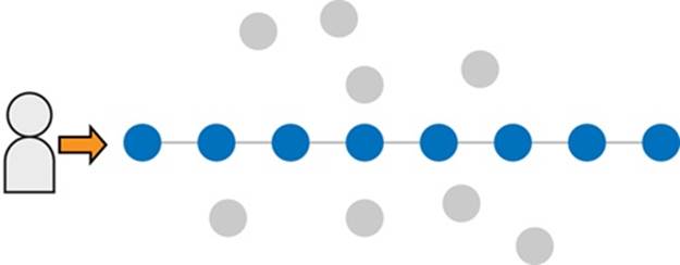
Figure 22-6. A typical user journey model reifies a linear story
In Figure 22-6, the gray circles represent aspects of the story that might have actually been important to the agent but were ignored in the retelling. Regardless of how many channels and touch-points a typical journey map captures, it creates a sort of fiction that—while an insightful illustration of one path—doesn’t capture the points of view of other services, systems, and agents that are intermingled with the environment. These journey diagrams are useful, but we should always be asking if there are other contextual perspectives that should be added to the mix.
Again, the idea of collage comes into play here. What if we instead map the actual, messy, wandering paths of people, and capture their nested perspectives? It would allow us to see how the elements of a shared environment are understood from key points of view, based on the real behaviors of every agent involved.
In Figure 22-7, the gray circles are fewer, because it turned out people had behaviors that the linear journey overlooked, and some circles that were ignored by one perspective were important to another. It also helps us see which parts of these journeys have high shared importance and how the overall environment’s nested structure is understood by each party. Even though we can never capture every single detail of every possible agent’s perspective, just adding one or two other perspectives can bring valuable multidimensional insight.
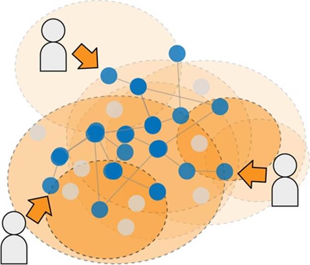
Figure 22-7. A collage approach can capture multiple perspectives
As architect and philosopher Christopher Alexander explains in his (essential reading) essay, “A City Is Not a Tree,” each hierarchy or linear structure is just one perspective in a complex latticework of relationships.[425] It’s important to understand those points of view, but just as important to see them in the full fabric of people’s lives.
Now that humans are not the only thinking, acting objects in our environment, we have to include digital agents in our ethnographic work. Ethnography is traditionally about people, but what does it mean for us to also spend some time observing and understanding what digital agents do? Additionally, these agents are often just part of a broader system of technology and culture, much of which is beyond immediate view.
As we learned earlier, complex semantic systems are, in essence, maps, and maps have agendas. They select for some information over other information. They reinforce some assumptions and break others. The more sophisticated and rich the rules behind the environment, and the more digital agents it employs, the more the environment has agency as a whole.
We’ve not delved far into artificial intelligence and “smart systems” here. However, information architecture (like all areas of design) increasingly needs to understand what context is like from the perspective of the system, as presented in Figure 22-8. How does the system “perceive” the world, and the humans in it?
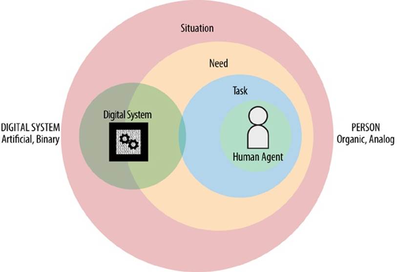
Figure 22-8. What happens when we reverse the players, and consider the situation, need, and task of the System, as it interacts and shapes context for the Person?
A useful exercise in any design involving digital agents is to work through how they see the world, and what situations and needs drive their discrete actions. What does the human agent look like to the digital agent? Try treating the user as an object in the environment that the system needs to find, interact with, keep an eye on, edit, or save, or whatever else we do with data. What is the ontology that describes and defines the human, its actions, and its context to the system?
These questions are ultimately part of defining what the system is to begin with, and how it categorizes the world we expect it to understand. Of course, we can’t interview systems (at least, not yet?), but we can learn a great deal by looking at user research from this angle as well as partnering with the technologists who programmed and configured the systems, or the business analysts who’ve documented them.
Structures for Tacit Satisficing
In our super-rational age, we tend to want to create super-rational structures. And, as we’ve covered, organizations have a strong interest in planned efficiencies. But, as Richard Saul Wurman says pointedly, “Order doesn’t equal understanding.”[426] Our culture tends to fetishize order, even at the expense of meaning. If everything is lined up neatly in a spreadsheet, it seems to have a kind of authority. If information is contorted into a comfortably controlled hierarchy, we’re glad somebody figured it out, and we take it as authoritative.
Western school systems are modeled on these tacit cultural maps, the same ones that ran railroads and factories. Yet, there are alternative options. Consider the Montessori classroom. In Montessori education, students can explore among various stations, or hubs, in the room. As is illustrated in Figure 22-9, typically, in an early-age setup, there are stations for activities such as drawing and painting, working with shapes, musical instruments, language arts, and simple math. Montessori teachers will give an introductory session with each type of station; the students are then allowed to explore them, mostly at their own pace and in their own order. It affords children the ability to construct their understanding of the objects and activities by interacting with the materials rather than in the abstract. Additionally, it doesn’t prize consistency and efficiency over self-discovery, sensemaking, and personal narrative.
Note that the options in a Montessori class are selected carefully, as are the objects and materials that are on offer. This is intended to nudge students toward particular kinds of learning. It’s a highly controlled environment but with a great deal of freedom compared to the more factory-like education approach in traditional schools. It instantiates decisions about what is important and what the students should be able to do without prescribing their every action or pace of learning.
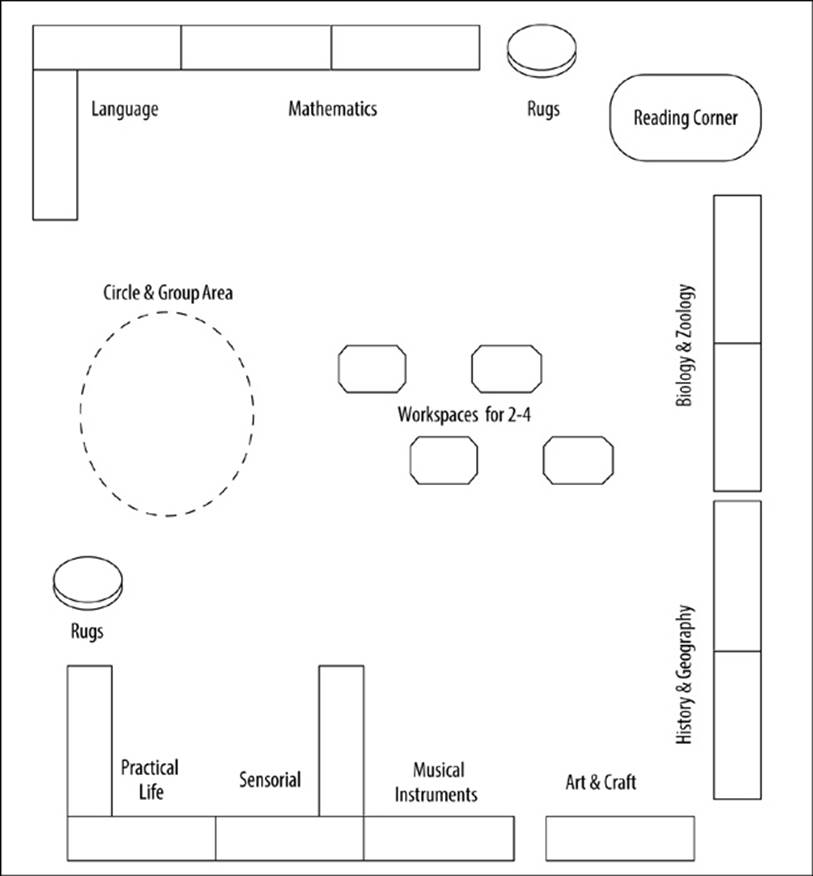
Figure 22-9. A Montessori classroom layout concept, showing stations for engaging and learning various activities and subject categories[427]
To some, this looks terribly inefficient and chaotic. But in fact, students are learning a great deal—discovering the world for themselves, in their own way. This is an architecture that depends as much on the theories that drive the pedagogy and the categories of learning styles aligned with subject matter as it does on the physical structures themselves. In fact, it’s these language-bound principles that provide the environmental invariants for the design of a successful Montessori classroom, whereas the physical layout varies from one school to the next.
This constructivist approach to allowing people to figure out the world in their own way is precisely how we can accommodate so many different people, with so many different needs and personal contexts.
Setting up structures for people to choose from based on their own path isn’t a radical concept; it’s something we use a lot, even if we haven’t thought of it in this way. In one example (see Figure 22-10), financial services company Vanguard breaks down several possible ways to browse, understand, and choose investment funds.
The landing page offers a crossroads with signage explaining the environmental constraints to which each path will lead. Some people will want more constraints than others.

Figure 22-10. Vanguard’s “hubs” for catching the users in several contexts of fund shopping
Google, which connects millions of people across nearly every digital context you can think of, has been sharing research on user behavior across channels and places. In one report, it explains that the multiplicity of information resources now available means that customers aren’t following as much of a linear path as they once did. For example, in marketing there is a well-worn metaphor of the sales funnel: customers start out in the broad “mouth” of the funnel as being just aware of a product or brand, then show explicit, more-focused interest, then active consideration, and so on, until finally purchasing. This metaphor has been an implicitly accepted “map” of marketing and sales for many years. But in Google’s research, it finds the metaphor isn’t as relevant now:
The sales funnel isn’t really a funnel anymore....Today’s shoppers bounce back and forth at their own speed in a multi-channel marketplace. They switch devices to suit their needs at any given moment. They search; go off to look at reviews, ratings, styles, and prices; and then search again. They see ads on TV and in newspapers and online. They walk into local stores to look at products. They talk to friends, over the back fence and on social media. Then it’s back to ZMOT for more information. In short, the shopper’s journey looks less like a funnel and more like a flight map.[428]
Now that there are so many more information sources online, the digital environment becomes the “home base” for considering and triangulating what customers learn from the traditional information hubs. The brick-and-mortar stores become just another information source rather than the necessary end-point for final decision-making.
In essence, people use the environment as youngsters use a Montessori classroom, finding their own “flight path” between contexts. The most successful marketing approaches, therefore, are putting environmental structure into the world that enables rather than short-circuits this behavior. Rather than relying on broadcast information, brands are instead using broadcast as a supplement to the online conversations, then (when they behave themselves) politely and helpfully engaging in those conversations.
You might look at things like this and ask: but where’s the context? Precisely. The structures aren’t forcing context so much as accommodating its unique emergence in each agent’s experience. Finding the right hubs and stations for people to satisfice through, calibrate within, and narrate to themselves means that we don’t have to plan out every possible use case—after all, it’s impossible at today’s levels of complexity anyway. Instead, we provide environments that are resilient, accommodating, similar to what game designer Will Wright, in reference to digital games, calls “possibility space”:
Players navigate this possibility space by their choices and actions; every player’s path is unique. Games cultivate—and exploit—possibility space better than any other medium. In linear storytelling, we can only imagine the possibility space that surrounds the narrative: What if Luke had joined the Dark Side? What if Neo isn’t the One? In interactive media, we can explore it.[429]
There is much that conventional digital design can learn from game design, especially in terms of structure that encourages and supports unstructured action and learning.
Blueprints, Floor Plans, Bubbles, and Blobs
We can do the research, do the analysis, and understand the many perspectives and paths involved in people’s contextual narratives. But how do we go about making the plans for such indeterminate structures?
From early in my own experience as an information architect, I have understood the “architecture” part of the name to be not just a metaphor, but about a new form of actual architecture. So, it didn’t take me long to lose patience with conventional site-map tree hierarchy diagrams. They treat a website’s information environment like the directory structure of a file server. In fact, websites broke away from “one page per level” information structures long ago. Now that the Web is just one layer in a multidimensional environment of many channels, modes, and states, tree hierarchies are more unrealistic than ever; we’re increasingly likely to work on projects that have no obvious web interface at all. As a result, I rarely make a tree hierarchy diagram as a deliverable anymore.
Whether using an application such as Visio or OmniGraffle, or a drawing on a whiteboard or paper, exploring the possible structures of information environments needs to allow for flexibility. We need to be careful to avoid locking ourselves out of contextual possibilities.
Knowing what we do now about embodiment, it’s no surprise that the medium and technique we use for our working artifacts has a direct effect on our cognition. If we start in a medium that’s time-consuming or tedious to change, we’re more likely to settle for whatever expression we already have. Our first try at an intricately drawn and connected schematic starts to look pretty good when we consider the work it will take to reorient shapes and reconnect magnets. This isn’t even to mention the paralysis that detailed interface wireframes can cause—the inertia against making changes convinces us they aren’t necessary and tempts stakeholders to just run with what is pictured.
The more our first effort uses polished, squared-off, and perfectly aligned objects, the more their “order” can easily masquerade as understanding. Context controls conduct, and the contexts we manufacture with our design artifacts can have unexpected, limiting effects on our solutions.
Interestingly, Tim Berners-Lee, in his original proposal describing the World Wide Web, explains that, “When describing a complex system, many people resort to diagrams with circles and arrows. Circles and arrows leave one free to describe the interrelationships between things in a way that tables, for example, do not. The system we need is like a diagram of circles and arrows, where circles and arrows can stand for anything.”[430] Expressing “web-natured” environments as societies of circle-shaped contexts has roots in the nature of the medium.
When I read Sir Berners-Lee’s statement, I was relieved, because I’ve been working with circles and blobs for years but feeling a bit ashamed when I compared my work with my more graphically disciplined colleagues. That’s because I tend to begin by throwing everything I can think of onto a page (digitally or otherwise), letting it scatter like mercury. Then, I wallow in it until patterns begin to emerge, and I begin stitching together relationships and functions, and nested overlaps. Usually this works much better if I’ve done some contextual observation and other research to get the problem space under my skin a bit.
On purpose, these circles and blobs, like those in Figure 22-11, involve the least possible intrinsic structure. The shape of the object can constrain us to seeing it only one way. A brick says, “I’m a brick; put me in a wall.” But a smooth, circular river stone says, “I’m a circle—I could be anything.”
Figure 22-11. A typical bottom-up starting point when I’m working on an information architecture problem (blurred to protect confidentiality)
Imagine my delight when I learned that serious, built-environment architects do something similar. They call them bubble diagrams (see Figure 22-12).[431] There’s a marvelous variety of them out there, which I find encouraging. Architects have to follow stringent guidelines for their official, deliverable documentation. But when working through the early stages of structure, they can play with it more freely—and look at the rich variety in how they make bubbles.
These diagrams are how architects can play with contextual structure at varying levels of abstraction, cheaply and quickly, without binding their thoughts to the hardwired angles of drafting rulers or CAD software. Even if making them digitally with connectors between, they are easier to rearrange on a whim, rather than strict boxes that have to choose which sides are connected and which are not.
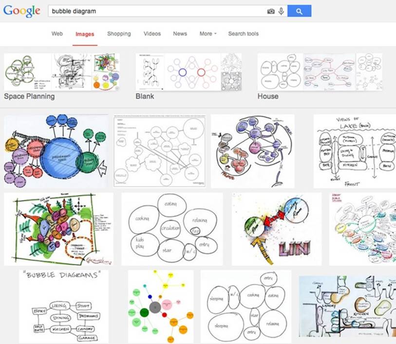
Figure 22-12. The marvelous variety one finds when querying “bubble diagram” using Google’s Image search
Likewise, when exploring possible futures for any sort of information environment, such as a website, mobile app, or even a full-service ecosystem, using circles and blobs can be freeing.
I’ve used them for doing something I call functional modeling (a phrase I borrowed from systems engineering, for which it means something much more formal). Figure 22-13 shows a functional model about the online capabilities needed for a fictional art-supplies retailer.
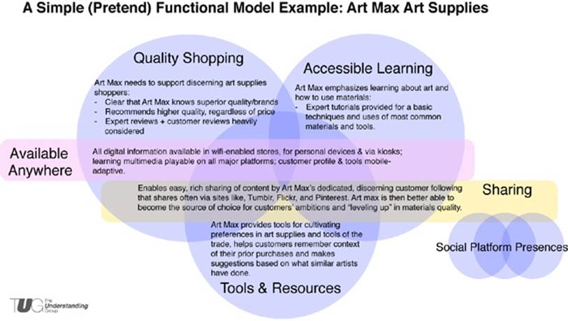
Figure 22-13. A functional model coalescing decisions about priorities and capabilities, without crossing into literal structure or interface design
Usually, I generate a functional model based on lots of raw material generated from contextual inquiry and stakeholder interviews. Sometimes I use that to do an affinity-clustering exercise on my own or with my team, but sometimes I take that raw material into a stakeholder workshop, where we explore affinities together. The exercise is often even more valuable for the discussions it prompts than the artifacts it produces.
The main point of the modeling, though, is to work through high-level definitions and decisions about what the nature of the environment should be—that is, what categories of function does it bring into the world?—without discussing actual, literal design and structure. This way, we work through some of the big questions without the distraction of “why isn’t my department in the global navigation?” or “why doesn’t the app have our promotions blinking at the top?” Trying as hard as possible to resist leaning into literal design is a useful discipline. It avoids using interface solutions as a poor proxy for making real decisions about business models, strategies, and brand definitions.
Even after this sort of modeling, it’s still risky to introduce the distractions of interfaces. Architecture still hasn’t found a direction. In Contextual Design: Defining Customer-Centered Systems (Morgan Kaufmann), Holtzblatt and Beyer argue that it is essential to “design the structure” first—getting the architectural framework right before rendering the object-level design of UI. Writing in the early 1990s, they call this User Environment Design, and unabashedly refer to it as architecture of “floor plans” before working through the object-level details of interaction.
As a floor plan for the system, the User Environment Design shows the parts and how they relate to each other from the user’s point of view. The User Environment Design shows each part of the system, how it supports the user’s work, exactly what function is available in that part, and how it connects with the other parts of the system, without tying this structure to any particular UI. With an explicit User Environment Design, a team can ensure that the structure is right for the user, plan how to roll out new features in a series of releases, and manage the work of the project across engineering teams. Basing these aspects of running a project on a diagram that focuses on keeping the system coherent for the user counterbalances the other forces that would sacrifice coherence for ease of implementation or delivery.[432]
Even though Contextual Design predates the public-and-commercial Web, and so much else that has emerged in the past 20 years, it offers a way of thinking about environment that still deserves to be more understood and adopted in mainstream software design.
The floor-plan approach takes the architecture of a system seriously as architecture of places where people take action. It introduces an embodied understanding of the way the system can be inhabited, but it still does so at a level of abstraction that allows change and iteration. In Figure 22-14, you can see how a typical floor plan mainly displays the most important aspects of the arrangement of places, each established to support a particular set of functions for inhabitants. The shapes of rooms and what seem to be decorative details are actually ways of establishing the function of each place: the purpose of an eat-in kitchen is also to accommodate a circular table, with a nice view; the modern family room is about electronic entertainment through a television screen, so it doesn’t need as many windows, and is tucked away in a corner of the structure.
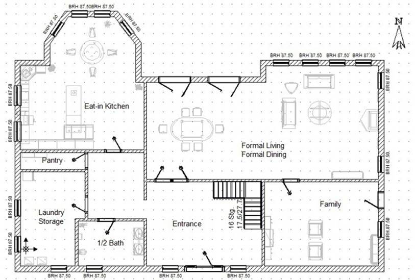
Figure 22-14. An example of a residential floor plan[433]
The object-design-level details come later, but the functional structural arrangement must be established first. Information architecture models can also use this level of abstraction to show how one context relates to another, how they cross over and inform one another, and their priorities in relation to the whole.
An example of a draft version of just such a diagram is shown in the right half of Figure 22-15. In this project, a functional modeling exercise that rendered the egg-shaped model on the left provided the defined priorities that informed an early version of actual site structure, in the map on the right.
I’ve found that if the diagram becomes too complicated and baroque, it raises a warning about how understandable the environment will be. A retail environment that is about “products” and “learning” and “managing projects” can accommodate a lot of complexity within those essential, high-level functional categories. Then, those categories can help define the essential nature of the outer structures of a nested website or other environment.
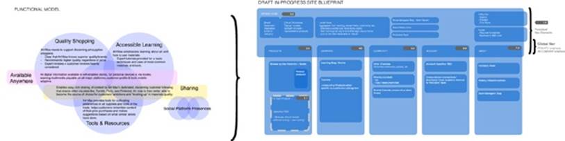
Figure 22-15. A functional model leads naturally to high-level structures in an early version of a basic floor-plan-like structural map
Note how the map on the right of Figure 22-15 isn’t using interconnecting lines but overlaps to show structure. By using semitransparent shapes, the map can indicate where summary versions or borrowed functions of some areas might overlap within other nested structures.
This overlap of content and function is something that’s possible in digital places that is less possible in physical ones. Structural definition is still needed to establish nested invariants, but software makes it possible for contexts to be replicated and connected in useful ways across the invariant barriers. The challenge is to ensure that they don’t blend so much that the environment is trying to allow the user to do everything from everywhere. Even if the kitchen can borrow some of the entertainment function of the family room, it shouldn’t be made to be both at once, which would obliterate the essential character of both places. A house with no walls or defining characteristics among rooms is just a big shed with furniture inside.
Likewise, a retail website’s account section might cross over with the site’s global header; and its authentication state might cross over with features at a store’s kiosk or checkout counter. These are not separate boxes connected by arrows, but nested, overlapped contexts, ambiently intersected.
The most value I’ve found in this approach is how it seems to intuitively tell a story about places and contexts, and how they relate to one another. One of my first clients as a full-time information architect (a fairly new role and title back in 1999-2000) was a nonprofit organization that brought together research scientists and large technology companies to funnel money to graduate student programs. It did this to cultivate talent and make it possible for companies to share “precompetitive” research. Bringing together so many different players meant the organization existed as a sort of confederation of research scientists, universities, and technology corporations.[434]
Since its website launched in the mid-1990s, it evolved like so many do: starting as a few linked pages only to later metastasize into a tangle of confused categories, wandering click-paths, and ad hoc features.
Our research found mixed feelings with the organization and its community: scientists who’d become more entrenched in their own subcommunities, divisions between appointed managers and regular folk, and enmity between academics and business leads.
We realized that the site had become a visible instantiation of that discord: a messy tangle of priorities in tension. A new information architecture would mean more than just organizing all their content. It meant making an environment whose places encouraged mutual understanding. It was a chance to create a system of contexts that could help heal a professional community, and in turn be a sort of civic structure to support mutual habitation.
We tried expressing that strategy using a traditional tree-shaped site hierarchy diagram. The response was less than enthusiastic. The structure came across as a pecking-order pyramid, where the subcommunities were relegated to second-class status. We realized the traditional tree structure wasn’t accurately portraying the strategy, which was actually to be more of a community building where a central atrium of important news and announcements tied everyone together.
The stakeholders needed something more than a schematic for information organization. So, as is demonstrated in Figure 22-16, we created a kind of floor plan, but one that showed how various contexts would overlap. It showed defined areas based on function, nested within the main container of the parent organization. Then, it showed how the subcommunities would have their own somewhat independent satellite areas—based on a common template but sharing a news-based context with the parent organization. It allowed the subcommunities to have their own places, but it continually reinforced a friendly, overarching presence of the parent organization—the benevolent “house” that sustained the subcommunities’ “rooms.”
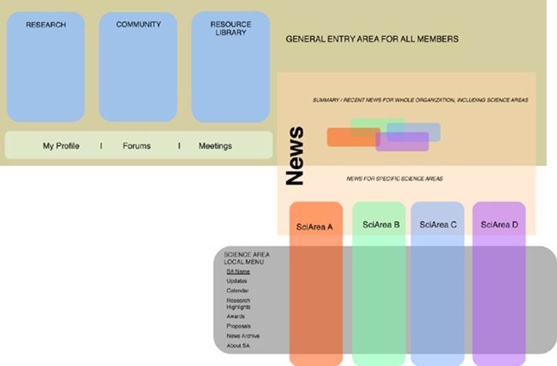
Figure 22-16. A version of the “floor plan”—which we called a “blueprint”—for a science organization, in a circa 2000 project (identifying specifics omitted)[435]
This new approach brought a great sigh of relief to the stakeholders: they could imagine themselves moving around in those places, collaborating in common areas, and focusing on specialized communities and functions in others.
Of course, this was a simple, almost cartoon-like, expression of structure. There was still much work to be done sorting out the navigation logic, roles, permissions, and many other issues. Nevertheless, this conceptual blueprint—composing the arrangement of defined contexts—was the model everyone needed to have a shared understanding of would be designed and built. I had no idea at the time why this worked out, but I now realize it likely has to do with how people understand nesting better than hierarchy, and how semantic information needs to establish structure but with awareness of how people need information to be environment more than discretely defined, logical abstraction.
I’ve used a similar approach for figuring out the multiple simultaneous contexts in a particular physical place, or with a particular user over time. If we map all the contextual layers, even simply, we can begin to see them piling up. It helps us see the cognitive demands the environment is placing on the user: how many layers are expected to be attended to explicitly? How many quiet, hidden layers are making decisions the user might not know about or has forgotten about? How many are making demands, interrupting each other with no apparent awareness of the others?
For instance, let’s examine the problem of a user’s contextual experience in her own family room. With the proliferation of new, ambient technology and mobile access, what contexts are in play that might be part of the nested environment where we might introduce a new product?
Figure 22-17 illustrates how several elements might come together for analysis or information architecture direction, as described here:
§ Overlapping shapes that roughly represent contextual layers, each identified and defined
§ A scale for attention requirement, estimating between Explicit and Tacit
§ A new scale for how noticeable and understandable the digital agents are, from Perceivable to Hidden
§ A quick indicator showing what information modes are most in play for each contextual layer
Such a mapping technique could give us a sense of how a person might perceive and understand the information at work in this place, which is a sort of mash-up of many places at once. The blue contextual layer, for example, is about the digital “black box” sitting in the front of the room (such as a Microsoft Kinect device), which might have a sensor range for “reading” the human agent’s bodily actions, even though the human is mostly unaware of it day to day. The other layers could be all sorts of things—thermostats, WiFi networks, and so on. And the same model could be adapted to see the world from the digital agent’s point of view, as well.
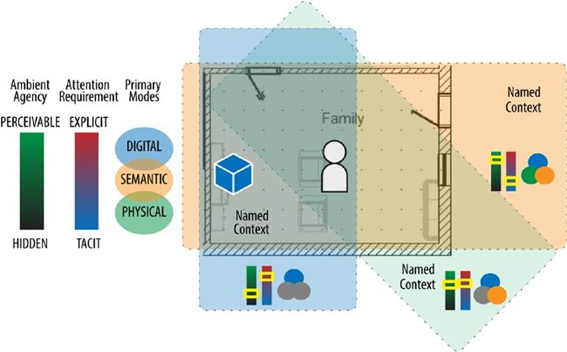
Figure 22-17. Adapting modeling approaches for analyzing how different context layers affect a place like a home’s family room
Usually, designers and consumers both will focus on the objects in a room like this. Yet, the objects—whether software or hardware—are only part of the picture. There’s also a contextual dynamic that’s happening between these layers of the environment and the room’s inhabitant. If we just let these layers be invisibly amorphous, we lose out on the ability to shape and improve them.
Naming these contexts is the first step toward designing them. By naming them, we bring them out of the ether, so we can define them and come to understand them. It makes us consider explicitly what these contexts are connected to outside of the immediate perception of the user; what other systems and agents, rules and relationships? We can be explicitly mindful of how we make this environment, rather than tacitly ignore its full effects on the user’s life. As information architect Abby Covert says, “Intent is language.”[436] What do we intend these contexts to be? What is their nature?
As we track the layers involved in any situation, and we begin seeing them pile up, we then must ask ourselves: how can we make the environment’s seams, joints, and activities more perceptible? How does it semantically represent its rules? Do those semantics provide invariant qualities in the environment, so the human agent can understand the digital influence over physical meaning? Is there just too much going on? Ultimately, we’re getting to the bottom of how agents understand the relationships between elements in their environment.
These are idiosyncratic techniques that I’ve found useful; they’re certainly not a methodology.[437] I share them only as pointers toward new approaches. Understanding context means revisiting and questioning how we plan, model, and make. It means inventing new ways of comprehending, analyzing, and architecting in this strange, new world we’ve made for ourselves.
[420] Beyer, H., and K. Holtzblatt. Contextual Design: Defining Customer-Centered Systems. San Francisco: Morgan Kaufmann, 1998.
[421] Other great resources: The Ethnographic Interview (Spradley); Observing the User Experience: A Practitioner’s Guide to User Research (Goodman, Kuniavsky, Moed); Practical Ethnography: A Guide to Doing Ethnography in the Private Sector (Ladner); Interviewing Users: How to Uncover Compelling Insights (Portigal).
[422] Credit where it is due: I borrowed this approach from work I once saw by user experience designer Wolf Noeding, circa 2006.
[423] Hinton, Andrew. “Beyond Findability,” Workshop for the IA Summit, presented by the Information Architecture Institute, 2009 (http://bit.ly/1s3NBW9).
[424] Resmini, Andrea, and Luca Rosati. Pervasive Information Architecture: Designing Cross-Channel User Experiences. Burlington, MA: Morgan Kaufmann, 2011:52.
[425] Alexander, C. “A city is not a tree.” Architectural Form, April/May, 1965:172.
[426] Information Anxiety, 1989, p. 48.
[427] Drawing by author. Based loosely on concept posted at http://csetjy.blogspot.com/2012/06/classroom-layout.html.
[428] ZMOT Handbook. Google, 2012, p. 11.
[429] Wright, Will. “Dream Machines,” Wired Magazine, April 2006;14(04).
[430] http://www.w3.org/History/1989/proposal.html
[431] Thanks to Jorge Arango, an architect by training, for introducing me to bubble diagrams.
[432] Beyer, H., and K. Holtzblatt. Contextual Design: Defining Customer-Centered Systems. San Francisco: Morgan Kaufmann, 1998:24.
[433] Wikimedia Commons: http://commons.wikimedia.org/wiki/File:Sample_Floorplan.jpg
[434] A version of this story was first published in UX Storytellers—Connecting the Dots; Jan Jursa (September 1, 2010) http://amzn.to/1x5rmDE.
[435] A version of this diagram was first published in: Van Dijk, Peter Information Architecture for Designers: Structuring Websites for Business Success. Rotovision: September, 2003.
[436] Covert How to Make Sense of Any Mess, 2014.
[437] For readers who want more detailed tools and methods, an excellent, more exhaustive approach is available in the final chapters of Resmini and Rosati’s Pervasive Information Architecture.