Microinteractions (2014)
Chapter 1. Designing Microinteractions
“Nothing big works.”
—Victor Papanek
The furious shouting started after the conductor stopped the performance. The New York Philharmonic had reached the very end of the slow, quiet Adagio movement that finishes Mahler’s Symphony no. 9. The audience, many of whom had paid hundreds of dollars for this privilege, sat attentive and rapt, listening to the still, sublime moments that resolve over an hour of music.
And then it happened: from the front row, the unmistakable sound of an iPhone’s “Marimba” sound—that high-pitched xylophone tinkle—going off over and over again. An alarm. It kept going. And going. The conductor, Alan Gilbert, halted the orchestra. But the alarm kept going off. By now, audience members were yelling at the phone’s owner, an older executive the Philharmonic later dubbed “Patron X,” a long-time symphony patron. Avery Fisher Hall, which just moments before had been unearthly calm and quiet, had erupted in chaos and anger.
As the New York Times reported in January 2012,[1] Patron X had just gotten the iPhone the day before; his company had replaced his Blackberry for it. Before the performance began, he had flipped the mute switch, turning silent mode on. But what he didn’t know was that one of the iPhone’s rules was that alarms still go off even when the phone is silenced. So when the alarm went off, he didn’t even realize it was his phone for an excruciatingly long time. By the time he knew it was his phone and had turned the alarm off, it was too late: the performance was ruined.
The next day, as news spread, the Internet exploded with vitriol and wisecracks. Composer Daniel Dorff tweeted, “Changed my ringtone to play #Mahler 9 just in case.” Arguments and discussions spanned across blogs, with some advocating that turning the ringer off should turn every sound off. In his January 2012 Article “Daring Fireball: On the Behavior of the iPhone Mute Switch” tech columnist Andy Ihnatko wrote, “My philosophy is ‘It’s much better to be upset with yourself for having done something stupid than to be upset with a device that made the wrong decision on its own initiative.’”
While others made the (in my opinion, correct) case that alarms still need to sound even when the ringer is turned off. As Apple pundit John Gruber pointed out, “If the mute switch silenced everything, there’d be thousands of people oversleeping every single day because they went to bed the night before unaware that the phone was still in silent mode.”
Apple’s own iOS Human Interface Guidelines gives its rationale for why muting the phone works the way it does:
For example, in a theater users switch their devices to silent to avoid bothering other people in the theater. In this situation, users still want to be able to use apps on their devices, but they don’t want to be surprised by sounds they don’t expect or explicitly request, such as ringtones or new message sounds.
The Ring/Silent (or Silent) switch does not silence sounds that result from user actions that are solely and explicitly intended to produce sound.
In other words, muting the phone does not silence the sounds that users have specifically asked for, only those they have not (e.g., text messages, incoming phone calls). This is the rule. Like many rules, it’s hidden, and it’s compounded by the fact that other than the tiny orange mark on the switch, there is no onscreen indicator that the ringer is off. If Apple was to change to a different rule—that the silent switch silences everything—other rules and feedback would have to be designed. Would the phone vibrate when an alarm went off? Would there be some persistent indicator that the phone was in silent mode, either onscreen when you woke up the phone or a small LED indicator in the hardware? There are many different ways silencing a phone could be designed.
Silencing a phone is an example of a microinteraction. A microinteraction is a contained product moment that revolves around a single use case—a tiny piece of functionality that only does one thing. Microinteractions can power an entire app or device, or (more often) exist alongside or inside a larger product. They are the small moments that can be dull and forgettable, or pleasurable and engaging. Every time you change a setting, sync your data or devices, set an alarm, pick a password, turn on an appliance, log in, set a status message, or favorite or Like something, you are engaging with a microinteraction. They are everywhere: in the devices we carry, the appliances in our house, the apps on our phones and desktops, even embedded in the environments we live and work in.
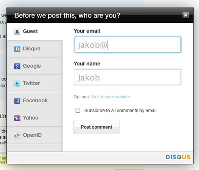
Figure 1-1. An example of a common microinteraction: signup. The Disqus sign-up form cleverly guesses your name based on your email address. (Courtesy Jakob Skjerning and Little Big Details.)
Microinteractions are the functional, interactive details of a product, and details, as Charles Eames famously said,[2] aren’t just the details; they are the design. Details can make engaging with the product easier, more pleasurable—even if we don’t consciously remember them. Some microinteractions are practically or literally invisible, and few are the reason that you buy a product; instead, they are usually pieces of features, or the supporting or so-called “hygiene” functionality. For example, no one buys a mobile phone for the ability to turn the ringer off, but it’s expected, and, as we’ve seen, that microinteraction can create all sorts of experiences—for good and bad. Some microinteractions can be frustrating, some dull and forgotten, while the best are engaging and clever. It’s this last that this book will provide the tools to design.
The case of Patron X is one of the few examples of a microinteraction making news. Even though we’re surrounded by microinteractions every day, we don’t usually notice them until something goes horribly wrong, as it did for Patron X. But microinteractions are, despite their small size and near-invisibility, incredibly important. The difference between a product you love and a product you tolerate is often the microinteractions you have with it. They can make our lives easier, more fun, and just more interesting if done well. That’s what this book is all about: how to design microinteractions well.
This chapter will teach you how to distinguish microinteractions from features, and gives a brief history of microinteractions. Then, we’ll dive into the structure of microinteractions, which also forms the structure of the rest of the book. The microinteractions model will provide a means of discussing and dissecting every piece of a microinteraction so that you can design or improve your own microinteractions. Finally, we’ll talk about how to incorporate microinteractions into your process.
Microinteractions Are Not Features ... But Still Matter
The combination of well-designed micro- and macro- (feature) interactions is a powerful one. This is what experience design truly is: paying attention to the details as well as the big picture so that users have a great experience using the product.
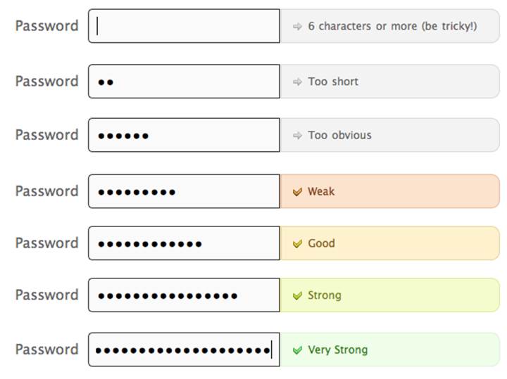
Figure 1-2. Twitter’s password-selection form is a great variation on a common microinteraction (picking a password), with very clear feedback. (Courtesy Little Big Details.)
Microinteractions differ from features in both their size and scope. Features tend to be complex (multiuse case), time consuming, and cognitively engaging. Microinteractions on the other hand are simple, brief, and should be nearly effortless. A music player is a feature; adjusting the volume is a microinteraction inside that feature.
Microinteractions are good for:
§ Accomplishing a single task
§ Connecting devices together
§ Interacting with a single piece of data, such as a stock price or the temperature
§ Controlling an ongoing process, such as changing the TV channel
§ Adjusting a setting
§ Viewing or creating a small piece of content, like a status message
§ Turning a feature or function on or off
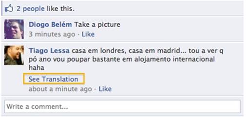
Figure 1-3. When someone posts on your Facebook page in a language that isn’t your default, Facebook offers to translate. (Courtesy Marina Janeiko and Little Big Details.)
Microinteractions Can Be Big
Microinteractions can be part of a product—or even the entire product itself. Take a toaster, for example. A toaster does one thing: toasts. It only has one use case: a user puts item to toast into the toaster and presses start. Toaster toasts. Toast pops up when done. That’s it. Now, of course, there are variations to this (toasting a bagel instead of bread), but in general the whole device is powered by a single microinteraction.
Similarly, small apps can be made up of one microinteraction. Thousands of small apps—desktop and mobile—do one small thing well, whether it’s converting measurements like Convertbot (see Figure 1-4), being a calculator, or showing weather data.
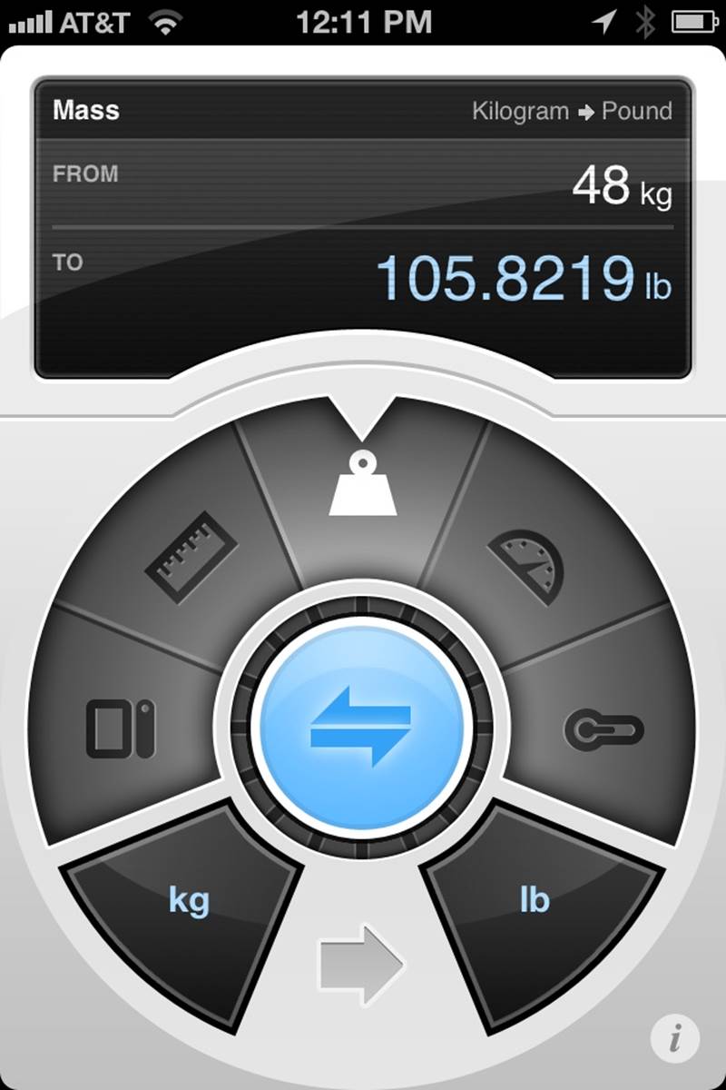
Figure 1-4. Tapbot’s Convertbot is an app built around a single microinteraction: converting one value to another.
Microinteractions are frequently the last parts of a product to be designed and developed, and as such they are often overlooked. But ignoring them is a mistake. The reason the original (G1) version of Android felt so unpolished was because the microinteractions were clunky, especially in comparison to the iPhone; for example, deleting items was inconsistently triggered, and in some applications pressing the search key did nothing at all. If the microinteractions are poor, the main features, no matter how nicely done, are surrounded by pain and frustration. The design of your product is only as good as its smallest part.
Consider that almost all operating systems, be they mobile or desktop, do basically the same things: install and launch applications, manage files, connect software to hardware, manage open applications and windows, etc. But the difference between operating systems—at least from a user’s perspective—are the microinteractions you have with it on a daily, even hourly, basis (see Figure 1-5).
![]()
Figure 1-5. The author’s menu bar in OS X is crammed full of icons, each of which launches a microinteraction.
Of course, some features are so useful and/or powerful (or so highly protected by intellectual property laws) that the microinteractions don’t matter as much. Many medical devices are examples of this, as is most early stage technology, when people are more amazed something can be done rather than how it’s done. For instance, the first generation of the Roomba (introduced in 2002) couldn’t calculate room size or detect obstacles and dirt, but it was a novel technology nonetheless, and subsequent models (especially now that there are competitors on the market) have focused more on the human–robot microinteractions.
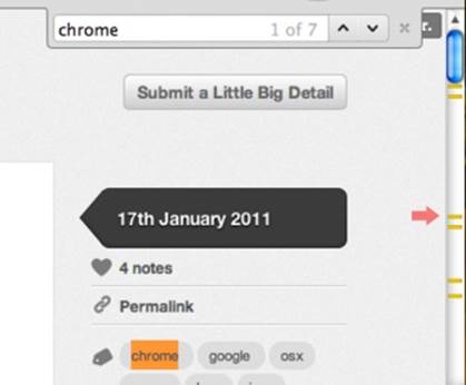
Figure 1-6. When trying to find a word on a page, Chrome indicates in the scrollbar where instances of that word appear. (Courtesy Saul Cozens and Little Big Details.)
In competitive markets, microinteractions are even more important. When there is feature parity, it is the experience using the product that increases adoption and brand loyalty. The overall experience of a product relies heavily on its microinteractions. They are the “feel” in look-and-feel. One reason Google+ fell so flat against Facebook was that its microinteractions, such as sorting users into circles, while initially intriguing, quickly became tiresome and gimmicky.
Another reason to pay attention to microinteractions is because they fit so well into our multiplatform existence. Microinteractions are the glue that can tie together features across mobile devices, TV, desktop and laptop computers, appliances, and the Web. While the microinteractions could vary by platform, their small size allows for a consistency that you might not have with large features. In particular, appliances and mobile devices with their small (or no) screens seem custom-made for microinteractions. Small interactions work well on small devices.
Take Twitter for example. Twitter is built entirely around a single microinteraction: sending a <140-character message. Users can do this from practically any device, anywhere. Some objects even tweet independently, or for us. Twitter can be used to send gossip or messages to coordinate a revolution. Well-designed microinteractions can scale well across platforms and to millions of users.

Figure 1-7. A nice piece of microcopy. When you go to ask for support at Harvest, it shows the time at their office alongside their office hours. (Courtesy Nicolas Bouliane.)
Microinteractions also fit well into our already crowded, overcomplicated, and fragmented lives. We need and even enjoy the fast glance at data, the rapid check-in at a restaurant, the casual review of messages on the subway. (The “Casual Games” category is really a set of stand-alone microinteractions for amusement.)
Microinteractions force designers to work simply, to focus on details. They challenge designers to see how lightweight they can design, to reduce complexity and streamline features that could otherwise be burdensome.
Figure 1-8. In Microsoft Office, when text is rotated, relevant styling buttons are rotated as well. (Courtesy Little Big Details.)
The Secret History of Microinteractions
In 1974, a young engineer named Larry Tesler began working on an application called Gypsy for the Xerox Alto computer. Gypsy was one of the first word-processing applications ever, and the successor to the groundbreaking Bravo, the first true WYSIWYG word-processing program and the first program that could have the ability to change fonts. Even though it was still a word-processing program, Gypsy was a different kind of application altogether: it made use of a mouse and a graphical user interface (GUI). Larry’s mission—and what would become his rallying cry for decades to come—was to reduce the modality of the interface, so that users wouldn’t have to switch to a separate mode to perform actions. (His website is http://www.nomodes.com, his Twitter handle is @nomodes, and even his license plate reads NOMODES.) Larry wanted users, when they typed a character key, to always have that character appear onscreen as text—not an unreasonable expectation for a word-processing application. This wasn’t the case in Bravo: typing only worked in a particular mode; other times it triggered a function.
![A “screenshot” (Polaroid[!]) of Bravo. The bottom window is being used to make a form in the top window. (Courtesy DigiBarn Computer Museum.)](microinteractions.files/image010.jpg)
Figure 1-9. A “screenshot” (Polaroid[!]) of Bravo. The bottom window is being used to make a form in the top window. (Courtesy DigiBarn Computer Museum.)
One of those functions was moving text from one part of the document to another. In Bravo (see Figure 1-9), users had to first select the destination, then press the “I” or “R” keys to enter Insert or Replace modes, then find and select the text to move, then finally press the Escape key to execute the copy.[3] Larry knew there was a better way to perform this action, so he designed one that not only made use of the mouse, but radically simplified this microinteraction. In Gypsy, the user could select a piece of text, press the “Copy” function key, then select the destination, and finally press the “Paste” function key. No mode required. And thus, cut and paste was born.
The intertwined history of interaction design and human–computer interaction is really the history of microinteractions. The tiny things we unthinkingly interact with every day on desktops, laptops, and mobile devices were once novel microinteractions: everything from saving a document to organizing files into folders to connecting to a WiFi network were all microinteractions that needed to be designed. Even “basics” like scrolling and opening multiple windows needed to be designed and engineered. The forward march of technology has provided a continuous need for new microinteractions. We use them unquestioningly now, and only really pay attention to them when someone designs a better way, or the technology changes and allows for or forces a new way of performing the microinteraction.
Indeed, as technologies have changed, the microinteractions that support them have also changed. Take scrolling, for instance. Bravo had a primitive version of scrolling, but scrolling really became more refined when Alan Kay, Adele Goldberg, and Dan Ingalls introduced scrollbars in another Xerox PARC product, SmallTalk, sometime between 1973 and 1976. SmallTalk’s scrolling could be smooth, pixel-by-pixel, instead of line-by-line. (This was famously one of the UI elements demoed to Steve Jobs and his engineers, which they then built into Apple’s Lisa (Figure 1-10)—and subsequently the Macintosh.)[4]
As documents got longer, scrollbars added arrows to jump to the end without scrolling. Tooltip-style indicators would appear to indicate where you were in the document. But the real change came with touchscreen technology on trackpads and mobile devices. Do you slide up or down to scroll down? Apple famously changed directions (from down to up) in OS X Lion after the introduction of its iPhones in order to align its laptops and mobile devices to “natural scrolling.” [See, for example, “Apple’s Mousetrap: Why did Apple reverse the way we scroll up and down?” by Michael Agger in Slate.] Apple has also (to the ire of many) hidden scrollbars except when scrolling is in process or the cursor nears the right edge of a scrollable window. The microinteraction keeps evolving.
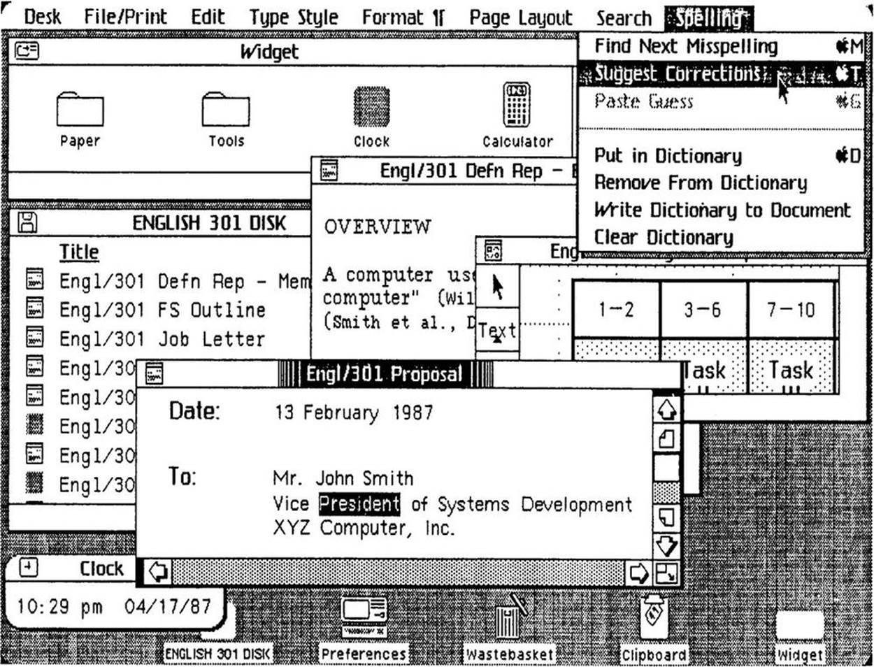
Figure 1-10. Apple’s Lisa (1982) featured dozens of “new” (for the market) microinteractions. (Source: Lisa Graphical User Interface Gallery Guidebook.)
But it’s not just digital products that have microinteractions; a case can be made that microinteractions originated with the first electric devices, such as the radio (1893), the flashlight (1986), and the washing machine (1900). As designer Bill DeRouchey points out in his talk “The History of The Button,” in the (pre-electric) mechanical era, users could follow their actions directly from the control to the output. You could pull a lever, watch the gears move and finally see the wheels turn. It was easy to connect the input to the output. Electricity changed all that. You could press a button on the wall and nearly instantly a light on the other side of the room turned on. Sure, the feedback was instant, but the method of execution was not. As DeRouchey says in “The History of the Button”, “The button meant for the first time the result of the human motion could be completely different from the motion [it creates] itself.” Action became abstracted.
In the digital age, particularly before the GUI, action became even more abstract. Inserting a stack of punchcards or flipping a series of switches produced output that was equally obtuse. For a time, the GUI cleared up and simplified microinteractions. But then Moore’s Law (processor speed doubles every 18 months), Koomey’s Law (power consumption for hardware decreases 50% every 18 months), Kryder’s Law (exponential increase in storage space), and increasing bandwidth and network connectivity (LANs first, then wireless networks, both local and mobile) created the need for more microinteractions, and those microinteractions needed to control actions far more abstract than turning on a light. Just as one example, syncing data across devices is a conceptually abstract idea, for which there’s no readily available physical analog.
Input methods are also drastically changing microinteractions. Not only do we have physical controls like buttons, switches, keyboards, and mice, we also have touchscreens, sensors, voice, and gestural means of triggering microinteractions. In the not-too-distant past, the only way to interact with the physical environment was to adjust it manually via a physical control. This changed in 1956 when Robert Adler invented the Zenith Space Commander, the first TV remote control (Figure 1-11). For the first time, users could control an object from a distance, invisibly.

Figure 1-11. Although there had been remote-control planes and boats previously (mostly for military use), the Space Commander television remote removed proximity from control for consumers. (Courtesy Peter Ha.)
Today, to trigger a microinteraction, you don’t even need to be in the same room. With the right equipment, you can adjust the temperature in your house from the other side of the world (see Figure 1-12). Or you only need to be in the right location; just by being in a certain block, your mobile phone can remind you of a to-do item, or your GPS device can tell you where to turn left. In public restrooms, you can turn on sinks just by putting your hands into them. You can tell your phone to find you a nearby restaurant, or flick your finger down a touchscreen list to reveal a search bar, or tap your phone on a counter to pay for your coffee. The list goes on.
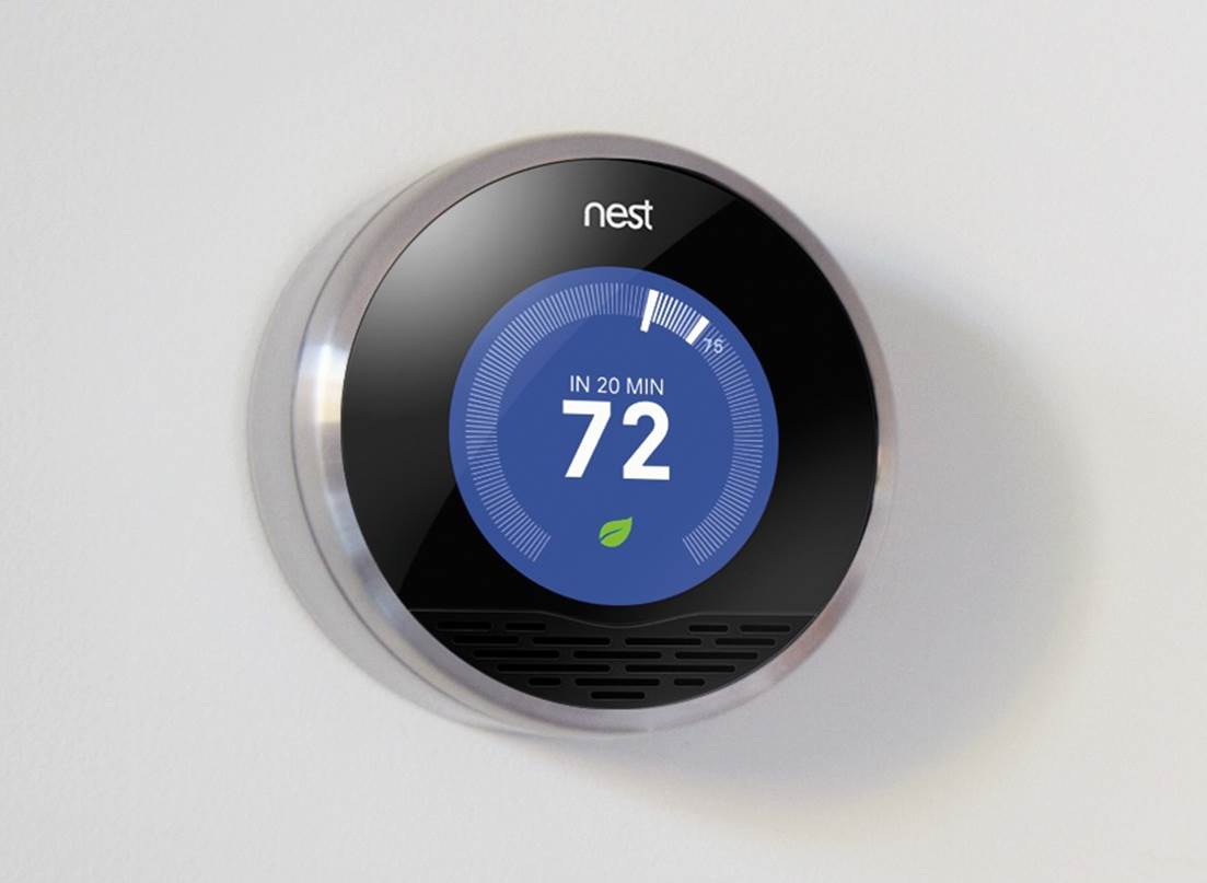
Figure 1-12. The Nest Learning Thermostat uses proximity sensors to know when someone walks into the room, then lights up and shows the temperature in a way that’s visible at a glance from across the room. No touching required. (Courtesy of Nest.)
The history of technology is also the secret history of the microinteractions that, like symbiotic organisms, live alongside them to frame, manage, and control them.
The Structure of Microinteractions
What makes effective microinteractions is not only their contained size, but also their form. A beautifully crafted microinteraction gracefully handles four different parts, which will be described next (see Figure 1-13).
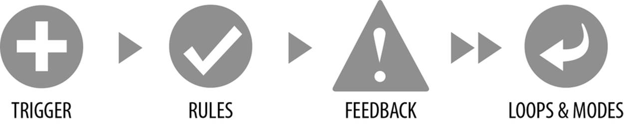
Figure 1-13. The structure of microinteractions.
These four parts—the trigger that initiates the microinteraction, the rules that determine how the microinteraction works, the feedback that illuminates the rules, and loops and modes, the meta rules that affect the microinteraction—are a way to design and dissect microinteractions.
The first part of any microinteraction is the trigger. With turning off the ringer on an iPhone, the trigger is user-initiated, meaning that the user has to do something—in this case, flip a switch—to begin the microinteraction. Thus, many microinteractions begin with an understanding of user need: what the user wants to accomplish, when they want to do it, and how often. This determines the affordances, accessibility, and persistence of the trigger. In our silencing-the-phone example, turning off the ringer is a very common action that users want to perform all the time, rapidly. Thus the trigger (the Ringer/Silent switch) is available all the time, instantly able to be turned on and off no matter what application is running. It was so important, it’s one of only five physical controls on the iPhone. Controls—digital and/or physical—are the most important part of user-initiated triggers. They provide not only the ability to engage with a microinteraction (and sometimes the ability to adjust it while in progress), but also usually the visual affordance that the microinteraction is even there (see Figure 1-14). If there were no ringer on/off switch on the iPhone, you might expect the phone had that functionality, but have to guess at where to find it. In many older mobile phones (and even in some phones still), silencing the phone was buried under several layers of a settings menu. Even for users who knew where the setting was, it took as much as 10 seconds to turn the ringer on or off. It takes less than a second to flip the physical Ringer/Silent switch.
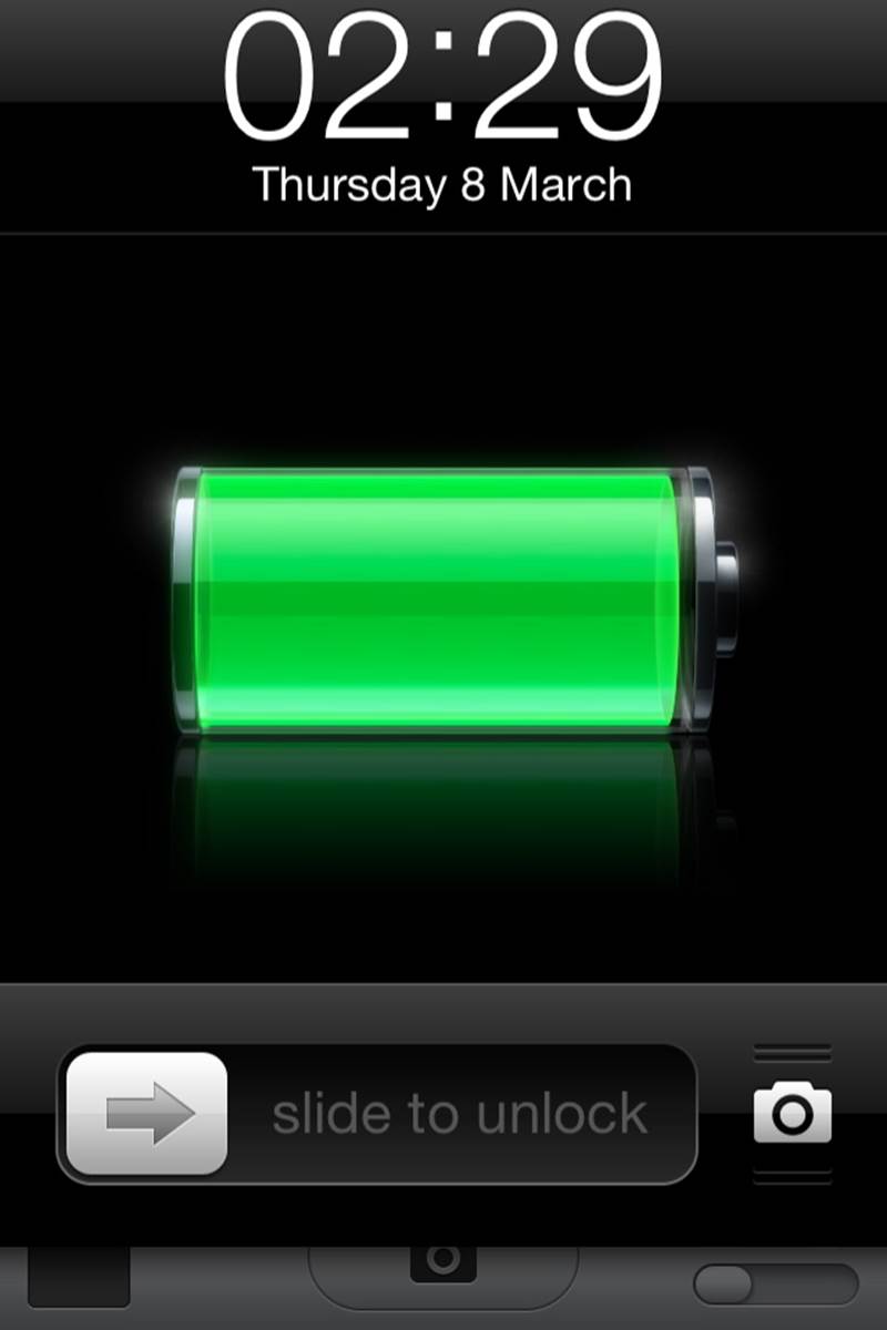
Figure 1-14. An example of a trigger. In iOS (as in Windows Phone), you can use the camera even on a locked phone. Pressing the camera icon bounces the bottom bar up a little, indicating that you swipe up to get the camera functionality. Of course, slide to unlock is its own trigger as well.
Of course, the physical control doesn’t have to be a switch either. Although the best designs feel inevitable, there is almost nothing designed that could not be designed differently. On Windows Phones, the trigger is a pressable rocker button (which also controls volume) that, when pressed, presents users with a screen overlay that lets users choose ringer status as “vibrate” or “ring + vibrate.”
But triggers need not be user-initiated. Increasingly, triggers are system-initiated—when the device or application itself detects that certain conditions have been met and begins a microinteraction. The triggering condition could be anything from detecting that a new email arrived, to the time of day, to the price of a particular stock, to the location of the user in the world. For silencing the phone, one could easily imagine that function integrating with your calendar, so that it automatically silences the phone whenever you’re in a meeting. Or by knowing your location, it automatically goes silent whenever you’re in a movie theater or symphony hall. As our applications and devices become more sensor-full and context-aware, the more ability they could have to make decisions on their own about how they operate.
NOTE
Triggers are covered in Chapter 2.
Understandably, users may want, if not the ability to adjust these system-initiated triggers, then at least the understanding of how they operate, just as Patron X probably would have liked to know how silencing his phone worked. In other words, they want to know the rules of the microinteraction.
Once a microinteraction has been initiated, it engages a sequence of behavior. In other words: something happens. This usually means turning some piece of functionality or interactivity on, but it might just show the current state of the application or device. It might use data to guess what the user wants to do. In whatever case, it turns on at least one rule, and rules can usually be defined by a designer.
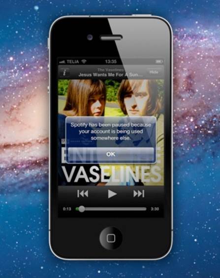
Figure 1-15. An example of a rule. When you’re using the music-streaming service Spotify and then turn it on on another platform, the first instance of Spotify pauses. If you resume playing on the first instance, the second platform will pause. This creates a very frictionless, cross-platform service. (Courtesy Sebastian Hall.)
Take what is probably the simplest microinteraction there is: turning on a light. Once you use the trigger (a light switch), the light turns on. In a basic light setup, there is a single rule: the light stays on and fully lit until the switch is turned off. You can change that rule, however, by adding a dimmer or a motion detector that turns the light off when no motion is detected. But the basic turn on switch/turn on light rule is very simple, and one that becomes apparent to anyone who uses a light, even a child.
With applications or electro-digital devices, the rules can be much, much more nuanced and hard to understand, even for small microinteractions. In the case of Patron X, it was the interaction with silencing the phone that caused the symphony incident, because unless there is a specific piece of feedback (and we’ll get to that next), rules are themselves invisible. Unlike the mechanical devices of the 19th century, users generally cannot see the activity the trigger has initiated. (This “feature” has been used to tremendous effect by hackers, whose victims launch a program that unbeknownst to them installs a virus onto their computers.)
NOTE
Rules are covered in Chapter 3.
Everything we see or hear while using digital devices is an abstraction. Very few of us really know what’s happening when we use any kind of software or device. Just as examples, you’re not really putting a “file” into a “folder” and “email” isn’t really arriving into your “inbox.” Those are all metaphors that allow us to understand the interactions that are going on. Anything you see, hear, or feel that helps you to understand the rules of the system is feedback, the third part of microinteractions.
Feedback can take many forms: visual, aural, haptic (vibrations). Sometimes it can be prominent and unmistakable, like the light bulb glowing when you flip the switch. Sometimes it can be subtle and ambient, like the unread badges that appear on email applications and mobile apps. It can be as descriptive as a voice telling you exactly where to turn while doing turn-by-turn directions, or it can be as ambiguous as an LED light blinking in a complicated pattern. It can be as disruptive as the fart-like buzz of your phone in your pocket announcing a message, or a whisper as a digital panel opens. What is important is to match feedback to the action, to convey information in the most appropriate channel possible.
In our turning off the ringer on the iPhone example, silencing the phone has two pieces of feedback: a screen overlay when the switch is turned on or off, and a tiny, visible strip of orange on the actual switch when the phone is silent. What doesn’t appear—and what was the downfall of Patron X—is any indication that even though the ringer is off, set alarms will still sound. There is also no onscreen indicator (other than the temporary overlay, which vanishes after a few seconds) that the ringer is off. These are design choices.
Even more than with triggers, feedback is the place to express the personality of the product. Indeed, feedback could be said, along with the overall form, to completely define the product’s personality.
Feedback is not only graphics, sounds, and vibrations; it’s also animation (see Figure 1-16). How does a microinteraction appear and disappear? What happens when an item moves: how fast does it go? Does the direction it moves in matter?
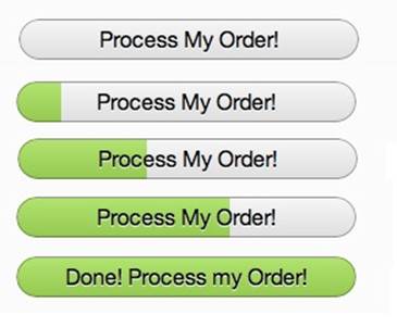
Figure 1-16. An example of feedback. In Coda2, the Process My Order button becomes a progress bar when pressed. The text should change to Processing Order and Order Processed!, however. (Courtesy Christophe Hermann and Little Big Details.)
Feedback can have its own rules as well, such as when to appear, how to change colors, how to rotate the screen when the user turns a tablet on its side. These rules may themselves become their own microinteractions, as users might want to adjust them manually as a setting.
NOTE
Feedback is discussed in Chapter 4.
The last part of microinteractions are the loops and modes that make up its meta rules. What happens over time with the microinteraction: do the interactions remain until manually turned off (as is the case with the Ringer/Silence switch) or do they expire after a while? What happens during an interruption or when conditions change? See Figure 1-17 for an example.
Although it’s often undesirable, some microinteractions have different modes. For instance, take the example of a weather app. Its main (default) mode is all about displaying the weather. But perhaps users have to enter another mode to enter the locations they’d like weather data from.

Figure 1-17. An example of a loop. On eBay, if you’ve bought the same item in the past, the button changes from “Buy it now” to “Buy another.” (Courtesy Jason Seney and Little Big Details.)
NOTE
Loops and modes are discussed in Chapter 5.
Microinteractions as a Philosophy
There are three ways of incorporating microinteractions into products. The first is to think about them on a case-by-case basis. During the course of a design project or when simply refining your product, try to identify any possible microinteractions. Make a list of them, then treat each as such. For each one, deliberately consider the structure as outlined in this book, and see if you can polish each individual component. You’ll wind up with elegant microinteractions—and possibly Signature Moments.
Signature Moments are those microinteractions that are product differentiators. A custom trigger control (such as the original iPod’s scroll wheel) or an elegant “loading” animation or a catchy sound (“You’ve Got Mail!”) can be marketed as though they are features and used cross-platform or in other products by the same organization. A Signature Moment will help create customer loyalty and recognition. The Like button on Facebook is now so well known that it’s part of the brand.
The challenge in working this way is keeping the scope of the microinteraction limited. The tendency is to turn them into features, because that is the way most designers are used to working. We want to tackle big problems and solve everything. Microinteractions are an exercise in restraint, in doing as much as possible with as little as possible. Embrace the constraints and focus your attention on doing one thing well. Mies van der Rohe’s mantra of “less is more” should be the microinteraction designer’s mantra as well.
A second way to think about microinteractions is to reduce more complex applications to individual products that are each built around one microinteraction. This is microinteractions as product strategy: your product does one thing and one thing well. Reduce the product to its essence, its Buddha nature. If you find you want to add another feature to your product, that other feature should be its own product. Many appliances, apps, and devices, including the original iPod, follow this model. This is how many startups work (or at least began), from Instagram to Nest: they did one thing well. The “minimum viable product” can be one microinteraction. Working this way justifies and provokes a radical simplicity to your product, which allows you to say no to feature requests as they arise. Of course, this is also a difficult stance to take, particularly in corporations where the inclination is to sell one product that does everything their customers might need. Imagine breaking up Microsoft Word into individual products! And yet this is what some competitors have done. For example, apps like WriteApp are optimized just for writing, with most of the functionality of a word-processing program stripped away, so that the focus is only on writing, for writers. Evernote began with a simple microinteraction: write notes that are available across platforms.
But there is a third way to think about microinteractions, and that is that most complex digital products, broken down, are made up of dozens, if not hundreds, of microinteractions. You can view a product as the result of all these microinteractions working in harmony. This is what Charles Eames meant when he said the details are the design. Everything’s a detail, everything’s a microinteraction: a chance to delight, a chance to exceed users’ expectations. As Dieter Rams said:
I have always had a soft spot in my heart for the details. I consider details more important than a great draft. Nothing works without details. Details are the essentials. The standard to measure quality by.[5]
In short, treat every piece of functionality—the entire product—as a set of microinteractions. The beauty of designing products this way is that it mirrors the smaller, more agile way of working that many companies are embracing. Of course, the pitfall is that you can get lost in the microinteractions and not see the big picture, that all the details won’t fit together into a coherent whole when you’re finished. And working this way takes extra time and effort.
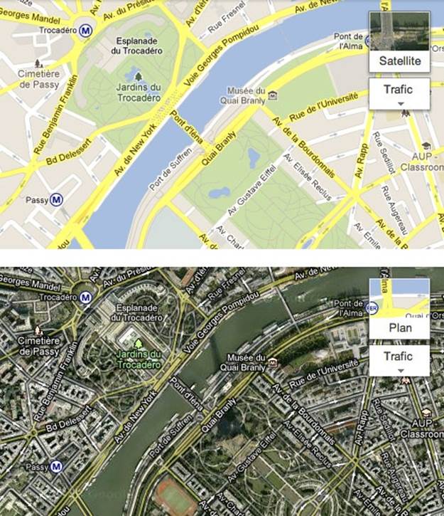
Figure 1-18. Whether viewing the Standard (“Plan”) or Satellite view of Google Maps, the widget for changing the view shows the map and a preview of the other view behind it. (Courtesy Hugo Bouquard and Little Big Details.)
This is also a difficult way for agencies—with their notoriously fast project schedules—to work. It’s honestly a challenging way for any designer to work, as often the attention of clients and stakeholders is focused on the big features, not the small details that would enhance those features or improve the overall experience. Indeed, it can be difficult to get enough time to focus on microinteractions at all. Convincing business and development team members that microinteractions are worth spending time on can be a challenge. It will likely mean extra time for design and development, after all. But it’s worth it.
The disastrous story of Patron X reminds us that microinteractions matter, that the designer’s job is to take the tasks that could otherwise be frustrating and difficult and make them otherwise. Larry Tesler knew this when he decided there had to be a better way to move text inside a document, and thus cut and paste were born. Microinteractions can improve the world, one tiny piece at a time. And they all start with a trigger.
Summary
Microinteractions are the small pieces of functionality that are all around us. Focusing on them is the way to create a superior user experience.
The history of microinteractions stretches back to the first electric devices. Most of the digital standards we’re used to now were once novel microinteractions.
A microinteraction is made up of four parts: triggers that initiate it, rules that determine how it functions, feedback that the rules generate, and the loops and modes that make up its meta-rules.
There are three ways of working with microinteractions: look for them and focus on each individually, reduce a complicated feature to a core microinteraction, or treat every feature as a set of linked microinteractions.
[1] Daniel J. Wakin, “Ringing Finally Ended, but There’s No Button to Stop Shame.” The New York Times, January 12, 2012.
[2] See 100 Quotes by Charles Eames, Charles Eames (Eames Office, 2007).
[3] Detailed in Bravo Course Outline by Suzan Jerome, published by Xerox, 1976.
[4] As recounted in Dealers of Lightning: Xerox PARC and the Dawn of the Computer Age by Michael A. Hiltzik (HarperBusiness, 2005).
[5] Dieter Rams in conversation with Rido Busse (1980), reprinted in Design: Dieter Rams & (1981).