Microinteractions (2014)
Chapter 2. Triggers

In the 1990s, New York City Transit began converting its seven million daily bus-and-subway passengers from paying fares with tokens—which had been in use since 1904—to paying with a MetroCard, a thin, paper-like plastic card. One of the key pieces of the city’s conversion plan was the installation of hundreds of vending machines all over the five boroughs for riders to purchase and fund these new MetroCards. This was no easy task. New York City is home to over eight million people, and tens of millions more live in the surrounding tristate area. According to a report by the Department of City Planning, in 2000, 36% of New York City residents were foreign born; there were enough people speaking a language other than English in 2002 to support 40 magazines and newspapers in another language.[6] Tens of thousands of residents are visually impaired, physically disabled, have little or no schooling, or are illiterate—or some combination thereof. The official guide to New York City reports that over 35 million tourists visit every year (in some years as many as 50 million), many of whom will ride the subway, but few of whom are familiar with it or know how to buy a MetroCard. In fact, the Metropolitan Transit Authority (MTA) had done studies of early MetroCard vending machine prototypes and had found that users were intimidated by the physical form and found the user interface to be incomprehensible.
Stepping into this challenge were designers Masamichi Udagawa, Sigi Moeslinger, and their team at Antenna Design, who were tasked with designing the MetroCard Vending Machine.
As Moeslinger recounts,[7] one assumption they had to dispel for themselves was that their users had experience using touchscreen-style kiosks. In the mid-1990s, few people outside of the service industry (where touchscreens were behind bars and fast-food restaurant counters) had much interaction with touchscreens, with one exception: automatic teller machines (ATMs). The designers assumed that even for the lowest common denominator, they would have at least some experience using an ATM. This turned out not to be the case—at the time, anecdotally up to 50% of the MTA riders didn’t have a bank account, and thus didn’t own an ATM card. They’d likely never used a machine like the MetroCard dispenser. “The concept of a touchscreen was really alien to them,” said Moeslinger. Just getting these users—millions of them—to approach and start using the new, unfamiliar machines was a real issue.
Antenna decided to make each screen of the machine only do one task. “It simulates a dialog and asks one question per screen,” said Moeslinger. (In other words, they made every screen a microinteraction.) There was some concern by the MTA that by doing so, it would make the transaction too slow. With millions of people using the machines, additional seconds in the transaction could cause lines and rider complaints. But the opposite proved to be the case. “Having quickly graspable bits of information made the transaction much faster than trying to save screens in the steps of the process.”
Antenna explored two interaction models: one in which you put your money in first, then you select what you want (like a soda machine) and a second in which you select what you want first, then pay. Users much preferred the second model, but there was still the problem of getting them to start using the new machines in the first place.
Their solution: turn the entire touchscreen into one huge trigger (see Figure 2-1). As discussed in Chapter 1, a trigger is the physical or digital control or condition(s) that begins a microinteraction. In this case the idle screen—the screen that appears after a transaction is completed or when a machine is sitting idle—became a giant call to action: TOUCH ME. As you can see in Figure 2-1, Antenna did everything short of lighting off signal flares to attract users to the trigger. The word “start” appears three times and “touch” twice. The hand animates, pointing towards the Start button. But here’s the thing: the whole screen is the trigger. You can touch anywhere to begin using the machine. The Start button is just a visual cue—a faux affordance—so that people know to “push” (when they will actually just tap) it to start. Although it seems like the button is the trigger, really it’s the whole screen. It’s a great solution to a very hard challenge—and one that is still in use over a decade later.
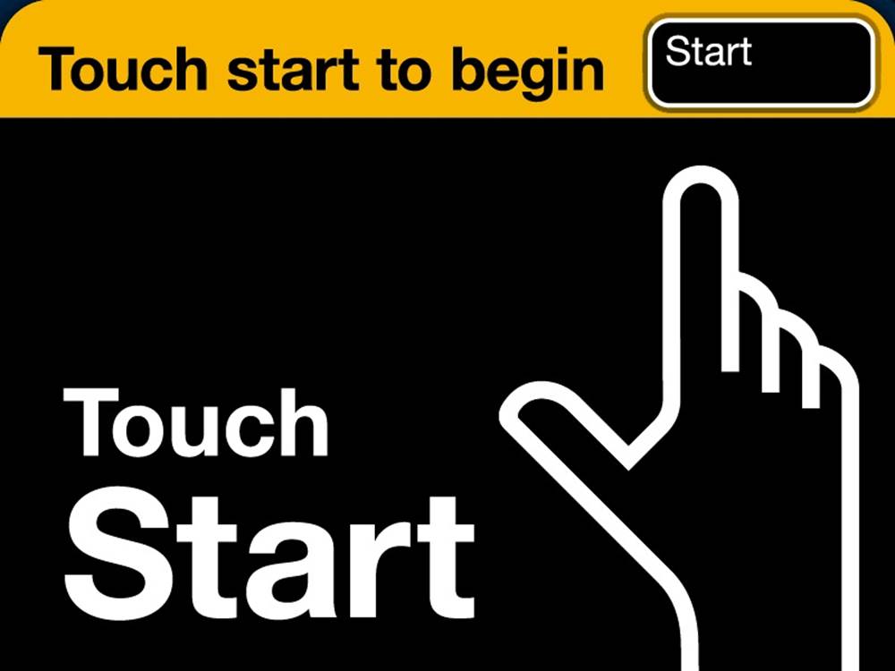
Figure 2-1. The idle screen from the MetroCard Vending Machine. Antenna Design deliberately overemphasized the trigger, which was not, as one might suspect, the button in the top right. It’s actually the whole screen. (Courtesy Antenna Design.)
The MetroCard Vending Machine introduces the first principle of triggers: make the trigger something the target users will recognize as a trigger in context. This might mean a physical (or seemingly physical, as with the fake Start button on the MetroCard Vending Machine) control like a button or a switch, or it could be an icon in the task or menu bar. Make it look like you can do something, and make it engaging. And while having a large, animated glowing finger pointing up to a Start button isn’t the right affordance for most microinteractions, it was appropriate—and wildly successful—for this context.
Manual Triggers
Where do microinteractions begin? Often they are the very first thing a user encounters as they turn a device on or launch an app. The on/off switch (or its digital equivalent) is the first trigger they encounter. On/off switches are, like the Start screen on the MetroCard, examples of manual triggers. (Automatic, system-initiated triggers are covered later.)
Manual triggers usually spring from a user want or need: “I want to turn the TV on.” “I want to turn the ringer off on this phone.” “I need to move this text from one place to another.” “I want to buy a MetroCard.” From a strategic point of view, it is critically important to understand what a user wants (or needs) to do, when they want to do it, and in what context(s) they want to do it. This determines when and where your manual trigger should instantiate. It might need to be globally available, like an on/off switch, or it might be very contextual, only appearing when certain conditions are met, such as being in a particular mode or when the user is in a particular functional area of the app. For example, Microsoft Office’s “minibar” formatting menu only appears when text has been highlighted. You can find out these user needs the usual ways: either through design research (observations, interviews, exercises) or through intuition and understanding of the subject area. Or you find out the hard way: in product testing or when the product is launched or out in the field. The point is to match the user need (when and where) with the location of the trigger. (See Making manual triggers discoverable.)
The second principle of triggers, although it seems incredible to even have to say this, is have the trigger initiate the same action every time. This is so users can create an accurate mental model of how the microinteraction works. This is violated more frequently than one might imagine. Tech reviewer David Pogue on the Samsung S Note:
Some of the icons in S Note actually display a different menu every other time you tap them. I’m not making this up.[8]
Another example is the Home button on iPhone and iPad, which either takes you to the home screen or, if you’re on the home screen, to Search. (Not to mention all the other functions that it does when you press it twice or press and hold. See Spring-Loaded and One-off Modes in Chapter 5.) While bundling functionality under the home button is a great way to reuse limited hardware, the single press that takes you to Search instead of doing nothing (or giving some kind of “Hey! You’re already there!” feedback) if you’re on the home screen is probably a step too far.
Possibly the least effective visible triggers are those that are only items in a drop-down menu. As a menu item, the trigger is effectively invisible; if the microinteraction isn’t frequently used, having it buried in a menu requires users to do a lot of searching to find it. Of course, the alternative is to have a visible trigger onscreen for a microinteraction that is infrequently used, which might not be the best solution either. Settings are a perfect example of this; users only use them infrequently, yet they can be essential for certain apps, so it can be a design challenge to figure out how visible the trigger for them needs to be.
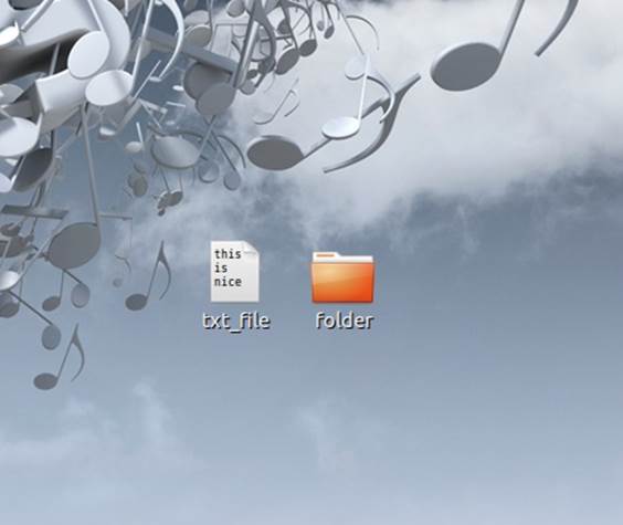
Figure 2-2. On the Gnome desktop, rather than a static text file icon, the icon shows the first three rows of text. (Courtesy Drazen Peric and Little Big Details.)
Bring the Data Forward
The third principle of manual triggers is to bring the data forward. The trigger itself can reflect the data contained inside the microinteraction. Ask yourself, what can I show about the internal state of the microinteraction before it is even engaged or while a process is ongoing? What are the most valuable pieces of information I can show? This requires knowing what most people will use the microinteraction for, but you should know that key piece of information before you even begin. A simple example is a stock market app. Perhaps it indicates (via color or an arrow) the current state of the market or a stock portfolio, which could prompt the user to launch the microinteraction—or not. The trigger becomes a piece of ambient information available at a glance that might lead to using the trigger.
The trigger can also indicate where in a process a product is (see Figure 2-3 for an example). The button you use to start a process (making toast, for example) could indicate how long it is until the toast is ready.
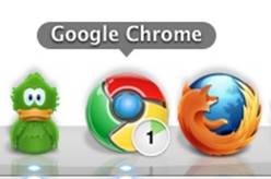
Figure 2-3. Google’s Chrome browser icon (the trigger to launch it) also indicates active downloads and the download’s progress.
The Components of a Trigger
Manual triggers can have three components: the control itself, the states of the control, and any text or iconographic label.
Controls
For manual triggers, the least you can have is a control (see Figure 2-4). The kind of control you choose can be determined by how much control you want to give:
§ For a single action (e.g., fast-forward), a button or a simple gesture is a good choice. The “button” in some cases could be an icon or menu item, while the gesture could be a movement like a tap, swipe, or wave. A button could also be (or be paired with) a key command or a gesture.
§ For an action with two states (e.g., on or off), a toggle switch makes sense. Alternatively, a toggle button could be used, although it is often hard to tell at a glance what state the button is in—or even that it might have another state. A third (and perhaps worst) choice is that of a regular button where a single press changes the state. If you choose this method, the state the button controls should be absolutely clear. A lamp is clearly on or off, so a regular (nontoggle) button could be used to turn it on and off.
§ For an action with several defined states, a dial is a good choice. Aside from having detents, dials can have a push/pull toggle state as well. Alternatively, a set of buttons could be used, one for each choice.
§ For an action along a continuum (e.g., adjusting volume) with a defined range, a slide or dial (particularly a jog dial, which can spin quickly) are the best choices. Alternatively, and particularly if there is no defined range, a pair of buttons could be used to change the value up/down or high/low.
§ Some manual triggers are made up of multiple controls or elements such as form fields (radio buttons, checkboxes, text-entry fields, etc.). For example, a microinteraction such as logging in might have text-entry fields to put in a username and password. These should be used sparingly and, whenever possible, prepopulated with either previously entered values or smart defaults.
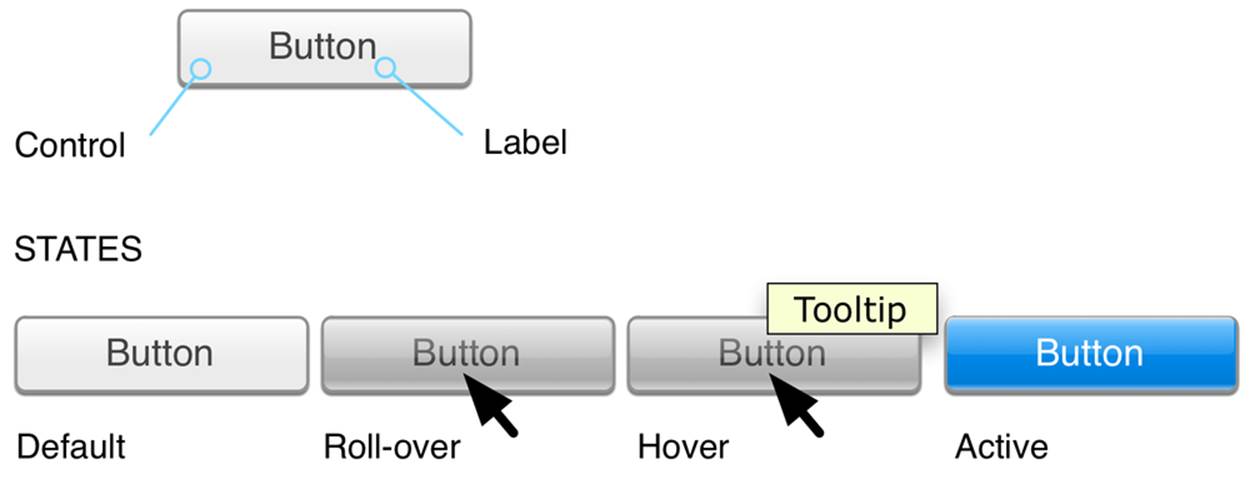
Figure 2-4. The parts of a control.
There are also custom controls that fall outside the traditional buttons, switches, and dials—an example being the scroll wheel from the original (nontouch) iPods. Custom controls will bring a distinct emphasis to your microinteraction, perhaps even making it a Signature Moment. Custom controls can also be gestures or touches (see Invisible triggers).
The goal for microinteractions is to minimize choice and instead provide a smart default and a very limited number of choices. The control you select for the trigger should reflect this philosophy.
Controls are tightly coupled with visual affordances—what users expect can be done, based on sight. The fourth principle of triggers is don’t break the visual affordance: if your trigger looks like a button, it should work like a button and be able to be pushed.
Making manual triggers discoverable
An important first question to ask is: how noticeable should this trigger be? The fifth principle of triggers is that the more frequently the microinteraction is used, the more visible it should be. Author Scott Berkun has a golden rule for discoverability that I’ve adapted for microinteractions. It’s this:
Microinteractions that most people do, most often, should be highly discoverable. Microinteractions that some people do, somewhat often, should be easily discoverable. Microinteractions that few people do, infrequently, should take some searching to find.[9]
This golden rule will serve you well when determining how discoverable your trigger should be.
But how do we discover anything?
There are two ways we as humans become aware of anything in our environment. The first is that the item, either through movement or sound, causes our attention to involuntarily attune to it. This stimulus-driven attention is what kept our ancestors alive, drawing their attention to charging rhinos and other dangers in the environment. Designers can use this same device to draw attention to a trigger by having it move or make noise. Doing this, particularly on a desktop or web environment, can be incredibly obnoxious. Because we involuntarily focus our attention on movement and sound, having a trigger move or make a sound should be reserved for high-priority microinteractions—and to have it repetitively do so should be reserved for the highest priority microinteractions, such as errors and alerts.
The second way we pay attention to anything is when we’re actively seeking to find something—when we’re goal-based. We actively turn our attention on items/areas to see if we can find something that meets our current needs. This attention, unless we are impaired or blind, is mostly visual. We turn our bodies, heads, or just eyes to visually search for what we’re looking for.
NOTE
However, it should be noted that our reaction time to sound is faster than visual; auditory stimulus takes 8–10 milliseconds to reach the brain but visual stimulus takes 20–40 milliseconds.[10] Reaction time to sound is also faster: 140–160 milliseconds for sound versus 180–200 milliseconds for visual.[11] Again, this makes evolutionary sense. The human eye is limited to about 180 degrees horizontal and 100 degrees vertical, while hearing is 360 degrees. A predator coming up from behind wouldn’t be seen, but could be heard. (Some reptiles and birds actually have 360-degree vision.) But while you could (in theory) use sound as a kind of sonar to find a trigger, in nearly every instance this is impractical.
When we’re searching for something, our field of vision can narrow to as little as 1 degree[12] or less than 1% of what we typically see. This narrowing of our field of vision has been compared to a spotlight[13] or zoom-in lens.[14] We engage in a process of object recognition, wherein we identify and categorize items in the environment.
When we’re engaged in object recognition, our eyes are looking for familiar shapes, known as geons. Geons are simple shapes such as squares, triangles, cubes, and cylinders that our brains combine together to figure out what an object is.[15]
Because of geons, it’s especially good practice to make triggers, particularly iconic ones, geometric. In general, it’s easier to find a target when we’re looking for a single characteristic rather than a combination of characteristics,[16] so it’s best to keep your triggers visually simple—especially if they are going to live in a crowded environment such as among other icons.
Once we identify an item (“That’s a button”), we can associate an affordance to it (“I can push a button”), unless there is another visual cue such as it being grayed out or having a big red X over it that negates the affordance. The sixth principle of manual triggers is don’t make a false affordance. If an item looks like a button, it should act like a button. With microinteractions, the least amount of cognitive effort is the goal. Don’t make users guess how a trigger works. Use standard controls as much as possible. As Charles Eames said, “Innovate as a last resort.”
The most discoverable triggers are (from most discoverable to least):
§ An object that is moving, like a pulsing icon
§ An object with an affordance and a label, such as a labeled button
§ An object with a label, such as a labeled icon
§ An object alone, such as an icon
§ A label only, such as a menu item
§ Nothing: an invisible trigger
Invisible triggers
Manual triggers can also be invisible—there might be no label or affordance to let the user know there’s a microinteraction to be triggered. Invisible triggers are often sensor-based, made possible via touchscreens, cameras, microphones, and other sensors such as accelerometers (as inFigure 2-5). However, you could also have an invisible trigger that is only a command key (Figure 2-6) or a mouse movement (to the corner of the screen, for example).
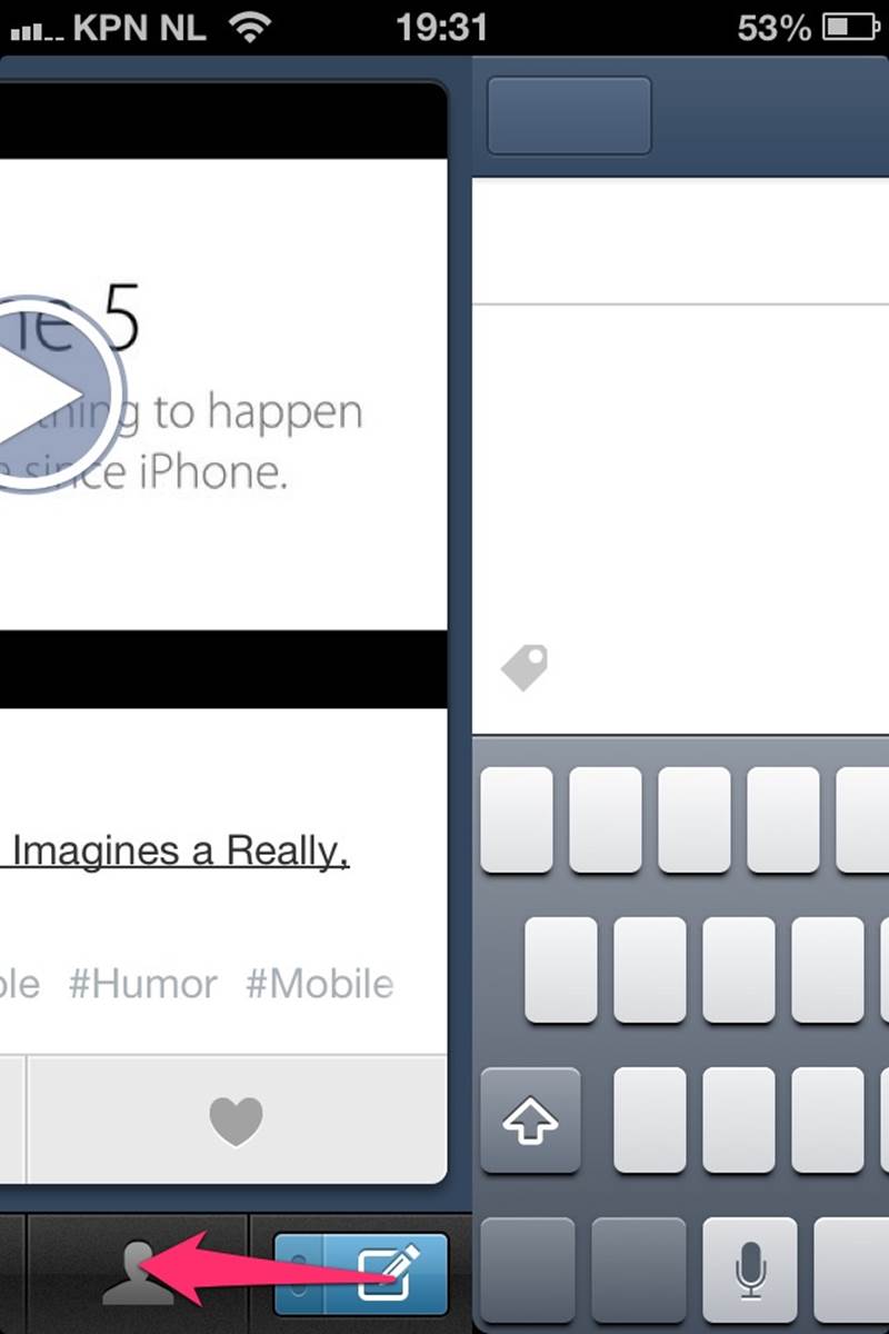
Figure 2-5. Swiping the button to the left on the Tumblr iPhone app (instead of pressing it) is an invisible trigger for creating a new text blog post. You can also swipe upwards to make a new photo post. (Courtesy Robin van’t Slot and Little Big Details.)
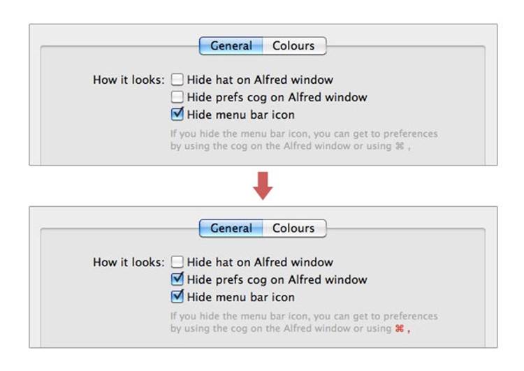
Figure 2-6. In Alfred’s settings, if you disable the visible triggers, the invisible one becomes highlighted. (Courtesy Hans Petter Eikemo and Little Big Details.)
Touchscreen UIs currently contain the most common invisible controls. Many multitouch gestures have no visual affordance to indicate their presence, and custom gestures beyond the usual taps and swipes are often found through a process of trial and error (see Figure 2-7).
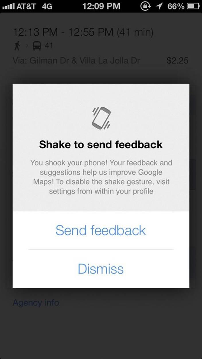
Figure 2-7. In Google Maps for iOS, shaking is an invisible trigger for sending feedback. (Courtesy Little Big Details.)
Voice input is another example of an invisible control. There are three kinds of voice controls:
Always listening
The product’s microphone is always on and users only need to address it (usually by name) to issue a command. Microsoft’s Kinect for Xbox works in this manner. “Xbox, play!” is an example of this kind of control.
Dialogue
The product’s microphone turns on at specific times to listen for a response to a prompt. (“Say ‘yes’ to continue in English.”) Most automated customer call interfaces work thus.
Combined with a control
In order to initiate a voice command, a physical control has to be engaged first. Apple’s Siri works like this: users press and hold the Home button in order to issue voice commands.
Gestural controls such as hand waves to turn something on, or a shake to shuffle are also often invisible. Like voice controls, sometimes there is an initial action (like a wave) or a physical control to get the device ready for other gestural commands. With Google Glass, tilting your head upwards or touching the side of the frame turns on the screen. Touching or being close to a device can be an invisible trigger, such as turning on a bathroom sink when hands are put under the faucet. Similarly, moving away from an object can be a trigger as well, such as automatically flushing a toilet when the person has moved away.
Why ever have an invisible trigger? The truth is, no matter what the interface, not every item is going to be immediately discoverable. Making everything visible and discoverable will often mean an incredibly cluttered, complicated, and not easily scannable screen. Hiding items makes the screen or object visually simpler, while not jettisoning functionality (Figure 2-8). Invisible controls allow for an emphasis on what is visible, and creates a hierarchy of what’s important. But it is important to note that invisibility should not be an explicit goal for microinteraction (or any kind of interaction) design; rather it should be a byproduct of context and technology: what makes sense to hide, given this environment? Or what must we hide because there is no place to display a visible control with this technology? The best microinteractions have just enough interface, but no more.
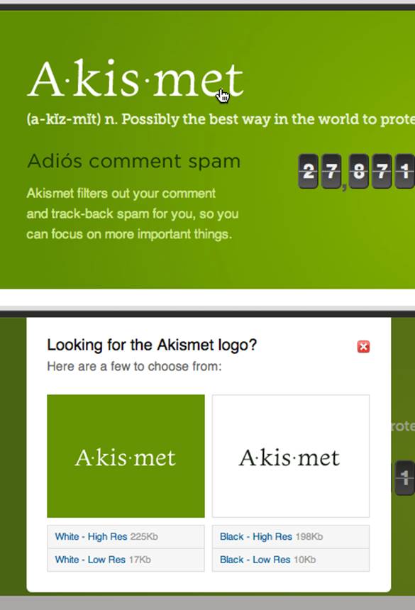
Figure 2-8. Akismet has a clever invisible trigger. When someone right-clicks the logo (presumably to save it), Akismet shows a window with several different resolutions. (Courtesy Fabian Beiner.)
Invisible triggers should be learnable. Once discovered (either through accident, word-of-mouth, or help), users often only have their (faulty) memories to rely on to initiate the microinteraction again. Being learnable means the invisible trigger should be nearly universally available, or alternatively, only available under particular conditions. Invisible triggers should be guessable, or, ideally, stumbled upon as the user performs other actions. For example, scrolling up past the top of a list reveals a reload microinteraction.
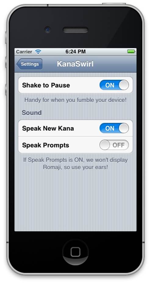
Figure 2-9. KanaSwirl’s settings allow for disabling what would otherwise be an invisible trigger (Shake to Pause). (Courtesy Shawn M. Moore and Little Big Details.)
Unless it’s impossible—there is no screen or place to put a physical control, such as with Google Glass—never make an invisible trigger for a high-priority microinteraction. Try to, at least, create a visible trigger for the microinteraction. For example, a command key and menu items.
Control states
Some manual triggers have multiple states. Although in most cases you won’t have all of these states, when designing a trigger, you should consider them:
Default
The idle state when there is no activity.
Active
If there is an activity working in the background—for example, downloading an update or syncing—the trigger could be used to indicate that.
Hover
Can be used to bring up a tool-tip-style description, expand the size of the trigger to reveal more controls or form fields, or simply indicate that an item is clickable. Even more useful, a hover can display a piece of data that is contained within the microinteraction (see Figure 2-10). For example, hovering over an icon that launches a weather app could show you today’s weather without ever having to launch the app. Bring the data forward.
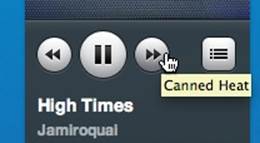
Figure 2-10. In the Rdio player, hovering over the fast-forward and rewind buttons display the upcoming or previous track. (Courtesy Nicholas Kreidberg and Little Big Details.)
Rollover
Often used to indicate presence or activity, or just an added indicator that the cursor is positioned correctly to engage (see Figure 2-11).
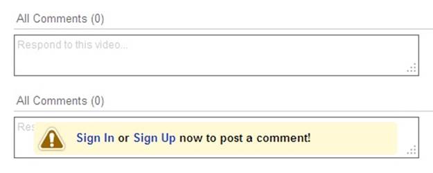
Figure 2-11. If you aren’t logged in and roll over the Comment field, YouTube prompts you to sign in or sign up. (Courtesy Marian Buhnici and Little Big Details.)
On click/tap/in process
What happens when the trigger is clicked, tapped, or begun. This can mean the trigger disappears, opens, changes color, or becomes a progress indicator as the microinteraction loads (see Figures 2-12 and 2-14). One variation is that the trigger does not launch the microinteraction immediately, but expands the trigger to reveal more controls. For example, a Save button could open up a panel that asks whether to Overwrite or Save As.
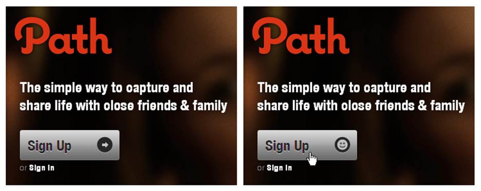
Figure 2-12. Path’s Sign Up button smiles when clicked. (Courtesy Little Big Details.)
Toggle
Switches and buttons can indicate their current setting (left/right, up/down, or pressed/unpressed, respectively). On physical devices, switches often make this easier to determine this at a glance, unless the button has some accompanying indicator, such as an LED that glows when in a pressed state.
Setting
Dials, switches, and sliders can show what setting or stage the microinteraction is currently at (see Figure 2-13).
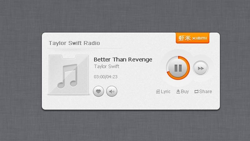
Figure 2-13. The play/pause control on Xiami.com indicates the playing time of a song. (Courtesy Little Big Details.)
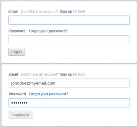
Figure 2-14. In CloudApp, the Log In button changes state after being clicked to let users know an action is happening in the background. (Courtesy Little Big Details.)
These indicators of state are usually the trigger itself—the trigger changes its appearance or animates—but it can also be an indicator light such as an LED positioned near the trigger. For example, a glowing red LED near an on/off switch could indicate its off setting. It’s good practice to keep any state indicator that isn’t attached to the trigger near the trigger. The same applies for any “expanded” version of the trigger: don’t open up a window elsewhere. Keep the focus on the trigger itself.
Labels
An important part of some triggers are their labels. Labels can name the whole microinteraction (e.g., the menu item or Microsoft Ribbon item name) or they can be indicators of state, such as a name at each detent on a dial. Labels are interface.
The purpose of a label is clarity: is what I’m about to do the thing I want to be doing? Labels put a name on an action and create understanding where there could otherwise be ambiguity. But because a label becomes one more item to scan and parse, only provide a label if there could be ambiguity. The better practice is to design the control so it has no inherent ambiguity (Figure 2-15).
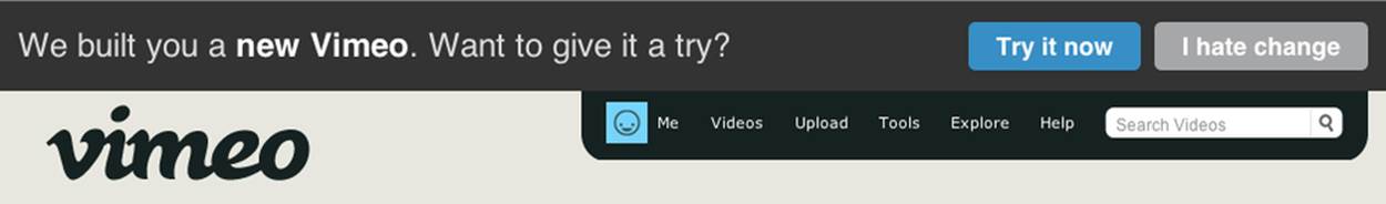
Figure 2-15. Vimeo’s cancel/dismiss/not now button is humorously labeled “I hate change.” (Courtesy Joe Ortenzi and Little Big Details.)
The seventh principle of manual triggers is to add a label only if it provides information that the trigger itself cannot. Consider how you could represent the label visually instead of by adding text. For instance, imagine a rating system of 1–5 stars. You could design a slider with numeric labels of 1–5 or you could have the trigger be just the five stars that light up one by one on hover.
This is obviously not possible or desirable in some cases. A missing label on a button can mean that that button is indistinguishable from every other button around it and thus is never pushed.
Unlike other kinds of product copy (i.e., instructional, marketing), microinteraction labels are not typically the place for brand creativity; they are utilitarian, to create clarity (see Figures 2-16 and 2-17). This is not to say to ignore whimsy or personality, but to do so only when the label remains clear. Google’s “I’m Feeling Lucky” button label might be amusing, but tells you absolutely nothing about what is going to happen when you press the button. There is no feedforward—an understanding of what is going to happen before it happens.[17]
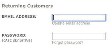
Figure 2-16. Barnes & Noble’s website has a label that visually indicates case sensitivity. (Courtesy Paul Clip and Little Big Details.)
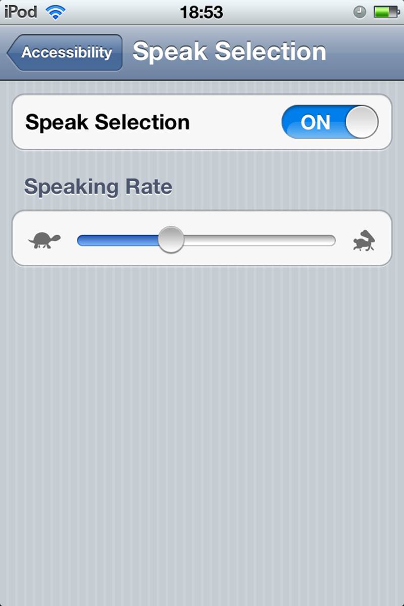
Figure 2-17. Apple’s iOS Speak Selection setting has an example of a whimsical but clear iconic label, using the fable of “The Tortoise and the Hare.” Although, in cultures where this analogy is unknown, this would certainly be puzzling. (Courtesy Victor Boaretto and Little Big Details.)
In general, labels need to be short yet descriptive and in clear language. “Submit” as a button label may be short, but it doesn’t clearly indicate in nontechnical language what action the user is about to take. In microinteractions, specificity matters. Being vague is the enemy of a good label. Be specific. (For more on this topic, see Microcopy in Chapter 3.)
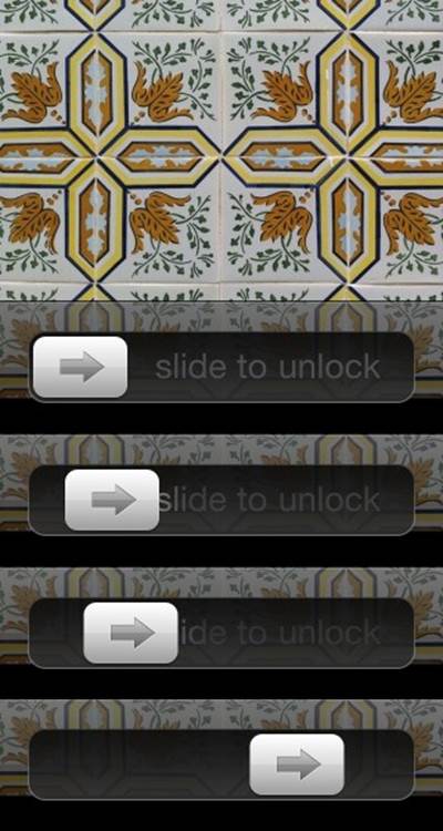
Figure 2-18. The label on the iPhone’s Slide to Unlock Trigger vanishes as you slide. (Courtesy Little Big Details.)
Consistency is also important. Since labels can be names, be sure you title anything you’re labeling (the microinteraction, a state, a setting, a piece of data) the same name throughout the microinteraction. Don’t call it an “alert” in one part of the microinteraction and a “warning” in another part.
The best way to ensure that your labels are successful is to write them in the language of those who will use it. If you’re using technical terms, your audience had best be technical as well; otherwise, use casual, plain language. Secondly, test the labels with the target users (see Appendix A). It’s not an exaggeration that a majority of usability problems are caused by poor (or no) labeling.
System Triggers
Not all triggers are manual. In fact, we’re likely in the era when most triggers aren’t human initiated at all, but instead are system initiated. System triggers are those that engage when certain condition(s) are met without any conscious intervention by the user, as in Figures 2-19 and 2-20.
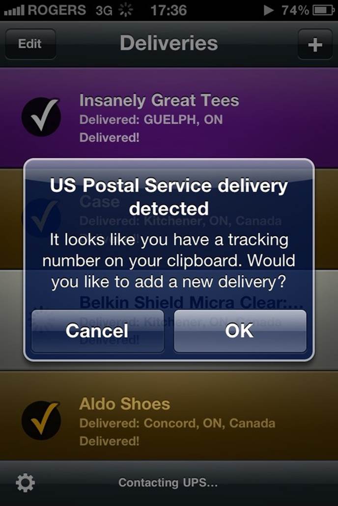
Figure 2-19. The deliveries app checks if there is a tracking number in the clipboard on launch, and if so, a system trigger launches this microinteraction. It’s also smart enough to indicate from which courier the number is from. (Courtesy Patrick Patience and Little Big Details.)
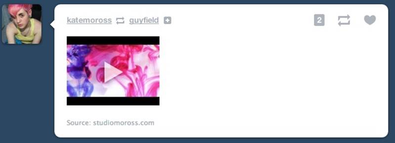
Figure 2-20. An example of a system trigger caused by another person. When someone you follow re-blogs someone you don’t on Tumblr, a follow button appears. (Courtesy Brian Jacobs and Little Big Details.)
These common conditions that can initiate a trigger:
Errors
When a system encounters an error, it often addresses the problem via a microinteraction, such as asking what to do or simply indicating something untoward has happened (see Figure 2-21).
Location
Location can be on many scales: from within a country, to a particular city or neighborhood, to a particular part of a room. A user in any of these settings can cause a microinteraction to fire.
Incoming data
Email, status messages, software updates, weather, brightness, and a host of other data that enter networked devices and apps can be triggers for microinteractions such as “You’ve Got Mail!” alerts.
Internal data
Likewise internal data such as time and system resources can be triggers (see Figure 2-22). An example is dimming the screen after a set amount of time.
Other microinteractions
One particular kind of system trigger is when one microinteraction triggers another. A simple example of this is a wizard-style interface. The end of step one (a microinteraction) is the trigger for step two (another microinteraction), and so on. (See Orchestrating Microinteractions inChapter 6)
Other people
In many social interactions, what another person does (e.g., reply to a chat, post a picture or message, send a friend request) can be the basis for a trigger.
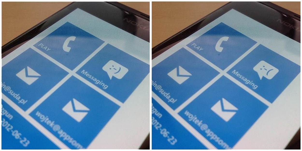
Figure 2-21. In Windows Phone, the messaging icon (a trigger) changes to a sad face if there was an error sending a message. (Courtesy Wojtek Siudzinski and Little Big Details.)
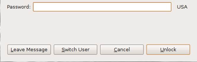
Figure 2-22. In Ubuntu, if the screen has timed out and locked, another trigger appears that lets a visitor leave a message for the device’s owner. (Courtesy Herman Koos Scheele and Little Big Details.)
Users might not manually initiate these triggers, but it is good practice to provide some means (e.g., a setting) of adjusting them. Every system-initiated trigger should have some manual means of managing or disabling it. Ideally, this is at the point of instantiation, when the microinteraction has been triggered (“Stop showing me these alerts”), but at a minimum in a settings area.
Additionally, users may want a manual control even when there is a system trigger (See Figure 2-23). For example, a user might want to manually sync a document instead of waiting for it to automatically happen. A manual control can provide assurance, as well as the ability to trigger the microinteraction in case there is something wrong with the system (e.g., the network connection is down, or the sensor didn’t register).
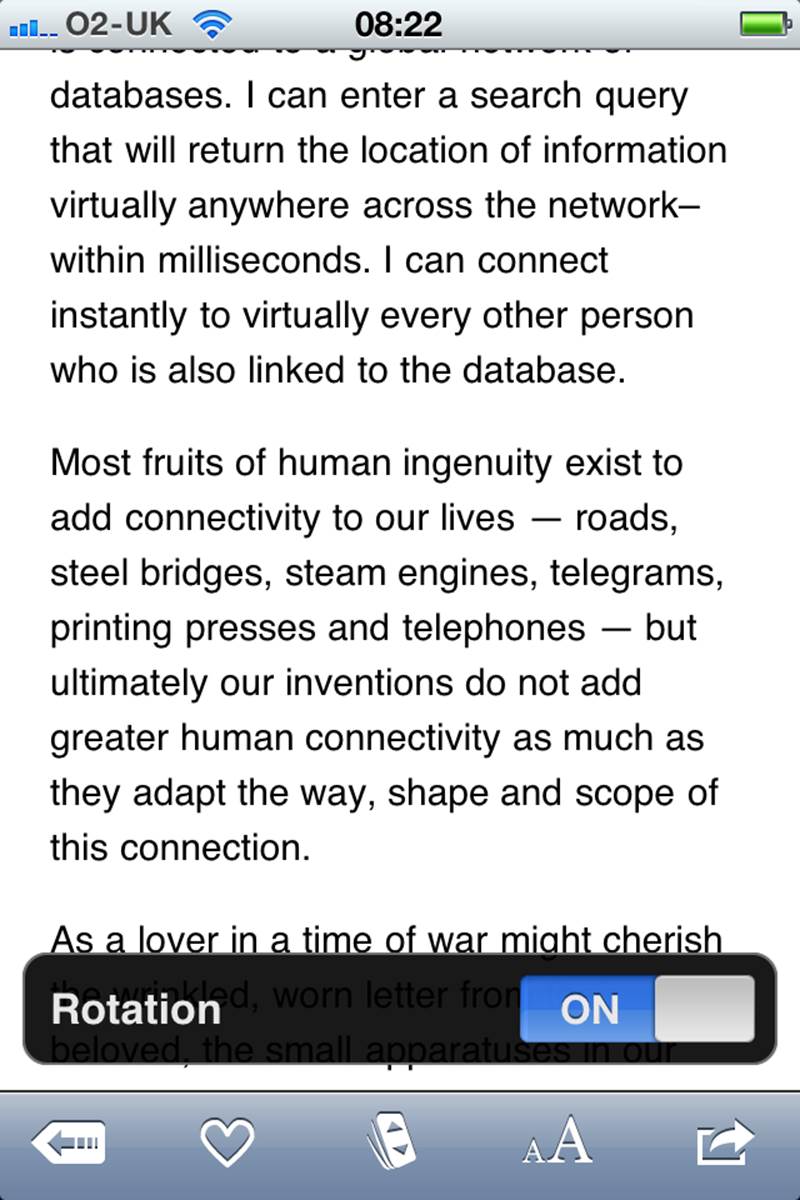
Figure 2-23. In the Instapaper iPhone app, if you accidentally rotate the phone between portrait and landscape mode and then quickly rotate it back, the Rotation lock setting appears. (Courtesy Richard Harrison and Little Big Details.)
System Trigger Rules
Some system triggers themselves need their own rules, the most common of which are when and how often to initiate (Figure 2-24). It can be system-resource intensive—draining battery life, or using bandwidth or processing power—for a product to be constantly pinging remote servers or reading data from sensors.
System trigger rules should answer the following questions:
§ How frequently should this trigger initiate?
§ What data about the user is already known? How could that be used to make this trigger more effective, more pleasurable, or more customized? For example, knowing it is the middle of the night could reduce the number of times the system trigger initiates. (See Don’t Start from Zero inChapter 3 for more.)
§ Is there any indicator the trigger has initiated? Is there a visible state change while this is happening? After it’s happened? When it is about to happen?
§ What happens when there is a system error (e.g., no network connection, no data available)? Stop trying, or try again? If the latter, what is the delay until trying again? (Loops are covered more thoroughly in Chapter 5.)
System trigger rules are closely related to the overall rules, which are covered next in Chapter 3.
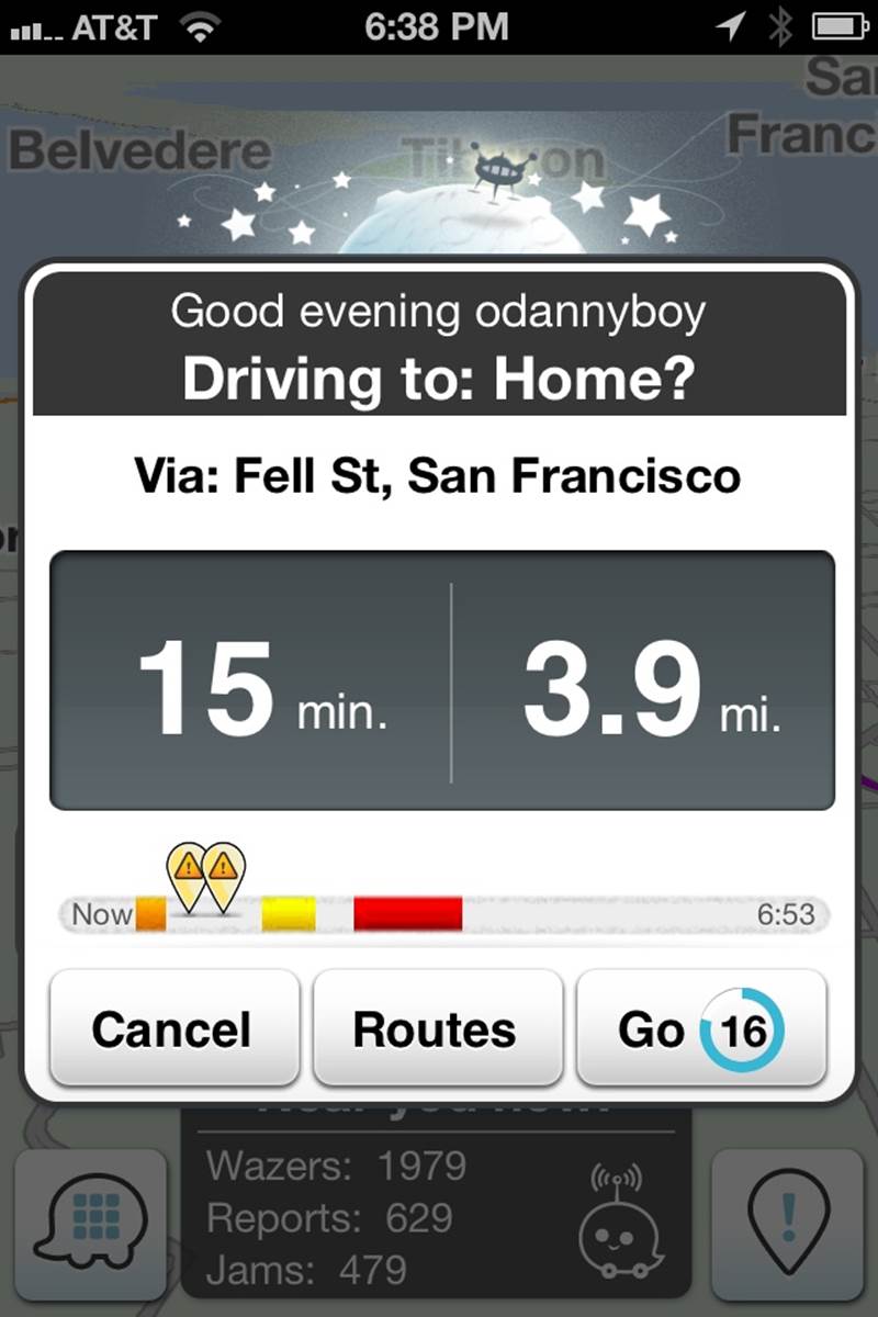
Figure 2-24. Navigation app Waze knows when I open the app in the late afternoon, I’m probably driving home and presents this as an option.
The best triggers are those that, like the Start screen on the MetroCard Vending Machine, fit the context of use and the people who’ll use it. The trigger’s control matches the states it has to communicate and is appropriately discoverable for how often it will be used. Its labels are clear and written in casual language. And most importantly, it launches users into the actual interaction—the rules.
Summary
A trigger is whatever initiates a microinteraction. Manual triggers are user initiated, and can be a control, an icon, a form, or a voice, touch, or gestural command. System-initiated triggers happen when a certain set of conditions are met.
Make the trigger something the user will recognize as a trigger in context. Have the trigger perform the same action every time.
Bring the data forward. Show essential information from inside the microinteraction on the trigger when possible, such as unread messages or ongoing processes.
If the trigger looks like a button, it should act like a button. Don’t break visual affordances.
The more used a microinteraction is, the more visible the trigger should be. Inside a menu is the least visible place for a trigger.
Add labels when there is a need for clarity, when the trigger alone cannot convey all the necessary information. Labels should be brief and in clear language.
System triggers need rules for defining when and how often they appear.
[6] “Ethnic Press Booms In New York City.” Editor & Publisher. July 10, 2002.
[7] The full story is told in her 2008 talk “Intervention-Interaction” at Interaction08.
[8] “A Tablet Straining to Do It All”, The New York Times, August 15, 2012.
[9] Adapted from Scott Berkun, “The Myth of Discoverability”.
[10] Marshall, W. H., S. A. Talbot, and H. W. Ades. “Cortical response of the anaesthesized cat to gross photic and electrical afferent stimulation.” Journal of Neurophysiology 6: 1–15. (1943).
[11] Welford, A. T. “Choice reaction time: Basic concepts.” In A. T. Welford (Ed.), Reaction Times. Academic Press, New York, pp. 73–128. (1980).
[12] Eriksen, C; Hoffman, J. “Temporal and spatial characteristics of selective encoding from visual displays”. Perception & Psychophysics 12 (2B): 201–204. (1972).
[13] Ibid.
[14] Eriksen, C; St James, J. “Visual attention within and around the field of focal attention: A zoom lens model.” Perception & Psychophysics 40 (4): 225–240. (1986).
[15] Geons were first espoused in “Recognition-by-components: A theory of human image understanding” by Irving Biederman in Psychological Review 94 (2): 115–47. (1987).
[16] Treisman, A. “Features and objects in visual processing.” Scientific American, 255, 114B–125. (1986).
[17] For more on feedforward, see “But how, Donald, tell us how?: On the creation of meaning in interaction design through feedforward and inherent feedback,” by Tom Djajadiningrat, Kees Overbeeke, and Stephan Wensveen, Proceedings of the 4th conference on Designing interactive systems: processes, practices, methods, and techniques, ACM, New York, NY, USA (2002).