Microinteractions (2014)
Chapter 3. Rules

In October of 2010 at Apple’s “Back to the Mac” event, Apple announced the then-latest version of its desktop operating system, Mac OS X Lion (version 10.7), which was released nine months later in July 2011. It sold one million copies on its first day, and over six million copies afterwards. In it, Apple unveiled new versions of Calendar, Mail, and Address Book apps. But there was one microinteraction that garnered a lot of attention, mostly because Apple deemed it unnecessary and removed it. That microinteraction? Save As.
In the early 1980s, Save used to be Save and Put Away (Xerox Star), or Save and Continue alongside Save and Put Away (Apple Lisa). (Put Away meaning close.) Save and Continue eventually just became Save, while Save and Put Away vanished, probably once more RAM allowed for multiple documents to be open at the same time without processor issues. Save As seems to have begun in the 1980s as Save a Copy as, which let users save a version as a new file without renaming. Eventually some applications had all three: Save, Save As, and Save a Copy as. Over time, as people understood the Save As paradigm, and with the broad adoption of the Undo command, Save a Copy as has mostly vanished.
At the time Apple decided to get rid of Save As, the rules of the microinteraction had been fairly stable for about 30 years:
§ Make changes to a file.
§ Save the file with a new name.
§ Subsequent changes happen to the newly created file. The previous file remains as it was the last time it was saved.
With Lion, Apple seemed to feel that Autosave, which allows users to return to previous versions, would obviate the need for Save As. Lion’s rules for saving go something like this:
§ Make changes to a file.
§ Those changes are autosaved every five minutes.
§ Subsequent changes happen to the latest version of the file.
§ You can rewind to earlier version of the file using the Revert to Last command.
§ You can also Browse All Versions, which triggers another microinteraction: the versions browser.
§ After two weeks, the file becomes locked and no changes can be made to it without first unlocking it or duplicating it.
If you want to create a separate file, you have to access Duplicate, an entirely different microinteraction:
§ Use the Duplicate command to make another (cloned) file.
§ The new file appears alongside the current file.
§ Rename the new (duplicated) file.
§ Subsequent changes happen to the newly created file. The previous file remains as it was the last time it was (auto)saved.
The new rules were practically the inverse of the previous rules: users had to decide before they made changes if they wanted the changes to be in a different file. Unfortunately, this is not how most people work (or, more precisely, not how we’ve been trained to work over the last 30 years). This change severely broke an established mental model and replaced it, not with a better microinteraction but with two microinteractions that together were difficult to understand and misaligned with how most users work. Most people don’t need the previous version of their document open at the same time as the altered version. Versioning is what programmers do, not what most people do. When users (infrequently) need an earlier version of a document, they’ll manually open it.
Response to the change ranged from puzzlement to outright anger: “The elimination of the Save As... command in applications such as Pages ’09 and TextEdit is, in my view, a downright stupid move. It completely breaks a very common workflow for creating a new file, which consists of opening an existing file and saving it under a new name,” fumed Macintosh blogger Pierre Igot in “Mac OS X 10.7 (Lion): Why ditch the ‘Save As’ command?”. “I really tried to make myself believe that was an OK decision, but after several months, it was clear that it wasn’t,” wrote web developer Chris Shiflett in his article “Apple botches ‘Save As’”.
Apple responded by quietly returning Save As in the 10.8 version of their OS, Mountain Lion, in 2012—although not to the menu, it should be noted, but as a hidden command—an invisible trigger. But it still didn’t work as before: the rules changed again. Lloyd Chambers, author of the Mac Performance Guide, summed up the changes and problems in “OS X Mountain Lion: Data Loss via ‘Save As’”:
If one edits a document, then chooses Save As, then BOTH the edited original document and the copy are saved, thus not only saving a new copy, but silently saving the original with the same changes, thus overwriting the original. If you notice this auto-whack, you can “Revert To” the older version (manually), but if you don’t notice, then at some later date you’ll be in for a confusing surprise. And maybe an OMG-what-happened (consider a customer invoice that was overwritten).
So in Mountain Lion, the rules for Save As work like this:
§ Make changes to a file.
§ Save the file with a new name.
§ Subsequent changes happen to the newly created file. Any changes made to the original file are also saved.
§ You can rewind to an earlier version of the original file using the “Revert to Last” command.
This is in addition to the rules for Saving and Duplicating above. So a simple, well-understood microinteraction was replaced by three difficult-to-understand microinteractions, with no feedback as to what the rules are doing in the background. Finally, in an update to Mountain Lion, Apple added a “Keep changes in original document” checkbox in the Save dialog. What a mess.
There are some lessons to be learned. If you can’t easily write out or diagram the rules of a microinteraction, users are going to have difficulty figuring out the mental model of the microinteraction, unless you provide feedback to create a “false” model that nonetheless allows users to figure out what is going on. Secondly, unless it’s radically new, users likely come to a microinteraction with a set of expectations about how it will work. You can violate those expectations (and in fact the best microinteractions do so by offering an unexpected moment of delight, often by subverting those very expectations), but only if the microinteraction is offering something significantly better, where the value to the user is apparent—and, ideally, instantly apparent. Apple is often amazing at this: just as one example, changing the iOS keyboard based on context, so that @ symbols are available on the main keyboard when filling in an email address field. But if the value isn’t instantly apparent, your microinteraction could come off as needlessly different, a gimmick. “Things which are different in order simply to be different are seldom better, but that which is made to be better is almost always different,” said Dieter Rams.[18]
Designing Rules
At the heart of every microinteraction—just as at the center of every game—are a set of rules that govern how the microinteraction can be used (“played”). What you’re trying to create with rules is a simplified, nontechnical model of how the microinteraction operates.
Perhaps the most important part of the rules is the goal. Before designing the rules, you need to determine in the simplest, clearest terms what the goal of the microinteraction is. The best goals are those that are understandable (I know why I’m doing this) and achievable (I know I can do this). Make sure the goal you’re defining isn’t just a step in the process; it’s the end state. For example, the goal of a login microinteraction isn’t to get users to enter their password; the goal is to get them logged in and into the application. The more the microinteraction is focused on the goal rather than the steps, the more successful the microinteraction is likely to be. The goal is the engine of the rules; everything must be in service toward it (Figure 3-1).
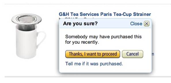
Figure 3-1. The goal of this microinteraction on Amazon is to prevent users from buying something off their wish list that someone may have purchased already—to prevent a situation...without spoiling the surprise (sort of). (Courtesy Artur Pokusin and Little Big Details.)
While the purpose of rules is to limit user actions, it’s important that the rules not feel like, well, rules. Users shouldn’t feel like they have to follow—or worse, memorize—a strict set of instructions to achieve the goal. Instead, what you’re striving for is a feeling of naturalness, an inevitability, a flow. The rules should gently guide users through the “interaction” of the microinteraction.

Figure 3-2. In Apple’s Mountain Lion OS, when you turn on Speech and Dictation, the fans in the machine slow down so the background noise doesn’t interfere. (Courtesy Artur Pokusin and Little Big Details.)
The rules determine:
§ How the microinteraction responds to the trigger being activated. What happens when the icon is clicked? (See Don’t Start from Zero later in the chapter.)
§ What control the user has (if any) over a microinteraction in process. Can the user cancel a download, change the volume, or manually initiate what is usually an automatic process like checking for email?
§ The sequence in which actions take place and the timing thereof. For example, before the Search button becomes active, users have to enter text into the search field.
§ What data is being used and from where. Does the microinteraction rely on geolocation? The weather? The time of day? A stock price? And if so, where is this information coming from?
§ The configuration and parameters of any algorithms. While the rules in their entirety can be thought of algorithmically, often certain parts of a microinteraction are driven by algorithms. (See the section on Algorithms later in the chapter.)
§ What feedback is delivered and when. The rules could indicate which “steps” should get feedback and which operate behind the scenes.
§ What mode the microinteraction is in. A mode is a fork in the rules that, when possible, should be avoided. But sometimes it’s necessary. For example, in many weather apps, entering the cities you want to know the weather for is a separate entry mode from the default mode of viewing the weather. See Chapter 5 for more on modes.
§ If the microinteraction repeats and how often. Is the microinteraction a one-time activity, or does it loop? See Chapter 5 for more on loops.
§ What happens when the microinteraction ends. Does the microinteraction switch to another microinteraction? Does it vanish? Or does it never end?
The set of rules may or may not be entirely known to the user, and they reveal themselves in two ways: by what can be done and by what cannot (see Figure 3-3). Both of these can be an occasion for feedback (see Chapter 4), although as the story of Patron X in Chapter 1 demonstrates, sometimes the user’s mental model does not match up with the conceptual model that the rules create.
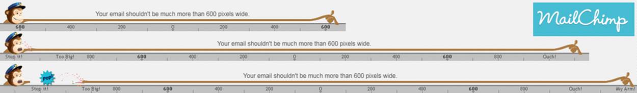
Figure 3-3. MailChimp shows you what can’t be done, by having the poor chimp’s arm stretch so far that it pops off when you try to make an email too wide. (Courtesy Little Big Details.)
Let’s take perhaps the simplest microinteraction there is: turning on a light. The rules are these:
§ When the switch is thrown, the light turns on and stays on.
§ If the switch is thrown again, turn the light off.
Very simple.[19] But if we put a motion sensor on that light, the rules become a lot more complicated:
§ Check for motion every three seconds.
§ If anything is moving, is it human sized? (You don’t want the light to go on because a cat ran by.)
§ If so, turn on the light.
§ Check for motion every three seconds.
§ Is anything moving?
§ If no, wait for 10 seconds, then turn off the lights.
Of course, all of these rules are debatable. Is three seconds too long to check? Or too much: will it use too much power checking that often? Maybe you want the light to turn on when a cat runs by. And I think many of us have a story about being in a bathroom stall and having the lights go out because the sensor didn’t detect any motion—maybe 10 seconds is too brief. Needless to say, the rules affect user experience by determining what happens and in what order.
Generating Rules
The easiest way to get started with rules is to simply write down all the general rules you know. These are usually the main actions the microinteraction has to perform, in order. For example for adding an item to a shopping cart, the initial rules might be:
1. On an item page, user clicks Add to Cart button.
2. The item is added to the Shopping Cart.
Very straightforward. But as you continue designing, nuance gets added to the rules. For example:
1. On an item page, check to see if the user has purchased this item before. If so, change the button label from Add to Cart to Add Again to Cart.
2. Does the user already have this item in the cart? If so, change Add to Cart to Add Another to Cart.
3. The user clicks button.
4. The item is added to the Shopping Cart.
And so on. And that’s just for a button like the one shown in Figure 3-4. There could be many more rules here.
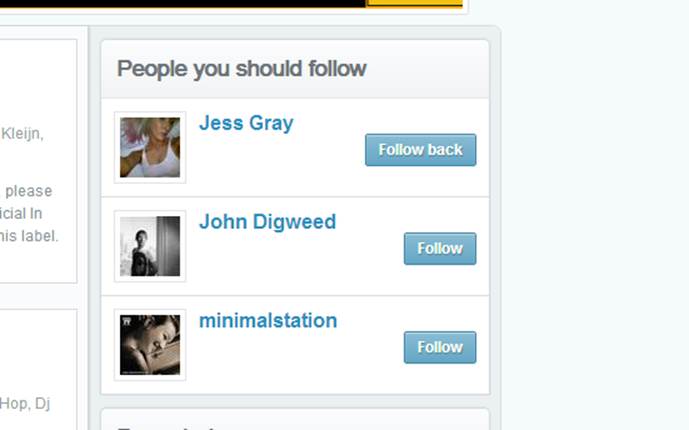
Figure 3-4. A simple button rule. If someone is already following you in Mixcloud, the Follow button becomes Follow back. (Courtesy Murat Mutlu and Little Big Details.)
Of course, rules can also benefit from being visualized. Sometimes a logic diagram can be useful (see Figure 3-5).
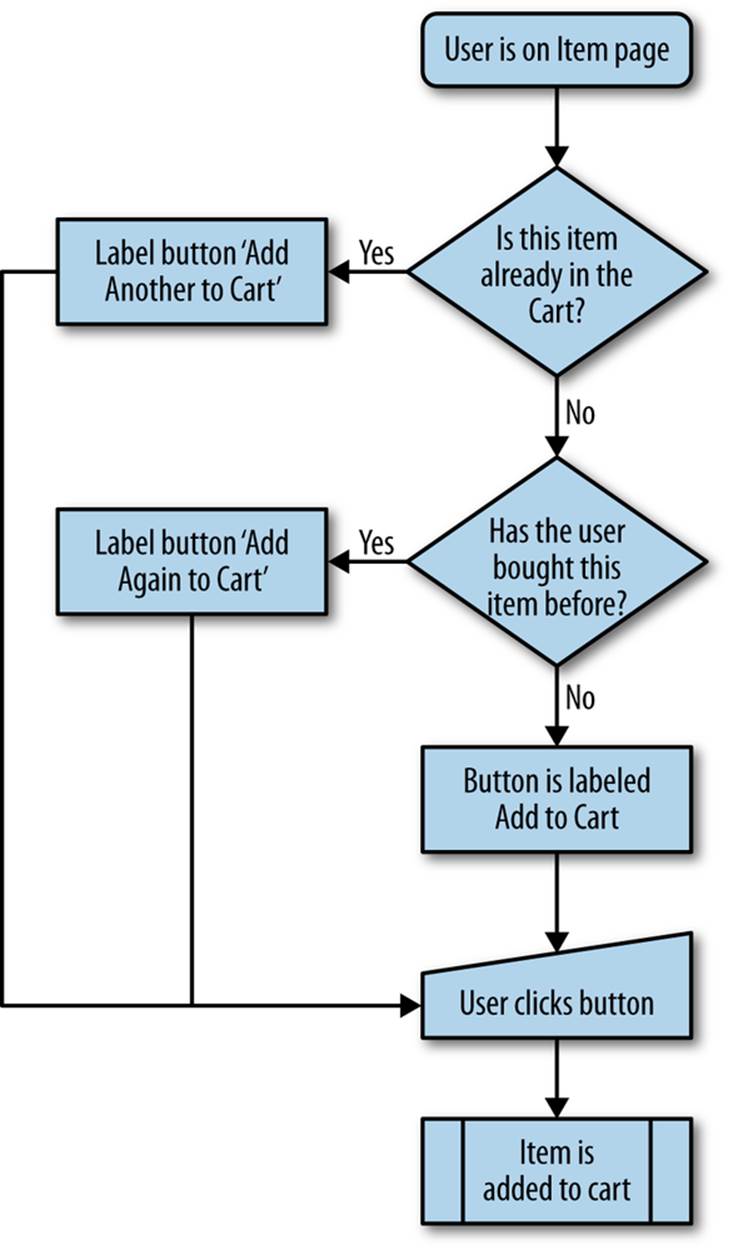
Figure 3-5. An example of a rules logic diagram.
A rules diagram can help you see the rules in a visual way, which can allow you to notice where actions get (overly) complex. It can also show errors in logic that might be hidden by text alone. You can see the effect of nuanced rules in Figure 3-6.
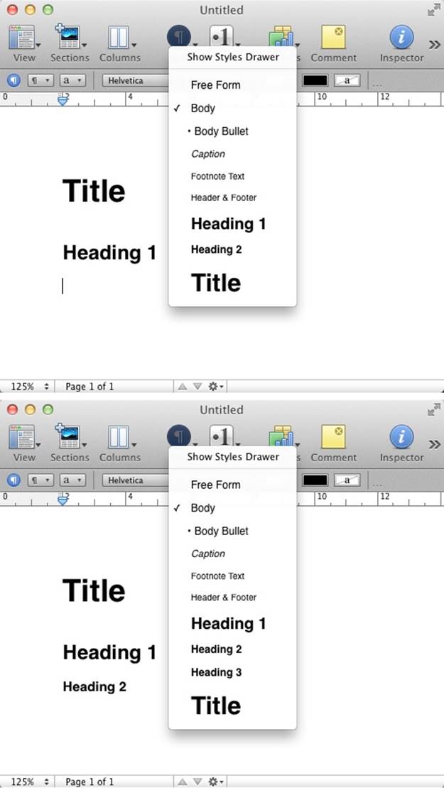
Figure 3-6. Apple’s Pages will automatically add smaller heading styles, but only after you’ve used the smallest displayed style. Heading 3 will only appear as an option once you’ve used Heading 2. (Courtesy Little Big Details.)
Verbs and Nouns
It can be helpful to think of your entire microinteraction as a sentence. The verbs are the actions that a user can engage in, while the nouns are the objects that enable those actions. For example, a slider enables the raising or lowering of volume. Verbs are what the users can do (raise or lower the volume), and nouns are what they do them with (the slider).

Figure 3-7. When friends Like your run on Facebook, you hear cheers in your headphones while using the Nike+ app. (Courtesy Little Big Details.)
Every object in your microinteraction—every piece of UI chrome, every form element, every control, every LED—is a noun with characteristics and states. The rules define what those characteristics and states are. Take a simple drop-down menu. It generally has two states: open and closed. When open, it reveals its options, which are some of its characteristics. It could have other characteristics, such as the maximum number of options and the maximum length of any option label. It could also have other states, such as opened with hovers, wherein tool tips appear when a user hovers over options. All of these details should be defined by the rules. (Verbs, too, have characteristics; for example, how fast something is accomplished and how long an action takes. These too should be defined in rules.)
Every noun in your microinteraction should be unique. If you have two of the same nouns, consider combining them. Also make sure that any two (or more) nouns that look the same also behave the same. Don’t have two similar buttons that act completely different. Objects that behave differently should look differently. Likewise, don’t have the same noun work differently in different places. The Back button in Android is famous for being seemingly arbitrary about where it takes the user back to: sometimes previous modes, sometimes entirely different applications [see Ron Amadeo’s article, “Stock Android Isn’t Perfect”].
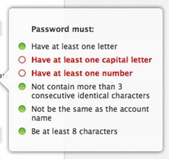
Figure 3-8. When changing your Apple ID password, must-have items are checked off as the user enters them. It reveals the constraints of the microinteraction in a very literal way. (Courtesy Stephen Lewis and Little Big Details.)
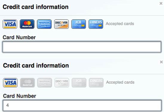
Figure 3-9. GitHub doesn’t make users select a credit card. Instead it automatically selects it for them by using the number they type into the field to detect what card type it is. (Courtesy of Little Big Details.)
The best, most elegant microinteractions are often those that allow users a variety of verbs with the fewest possible nouns.
Screens and States
It might be tempting to turn each step of the rules into its own screen; that is, to turn every microinteraction into a wizard-like UI. This works for specific kinds of microinteractions—namely those with defined, discrete steps that are not done often, or are done only once. But for most microinteractions, this would be disruptive and unnecessarily break up the flow of the activity. It’s much better to make use of state changes instead. In this way, we use progressive disclosure to reveal only what is necessary at that moment to make a decision or manipulate a control without loading an entirely new screen (see Figure 3-10 for an example).
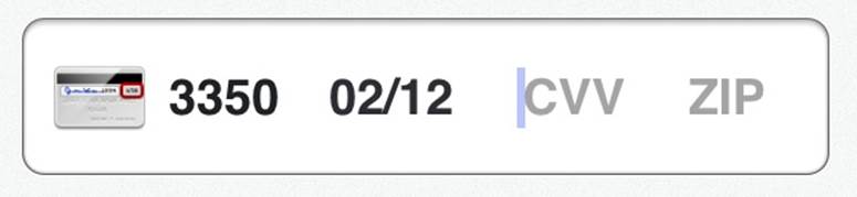
Figure 3-10. When it comes time to enter the CVV number on the Square iOS app, the image of the credit card flips over so that you can immediately see where the number would be. (Courtesy Dion Almaer.)
As the user steps through the rules, the objects (nouns) inside the microinteraction can (and likely will) change to reflect those changes in time. Each of these is a state that should be designed.
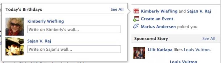
Figure 3-11. If multiple friends have their birthdays on the same day, Facebook’s birthday microinteraction lets you write on both of their walls at the same time. (Courtesy Marina Janeiko and Little Big Details.)
Any objects the user can interact with can have (at least) three states:
An invitation/default state
This is when the user first finds the object. This is also where prepopulated data can be deployed.
Activated state
What is the object doing while the user is interacting with it?
Updated state
What happens when the user stops interacting with the object?
Let’s take a simple drag-and-drop as an example. An object’s initial/default state should look draggable. Or, barring that, the object (and/or the cursor) should have a hover state that indicates the object can be dragged. Then the object should likely have another state while being dragged. (It’s also possible the screen itself [another noun] at this point has a different state, indicating where the object could be dropped.) And finally, a state when it is at last dropped, which might be simply to return to the default state.
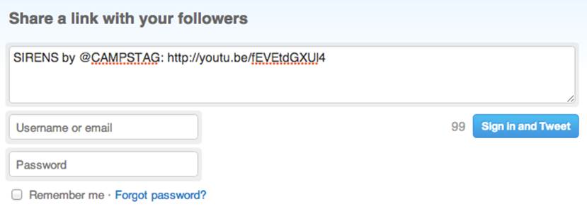
Figure 3-12. On Twitter, the button to share a link has two idle states: signed in and not signed in. If not signed in, the button allows users to do both at once. (Courtesy Rich Dooley and Little Big Details.)
A designer of microinteractions pays attention to each state, namely because each state can convey information to the user about what is happening—even if what is happening is nothing.
Constraints
The rules have to take into account business, environmental, and technical constraints. These can include, but certainly aren’t limited to:
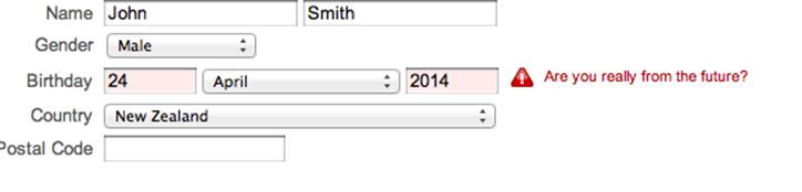
Figure 3-13. Yahoo! has a sign up microinteraction that won’t let you put in a future date. Making that field a drop-down with only acceptable years would prevent this error entirely. (Courtesy Little Big Details.)
§ What input and output methods are available. Is there a keyboard? A speaker?
§ What is the type or range of any input. For example, the number of characters allowed in a password, or the maximum volume a user can turn the sound up to.
§ What is expensive. Not just what costs money (such as access to certain data services, as in Figure 3-14), but also what is expensive from a resources standpoint. Perhaps doing a call to the server every 10 seconds would be a massive hit to the server load and drain the device battery too quickly.
§ What kind of data is available. What can be collected from sensors? What services/APIs can we access to get information about location, news, weather, time, etc.
§ What kind of data can be collected. What personal (behavioral) data can be collected and used?
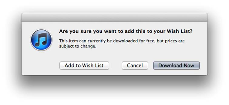
Figure 3-14. When trying to add a free item to a Wish List, iTunes lets you know you can just download it for free instead. (Courtesy Little Big Details.)
These last two constraints allow you to not start from zero.
Don’t Start from Zero
After the trigger has been initiated, the first question for any microinteraction should be: what do I know about the user and the context? You almost always know something, and that something can be used to improve the microinteraction (Figure 3-15).
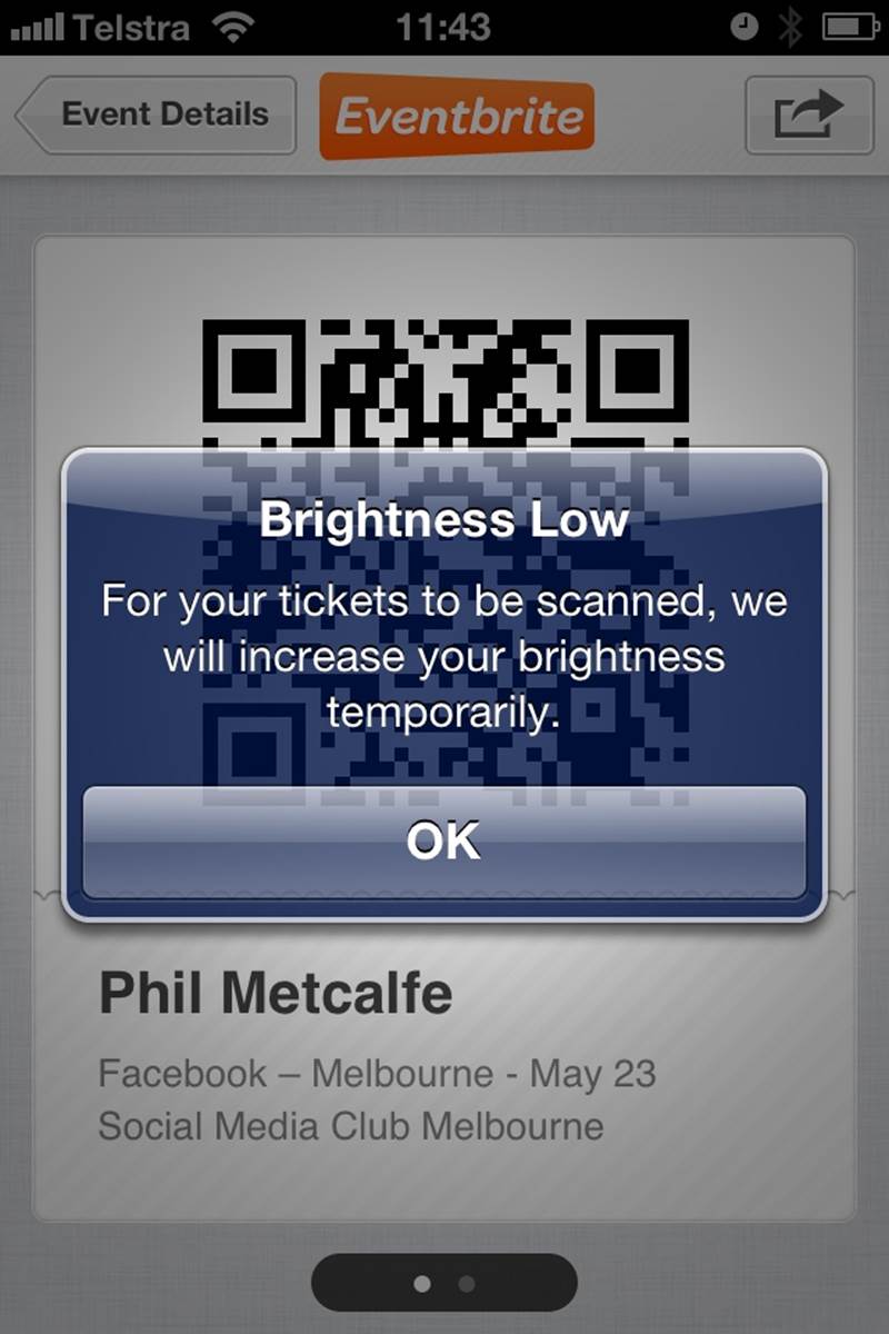
Figure 3-15. The Eventbrite iOS app increases the brightness of the Mobile Ticket screen for easier scanning of the QR code. Useful for the context. The alert is probably unnecessary, however. (Courtesy Phil Metcalfe and Little Big Details.)
Some examples of data that could be used:
§ What platform/device is being used
§ The time of day
§ The noise in the room
§ How long since the microinteraction was last used
§ Is the user in a meeting
§ Is the user alone
§ The battery life
§ The location and/or direction
§ What the user has done in the past
Data can even be useful when it doesn’t come directly from the user (Figure 3-16).
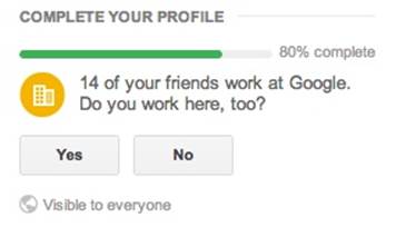
Figure 3-16. Google+ guesses where you work based on your friends’ employment. (Courtesy Artem Gassan and Little Big Details.)
That last piece of data—which may be the most important one—relies on collecting information about user behavior, but we’re long since past the point where this should be an issue from a system resources point of view; even low-powered appliances have enough memory and processing power to do it. It’s just whether or not human resources (developers) can be convinced it’s worthwhile. (It is.) Of course, designers should be cognizant of privacy; if the microinteraction deals with sensitive subject matter such as medical information, you might reconsider collecting personal behavior. Ask: could the information that the microinteraction collects be used to embarrass, shame, or endanger users? If so, don’t collect it. It’s better to have a depersonalized experience than one that is fraught with fear of exposure.

Figure 3-17. Pro Flowers uses the date to show you the next big holiday when selecting a delivery date. (Courtesy Gabriel Henrique and Little Big Details.)
Many of these pieces of data can be used in combination: at 10:00 every day, the user does X, so perhaps when the microinteraction is triggered at that time, offer her X. Or every time the user is in a particular location that he hasn’t been to in a while, he does X. Or every time the user logs in from her mobile device, she’s interested in seeing Y. You can see an example of this in Figure 3-18.

Figure 3-18. Threadless lets you know when you first land on the site whether it can ship to the country you’re in or not. (Courtesy Little Big Details.)
The point is to use the context and previous behavior (if any) to predict or enhance the microinteraction (Figure 3-19). This data collection can be thought of as ongoing user research; with some analysis you can see how people are using the microinteraction and adjust accordingly. For example, by collecting behavioral data, you might discover that power users could employ an invisible trigger to get them to a certain point in the rules. Navigation app Waze lets power users slide (instead of push) a button to get directly to Navigation, saving two taps.
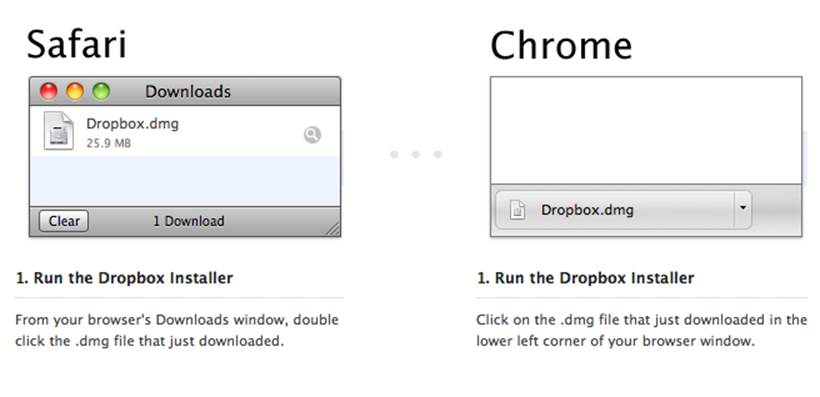
Figure 3-19. Dropbox changes the download instructions based on which browser you’re using. (Courtesy Mikko Leino and Little Big Details.)
Absorb Complexity
Larry Tesler, the inventor of cut and paste whom we met back in Chapter 1, came up with an axiom that is important to keep in mind when designing rules: Tesler’s Law of the Conservation of Complexity. Tesler’s Law, briefly stated, says that all activities have an inherent complexity; there is a point beyond which you cannot simplify a process any further. The only question then becomes what to do with that complexity. Either the system handles it and thus removes control from the user, or else the user handles it, pushing more decisions—yet more control—onto the user.
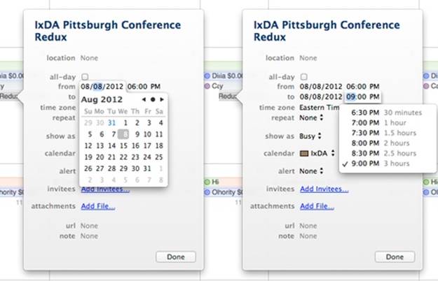
Figure 3-20. Even in the clunky iCal, there is a nice rule in the selection of a time microinteraction. Rather than have you do the math to figure out how long an event would be, iCal shows you event duration when selecting the end time. It’s an effective use of microcopy. (Courtesy Jack Moffett.)
For microinteractions, you’re going to want to err on the side of removing control and having the microinteraction handle most of the decision making. One caveat to this is that some microinteractions are completely about giving control to the user, but even then there is likely to be complexity that the system should handle (Figure 3-21).
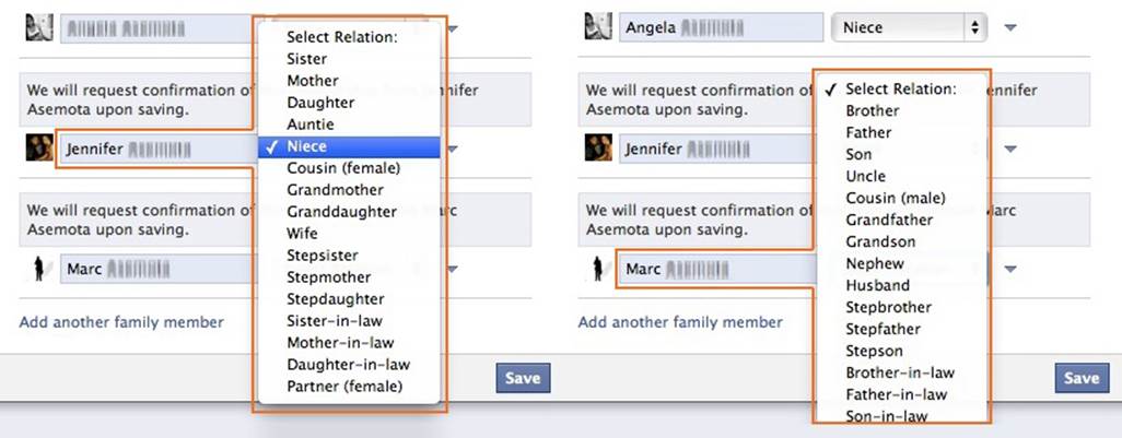
Figure 3-21. When you add a new family member on Facebook, Facebook automatically recognizes the chosen family member’s gender and adjusts the list of possible familial relationships in the list box accordingly. (Courtesy Stefan Asemota and Little Big Details.)
Start by figuring out where the core complexity lies, then decide which parts of that the user might like to have, and when in the overall process. Then, if control is absolutely necessary, provide it at that time (Figure 3-22).
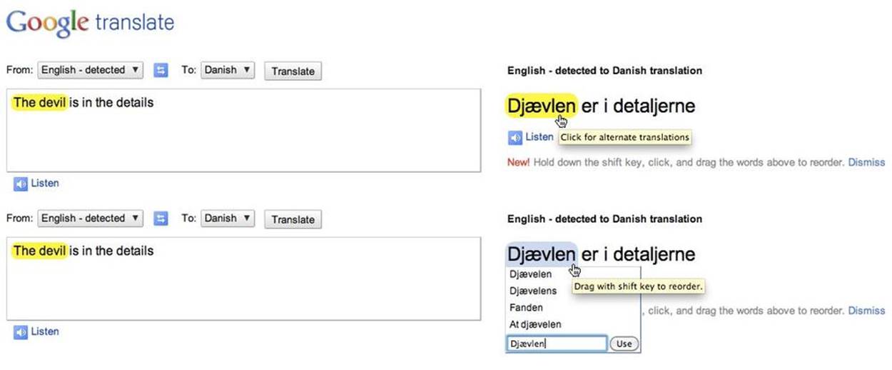
Figure 3-22. When hovering over the translation in Google Translate, it highlights the translated phrase in the original text. You can get alternate translations, but only by clicking on the translated text. (Courtesy Shruti Ramiah and Little Big Details.)
Computers are simply much better at handling some kinds of complexity than humans. If any of these are in your microinteraction, have the system handle it:
§ Rapidly performing computation and calculations
§ Doing multiple tasks simultaneously
§ Unfailingly remembering things
§ Detecting complicated patterns
§ Searching through large datasets for particular item(s)
Of course, removing complexity means you must be smart about the choices you do offer and the defaults you have.
Limited Options and Smart Defaults
The more options that you give a user, the more rules a microinteraction has to have, and in general, fewer rules make for better, more understandable microinteractions. This means limiting the choices you give to the user and instead presenting smart defaults.
With microinteractions, a good practice is to emphasize (or perform automatically) the next action the user is most likely to take. This emphasis can be can be done by removing any other options, or just by visual means (making the button large, for instance). As game designer Jesse Schell put it in his book The Art of Game Design (CRC Press), “If you can control where someone is going to look, you can control where they are going to go.”
Knowing the next likely step is also valuable in that you can perform or present that step automatically, without the user having to do anything else (see Figures 3-23 and 3-24). This is one way to link microinteractions together (see the section Orchestrating Microinteractions in Chapter 6).

Figure 3-23. Clicking the Report button on YouTube automatically stops the video you’re about to report. It performs the next likely action for you. (Courtesy Aaron Laibson and Little Big Details.)
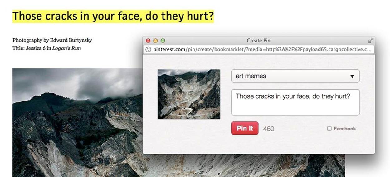
Figure 3-24. Any selected text on a page will prepopulate the caption field when adding it to Pinterest. (Courtesy Louisa Fosco and Little Big Details.)
Every option a user has is at least another rule, so the best way to keep your rules to a minimum is to limit options. In short, be ruthless in eliminating options. Microinteractions do one thing well, so ideally the user would have no options, just smart defaults throughout the entire microinteraction. Everyone does one action, and that action plays out: from Rule 1 to Rule 2 to Rule 3. This is what made Google’s search box the most effective (or at least the most used online) microinteraction of the early 21st century. Everyone followed the same rules:
§ Enter text and press (the emphasized) search button.
§ Show search results.
Of course, even here Google added an option: the I’m Feeling Lucky button, which took you directly to the top search result. I’m Feeling Lucky was only used by 1% of users...and reportedly cost Google $100 million a year in lost ad revenues. In 2010, Google effectively killed I’m Feeling Lucky when it introduced Google Instant, which immediately started showing search results as you type, so there is no chance to press the I’m Feeling Lucky button.[20] Now the rules look like this:
§ Enter text.
§ Show search results.
It literally cannot get any simpler, unless at some point in the future Google is able to guess what you want to search on and immediately shows you results.
For microinteractions, more than one major option is probably too many. This is not to say you cannot have choices, such as a temperature setting (hot, warm, cold), but rather more than one option that radically changes the rules is ill advised. It’s likely that this kind of change puts the microinteraction into a different mode (see Chapter 5). One common example of this is the Forgot Your Password? Mode that many login microinteractions have. Clicking that link takes the user into a different mode that hopefully, eventually takes the user back to the main mode to enter the remembered password.
If you are going to make a default decision for a user, in some instances there should be some indication of what that decision is. One example is Apple’s Calendar notifications. When a calendar notification appears (e.g., “Meeting in 15 minutes”) there is a Snooze button the user can press. However, there is no indication of the duration of that snooze (as it turns out, it’s, in my opinion, an overly long 15-minute snooze) and there’s no way to change this default. “Snooze 15 Minutes” would be a better button label: one that indicates what the rule is.
The most prominent default should be the action that most people do most of the time. Even if you decide that this shouldn’t be automatically done for the user, it should be visually prominent. The most common example of this are OK/Cancel buttons. Cancel is likely pressed considerably less often than OK, so OK should be more easily seen (larger and/or colored). And don’t forget the Return key (if there is one). Pressing Return should perform the default action.
If you have to present a choice to the user, remember that how you present that choice can affect what is chosen. Items at the top and bottom of a list are better recalled than those in the middle. A highlighted option is more often selected than one that is not. And if the user has to make a series of decisions, start with simpler, broader decisions, and move toward more detailed options. Colleen Roller, Vice President of Usability for Bank of America Merrill Lynch, rightly says that, “People feel most confident in their decisions when they understand the available options and can comfortably compare and evaluate each one. It’s easiest to evaluate the options when there are only a few of them, and they are easily distinguishable from each other.”[21]
Since every option means (at least) one other rule (and remember we’re trying to keep rules to as few as possible), the options you present to a user have to be meaningful. Meaningful choices affect how the user achieves the goal of the microinteraction—or even what the goal is. An example of a meaningful choice might be to sign in via Facebook or to enter a username/password. Nonmeaningful choices are those that don’t affect the outcome no matter what is chosen. Amazon’s Kindle app makes users select what color highlight they want to highlight passages in, even though you can’t search or export by highlight color; it’s only marginally meaningful and should probably have been left out of the default microinteraction of highlighting. Ask: is giving this choice to a user going to make the experience more interesting, valuable, or pleasurable? If the answer is no, leave it out.
The elimination of choice should have one beneficial side effect: the removal of many possible edge cases. Edges cases are those challenging-to-resolve problems that occur only occasionally, typically for a small minority of (power) users. Edge cases can cause your microinteraction to warp so that you are designing to accommodate unusual use cases, not the most common. Edge cases are kryptonite for microinteractions, and everything possible should be done to avoid them, including revising rules to make them impossible. For example, if a Year of Birth form field is a text box, it’s easy to put in invalid dates, such as those in the future. Remove this edge case by making the field a drop-down menu.
Controls and User Input
Most microinteractions have some place for manual user input. What has to be decided is which controls, and how they manifest. Take something as simple as a volume microinteraction. Volume can have three states: louder, quieter, and muted. These could appear as three buttons, a slider, a dial, two buttons, a scroll wheel, a slider and a button, and probably several other variations as well.
With controls, the choice is between operational simplicity and perceived simplicity. Operational simplicity gives every command its own control. In our volume example, this is the three-button solution: one button for Make Louder, one button to Make Quieter, one button for Mute. With perceived simplicity, a single control does multiple actions. For volume, this would mean selecting the slider or scroll-wheel options.
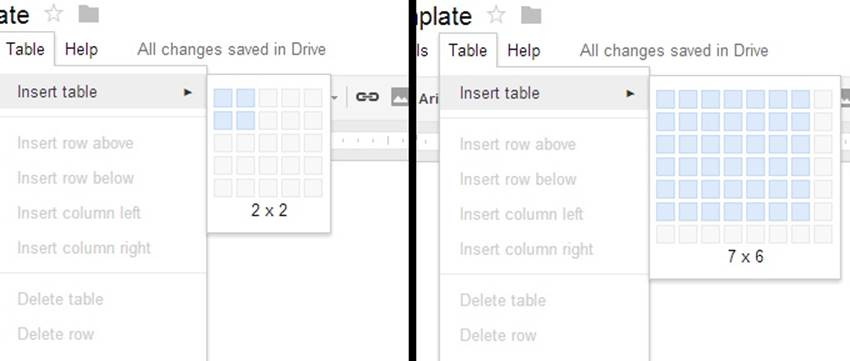
Figure 3-25. Google Drive’s Insert Table microinteraction has an expanding hover window that lets users visually determine the size of the table. (Courtesy Kjetil Holmefjord and Little Big Details.)
For microinteractions that will be done repeatedly, err on the side of perceived simplicity, unless it is an action that needs to be done quickly and with no chance of error—for example, the Mute button on a conference phone; combining it with the Make Quieter action would probably be a disaster. For microinteractions that will only be done once or occasionally, err on the side of operational simplicity; display all the options so that little to no foreknowledge is required.
Text fields should be forgiving of what is placed in them and assume that the text could be coming from any number of places, particularly from the clipboard or the user’s memory. For example, a form for a telephone number should support users putting in any of the following: (415) 555-1212, 4155551212, or 415-555-1212. Text fields in particular need what system designers call requisite variety—the ability to survive under varied conditions. Often this means “fixing” input behind the scenes in code so that all the varied inputs conform to the format that the code/database needs (see Figure 3-26 for a poor example and Figure 3-27 for a positive one).
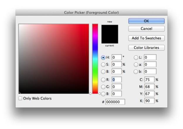
Figure 3-26. Adobe Photoshop’s Color Picker microinteraction has a place to enter a hex value. However, it’s not smart enough to strip out the # if one is pasted into it. (Courtesy Jack Moffett.)
Figure 3-27. 37signals’ Basecamp gets it right. When you paste an email ID like “Jane Smith <myemail@gmail.com>,” it automatically strips out everything extraneous and leaves just the email address. (Courtesy Harpal Singe and Little Big Details.)
Ordering of lists, such as in a drop-down menu, should be carefully thought out. Sometimes it makes sense to have a predetermined scheme, such as alphabetical or last used. Other times, it might make more sense to be seemingly illogical. For example, if most of your users come from the United States, it makes no sense to have them scroll through the previous 20 letters of the alphabet to reach the U countries—be seemingly irrational and put it at the top of the list or else just make it the default.
Sometimes it makes sense to have redundant controls. Particularly if your microinteraction is going to be used frequently by the same user, it may be wise to design in shortcuts. In desktop software, these have traditionally been keyboard shortcuts such as Command-Q for Quit, while on touchscreen devices and trackpads they have been a gesture (usually multitouch). Just make sure that no significant (to the activity flow) control is buried under a shortcut. For any important action, there should be a visible, manual way to engage with it.
Preventing Errors
One of the main tasks for rules should be error prevention (see Figures 3-28 and 3-29). Microinteractions should follow the Poka-Yoke (“mistake proofing”) Principle, which was created in the 1960s by Toyota’s legendary industrial engineer Shigeo Shingo. Poka-Yoke says that products and processes should be designed so that it’s impossible for users to commit an error because the product/process simply won’t allow one. One quick example of Poka-Yoke in action is Apple’s Lightning cable. Unlike their previous 30-pin connector (and every USB cord), the Lightning cable can be plugged into the iPhone’s or iPad’s port facing up or down. Unlike with a USB cable, you can’t try to put it in upside down (where it won’t fit) because it fits either way.
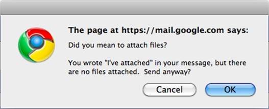
Figure 3-28. Gmail gives you a notification before sending the mail to see if you’ve forgotten to attach a file. (Courtesy Little Big Details.)
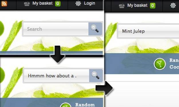
Figure 3-29. If you press the search button on Make Me a Cocktail with nothing in the search field, instead of displaying an error message or nothing, it shows a random cocktail. (Courtesy Nick Wilkins and Little Big Details.)
Similarly, you want to design your microinteraction so that the rules don’t allow for mistakes to be made (Figure 3-30). This may mean reducing user control and input, but for microinteractions reducing choice is seldom a bad practice.

Figure 3-30. Dropbox for iOS pauses uploads when there is a low battery. (Courtesy Little Big Details.)
Ideally, your microinteraction should be designed so that it does not present an error message when the user has done everything right (because the user shouldn’t be able to do anything wrong), and only presents an error message when the system itself cannot respond properly. Pop-up error alerts are the tool of the lazy. If an error does occur, the microinteraction should do everything in its power to fix it first (see Figure 3-31).
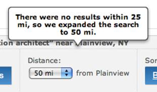
Figure 3-31. Meetup.com adjusts your search results to attempt to correct the error of no found results. (Courtesy Michael J. Morgan and Little Big Details.)
Using the rules, you can also prevent people from using your microinteraction in ways it wasn’t intended to be used (see Figures 3-32 and 3-33). For example, you could disallow expletives in comments.
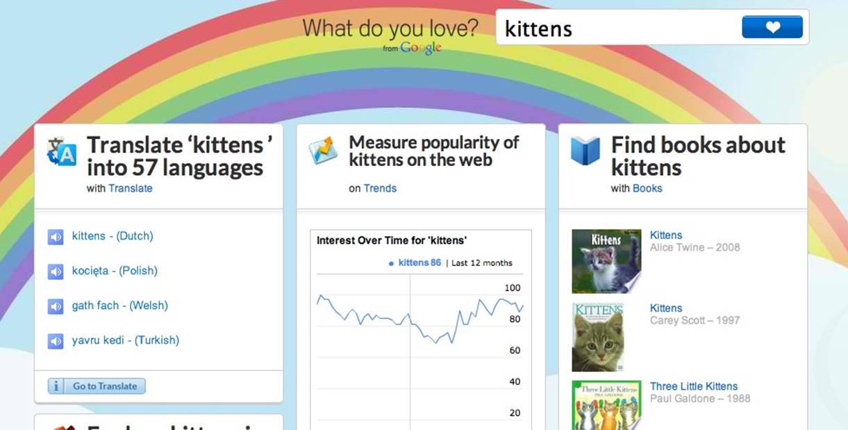
Figure 3-32. What do you love? won’t let you enter expletives. It just changes the word to “kittens” and shows those results instead. (Courtesy Zachary Reese.)
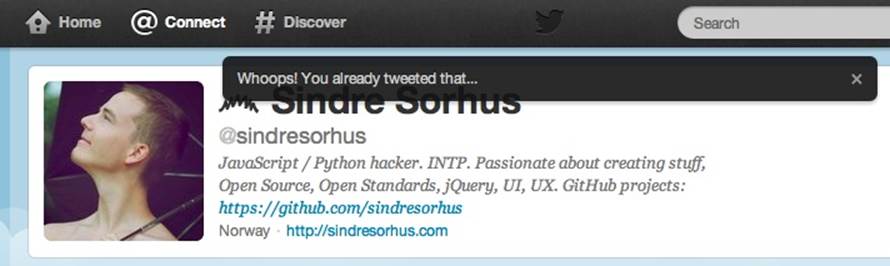
Figure 3-33. Twitter won’t let you tweet the same message twice, mostly to protect its service from abuse. Detecting a duplicate before the user presses Send would be better, although more system-resource intense. (Courtesy Sindre Sorhus and Little Big Details.)
Microcopy
Microcopy—labels, instructions, and other tiny pieces of text—is part of understanding the rules. Microcopy is a kind of fixed feedback or feedforward. The entirety of a microinteraction can be a single piece of microcopy: look at Facebook’s Like “button,” which is based entirely on the word Like in blue text.
A system trigger could cause an essential piece of microcopy to appear when it would be most helpful. For example, on a store’s Contact page, a “Sorry, we’re closed” message could appear beside the phone number during off hours. And that would be the entire microinteraction right there!
With almost all microinteractions, you want to first make sure any text is absolutely necessary for understanding; instructional copy for microinteractions often isn’t. You don’t usually have to put “Please log in” at the top of a login form for users to understand that is what they should do. If you do need to include text, make sure it is as short as possible. As Winston Churchill so aptly put it, “The short words are the best, and the old words best of all.”
Never use instructional copy when a label will suffice. Tap Next to Continue is unnecessary if there is a button labeled Next or Continue. If a label, such as the name of an album, has to be truncated (for space), there should be a way to see the full title on hover or rollover (desktop/web apps) or tap/click (mobile). Sometimes, particularly with physical buttons, there isn’t enough space for a word and manufacturers try to put part of the word on the control, ending up with a letter jumble that resembles a customized license plate. This is not recommended. If a word doesn’t fit, consider an icon instead.
Avoid labels that could be misinterpreted. On photo-sharing service Flickr, for instance, the two choices to navigate photos are ← Previous and Next →. However, Previous takes you to the next newer photo, while Next takes you to the next older photo (Figure 3-34).
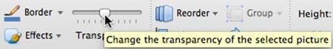
Figure 3-34. Microsoft’s Powerpoint transparency slider in the Ribbon. There is no label to indicate if you’re making it more or less transparent, and the change doesn’t occur until after you release the slider. (Courtesy Jack Moffett.)
The best place for most labels is above what is going to be manipulated. The second best place is on or in the object to be manipulated, as Luke Wroblewski notes in “Top, Right, or Left-Aligned Form Labels” and “Web Form Design: Labels Within Inputs” . This is because it only requires a single-eye fixation to take in both the label and the object. In other words, the eye doesn’t have to spend time moving between two objects, which the mind then has to connect.[22] However, the tradition with icons is the label goes below the icon.
Be careful putting a label inside a text form field. When it disappears (as it must because the user clicks into it to put text there), the user can forget what the field is for, and there is no easy way of going back short of clicking out of the text field. It’s better in some cases to put the label above (Toy Search) or on a button (Search for Toys) alongside, with examples (e.g., “board games, Lego, or dolls”) in the text form field itself.
Be sure that any instructional copy matches the control exactly. For example, don’t have the instructions read, “Add items to your shopping cart,” then have the button say, Purchase Objects instead of Add Items.
When possible, make text relational instead of exact, particularly dates and times. “Three hours ago” is much easier to understand than showing a date and time stamp, which causes users to make translations and calculations in their head as to when that was. (Of course, sometimes an exact date or time is necessary and shouldn’t be obscured.)
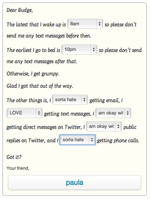
Figure 3-35. Budge’s setting screen for To Do Reminders uses clear copy and choices to make what could have been a boring form interesting. (Courtesy Paula Te and Little Big Details.)
Avoid double (or more!) negatives, unless your intention is to confuse or deliberately mislead people. “If you don’t want to unsubscribe to our email newsletter, don’t uncheck this box.”
Algorithms
In 1832, a 17-year-old self-taught son of a shoemaker had a vision of how “a mind most readily accumulates knowledge ... that man’s mind works by means of some mechanism.” Twenty-two years later, as a university professor, this former child prodigy published his masterpiece: An Investigation of the Laws of Thought, On Which Are Founded the Mathematical Theories of Logic and Probability. (Like many masterpieces, it was criticized, dismissed, or simply ignored when it was first published.) That professor’s name was George Boole, and he was the father of what we now know of as Boolean logic.
Boole devised a kind of linguistic algebra, in which the three basic operations are AND, OR, and NOT. These operations form the basis for generating algorithms. Algorithms are, in the words of Christopher Steiner in Automate This: How Algorithms Came to Rule Our World (Portfolio Hardcover):
Giant decision trees composed of one binary decision after another. Almost everything we do, from driving a car to trading a stock to picking a spouse, can be broken down to a string of binary decisions based on binary input.
[...]
At its core, an algorithm is a set of instructions to be carried out perfunctorily to achieve an ideal result. Information goes into a given algorithm, answers come out.
Although the rules could, in a meta fashion, be thought of algorithmically, some microinteractions depend on algorithms to run. For example, take search. What appears in autofill—not to mention the order of the results themselves—is all generated by an algorithm (Figure 3-36). Recommendations, driving directions, and most emailed/read are all generated algorithmically. Some branded elements, such as Nike FuelBand’s NikeFuel points, are based on an algorithm, as is the custom color picker in FiftyThree’s outstanding iPad app, Paper.[23]
Traditionally, these algorithms have all been generated by engineers, but as more and more products come to rely on algorithms, it behooves designers to get involved in their design. After all, a beautiful search microinteraction is meaningless without valuable search results.
Figure 3-36. If you’re watching a music video on YouTube, it algorithmically matches your location to the artist’s touring schedule. (Courtesy of Nanakoe and Little Big Details.)
While the code behind algorithms is far too complex to get into here, defining the algorithm is. There are four major parts to any algorithm:
Sequence
What are the steps in the process? What item comes before what? Are there any conditionals, where an action is dependent on a particular condition? For a device like the Nike FuelBand, this might be something like: for every two steps (as measured by an accelerometer in the hardware), add one to NikeFuel.
Decisions
These are usually in the form of if ... then statements. For example, if the time is 00:00, then reset.
Repetitions
How does the algorithm loop? This can be the whole algorithm, or just a particular sequence. For example, while the user is typing in the search field, update search results every time there is a new letter.
Variables
Variables are containers for the data that powers algorithms. Defining these will allow you to tweak the algorithm without having to rewrite it entirely. Number of Search Results could be a variable, as could Number of Steps Taken. Variables are numeric, alphabetic (text), or logical (true/false).
To put this all together, let’s say a microinteraction involves displaying music recommendations. The steps in the sequence are the kinds of music you want to show, and in what order. Are they all from one genre? Does new music take priority over old? Decisions might include: has the user ever listened to this artist before? If so, do not recommend. The algorithm might loop until all the recommendations are filled. And variables could be genre, artist, album, listened to, similar to, tempo, and a whole host of possible characteristics one could use to match music. Variables could also include values such as the percentage of new music to old, and the total number of recommendations to show.
It can be helpful for users to know what data/variables are being acted upon in an algorithm, so that they can manually adjust them if possible. For example, knowing how your FuelBand adds FuelPoints would be valuable so that users could increase their activity appropriately. As it is now, it’s a bit of a mystery. Of course, some algorithms, such as Google’s search algorithm, are deeply complex and could not be easily explained, especially in microcopy.
What is important to keep in mind from a microinteraction design standpoint is what the user is intending to do, and what data/content is going to be the most valuable, then ensure that those human values get baked into the algorithm. Too often, and too easily, algorithms can be designed solely for efficiency, not for value.
The trouble with rules is that, in the end, they are invisible. Users can only figure them out when something drastic happens, like Apple’s change to Save As, or from the feedback the system provides, which is the subject of Chapter 4.
Summary
Rules create a nontechnical model of the microinteraction. They define what can and cannot be done, and in what order.
Rules must reflect constraints. Business, contextual, and technical constraints must be handled.
Don’t start from zero. Use what you know about the user, the platform, or the environment to improve the microinteraction.
Remove complexity. Reduce controls to a minimum.
Reduce options and make smart defaults. More options means more rules.
Define states for each object. How do the items change over time or with interactivity?
Err on the side of perceived simplicity. Do more with less.
Use the rules to prevent errors. Make human errors impossible.
Keep copy short. Never use instructional text where a label will suffice.
Help define algorithms. Keep human values in coded decision making.
[18] Supposedly said in 1993, and quoted by Klaus Kemp in Dieter Rams: As Little Design as Possible, Phaidon Press, 2011. Rams may have unknowingly been paraphrasing 18th century German philosopher Georg Christoph Lichtenberg, who said, “Ich weiss nicht, ob es besser wird, wenn es anders wird. Aber es muss anders werden, wenn es besser werden soll.” (“I do not know if it is better if it is different. But it has to be different if it is to be better.”)
[19] Of course, this isn’t exactly physically how a light switch works. Flipping the switch completes an electric circuit—a circular path—which allows electrons to flow to the lightbulb. Flipping the switch again breaks the circuit. But users don’t need to know this; they only need to understand the rule.
[20] Nicholas Carlson, “Google Just Killed The ‘I’m Feeling Lucky Button,’” Business Insider, September 8, 2010.
[21] “Abundance of Choice and Its Effect on Decision Making,” UX Matters, December 6, 2010.
[22] For more on eye fixations, see J. Edward Russo, “Eye Fixations Can Save the World: A Critical Evaluation” and “A Comparison Between Eye Fixations and Other Information Processing Methodologies,” in Advances in Consumer Research Volume 05. 561–570 (1978).
[23] See “The Magical Tech Behind Paper For iPad’s Color-Mixing Perfection,” by Chris Dannen in Fast Company, November 8, 2012.