Mobile User Experience: Patterns to Make Sense of it All (2014)
Chapter 2. Why Mobile UX, Why Now?
Abstract
Why mobile user experience? Why now? This chapter answers these important questions. We will look at what makes the mobile experience unique and why we need the creation of a mobile user experience discipline to be able to respond to it. We examine the technology, the right timing, and the users that have created the perfect storm of mobile. Delving deeper, we discuss what about mobile requires our thinking to respond differently to this unique problem of creating experiences for smartphones and tablets. As a result, we will discover the opportunity that mobile presents to us to innovate and engage our users with our mobile user experiences.
Keywords
Mobile; Opportunity; Android; iPhone; Mobile user experience; Users; Technology; Mobile UX; Perfect storm
Introduction
A few years ago, I lectured at a college about the future of the mobile web.1 At the end of the lecture, one of the faculty members approached me with a question. “In the battle between print and the web, who will win?” Taken aback, I answered with: “The war has been over for a while, now we are just counting the bodies …” Now imagine what I would have said had she asked me about the mobile.
In the case of the mobile, it was not a battle but a leveling impact with the force of an atomic blast. Its effects were fast and far-reaching. The mobile went from being a toy one day to a source of revenue the next. By early 201l, smartphones had outsold desktops.2By 2013, worldwide smartphone sales were in the billions (1.8 billion to be exact).3 To put this in perspective, with the “personal desktop revolution” that started in the mid-1980s, it has taken more than 20 years to get worldwide PC sales over 300 million (2005).4With this trend, some users, especially in developing countries, will access the web on a smartphone before they do on a desktop; this is already the case in some countries. We have entered the mobile age and it is coming straight at us like a storm, a perfect storm.
The Perfect Storm of Mobile
Why a perfect storm? Like the figure of speech for the weather, this storm “arose from a rare combination of adverse meteorological factors.”5 It took three unique factors to align and develop to create the mobile storm we are in now. We needed the technology, the users, and user experience all ready at the same time. Had one or another not been available, the ecosystem would not have evolved. Let me explain.
Technology
The first factor is the technology itself. By the time the first iPhone appeared, small devices were already commonplace. Users already had a history with iPods, mp3 players, and PDAs; the general public were accustomed to small handheld devices. Feature phones6used some form of Internet access and these were common across the globe. By this time everyone, including his or her brother, grandmother, or child had a Motorola Razor phone in their pocket. It was the inclusion of touch technology and readily available 2G bandwidth that accelerated the use of the smartphone. The synthesis of a small handheld device with a phone, mp3 player, and camera was the next logical step in the technology trend.
Users
The second factor is the users themselves. Like the technology, they were already familiar with keeping a small handheld device in their pockets. They were familiar with of using and carrying an mp3 player, phone, and/or camera (sometimes carrying all three). Combining these three devices was the logical next step. The groundwork for the usage patterns already existed, and adding Internet usage was a natural expansion. By the time the first smartphones were launched in 2007, users were already familiar with using the desktop web. There was no need to teach them about buying online, accessing their email, looking for a map location, and other web-based patterns. The learning gap and usage patterns of getting users online had already been bridged. Some users had been using the web since primary school at this point, users were not only well versed, they had grown up with the Internet. The only thing left was to teach them how to optimize these patterns for mobiles; a smaller feat compared to teaching them how to use the web on a desktop computer for the first time.
User Experience
The third factor of the perfect storm is user experience as a discipline. By 2007, user experience design was already considered a formal discipline in the web design industry. It had become a crucial piece of any web-based design or build. It has evolved from the art form in its infancy (information design) to the science of user centric experience design. Now a user experience designer sits between an art director and the web developer; at times they even manage the project. The science of user experience design is also the guiding principle of increasing web sales, increasing user conversions, optimizing design, and retaining users. Web design has been refined from a loosely trained discipline (you usually picked it up on the job) to the formal education of user experience designer (college degree and certificates). By the time Apple released the human interface guidelines for their iPhone, it was not a surprise, but rather an expectation and common practice.
The Problem
Like learning how to use the web on the desktop for the first time, mobile brought its own challenges. Compared to the desktop, we have introduced new variables to creating a user experience on a mobile device. Gone are the consistent factors of the desktop experience, the large size of bandwidth, and even the user’s focus and attention to the task. With mobile, you have to take into account the carrier, the type of device you are on, the operating system, and the screen size; these factors add up to what I call the “Mobile Equation.”
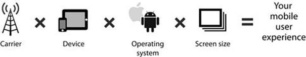
The Mobile Equation.
Think of this as the recipe for designing mobile experiences. Mix the inconsistency of the carrier and your signal strength depending on your location. Stir in the different operating systems (Android, iOS, Windows, etc.) and the different versions of each OS. Whisk in the different form factors and sizes of each mobile device you will be using. Finally, add in the different screen sizes and types into the equation (LCD, Super AMOLD displays) and the unpredictable oven temperature of the users’ usage patterns. This entire equation gives you an insight into the unique challenges of creating a mobile experience. Why would anyone want to inherit this mess? Why would anyone want to work on mobiles compared to the desktop? These are questions that can only be answered by the opportunity that the mobile provides us.
The Opportunity
Regardless of its rapid growth, innovative technology, or even global reach, mobile gives us an opportunity that we have never had with the design of desktop web experiences. The grand vision of Web 2.07 was to connect one-on-one with a user; it was to provide them with personalized content and a user experience just for them through the use of dynamic web experiences. In reality, that dream never came to fruition; the web experience became too busy and overcomplicated the longer we went on. The mobile enables that dream to come true. It puts one Internet-enabled device in the hand of a single user. It gives them the power to access the web at anytime and at any place and the option to broadcast or connect directly one-on-one. It is this usage pattern that presents us the opportunity to design a mobile user experience that can be consumed on a one-on-one basis. Users will carry our mobile experiences with them anywhere and open them anytime. It is this same mobile experience that they can engage with and keep in their pocket; it is both their personal and public persona. The mobile gives a single user a camera, an open web connection, a way of posting, tweeting, and messaging to the outside world. It is their voice; you can help design a mobile user experience to enhance it. This is the mobile opportunity.
1Adrian Mendoza, “Design in the Age of Mobility,” MassArt, Boston, MA, October 28, 2010.
2Dana Wollman, “Smartphones Outsell PCs for the First Time Ever,” Huffington Post, February 02, 2011. http://www.huffingtonpost.com/2011/02/08/smartphones-outsell-pcs-f_n_820454.html.
3Gartner.com, April 4, 2013, http://www.gartner.com/newsroom/id/2408515.
4eTForecasts, “Worldwide PC Market.” http://www.etforecasts.com/products/ES_pcww1203.htm.
5Oxford English Dictionary.
6Feature Phone—Term for mobile phone with basic Internet connection. It mainly opens WAP enabled web pages.
7Web 2.0—Term coined in early 2000s to describe dynamic websites with user generated or social media content.