Mobile User Experience: Patterns to Make Sense of it All (2014)
Chapter 5. How Mobile Wireframing Works
Abstract
Wireframing is not just unique to mobile user experience, but how we apply it to the mobile is a very different process. The goal of this chapter will be to show the step-by-step process of creating layouts and flows for mobile experiences. The intent for the reader is to gain the knowledge on how to lay out their mobile experiences and how to add specific user interface elements into their wireframes. This chapter acts as a mobile reference guide for UX designers as they plan on translating their design or building a new mobile experience. We will discuss topics such as adding touch gestures, representing motion, and the proper layout for a mobile wireframe.
Keywords
wireframe; user experience; gesture; touch; screen size; device; accelerometer; stencil; flow; mobile
Introduction
The goal of the wireframe is to plan and set in motion the format of the mobile experience; here is where you lay out the groundwork, intent, and interaction of your experience. Before starting the wireframe process, you will need to define these criteria for your experience:
■ Screen sizes
■ Platforms
■ Interactions
■ App or Mobile website
■ Smartphone or Tablet
We will be using the wireframe not just to define sizes, content, or interactions, but also to tell a “narrative.” How will your user enter the experience? What will they do there? How do different platforms affect the experience? How does it work on a tablet versus a smartphone?
By building a mobile wireframe, we will be able to document the narrative and intent of our experience. By doing this correctly, we will make it easier for a visual designer to create the UI design and the mobile developer to build it.
As we move forward, we will look at how selecting our mobile criteria is important to your first wireframe layout. Once we lay out our first wireframe in this chapter, we will be building it up over several layers of information. Think of it as a work in progress …
… Now let’s start wireframing!
Create Context
Unlike wireframing for the desktop, mobile development requires us to set some context to the narrative we are building. Think of this as a stage set for a play. If you are designing for Android, use an Android frame, if designing for iOS, use an iPhone frame, and if you are designing for the mobile web, then use a more generic device frame. As our experience will always be viewed within the frame of a device, this helps visualize and contextualize your experience to the device. For example, if you are designing an Android app to use the hardware buttons you will need to make reference to these when you wireframe your experience. This is much easier when you include the frame within your wireframe.
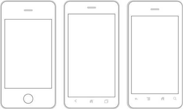
Outline of iPhone 4, Android 4.0, and Android 2.1.
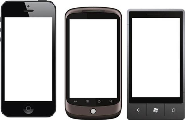
Image of iPhone 4, Nexus One, and Windows Phone.
Visually, the design of the frame is up to you. You can either use something more literal, like an image of the device, or more stylized, like an illustration of the frame. In my experience, I have used both. Using the image of the device creates a strong visual impact when you present the wireframe. … It says, “this mobile experience is for an iPhone.” Using a stylized illustration for the device is easier to work with when you have a large wireframe deck; this helps reduce the file size. When creating an experience for the mobile web it is much easier to use a more generic illustration, an image of a device everyone knows as it clears the way for the client to imagine the design.
Tool Tip
Want to know how to make a device frame for yourself?
Here are three methods.
Method #1: Go online and find an image of an iPhone or Android device. Open the image in a photo editing software and cut out the screen size. Scale accordingly, save, and presto! (Make sure you keep it at 100 dpi or higher if you want to print out your wireframes. If you are planning to only share by email, then keep it under 100 dpi.)
Method #2: Go to the SDK websites for Android or Windows. You can download files for device skins (images of phones) there.
Method #3: Using a downloaded image, trace it in vector illustration software. Save it as an EPS file format; once completed you can scale and shrink this vector artwork.
Screen Size
The next step to building your wireframe layout is to select a screen size. If you are looking to cover all of your bases, select a common resolution like 480 × 800 pixels. If you are looking to work for iOS select a screen resolution like 640 × 960 pixels. Make sure the selections you choose will correspond to your business decisions on what platforms or operating systems you want to support.
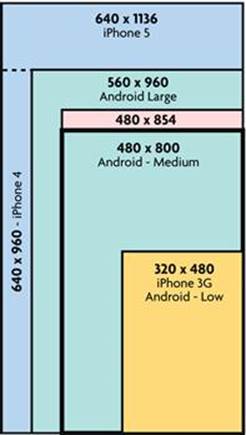
Mobile Screen Size and Proportion Matrix.
Selecting a screen size is as much about size as it is about proportion. The proportion/size matrix shows a quick snapshot of how sizes and proportions change with size. If you are looking to cover a wide range, you will need to think about an elastic design versus designing to only one target. In reality, even if you are designing to an app or mobile website you will still have to support some level of multiple screen sizes; this is inevitable. As we build our wireframes we will look at how to respond to various sizes and how to represent them.
Once you have selected your target screen size, make sure that your device frame works with your selection. If you have chosen a screen size of 640 × 1136 pixels (iPhone 5) make sure your device image or outline matches.
Representing Page and Screen Flows
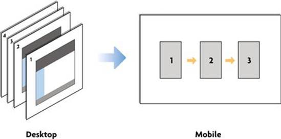
Desktop Wireframes versus Mobile Wireframes.
One of the unique characteristics of mobile wireframing is the small size of screen real estate. As a result, the language of showing actions is much harder if you separate screens as separate pages. One of the techniques to combine actions into a flow is to connect three to four screens together. In practice we would lay out three screen frames on each page. Using arrows, we want to show how interconnected paths get displayed as mobile screen flows. Think of a set of mobile wireframes more as user flows than pages. Each user flow will then be separated on an individual page. As a result, each page will tell a story of a user action or function.
Tool Tip
What if my flows end up being over three to four screens?
I have two suggestions for you:
1. Rethink your action. Would your user go through that many steps in one sitting? Probably not. The goal of creating mobile experiences is to keep them down to bite-sized actions that the user can accomplish on the go.
2. If you have one long action, for example “Order a Product”; I would suggest breaking it down into separate actions on separate pages (i.e., Page 1: Add to cart. Page 2: Checkout).
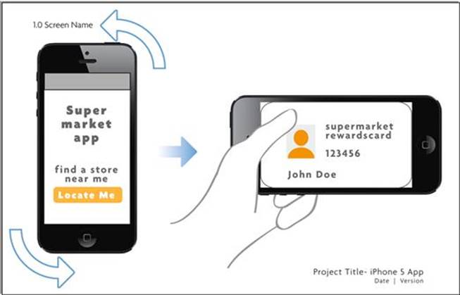
Creating Your First Layout
Now that you have chosen your screen size, device skin, and learned about how a mobile set of wireframes will flow, let’s start assembling a page! Here is a list of things you need to know as you create your first layout:
1. Use a large page size. I would recommended a 11” × 17” at a minimum.
2. Use your device skin on the first panel. It is there to give the reader context, not to clutter the page.
3. Name the flow. For example, add to cart, add a friend, etc.
4. Name the app. Be clear if this is a native app or mobile web app.
5. Create your first page as a template. You will be reusing this page over and over again, so make sure you can reference it.
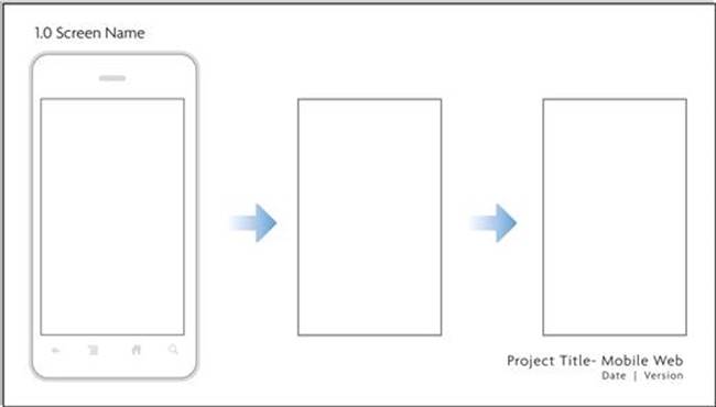
Example 1.
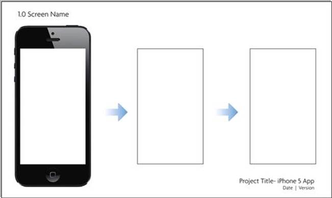
Example 2.
Tool Tip
What software should I build these mobile wireframe templates in?
Building your wireframe templates can be done in any software. I have used a collection of different software depending on the project. I have used InDesign, OmniGraffle, Visio, Keynote, and even PowerPoint. Whatever you choose, make sure you account for two criteria that will make your life easier:
1. Allow for multiple page layouts.
2. Export to a format you can email and print (like PDF).
Representing Inputs
One of the most important differences between designing for the desktop versus mobile is the use of the device input as key design elements. On the desktop we don’t worry about the users’ keyboard or even what a dropdown will look like, these are all standardized. In wireframing for mobile, we have to take into account the device and platform keyboard type and size, and any standard controls of UI library elements that you may design with. In our case, we need to use the actual elements for our design. For example, if you are working on an iOS app, then specify the actual iOS keyboard; our goal is to separate any prebuilt patterns and UI elements from those that you are designing. This makes your presentation read more realistically and announces to the designers and developers what is already handled by the SDK or device, compared to what they need to design and build from scratch.
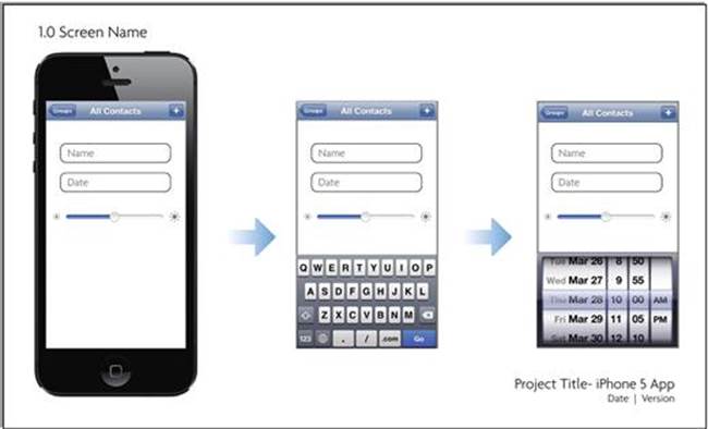
Example with iOS UI Elements.
Tool Tip
Want to know where to download wireframing stencils?
Don’t reinvent the wheel. There are resources online to allow you to download UI stencils for different formats and platforms. Here are a few places to download them:
General Resources
www.mobileuxbook.com/wireframing
www.graffletopia.com (for OmniGraffle only)
Android
http://developer.android.com/design/downloads/index.html
iOS
http://www.teehanlax.com/blog/ios-6-gui-psd-iphone-5/
http://www.teehanlax.com/blog/ipad-gui-psd-retina-display/
Windows Phone
http://blogs.windows.com/windows_phone/b/wpdev/archive/2010/07/27/windows-phone-7-design-resources-ui-guide-and-design-templates.aspx
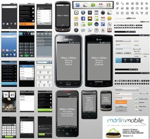
Sample Omnigraffle Android UI Stencil.
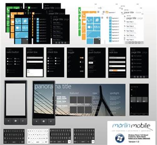
Sample Omnigraffle Windows Phone UI Stencil.
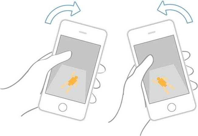
Representing Gestures
As you lay out your mobile user experience you will find cases where you design an interaction that will require you to represent a touch gesture. In these cases you will need to add indicators of these gestures to your set of wireframes. In my example, I use illustrations of the gestures with and without fingers. They are interchangeable, but each has its own advantages. Showing gestures with a finger makes it very apparent to the reader that the gesture is to be controlled in a very specific manner (i.e., pinch in or out). It also highlights a prominent action that will take place in the user experience. Using illustrations of gesture without fingers makes it easier when working on an experience that will require the user to use several gestures (i.e., in a game); in this instance using a simple gesture will make it less distracting to the reader. You can build your own library of touch gestures, just make sure that the colors and visual style you use remain consistent.
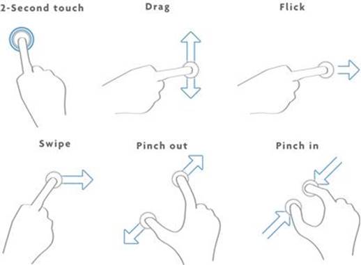
Gestures with Fingers.
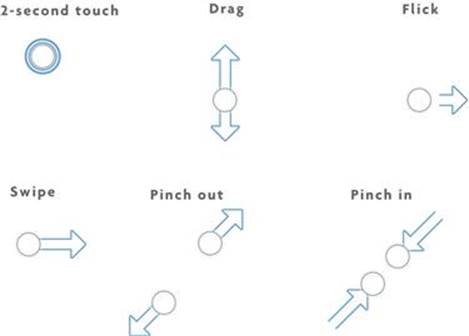
Gestures without Fingers.
Gesture in Wireframe Example.
Annotate, Annotate, Annotate
One of the most important pieces of a wireframe deck is annotation. Remember you are not only laying out your design, but also providing instructions. When designing mobile experiences it is critical to denote every action and interaction you want to capture. Here are three common examples of what you will need to capture:
1. Annotate UI actions—If you want the keyboard to open when the user first opens the app, make sure to create an annotation under the first screen.
2. Annotate Layout—If you want your background to stretch and be elastic, or have an element anchor to the top or bottom of a screen.
3. Annotate Gestures—If your experience requires multiple gestures, be clear on what UI elements are activated by the gestures.
Don’t worry if you need to add an extra page for your annotations. Our goal is to capture as much relevant information about your screens as you can add. I usually wait to do this at the end of a design session. Once I know I have fixed my UI elements and page interactions then I go back and document them.
Wireframing Other Cases
When representing a gesture and adding annotations are not enough, you will need to create a new layout that does not fit snugly within the three to four screen flows. In these cases, you will need to adjust your layout to represent this new page format. I will present three of the most common cases; representing the use of the accelerometer, working with multiple screen resolutions within the same app, and responsive web design.
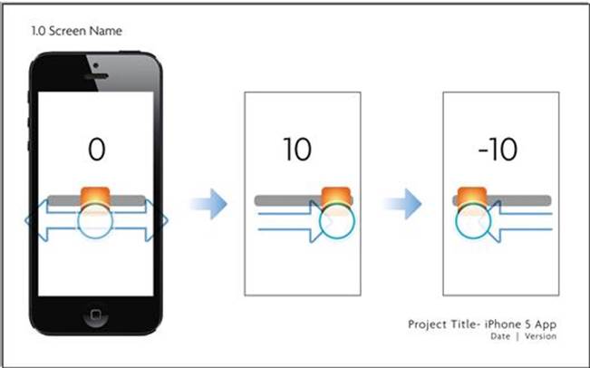
Representing Motion (Accelerometer)
One of my favorite aspects of working with mobile devices is being able to design using the accelerometer. This allows you as the user experience designer to have the devices motion or rotation start an interaction. As you can predict, this will likely need its own layout. Our goal here is to be able to show how motion via the device or by the users own gesture will control the start or end of an interaction. In these cases we will need to use either illustrations of the motion or arrows to denote what is actually being moved. Use a layout to describe the before and after state if you are using a rotation or the active state if you are interacting with the device (i.e., tipping the device left or right).
Example Showing Accelerometer.
Rotation in Wireframe Example.
Representing Multiple Devices (Mobile App)
When designing an app you will find yourself having to fit your experience into several screen sizes. This case is more common than you think. One of the typical cases is adjusting the screen for iPhone 5 when working on an iOS app. As the screen expands longer than the typical 640 × 960 resolution, you will need to show how your experience will be adjusted for the difference. Another iOS example is designing a universal app that is both iPhone and iPad compatible; in this case you will need to show how the design relates to both formats. When working with Android, you will need to design your experience for the different screen sizes (small, medium, large, etc.). In these cases you will need to use a combination of wireframe examples and annotations.
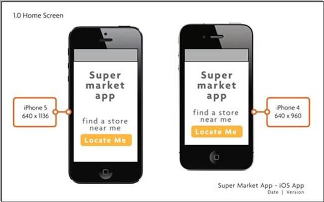
Example Wireframe for Multiple App Screen Size/Devices.
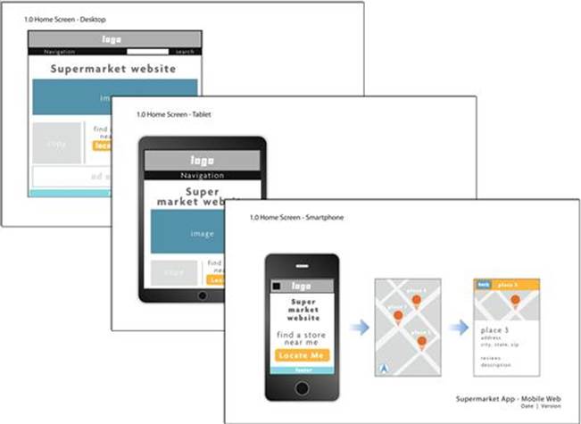
Representing Responsive Design (Mobile Web)
Designing for responsive web design has several challenges, one of which is representing how different break points (compatible screen widths) get illustrated in your mobile web wireframes. In this case, you will first need to define all the screen widths you are planning to support. Will you end up designing for a smartphone, tablet, and desktop browser? If so, plan on what screens will be responsive and design around them. In a typical case you can show three sample screens on one page; the idea is to show the relationships between each different width.
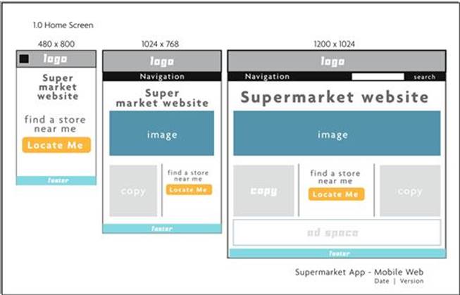
Sample Responsive Design Wireframe Sheet.
Are you planning on changing the user experience of each break point? If you answer yes, I have some bad news. Plan on creating separate decks for each break point/screen width. Because each experience will be dependent on the unique screen flows, you will need to represent these as separate wireframe decks.
Sample Full Responsive Design Wireframe Deck.