Mobile User Experience: Patterns to Make Sense of it All (2014)
Chapter 4. Understanding the Device
Abstract
Learning about a device is critical before we can move ahead with designing and building a mobile experience. For a mobile, it is essential for any user experience designer to be on the device to understand this vehicle of delivery. In this chapter, we examine the differences in hardware, gestures, and user interface elements that make the top mobile platforms unique. Only by learning about a device and how it operates can we design for these different platforms and experiences. By doing so, we can create a user experience design across Android, iPhone, and even other devices, such as tablets. The goal of this chapter is to teach the reader the importance of being on the device.
Keywords
iPhone; Android; Windows Phone; iPad; Tablet; smartphone; user interface; keyboard; mobile; device
Introduction
MOBILE MANTRA #2: BE ON THE DEVICE
The first time I heard this, I laughed at the phrase. It was such a ludicrous concept. Why would I need to be on the device? Why would someone own every phone model? This wasn’t the case on my Palm OS device or Apple Newton, but the smartphone was a different beast. The differences between the first iPhone and the first Android device were night and day. Not only was the hardware distinctive, but the user interface alone was enough to transform my opinion about this phrase.
Now, after spending time with smartphones, I am a big believer of “being on the device.” It has become a mantra I teach all designers and developers I meet. It is the first phrase I share when I am asked about the differences between mobile platforms and the last thing I repeat to others when I am asked to test an application or mobile website. The mantra is rooted in a single premise: to best understand an iPhone or Android device you need to feel it in your hand, to experience it personally. Only in this way can you capture the tactile and complementary nature of how interactions affect the UI. Only in this way can you answer the questions of differences between any smartphone. Without the experience of actually using what you have designed on a device, you have no way of refining it. How does my hand reach for a button? How big do my buttons and UI elements need to be when I touch or swipe? What happens when I first turn on the device? What happens when I open or close an app or mobile website?
Exercise #1: Going for a Walk
Walk into your local phone carrier store (e.g., a Verizon wireless store, an Apple store, or an O2 store in the U.K.). Plan an afternoon or morning for this. Go to the demo phones and open the same mobile website on as many as you can. If you want, load in the same app as well. Once you’re done, try this at another carrier store.
You will notice several differences when you jump from device to device: the hardware buttons are different, the button locations are different, and even the weight is different. Even how you hold a device in your hand changes on different platforms. Once you engage with the UI, you will also notice differences in versions of the operating system and the screen configuration. By opening the same website or app you will see the differences in how the screen, UI, and functionality are displayed; each device will treat that experience differently. Now, imagine all your users or customers having the same experience when trying to open your mobile website or app.
If you are planning on designing or developing in iOS, get an iPhone; if you are planning on Android, get an Android device—or two or three. If you are planning on working on a tablet, get a tablet…. You can see where I am going with this. Only by being on the device can you get the true user experience and a thorough understanding of how you can shape the experience to account for difference between devices, operating systems, screen sizes, and form factors.
The goal of this chapter is to provide a primer for starting to design on multiple platforms. To begin designing for each experience you need to know how the platforms work and what are the unique user interactions, user interface elements, terminology, and device characteristics. Once you have the basics you can start building your unique experience across each platform.
Getting to Know iOS
An Anecdote About Gestures
Microsoft Surface Table Circa 2007.
Hidden away in the lobby of one of the big digital ad agencies in Boston sits a piece of mobile history. Cluttered with some fancy modernist seats, a digital vending machine, and a slick over-designed reception desk sits a table that you might confuse for a vintage Pac Man tabletop game if you didn’t give it a second look. In 2007, Microsoft released their first version of a touch-based operating system called Surface. Integrated into a tabletop, most passersby in this lobby would not even know that this table was the one of the first touch-based interactive experiences.
In 2010 my two business partners and I sat in this company’s lobby, waiting for a meeting. I walked up to the table and swiped to unlock it, selecting an image with both hands, I began to scale and rotate images and applications. With a flick of a finger, a push of my hand, I began to control the user interface like a pro. With a puzzled look, my two partners stared in disbelief—How could I learn and control all of these functions of this operating system in such a short time? One of them finally asked, “Have you used one of these tables before?”
My response: “No I have never used one of these before in my life.” To their surprise they both asked “How did you learn how to use it so fast?”
“YouTube.”
Introduction to Behaviors and Gestures in iOS
Exercise #2: An Introduction to the iPhone
Ask your friends, family, and colleagues this one simple question: What was the first thing you did when you got your iPhone?
To your surprise you will get back several responses ranging from: I plugged it in, I called my mom, I opened the box, I synced it with iTunes, I started surfing the web, downloaded an app … and a few others that you might not expect.
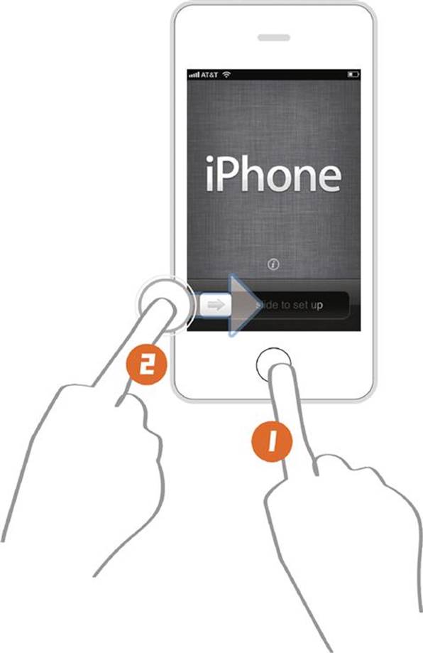
In reality, all iPhone owners will encounter the same first learning experience without even realizing it. They have all encountered the welcome screen as the iPhone turns on for the first time.
In less than a second all new iPhone users learn all of the basic interactions in using the device:
1. Touch the home button with your finger to turn the phone on.
2. Touch and slide the screen to unlock it.
As a user experience designer, this is the pinnacle of what we refer to as the “5 second learn.” In these critical first five seconds of grasping a user’s attention the iPhone has taught its new users how to use it. In this basic screen the mobile experience has also taught the users some basic interactions as well:
1. The screen is touch based.
2. User interface elements are touch based.
3. The user will need to use fluid gestures, such as touch and swipe to engage the user interface elements.
4. The hardware buttons are secondary to the touch experience.
There is no manual with required reading, no long description for the users to read on the screen, no special alphabet to learn, no tutorials to go through, no call to customer support and definitely, no YouTube videos to watch. In less than 5 s, the user has been introduced to the world of iOS and using its touch gestures.
Behaviors of iOS
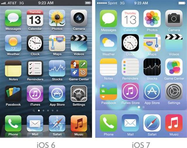
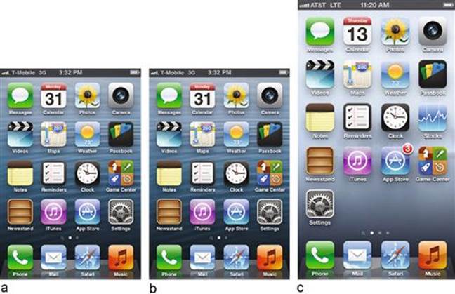
iPhone Home Screen.
Gestures were not the only innovative concept presented with the first iPhone. Once past the welcome screen, the user encounters a home screen with icons. These icons are designed to launch applications from this landing page. This concept of the “App” was new to users with the first iPhone release. Its use of icons as navigation and their relationship back to the “App” was critical in creating a scaled-down version of the desktop experience. This mobile experience would not mimic its desktop counterpart, but bring familiar desktop processes to people in more “bite-sized” chunks; hence the “app” was born.
The idea of an icon-based launcher was nothing new to mobile audiences; this concept had been previously seen in the Palm OS world. Unlike it predecessor, the iPhone added a section to the bottom of the screen to launch primary applications and a phone dialer. This idea of a bottom-based navigation would be a consistent navigation element that would be commonly deployed across most platforms. Another and perhaps the most lasting and influential innovation was Apple’s creation of a standardized library of intuitive gestures, interactions, and user interface elements to produce a consistent user experience.
The Language of Touch Gestures
The iPhone introduced the world to a series of unique touch gestures. The idea of controlling a digital interface with a touch was not new; several years earlier the ability to touch and activate a screen was very common in kiosks and game devices. What made this event new was the language of gestures that was introduced in the iOS to complement its initial touch gesture. These gestures have since become part of the basic lexicon of how people approach devices.
The Tap

Tap Gesture.
The tap gesture is the building block of the iOS platform. The uniqueness of this element is the usage of pressure sensitive glass to enable the finger pressure of the user to come in contact with the screen, a feature now universal to all touch-based mobile devices. This gesture engages the user interface elements using a minimum 44 × 44 point active area around a button or slider. This accounts for the signature larger, rounded UI elements that the iOS is known for. The pressure sensitive screen allows the user to hold down as lightly or as forcibly as needed. This use of sensitivity allows for tapping, flicking, and dragging of a finger using the same touch gesture, it is the building block of the gestures explained below.
The Drag
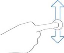
Drag Gesture.
Dragging uses the touch gesture to scroll or pan a user interface element. This gesture combines a push and movement of a finger to move an on-screen element. It is usually reserved for a steady and directed movement on the screen. An example of this would be to drag and move an app icon, or in the example of the welcome screen to drag the slider over to open the phone.
The Flick
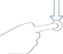
Flick Gesture.
A user can use a flick to scroll or pan quickly through the screen or navigation elements. This gesture, like that of the drag, uses both the touch and movement of a user’s fingers. Unlike the drag, the flick is designed to allow for a lighter touch for quicker and less directed movement. The flick uses forward motion of a finger to start the gesture. An example of this gesture is scrolling to the bottom of a web page quickly or flipping through photos.
The Swipe
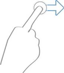
Swipe Gesture.
The swipe is based on using a larger finger contact area for directed on-screen movement (famous for flipping through photos in iOS). The swipe allows the user to access on-screen menus, access navigation trays, open menus, and other touch-heavy user interface elements. A common example on the iPhone is to swipe from one home screen panel to the next, moving from one element to another in the iTunes carousel, or accessing the dropdown notification menu. It is meant for slower and more controlled interactions.
The Pinch
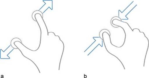
a. Pinch Gesture—Pinch out (Zoom in), b. Pinch in (Zoom out).
The pinch uses finger interaction to control zooming in and out of an application or screen. It is based on two distinct gestures. The first is the use of a pinch open to zoom in and the second is the use of a pinch close to zoom out. This is the first iOS gesture to use two contact points to activate the on-screen controls. This gesture allows users not only to zoom in and out of apps, like Google Maps, but also to zoom in and out of web pages.
Tool Tip
Want to learn more about other touch gestures and those available across different platforms? I have collected a reference list with various links and articles. View it here:
http://www.mobileuxbook.com/gestures.
Random Gestures
Along with these basics, some other gestures have been introduced that users are less familiar with. One of the more random gestures introduced in iOS is the “Shake.” It uses the phone’s accelerometer to activate a user interface element or user-driven action. Not commonly known, one of the only examples found in iOS is using the Shake to undo a typed word or to provide feedback in Google Maps. If you ever see a person randomly shaking their iPhone like a crazy person, don’t be alarmed, they are using the shake gesture. …
No really.
The iOS Kit of Parts
Apple’s iOS Human Interface Guidelines focus on creating a standardized user experience for its hardware and user interface use. I would not call these guidelines but requirements. Designing to these specifications, interactions, and user interface elements is necessary when applying for their app review process; a process required when publishing an app in the Apple App Store.
This is not to say that this process is difficult or impossible, but rather the focus of these guidelines is to create a consistent user experience. By introducing you to the iOS kit of parts in this chapter it can help you understand these “guidelines” and plan for them when you design your mobile experience.
Screen Sizes
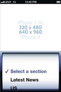
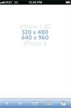
a. 320 × 480, b. 640 × 960, c. 640 × 1136.
One of Apple’s first guidelines was standard screen sizes. This way a designer and developer could build to a set screen size and resolution. At this moment in time, there are three iOS screen sizes. Regardless of whether you design an app or a mobile website, you must be aware that you will need to take into account these three resolutions.
Standard iOS Display—320 × 480
Used for the iPhone 1G (first iPhone) to the iPhone 3Gs, this screen size became the standard size for most mobile devices. The screen size is now obsolete but it still exists on some phones. Consider it the minimum screen size to design for.
Retina iOS Display for 3.5" Screen—640 × 960
A new entry for Apple iPhone 4 and 4s only devices, the retina screen is Apple’s attempt to introduce a high-resolution display. The screen is physically the same size as the old 320 × 480 resolution. Most users will not notice the difference when you put the two phones next to each other. As a designer you will need to design for the larger screen resolution. Apple also introduced the “@2x” file format; this tells the Safari browser (with the help of CSS and Javascript) and Apps to display images at a high resolution. This format was introduced to iPad and iTouch devices as well.
Retina iOS Display for 4" Screen—640 × 1136
Introduced for the iPhone 5 and above, the screen size also retains the same physical screen as the first retina display … just a bit longer … by ½ inch.
User Interface Elements
The core interface elements in iOS are referred to as “standard controls.” This library of buttons, navigation, keyboards, and other common entry points to interaction maintain their own look and feel with some basic options for customizing them. When building and designing an app, the color palette of these UI elements can be changed, but the basic shape and function will always remain the same. These elements also have built-in hover and on-press states. To change the shape or function will require additional design and development effort. This is what is referred to as building a “custom control.”
When designing for the mobile web the input controls (i.e., keyboard, spinners, and pickers) become standardized by the browser. For example, if you have a field in a web page, the browser will open whatever default keyboard iOS is using. By using HTML 5 some inputs can be specified. In these cases I will add the code for you to try.
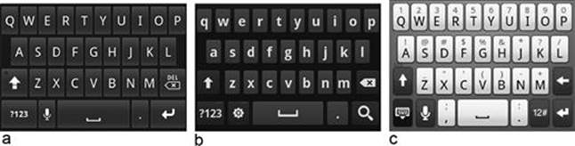
The Keyboard
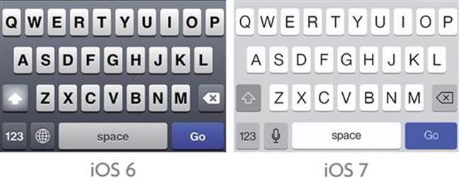
Example of iPhone Keyboards.
The iOS keyboard has matured since its first release. Now the keyboard input includes not just alphanumeric values, but language localization, emoticons, and special characters. One of its signature UI elements is an over state triggered when a finger touches the button. This function also allows a 2 s touch to access special characters per each letter. As a designer, this gives you a fully stocked keyboard to work with; best of all, the proportion and size of this keyboard remains consistent through OS versions and different device models (except in an iPhone 5, where the keyboard loads a ½ inch lower). This element, regardless of screen size, will always launch fixed to the bottom of the screen.
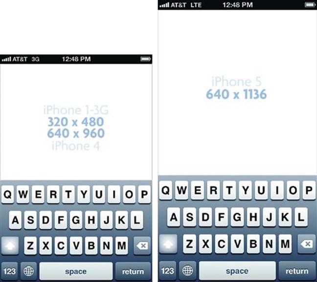
iPhone Screen Sizes with Keyboards.
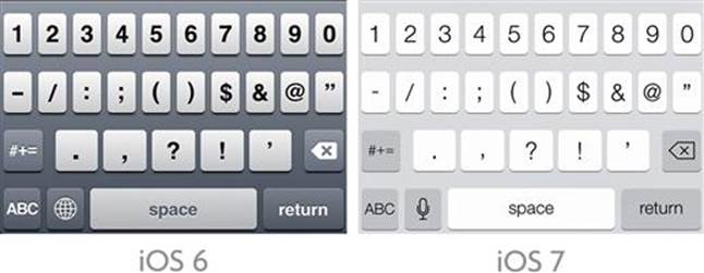
When designing for an app you have the unique function in iOS to specify which keyboard you want to launch. The keyboard types include:
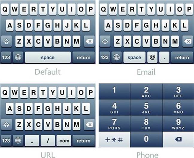
iPhone Keyboard Types.
HTML 5 Code
By using HTML 5 on your mobile website you can also access these keyboard options. Add this code to your input fields. Try it out!
■ Open a Text Keyboard: <input type="text"></input>
■ Opens a Number Keyboard: < input type="number"></input >
■ Open a Telephone Keypad: < input type="tel"></input >
■ Open a URL Keyboard: < input type="url"></input >
■ Open an Email Keyboard: < input type="email"></input >
■ Open an Zip Code Keypad: < input type="text" pattern="[0-9]*"></input >
■ Open a Date Input: < input type="date"></input >
■ Open a Time Input: < input type="time"></input >
■ Open a Date & Time Input: < input type="datetime"></input >
■ Open a Month Input: < input type="month"></input >
The Pickers and Date Pickers
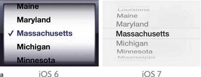
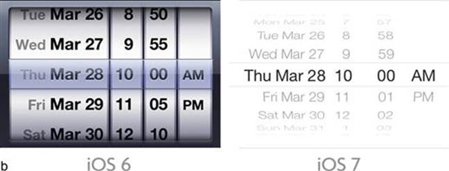
a. Picker, b. Date Picker.
The picker is another unique iOS element. The picker replaces the traditional dropdown box from the desktop browser. This element allows for a larger contact area for touch gestures making it easier to pick from the selection options. When designing for the mobile web this option is loaded in the browser by default. On the other hand, when working with an app, you have the ability to add a date picker to your experience design. This is a combination of various inputs in one spinner; this input method can be customized to select from whatever categories you want. A good use of this UI element would be selecting currency or date and time. The pickers, like the keyboards, launch fixed to the bottom of the screen.
iPhone Screen Size with Picker.
Inputs

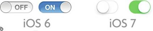
a. Slider, b. Switches.
The last set of inputs is app specific; they are the slider and the switch. These input methods can be used to create interactive methods when selecting choices and ranges on the screen. Their design emphasizes using gestures to control elements that would have normally been radio buttons or checkboxes in the desktop world. Both methods use the drag gesture to activate and deactivate the control; the switch can also be activated by a touch. These elements can be placed anywhere on the screen, but require enough padding around them so they can be easily accessible by a finger. A good rule of thumb is to provide 20 to 40 pixels of padding of empty space around these elements.
The Tab Bar

The tab bar is one of iPhone’s signature navigation elements for apps. This replaces the traditional tabs found on most web pages with a language of icons and small titles. This element is commonly found in all of the apps that come preinstalled with the iPhone and is available as a standard control. As a result most iPhone users are familiar with this interaction and its behavior. It has several builtin behaviors that make it easy to use and implement.
1. A selected state—Icons are automatically colored blue to show they are active.
iPhone Screen Size with Tab Bar.
2. Consistent placement—The tab is locked to the bottom of the screen on each view regardless of the screen size.
3. Scalability—The tab bar automatically scales itself for retina and non-retina displays. When working on an app to support a retina display icon the designer only needs to scale the image twice as large and add the @2x to the icon name. Add into the project folder and its ready to go!
4. Touch area—Each icon added to the tab bar includes a large active touch area hence the shadowed area around each active blue icon.

5. Maximum width—After five icons the “More” feature allows the user to open a separate view to select other navigation paths.
The tab bar element includes an ability to do some basic color customization; the tab bar background color and active color can be set within the iOS SDK.
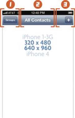
The Navigation Bar
Another native app navigation feature, the navigation bar plays a critical role in the experience design of using lists and pages in iOS. This bar is used within the second- and third-level screens to allow for navigation, back buttons, actions buttons, and titles for accessing content. Like the tab bar, the iOS SDK provides basic customization of colors and gradients.
iPhone Screen Size with Nav Bar.
The navigation element always remains consistently placed at the top of the screen, allowing the user to have the experience of finding a way through their content. The basic interaction rules for this element are as follows:
1. Left Area—Button to go back one step or page view.
2. Center Area—Title of the current content or page view.
3. Right Area—Actions button for the current content or page view.
Surprisingly, this iOS app user interface element and interaction has now become popular in mobile web design as well. The design and interaction pattern has been translated for use in the mobile web browser. For the mobile web, the designer will need to create all of the elaborate buttons states (over, on, down) and functionality in order to use it. A more detailed usage of this experience pattern can be seen in Chapter 6 (see the List Pattern).
The Tool Bar

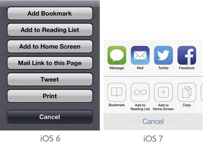
The tool bar acts as a general placeholder for icons, buttons, and text. The goal of this element is to use it to support the current view or page by providing secondary navigation. A perfect example of this is its use within the Safari app. In this example, the tool bar allows for functionality like bookmark, share, and change browser views. Again, this element is always anchored to the bottom of the screen. This element allows for the most customization as it can be changed to not use the gradient background and use an image as its background instead.
iPhone Screen Size with Tool Bar.
Action Menu
The action menu allows for secondary navigation within an app. The typical scenario is to launch the action menu from a navigation or tool bar. This gives users access to secondary actions or navigation. This element cannot be customized, but does allow you as the designer to add as many different actions as posvsible.
Getting to Know Android
Welcome to the Android Party
I am always asked, “How do you describe the Android?” Taking a moment I respond with this answer.
Android is the phone for everyone. It’s the hipster, it’s the partygoer, it’s the quiet student in the corner, it’s the loud cheerleader, it’s the drunken uncle, it’s the phone for every person. …
This is Android.
How is it possible to make one smartphone that can work for everyone? How is it possible that one smartphone can fit everyone’s needs, wants, and desires? Simple, you literally make one smartphone for every kind of person.
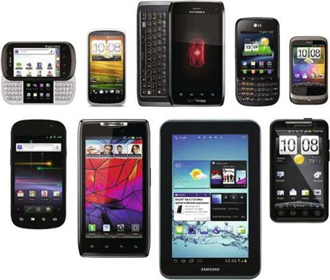
Sample of Different Android Smartphones and Tablets.
I wasn’t kidding … by the time you are reading this I personally will have catalogued over 400 different models of Android phones and tablets. These include every configuration, screen size, form factor, size, carrier, and manufacturer imaginable. In one way or another, an Android phone will appeal to everyone. This is Android.
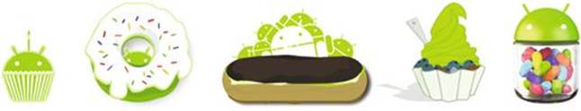
Official Logos for Android Operating Systems. … No I’m Serious!
To technically answer the first question is much simpler. Android is an open source platform created by Google. Its open source license allows any company or individual to design, build, or even install the operating system on any device. If you are a company building a smartphone why would you create your own operating system when you can license one for next to nothing. That being said, this is one of the reasons Android devices have exploded with all kinds of variations. Every manufacturer has built upon the Android platform to create their flavor of the operating system as well.
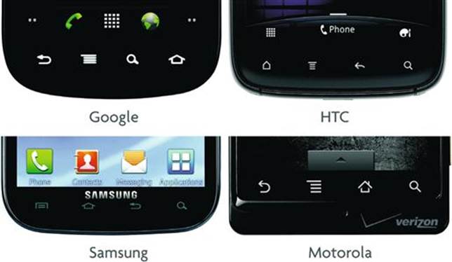
a. HTC, b. Google, c. Samsung, d. Motorola.
With every new manufacturer comes a new and exciting flavor or skin of the Android operating system: Samsung has Touchwiz, while HTC has Sense UI. Each includes its own user interface elements, home screen, apps, widgets, and interactions. This makes designing across all flavors an exercise in juggling design and user experience. Are you ready for the challenge?
Hardware Interface, Android Gestures, and Behaviors
Before moving forward, let’s take a step back. Every variation on Android starts from the same base code. The Android platform is based on creating some core interactions and interfaces that all variations share in some way or another.
Hardware to Software Interface
Android Hardware Example.
Starting with the Android hardware most devices share some method of hardware buttons. Some are more recognizable than others, but they all try to retain the same functions even across manufacturers and Android flavors. These hardware buttons activate the user interface and can be used for your purpose to design and complement your user experience. Be aware that there is no consistency to the availability of these buttons on Android devices. Some manufacturers will choose to add or remove hardware buttons depending on their own device. Below is a list of what is available:
■ Back button—works as a traditional back button in the browser and also works in moving back to another screen in the OS or an app
■ Menu button—opens the device settings, but works to launch an in-app menu that you can design
■ Search button—works to open the devices search feature, but it can be used to open a search function with an Android app
■ Home button—works to return the user back to their home screen
■ Recent apps—Works to switch from all open and recent apps
When designing an Android app these buttons can be mapped to create an interface for your app. For example, mapping the search button to open a search function within your mobile app experience. This assumes that all of your users’ Android devices have a search button; this might not always be the case.
Android Behaviors and Interactions
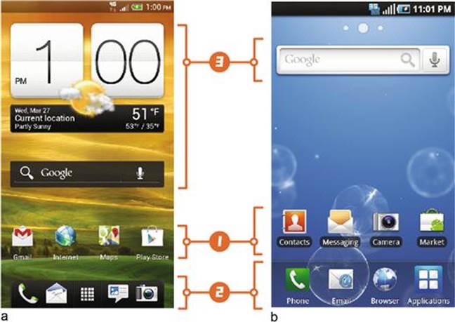
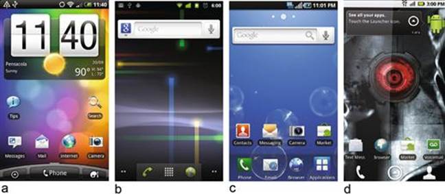
a. HTC Home Screen, b. Samsung Home Screen.
The Android interaction concept closely resembles that of the icon-landing page presented in iPhone. Some of the differences in behavior and interaction can be seen on the home screen.
1. Apps—Android also uses the concept of apps, but unlike iOS, these apps create shortcuts on the home screen. The actual app lives in a separate applications screen.
2. Bottom Navigation—Like iOS, the Android home screen adds a tab bar to house the dialer, some apps, and a shortcut to the application screen. This visual styling of this bar is one of the most commonly changed UI elements in the different Android skins. Some tab bars are customizable, while others constrain the number and types of functionality and apps that are displayed.
3. Widgets—A unique UI element specific to Android. A widget allows apps to load data and functionality onto the home screen. Widgets can be designed and built in different sizes. They are included as part of the app and can be loaded onto the home screen after the app is installed.
The Menu
Another element unique to the Android is the menu. The menu allows for additional secondary navigation for an app. As discussed in the hardware interface section, it is commonly opened using the physical menu button found on the phone. This function is being deprecated in Android 4.0 in favor of an action menu, but it still allows for access to the menu for legacy apps.
Touch Gestures
The iPhone created a wave of excitement about touch gestures; the pinch and zoom, the swipe, and the tap became synonymous with smartphones. The first version of the Android OS was released with zoom in and out buttons for the map and browser. Later the pinch in and out were added. Not to say that the iPhone lead the Android to integrate these gestures, but we can say it was an influence. Many of the iOS gestures can now be found within the Android OS; they share the same interactions and behaviors. Like the iOS shake gesture Android also has its own unique touch gesture.

2-Second Touch Gesture.
The 2-s touch is a gesture that most users are not familiar with. Think of it as using the right mouse button on your desktop; it reveals an entire secondary set of tools or navigation. Traditionally it opens a popup menu over the current screen. Surprisingly, this gesture has lasted the test of time and continues to be integrated into the most current Android OS. When developing an app you can apply this gesture to your design elements. Next time you play on an Android device try the 2-s touch.
Understanding the Android Kit of Parts
Designing for Android has always been considered the “wild, wild west” of mobile design. Its guidelines have always been more suggestions than requirements. Its design documentation has been close to nonexistent and its user experience guidelines have been a thing of fiction. The library of user elements is limited. It is easier and faster to create your own custom UI elements than to use the UI library from the Android SDK. Unlike iOS, there is no approval needed to get onto Google Play (Android market) and no review process to do so. In some cases, a flavor of Android will even launch without Google Play installed.
With that said, I will give you an introduction to working in and around these obstacles. Once you know the obstacles you can better plan your design decisions.
Screen Sizes
The Android screen size has been a major part of the inconsistent user experience in Android. Every manufacturer, device, and carrier has its own screen size. Take, for example, Motorola which for a time only released smartphones with a 480 × 854 screen size. Why the extra 54 pixels? … The world may never know. Below are the three most common screen sizes with 480 × 800 being the most common.
a. 320 × 480, b. 480 × 800, c. 540 × 960.
But wait there’s more … Here is a partial list of the screen sizes you may encounter in Android.
■ 240 × 320
■ 320 × 480 (ldpi)
■ 480 × 800 (mdpi)
■ 480 × 854
■ 540 × 960 (hdpi)
■ 720 × 1280
■ 800 × 1280 (xdpi)
■ And the list keeps growing …
When building an Android app the SDK handles these multiple screen sizes by splitting each screen size into categories: small (ldpi), medium (mdpi), large (ldpi), and extra high (xdpi). If you want your app to work across all of these sizes you are inherently required to create different layouts and image sizes for each design you create. Planning on designing for the mobile web? The flexible nature of responsive web design is perfect for solving the Android screen size dilemma.
User Interface Elements
As discussed before, the Android user interface library has always been limited to a few elements. Within this group there are a handful of user interface elements that are commonly used. To make this more difficult, these elements are stylized differently depending on the Android flavor/skin.
The Keyboard
a. Google, b. Samsung, c. HTC.
The keyboard is one of biggest moving targets when designing for the Android OS. Every flavor/skin of Android has its own design, size, and functionality associated with it. Samsung includes a swipe keyboard that allows you to drag you finger instead of typing words; HTC includes a keyboard that allows users to choose special characters and numbers with a 2-s touch. The only consistent behavior is that the default keyboard will open when you access a mobile web page or app; it will also be anchored to the bottom of the screen. When designing an app you can control when the keyboard opens and if you can, open a dialer as well.
HTML 5 Code
Only a few options are available in HTML 5 for Androids’ default browser. By setting the input type as you see below you are able open the different keypads, keyboards, and pickers.
■ Opens a Telephone Keypad: < input type="tel"></input >
■ Opens a Number Keyboard: < input type="number"></input >
■ Open a Date Input: < input type="date"></input >
■ Open a Time Input: < input type="time"></input >
■ Open a Date & Time Input: < input type="datetime"></input >
■ Open a Month Input: < input type="month"></input >
Want to see what your Android device supports? These options will vary by Android version and browser. Open this link from your device’s browser and select the input fields.
http://www.mobileuxbook.com/keyboard.
Tabs
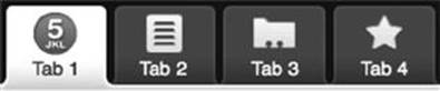
Android Tab Bar.
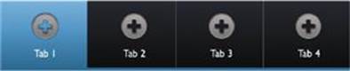
Samsung Tab Bar.
The tabs element is unique to building Android apps. Its concept is very simple; allow the user to create a tabbed navigation. It includes some built-in behaviors such as a hover state and an active color for a tab. Unlike iOS, the tab bar can be placed anywhere on the screen. There is only one problem with this element when using it; it inherits colors and stylizing from the Android flavor/skin of the device they are on. For example, if using it on a HTC device a green color will be set to an active tab, when on Samsung a blue color is inherited, and so on. Now imagine designing blue icons and seeing them disappear on Samsung or specifying your text to be white and seeing it disappear on the base Android tab. In this case, designing your own custom control will make your life easier.
Lists

Android List Element.

Samsung List Element.

HTC List Element.
Another app-only element, a list element, best shows the problem of the inherited colors and styling. You can use a list element as a button, a check box, or a switch, you can also add an icon and two lines of text. One of the problems of consistency is seeing the sizes and shapes of the inputs change depending on the flavor of Android. As with the tabs, color also plays a critical role in trying to maintain a consistent UI design; if you make your icons green they will disappear on a HTC device, if you make them blue they will disappear on a Samsung device, etc.
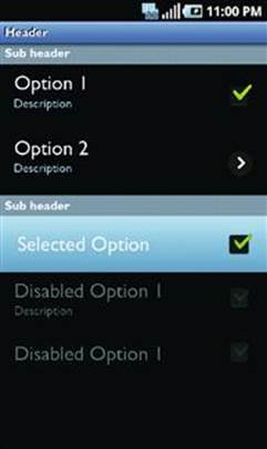
Samsung List Element with Different Input Options.
Turning Over a New Leaf …
With the release of Android 4.0 and beyond, Google introduced guidelines for design and user experience. The idea is to reintroduce the Android with a consistent and flexible user interface.
■ What has changed?—The menu button is now replaced with an action bar in the UI. The search button on the device is gone.
■ What has been added?—An entire library of user interface elements. A library of design patterns. A style guide for colors and typography. Support for tablets.
■ What hasn’t changed?—There is still no review process for your app, and it is still difficult to make multi-screen experiences across the same app.
Explore Android 4.0’s new design and user experience guidelines at: http://developer.android.com/design/index.html.
Understanding Everyone Else
Why did it take me this long to answer the question: “Why only show iPhone and Android first?” This has nothing to do with favorites, which one I owned first, my experience, or even what platform was introduced first or second.
In a nutshell, Android and iPhone have the largest adoption to date.1 Their basic interaction is easy to understand and similar, both use the same interaction concept of apps and icons, and both are based on the same webkit browser (soon to be changing with the arrival of Google’s Blink browser engine). Building a mobile experience across both is easier when you can apply the same design patterns, user interface elements, and user experience design.
That being said, I will do a quick review on the smaller adopters in the mobile space.
Windows Phone 8
Microsoft reinvented its mobile offering with the introduction of the Windows Phone platform. Starting with their Version 7, they took a different approach to the interaction concept of apps and icons. Their approach focuses on a more visually designed experience with an emphasis on text and images. The layout of an experience is designed to spill into other views, creating a fluid and organic layout when travelling between pages. In some cases titles, images, and page content overlap each other on the screen. Designing for this experience requires designing patterns that overlap multiple screens compared to separate views or pages as in the Android or iPhone. One example is an app that might scroll horizontally compared to scrolling vertically within the Android or iPhone.
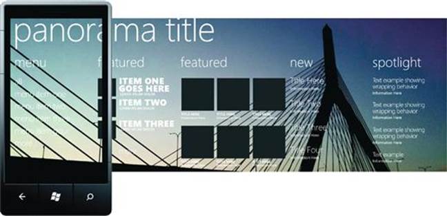
Taking a cue from Apple and the experience from the Android, Microsoft created standards for hardware and user experience guidelines to complement the creation of apps for their platform. Yet, with all of this support, market adoption has been slow due to limited devices released and software support for the platform.
Nokia Symbian and Beyond
One of the larger players internationally, Nokia’s Symbian platform has dominated feature phones around the world. Yet, the Symbian platform for smartphones has not had the largest adoption compared to iOS and Android.
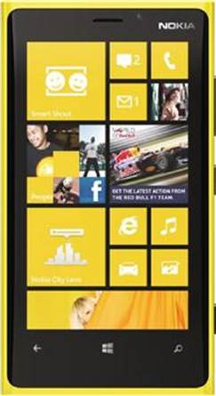
Nokia Lumia 920 Phone Running Windows Phone 8.
Looks familiar? In 2011, Nokia announced a partnership that would install the Windows Phone platform on new Nokia smartphones. By 2013, Nokia officially killed Symbian in favor of using Windows.2 With this support the Windows phone OS could potentially become a third running mate in the mobile race. I’ll keep my fingers crossed for them.
Blackberry
I would call this the story of “riches to rags.” Once the dominant player in business smartphones, Blackberry had led the largest adoption of early smartphone use. Its reach was vast, but its focus on user experience was nonexistent, leading to a fragmentation of different devices, form factors, and operating systems, making it close to impossible for any designer or developer to keep up with the changes. Features that existed in one OS version disappeared in another; touch gestures that were created for one device would only be useful for that singular device model. Now Blackberry devices struggle to keep a small market share. In a world now dominated by the iPhone and Android, the story of Blackberry is about trying to do too much across too many devices at once (Sounds familiar … Android?).
Getting to Know the Tablet
Why did I not include tablets in this conversation? Simply because, tablets are NOT smartphones and they are NOT desktops, they are their own unique experience. A tablet lies between the bite-sized experience of the mobile and the full-sized desktop counterparts. These live in a gray area that is in the process of being defined. To design for a tablet is to ask the question: what will you NOT do on mobile and what will you NOT do on the desktop. This is the tablet experience.
With a much larger screen size (1024 × 768) and a much larger weight (anywhere from 1 to 2 pounds) compared to the mobile device, the inherent interaction and behavior of using a tablet is different. Users commonly use two hands to engage the tablet; one hand to hold and the other to touch. Most tablets are WiFi only, but the trend to make them network-capable devices is starting to advance. Another movement is that of making a smaller tablet with a 7 to 8-inch screen.
As user experience designers, our goal is to design content and interactions on one or two mobile screens. With the larger screen real estate and engagement of two hands, we are able to create and drive more functionality on only one screen. Tablets are normally rotated more than mobile devices. As a result, the user can view pages with the 768 pixel width or a 1024 pixel width with just one turn.
I will review the two most common tablet operating systems; you might have guessed by now these will be based on the iOS and Android.
iPad (iOS)
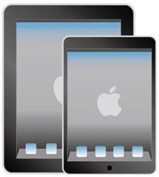
iOS Tablets (iPad & iPad Mini).
The iPad was first introduced as an extension of the iPhone operating system. It shared much of the same gestures and UI elements that were well known in the iPhone world. Users did not have to learn a whole new set of gestures or interfaces as the iPhone had already taught them how to use these. To say the least, it was like using a big iPhone. Since its release the iPad has become its own entity. Now with more features and functionality (front facing camera, retina screen), it uses some iPad-only multi touch gestures and UI elements. For example, three fingers allow you to switch from one app to another; recently a split keyboard was added to allow iPad users to type with both hands. Apps can be designed and built using the universal format to create an app that opens on both the iPhone and iPad. The developer and designer will need to build a separate view for the iPhone and iPad, but they will be encapsulated within the same working file.
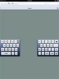
iPad Split Keyboard.
Android
A more interesting story in the world of tablets, Android first released a tablet-only version of their OS, Android 3.0 (Honeycomb) also known as the forgotten operating system. Designed under the concept of tablets being unique compared to the behaviors and interactions of a smartphone; the OS was a failure. The OS was so unique that its UI elements and interactions would only work on apps and experiences that would be specifically developed for 3.0. One of the positive results of this endeavor was the reinvention of Android 4.0 to create a consistent user experience across all Android devices.
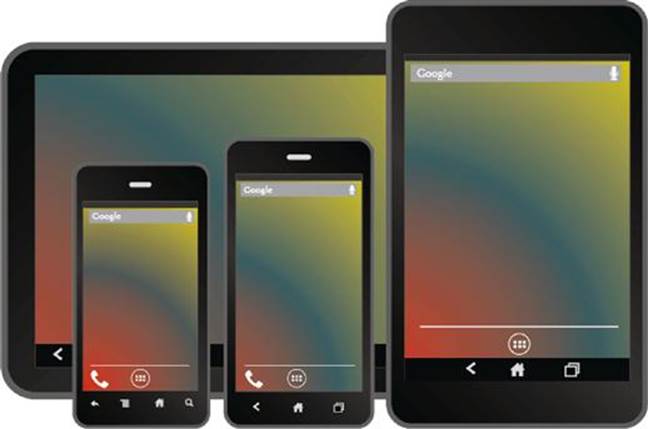
Android 4.0 Smartphones and Tablets.
Both tablets and smartphones now share the same UI elements and user experience behaviors. Though it’s a preliminary attempt to unify these experiences, time will tell if this helps to lessen the effect of multiple screen sizes and form factors in the Android tablet world. When building a 4.0 app the Android designer and developer still need to build using the traditional layouts (xdpi for tablets). The user experience behaviors for how to handle larger multi-screen layouts is now part of the new Android 4.0 guidelines and documentation; a much-needed improvement for the Android.
Putting It All Together
Now that we know the devices and differences in mobile platforms, we can start with an informed view on the mobile. This may seem like a difficult challenge, but I think otherwise; the best part of a mobile is that we have some set boundaries as a starting point. The challenge is being able to design with a unique frame, a unique set of UI elements, and a unique set of gestures. These are all constraints that are easy to overcome with just a little bit of extra work. Our job as experience designers is to keep our pulse on this ever-changing ecosystem. I see this as a positive, by keeping up with this changing mobile landscape we can actively contribute to the innovation of the mobile from an informed perspective.
Next Steps: Building the Narrative
The start of any good narrative is to introduce the cast of characters, places, and events. Before we can start to form our mobile experience, we need to learn everything about the context that these experiences will live in; what different devices are like, how gestures work, and what makes their UI elements unique. Think of the devices as our cast of characters and the operating systems as stage sets. Next, we need to learn how to write a compelling story and how to visualize it. For our mobile user experience this will be our wireframes. The dialogue will be our mobile patterns and the performance will be our use of prototyping. All of this combined will create the narrative we present to our mobile users. Some narratives started with “Call me Ishmael” others with “It was a dark and stormy night,” but ours starts with …
“Be on the device.”
1Chris Burns, “Nielsen 2012 recap puts Android and iOS on top,” December, 21st 2012, http://www.slashgear.com/nielsen-2012-recap-puts-android-and-ios-on-top-21261981/.
2Matt Warman, “Nokia ends Symbian era,” The Telegraph, January 2013, http://www.telegraph.co.uk/technology/nokia/9824179/Nokia-ends-Symbian-era.html.