Designing Connected Products: UX for the Consumer Internet of Things (2015)
Chapter 13. Designing with Data
BY ALFRED LUI AND CLAIRE ROWLAND[202]
Introduction
The IoT will enable access to vastly more data about the world than we’ve ever had. By 2020, some analysts estimate that 10% of all digital data will be generated from connected devices.[203] Industrial applications may account for a large chunk of this, but data is also becoming part of the fabric of consumer products. Designers need to understand how to work with information as a “design material.”[204] What can be captured? How should it be interpreted and what insights can be derived? What new products can be developed and what previously unmet needs can now be addressed? And how do we go about designing compelling, valuable, secure, and trustworthy experiences using data? How can we help bring new insights to users through product design, and design products that behave smarter?
This is a rapidly evolving field, covering multiple topics each of which could easily be a book in its own right. In this book, we aim to provide an overview of the key issues.
This chapter introduces:
§ The technical context of data in IoT (see Data in IoT)
§ Current types of data-driven product (see Augmenting Your Data with Third-Party Data)
§ Considerations for designing with data (see What This Means for Design)
This chapter addresses the following issues:
§ How data processing in IoT is often distributed, and what that means for the product (see Flow of Data in Connected Products)
§ Typical characteristics of IoT data, and their impact on design (see Types of IoT Data)
§ The different concerns of designing types of data-driven products (see Types of Data-Driven Product)
§ How focusing on users’ goals is the key to making data meaningful and actionable (see What This Means for Design)
§ How users’ attention is a scarce resource, and how to be respectful of it (see Attention is a Scarce Resource)
§ How products that seek to produce behavioral change need to deliver very specific insights in the right context (see When Behavioral Change is a Goal)
§ What’s different about visualizing data for connected products (see Visualizing Data)
Data in IoT
IoT creates the potential for almost anything that happens in the physical world to be measured (through sensors) or inferred (from the richness of data sources), creating a digital trace. For good or ill, we will know much more about the world around us, and about ourselves (the ethics of what should and should not be captured and what should or should not be done with it are dealt with in Chapter 15).
Data on the level of a single device can be useful, but when those devices are connected, the power of the network comes into play. Not only is device data accessible from anywhere, but information from many devices and many other datasets can be combined. It’s interesting to see the energy consumption of a single home. But it’s considerably more valuable to understand how it compares with the energy consumption of millions of other homes, correlated with geographical location, demographics, and weather. Data from millions of single devices combines to give us collective intelligence about the world.
Networking allows us to work with data that is distributed across many different sources, but making sense of it can be a challenge. Distributed datasets are often stored in different formats, and are often unstructured (e.g., free text or multimedia content instead of neatly organized fields in a database). Data scientists working in this field view the growing volume of IoT data as one of the next major challenges. And in practice, poor interoperability (as covered in Chapter 10) may mean that accessing and working with different data sets is a challenge.
In IoT, the bulk of data is likely to come from industrial applications. Examples may include tracking stock (or even livestock), environmental monitoring, and monitoring the health of equipment for predictive maintenance. For example, US rail operator Union Pacific Railroad (Figure 13-1) uses connected sensors to predict and prevent train derailments.
![The Union Pacific Railroad uses connected sensors to detect problems with wheel bearings that could cause derailments (image by Emmett Tullos [ravensong75] from Flickr, shared under CC license)](ux_2.files/image344.jpg)
Figure 13-1. The Union Pacific Railroad uses connected sensors to detect problems with wheel bearings that could cause derailments (image by Emmett Tullos [ravensong75] from Flickr, shared under CC license)
Infrared sensors on the tracks take over 20 million temperature readings of train wheels a day to check for overheating, which indicates impending failure. Trackside microphones listen for noises that indicate damaged bearings in the wheels. On the heaviest freight trains, wheels are even scanned with ultrasound to detect flaws. Fiber-optic cables running alongside the tracks carry these readings back to data centers. There, pattern-matching algorithms identify outlying readings that might spell trouble and notify human experts. Within five minutes of an unusual reading being taken, an expert will decide whether to take action—for example, notifying the driver to stop the train for inspection or slow it down for safety until it can be repaired at the next station. Using this system, Union Pacific has cut bearing-related derailments by 75%.[205]
The falling cost of electronic sensing and connectivity means that data capture is also becoming a core capability of many consumer products. Electronic components that measure environmental and biometric data such as geolocation, temperature, altitude, skin temperature, and heart rate are readily available, often even in smartphones. Two of the best-known examples of data-driven consumer connected products right now are smart energy meters and health and fitness wearables. But all IoT systems generate and use data to some extent.
Of course, raw data has no value unless you are able to extract meaning from it: in particular, to generate actionable insights. Understanding the data can be interesting. But the real value is derived from what you are able to do differently as a result of the insights. A fitness tracker app that tells you how many more steps you need to walk to offset your calorie intake is providing actionable advice.
Visualization is an important tool for making sense of data. But the output of designing with data need not be a visualization. Data can also be used behind the scenes to design adaptive services that learn about the user, and present the right functionality and content at the right time for that person. IoT enables these services to be used to tailor interactions in the physical environment, as well as through screens. The Disney MagicBand (introduced in Chapter 2; see Figure 13-2) links to an online account as part of the MyMagic+ service. This allows information about a guest’s park attraction and restaurant reservations to be combined with their location to personalize the experience. Guests can be greeted by name, pre-ordered food can be prepared as guests approach the restaurant ahead of their reservation, and visitor movements around the park can be used to help Disney suggest itineraries that minimize wait times.
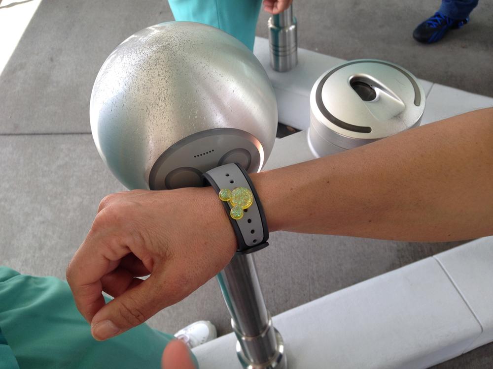
Figure 13-2. Guest ID and location information from the MagicBand enables Disney to personalize the guest’s experience in the park (image: Ciara Taylor)
Nor is designing with data necessarily about enabling user action. There is a current trend toward services that use data explicitly to promote behavioral change. They may encourage us to exercise more frequently, use less energy, or eat slower (Figure 13-3).
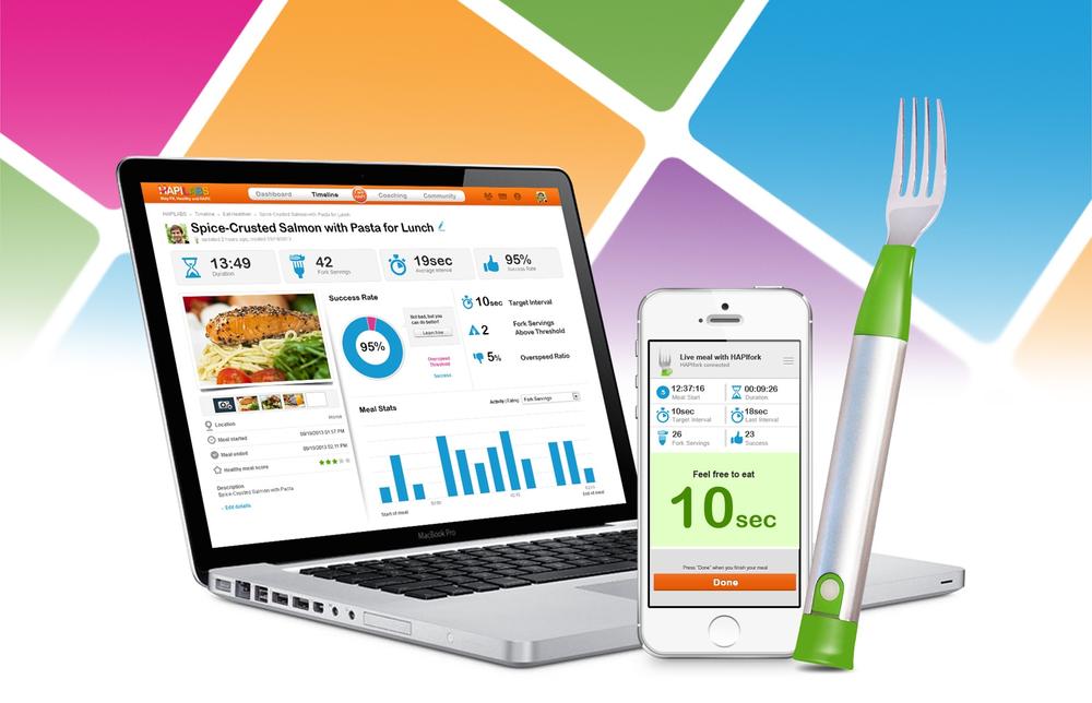
Figure 13-3. The HAPIfork monitors the user’s eating habits and encourages him to eat slowly (image: HAPI.com)
But data can be also be used to enable systems to function more efficiently and even act autonomously. A “smart” thermostat adapts to the home’s occupancy patterns and the occupants’ comfort level. To do this, it gathers and analyzes data, and decides for itself how to act. The product’s developers had to determine:
§ What data the thermostat could collect
§ How to analyze it
§ How best to act on it
§ How to keep the user informed of all this and ensure they maintain a degree of control
This is just as much about design as the energy data visualization that alerts you when you’re using more electricity than your neighbor.
In short, IoT gives us more and better data about the world. It gives us the ability to use that data to create smarter products and services that adapt to our needs and enable more efficient use of resources. The design challenges are in identifying opportunities to use data to create new products and services, and deliver better user experiences. As Tim O’Reilly points out, even Uber (Figure 13-4) is arguably an example of this:
The IoT is really about human augmentation. The applications are profoundly different when you have sensors and data driving the decision making... Uber is a company built around location awareness. An Uber driver is an augmented taxi driver, with real-time location awareness. An Uber passenger is an augmented passenger, who knows when the cab will show up. Uber is about eliminating slack time and worry. People would call it “IoT” if there was a driverless car, but it already is part of the IoT. You can measure, test, and change things dynamically. The IoT is about the interpolation of computer hardware and software into all sorts of things.[206]
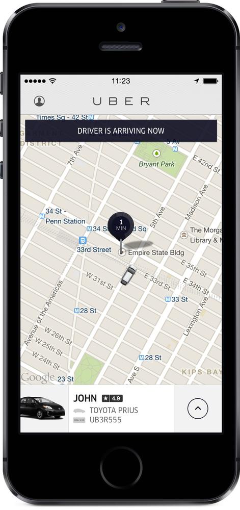
Figure 13-4. Uber’s service relies on location data (image: Uber)
Flow of Data in Connected Products
In this section, we’ll look at the technical context around data in IoT systems: where the data comes from, where the data is processed, how frequently the device connects to the network, and what may be done with it. The traditional Web is very centralized, but in IoT the edge devices can be a lot more autonomous. In Chapter 3, we discussed the need to understand “where the code runs” in a distributed system and the impact that it has on UX. In a data-driven product, where the data comes from and the way it flows around the system are also fundamental to shaping the user experience.
We’ll start by looking at this from the perspective of a single device (Figure 13-5). Data may come from onboard sensors on the device, or from the network. It may be processed via the device’s onboard CPU, or in the cloud. The device may transmit data all the time or store and sync intermittently. Data may be displayed on a local UI on the device (or otherwise acted on locally), and/or passed to other devices, via local networking or the Internet.
A simple example might be a single air quality sensor out of a network of hundreds or thousands. Each individual sensor takes a data reading and sends it to the network at intervals of a few minutes. It may have enough intelligence to transmit more frequently if readings go over a certain threshold, and the ability to cache readings and send them in a batch if it loses connectivity. But it isn’t doing any local processing to analyze or transform the data in any way. All the processing is done in the Internet service. The early version of the Jawbone UP (Figure 13-6) and the Withings scale also work on this model. The local device lacks a UI (or if one is present, it’s minimal): the data is mainly accessible via a web or phone app.
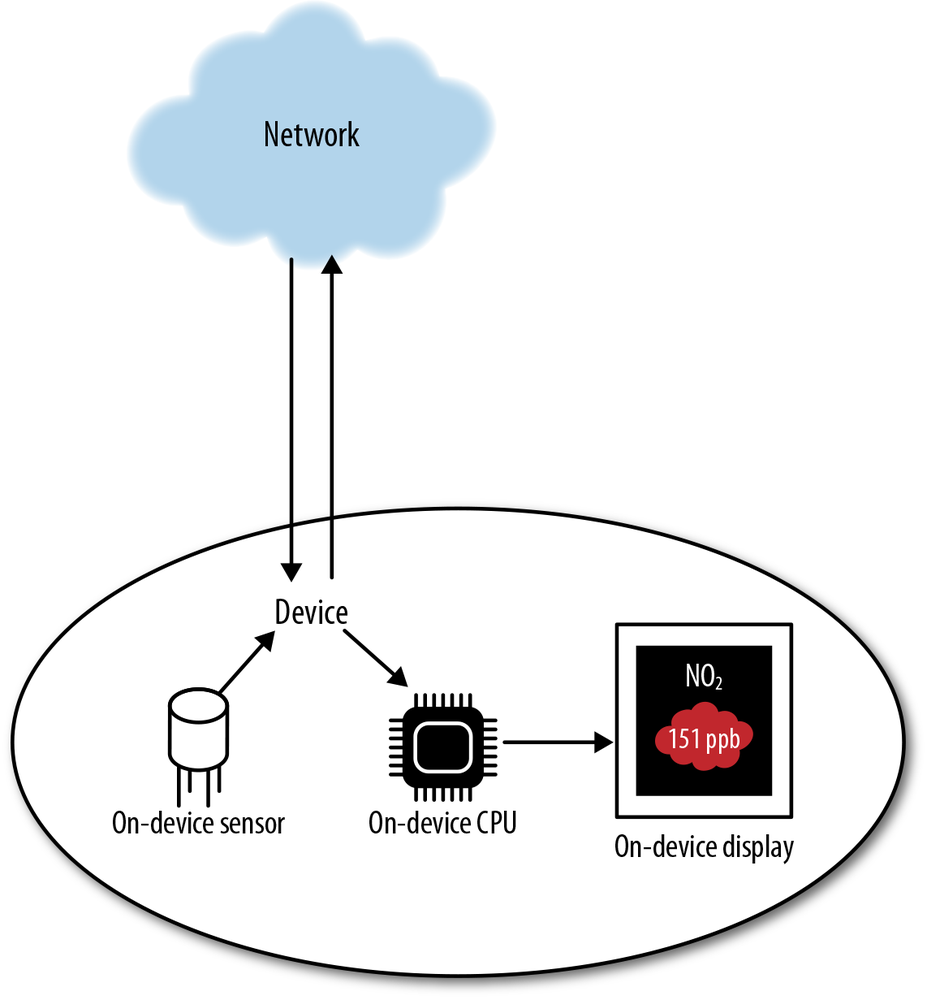
Figure 13-5. Flow of data around connected devices
A more complex example might be a robot vacuum cleaner, which uses data from onboard sensors and onboard processing to navigate and learn the layout of rooms for more efficient operation. In normal operation, it doesn’t rely on the network—all processing is local. It is not, for example, downloading floor plans of the house. But it might connect to an Internet service to report details of its activity (so the user can see when it has cleaned) or diagnostics (so the user can tell when it needs servicing). A thermostat that attempts to learn when the house is occupied, and what temperature the occupants find comfortable, might also do a significant amount of local processing. In addition, it might also have an onboard UI.

Figure 13-6. The original Jawbone UP did not process data locally (image: Jawbone)
An example in between the two might be a car navigation system that uses a combination of networked data (live traffic), onboard readings (GPS), and static onboard data (maps). Some processing is applied locally (e.g., finding the best route to the user’s intended destination given all available data), and some remotely (e.g., traffic information). Waze,[207] a car navigation app, crowdsources live traffic information from its users to determine the best route. In this example, the edge device broadcasts data to the network as well as receiving it, allowing the service to build up an aggregated picture of local traffic conditions across all users[208] (Figure 13-7).
There are pros and cons in handling data processing locally (in edge devices) versus centrally (in a cloud service). This is a key question that system architects need to consider, and the best answer for any given system will depend on the characteristics of that system.
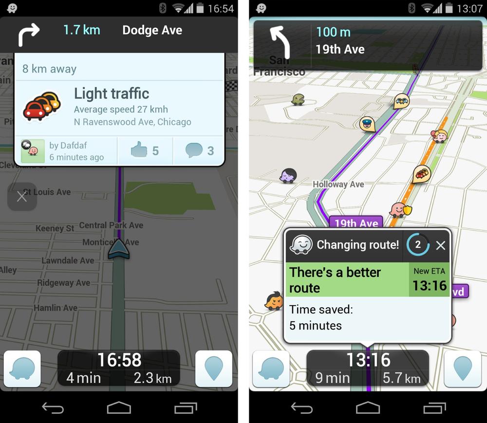
Figure 13-7. Waze crowdsources local traffic and road information in real time (images: Waze.com)
Cloud servers are more powerful than edge devices, can take in more data points, and more easily connect to other services to draw in data from other systems. Handling analysis in one place means that network traffic can usually be reduced, as the service pushes out the results of the data analysis (instead of a network of devices pushing raw data at one another). This kind of centralized processing is good for large datasets like energy analytics or trends in fitness data. It scales much better than local processing: as you have more data and more capacity, you can add more servers. Because storage is cheap and scalable, data in the cloud is also persistent: you can keep it as long as you need it. Data in an edge device may need to be erased when storage space is needed.
However, as we’ve seen in Chapter 3 and throughout this book, anything that happens over a network is subject to latency and reliability issues. If you need immediate responsiveness or near-failsafe reliability, a device will need to be able to process data locally to some extent—for example, a self-driving car equipped with cameras, image processing, and proximity readings detects a potential collision situation. The potential course of action—swerve, slam on brakes, do nothing—may be different, depending on whether the object in the way is a wall, child, or squirrel and whether taking that action might endanger anyone else on the road. That decision must be taken and acted upon in a split second, which means local processing. The car cannot risk having to ask the Internet what to do.
Many current IoT services use a centralized model. But interest in processing at the edges is growing. Cisco uses the term “fog computing”[209] to refer to the distributed model of cloud computing that encompasses sensors, smarter edge devices, and smarter hubs as well as centralized servers. This kind of distributed processing may protect against latency and outages and enable better user experiences.[210]
Data Science
Whether you’re working directly with data scientists, or third-party data that was analyzed elsewhere, it’s worth having a basic understanding of what data scientists do.
Data science is the extraction of actionable knowledge from data.[211] Data scientists explore complex problems using a variety of techniques from many fields, including mathematics, statistics, and computer science.
A particular focus in current data science is big data. Extracting results from large, distributed, unstructured, or semi-structured datasets is a very different challenge from querying organized, structured databases. It has required the development of new types of algorithm (e.g., Google’s MapReduce). One of the central trade-offs in big data is in optimizing the data for fast querying versus leaving it in its original form. Preserving the original source provides the flexibility to use the data in other ways in the future, but carries the drawback that running queries will take more time.
Accommodating and analyzing large volumes of data is a serious investment in both effort and money, and has to be well planned. Gathering any data you can in the hope it will be useful later is not efficient or effective.
As with any kind of science, starting with a clear formulation of the questions you want to answer with data is important (as well as the business objectives of spending time investigating it). The questions frame the data you choose to collect, and how you analyze them. How you analyze them, in turn, has an impact on your conclusions.
Cleaning and preparing data (e.g., dealing with errors and inconsistencies, weeding out data that doesn’t help answer your questions) prior to analysis can take a significant amount of time.
Analysis involves extracting meaningful insights from the data, and can also be extremely complicated to get right. An activity tracker might use an accelerometer to capture movement. But patterns of movement vary depending on the activity type, your height, your weight, and even the type of shoes you wear. If your goal is to get an accurate picture of the user’s activity level, you might require data from other sensors or sources. A smart energy metering service might try to disaggregate the consumption of each household appliance from a customer’s energy readings.[212] Or it might compare a single customer’s energy readings against a reference data set for similar households to produce similar insights by statistical inference (see Figure 13-8)
Finally, there is the communication process, which may involve visualizing the results, translating numeric insights into the story the data is actually telling, and the actions it points toward.
Types of IoT Data
The types of data that may be captured by connected devices includes:
§ Information about the physical world (e.g., it’s 14° C, there is no movement in the living room, NO2 is within acceptable limits)
§ Information about things, such as location or state (e.g., the package is in Jacksonville, the light is on and using 13W, the washing machine has a blocked pump)
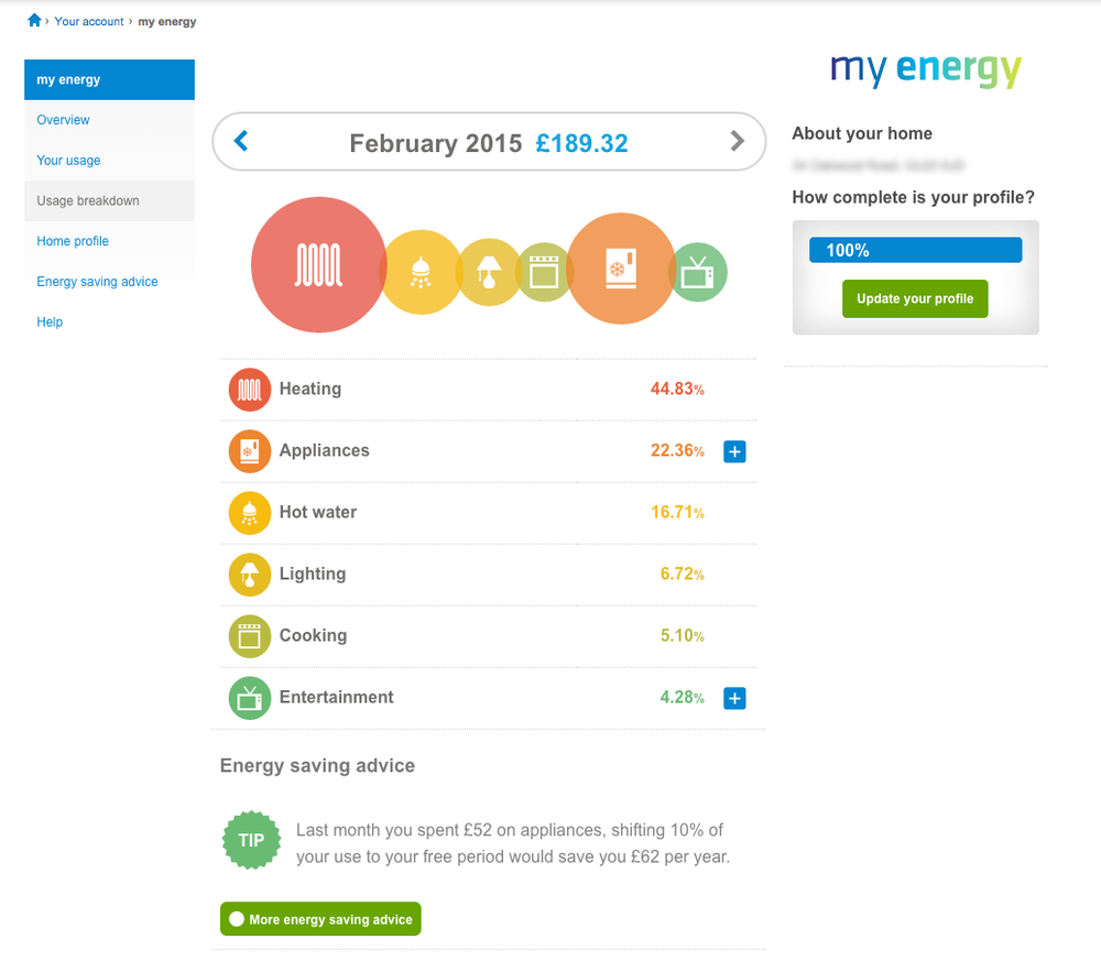
Figure 13-8. The British Gas My Energy online report shows a breakdown of a smart meter customer’s energy consumption by appliance (image: British Gas)
§ Biometrics (e.g., heart rate, respiration)
§ Human behavioral data, such as physical activity level or what the user is doing with the system (e.g., turning on the oven, accelerating and braking in a car)
A system may well use a combination of all of these. For example, doing a run with a fitness tracker (or even just a smartphone) would generate data about the location, time, speed, and number of steps taken during the run. Wearing a heart rate monitor would add heart rate measurements, which could be used to infer the intensity of the run, in relation to the user’s general fitness level. The system might also track weather data from a third-party service, to take into account run conditions and the effect on the body.
Static versus dynamic
Data can be either static or dynamic. Static data doesn’t change, or changes very slowly. Static data about the world includes mapping data, such as the locations of countries, mountains, cities, and buildings. Static data about a person would usually include their sex and name, height, and date of birth. Static data about things tells us about their properties: for example, the washing machine has a maximum spin speed of 1,400 RPM, or the car is a red Ford Focus with a two-liter engine.
Dynamic data changes all the time (i.e., particular measurement, taken at different times, will produce different results). Dynamic data about the world includes temperature and humidity readings, weather conditions, traffic density, levels of pollutants, and whether there is currently movement in front of a sensor. Your weight, activity level, blood pressure, and energy intake are all dynamic. Dynamic data about things describes what they are doing right now (e.g., the washing machine is currently in rinse cycle, the fridge is using 45W of electricity, the boat is at latitude 17.761158 and longitude –88.027749).
In an IoT context, static data generally serves to provide interpretive context to dynamic system data, such as sensor readings or information about what the system (or user) is doing. For example, the GPS coordinate just mentioned is meaningless to most of us on its own. But set in the context of mapping data, it can be used to tell us that the boat is moored in Caye Caulker, Belize (see Figure 13-9).
Direct versus inferred
Some data points, such as the user’s heart rate or current speed of driving from the odometer, are directly measured. There may be some question over the margin of error of the instrument used to measure them, but in general we treat such measurements as facts about the world.
Other observations may be indirectly inferred from other sources. Observing electricity consumption patterns in the home can help indicate whether anyone is in, up and about (see Figure 13-10). If a bike is traveling away from its owner’s phone, it might be stolen. If bed sensors detect that a senior citizen is not up by 9 a.m. and has not boiled the kettle as per her normal routine, it could be an indication that something is wrong.

Figure 13-9. GPS coordinates 17.761158, –88.027749, aka Caye Caulker (images: Sam Beddoes via Flickr, CC licence; Google Maps)
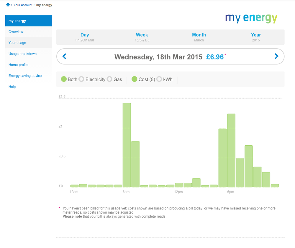
Figure 13-10. Hourly energy consumption patterns for a day give an indication as to when the home’s occupants are in, and active. (Image: British Gas My Energy online report)
Inferences can be extremely powerful, but they contain the potential for inaccuracy. If your system acts on inferences, or presents them to users, it’s important not to treat them as incontrovertible facts.
Big versus small, real-time versus historical
Data scientists often focus on “big” data: huge, distributed datasets and the techniques for working with these. As we’ve discussed, IoT will create a lot of data that needs to be processed and analyzed in this way.
But data does not have to be big to be significant. A single sensor reading can tell you that there is smoke in your home. A single GPS coordinate from a pet collar can tell you the location of your lost dog. Very small data, like this, can be highly significant in telling us what an object is doing, or what is happening in the environment. Small data points like this are generally most significant when they tell us what is happening right now. Knowing that your child has just come home from school or that your house is using 2kW of electricity is useful at the time, but much less so four hours later and not at all two weeks later. Occasionally, a small data point can remain significant in a historical context, if it is linked to a significant event. For example, knowing exactly what time the motion sensor triggered your alarm, and in what room, when you were burgled two months ago could be important information in support of an insurance claim or criminal case.
These data points mostly have significance in the longer term only when aggregated to identify trends, or provide meaning to current readings. Knowing that your child usually comes home at 4 p.m. or your house’s baseload electricity consumption is 150W is helpful to provide context to things that happen now. For example, if you’re on vacation but your house is consuming considerably more electricity than your baseload, something has been left on, and you might want to turn it off (if you have the means to do so).
Over time, individual data points are likely to decay in value more and more, and become useful only as part of aggregated trends. Your home’s energy consumption day by day, last winter, might be useful mapped to weather conditions. It might give an indication as to how efficient your heating system is. Your home’s energy consumption in January two years ago may only have value as a single aggregated figure, used to show that this January’s consumption has been high, low, or average compared to previous years. The user’s interest in the data is likely to become less granular over time. It often makes sense for more recent data to be fine grained (e.g., to see every weight measurement you have taken recently). The older that data becomes, the more coarse-grained the focus of interest becomes: comparing your recent weight with general trends up and down in recent years.
Large datasets often contain historical data, but complex IoT systems can also generate a large amount of live data that needs to be analyzed and acted on in real time. Real-time data enables context-aware services that modify the information, functionality, or even pricing offered to the user in response to live conditions. Uber[213] monitors the location and availability of cars across the network to determine when demand is high, and charges more at those times: this is called surge pricing. Surge pricing can help to manage demand, by encouraging more drivers to work at busy times.[214]
Time, frequency
When data is being aggregated from many different sources, keeping track of the order in which it happened (time series) is critical. Knowing whether a reading from sensor A was taken before a reading from sensor B, or vice versa, can completely change the interpretation of the data. Is the house warming up, or cooling down?
The frequency with which data readings are taken is also important. “Real-time” data often isn’t actually live. As we saw in Chapter 3, many connected devices aren’t constantly connected, so may report or receive data intermittently. Sending very frequent readings may clog up the network. “Live” data readings might be taken at intervals ranging from a few seconds to a few minutes or more. As cited in Chapter 4, an electricity smart meter sensor might report 7-second reads, but a gas sensor might only report 15- or 30-minute reads as it runs off a battery. This changes the value of the data. The electrical data can perhaps tell you which appliances are on right now that you might need to turn off, and the gas data will give you general trends, such as whether the heating schedule is aligned with the times the house is occupied or not. As we saw in Chapter 3, power issues are a major factor in determining connectivity patterns of connected devices.
Augmenting Your Data with Third-Party Data
You may choose to augment the data from your product with third-party data. This is often used to provide context. For example, third-party weather data might help an energy monitoring system interpret where energy is being used, or enable more efficient functioning of a solar power generation system. A connected lost-and-found tag on your bag might allow you to link its service with your account on Uber and Foursquare, allowing you to backtrack to places where you might have misplaced your item.
If you’re using data from a third party, you will have to work with their data structure, and you are at the mercy of their availability. In Chapter 3, we discussed rate limits on APIs, which might mean that you are only able to query the third party’s data API a certain number of times per day, or per hour. You may not always get “live” data, especially not from a free third-party service.
If your product is sold in different markets, there may be geographic differences between the third-party services used between those markets. Public transit information for London does not come from the same source as public transit information for New York.
Integration with third-party services may require explicit consent from the user, for example, if you want to access their Facebook friends graph. You need to design the service to degrade gracefully if the user refuses or revokes permission, or if the third-party dataset is temporarily unavailable.
Types of Data-Driven Product
Designing with data isn’t just about presenting data to users. As we saw in Chapter 4, data gives us the potential to think about products differently.
The current crop of products on the market can be thought of in terms of:
Context
How the data relates to the user: whether it relates to them as a person, or their environment
Action/automation
What is done with the data: whether it is presented back to the user to inform his own actions, or whether it’s used to drive system actions, like automation or autonomous systems
The grid in Figure 13-11 shows how this translates to four product quadrants.
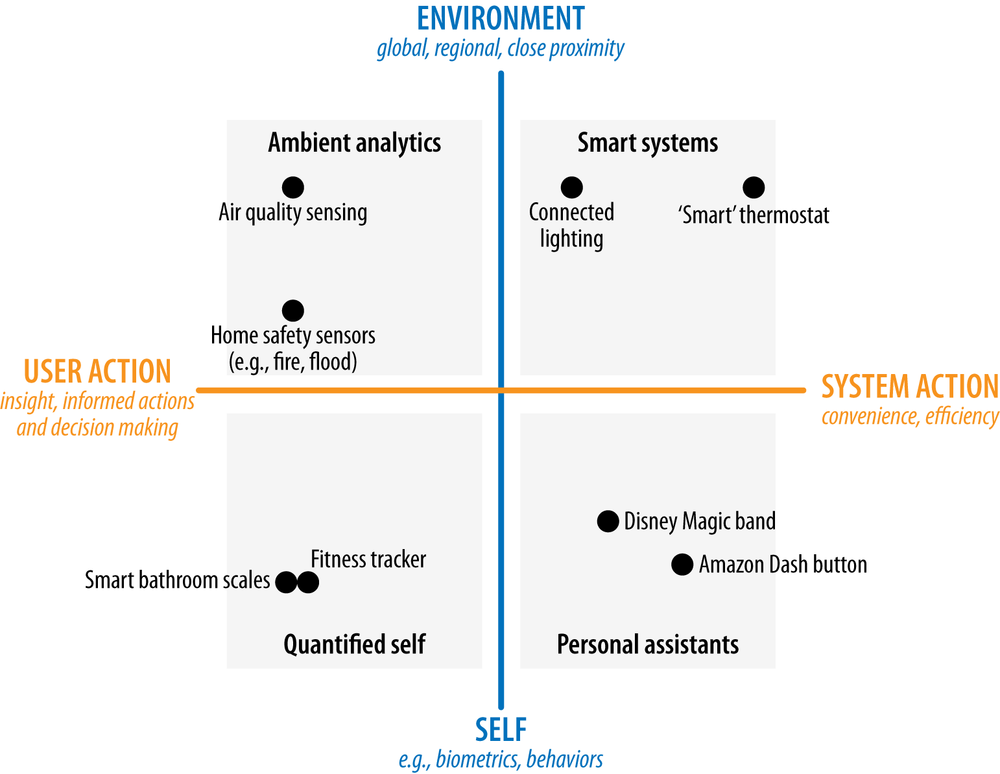
Figure 13-11. The context-action framework
The vertical axis represents the context of the data in relationship to the consumer. At the top end of the vertical axis are broad-scale data about the environment, such as atmospheric temperature or traffic. Further down, we might find more localized information about the user’s personal environment, such as which light bulbs in her home are switched on and how much energy the home is using right now.
At the bottom of the vertical axis is data about the users themselves. These could be physical measurements such as heart rate, glucose level, diet, and energy consumption through daily activities, or behavioral data such as sleep patterns or how much time they spend using a smartphone.
The horizontal axis represents what that data is used for.
On the left is user action, where data is presented to the user, who then decides what action to take. Many current IoT products fall into this category. The Automatic Link (see Figure 13-21)[215] is an example of an insight product. It aggregates sensor data inside the car with gas prices to help consumers relate fuel cost to their driving habits. It doesn’t do the driving on their behalf.
On the right is automation, where devices act upon the data themselves. This may be through automation—where the user creates rules to be triggered when certain data values are met (e.g., turning the lights on when it gets dark, or unlocking the car when the user approaches). Or it might be through systems that take autonomous action (e.g., a thermostat that learns when the home is likely to be occupied and what temperature the residents find comfortable). The goal is to save the user effort, and sometimes to optimize/produce a better result than could be achieved by letting the user do all the work (i.e., setting heating schedule). (Automation and autonomous systems are covered in more detail in Chapter 15.)
Over the next few years, we can expect to see some product categories move from insight toward automation. For example, smart meters currently only offer insights into energy usage. The emergence of the smart grid—able to predict outages and balance demand—will enable energy suppliers to offer dynamic pricing and incentives to customers willing to allow the supplier to control their usage (e.g., pausing the tumble dryer) at peak times. But there are some activities that won’t lend themselves to automation. An activity tracker, like the Jawbone UP or Fitbit, can tell you whether you’re getting enough exercise, but will never be able to go for a run on your behalf (although perhaps in the future it might offer a tie-in to your diet plan or grocery shopping service to help you eat more healthfully).
Each quadrant of this diagram represents a different type of product in the consumer IoT market today. Next, we’ll look at what those are, and what that means for design.
Smart Systems
Smart systems aim to achieve efficiency through automating actions. Most of these systems are comprised of multiple devices distributed in the environment, such as home automation systems. Key design challenges are interusability and interoperability. The ability to work with other systems in the same environment (e.g., the security alarm and the lighting system) magnifies its value.
Ambient Analytics
Ambient analytics systems (Figure 13-12) seek to improve the consumer’s understanding of their environment. Drawing on data from sensors and (often) external sources, they seek to expose trends and changes in an environment. The goal is to provide reassurance, and when appropriate, enable the consumer to proactively make decisions against anomalies.
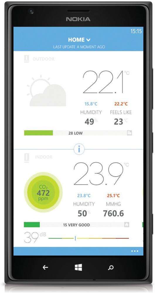
Figure 13-12. The Netatmo weather station can track temperature, humidity, air quality, and indoor and outdoor carbon dioxide level; the consumer can view data trends using an online dashboard, and share data with others around the world (photo: Masaki Okomura/Netatmo.com)
Personal Assistants
Personal assistants (Figure 13-13) use the consumer’s data to personalize services and remove pain points from their activities. Because these solutions are expected to be personal, the system can deliver additional value by learning and adapting to changes in the consumer’s patterns. As with smart system solutions, interoperability with other systems is often important: for example, the Disney MagicBand works with payment systems, hotel room access, restaurant and ride bookings, and more. Safeguarding the consumer’s personal data is vital for these systems. Amazon’s Dash Button provides a trigger allowing the user to reorder branded consumables at the point at which they are used. The Dash Replenishment Service behind the button relies on Amazon’s ordering, payment, and fulfillment systems and can be built into the device hardware by the manufacturer. Any unauthorized change to the data may trigger false actions in different parts of the system.
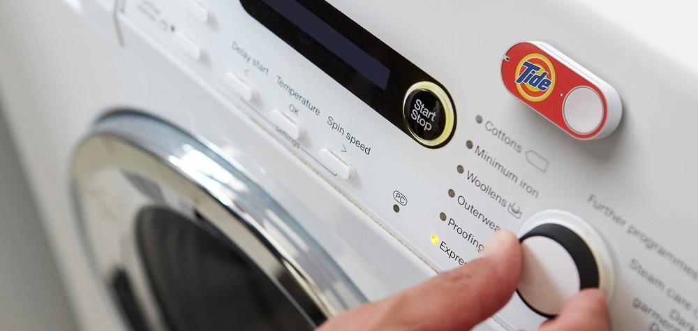
Figure 13-13. An Amazon Dash button for ordering Tide laundry detergent on a washing machine (image: Amazon.com)
Quantified Self
Quantified self products (Figure 13-14) help the consumer understand their behaviors and provide insights to help them make improvements. Most activity and sports performance trackers are in this quadrant. The majority of the products in this quadrant are bought with a specific goal in mind, often linked to behavioral change. The key design challenge is to use the insights to help users toward that goal. This requires effective feedback grounded in behavioral psychology.
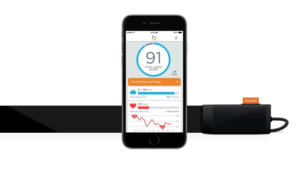
Figure 13-14. The Beddit Sleep Monitor: a thin sensor strip adheres to a mattress and tracks the consumer’s sleeping quality based on his movements, respiratory rate and heart rate; the accompanying mobile app visualizes the data and provides recommendations to improve the consumer’s sleeping habits (image: Beddit)
Many quantified self products are well-being oriented, targeting those who are generally well but wish to be healthier or fitter. More products are likely to emerge that target those coping with ill health, or the risk of it. But medical devices must pass stringent certification processes with regulatory bodies like the FDA (in the United States). The manufacturer is also liable should any harm come to the user through a fault in the device, or inaccuracy in the information. As a result, many companies find it easier to frame their connected devices as “lifestyle” products rather than medical-grade equipment.
Data Above the Level of a Single Product
This last example highlights that the value of data-driven products isn’t just about the individual user. The more connected products we have, the greater the value of the aggregated data they generate. Data from a single car may be useful to the driver, but data about many cars provides a view of traffic density. Data from a single activity tracker and heart rate monitor might help the watch’s owner manage her fitness, but data from thousands or millions of similar devices, anonymized but tied to basic demographic information, could be an invaluable resource to medical researchers (or insurance companies).
For example, Apple’s ResearchKit—a platform enabling medical researchers to collect health information from iPhone users—has just been announced at the time of writing (though not yet released). It’s easy to see how heart rate data from the Apple Watch across millions of wearers could be mined for cardiology research.
What This Means for Design
In this section, we’ll look at the key considerations for creating valuable user experiences for data-driven products.
Making Meaning and Enabling Action
The most fundamental questions when designing data UXes are:
§ How to make the data meaningful to the user
§ How to make data actionable: enabling something of value to happen as a result of the data.
People often equate making data meaningful with visualization. Visualization can be a powerful tool for communicating meaning, but it isn’t the whole picture. In this section, we’ll consider general principles for identifying what’s meaningful and valuable to your users, and how to present it to them.
The process of generating meaningful and actionable insights starts right at the beginning of the process of working with data. It affects the framing of the questions you want the data to answer, the choice of what data to collect or measure, and the algorithms you use to analyze it. As a designer, you may be involved in these data science activities, or you may be tasked with communicating the outputs to the user.
Either way, the key question (as ever, in user-centered design) is understanding the user’s motivations and goals for using the product. Why are they using your product, and what do they want to achieve through using it?
Generally, users have an end goal in mind that has nothing to do with the data. That goal might be to lose weight, or save money on energy. By understanding what motivates your users, and what they want to achieve with your product, you can focus your data insights on helping them achieve that goal.
Understand motivations and goals
Different underlying motivations and goals for using your product can put a radically different spin on the resulting UX. Imagine you’re designing a home energy monitoring service. You might determine that there are three possible motivations that drive energy consumption 'margin-top:6.0pt;margin-right:0cm;margin-bottom:0cm; margin-left:18.0pt;margin-bottom:.0001pt;text-indent:-18.0pt;line-height:15.0pt; vertical-align:baseline'>§ Maintaining a reasonable standard of comfort and convenience
§ Saving money
§ Minimizing the impact on the environment
Different users may care about these things to different extents. Those who are time poor but cash rich will probably value comfort and convenience quite highly. Those for whom money is tight will be very keen to reduce their bill. And those who are very environmentally conscious will want to minimize their carbon footprint.
It’s quite possible for users to care about two or all of these. But each energy decision they make (whether to switch on the AC or heating, whether to invest in home insulation or solar PV panels, or even just whether to leave on the landing light at night) is driven by a consideration of which is most important there and then. It’s quite possible to care about minimizing your carbon footprint but be willing to leave a light on all night if an elderly guest prone to falls is staying. And however much you want to save money, you might draw the line at taking cold showers in the winter.
The ideal design for each of these motivations in isolation would be quite different. A cost-saving experience would break down in detail the cost implication of every energy behavior, maintain a running prediction of the next bill, suggest any possible savings, however small or potentially inconvenient, and keep track of the cost savings actually made. An environmental impact reduction experience might frame energy behaviors in terms of carbon impact, suggest ways to minimize it, track carbon saved from behavioral changes over time. A comfort and convenience–centered experience might suggest ways to reduce waste and raise comfort, such as investing in a new boiler or better insulating the home. It might offer automation—for example, via an intelligent thermostat. But it would not bug the user to make small savings all the time, especially if they involved effort or inconvenience.
In many cases, you’ll be designing for a user base that has a mix of goals and motivations, and creating a balanced design that keeps everyone happy will be a big part of the challenge. In the case of the energy example, you might find that the common ground is reducing waste. Even people with pots of money don’t generally like wasting it. Or it might be informed control: everyone wants to know the energy impact of their activities so that they can make informed decisions about where their money, or carbon usage, is going.
Provide context
At first, just having data that wasn’t previously available can be a novelty. Seeing your step count for the day or your home’s electricity consumption pattern over 24 hours for the first time can be pretty interesting.
Suppose you wear a heart rate monitor/step tracker for a day. Perhaps you bought it because you want to monitor your overall health, or to get fitter, or get better sleep. The service sends you a graph of your daily readings in an email (Figure 13-15).
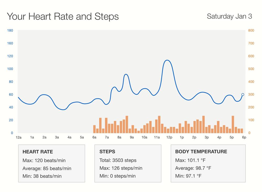
Figure 13-15. Heart rate and activity chart for a day
There are some visible patterns in this data. Your heart rate:
§ Rose in the morning just after you woke up
§ Varied throughout the day, correlated to your activity level
§ Rose during lunch (around 12 p.m.), then fell and returned to normal about an hour later
In this chart, the data has been collected and synthesized into a readable form. It’s interesting, the first time you see it. But what is it telling you? Are you normal? Are you healthy? Is there anything here you ought to be worried about?
In order to understand what the data means, you need more context. That might include comparisons to your previous data: how these readings compare to your heart rate in general (is anything unusual happening today?); how they compare to the healthy range for someone like you (are you generally fit?); how they relate to the reason you bought the product (improving your fitness or getting better sleep). To have value, insights need to be relevant and useful: helping users achieve their goals.
Providing context might also mean relating the data to the user’s prior knowledge or experience. Part of this is about representing it in terms that make sense to people. For example, energy consumption is generally measured in watt or kilowatt hours (kWh). Most people have no idea what a kilowatt hour is. It’s a pretty complicated thing to explain, not least because live electrical power consumption is measured in watts or kilowatts, which are similar but not the same. Some energy meter displays mix both watts/kilowatts and watt hours/kilowatt hours.[216] Most consumers have zero interest in understanding this. Comparisons can make the mystical energy units more palatable: you used 20% more energy heating your home this winter compared to last winter; your new TV’s power consumption is 30% higher than your old one.
From our own research, consumers generally measure energy consumption in terms of money. How much was last month’s bill? How much will the next one be? A valuable way to help them understand their energy consumption is to relate their energy behaviors to cost. How much does it cost them to run the tumble dryer, have a shower, or to heat the house for a week? How much do the appliances that run all the time (their baseload consumption) cost them per minute? The British Gas report back in Figure 13-8 shows consumption by appliance in both cost and kWh.[217]
The precision with which you express your data also sets context. An activity tracker that indicates you walked 7,518 steps today implies that it is extremely accurate. As we saw earlier, this may not necessarily be the case. If what your system is good at measuring is general trends, focus the UX on highlighting those trends instead (e.g., you have been less active in the last week).
Actionable insights, explanations, and data
If you have lots of data, it’s tempting to want to show it off. But less is usually more to avoid the key insights becoming lost in the morass. Graphs and other visualizations can be powerful tools, but unfocused “dashboards” that summarize all the data to the user can be overwhelming. Designers and data scientists may love to look at beautiful visualizations. But mainstream consumers may associate graphs with math lessons in school. Not everyone enjoyed math.
Think back to the consumer’s goal: is it to spend time looking at graphs, or is it to achieve something outside the product?
If you’re using data to provide a smarter service, as is the case with the Disney MagicBand, you may not have a “data” consumer interface to speak of. The power of your service is in your ability to improve service interactions in context. Waiters can locate customers in the restaurant with the food they ordered earlier, and the service can plan itineraries around the park attractions that minimize walking and waiting time. The key here is to improve the users’ experiences at the “moments of truth” that most affect their overall experience.
If you are displaying data to users in a UI, your UX should focus on the headline insights. There may only be one or two of those, and that’s OK. It might even be better to forget the graphs and just present text headlines—for example, “You’re getting fitter. Congratulations!”
The headline should contain enough information that the user can see the relevance and grasp the important information without needing to read further. It should be specific, and where possible, provide some explanation for the insight (e.g., “Your next gas bill is on track to be $100 more than usual, because the weather is colder than usual for this time of year”).
You can then offer users who are interested access to a more detailed explanation of the insight, and then perhaps allow them to dig deeper into the data if they wish. This is the design technique of “progressive disclosure”: giving the user only the essential information they need to understand at each point to reduce cognitive workload, with the option to dig deeper (see Figure 13-16).
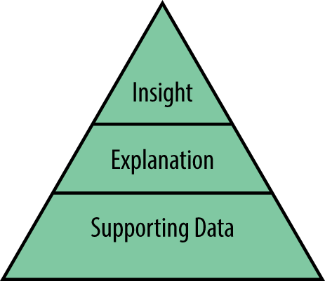
Figure 13-16. The pyramid approach to progressive disclosure: top-level insights are supported by explanations, backed up with supporting data for those that want it
The most important and valuable headline insights are those that are actionable in terms of users’ goals. Can users do something as a result of this insight that helps them toward accomplishing their goals?
For a non-IoT example, consider weather apps. Conventional weather apps present facts about the forecast for your general area. The Dark Sky app uses hyper-local information to answer the question most likely to influence our short-term Figure 13-17.)
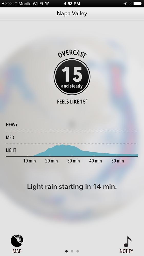
Figure 13-17. Actionable advice in Dark Sky, a mobile weather forecast app
The personalized energy tip in Figure 13-18 provides information on appliance usage linked to a suggested action to reduce the user’s bill.
An activity tracker might consider contextual data, such as weather and the user’s calendar, to offer actionable advice. Perhaps the user is running low on their target step count for the week, but it’s a nice day, they have nothing in their calendar around 12 p.m., so the system might suggest a lunchtime walk. This kind of advice is often far more valuable than a graph.
By enabling improved ways to control devices (whether manually and remotely or automatically), IoT gives us better opportunities to act on insights. The action might even be taken by the system—for example, the heating system that turns down the thermostat because it detects that the house is unoccupied and knows that the user has a broad goal of wasting less energy. Even without an “intelligent” heating system, a service that correlated data from the security alarm and a connected heating controller could tell the user when the house was empty and the heating on. It could then give them the option to turn it off.
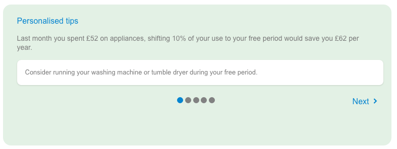
Figure 13-18. Personalized energy tip from the British Gas My Energy Report
Insights like these, which are actionable in the moment, require live or near live data. You can’t offer an immediate action on out-of-date data. What “live” means will depend on your application. Electrical power consumption might be out of date in seconds—a room temperature reading can be minutes old and still assumed to be fairly accurate.
Live electricity data can tell you which appliances are on right now, allowing you to turn off any that are not needed. But if your gas data is 15 or 30 minutes old, it isn’t necessarily telling you what is happening right now, but giving you an indication of daily fluctuations in energy consumption from which you can draw broader-brush conclusions, such as that the heating tends to come on before anyone gets home. In this case, the system might suggest you adjust the heating schedule, or offer to do it for you. But insights on longer-term trends may not lend themselves to such simple actions. Your gradually increasing weight over the last year can’t be fixed with a button tap.
You may sometimes need to decide whether (and how) to communicate insights about things that the user can’t act upon, or can’t reliably control. A system that monitors the vital signs of a cardiac patient might calculate, based on data from other patients, that he has a 25% chance of having a heart attack in the next 48 hours. Should it tell him? A stressful and distressing message—“You might die tomorrow”—would be counterproductive, not to mention unethical. A better message might be “Your heart is under stress. Get plenty of rest, take your medication and see your doctor as soon as you can.”
The timing and sensitivity with which insights are delivered is a major factor in determining their efficacy, and the user’s experience of receiving them. We’ll cover this in more detail in the following section.
Attention is a Scarce Resource
Many of us already suffer from information overload. Connected devices will, if we are not careful, only make matters worse. The amount of information from devices on us and around us will dramatically increase, all competing for our attention. But human attention is a finite resource. Most of us are already interrupted many times a day by various types of message and notification. Interruptions are known to have a negative effect on our cognitive performance,[218],[219] and are linked to stress.[220] Ubicomp pioneer Mark Weiser’s dream of calm computing seems an impossible utopia:
Machines that fit the human environment, instead of forcing humans to enter theirs, will make using a computer as refreshing as taking a walk in the woods.[221]
Current IoT systems like to tell us what they are up to, through smartphone notifications, email reports, tweets, SMSes, and even phone calls. That’s understandable while they are relatively novel. But the more of these devices we have in our lives, the more unmanageable the notifications and interruptions will become. Current methods of notification management require us to manage settings for each service on our smartphones, or within the service itself. That may not scale up very far. We need ways to filter out the noise and stay informed of only what we need to know, which we can apply across multiple products and services.
We don’t yet have good tools to do this. But as designers of IoT systems, we should still do our best to shape our services to be respectful of the user’s attention, and consider carefully what justifies claiming it. We should aim not to add unnecessarily to the growing clamor of Internet noise that grinds all of us down at least sometimes. It is nearly always the case that users have something they view as more interesting or important to do than whatever it is we want to tell them right now.
We can do this by considering how the user’s motivations shape:
§ The relative importance of our messages
§ The right way, and right time to deliver them
§ How our services can help users filter information to get only what they need and want
The user’s core motivations for using the product or service should help you focus only on the most important messages. Tell people only what they really need to know. Most people using activity trackers probably have the goal of trying to be more active. Instead of telling users how much they have walked, why don’t these just alert users when they haven’t walked enough?
The motivations for using a system should also shape communication patterns. For example, a core motivation for investing in security and many home control systems is peace of mind. A peace of mind system need not tell the user everything that is happening: that would be counterproductive! The user may occasionally want actively to seek reassurance: for example, did they remember to lock the door? But mostly, they want a system that runs quietly in the background when everything is OK, but that they can trust to tell them when there is a problem. The system needs to be smart enough to figure out when an event is urgent, important, or just noise, and whether it requires action. (We discussed the choice of notification channel in Chapter 12.)
Delivering messages at the right time is also key to being respectful of the user’s attention. No one wants to be woken up in the middle of the night to be told their new sleep quality report is available. Understanding how your product fits into the daily or seasonal activities of your users is valuable here. Are there natural cycles to using the product? For example, users may be interested in a live energy read at night to see whether they have turned everything off. Energy customers on a monthly payment plan are likely to be most interested in usage patterns on a monthly cycle, when the bill is due. Customers on a quarterly payment plan may take a longer view. Designing around these cycles may create a more meaningful product than assuming that they must want to look at it all the time.
Finally, consider whether your product can actively help manage information overload. This is a key opportunity for wearables. For example, a smart watch’s configurable rules might allow users to filter smartphone notifications: being alerted only of the most important calls, texts, or notifications from the most important apps.
Experience Over Time
A key design challenge for data-driven products is what to show the user when you don’t have very much data. The early experience of using a data product may, frankly, not be that great. It might need time to gather some data before it can do what it’s really good at. The energy meter that only has one week’s worth of data might be able to estimate that your kettle costs $.04 to boil but can’t tell you much about your long-term usage trends or predicted next bill. Engaging the user, and keeping them engaged, while you wait for the really valuable insights or functionality to emerge, is a challenge. User expectations need to be clearly set, and progress toward the more valuable stage of operation clearly communicated.
For example, the Nest Learning Thermostat makes its purpose very clear to the consumer up front—it keeps your home comfortable and saves energy by learning about you. During the first week when there is no data about the consumer’s home, it asks the consumer to adjust the temperature of their home manually (this may even be a step backward in user experience to users accustomed to programmable controllers). Every time the user makes an adjustment, the thermostat provides visual feedback that it has learned the input. After a week of monitoring the temperature inside the home, adjustment patterns and movement patterns, it offers the user the option to turn on the Auto-Schedule. As the names suggests, Auto-Schedule tunes the temperature of the home according to the user’s previous adjustments. The act of asking the user to turn on the feature, together with the data that the feature provides, demonstrates that the device has been learning.
Inference and Interpretation
In Types of IoT Data, we discussed inferences: taking a set of observations, and applying inductive reasoning to conclude what may be happening, and why. If smoke is detected and the home’s temperature is unusually high, there might be a fire.
Inferences can be very powerful, but they contain the potential for inaccuracy. If your product makes inferences about users, it’s really important that they understand how you are forming those inferences, what you have done with them, and if they aren’t accurate or they don’t like the result, what they can do about it. We don’t know whether the “smart” drink vending machine in Chapter 11 will tell you the age and sex it thinks you are and the decisions it has made to show you only certain drinks on that basis. But at the very least it ought to provide an option to view all drinks, to everyone.
A related problem is the interpretation that may be applied when trying to put your data in context. For example, an energy monitoring system might tell you that you use 50% more energy than “similar” households. You may well want to see how it has classified those households as similar (e.g., location, age and size of building, and number of occupants). If any of that information is incorrect, you’ll want to update it (see Figure 13-19).
This is particularly sensitive when the product is perceived to be judging people for doing something “bad” or trying to modify their behavior. Users may feel they have valid reasons for their actions that the system isn’t taking into account. You may genuinely be missing some context. For example, high energy consumption might be due to a sick person at home who needs the heating on all day. Sudden braking might not be bad driving, but avoiding a child running across the road. Poor sleep might be due to a new baby (see Figure 13-20). Be sensitive to the fact that your assumed view of the user’s needs might be incomplete, and adjust messaging accordingly. The sleep app, for example, might communicate a change in data by saying “I’ve noticed a dramatic change in your sleep habits,” and offering to turn off alerts temporarily alongside guidance on getting better sleep.
Figure 13-19. The British Gas My Energy report allows users to provide contextual information about their home to aid more accurate interpretation of energy data (image: British Gas)
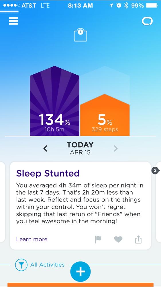
Figure 13-20. The Jawbone app showing evidence of poor sleep; this might be due to late night TV...or a sick child
Transparency and Trust
Where data about users is being collected and stored, the security of that information and the privacy of the end user are vitally important concerns. This is discussed in depth in Chapter 11.
In terms of UX design, the basic principles are:
§ Be transparent about what data is collected and why, and don’t collect more than you need
§ Be transparent about what is done with it: how do you use it, and with whom it might be shared
Many products bury this kind of information within user agreements that almost no one reads. In 2013, LG smart TVs were found to be transmitting information about user’s viewing habits and even the names of personal files on USB sticks back to LG, for use as part of their Smart Ad targeting service, capable of offering “sharp suits to men, or alluring cosmetics and fragrances to women.”[222] LG claimed that the existence of this functionality was made clear in the terms and conditions and that it was the users’ fault for not reading these, but this argument was undermined by the fact that option to turn this functionality off did not work (this has since been fixed).
A much better approach is to communicate the benefits of granting the service access to the customer’s data. Show that the customer needs to grant access to a basic set of data in order to use the product, and adding additional data afterward brings additional features.
Also, make the data that you collect from your customers available to be downloaded as a report or raw data. Not everyone will use this feature, but the point is to make the information available for the customers who want to see what you can see. If any part of your service experiences a security breach, you must report the incident to your customers and communicate the steps that you will take to fix the situation. Develop a procedure to handle legal information requests from government bodies, national or overseas, to provide notice to users when such requests occur.
If a customer decides to stop sharing their data with you or to stop using your service, they should be given the ability to remove their data from your service.
Data May Not Be Objective
It’s important not to place too much faith in measurements and models. Data may give the appearance of representing immutable and precise truths about the world, but this is misleading. The way you take measurements, and the algorithms you use to analyze them, can result in different conclusions. Whatever you do, your data will only ever represent a partial worldview and it might not be as accurate as it appears to be. For example, your activity tracker may report that you took 7,518 steps today, but different brands of tracker can give different readings depending on variations in sensors, algorithms, where they are worn on the body, and the height and gait of the wearer.[223]Algorithms can also learn the inherent biases and discrimination in the data and societal context, leading apparently objective analysis to produce distorted and discriminatory conclusions. For example, St. George’s Medical School created a big data algorithm to increase the objectivity of its admissions process. But the algorithm learned to favor white male candidates, as they were over-represented in historical admissions data.[224]
The sheer volume of data available now also has its risks. Humans are wired to perceive patterns in data, even if none exist. And if you analyze a large enough dataset, you will find random correlations that aren’t significant. A conclusion that appears to be supported by data will appear more credible, but it may not always be accurate.
The upshot for UX is always to be up front about what you measured, what you did with it, and its limitations. Make the data and the process as transparent as possible, and provide access to the raw data so others can, if they wish, explore it for themselves.
When Behavioral Change is a Goal
There is a current trend for connected products that nudge us toward behavioral change: using less energy (e.g., Opower), getting more exercise (e.g., Jawbone UP), driving more fuel efficiently (e.g., Automatic; see Figure 13-21). Connected devices can be effective in supporting for behavioral change as they provide the ability to monitor behaviors and deliver insights and nudges in the moment. To be effective, such products require careful design and a good understanding of your users, the domain, and the relevant psychology around behavioral change. This is a deep and complex topic in its own right. If you’re interested in exploring it in depth, we recommend Stephen Wendel’s book Designing for Behavior Change.[225] In this section, we will give a brief introduction to some key concepts and examples.
Many of these systems track user behavior, such as activity level, and then provide insights on that behavior, nudging users toward “better” behavior that helps them toward their goal, such as walking more. Sometimes it can be effective to take the behavior out of the user’s hands, allowing intelligent, automatic technologies to make “better” decisions for us, like turning the heating off when no one’s in. In this section, we’ll focus primarily on the former.
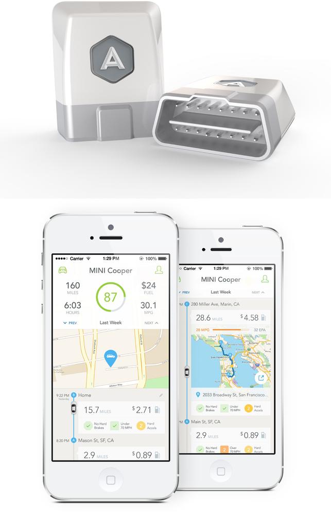
Figure 13-21. Automatic seeks to help drivers learn fuel-saving driving habits. The Link device (left) relays data from the car’s onboard sensors to the user’s smartphone. By analyzing the data, Automatic visualizes the correlation between driving behavior and fuel consumption and gives the user a ‘drive score’ every day. Users can compare their scores with other users and are encouraged to minimize harsh acceleration, braking and control their speed for better fuel consumption (images: Automatic.com).
A central concept in behavioral change is the feedback loop, a model often used by behavioral scientists and service designers to help people create new habits.[226] There are different versions of the feedback loop, but in general there are four stages:
Evidence
Data about the behavior is measured, captured, and stored
Relevance
Evidence about the behavior is crafted into meaningful insights for the user
Consequence
The evidence is used to describe the outcome and effects of the user’s current behavior
Action
Alternative courses of action are set out, encouraging the user to choose to change course
For example, an energy monitoring service might tell the user: “Based on analysis of your gas usage (evidence), we think you spend 20% more on heating your home than other similar households (relevance). This winter, that could be a difference of $150 on your bill (consequence). Turning the heating down by 3° F could save you $75 (action).”
Notice that this example is very specific: it helps the user understand the energy consumption of a particular behavior (using heating). Connecting the evidence to specific actions helps users understand how to change those actions. It also targets loss aversion: the tendency for people strongly to prefer to avoid losses than to make gains.[227] A message that says “if you don’t do this, a bad thing will happen” is estimated to be nearly twice as powerful as a message that says “if you do this, a good thing will happen.”
Context is also important in making insights relevant and meaningful (as discussed in Making Meaning and Enabling Action). Energy trends might be best explained in terms of the user’s own usage year over year (rises/falls in consumption) or by comparison to neighbors/other similar households. But comparisons can backfire if users don’t perceive the people against whom you are comparing them actually to be similar: for example, comparing the energy usage of someone with three children to their neighbor who lives alone won’t be well received. And if you choose to compare behaviors to other behaviors, choose your comparisons carefully to avoid muddying the picture of what you deem “good” or “bad.” You might think that comparing someone’s carbon consumption from tumble dryer usage to the equivalent of a 600-mile bus journey from San Francisco to Las Vegas would make them think “gosh, that’s a lot.” But if that’s a journey the user would typically expect to take by plane, taking the bus seems like the virtuous option. You can also use comparisons to help frame the consequences of actions. A food tracking service might encourage you to think twice about eating that doughnut by telling you that you’d need to walk six miles to burn it off.
As already discussed, the timing of insights is also critical. If you can catch the user at a time where their motivation to change is high (e.g., when the next energy bill is due) or when there’s an opportunity to engage in the desirable behavior (or to head them off from the undesirable behavior), your message is more likely to be acted upon.
When it comes to giving advice, tone of voice matters. All of us like to make better decisions in our lives, but most of us don’t like to be told what to do. Make the user feel they have a choice, even if you’re steering them toward it. And before you berate them for a “bad” behavior, consider that you might not be aware of a legitimate justification for that behavior. If someone hasn’t walked at all for a week, it might be that they’ve broken their ankle. If someone’s gas usage data tells you that they have an old and inefficient boiler, it doesn’t necessarily mean that they are ignorant of the fact. It might be that they live in a rented property and can’t convince the landlord to replace it. Not every problem is the user’s fault and behavioral change may be only part of the solution. Because of this, it’s worth working to understand the user’s ability to act (e.g., fitness trackers might allow users to specify any health conditions, and energy insight services might ask users to indicate whether they are tenants or homeowners, and which appliances or systems are their own responsibility). Your aim should be to help people set realistic goals. Designing a “savings target” for an energy insight service might seem like a great idea, but if you find that users expect to save 50% off their bills, that might not be realistic. Likewise, setting the goal of running a marathon with only one month of training isn’t realistic. Allowing users to set these kinds of goals is over-promising and setting them up for failure.
But in some cases, the collective gain is greater than the gain for any one individual. Opower’s average energy saving achieved across their customer base, for both electricity and gas, is approximately 2%.[228] That might not seem like much in the context of an individual’s bill. But across millions of customers, it adds up to a significant carbon saving.
Visualizing Data
Data visualization is a powerful tool for communicating insights. Like designing for behavioral change, it’s also a huge topic in its own right. It’s beyond the scope of this book to cover in depth. Trina Chiasson and Dyanna Gregory’s free, crowdsourced ebook Data + Design[229] is a great place to start. Edward Tufte’s Beautiful Evidence[230] and Ben Fry’s Visualizing Data[231] are also very useful resources. In this section, we’ll give a brief summary of some key issues.
The data from an IoT system could be displayed on the device itself. Many connected embedded devices, as we saw in Chapter 8, have limited display capabilities, so you’re unlikely to get to display complex graphs on such a device. It might be better to focus on pared-back insights. There is a lack of widely understood conventions for using restricted displays, and you’ll likely need to bake the design for your display into the hardware, so you can’t change the UI later (see Figure 13-22).
If you’re displaying data in a web or mobile app, you’ll have a lot more screen estate to play with. But the oft-repeated message throughout this chapter—focus on the user’s goals for using the system—still holds true. The connection between the data and the user’s needs must be apparent. Relevant features in the data should be highlighted: just putting numbers and graphs next to each other is not enough.
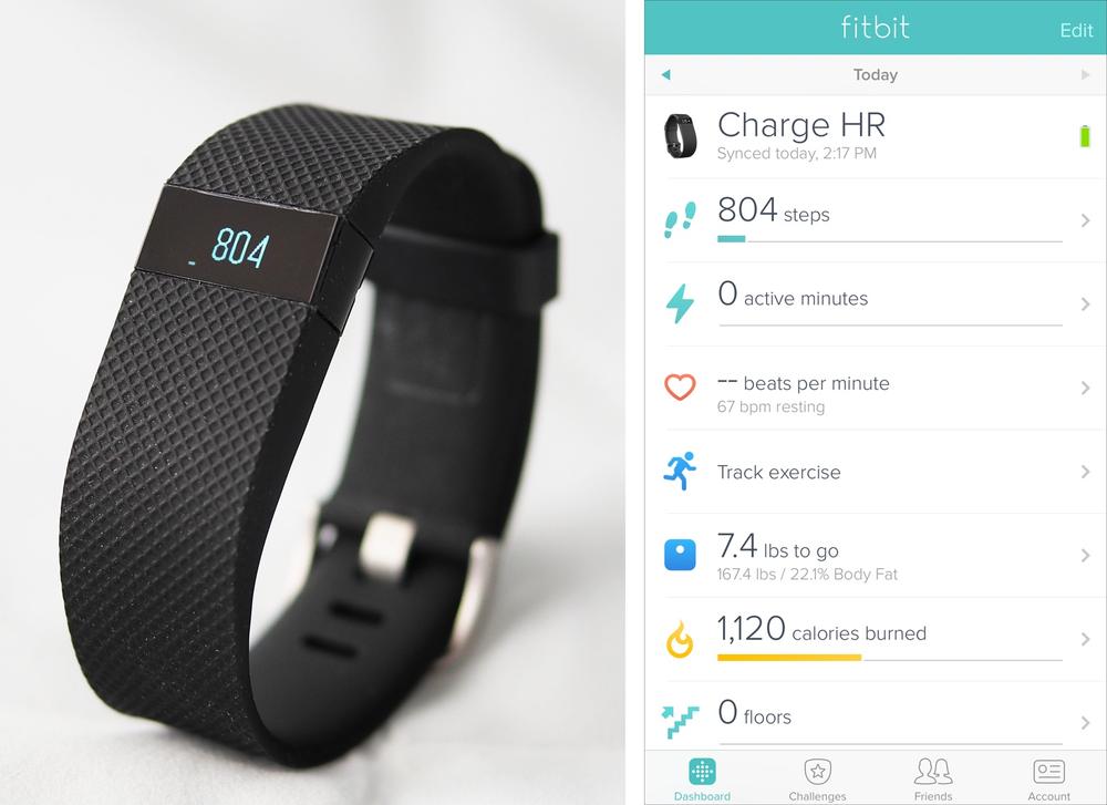
Figure 13-22. Fitbit band showing simple step count, with fuller information in the mobile app (images: Fitbit.com)
Statistician and data visualization pioneer Edward Tufte argues that information design—or as he calls it, Analytical Design, should be driven from the question: “How is this design supposed to help people think about the evidence?”
Returning to our heart rate monitor example from earlier in this chapter (Figure 13-15), what are the high, average, and low measurements generated by the heart rate supposed to help the user understand? The vertically aligned line graph and bar chart seem to suggest a relationship between these measurements, but what is that relationship?
The data—or evidence—is present but there is no guidance to help the user think about it. The spread of data unfortunately misses the opportunity to aid the consumer in examining and reflecting on the evidence, and therefore offers little value.
In our heart rate monitor example, if we know the consumer wears the device because he wants to lose weight, we can apply these principles to help him make better sense of this data. For example, we can connect his heart rate and steps, and highlight the intensity of his activities throughout the day. Second, we can compare the length of high-intensity activity in the day with their average. We can even go one step further and compare this user’s data with data from other users who share similar physical characteristics and fitness goals. Lastly, we can show causality by connecting trends in activity levels over time with the user’s weight. Instead of simply showing the data, we can demonstrate how the system of data connects to the consumer’s goal, which will help the consumer think with the evidence.
The nature of your data will also affect the way you visualize it. Are you displaying live data? A visual that includes some animation, like a dial, might be appropriate. Are you showing a continuous stream of very frequent readings, whether live or historical, like electrical power consumption throughout the day? In that case, a line graph would be suitable. Or do you have intermittent, cumulative readings, like a step count or half hourly gas consumption data? In that case, a bar graph is more appropriate. Overall trends should show direction of movement—that is, whether your energy consumption or general activity level is rising or falling. And it’s worth highlighting any headline insights and displaying inferences and explanations available from within the graph.
Visualizations aren’t necessarily a tool only for end users. The proliferation of sensors and complex networks of connected devices will create a need for service providers themselves to use tools, some visual, to monitor data and activity from around the system to keep it running smoothly.
Visualization guidelines often focus on historical analysis. Data is aggregated into a single set, ingested and processed before visualizations are generated. This takes time. As we saw earlier, IoT data is often at least partly real time and coming from multiple sources. For example, your energy meter display may have a local reading, but also take in aggregated data about other people’s consumption, too.
The principles for designing visualizations are still valid whether you’re dealing with live data or not. But real-time analysis is harder to do, so you might not be able to deliver the same complexity of insight as you could with historical data. It’s one thing to say that, over the last three months, you spent 20% more on running your air conditioning than similar households. It’s quite another to say that your AC is currently using 20% more power to run than your neighbors. That kind of analysis requires much more complex processing. It may be possible, but it will be more expensive to do. The cost would have to be justified in terms of the value to the end user, or your business.
Using Data in the Design Process
Data-driven design has become increasingly popular in web and mobile apps.[232] Using A/B or multivariate testing, software services can push alternative designs out to large samples of users and see which ones fare best with users.
This can be harder to do with hardware. The more functionality and interface design are baked into a physical device at the point of manufacture, the harder it is to make subsequent changes. But where device functionality can be modified in software, it is easier to iterate. The Little Kelham case study, between Chapter 6 and Chapter 7, cites the example of a button placed by each home’s front door. The designers weren’t sure exactly what it should do, but a button by the door seemed like a useful thing to have. The functionality of the button can easily be modified through software once residents have been living in their homes for a while and had a chance to figure out the most useful thing for the button to do.
Data-driven design is often thought of as working with quantitative data: data that tells us what lots of users are doing. Knowing what users are doing can help you identify problems: features that users aren’t using or aren’t using well. But it doesn’t help you figure out what to do about it: for that, you also need to understand why. This comes from qualitative data: observing and talking to smaller numbers of users, as we saw in Chapter 5. Little Kelham is a good example of designers combining knowledge of what users are doing with the system with qualitative insight: observing and learning about how residents use their systems.
When you’re designing a data-driven product, it’s important to start working with real data as soon as you can. It’s hard to optimize the UX around the insights unless you know what they are likely to be.
Summary
The falling cost of sensing and computation means that there are more and more devices that are capable of capturing, and acting on, data about the world. This provides us with information about the environment, our behaviors, and the devices themselves on a scale that was not previously available. Where data is processed—in a central service or in the edge devices themselves—depends on the nature of the product and can affect the experience of using it. IoT data may be directly measured or inferred, big, small, real-time, historical, and measured at different time intervals. All of these affect what you can do with it, in terms of product function and UX.
The current crop of consumer products on the market can be thought of in terms of whether they capture personal or environmental data, and whether they enable the user to take more informed action or whether the system acts on the data itself.
To create meaningful outcomes from data, designers must consider users’ motivations and goals for using the product and provide actionable insights that set data in context. Users’ attention is a precious and finite commodity of which we must be respectful when communicating data. Engaging users in the early stages of using a data-driven product can be a challenge, before the product has much data. If you’re designing for behavioral change, insights and advice must be sensitively crafted. Visualizations should be designed to help users think about the evidence. Following a data-driven design process can be more challenging when there’s hardware involved.