Designing Connected Products: UX for the Consumer Internet of Things (2015)
Chapter 14. Iterative Design: Prototyping and Learning
BY ELIZABETH GOODMAN
Iterative design—rounds of observing the world, generating ideas, building prototypes, observing the prototypes in use, and returning to idea generation—is the best way to build connected products and services that are not just useful but a joy to use. In previous chapters, we discussed observation and idea generation. In this chapter, we’ll discuss prototyping and evaluation, which typically go hand in hand in iterative design processes. Both are necessary for discovering new possibilities and avoiding pitfalls.
This chapter introduces:
§ Characteristic dynamics of iterative prototyping and evaluation (The Necessity of Working Iteratively)
§ Lightweight methods for prototyping initial product ideas (What Does the World Look Like with Your Product in It?), embodied experiences (Experience prototypes), services (How Does a Product Support a Service (and Vice Versa)?), working algorithms and streams of data (How Do We Prototype with Data?), and novel interaction modes (How Will People Interact with an Interface?)
It also addresses the following issues:
§ What prototypes are for (Using Prototypes to Answer Questions)
§ How to decide what to prototype (How Do You Decide What to Prototype?)
§ Why teams avoid evaluation...and what to do about it (Evaluation: Success Demands Failure)
The Necessity of Working Iteratively
In theory, iterative design is very simple: you learn about a situation, you make something to intervene in it, you watch other people trying what you’ve made, and then you apply what you’ve learned. Then you repeat as many times as you can. In practice, iterative prototyping is not nearly so straightforward.
Consider the experience of hotspot/router startup BRCK, as told in our case study (between Chapter 12 and Chapter 13). BRCK discovered users’ difficulties with initial setup after they started shipping their router. The shipping schedule did not give the team enough time to manufacture new hardware or plastic cases. To move quickly, the team instead revised the packaging, initial instructions, and online support.
The Sifteo Cubes, a connected game platform, faced a similar problem. The award-winning cubes had an elegantly simple battery insertion mechanism that first-time users found “not so obvious,” said founder David Merrill. Not being able to insert the battery meant not being able to use the cubes at all.
Like BRCK, Sifteo discovered the problem too late to fix the root cause. Altering the battery compartment itself would require time and money Sifteo didn’t have to spare. So Sifteo, like BRCK, took a faster and cheaper path: redesigning the printed instructions, packaging, and instructional videos (Figure 14-1). Quick rounds of experimentation led the designers to a transparent sticker with a blue arrow pointing to the battery insertion location. Then they set about testing whether the arrow solved the problem. The team tested 10 different arrow versions before finding a size, color, and placement that reliably prevented first-time difficulties (Figure 14-2). (Chapter 12 has more on key interactions such as initial setup.)
The experiences of BRCK and Sifteo remind us that no team, no matter how brilliant, gets every product decision right the first time. The only question is whether teams factor prototyping and evaluation into the timeline—or whether the need for prototyping and evaluation come as a surprise.
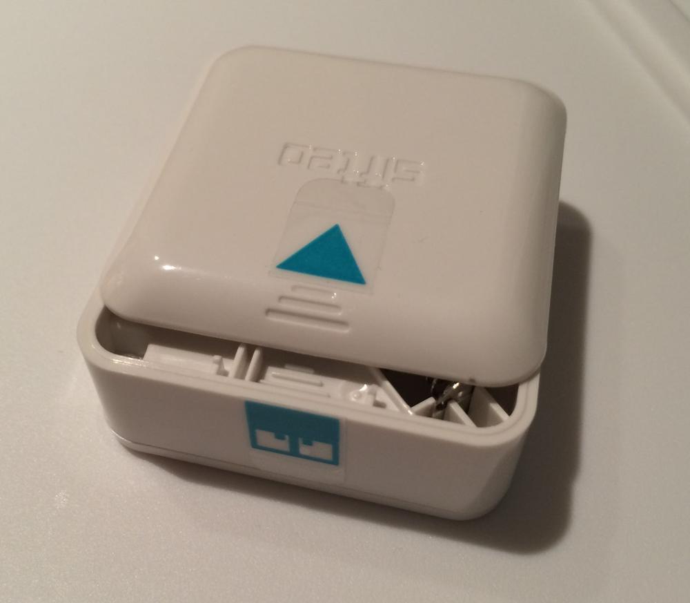
Figure 14-1. A video walks first-time users through battery insertion (video: David Merrill/Sifteo); view the video at https://www.sifteo.com/manual
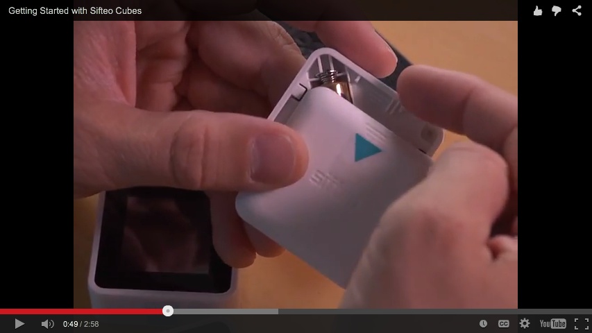
Figure 14-2. Blue arrow stickers indicate how to line up battery compartment and lid (image: David Merrill/Sifteo)
Using Prototypes to Answer Questions
The value of prototypes resides less in the models themselves than in the interactions they invite.
—MICHAEL SCHRAGE, SERIOUS PLAY[233]
Prototypes are experimental models—objects crafted to help answer specific questions about the project. As models, prototypes are deliberately simplified pictures of the project. Their constraints help us concentrate on what matters most, rather than distracting us with less important details. As experiments, prototypes are most helpful when we let them surprise us.
The goal is to make the right prototypes for your project. When design firm BERG worked with Google to instantiate voice/video chat services in a standalone device, the firm ran two parallel prototyping efforts, for what they called Connbox.[234] The first effort evaluated technical feasibility. Would it be practical to manufacture such a device? The team started by making a functional, but fragile and messy, “end to end” software and hardware package (Figure 14-3). To ask, What would life be like with a mostly-on video connection?, the team made the prototypes more robust, with more durable cases (Figure 14-4), and started to try them out (Figure 14-5).
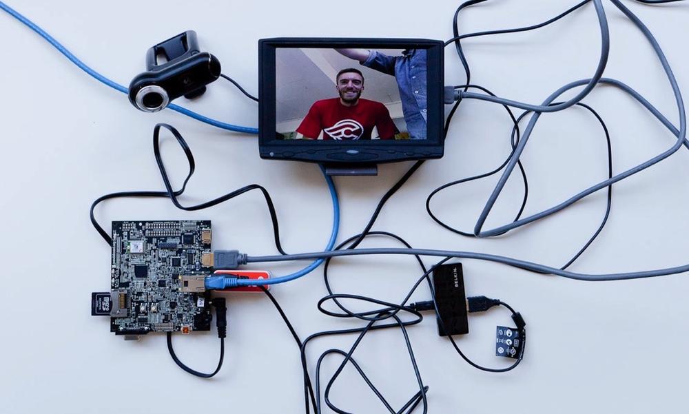
Figure 14-3. An early prototype proves the team could make a functional object, but is hard to deploy (image: BERG)
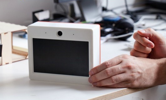
Figure 14-4. A simple case helps make the prototype more robust, while minimizing attention to the industrial design (image: BERG)
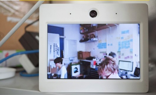
Figure 14-5. The designers install the encased hardware in their studio (image: BERG)
Interaction and industrial design prototyping, informed by life with the functional prototype, next explored how to make users feel comfortable with a mostly-on video appliance. Drawing on human-computer interaction research into “beautiful seams,”[235] the designers asked themselves how “to make the state of the connection as evident as possible, and the controls over how you appear to others simple and direct.” Storyboarding a scenario (Figure 14-6) forced them to work through the complexities of keeping and discarding: Should the device be attention-getting enough to interrupt an ongoing activity? Through iterative cycles of storyboarding, the team established more key features for control and directness, such as gestural interactions with a “do not disturb blind” to partially block what the other box sees.
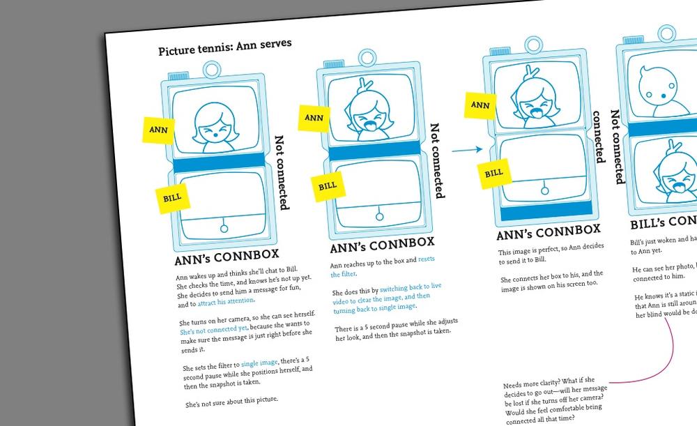
Figure 14-6. Interaction design storyboarding spurs more questions (indicated by red line) (image: BERG)
Next came “looks like” industrial design prototypes (Figure 14-7), which asked How might mechanical controls such as dials and slides make the connection state more visible and control more direct? But, as Matt Jones writes:
This is not a simple translation between a software and hardware behaviour, it’s more than just turning software controls into physical switches or levers.
It involves choosing what to discard, what to keep and what to emphasise.
The final answer: a looks-like prototype that was still minimal, but that used color (e.g., orange for video, blue for connection, green for audio) to emphasize the current state of the software and how the user can mechanically change it.
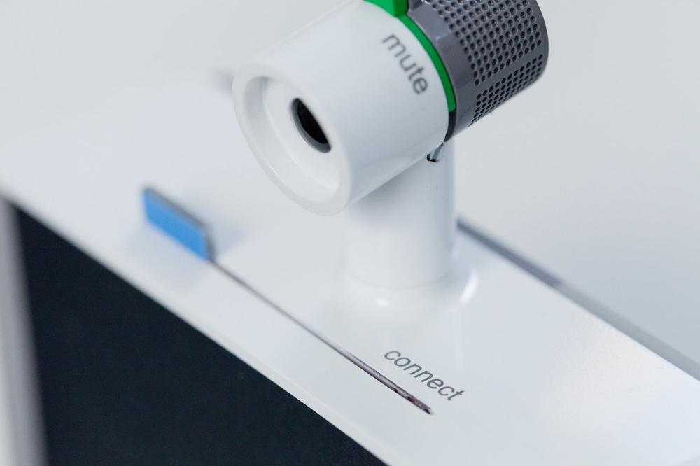
Figure 14-7. Simultaneously, industrial design “looks like” protoypes consider how to make system status more visible and control more direct (image: BERG)
The Connbox process shows us that decisions about what and how to prototype are situational. As teams work from initial ideas to more polished proposals, they decide as they go what types of prototypes will help them. Different lines of prototypes may progress in parallel (as with Figure 14-4, Figure 14-6, and Figure 14-7), then merge into a single polished whole. Some prototypes, like the scenarios in Figure 14-6, are conceptually influential but are not meant as specifications for final designs.
The following sections will list some typical questions and introduce ways to answer them. However, there is no automatic “best choice” at any point. In deciding how and what to prototype, we like this advice from design scholar Youn-Kyung Lim and her colleagues:
The best prototype is one that, in the simplest and the most efficient way, makes the possibilities and limitations of a design idea visible and measurable.[236]
The methods in the next sections are ordered roughly in terms of technical complexity. We are not, however, implying any necessary chronological sequence. Instead, we see these sections as a sort of recipe book from which you can select the techniques most appropriate to your questions and adapt them to your own taste and resources.
The chapter will not address the mechanics of exploration and evaluation. Any usefully detailed explanation of evaluation methods would likely double the length of this already long book. Instead, this chapter will delve into the prototyping concepts and tools that make evaluation exercises easier to integrate into your project.
What Does the World Look Like with Your Product in It?
If you’re designing a product or service that radically differs from what already exists, how do you get informed comments from decision makers? This is particularly difficult with connected products, which often involve new relationships among existing systems and infrastructures, and new forms of data capture and analysis. You want people to base their responses on a clear and concrete vision of the device in context. However, if what you’re proposing is vastly different from their past experiences, evaluators will likely need help imagining the world with such a new product in it. At the same time, you don’t want to spend too much time detailing interfaces and interactions for a product concept that you might end up discarding.
The solution is a high-level, but convincingly real, representation of a future in which the product is already in use. Here, we’ll discuss three quick ways to evoke future products in use: collages, media from the future, and video prototypes.
Collages
Many disciplines, from industrial design to architecture, create realistic mockups. Generally, these artifacts are created late in the design process to help clients or other decision makers settle on a final design before moving to manufacturing/building. Often, as with industrial design (Figure 14-8), these “concept designs” are shown in isolation from the environments of use and systems within which they work.
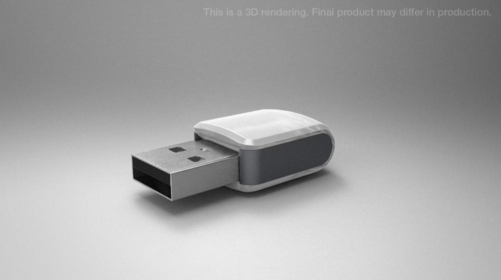
Figure 14-8. Industrial design concept rendering for the Blink(1), a programmable notification light; the Blink(1) requires a USB connection to a computer that is not shown in the rendering (image: ThingM)
In order to get a handle on systemic complexity, designers of connected products often reverse these established practices. They make semi-realistic mockups early on in the process in order to help nonexperts imagine unfamiliar devices and usages. And they make documents that situate physical objects in context—within the environment of use, as a part of other services and systems, and perhaps as a channel for existing media.
So teams often need to make trade-offs in effective early concept communication for connected products. On the one hand, they need to convey the full complexities of a product–service system, often to project outsiders who don’t share the team’s background or assumptions. On the other hand, the goal of early concept communication is to use concepts as springboards for discussion: combining elements, deleting elements, rejecting some, keeping others, generating new ideas, and generally exploring what kinds of products and uses make sense. To do that, you need to generate and represent many ideas in a short period of time. So in early deliverables, designers are often trying to convey, simultaneously:
§ A realistic-seeming representation of the product in use
§ High-level mapping of relationships to systems, platforms, and infrastructures
§ That despite the semi-realism, the concept should be taken as open and unfinished
...without spending too much time on any one document.
“Story collages” is an umbrella term we’ve invented for two lightweight concept communication techniques—storyboards and product/service visualizations—that product, service, and environment designers successfully use to tell stories about interconnected products and systems. Mixing representational styles is the key to communicating newness, “everydayness,” and openness in a single artifact.
Product/Service Visualizations
One of the first steps in a new project is often translating inspiring rhetoric into concrete specifics. The blue-sky technological visions are exciting, but it’s often hard to see exactly how one might put them to work. For example, in working with a global consortium of city managers, the design and planning firm Arup needed to put “smart cities rhetoric into something plausibly everyday,” writes designer Dan Hill, for a generative design workshop on future urban forms and services. Their goal was not to convince the attendees to implement any given idea, but to use the concepts as “pivots for conversations” about the specific aspirations and concerns of each city.
To fuel the conversation, they created what we’re calling product/service visualizations—single-page mockups of key forms, relationships, and interactions. These mockups montage photographs of existing sites with renderings of the concepts. The interfaces are a little rough and generic and the renderings are deliberately quick and imperfect. The images aren’t even sufficient—viewers have to read the annotations to grasp what’s going on. But perfection isn’t the point. The point is to condense a complicated set of interactions and systems into a specific and concrete image that conveys both problems and possibilities.
That’s why we call them product/service visualizations: they make visible the relationship among products, services, environments, and systems. For example, Figure 14-9 shows relationships among a smart bike garage, screens, dynamic data, riders, and passers-by during the day and night.
If they are obviously up for debate, such images don’t have to present desirable or even feasible concepts. The Arup team, for example, deliberately included some flawed concepts so that the workshop participants could debate them. They turned the concepts into posters (Figure 14-10) to make them easy to pass around a table.
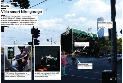
Figure 14-9. Product/service visualization for a shared urban bicycle service (image: Dan Hill)
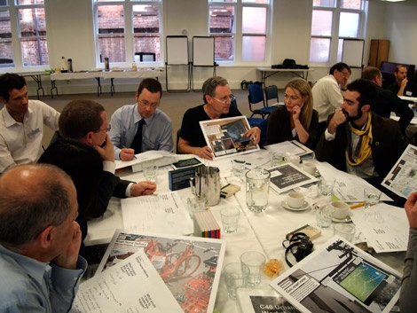
Figure 14-10. A product/service visualization prompting discussion at workshop as
It’s telling that the technique emerged in part as a response to the challenges of designing an Internet-connected product. Experience prototyping is an elegant way to investigate the characteristic dynamics of connected products and services—encounters that the user does not fully control (like a defibrillator) or that may depend upon multiple components in the built environment (like an appliance).
Wizard-of-Oz demonstrations
In Frank Baum’s book The Wizard of Oz, the heroine faces a terrifying, ghostly apparition—which is actually a projection controlled by a hidden human.
Similarly, in Wizard-of-Oz prototyping, a hidden human simulates the actions of a machine. It’s a type of experience prototyping.
In Figure 14-16, for example, a demo from Ericsson Labs of a shared interactive space based on touchscreen interactions relies on two actors in another room (Figure 14-17). One, visible to the audience, speaks to the demonstrator. The other, off-screen, watches the action and triggers on-screen actions based on the gestures he sees. The two screens aren’t even on the Internet—they’re just connected by a long cable. The screen interface itself is just a rough mockup designed to suggest functionality without much polish.
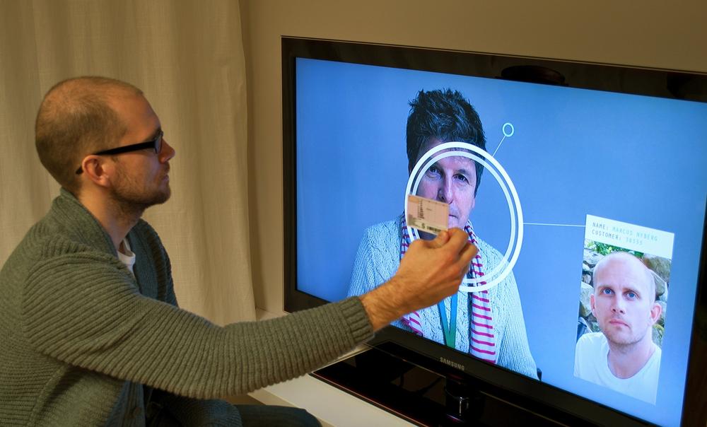
Figure 14-16. Wizard-of-Oz prototype of a video-driven collaboration service (image: Ericsson User Experience Lab)
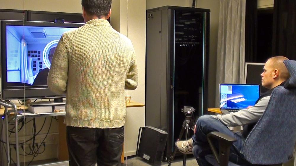
Figure 14-17. Behind the scenes of the Wizard-of-Oz prototype, the person at the laptop manually triggers animations as the demonstrator speaks (image: Ericsson User Experience Lab)
The advantage to the method is that it provides a convincing demonstration of unproven technologies relatively quickly. Even those who know that the experience is faked will often suspend their disbelief long enough to give genuinely felt feedback. The disadvantage is that Wizard-of-Oz prototypes that rely on triggering preprogrammed actions, as with the previous example, are inflexible. They require choreographed demonstrations rather than open interaction.
Marcus Nyberg of Ericsson Research stages such “immersive presentations” in order to stimulate emotional, not just intellectual, reactions to proposals early on. He writes:
For services, including several interconnected applications, devices, objects, and so on the method is particularly relevant as implementing these concepts as functioning prototypes would take a large amount of resources as well as time. And perhaps requiring all this before you know whether you are on the right track or not.[240]
How Does a Product Support a Service (and Vice Versa)?
The phrase “connected products and services” is a bit misleading. From washing machines to running shoes, many products can now be monitored over the Internet. By the same token, newly connected objects are transforming traditional services. The FedEx SenseAware device, which we described in Chapter 4 (Figure 4-17), monitors package location and environmental conditions such as temperature. It adds supply chain management to the original service of package delivery. Connected objects, then, become meaningful as components of services.
Service design is an emerging field, but most practitioners agree that it concerns how interactions with touchpoints (interfaces and components) and channels (streams of media) change over time. (See Chapter 6, Chapter 9, and Chapter 15 for more on service design.) Beyond product hardware and software, service design topics for prototyping and evaluation could include:
§ Unboxing and/or setup experience (including instructional materials)
§ Customer support mechanisms during use
§ Support for environmentally responsible disposal and recycling
There are some specific aspects of service design that we consider elsewhere in the book, such as interoperability (Chapter 10). Here, we’re more interested in providing some prototyping tools to help you work out how any one product or interface fits into more complex services before moving to working prototypes.
Our main recommendation is to work both from the bottom up and from the top down—that is, to move between considering the service as a whole and addressing individual interfaces or components. The key is working quickly and at a high level to avoid getting stuck in the details of any individual component. One good tool is Business Origami, a method invented at Hitachi Design Center.
Business Origami is a game-like activity that uses paper cut-outs to rapidly and iteratively work out the relationships among components at various phases of engagement with a service. Those components should include:
§ Touchpoints, or the parts of the service with which users interact—such as a bike rental kiosk, a mobile app, rental payment management systems, and even paper receipts.
§ Places or locations, such as a bank or a car.
§ Important actors for each phase, such as buyers or technicians.
§ Key stakeholders, especially if you are entering a heavily regulated domain such as healthcare or transportation.
Paper cut-outs stand in for potential service components. As participants list likely components, they place the shapes on a paper-covered tabletop (Figure 14-18). As participants talk through what the service does, they collaboratively sketch and label relationships among the components. The bike, for example, would get linked to the kiosk. The mobile app might be linked to the payment system.
Walking through various scenarios prompts participants to add, delete, and move around the paper cut-outs, redrawing the sketched-in relationships as they do so. Representing service components with paper cut-outs is especially helpful because paper is cheap and easy to work with. Multiple people with different levels of technical skill and interest in the project can interact with different cut-outs at once. When the activity is done, the cut-outs remain as a tangible map of the service and its components.
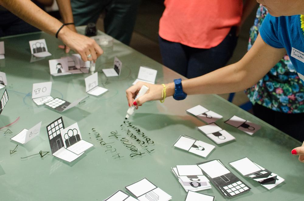
Figure 14-18. A team uses Business Origami to work through a service for crowdfunding volunteer activities (image: Nearsoft, Inc.)
Later in the process, evaluating prototypes of individual components might mean revising other parts of the service—and returning to the origami. The smart bikes might end up needing a publicly visible availability dashboard, for example.
How Do We Prototype with Data?
As we wrote in Chapter 13, data is as much a part of the product as the hardware and the service behind a connected product. Subtracting data from any connected product renders it useless.
To explore what using a connected product feels like, you’ll almost certainly need to prototype some aspects of producing, sharing, modeling, and acting upon data. As usual, our advice is to limit what you build. If you let it, prototyping data-infused products and services can engage nearly every form of computer science and mechanical engineering, from sensing and networking to algorithm design and machine learning. Your job as a UX designer, however, is to investigate how people experience data-driven interactions in order to inform business strategy and engineering decision making. You need to figure out how people might create meaning from data.
Again, as usual, our recommendation is to spend your time and money making many lightweight prototypes rather than one fully featured one. That being said, you still need to understand the design, engineering, and business questions at stake so that you can decide how your prototype can help answer them.
Chapter 13 discusses designing with data in much more detail. However, UX prototyping questions generally fall into four categories:
Sensing
Translating phenomena outside the device into system-usable data.
Sharing
Transmitting and receiving data from other system components. Is your system closed, circulating data only within itself? Do you need external data sources, such as user profiles, to make sense of internal data? If your business strategy involves selling user-generated data, how are users likely to respond? How might you ask for permission before collecting behavioral data, and how might you inform the subjects of data collection about how you use it?
Modeling
Assigning the data to appropriate categories. For example, an activity tracker isn’t literally counting footsteps. Instead, it’s running data from accelerometers through an algorithmic model and comparing clusters of data to activity profiles. “Footsteps” happen to be salient to activity tracking. Another project might take the same data and try to identify dance moves. What categories might be meaningful to various participants in the product ecosystem? What kinds of categories or models are likely to be sensitive or controversial? We cannot emphasize enough the necessity of evaluating, early and often, the kinds of inferences you are making about people, how you are using those inferences, and whose interests you are pursuing.
Responding
Using categorized data to act appropriately. How will your system respond to the data it collects? What data does it need to act appropriately? What does “appropriately” mean to various project constituencies?
Canned data
Archived, or “canned,” datasets let us speed up, slow down, and replay complex interactions that might change over time. Typically, there are four reasons to use canned data:
§ To speed up slow-moving interactions into more easily testable “time lapse” visualizations
§ To slow down zippy processes so humans can work with them in detail
§ To combine interactions (e.g., initial sign-up and updating the system) that in reality are distant in space and time into artificial but more easily testable unified scenarios
§ To evaluate the feel of data-driven features before putting time and effort into integrating a live data source
Data platforms (at the time of writing, one of the best known is Xively, but you might find that others better suit your needs) can help with the first two goals by providing canned streams of data to play back at various rates, like a timelapse or slow-motion film. The third goal, however, often requires some fakery.
Faking it
Data-driven UX depends on algorithms in the background that users might never notice, much less control. So UX needs to drive algorithm development and implementation, not the other way around. Early prototyping should focus on understanding what people need from the system and what the system needs from the people who work with it...not on solving hard computer science problems.
Wizard-of-Oz demonstrations are an excellent way to fake what you don’t want to make. Speech and image recognition, navigating a robot around obstacles, modeling human sentiment...many interesting tasks are easy for humans, but hard for computers. The finished product might have those features, but making a working prototype while testing out multiple concept directions will waste engineering resources.
You can also fake working algorithms quickly by mocking up the results. Trying to imagine a wearable pollution monitor? Take a mobile phone, load up a series of fake visualizations of escalating pollutant levels, and attach the phone to a backpack. Now walk around and watch the pollution levels rise. How does seeing those visualizations make you feel? Do other people find the visualizations on the backpack useful or comprehensible? Is attaching a pollution monitor to the wearer’s back really a good idea? There’s no need to struggle with getting access to the right data and implementing a visualization algorithm if the initial experiment isn’t interesting.
However, we warn you: as with video prototyping, one’s imagination can easily run ahead of what’s technically possible. Unless you are working on a very speculative, blue-sky proposal, consult with experts first about what’s realistically possible in the project timeframe before getting too attached to your fakery.
How Will People Interact with an Interface?
Interactions with connected products and services often move beyond the traditional form factors and mouse/keyboard inputs. From wall-size environments to miniature wearables, screens take on new sizes and shapes. New products on the market show a dizzying array of tangible, tactile, haptic, and sound-based input and output mechanisms. Even the very concept of “interaction” is mutating. The early days of interaction design assumed a human interacting with a machine. Real-time data streams and ever more sophisticated algorithms now drive interactions among machines, with computers learning how to make semi-autonomous decisions. If good design lies in crafting the details as well as framing the initial concept, then diagrams or storyboards won’t do. We need ways to prototype multisensory interactions quickly and cheaply.
Inputs and outputs: beyond the screen, keyboard, and mouse
Over the past 10 years, prototyping nonscreen-based interactions has gotten substantially easier. The introduction of the Arduino in 2005 led the way. Now there are many new toolkits, such as the Raspberry Pi (launched in 2012), that reduce the level of technical expertise required to prototype new forms of devices and nonscreen-based interactions. But the rule of thumb still applies: if you need a “works-like” prototype, be picky about what you prototype and build as little from scratch as possible.
Adapt a working device
The easiest way to prototype interacting with a device is to find a working consumer electronics device that can imitate what you’re imagining. Tape a tablet to a refrigerator to simulate gestural interactions with a smart fridge. Record a friend talking and have a partner play it back on cue to simulate speech-based interactions (see Wizard-of-Oz demonstrations).
Connect toolkit components
If you can’t find an existing device that can even vaguely approach what you imagine experiencing, it’s time to start working with toolkits. The key is finding pieces—e.g., toolkits and components—that fit together with only reasonable adjustments. The rise of what’s often called “maker culture” has supported a bunch of websites, such as Sparkfun (www.sparkfun.com) and Seeedstudio (www.seeedstudio.com) that sell basic kits such as the LilyPad ProtoSnap wearables package (Figure 14-19) and provide the tutorials (Figure 14-20) and community forums to help beginners get started.
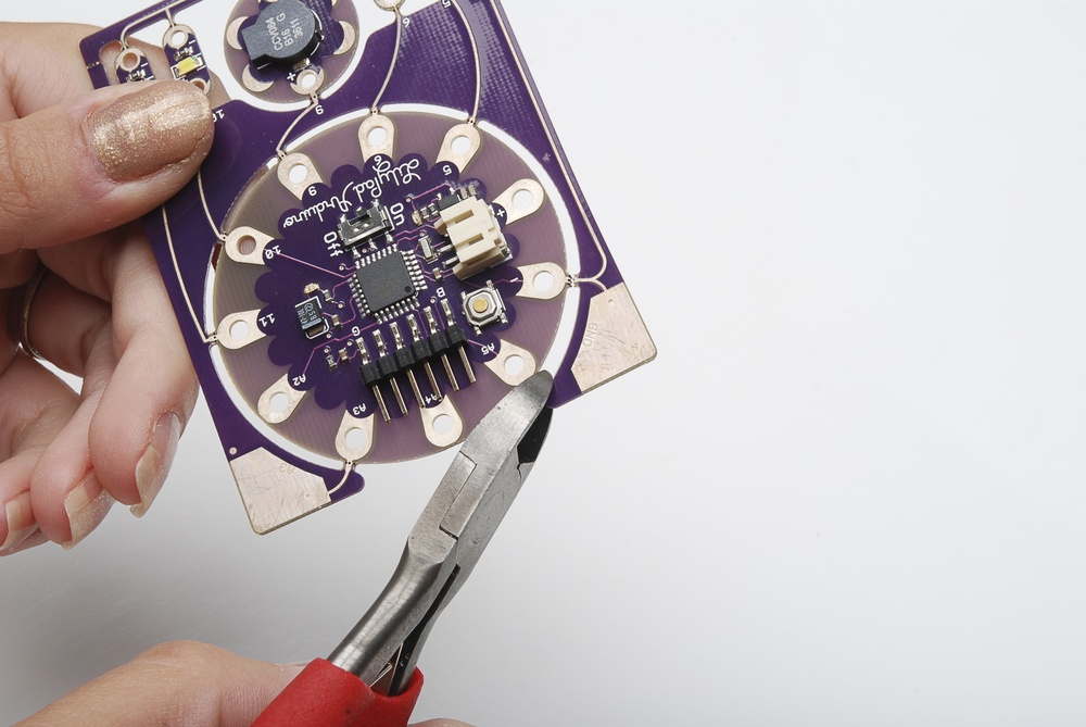
Figure 14-19. ProtoSnap—LilyPad Development Board (image: LilyPad)
For readers who, like us, don’t have an electrical engineering degree, the key to getting started is finding a supportive community—sometimes online, sometimes in person. Depending on where you live, you may have a local hacker/maker space that can teach you the basics. Or look for distributors that provide readable documentation well as detailed tutorials for beginning prototypers.
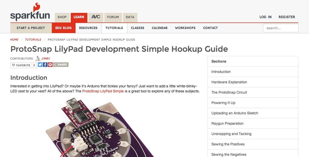
Figure 14-20. A LilyPad ProtoSnap tutorial at Sparkfun.com demonstrates a simple first project with the kit in detail, https://learn.sparkfun.com/tutorials/protosnap-lilypad-development-simple-hookup-guide (image: Jimb0 and LilyPad)
New screen interaction paradigms
Some screen-based interactions require less prototyping effort than others. If you are designing apps or websites for existing consumer electronics devices, much of your work has already been done for you. You can draw on premade platform features, design frameworks, and component libraries. With the basic infrastructure already in place, writing code is cheap and easy. Skilled frontend coders can often move directly from paper sketches to low-cost interactive prototypes. And indeed, that’s how many interaction designers and developers like to collaborate.
However, designing screen interfaces for new devices is a different beast altogether. Borrowing interface components and toolkits from existing platforms might save you time, get you to working code faster, and make the product seem more familiar to wary users...but it can also result in inappropriate and unusable interfaces. An app for a smart watch almost certainly shouldn’t replicate an app for a tablet. Even if your new kitchen appliance runs a web browser, do you really want that browser to work like Chrome?
Indeed, you may need to develop an interaction paradigm from scratch. Are you integrating mechanical inputs? What about gesture recognition or computer vision? How does navigation work? Are there battery, memory, and processing limitations in the hardware to take into account? Are there display limitations, as with a monochrome screen for an ultra-low-power wearable? Can you change the display specifications to support richer screen interactions, or are they fixed?
Developing for new platforms can be slow and expensive, so you’ll probably want to do more upfront paper prototyping (see Figure 14-21 for an example), semi-interactive click-throughs, and simulations on existing consumer electronics before moving to code.
Evaluating placement, size, and scale
Thumbnail sketches are great for generating lots of ideas quickly, but there’s no substitute for continuing paper prototyping in place, at 100% scale. We still cringe at the memory of discovering that left-handed users could not view the screen of a hand-carried device only after building an expensive working prototype.
For small displays, prototyping at 100% scale will help you discover and solve ergonomic problems of vision and interaction—particularly if you attach the paper screen prototype to a rough device mockup. Try role-playing a wearable with a paper screen: what do you have to do to see the screen? How would you feel if strangers could view it? Or, if designing an appliance, attach the small screen to a full-size foamcore mockup of the large object. Can people with nonstandard (in a wheelchair, say) and standard physical capacities use it?
For displays much larger than a typical computer screen, paper prototyping at 100% scale helps you discover and solve similar ergonomic problems (Are key controls too high up for the majority of people to reach? What happens when multiple people crowd around an interactive table-top?), as well as social questions of multiperson viewing and interaction. Taping a full-size paper mockup to a table or a wall is the quickest way we know to investigate the feel of living with a large-scale display. You can also use a projected image, of course—but paper is more flexible and can be easily annotated.
Stimulant, a consultancy that creates interactive environments, writes:
We are usually asked to make ergonomic recommendations for our fabrication and construction partners, so a physical mockup also helps to adjust the angle of interaction surfaces. In our guerilla usability testing, we found that most users felt more inclined to interact with the touchscreen if it were angled more like a drafting table than if it were more perpendicular to the floor. That’s the kind of news we can use.[241]
Placement also matters. If you are designing one of those smart fridges, how high up should you place your screen? What about buttons and other controls? Taping a tablet to an actual, full-size refrigerator is a quick way to start asking and answering those questions. Or, as in Figure 14-15, you might use easy-to-move cardboard boxes to prototype appliances and furniture.
How Do You Decide What to Prototype?
Prototyping connected products and services can take more time and more skill than even experienced industrial and interaction designers expect. One of the challenges for iterating while designing connected devices and services is staying simple and efficient when tempted to make your prototypes complicated and slow. The following sections detail three rules of thumb to keep the iterative cycle going. They synthesize both rigorous scholarship and plenty of painful personal experience.
Prototype what you care about
This is the most important rule. Prototypes, as we pointed out earlier, can’t instantiate every aspect of a problem or solution. And some aspects of connected products, such as working hardware or real-time data feeds, may be spectacularly difficult to prototype—or perhaps even impossible.
Figure 14-21. Usability testing with a full-size, taped-together paper prototype of an interactive display (image: Stimulant)
Given that time, money, and attention are all limited, you should always use the technique that can answer your most pressing questions while investing the least amount of effort. If you don’t know which questions are most pressing, making a prototype using as little effort as possible can spark those discussions. In this way, prototyping can also trigger necessary process and project decision making.
For connected products and services, answering the most pressing questions generally means prototyping entire systems before visual design and industrial design. And it means investigating activities and experiences across multiple components of the service (including paper and other nondigital ones) before specific screens. Industrial design and visual design should also be iterative, but they, as Sifteo and BRCK discovered, have rather more rigid timelines. Chapter 7 examines industrial design in more detail, including design for manufacturing and assembly.
Focusing on functionality doesn’t mean that visual and industrial designers don’t need to participate in early concept generation and evaluation. They do. Connected products cannot be designed solely by industrial designers, or by digital UX designers. Collaborative work doesn’t just help build consensus; it also allows members of different disciplines to learn from one another and benefit from the skills and perspectives of team members they might not have worked with otherwise.
This first rule leads to some others. Let’s look at those next.
Build as little from scratch as possible
We understand that many people really enjoy building working prototypes from scratch, in the same way that many people enjoy making their own pastry dough or tailoring their own clothes. Spending a lot of time building a prototype from scratch is undeniably satisfying. However, it is also inefficient. The point of early prototypes is to explore different aspects of the design space and inspire new responses. The point of later prototypes is to refine, evaluate, and prioritize those responses to that space. (Different timelines apply to software and hardware engineering for production, of course.) In the best case, spending too much time and effort on any one prototype slows down your iterations. In the worst case, you can get too attached to a specific prototype, and resist abandoning it even when shown evidence that your audience doesn’t find it useful or usable.
This lesson applies to all methods of prototyping, not just digital tools. It’s as easy to spend too much time on an elaborate paper prototype as it is soldering wires.
Fit the medium to the purpose
Elaborate or too-perfect styling creates many of the same problems of attachment and time use for prototyping as building too much from scratch. As well, early obsession with prototype aesthetics—particularly while developing a new or emerging product category—can distract from a crucial question: what might the product do?
As Bill Buxton writes in Sketching User Experiences, both “high fidelity” and “low fidelity” in terms of functionality and styling can be unhelpful terms for prototyping. Instead, as IDEO partner Duane Bray says:
What’s most important for a prototype is to choose the right fidelity for the question you’re seeking to answer.[242]
The right medium and style are the ones that direct attention to the aspect in question while signaling that other aspects are less important at this moment. Of course, those aspects will change over the course of the project as you settle basic “make the right thing” questions and move on to “make the thing right” questions of usability, features, and style.
It’s not that the aesthetics of prototypes aren’t important. They are. But polishing the appearance of early prototypes is generally a poor use of your time and the time of evaluators. Prototypes can have their own aesthetics. Buxton argues that “hand-drawn” screen elements can signal that the interface is in a rough, early state, with hardware prototypes just as rough and “sketchy” (as in Figure 14-3). Alternatively, a deliberately neutral style can signal, as with BERG’s minimal case design, that the industrial design isn’t what’s being examined (Figure 14-4).
Another familiar distinction is that between “looks like” and “works like” prototypes. To this, we and many other people add a third category: “feels like” prototypes. If you’re interested in product experience, you might not want to start by prototyping the form of the product at all. Instead, you might be more interested in how an experience feels. In that case, you don’t need to build an object that “works” by any definition. Experience prototyping and Wizard-of-Oz demonstrations might actually be more faithful “feels like” prototypes than a barely functional object or two-dimensional storyboards.
Evaluation: Success Demands Failure
Many companies that loudly proclaim the need for human-centered design, iterative design, or “failing early” often don’t perform the sort of frequent evaluations that they themselves advocate. They walk through prototypes within the team, but don’t invite in outsiders, much less user representatives. Ask them why, and you’ll hear lots of different rationalizations. Sometimes “research restricts creativity.” Sometimes “research is too expensive.” Sometimes “there’s no time.” Sometimes “we want to wait until we do can do it right.” Sometimes, “we don’t need to do research because we’re designing for people like us.”
The irony of iterative design is that later success demands early failure. Putting off UX evaluation activities until you have a fully working prototype is the worst possible thing to do when time is short and you have little money. High stakes and infrequent testing with polished, high-fidelity prototypes is an excellent way to doom your product. Using many different types of prototypes to ask questions as you go will more likely produce desirable, useful, and usable products than a single “evaluation phase” after you have a functional prototype. We know that having outsiders criticize cherished ideas can hurt. But the results of basing design decisions on guesswork will hurt more.
The choice you face is not between iterative and noniterative design. The choice is between iteration and a refusal to improve.
Planning for iteration is the wisest way to develop any kind of product, much less products as complex as connected products and services. How else are you going to avoid wasting scarce resources? How else are you going to base your directions on observation as well as intuition and guesswork? How else are you going to discover surprising new opportunities you couldn’t have imagined on your own?
One way to make evaluation more frequent is to make it more informal. The word “evaluation” itself can make research seem nerve-wracking—as if a schoolteacher is grading a final paper. At some point, you may want to get serious about ergonomics and usability. However, especially early on, some research is better than none.
If the word “evaluation” seems too formal, try calling those activities “learning.” Or “trying stuff out.” Or “customer support.” The BRCK team offers in-person configuration assistance at their studio in Nairobi. The main goal is to support new customers—but the BRCK helpers are also using the encounters to evaluate the latest changes to the setup process.
Try picking an easy-to-track success metric that doesn’t require much calculation. For Sifteo, that metric was: Do fewer than 2 people out of 10 complain about the battery insertion mechanism? Every week, the Sifteo researcher had 10 to 15 people attempt the setup process with revised setup instructions until the complaints fell below that threshold.
In the long run, though, what’s important is that learning continues after the product launches. As Juliana Rotich says of the BRCK’s hardware, software, and instructions, “We’re learning and iterating and changing every single day.”
The choice and order of prototyping and investigation activities will be specific to each project, based on your goals, your challenges, and your skills. The process should be exciting, not agonizing. Prototype early. Iterate often. Learn well.
Summary
Prototypes are experiments made to answer specific questions. Prototyping starts before a product concept is chosen, and continues long after launch. However, prototyping connected products can be technically complicated. Decide what questions you want to answer before making a prototype will keep you from wasting time and effort.
Early stage concepts often ask us to imagine everyday life with a new product. Story collages, media from the future, and video prototypes make the product feel real, and contextualize it within a service ecosystem, while signaling that the concept is still open for debate.
Experience prototypes, including Wizard-of-Oz demonstrations, can be a lightweight way to explore new features or functionality. Using role play with relatively low-tech props, they evoke the feeling of using a product, rather than how it looks or works.
Connected objects become meaningful as components of services. To prototype the relationship among service components, the key is staying at a high level to avoid getting stuck in the details of any individual component. Business Origami uses paper cut-outs to map out those relationships iteratively and quickly.
Crafting the details of interactions doesn’t necessarily demand working prototypes. Adapting existing devices, semi-interactive click-throughs, and full-size paper mockups are all good ways to test and refine imagined interaction modes before committing to hardware. If you are prototyping hardware, however, look for distributors and toolkits with easy-to-use documentation and thriving online communities.
Data-driven UX presents its own challenges, such as prototyping sensing, sharing, modeling, and responding in real time. Canned data and Wizard-of-Oz demonstrations help answer questions about the felt experience of streaming data and algorithmically driven interactions.
Nevertheless, you will never be able to prototype every aspect of your product. The central recommendation of this chapter: prototype what you care about. Making and evaluating many cheap prototypes early on with potential users and other stakeholders will help you avoid more problems and discover more opportunities than waiting to evaluate a single high-fidelity one.
|
I Want To... |
Try... |
|
Decide early on whether an audience sees value in an idea for a new product or service |
Video sketching to demonstrate convincingly how the product might workStory collages to set conversations about future technologies in a believably “everyday” contextWizard-of-Oz prototypes to dramatize nonworking technology quickly and cheaplyMedia from the future to imagine how outside observers would explain the value of your idea to themExperience prototyping to roleplay everyday encounters with the product |
|
Identify product/service components and the relationships among them |
Business Origami to map relationships among components iteratively, collaboratively, and tangibly |
|
Investigate interactions with specific service components |
Paper prototyping at 100% scale to address ergonomic factorsWizard-of-Oz prototypes to quickly communicate data-driven interactionsTheatrical experience prototyping to invoke in-the-moment emotions |
[233] M. Schrage, Serious Play: How the World’s Best Companies Simulate to Innovate (Boston, MA: Harvard Business Review Press, 1999).
[234] Described in: M. Jones, “Connbox: Prototyping a Physical Product for Video Presence with Google Creative Lab,” 2011, http://berglondon.com/blog/2013/02/26/connbox/.
[235] M. Chalmers, I. MacColl, and M. Bell, “Seamful Design: Showing the Seams in Wearable Computing.” IEE Eurowearable, 2003 (pp. 11–16). doi:10.1049/ic:20030140.
[236] Y.-K. Lim, E. Stolterman, and J. Tenenberg, “The Anatomy of Prototypes: Prototypes as Filters, Prototypes as Manifestations of Design Ideas,” ACM Trans. Comput.-Hum. Interact 15(2): 1–27, doi:10.1145/1375761.1375762.
[237] D. Hill, “Sketchbook: Melbourne Smart City, for City of Melbourne/C40 Cities” (incl. a note on why it’s easier to crowdsource a revolution than a light-rail system), August 26, 2011, http://www.cityofsound.com/blog/2011/08/melbourne-smart-city-c40.html.
[238] We mention similar techniques in Chapter 6 as “immersion tools.”
[239] M. Buchenau and J. F. Suri, “Experience Prototyping,” in Proceedings of the 3rd Conference on Designing Interactive Systems: Processes, Practices, Methods, and Techniques (New York: ACM, 2000), 424–433, doi:10.1145/347642.347802.
[240] M. Nyberg, “Smoke and Mirrors (and a couple of ideas),” December 13, 2012, http://www.ericsson.com/uxblog/2012/12/smokes-and-mirrors/.
[241] Stimulant, “Visualizing BioOncology: Design Behind the Scenes,” August 18, 2014, http://stimulant.com/visualizing-biooncology/.
[242] D. Bray, “How I Work: IDEO’s Duane Bray On Creating Great Digital Experiences,” http://www.smashingmagazine.com/2013/05/04/how-i-work-ideos-duane-bray-interview/.