Designing Connected Products: UX for the Consumer Internet of Things (2015)
Chapter 7. Embedded Device Design
BY MARTIN CHARLIER
This chapter is about the design of physical objects in the Internet of Things. In particular, the devices users interact with and that have embedded electronics. Compared to web or mobile UX design, thinking about physical objects requires an appreciation for some fundamental differences.
When reading or hearing about hardware startups, you’ll often hear that “hardware is hard.” This conclusion speaks to those fundamental differences to software. Designing software revolves around the ability to release early, iterate continuously, and easily address a global market. Hardware involves high upfront costs, can’t change once manufactured, and every market requires individual due diligence.
In this chapter, we will look at some of the basics of designing physical objects, what’s important to consider when designing physical connected objects, and how this is relevant to UX designers of an Internet of Things product.
This chapter introduces:
§ Ways to think about physical object design with a focus on IoT (An Introduction to Thinking About Physical Objects in IoT)
§ The differences between digital UX and making physical products (Making Stuff: Differences to UX)
§ The industrial design process (Essentials of the Design Process)
§ The different facets of physical devices and their roles in creating great connected products (Three Faces of a Physical Product)
This chapter addresses the following issues:
§ Why physical device design is about more than usability and function (Another Layer of Experience)
§ What UX designers need to know about the ideology of industrial designers (Mindset of Industrial Designers)
§ How concept generation, prototyping, and iteration work for physical devices (Mindset of Industrial Designers)
§ Tips and lessons for successful collaboration with industrial design teams (Collaboration Between UX and ID)
An Introduction to Thinking About Physical Objects in IoT
To begin, let’s take one step back and first talk about the design of physical objects in general. In this section, we will touch on how the form of a product communicates, what different facets make up the design of a product, and where to start designing the physical devices in your system. This all frames the rest of the chapter and puts into perspective how this chapter talks about device design—that is to say, not just from a functional point of view.
The Demise of “Form Follows Function”
The form of physical products used to be heavily influenced by the technology within them. Television sets or old monitors had to accommodate a cathode ray tube, so they were big boxes that often tapered toward the back. Photographic cameras had to fit a film spinning from one cylinder into another with enough space to move it across a shutter, so they were cuboids.
This relationship between form and technology is one aspect of the well-known and somewhat tired principle of form follows function. It extends into the way we use products. Take the example of power tools. Masculine styling gimmicks aside, an ergonomic fit (and the technology inside) define the form. Controls are in easy reach of fingers and thumb. The form helps the function: aligning, switching on, and applying force with the tool.
None of this translates well into the world of digital products. Whether you’re looking at an external hard drive, a router, a music player, a set-top box, a compact digital camera, or a smartphone, they all might as well be featureless black boxes of different sizes. As design critic Alice Rawsthorn points out: “[...] the appearance of most digital products bears no relation to what they do.”[93]
Picture for a moment an iPod shuffle (Figure 7-1). It’s a thumb-sized device with a few buttons on one side, a clip mechanism on the other, and a headphone jack. If you weren’t familiar with the concept of digital music files, the common iconography, or the size and appearance of a headphone jack, you had no chance of figuring out what this object does. As Rawsthorn points out, from this perspective, the most prominent feature is the clip mechanism. “Some sort of decorative clip,” you might think.
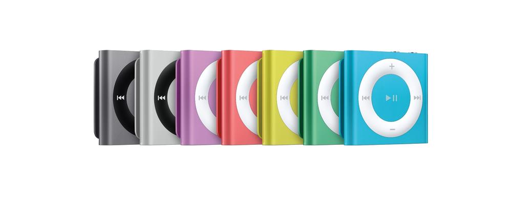
Figure 7-1. iPod shuffle (image: Apple)
This is even more important when we enter the world of not just digital products, but the Internet of Things, where products connect to other devices to form systems that deliver services. That is because the kinds of devices that exist in the Internet of Things are more diverse and the roles they play more complex. Take, for example, the devices enabling many connected products in the first place: hubs, broadband modems, and WiFi routers. Explaining what this box (or sometimes array of boxes) does is another more abstract step compared to the iPod.
But why is this important?
Don Norman coined the term affordance for “the perceived and actual properties of [a] thing, primarily those fundamental properties that determine just how the thing could possibly be used.”[94]
Door handles are a simple example of this at work. Compare the two doors in Figure 7-2. A flat panel like on the door on the left “tells” you to push, while a handle like on the right “tells” you to pull.
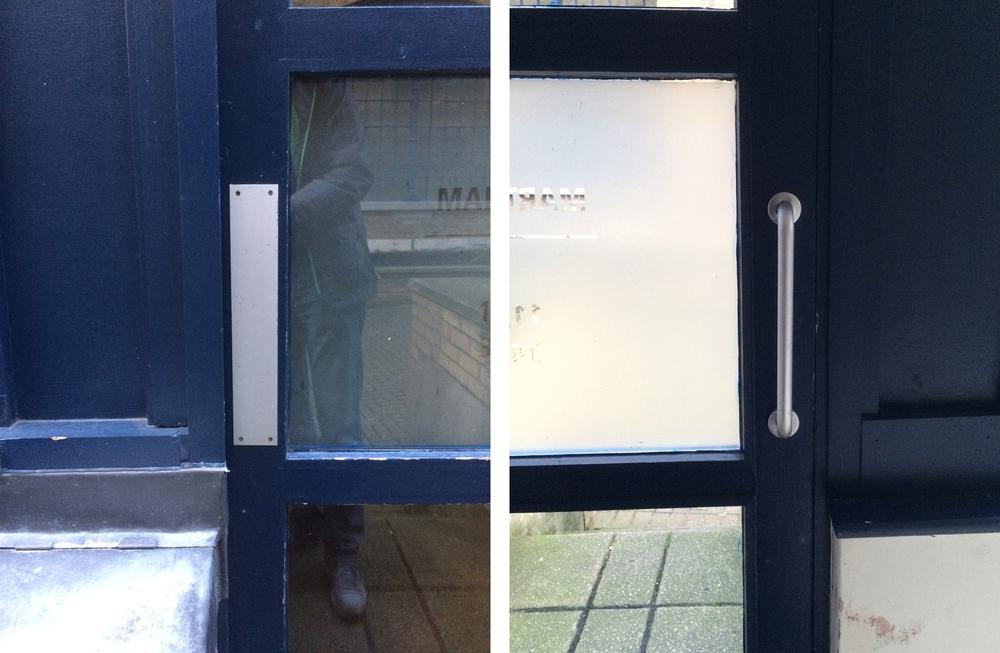
Figure 7-2. Different door handles (image: Martin Charlier)
Affordance is more than just understanding how a thing might be used. It is also about helping people make sense of it, to understand what it does or at least what sort of thing it is. For example, the six devices shown in Figure 7-3 cover products to do with heating, home automation, television, monitoring pets, and music.
Unlike in television sets or photographic cameras, today’s electronics rarely impose a particular form on the device. This means there are few archetypes or category conventions that make a device identifiable as having a certain function or purpose. So in many ways, the physical design of a connected object needs to work much harder than before. Sadly it seems that the opposite is often the case at the moment. More often than not connected products are nondescript plastic boxes with cables and blinking lights.
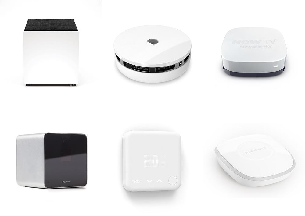
Figure 7-3. A collage of six different connected products: All are great products in their own right, yet it is hard (if not impossible) to make an emotional connection to the activities or contexts these devices relate to purely from seeing these devices
Another Layer of Experience
Beyond these practical, functional considerations, there is another layer of experience that comes into play when dealing with physical objects. Don Norman points out:
The virtual worlds of software are worlds of cognition: ideas and concepts presented without physical substance. Physical objects involve the world of emotion, where you experience things, whether the comfortable sensuousness of some surfaces or the grating, uncomfortable feel of others.[95]
Norman describes three levels of design: behavioral, visceral, and reflective:[96]
§ Behavioral design is largely what we briefly described earlier: the aspects of usability and affordance, how the design makes us behave.
§ Visceral design is less quantifiable. It is the kind of design that simply pleases our senses and is attractive. Similar to the way humans find symmetric faces more attractive, it is a sort of gut reaction. An example could be the hole pattern design on the Nest Protect smoke alarm (see Figure 7-4). The pattern used is unlikely to have a functional benefit over other pattern designs, but it simply makes the product visually enjoyable.
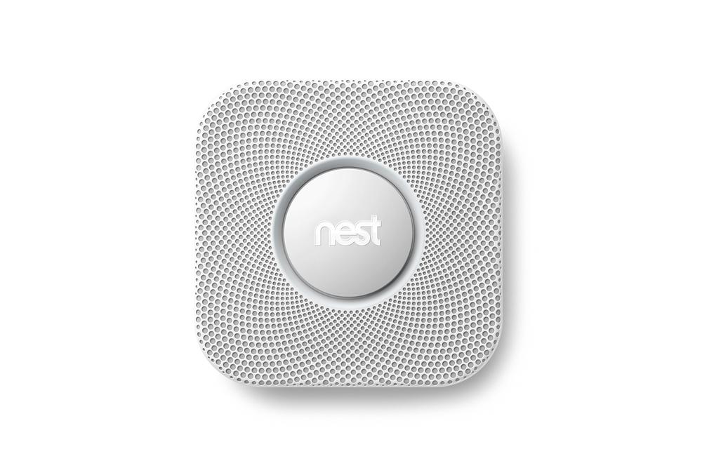
Figure 7-4. Nest Protect (image: Nest Labs)
§ Reflective design concerns the image the design portrays and how it makes the owner feel. It can be about the statement it makes about the owner or the image it projects. Norman’s example is a clever watch with an unusual but thought-provoking way of telling the time that he likes to wear on special occasions. You could think of this as “design to start a conversation” (even if with yourself). Rumor has it, that’s what designer Philippe Starck once said about his famously useless Juicy Salif lemon squeezer (Figure 7-5).
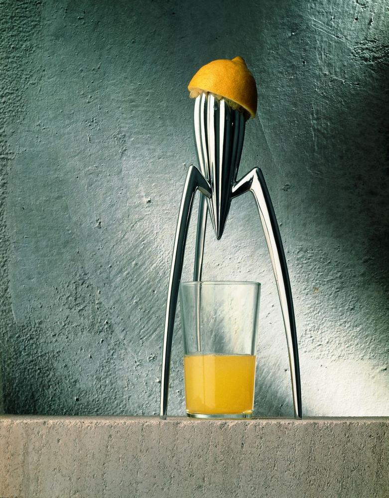
Figure 7-5. Juicy Salif lemon squeezer—rumor has it designer Starck said about it: “It’s not meant to squeeze lemons, it is meant to start conversations.” (image: Alessi)
These levels of design play an important role in general, not just in physical object design. You can imagine how a digital user interface looks gorgeous, or how using a certain service is about making a social statement. Yet, when it comes to physical things that are on display in our homes, on our bodies, or in our cars, they are especially important. That is because these things are in the physical world. We have to deal with them, place them somewhere, see them, or get rid of them. Unlike software, we can’t close them, hide them in a folder, or minimize them. Whether in use or not, they take up space and we have to deal with them—even if just by seeing them.
Finally, there are many technical considerations that come into play, too. For example, if the device connects wirelessly, its antennas might require a physical form that has to be accommodated. The choice of materials can impact the performance of the antennas and the placement of the device can limit the options for powering it. All this can have knock-on effects to the UX of the system.
Interaction and Placement: Basic Design Drivers
Two primary considerations for the design of a connected device are the user interaction it involves and how conspicuous its typical placement is. If we analyze the relationship between these two considerations, three clusters emerge that a connected device will likely sit within (see Figure 7-6):
§ Devices that are hidden away and only rarely interacted with beyond initial setup.
§ Devices that are interacted with occasionally, but that are more conspicuous and abundant due to what they do.
§ Devices that are interacted with frequently and that are likely to be on display to be easily accessible or visible.
Each of these groups needs a different design approach.
Devices that are hidden away and only rarely interacted with beyond initial setup
(Interaction: Rare; Placement: Inconspicuous)
Bridges, gateways, and hubs are the physical devices required to make an IoT system work; they provide infrastructure. User interaction is often limited to the setup phase, after which the devices are almost forgotten about. Other than setup, further user interaction often only occurs in the event of issues. Users might want to press the “Reset” button or check which status LEDs light up.
The placement is often constrained by technical requirements like a wired connection to the main broadband router or a power connection. These devices are often hidden away in cupboards, corners of the room, or stuck behind shelves or other furniture.
The industrial design of devices in this group should embrace the interaction and visibility characteristics by making the device quite compact, stackable and placeable or mountable in different orientations. External hard drives have a similar design context and some manufacturers have embraced this by offering stackable designs (see Figure 7-7).
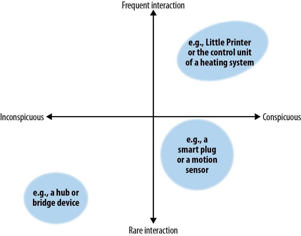
Figure 7-6. Mapping the frequency of interaction and how “visible” a product is when installed; connected products fall under three common areas (illustration by Martin Charlier)
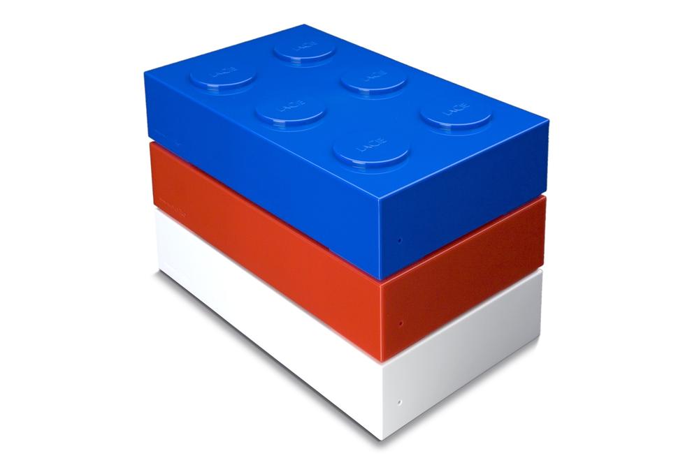
Figure 7-7. Stackable external hard drive “Brick” by LaCie (image: LaCie)
The design might even take into account that the only interaction beyond the initial setup is likely to be a system reset. Why hide the reset button away, or make it difficult to operate if it’s the only interaction users are likely to do after setup?
An example from the Philips Hue connected lighting product line is the Hue Bridge (see Figure 7-8). Note how status LEDs and the link button are prominent central features of the device design. On its back are hardware features that allow it to be mounted on a wall and overall the device design is relatively ordinary.
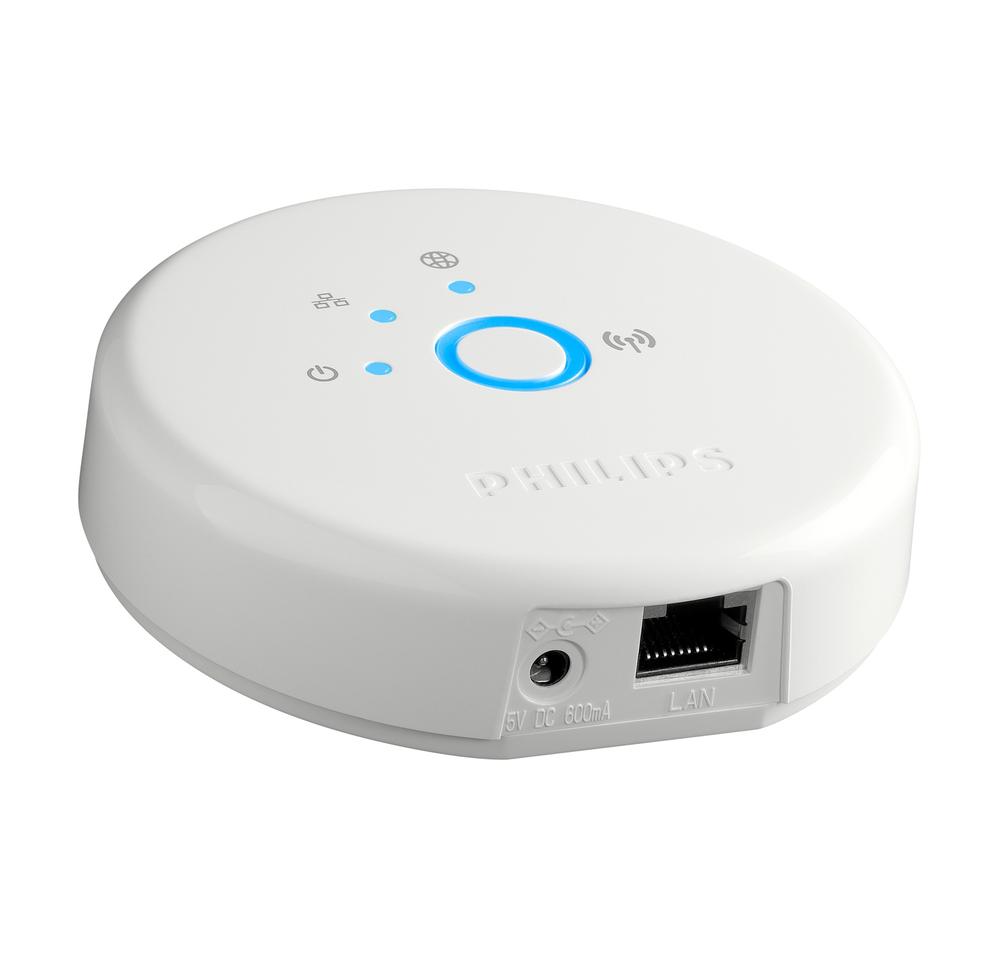
Figure 7-8. Philips Hue Bridge (image: Philips)
Devices that are interacted with occasionally, but that are more conspicuous and abundant due to what they do
(Interaction: Rare; Placement: Relatively conspicuous)
Smart plugs or motion sensors also provide a kind of infrastructure. But they are more specific to the purpose of the product and there might be lots of them. The placement, too, is more about the product purpose rather than purely connectivity. A motion sensor can’t be hidden away like a hub, because most motion sensing technology requires the device to have a clear line of sight to the area it is observing.
Compared to hubs or bridges, users are more likely to move these devices around—for example, to rearrange smart plugs or motion sensors. And while interaction might not be on a daily basis, these devices are a little more top-of-mind than hubs or bridges.
This means the design should take branding and styling into account to greater degree. After all, because of the visibility, these objects will become a symbol for the brand or service. See the smart plug in Figure 7-9. Although it’s a functional device, it features a soft and friendly shape as well as prominent branding.
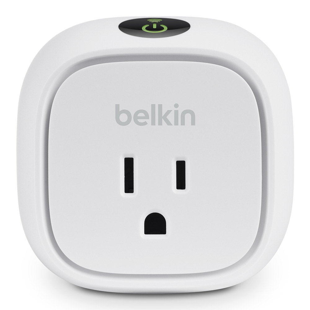
Figure 7-9. Belkin WeMo Switch (image: Belkin)
This also means that while devices might have practical design features for placement or arrangement similar to those we discussed in the previous group, these take aesthetics into account to a greater degree. For example, Tile, a Bluetooth tag that lets users find the products it is attached to, integrates a hole for attaching it to a key chain in more than a purely functional way (see Figure 7-10). The hole’s size and placement is an integral part of the overall design of the product. It relates to the corner radii of the device and even features in the logo of the brand.

Figure 7-10. Tile (image: Tile)
Looking at the Philips Hue product line, the light bulbs and to some degree the lamps and pendant lights fall in this category (see Figure 7-11). They aren’t directly interacted with any more than the bridge, but by virtue of their function are placed much more visibly or on display. The difference in placement and visibility alone is reason enough for a different design approach: the Hue bulbs have more visible branding, a more refined industrial design using details like chamfers, convex and concave surfaces, and a more sophisticated use of colors and surface finishes. The various bulbs even share some design details like proportions and tapering toward the thread, suggesting that they are part of the same range of products.
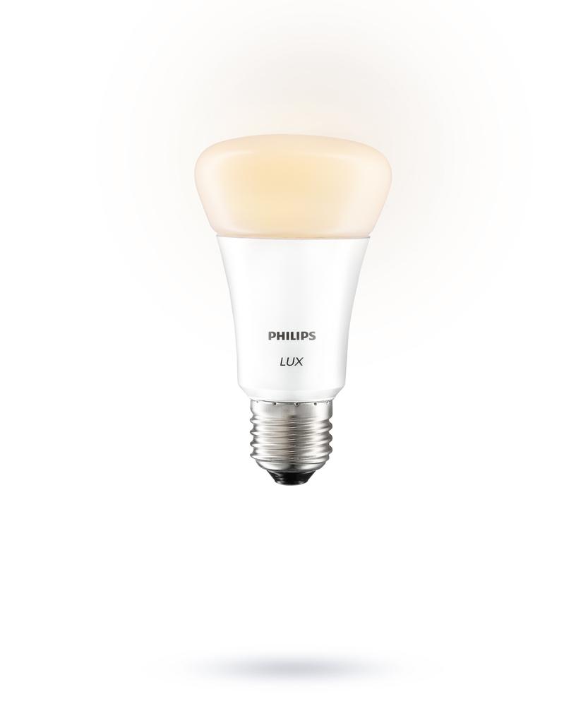
Figure 7-11. Philips Hue bulb (image: Philips)
Devices that are interacted with frequently and that are likely to be on display to be easily accessible or visible
(Interaction: Frequent; Placement: Conspicuous)
The connected devices “where the action happens.” They can be only for user input, only for “output,” or a mixture of the two.
An example for an input-only device is the Amazon Dash (Figure 7-12), a candy bar–sized device that connects to its owners’ Amazon Fresh grocery delivery account via WiFi. It lets the user add items to their online shopping list by either scanning the barcode of an item, or by speaking into the device. Other than that, it has no function. Note that a device like this might still need a bridge to get connected, which would fall in one of the previous groups.
Figure 7-12. Amazon Dash (image: Amazon)
An example for an output-only device could be Voy Oslo’s connected Owl “Ugle” (Figure 7-13). It is remotely controlled to turn its head to a specific color patch on its body. The connected object has no other function or ability—it only outputs a value set elsewhere.
Figure 7-13. Voy Oslo Ugle (image: Einar Sneve Martinussen and Jørn Knutsen, Voy)
Of course there are also many in-between devices. A smart thermostat, for example, is a mixture of both input (set temperature) and output (review system status).
For this group of devices especially, the visceral and reflective aspects of design play a much more important role. That is because they are more openly on display and become symbols of the service. The design of these objects must deliver on more than just function. It also needs to live up to the less functional promises the product or service makes. So the most technically complex and important devices in a system might not be the most important when it comes to design.
In the Philips Hue product line, the Tap remote control sits in this cluster of products (Figure 7-14). Like the light bulbs, the device isn’t likely to be hidden away like the bridge. Even though the basic form is similar to that of the bridge (a hockey puck–like cylinder), the industrial design is much more sophisticated. Surface details, colors, and material finishes are much closer to those visible on the bulbs than on the bridge. The device is also powered differently to make it moveable: it uses kinetic energy created when pressing its buttons to send commands.
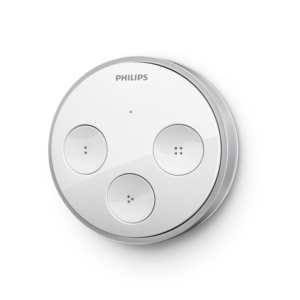
Figure 7-14. Philips Hue Tap remote control (image: Philips)
Challenging These Characteristics
It’s easy to jump to a conclusion about whether a device will be on display or not, or whether it needs interacting with or not. But it can be an inspiring exercise to challenge your assumptions in this regard. In 2009, Internet service provider TalkTalk approached a design course at Goldsmiths University in London and asked the course to design “future routers.”
The design students came up with concepts for routers that explored the prominence of the router as an object in the home and also its purpose (see Figure 7-15). One concept turns the router into a wall clock that displays the time of day combined with expected bandwidth. The concept acknowledges that bandwidth fluctuates and turns the router into an object that makes this information accessible. Another concept places the router near the entry of the house and includes key holders. The house can now use the presence or absence of keys to determine the presence of residents. When all keys are gone, the router switches itself and other devices off to save power (http://bit.ly/1BuE9jz).

Figure 7-15. Two of the router concepts created in the Future Routers project (images: Goldsmiths/TalkTalk)
Different design approaches are also visible in Google’s connected television products Nexus Q and Chromecast (see Figure 7-16). Both devices have a similar value proposition and involve a similar degree of interaction. But they show different approaches to the prominence of the device. While the Nexus Q is an elegant-looking sphere with sophisticated details, Chromecast is a small dongle that looks like a USB memory stick. The former has been designed to be on display while the latter disappears from view once connected to a television. Both devices alter the television experience, yet only one of them is easily visible doing so.
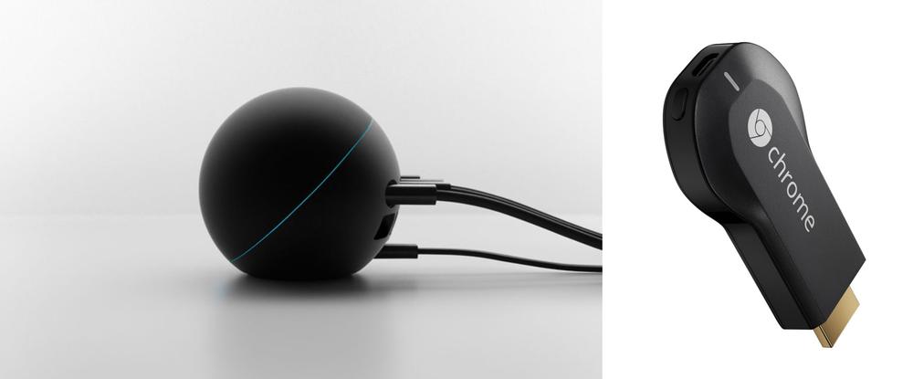
Figure 7-16. Google’s connected television products, Nexus Q and Chromecast (images: Google)
At the time of writing, the Nexus Q is no longer available and Google appears to have replaced it with Chromecast. Perhaps this gives a clue as to which approach Google thinks is more appropriate for this kind of product.
Making Stuff: Differences to UX
Now that we’ve discussed ways to think about connected objects conceptually, let’s look at how the design process of physical objects differs to digital UX. The rest of this chapter is by no means meant to be a complete and exhaustive description. The aim is for UX designers to gain a basic understanding of industrial design. This section gives UX designers an overview of what basic knowledge they should have about industrial design.
Product Design, Industrial Design, Design Engineering
To begin, let’s discuss some of the nuances that exist within the industrial design discipline. The exact titles designers and design agencies use vary and are also subject to a lot of debate in the design community. It’s useful to be aware of the differences and able to probe and understand the profile of a designer or design team you might be working with.
Let’s take three common titles: Product Designer, Industrial Designer, and Design Engineer. While there are no clear-cut definitions, there tend to be some differences between them. All are capable of designing physical objects and have an understanding of manufacturing techniques. But the titles signal different strengths and areas of focus.
Product Designers focus on a product’s conceptual aspects—what it does, how it’s used, how it looks—as well as give some thought to how it might be made. Industrial Designers, in contrast, are more involved in the engineering of a product and its manufacturing. Design Engineers have an understanding of the design process, but as the title suggests focus specifically on engineering and manufacturing. They concern themselves less with value propositions and the conceptual aspects. As mentioned previously, this is subject to a lot of discussions and many designers will happily debate and argue these semantics for hours.
For simplicity’s sake, we’ll use Industrial Design for the rest of this chapter.
The lesson here is that it is useful to understand that, like in digital design, there is a spectrum of skills that isn’t covered by a single person, or single agency. Some might offer engineering services and manage manufacturing. Others might only develop concepts that engineering firms need to take further.
This is similar to the spectrum from design to development in digital products. Some designers get involved in technical decisions, others stay away from them. Some designers even work in code and could be described as designer–developers. A difference is that it is more common for industrial designers to have a good understanding of manufacturing than it is for digital designers to have knowledge of computer science.
Another difference common in digital design isn’t easily found in physical object design: the split of UX and visual design as separate disciplines. A separation between designers that think about how a physical product is used and ones that think about how it looks doesn’t quite exist. Industrial designers take a holistic approach that covers both usability and aesthetics. In digital design terms, one could describe industrial designers as constantly jumping between “visual design,” “interaction design,” “UX,” and “development” in terms of their thinking.
Mindset of Industrial Designers
Another difference between UX design and industrial design is in the general mindset of the discipline. This has to do with their differing histories.
UX and interaction design originate from computer science, cognitive ergonomics, and the field of human–computer interaction. Industrial design has developed from architecture, the arts and crafts movement, and to some degree, engineering and theatre design. In parts, it is less scientific than UX. In contrast, UX increasingly involves analytics and measurements informing design decisions to optimize conversion or usability. Industrial design has remained less quantifiable and considers styling and aesthetics as much as it does ergonomics and usability.
This is evident in the way industrial design involves emotions and branding to a much greater degree. As an example, while UX design tends to concern itself specifically with the way a user completes a certain task, industrial design also concerns itself with considerations that UX designers might leave to visual designers or developers.
Another way of looking at these differences is the degree of codification of the discipline. UX design tends to revolve more around implementing “best practice” solutions. UX designers often use “pattern libraries” to sift through tried and tested solutions and find the most suitable ones to adapt for a particular challenge. This only exists in industrial design when it comes to details—say, a hinge mechanism for a battery cover. But on the level of the overall design, industrial designers work with a greater degree of freedom.
Design Freeze as Opposed to Continuous Iteration
The commitment involved in manufacturing is bigger than in software. For obvious reasons, you can’t make changes to a physical product once released, or offer an update for people to download. Modern software development with continuous iteration even after release means the “design” is never finished. In contrast, physical design projects have a “design freeze” point. This is the point on the project timeline when the current state of the design is “frozen in time” and handed over for manufacturing. After this point, further design changes would require postponing or even re-planning manufacturing. This fundamental difference means the design approach is different, too.
Because design decisions are not reversible once the product is manufactured, design teams project further into the future when generating concepts, do more upfront user research, and often prototype and test multiple alternative design directions at the same time. Once a direction is selected, the team goes on to develop it. In contrast, software design teams can start working directly toward a minimum viable product, release it, and then iterate and improve it. So rather than “just get started and then improve,” the approach of industrial design is to conceptualize the perfect product and then work toward an achievable version as close as possible to it.
This means multiple design directions are often explored in parallel for longer and developed quite far. That way options can be kept open and decisions made later on. In software, a single concept can be selected, developed, released, and completely flipped into something else for the next version based on feedback from releasing it.
All this doesn’t mean iteration during the development is impossible. But with physical objects, it is often approached slightly different. When BERG developed Little Printer the team created functional prototypes that didn’t look like the final product, but worked like it (see Figure 7-17). This allowed them to learn about how people would use and “live” with the device, and iterate the product experience. At the same time, the team iterated the appearance using a series of different models, iterating color and styling details (see Figure 7-18). Chapter 14 walks through prototyping in more depth, using another BERG project as an example. Although not always cost effective, additive manufacturing and electronics prototyping platforms increasingly make it possible to create small runs of devices that combine appearance and function.
These are ways to refine the value proposition and experience aspects of a physical product. But they don’t uncover the problems and challenges of manufacturing. This can only be done through working with the factories that will make the device. Hence, design for manufacturability (DFM) is a design phase in its own right. This phase is all about achieving, tuning, and improving the actual manufacturing of the product. We’ll talk a bit more about DFM later in this chapter.
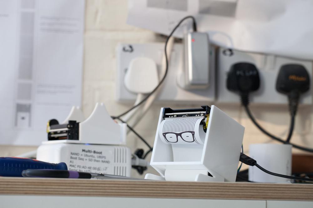
Figure 7-17. BERG Little Printer experience prototypes (image: Timo Arnall)
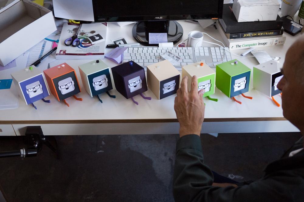
Figure 7-18. BERG Little Printer nonfunctional appearance prototypes (image: Timo Arnall)
The kind of continuous iteration that is possible in software, even after a product has been launched, can be achieved within reason, too. For example, during the design phase of the digital service of sustainable property development Little Kelham (see the case study between Chapter 6 and Chapter 7), the team identified that users would benefit from a physical button placed near the front door of their homes. The initial hypothesis was that this button would be used to switch between “home” and “away” modes. What that meant exactly, however, was something the team didn’t have to decide finally. The function of the button wasn’t hardwired into the product and the team could iterate in software, even after the hardware was installed in homes.
Designing physical controls to be dynamic in such a way means the benefits from continuous iteration become accessible to physical products, not just software, within reason: designers still have to identify a requirement for certain dynamic controls and put them in place during the hardware design phase, something that wouldn’t be necessary in software.
Essentials of the Design Process
Now that we’ve looked at some of the key differences between UX design and industrial design, let’s dive a bit deeper into the process of making physical products. In this section, we’ll look at some of the stages of the industrial design process that a UX designer is less likely to be familiar with.
Like in any user-centered design process, user insights, market research, and value proposition development are essential parts of designing physical things, too. But in the following, we will focus on the later project phases that are more specific to physical device design.
Establishing a Design Direction
Digital UX design often operates within established platforms like the Web or Apple’s iOS. This provides a lot of constraints and building blocks right from the start.
This is different in industrial design. Hence the initial activities and tools in industrial design help narrow down the amount of choices, whether they be material options, shapes, colors, surface finishes, or stylistic details.
Mood boards and design themes
Mood boards (also called “design themes” or “visual language boards”) are collages of pictures or words describing a conceptual direction or target audience taste. They can look at form factors, materials, colors, contexts, or other areas like architecture or fashion. Often, multiple mood boards are used to contrast and compare possible directions and provide designers with inspiration for their further exploration.
They are also used to describe and analyze competitors, design trends, or user profiles. Mood boards are a great addition to personas, a tool that should be familiar from UX design. In this case, the collages help describe what products, brands, CMF (color, material, finish), or environments are relevant to the persona. This is useful to set a design direction early and focus the concept generation phase. See Figure 7-19 for an example of three different design themes created for a recent project at insight, design, and innovation firm Evolve Collaborative.
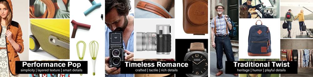
Figure 7-19. An example of three design themes used for a travel product design project. Each theme provided an inspirational starting point for broad concept exploration. The themes are used to differentiate and organize the exploration while providing inspiration for form, detail, interaction, color, and materials (images: Evolve Collaborative, Portland, Oregon).
CMF research
CMF stands for “color, material, finish.” In some industries (like automotive design) CMF is a discipline in its own right. CMF designers analyze color, material, and fashion trends, find new materials or finishing processes, and inform the design strategy.
In other cases (like in smaller design agencies), CMF is integrated into the design process and done by the industrial designers.
It often involves a lot of trends research and analysis. The longer time frames in industrial design mean a product might take a year or longer to be ready for market. CMF helps to ensure a product doesn’t look dated before it is even released.
CMF research is about more than just looks. It’s also about environmental considerations, like identifying recycled or sustainable materials for the product.
The importance of sketching
Different kinds of sketches and hand drawings play an important role in the industrial design process. Throughout the project stages they fulfill various purposes.
After establishing a direction using mood boards, industrial designers often start exploring form ideas by quickly generating low-fidelity drawings. These “scribbles” or “thumbnail sketches” aren’t doodles; they involve focus and concentration. They are used early on to generate a high quantity of ideas, forms, and directions, and document these ideas (whether they work well or not) so that the designers can move rapidly rather than laboring over single ideas. Sketching is both a visual thinking and a visual communication tool. In this early stage, it is all about exploring as many ideas and thoughts as possible in the shortest possible time, irrespective of quality or feasibility. This is a creative process where ideas are continually formed, documented, and taken forward as inspiration, which means even drawing mistakes or not obviously relevant input from looking at other products, fashion, or architecture provide relevant stimuli.
Using the different design themes or idea attributes like fundamental material choices, the quick scribbles can be clustered to help facilitate the decision making around what direction to explore further (see Figure 7-20).
As a design direction selected from such quick sketches is pursued further, sketches gain fidelity and detail. Industrial designers will start to draw various views describing the form in three dimensions and might also spend more time on selecting and showing colors, materials, and finishes using marker pens or computer software. Figure 7-21 shows such more refined sketches from a project at design and innovation consultancy Seymourpowell.
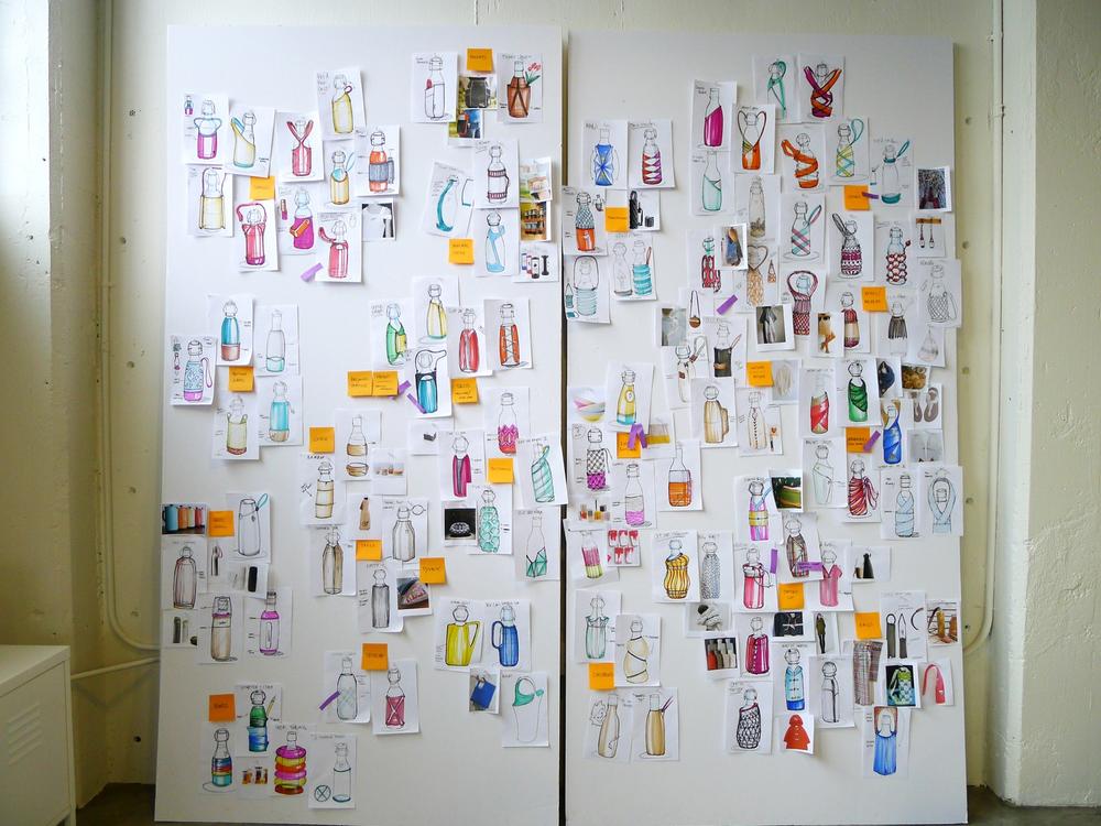
Figure 7-20. Quickly generated early sketches organized by relevant attributes like material type or the way features are integrated (image: Evolve Collaborative, Portland, Oregon)
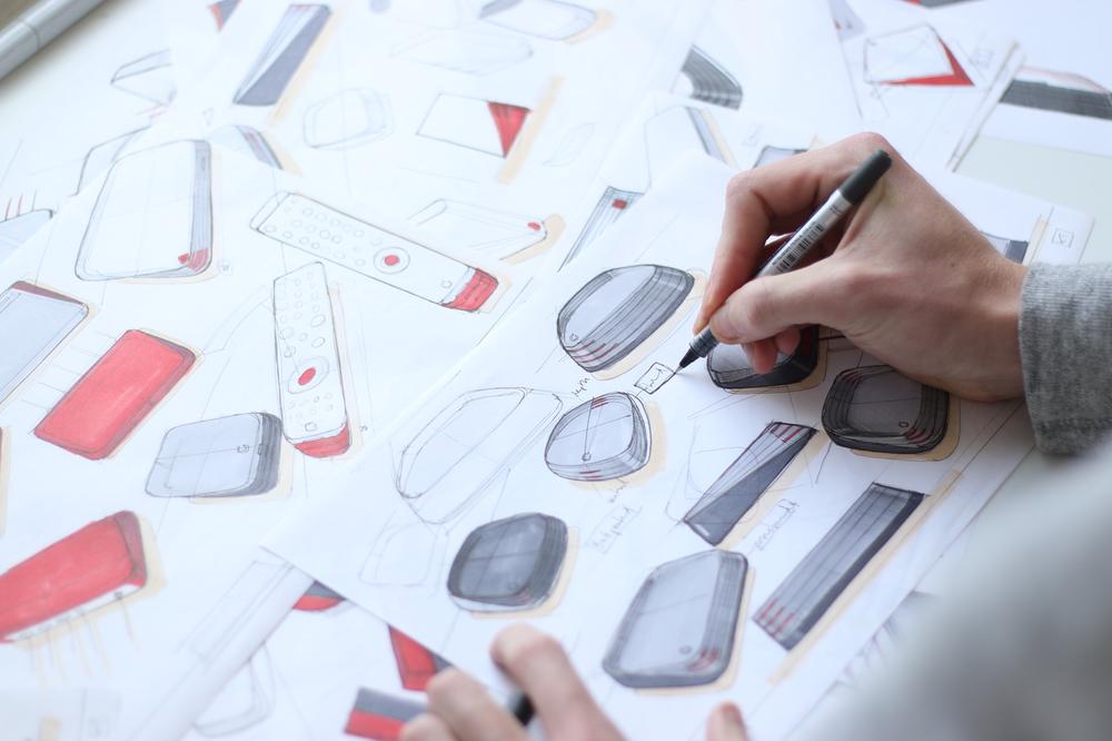
Figure 7-21. Sketches exploring individual concepts from multiple angles and with more time spent working out design details (image: Seymourpowell)
As ideas and concepts are refined, combined, and built upon, the number of sketches decreases and the fidelity of sketches increases. Interpreting and “reading” early-stage sketches like the ones described so far tends to require a bit of an understanding of industrial design in general. Among designers, vague details that hint at a design direction are enough to understand what a particular sketch represents or embodies. That’s why when presenting and reviewing with nondesigners or designers from other backgrounds, industrial designers sometimes create even more refined presentation sketches using templates created in CAD and additional post processing using digital drawing tools.
However, ideas are often deliberately presented to clients using sketches, as opposed to entirely computer-generated photorealistic images. Sketches leave room for interpretation and are not understood to be too definitive. This means sketches can focus a conversation on particular areas. Like in digital design, using high-fidelity representations too early can lead to distraction when clients react to color or form details that aren’t decided yet. To manage this, it is not uncommon to make drawings “sketchy” for client meetings. Designers add “wrong” lines to make the sketches more ambiguous and prevent the conversation from getting bogged down in details.
Even at the late stages of projects, pen and paper are important. Construction drawings and technical sketches help ideate mechanical details and communicate with model makers or engineers. Pen drawings play an important role in the making of physical products. It’s important to understand how different types of drawings are used: to describe a general design direction, to propose a specific form factor, to describe a particular detail, or to document an exact specification of a part.
Formulating a design language
“Design language” is about translating design strategy and brand values into different mediums. While “design principles” (discussed in the previous chapter) are concerned with interactions and behaviors, “design language” is about the aesthetic and visual manifestation of design strategy and brand values.
In the case of industrial design, this tends to encompass form, CMF, and design details like signature elements. The design language is an abstraction of the characteristics of a design and becomes a reference for other products from the same brand or product line. Once established, the design language becomes a guide for future industrial design projects.
A way of looking at it is to imagine a product or system as a person. How would you describe that person? How can you achieve this perception through industrial design? Is it sterile or playful? Is it clean or raw? Is it figurative or abstract? Organic or geometric? How do these qualities manifest themselves as shapes, colors, materials, surface finishes? Are there signature elements that are always integrated in a particular way?
A design language can help create coherence across products. But perhaps more importantly, it is a tool to define how the design embodies particular qualities and characteristics.
In a blog post about design language, creative director Luke Williams discusses this in more depth. He reverse-engineers the design language of early-generation iPods as an example. Why was the iPod’s design so often described as “clean”? Williams links the industrial design to an environment that is all about “cleanliness”: bathrooms. By referencing white porcelain and chrome, whether deliberate or not, the design supports this notion. (See Figure 7-22.)[97]
Design language becomes especially important in the Internet of Things. Connected products often involve a range of devices that are part of the same system. A common design language can help convey and reassure that the separate devices are part of one whole.
Design firm Seymourpowell worked with Korea Telecom to create such a common design language for their products (see Figure 7-23). Note how the diverse products are connected through consistent form details such as corner radii, convex shapes, and surface treatments.
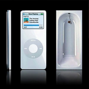
Figure 7-22. iPod and bathtub (image: Frog Design)
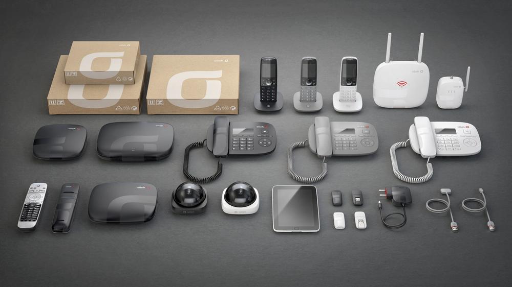
Figure 7-23. Korea Telecom range of products unified by a design language (image: Seymourpowell)
For connected products, it isn’t enough to create coherence across different devices. Design languages need to extend into helping convey the functionality, purpose, and role of the ever more devices and objects we will have. There are few conventions designers can build on. How can design language help differentiate a connected product from an unconnected one? This is a challenge that industrial designers will face when they work on connected versions of hitherto unconnected products. At the most basic level, this can mean the prominent inclusion of established symbols to communicate connectedness. For example, the connected Crock-Pot slow cooker (see Figure 7-24) prominently features a common WiFi symbol on its main face.
Detailing and Developing the Design
Once a few design directions have been selected, concept generation moves from sketches and drawings into three dimensions. Designers then create the data necessary to produce accurate mockups and photorealistic visualizations of the product. But there is more that goes into taking a sketch of a device into 3D.
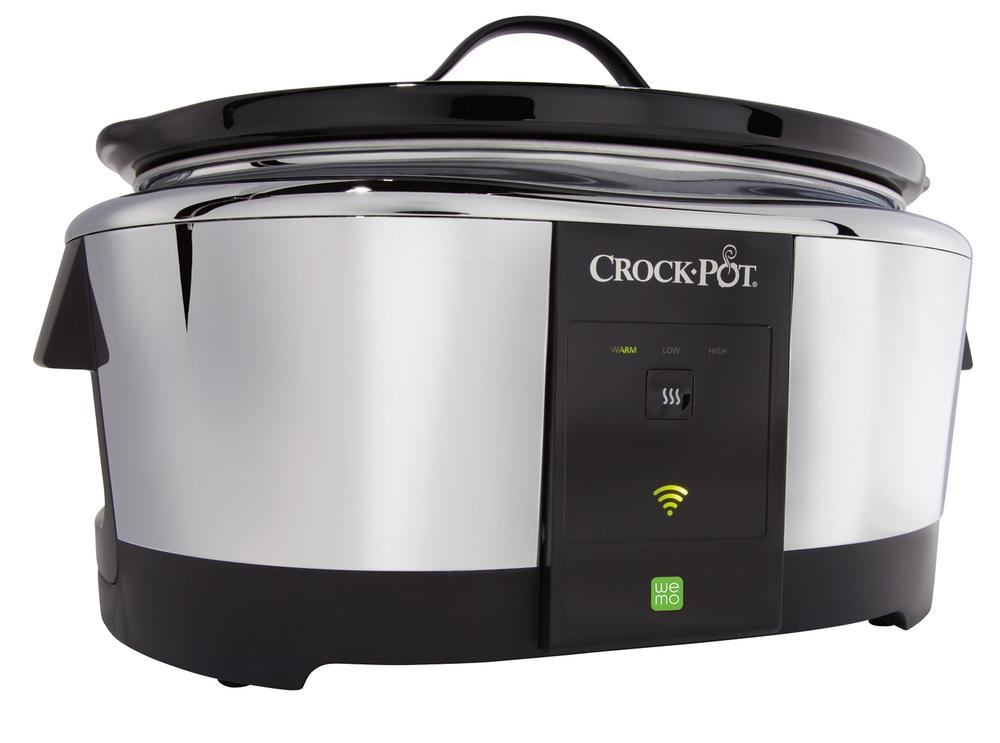
Figure 7-24. Crock-Pot Smart Slow Cooker with WeMo (image: Belkin)
3D modeling and rendering
During 3D modeling, designers need to work out geometric details that they could ignore in a pen sketch. Surface geometry isn’t always as straightforward as you might imagine and forms that might be easy to draw can be tricky to create in three dimensions. This is done using surface or solid CAD (computer-aided design) software (Figure 7-25).
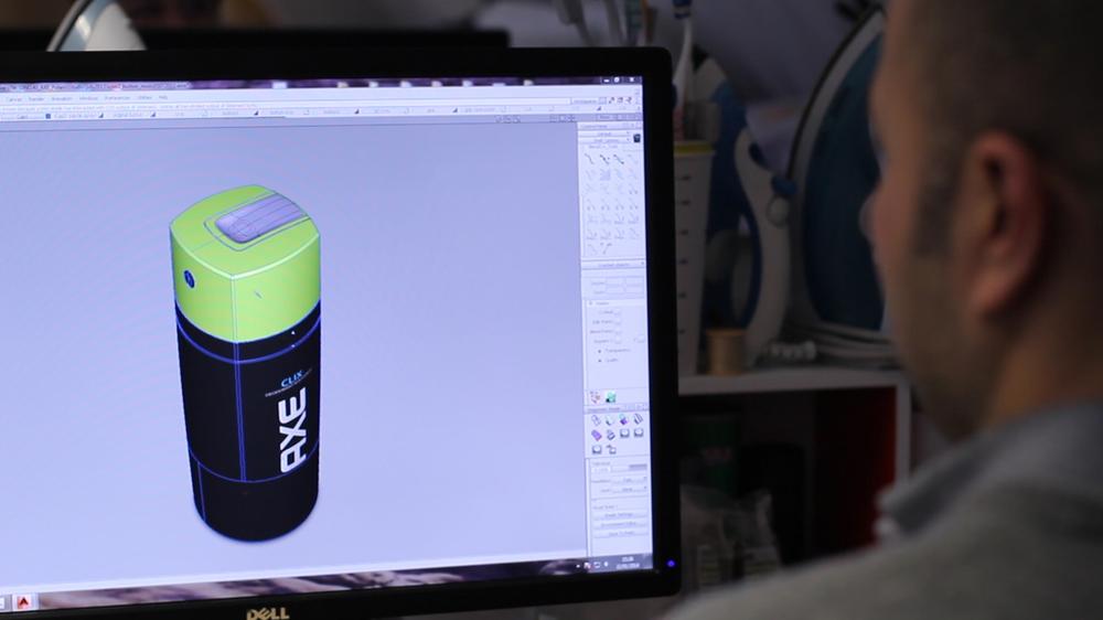
Figure 7-25. A designer at Seymourpowell working on a 3D CAD model (image: Seymourpowell)
For example, when blending two surfaces into each other, industrial designers need to take extra care to define “surface continuity,” the smoothness of the transition. This is particularly important in surfaces that will be clearly visible in the final product, and when materials are used that are reflective (even just slightly). Designers use different terms to describe the degree of surface continuity (see Figure 7-26). This is about ensuring the tangents of each surface are equal at the transition. Higher degrees of continuity mean that even the curvature or the rate of change of the curvature is equal in the point of transition. This is important for creating not only a smooth transition, but making sure light reflections across this transition are smooth, too.
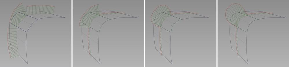
Figure 7-26. Different degrees of surface transition continuity made visible through “curvature combs”—from left: (1) positional continuity, note the gap in the curvature plot (red); (2) tangent continuity, curvature plot aligned, but not at same height; (3) G2 continuity, the curvature is aligned, but changes suddenly; (4) G3 continuity, the rate of change of curvature is smoother (illustration by Martin Charlier)
3D CAD models are also used to generate photorealistic renderings of the product, often using specific rendering tools such as Luxion Keyshot or Bunkspeed Shot. Tools like this are great to quickly simulate different color, material, and finishing options and present the product in different environments.
Sometimes, product renderings are even used to replace photography on packaging or advertisement. Believe it or not, 75% of the images in IKEA’s catalog are renders instead of photography.[98] To IKEA, using computer-generated images makes creating and maintaining their catalog easier and more efficient.
CAD/CAM
Computer-aided design and computer-aided manufacturing refers to software packages used to create 3D data and manufacture products.
Industrial designers often use a combination of software packages because there are trade-offs between them. So-called surface modeling packages let designers focus on creating complex freeform surfaces. But they’re not ideal for producing data immediately usable for manufacturing or maintaining complex models that auto-update when engineering features are changed. In contrast, solid modeling tools are good at creating 3D data of high enough quality for manufacturing and tend to have parametric tools that keep a “history” of dimensions and features applied. This means updating an underlying parameter of a model (like a wall thickness) automatically updates an entire model accordingly. However, solid modeling packages often lack convenient features to create the kind of freeform detailing desired by industrial designers.
CAM software takes the data created in CAD further. Designers, model makers, or engineers use it to control computer numerical controlled (CNC) milling machines. It creates the tool paths a milling machine follows with its cutters to cut the model from a block of material.
Model making and prototyping
Like with pen drawings, there are different levels of model making and prototyping that industrial designers use at different points in a project.
At early stages, designers use foam materials to rapidly create models by hand. Modeling foams made from polystyrene or polyurethane can be easily cut, sanded, drawn on, or CNC machined to generate physical mockups. These let designers explore the size and form of a device (see Figure 7-27). Paper and cardboard are used in the same way.
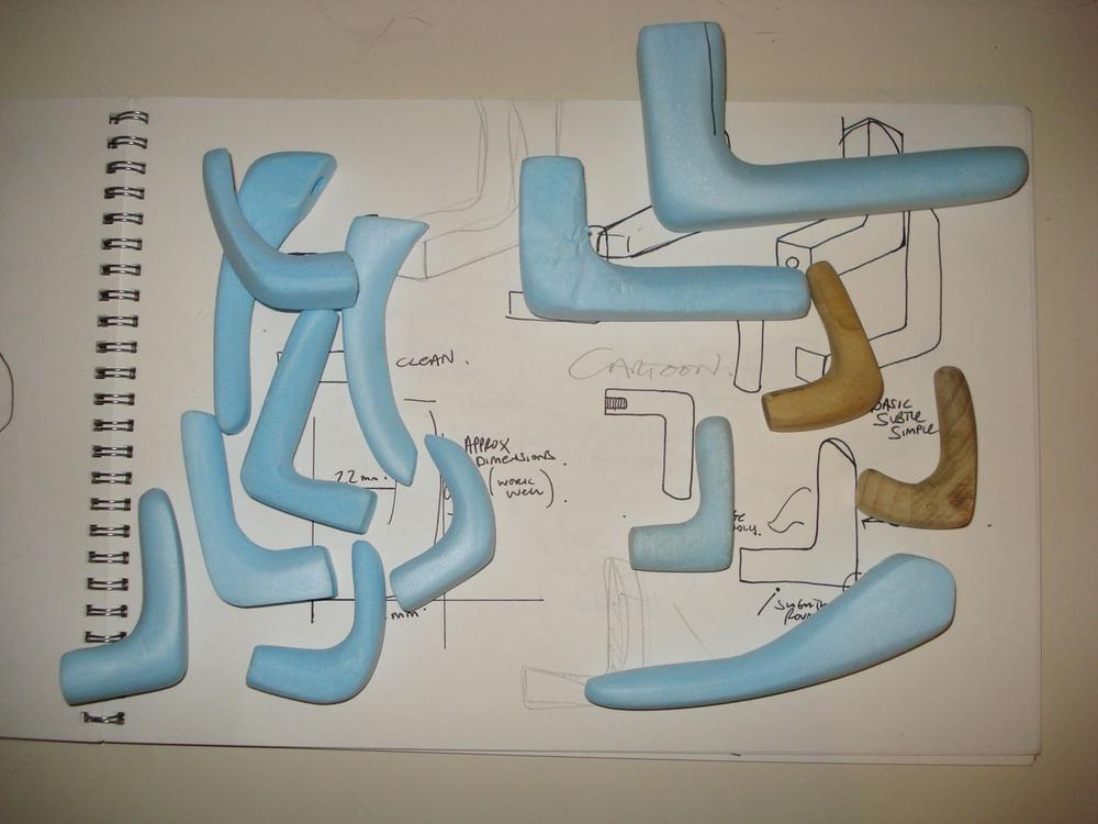
Figure 7-27. Handmade models exploring different forms for a door handle (image: Joseph Smith)
Such modeling foams come in different densities. Denser versions are harder to work with by hand, but more suitable for higher-fidelity models at later stages. Designers and model makers then use CAD and CNC machines to create models that can be painted to look almost indistinguishable from the desired final product. Models like this can help decide between, say, three different options for a design.
Aside from subtractive methods like CNC milling (where material is subtracted to create a model), additive methods like 3D printing are also used. Here a machine adds material only where necessary to create a model.
3D printing has enjoyed a lot of attention in recent years. But additive manufacturing (or “rapid prototyping”) has been a familiar prototyping process for designers for years. It can be used for early models of a product, but is more suitable for later stages when higher-fidelity models are required or mechanical engineering features need to be tested.
Such higher-fidelity models are also called “appearance models.” They represent a product concept, show the form factor, and might be spray painted to show the color or even surface textures. They can be 3D printed, but are often machined, because at least currently, CNC machines can achieve a higher degree of accuracy than 3D printers. In addition, the specific high-density foam materials are better suited for spray painting and finishing than the materials used in 3D printing.
Engineering and Production
When it comes to making product concepts real, design and engineering blend into each other. Making a product ready to manufacture is an enormous task in its own right. It requires engineering and manufacturing knowledge, as well as an understanding of how things are assembled in factories. A close collaboration with the factories involved is essential.
Two essential aspects of this stage that won’t be familiar to UX designers are design for manufacturability (DFM) and product certification. DFM is where the design is reviewed and developed further taking into account costs and efficiency of the actual manufacturing techniques. Product certification is about obtaining the required certificates that allow the product to be sold in different markets.
Hardware engineering, DFM, DFA
Previously we talked about CAD modeling and creating the data to manufacture the forms of a product. In addition, a lot of engineering goes into areas not visible to most people. The knowledge required at this stage of product development means that designers often work alongside hardware or mechanical engineers. They might even hand over the project entirely.
Designers and engineers need to decide how to split parts to manufacture and assemble the device efficiently. Together, they design hinge or snap mechanisms. Or they place and design features to mount other components.
This phase sometimes reveals design changes necessary due to manufacturing methods or materials used. For example, designers and engineers need to think about where plastic is injected into a part and how it will flow through the mold. Even the rate at which the plastic cools down needs to be taken into account. Wall thicknesses or corners can cause problems and flat surfaces might warp due to irregular cooling of the plastic.
The care and skill applied during this phase decides whether people will perceive a product as low or high quality. What we pick out as elegant and simple products more often than not involves complex engineering and DFM.
In the documentary film Objectified, Apple designer Jonathan Ive describes the effort that goes into DFM. He points out that Apple’s designers spend more time designing the fixtures and jigs used during manufacturing and finishing than the parts themselves. This shows how challenging it can be to achieve a beautiful and simple form factor. The real challenge might be in how a part is accurately held in place to machine or polish it.
Design for assembly (DFA) is another part of this area of consideration. The aim here is to take into account how a worker will put the product together, and how quality is assured. Again, the design of parts might need to change to allow for quicker assembly, or reduce the number of steps.
It’s worth bearing in mind that in the area of connected products, not every product will need to be hardware engineered from scratch. For example, telecommunications service providers might not design and engineer their own router hardware, but buy and customize compatible off-the-shelf products that deliver the service. A designer of a connected product might be spending more time working with a supplier of hardware to customize and refine it, rather than develop and engineer it from the ground up.
Product certification
Most electrical products need to be certified by authorities before they can be sold. In the European Economic Area, for example, this typically means having a CE (Conformité Européene) marking as well as a WEEE (Waste Electrical and Electronic Equipment) symbol. These mandatory marks declare that a product meets the requirements of the relevant European directives. In the case of CE, these directives concern, for example, the safety of low-voltage devices, electromagnetic compatibility, or compliance with RoHS 2, a directive restricting the use of certain hazardous substances in electrical and electronic equipment. A WEEE symbol is required by another directive and indicates to end users that the product needs to be disposed as electrical waste.
In the United States, a certification many connected products will require is the FCC Declaration of Conformity. This is a certification mark issued by the US Federal Communications Commission, a government agency that regulates electromagnetic interference.
With most of such certifications, specific requirements and tests are defined for different categories; some might be about safety and in other categories they might be about electromagnetic interference or use of certain materials. If a product falls within more than one category, it’s necessary to pass a range of tests.
Some example tests are: Does the material used emit toxic gas when burned? Does it shatter into dangerous parts when dropped? Do the electronics emit electromagnetic signals that interfere with frequencies used by air traffic control or public radio stations?
Depending on the categories, certification can be carried out by manufacturers themselves or by authorized representatives. This is the case for some of the CE marking categories. Because the area of product certification is complex, specialized firms offer consultancy and execution of the required tests and documentation.
Product certification can have an impact on the industrial design of a product. For example, certain certification legislation requires additional security for the battery compartment if a product uses lithium ion coin cell batteries. A recent change in legislation like this led BleepBleeps to delay their production to include an additional screw fixing in their Sammy Screamer motion alarm.[99]
Collaboration Between UX and ID
As the Internet of Things brings together digital and physical design, close collaboration between UX and industrial designers will become more commonplace. Being aware of differences, similarities, and the domain-specific tools improves these collaborations. Integrating design teams is a further step toward creating great connected products.
Design studio Clearleft explored this collaboration in an internal project. Through their internship program, they brought together an industrial designer, a web designer, and a technologist. Together, the team approached a broad briefing to “turn an active behavior into a passive one.” The multidisciplinary team jointly generated product ideas and design concepts.
The final concept was a modern-day jukebox named “Chune.” The product would get its music selection from the tastes and playlists of the people nearby (see Figure 7-28). The team brought the product idea to life by prototyping both the hardware and software aspects. They developed a functional physical mockup as well as UX prototypes for the software touchpoints.
The approach of one integrated team with different disciplines proved successful. Victor Johansson, the industrial designer of the group, described that the different backgrounds meant domain-specific ideas and knowledge came together into a holistic concept. Everybody informed every aspect of the concept and the team created a single design vision. No silos. Toward the later stages of the project, the team split up tasks according to their domain specialisms. Each team member could then work toward the joint vision in his or her respective area.
Projects like this are useful to explore how successful collaboration between software and hardware designers should be set up.
Figure 7-28. Chune speaker prototype (image: Clearleft)
Jason Mesut, Head of Experience Design at Resonant Design and Innovation, brings together his industrial design background and deep experience in UX to help businesses integrate the two and develop experience-focused products and services. His recommendations match the characteristics of the Chune project. In order for UX designers and industrial designers to collaborate successfully, Mesut urges both sides to “unite under a common purpose,” “develop a shared vocabulary,” “share work regularly,” and “prototype together.”[100]
Three Faces of a Physical Product
We’ve now covered an overview of industrial design methods and tools. Next, we will discuss the different aspects that make up a product, what they are about, and how they relate to connected devices.
We’ll break the design of connected objects into three areas:
Form, function, and usability
What does it do? How is it used? What does the way it looks tell you?
Aesthetics and appearance
How does it look? What color does it have? What’s the surface finish?
Materials, manufacturing, and maintenance
What is it made of? How is it made? How is it assembled? How is it maintained?
Form, Function, and Usability
Some of the first and most obvious considerations for the design of a connected device are practicality and ergonomics. What’s the main purpose of the device? Who is using it? Do users need to hold or place it in a particular way? The design needs to make the product self-explanatory, easy to understand, and comfortable to use.
Anthropometrics and ergonomics
The field of anthropometrics is about measuring the human body. It’s about understanding dimensions, proportions, anatomy, and ability to move. The field of ergonomics (or human factors) uses this information to optimize the use of equipment and devices.
Take, for example, a workstation. The understanding of the human body informs the design to avoid operators having to work in uncomfortable postures. Figure 7-29 shows an illustration of measurements that the designer of the workstation would take into account.
In the design of connected devices this is important, too. For example, in the design of a smart plug, you might want to take into account the maximum grip strength of different grip types like power grip or pinch grip. The physical design should provide a good enough grip to easily remove it from a tight socket without causing the user pain.
Another aspect of ergonomics is to understand the physical context of use. For example, heating thermostats are normally mounted at chest height for reasons of thermal efficiency and the way the body perceives temperature. This means users might miss buttons on the top or bottom sides of the device, or find them uncomfortable to use.
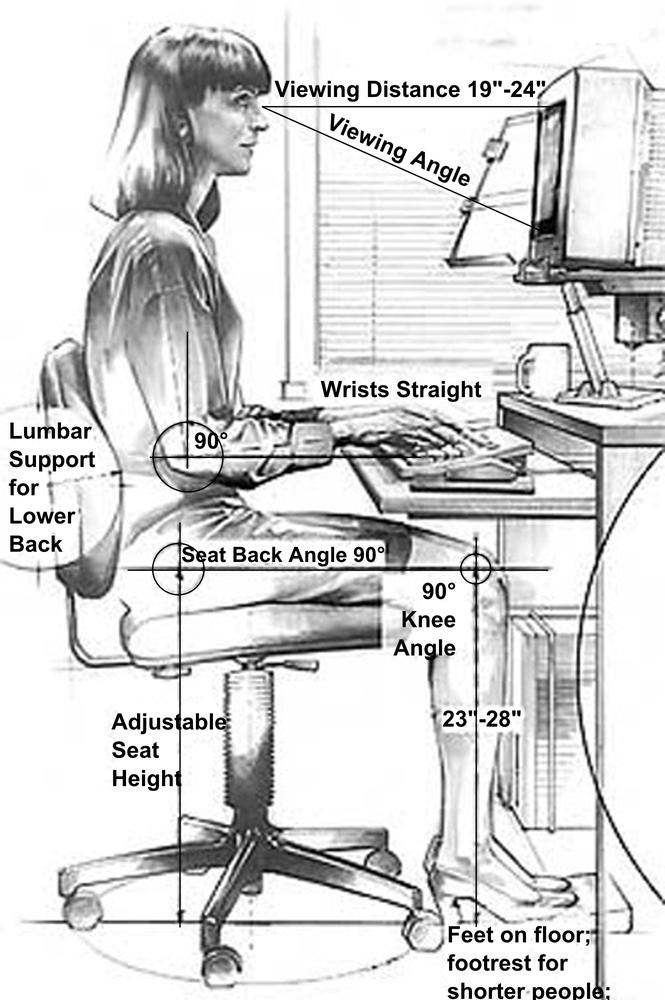
Figure 7-29. An example of anthropometric measurements (image: public domain)
Affordance
We’ve already briefly mentioned affordance and the classic example of door handles earlier. Another aspect of affordance is the use of mapping to help convey how something might be used or what it might do. An example is the buttons used to adjust the seat in certain car models. By making the button sizes and arrangement map to the parts of the car seat, users will find it easy to understand which button moves what.
In the case of connected objects, affordance is important to consider, too. The design of a motion sensor, for example, should give clues about what its field of vision is and how users should place it.
Mapping is another strategy to make a connected product or its user interface self-explanatory. An example is the Pivot Power Genius, an app-enabled power strip. An illustration of the strip inside the app maps to the design of the device. This clarifies which button controls what switch. (See Figure 7-30.)
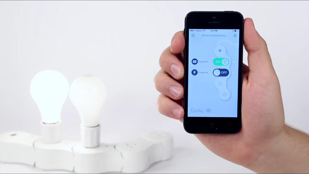
Figure 7-30. Quirky+GE Pivot Power Genius (image: Quirky)
But using a very literal mapping isn’t always advantageous and can lead to inappropriate UIs. It can be more important to follow platform conventions of a device. Chapter 9 discusses designing for consistency of UI elements and interactions across devices in more depth.
Practicalities
There are also practical considerations that shape the experience a user has with a product, but that are often overlooked. Examples are battery compartments and how to open them, and whether users will need tools like screwdrivers to set up a device.
Other examples are bulky power adapters that render neighboring plugs on multiway sockets unusable or poor accessibility of ports to wire up the product.
If your aim is a great product experience, you should make sure such practicalities aren’t de-prioritized.
Functionality and interfaces
Another big aspect of the form and function of a device is of course how it is used. What functions does it have? What buttons do what? How is it operated?
Because this is such a big area in its own right, we will cover it in Chapter 8.
Aesthetics and Appearance
Industrial design goes far beyond function. We discussed earlier that it is a discipline that is as much about looks as it is about usability and function. This is less important for technical components that are hidden or integrated. But for things that take up space in our homes or things we wear on our bodies, aesthetics are important.
An article about the design of the Fitbit points out: “For a wearable device to be successful, it needs to do much more than just work: It also has to look good on you.” The designer Gadi Amit elaborates: “These objects are the most personable, nearly sensual or intimate objects. [...] They pose so many complex questions about your personality and fit to your specific human body. It’s a very delicate balance of emotional next to rational thinking.”[101]
Let’s look at the role appearance and aesthetics play in connected products.
Consistency and cohesion: Making connections
Styling details and design language can be powerful tools to make sure a product is recognizably from a particular brand, or tie a collection of devices together conceptually.
For example, the devices from Estimote, a maker of Bluetooth beacons (see Figure 7-31) that can be attached to objects or locations, have a very distinct industrial design that uses shapes and colors also found in their app and company logo. The devices (as well as logo and app) use shapes similar to surface polygons used in 3D mesh modeling—where flat, usually triangular surfaces are used to describe a 3D model. In combination with a bold use of color, Estimote’s devices are easy to identify as being from the Estimote brand.
The aesthetic components of industrial design can also help conceptually connect multiple devices a user might have in their home. For example, the BERG Bridge, BERG’s Little Printer, and the remote control app share design details like color palette, fonts, and materials that link them together (see Figure 7-32). This makes it easier for a user to make the conceptual connection, too.
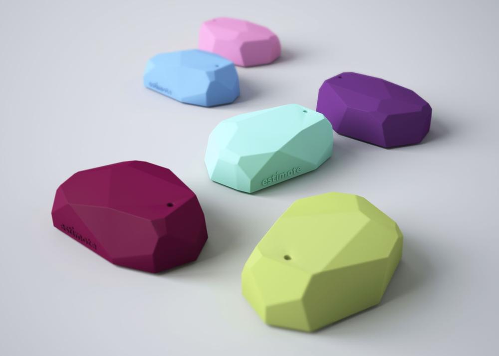
Figure 7-31. Estimote beacons (image: Estimote)
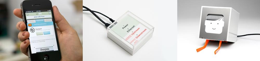
Figure 7-32. Commonalities across BERG’s Bridge, Little Printer, and app: use of color (light green and orange accent); typeface use in app and on bridge; material and finish of white plastic across bridge and the device itself (images: BERG)
In contrast, an off-the-shelf, or separately designed bridge device might not look related to the connected object it enables. This becomes more important when there are multiple bridges enabling different sets of connected devices. What relates to what?
Styling details and design language also tie a collection of things together under one brand or one value proposition. A motion sensor is a more or less generic sensor with many different applications. It can be hard for people to understand the value it offers or remember what system or service it is part of. Although currently just a concept, the BleepBleeps family of connected parenting devices (see Figure 7-33) uses appearance and styling to help with this problem. The product range (only one of which has been funded through Kickstarter so far) shares a playful industrial design where each device is presented as a different character with an individual color, name, and (arguably) a face. The link of generic devices (such as a temperature sensor or a motion sensor) to the entire service is easier to spot and the function easier to remember given the specific theme of parenting and the witty device names (such as Tony Tempa, an ear thermometer; Sammy Screamer, a motion alarm; or David Camera, a baby monitor).
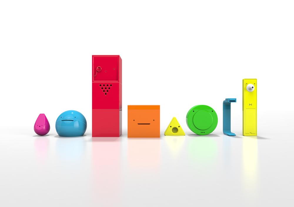
Figure 7-33. The BleepBleeps line up of concept products (image: Tom Evans—BleepBleeps)
Contrast this with the devices available for the SmartThings connected home platform (see Figure 7-34). The nondescript industrial design might help make the devices blend into their environment and be less conspicuous. However, the cues in the industrial design of each device (which help users remember and understand what each device does) are much more subtle, too.
Conveying brand image and brand promise
The aesthetics and appearance of a product is also important to convey a particular brand image or promise. Imagine three connected toothbrushes: one with a minimalist form factor, referencing details from clinical equipment and a hospital color palette; one with toy-like details and a bright and varied color palette; and one made with what feels like cheap materials and a generic form factor.
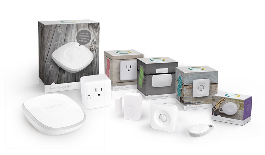
Figure 7-34. A selection of the SmartThings products range (image: SmartThings)
How does each of these affect your expectation of the kind of service they connect to? Not just in terms of quality, but also in terms of what the service experience is about. Let’s say the quality of data collection and analysis of each are the same. How much would you trust recommendations from the “cheap” toothbrush compared to the clinically sterile-looking one? What kind of an experience (say, “playful” or “serious”) would you expect from the toy-like one as opposed to the other two?
This power of styling is well illustrated in a project by designer Karin Ehrnberger. To explore gender-coded design, Ehrnberger swapped around the design languages of a power drill and a hand blender and made models (see Figure 7-35). The result is striking: the power tool seems weak and unreliable. The blender, on the other hand, seems dangerously overpowered for what it needs to do.
Personality and character
Another way to approach the styling of a connected device is to give the object character and personality attributes. This can help convey functionality and other conceptual aspects of the product and wider system. An example is the design approach of BleepBleeps, which we mentioned earlier.
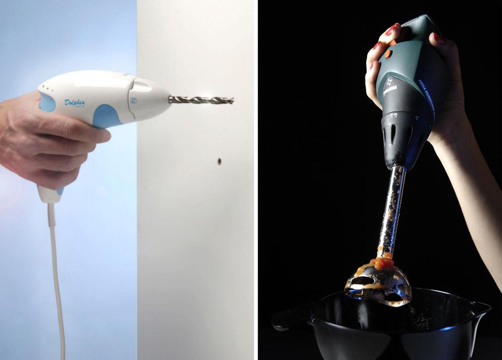
Figure 7-35. Karin Ehrnberger’s mockups of drill and blender with swapped design language (images: Karin Ehrnberger)
BleepBleeps designed each device as a character with a name and color. Names relate to the device function. Sammy Screamer is a motion alarm, Tony Tempa a digital ear thermometer (see Figure 7-36.)
Figure 7-36. BleepBleeps Tony Tempa ear thermometer (image: Tom Evans—BleepBleeps)
The industrial design makes use of a psychological phenomenon called pareidolia, where humans see faces in objects or things where there aren’t any. With only a little styling, a plastic device with a temperature sensor can become a curious-looking character using his/her/its nose to take a reading.[102]
All this makes recognizing and remembering which device does what much easier.
It can also make a product simply more enjoyable. BERG’s Little Printer wouldn’t be the same without its growing hairstyles and its happy or sad face. Besides adding enjoyable quirks, styling like this can make the interaction with a device feel less like “managing an appliance.” Take Little Printer: when it loses connection, it prints a speech bubble asking for help (see Figure 7-37).
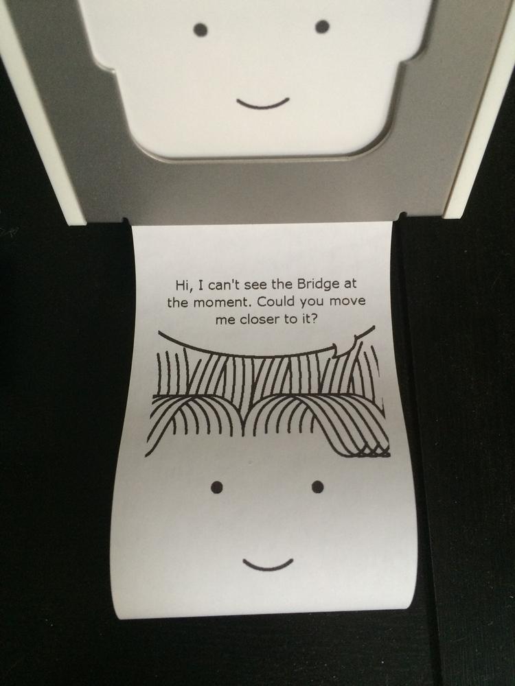
Figure 7-37. Little Printer’s way of giving an “error” message (image: Martin Charlier)
Multisensory: Weight, texture, temperature
The aesthetics and appearance of a product goes beyond visual qualities. Weight, materials, textures, and even surface temperatures play a major role in the experience of a product.
An example of this is the Beo4 TV remote control from Danish luxury electronics manufacturer Bang and Olufsen (see Figure 7-38). A typical remote, even for a high-priced television, weighs about 100g and is made of plastic. With 290g, Bang and Olufsen’s remote is almost three times that weight. It uses metal elements that provide a cold sensation when touched. This isn’t the case with plastic made to look like metal so it confirms the authenticity of the material. All this carries through the brand’s image of high quality and luxury.
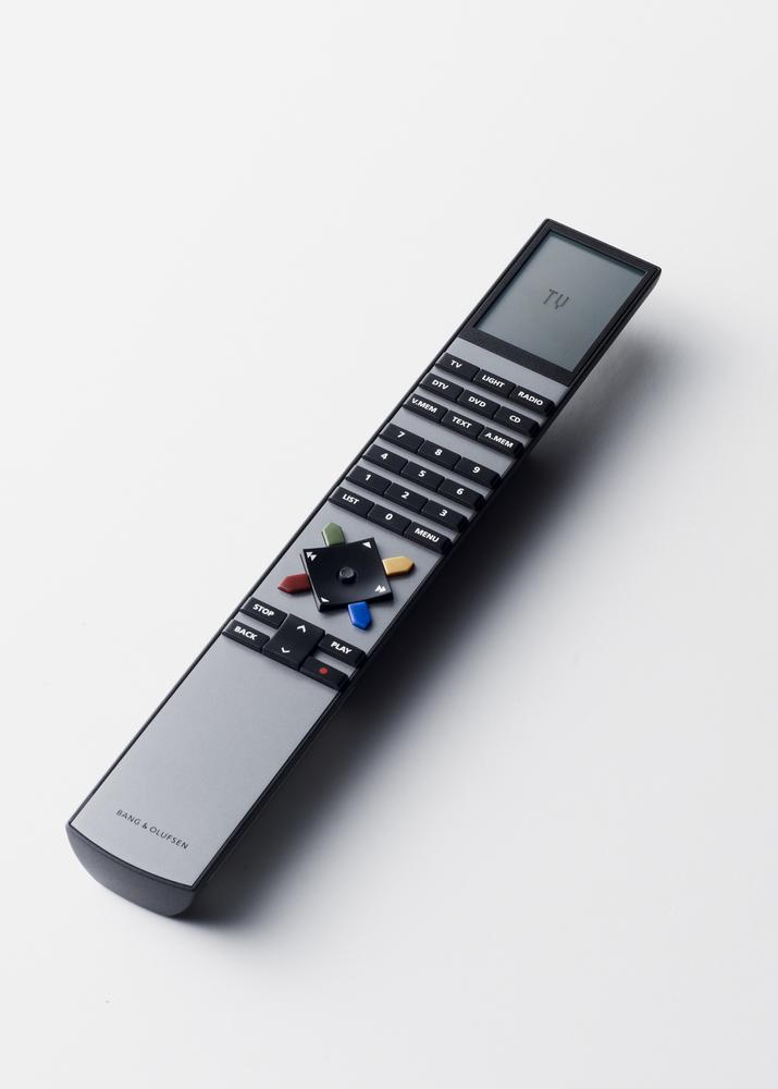
Figure 7-38. Bang and Olufsen Beo4 remote control (image: Bang and Olufsen)
Such sensual aspects of the device might need specific components. In consumer electronics, it’s not uncommon to add weights simply for this purpose. When making mockups, designers can incorporate this by adding small blocks of metal into the model. That way a user research study can be sure to include the impression the weight of a product makes on the user.
Texture and materials can also include sensual qualities beyond color. Toymail Mailmen, shown in Figure 7-39, are an example of this. They are connected voice mailboxes aimed at kids. The devices use a soft touch, almost rubber-like plastic. This provides protection, as it doesn’t easily break. But it also feels friendly and nonserious compared to a hard, high-gloss finished shell.
Figure 7-39. Snort, one of the Toymail Mailmen (image: Toymail Co.)
In Chapter 8, we touch on functional aspects that are part of the aesthetic experience of a device, including how physical controls feel and what sounds a device makes.
Materials, Manufacturing, and Maintenance
The third area of consideration when designing a product is about the materials, manufacturing processes, and ongoing maintenance. In the following section, we will discuss some of the most important things to consider.
Operating environment and maintenance
Unlike software, physical things collect dust, get touched, and are exposed to environmental conditions.
It’s obvious that if you’re designing a device that will be used underwater, it needs to be watertight. But there are less obvious environmental conditions that designers need to consider, too. For example, UV light degrades certain materials and surface treatments. We’ve all seen faded plastic on products that are a couple of years old. If a product is used outdoors, designers need to consider rain, cold, and heat. Even the mild acid coating of the human skin can alter a surface over time. These are just some examples that show how important it is to understand the operating environment of a device.
This is not just about protecting the device from its environment, but the other way around, too. If users wear a device with skin contact or come into contact with it frequently, designers need to ensure the materials or adhesives used don’t cause irritation or allergic reactions. Such allergies are not rare—for example, it is estimated that 10% to 20% of the US population is allergic to nickel, a metal found in many electronics. [103]
Cleaning a product is also an important consideration for the design. If the form has features that collect dust and are difficult to clean, it is likely to look dirty and unwelcoming after a few months in operation.
If users wear the device like an accessory or it’s a piece of clothing, it may need to be washable. For example, the Mimo wearable baby monitor (Figure 7-40), which features sensors embedded into a baby kimono, is machine washable.

Figure 7-40. Mimo wearable baby monitor kimono (image: Rest Devices, Inc.)
Manufacturing constraints
The way a product is manufactured provides a range of constraints. These include the form, color, texture, and finish of a product. Partly, this is to do with what is technically feasible, but it’s also a cost consideration. Certain designs might be possible, but much more expensive to make.
Let’s look at an example from injection molding, a process common in mass-manufactured devices. Hot liquid plastic is injected into a steel mold made of two or more parts, known as the “tool.” These molds enclose a cavity defining the shape of the desired plastic part. The plastic flows through the mold, cools down, and hardens. Then the molding machine separates the tool so that the plastic part can be removed.
Even this simple and widely used process involves many design constraints. You can observe these in plastic products around you. For example, surfaces parallel to the direction of pull can be problematic. Parts with such surfaces are difficult to remove from the mold. You might have experienced two cups that fit perfectly into each other being difficult to separate. The friction involved in separating the part from the mold also puts strain onto the part, which can damage it. To avoid this, designers work with “draft angles.” This means giving the surfaces in the direction of the pull a slight slant. See Figure 7-41.
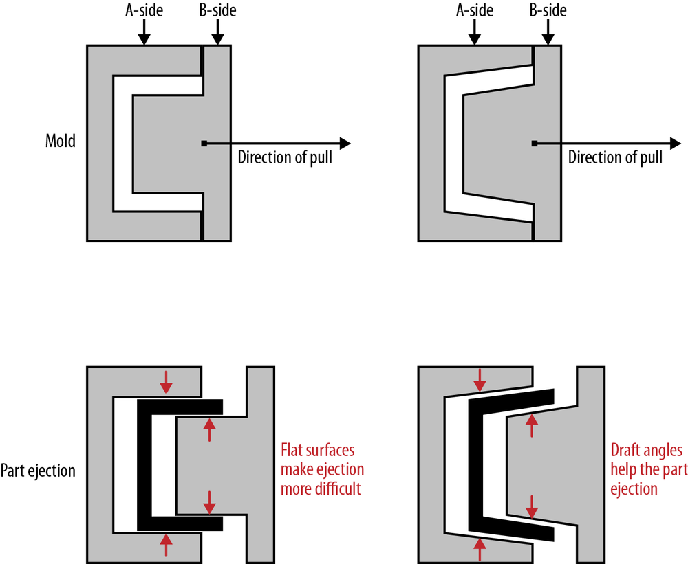
Figure 7-41. Illustration of a straight pull mold (left: no draft angles; right: surfaces with draft angles)
“Undercuts” are another example. Imagine you’d like a hole going through one side of your part. You’d need a pin-shaped feature in the mold that creates this hole during the injection process. But this feature is then in the way to remove the part from the mold. This is an example of an “undercut,” a design feature that cuts under (or goes over) the mold pull direction. Creating undercuts isn’t impossible, but it makes the mold more expensive. A side-action would be required. The mold then requires three parts: the two main sides, as well as the pin that can retract from the cavity to release the part (see illustration in Figure 7-42). Designers aim to avoid side actions. They increase the complexity of the mold design, which increases costs.[104]
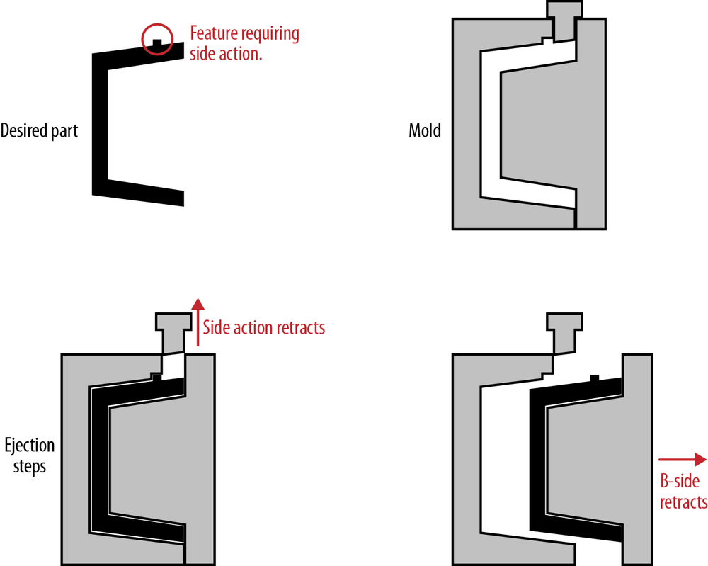
Figure 7-42. Illustration of a side-action mold
In contrast, 3D printing does not involve a mold, and so “undercuts” are not an issue. Other design constraints exist though. Depending on the 3D printing methods used, designers need to consider construction geometry or escape holes. Construction geometry is additional material that is printed around the desired part. It helps support the part until it is finished and can support itself. This excess material needs to be broken away, cleaned, or even dissolved using acid. Designers need to consider how the operators can reach the material to remove it.
Escape holes are openings in the part through which the operators can remove unused material. Some 3D printing methods work by selectively hardening areas in layers of material. This means unhardened (and reusable) material might be enclosed inside the part. Designers need to consider how this unused material can be removed.
These are just some examples of design constraints that the manufacturing process might impose on the designer. You can see how injection molding and 3D printing create entirely different kinds of design constraints.
Compared to injection molding, the constraints of 3D printing are negligible. But although it’s a great method for prototyping, it’s not currently a process for mass manufacturing. This means it can be deceptive. A design that is possible to create using 3D printing might be costly or impossible in a mass-manufacturing process. So, during the design, it is important to decide on the final method as soon as possible.
There are many different manufacturing methods, materials, and finishing processes. For designers interested in going into more depth, some useful books are:
§ Making It: Manufacturing Techniques for Product Design by Chris Lefteri (Laurence King Publishing)
§ Materials and Design by Michael Ashby (Butterworth-Heinemann)
§ Manufacturing Processes for Design Professionals by Rob Thompson (Thames & Hudson)
§ From Concept to Consumer by Phil Baker (FT Press)
Sustainability and recycling
Environmental and ethical considerations also play a role in the design of physical products. Concepts such as the “circular economy” and frameworks such as “Cradle to Cradle” advocate a sustainable and waste-free product lifecycle. As consumers become more interested in the environmental impact of products, manufacturers become more open about it, too.
The Fairphone, a smartphone released in 2013, has such considerations at its center. The device uses only materials that are “conflict free.” This means their use doesn’t fund armed forces or violent conflicts.
Material libraries such as Material Connexion offer specific services to find and identify such sustainable and ethical materials.
See Chapter 11 for more on the environmental impact of an IoT product.
BOM cost versus future-proofing
When making a product, an important document to work with throughout a project is the bill of materials (BOM). It is the list of all components of a single unit with their respective costs. Traditionally, together with development and marketing costs, this would guide the retail price. Increasingly, other business models mean that devices are sold at or even below cost.
The role of the BOM is changing from the key document defining product cost to one aspect of a cost structure. It is still an important document for designers to work with. Until now, designers and engineers often aimed to reduce BOM cost as much as possible. In the case of connected products, this isn’t necessarily good. Removing components or replacing them with alternatives to reduce costs can close the door on future functionalities. Designers need to make trade-offs between cost and longevity of a device. If your device includes components that aren’t currently used, but that might enable future functionality, the additional cost of the device might be hard to justify for consumers comparing price and functionality at the point of purchase.
Designers of connected products need to strike the right balance. And traditionalist designers and engineers accustomed to a culture of reducing BOM cost need to change their way of thinking. They need to consider the BOM in the context of a roadmap and ecosystem that means components that aren’t used right now are still important.
Summary
The Internet of Things means that hardware and software design practices blend into each other. Connected products can neither be designed solely by industrial designers, nor by digital UX designers. Designing great connected products requires deep collaboration of these disciplines. This chapter provides a step toward enabling this kind of collaboration. Both sides have a lot to learn about each other to better understand and work with each other. Both sides also have a lot to learn from each other to push their respective practices even further.
Most importantly, as consumption moves back from digital to physical, all designers involved need to act responsibly. Unlike the apps that were hip for a while, and then weren’t anymore, physical products don’t disappear easily. When they’re not in our homes anymore, chances are they end up in piles of e-waste, often in poor nations, where they are being burned and dismantled to salvage the components and metals that can still be sold. In the process, toxic materials not only contaminate the environment but also poison the workers that scrap them.
Designing connected products is a new kind of discipline that combines digital UX, industrial design, and more. The designers of this new discipline mustn’t forget the responsibility they carry toward our world’s resources. And they mustn’t forget that design is more than usability and efficiency—it is also beauty, craft, and art.
In summary, UX designers and product managers should be aware of the following characteristics of industrial design:
§ Representing function through physical form and appearance is much harder for connected objects because there are few established device archetypes or category conventions, and many functions do not manifest in a physical form.
§ In addition to functional requirements, the design of physical devices needs to consider emotional, aesthetic, and symbolic representative aspects.
§ Frequency of interaction, how conspicuous a device will be once installed, and how many of a device users will have are basic drivers for the physical design. Although there are conventions for some device types about these drivers, it can be a worthwhile exercise to explore breaking with these conventions to arrive at innovative connected products.
§ Like in software, designing devices requires a spectrum of skills rarely covered by one person or even one company. Industrial Design is a term that includes many experts from aesthetics and styling to engineering and manufacturing.
§ Industrial design has a different mindset and approach to UX. It is less task driven. It involves equal parts thinking about appearance, usability, engineering, and manufacturing.
§ Both software and industrial design involve prototyping and iteration cycles. But industrial designers go through multiple cycles rapidly before releasing a product, while software teams can release earlier and continue these cycles to improve and update the product after the release.
§ Industrial design is not bound to platforms that provide constraints and building blocks. Industrial designers use specific tools and methods of which UX designers should be aware.
§ Pen and paper are still some of the most important and most used tools in industrial design—at every stage of a project. In the same way that industrial designers need to understand different types of UX sketches and drawings, UX designers should know how to “read” the different kinds of industrial design sketches and scribbles.
§ Despite recent popularity, 3D printing is only one of many prototyping methods and is rarely used for mass manufacturing. UX designers should be aware that different manufacturing methods impose different constraints on the device design.
§ Designing and selling a physical product involves challenges unfamiliar from developing and selling software, like manufacturing constraints or device certification. Physical appearance is only the tip of the iceberg.
§ In order to build great experiences across all touchpoints, physical and digital, UX and industrial design teams need to be integrated and work jointly on an initial design vision.
§ Decisions involved in the design of a product fall into three areas that are all interrelated: the way it is used, the way it looks, and the way it is made. UX designers should have a basic understanding of the kinds of considerations in each area.
§ Aesthetics and appearance of a device play an important role in conveying brand values and in making products desirable and enjoyable. But they can also be used to improve the usability of a product.
§ Real physical concerns like exposure to environmental conditions, material degradation, and what can and can’t be manufactured all influence the design of a product.
§ Making physical products always also means making decisions on environmental, social, and ethical questions about material sources, manufacturing conditions, and the entire product lifecycle.
[93] Alice Rawsthorn, “The Demise of ‘Form Follows Function,’” The New York Times, May 30, 2009, accessed March 25, 2015, http://nyti.ms/1BuDf6K.
[94] Donald Norman, The Design of Everyday Things (New York: Basic Books, 1988), 9.
[95] Donald Norman, Emotional Design: Why We Love (or Hate) Everyday Things. New York: Basic Books, 2004, 90.
[96] Ibid., 63–98.
[97] Luke Williams, “The iPod and the Bathtub: How Products Shape Our Perceptions,” Gizmodo, September 12, 2005, accessed March 25, 2015, http://gizmodo.com/124912/frog-design-mind.
[98] Mark Wilson, “75% Of Ikea’s Catalog Is Computer Generated Imagery,” Fast Company, August 29, 2014, accessed March 25, 2015, http://bit.ly/1BuEq67.
[99] More about this in this update posting: http://kck.st/1BuEu5G.
[100] Jason Mesut discussed collaboration between UX and industrial design in a talk that is available here: http://bit.ly/1BuEz9x.
[101] Rachel Feltman, “The designer of the Fitbit says wearable devices need to be ‘nearly sensual,’” Quartz, January 20, 2014, accessed March 25, 2015, http://bit.ly/1BuEJ0y.
[102] Try for yourself here: http://www.thingswithfaces.com/.
[103] Rachel Abrams, “Nickel Allergies on Rise as Devices Meet Skin,” The New York Times, August 20, 2014, accessed March 25, 2015, http://nyti.ms/1BuET8q.
[104] See http://www.protolabs.co.uk/resources/molding-design-guidelines/ for more examples of design considerations for injection molding.