Designing Connected Products: UX for the Consumer Internet of Things (2015)
Chapter 6. Translating Research into Product Definitions
BY ELIZABETH GOODMAN
So you did some research. You have piles of observations, images, video, and notes. Now what?
Designer Bill Buxton sums up the next steps in two phrases. You need to make the right thing—that is, make something the target audience finds valuable. You also need to make the thing right—that is, make the product desirable and usable. To do both of those requires translating the raw data from your research into design action.
This chapter is intended to help you take on two challenges to making the right thing.
The pressing need for clear communication and decision making is the first challenge. As we said in Chapter 4, connected products often rely on complex webs of other products, services, and infrastructures. Mass-market consumers, in areas in which they do not have deep technical or domain knowledge, generally expect a product to come designed and engineered to fulfill a specific need. So the benefits of connected products are often hard to communicate succinctly and clearly...not just to the buyers or users of the product, but also to the people building it.
Frequent friction between business models, users’ expectations, and shared values form the second challenge. This friction can lead not only to UX problems, but also very public controversies if (and more likely when) users discover them. We believe that translating engagement with stakeholders directly into product definitions is the best way to anticipate potential mismatches, and then to either mitigate them or turn them into advantages.
This chapter introduces:
§ Product definition techniques for analyzing values and benefits (Tools for Discovering and Communicating Value); explaining what your product is (What Is Your Product?); and deciding how it works (Service Ecology Maps)
§ Common mismatches between business models, technical capacities, and user expectations (Recurring Questions for Product Strategy)
It also addresses the following issues:
§ Why you should expand your definition of “value” (Expanding the definition of “value”)
§ Why metaphors are important—and dangerous—in product definitions (What Is Your Product?)
§ How to generate and use design principles (What Does the Product Do?)
This chapter outlines important concepts and questions for translating your research into definitional statements that tap into what stakeholders care about. Along the way, we’ll also discuss how tools you may already use, such as stakeholder profiles and customer journey maps, might help you answer those questions.
In Chapter 14, we’ll discuss making the thing right.
Generating the Elevator Pitch
Our goal in this chapter is to help you put together the “elevator pitch”—a concise statement that communicates:
§ What the product is
§ What the product does
§ And why the product is important
From full-on value proposition documents to glossy renderings, there are many ways to define a product in the early stages of design. But the elevator pitch should be the starting point for all of them.
Most importantly, writing an elevator pitch forces critical thinking. If you cannot succinctly explain what your product is and how it could work, you’re probably avoiding important questions of usefulness and feasibility. Until you’ve answered those questions, you shouldn’t be spending time and money making beautiful images.
You also need a one-sentence explanation for a very pragmatic reason: that’s all the information people new to the project generally want to hear.
Let’s structure it as a fill-in-the-blank exercise:
Product name is a(n) type of object that helps category of people name of job to be done by technical means.
You can move around the elements to make a nicer sentence, of course. For example, take this statement from energy information provider Opower:
Opower combines a cloud-based platform, big data, and behavioral science to help utilities around the world reduce energy consumption and improve their relationship with their customers.
At this point, we hope you have filled in the category of people blank already—that’s where you started your research, after all. This chapter focuses the job to be done and type of object parts of a product definition. We’ll discuss the technical means component only in how it affects the job at hand. The next set of chapters will take on the technical means part in more detail.
Why Does Your Product Matter?
Chapter 4 introduced the idea that value propositions should drive UX. Actors need a clear sense of what the product might do for them and why they might want it (see Figure 4-2) despite the costs associated with buying, installing, and using it. If the value proposition doesn’t make sense to purchasers or users, no amount of well-crafted interaction or industrial design will make the product successful. A value proposition supplies the “why is this product important” part of an elevator pitch and helps fill in the job to be done blank.
There are many references you can consult to learn about value propositions in general. What we’re interested in here are the questions and opportunities that arise from new technical capacities for data collection, sharing, analytics, and automation.
Often, basic research presents us with a straightforward value proposition. What immediate problems do people face? Why aren’t their current solutions working? How could you provide something better? And often, the next steps are quite clear: you provide a product that helps people fix their problem at a price they are prepared to pay, and everyone wins.
This section will focus on harder questions of product definition. What happens when the benefits and costs envisioned by multiple product/service stakeholders conflict? As with the conflicts over needs we discussed in the previous chapter, tensions among benefits, costs, and values have high stakes and are surprisingly common. As lawyers like to say, cui bono? In other words, who benefits?
Take the Target “pregnancy coupon” controversy.[74] Target, a retailer based in the United States, assembled a dataset combining female customers’ purchases and information on customers from outside sources. Using Target baby gift registries, the company developed a predictive model of likely pregnancy based on the long-term buying patterns of women who created a registry. Then it starting sending coupons to women whom the model calculated were probably pregnant.
At that point, someone within Target realized that the coupons were, in the words of reporter Charles Duhigg, a “public-relations disaster” in the making. A pilot run showed that many customers did not react well. It’s easy to see why. Pregnant recipients could perceive the coupons as an unwanted corporate intrusion into personal matters. Recipients who were not pregnant might find the suggestion of pregnancy offensive. Or worse, the coupons might be hurtful: becoming pregnant (or not being able to become pregnant) is often an emotionally sensitive topic. As Duhigg writes,
So the question became: how could they get their advertisements into expectant mothers’ hands without making it appear they were spying on them?
What Target did was mix pregnancy-related coupons with unrelated offers. That way, the pregnancy coupons appeared to have been included by chance, making customers less likely to take offense from them.
Clever? Or creepy? Customers don’t voluntarily choose to be a part of this program: all Target shoppers are automatically included and can’t opt out. Clearly, many customers don’t want Target to investigate their reproductive status. Equally clearly, Target wants to lock in a lucrative business in diapers and baby goods before the baby arrives. Sure, the customer will save some money with the coupons. And they don’t have to do anything special to participate. But are the tangible benefits worth feeling like a giant multinational corporation is snooping into your private life? Does the situation really improve if the company conceals the predictive analytics component of the program, so customers don’t have the opportunity to object?
Over the rest of this chapter, we will map some of the complexities of defining “value” when it comes to mass-market connected products and services.
Expanding the definition of “value”
The traditional definition of “value proposition” takes “value” to mean the tangible benefit (saving money, for example) the product delivers. But that definition, while straightforward, doesn’t quite account for the controversy we just described. The coupons saved both money and time—yet many people did not see the value. In considering “value” during product definition, then, we should expand this usual definition to include intangibles such as personal aspirations and moral codes of behavior.
Aspirations and goals
What we value is what we care about. Often, we care about things we want to do, be, or have but are not likely to achieve. That’s the true value proposition behind most “affordable luxury” products and services: they allow purchasers to feel closer to their dreams. After all, most of the people who buy expensive athletic gear aren’t actually going to be climbing Mt. Everest or training for an Iron Man triathlon. If your business model involves helping people feel closer to specific dreams, it’s worth taking time to clearly articulate what those dreams are.
Moral behavior
What do stakeholders believe is the right way to act? What we believe is right affects everything we do—down to the products we buy and the services we use. You don’t need to share your users’ morality, but at the very least you need to take it into account. The pregnancy coupons bring up two questions of “right” behavior. The first is the behavior of the recipient—pregnancy (or, more specifically, the activity that leads to pregnancy) is morally loaded for many people. The second is the behavior of the coupon-issuer: What kinds of data collecting and modeling do consumers expect from a retailer?
Seemingly straightforward economic decision making often triggers these questions. The moral value of privacy—which we could define in this situation as “security from intrusion into one’s intimate affairs”—is a foundational value for Target’s core customer base in the United States. Which is why, as we discuss in Chapter 11 and Chapter 15, the right to privacy is enshrined in law not just in the United States but in many other countries. What Target did could be interpreted as an unwarranted violation of that value—that is, immoral spying. How willing are you to take actions that may violate what your users believe to be right?
Whatever you think about Target’s decision, they did one thing right: they confronted the looming conflict between what they wanted and what their customers wanted head-on. They did not pretend it did not exist, or that it would go away if they did nothing.
As the Target example showed us, wearables, medical devices, and home sensing products are only the most obviously value-laden products. Even a credit card or email address can spur debate. The more a product or service touches on conditions and behaviors that users can reasonably assume are private, the more likely you are to face questions like Target’s. At the end of this chapter, we’ll outline some of the most common concerns.
Tools for Discovering and Communicating Value
When you’re defining a product, you need to be clear about where your definitions of “value” or “benefit” come from, and to whom they apply. Research tools can help you get a handle not just on what people care about—but where their goals and your own goals might collide. Technology policy scholar Katie Shilton calls these sorts of activities and documents values levers[75]—tools for articulating what stakeholders value more explicitly, drawing out consequences, and negotiating conflicts.
Portraits
A portrait is just what it sounds like—a representation of a person, typically a category of user. Portraits make observed values and behaviors more concrete and more relatable in order to better support decision making.
The best-known type of portrait is the persona. Personas are fictional characters synthesized from recurring patterns and compelling stories found in research. So though personas are not real people, they draw upon real research data. Persona advocates praise them for making massive amounts of data relatable and usable. Contrasting personas can be used to highlight attitudinal and behavioral differences that are present, but less obvious, in the data. Detractors point out that personas are, well, not real, and that practically it’s very hard to make memorable yet realistic ones.
There’s another option, of course: if you want to bring an understanding of real people into your project, why not just use data from the real people you met? That’s what many designers do. They distill representative quotations and images from participants into brief profiles (as in Figure 6-1) that illustrate research themes.
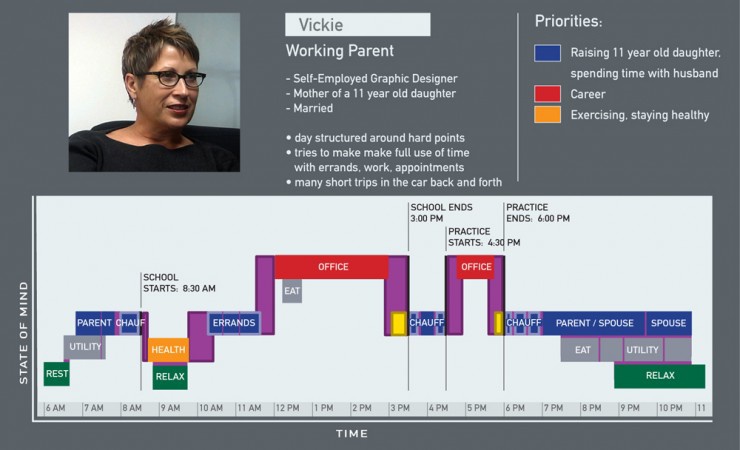
Figure 6-1. A profile of Vickie, a working parent (image: Karten Design)
Whether you use personas or profiles, portraits can identify, make visible, and then negotiate potential value and need conflicts in the course of developing a product definition:
Prioritization
No product can be all things to all people. We keep on making this point because feature bloat continues to be a problem. Using portraits to map out important dimensions of difference among people is a first step in deciding what, and whose, needs or values you will prioritize. It also helps you figure out how (or if) to compensate those you ignore. Shilton advocates naming and labeling certain moral values, such as “privacy,” “freedom,” or “justice,” to make them more available for discussion. If your project involves open source technology, for example, commitment to “openness” (being explicit about what it concretely means) should show up in your portraits. If an important group of users is committed to openness defined as “open source development,” and your business model depends on proprietary code, portraits can help teams come to grips with potential tensions.
Generalization
Highlighting similarities among different groups of people can help you form design principles (see next section) to support the widest slice of people. That is what Karten Design, a product innovation consultancy, did in studying “time empowerment” for Johnson Controls: it found that different types of people used time in the car for relaxation. The firm was then able to conceptually recast that time in the car as a valuable “oasis” of rest amidst a flurry of activity (Figure 6-2).
Inspiration
The inspiration for great products doesn’t always come from happy stories about middle-of-the-road users with easily met needs and conventional values. What about people at the extremes, like early adopters, intense enthusiasts, and skeptics? Early adopters are probably unlike latecomers in important ways. But enthusiastic early adopters can tell you something about what it’s like to live with a new type of product everyday. Skeptics are also useful—they can make you consider how your ideas might violate certain values and expectations.
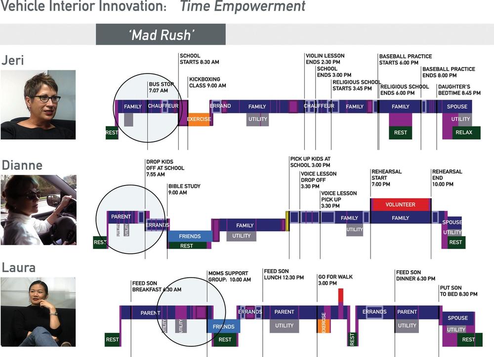
Figure 6-2. Comparisons of the activities and emotions experienced by parents with different relationships to time management (image: Karten Design)
Aspiration
Portraits are usually realistic representations of what groups of people are actually like. But they can also represent dreams and fears—which are hard to see in videos but which loom large in our lives. Portraits can illustrate what users want to be. Or what they fear becoming. Extreme portraits can help define aspirations even if the probable user is more middle of the road.
Immersion tools
Decades of cognitive science have shown that we learn differently when we do an activity from when we watch it being done. Through semi-structured activities—having people try unfamiliar tasks, play games, or wear costumes, we make diagrams and other static models both immediately meaningful and memorable in the long term. Design researcher John Payne calls such planned active engagement “immersion tools.”[76]
Often, teams use simulation exercises to evoke the experience of a target audience. Games with clear rules are a way to convey the logic at play decision points and trade-offs (Figure 6-3). Costumes or props, such as the Empathy Belly used by Ford (Figure 6-4), can induce physical or cognitive states radically different from those of the design team.
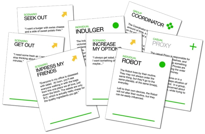
Figure 6-3. Playing a “card game” helped ground product brainstorming in the research (image: John Payne and Alexa Curtis)
Many people describe this immersive understanding as “empathy.” But “empathy,” we think, is better understood as an ideal rather than a predictable outcome. To empathize is to feel just what someone else feels. Can you really feel what it’s like to live as a paraplegic for the rest of your life by using a wheelchair for an hour? No. Will playing a card game about border crossings really submerge you in the worldview of a migrant worker? No. However, immersion tools can help you gain a less abstract, more concrete sense of the decisions and sensations of everyday life. And that will give you a leg up in crafting value propositions that take into account intangibles such as morals, aspirations, and fears.

Figure 6-4. A Ford engineer demonstrates the use of an Empathy Belly to simulate the sensations of driving while pregnant (image: Ford)
Customer journey maps
A customer journey map (sometimes called an experience map or experience flow) represents how an actor interacts with a product or service over time. A journey map includes places, events or time periods, touchpoints, and interactions. Karten’s profile of Vickie (Figure 6-1) contains a diagram that looks like a customer journey map—in this case, the “journey” is a typical day. Customer journey maps, however, more typically center on coherent activities such as a museum visit (Figure 6-5). They are key tools for identifying what jobs customers might need done at specific points in time—and why those jobs matter.
What could a customer journey map include?
§ Important people and organizations (from the perspective of the customer/user)
§ Key locations (i.e., “the car” or “the hospital”)
§ Tools and technologies in use (paper counts!)
§ Activities, processes, and interactions over time
§ Touchpoints where the user encounters the service
§ Pain points and highlights (from the perspective of the customer/user)
§ Opportunities for design-led changes (often identical to pain points)
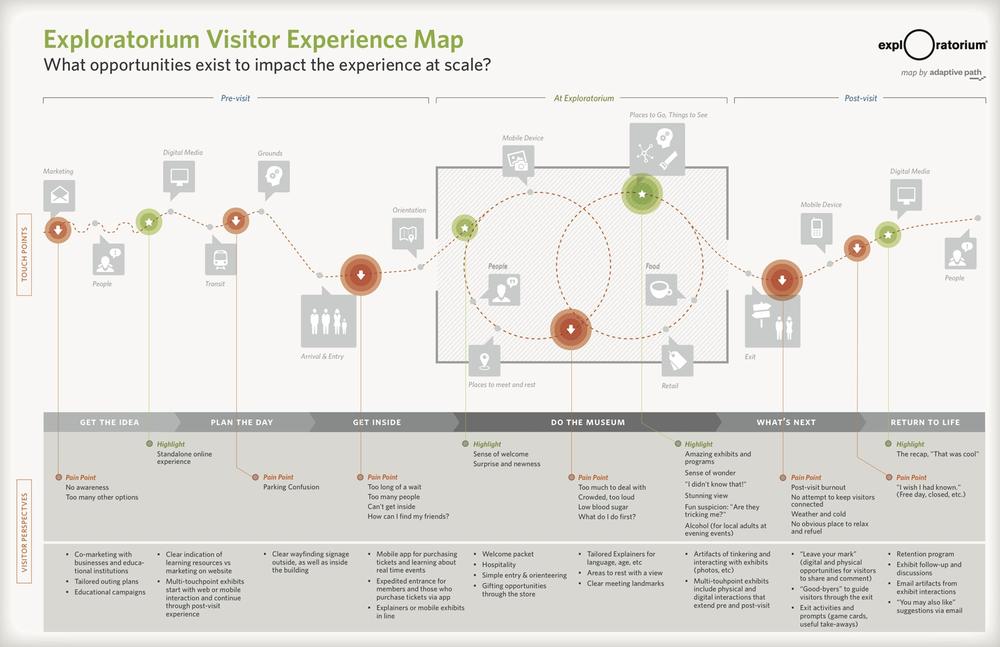
Figure 6-5. Map of museum visitor journey by design consultancy Adaptive Path for the San Francisco Exploratorium; orange circles mark pain points, green circles mark highlights (image: Adaptive Path)
Journey maps are particularly useful for designing connected products and services because they put the experience, not a technology or task, front and center. In the previous chapter, we defined context as all the factors outside the product that become relevant as people engage with it. In showing activities over time, the journey map can explain where and how contextual factors become relevant (or irrelevant). They help teams see experience as evolving, rather than static.
What Is Your Product?
Knowing what people value, how do you decide what type of object you’re designing?
Let’s return to our original fill-in-the-blank product definition:
Product name is a(n) type of object that helps category of people name of job to be done by technical means.
Making conceptual models is the next step in filling in the type of object blank.
Conceptual Models and Domain Metaphors
In the words of Don Norman, a conceptual model is “a story that puts the operation of the system into context: it weaves together all of the essential components, providing a framework, a context, and reasons for understanding.”[77]The first two words are the most important part of this definition: a conceptual model is a story. And metaphors are one of the best ways to tell a story.
Metaphors work by linking two unrelated concepts together, like “watch” and “coach.” The classic example of a conceptual model as metaphor is “the desktop.” For the past 40 years, the components and organizational logic of a 1960s-style office desk have supplied the underlying metaphor for interfaces to computer operating systems...long after the 1960s-style office itself disappeared. Some more recent examples:
§ The Nike Sportswatch: a “personal running coach”
§ The Nest: a “Learning Thermostat” (with “nest” itself a common metaphor for a home)
Sometimes metaphors are direct: the watch is a running coach. Sometimes the metaphors are implied: the Nest is a student who is “learning.” Such metaphors help make the unfamiliar, such as a watch that tracks your movements, seem more comfortably familiar.
Before deciding what type of object you’re making, consider how conceptual metaphors might be shaping your thinking. Scholars of metaphor and language argue that we don’t just speak in metaphors, we “live by” them. Metaphorical comparisons shape thought and action.[78] For example, the metaphor “Argument is war” produces statements like: “Your claims are indefensible” or “He attacked every weak point in my argument.” As scientists George Lakoff and Mark Johnson point out:
The metaphors not merely in the words we use—it is in our very concept of an argument. The language of argument is not poetic, fanciful, or rhetorical; it is literal. We talk about arguments that way because we conceive of them that way—and we act according to the way we conceive of things.
One common recommendation is to match the product’s conceptual model as implemented by designers to its users’ mental model. Mental models are expectations about what the product is and how it works. They are acquired over time, through use and education. If the product’s conceptual model doesn’t match up with users’ mental models, the product will at best be difficult to use. The 1960s office, for example, may now be an actively confusing conceptual model. Its follow-on interaction models (see Figure 4-2) of static hierarchical folders and the trash can notoriously mislead inexpert users about the functions of aliases, dynamic folders, nonpermanent deletion, and other important tools for digital information organization.[79] (Conceptual models in the context of IoT systems are discussed in Chapter 9.)
But there’s a necessary step before modeling the product that is often forgotten: modeling the domain. The stories we tell about products necessarily descend from the metaphors we use to explain situations. So reuse of domain metaphors is dangerous when it leads you to transplant (see, another metaphor!) your own values and aspirations to inhospitable climates. If your domain metaphor conflicts with users’, the product conceptual model and interaction models likely will conflict as well.
Take the long history of “home automation” products. The conceptual model is that of programming. The follow-on interaction model implies connecting inputs to outputs as if wiring up a machine. Both models, as designer Mike Kuniavsky points out,[80] draw on an underlying domain metaphor: your home is a factory automated by robots.
The problem, to revisit our discussion in Chapter 4, is that the available evidence indicates that treating homes like factories leads to frustration for product makers and users alike. Lots of people don’t want a home life with qualities associated with factories, such as rigid routines, constant labor, and boredom. It doesn’t matter if factories don’t actually have these problems—what matters is the conflict between what customers value about homes and what they imagine factories to be like.
Moreover, mental models based on imagined factories can mislead inexpert users about what the systems will really do on their behalf. Take the traditional “automated” sprinkler system. Is it really automatic? Yes and no. Rain or shine, the program follows the same schedule, potentially drowning already rain-soaked plants or letting parched plants wither. Connecting the system to sensors and weather reports can make the schedule more sensitive to environmental conditions. However, different plants have different watering needs. You cannot place a rose and a cactus on the same irrigation “assembly line” and expect them both to thrive.
Like a real factory, “automated” watering systems require lots of tinkering and monitoring to cope with unexpected events and variable materials. They require some knowledge of plants’ needs, and the skill to diagnose plants’ problems. Poor results (and hence difficulty in acquiring and keeping customers) can come from the implicit “set it and forget it” promise of the “automation” metaphor.
And, most importantly, it’s by now very clear that the follow-on interaction model of “programming” only appeals to a small subset of the market.
So as you’re filling in the type of object blank, ask yourself: what kind of domain metaphors might be influencing your conceptual model? What other metaphors might be closer to how your audience sees the world? What other metaphors might be more creatively fruitful?
Grounded Innovation
We aim for grounded innovation[81]—product definitions that explore new territory while staying firmly rooted in existing activities and values. Ideally, we get to start with values (both tangible and intangible) and brainstorm ways to further them. Your target users aspire to playfulness and creativity: A home is an orchestra, and your product is the conductor’s baton for an ensemble of devices. They want to feel like their house is alive: A home is a garden, and your product, like the Roomba, is an insect that might not be as smart as a human but helps the garden thrive.
However, much of the time designers start with the basic definition already established. If you work for an automobile company, don’t try asking to design a bicycle helmet. In a technology-driven project, a grounded innovation approach might start with what a platform can do and work backward. Home automation products are still un-nuanced and un-adaptive compared to humans. But that doesn’t mean owners can’t enjoy having them around.
Consider the Roomba. Many Roomba owners regard their little robots fondly, like members of the household. Roomba owners probably aren’t your target audience. However, their pet-like or familial relationships with their Roombas can serve as a useful analogy. What happens if you view a home automation system as a pet? A home automation product probably won’t even seem as intelligent as a puppy. But could the attachment of owners to less intelligent pets, such as spiders or snakes, inspire home automation design?[82] Metaphors don’t always have to derive from your immediate target audience—you can draw them out from analogous populations and situations as well.
What Does the Product Do?
Finally, we consider technical means. “Means” here includes:
§ Abstracted imperatives, or design principles, that prescribe how the product should work
§ Specific proposals for the concrete service elements and that will implement those abstracted principles, often generated by service ecology maps
One way of looking at functionality doesn’t necessarily have to come before the other. Design principles can guide how teams use service ecology maps; mapping activities can motivate design principles. What’s important is using these and other techniques, such as journey mapping, to ground technical decisions in the foundational values and metaphors you derived from encounters with users and other product stakeholders.
Design Principles
Design principles are concise imperative statements. They translate values and metaphors into action by helping teams generate and evaluate design ideas.[83] If conceptual models provide high-level inspiration, design principles guide action.
Here’s one from Opower (all of the Opower design principles are available at http://opower.com/designprinciples):
Always lead to action.
Or another, for a British home security maker:
Be calm. Don’t bug me.
Design principles help translate research themes into action because they are loosely prescriptive. They are loose, in that they can apply to multiple interfaces and media (see Figure 6-6 and Figure 6-7). They are prescriptive, in that they require—or discourage—specific results or methods.
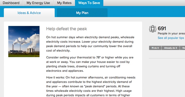
Figure 6-6. Example of solution generated from “Always lead to action” Opower design principle: a web page with steps to save energy at peak use times (image: Opower)
Good design principles help you design better connected products and services when they:
...are clear
Deciding upon design principles should be a collaborative exercise in clarifying your assumptions and the evidence for them, then agreeing on how to respond when interests collide.
...are open
Useful principles leave the specific form of the solution to the designer. “Always lead to action” can motivate both website content strategy (Figure 6-6) and the creation of a simple paper doortag (Figure 6-7).
....are agreed upon
Making design principles can help groups of people come to agreement about what is important to them, and why. But principles that aren’t honored across an entire organization are sources of conflict, not of consensus.
...are authoritative
Taken seriously, design principles can rally a team to support hard decisions. They can help maintain consistent tone and interaction mechanisms across disparate interfaces. They can help you decide which devices should enable which activities (see Chapter 9 for more). Most importantly, they can help groups say “no” and mean it to features and attributes that aren’t necessary.
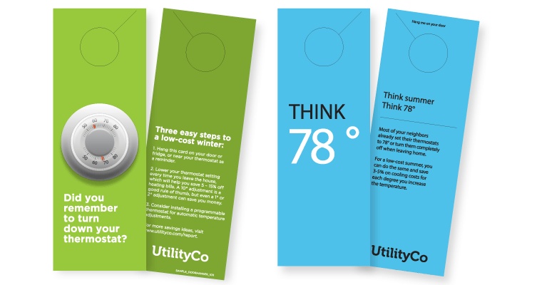
Figure 6-7. Example of solution generated from “Always lead to action” Opower design principle: a paper door tag to help people remember to actively manage thermostat settings (image: Opower)
Opower is just one successful company that uses design principles to both generate service ideas and evaluate them. According to Opower’s Deena Rosen, Suelyn Yu, and Ryan Devenish:
The principles help us generate ideas by framing brainstorms around selected principles in the exploration phase. Later in the process, once concepts are further developed, we check them against each principle. They provide a common framework for anyone to evaluate ideas across the product team. For example, during a design critique you might hear:
“Using principle number two assume people don’t care, I prefer concept A over concept B because it creates a stronger emotional response that can grab the user’s attention.”
There’s no single method to generate design principles. Opower, for example, derives its design principles from behavioral science. The company believes that rigorously tested findings are more likely to remain valid across projects and populations. On the other hand, the design firm IDEO drew “poetic” design principles like “1+1=3”—or “build something new out of two things that don’t usually belong together”—for the Brazilian accessory maker Havaianas from casual observations of Brazilians’ improvisational tinkering.[84]
To test the quality of a principle, ask:[85]
§ Does it help you say “no” more often than “yes”? Design principles should help you cut down your options, not increase them.
§ Does it help distinguish your product from the competition? If not, then it’s probably not important enough to turn into a general principle.
§ Would you ever aim for the opposite? “Be usable” seems like a good principle—but nobody ever aims to make an unusable product. Design principles should be specific to your project, not universal truisms.
§ Is it specific to the product or company? Opower derives its imperatives from the psychology of energy use. The IDEO team visited the Brazilian base of its client to inspire accessories for a global market. Both strategies generate useful principles by grounding abstract imperatives in the immediate, concrete context of design and use. If an otherwise sound-seeming principle isn’t tightly linked to the business or product, perhaps it’s more of a general recommendation.
Design principles aren’t written in stone. You should keep testing them as you go, revising with new research findings and new product goals. We give one simple template for generating design principles in Table 6-1.
Table 6-1. Using design principles to generate and evaluate service design propositions (framework adapted from a template by Traci Thomas)[a]
|
Analysis |
Design |
||||
|
THEMES |
FRAMEWORKS |
PRINCIPLES |
CONCEPTS |
TESTS |
|
|
Intentions |
Descriptive |
Descriptive |
Prescriptive |
Generative |
Evaluative |
|
Questions to ask |
What are the patterns or key themes in the data? |
Why is this pattern important? Why is it occurring? What are some usual consequences? |
What should the product do in response? |
How might we...? |
Should we do this? |
|
Examples |
People often forget even simple ways to save energy |
To save energy, utility customers must change their behavior. Users should always get a clear way to do that. |
Always lead to action |
Door tag for in-situ remindersWebsite highlights concrete tips and advice |
Does Concept A lead to action? No? Then we won’t implement it. |
|
[a] T. Thomas, “A Simple Framework for Generating Insights,” http://bit.ly/1bDdFXO. |
|||||
Service Ecology Maps
Underlying the UX is a core question: what are the basic elements of the whole system and how do they fit together? Most technical decisions will be made in iterative phases of design, development, and evaluation (see Chapter 14 for more). For the purposes of initial product definition, however, you need some reasonable guesses at the sorts of technologies involved.
For example: Does your product use reprogrammable, sticky sensors to monitor domestic activities and conditions? That would be the Mother smart sensor system. Does it use body-worn sensors and a smartphone app to help you improve your physical performance? That would be the Nike Fuelband.
A simple-seeming device is often just the most visible part of a complex service-product system. The GlowCap, for example, is a service that reminds users to take medication on schedule and tracks compliance. First, the pill bottle top senses when it is being opened. If the user doesn’t open the bottle on time, it glows and makes noise. If the audiovisual reminders don’t work, the patient receives a call or text. The service can notify a caregiver automatically, order refills, and send a weekly report to a clinician or caregiver. The value proposition is admirably clear: just-in-time reminders and automated reporting improve medication compliance and hence health outcomes for anyone who takes medically necessary pills.
Implementing that simple idea is complicated. Just refilling a prescription through the GlowCap requires handoffs between five different telecommunications systems. The bottle cap (battery powered) has only enough power to connect (1) to a mains-powered base station, which in turn sends data to the servers via the subscriber’s cellular network (2). The Vitality server requests an automated phone call (provided by a third-party company) to confirm the refill with the user (3). Once confirmed, the Vitality server sends a refill request message to the user’s pharmacy (4). Once the refill is ready, the pharmacy contacts the user (5).
Clients for that medication compliance data include pharmaceutical companies, retail pharmacies, and health care providers. All that health data storage and transmission must follow national and state privacy laws. Moreover, each client has a different interest in the data, and wants a different view of it. The healthcare providers get printed monthly updates on patients, and potentially integration with electronic health records. The GlowCap is much more expensive than a nonnetworked bottle cap—who pays for the difference? And how might pill-takers acquire a GlowCap? Directly from the pharmacist? From a prescribing doctor? On their own? What happens when the patient no longer needs the GlowCap? Is it recyclable?
A service ecology (or ecosystem) map (Figure 6-8) helps answer questions like these. It translates research into a legible diagram that represents the most important elements and how they are connected.
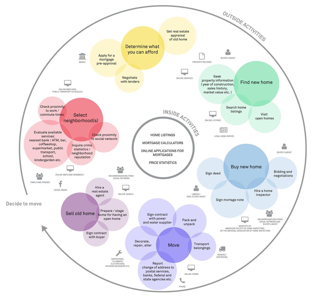
Figure 6-8. An ecosystem map for a fictional online home-listings company. It labels the company’s functions and services as “inside activities” and the activities that users handle themselves as “outside activities” (image: Sofia Hussain)
Service ecology maps:[86]
§ Give you a way to keep track of relevant actors and stakeholders
§ Surface relationships among those actors and stakeholders
§ Help you reimagine how those actors and stakeholders might relate to each other
Importantly, service ecology maps can visualize people, organizations, and even places that are affected by use but are not users. This is particularly useful for complex domains such as health, finance, or transportation, where there might be regulatory agencies, municipal or national laws, and unions involved. But it can also help you grasp even the ordinary complications of running a household, as in Figure 6-9.
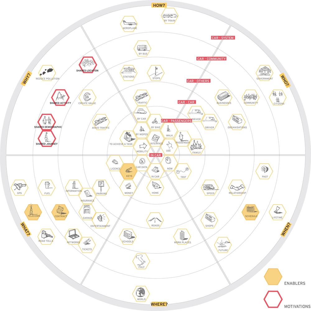
Figure 6-9. An ecosystem map for a car-sharing service (image: Rosenfeld Media)
Ecology maps are particularly useful for designing connected products because they show relationships among different categories of elements: people, regulations, infrastructures, applications, and so on. Those relationships could include: enrollment, family bonds, payment, legal liability, corporate governance... anything at all that could connect entities together. They represent business models along with technical requirements. Figure 6-9 shows a service ecology map that includes, among other things, “citizens,” “traffic,” “keys,” and “contract.” In theory, there’s no end to the details. At this point in product definition, however, the best ecosystem maps are those that help you work out how design principles might play out in practice. A Business Origami workshop (described in Chapter 14) is a good way to start.[87]
Building a service ecology map can itself generate new ideas. Listing the actors and visualizing the relationships among them will probably trigger some brainstorming about how things could be better, and how to bring those changes about. With the important elements made visible, you can start hypothesizing about what would happen if you removed certain actors, swapped in new ones, or changed the relationships among existing ones.
Think about automation, often seen as the obvious next step for many tasks. Certainly, you can install an automated watering system to keep your plants from dying. Or you can use a wireless moisture sensor such as Botanicalls (www.botanicalls.com) that telephones or tweets when the plant needs more water. Both options will help plants survive. However, the first option means paying less attention to your plants and their environment. The second means spending more time on gardening. For the many people who find gardening relaxing and healthy, there’s no question that the second option is preferable. Working with ecology maps can help us see past the obvious choices to potentially more interesting solutions.
Because service ecology maps often get very complex, it is helpful to use visual cues to focus attention on a few key relationships. Figure 6-9 uses color to highlight two types of elements: motivations for participation and enablers of use. Figure 6-8 foregrounds the activities of moving house, making the tools, actors, and stakeholders less prominent.
Recurring Questions for Product Strategy
Over the years, we have noticed that certain business strategies, implemented with the best of intentions, can spur public disputes when user experience radically violates user expectations.
Expectations, of course, change. They are neither universal nor eternal. However, consumer product design deals not with the far future but with the situation right now.
We can sum up many of the potential issues as imbalances in effort and reward. That is: Who (or what) does the work necessary for the product or service to function? Who (or what) reaps the rewards? Are those rewards meaningful in light of the effort, or cost, of providing or using a service?
In the previous chapter, we pointed out that a home security system might have to accommodate parents, small children, teenagers, pets, delivery people, and so on. If your home security product requires labor from people who don’t find it inherently rewarding, don’t feel like their effort will be compensated appropriately, and don’t care about poor outcomes (e.g., teenagers), it is likely to fail. The time to start dealing with those imbalances is during product definition, because they have consequences for business models, user experience, and technical implementation.
Throughout this chapter, we’ve referenced three common sources of friction:
§ Persuasion and behavior change
§ Data ownership and data sharing
§ Machine automation and human action
You may not need to consider every one of these as you define a new product, but it’s worth keeping them in mind as questions for debate rather than taking their relevance, or irrelevance, for granted.
Persuasion and Behavior Change
Connected device makers are often in the business of behavior change. Activity trackers like the Fitbit aim to help people exercise more, Opower’s data-driven reminders aim to reduce energy or gas consumption, and Target’s “pregnancy coupons” aim to induce more spending. Networked pill bottles like the GlowCap promote medication compliance, and networked scales like those from Withings make weight management more collaborative. These business models depend on the collection of data about human behavior, in real time, and the predictive analytics to make inferences from them.
Changing habits takes a lot of work. The difficulty, as we discuss in Chapter 11, is that users must commit to using the product before they see results. If you’re designing a product intended for behavior change, then any calculation of effort and reward needs to factor in not just the work of changing one’s habits, but also the work of using and maintaining the product intended to foster that change. So who or what benefits from all that work?
If you buy an activity tracker or other self-monitoring service, then you are doing all this work for yourself. The actor doing the hard work—that’s you—reaps the rewards...if it works. Designers can move past the initial value questions to designing the thing right, so that buyers keep on using the product past the initial flush of enthusiasm.
Different questions arise when the people doing the hard work of behavior change may not reap all or even most of the rewards. Users may not want to change their habits to suit buyers or product managers. How might you help negotiate that tension?
In some cases, tension among different stakeholders opens opportunities for product and service design. Remember, Opower lists one of their missions as improving the relationship of utilities and their customers. The company acknowledges upfront that the relationship could be improved. That’s why we emphasize modeling the perspectives of multiple stakeholders, not only users. Value tensions or conflicts can productively motivate persuasive product design, but only if you first identify and acknowledge them. We talk more about identifying conflicts among needs and roles in Chapter 5.
Data Ownership
Designing for connected products is, in the words of Chapter 13. By “data ownership,” we mean roughly, (1) what kind of information about users does your product collect and (2) who can access it? If you think that sensing or modeling human behavior is part of how your product works, then the product definition stage is a good time to start mapping out a potential range of reactions to it.
Take the Pay As You Drive program from Progressive, an insurance company. A custom device plugged into a car’s onboard diagnostics port tracks driving habits for six months, after which the driver’s insurance may be discounted to reflect what Progressive considers “good driving.” The device does not track or report location, and the data is only released in case of accident. Some observers saw it as a useful way to pay less money for coverage. Others saw it as invasive surveillance.[88] As one industry observer wrote:
Are you on the side of giving up some anonymity in order to save, or would you like to keep government and large companies out of your personal behavior?[89]
The proliferating legal and governmental debates over corporate tracking of online behavior, “the right to be forgotten,”[90] the repeated uproar over various data storage services not being as secure as promised—all of those speak to a pervasive anxiety about what strangers know about our “personal behavior.” These anxieties are not so much about the letter of the law—everyone agrees, for example, that Pay As You Drive is entirely legal—but whether corporations ought to collect it.
And as with the Pay As You Drive program, questions about data use are often summed up as questions about privacy—that is, what other entities should be able to learn about individuals. However, definitions of “privacy” are highly variable. Different cultural groups may have very different expectations for what sort of information is sensitive, who has the right to access it, and under what circumstances it can be shared. Moreover, expectations can change over time as people become habituated to new types of services. Before Facebook, who ever expected to have our morning news include selfies of casual acquaintances violating state and national laws? Not us, that’s for sure.
Here are some questions to ask yourself as you start thinking about how to fund your project:
§ Are any of your users likely to call the information you’re collecting (or the inferences you draw from it) “personal” or “sensitive”? What about the legal systems that govern conduct—whether your conduct or your users’?
§ With whom are you planning to share that information, or those inferences?
§ Are any of your users likely to object to sharing that information or making those inferences available to others? What about the relevant legal authorities?
If the answer to any of those questions is “yes,” arguing that your service falls within the letter of the law will probably not pacify opponents. If the answer to any of those questions is “I don’t know,” you should probably do some research. If you’re in an organization committed to treating data from users in ways that would upset them, you should at least plan how you’ll respond when what you’ve been doing becomes public.
For us, the first commandment of good design is Do your best not to violate your users’ values. New products and services may well cross the line for some people, as with the automotive journalist we just quoted. The wise company, like Progressive, will anticipate those objections and develop strategies for mitigating them. For example, Progressive doesn’t track location and removes the devices after the trial is over. Progressive even calls the device the “Snapshot” to communicate that it is more like an informal photo (there’s another metaphor!), not a continuing data stream. But in order to take effective steps, you need to stay sensitive to those potential objections.
We’ll discuss the ethical questions of connected products further in Chapter 11, alongside the technical implications for security, privacy, transparency, and the right to control one’s data.
Automation
There’s a tendency in connected products and services design to assume that having machines take over human work is a good in itself. Who doesn’t want to offload work—whether mental or physical—onto a machine? However, there are good reasons to treat automation as a choice, not a default. Instead of talking about automation, philosophers of technology often talk about “delegation”—that is, the distribution of responsibility and effort among different kinds of humans and machines.[91]
Consider a home security service that helps neighbors look out for each other instead of delegating the responsibility to security cameras and remotely operated locks. In that example, having either a human or a camera keep a watch on the front door produces very different services, very different value propositions, and very different models for what the system is and how it works. And it’s not clear that one is necessarily better than the other. Many resource-sharing services (e.g., Lyft, Airbnb, etc.) are popular precisely because they automate one part of the service while creating more work for humans elsewhere. Or consider our gardening example—pruning one’s roses might be labor intensive, but it is also part of what makes gardening worthwhile.
Summary
Are you making the right thing?
Our goal is to use our understanding of users and other stakeholders to define products that people are more likely to use and like using. But it’s a complex process. Users and other nonexpert stakeholders’ worldviews and values often conflict with those instantiated in typical technologies and business models. And often, they don’t have the technical expertise to predict long-term consequences of use.
If users don’t immediately feel a benefit in proportion to the costs of using the product, no amount of interface wizardry will solve the problem. Moreover, discovering the long-term costs of common business models can anger previously unaware users. We touched on persuasion, data control, and automation as frequent sources of tension between business models and user expectations. We’ve also introduced some tools for identifying and anticipating those tensions.
We strongly recommend negotiating, not ignoring, these conflicts. We’re not demanding that you resolve every tension immediately. Nor are we telling you to never ever surprise your users or do something they might not like. What we are saying is that product definition is the time to begin identifying and confronting potential mismatches in benefits and costs across stakeholders.
Before making glossy renderings or detailed product plans, make a succinct “elevator pitch” product definition in the form of:
Product name is a(n) type of object that helps category of people name of job to be done by technical means.
The elevator pitch sums up what the product is, what it does, and why it’s important.
To identify the job to be done, you ask what actors and stakeholders value—and how a product could help them keep it or gain it. “Value” doesn’t just mean tangible benefits (like saving time or money). It also includes personal aspirations and definitions of moral behavior. Portraits, immersion tools, and journey maps are three techniques for drawing out values from research data and communicating them.
What type of object are you making? Using a metaphor for the product’s conceptual model can help people relate new and unfamiliar technologies to what they already know. However, careless metaphors cause trouble when they assume knowledge the audience doesn’t possess, or don’t resonate with an audience’s existing worldview. The product name, such as “Snapshot,” “FuelBand,” or “Mother,” is also a way to bring a metaphor into the elevator pitch.
Through what technical means does the product work? Design principles are concise, product-specific imperatives. By guiding concept generation and evaluation, they translate values and metaphors into decision making. A service ecology (or ecosystem) map helps decide where and how to apply those principles. It combines stakeholders, their attributes, and contextual factors into a simplified diagram showing connections among the most important elements.
The examples in this chapter illustrate three sites of frequent imbalances in the benefits and costs perceived by various actors and stakeholders: persuasion and behavior change; data ownership and sharing; and machine automation and human action. Translating engagement and research directly into product definitions is the best way we know to anticipate potential imbalances, and then to either mitigate tensions or turn them into advantages.
The next chapters will start to address Buxton’s second challenge: how to make the thing right.
Case Study 2: Little Kelham: Connected Home
BY MATT EDGAR
Little Kelham in Sheffield, Northern England, is a development of 150 houses by sustainable property developer Citu. Each home is insulated and ventilated to a “passive house” standard that needs far less energy than a conventional home to stay comfortably warm all year round. To complement this low carbon living proposition, Citu wanted a digital service for homeowners to monitor and control their energy and water use.
The development has a strong community dimension, too. Instead of separate solar power from the roof of each house, residents will share the benefits of electricity generated right across the site. When they do use energy from the grid, they’ll buy in bulk as a community. So the digital service we designed for Little Kelham had to be true to this vision—not just something for individual homeowners, but a service that would help the community as a whole collaborate to make the most of their resources.
To make it happen, we had to first get to know a full stack of IoT technology, working across the site as a whole, and be sure all the parts would play nicely together to deliver a good experience to every user (see Figure 6-10):
§ Each house contains “edge devices”—the sensors, actuators, and meters
§ There’s a “gateway device” in the form of a building management system (BMS) for the whole site
§ Data is stored and the BMS controlled by the digital service through an Internet API (application programming interface)
§ The digital service has a responsive web user interface (UI) for homeowners to access at home and remotely
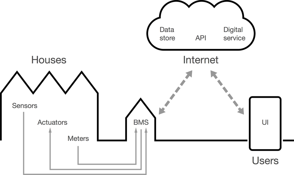
Figure 6-10. The energy system at Little Kelham
The full user experience runs over the Internet, but the BMS and in-home hardware can still operate and back up data locally if they ever lose their connection.
Little Kelham’s distinctive proposition and context drove hardware choices from the start. The UK government’s smart meter standard prescribes readings every 30 minutes. This would risk (in northern England at least!) missing the chance to use solar power generated during a brief sunny spell. Therefore, meters at Little Kelham needed to report much more frequently—once a minute instead of once per half hour.
Our UX design also responded to the profile of Little Kelham buyers, and behavioral insights from another sustainable development, Greenhouse in nearby Leeds. The majority of buyers were professionals who would be out at work during the daytime when solar peaks were most likely. We didn’t want them to miss out on cheap electricity, so we built in an option to automatically heat a well-insulated hot water tank whenever solar power was plentiful (see Figure 6-11).
In construction, some things are literally set in concrete, but IoT services can and should be more malleable than that. Knowing requirements would change over time, we took a user-centered, agile approach to the design process. We focused the first release on helping Little Kelham buyers get to know their homes through a few simple visualizations and controls. More sophisticated functionality could be left for future iterations to be codesigned with residents according to their emerging needs.
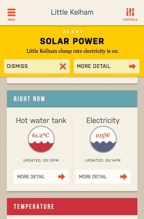
Figure 6-11. Alerts let users know they can take advantage of cheap electricity generated from on-site solar panels—this is a key part of the Little Kelham proposition that the UX needs to support
At-home research visits helped us build empathy with people who were moving house. Everybody working on the digital service went on at least one visit to someone who was in the process of moving, or had just done so. In kitchens surrounded by boxes and bubble wrap, it was easy to see how the first few stressful weeks after moving in are vital in creating patterns of behavior in the new home. Unfortunately, the way utilities have traditionally worked, it can take months for someone moving into a new home to get a believable electricity, gas, or water bill. By then, they’ve most likely settled into ways of living there—no matter how inefficient—that will be difficult to shift. Making energy use and costs much more visible in the first weeks of living somewhere emerged as a key opportunity for our new service.
Utility usage and control are often presented in a mechanistic way, with graphs and skeuomorphic representations of transistor-age dials and controls. Yet listening to residents it was clear that there was an opportunity for a much richer palette of interactions. Interviews with existing users of smart energy monitoring revealed ways in which the need for data could vary over time. For example, one Greenhouse resident recalled: “In the first year I used to check it a lot. Now I’d probably check it more when it starts to get warmer or starts to get colder.”
Thinking about this initial learning period was especially important for buyers at Little Kelham. They would be moving from conventional houses to “passive” homes. Rather than making “smart homes” that would try to second-guess their inhabitants’ future intentions with complex theoretical rules, the aim was to make “smart homeowners” who would feel more confident and in control of their new living environments.
To broaden the palette of interaction in heating control, we referred to the three levels of emotional design described by Don Norman: visceral, behavioral, and reflective.[92] Standard heating controls—even the few well-designed ones on the market—tended to focus on the behavioral part, the pleasure and effectiveness of using the controls. By adding usage monitoring and billing, Little Kelham’s digital service would support a more reflective response, the ability to rationalize and understand home energy management and utility costs on an intellectual level. Thinking of energy data as a social object to be discussed among members of the same household or with neighbors reinforced this further.
But a visceral reaction to the environment was also important: sometimes users just want to make a space feel warmer or cooler right now. In research visits, homeowners had shown us how, when cold, they would reach for the thermostat to raise the temperature, by overriding the timer or increasing the thermostat set point. To break the link between feeling cold and turning up the thermostat, the digital service gained a new screen that asked the user how their home felt at that moment—too hot, just right, or too cold. This returned tailored suggestions such as closing windows, or putting on more clothes, as well as turning up the heat. It became known in the project as the Goldilocks interface (Figure 6-12). Helping people learn what “just right” feels like to them would be a valuable outcome in its own right, and the data from it could be fed back to building managers to help with fine-tuning the passive house technology.
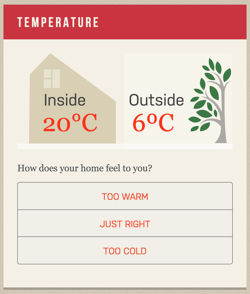
Figure 6-12. Comfort is a highly personal and subjective concept; rather than expecting users to know what the “correct” temperature should be in degrees Celsius, the Goldilocks interface asks a question everyone should be able to answer without thinking—whether they are too warm, too cold, or just right
We tested an alpha version of the digital service with users to validate assumptions and refine the design before giving it to homeowners. This highlighted the importance of latency and feedback in the interface. Inevitably some equipment takes a few seconds to respond to remote control instructions and to return its new status. Showing users that something is happening during this delay helps to reassure and build credibility. Rather than building in irritating “are you sure?” dialogs around important actions, the service is designed to enable one-click actions, but with the possibility of undoing commands made in error (Figure 6-13).
At the time of writing, the digital service is being deployed at Little Kelham. We’ll continue to support, learn, and further develop the service in partnership with residents as they move in and settle into their new homes (see Figure 6-14).
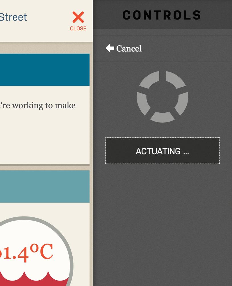
Figure 6-13. The service’s responsive web app displays an “actuating” message with an animated spinner while it waits for confirmation that the user’s command has been successful; as long as the spinner is displayed, the user can still cancel their command

Figure 6-14. A CGI rendering of the development at Little Kelham
What’s next? Well, more technically inclined residents should be able to download data about their homes, and even connect it to other tools and services using a secure, RESTful API. We also think a subset of home performance data could also become a valuable asset to pass on to new owners if the houses are sold.
[74] C. Duhigg, “How Companies Learn Your Secrets,” The New York Times, February 16, 2012, http://nyti.ms/1bDaobf.
[75] K. Shilton, “Values Levers: Building Ethics into Design,” Science, Technology & Human Values, doi:10.1177/0162243912436985.
[76] J. Payne. “From Experience Models to Immersion Tools: Transferring Ethnographic Knowledge In An Agile World,” August 13, 2014, http://epicpeople.org/blog6/.
[77] D. Norman, “Design as Communication,” http://bit.ly/1bDb5kG.
[78] G. Lakoff and M. Johnson, Metaphors We Live By, Second Edition (Chicago: University of Chicago Press. 2003).
[79] A. Katifori, G. Lepouras, A. Dix, and A. Kamaruddin, “Evaluating the Significance of the Desktop Area in Everyday Computer Use,” 2008 First International Conference on Advances in Computer-Human Interaction, (2008): 31–38, doi:10.1109/ACHI.2008.27
[80] You can read much more on metaphors and connected products in M. Kuniavsky, Smart Things: Ubiquitous Computing User Experience Design (Burlington, MA: Morgan Kaufmann, 2010)Elsevier.
[81] This phrase comes from L. E. Holmquist, Grounded Innovation: Strategies for Creating Digital Products (Burlington, MA: Morgan Kaufmann, 2012).
[82] Grounded Innovation contains helpful case studies and detailed instructions on using analogies and metaphors in designing new types of products, including the inspiration for the robot-as-pet example.
[83] For a vast number of examples, visit http://www.designprinciplesftw.com/.
[84] J. F. Suri, “Poetic Observation: What Designers Make of What They See,” in Design Anthropology, ed. A. J. Clarke (Vienna: Springer Vienna), 16–32.
[85] Derived from J. Spool, “Creating Great Design Principles: 6 Counter-intuitive Tests,” http://www.uie.com/articles/creating-design-principles/.
[86] This list, and Figure 6-11, drawn from A. Polaine, L. Løvlie, and B. Reason, Service Design: From Insight to Implementation (Brooklyn, NY: Rosenfeld Media, LLC, 2013).
[87] Handy instructions for ecosystem mapping are available from Hussain, S. (3 February 2014). Designing Digital Strategies, Part 1: Cartography. http://bit.ly/1bDbVhn.
[88] “How’s My Driving?” The Economist, February 23, 2013, http://econ.st/1bDc84c.
[89] K. Gordon, “Spying for Savings: Progressive Snapshot,” http://bit.ly/1bDcdF0.
[90] See The Guardian’s online archive of “right to be forgotten” articles for a helpful primer on the term, especially as used in Europe and Britain: http://www.theguardian.com/technology/right-to-be-forgotten.
[91] A reasonably accessible introduction is: B. Latour, “Where Are the Missing Masses? The Sociology of a Few Mundane Artefacts,” in Shaping Technology-Building Society: Studies in Sociotechnical Change, eds. W. E. Bijker and J. Law (Cambridge, MA: MIT Press), 225–259. Freely available from http://www.bruno-latour.fr/node/258.
[92] http://www.jnd.org/books/emotional-design-why-we-love-or-hate-everyday-things.html