Eliminating Waste in Business: Run Lean, Boost Profitability (2014)
APPENDIX. Tools to Eliminate Waste
Throughout this book we have highlighted various wastes that we have found in companies and, where possible, we have suggested solutions to reduce or eliminate these wastes. In addition to using the ideas in this book, it is helpful to know how to use and implement Lean techniques in your organization, which is the purpose of this appendix.
The concept of “Lean” has become a bit overused and overhyped, sometimes touted by consultants and management professionals as a cure-all. Although not exactly a cure-all, the Lean concept does include a multitude of highly effective and proven tools to help you eliminate waste in your company. And when you use these tools correctly, you can rest assured you are cutting the appropriate waste, not services or anything else that is necessary to your company or customers.
A search of available books on Lean Six Sigma yields nearly 4,000 results, and we certainly are not going to attempt to replace these books with a short appendix on process improvement. We do, however, introduce some of the Lean and Six Sigma concepts so that you can research your areas of interest in order to address your wastes. We strongly suggest employing someone in your company, if your company is large enough, who is a true expert in the field of process improvement. No company needs to use all of the process improvement tools at once. In fact, in order to build a culture of continuous improvement, you should start small with simple changes that are easily adopted. Because many of these simple tools fall within the list of commonly used Lean tools, we will start by introducing them.
Lean Tools
Lean manufacturing is often known simply as “Lean” due to its applications outside of manufacturing. Representatives from Virginia Mason Health System, for instance, visited Toyota in Japan to see its Lean operations first-hand. When these representatives from Virginia Mason returned to the United States, they created the Virginia Mason production system. Lean is a great at producing efficiency. This is why it has its roots in manufacturing.
Production companies have struggled for decades with how to do more with better outcomes and fewer resources. The Japanese manufacturers, along with Dr. Edwards W. Deming, developed a series of tools and processes that became known as “Lean.” We referenced a few of these tools in the workflow and layout sections of Chapter 8. As with any skill, even after reading and learning about these tools, you will need to practice them in order to become good at them. Lean creates efficiency by reducing and balancing the eight wastes shown in Figure A-1.
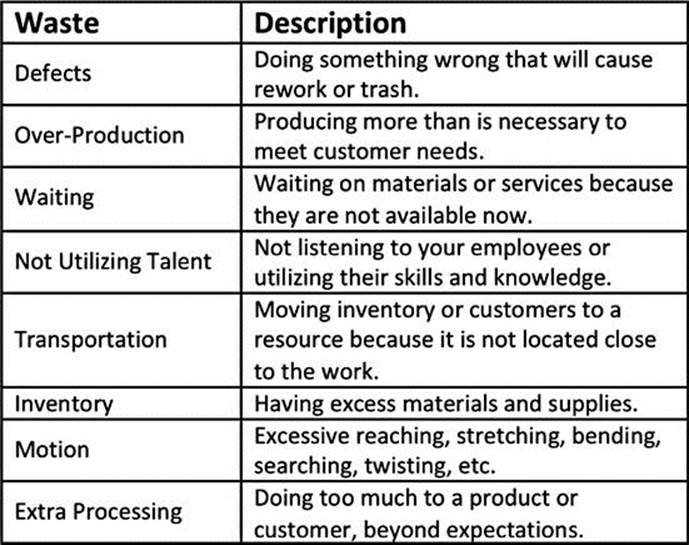
Figure A-1. Eight Wastes Identified by Lean (D.O.W.N.T.I.M.E.)
The process companies use to implement Lean is called Kaizen. Kaizen is a process where workers are removed from their regular duties so that they can analyze a process and improve it in 3 to 10 days. Figure A-2 shows the basic Kaizen process. Some of the improvements that are commonly implemented using Kaizen include changeover reduction, 6S organization, workflow reorganization, step reduction, and Kanban implementation. There are other times when Kaizen can be used; these are just a few examples.
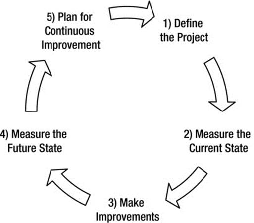
Figure A-2. Basic Kaizen Process
One major weakness of Lean is that it is not designed to address effectiveness issues. There are tools, such as poke-yoke, that will improve your ability to be effective, but the main effectiveness tools are from Six Sigma.
![]() Note Use Kaizen to implement the improvements from Lean tools.
Note Use Kaizen to implement the improvements from Lean tools.
Flowcharting
In other areas of this book we have used some flowcharting techniques. There are a few primary flowchart tools, as shown in Figure A-3. The selection of the right flowchart will depend on the process you are analyzing. The activity and deployment flowcharts are often the most appropriate.
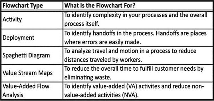
Figure A-3. Flowchart Types
Flowcharts are comprised of many different symbols, and the most common of these symbols are shown in Figure A-4. Programs such as Microsoft Excel, Word, and PowerPoint all have flowchart symbols included in their drawing tools, making it easy for you to quickly create flowcharts electronically. There are also many open source online tools that you can use to create flowcharts. Our favorite flowcharting tool is Microsoft Visio. In addition, you can find templates for almost any of these flowcharting tools.
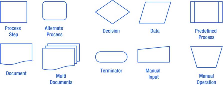
Figure A-4. Common Flowchart Symbols
In an activity flowchart, you can count the number of diamonds (decision points) to see how complex your process is. Figure A-5 is a simple version of an activity flowchart. This is a very simple example with only two decision points. We have seen many flowcharts with dozens of decision points. If you redesign your processes to reduce the number of decisions, you can save time and money by improving efficiency as well as improve quality due to a simpler process. Your goal should be to understand how any process is done so that you can eliminate all redundant, inefficient, or unnecessary tasks.
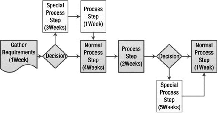
Figure A-5. Activity Flowchart
Figure A-6 shows a deployment flowchart. Each time the arrows between steps cross the lines between the lanes in the flowchart, there is a handoff. This process is like a relay race. Handoffs in a relay race are the points where the runners hand the baton to each other. This is when the baton is most likely to be dropped. Your business processes are the same as this relay race. It’s when you hand off your processes between job functions or people that mistakes are more likely. You can use the deployment flowchart to look for ways to reduce handoffs, because every handoff creates an opportunity for an error.
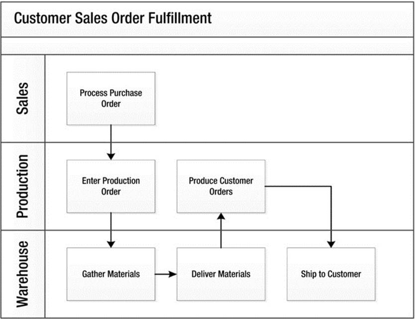
Figure A-6. Deployment Flowchart
As briefly described in Chapter 4, the value stream map is the flowcharting tool that evaluates how much time workers are actively working on filling customer needs versus the waiting time between stages. Figure A-7 shows a simple value stream map. By reducing the waiting time between steps and sometimes even reducing the value-added time through process improvements, you can reduce the time between customer request and delivery. There are many other techniques that can be used to document and improve a value stream map. Value stream mapping is a more advanced form of flowcharting. To do it effectively, you should get an expert to walk you through your first few value stream maps at a minimum.
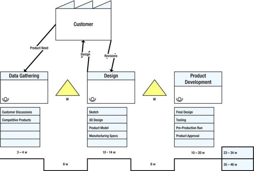
Figure A-7. Value Stream Map Example
Value-added flow analysis is the last flowchart type we discuss here. This is simply where you document each process step on a sticky note and put the notes on the wall in sequence. You then mark or pull out the value-added steps so that you can see how much of your process is value-added. Your challenge then is to eliminate as many of the remaining steps as possible. One variation of the value-added flow analysis has you put down the time for each step so that you could see how much you have reduced the process cycle time.
In Chapter 8, you can read about using the spaghetti diagram to streamline workflow in your business.
![]() Note Use flowcharts to see your processes better and look for improvement ideas.
Note Use flowcharts to see your processes better and look for improvement ideas.
Tools to Improve
Once you have taken the time to understand your process through process mapping or by going to Gemba (the place where the work is done), you need to take action on the opportunities for improvement. The following sections describe a few of the simplest Lean tools to use. Companies that start a Lean journey usually start by implementing some or all of these tools.
5S
You can read about workplace organization (5S) in Chapter 8, where we talked about how to improve your workflow. Remember that this tool can help you organize just about any workspace, which can bring major savings to just about any kind of company. 5S is for workplace organization. By using 5S, you can make the workplace more pleasant and realize efficiencies by eliminating some of the eight wastes of Lean.
SMED
You can read about rapid changeover (SMED) in Chapter 8, where we talked about how to improve your workflow. SMED is the method that you use to reduce the time it takes to change from one production run to another or from one customer to another. This changeover time is wasteful, because your resources are not making you money.
Continuous Flow
Companies can service customers better and reduce waste by designing processes to avoid batching, or waiting to perform a task until it needs to be performed multiple times. This process helps avoid having a bunch of work that is partially done because each task is started and finished on a continuous basis. By creating continuous flow, you can often reduce the amount of time it takes to perform services or start delivering products to your customers.
Most of us have built assemble-your-own furniture or toys. When you assemble these items, you open the box and follow the step-by step-directions until the item is assembled. Now imagine that you buy five dressers for your home at once because you needed to replace your others due to some damage. Would you open all five boxes and then go through step-by-step on all five dressers at once? Or would you open one box and build the first dresser and then the second and so on? Of course, most of us would do that latter and build each dresser individually.
If this is the case, then why do so many manufacturing and service companies partially build many items at once, leading to what is called “work-in-process” inventory? Doesn’t it make more sense to build one item at a time? This continuous flow process approach creates a continuous or one-piece flow. If you as a consumer build all five dressers at one time, it would take a long time until you finish one dresser. When you build one dresser at a time, you complete all the dressers a lot faster.
Now, you can make the argument that you can gain speed in each part of the assembly by working on five dressers at once, and you may be correct, but as with any other Lean tool, there is a balance to maintain. Continuous flow helps reduce the time to finish the first item. It also may improve quality because you focus on one item at a time. Regardless of whether you think this method makes sense in your organization, we challenge you to evaluate it in some kind of pilot test and let the results speak for themselves.
Cycle Time and Takt Time
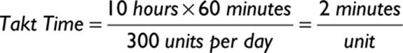
The rate of production of a service or product is called its cycle time. Cycle times must be short enough to be able to meet the requirements of Takt time. Takt time is the rate of production of a service or product that is necessary to meet customer demand. It is calculated as follows:
![]()
For example, if your customers need to have 300 units per day (or product or service) and your productive work time for a 12-hour shift is 10 hours, your Takt time is 2 minutes per unit. Another way of saying this is that you have to produce a product or service every two minutes to meet customer demand.
This knowledge is important because if you know you are not able to meet the requirements of Takt time, you need to change something in your operation to meet customer demand.
Kanban
Kanban is used to help control inventory or the flow of process steps. It uses visual symbols or cues to pull inventory or work throughout the facility at the rate that it is being utilized by the customer. Kanbans are a very simple way to control inventory in a small to midsized business, where a complicated software system is not necessary and would cause extra waste.
Poke-Yoke
Poke-yoke is the concept of mistake-proofing. This is one of the areas where Lean can help you become not only more efficient but also more effective. There are two types of poke-yoke: warning and control.
Warning poke-yokes are like those red and green squiggly lines underneath spelling and grammar errors when you type a document in Microsoft Word. Another example is the beeping that your car makes when you leave your lights on. The warnings don’t stop you from making a mistake, but they do notify you that you are about to make one. In the workplace, any machine that has warning lights or sounds is using a warning poke-yoke. In a healthcare setting, the various telemetry sounds end up becoming background noise and therefore lose their effectiveness. Pop-up warning messages that are common in software packages are also warning poke-yokes if you are allowed to proceed with the wrong action regardless of the warning.
Control poke-yokes prevent you from making a mistake. One example is the size of the diesel nozzle at gas stations. The diesel nozzle is larger than the gasoline nozzle. You can’t put a diesel line into a car that runs on gasoline. If you look around your business and home, you will quickly find other examples of poke-yokes that have been designed to keep you safe. Your challenge is to design poke-yokes into your processes to keep your business from making mistakes.
These are just a few of the many Lean tools, and we have not gone into any depth on these tools. Lean has some tools, such as poke-yoke, that are for improving the effectiveness of your operations, as just described, but for the most part, Lean is about efficiency. In your business, you need to have both efficiency and effectiveness to be successful. For this reason, Lean is often combined with Six Sigma methods so that both efficiency and effectiveness are addressed through process improvement.
LEAN SIX SIGMA
Just like the Lean weakness of not addressing effectiveness, Six Sigma is not designed to address efficiency. The marriage of these two methods has led to Lean Six Sigma, where workers utilize tools from both disciplines to make the maximum improvement in efficiency and effectiveness.
Six Sigma
Six Sigma was developed at Motorola as a way to improve quality, and it’s a set of tools you can use to improve the effectiveness of your business. Effectiveness includes not only the quality of your products or services but also the customer requirements. For the most part, the Six Sigma tactics are simply a rebranding of previous quality-improvement methodologies. The rebranding and organization of these methods have improved the effectiveness of the tools, so Six Sigma has been a great success in business.
The goal of Six Sigma is for an organization to produce Six Sigma quality or at least pursue Six Sigma quality. This means that all product characteristics are within the expected dimension or performance within plus or minus six standard deviations from the mean. This level of performance produces 3.4 defects per million opportunities for a defect.
A Six Sigma project can be started when you need to develop a new process for producing a product or service or when you have an existing process that you need to improve. For example, if you have low customer satisfaction ratings, you would start a project to improve those ratings. This is process improvement. If you are opening a new service that you have not provided before, you would start a project to ensure that your new service is successful. This is process design. You work on each of these projects using tools for product or process design and a different set of tools for product or process improvement. Process improvement is a more common need, so we will focus on process improvement. But first, we’ll take a brief look at the process for designing for Six Sigma.
Design for Six Sigma (DMADV)
Take a look at Figure A-8, which shows the process for designing for Six Sigma. Although we do not write about the details of designing for Six Sigma, we do want to introduce the steps.
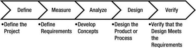
Figure A-8. Design for Six Sigma Methods (DMADV)
The tools for Design for Six Sigma include some of the same selection tools that we will discuss in the “Improve for Six Sigma” section. The rest of the tools are for requirement gathering, requirement ranking, and project management. Unless you are designing products, the depth of knowledge in DMADV is not necessary, so for brevity, we will go right into DMAIC.
Improve for Six Sigma (DMAIC)
Take a moment to review Figure A-9, which describes the process for process improvement. Each of these processes is discussed in more detail in the following sections.
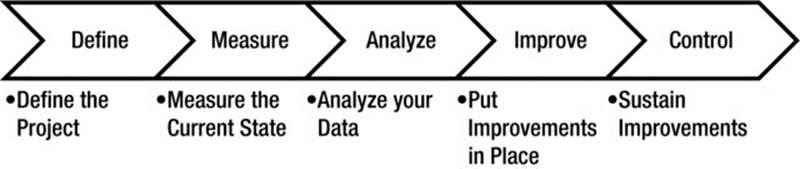
Figure A-9. Improve for Six Sigma (DMAIC)
Define
The define phase of the improvement process is used to specify what will be done during the project and what the customer requirements are. As with all of the phases of DMAIC, the define phase has multiple tools. Some of these tools you will use all of the time, and others you will use only when necessary. Experience with using these tools will help you know which one to use.
Charter
The project charter is one tool that you will use every time you have a project. It helps you define specific aspects of the project and keep focused on the problem that you set out to solve. We have seen various versions of project charters. However, there are a few fundamental portions of the charter that are common:
· Problem statement: The part of the charter that defines the problem in a way that shows how bad the problem is. This is to communicate why you want to work on this problem.
· Business case: Shows why your business would value this project. This value usually comes in the form of a financial gain. The gain may be related to cost reductions or avoidance, revenue increase, risk reduction, cash flow increase, or even capacity increase. At a minimum, the business case should show enough benefit to justify the effort associated with the project.
· Scope: A common issue that occurs in a project is scope creep. This is where you start to solve a specific problem but as your project moves forward, you find other problems to solve. Before you know it, your project is too big to finish quickly. The scope part of the project charter helps you keep to working on what is within scope.
· Goals: The goals section is where you document how you plan to measure the outcome of the project. It is best to have SMART goals. SMART is an acronym for specific, measurable, attainable, relevant, and time-bound. One example might be “Reduce our quality rejects from four to three percent by January 31, 2016.”
· Timeline: A list of stages that includes checkpoints with your project sponsor to show what has been accomplished. Without specified “due dates,” people tend to procrastinate. You could use the DMAIC phases for your timeline or any other method you find appropriate.
· Team: The final section of the charter is the team. This identifies who is working on the project, who owns the solution, and who is sponsoring the work. People need to be held accountable for every step to make sure tasks are accomplished.
Your project charter is a living document. That means that some of the information on the charter may change over time—as long as the project leader and project sponsor agree on the changes. Changes happen mostly because of things that you learn as you work on a project.
![]() Note The charter is your contract with the team and the sponsor, but it can be modified as you learn during your project.
Note The charter is your contract with the team and the sponsor, but it can be modified as you learn during your project.
SIPOC
SIPOC is an acronym for suppliers, inputs, process, outputs, and customers. The SIPOC is a simple tool that helps you better understand your process and validate your charter. When you do a SIPOC, you start by identifying the customers so you know who to talk with regarding expectations of the process. As part of the customer identification, you should then start identifying the outputs of your processes in terms of what you provide for your customers. Then, you should identify your suppliers so that you can solicit help from them to identify and implement solutions. The inputs to your process should be your first set of inputs, which may be causing your poor performance. Finally, your process, which is limited to five to eight high-level process steps, helps you validate the scope. If the SIPOC and the charter don’t match, one of them is wrong.
Figure A-10 shows a SIPOC for the owner of a hamburger restaurant. This idea is to improve the product and customer service. The owner can bring together a team of suppliers to determine what would improve the sandwich quality and the environment. By doing a SIPOC, the entire team has a better understanding of the project.
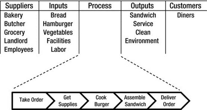
Figure A-10. SIPOC
![]() Note Use SIPOC to validate your charter and to help understand your process.
Note Use SIPOC to validate your charter and to help understand your process.
Voice of the Customer
Voice of the customer is a set of tools designed to improve your understanding of the customer’s needs. These tools are commonly used in market research and include surveys, focus groups, and data analysis. The point of the voice of the customer is that if your customer isn’t telling you what her requirements are, you need to do work on your project to figure out these needs. We discuss market research in Chapter 3. These methods should be used as part of the voice of the customer work on your project.
Measure
The measure phase of the improvement process is about documenting the opinions of the experts and preparing to gather data to validate those opinions. The process experts are those frontline workers who perform the work in the process that you are improving. This is a fundamental concept of process improvement. Use the ideas coming from your workforce. These ideas are probably pretty good.
Prioritization Matrix
The prioritization matrix prioritizes the potential root cause(s) of the problem so that you can reduce the number of causes to analyze. This tool relies on the opinions of your workers. It uses a weighting system to define your prioritization criteria, with a rating scale of 0, 1, 3, and 9. Figure A-11 shows an example of the prioritization matrix. In this example, “lack of established process” gets the highest score, so the prevailing opinion is that it is the primary suspect of the root cause of the problem.
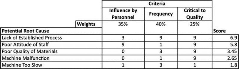
Figure A-11. Prioritization Matrix
You can use the prioritization matrix prior to the project kickoff (project prioritization) or in the improve phase (solution selection matrix). These are the same tool with different names.
Measurement System Analysis
If you are using a tool to measure something in order to collect your data, then your tool must be accurate and used consistently. There are two types of measurement system analysis: Gage R&R and Kappa studies.
Gage R&R stands for Gage Repeatability and Reproducibility. This is the method that you are using if you are collecting measurable data. Any measurement method used to measure continuous data, like weight, time, distance, or volume, uses Gage R&R as the way to validate that the measurements are reliable. The Gage R&R analysis typically will measure multiple people using the same piece of equipment and a variety of items to be sampled. Each sample is measured multiple times (typically three) by multiple people (typically three). Statistics are used to calculate the Gage R&R results. If the results are not sufficient, either a new tool or a process change is necessary to improve the results.
Kappa studies are used for measurement methods where a visual inspection is used, and the results are based on the opinion of the person doing the inspection. Typically, there more samples involved in a Kappa study because it uses discrete data (data that you can count and not logically divide). There are a few (typically three) people who are involved in the study, plus an expert opinion who makes the final decision about the samples. The statistics used in a Kappa study look for the percentage of agreement between the people doing the inspection. A high percentage, such as 90 percent, means that the inspection method is acceptable. Lower agreement levels require more definition or tools to enhance visual perception.
Both measurement system analysis methods can be improved by improving the operational definition of how the measurements are to be performed and what the correct standards for good versus bad are.
![]() Note Without measurement system analysis, you cannot trust your data.
Note Without measurement system analysis, you cannot trust your data.
Sampling
Because it is often impossible to look at all of the data for any given process, we rely on sampling to collect our data both for baseline measurements and measurements after we have implemented our improvements. Establishing a baseline is one of the more important aspects of any project because without a baseline, it is hard to prove that any real improvement is achieved. Along with a baseline, you need to understand how capable you are of meeting the customer requirements from your process. If your sampling method is faulty and your measurement system is not reliable, then your baseline data and data on the capability of your process is likely to be incorrect.
There are multiple sampling methods available, but we do not discuss these in this book. The most important aspect of any sample is that it be representative of the overall population of data for the process that you are studying. For sampling, the sampling method and size will have a great influence over the accuracy of your conclusions. Almost every reported data that you see on television or the Internet is a product of sampling. A common example is political surveys to show who is winning political races. These survey results normally come from asking questions of just a few thousand people, who then represent millions of voters. The accuracy of these surveys is based on the number of samples and the sampling method. As we talked about in Chapter 3, focus groups results are typically inaccurate. While focus groups have many faults, a large part of the error is due to sampling error. A sample of 8-12 people cannot adequately represent millions.
![]() Note A reliable sample is necessary to establish baseline capability and the stability of your process.
Note A reliable sample is necessary to establish baseline capability and the stability of your process.
Analyze
The analyze phase of the improvement process is where you look for patterns in your data and find ways to validate the opinions documented in the measure phase. The analyze phase is primarily completed using graphs, statistics, and analyses of flow charts. In the analyze phase, you are validating the root cause(s) of the problem and looking for trends or patterns in your data.
Time Series Plots and Control Charts
Time series plots, which are typically created in Microsoft Excel, are the line graphs that you see so often in business. Figure A-12 shows an example of a time series plot. Time series plots are taken over time and shown in chronological order. If the data shown on a line graph is not represented over time, then you cannot look for trends or patterns in the information.
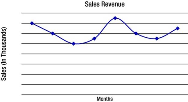
Figure A-12. Time Series Plot of Sales Revenue
Control charts are basically time series plots with more data. This data helps you understand more about your process. There is an upper control limit (UCL) and a lower control limit (LCL) that are set by the variation in your process. For the purpose of determining if your process is stable, we set these control limits at three standard deviations from the average. In various industries where control charts are used, there are other criteria that define the control limits. There are also other tests that can be used to tell if the process is unstable when you use a control charts. Figure A-13 shows an example of a control chart for the same sales revenue data used in Figure A-12.
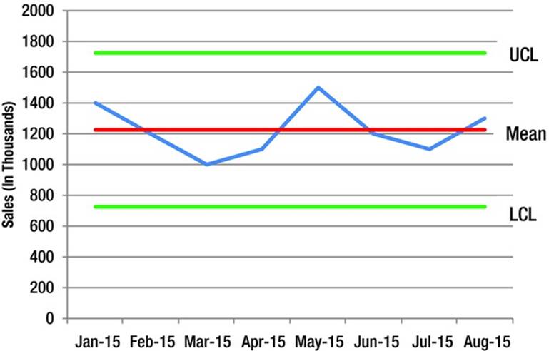
Figure A-13. Control Chart of Sales Revenue
When you look for a stable process, the primary characteristic is whether any of your data is outside of the UCL or LCL. You may also look for patterns in the data. The example shown in Figure A-13 would represent a stable process—that is, the amount of variation of sales revenue from month to month would be considered normal variation absent of any special events. Although this process is stable, it does not mean that it is capable of meeting your needs. For instance, if your requirement is that your sales revenue needs to be greater than $1.15 million, even if your process is stable, it is not capable of meeting your requirement. Given this information, you would have to take some action to increase your average sales each month.
![]() Note Use a control chart to look for stability. Stability, however, does not imply that the process is performing well enough.
Note Use a control chart to look for stability. Stability, however, does not imply that the process is performing well enough.
Pareto
The Pareto chart is based upon the Pareto Principle developed by Vilfredo Pareto, an economist who said that 80 percent of the world’s wealth was controlled by 20 percent of the population. This is more commonly known as the 80/20 rule. When you are trying to improve quality, this is a great tool to visualize your data.
Figure A-14 shows an example of some quality defects seen by a plastic injection molding company. Notice the “Other” category—in a Pareto diagram, the less frequent items can be grouped into a category to make the diagram simpler. In this example, there are five issues that are causing 80 percent of the quality rejects. By looking at this graph, you can see that excess plastic is the most frequent cause for a quality issue. Therefore, when working on reducing the overall quality rejects, it makes the most sense to focus on excess plastic as a cause of rejects. The tool helps you know which problem to address first.
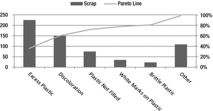
Figure A-14. Pareto Diagram of Defects in Plastic Injection Molding
As you work on the most frequent issue on a Pareto diagram, you should move to the next most frequent cause, making it necessary to focus on something else. In this example, once excess plastic is improved, discoloration would become the focus area for improvement.
![]() Note Use a Pareto diagram to prioritize the issues you will work on correcting.
Note Use a Pareto diagram to prioritize the issues you will work on correcting.
Dot Plots and Bar Charts
Dot plots and bar charts are similar tools that look for the frequency at which something occurs. Typically, you need special software to create the dot plot easily, although it is possible with spreadsheet software. For this reason, we normally just use the bar chart function in Microsoft Excel or similar software when we want to create a simple frequency diagram. Figure A-15 shows a simple bar chart.
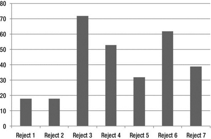
Figure A-15. Bar Chart
Although they are simple, bar charts convey more information than the raw numbers do, because the result is visual. If you have spreadsheet software, you can easily create a bar chart.
![]() Note Use bar charts as a simple way of looking at data.
Note Use bar charts as a simple way of looking at data.
Box Plots
A box plot shows the range of your data. Figure A-16 shows an example of a box plot. In this example, you have a few weeks of information on how many rejects were created each day of the week. This tells you how much variation there is by day of the week and the total range within the day of the week. For instance, in this chart, Sunday has a lower median number of rejects than any day besides Monday because the centerline is the median value. The distance from the top of the top line to the bottom of the bottom line is the total range of the data over time. From this box plot you can conclude that Sunday is the most consistent and Tuesday is the least consistent day.
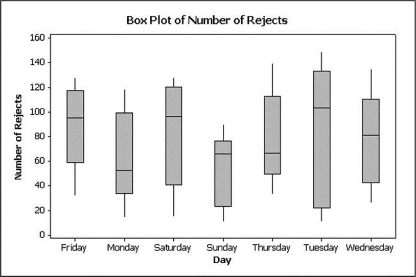
Figure A-16. Box Plot of Rejects by Day of Week
For such a simple graph, the box plot contains a lot of information. Unfortunately, it’s not easy to create a box plot in a spreadsheet program; you may end up having to purchase special software to do this. The box plot is typically a part of the standard statistical software packages available for purchase. When you want to use hypothesis testing, you will need the same software. Therefore, if you use these statistical tools, make sure that the software your purchase is capable of meeting all your needs.
Hypothesis Tests
Hypothesis tests are the various statistical tests that you can use to determine if two or more characteristics of your data are statistically different. There are various tests, each of which has a specific purpose. These tests include a test for equal variances, which is used to determine whether the variation between two sets of data is similar. When comparing the averages of two sets of data, you can run the test for equal variances before running these tests.
The two easiest tests for comparing the averages of two sets of data are the analysis of variance (ANOVA) test and the t-test. You will need to consider your sample size and how accurate your results need to be in order to select the right test. In most manufacturing process-improvement projects, you will have the prerequisites to use ANOVA such as equal variances, no special causes, and normal data.
Tests such as Mood’s Median and Kruskal-Wallace are used when you do not have the prerequisite data needed for ANOVA or t-test. In service industries like banking and healthcare, where you have a skewed distribution of data, these tests are very useful.
The steps of hypothesis testing are simple:
1. State the question that you are trying to answer.
2. Define the null hypothesis and alternate hypothesis.
3. Define the alpha value for the test, which is typically 0.05 or 0.01.
4. Compute the test and compare the P-value to the alpha. A P-value higher than the alpha value means that you cannot reject the null hypothesis.
The difficult part of hypothesis testing is choosing the right test for your situation. You also have to be careful to understand that just because you come to a conclusion the null hypothesis doesn’t mean that you have proven anything. In fact, all you have done is shown how confident you are in your answer. In a company that is new to process improvement, the gains are often so big that the hypothesis tests are not necessary. If you plan to use hypothesis testing, we recommend that you bring in an expert to help you run the correct tests and interpret the results.
![]() Note If you don’t know how to use hypothesis-testing tools correctly, bring in an expert.
Note If you don’t know how to use hypothesis-testing tools correctly, bring in an expert.
Ishikawa
The Ishikawa diagram (also known as the fishbone diagram) is typically used to determine the root cause(s) of a single problem. It is used when trying to brainstorm potential causes. Figure A-17 shows an example of an Ishikawa diagram. The Ishikawa diagram helps you narrow down to a potential cause. If you want to figure out the root cause, it is necessary to dig deeper.
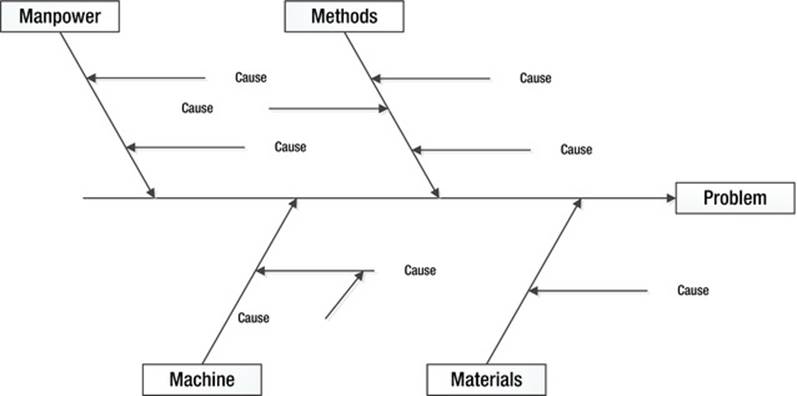
Figure A-17. Ishikawa Diagram
The Ishikawa diagram is a very useful tool that you may end up using frequently once you learn how to use it effectively.
Five-Why Analyses
When performing a root cause analysis, you often get to the apparent cause pretty quickly using a tool such a fishbone diagram. You can then use the five-why analysis to ask why until you get to the root cause. It is called the five-why analysis because you might ask “why” five times before you get to the root cause. The number of whys necessary depends upon the problem. For instance, you may get to the root cause by asking why only once or it may take more than five times. Once you have determined your root cause(s), it is time to improve your process. So let’s look at an example.
1. Our sales are not high enough.
a. Why?
2. Our sales people are not getting enough customer orders.
a. Why?
3. Our sales people are not utilizing their time effectively.
a. Why?
4. Our sales people aren’t targeting which customers to focus on.
a. Why?
5. Our sales people haven’t analyzed the data.
a. Why?
6. Our sales people do not have the necessary skills.
a. Why?
7. We have not required these skills nor trained the sales people on these skills.
Improve
In the improve phase of the DMAIC process, you select solutions to the root cause(s) that you have identified. Along with this solution selection, you also must minimize risk and show that the changes drive the right amount of improvement. You should be careful to change one variable at a time so that you understand what is driving your improvements. If you change several variables at once, you may end up spending time and money implementing changes that are unnecessary.
You often start the improve phase by thinking of solutions and using the solution selection matrix. Remember that the solution selection matrix is the same tool as the prioritization matrix, but you’re using it in a different way. Once you have identified your best solutions, it is time to minimize risk.
Failure Modes and Effects Analysis
Failure Modes and Effects Analysis (FMEA) is a tool that can help you identify process risks, propose improvements to your process, and put interventions in place to minimize those risks. You use FMEA to identify and rate risks on three scales. All three risk types are evaluated on a scale of one to ten.
The first scale measures severity. In this scale you are rating how bad the results of a failure would be. A ten could be life threatening. A one is not a big deal. All other numbers are relative between these two extremes. Typically, any failure with a severity rank of nine or ten should get more attention. You might need to use a poke-yoke to warn of this failure, for example.
The second scale measures occurrence. A ten means that this failure occurs every time, whereas a one means that it never happens. A high number may trigger you to put extra checks in place to ensure that you catch the failure before it reaches your customers.
The third scale measures detection. A ten signifies that you don’t notice the failure until the customer has experienced the effects of the failure. A one means you that you always catch the failure before it reaches the customer.
After you have ranked all potential failures, you calculate a Risk Priority Number (RPN) to prioritize the issues to address. The RPN can be between 1 and 1,000. Many companies set a threshold of 100 to signify when an action needs to be taken—any RPN over 100 needs to be addressed. Obviously, you cannot modify how severe a failure would be so actions taken to reduce the RPN may include improved detection methods or occurrence reduction. Figure A-18 shows a basic version of FMEA. The Automotive Industry Action Group (AIAG) provides a solid format for FMEA that is universally accepted across industries.
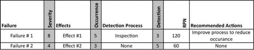
Figure A-18. Failure Modes and Effects Analysis
Once you have completed your FMEA, you can take the actions identified in the process that reduce the risk of failure. The FMEA can be used for DMAIC and DMADV work.
Design of Experiments
Design of experiments (DOE) is a fundamental skill necessary for a Six Sigma Black Belt to have. Many of the process-improvement projects don’t require the use of DOE. This tool uses a structured experimental design. You change one variable at a time and then determine the effects of the change. You can also look at how changing multiple variables affects your process. This method is especially useful when you are pursuing an ideal recipe. In manufacturing, this tool is used extensively on machine settings and material formulations. You can often use this tool to make a process successful when traditional process-troubleshooting methods fail.
Piloting
Once you have designed your new process and put improvements in place, you can benefit from piloting your solutions. This is the process of testing your solutions to identify risks or issues caused by your improvements prior to full-scale implementation. Test-marketing new products is an example of a pilot. Test-driving new car designs before full-scale production is another example. Wherever possible, you should pilot changes to your process.
![]() Note In the improve phase, you need to minimize your risks and pilot your solutions.
Note In the improve phase, you need to minimize your risks and pilot your solutions.
Control
The final phase of Six Sigma process improvement is the control phase. This is where you do things to keep the new process in place after the project is completed. Without the control phase, you risk losing any gains that you have made over time. We encourage you to document your project so that others can learn from your work and implement similar improvements elsewhere in your organization.
In the control plan, you create policies, procedures, and training based on the new standardized process. Because most of these tools are common and easy to understand, we introduce only two of the not-so-common tools here.
Control Plan
The control plan, which is also known as the process-management plan, is a document that explains what actions you will take to monitor and control the process. It can include inspection or checkpoints at specified time intervals. It also includes what actions will be taken if the inspection is not favorable. It explains what, when, who, and how the new process will be controlled.
Visual Management
Visual management is the use of dashboards, displays, light trees, flags, and so on to differentiate the normal from the abnormal. Visual management is a key tool because it allows you to make close to real-time adjustments based on the feedback that you get. We have seen visual management done with whiteboards, chalk boards, LCD display monitors, light trees, line demarcations on the floor, signs, and even pictures. Control charts can even be a form of visual management if they’re posted in the work area. The challenge behind visual management is ensuring that it affects the work being done and is relevant.
THE SIX SIGMA JOURNEY
Six Sigma users go through weeks of training and mentorship from a Master Black Belt to learn the Six Sigma tools and show practical application of those tools. These tools include brainstorming, prioritization, and root cause analysis activities as well as various statistical tools. The expectation of a Six Sigma Black Belt is knowledge of the tools, how to use them, and when to use them to implement breakthrough improvements.
Theory of Constraints
TOC is an acronym for the theory of constraints, a concept introduced by Eliyahu M. Goldratt when he wrote The Goal in the 1980s. The basic concept is that an operation is only as strong as its bottlenecks and weakest links. Goldratt introduced some methods to improve throughput by removing barriers to efficiency. TOC is a good set of tools to use in addition to Lean Six Sigma if there are process flow issues or bottlenecks in your operation, but it does not replace Lean Six Sigma.
Conclusion
There are, of course, other tools and methods used for process improvement, but Lean Six Sigma and Theory of Constraints are probably the most universal. Regardless of whether you use the ones that we recommended or you use other sets of tools, the point is that you need to have a structured continuous improvement process. If you do not have the resources in-house to implement process improvement, you should hire a consultant to introduce the techniques. You will also need internal champions who will continue the methods once the consultant has left.
All materials on the site are licensed Creative Commons Attribution-Sharealike 3.0 Unported CC BY-SA 3.0 & GNU Free Documentation License (GFDL)
If you are the copyright holder of any material contained on our site and intend to remove it, please contact our site administrator for approval.
© 2016-2026 All site design rights belong to S.Y.A.