Getting a Web Development Job For Dummies (2015)
Part II. Core Technologies for Web Development
Chapter 9. Understanding CSS and JavaScript
In This Chapter
 Understanding how HTML, CSS, and JavaScript work together
Using CSS for text styling
Using CSS for positioning text and graphics
Designing web pages with WordPress
Using JavaScript in web pages
The preceding chapter introduced and explained key basics for HTML. Anyone who works in web development needs to know the basics of how HTML works.
In this chapter, we introduce the basics of Cascading Style Sheets (CSS) and JavaScript, which are additional key elements in understanding how web pages are put together. Taken together, this information is crucial for all web developers. But it affects you differently depending on your role.
If you are a novice web developer who will be creating web pages directly, you need to learn this information thoroughly. Good starting resources are the tutorial made available by the World Wide Web Consortium, which you can find atwww.w3.org/community/webed/wiki/Category:Tutorials.
If you are an experienced web developer, review this information to gain perspective and clarity on the work you do every day. Consider quickly reviewing the World Wide Web Consortium’s tutorials to see if they show you anything new. Then use these pages to help you explain to colleagues and new employees how you work, and how they can best work with you.
HTML, CSS, and JavaScript Together
Originally, web pages were all HTML. HTML font elements, such as <b> for bold and <i> for italic, controlled the look of text; tables, misused to contain the entire contents of the page (as described in the preceding chapter), controlled layout. But this has been replaced by a combination of HTML, CSS, and JavaScript.
Why use HTML, CSS, and JavaScript together? Well, creating a useful, usable web page is difficult. Using HTML, CSS, and JavaScript together takes that difficult job and divides it into three parts. Each part is handled by the right tool for the job:
· HTML: HTML only contains content: text, links, images, and designated names for different blocks of text — from headers to different styles within the flow of text.
· CSS: All the styling information, such as font styling descriptions and layout, are controlled by CSS. Because style sheets can be reused, as well as cascaded — with higher-level style sheets overridden, where necessary, by lower-level ones — efficiency and consistency are much enhanced.
· JavaScript: Web pages need to behave — that is, to support at least simple interactivity. For instance, if the user enters numeric characters into a country name field, you want this to get quickly flagged — preferably before the user clicks the Submit button. JavaScript is the right tool for this job.
This separation of responsibilities among HTML, CSS, and JavaScript has a bunch of advantages. Among the key pluses are
· In-memory reuse of CSS files: If most of your CSS files apply to multiple pages, they get loaded into the browser’s working memory the first time they’re needed, and then hang around as they’re reused by subsequent pages. They only download once per session.
· Smaller HTML files: Before a web page can be displayed, the entire HTML file must be downloaded. Putting display specifications in CSS instead of HTML makes the HTML file much smaller. Assuming that the needed CSS is usually already hanging around in memory, the total size of the data that needs to be downloaded for each web page is much reduced.
· Device compatibility: You can use different style sheets for different devices. Your same small HTML file can work on a lot of different devices, and only the CSS files that work on a given device get downloaded and used on that device. Bonus: The CSS files for mobile devices will be smaller and simpler, so you’re downloading smaller files over the often-dodgy cellular data connections available on mobile devices.
 You can find an overview of what you need to know to develop web pages, including solid introductions to HTML, CSS, and JavaScript, at the World Wide Web Consortium site: www.w3.org/community/webed/wiki/Main_Page.
The World Wide Web Consortium has a useful overview of how these pieces work together, although it emphasizes somewhat different points than we do. To see its take on it, visit www.w3.org/community/webed/wiki/The_web_standards_model_-_HTML_CSS_and_JavaScript.
This web page is shown in Figure 9-1.
In addition to all the good reasons for using HTML, CSS, and JavaScript in combination, there’s another reason: This combination has become the standard. Learning to work the way most of your colleagues do will save you time, energy, and frustration. That doesn’t mean you shouldn’t remember some of your old HTML tricks, and you should learn more modern tools, such as PHP, but recognize what the mainstream has been for a long time now, and be ready to work within that framework as needed.
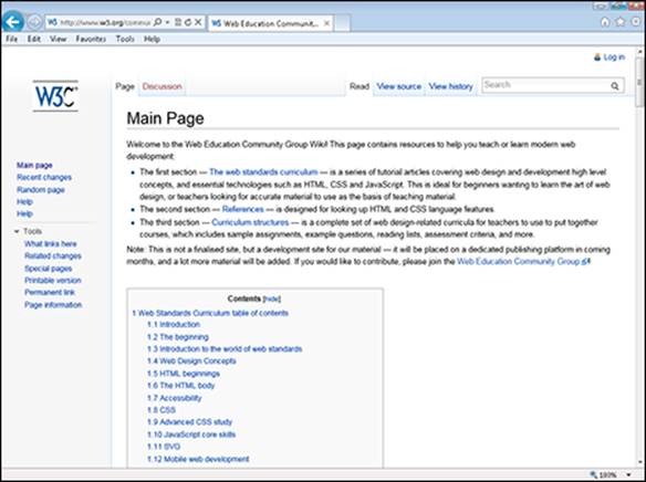
Figure 9-1: The World Wide Web Consortium site gives an overview of the relationship it suggests you use among HTML, CSS, and JavaScript.
Before you get too far into the weeds, however, it’s important to take some time to think about what you’re trying to accomplish. Figure 9-2 shows an article called “F-Shaped Pattern for Reading Web Content” from the Nielsen Norman Group. View the article atwww.nngroup.com/articles/f-shaped-pattern-reading-web-content/.
This article, and others on the Nielsen Norman site, give you some underlying reasons for designing your web pages in ways that will promote usability and usefulness. See the sidebar, “Jakob Nielsen on web design” for some additional perspective.
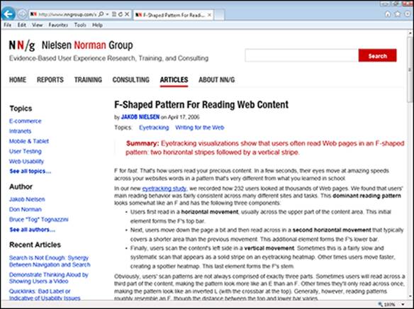
Figure 9-2: People, as a group, read web pages in a very specific way.
 No one source on web design is likely to steer you entirely in the right direction. The article referred to here, for instance, doesn’t even mention tablets or mobile phones, and these different devices have different needs. Users who consume most of their web pages on one device are also likely to change their expectations about what they see on the others. So it’s up to you to read broadly, synthesize input, think, try things out, and own the final result.
Using CSS for Text Styling
As we describe in Chapter 8, HTML was supposed to be somewhat above pedestrian concerns such as how a page actually looked when displayed. Ideally, according to many HTML mavens, you were meant to specify meaning in HTML; the actual display format used to convey that meaning to the user would be decided on by the web browser, such as Microsoft Internet Explorer or Apple’s Safari. The display format chosen by the browser would also reflect the specific device in use.
This approach was only really practical when a web page was made up of one long, single flow of text, with no left-hand column for, say, navigation, and no right-hand column for, say, related articles or advertising. As soon as you wanted to go to even a simple two- or three-column format, the original intention of HTML broke down.
CSS, though, actually allows you to use HTML in something like the way that the purists originally intended. Because CSS not only allows you to specify the display format: It actually allows you to address magazine-type concerns such as the look of your text and the layout of a page, sometimes down to the pixel level.
In Chapter 8, we introduce basic HTML. However, when using CSS with HTML, you use HTML differently.
A lot of things which were only added to HTML several years into its development, such as adding a specific font, are taken right back out. Instead, you define the look of common HTML tags in CSS.
Here’s an example:
body {...
font-size: 14px;
...}
These statements define text within the body of a web page to have a default size of 14 pixels. This works well on most devices. However, you might want to have different style sheets for most devices, which might have different default sizes for body text.
You can also define the look for established HTML tags such as headers and paragraphs. In addition, you can use new names for tags in your HTML file, such as .editornote, and then define them in CSS.
Editornote is a class, a kind of subset of an established tag such as the paragraph tag. In HTML, you define a paragraph of a given class as follows:
<p id="editornote"> ... </p>
Then, in CSS, you have to define what editornote means, or it will be undefined:
p {
.editornote font-weight: bold;
}
Here are some other CSS attributes that you can use for text styles:
· font-family: What’s normally called the font, such as Courier or Times New Roman.
· font-style: Usually just italic or normal.
· font-weight: Usually just bold or normal.
· font-size: From xx-small through x-small, small, medium, large, x-large, and through to xx-large.
· text-align: Choose left, right, center, or justify.
As Humpty Dumpty said in Alice in Wonderland, “Words mean what I want them to mean.” When talking about text on the web, be aware that words are used differently in CSS than in normal life. For instance, a font’s style would commonly be assumed to include the options italic, bold, and underline; however, in CSS, the font-style attribute usually refers only to italicizing, whereas font-weight is the attribute for bold.
Figure 9-3 shows an explanation of how to style text with CSS. See this page for details on specific CSS attributes: www.w3.org/community/webed/wiki/Text_styling_with_CSS.
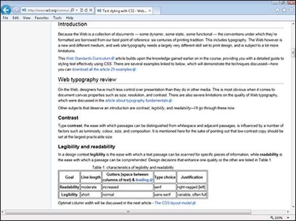
Figure 9-3: You can learn how to style text with CSS from w3.org.
Jakob Nielsen on web design
One of the best resources for any web developer is Jakob Nielsen’s articles on web design, which cover a period of more than 15 years, continuing through this writing.
From very early on, Nielsen addressed basic usability concerns such as the poor resolution of computer screens; the importance of consistency to users; and where users really look when presented with a web page. Nielsen’s blog, Alertbox, was famously at the web address www.useit.com for many years.
In recent years, Nielsen teamed up with Don Nelson, once a famous manager at Apple, and Bruce Tognazzini, the founder of Apple’s Human Interface Group, to form the Nielsen Norman Group. The site www.nngroup.com now hosts Nielsen’s past and current columns.
The site is an intriguing mix of old and new. Check out the Most Popular section under the Articles header. At this writing, the top three articles are “Usability 101: Introduction to Usability, from 2012,” “Top 10 Mistakes in Web Design,” from 2011, and “How People Read on the Web,” from 1997. Despite their varying ages, all these articles — and many others on the site — are still just about required reading today.
However, Nielsen and his colleagues are great scolds, but not always good examples. The www.useit.com site was famously one of the ugliest-looking popular sites on the web for years. Learn from Nielsen and company, but incorporate others’ recommendations and your own ideas on best practices as well.
Using CSS for Layout
In the 1990s, as the web grew, web designers became accustomed to using HTML tables for page layout — that is, getting the overall structure of the page right.
For example, a common page layout for the web is a three-column layout, with navigation in a narrow column on the left, the main content or article in a wide column in the middle, and advertising and “related content”-type sections in a narrow column on the right. This kind of layout was implemented as three separate tables within one overarching table that positioned them relative to each other. (People had lively debates about topics such as whether you could do without the overarching table.)
As CSS matured in the late 1990s and early 2000s, it became possible to use it reliably for page layout. To contrast this with the use of HTML tables, such layout is frequently called tableless layout for the web.
In 2002, the World Wide Web Consortium published a how-to on “tableless layout,” shown in Figure 9-4. This is a good introduction to the topic. Check it out at www.w3.org/2002/03/csslayout-howto.
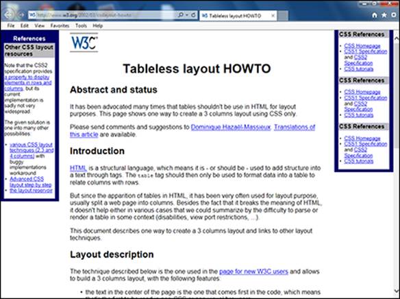
Figure 9-4: The World Wide Web Consortium will show you how to use CSS for a web page layout.
At the time, these layouts only worked with the latest and greatest browser versions because the development of CSS into a tool that could handle the demands of complex web page layouts was a slow and messy process, marked by controversy and some degree of game-playing among major players such as Microsoft and Netscape, which by that time was owned by AOL Time Warner.
Tableless layout and tableless layout are good search terms to use if you want to find introductory articles on how to use CSS for page layouts.
Here’s a brief overview of some major CSS elements used for page layout:
· The <div> and </div> tag pair mark out an element — a block of text and, potentially, graphics — so it can have specific layout applied to that element directly.
· The <span> and </span> tag pair mark out an area within a paragraph that has specific formatting applied to it, such as italics or a different text color.
· Within the <div> or <span> tag, the display attribute can be set to none to hide content, set to list-item to display an item in a list, and so on.
· The width attribute is the main attribute for controlling columns; using max-width instead prevents scroll bars from appearing when the user makes a browser window narrow. A width of 600 pixels is common for the main content column of a web page. Percentage widths tell a column to take up a certain percentage of the overall layout it’s placed within.
· The fixed and relative elements are used with the top, bottom, right, and left properties to position elements within a column or box. The float property, which can have values that include left and right, helps position an image relative to text.
These elements are only one way to go. You can use boxes and other, newer CSS techniques to create robust layouts. These layout techniques evolved as the CSS standard evolved to include new capabilities.
Figure 9-5 shows an example of CSS positioning that is best implemented in one way for newer browsers because the newer way is easier to understand, but in a different way for the Microsoft Internet Explorer web browser version 6, which many people at the time were using. This is a solid example of the many ways web designers have had to tweak their layouts over the years as the CSS standard and browser capabilities evolved.
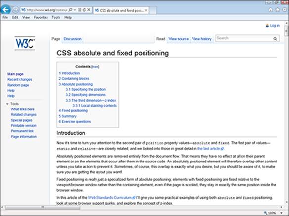
Figure 9-5: Web pages use different CSS to support different browsers.
Using WordPress as a web design tool
WordPress is an amazingly popular web design tool. It comes in two versions. If you set up a website through www.wordpress.com, you can have your own URL, and WordPress hosts the site for you. Or you can download WordPress software and host it on your own servers, or servers provided by a third party.
If you use the first option, where WordPress hosts the site, your options are limited, but you’ll still have scope for editing HTML and CSS. With WordPress software, where you provide the hosting, your options are very extensive indeed.
WordPress is a great tool to have in your toolkit for websites that you need to get up in a hurry, scale quickly, or turn over responsibility for to someone else. At least, that’s our view. Some web designers swear by WordPress and use it for most, or even all, of their work. Others, equally competent, swear at WordPress, and won’t use it even if a client demands that they do. For most of us, it’s worth doing at least a project or two in WordPress, seeing how you like it, and having it in your toolkit for future projects.
In most web work, your work includes maintaining older pages as well as creating newer ones that are intended to work on different kinds of devices. Given the varied nature of most jobs, you’ll need to get used to a wide variety of different approaches to using CSS, and even to moving pages from an older way of using CSS to a newer one.
You might think you’re off the hook in terms of having to learn different CSS for different browsers because the standard has settled down, and most browser versions in use today support relatively up-to-date, capable versions of CSS. This is true, but you will often need to deal with older web pages that have the older approaches to using CSS baked in. Also, today, people expect to use websites seamlessly across mobile phones, tablets, and computers with wildly different screen sizes and screen resolutions. A web developer’s work is never done …
Cross-browser and cross-device compatibility continue to be major concerns for websites. Compatibility among the current versions of major browsers is now much higher, but there are still many odd and old browsers in use, and there is more and more use of an ever-growing variety of smartphones. Test aggressively before deploying your site, and then get ready to support a “rapid response” capability to fix bugs that show up shortly after a new release rolls out.
Using JavaScript in Web Pages
JavaScript is a computer programming language that’s part of the trinity of web development: HTML, CSS, and JavaScript. You need to understand the basics of how it’s used in web pages to do any job in web development — and you always have the option to make JavaScript expertise your main calling card as a web developer.
JavaScript is an interpreted programming language, which means you can write it into an HTML file, and it will be interpreted and executed as the web page loads. (Almost all web browsers contain code, called a parser, to execute JavaScript.) You can use various techniques to have some JavaScript only be interpreted and executed after the main page has loaded and some other JavaScript has already executed.
The advantage of JavaScript is that it puts computing power into your actual web page. Usually, if the user is looking at, and responding to, a web page such as a form, you can’t do anything with the form’s content — such as check it — until the user submits the entire form. JavaScript can shortcut this process, checking content as the user enters it.
JavaScript can control animations in a page or change what appears depending on what the user mouses over. Use it in combination with HTML and CSS. Also in combination with back-end code, JavaScript can check the content of an entry field to make sure it’s correct, but you should use back-end code to update a database with the information that’s entered.
JavaScript can be put between the <script> and </script> tags in a web page, or put in a separate JavaScript file that ends with .src, or both. Here’s the code to reference an external JavaScript file and to put up an alert if the browser executing the HTML code in the web page can’t process JavaScript:
<script type="text/javascript" src="yourscript.js">
alert("If you are seeing this message then this browser does not support JavaScript.")
</script>
If you keep JavaScript code in an external file, you can share it among numerous web pages. Browsers cache the file, so it won’t need to be downloaded multiple times. And you can more quickly and easily find and fix problems within your JavaScript.
You can also put your JavaScript code into multiple files and load only the ones you need in each of your web pages.
JavaScript is insecure, and anyone who can access a web page can access all the JavaScript code in it. So don’t use it for encryption or security because someone will be able to reverse-engineer anything you do simply by looking at your web pages.
JavaScript can change the HTML and CSS contents of your web page. The following JavaScript puts text and a clickable button on a web page:
<!DOCTYPE html>
<html>
<body>
<h1>Clickable Button in JavaScript</h1>
<p id="test">JavaScript can change the style of an HTML element.</p>
<script>
function testFunction() {
var x = document.getElementById("test");
x.style.fontSize = "40px";
x.style.color = "blue";
}
</script>
<button type="button" onclick="testFunction()">Click Here!</button>
</body>
</html>
Google completes the web equation
Finding web pages is such a huge element of web use that you should include searchability in all your web development decisions. For instance, you might have a web page with a popular search term used in the middle of the page. Consider moving the term to the top of the page to improve the page’s ranking in web searches and spare the user from having to struggle to find the term after they’ve arrived at your web page.
Search engine optimization (SEO) is becoming a huge part of the process of creating and updating web pages. You want your page to rank high on searches for relevant terms, and this is often a huge challenge. High search-engine rankings on popular terms are so valuable that companies spend millions of dollars trying to improve their position in search.
Because SEO is such a widely practiced art, Google — by far the leader in search — and other search engines, such as Microsoft’s Bing, are constantly changing their algorithms as to what page content will “work” to move pages up or down in the rankings. So if this area is important to you, plan to study hard to learn the basics, and then spend a lot of time keeping up with the latest news as things change.
There are, though, a few basic principles you can safely follow over time. Pick five to seven keywords or phrases that you want to be “findable” on, and use those exact keywords or phrases — not synonyms or variations — repeatedly in your website. Use your keywords in page titles, headers, image captions, the first 50 words of a page, in META tags, and in page URLs, with the keyword set off by dashes.
These tips will be a good foundation for reasonably good search results on their own, and also a good starting point for much more detailed work if you want to get into the dark arts of SEO as a part-time or full-time occupation.
One of the most common uses of JavaScript is for error-checking. You can allow the user to type in a value, and then use JavaScript to parse the value and make sure it make sense. For instance, you can ask users for their phone number, and then make sure that what they enter fits the profile of a valid phone number.
If you need more information about JavaScript, start with the JavaScript tutorials at W3. Here’s the introductory one, shown in Figure 9-6: www.w3.org/community/webed/wiki/Category:Tutorials.
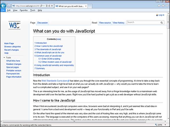
Figure 9-6: You can start learning how to use JavaScript here.