Responsive Web Design, Part 1 (2015)
The Modern Responsive Designer’s Workflow
BY DAN MALL
In our industry, we are often subject to three things: titles, tools, and output. We sort ourselves into buckets based on our job titles: designers, developers, content strategists, information architects, and others. It’s often cleaner that way. We sort ourselves by tools as well. Designers use things like Photoshop and Sketch, and developers use things like Sublime and CodePen. If you walk by somebody’s desk, and they’re using Omnigraffle, it’s likely they’re an information architect.
We’re also categorized by output: designers are expected to produce comps; developers are expected to write code. Our deliverables and output are severely outdated, limiting the squishy, giddy, icky, amazing, multi-device world that we live in.
We’re good at placing ourselves within these specific buckets, but what often goes wrong in projects happens within gaps between the job descriptions and deliverables lists.
When I started my design collaborative called SuperFriendly, I was determined to find a new set of tools and outputs to better suit the people who hire us and to better serve their customers. I had a few specific goals in mind that I wanted to achieve, goals that would make my workflow more productive and more efficient.
First, I wanted to figure out how to achieve the highest fidelity in the shortest amount of time. The second goal was to remove abstractions wherever possible, so I could clearly see what I was designing and building. The third goal was to ensure that during the process, all deliverables would come with conversation.
To this end, I found that I often prioritized frameworks over processes. As an industry, we talk a lot about processes, but I find it more useful to think about what frameworks I want to put in place.
Consider this example. A Newton’s cradle is a process. It’s a repeatable system that’s optimized for efficiency, not innovation. It always starts the same way: you lift a sphere on one of the ends, release it, it hits the one next to it, and it continues in that system. It doesn’t deviate from that system. There’s nothing surprising about it; there’s nothing unexpected about it. That’s what it’s good for.
By contrast, a football field is a framework. Every game is the same length; it’s played on the same type of field; it follows the same rules. Everyone knows where out-of-bounds is, and everyone knows where the goals are. Yet what happens within the ninety minutes is a surprise every time.
I wasn’t looking for a process for my agency — I was in search of a new framework. One that would work well with my workflow. After a lot of experimentation, failing and trying again, I found what works very well within general project constraints, at least for me. This is exactly what this chapter is about: a couple of things that I found in my responsive design workflow, with a few techniques and ideas that have proved useful in my own work.
Planning
The first piece of that framework might sound remarkably unremarkable: designers should be more involved in planning. Conducting interviews are a great way to start planning.
Recently, I was working on a project for a magazine with a primarily female readership. Before we did anything — before we did any comps or any information architecture — we just spent some time interviewing.
We talked to readers of both the print magazine and the current website, and found things we couldn’t have assumed otherwise.
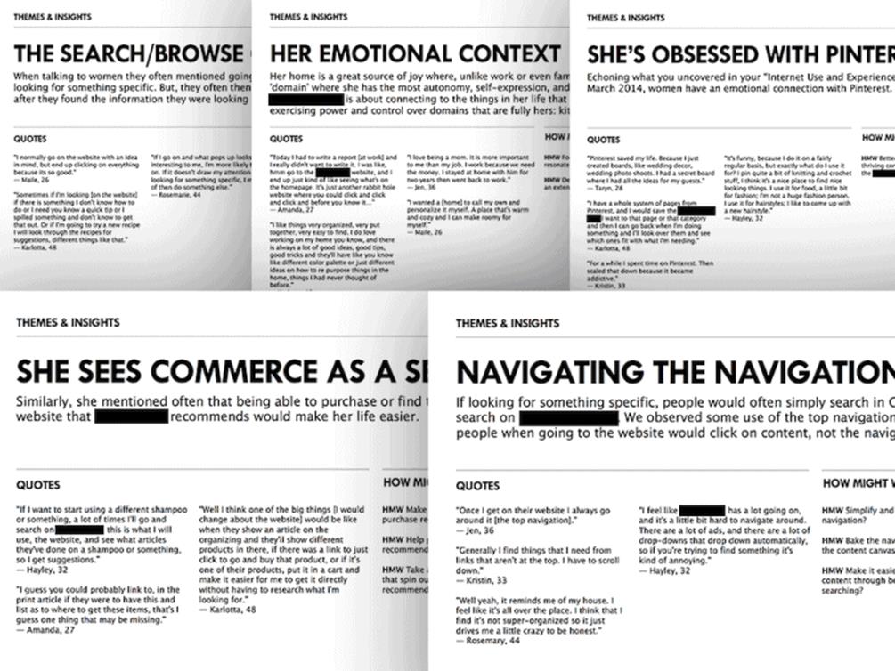
When we went to the kick-off meeting with the client, we brought a deck of observations we gleaned from the interviews. We weren’t making any recommendations at that point; we were just saying, “Here are some things we found interesting, and we’d like to have a conversation about it.” We found that:
•Most readers are obsessed with Pinterest. While that might have been a safe assumption, we heard specifically from actual readers that they often have Pinterest open at the same time they’re reading the magazine.
•An unexpectedly high number of these readers mentioned something they called “emotional context” while they were reading. That seemed to be a striking phrase that was common among interviews.
•They didn’t use the navigation very much. They often just browsed along with the content and used search as a last resort, but often skipped the navigation.
•Surprisingly, readers expected commercial offerings as a service of the website. Many of the readers we talked to said, “I would love this magazine to tell me what products to buy.” That was a huge advertising opportunity, and something the client had never done before because they just assumed that readers might think it was pushy advertising and skip over it. But the readers trusted this brand so much that they wanted recommendations for products to buy. They were leaving millions of dollars on the table simply because they hadn’t even talked to people about it and had dismissed it.
By conducting interviews, you can learn a lot about the product and what it lacks. These insights can then be grouped, ranked and presented as a deck.
Interviewing is a very valuable skill in a designer’s toolkit. It’s a simple technique that can empower you to make the right decisions and smart design choices for your clients. We should use it more meaningfully and more often.
On that project, I worked with Jennifer Brook, a great user experience designer and researcher. Jennifer always asks me to hypothesize. When we work together, she usually prompts me with questions and thoughts like this:
“As an experienced professional, what do you think should be on the site? Tell me your vision for the site, and I’ll go find research that supports it. But, if I instead find research that refutes it, I’ll come back to you with that research and we can adjust the hypothesis together.”
We don’t hypothesize enough as an industry.
We should be guessing more. Let’s validate our hunches with research, but don’t be afraid to take some guesses.
WRITING-FIRST DESIGN
Before I start designing anything, I write. When I have trouble designing, rather than trying to force my way through Photoshop and design tools, I put the tools aside and jump into a text editor instead. I write manifestos for myself (I’ve also heard them called creative briefs, strategic briefs, or communication briefs).
Basecamp’s designers have been following a similar approach for years. Instead of jumping into a visual tooling environment, they prefer “writing-first design1”, whereby interfaces and interactions are sketched out in a text editor as plain text first, and are enhanced and refined with visual assets later.
One tool I’ve found useful for this is Ommwriter2. What I love about it is that it forces me to go fullscreen, and it will give me either a handful of subtle backgrounds or a plain blank one. Ommwriter also provides the option to play ambient background music. It compels you to focus and prevents distractions. I love this isolationist version of writing, where you’re perfectly alone with your thoughts and a blank canvas.
I also tend to use Notational Velocity3 a lot, and particularly a fork of Notational Velocity called nvALT4, which supports Markdown. It’s pretty much on every machine I use for work, and it’s on my phones, too. What makes nvALT so useful is that it’s easy to sync notes back and forth, so you always have your notes synced without having to put them into Dropbox or email yourself. Having a tool like that is handy because I always have my thoughts accessible to me no matter where I am. In fact, this little tool has been one of the greatest design tools for me — a virtual, digital notepad wherever I go.
So how exactly does a manifesto help in the design workflow?
A good manifesto has to contain creative direction, a point of view, a perspective. Without strong creative direction, everything feels a bit too vanilla. I love vanilla as much as the next person, but sometimes I want salted caramel. To create something memorable and unique, you need a very distinctive idea, a different angle: that’s what creative direction is. Flat design isn’t a point of view. CSS transitions are not a point of view either. A good manifesto should go beyond that, saying what you’re going to do and, more importantly, what you’re not going to do.
Let’s make this clearer by looking at one example with a strong creative direction and another without. What you see below is an architecture of a website. Could you guess what site it is?
Explore | Albums | Songs | News | Store
Perhaps you could narrow it down to being the website of a band? But which band? It’s hard to tell which one. The reason for that is that the architecture here is vanilla. While it works for a lot of bands, it doesn’t work for a specific one because it’s so generic. It doesn’t provide any help for you to identify precisely which band because there’s no unique perspective that relates to a particular group.
Let’s look at another example:
Songs | John, Paul, George & Ringo | From Liverpool to the Hall of Fame | News | Store
That’s right: this site structure makes the band much easier to spot. This is the architecture for the Beatles website. This has a point of view, a perspective. What kind of manifesto could lead to an architecture like this? I imagine it could look something like this:
The Beatles are the greatest band of all time. Their songs and history are deep and dramatic tales; few institutions have been loved the world over for so long. The range of music they performed spanned many genres. Their music became much more than entertainment; it evolved into an embodiment of ideals that well-represented its era. Their website should reflect that richness from every angle.
Admittedly, that’s pretty assertive, but notice how much of a point of view it has. This is something that can’t be mistaken for another organization. A vision like this can’t be mistaken for another band. This type of bold approach is severely lacking on the web today. If the web had stronger creative direction it would be much easier to identify brands (and bands), what they stand for, and whether or not you wanted to be associated with them.
If you’re interested in what manifestos or creative briefs contain, there’s a very good article by Jared Spool called the “The Magical Short-Form Creative Brief5.” It offers some very helpful tips on what a good manifesto or creative brief should have in it, including the project objective, the key personas, the key scenarios and the key principles.
If you look at the planning tools I’ve outlined above and at the output they provide, it looks quite different from a designer’s usual output. Thinking differently about your skills and tools opens up more opportunities for the types of activity that you could be doing to add value for your teams and co-workers and clients.