Responsive Web Design, Part 1 (2015)
The Modern Responsive Designer’s Workflow
Inventory
We could spend a lot of time planning what we are about to design and build, but to do it efficiently we need to have a clear understanding of the guts and inner workings of the interfaces in a project. That’s why the second part of my framework is Inventory. There are many different kinds, but the first type that I tend to use a lot is an interface inventory.
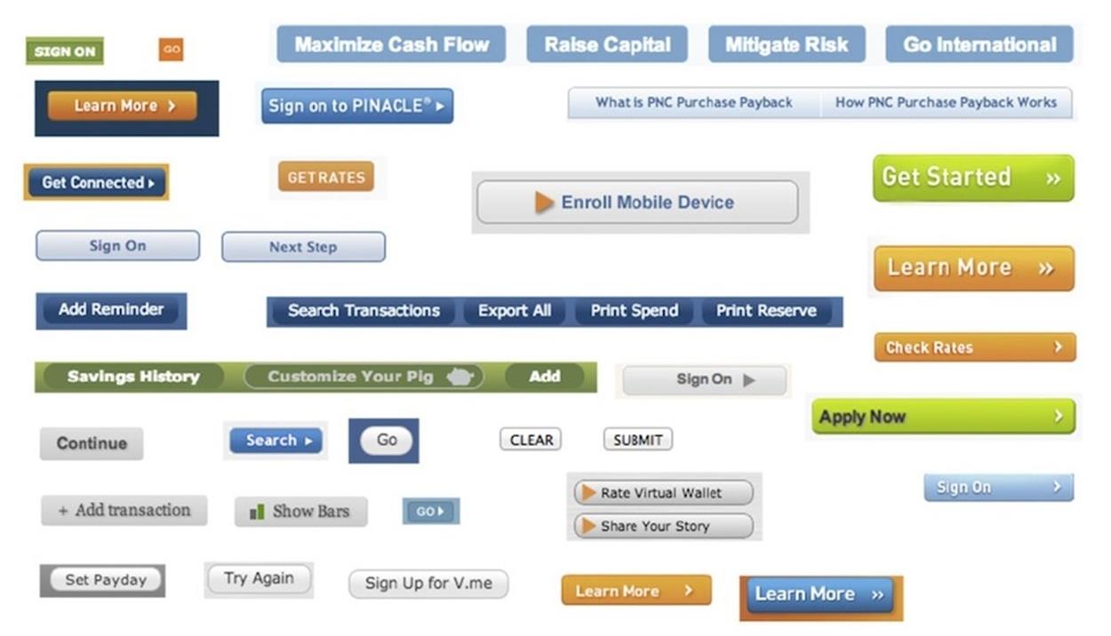
Interface inventories help is to regain the consistency and sense of control in the design process. (Source: http://bradfrost.com/blog/post/interface-inventory/6)
In the example above, front-end designer Brad Frost conducted a thorough inventory of all of the buttons on his bank’s website. The sheer amount of buttons used throughout the website was a clear sign of inconsistency deeply embedded in the design. It’s one single brand, but there are so many different colors and typefaces and sizes and proportions that it might be hard to believe that all these interface elements co-existed on one website.
Drawing up inventories can be immensely helpful. Whenever you’re lost, disappointed or disillusioned somewhere in the middle of your project, conduct an interface inventory; it will help you stay on track and regain confidence. Sometimes projects start to slowly drift away from you, gradually becoming inconsistent and fragmented, and there’s no easy way to notice that until it’s too late. Interface inventories help you prevent this from happening. They help you notice what disparate elements you might have, so you win back a feeling of control in which you are building a scalable design system instead of a loose set of components or common layouts.
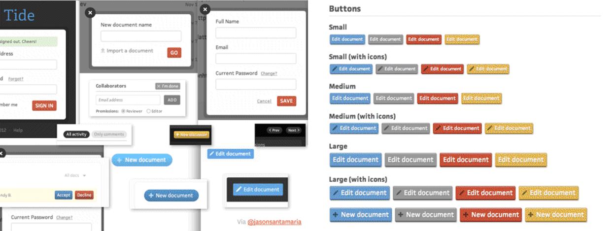
Interface inventory conducted by Jason Santa Maria when working on Editorially.
Designer Jason Santa Maria used exactly this approach when he was designing the app Editorially. He conducted an inventory of all the different interface elements that he had created and noticed just how much disparity there was across them. He decided to consolidate some of those elements: some were similar enough that they could be combined into one while others needed to be refined. The interface inventory also revealed the gaps that existed, and Jason was able to create a few more components to cater for scenarios he hadn’t considered previously. The inventory alone helped him set up a sound foundation for a style guide. That style guide was then able to transition to front-end development and helped everybody involved in the project.
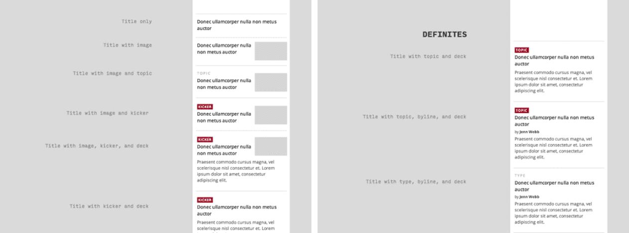
Apparently there are a number of ways to design a link to an article. Grouping and prioritizing options helps establish consistency and hierarchy in a design.
When I was designing the new O’Reilly site7, I did an interface inventory in the middle of the project. I realized I had designed 22 different ways to link to an article: everything from a title with an image to a title with a deck; a title with a deck and a byline; and a title with an image, a deck and a byline. It was just way too much. We didn’t need that many elements. By designing one piece at a time, we reached a state where there were too many different states for our own good.
We decided to consolidate. We created categories called “Definites” and “Maybes”, and ended up with three definites and two maybes. Going from 22 to 5 allowed us to work with a much tighter set, which was ultimately better for our working team, the client, and the users of the site.
PERFORMANCE BUDGET
Visual components aren’t the only area that can benefit from inventories. Performance budgets are another helpful type of inventory.
Recently I worked on a project for Radio Free Europe/Radio Liberty, an organization that reports news in countries where the free press is banned by the government or not fully established. Their work can be dangerous: people have been incarcerated or even hanged for accessing the content. We heard stories about places like Uzbekistan, where people were crossing borders illegally just to read the content on the website; that’s how important this content is to their readers.
Performance was an extremely important consideration for this project — it could literally be a matter of life and death. Radio Free Europe was already working intensely to achieve good performance, doing smart things both on the server and the client progressive enhancement to ensure that core content was loaded as quickly as possible even the slowest connections. They serve hundreds of millions of page views every month, powering 150 sites in over 60 countries. Their readers face very hostile environments; many of their readers access the content exclusively on mobile devices where 3G is the fastest possible speed.
Because we were talking about performance, we started to use new tools. One of those tools was WebPagetest.org8, where you can plug in the URL and see how well it performs under different connection types. WebPagetest grades websites using a few specific metrics such as first byte time, start render time, speed index, and how well the images are compressed. It gives you recommendations to improve those metrics and consequently improve the performance of your site.
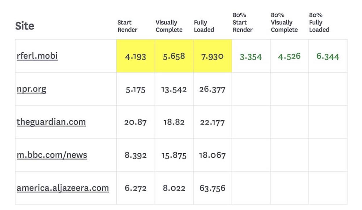
Based on this data, we decided to create a performance budget to ensure that performance was prioritized from the very start of the project. The site should be fast, but just how fast is fast enough? We ran the current Radio Free Europe site through WebPagetest. As we ran it through, the tool returned a set of numbers: 4.193 seconds for “Start Render”; 5.565 seconds for “Visually Complete”; and 7.93 seconds for “Fully Loaded”.
Performance budgets don’t look fancy: they’re just a spreadsheet with metrics and performance goals. In this case, our goal was to be at least 20% faster.
Once we had our data for those metrics, the next thing we could do was gather the data from our main competitors, just to make sure that we were at least on a par with them. Radio Free Europe is a news site, so they don’t have competitors in the traditional sense, we inventoried sites Radio Free Europe admired. We gathered data from sites like National Public Radio (NPR), the Guardian, Al Jazeera, and the BBC. Surprisingly, the Radio Free Europe was the fastest of the bunch.
We could have stopped there, but we didn’t think that was good enough. Tim Kadlec, my developer on the project, wrote a post a few months before this project called “Fast Enough9.” In the post, he highlights some fieldwork in researcher Steven Seow’s book Designing and Engineering Time10 that suggests people perceive tasks as faster or slower when there’s at least a 20% time difference. We didn’t just want to beat the other sites in terms of speed; we wanted regular readers of Radio Free Europe to notice an improvement in loading time for the new site.
We looked into those initial timings — “Start Render”, “Visually Complete” and “Fully Loaded” — and calculated what we should aim for, shaving 20% off the fastest results we discovered. Instead of starting to render in 4.19 seconds, we wanted the site to start in 3.35 seconds. We wanted the site to be “Visually Complete” in 4.46 seconds, not 5.57. This simple calculation provided us with times to target.
But that wasn’t enough, because we really need page weight to make this actionable in a design process. All of these times we were using WebPagetest’s suboptimal mobile 3G speed, which is 768 kilobits per second with a 300 milliseconds round-trip time. We measure page weights in bytes, not bits, so we have to do some conversion. 8 bits is equal to 1 byte, so...
768kbps ÷ 8 bits/byte= 96 kilobytes/second.
We can use that number to create some handy conversions. Here’s our handy formula:
Target time (in seconds) × 96 kb/s = Target weight (in kb)
If we want the site to start rendering in 3.354 seconds, we do:
3.354s × 96 kb/s = 322kb
That’s the maximum page weight we can have in order to get the site to start rendering in 3.354 seconds or less on a 3G connection.
We can use that number as a ballpark figure for the assets we need on the site. Those assets usually come in these five categories:
1. HTML
2. CSS
3. JavaScript
4. Images
5. Web fonts
Using HTTP Archive11, we can find some average weights:
•The average HTML page weighs about 60kb
•The average CSS file weighs about 58kb
•The average JavaScript file weighs about 295kb.
When we add those up and measure it against our target kilobyte weight, we get 413kb (60kb of HTML + 58kb of CSS + 295kb of JS), which is already 91kb over our 322kb Start Render budget. If we followed the average usage of all those assets, we wouldn’t even have any images or web fonts on the new site!
Now that we know what to expect from the average size of a page, we can do some budgeting.
Perhaps we talk to our developer and ask if there’s any way we can get that JavaScript number down. She might say, “I’ve been meaning to try a project without jQuery and just do plain old JavaScript.” If we strip the 266kb jQuery out of our 295kb JavaScript file, that gets us to 29KB, which leaves 175KB left in our budget. We could split that between images and web fonts, giving us about 87KB for images and 87KB for web fonts: perhaps four 20kb images, and about six 15kb web fonts on a page. Here’s what that complete budget would look like:
•HTML - 60kb
•CSS - 58kb
•JS - 29kb
•Images - 87kb
•Web fonts - 87kb
•Total - 321kb
We can even optimize a bit further. You now have a budget for six web fonts, but you might not need all six; perhaps you can get away with just four. If we reallocate some of that weight, we could move two web fonts’ worth (~30kb) over to images, giving us a new 117kb budget for images (roughly 5 images at 20kb each) That budget would look like this:
•HTML - 60kb
•CSS - 58kb
•JS - 29kb
•Images - 117kb
•Web fonts - 57kb
•Total - 321kb
For designers, this kind of information is incredibly liberating to have before starting a design. Knowing that I can use six images and four web fonts before jumping into Photoshop means that I’m using performance as an ingredient in the design process, rather than trying to squeeze it in afterwards. We do our best work under constraints, and knowing this constraint up front is invaluable.
VISUAL INVENTORY
American philosopher Eric Hoffer once wrote, “Language was invented to ask questions. Answers may be given in grunts and gestures, but questions must be spoken. Humanness came of age when man asked the first question.”12
When I start a design, I have many questionsWhat colors and typefaces should I use? Should there be an underlying metaphor or concept to this design? Is showing the application on a shiny laptop the best way to sell it? Can the brand pull off a minimalist design approach? Should the copy be more playful?
Our industry’s typical response is to craft three comps representing three different directions: one comp to explore and answer each major question individually. While a comp is one of the highest-fidelity types of deliverables, they’re a major time commitment to create, especially when we end up throwing away the majority of that work once a client picks one of three directions. In my experience, we lose far too much time in the process by crafting comps — it’s doable and sometimes necessary but extremely time-consuming. There has to be a better, smarter way to do this.
Rather than starting my design process in Photoshop or Sketch or Illustrator, I tend to start to use Keynote. When a client asks for a “playful” design, I could create an original “playful” comp for them, but that may take a few days. Instead, I’ll create a default Keynote document and paste in a screenshot of a “playful” website — like the GoGo squeeZ13 site. I write a little blurb next to it, like, “How playful and whimsical should the new site be?” For instance, the GoGo squeeZ site is full of smiles and catchy illustrations that make you grin as you explore the site.” I’ll also Photoshop the client’s logo into the screenshot as a simple way for them to see themselves in a different way. I’ll compile 10 to 20 of these to send over, which I call a visual inventory.
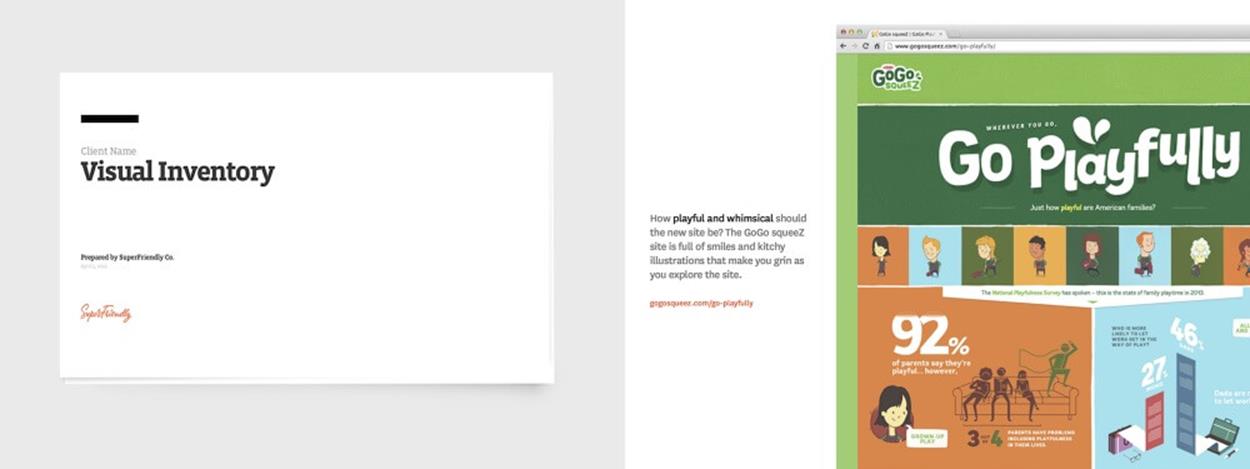
Crafting comps takes time, but you can explore art direction through existing examples in a Keynote presentation.
Remember “the highest fidelity in the shortest amount of time” from the start of this chapter? How do we achieve that? Obviously, a comp has very high fidelity, and it’s the most realistic version that you can achieve (or almost, short of building the actual site), but it always takes a lot of time to get there. On the other hand, a visual inventory achieves a high fidelity that is close to a comp in terms of its actual look and feel. Photoshopping the logo takes a short amount of time. Highest fidelity, shortest amount of time.
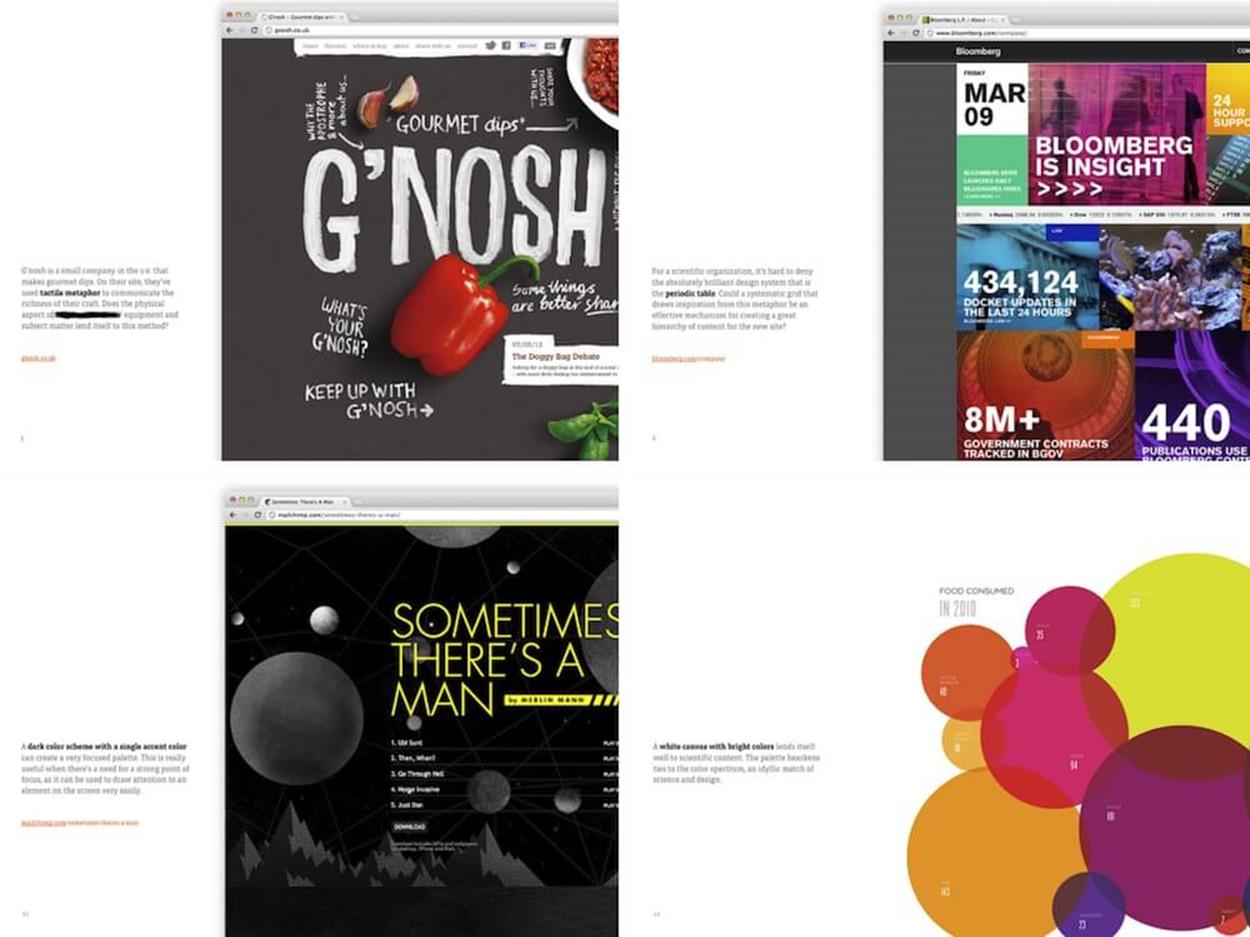
Showing different styles alone is often enough to start up a fruitful conversation on the art direction of a site.
Feedback on a visual inventory can start to give you a checklist of things the client responds well to. For example, they might think flat design isn’t a good fit for their brand, but highly saturated design is; or that software as lifestyle is not a concept that’s going to work for them, but a case study-driven site would work better; or that the tone might need to be more professional than playful.
We can start receiving precise, helpful answers to all those questions within a much shorter amount of time. Unlike mock-ups or comps which take a few days or weeks in Photoshop to produce, a visual inventory can be put together within a few hours. It’s a helpful shortcut that allows you to avoid spending too much time and effort on things that won’t make it in the end. Instead of making random guesses, you're working with tangible, concrete material that will find its way into the final result.
I published a little article14 about the visual inventory technique and have Keynote and PowerPoint templates if you want to get started with one.
As designers undertake more inventory, we’ll more often use tools like WebPagetest, Excel and Keynote to make assets like visual and interface inventories, and performance budgets. Again, that’s very different from what we’ve been used to. In my experience, these are the most valuable tools that modern designers need to know and use — and use well — in order to adapt to the complexity of the multi-device world we have.