Responsive Web Design, Part 1 (2015)
Responsive Design Patterns And Components
BY VITALY FRIEDMAN
We’ve all been there: responsive design is manageable, but it isn’t straightforward; its premise shines through once it’s designed and built, but throughout the process it poses hidden challenges and stumbling blocks. Consequently, the workflow often feels remarkably slow and painful. Responsive design prompts us to reshape our mindset and refine our practices, but also to explore new interaction patterns across a wide variety of screens, input modes, and connection types. However, we don’t have to reinvent the wheel every single time we stumble on a design problem. That’s what good ol’ design patterns — essentially common techniques for tackling common issues — are pretty useful for.
Yet just as design patterns can be helpful and convenient, they can also be misleading, driving us to generic and soulless designs, mostly because we often lack context when applying them. More often than not, we don’t know the rationale or the objectives, the failures, usability tests, the impact on conversion rates and all the decisions made along the way, so we have to make our decisions merely trusting other decisions in other, possibly unrelated contexts.
Now, obviously, every project is different. Every project poses unique challenges, with different audiences, goals, requirements, constraints and objectives. So it shouldn’t be surprising that sometimes applying design patterns directly will work just fine, while other times it will fail miserably when validated in the face of reality. That’s a risky undertaking indeed; with design patterns thorough testing isn’t just important, but crucial for getting things right.
We’ve all learned from our own experiences that responsive design isn’t just a set of media queries used to patch broken layouts. It’s much more difficult than that: in our work we see it as a complex multi-dimensional graph with dimensions ranging from typography to performance. As designers, we have to put just the right dots at just the right spots across these dimensions to ensure that we create a scalable and maintainable multi-device system. Usually it’s not simple nor straightforward.
When crafting responsive experiences, we have to consider a number of dimensions at once: not only design constraints such as typography, navigation or performance, but also strategic decisions such as hostile browsers, narrow screens, touch input or maintenance. To tackle this complexity, we have to shift our focus towards designing resilient and reliable design systems.
In fact, while design is often seen as a continuous process, going from start to finish in a series of smooth, successive iterations, I find that more often it’s a meticulous series of sprints — finding solutions, refining them in iterations, hitting dead ends, and starting over again and again — until you find a solution that works well within the context of a design, which eventually brings you to your next design problem. The main issue is that those dead ends are really expensive. This is when you lose most time, and when recovery can be very difficult and frustrating. Design patterns help you recover from hitting these dead ends; they can reroute your decision-making process efficiently. They can also allow room for creativity as long as you don’t follow them blindly.
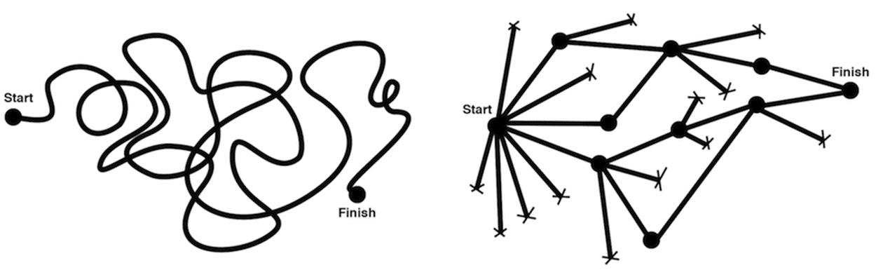
The design process is tricky and unpredictable. It’s not a continuous process with successive iterations, but rather hitting and overcoming dead ends over and over again. Image credit: Julie Zhuo1.
Over the last few years, I’ve been spending quite some time in small and large companies, solving responsive design problems, primarily related to UX and front-end performance. I’ve seen a number of design solutions emerging, evolving and flourishing, and others getting shot down in merciless user interviews or performance audits. I rarely found unique and obscure solutions suddenly coming out of thin air, though; more often they were built on top of already existing (and seemingly established) design patterns, supported and informed by trial and error, and fine-tuned by permanent, ongoing design iterations. Ideas don’t come out of nowhere, they are built on top of others; I believe this holds true for design patterns as well.
What does this mean for a design process? Well, I think it’s perfectly fine to choose design patterns and build your own on top of them. When coming into a company to work on a project, our team can’t afford losing time because we have just a week or two to produce meaningful results, mostly functional prototypes. We can’t spend too much time on high fidelity mock-ups or on complex custom cross-browser components which might take weeks of development. To stay efficient, we can’t spend a lot of time on high fidelity in the prototyping stage. In most cases, we have to be pragmatic, efficient and selective; to achieve that, we explore design patterns and test them against reality with actual users — early, quickly and often. Rinse, iterate, repeat.
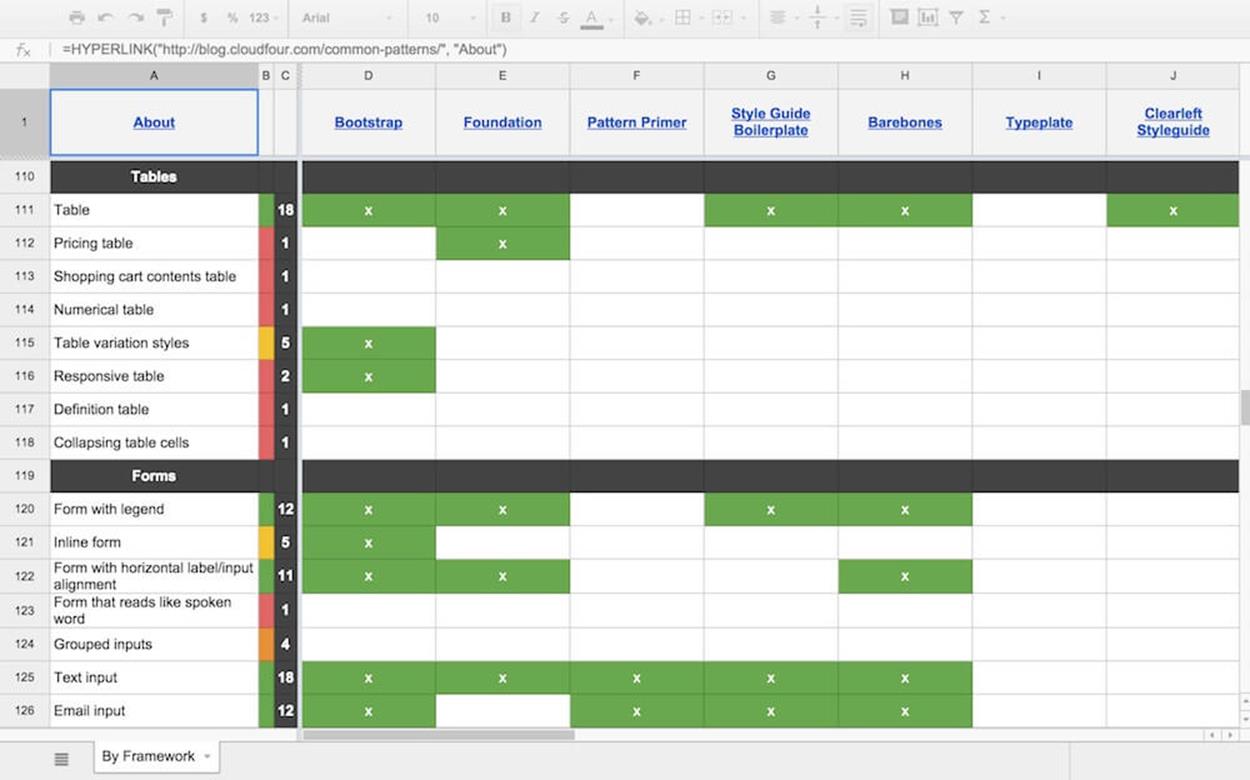
A reference spreadsheet2 containing components and popular frameworks or pattern libraries in a handy overview.
During prototyping, we often use CloudFour’s elements spreadsheet3 that lists a number of components against frameworks and large pattern libraries. If we need a very specific component, we might find it in there and build a prototype very quickly. It doesn’t mean that this is just the right solution for our problem, though, and it doesn’t mean that we are going to use this piece of code in production either. But for prototyping, it can be extremely useful.
In these situations, patterns (among other things) prove to be extremely handy time-savers — again, not because they always work everywhere but because they give you a sturdy foundation, and as you keep working on the design they often help you converge toward the final solution much quicker than if you started from scratch. Of course, sometimes you have to start from scratch after all, but knowing solutions that worked (or failed) in real-life projects helps you better shape and guide your decision-making, and limits your options, which I find extremely powerful and liberating in the design process.
That’s exactly what this chapter is about: clever design solutions, obscure techniques and smart strategies that I’ve seen working or failing in actual projects, and which could be applied to your projects, too. You might not be able to use all of them, but hopefully you’ll get a good enough idea of just what kinds of solution might work well in common situations when designing or building responsive websites. Let’s start. Fasten your seat belts. It’s going to be quite a journey.
Navigation Patterns
Surprisingly, making navigation work well across a large variety of devices often proves to be one of the most challenging and involved undertakings in responsive design. And it’s often not just a matter of organizing all existing content but rather reducing existing complexity and setting priorities well.
PRIORITY LISTS FOR CONTENT AND FUNCTIONALITY
Priorities are often tough to agree on, though. While asking clients what is and is not important rarely yields meaningful results, listing important pages in a spreadsheet and asking clients to assign priorities to them often does the trick. As one of the first steps in the design audit, we prompt the client to assess and state priorities by marking pages (or features) which are of primary, secondary or tertiary importance. This classification helps group items accordingly and shifts the focus of the experience toward more crucial tasks or content, or at least prioritizes them in the navigation later.
You can actually suggest priorities (“user” view) in a spreadsheet as well, and if they aren’t quite right you will surely be corrected by the client. The client’s assessment is likely to reflect business objectives (“client” view) which then have to be weighed up and balanced with the user needs you indicated. Even if you don’t get a clear overview of what content or features matter most this way, you still introduce the notion of priorities into the conversation which can be helpful to drive the design process in the right direction — towards focused multiscreen experiences, with the focus on content and how it’s organized, of course.
THE CONTENT IS FOR EVERYONE: CONTENT PARITY
Having clear priorities is useful, but alone it doesn’t justify removing or dismissing any piece of content or functionality altogether for any screen — just because users expect everything to be available everywhere. That’s why, over the years, content parity has become an established paradigm for delivering content to users. Obviously, content parity doesn’t mean that every experience is going to be identical for every user (it can’t be), but all pieces of content should always remain available, whatever settings and input modes the user uses.4 In other words, you don’t have to show all content or navigation options at once, but they should remain accessible on every device, perhaps appearing on a tap in an accordion or via click-through in the navigation drawer.
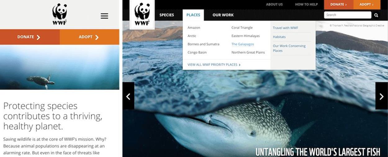
In a narrow view, WWF reduces the entire navigation to three critical items: two calls to action and a navigation icon, leading to primary navigation.
WorldWideLife.org is a good example for this pattern: in a large view, we see a series of drop-downs (actually, every single navigation item is a drop-down), which get reduced to two main call-to-action buttons and a navigation icon (the infamous hamburger icon) in smaller views. Once you click or tap on the navigation icon in a smaller view, you don’t see all the navigation levels at once, but only primary navigation items. These links take you to a page containing further navigation options, unlike the links in a drop-down or multilevel accordion, which are all presented at once. In fact, sometimes you don’t need to show all options at once; for mobile, prioritization is both crucial and necessary to avoid a cluttered and inefficient interface.
A multilevel accordion could be a useful solution in some contexts, but it’s worth testing to see if your visitors actually access a fifth-level navigation item via an accordion or just use search instead. Obviously, it depends on the task, too, but polluting HTML with five levels of navigation or sending AJAX requests to fetch more navigation might be unnecessary.
In some situations, it might be worth deviating from this principle by showing context-sensitive content, based on assumptions derived from screen width, touch support, and geolocation. For example, if you provide online banking and your application isn’t responsive just yet, you might want to show a link to the mobile banking login, as well as opening hours and the closest branch nearby, like KiwiBank5 does. The information should be available in the other views as well, but it could be presented differently.
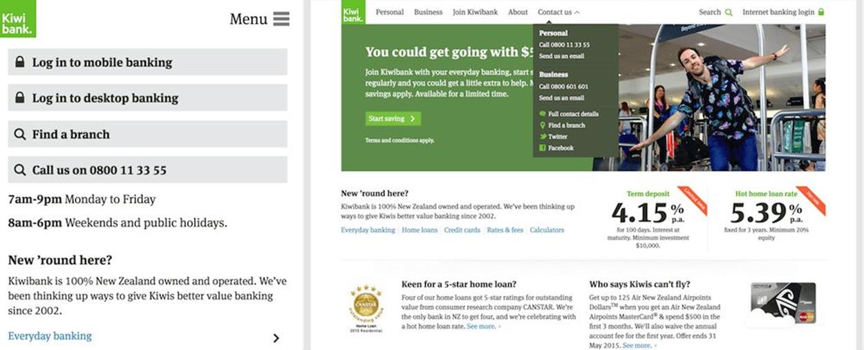
On KiwiBank, all content is consistently available everywhere, but priorities change depending on the viewport. That’s a risky undertaking, but it could be worth testing at times.
A restaurant could show directions, distance from your current geographical position and expected arrival time, as well as reservation options taking that timing into account — e.g. on tap, in an accordion. Obviously you could argue that these pieces of content would be equally important for desktop experiences, too, but perhaps you’d need to display them differently. Priorities matter: and thinking about them up front can often go quite a long way to help establish a consistent, good user experience.
FANCY HAMBURGERS, OBSCURE CANVASES AND SNEAKY WORDINGS
When it comes to priorities, actual content always deserves special attention. Since the focus of the user experience should always lie on content, everything else has to get out of the way, and this holds true for navigation, too. That’s where the infamous off-canvas pattern with the at least equally infamous hamburger icon comes into play.
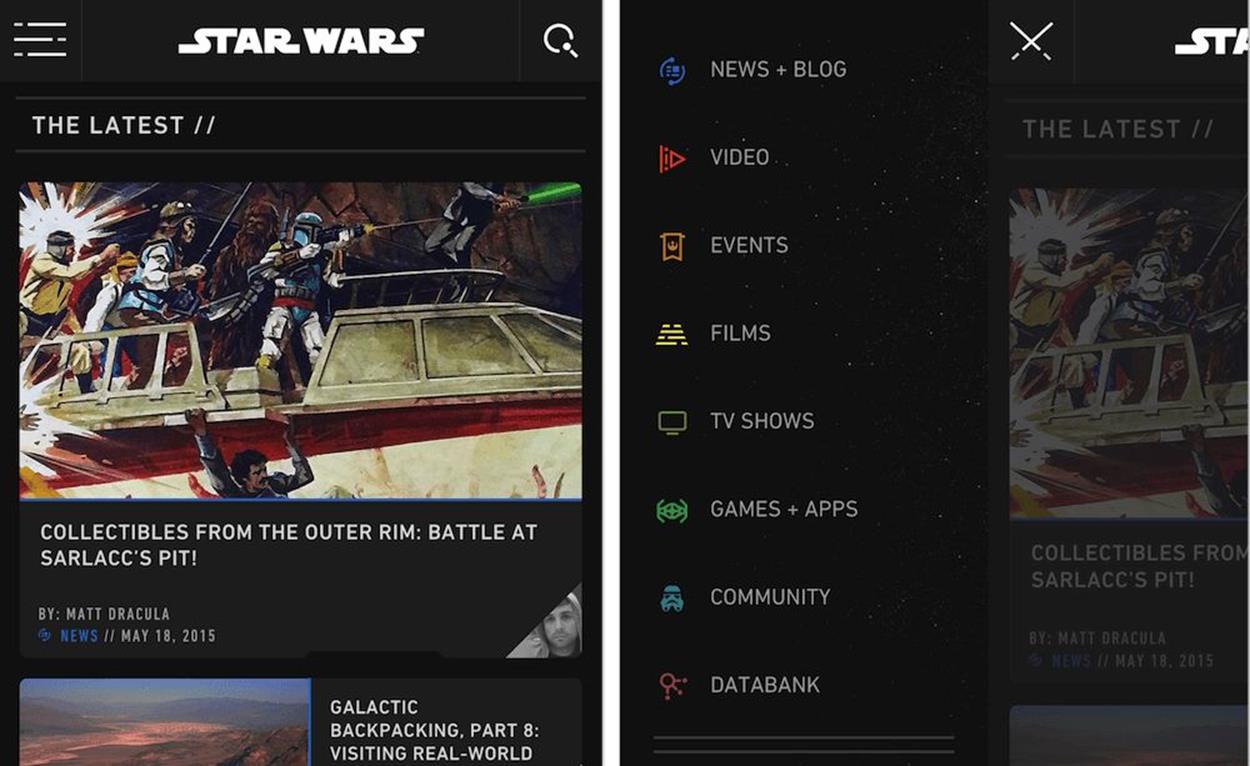
StarWars.com probably has the most unusual “hamburger” navigation, with three horizontal lines turning into lightsaber on click — and a navigation drawer sliding in from the left side.
You know how it works: in a narrow view, users might see a few main navigation options (such as Search, Cart or Menu buttons), but they don’t see all available navigation options right away. These options are revealed via a navigation drawer on click or tap on Menu, sliding in from the left, the right, the top or sometimes sliding in between the logo and the main content area. What sounds like a pretty much established and widely accepted paradigm doesn’t necessarily work flawlessly in every context. We noticed that navigation items hidden behind an icon almost certainly result in a (much) lower engagement ratio when compared with links displayed on the page — and consequently produce fewer clicks. Besides, if critical items of your interface (such as a shopping cart or login) are hidden off-canvas, users can get impatient and frustrated. Such navigation items would be better off displayed on the page, perhaps with a noticeable icon, in a tab, as a button or as a simple link.
It’s not just about engagement, though. We’ve also noticed that when using the off-canvas pattern we always ended up with an uncomfortable viewport range between the standalone hamburger icon on very narrow views and a fully fledged navigation menu on larger views. The problem: when exactly do you start displaying full navigation? Or, the other way around, when exactly do you start hiding full navigation behind an icon? And what exactly should happen on screens which are neither narrow nor particularly wide? Well, usually we would just dismiss it as an edge case and not display any navigation items at all, although we might have enough space to show something usable. That’s suboptimal at best.
And then, of course, the issue of internationalization comes along: what if, on top of the existing uncomfortable viewport range, you need to accommodate navigation for a dozen languages? To keep your codebase maintainable in the long term, you can’t keep creating media queries based on every supported language (e.g. by adding classes on the <body> element); you’d have to create a mess of additional classes, or even style sheets that would need to be revisited once the navigation changes dramatically.
You could use a little JavaScript to measure dynamically how much space you have and either turn a search box into a search icon, or turn navigation items into a menu icon when there is no space left for the container to be fully displayed within the current viewport width. Libraries like makeFit6 do just that by observing the resize event and adjusting the layout accordingly. We tend to use JavaScript as a method of last resort though.
The uncomfortable range. All navigation items could potentially be displayed, but instead, they are hiding behind the infamous icon.
Of course, you could solve some of these issues with iconography, but icons aren’t always universally understood and often it’s just not an option: what icon would you choose to display “Our philosophy” or “Delivery times”? Not surprising, then, that in many scenarios the off-canvas pattern seems like the simplest and safest strategy to keep navigation options out of the way, yet still accessible and unobtrusive, so the navigation won’t break or pollute an existing layout, independent of the languages you choose to support in the future.
Another thing we noticed is that, when implemented without a thorough content inventory, the off-canvas drawer might end up containing many unnecessary secondary items and many nested levels of navigation. Sometimes it’s required and expected, but more often it isn’t. Therefore, when we start working on a project, we always look into options of focusing on primary navigation alone. If search is provided, we explore what happens if we remove secondary navigation altogether, both on desktop and on mobile, and how user experience deteriorates as a result. If the result is suboptimal, we add one level of navigation and measure again. If we still notice a UX problem, we keep repeating the process. And if there is a lot of content to organize, sometimes we look into providing something like a step-by-step guide from general to specific navigation items, very much like the GOV.UK homepage. When required, different nested levels in mega drop-downs could be accommodated via accordions, although they might not be absolutely necessary if search provides autocomplete or uses the type-ahead pattern.
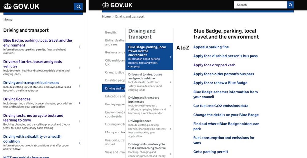
On gov.uk, different levels of navigation are displayed as layers, so all sections are available right away, with one click.
So what are we going to do with these hamburgers and canvases? Off-canvas is a good option, but it’s not a golden bullet. In fact, there are other ways to keep navigation out of the way yet still accessible and user-friendly; meet the first one, the shiny Priority+ pattern.
SHOW WHEN YOU CAN AND HIDE WHEN YOU CAN’T
With the Priority+ pattern, instead of hiding important navigation items in smaller views, we use all available space to show as many items as possible, prioritized from left to right in LTR interfaces, and from right to left in RTL interfaces. At the end of the navigation list, you then provide an interface element to toggle the view of all navigation options, via accordion, an expandable area, or a discrete modal window. Obviously, the “More” link or full navigation icon would need to be aligned right in LTR interfaces and left in RTL interfaces. As Brad Frost rightfully states7, “[t]his ability to scan these labels left-to-right and feed right into the overflow ‘more’ link feels like a more natural discovery flow compared to everything hiding beneath an ambiguous icon.”
You could even go as far as displaying navigation options next to the logo, not using any additional vertical space for navigation at all. In that case, making your logo responsive — delivering different assets to different views — would be helpful as well, either via an SVG sprite or media queries within SVG to adjust the thickness of lines and elements of the design. Obviously, it depends on the complexity of the logo, but using responsive iconography to save precious vertical space on the screen for content could be worth considering for icons with a high level of detail.
The Guardian and Google Docs are good examples of the pattern in action. In every view, users see something: a few navigation items which hopefully are sorted according to their usage and priority. Because you prioritize important items, critical actions will always be reachable and visible, potentially driving more direct traffic to those important sections or features of the site. This could be particularly useful for cases with a large amount of heavily used navigation sections, such as an online shop which accommodates a mega drop-down in large views.
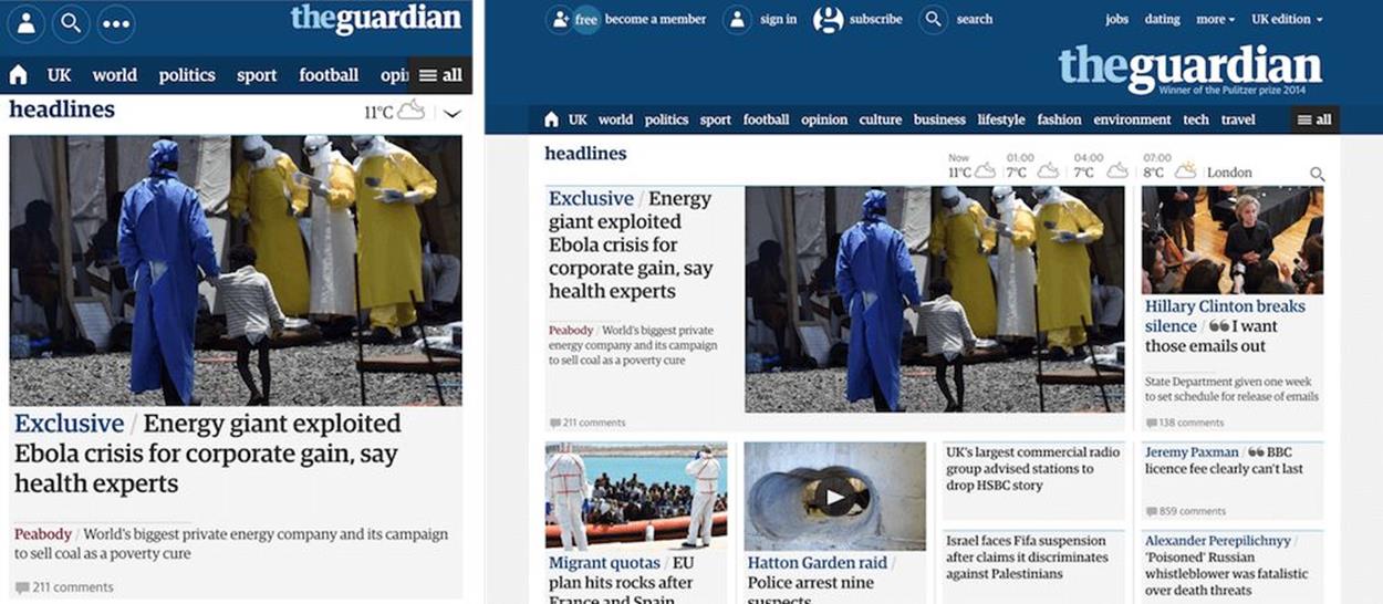
The Guardian shows as many items as possible in a horizontal bar, prioritized based on what’s most popular, and the rest is accessible in the “all” menu.
However, it’s not always clear what navigation icon to choose for a given scenario. In a few projects involving older people, we found that the hamburger icon isn’t widely understood and sometimes leads to confusion. You could argue that it’s just a matter of time until the hamburger icon becomes accepted, but it’s a safe bet to avoid any iconography altogether and use a clear label (“Menu”) with a clear affordance as a button8.
Historically, we used to place the icon in the upper corners of the screen, but larger screens made it difficult (if not impossible) to reach those interface controls with a thumb alone, which is a preferred mode of use by a large majority of users; it might be a good idea to place them as tabs at the bottom of the screen instead, or as a floating navigation icon in the bottom-right corner. The transparency of the icon could increase as the user keeps scrolling down the page, making it noticeable but unobtrusive, and still providing options on tap. Obviously, you wouldn’t want to embark on a hideous journey of position:fixed bug fixing, but there are some workarounds, e.g. position:sticky polyfill9.
If we do use the off-canvas pattern, we always tend to cover three critical use cases. First, when users tap on an icon or button to open the navigation drawer, they shouldn’t have to move their mouse or finger to close it again; the interface should display the button to close the navigation in exactly the same spot where it initially displayed the menu button. We found out that just as visitors use navigation to jump to the specific content they need, sometimes they want to explore available options without jumping deep into specific areas of the site.
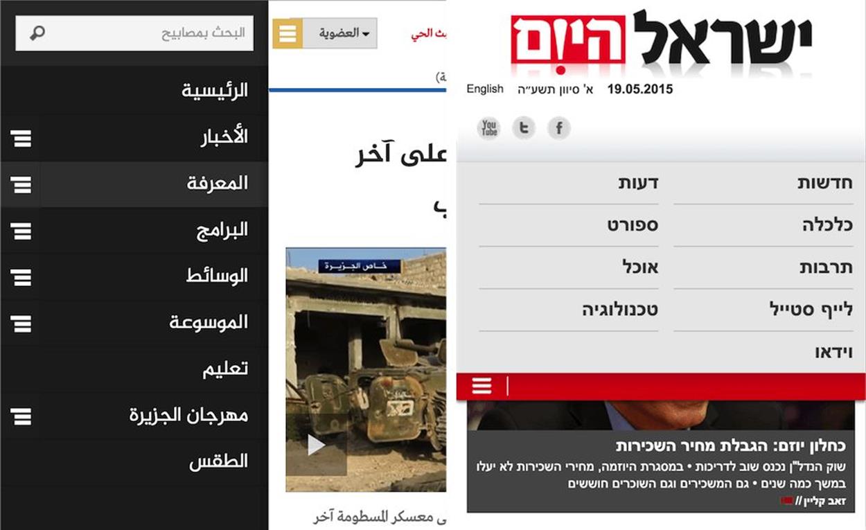
If you have a lot of navigation, as Al Jazeera does, off-canvas is often a bulletproof solution. For less navigation, something as simple as content sliding in might be a better option, as shown on IsraelHayom.co.il.
Second, we tend to bring in a more detailed navigation drawer sliding from the left or right while we slide more focused or shorter navigation between the logo and the content.
Third, we tend to maximize the amount of content displayed on the screen, so we remove as much secondary content as possible including navigation, logo and any supplemental items. The content deserves room to breathe and the closer we can get to all of the space being reserved for content, the better the experience will be. It often means that the logo gets smaller in narrow viewports and the navigation button either disappears or floats with scrolling while fixed headers, footers or pop-ups are avoided at all costs. Medium10, for example, removes the entire navigation when a user starts to scroll down and reveals it again once a user scrolls back up. This technique might work for overviews of products as well as long reads, although we’ve never had a chance to test it in an actual project.
YOUR CONTENT SHOULD LIVE IN A PERFECT RECTANGLE
We spend a lot of time adding horizontal media queries to adjust layouts, but I’d argue that in many cases vertical media queries would be well suited for any layout adjustments as well. Since users prefer to use mobile devices in portrait mode (90%) and their screen height is usually smaller than a desktop’s screen height11, you could take into account the viewport area and try to ensure that users always see enough content, so the font size would depend on both width and height. In fact, you could easily automate the font size adjustment by embedding vh and vw units in your size calculation; for instance, body { font-size: calc(2em + 0.7vw - 0.3vh); } works great for a single-column layout, but might break a multicolumn layout, so choose a value for vw and vh units with caution.
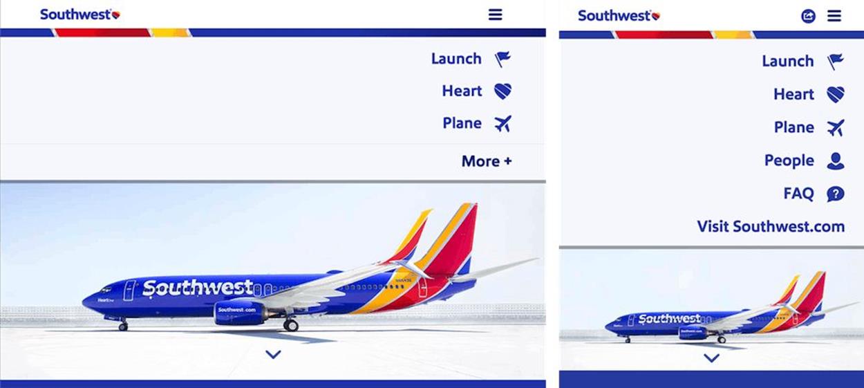
If you have many navigation options, you could use vertical media queries to show fewer items if there isn’t enough space to show them all.
A good example for vertical media queries would be a layout in which open navigation options cover a significant portion of the content. In such cases, you could reduce the number of displayed items (again, very much like the Priority+ pattern suggests) and add a toggle to switch to the remaining items if there isn’t enough vertical space to show them all at once (see Southwest Airlines example above). Another use case would be a vertical full-height navigation where you might want to adjust the blocks of content to fit the entire content on the screen. Also, paddings, margins, font sizes, and icons could be adjusted to tame the content within the screen. If you have a drop-down which appears in the middle of the page, you could review the amount of space available in the browser window under the drop-down, and potentially display navigation options above the drop-down when there isn’t enough space beneath it.
You could also detect device orientation and adjust interface controls to better match more comfortable hit areas, pulling them to the left and right in the landscape view, and to the bottom of the screen in the portrait mode.
You could even go so far as transforming a content-heavy page, which could feel almost endless on a narrow screen, into an accordion-like table of contents with progressive disclosure, so that users can toggle sections of the page and jump quickly to the content they care about, very much like Wikipedia12’s pages do.
In fact, in a large variety of scenarios, exactly this pattern — progressive disclosure with a toggle or accordion — proves to be a remarkably useful technique to tackle most content-related issues. If you have to break down the complexity of an interface component into something more manageable, or just simplify a seemingly crowded article page, you’ll be able to achieve good results quickly, as long as you group content logically and consistently. Whenever you don’t know what to do next, think of progressive disclosure as a workhorse at your disposal — it will do the trick more often than you think.
BREAKING DOWN THE WALLS WITH ENCAPSULATED VIEWS
Breaking down complexity is probably the most common undertaking when implementing responsive navigation, yet the main mistake we make is showing all options at once on all screens, basically carrying over a vast amount of navigation overhead from the desktop to mobile experiences (or from mobile to desktop experiences when building mobile first). The problem becomes apparent when the navigation isn’t compact and straightforward.
What happens if you are running an e-commerce site with a number of filters for selecting size, color, and shape, and you want your users to be able to quickly switch to categories and perhaps compare products? Furthermore, to avoid unnecessary interactions, you’d like to update content automatically in the background when a user selects a filter, without them having to click on the “Submit” button every now and again. If you choose to show all filters at once, users might not see any content at all, so it will be loading in the background but users will have to scroll all the way down to see the content. You could reveal the filters by tapping on an icon in the upper-right corner, but once users have selected a filter and scrolled down to see the content, they will have to scroll back up again to adjust the filters. Both scenarios aren’t particularly user-friendly. So, what do you do?
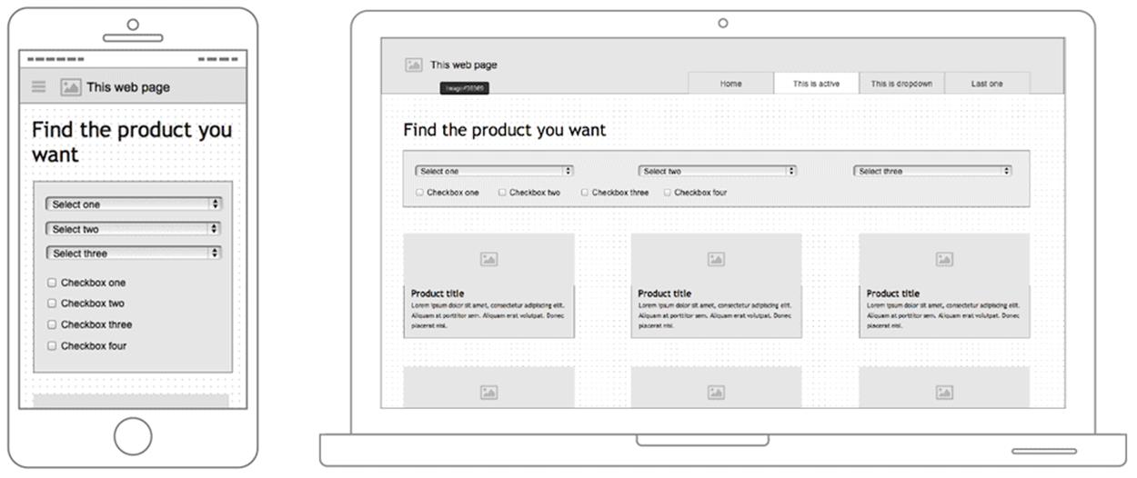
A wireframe of an e-commerce page with a few filters. In a narrow view, users would see exactly 0% content, even with selected filters. Image credit: Daniel Wiklund13.
The simplest strategy would be to break down the single, large filters section into multiple detached, smaller sections. We then could show them at the bottom of the screen as three to four separate tabs instead of just one large block in the header of the page. Each of the tabs would need to have a clear label (e.g. “Color”, “Size”, “Price range”), and once tapped or clicked, reveal appropriate filters. Another option would be to have the filters float on the side as users explore the products they have filtered. A slightly more interesting option would be to hide the filters behind an icon in the upper-right corner and display them on tap or click as a persistent layer. This layer would cover a part of the screen (on narrow views, obviously, the less screen it covers, the better) while the content would appear in a semitransparent layer beneath the filters layer. So if users have relatively wide screens, they’ll see both the filters and the content. That’s also the reason why the layer is persistent: if users choose to close the filters section, they must have made up their minds, so (almost) the entire screen will be dedicated to the content and not filters; otherwise they might need to repeatedly open and close the filter drawer.
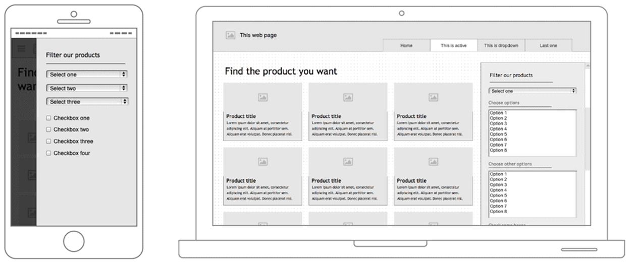
With encapsulated views, we can show both the content and the navigation — as far as possible. In narrow views, we could use a persistent layer covering a part of the screen on the right, and on larger views, the filters could appear on the right side as well, for consistency. Image credit: Daniel Wiklund14.
This pattern is called the view mode pattern because the features and content of a website are divided into individual, encapsulated views (or cards, or layers) and connected within your interface. This way, you can recoup space even in smaller viewports while gaining the ability to update and process user input (which would need to happen asynchronously, causing a bit of performance overhead). This resembles the off-canvas pattern but could be used for more than just navigation. For instance, you could provide autocomplete search functionality in this way, or even design your entire checkout with each step sliding in from the side, showing the actual product being purchased during the entire checkout.
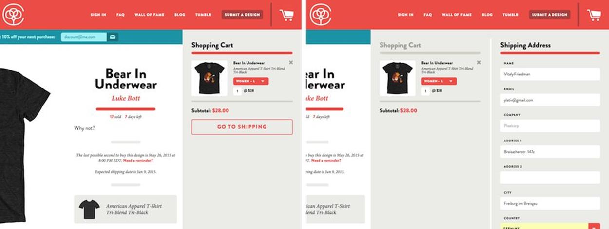
On CottonBureau.com, the checkout experience is designed with the “view mode” pattern in mind. Each step in the checkout is sliding off-canvas from the right, showing both the content and the checkout as far as the space allows for it.
The pattern can be remarkably helpful for complex components, and it could be further improved by allowing users to easily switch between multiple layers by just tapping on them. This technique is used by the Danish Cancer Society15 to enable users to both browse through the different levels of navigation (on the right) and see the content of the selected section (on the left) at the same time. In fact, the pattern passed usability studies with flying colors, and it’s still being used now almost a year later.
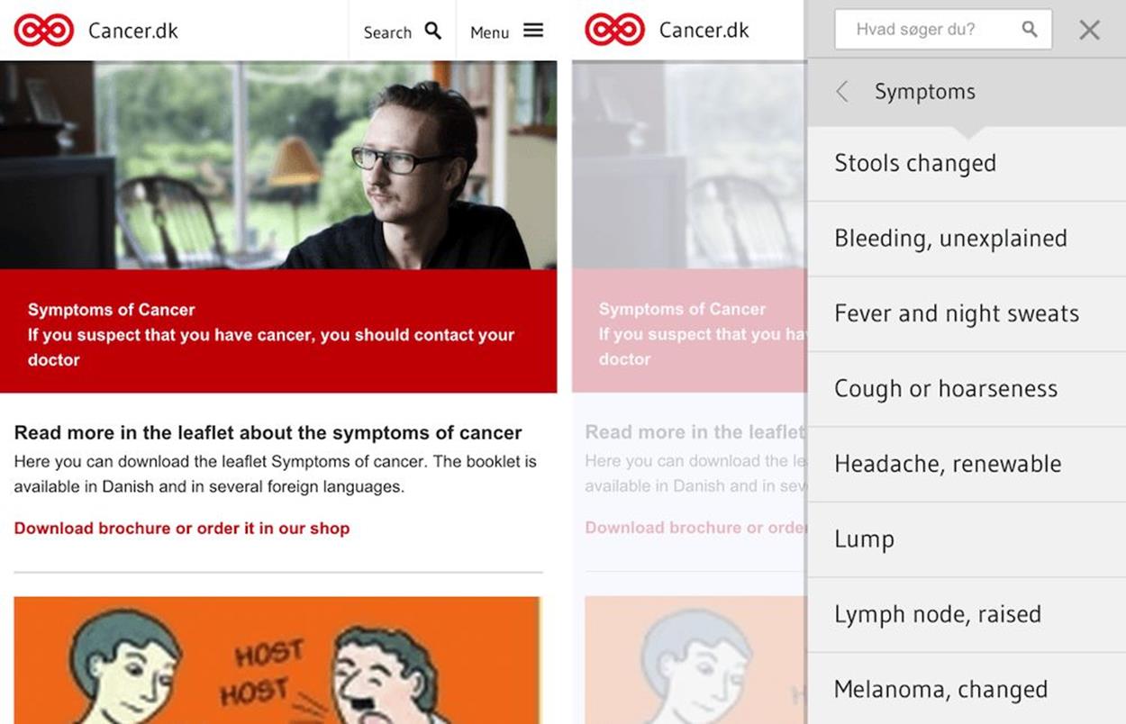
View mode pattern used on Cancer.dk to reveal navigation options while showing content on the left side. When users browse through navigation options, the content area is updated automatically.
THE ALMIGHTY FOLD AND NASTY CAROUSELS
Almost every single meeting I find myself sitting in involves an uncomfortable, toxic ingredient with a lingering and irritating bitter aftertaste. Yes, somebody sparks an endlessly painful conversation about the almighty fold, or more specifically, important interface elements that should stay above the fold. These conversations are remarkably misleading and counter-productive, and usually lack any user research data to prove… well, pretty much anything. When somebody raises a question about the fold and call-to-action buttons, it’s usually a warning sign that things are about to go south. Whenever it happens, (rather than freaking out and leave the room) you could question the validity of their arguments and request actual data.
As it happens, quite often above the fold isn’t as important as below the fold. As Luke Wroblewski stated in one of his talks, “The hardest thing on mobile is figuring out the right time and place to display an action”16 — displaying a call-to-action button very early at the top of the page is often neither the right time nor place to encourage that action.
Crazy Egg17’s recent redesign showed that short, concise landing pages don’t necessarily result in higher conversion rates when compared with longer pages. In the redesign, the challenger design was 20 times longer than the control but caused a 30% increase in conversion18, simply because the design team added testimonials and feature highlights that made a convincing argument at the right time and the right place. Again, to quote Luke from the same talk, “[t]he issue wasn’t whether the call to action was visible, but rather whether the call to action was visible at the point when someone has become convinced to take action.”
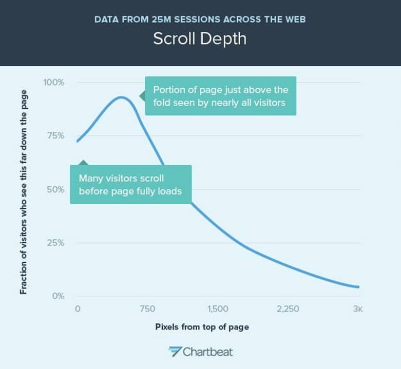
Perhaps “above the fold” isn’t the most lucrative area anymore — just above and just below the fold are.
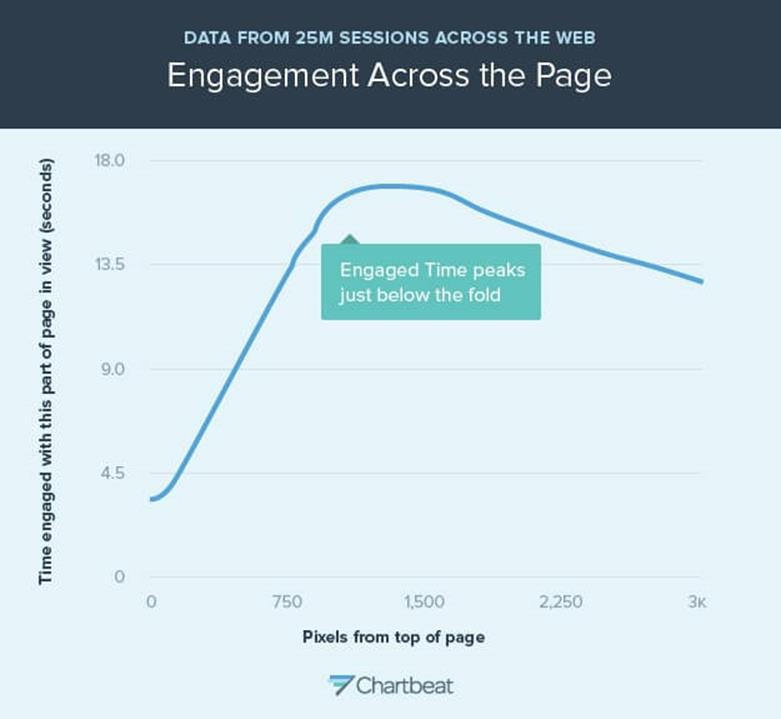
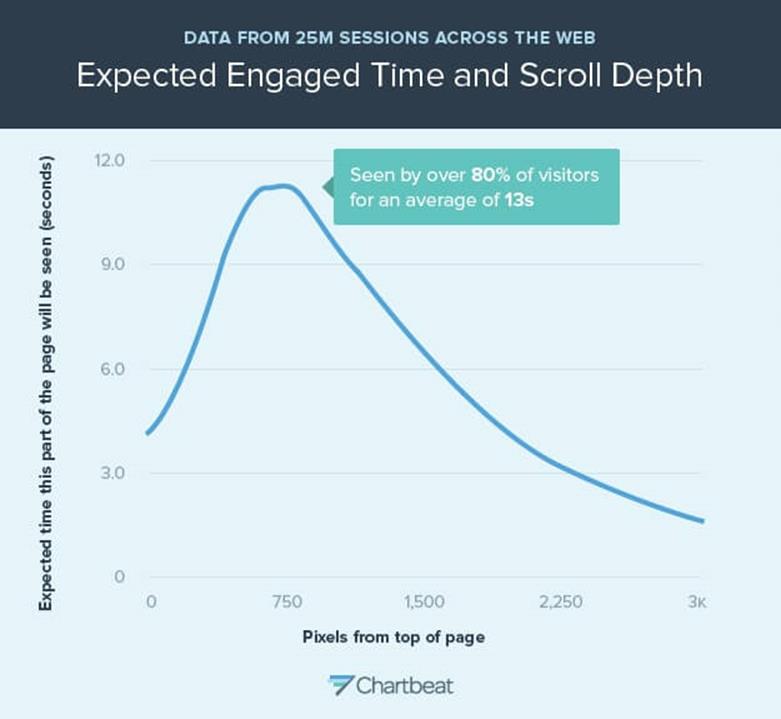
But how do you identify this point? Well, you rely on research. According to a recent Chartbeat study, “Scroll behavior across the web19” by Josh Schwartz, the very first thing many people do when they encounter a website is scroll down. This is primarily because they can often find the logo, navigation, search field and ads at the very top of the page, occasionally accompanied by a window encouraging users to download an app — often there is just no useful content at the top of the page. In fact, some users start to scroll down a page before it finishes loading. The most viewed area of the page is just above the fold, at about 550px, with just over 80% viewership. The area between 750px and 1,500px is viewed nearly three times as long as the top portion of the page, with the peak at 750px seen by over 80% of visitors for an average of 13 seconds. This is where most people spend most of their time and this is where a call-to-action button would be best placed, provided that the work of convincing the user has already been done.
Another myth surrounding many conversations in the war room (also called “the meeting room”) are the benefits of carousels. Clients love them, but the verdict of the design community is pretty clear: carousels don’t convert. The images aren’t seen nearly as often as they should be, not to mention performance issues; hence, they should be avoided at all costs. To be honest, it’s not surprising most carousels aren’t efficient — all too often they are poorly designed. They are nothing more than an oversized image, with a few hardly noticeable dots (supposed progress indicators) and, if you are lucky, arrows on the side; or, if you are unlucky, automatically rotated images. However, carousels rarely give users any incentive to navigate to the next item, and once they choose to do so, the controls prove to be very difficult to use.
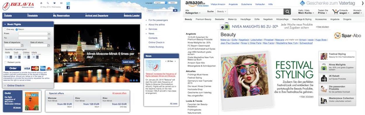
Carousels aren’t necessarily dead. Poorly designed carousels are highly inefficient. Well-designed carousels could be efficient: there must be a clear incentive for users to flip it through. Belavia.by and Amazon.de in comparison.
Carousels can be designed better, though. Recently, Amazon adjusted its carousels by adding a vertical bar on the right-hand side to better highlight all items within the carousel using small thumbnails of the products and a descriptive caption of the offers, in effect creating a tabbed widget that is easy to tap and click. Still, the images in the carousel rotate automatically, but the experience isn’t obtrusive at all, providing helpful hints for valuable deals that users might indeed find helpful, without obscure dots and navigation arrows. When users click on one of the thumbnails, they know what to expect and they have a good reason to engage with the carousel. Amazon didn’t share any numbers, but after initial testing it has been rolling out the new design on every category page, so the results are likely not to be disappointing.