Responsive Web Design, Part 1 (2015)
Responsive Design Patterns And Components
OPTIMIZING FOR LARGER SCREENS
Looking back at the last few years, most of the projects we spent a lot of time on turned out to be redesigns; designing and building a responsive website often boils down to somehow adapting the desktop experience to the mobile space. Consequently, if a component can be resized and squeezed into a narrow viewport, then it’s usually the first option that is considered. However, mobile often requires an entirely different approach; optimizing for narrow views is a matter not just of scaling down, but also rethinking the user interaction and coming up with an entirely different, unrelated interface pattern for that interaction.
And just as we have to rethink for narrow views, we have to rethink for larger screens as well. Quite often responsive websites appear to be designed with a maximal screen width in mind, so while they work well from views up to approximately 1,750px, the design feels lost on larger screens, with content stuck either in the middle of the viewport or aligned to one side of the screen.
If you have a robust visual design, you could enlarge the width of the container and increase the font size of its elements for larger views while adjusting the background image or background color of the site. This way, you create an illusion of filled space, like the Institut Choiseul20 does.
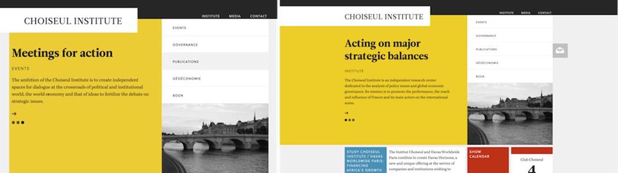
For larger views, you could center the layout and play with the background color to create an illusion of filled space.
If you don’t have a strong visual design in place, you could either display different pieces of content separately and prominently in multiple columns, perhaps as overlaying content areas; or shift one of the content areas to the left or to the right. An interesting example for that would be a search page; when users with large viewports click on one of the items in your search, the page could appear on the right with the search results still present on the left, and on narrow screens only the requested page is displayed. That’s what the Kremlin website21 does, always accommodating the available space intelligently.
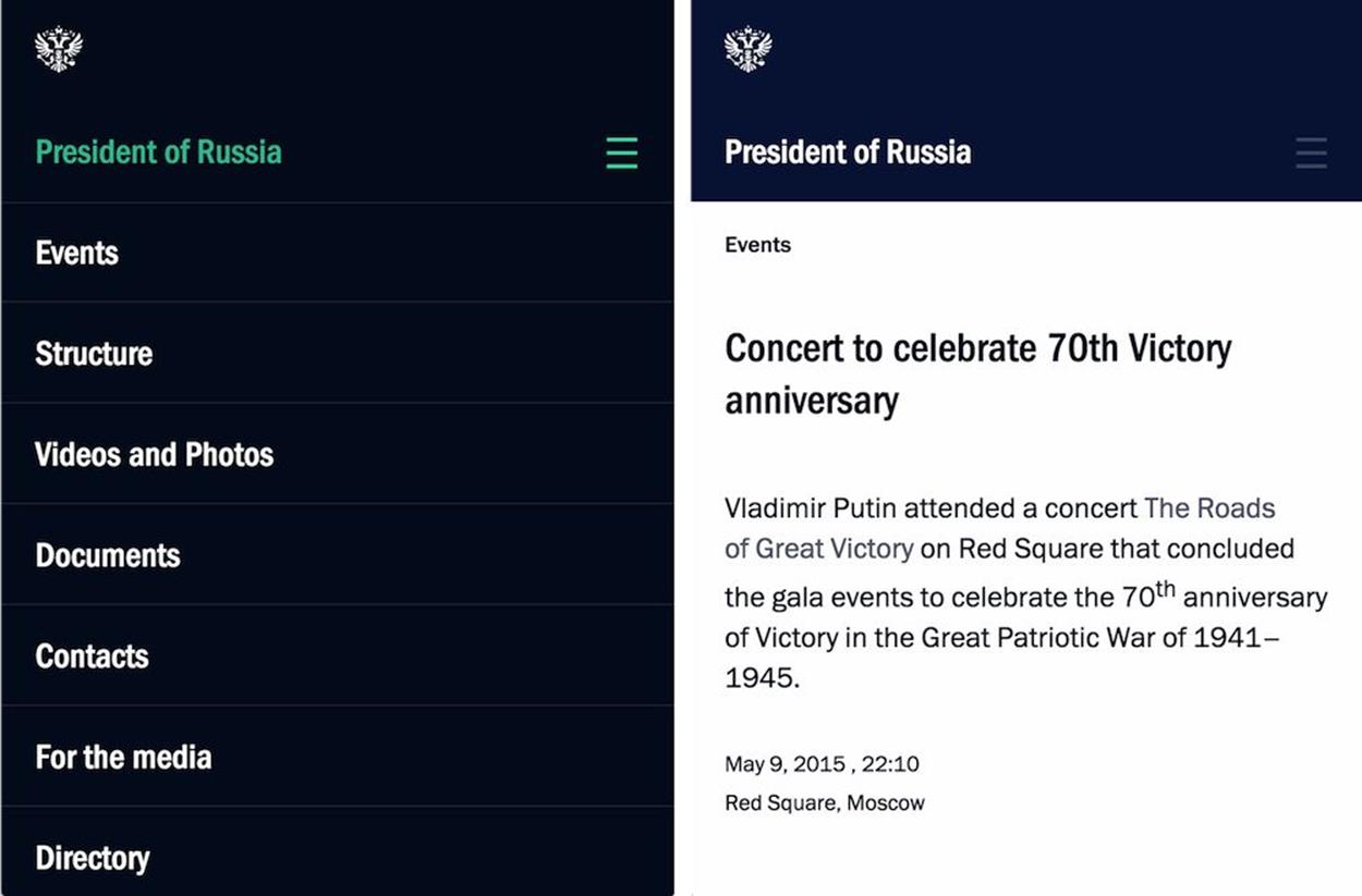
On narrow viewports, the Kremlin site shows either the content or the navigation.
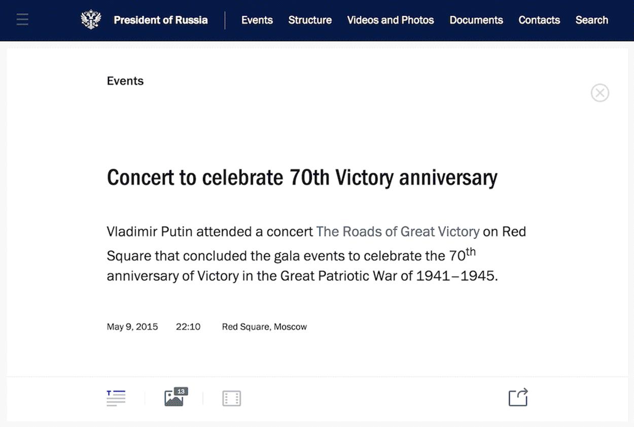
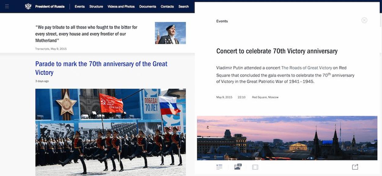
If there is enough screen to fit multiple pieces of content at the same time (e.g. both the search results page and the actual search result) you could show both at the same time.
This pattern could be applied in other scenarios as well; for example, if you have a gallery in your article or product page, in larger views the images could float to the right, next to the article; or slide into designated areas in narrow views. The same goes for comments, surveys, and any other supporting content.
TABLES ARE TOO USEFUL TO DIE
There are a few well-established navigation patterns that could be tweaked for specific contexts, but what about more rigid interface components, such as tables? While navigation menus are often merely lists of anchors, pieces of content residing within tables often have firm relationships, manifested by their position and their column and row headings. When it comes to displaying tables, we should not only present the content but also respect these relationships. This causes a few headaches when designing for narrow views simply because tabular data requires some space to be fully displayed.
If we display a table as it comes, the content will likely be hard to scan and read; tables are regularly rendered either too small for comfortable reading or too large for comfortable navigation. What do we do then? The few reliable options we have depend on changing the orientation of the table from horizontal to vertical, or displaying tabular data and relationships in fragments.
The first option isn’t difficult to achieve: we could either flip the headings to the left or right or just turn all table cells into block elements and show them in a single column with corresponding table headings serving as labels. This works well for small tables but becomes unwieldy for more complex tables, creating long, potentially annoying pages which are difficult to scan. We already know what works well in most scenarios, though: accordions! To keep the <datalist> shorter and more compact, you could turn single blocks of content into accordions or toggles and reveal content on tap or on click.
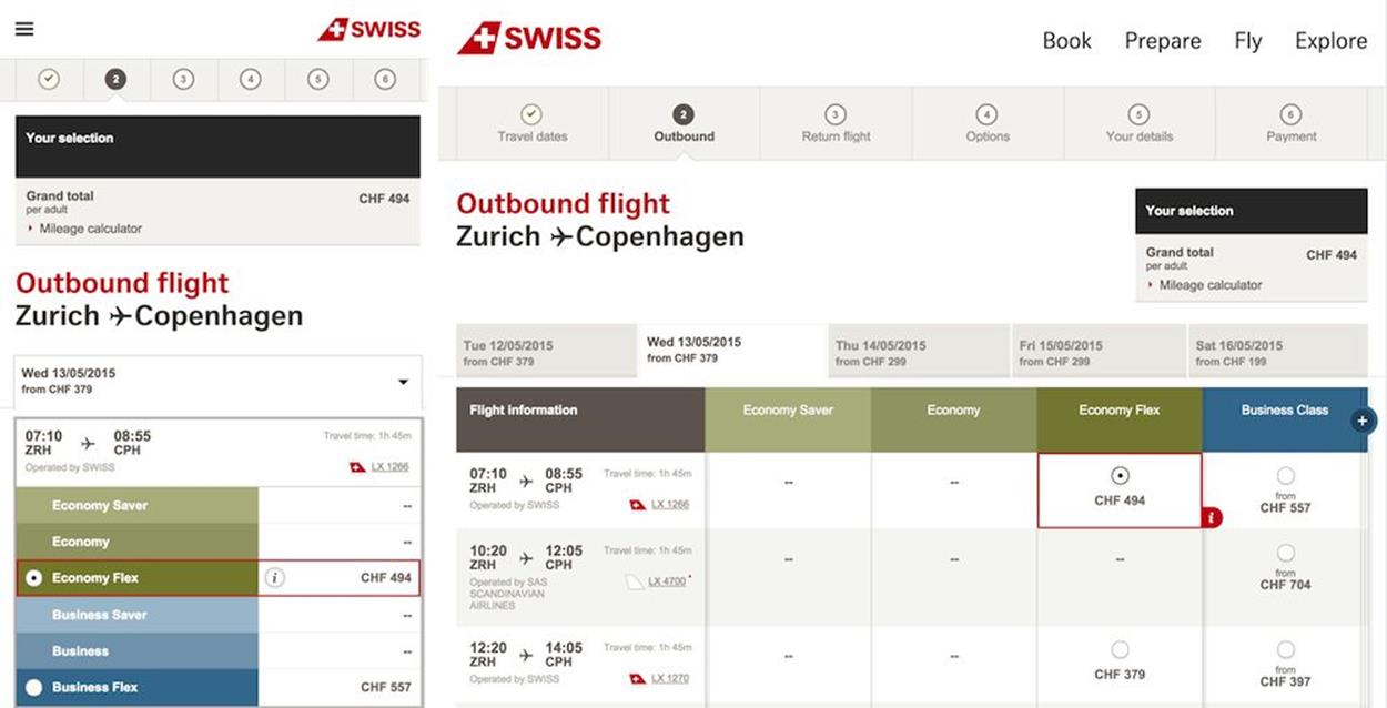
SwissAir.ch provides many interesting subtle examples of a smart responsive design. One of them is a flight selection table, changing orientation from horizontal to vertical between large and narrow views.
Certain tables call for specific and sometimes creative solutions. For instance, if you’re designing a table to allow users to select a flight, with outgoing flight options lined up horizontally, and return flight options lined up vertically, you might end up with a table in which every cell contains a radio button. While radio buttons often require a very predictable amount of space to be clickable or tappable, headings in such scenarios would usually occupy more horizontal space, making the table unnecessarily wide. In this case, you could tilt column headings a little (perhaps 45–65 degrees) to regain some of the horizontal space at the expense of some vertical space.
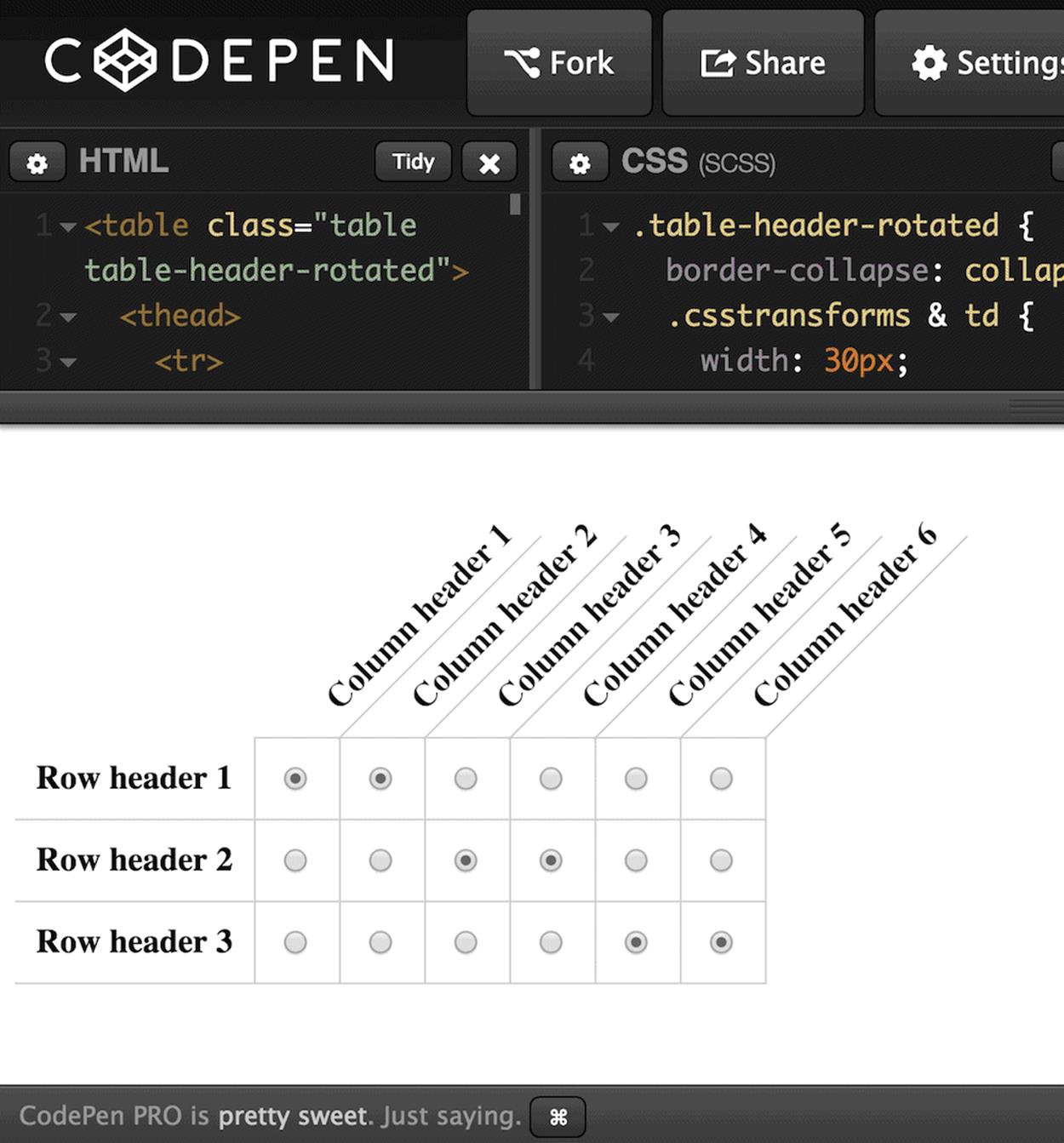
Sometimes you might want to tilt headings a little bit to regain horizontal space by sacrificing some vertical space. It really depends on the nature of the table. Credit: http://codepen.io/anon/pen/WbzbbQ22.
A table shouldn’t always remain a table, though. When dealing with a sports tournament table, such as the NFL Playoff coverage archive, for example, a multilevel tabular view might be appropriate for wider views but wouldn’t work well in narrow views. You could adjust the spacing, font size and level of detail, but it might not do the trick. Instead, you could altogether reimagine the entire experience, and show the Super Bowl game in the middle within a slider, and allow readers to explore the AFC and NFC leagues by moving to the left or right, perhaps with convenient toggle buttons or swipe action.
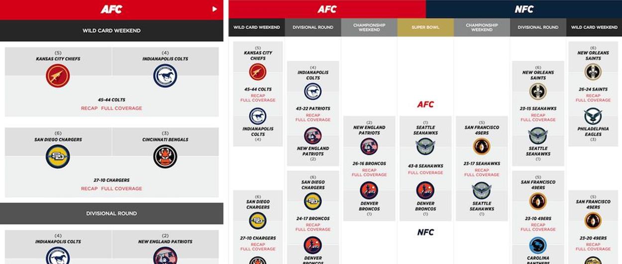
A tournament table isn’t easy to design: SBNation.com went for turning a table into a slider, although a set of accordions with a more condensed view might work just as well.
Think about the specific properties and structure of a table before settling on a solution. You might discover similar table issues when designing any kind of survey, or selecting tickets for a performance (with dates presented as columns, shows presented as rows), or any other experiences where multiple selection is in place.
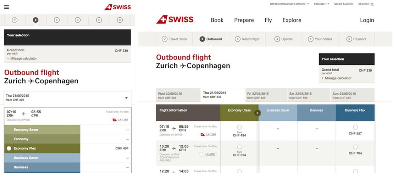
On narrow views, SwissAir.ch shows a condensed view with radio buttons aligned vertically; on a larger view they appear as layers. Notice how breadcrumbs change between views.
Another option would be, again, to display some columns as cropped encapsulated views or layers, as mentioned above. That’s exactly what SwissAir’s website23 does. If one of the table columns is particularly important, you could also keep it fixed while making the other columns scrollable, so when users start reading the table, they always have a clear association between the content that they read and the row where it belongs.
If the data in your table is mostly numerical, you could visualize it as a graph or chart in both narrow and desktop views, and provide a link to a full table view for users who wish to see the tabular data instead (as well as a “graph” view for users wishing to see a chart on desktop views).
These solutions work well, but they aren’t always applicable. Content can be incoherent, data relationships could be strict and the table might not have any consistent structure. In these cases, displaying tabular data in fragments — again, reducing the complexity of the component — can work remarkably well. The idea is simple: since we can’t make any assumptions about the columns or rows that users would or would not like to see, we could allow them to select columns of interest while at the same time providing an option to show all columns as well.
The way you could design this experience would be by adding a few buttons above the table: perhaps a “Display all” button that, once activated, shows the entire table at once; and a “Display” drop-down, with all columns listed as checkboxes. If users are interested in specific columns, they can select the those and dismiss the others, thereby reducing the amount of content to display and potentially fitting it well in both narrow and wide views. You’d need to choose the columns to be displayed by default, and this selection might change depending on the available viewport width (or height).
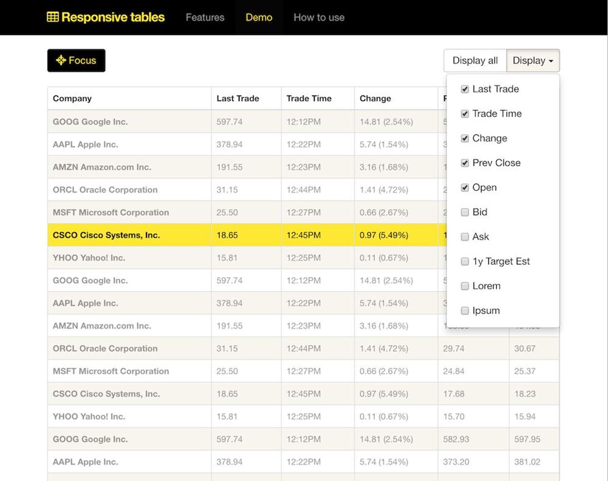
If we can’t make any assumptions, it’s safe to just ask users what they’d like to see. Perhaps with a “focus” view for a slightly better scrolling behavior. Source: http://gergeo.se/RWD-Table-Patterns/24
Such a design pattern is quite manageable; but what happens when the user is interested in seeing all the columns at once? We’re back to square one, with a poor initial experience: zoom in, zoom out, add a dash of horizontal scrolling. That’s simply not acceptable. In usability tests, we noticed that users often feel lost in such complex tables, especially when data is mainly numerical. Users aren’t quite sure whether the value they are looking at actually corresponds to the column and row headings that they were interested in at first. To tackle this problem, tapping or clicking could visually highlight either a column or a row or both, and establish a clear relationship between the fragment of data the user is reading and the column and row it belongs to.
Another option is to show the first few columns first and display a stepper control to enable users to move easily between sets of displayed columns. When a viewport accommodates four columns of a ten-column table whose first column comprises table headings, you could keep the headings column fixed and show the next three columns first, revealing subsequent columns on click or tap, and so on. For a narrower viewport, you could reveal two columns in each step, with the headings column remaining static. Additionally, an indicator could present how many items are currently in view, very much like we do in carousels.
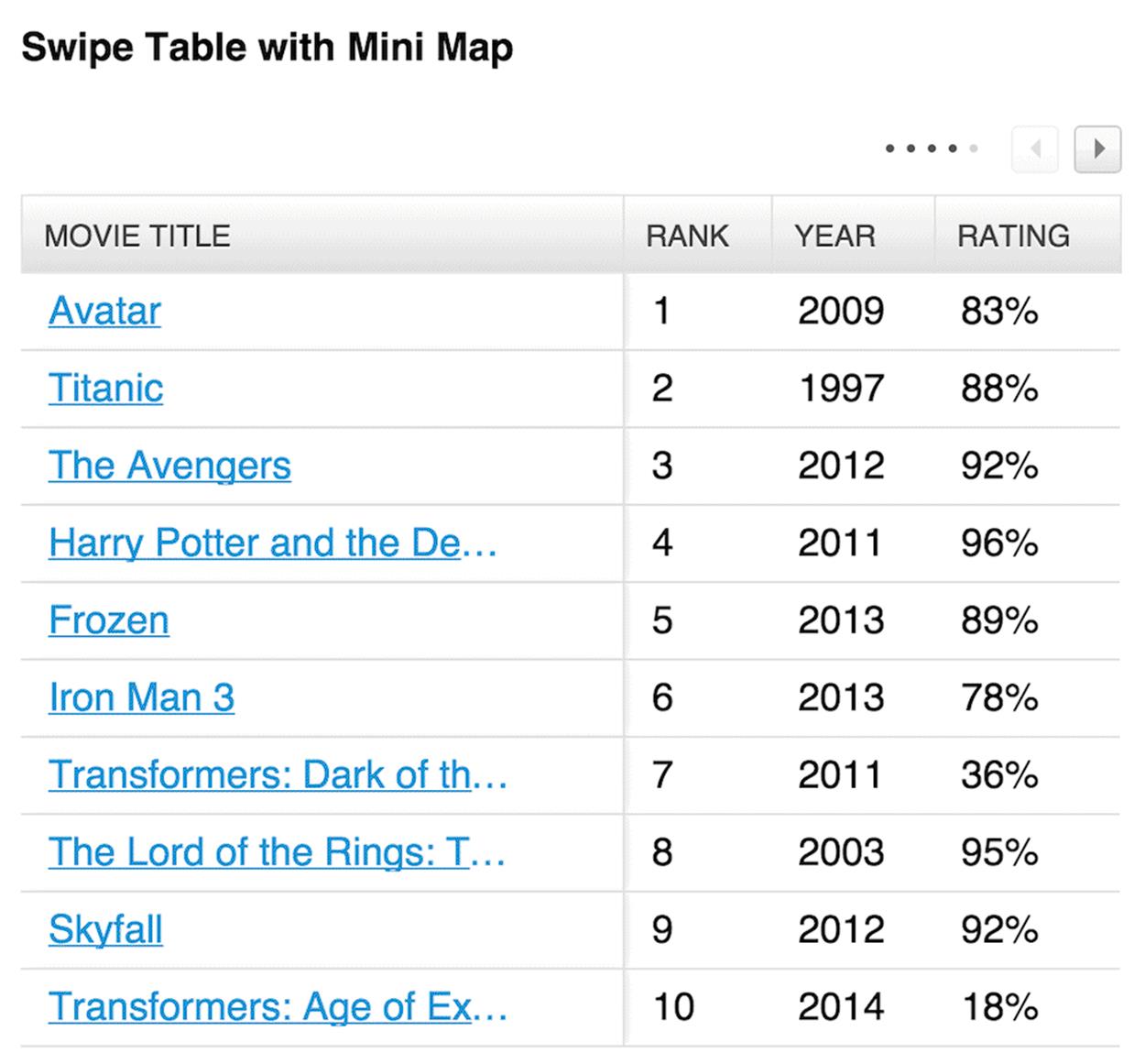
You could also integrate a mini map and combine it with a selection of columns the user wants to see. Source: https://github.com/filamentgroup/tablesaw25
FilamentGroup has released Tablesaw26, a comprehensive group of small JavaScript libraries for managing tables. Among other things, it covers many use cases highlighted in this chapter.
These last solutions often seem more appropriate for tables than a <datalist>, unless the nature of the table requires all columns to be present at all times. In an overview of pricing options, insurance plans or a car comparison, different columns and rows might have different weight for users, so allowing them to select columns or rows of interest could work well. But when it comes to flight selection, seat selection in a theater or checkout in an online shop, the integrity of a table is vital. There, a <datalist> (potentially with an integrated accordion if there is a lot of data to show) might be a more appropriate solution.
PULL CONTENT OUT, BREAK IT DOWN, PUT IT BACK AGAIN
While these approaches work well for tables and data grids, they won’t necessarily work for calendars: with days of the week lined up horizontally, for example, and time of day lined up vertically. We could decide to drop all Fridays as well as a specific time range (such as 12pm–2pm for lunch breaks) but it would pretty much ruin the purpose of a calendar. It might be even more difficult if we decide to lay out days of the month against days of the week. A <datalist> option would, again, potentially end up with an annoyingly tall page or an overwhelming number of accordions all at once; and what if a user wants to see a cross-column/row selection after all (for example, all Friday evenings in a given month)? Retrieving this information would require them to open four accordions, for every Friday in a month. That’s not user-friendly.
In this and similar scenarios, we should take a step back and look into options of reducing the fidelity of the initially displayed content. Do we need all icons in the calendar? Do we provide any meta information that could be displayed separately? Can we use ellipses to shorten the amount of text? What else can we remove to keep the calendar focused and retain its integrity on narrow views as well?
That’s the exercise we run through as a team every time we encounter not only calendars, but pretty much any complex component that can’t be modified easily without compromising user experience. By simplifying content fragments within the component, we can always break down its complexity and focus on the core content it contains.
Ultimately, there is always the option of pulling the content out of the component, identifying and grouping content fragments logically, and presenting them as separate encapsulated views within a few subsequent sections on a page. For a calendar, you could choose to pull highlighted items and present them in a smaller, focused tabular view in narrow viewports, while all the other items could be displayed in a <datalist> underneath the table. If you need to design a city map with numbered markers within the map and detailed hints about specific locations displayed on tap or hover, you could reduce the fidelity of a map in narrow views, and pull out the content beneath the map as a <datalist>.
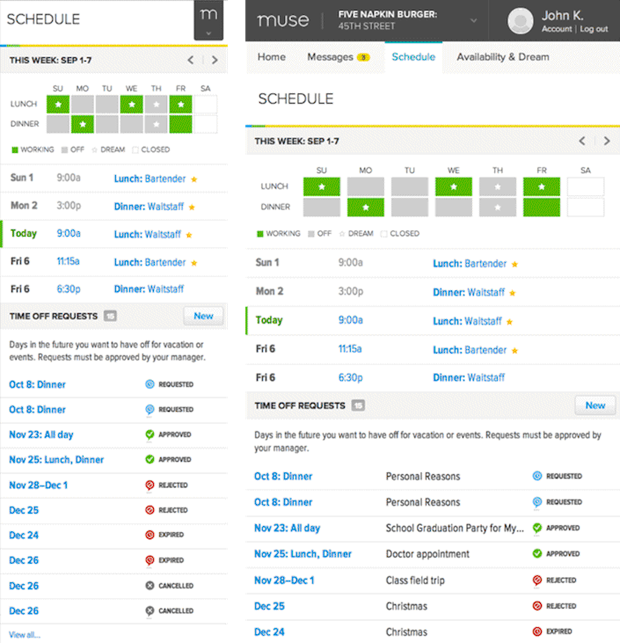
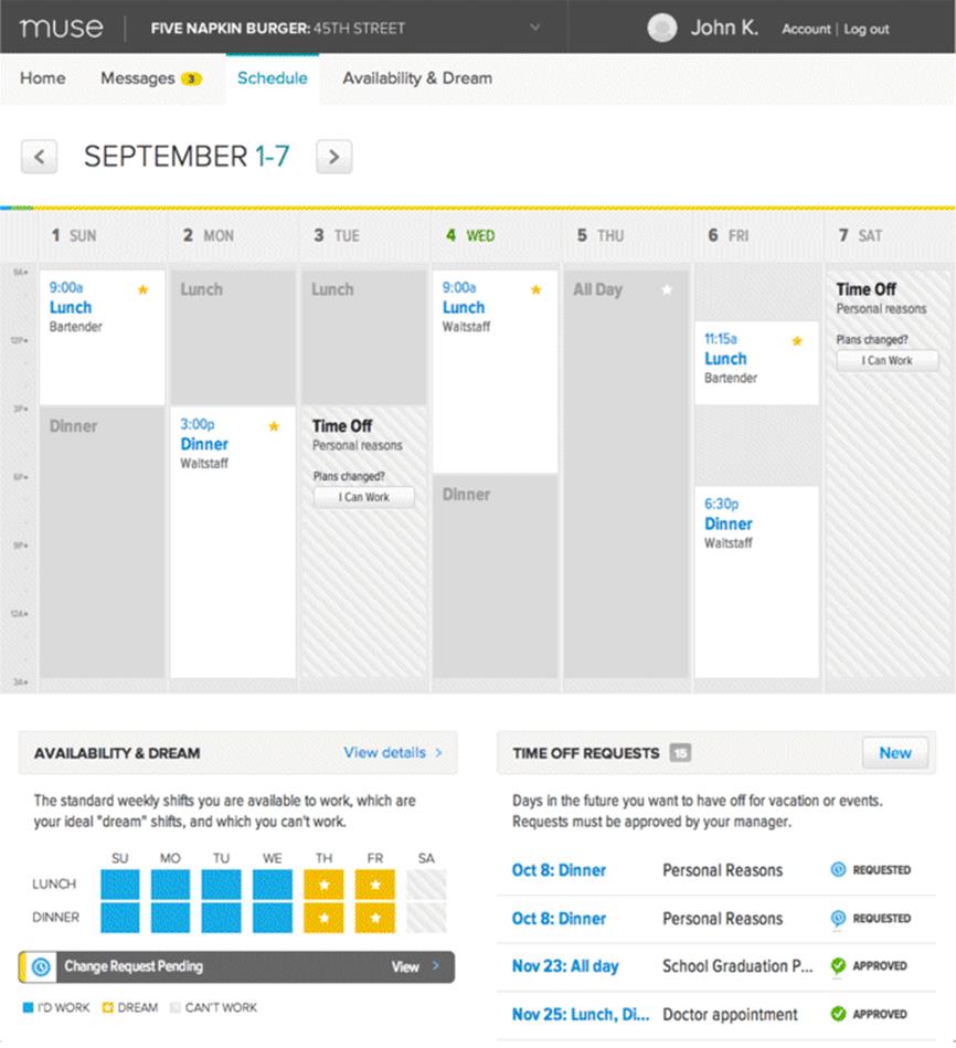
A calendar doesn’t have to look like a calendar across all screens. You could use the content from a calendar and display it in two separate views on narrow screens, like Muse does.
What if you are designing a platform for selling tickets to any kinds of event, be they concerts, baseball games or cinema screenings? You’d like venue owners to submit a seating map for their venue to you, along with an overview of the most expensive and most affordable areas, so buyers can visit your site and purchase a ticket to the show. Visitors should be able to select an area where they want to sit, but beyond that they should be able to zoom in to the area of interest and select both the row and, once zoomed in again, the actual seat they’d like. Obviously, the entire website should be fully responsive, too.
One way of solving this would be to introduce what is known as the assistant pattern — complexity is reduced by asking users to set some preferences first (the pricing range or the seating area, for example) to lower the level of detail required on the map and remove markers that aren’t useful. We then get a more manageable map, perhaps with slightly larger dots to comfortably accommodate 44×44px hit areas. Underneath the map, we could provide an overview of options listed either by seating area or price — adjustable by users. When users choose to explore an option, they are zoomed in to the area of interest and receive further details about the seating in the information area beneath the map. Moving back through the list of options would zoom out the map view. Alternatively, you could also use a slider to enable visitors to define precisely the level of detail they’d like to see.
This experience could translate to both narrow and wide views, and we could take advantage of available space to display a more detailed map in larger views. Again, the strategy of breaking down complexity and creating a few smaller and more manageable content fragments could go a long way in pretty much every responsive design issue you’ll encounter.
ADJUSTING MICRO-COMPONENTS
Breaking down complexity isn’t always necessary. Components can be relatively simple with pretty straightforward ways to make them work for the whole range of screens — if you have the right idea of how to adjust their design and behavior.