Responsive Web Design, Part 1 (2015)
Responsive Design Patterns And Components
PROGRESS STEPS
For example, think about the progress steps or breadcrumbs in a checkout. If a checkout takes four or five steps in total to complete, displaying the entire user path through these steps would require way too much vertical space in narrow viewports. Instead, we could use the content property with a pseudo-class in CSS to display the current step as plain text, with arrows pointing to the previous and next steps (see Hrvatski Telekom Screenshot for comparison). A very simple adjustment that doesn’t require a lot of work, but produces a perfectly sensible result.

Hrvatski Telekom shows a fully fledged breadcrumbs navigation in large views and turns them into plain text in narrow views. Image credit: Marko Dugonjić.
TIMELINES
For timelines — either horizontal or vertical — marking important milestones or dates on either side, an almost natural solution would be to flip the timeline to a vertical view and perhaps display the content for each milestone via a toggle.
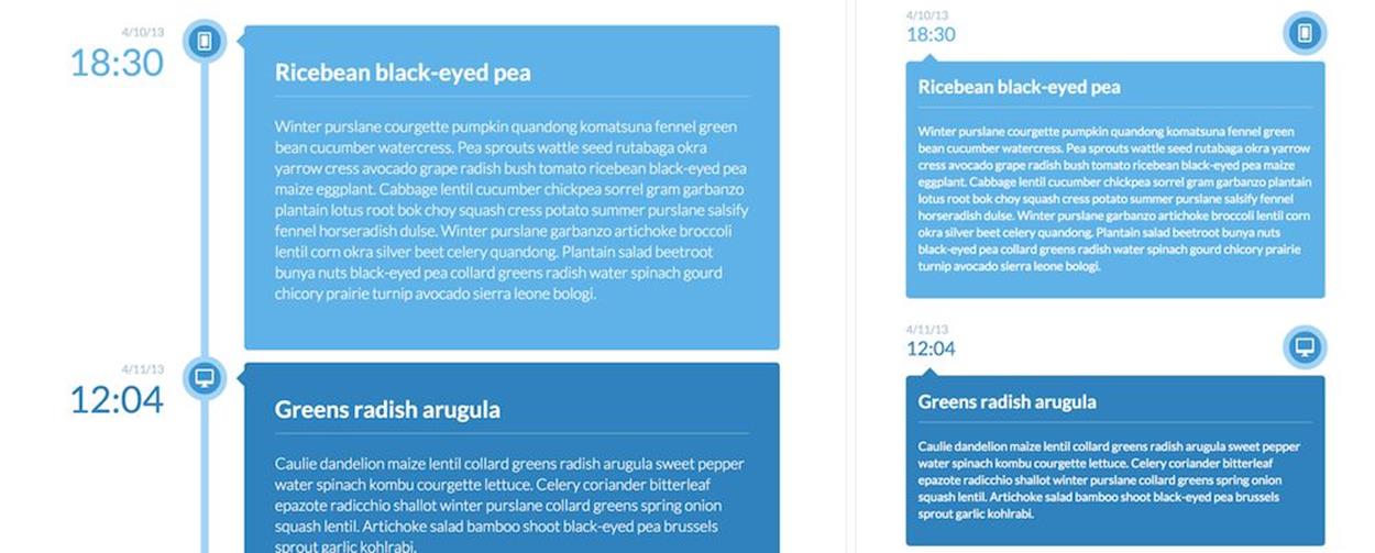
A timeline: horizontal orientation in a large view, vertical orientation in a narrow view. Nothing spectacular, really.
GRAPHS AND CHARTS
When it comes to graphs and charts, you could create highly sophisticated, and perhaps even animated, responsive charts with SVG and CSS using Chartist.js27; you might need to reduce the fidelity of the chart and tweak the appearance and position of labels to keep them readable in narrow views (see the responsive data charts at Informed Design28.
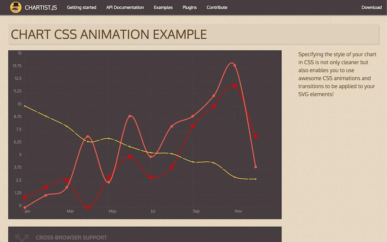
Responsive graphs aren’t easy to manage, as long as you create them with SVG, and not as static images. For example, with Chartist.
MAPS
If your chart accompanies a map and you use polygons on the map for user input, sometimes the map’s fidelity can’t be reduced without making interaction inconvenient for users. For example, an SVG map of the United States, every state a polygon, could allow users to click or tap on polygons to select a state (perhaps as a filter for specific items related to that state); but the further the map is scaled down, the more difficult it becomes to select a state. A bulletproof solution would be to use a simple drop-down in a narrow view, with progressive enhancements up to a fully interactive map when the space allows for it.
The solution isn’t as straightforward, though, when you need to display a large preview of the entire map and not only a cropped region of it. First of all, we could use Thierry Koblentz’s padding-bottom hack29 to create a fluid map that preserves aspect ratio30 to keep the focal point of the map centered31.
In usability studies, we noticed that embedding Google Maps or any kind of iframe often leads to confusion: when users decide to scroll down a page, they get dragged into the map and find themselves scrolling the iframe instead. The only way out is to tap an area outside the iframe and keep scrolling there; but if the iframe takes up a lot of vertical space, getting out of it can be painfully difficult.
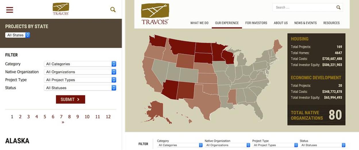
Travois32 uses progressive enhancement to turn a simple, accessible drop-down into an interactive SVG map for larger views.
In such cases, you can use two workarounds to improve user experience. First, for every map embedded in your site, you can create a semi-transparent <div> overlay that would cover up the entire map, like a layer of ice covering a river on cold winter nights (poetic, right?). When users scroll down through the page, they will slide over the empty <div>. If they do decide to access the actual map, they need to click or tap the map first, so the <div> will be removed from the DOM via JavaScript. Users without JavaScript support would receive a link to the Google Map page via <noscript>.
A slightly better pattern to achieve almost the same experience is exhibited by adaptive maps33, where we load a basic text link to Google Maps by default and additionally load either a static map image for small screens (preview) or a full iframe map for larger screens — preferably conditionally, so we don’t have a performance overhead in either case.
LIGHTBOXES
The same adaptive logic could also be applied to lightboxes which so often break user flow on narrow views. Quite a few websites simply squish a lightbox as a fullscreen overlay, with heavy lightbox scripts and tiny interface controls. However, this behavior goes against the logic of why lightboxes exist in the first place. As Jordan Moore so eloquently wrote34: “[t]he purpose of a lightbox is to display a larger image corresponding to the selected thumbnail version while keeping the user on the same page instead of linking directly to a page showing the full image. […] In fact you may argue that a lightbox shouldn’t even exist on small displays.”
Which hits the nail on the head. But if a lightbox shouldn’t exist on small displays, how do we deal with it? Actions that happen in a lightbox on large views are often best handled as separate pages on smaller screens35, so if you have an interaction that requires user input, dedicating an entire page to it in narrow views might be a good idea.
When your lightboxes contain only photos (a product gallery, for instance), you could present them within a swipeable area in narrow views, or you could simply link to the image file directly by default. Opening an image “allows the user to pinch and zoom to read what could otherwise be entirely illegible.36” Then you could detect the screen size and decide whether to load a lightbox script or not, and if the screen is large enough to accommodate the lightbox, inject the script on the fly. Again, no performance overhead and a better experience for everyone.
FOOTNOTES AND SIDENOTES
When working with magazines publishing long reads, you might end up with situations when an article features a number of sidenotes, footnotes or pull quotes. You could try to squeeze the sidenotes within the article, perhaps right after the paragraphs which they relate to, but if they are lengthy they might interrupt reader’s flow. On the other hand, with footnotes displayed as <sup>-links, users will have to jump to the foot of the page, read the footnote and then jump back to the reference, which is fine but a bit noisy and creates extra work for the user.
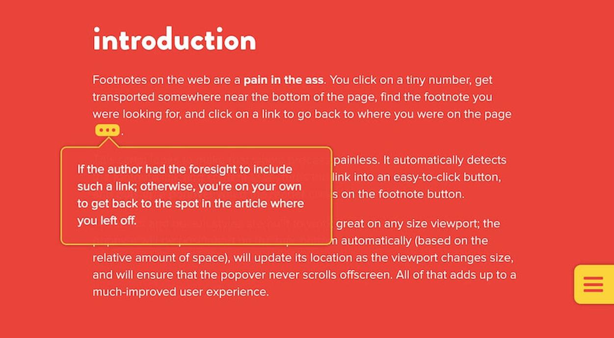
Instead of putting sidenotes within the text or footnotes at the foot of the paragraph, we could introduce inline notes and pop-overs, enhanced with JavaScript, e.g. with BigFoot.js.
An interesting way of dealing with these issues is by using inline footnotes as pop-overs. You could use BigFoot.js37 to automatically detect the footnote link and content, turn the link into a large enough button, and open a pop-over when the reader clicks on the footnote button. Of course, the pop-over has to be positioned on the top or bottom automatically (based on the amount of space available), should update its location as the viewport changes size, and should never scroll offscreen. You could apply this technique to sidenotes as well: just turn them into inline footnotes at the end of every paragraph, with a different CSS styling to keep them distinguishable, and they will be fully displayed on click or tap.
Yes, you read it correctly: PDF. We spend a lot of time talking about removing all render-blocking resources from the critical rendering path, but I believe we don’t spend enough time discussing how to deal with good old-fashioned PDFs. PDFs are often very heavy in file size, sometimes uncompressed, and difficult to read on a mobile screen. If your users happen to be on a slow connection, the chances are high that they won’t even bother downloading a PDF file because they won’t be able to read anything from it until it’s been completely downloaded — unless the PDF is opened in a smart browser with an integrated PDF viewer. But what if a user knows that the content she needs is on page 17? There is no way of accessing it before the first 16 pages have been downloaded and rendered.
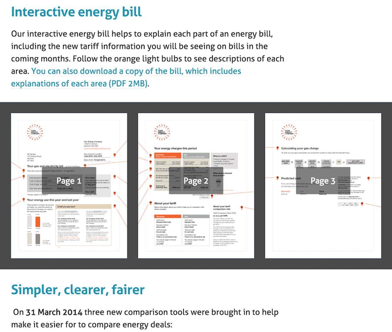
Instead of providing only a link to PDF, we could generate thumbnail preview for all pages and make them available to users additionally to the PDF view.
Now, we could generate different versions of the PDF for different views and serve them conditionally to different screens, but it’s inconvenient and involves unnecessary work. Instead, we could generate a (relatively) large thumbnail version of each PDF page, save it highly compressed and provide an overview of all pages to the user, as well as a PDF file. If users want to jump to page 17, they can do it via a thumbnail view. The image received will not look particularly impressive, but it will load fast and it will contain the information users need. And if they decide to download the PDF file after all, that option is always available. This is exactly what Energy Made Clear38 does, and it does it very well indeed.
CUSTOM RESPONSIVE ELEMENTS
Sometimes the nature of a website requires you to get quite creative when searching for a solution, so relying on more common components like the ones listed above won’t really help. What if you’ve been asked to design a fully responsive site for living sheet music and guitar tablature with interactive notation and tabs, for example?
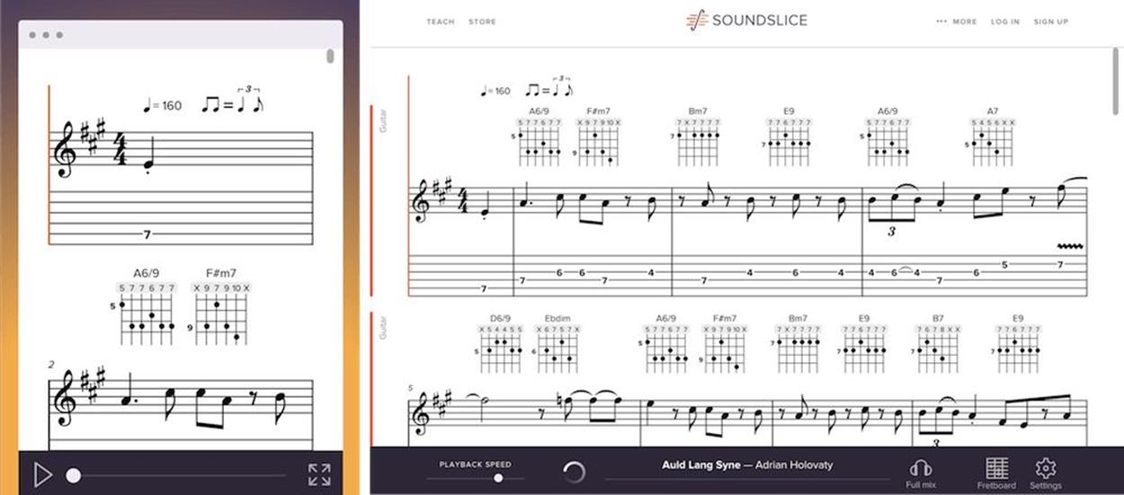
Interaction music notation, with chords and tablature adjusting depending on the screen size. With a bit of SVG, <canvas>, JavaScript and media queries.
Well, you start exploring. In such rare cases, you would need to figure out how to create custom responsive elements, perhaps with SVG or in <canvas>, and then decide how the content should be adjusted to be properly displayed at different screen resolutions. The front-end engineers behind Soundslice39 had exactly this problem, and the way they solved it was by introducing adaptive notation in which the displayed size and thickness of chords and pauses is recalculated and redrawn in <canvas> when a window is resized. I’d argue that if you can make sheet music responsive, you can make pretty much anything responsive, wouldn’t you agree?
DEALING WITH COMPLEX VISUAL DESIGN
Well, you probably would agree, unless you have a very complex visual design to deal with. Coping with an abundance of visual content is often one of the reasons why responsive projects become frustrating, with the designs becoming generic, flat and oversimplified. In terms of workflow in such cases, different viewports often require intense art direction to keep the design consistent, with different visuals and different layouts for those visuals in place. In practice, it requires a bit too much extra effort, so it’s generally more convenient to settle for a slightly simpler and more minimalistic design in a narrow viewport, and then add visuals only for larger viewports. It’s not the only option, though.
Japanese and Chinese websites are a good primer for heavy visual responsive websites with a consistent design across viewports; in many ways they feel more advanced and thought-through. Not only hero photos or product images are art-directed; also complex infographics, step-by-step guides, video backgrounds and supporting visuals along with animations and transitions are properly directed and adjusted for tap, click and hover. Of course, these pages are quite heavy at times, but the visual consistency is very apparent in most cases.
It’s not just the culture that demands a lot of visual language in Asian countries. Because web fonts would need to support thousands of glyphs, loading them just isn’t viable, so text is embedded into images; and because mobile is dominating Asia, text has to be perfectly readable on narrow screens, so different versions of images are sent to different screens. Owing to this, Asian websites are almost inherently prepared for the art direction use case: there is just no way around it. Not surprising then that it’s an interesting space to explore patterns for dealing with visuals.
What if you have a number of heavily illustrated sections on a page, and these sections build up a content blob — a large area featuring all the sections at once? While you can be quite creative in your choice of visual arrangement in large views, you’ll have to be more restrained in narrow screens.
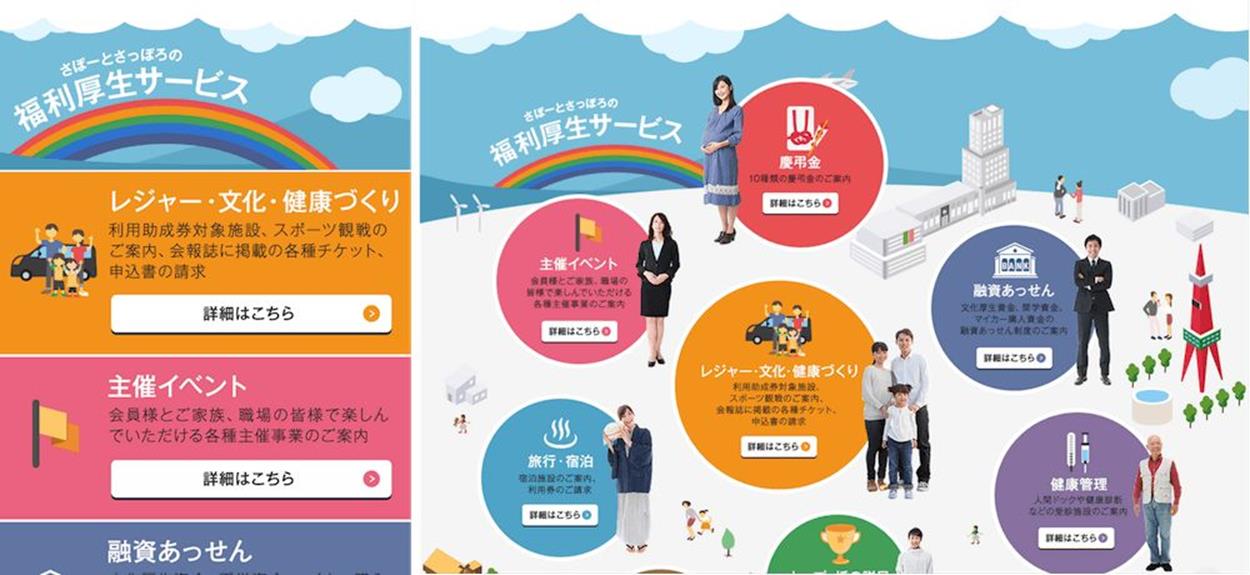
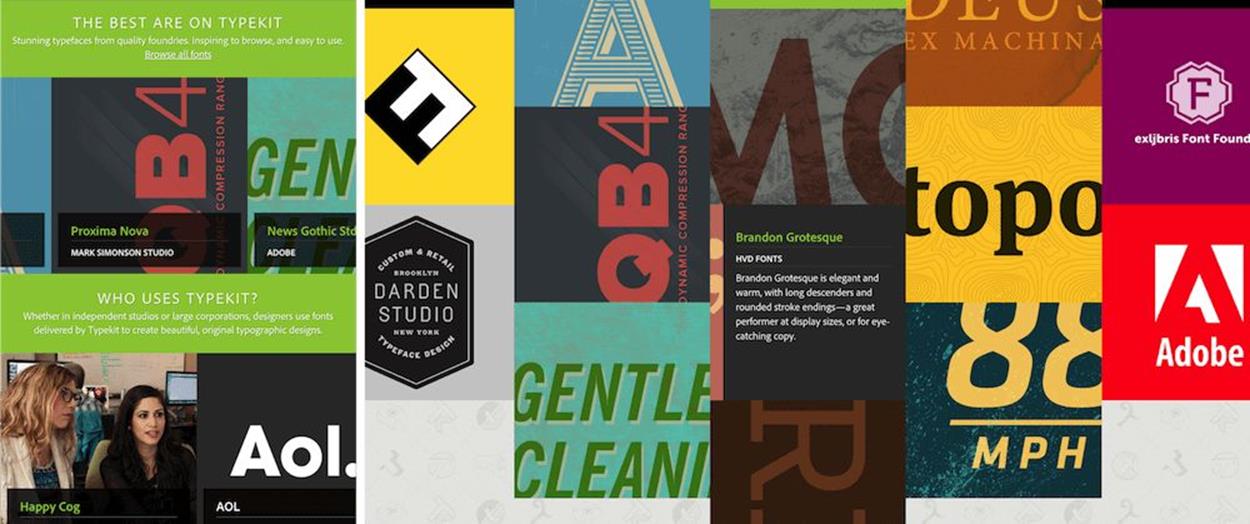
Complex visual layouts on large screens can translate to slightly different layouts on narrow screens; often a list of navigation options works well, and so does a slider — but controls to move between content blocks could be helpful. Sapporo and Typekit.
Two patterns often work well in such scenarios: you could either turn each illustrated section into a full-width block and arrange all sections vertically in one column (see Support Sapporo40); or arrange all sections horizontally and use a slider to navigate through the items with a swipe (see Typekit41)
In the first case, you could use accordions if the sections are content-heavy; in the second case, it might be a good idea to ensure that a portion of the next section is always displayed (the overflow pattern), or, even better, add toggles in the top-right corner to let users easily navigate to the previous and next sections without having to swipe very precisely.
Davide Calignano has recently published a simple technique42 to keep a portion of the next section always visible with calc. Worth looking into.
So what can we learn from Japanese or Chinese websites? In many cases, background images have repeated patterns and are stretched for larger screens; secondary visual assets are dismissed in narrow views, but primary visual assets are more prominent than on larger views. More than usual, you’ll need to fit images within the container or a grid, either with background-size for background images or with object-fit for foreground images. Photography will often require art direction via the <picture> element, and heavy iconography might call for responsive icons.
BETTER, SMARTER RESPONSIVE WEB FORMS
Nobody loves filling in web forms; however, they are perhaps the most common yet least enjoyable interaction on the web. Going from one input field to another and typing in data feels like such an outdated paradigm, but at first it seems that there isn’t much we can do to move away from it. Nevertheless, we could make the experience with web forms slightly better, in particular in responsive websites: we just need to figure out how to minimize user input and how to present required input fields intelligently, for narrow and wide screens.
Stacking input fields, text areas, and drop-downs beneath one another for better mobile experiences isn’t a particularly adventurous undertaking. But it’s the micro-interactions taking place between these input fields that could improve the experience. Ideally, we’d love users to be able to focus on one thing and do it fast: typing. It shouldn’t be necessary to move the mouse cursor or tap with a finger on an input field — users should be able to stay on the keyboard comfortably, without diverting their attention to anything else. Of course, the tabindex should still be appropriately set, so when users decide to switch to the next field via Tab on their keyboard, they can; but moving between the input fields might not necessarily require it.
FOCUS ON TYPING THE DATA
Swissair43’s responsive forms are a very good example of achieving exactly this goal well. When users make a selection (in a drop-down, for example, or in a calendar), they automatically move on to the next field and can continue typing right away, unlike most interfaces where you have to manually move to the next field when you’ve finished with the current input. Just such a paradigm is central to web form patterns suggested by Typeform44: the user always sees only one large input field at a time and can use keyboard shortcuts to make a selection or confirm input — by pressing “Enter” they move on to the next field. No drop-downs are used, no <select> menus employed — the entire experience is focused entirely on typing in data without any distractions. It works well on desktop, but it’s still a bit annoying on mobile where you will see the keyboard popping up and out again after every input.
“One-input-field-at-a-time”-experience on Typeform allows users to fill in forms by focusing on only what they absolutely have to do: typing data. Everything else is taken care of automatically.
You could apply quite a few very subtle yet very handy tweaks in your form design pretty quickly:
•When a user arrives on a search page, be it related to booking flights, online shopping or a list of FAQs, activate the search box by default with the autofocus attribute.
•Provide valuable metadata to browsers by wisely assigning autocomplete attributes on input fields, helping them prefill the entire form automatically.
•Vertically adjust a textarea based on user input. Instead of reserving four rows for the input, you could stipulate just two and increase the height of the element dynamically so the scrollbar never appears.
•When a user has a lengthy address, allow them to dynamically add another input field for an optional second address line, instead of displaying it by default.
•It’s possible to prefill state, city and sometimes even a street from just the ZIP code.
•To ensure users never lose any data, temporarily store the input during a session in local storage. When a user accidentally hits “Refresh” or closes the window, the next time they open the window, all data will be preserved until the input has been successfully completed.
Not only the the design of input elements matters, but also the choice of input elements, too. In our projects, we tend to spend a lot of time thinking about ways to remove input fields and drop-downs altogether and replace them with slightly more comfortable input methods, such as sliders, toggles or radio buttons.
THE RIGHT INPUT ELEMENT FOR THE RIGHT INPUT
Some input elements are more suited for specific inputs than others. T-shirt size might be easier to select with a button rather than a drop-down menu. This could also act as a filter: once size is selected, other sizing options could disappear from the overview behind a semitransparent “All sizes” button. A price range would work better as a slider; the number of nights in a hotel, or any other discrete numerical input, would be better off with a simple stepper control.
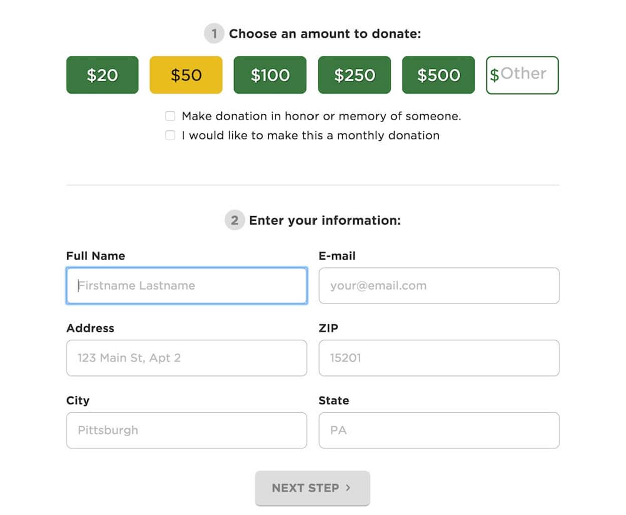
Segmented control for a donation form: with a few items provided, instead of a large drop down or silent input field. https://www.pittsburghfoodbank.org/donate/feedthekids/45
A flight’s class with only a few options (first, business, economy) could be presented as tabs — segmented controls — with only one tap required to provide input. Special dietary requirements, for example, or any on/off states could be designed as a toggle. Such details make up the entire experience, so before we design (or redesign) a form, the first thing we do is take an interface inventory of all the input elements within the form. Chances are that the choice of input elements will have to change significantly.
STEPPERS AND SLIDERS
Steppers and sliders are, however, the most convenient types of input (almost silver bullet techniques in form design!) and they could be used extensively in a variety of scenarios.
The main advantage of steppers is that they require exactly one tap to increase or decrease the value. This makes them helpful in checkouts (number of the same item in the shopping cart), defining settings and preferences (number of travellers on a hotel booking website), or any other selection of clearly discrete values. Steppers aren’t very helpful when the range of values isn’t restricted to a few items: they wouldn’t be a good fit when selecting the color of a T-shirt or the brand of running shoes a customer wants; a filter list might work better in these cases.
Steppers adjust a specific value quickly and precisely; sliders can help adjust a large set of values quickly, but not as precisely. Depending on the task, we can use a single slider with just one value (say, a specific date in history), or a double slider with a range of values (a min/max price range for a home). For predefined values, such as clothing size, we could use discrete sliders with fixed values that users can snap to easily; for indeterminate values such as price or temperature, we could use continuous sliders which don’t have any fixed values at all.
One caveat: if users can select any range of their choice, they might end up with empty results pages which are at best disappointing and not particularly helpful. To avoid this issue, you could extend a slider with additional metadata about the number of available products in specific ranges, creating a histogram slider, or inventory slider. You could design this by simply adding a bar chart above the slider, showing the number of available items at a given value, such as a price point. That’s what Airbnb designers decided to use for the price range of available apartments. This way you clearly indicate which range is most populated with results, and where they shouldn’t expect many results.
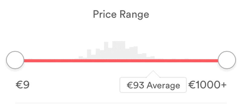
A histogram slider on Airbnb provides some metadata about the number of available apartments at a given price range.
TACKLING COMMON PAIN POINTS
The patterns described above could serve as nice enhancements for specific scenarios, but there are a few common pain points that could be resolved with a few less obvious techniques.
One of them is to ask users to verify their input, be it a password or email. There is no need to ask for a password twice: you could just use a toggle button to show or hide a password if necessary, and it’s a good idea to label it “Show” or “Hide” rather than relying on an ambiguous icon. Instead of asking for email verification, you could use email autocomplete to prefill email addresses based on common email providers, or automatically correct them. It’s also a good idea to let new users verify their email address before sending a message via the contact form, so they have a chance to correct it before sending the data, and you won’t end up with incorrect or mistyped email addresses.
To tame a web form’s height, we sometimes use input placeholders as labels to indicate what kind of data is required. However, if the input is lengthy or users are interrupted, they might lose the context of what exactly they were supposed to type in. That’s where the floating label pattern is useful: the labels exist as placeholders but when users start typing, the labels float above the field in a slightly smaller font size. It’s a nice way to keep both the input and context in place without losing too much space. If you can’t move the label to the top but a field is wide enough to accommodate it, you could float the label to the right or left in the narrow view as well.
“Floating label” pattern in action: when users start typing in data, input placeholders turn into labels and float above the input field. Users see both: the label and their input. Source: http://mds.is/float-label-pattern/46
Some sites insist users are over a certain age. These sites honestly don’t care about the actual day and month and year when users were born, they care only about the age. Most visitors lie when challenged by this kind of input, so why don’t we make it easier for them to lie? Instead of asking for a specific date of birth, ask if the user was born in “1990 or earlier”, or any relevant year, and use it as the input value. It might not be feasible in every country, but it’s worth looking into.
Then there is the king of <select> drop-downs: the almighty country selector. Depending on your country of residence and your current geographical location, often users just don’t know where to look for their country. Will it be prioritized and displayed at the top of the list? Will it appear in alphabetical order? Will it appear in their language or in English? If you come from the Netherlands, should you look for “Holland”, “Netherlands” or “The Netherlands”? As a result, the drop-down becomes an endless, tiresome journey through known and obscure countries. Not the best form of travel.
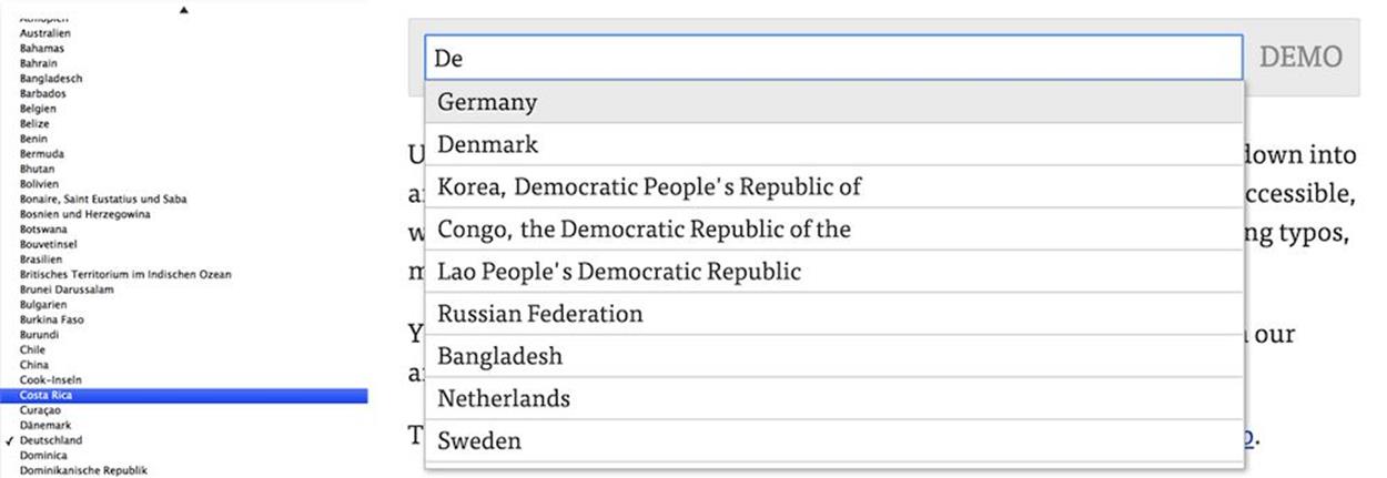
Less smart and smart country selector. Asking a user to type the first characters of their country might be easier than scrolling through an almost endless list of countries.
Instead of providing a drop-down, ask people to type what country they are from. You could define synonyms for common input values to make your field smarter: whether a user types in “DE”, “Germany” or “Deutschland”, they’d get the same suggested value; the same goes for “NL”, “Holland”, “Nederland” “Netherlands”, or “The Netherlands”. More typing, but also more convenience for the user.
Obviously, if you care most about a specific input, such as email, or telephone input, your efforts should focus on that input. You could search for specific libraries that would support and manage this input, like an email autocompletion library or telephone formatting library. Don’t go over the top with libraries, of course, but the right tool in the right context can be just what you need to get things done well and tackle common pain points in no time.
CONCLUSION
Phew, that was quite a journey but, frankly, this journey wasn’t particularly comprehensive. There is a plethora of good, smart solutions to be discovered — it’s just up to us to look for and find them. Explore foreign responsive websites, because you’ll likely be confronted with unique interactions and patterns that you haven’t encountered before. Chances are high that your problem has already been solved.
In some circles, responsive design has a reputation for being difficult, complex, tiring and inefficient. Well, it isn’t. It isn’t if you have a good team around you, a good process in place, and a set of design patterns on which you can build your solution every now and again.
I hope you’ve found a few gems in this chapter that you’ll be able to apply to your project right away once you flip over this page. You will fail along the way, and you will start over, but you will eventually succeed and achieve better and smarter results much faster than you used to.