Responsive Web Design, Part 1 (2015)
Mastering SVG For Responsive Web Design
Making SVGs Cross-Browser Responsive With CSS
Icons don’t need to be fluid; they don’t have to respond to their container’s width. But if the illustration is embedded as a regular image or object, or even a background image, we need to make sure that it responds to layout changes as expected. Using CSS, an SVG image can be made fluid and adaptive.
MAKING SVGS FLUID WITH CSS
When an SVG is exported from the editor, it always has height and width attributes that are equal to the size of the canvas in the editor — unless you removed these attributes during your optimization process.
In order to make the SVG fluid, you first need to get rid of these attributes. Any fixed height and width will restrict the SVG to those dimensions, preventing it from responding to changes in its container’s width.
Do not remove the viewBox attribute. It also comes by default. Keep it. Without the viewBox, the SVG is not going to be responsive.
You may have to set the preserveAspectRatio attribute to xMidYMid meet. If the attribute is not present, you don’t need to do that because it will default to this value. If it is set to another value, then — unless you have deliberately set it to that value — you should change it. The value xMidYMid meet scales the SVG canvas up as much as possible while keeping it inside the bounds of its viewport and maintaining its aspect ratio.
Next, depending on the embedding technique you used, you may need to apply a fix or use the padding hack to make your SVG fluid. We’ll talk more about how this hack works shortly.
If the SVG is embedded as a CSS background image, no fixes or hacks are needed — it will behave and respond to CSS background properties as expected.
If the SVG is embedded using <img>, <object> or <embed>, the SVG will be fluid and scale as expected in all browsers except Internet Explorer — IE requires a fix to scale it correctly. IE has a problem scaling the image: it scales the <svg>’s width correctly (the SVG viewport width) but the height is fixed at 150px, the default height for replaced elements in CSS. IE is smart enough to set the width of the SVG to 100%, which means that the SVG will scale horizontally but not vertically, thereby producing an amount of white space on either side (left and right) of the image. The white space on either side of the image is due to the SVG viewport extending horizontally but not vertically, which results in the SVG viewBox being restricted by the height; with the aspect ratio of the viewbox preserved by default, this ratio will no longer match that of the viewport, hence the white space.
To fix that, you need to explicitly set the width of the SVG to 100%. For example, assuming you have <img src="mySVG.svg" alt="Banner image" id="banner"/> in your markup, you can make it fluid by adding this rule to your CSS:
#banner {
width: 100%;
}
As the image container’s width changes, the image will respond as expected. Note that the dimensions of these elements will establish the viewport for the SVG canvas.
If you embed the SVG using <iframe> — and like all other elements embedded as iframes — most browsers will set the size of the iframe to the default size of replaced elements in CSS: 300×150px.
The only way to make an iframe responsive is by using the padding hack. The padding hack was pioneered by Thierry Koblentz in 200956. Koblentz’s technique makes it possible to create intrinsic ratios for videos and iframes.
To make the iframe fluid, you first need to wrap it inside a container:
<div class="container">
<iframe src="my_SVG_file.svg">
<!-- fallback here -->
</iframe>
</div>
Next, we apply some styles to the container following these rules:
.container {
height: 0; /* Collapse the container's height */
width: width-value; /* Specify any width you want (a percentage value, basically) */
/* Apply padding using the following formula */
/* This formula makes sure the aspect ratio of the container equals that of the SVG graphic */
padding-top: (svg-height ÷ svg-width) × width-value;
position: relative; /* Create positioning context for SVG */
}
The idea here is to establish a height-to-width ratio on the container that is the same as the height-to-width ratio of the <svg>. We make use of the padding-top (or padding-bottom) property in CSS to do that.
First, we collapse the container’s height. Since padding specified as a percentage is calculated relative to the width of the element — even if the padding is at the top or bottom of the element — we’re going to apply padding to expand its height again. The new height of the container will be equal to the padding; any additional height will throw off the aspect ratio we need.
The padding is applied to the top (or bottom) of the container, following the formula shown in the code snippet. This formula uses the values of the height and width attributes of the <svg> (the ones we removed earlier) to specify a padding value that allows the intrinsic ratio of the container to match that of the <svg>.
If we were to make the logo from the first section of this chapter fluid, the container’s CSS would look like the following code. The height of the SVG logo is 214px, and its width is 182px.
.container {
width: 50%; /* Or any width for that matter */
height: 0;
padding-top: 42.5%; /* (182px ÷ 214px) × 50 */
position: relative;
}
Because the container’s height has been collapsed and a fairly large amount of padding is applied to the top of it, its content — the SVG iframe— is pushed down so that it no longer sits inside the container anymore. In order to pull the SVG back up, you need to position the iframe absolutely inside the container. This is why we used position: relative on .container — it will establish a positioning context for the SVG.
Finally, and now that we have a positioning context, you position the iframe absolutely inside the container, and scale it so that it gets the container’s height and width:
iframe {
position: absolute;
top: 0;
left: 0;
width: 100%;
height: 100%;
}
Note that you will probably need to remove the default iframe border; override it with your own or remove it completely with border: none;.
If you’ve embedded the SVG inline as a code island inside the HTML document, it will work as expected in all browsers except IE; the height of the SVG will again be fixed to 150px as in the case of <img>, <object> and <embed>. But the solution to this issue is different this time: instead of applying width: 100% to fix this, the padding hack is required again. Wrap the <svg> in a container and use the CSS hack mentioned earlier to make the SVG fluid.
Note that, unlike the <iframe>, the <svg> does not need a height and width to inherit its container’s size. It won’t hurt if you add them, but they’re not required.
MAKING SVGS ADAPTIVE WITH CSS
Because SVG content is made up of XML tags that render graphics, we can select individual elements and apply specific styles to them, just like we can select HTML elements, using CSS selectors.
Like changing the styles of an HTML element — like background color, borders, and so on — you can also change certain styles of an SVG element using CSS. SVG elements are usually styled using presentation attributes like fill, stroke, transform and many others. However, only a subset of all presentation attributes can be set using CSS. You can find a list of SVG styling properties that can be set using CSS57 in the SVG Styling specification. Note that in SVG 2, this list is extended to include more properties.
SVGs also accept styles specified inside CSS media queries — just like HTML. However, there is one important difference between the way an HTML element responds to media queries and the way an <svg> does: the sizes specified in the media queries refer to the size of the SVG viewport, not the size of the page viewport, unless the SVG is embedded inline in the document (using <svg>). If an SVG is embedded using an <img> or <object>, the sizes in the media queries will correspond to the sizes of these elements. On a practical level, this is like having element queries58 in SVG. But if the SVG is embedded inline, the viewport sizes in the media queries refer to the size of the page viewport instead.
To apply media queries to the SVG, add them inside a <style> block inside the root <svg> element.
<svg xmlns="http://www.w3.org/2000/svg" version="1.1" viewBox="0 0 182 214">
<style>
/* CSS styles and media queries here */
</style>
<!-- SVG elements here -->
</svg>
Suppose we want to make the earlier nautical logo adaptive, hiding parts of it on smaller viewport widths so that it doesn’t take up too much screen real estate (see below).
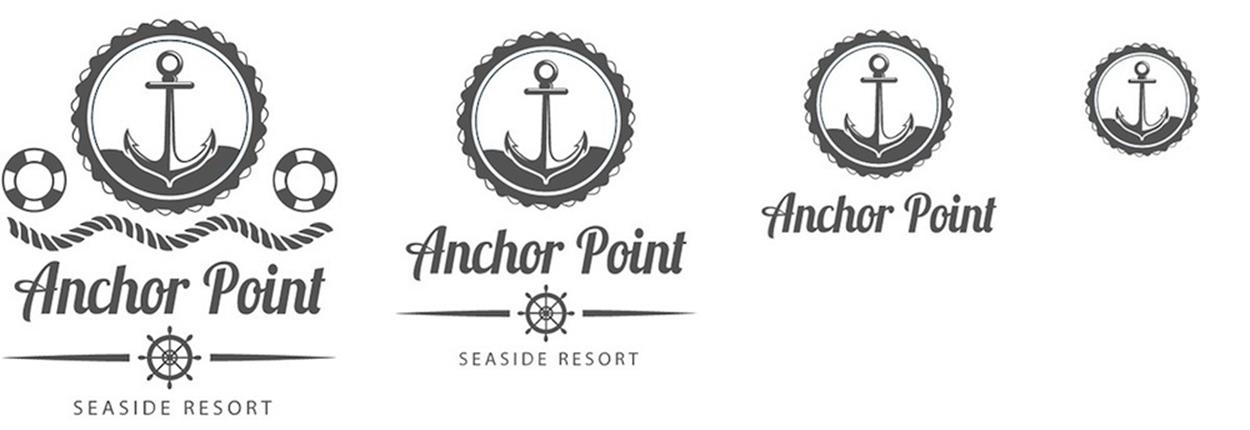
An adaptive logo created using CSS media queries. (Logo designed by Freepik.com)
An adaptive logo — or any image illustration for that matter — can be useful for hiding extraneous detail on small screens, removing small text that may not be readable, or styling certain parts of the image in different screen contexts.
To do that, we’re going to select the parts that we want to hide and then we set their display to none. Of course, you can also style elements differently rather than hiding them. The code for the adaptive logo looks like this:
<svg version="1.1" xmlns="http://www.w3.org/2000/svg" viewBox="0 0 182 214">
<g id="horizontal-rule"><!-- shape content --></g>
<g id="rope"><!-- shape content --></g>
<g id="log-title"><!-- shape content --></g>
<g id="top-anchor"><!-- shape content --></g>
<g id="logo-subtitle"><!-- shape content --></g>
<g id="rescue-wheels"><!-- shape content --></g>
<path id="boat-wheel" d="…" />
</svg>
Adding the media queries:
<svg version="1.1" xmlns="http://www.w3.org/2000/svg"
viewBox="0 0 182 214">
<style>
@media all and (max-width: 400px){
#rescue-wheels, #rope {
display: none;
}
#logo-title, #boat-wheel, #horizontal-rule, #logo-subtitle {
transform: translateY(-15px); /* nudge elements up to fill white space resulting from removing the elements in the middle */
}
}
@media all and (max-width: 250px){
#boat-wheel, #horizontal-rule, #logo-subtitle {
display: none;
}
}
@media all and (max-width: 210px){
#logo-title {
display: none;
}
}
</style>
<!-- SVG content -->
</svg>
You can make images adapt any way you want — it’s as simple as making HTML elements adaptive.
Similarly, you can create responsive icons in a spritesheet-like method by defining several icons inside your SVG and then using CSS media queries to only show the icon that you want based on the viewport size. The icons and the logic used to show and hide them would all be encapsulated inside the SVG as well.
First, the icons are arranged inside the <svg>:
<svg>
<g id="home_icon_0" class="icon">
<!-- paths and shapes -->
</g>
<!-- … -->
<g id="home_icon_8" class="icon">
<!-- paths and shapes -->
</g>
</svg>
Then, CSS is used to hide the icons and show only the icon we want based on the conditions specified in the media queries:
<svg>
<defs>
<style>
/* Hide all of the icons first. */
.icon {
display: none;
}
/* Display the first one. */
#home_icon_0 {
display: block;
}
/* Display the desired icon and hide the others according to the viewport’s size. */
@media screen and (min-width: 25em) {
#home_icon_0 {
display: none;
}
#home_icon_1 {
display: block;
}
}
@media screen and (min-width: 30em) {
#home_icon_1 {
display: none;
}
#home_icon_2 {
display: block;
}
}
/* And so on */
</style>
</defs>
<!-- Icon groups go here -->
</svg>
Ilya Pukhalski wrote about this technique in his article for Smashing Magazine, “Rethinking Responsive SVG59.”