Responsive Web Design, Part 1 (2015)
Building Advanced Responsive Modules With Flexbox
BY ZOE M. GILLENWATER
I can remember when I first heard you could create a web page layout without tables — just CSS. I was rather confused, but intrigued. There was this new thing called CSS floats, and you could use it to place boxes beside each other in columns without having to struggle against massively nested table markup, spacer GIFs, rowspan and colspan, and all the other junk that made tables so ill-suited for web layout. I dived into float-based layout headfirst and didn’t look back, but along the way I discovered, as I’m sure you have, that floats have their own shortcomings that can sometimes make them tricky to work with — after all, they weren’t actually designed to control overall page layout.
For one thing, you always have to plan for some sort of float containment method so that the floats don’t hang out of the bottom of their parent containers. You also need to be careful that your floats don’t wrap when you didn't intend for them to do so. Plus, although floats don’t suffer from the rigid structure of tables, you’re still somewhat dependent on the HTML source order, since floats don’t move up, only over to one side (at least not without all sorts of negative margin madness). And, of course, there are the usual complaints that you can’t make separate floats the same height, and you can’t center a float horizontally or vertically. Most of these things can be worked around in various ways, sure, but the techniques can be messy and confusing. They’re complications that have to be worried about and fiddled with every time, instead of features that just work.
Add to the mix the requirement that your float-based layout be responsive, and these limitations become even more obvious and frustrating. Being able to move something just left or right isn’t good enough when you need the same box to appear at various places on the screen at different viewport sizes. Plus, now that you’re using percentages to size your floats, there’s an even greater likelihood that a miscalculation on your part, or a rounding error on the browser’s part, will send a float wrapping. Using display:table or display:inline-block solves some of the issues with float-based layout, but with one big limitation: the source order has to match the visual order, even more so than with floats.
The CSS Flexible Box Layout module1, called flexbox for short, solves a lot of these shortcomings and makes building responsive layouts much easier than our current layout methods. Flexbox gives you more control over the things you care about in a responsive layout — like order, alignment, and the proportional sizes of your boxes — and lets the browser figure out the rest, the math-y stuff that computers are good at, like the exact dimensions needed for the boxes to perfectly fill the available space. You can create much more complex and reliable layouts with flexbox than you can with floats, table display, or inline-block alone, all with far less CSS.
When To Use (And Not Use) Flexbox
That doesn’t mean flexbox is a silver bullet. It’s one of several new layout mechanisms that CSS3 offers us, and each is well-suited to different uses.
GO FOR IT!
Flexbox is strongest when used to lay out, size, and align the components within a section on a page, or the content within a component. For instance, flexbox would be great for laying out the links within a menu, the fields within a complex form, or the story boxes within a main content area. We’ll look at several component layout examples like these throughout this chapter.
Even though a couple of browsers still in use today don’t support flexbox (basically IE9 and earlier), you can still use it today as a way to progressively enhance the responsiveness of your UI components. Non-supporting browsers may render alignment, spacing or sizing a little differently from flexbox browsers, but we’ll make sure they don’t display anything broken, weird or ugly. Flexbox is a great progressive enhancement tool when fine-tuning the appearance of your components.
If you’re building a responsive site, flexbox can be especially useful in making your components more adaptive to the changing dimensions of their containers. The browser can automatically resize and move chunks of content as needed, often without you having to add any media queries. If you want to maximize the responsiveness of your content, flexbox is the way to go.
Flexbox is also a great option for creating the overall page layout on narrow mobile screens. That’s because mobile layouts are usually much simpler than desktop layouts, and because browser support is excellent among mobile browsers — all the major mobile browsers support it.
For up-to-date stats on which browsers support flexbox, head to http://caniuse.com/#feat=flexbox2.
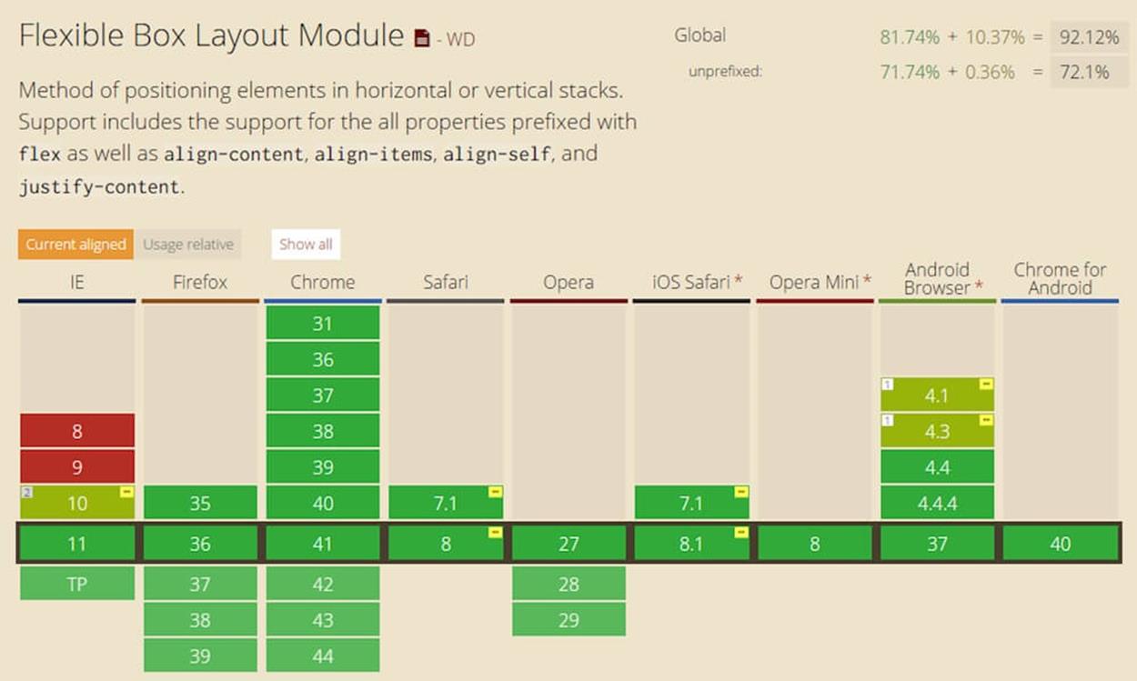
Can I Use shows that all major browsers support flexbox, or over 92% of browsers in use globally (as of spring 2015).
HOLD UP
Apart from mobile, flexbox is not terribly well-suited to handling the overall page layout, unless that layout is relatively simple. There are a number of reasons for this. For one thing, flexbox rather depends on items being siblings to one another. If you have a complicated HTML structure, you may not be able to get different pieces at different levels within the hierarchy to work together in the way you want. For instance, if you have two sibling elements, one with child elements nested inside, you can use flexbox to make those siblings match each other in width and height, but you can’t get the children to automatically match the width and height of their parent’s sibling.
Flexbox is not a true grid system. Within a single row or column, flexbox can make all the items have equal widths or heights, or proportional dimensions, which seems very grid-like. But for every new line, flexbox will start over on its calculations, resulting in items that don’t necessarily line up with the items in the lines before or after. Relative sizing is an awesome feature of flexbox, but the sizes of items are relative only to siblings in the same row or column.
Another reason flexbox isn’t the best for overall page layout is that you don’t have complete freedom over the visual placement of your content without regard for HTML source order. That’s the holy grail of page layout, and it’s something that CSS Grid Layout3 will give us, once it’s fully developed and more widely supported. Flexbox can do some reordering, but it’s still a bit source-dependent, as we’ll see in more detail later on with the order property.
The final reason to avoid flexbox for overall page layout for desktop (at least for the time being) is that browser support for flexbox on desktop still has a couple of holes: IE9 and earlier versions of IE don’t support it, and all other major desktop browsers do. While this means that flexbox does actually have great support on desktop browsers — enough to use it to lay out individual page components — depriving users of the overall page layout is a lot more problematic than them not seeing the exact sizes and alignment within a page component. I’m completely fine with users of IE9 and earlier seeing something a little different from other browsers. But not seeing any layout at all? That’s going a bit far.
Apart from desktop page layout, flexbox is also not the right choice for flowing content into multiple columns. That’s the job of the CSS Multi-column Layout module4. Flexbox can lay out blocks of content beside one another, creating multiple columns, but each of those columns has to be a separate element in the HTML.
So again, use flexbox for what it’s been designed to do and is good at: laying out individual components and their chunks of content. Like any tool, it has its strengths and weaknesses.